


 Featured Videos


Every year at Basel people proclaim that blue is making a come back… but I dare say, it never left. Blue dialed watches are…well, and interesting change of pace. If you only had one watch, I’d say, don’t get a blue watch. By nature, they are less versatile, more stylized and showy. But if you had a few watches, and wanted one with some color, but not too much color, just enough to make it stand out, yet not clash with your attire like an orange dial might; then blue is a good choice. It lends itself to both formal and casual watches, and since there is a never ending range of blues, from dark to light, verging on turquoise to near purple, you can likely find a blue that speaks to your style. And, by being brighter and more lively, blue dials tend to feel better suited to the warmer months.
But perhaps my favorite thing about blue is how well it goes with brown leather. Pairing a blue dial with the right tone of brown makes both sing in a way that rarely occurs with black or white dials. Whether a dark chocolate, a bright orange chestnut or a mahogany with hints of red… when matched against the right blue, they both come to life, making pairing with shoes, belts and of course straps all the more enjoyable. Below is a list of 10 watches, in no particular order, that by no means comprises the totality of what’s out there, but does provide a range of styles and blue tones to consider. Enjoy!
Squale 1521
We love the Squale 1521 and so should you. It’s not just an authentic dive watch with a great, albeit slightly unknown, history, it’s a great value too. Oh, and they have style to spare. Though typically seen in black, Squale makes a bright blue with blue bezel option. This is one of the louder blues in this guide, but it still has lots of charm. It’s crisp and clear like the oceans it wants to be in and the skies above them.
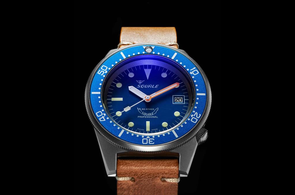
There is the standard version with a polished steel case, but for something more subtle, our friends over at Page & Cooper are offering (currently in pre-order) a satin cased version that I think will be the way to go. The satin finish will temper the blue a bit, reigning the watch in just a bit. Shockingly good deal at £575/$843 (outside of EU).
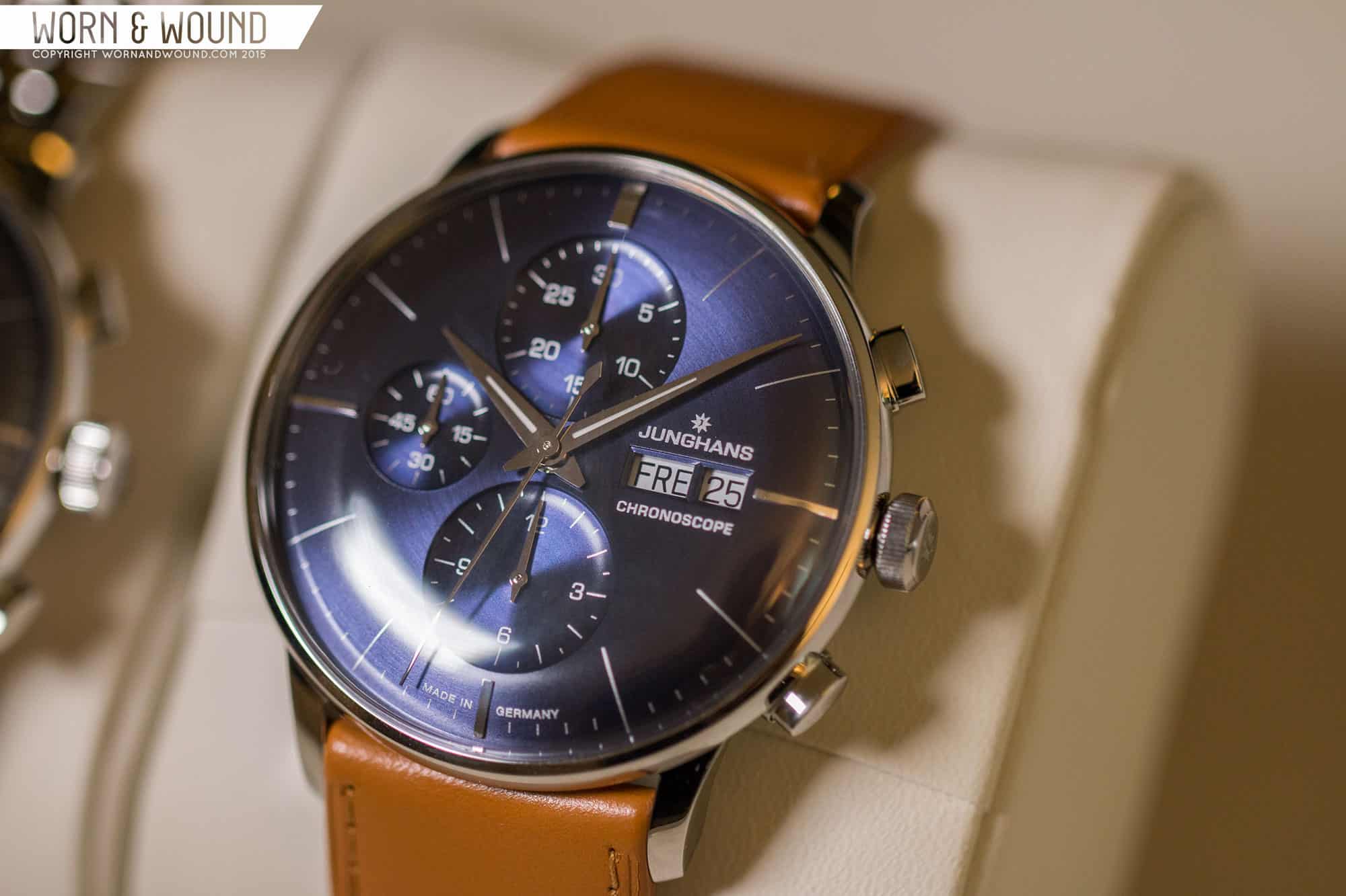
Junghans Meister Chronoscope
At Basel this year, Junghans released a new version of their killer Meister Chronoscope with a new sharp blue dial. To start, the Meister Chronoscope, which while different from the Max Bill Chronoscope, still has a minimal German feel, is one of the most stunning modern dress chronos. The domed dials and elegant cases makes these uniquely stunning and pleasure to look at. The new blue is cold and steely, and on the dark side, but has a metallic sheen from the radial finishing. In person, it was entracing…and though I might still be partial to their gray dials, it’s a strong blue offering. They also paired it with a bright tan strap that emphasized the dial perfectly. $2,119 available in august.
Meistersinger Neo
Meistersinger has had a strong blue game for several years now, with beautiful sapphire dials on several of their models. You can take your pick from amongst them, but I have a soft spot for their smallest and most affordable model, the Neo. Hopefully we’ll get one these to review someday soon. As with most Meistersingers, the Neo is a one hander that is less about precision time-telling and more about style and concept, and at 36mm with a large domed acrylic crystal, it nails the style part. These are fun, charming little watches that can be worn in dress or casual occasions.
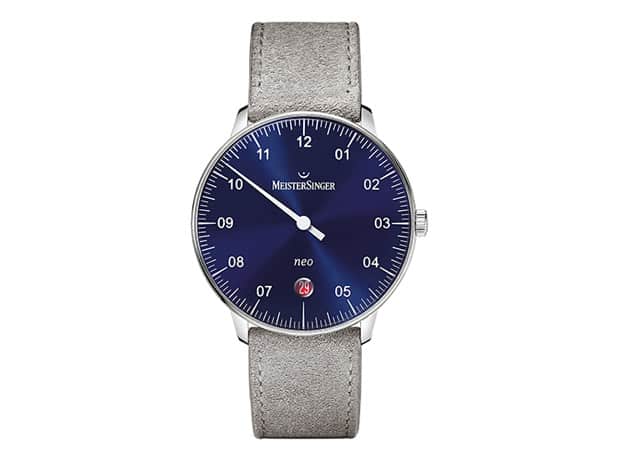
The Neo blue has an inky sapphire color with sunburst effect that gives a lot of presence to a small watch. To increase the playfulness even a bit more, Meistersinger gave the blue Neo a red date disk with white date text. The contrast is extreme and clearly meant to be a visual centerpiece. Considering most brands don’t bother to change date wheels at all, I have to applaud them for changing it for the sake of fun. $1,300-ish
Seiko 5 SNK807

This wouldn’t be a proper guide if it didn’t have a Seiko 5 SNK in it, and it just so happens to fit effortlessly. The SNK807 has the classic field look we’ve all come to love but mixes it up with a matte, dark blue dial. Before seeing this one in person, I thought it might be too blue, but it’s actually just right. It’s the kind of dark blue that could be mistaken for black in dim light, but when hit by the sun is a beautiful, but subtle tone. It doesn’t betray the military feel of the watch at all, yet adds unexpected character. I wear mine on one of our 18mm Chestnut Model 2 straps, and despite being the least expensive watch in my collection, is one of the most eye catching. Oh yeah, and it’s about $60…
Christopher Ward C9 5-day Automatic 40mm
In the time since I reviewed C Ward’s groundbreaking, C9 Harrison 5-day automatic chronometer, they went ahead and answered a lot of people’s issues and brought out a 40mm version, as well as dropped the price slightly to $1,895… I liked it at 43, but at 40, it just makes so much more sense as a masculine formal watch… Not a dress watch by classic standards, but a handsome piece with a serious movement that can be worn in all professional circumstances… bravo.

But, that has nothing to do with the color blue…other than the new 40mm version (as well as the original 43mm version) have a blue dialed option. In keeping with the formal approach of the watch, the blue is relatively reserved. It still is clearly blue, but it’s calm and soothing. The markers and hands are then all polished steel, contrasting nicely and giving the watch an overall metallic feel. If you air towards white or light blue shirts for work, this watch will fit effortlessly into your wardrobe… oh, and just to reiterate, it has a bloody 5-day automatic chronometer in it!
Autodromo Prototipo Blue
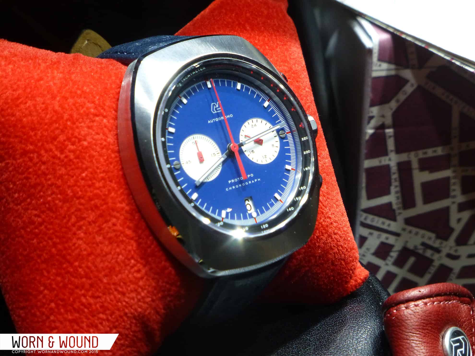
Another watch that we’ve made our affection for clear, the Autodromo Prototipo is probably the best way to get that vintage racing chrono look and feel, without dropping massive dollars. And now, it’s also the best way to get a blue vintage inspired racing. The most recent model of the Prototipo to come out, which dropped sometime last fall, has a rich blue dial, off set by contrasting white sub-dials and red accents. In the context of a racing watch, the blue and red palette really makes sense, referring to the exotic colors of the cars doing the racing. Autodromo paired it with blue rally strap, really accentuating the cool colors. $625
Seiko 5 SNZH53
What? Another Seiko? Damn right! The SNZH53 was one of the first watches we reviewed here on w&w, and it’s still a great piece. Less one of Seiko’s real tool watches, and more known as a canvas for the “fifty fathoms” mod, the SNZH’s are simply cool, stylish watches that are fun to wear. If, like me, your not wearing dive watches down to the briny depths very often, but rather are wearing them to enjoy the look of a diver, the SNZH has a lot to offer, such as a vintage influenced dial and bezel, and a domed hardlex crystal… not bad for an automatic at around $130+
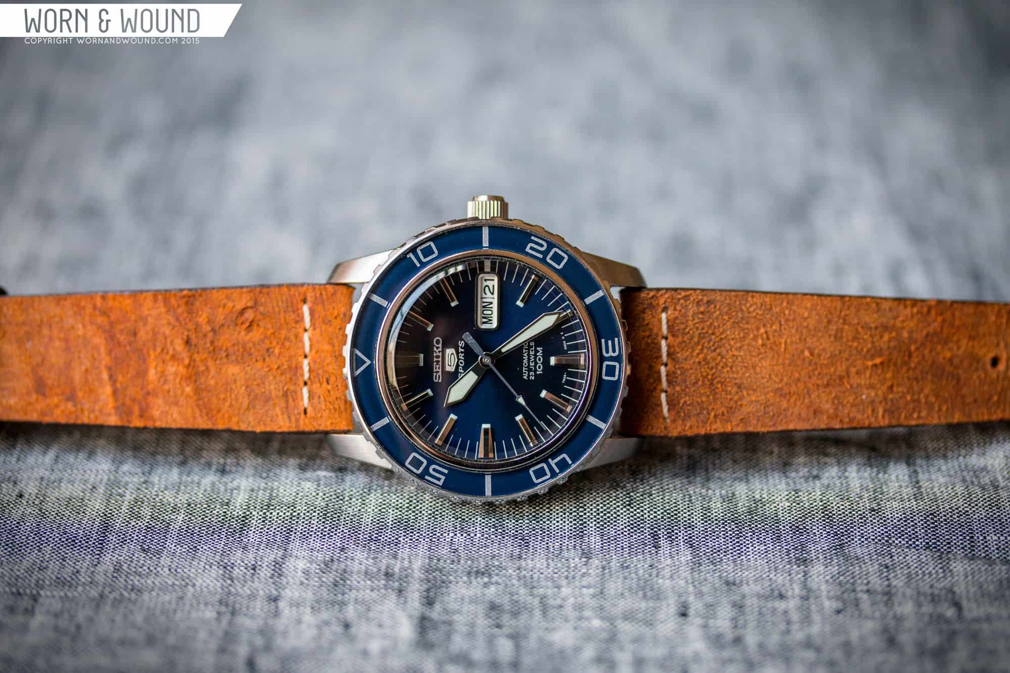
Once again, this should be about the fact that the SNZH53 is blue, because it is. Both the bezel and dial are dark blues, but differing types. The bezel insert is deep and dark navy that appears gloss as it is covered by a plastic, likely acrylic layer, giving it a vintage bezel look. The dial is slightly brighter and has a sunburst effect. They compliment each other well, creating a watch with an overall blue cast. Unlike the Squale mentioned earlier though, it’s all fairly subdued, not hitting you over the head with color. This watch looks great on tan or rust leather (shown here on a ColaReb).
Sinn 903 ST Be
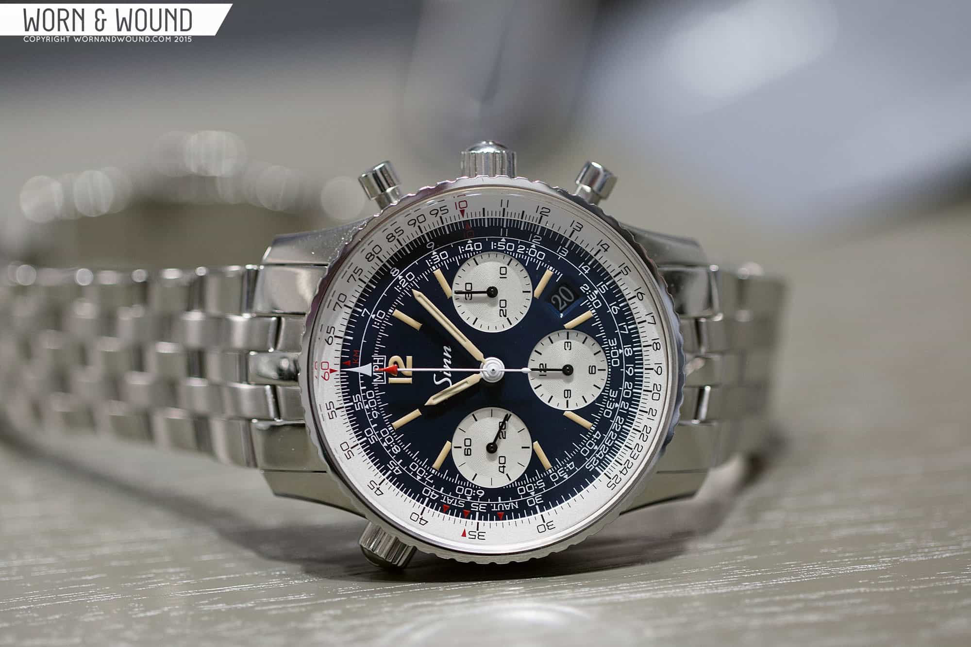
Another new watch from Basel 2015, the Sinn 903 ST Be is the first update to the 903 in sometime. We covered it here, and as Ilya said there, it was one of our favorite uses of blue this year, and also a very unexpected one. What was so nice about it, was how subtle it was. This was not an in your face blue. In fact, you might not realize it was blue at first. Rather, it seemed more like a faded black of some kind, as though it had been left in the sun. Throw in the parchment lume and you have a clear play on patina. Yet, it doesn’t feel forced or contrived on this watch. Perhaps this new version will help bring the 903 back into the spotlight a bit, as it’s the closest thing to a vintage Navitimer, other than an actual vintage Navitimer, one can get. $3,450 on bracelet, $3,120 on leather strap
Melbourne Portsea Blue
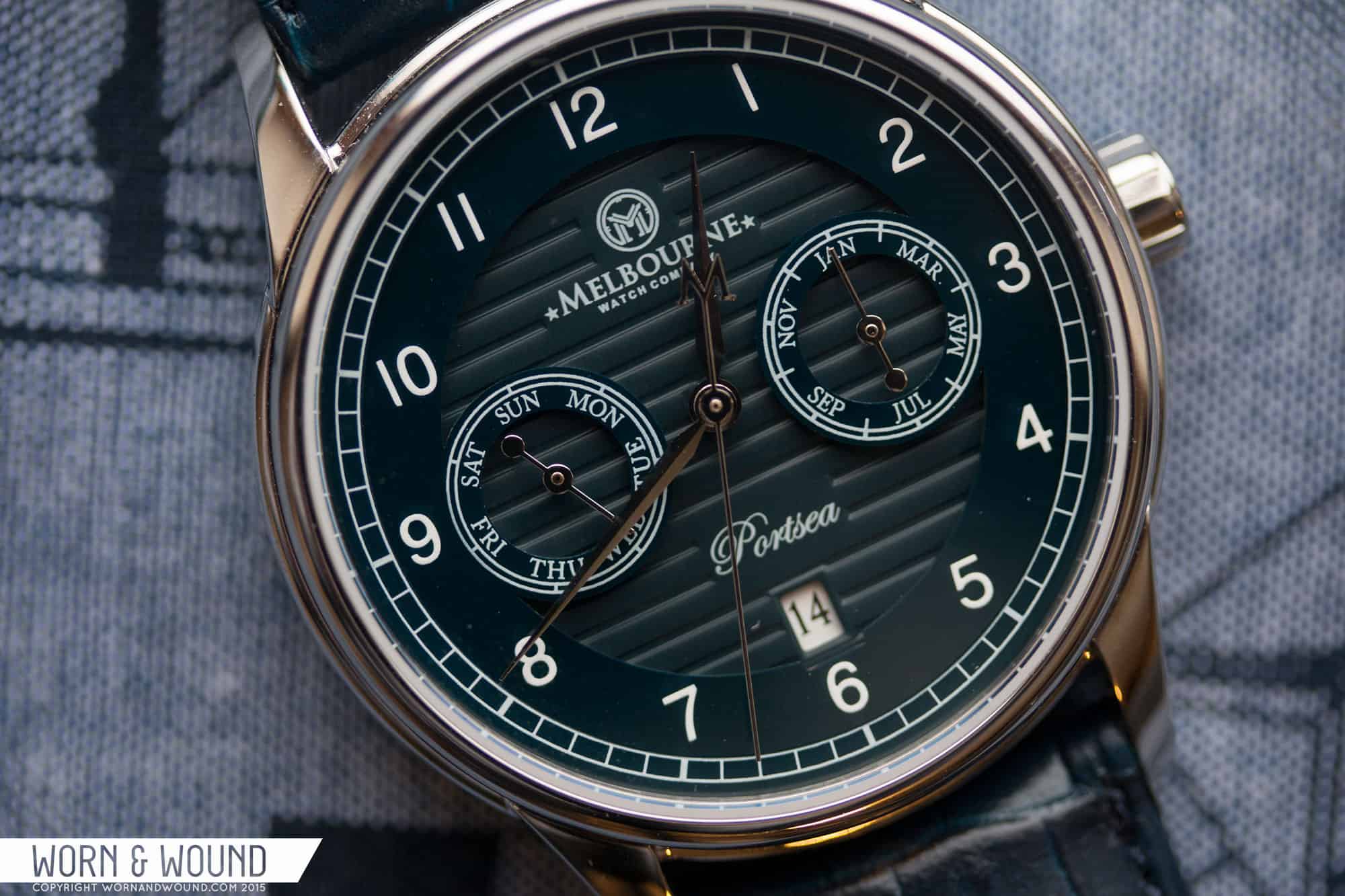
The Melbourne Portsea is such a cool watch. I enjoyed the hell out of it when I reviewed them, and they left a lasting impression. From the layered dial with ceramic components to the stamped case back, to the Miyota 9120 movement to the over all clever play on the Marine style, there is just so much that wins with this watch. But the most unexpected win, was the use of blue. They chose just the perfect inky dark blue for the dial. One that works with the nautical theme of the watch, gives it a unique personality and made it more fun to wear. It’s one of the few times the use of blue genuinely elevated the design a bit. $613
Heuer Skipper 15640
I felt as though I had to include one vintage grail on this list for fun, so here you have it; the Heuer Skipper ref 15640. Heuer Skippers are cool, and super collectible pieces. Rather than be their own watch, in the sense of having new cases, etc.. Heuer used Autavia cases for most of the styles (there is also an version with a Carrera case, but that’s like hopelessly rare), and modified cal. 15 movements that were altered for Yacht race countdowns. The 15640, or first gen, had a dark blue dial, and brighter blue bezel that gave it a softer and more aquatic look than the later black dial versions. The pièce de résistance, however, is the oversized 15-minute counter at 3 in red, white and blue 5-minute segments. Finishing the dial off are near fluorescent orange hands.
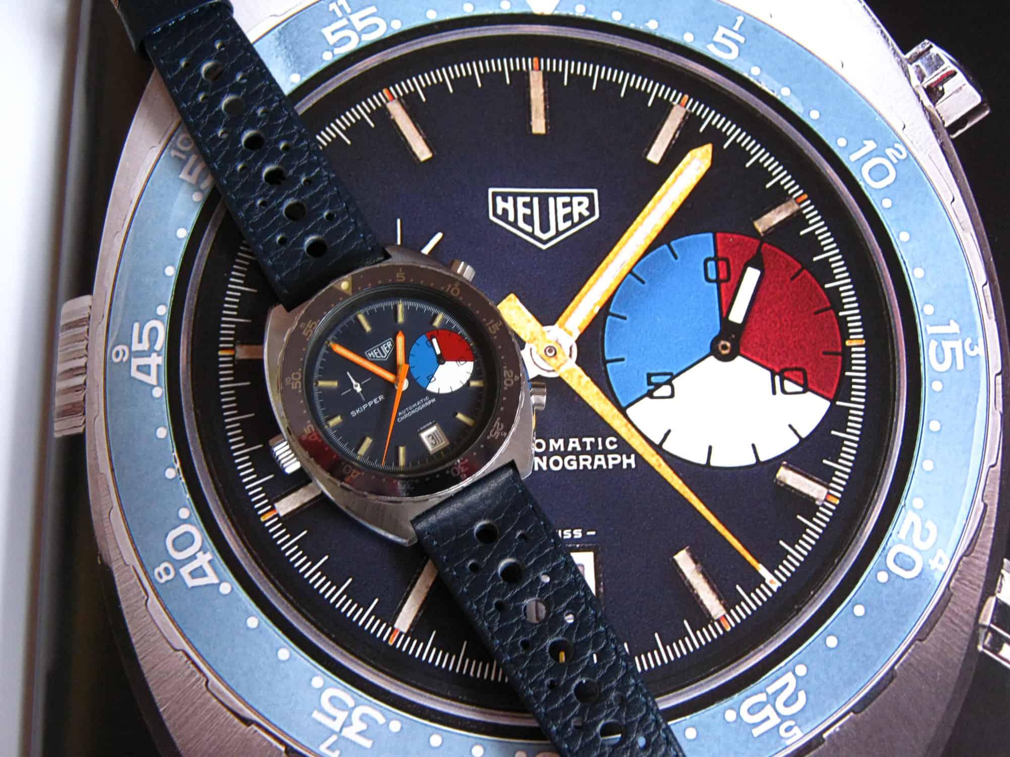
This watch just wants to be blue, is meant to be blue. From the yachting colors in the subdial to the name “skipper”, blue is clearly in it’s DNA. Making things cooler, it still has the look and feel of an Autavia, giving it a very rugged overall feel, which contrasts with the softer tones. Though these rarely come up, they seem to trade in the upper $3k range, which is almost on the low side all things considered. special thanks to Chronocentric user Raticosa for letting us use the above image