


 Featured Videos


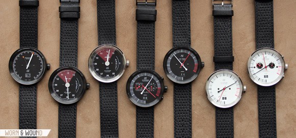
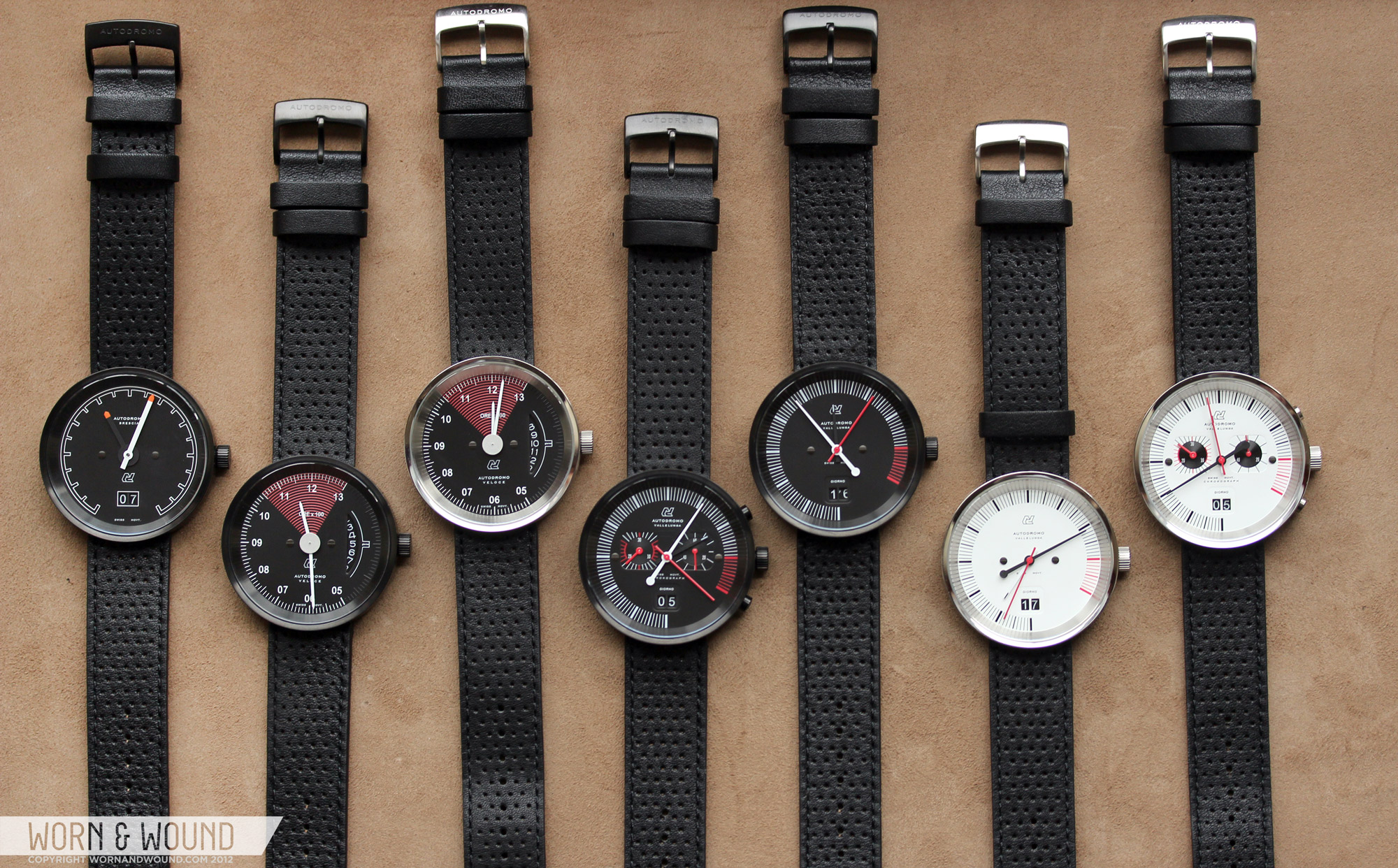
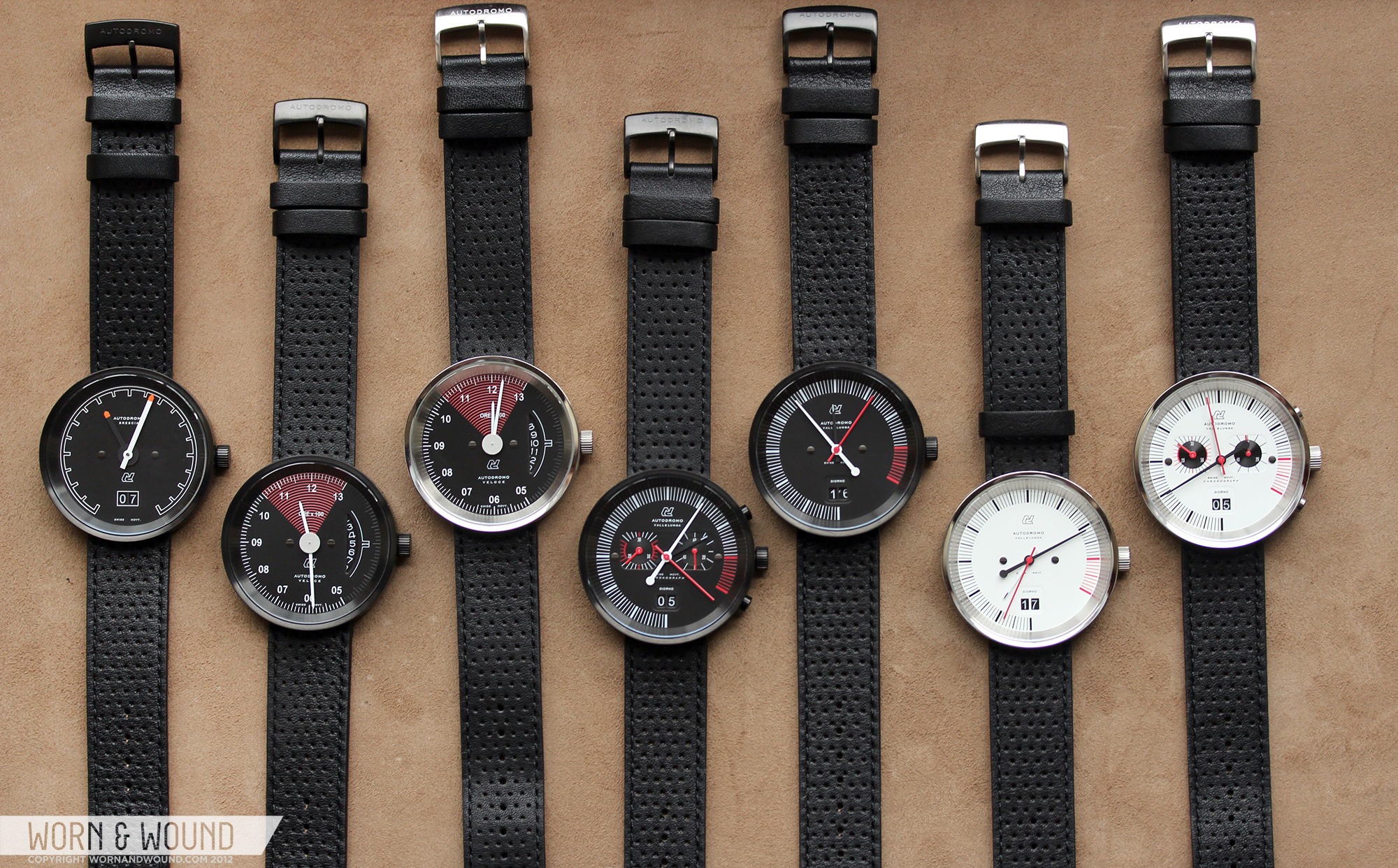
For some of you, particularly the gearheads in the crowd, Autodromo is a young brand that stirs up a lot of excitement. A self-described “driving-oriented design brand,” Autodromo recently burst on to the watch scene with a line of 60’s Italian sports car inspired timepieces, carried out with an acute eye to detail and clear appreciation for superior craftsmanship. Each of the Autodromo timepieces are designed from the ground up, with no stock parts from the strap to the case to the dial. We recently had the good fortune to meet up with Bradley Price, Autodromo’s founder, and talk to him about his passion for watches and of course, cars. Oh, and he was kind enough to lend worn&wound his complete line of watches, the results of which can be seen below via an extensive photo gallery and epic video overview.

Based in New York City, Bradley Price is a man with a vision, and the wherewithal to bring that vision to life. One day, inspired while driving in his Alfa Romeo, the concept for Autodromo took shape; to bring the visceral experience of driving off the road and on to your wrist. Several years later, Autodromo was born. Driven (pun intended) by his passion for 60’s era automobiles of Italian lineage, the design of the Autodromo line of watches is perfectly stylized, capturing the experience of driving a fine vintage car so well even the Subway riders amongst can appreciate.
As Bradley describes it, “the Italian sensibility about creating automobiles – whether a humble Alfa Romeo Giulia Ti or an exotic Lamborghini Miura – has always represented the sheer, unadulterated pleasure of motoring like no other.” This passion is evident in the Autodromo line of watches. But there is a lot more to expect from Autodromo, as Bradley pointed out “we don’t want to be thought of as a “watch brand.” We are really a driving-oriented design brand, and as the product line starts to expand into new products and leathergoods, this will become apparent.”

But there’s a lot more to Autodromo than a passion for cars, as Bradley’s passion extends to vintage timepieces as well. “When I started to get more serious about vintage watches I really got into vintage Heuer (pre-TAG)” Price said, “because it was so intimately connected with racing in the 1960s and 70s, which is an era I am fascinated by”. While not directly inspired by these pieces, Bradley’s love of whatches is evident in the design and manufacturing of the Autodrmo line of timepieces. As mentioned, we got our hands on Autodromo’s entire collection and went to town taking photos, video and getting up close and personal with each model.
Case
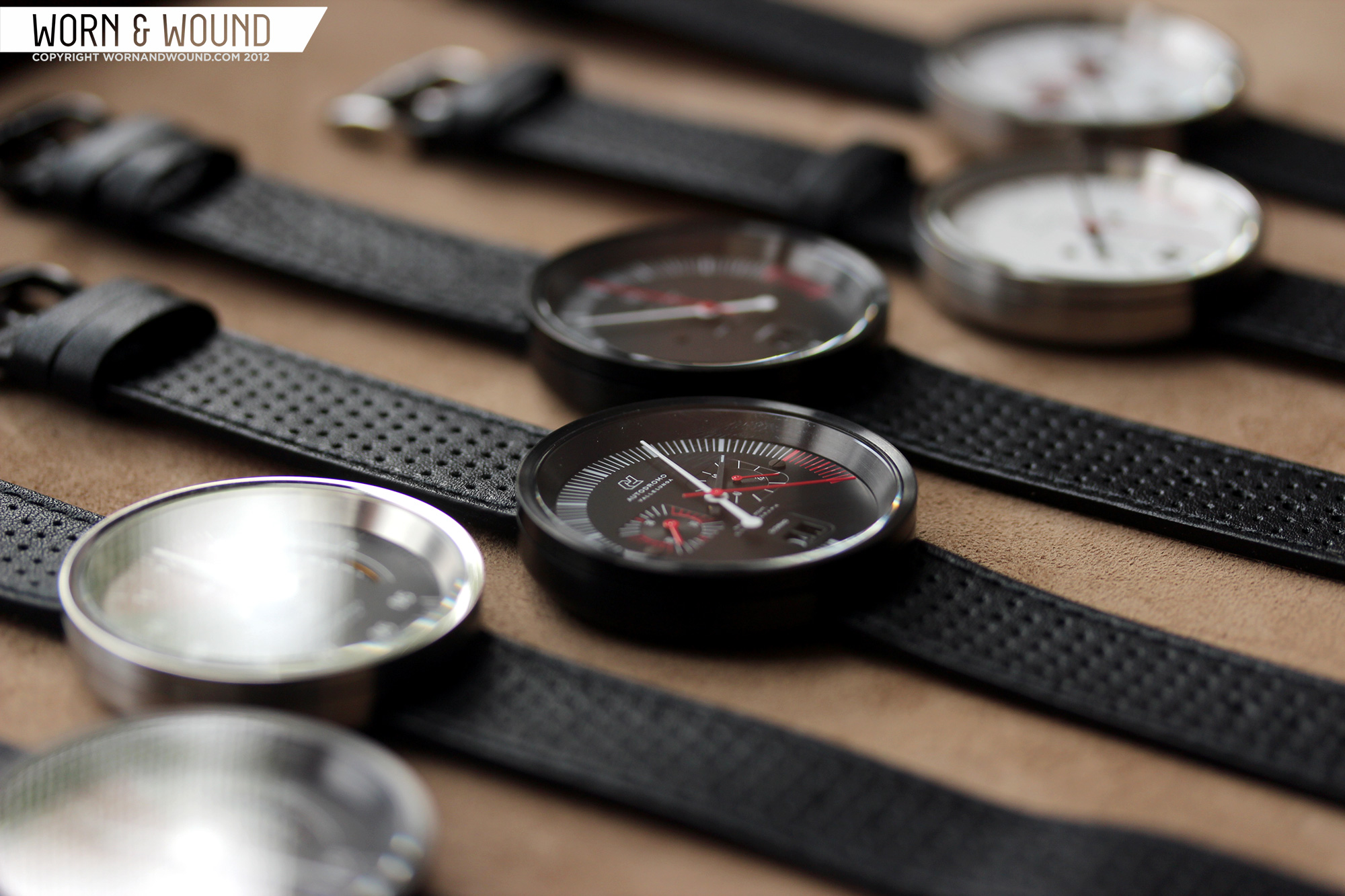
 Common to all 7 of the current Autodromo models is the 42mm x 10 mm stainless steel case in either brushed or PVD finish. The design of the case is deceptively simple at a glance, revealing finer details upon closer inspection. From above, the lugless design and 39 mm KI glass crystal make for a simple and clean circle. The thin polished bezel, which is one of the few polished details of case, leads the eye into the watch, first to the sloped steel inner bezel, then to the dial. The sloping bezel, which is lacking in markings, adds a sense of depth to the watch, exaggerating the distance between the glass and the dial. This builds on the automobile gauge reference of the watches as well as creates a look that is unique to the line. Though the glass is quite large, which usually lends itself to an all-dial type of watch that wears larger than it looks, the Autodromos are proportioned very carefully, having just enough wrist presence without an oversized dial.
The profile of the case is equally simple and finessed. Essentially, the sides are straight, as the case is cylindrical, but instead of ending abruptly the case curves in with a very soft radius, to eliminate any sort of uncomfortable edge. This radius then flows across the entire case back, creating a very soft dome to the whole surface. The case back itself is not mounted on top of the case body, but rather sits in, seamlessly continuing the surface. Though this detail is on the back, when you see and feel this in person, you can tell that the quality of the fabrication is extremely high. There is only a hairline gap where the body and case back meet. The back itself is held on with four small flathead screws.

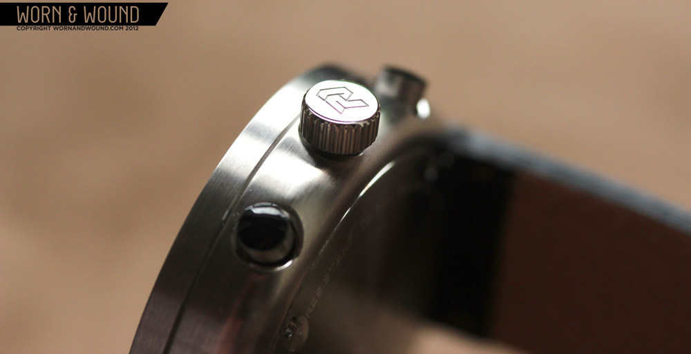
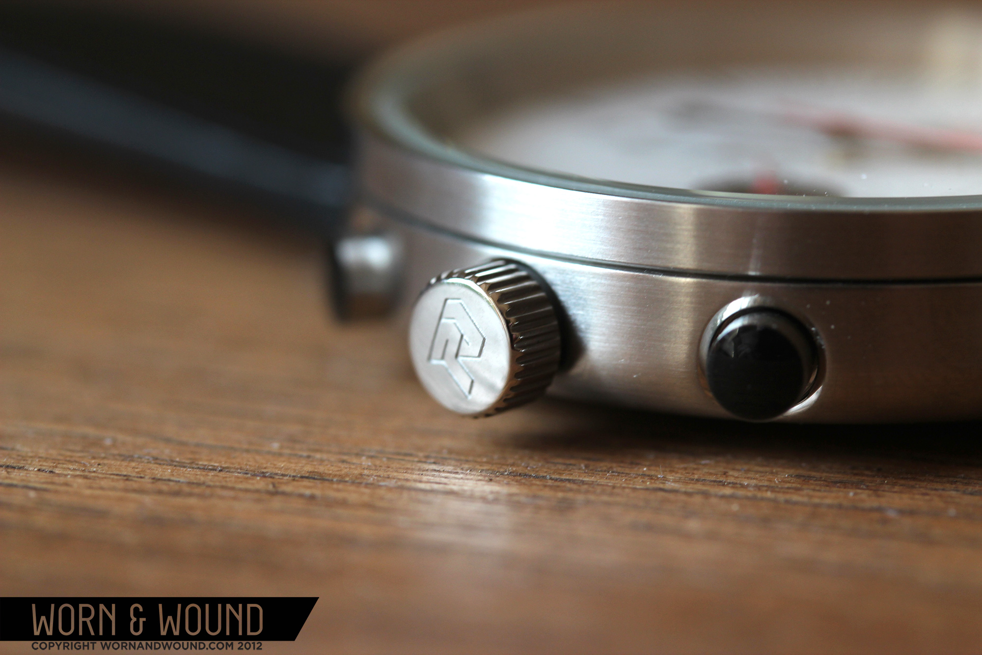
The build quality, as should be evident by now, is extremely high. One of the most simple, but reassuring qualities a watch can have is a proper amount of heft, which the Autodromos have. That is not say they are heavy, they are in fact quite nimble, but for quartz watches that do not appear bulky, they have a satisfying weight. The cases themselves feel rock solid, are brushed perfectly evenly on the sides and back and polished to a mirror shine on top. The PVD versions are dense black, taking on a slight sheen from the brushing of the case. The 6mm x 3mm push-pull crown is also well crafted, with a simple shape that is well proportioned to the case.
 Case: Brushed Stainless and PVD
Movement: Ronda 4003.B
Dial: White of Black
Lume: N/A
Lens: KI Glass with Sapphire Coating
Strap: Black Leather
Water Res.: 30m
Dimensions: 42mm
Thickness: 10mm
Lug Width: 20mm
Crown: 6 mm push-pull
Warranty: 2 years
Price: $465
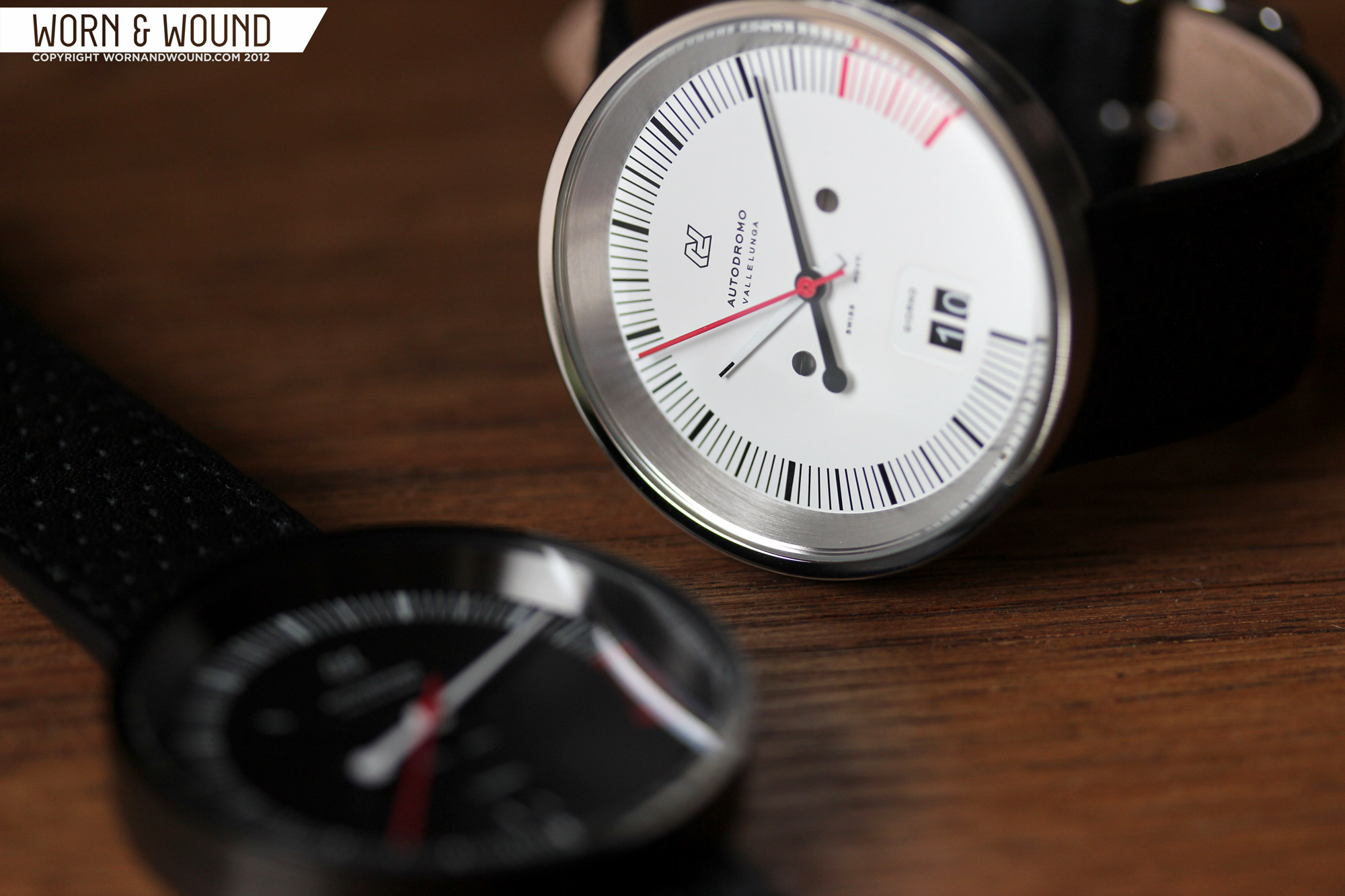
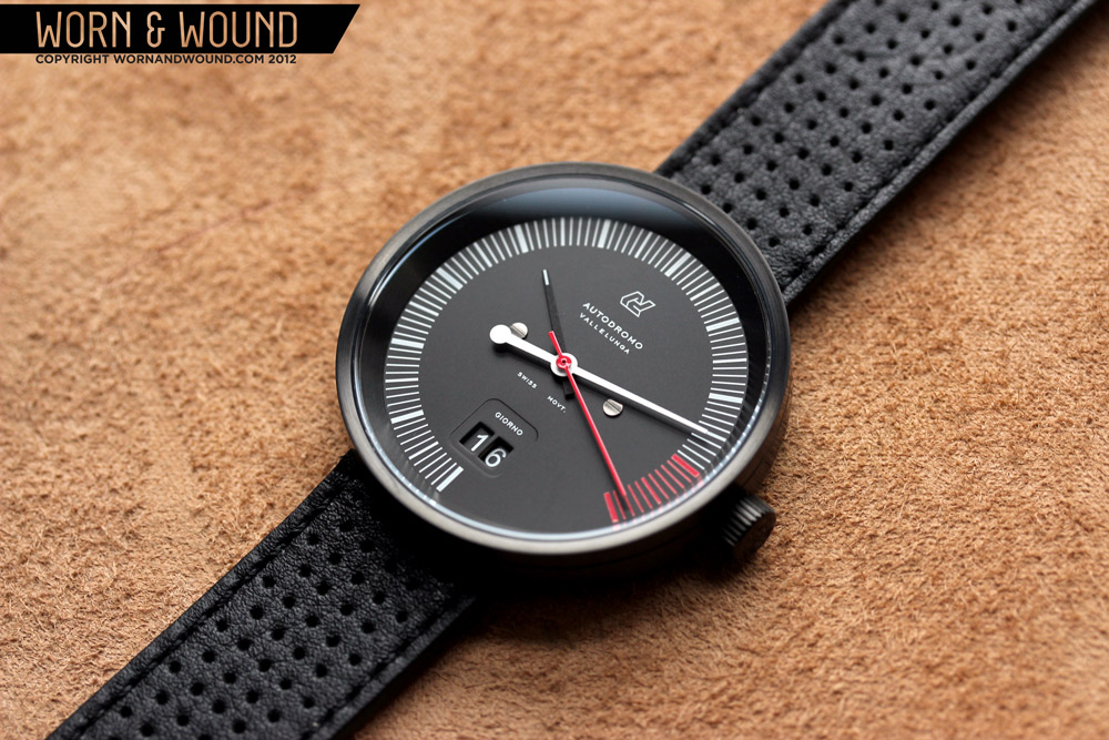
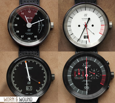
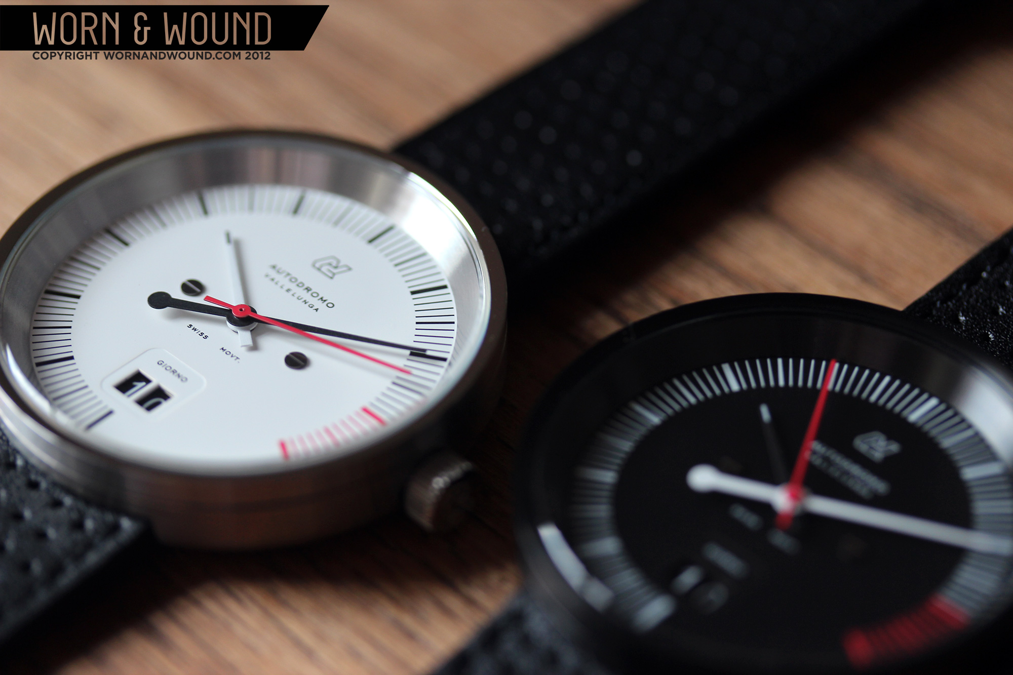
The Vallelunga 3 hand models are available in 2 color ways, a white dial version with a brushed stainless case and black dial version with a PVD case. The dial design is based on tachometers from 60’s and 70’s sports cars, which is clearly evident in the incomplete index, “red line” region from 3 – 4 and hand design. Overall, the dial is very clean and minimal, lacking in numerals, save the big-date window at 6. There is some text running down the center of the watch, but in a very small font that does not distract. There are also two applied screw heads on the dial on either side of the center. The index, which runs from 6 around to 4, with no markings at all from 4 – 6, is comprised of lines of equal length, but varying width. The hours are thickest, followed by half hour markers and then half-minute/second markers. The half minute/second markers is a bit confusing at first, as one is used to certain conventions on a watch dial, but I found it easy to adjust to.

At 6 is the big-date window, which actually consists of 2 small windows in an impressed rounded-corner rectangle. The double-digit date, with white text on black date disks, fits perfectly into the aesthetic of the watch. The “digital” read out is reminiscent of many counters one experiences in a vehicle, and it adds a moment of density to the dial, bringing the eye to 6, where the index “starts”.
 The hands of the Vallelungas are designed to play into the tachometer aesthetic as well. The first hand one is likely to notice is the large minute hand, which is in the opposite color from the dial. The hand has a simple tapering shape, with a large circular counterweight on one end. Next, one notices the bright red seconds hand, ticking away. And lastly, one sees the hour hand, which is in matching color to the dial, save a small contrasting dash on one side. Clearly, the hour hand is not meant to jump out, as the emphasis of the design in on the minutes. That being said, it is not actually difficult to seek out the little dash on the hour hand when one is actually trying to tell the time. The lack of clutter on the dial aids in this.
 Case: Brushed Stainless and PVD
Movement: Ronda 5020.B
Dial: White of Black
Lume: N/A
Lens: KI Glass with Sapphire Coating
Strap: Black Leather
Water Res.: 30m
Dimensions: 42mm
Thickness: 10mm
Lug Width: 20mm
Crown: 6 mm push-pull
Warranty: 2 years
Price: $550
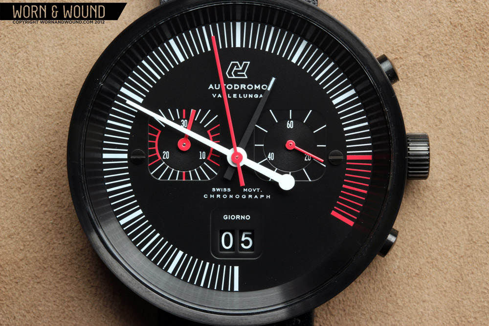
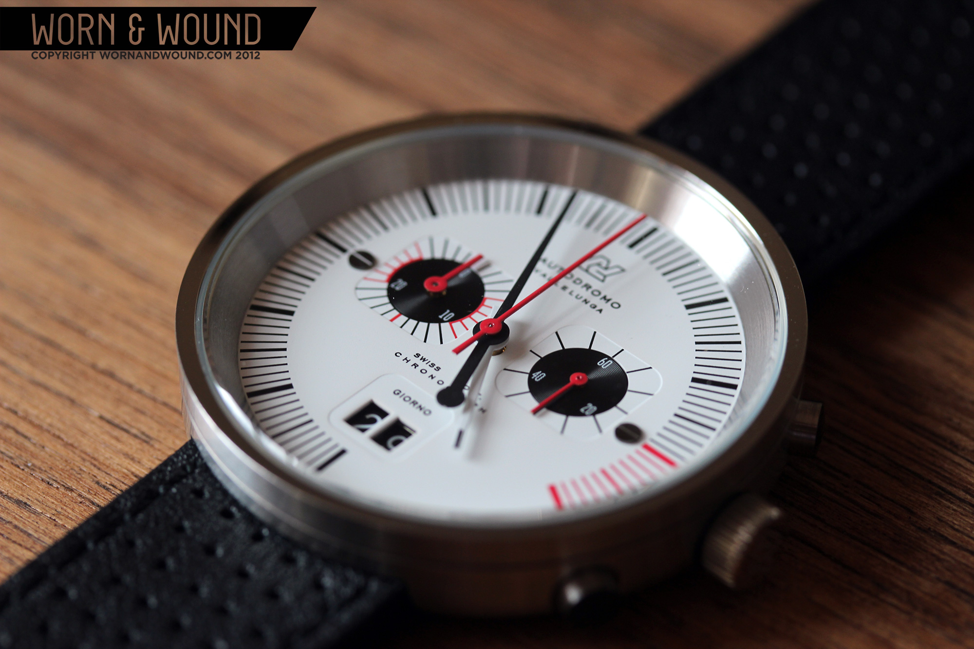
The chronograph version of the Vallelunga, which also come in 2 color variations, has the same overall dial design as the 3-hand model, with the addition of 2 sub-dials. The sub-dials both consist of black circles with an impressed concentric circle pattern, within impressed rounded-corner squares in true 60’s – 70’s chrono fashion. The markings on the indexes radiate out from the circles and terminate at the edge of the square. The dial at 3 is the active seconds hand for the watch. It has numerals at 20, 40 and 60 and linear markers every 5 seconds. At 9 is a 30-minute chronograph register, with numerals at 10, 20 and 30, and markings for each minute. The index is broken up into different colored sections, where the color changes from black or white (depending on dial color) to red. The addition of these two dials increases the visual complexity of the Vallelunga look dramatically, turning the minimal and spacious dial into something more dense and aggressive.

The hands of the Vallelunga chrono are basically the same as well, expect that the seconds hand is now the chrono-seconds, and each sub-dial has a small red stick hand. The chronograph function is controlled in the typical fashion, with two pushers on either side of the crown. At 2 is the start/stop pusher and at 4 is the reset. The pushers themselves are small cylinders with slightly domed plastic inserts on their tips. The inserts are great detail, as they add a finishing touch to an often-overlooked component that looks and feels good. On the stainless model, the black inserts also add a touch of contrast to the case.
 Case: Brushed Stainless and PVD
Movement: Ronda 6003.D
Dial: Black
Lume: N/A
Lens: KI Glass with Sapphire Coating
Strap: Black Leather
Water Res.: 30m
Dimensions: 42mm
Thickness: 10mm
Lug Width: 20mm
Crown: 6 mm push-pull
Weight: 68g (our measure)
Warranty: 2 years
Price: $425
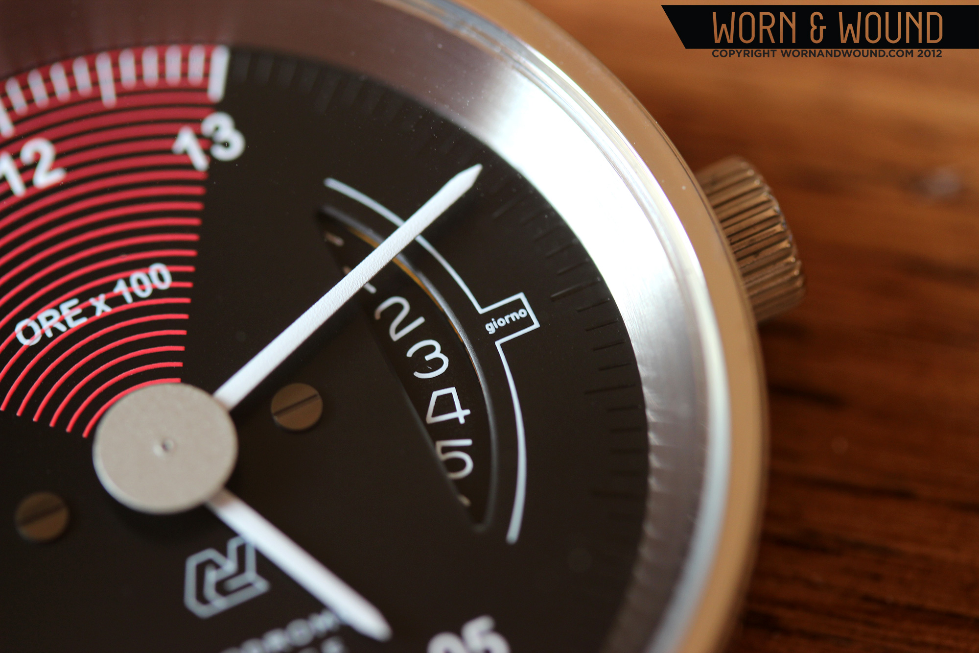
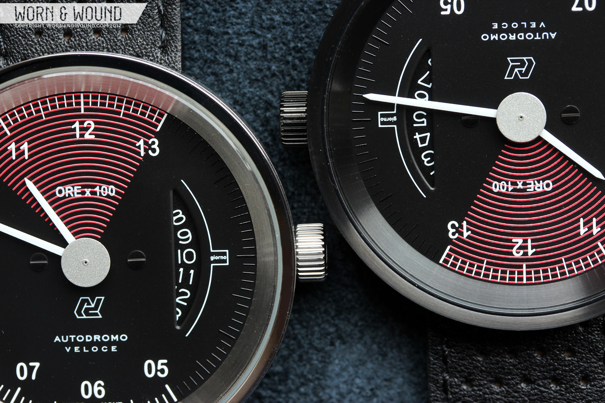
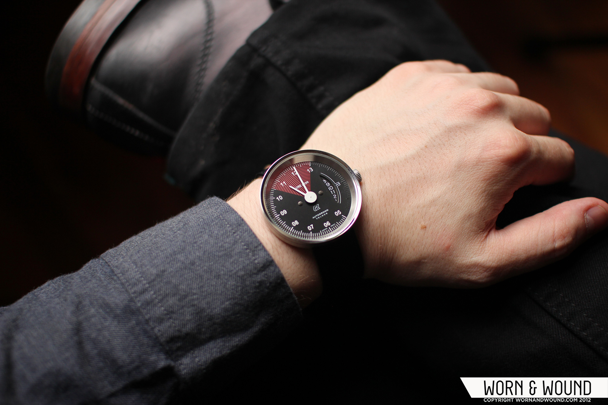
The Veloce is available in two variations, both with the same dial and hands, but with PVD or brushed stainless case. Like the Vallelunga, the Veloce is based on tachometers, but takes a different approach to the look. The dial, which is black, features a partial index that appears to run from 5 to 13. In this case, 13 is actually 1. The Veloce is the only Autodromo model currently available that has numerals for the hours, even if they simultaneously refer to RPMs. The index, which is in white from 5-13, has thick and slightly longer lines for the hour, slightly thinner lines at the half hour and smaller lines for half minutes. From 13 – 5, where it appears there is no index, the lines are continued in gloss black on the matte black of the dial. This is a cool detail of the watch as at a glance or from a far, the black can’t be seen, but up close it’s readable. This helps keep the tachometer look while keeping legibility.

The Veloce is also the only model with a normal date disc, but the presentation of the date is anything but common. Rather than having a typical square date window, there is a large arc, or d-shaped window that shows a larger portion of the white on black date disc. This large aperture is centralized between 13 and 5, filling the void where the index is black. The date is still read at 3, where the word “giorno” indicates. Overall, the look of the Veloce dial is more intricate than the other models, which are all relatively minimal, save a few details.  The balancing of the numerals, unique date window as well as some superfluous graphics, like a series of concentric red lines that radiate from the center and fill an arc from 10.5 – 13, indicating a “red line” area, is well achieved. In typical sense, the Veloce is likely the most legible of the line, though the dial is asymmetrical and different from any you have seen.
The hour and minute hands are simple white sticks with sharply pointed ends. They stand out against the dark dial and are readable at a glance. At the center, above the minute and hour hand, is a silver disc that measures about 5 mm in diameter. The disk is actually mounted to the seconds hand, and upon close inspection one can see it tick. Though the automotive references are very clear in the watch, the disk takes it even farther, while still not being tacky. I sort of expect the hands to rocket around the dial at any moment.
 Case: Brushed Stainless and PVD
Movement: Ronda 4003.B
Dial: White of Black
Lume: N/A
Lens: KI Glass with Sapphire Coating
Strap: Black Leather
Water Res.: 30m
Dimensions: 42mm
Thickness: 10mm
Lug Width: 20mm
Crown: 6 mm push-pull
Warranty: 2 years
Price: $465
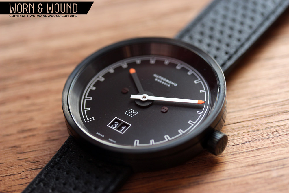
The Brescia is the most minimal of the Autodromo line featuring a simple graphic index, 2 hands and a big date. Available in only one version, black dial with a PVD case, the look is austere, but still draws on the Italian vehicles that the line hearkens to. The index is presented as an outline with no numerals. There are minor variations in size between the hour marking and half hour markings, but nothing is overly accentuated or breaks the appearance. While a sense of a vehicular gauge is there, largely lent by the gap from 5 -7, the look is abstract and not so specific as a relating to a tachometer. If the Veloce is perhaps the most literal of the line, this is the least. It also transcends the time period a bit, as the cleanliness of the dial and the black on black coloring have a modern look as well.

The most pronounced feature is the big date window at 6, which is outlined in white. The break in the index leads the eye do the date. The two hands are fence post shaped, the minute in white with a bright orange tip and the hour in black, also with an orange tip. The hour hand flows into a large circle at the center of the watch, which is subtle, but a nice detail. The orange tips of the hands jump off the dial, as they are the only bits of color on the whole watch.
Strap + Wearability
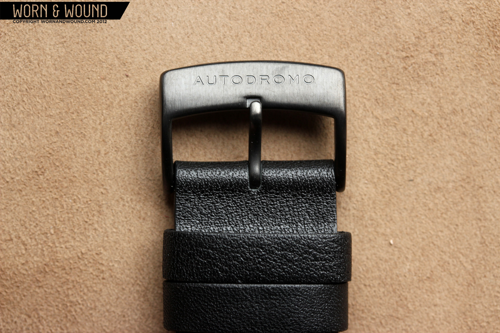
 The Autodromos come on a 20mm black leather strap with a perforation pattern, referring to leather driving gloves. The underside of the strap is a natural leather color with a nubuck texture and a very dramatic and cool embossing pattern, created from interweaving Autodromo logos. The pattern takes on a sort of tired tread look, which is likely intentional. The leather is quite comfortable out of the box, requiring little break in. It is also a pleasantly thin leather strap, at about 2.5mm thick, which allows for greater breathability and less bulk on the underside of the wrist. The low profile of the strap also doesn’t take away from the case. The straps are fitted with simple signed thumbnail shaped buckles that match the case finish.
On wrist, the 42mm lug-less design fits very well. 42mm is a definite sweet spot for contemporary watches. It’s big enough to stand out and have presence, while not being ridiculous or ostentatious, and fits most wrist sizes. The lack of lugs aids the versatility here, as there is no potential for overhang. The slightly domed case back prevents the watch from being in full contact with your skin at any given moment, which allows for more airflow and thus more comfort. That practical stuff aside, there isn’t a watch in the Autodromo line that doesn’t make a statement on the wrist. The strong graphic elements of the dials, stark colors and clean case design make them pop off of the wrist. Naturally, since they are based on Italian sports cars, they have generally sporty looks, but also like Italian sports cars, they are refined and elegant. The steel models in particular could slip as easily under the cuff of a blazer as the sleeve of a leather jacket.

Packaging
The Autodromo line comes in a unique package that was designed exclusively for the line. Drawing on the packaging of vintage camera equipment, the design of this package does a lot for telling the story of the time period of the watch. The case itself is cylindrical, bound in a black pleather material, with the name of the brand deeply impressed on the lid. On the front side of the case is a tab with a snap closure that has been adorned with the Autodromo logo in white. Though extremely simple, the snap is both satisfying to open and secure. Inside, the package is lined with red velour, giving the watches a strong first appearance. And like the vehicles that inspire the brand, the touch of red adds a necessary amount of decadence. The package also comes with an instructions booklet and a steel warranty card, which refers to a chassis ID plate.

Conclusion
So what does the future hold for Autodromo? A lot to get excited about. In addition to the development of their first non-watch product, a stringback driving glove, this holiday season we can all look forward to their first three-hand automatic watch. We can hear all the watch nerds rejoicing now. And as for stylistic direction, the options are pretty endless. To quote Bradley, “I think you will see an expansion in terms of time period. There will be some designs with a more 50s feeling, and perhaps in the future we will do something more early 80s with a very wedgey retro-futuristic feel. It’s pretty wide open right now.”
The future looks bright for Autodromo. Bradley clearly has an eye for superb design and has the proven ability to produce a product that is built to a high standard. That’s a combination that is sure to result in happy customers and a long future of making great products.
by Blake Malin + Zach Weiss
Sample units provided by Autodromo


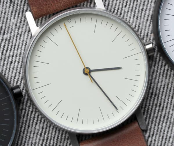
Normally not a fan of red, but these I really like. Hope to see some color variations on future collections. Blue, yellow, orange would be nice…
I’m interested in purchasing the Prototipo Silver Dial w/ pumpkin
leather rally strap. Featured in May12, 2014 issue of Autoweek.
Please confirm availability and price.