


 Featured Videos


It has been a while since a watch has crossed our paths that has been utterly unique, with a design vocabulary all of its own. Often, the watches we look at are derived from historical designs, namely of military origin. Sometimes the watches refer more to classic watch making, and sometimes they simply refer to other iconic watches whose values greatly exceed that which is normally obtainable. Well, in the case of the new SevenFriday P1, no such immediate references can be made. The P1 was designed from the ground up with a unique vision and a remarkable attention to detail. Inspired by machinery, architecture and a general industrial aesthetic, the P1 is not quite like anything we’ve seen before.
At $891 ~$1,100, the P1 isn’t an impulse buy, but I do believe it is a good value for what you are receiving. The case has a very interesting and distinctive design that features various finishes and a great attention to detail. The dial is intensely layered with a plethora of cool little things that will catch your eye. And powering the watch is the Miyota 82S7 21-jewel automatic movement, which has an open balance that is viewable through the dial. While the look of the watch might not be for everyone, for those who like a bold watch with a lot going on that definitely has a personality all of its own, the P1 is likely a very exciting option.
 Case: Stainless Steel
Movement: Miyota 82S7
Dial: Black and Silver
Lume: no
Lens: Mineral Crystal w/ AR coating
Strap: Black Leather
Water Res.: 30m
Dimensions: 47.6x47mm
Thickness: 13 mm
Lug Width: 28 mm
Crown: 8 x 3 mm
Warranty: 2 years
Case
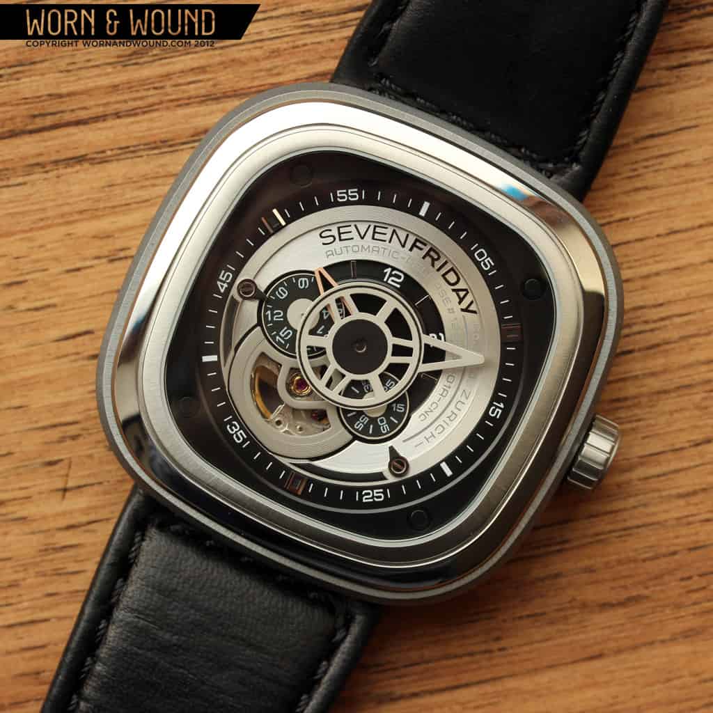
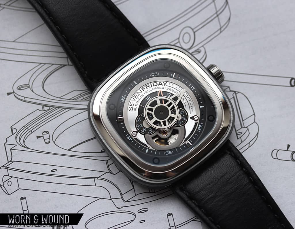
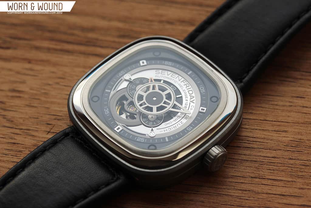
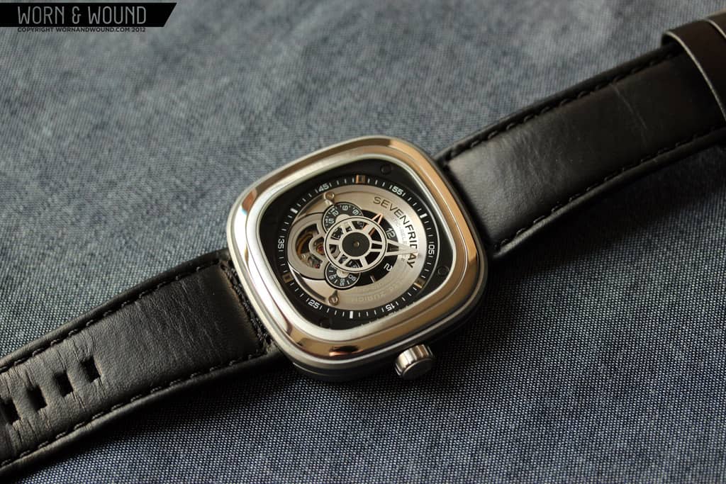
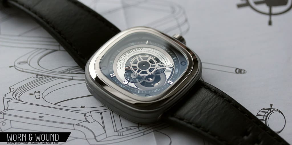
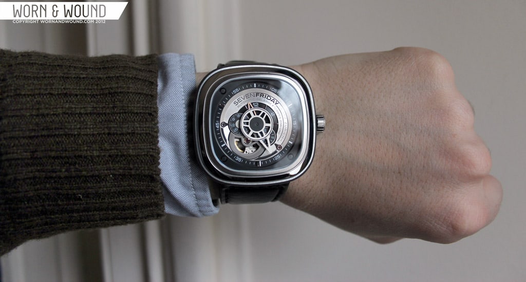
The P1 has a massive 47.6 x 47 x 13mm steel case with a cool shape. Essentially, it’s a square with heavily radiused corners and ever-so-slightly bowing sides, which is similar in form to the Tag Heuer Silverstone and the Rado 5.5. What is interesting about this shape is that there are no straight lines on the case, which give it a less severe look than a normal square. Simply put, it’s a very appealing form. But what really stands out about the case of the P1 are the various finishes implemented.

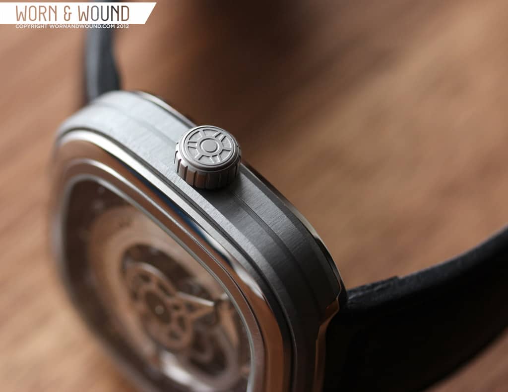
The sides of the case have a light blue-grey coating on it that combined with a coarse brushed finish, gives the bulk of the watch an interesting “raw” metal look. The bezel consists of a polished steel ring out side of a satin-brushed steel ring that surrounds the dial. The brushed finish on this ring is actually radial, moving out from the center. This creates an intriguing play of light that brings the eye in and out of the dial. The edge of the case back is also polished, which creates a nice symmetry with the dial. We’ve never come across a watch in this price range with such an extensively detailed and well-finished case. The industrial and architectural influences are very apparent in the design.
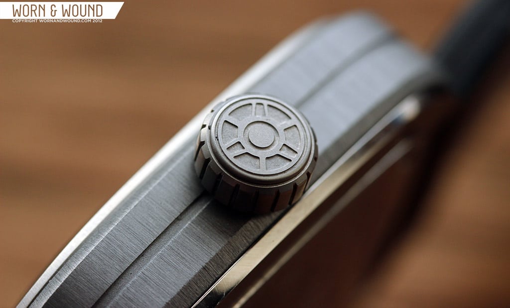
 On the right side of the case positioned off of 3 is a low and wide, 8 x 3mm crown. The crown is also coated in blue-grey in order to not clash with the side of the case. It’s a push-pull crown that doesn’t have a lot of resistance to it. I do wish that they had used a screw-down crown for the watch as the sort of “loose” feeling crown betrays the solidity of the rest of the watch. That being said, it’s not poorly made or weak, i’s really just a sensory thing, and it actually allows for hand-winding more easily. The crown itself is nicely designed with a textured side and a sort of logo on the flat side. The shape on the crown matches the shape on the minute hand for some continuity.
Flipping the watch over, you can take a look at the, once again, elaborately detailed case back. Interestingly, there are sort of two case backs, the main case back, which is held in with four screws, and then a hatch/plate, held in by another set of 4 screws, that contains the text and decoration. The plate has been heavily etched with various details about the watch such as the case dimensions, the strap dimensions to the water resistance and some movement details. Each text description is accompanied by a descriptive drawing. There is also a large SevenFriday logo, with an inverted etched treatment, as well as various reference numbers.

Dial and Hands
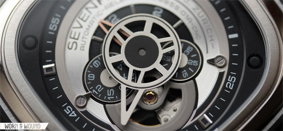
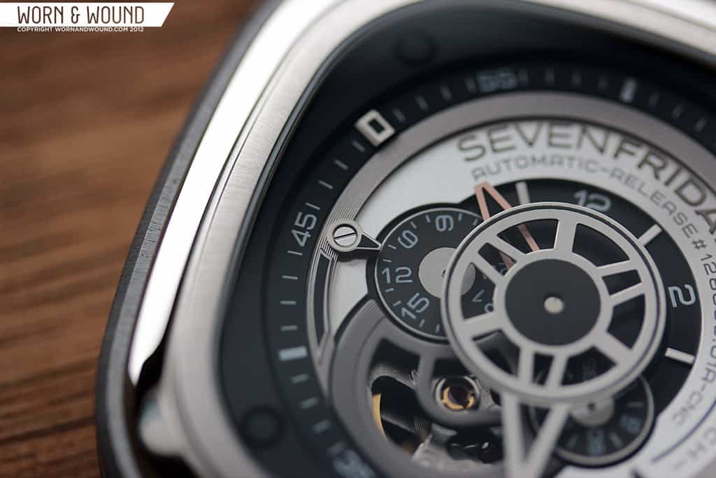
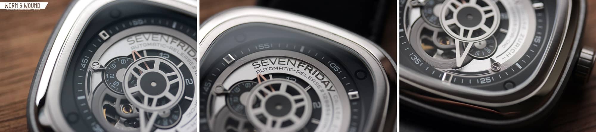
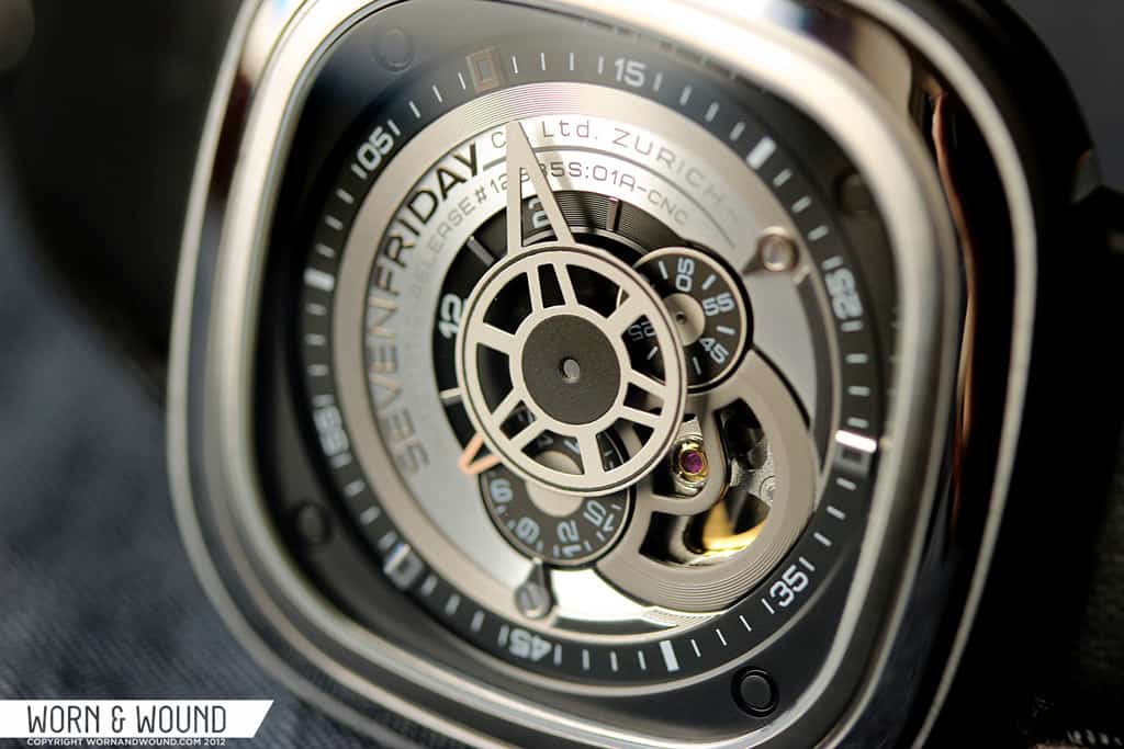
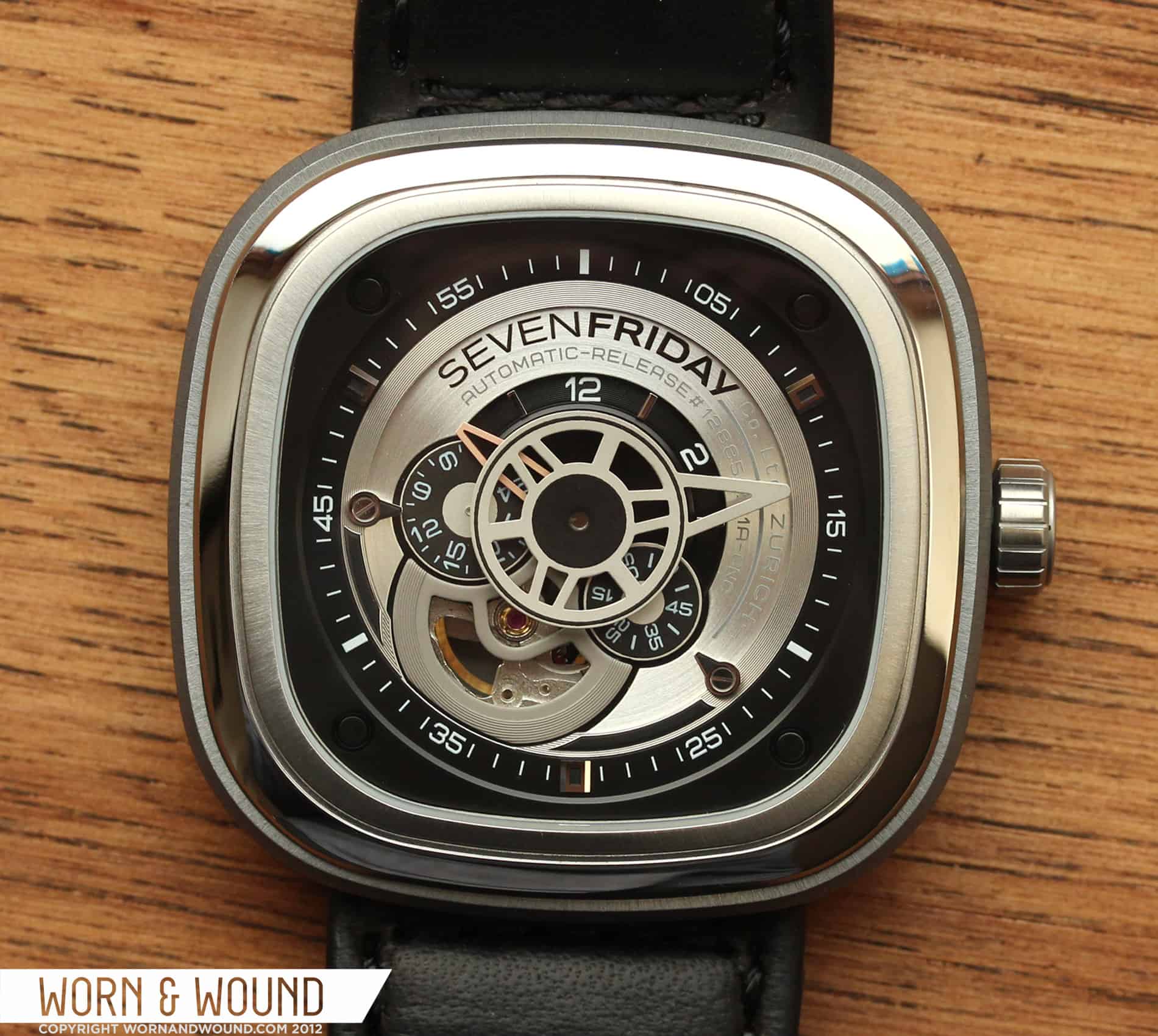
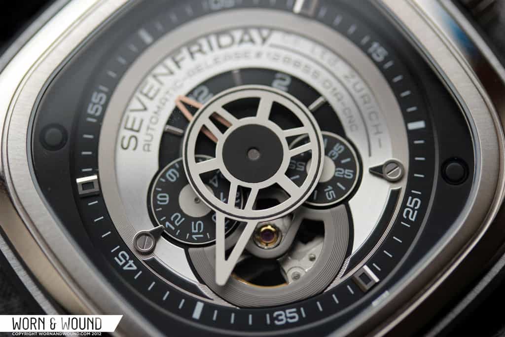
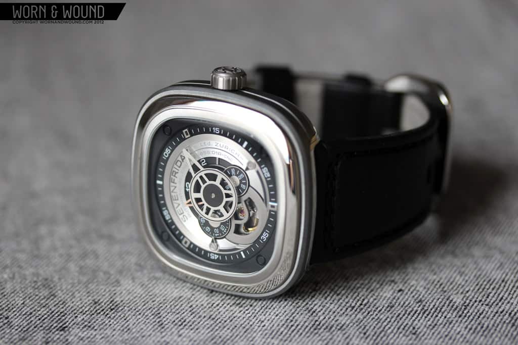
If you thought the case had a surprising amount of details, just wait until you get a close look at the dial. Perhaps dial is actually the wrong word for the P1…. Information Center? Time Display Read Out? Temporal Metrics Array? No matter how you look at it, it’s an intensely detailed and layered dial with tons of cool little eye-catching things to ogle throughout the day. Starting on the outer edge of the dial, there is a sort of black buffer area between the bezel and where the information begins. This area serves as a nice rest for the eyes between case and the dial, and is used to transition from the rounded-square shape of the case to the circular format of the dial.

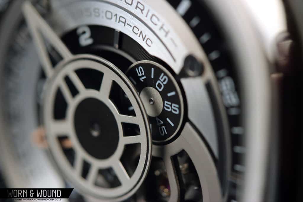
Moving in still, the dial drops down a bit, and you hit the minute index, which is presented as a mix of numerals and tick marks in white on black. At 10, 30 and 50 are small, applied markers of steel with black inlays. They don’t necessarily serve a purpose, but they look nice and break up the index. The next ring in is simply steel with a very fine concentric circular texture that gives it a satin sheen. Following this ring around, it leads you to the matte grey cage over the balance wheel of the open heart Miyota 82S7 movement, which cuts the steel ring at 7. I really quite like how the exposed balance wheel was implemented in the design. Aesthetically it works well with the industrial look, and conceptually it plays well with the living machine concept that drives the watch.
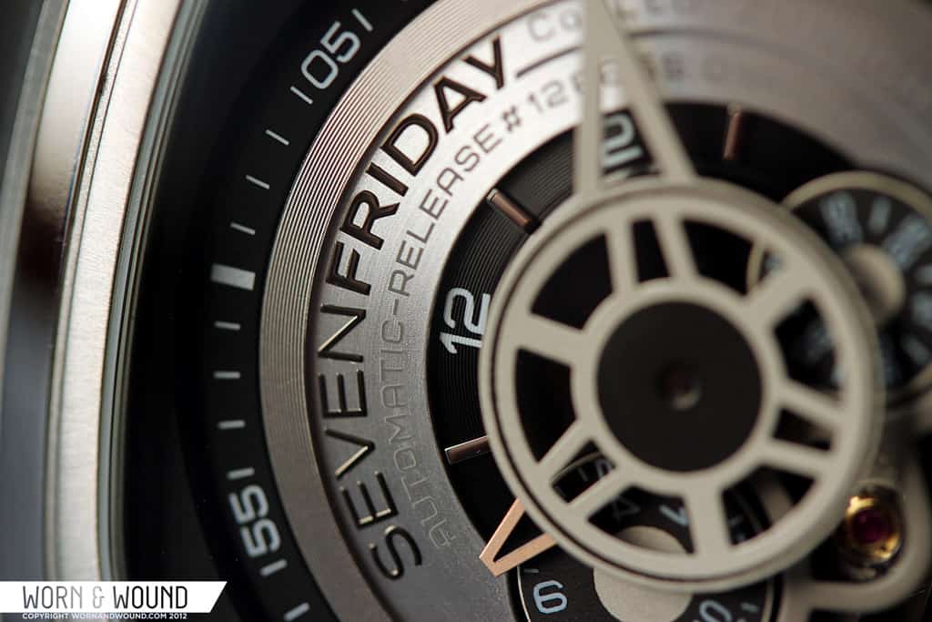
The next layer of the watch is a very finely brushed steel plate on which the SevenFriday logo and a large amount of other text is printed. The logo is in black and is bold, but well proportioned for the dial. The rest of the text is in a medium grey that disappears somewhat into the steel plate. This was smart as there is so much text that it would have out weighed the rest of the dial had it been black. Whether or not that text is needed regardless is debatable. The center area of the dial is a black semi-circle with hour markers from 11 to 3. The various disks and details that fill the lower left quadrant of the dial eat up this area, hence the incomplete index.

The hands of the watch really act as extensions of the dial rather than separate elements. Perhaps the first thing one actually notices when looking at the dial is the gigantic part-disk, part-pointer minute hand located dead center. The minute hand has a matte silver color and an elaborate design of cutouts that make it resemble a cog or a flywheel of sorts. Protruding off of the central cog/disk area is a pointer that is actually used to read the time. The hour hand is relatively small, copper colored and quietly nestled under the large minute hand. While it is totally over shadowed by the minutes, it is readable and the drop of warm color is a very nice touch.
At 9 is a 24-hr disk of white numerals on a black surface and at 4.5 is a slightly smaller but similarly styled active seconds disk. The use of disks for these two complications is a really smart move that also looks great. They work well with the ring-driven design of the dial, and the active seconds disk has a feeling of an operational meter, which like the open balance, works towards the industrial machine aesthetic. At 9 and 4.5 are also these really cool applied arrowheads that point towards the two disks. Personally speaking, these are my favorite details on the watch, small as they may be.

Overall, the uniqueness of the dial is extremely compelling. It’s bold, visually complicated and fun to look at. While we usually praise brands that practice restraint in their designs, I have to applaud SevenFriday for going all out, yet still exceeding. I believe this success is partly due to the fact that the design was clearly driven by the layout and functions of the Miyota 8S27 movement within. Rather than designing a watch and plugging in a movement that would work, they started with the heart of the beast and moved out. Considering the brand’s philosophy is to be inspired by machinery, this design approach is very appropriate.
Strap and Wearability
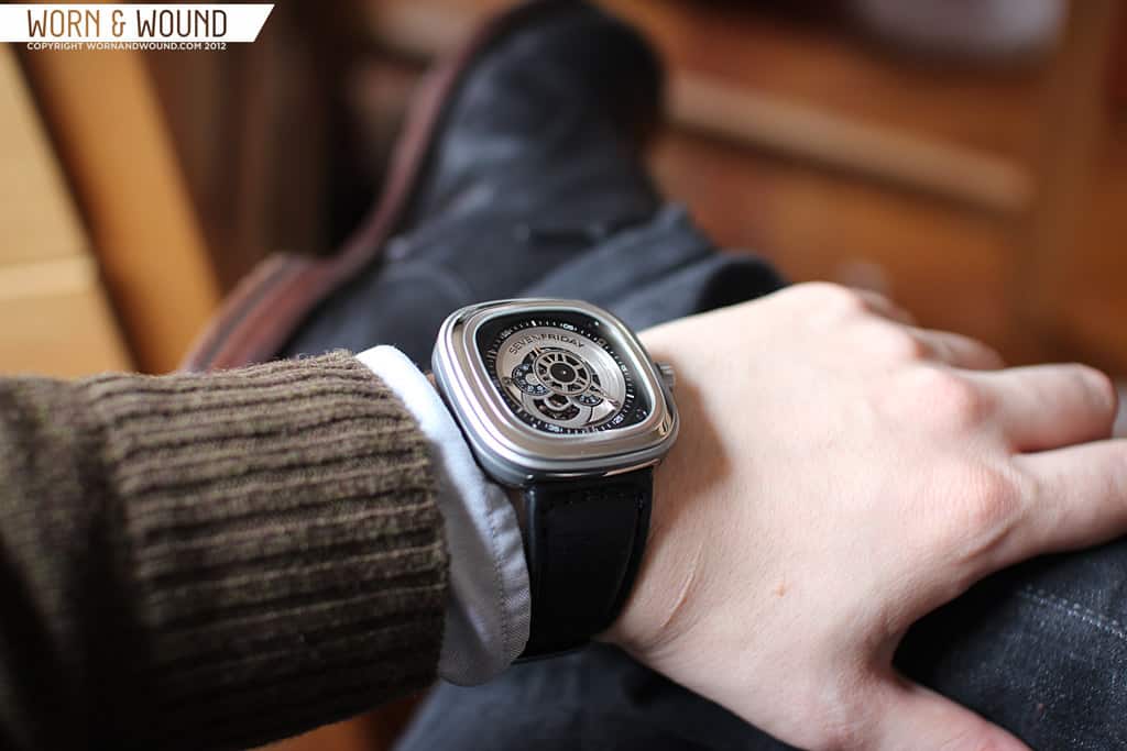
Obviously, a watch that measures 47.6 x 47 x 13mm is going to be too large for many people. In fact, I was concerned that it would be too large for me. Yet, while very large in one dimension, the other two are on the medium to small range, so the watch balances out. I found that it was quite tolerable on my 7″ wrist, not over hanging the sides or standing too tall. Nevertheless, it is still a jumbo watch that might not be right for everyone. Regardless, it is one hell of a bold and striking watch. Eye-catching only just begins to express the presence this thing has. Every detail and change in finish catches the light differently, glimmering and shining in very attractive ways.

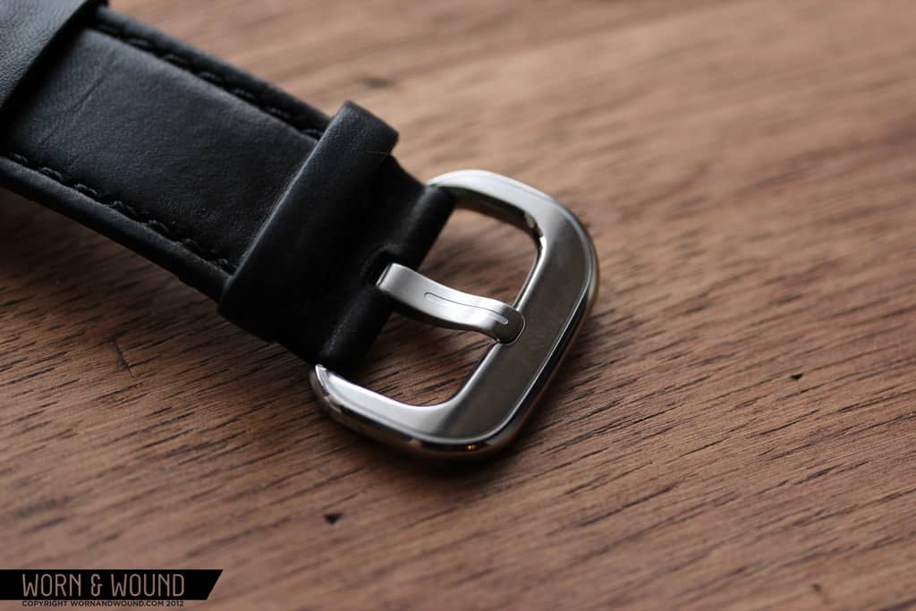
 To suit the large case width, the P1 is packing 28mm lugs. The strap that comes with it is a fairly matte black leather with black stitching that tapers from 28mm at the lug to 24mm at the tip. While proportionally, the 28mm strap works with the case, I do find it unfortunate to have such an uncommon lug width to deal with. You will likely have to go directly to SevenFriday to get replacements or other color options. That being said, the strap is good quality and pretty comfortable for such a large strap. The buckle they put on it is also designed to match the case, with large radiused corners and a mix of finishes. This is a nice touch that keeps the aesthetic consistent.
Packaging
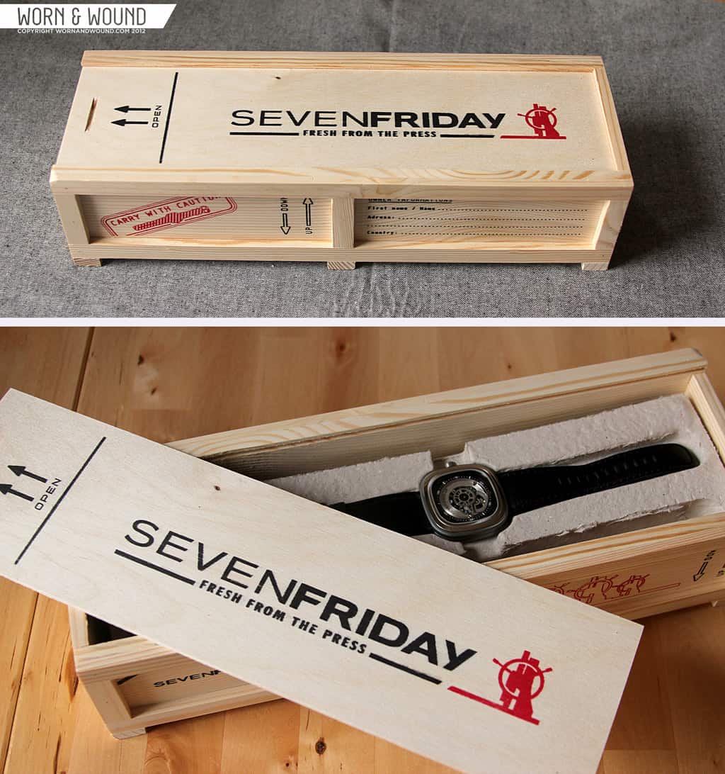
At this point it should be of no surprise that the box the P1 comes in also has a nearly obsessive attention to detail and has been designed to be completely unique, though subtlety was never enter the picture.  The box is a blonde unfinished wood, likely pine or bass, shipping crate with cross members, panels, tongue in groove construction and a sliding lid. There are various graphics in red and black screened onto the wood. The design looks like a miniaturized crate that a piece of large machinery, like a standing drill press, would come in, with space for a palette jack and so on. While novel and a bit kitschy, it is a very dramatic and downright fun presentation.
The interior isn’t lacking either. Slide off the lid to find the watch, wrapped in protective plastic and nestled in a paper pulp structure, think egg carton material, which supports it in shipping. I’ve never seen a watch come packaged in that material and I quite like it…I half expected to get grease on my hands when picking up the watch. Also in the box is a metal warranty card, a set of instructions and drawings, many stickers and a red micro-fiber cleaning cloth. Overall, very cool packaging in terms of presentation and protecting the watch. It’s not something I would necessarily keep around after, since it is quite large, but one could use it to store something or other.
Conclusion
The SevenFriday P1 is really unlike any other watch we’ve reviewed on worn&wound, and I think is really quite unique in the watch world in general. Its machine driven design with a focus on obsessive detailing and finishing is as distinct as it is attractive. The build quality lives up to the look, and overall it’s a very good watch with a good Miyota movement inside. Clearly, the watch has a modern aesthetic with strong architectural and industrial influences that may or not appeal to everyone, but if it does appeal to you, you’ll like it a lot. Considering the watch was designed from the ground up, save the movement, and every piece is new to the watch and unique to the brand, $891 seems like a very fair price $1,100 is pushing it, but still acceptable. If you are concerned about the size, SevenFriday has a printable version for you to cut out and try…which I recommend doing since it is a large watch.

We are very excited to see how this brand develops and what new offerings they will drop in the coming years. Clearly, they have their own vision of what a watch can be, and the smarts to achieve those designs at affordable prices. There is also the P2 currently available, which for $945 is the same design with black PVD coatings and copper accents for a more mysterious and dressy look…. and they’ve shown teasers of the PR3, a sportier model with a black rubberized coating and red accents.
by Zach Weiss


That looks like an Altoids Small tin on the wrist.
Great design, looks cool, too big.
Love the concept and the dial design. But that case, just kills the aesthetics.
Having viewed a plethora of watch designs the watch is quite handsome-a perfect busy dial yet serene, metal finishes amazing, dwarfs the high-end industrial over-cluttered designs-this design is mesmerizing.
I really like this watch, especially the brown/bronze color scheme available on the Seven Friday website. But I just can’t get over the size. I want to wear something like this but it’s pretty monstrous. I think it looks too big on your wrist, sorry to say.
That’s fair Richard. It’s is certainly big and I don’t have large wrists, that being said, it looks larger in the photos than I felt it looked in person. Either way, it would be smart of them to offer something less gargantuan in the near future.
Similar comments to the others, quite like this watch, really considered as a purchase until I realised the size.
Definitely an interesting concept, love to see them produce something for the thinner wristed chaps like me.
I am interested to buy the Seven Friday PR1. How do I go abt doing it. ? I’m in SE Asia.
Hi Thomas, you can get SEVENFRIDAY from Red Army Watches in Singapore, Malaysia and Indonesia.
Thanks Jieting for d info. Much appreciated.
The dial is wonderful. Change that case and band and the watch would be fantastic. Also I would think a Miyota-powered $900 watch would come with sapphire. Thanks for the great review – Justin
Where exactly do they have it for $891 ?
Where exactly do they have these for $891? Do they deliver internationally ?
the watch has come available in durban south africa on friday.
the awesomeness of this watch can only be experienced in reality !! the size id not over done , the class is just stunning ! just bought 2 !
This watch makes me want to watch the Hudsucker Proxy.
The SevenFriday P1-1 belongs to the first generation of releases by this young and upcoming brand. The cushion-shaped case on this -original- model is stainless steel with a so-called ‘animation-ring’ in aluminum. The partially skeletonized dial reveal the beating hard of its Miyota movement.
We have this amazing watch in our website https://goo.gl/E5slF0