


 Featured Videos


It’s a rare occurrence to come across a watch with a unique graphic vocabulary. We’re use to seeing familiar elements, such as certain fonts and hand shapes that root a watch in either history or current trends. When something totally different comes along it’s often jarring, though if it succeeds it can be very interesting and exciting.The new line of watches by Aark Collective, a young Australian brand, is a great example of a different take on the classic watch. Whether their bold and quirky look is appealing is really up to you, but either way, you haven’t seen watches quite like these before.


But before I even get to the watches, it’s worth looking at the brand itself. Aark Collective takes a different approach from the get-go with a webpage full of striking imagery and abstract graphic art. Everything exudes a modern aesthetic that only a small handful of watch brands employ, namely Uniform Wares and Nixon. But while the other two are more fashion and sport oriented, respectively, Aark Collective is whimsical. The name alone is a bit strange, making no mention of watches, and almost suggesting it’s not a company, but a group of people with a single cause. Anyway, as a sucker for interesting graphics and well-directed photography, it only took a moment on their site before I was drawn in. The interesting branding continues onto the watches as none have logos on the dial, but rather a debossed logo on the end of each strap.
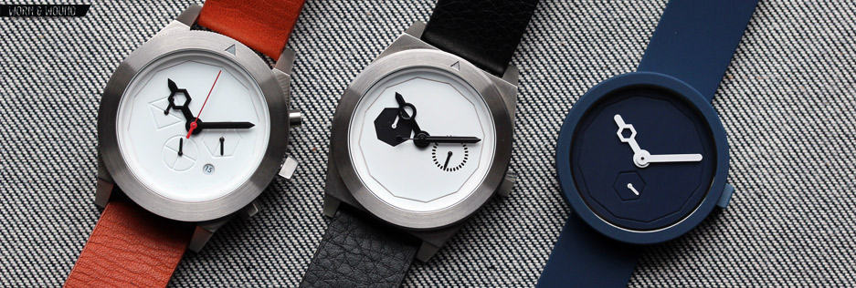
The initial line up by Aark Collective consists of 3 models in a handful of colors. First, there is the 38mm “Classic”, second is the 40mm “Timeless” and lastly is the 42mm “Iconic”, all are powered by Miyota Quartz movements. Each watch, which are ordered from simplest/cheapest to most complex/expensive, takes a basic watch type and uses simple geometry to transform the expected dials and indexes into something abstract and distinct; for example, all of the watches feature triangular crowns, which is a subtle, but unexpected detail. The kind folks at Aark Collective sent over one of each for me to take a look at, so without further adieu…

 The Classic is a simple and fun watch that is immediately appealing and easy to grasp. It’s a monotone 38mm lugless watch with a rubberized case, matching rubberized strap, matching dial and a 3-hand movement with small seconds. Everything, save the hands, is a rich navy blue color (there are several other colors available). The dial is free of printed indexes of applied markers, but rather has two shapes molded into the surface. On the perimeter is a 12-sided polygon or dodecagon with each apex demarcating an hour. This is an element that is used across all three of the watches and clearly brings the Issey Miyake 12, by Naoto Fukasawa, to mind. At 6 is a small seconds sub-dial that is represented with a hexagon, each apex marking 10 seconds. The play of the circular case to the two polygonal indexes is interesting, albeit the indexes do not jump out at a glance.
The hands of the Classic are bright white, making them jump off of the deep blue dial. The minute and small seconds hands are simple sticks with a rounded end, but the hour hand is a bit different. There is a hexagonal aperture about halfway down the hand that is about twice as wide as the rest of the hand. The window that is created lines up perfectly to site within the hexagonal small seconds dial such that the axis of the second hand is dead center in the window. So at 6 you get this moment of ultimate alignment that is very cool. This style of hands is a them that runs through all three watch types.

On the wrist, the Classic wears fairly small, but not tiny, making it an acceptable design for men, women and children. The look is quite strange, at once being an object of modern design and a toy-like object with somewhat playful features. That being said, it’s simply appealing, enjoyable to look at and easy to read. The Classic is priced at $140 making it clear competition for the more austere Uniform Wares 103 models.

 This is where things begin to get stranger. The Classic is not a stretch from the norm. It has easy to read indexes that while lacking numerals are still doing their job in the scheme of time telling. It was simply different. The Timeless, which is a 5-hand movement with day/date sub dials, gets more abstract. Starting from the outside, the brushed steel case of the Timeless measures 40 x 49 x 10mm and has a chunky design. Looking at the profile, the case is two flat slabs, the main chassis and the bezel. The lugs are cut out of the slab and sloped with a sharp chamfer. The design emphasizes the brands imagery, which is all about simple shapes contrasting each other. Interestingly, the all steel bezel turns and has a 120-click unidirectional mechanism. In theory, it could be used to measure elapsed time as there is an etched triangle that can be aligned.
The dial of Timeless in Chrome is white with a black sub-layer. As with the classic, there is a dodecagon index for the hours and minute, but it’s the sub-dials that make things interesting. The bi-compax design, with one black shape and one perforated, gives the watch an asymmetry that is peculiar, throwing the weight of the dial to the left side. This might be a silly thing to say, but I can’t help but think it has a black eye. The dial at 9 is a heptagon that is cut through the white, revealing the black layer underneath. Each apex of the polygon indicates a day, with Monday, presumably, at the top. The dial at 9 is then the date, which is marker with 31 small black ovals evenly spaced around a circle.

Needless to say, you’re not going to be telling the date at a glance with this watch. There are no points of reference for counting, and the ovals are too small to keep track of. Similarly, though one could assign days to the heptagon, it’s totally arbitrary. I could say the top is Monday, you could say it’s Sunday, or any other day. In the end, the sub dials are basically abstract decorations with a moving element at their center. If you look at it like this, then the watch is slightly different every day of the month, and likely every month of the year. Aesthetically, the Timeless is challenging. It’s so simple that the asymmetry is very pronounced. It’s not unattractive, in fact I find it very appealing, but it’s more of a design you look at and think about than simply enjoy.
On the wrist, the Timeless really shines. The case is extremely well proportioned and designed, fitting my wrist very nicely. The cold steel case, black and white dial and black Italian Calf skin leather band combine to be quite provocative. Unlike the Classic, which playful, the Timeless has a maturity to it that, despite its abstract design features, makes it easier to integrate into ones’ attire. The bi-compax dial also clearly plays off of classic watch designs, lending the Timeless a familiarity when seen at a glance. The Timeless costs $250 for the black PVD and steel version, and $280 for the gold plated model.

 Aark Collective describes the Iconic as being “influenced by industrial and avionic instruments, it is raw, tough and precise”. While an aviator it is not, to me this translates as: the Iconic is the masculine watch of the collection. And in proportion to the other watches, it certainly is. Interestingly, as the only chronograph in the bunch, it also has the most hands and sub-dials, and therefore visual complexity. The brushed steel case is 42 x 50 x 12mm and is generally chunkier than the case of the Timeless, with more pronounced lugs and sharper angles. It also places more emphasis on the bezel, by adding a coined edge. In fact, I believe this is where the “raw and tough” attitude is to be found, and in fairness, it does lend the watch a more industrial aesthetic.
Perhaps my favorite detail of the watch as a whole is actually the pushers and crown. The chrono-start/stop pusher is round, the crown is a large triangle and the chrono-reset pusher is a hexagon. Once again, a subtle detail that ties the watch into their branding as a whole, and adds bit of unexpected character. Looking at the dial, the Iconic is sticks to the same vocabulary of form as the Classic and Timeless, with the 12-sided index and simple, clean and abstract sub dials. At 3 is a bisected hexagon that is used as a 24-hour dial. Each apex is 4 hours, and the bisecting line illustrates AM and PM. At 6 is the active seconds hand, which is in a quartered circle, each quarter obviously being 15 seconds. A lastly at 9 is the 60-minute totalizer for the chronograph, which is represented with a bisected diamond, each apex being 15 minutes. Though accuracy isn’t the name of the game with these dials, they do have some functionality as the sub divisions add reference points. Aesthetically, they make for a unique design, if not quite as distinct as that of the Timeless. The familial motif for the hour and minute hand is used on the Iconic as well.

On the wrist, the Iconic has a handsomeness and masculinity that distinguishes it from the other watches in the line. It’s simply larger and bolder, though the combination of the white dial, tan strap and steel case has a mildness to it. The all black “Graphite” and black and white “Monochrome” versions certainly would have a meaner presence. I think it was smart of Aark Collective to make this somewhat larger watch to attract that crowd, as I see the Iconic as being a more artistic alternative to brands like Tsovet and Nixon. It is also priced similarly at $380.

Conclusion
While they are certainly not for everyone, and I don’t think they were meant to be, the Aark Collective watches are a really unique line with some very interesting visual elements. Part of what makes watches so interesting in the first place is that they are a mix of graphic, product and fashion design, but usually it is the latter two that dominate the conversation. The stark and abstract forms that are employed by the Aark Collective speak to a 2D tradition of graphics that doesn’t often make it to the dial. When it does, it opens ones eyes a bit to the possibilities of watch design.

In the end, these are the kind of watches that one is likely to find at small boutiques and museum shops rather than watch forums, but I do think they have a distinct value in the conversation of affordable watches. It is really only in this price range that brands take these types of aesthetic risks (just take a look at the Dezeen Watch Store for examples). That being said, I think that the Classic model would make a terrific gift for a younger watch collector, someone with a quirky sense of style, or someone interested in objects with a modern aesthetic. And the Timeless, perhaps my favorite of the group, has a place as a bizarre and interesting anomaly in watches; it certainly is a conversation piece. I hope that Aark Collective keeps pursuing their vision in new designs. Naturally, I’d love a mechanical to join their line, but I’d also be very excited to see what they would do with a moon phase… perhaps they could team up with Ochs und Junior?
By Zach Weiss


I think Alain Silberstein is perhaps a more apt partnership 😉
ha, perhaps… or they could just call up the old gents from the Memphis design movement http://italychronicles.com/memphis-clocks/
If only they had automatic versions…
Nice Find!