


 Featured Videos


The original reissue of the Seagull 1963 was and still is a big success. Great looks, an intriguing history and a price no one could scoff at ensured this. We took an in-depth look at the original 38mm version some months ago and were charmed by it’s unique vintage character. The gold-tone dial, gold applied markers and blued-steel hands gave it a unique character that while stemming from military design had an elegance that made it versatile and altogether stylish. And of course, the ST19 manual column wheel chronograph movement inside gave it a mechanical prowess that sealed the deal. Since we already covered it once, I don’t plan on rewriting the story of the 1963 here, so take a look at the first article to get some background.
To follow up the success of the original, Seagull has released a new series of larger, 42mm versions. Additionally, they added 2 new color variations to add yet another layer of options. While the larger size was likely a response to the general trend for watches, especially chronographs and sport watches, to be in the 40 – 44mm, the new colors are unexpected and quite interesting. The 42mm is still available in the original gold tone, but now there is a black with silver and a white with black option. The other new feature is a higher price tag. The original 38mm with a sapphire crystal is still available for $389, but the new 42mm with acrylic crystal is $469.
Since we discussed the 38mm with gold dial before on w&w, we figured it would be more interesting to take a look one of the new colors. So, we went with the white with black version. Dials of this style are commonly referred to as “panda” dials, do to their obvious similarity to the face of a panda bear. Cute associations aside, it’s a style that is not common on contemporary watches and happens to be great looking. In the case of the 1963, it adds a different “vintage” element that might make the watch even more appealing to some.
 Case: Steel
Movement: Seagull ST19
Dial: White
Lume: yes, on hands
Lens: Acrylic
Strap: Leather
Water Res.: NA
Dimensions: 42 x 48mm
Thickness: 13 mm
Lug Width: 22 mm
Crown: 6 x 4 mm screw down
Warranty: NA
Price: $469
Case
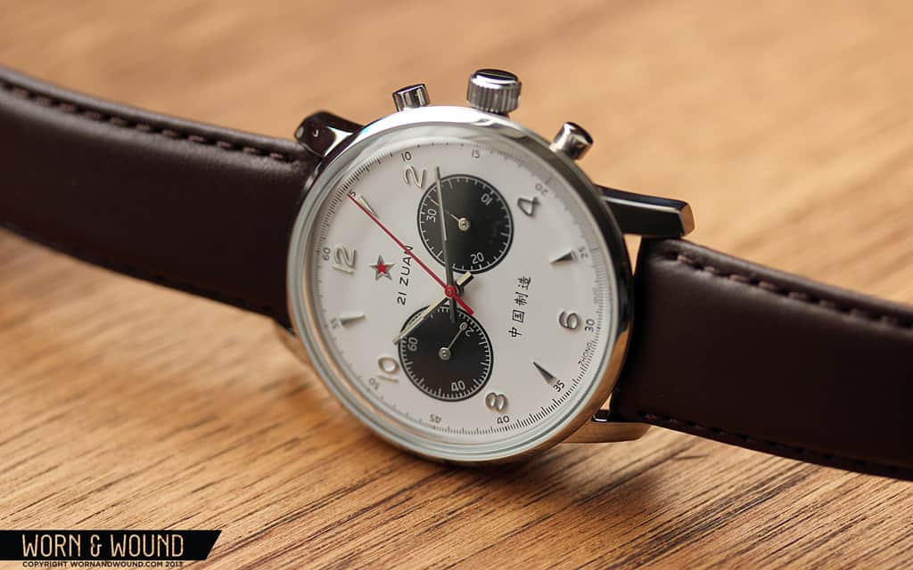
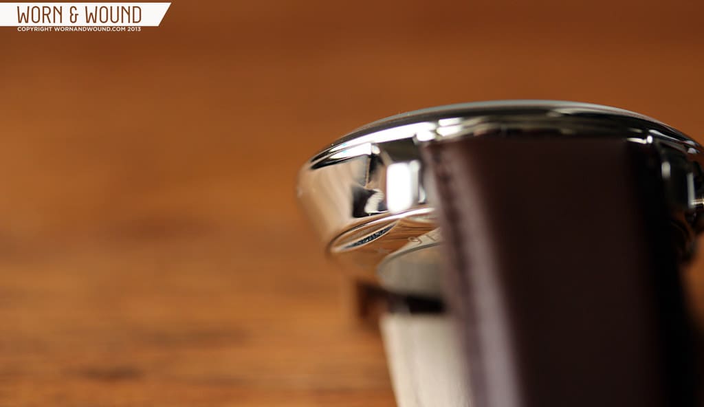
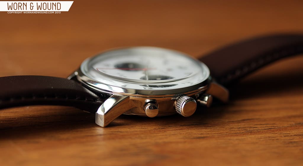
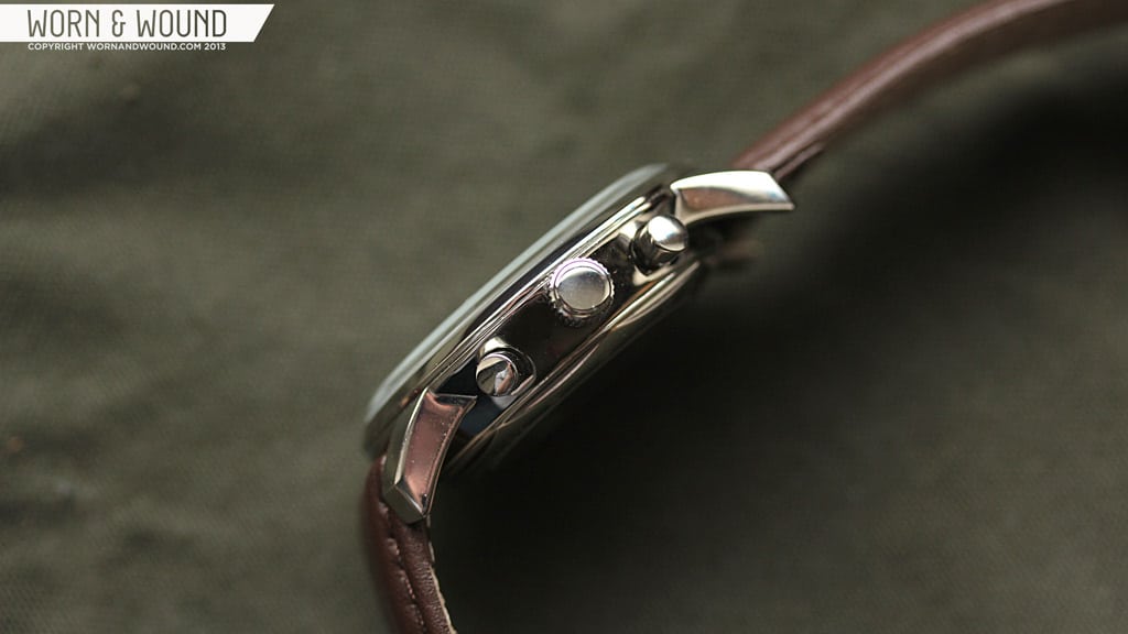
The stainless steel case of the new 1963 measures, as the name suggests, 42 x 48 x 13mm. The relatively short lug-to-lug distance, which makes it tolerable for smaller wrist as well, tempers the larger diameter. It’s a very simple case with minimal finishing, but some interesting geometry. From above, there is little that stands out. The central case is circular with large and fairly thick lugs protruding. Things get interesting when you look at the watch from the side or down the lugs. The whole case tapers upwards towards the domed acrylic crystal, but rather than being flat or round, the sides actually are concave. Essentially, if you laid the watch crystal down, it would look like a cross section from a bell.

The chrono pushers located at 2 and 4 are similarly very plain, just being small steel cylinders. The crown at 3 is decently large measuring 6 x 4mm as one would expect since this is a hand wound movement. Unfortunately, the crown is unsigned, giving it a very generic look. The 38mm version had a Seagull logo etched in, so I was surprised by the lack of branding here.
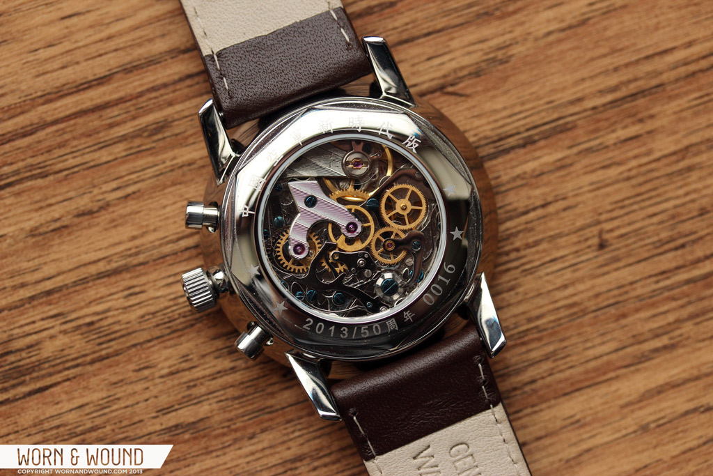
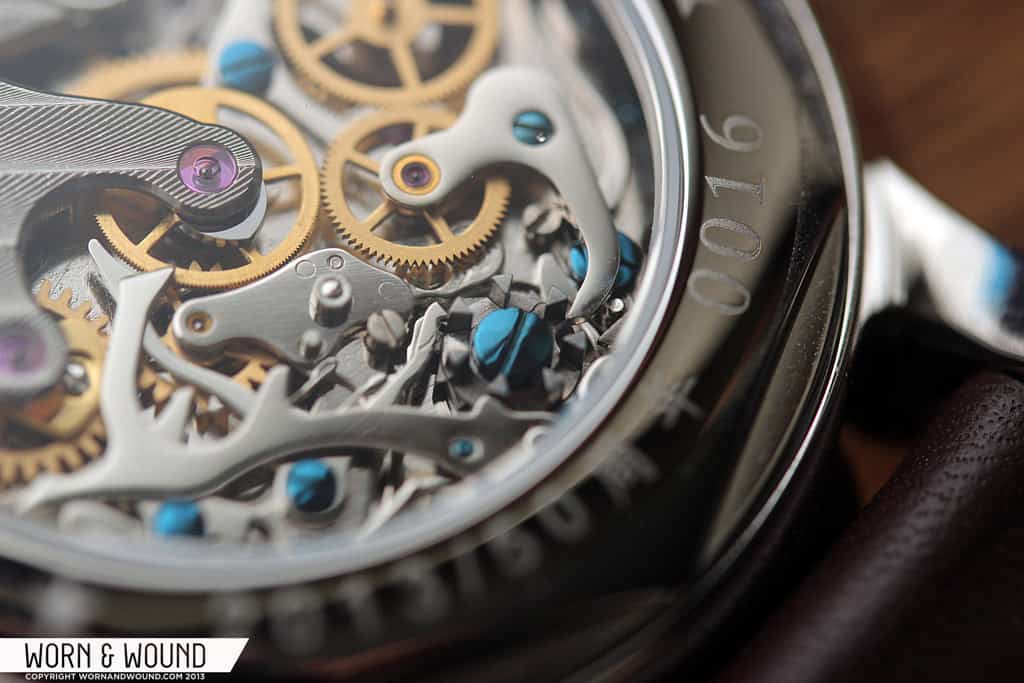
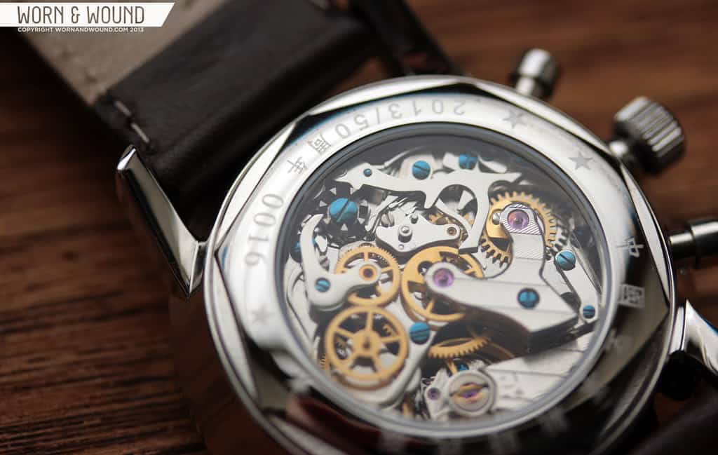
The watch features a display case back that shows off the intricate and beautiful ST19 movement inside. Around the edge of the case back are various Chinese characters, some stars and numbers. Though more than enough to look at on its own, the original 38mm version had a very cool red screen-printed graphic on the glass. Though this slightly obscured the movement, it was very unique and an element I miss on the 42mm version.
Dial
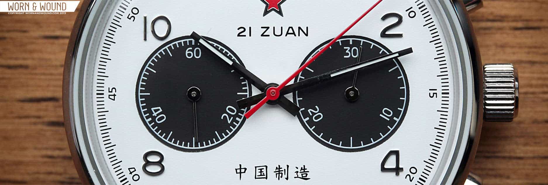
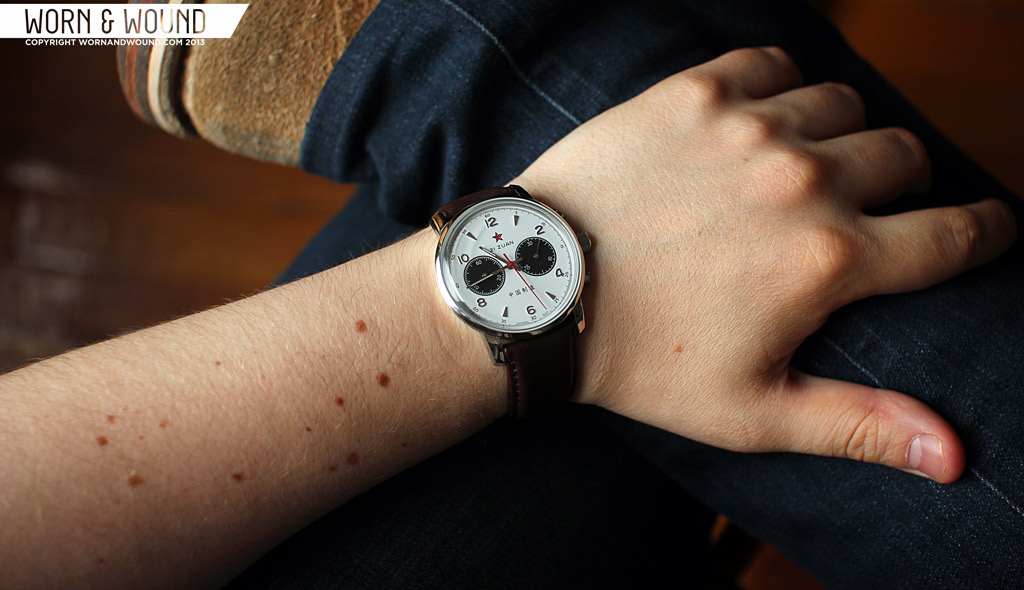
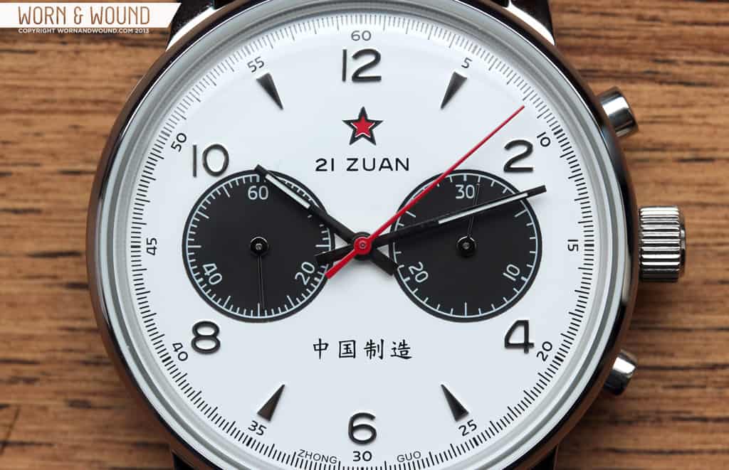
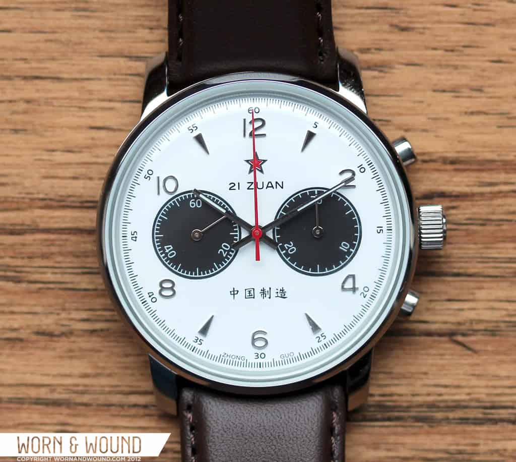
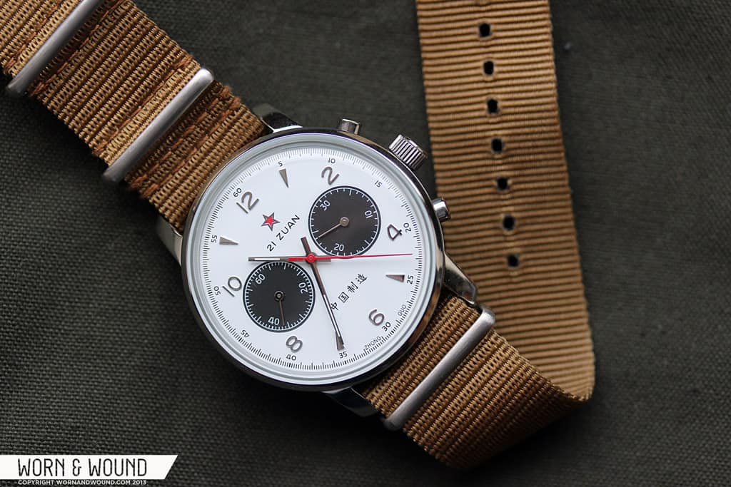
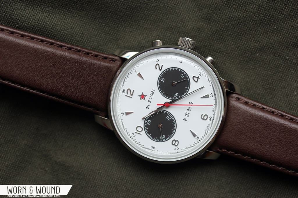
The dial of the 1963 42mm has all of the same elements as the original, but has been scaled to fit the larger size. It’s a very attractive and purposeful design, with interesting elements, which doesn’t lose anything by being scaled. The panda variety features a matte white background with a silver applied hour index. Around the outer edge of the dial is a finely printed black minute and chronograph seconds index with precision to 1/5th of a second.
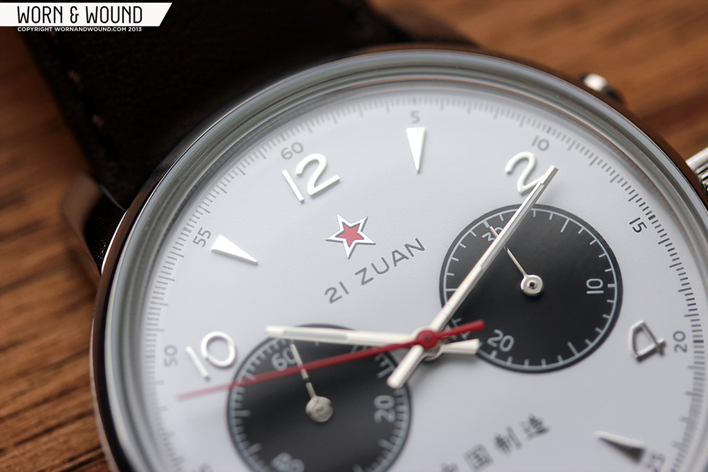
The applied markers of the 1963 watches have always been on of my favorite design elements of the watch. Adding a somewhat more decorative and dressy component, the markers elevate the design beyond that of simply a military watch. They also have a distinctly 60’s feeling, being a mix of triangles and numbers, which gives the watch a vintage aesthetic as well.
Just below 12 is a red star with an applied silver border, and just below that it reads “21 Zuan”. This indicates that the ST19 movement inside has 21 jewels. There are 19 and 21 jewel varieties of this movement, though I don’t know where or why there are additional jewels. Just above 6 are four Chinese characters, likely indicating the location of the factory in which the watch is made as it did on the original 38mm version.

At 3 and 9 are the 30-minute totalizer and active seconds, respectively. Both are large black circles with white indexes. As a high contrast element, and a defining feature of a panda dial, these sub-dials really standout and are the first thing you see when looking at the watch. Since the dial of this watch got larger, yet the positioning of the sub-dials stays the same as that is due to the movement, there is a sense of the sub-dials being too close to the center. While this might not be noticed by all and doesn’t affect the overall aesthetic quality, I couldn’t help but see it and feel that things were a touch out of balance.
Nevertheless, the panda dial is a very attractive style that works with this watch design, especially since it is a bi-compax chronograph. Though perhaps less authentic than the gold tone variety, it still comes across as vintage inspired and is perhaps a bit sportier than original color. Famous Panda dial watches, like the Paul Newman Rolex Daytona, have close ties to automobile racing, so I can’t help but associate that with this dial design.

The hands of the Panda dial 1963 42mm are different than that of the gold dial. The main hour and minute are silver rectangles with small slivers of lume, rather than the blue steel stick hands of the original. The chronograph seconds is a red stick, which quickly distinguishes it from the rest of the hands and makes it jump out of the dial. Both sub-dials feature small silver stick hands, which while not inappropriate to the design, are sometimes hard to see. The silver can disappear into the black, which makes me feel that white would have been a better choice for legibility.
Movement: Seagull ST19
The Seagull ST19 21-jewel column wheel chronograph at the heart of the 1963 is a big part of what makes this watch interesting. As much a part of the history of the watch as the dial design, the ST19 is based on the Swiss Venus 175 movement which was sold off to the Chinese. This modern version has many similar characteristics to it, one of the most significant being the column wheel, which is harder to produce and therefore more uncommon than cam-style chronographs.
Aside from the history and the mechanism, what makes this movement so unique is that it’s really the only inexpensive mechanical chronograph option out there and it happens to be great looking. Flip the 1963 over and you are presented with a labyrinth of blued screws, gold-tone gears and a few decorated bridges. It’s attractive and mesmerizing, especially when one plays with the chronograph buttons while viewing the movement. While it’s a far cry from the decorated and hand finished chronographs of haute pieces, it’s a lot more than one expects on a sub $500 watch, adding a lot of value to the piece.

The movement itself is non-hacking, manual wind with no date function and a frequency of 21,600 BPH. During my time with this watch, there was no noticeable inaccuracy. That being said, the chronograph itself has a few issues. First, is an issue of sensation. When you start the chrono, it has a fairly satisfying click. When you pause it, it still clicks though with less snap. But when you reset it, there is no sensation at all. Though this might not bother some, I do like a tactile response in my chronographs. The other more significant issue is that when the chronograph is paused, the seconds hand jumps back anywhere from half to a full second. Clearly, this limits its potential as a precise timing instrument, though I somehow doubt it’s going to ever be used as such.
Straps and Wearability
The 1963 42mm comes on a 22mm chocolate brown leather strap with brown stitching. The quality is decent and it is comfortable enough, but it is a fairly boring strap that doesn’t really emphasize or compliment the watch. A black strap with white stitching would have been a more logical choice given the dial. One thing I did like about it though was the buckle. Though it isn’t signed, or have a particularly interesting shape, it has a nice solidity to it and thickness.

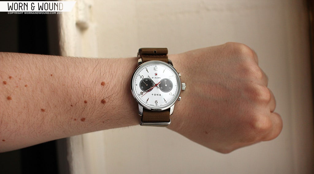
Since the leather didn’t quite do it for me, I did try the watch on a nylon NATO, which definitely made it more fun. The sportiness of the panda dial is emphasized by the NATO design, as are the military undertones. The 38mm version only comes with a green NATO, which simply makes more sense than a generic brown leather strap.
That being said, on the wrist the strap is not where your eyes are going to be. The dial really is attention grabbing and very attractive. Since the watch has a fairly small bezel, the dial has a ton of presence. And there really is something striking about panda dials. It’s hard to explain as there isn’t anything special sounding about a white dial with black sub-dials, but in person it just works. The mix of white and black also makes for a very versatile watch, especially given the vintage and decorative elements. The 42mm size is also quite comfortable for a medium to large watch. On my 7-inch wrist, I did not feel that the watch was too big. This is largely do to the 48mm lug-to-lug size, as well as the fairly thin 13mm height.
Conclusion
The Seagull 1963 42mm is without a doubt a very attractive watch no matter the size or color option one chooses. While in the long run I think the original gold tone dial is more unique, the panda dial version is an exciting alternative. There aren’t many new panda dial watches out there, and given the movement, price, etc of the 1963, this is a great option for those who like that look. It would be great to see them make the 38mm version with a panda dial as well.
Aside from the dial, there are a few things that I did find lacking. The absence of a signed crown, no art on the display back crystal, the boring strap…these things all amount to the watch feeling a bit generic. The dial rocks as does the ST19 movement, but the supporting cast leaves something to be desired. While $469 is not much to pay for a mechanical chronograph, it is almost $100 more than the 38mm version, which also features a sapphire crystal (though I think acrylic is more appropriate for this watch). I guess the question that is left is whether or not an additional 4mm and more dial options is worth the extra cost.

So, that all being said, I do see this watch as being very appealing to those who liked the original Seagull 1963, but wanted a larger watch and those who like panda dials. In the end, I am sure that in both cases you will find the watch satisfying and very enjoyable to wear.
By Zach Weiss
Review unit supplied by Seagull1963.com


Nice photos, looks great on the NATO strap too.
Great review.
I just got a champagne dial 42mm which interestingly does have a bit of detail on the crown – it’s got a star on it matching the one on the dial.