


 Featured Videos


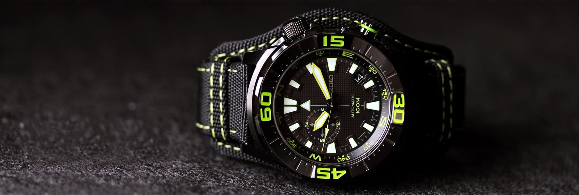
It’s hard to argue with a good Seiko. Affordable, well built and generally cool looking; they sort of define value in mechanical watches. Typically, we’ve reviewed watches from the Seiko 5 series, which range from absurdly affordable to incredibly affordable. Today, we’re going to take a look at a Seiko Superior, which is a couple of rungs higher on the Seiko product ladder. Coming in at $250, still quite low in the scheme of things, the Seiko Superior SSA059 is packed with features, looks wild and is a limited edition of 2500.

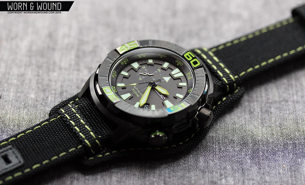
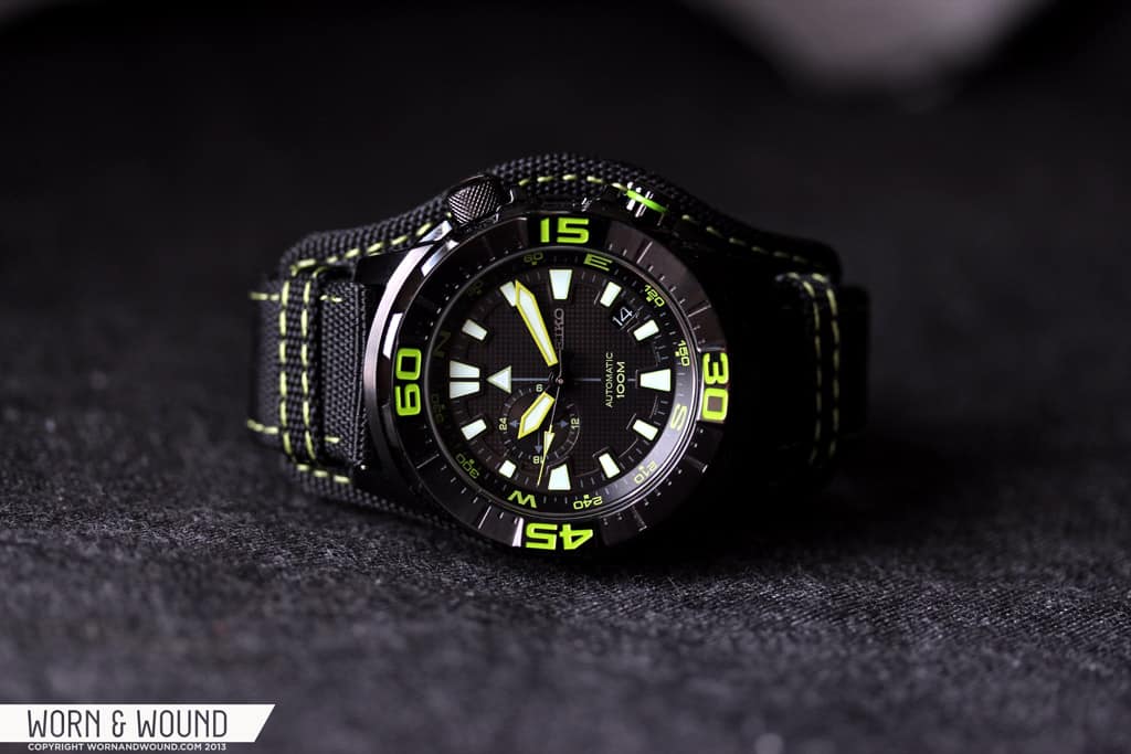
The SSA059 caught our attention for a few reasons; one was the intense look of the watch. With a black case and dial accented with acid green markings, interesting layering, texturing, compass functionality and a rugged nylon bund strap, this is a robust watch with a very aggressive attitude. It also is fitted with internal and external bezels, which is fairly uncommon. Lastly, is that this uses the relatively new Seiko 4R37A automatic movement, which we were simply curious to see in action.
 Case: PVD Steel
Movement: Seiko 4R37A
Dial: Black
Lume: Yes
Lens: Hardlex
Strap: Nylon and Leather
Water Res.: 100M
Dimensions: 44 x 48.75mm
Thickness: 13 mm
Lug Width: 22 mm
Crown: 7 x 5 mm screw down
Warranty: 2 Years
price: $249
Case
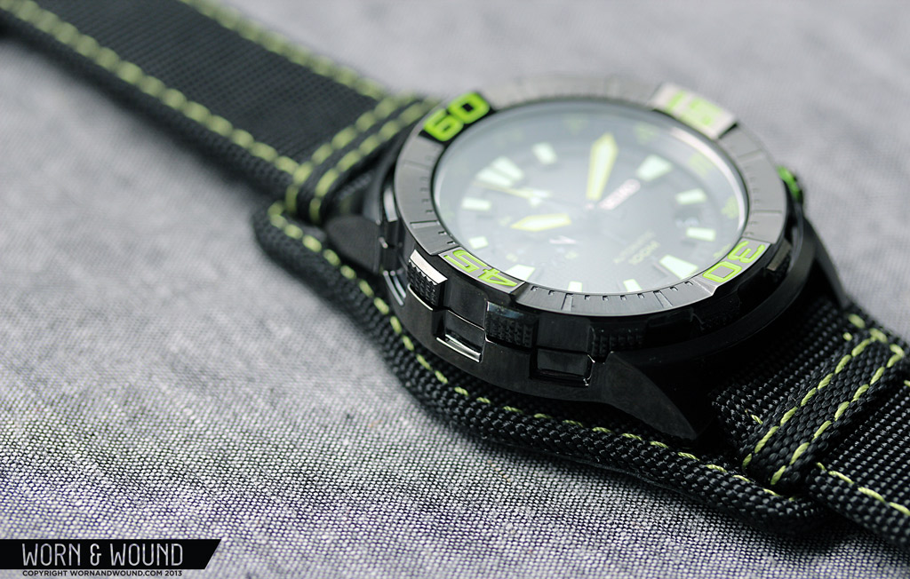
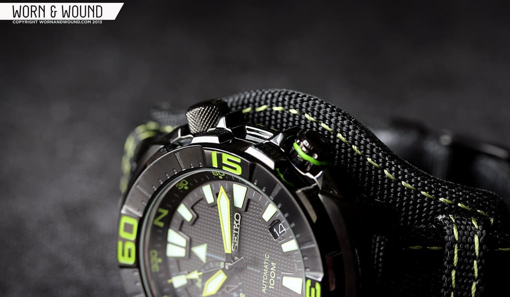
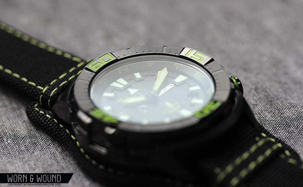
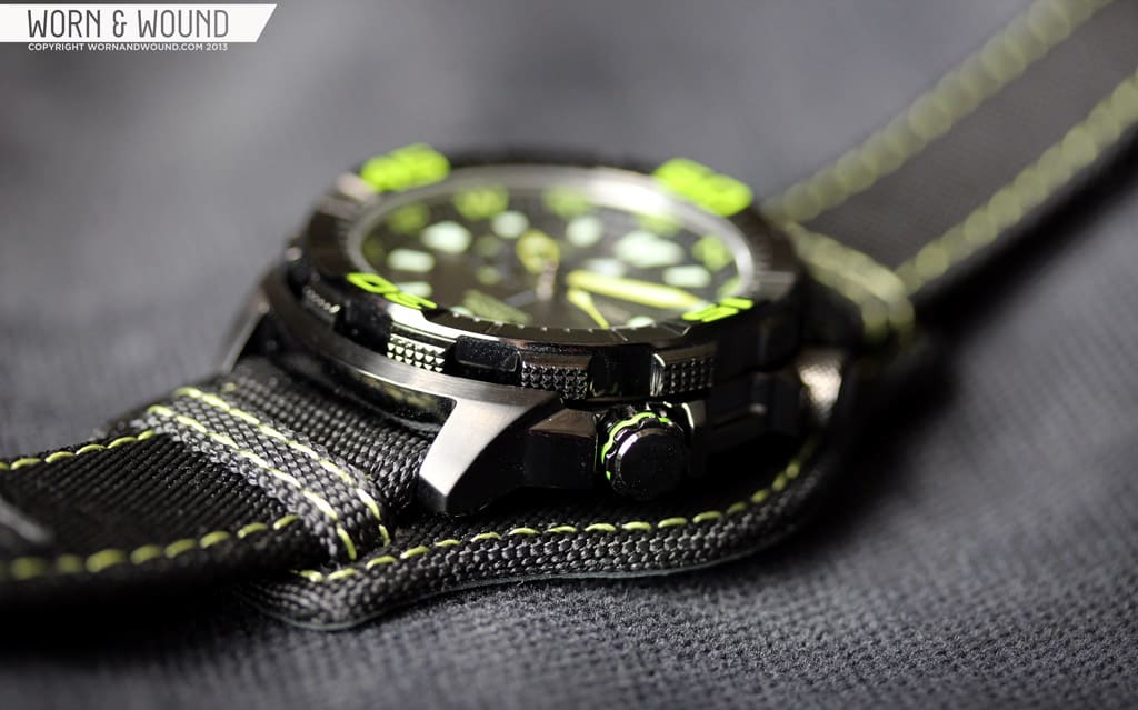
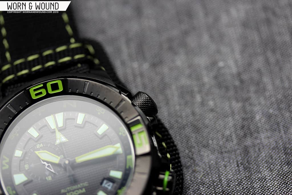
The beefy, tank-like case of the SSA059 has a complex design with lots of interesting guards and cutouts as well as an asymmetrical design. It’s a large watch at 44 x 48.75 x 13mm, though the black PVD and chunky shape make it look falsely compact. Looking at the watch from above, the case is dominated by the large external bezel, which is faceted and textured in various ways. The two large crowns, one for movement adjustment and the other for the internal bezel, jut out of the right side, which along with their respective crown guards create a large mass of black metal on one side.

The lugs then are relatively short, but quite thick. One very cool detail is that the lugs are connected by a sort of bridge that follows the edge of the case, which rises above the edge of the bezel. This basically creates the effect of the bezel being partially sunken into the case, giving it a solid and protected feel. Looking at the watch from the left reveals another great and functional detail. The side of the case has a turret shape, with panels going in and out. These line up with the knurled grips of the external bezel making it easier to grasp and turn the bezel as well as align it to the mark.
The bezel itself has a 120-click uni-directional mechanism that is good quality. It’s tight, snappy and seemingly lines up. That being said, it’s hard to determine where the mark is since the numerals on the bezel are so large and the internal bezel can be aligned to anything. So, by aligning the grips on the side of the bezel with the grooves on the side of the case, you get a quick reference that you can both see and feel.
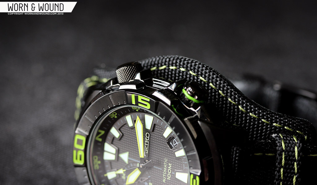
Jumping to the other side of the case, you have the two crowns I mentioned before. Both measure 7 x 5mm, but have very different designs to distinguish them and their functions. The crown at 2 is used to wind the watch as well as set the time. This crown is a straight cylinder with a knurled texture, making it easy to grasp. I was surprised to find that it was not screw down considering this is an automatic watch and the style of the watch leans towards over-built and sturdy. Nevertheless, the quality of the crown is substantial and given the guards, I doubt it would accidentally dislodge. The second crown, located at 4, has a simple toothed design with a line of acid green cut into it, which designates it as being used with the internal bezel. The action of the internal bezel, which is bi-directional, is reassuringly tight.
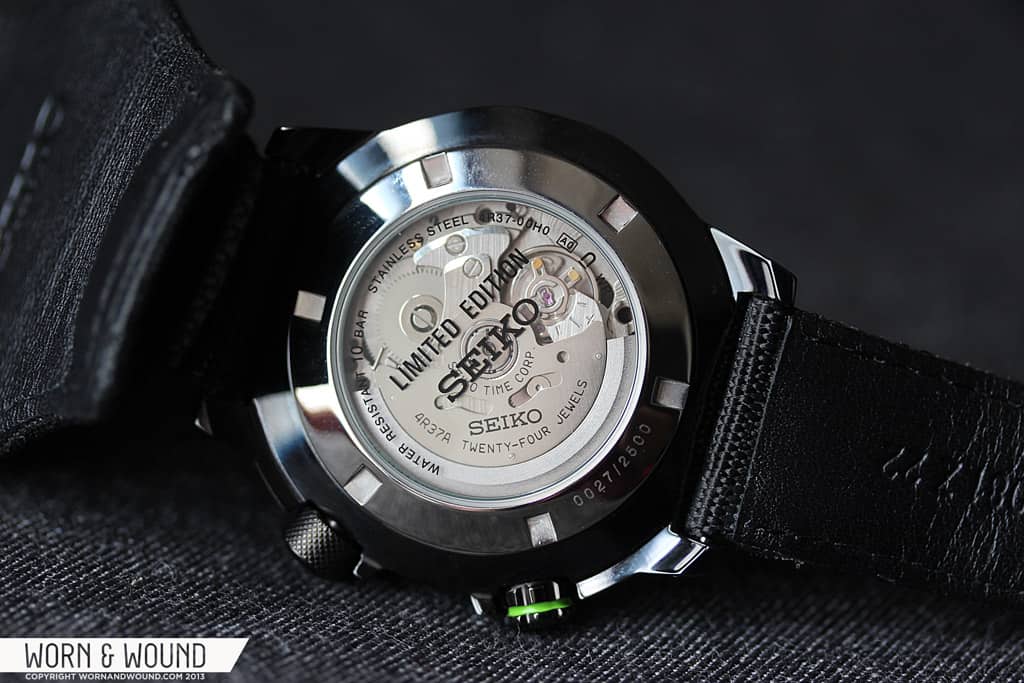
Despite the fact that the watch comes mounted on a bund-style strap, it does have a display case back. The 4R37A movement inside is plain looking, with no discernible decoration, though it’s always enjoyable to be able to see the movement. The details that would normally be around the display window are instead screened onto the window, with an emphasis on a large “limited edition” at the center. The edition number is then etched in very small numerals on the back itself.
The SSA059 is fully PVD coated, except for the steel portion of the display case back. It’s a rich black coating that is well applied, as would be expected. On all surfaces except for the tops of the lugs, which are lightly brushed, the PVD is over polished steel, giving it a deep but shiny appearance. I’m not sure if this was the best choice for this watch, which is clearly very rugged with some military/tactical influences. The shininess makes the metal have a plastic quality and also picks up fingerprints very easily. That being said, it’s a cool looking watch in black, which I believe is exclusive to the limited edition model.
Dial
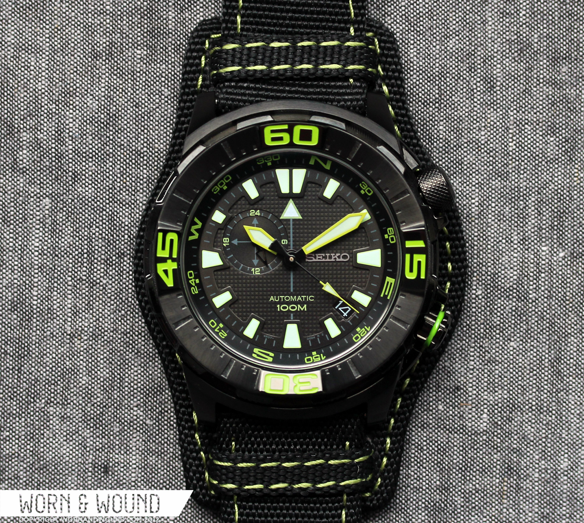
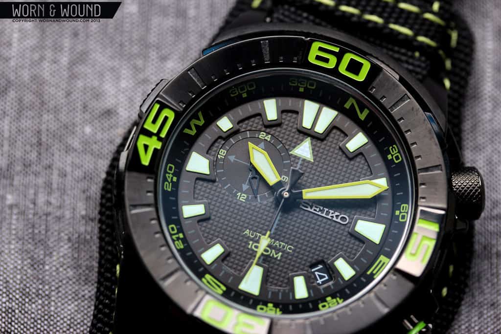
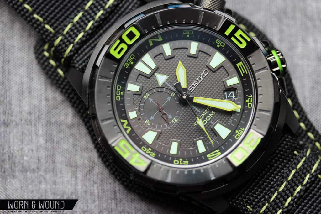
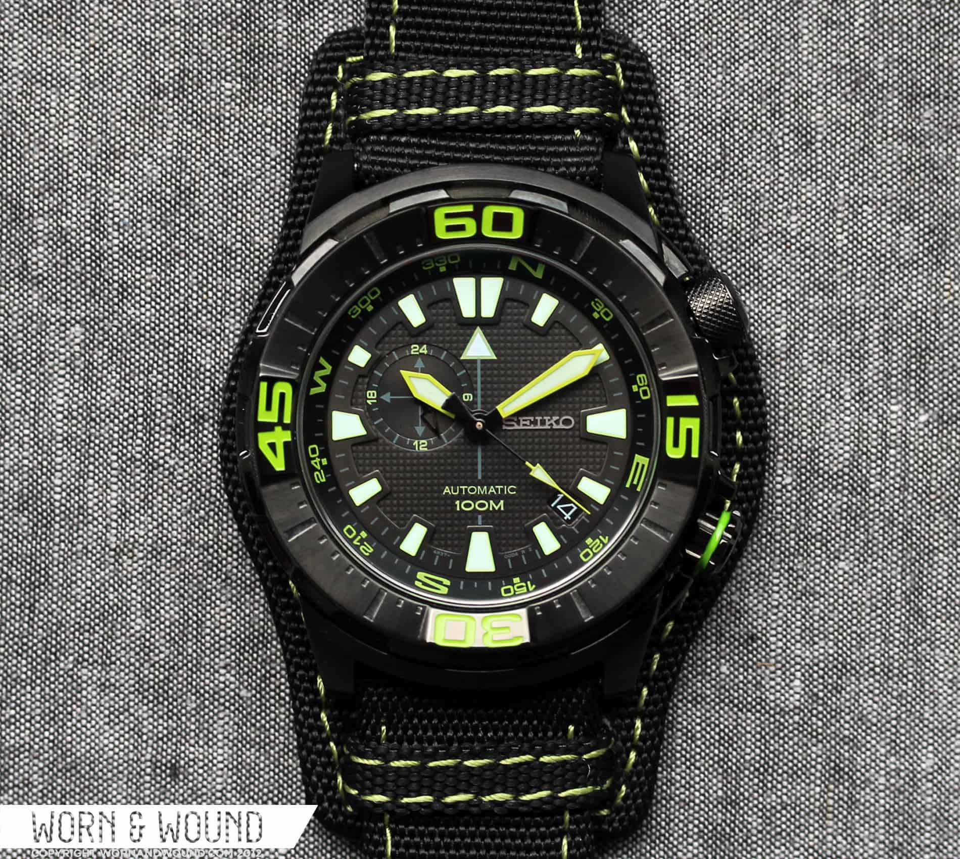
The dial of the SSA059 has a complexity that reflects that of the case design. With various layers and textures, it’s anything but plain and simple. The dial can be broken down into two sections, the main dial and the bezels. The main dial consists of two layers, both of which are warm black. The base layer is fully patterned with a grid of small squares. It’s hard to see with the naked eye, but each square is actually a tiny pyramid, giving this layer a very interesting texture. Bisecting the dial from 6 to 12 is an arrow with a grey stem and a large green-bordered white triangle at 12. Just above 6 in acid green “automatic” and “100m” are printed and at 3 is an applied metallic Seiko logo. There is a lot going on here, which is the general vibe of the watch, but it all comes together pretty well.

Offset at about 10 is a large 24-hr sub-dial, which is also multi-layered. The index of the 24-hr dial is set on a ring, which is just below the main dial layer. It consists of dark gray hash marks for the hours, with green numerals for 6, 12, 18 and 24. On the lower layer of this sub-dial is a cross with arrows, referring to the compass functionality of the watch. On the opposite side, and around 4.5 is a small window showing the white on black date disk. Unfortunately, this window isn’t exactly at 4.5, but rather a little closer to four, which looks a little sloppy. This isn’t a detail you will notice regularly as it is minute, but it annoyed me nevertheless.
The primary index of the dial is printed on a ring, which is a layer above the base dial. The index is made up of large trapezoidal shapes of varying size, each fully lumed, for every hour. Between each trapezoid are very faint grey lines, to indicate minutes. Frankly, they are so light you have to strain your eyes to see them, and likely wont see them at all at a glance. The large trapezoids, however, are super bright and legible. The shapes all taper towards the center of the dial, giving the dial a sense of motion and added depth.

Moving outwards, you have the deeply sloped internal bezel. This bezel is actually fitted with a compass index, indicating each direction and the degrees between them in 30-degree increments. This is a pretty cool feature to have on the watch, though you are not too likely to use it. By aligning the watch such that the 24-hr hand is pointing in the direction of the sun (don’t change the time, move the watch), you can establish north (in the Northern Hemisphere).
You then can set the internal bezel to reflect this, giving you a more precise compass to read. Of course, would have to keep adjusting the compass as the sun moves. Clearly this is a rudimentary compass that is not as functional, especially in a real-life survival situation, as a magnetic or GPS based compass, so don’t buy one then get lost in a desert somewhere. That being said, it has a fun MacGuyvery quality.
The external bezel then provides large green numerals into the mix. The bezel also angles down towards the center of the dial, drawing the eye in. All in all, the look of the dial and bezels is very intense. There is a lot going on, but it seems to balance out well. Nothing really overwhelms anything else, and the main index is always legible. Similarly, the hour and minute hands really stand out. Both are green-bordered roman swords with lume filling. They are bold and hard to miss, but not over-sized.
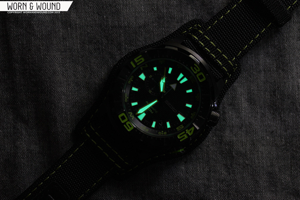
The seconds hand is a black and green arrow with a thin needle that extends to the edge of the dial, complimenting the hour and minutes. The 24-hr hand, in contrast, is quite subtle. It’s a reflective black, double side arrow that barely stands out from the black of the dial. Not sure why it’s quite so low visibility, but I’d be lying if I said it wasn’t cool looking.
Movement
The Seiko 4R37A movement inside of the SSA059 is a fairly new caliber from the brand, only showing up within the last couple of years. It’s a 24-jewel automatic with hacking and hand-winding, date, 24-hr hand and a frequency of 21,600 bph. The hand-winding and hacking are both very welcome features and the 24-hr hand is an interesting addition. Though not as common in the more inexpensive Swiss movements, 24-hr hands are available in a variety of Miyotas, such as the 82S7 and 9100 models. Since they are directly tied to the time, one can’t use them as a second time-zone, but they do have value as am/pm indicators and come in handy abroad.

In the time we’ve spent with the watch, we’ve seen no noticeable inaccuracy or issues with the power reserve, winding, hacking, etc… Using the Twixt Time app, we rated the movement to +3.9s/day, which is very good.
Strap and Wearability
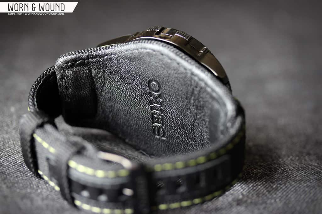
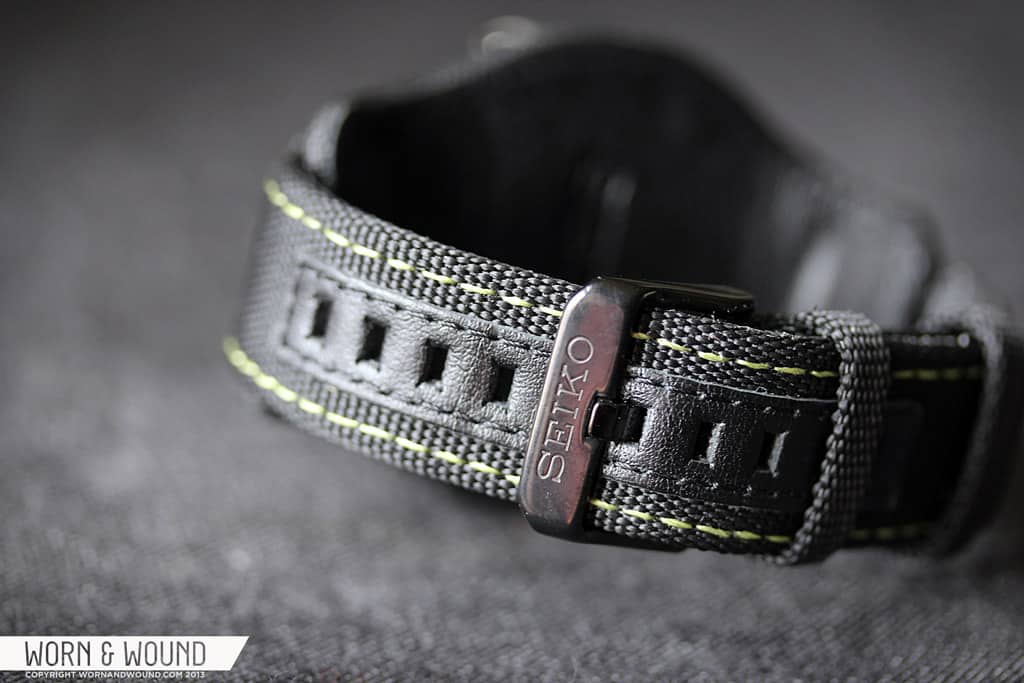
I honestly might have noticed the strap before I noticed the watch when I first saw the SSA059. Bund-style straps, easily distinguished by the large pad that sits beneath the watch, are uncommon on modern watches especially non-military ones. Though I suppose this watch has some military influences (the solar compass, the hands), I think of it more as an adventurer’s watch. Nevertheless, the aggressive styling from the case and dial were directly ported into the interesting choice. The 22mm strap is made of durable heavyweight black nylon with contrast green stitching. The whole thing is padded and leather backed for comfort and durability. As nylon frays when cut, the sizing holes have a protector of black leather as well.

It’s a nicely made strap that feels like it will last though the leather backing is a bit plastic. The bund-style is pretty gnarly looking, increasing the perceived size of the watch dramatically. It also gives the watch a sense of being a piece of proffesional equipment (not that a watch isn’t). That being said it’s not the most comfortable thing on earth. First off, it increases the height of the watch dramatically, adding about 3.5mm of material. Secondly, it’s just a lot of thick material against your skin, which inevitably gets hot and sweaty. The pad also makes it fairly difficult to grasp either of the crowns.
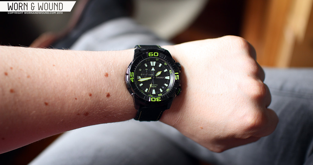
Luckily, the back pad is removable. When off, the strap is a more normal two-piece that still has aggressive looks that compliment the watch. You also get a clearer sense of the watch, as it’s not lost against the black background. On the wrist, the watch wears smaller than its dimensions would suggest, but is still quite large. Regardless, it has tons of presence. It’s simply fierce looking and is not for those who prefer subtlety. The black and green are a vibrant combination that standout no matter what you wear it with. Throw in the asymmetrical case and double crowns, and you really have a beastly looking machine. That being said, the intense look sort of limits the use of the watch to non-formal situations.
Conclusion
The Seiko Superior SSA059 is a hell of a watch. It’s easy to forget when wearing it, or reviewing it for that matter, that it costs only $250. It’s built like a rock, has lots of great and fairly unique features, a quality automatic movement with date and 24-hr complications and it looks like it was designed for some sort of Space Marine. In fact, the only drawback is the intensity of the looks, in the end they are love it or leave it. Big, bulky watches, especially PVD ones, just aren’t for everyone, but if they appeal to you, this is a great affordable option.

*Update: Looks like there are a few other versions out there that are a bit less intense. The SSA053 features a denim blue dial and strap and the SSA055 has an olive green palette, both of which are about $185. Then there are the SSA047 and SSA057, which have a white and black dials, respectively, and steel bracelets for $255. Lastly, the SSA051, which is all black with a black steel bracelet. So… if the black and green don’t do it for you, but the watch design is of interest, there are plenty of other options.
by Zach Weiss
Review watch courtesy of Island Watch


What about some pictures with a different strap ?
Huge 2nd on that. The OEM strap doesn’t seem to do it justice.
I love this brand! Another winner. So much detail on the dial for such a low price. Thanks for the write-up, guys.
THANK YOU for listing the dimensions in A x B x Cmm. I don’t know why this isn’t standard; case diameter is hardly a good measure of how a watch will wear. I find myself hunting for lug-to-lug measurements (which are probably the best indicator) all the time.
Usually not my thing but I dig this Seiko. I think it’s a good alternative to a black Casio G-shock or some other sport watch which is primarily used for looks rather than function.
I’m sure it’s a nice watch but I’m not a fan of the styling. It does look very Casio G-Shock (which I don’t think is necessarily a good thing). The Mountain Dew green color is a bit extreme and a Seiko Orange Monster is about as Extreme as I get. Call me old fashioned I guess. I’d like to see a second version with a more traditional flair. I think that would be a real winner!
I’ll preface this with the fact that I’m a big Seiko fan.
Nice feature set – love the 24 hr secondary dial, nice compass bezel, and I like the more discrete numbering on the outer bezel. I also like the texture on the dial and the little bevel cut on the 9 o’clock marker – the sword hands work for me. Has a great movement too.
However – the black band overpowers the watch – no spare Nato straps Zack? Not a deal breaker as straps are easily changed.
The neon green colour scheme – not my style. Also don’t like the useless arrow below the 12 – seems silly.
Hi Toni,
I added some details on other models I found with the same basic design but more tolerable colors, so check those out.
Unfortunately, I didn’t have any 22mm NATOS with black hardware that looked right or would fit, otherwise I would have tried it.
-Zach
Zack – you cracked me up with your “it looks like it was designed for some Space Marine” comment – you called that one perfectly.
The other colour combinations are really attractive – especially the green, blue and black faces. It is odd that the hour hand has the special trim colour on those, rather than the more traditional minute hand with the unique border.
Thanks for the update. Really nice watch.
Thanks for updating with the additional models. The black and white faced versions on the stainless bracelets are very handsome and much more my style.
Thanks for your review. The table in the review says the watch has a screw down crown, but in the text you state that it doesn’t have a screw down crown.
I just bought an SSA051. I’m anxious for it to arrive.