


 Featured Videos


When last we looked at an Oris, it was the beautiful beast known as the Aquis Regulateur Der Meistertaucher. This solid titanium diver impressed with its unique design and flawless execution. When I think of Oris, that is the type of piece that comes to mind. Whether an modern and advanced diver, or a clean and crisp pilot, the Oris’ that are most commonly seen are in the sport variety. Today, we’re going to take a look at a watch that is very different from that, showing off the brand’s versatility.
The Oris John Coltrane Limited Edition was first introduced at Basel World a couple of years ago that immediately caught our attention. As part of their line of LE watches that are inspired by famous Jazz musicians, the Coltrane is a 50’s style dress watch with very subtle hints at its patron musician. The design begins it inspiration with Coltrane’s seminal album, Blue Train, which was released in 1957, setting the stage for the era for the aesthetic.
The design draws on classic designs from that time, mixes in modern execution befitting of an accessible luxury brand like Oris, and a single reference to the musician. On the dial, the name “John Coltrane” is not emblazoned, nor is there a guilloche saxophone (I hope such a horror doesn’t exist), but rather just a blue train track index. That’s it. A tasteful reference to the album and nothing more.
As someone who is typically not a fan of ambassador watches, this really impressed me. Here, they had all the opportunity to go overboard, but didn’t. The watch itself is then minimal and elegant with some features that are truly gorgeous. It has a massive sapphire crystal and is powered by the Oris 733, which is a rebranded SW 200. The Coltrane is a limited edition of 1000 pieces and comes in at $2,200 MSRP.
Oris John Coltrane LE Review
 Case: Steel
Movement: Oris 733 / Selitta SW-200
Dial: Black
Lume: NA
Lens: Sapphire
Strap: Leather
Water Res.: 30m
Dimensions: 38 x 44mm
Thickness: 11.4mm
Lug Width: 20
Crown: 6 x 3 mm
Warranty: yes
Price: $2,220
Case
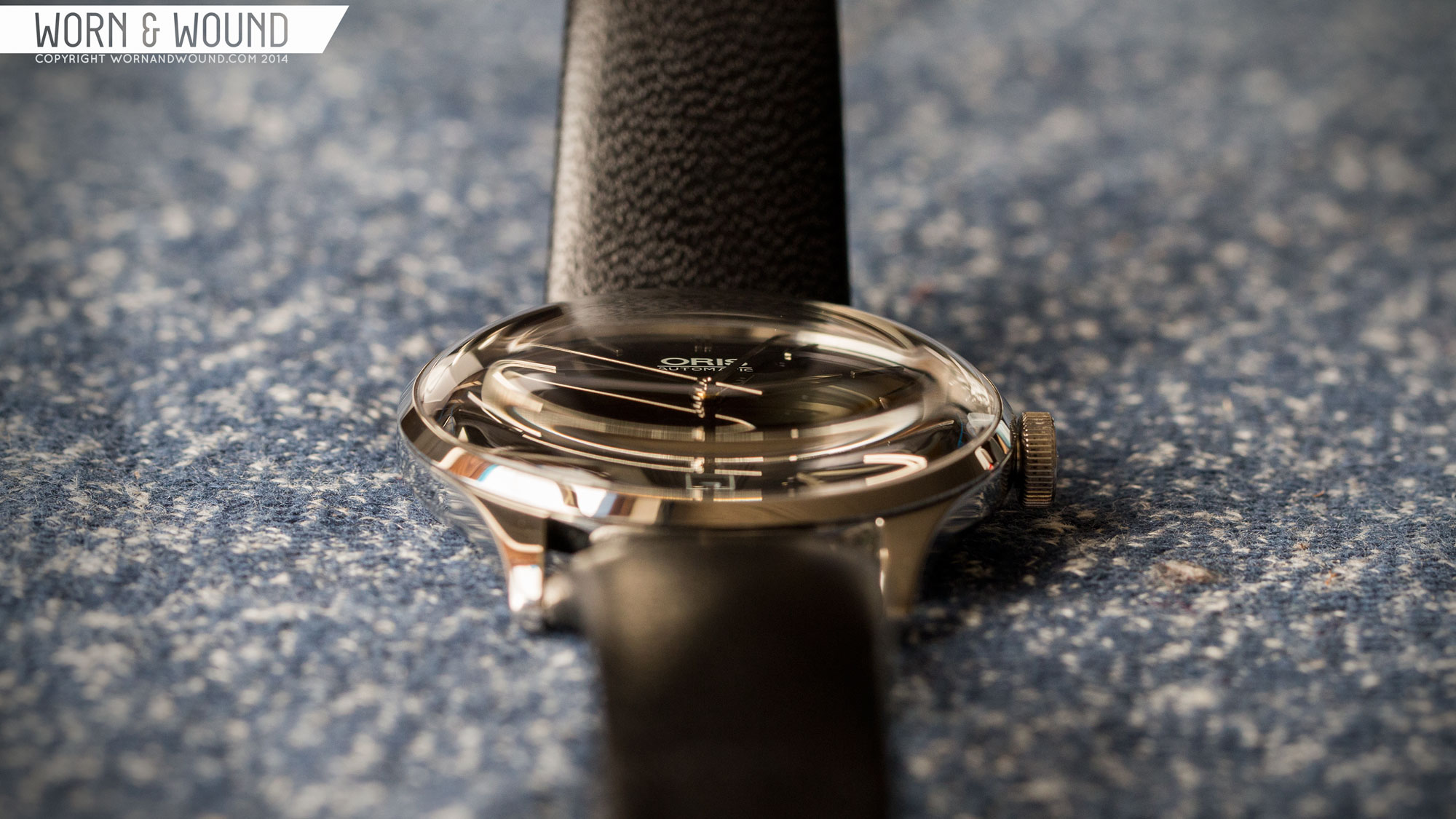
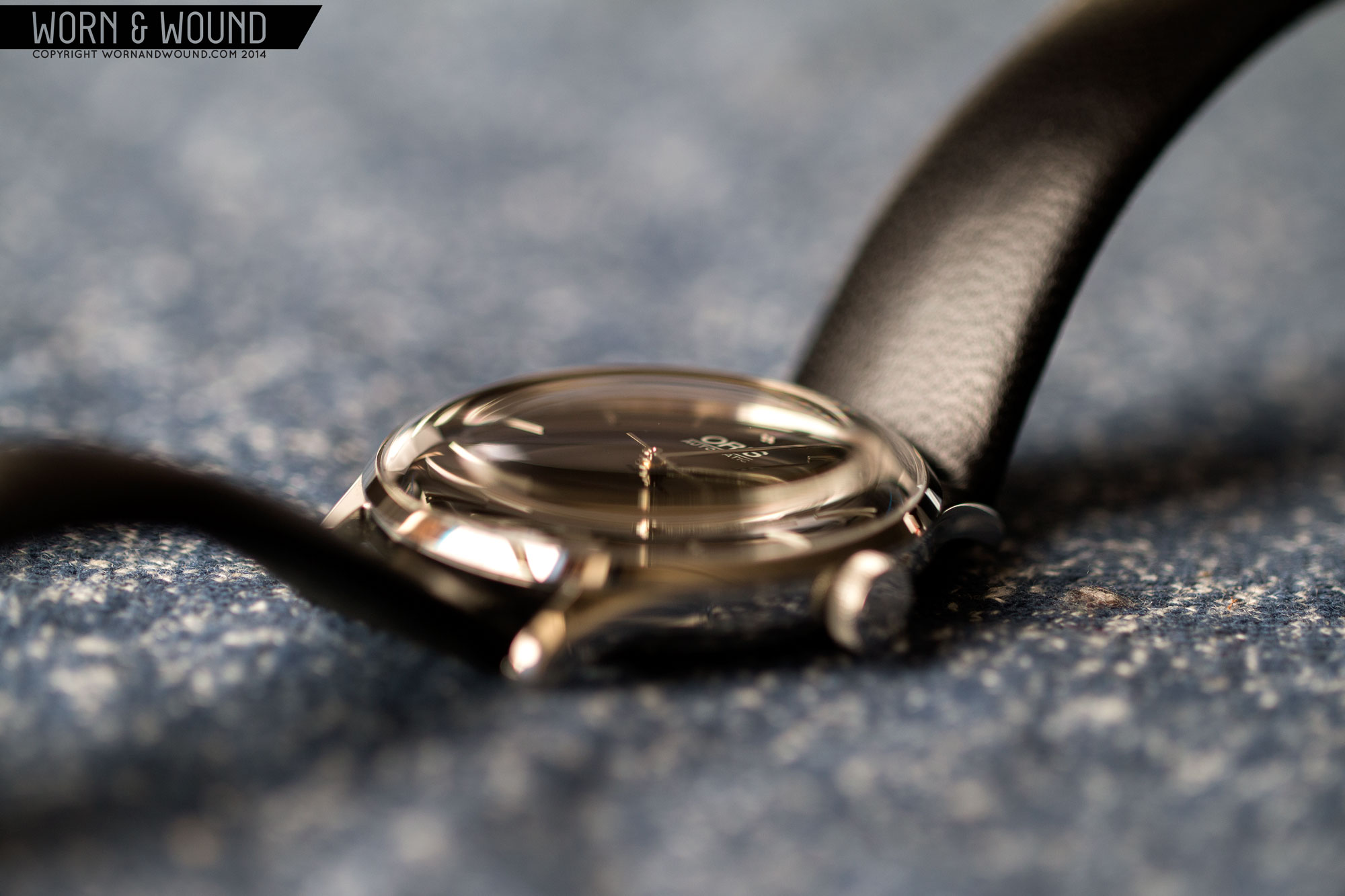
The case of the Coltrane has vintage styling with thoroughly modern execution and one of the coolest crystals I’ve seen. Measuring 38 x 44 x 11.3mm (to the top of the dramatically domed sapphire crystal), the watch is properly sized to speak to vintage pieces and be appropriate as a modern dress watch. It also features 20mm lugs, which is a bit wider than expected, giving the watch a slightly broader and more masculine look.
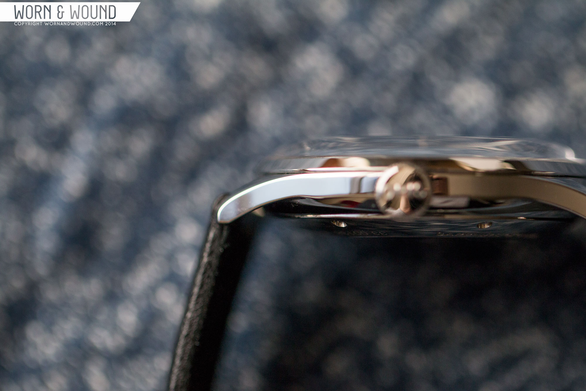
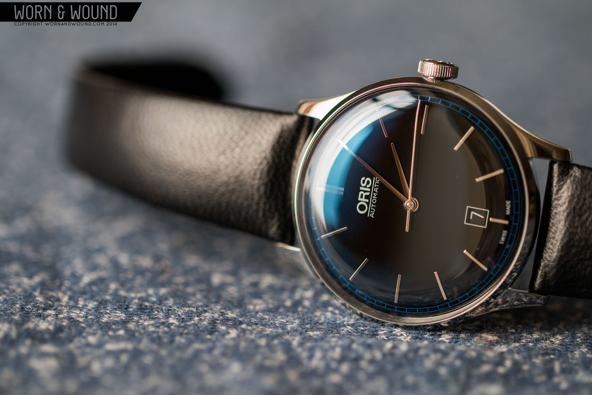
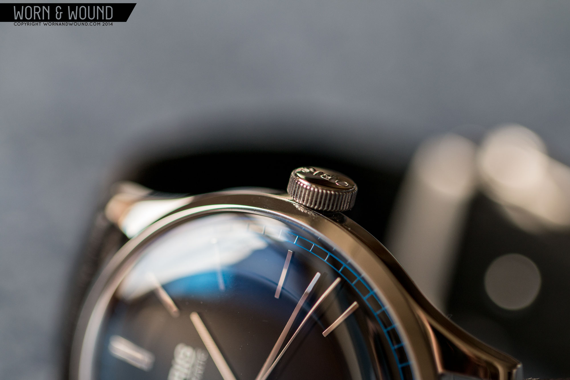
The design itself is simple and elegant, with slender, contouring lugs and polished surfaces all around. The crown on the right-side is nicely oversized at 6mm, giving the watch a bit more of a sporty look. It’s also easy to grasp for hand-winding and setting the time. The real star of the case, though, is a sapphire crystal.
Standing a few millimeters tall, the sapphire has a beautiful, sculptural shape that at once speaks to the acrylic box crystals of the early-mid twentieth century, and to Oris’ modern manufacturing abilities. Unlike most sapphires, this one has a relatively flat top, with a broad radius shoulder that drops down a few millimeters and fluidly connects with the cases thin steel bezel. Where the crystal curves, it distorts the dial when viewed at a low angle and creates dramatic reflections. Though, if I were to complain, as a photographer, the dome does make it hard to get a clear shot, but I think I can live with that.
Flipping the watch over, the case-back is very restrained. It simply features an Oris crest surrounding by various words and details, including the number of the watch (i.e. 0138/1000). On one hand, its simplicity speaks to vintage watches and while having the words “John Coltrane” doesn’t over do the connection. On the other, it’s a bit lackluster for a $2,200 watch, and Oris typically shows of their movements, which might have been nice to see here.
Dial
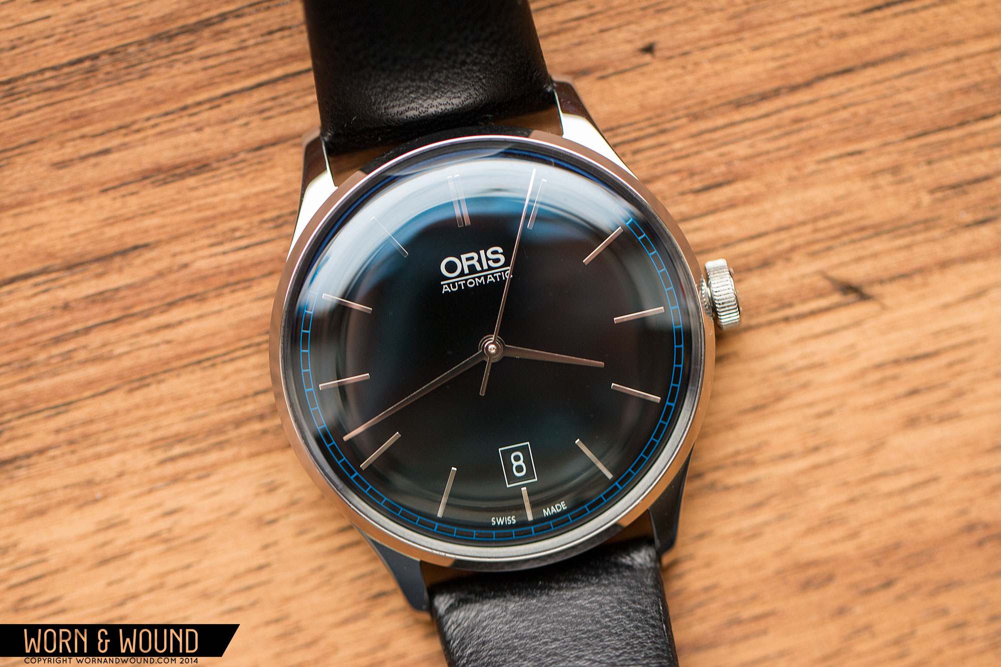
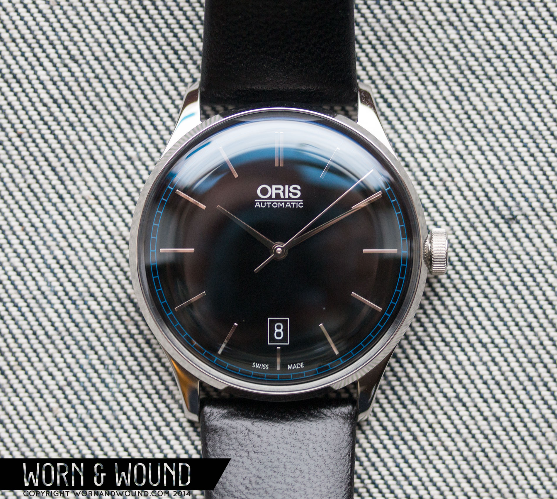
The dial of the Coltrane is simple, restrained and effortlessly cool. The surface is gloss black, which appears darker than matte blacks do. On top there is a primary index of thin applied steel markers. They are minimal, but legible, adding a little glimmer to the dial. At 12, there is a double marker, and at 6 the marker is truncated to make room for the date window. The date is presented in white on black, for a seamless look.
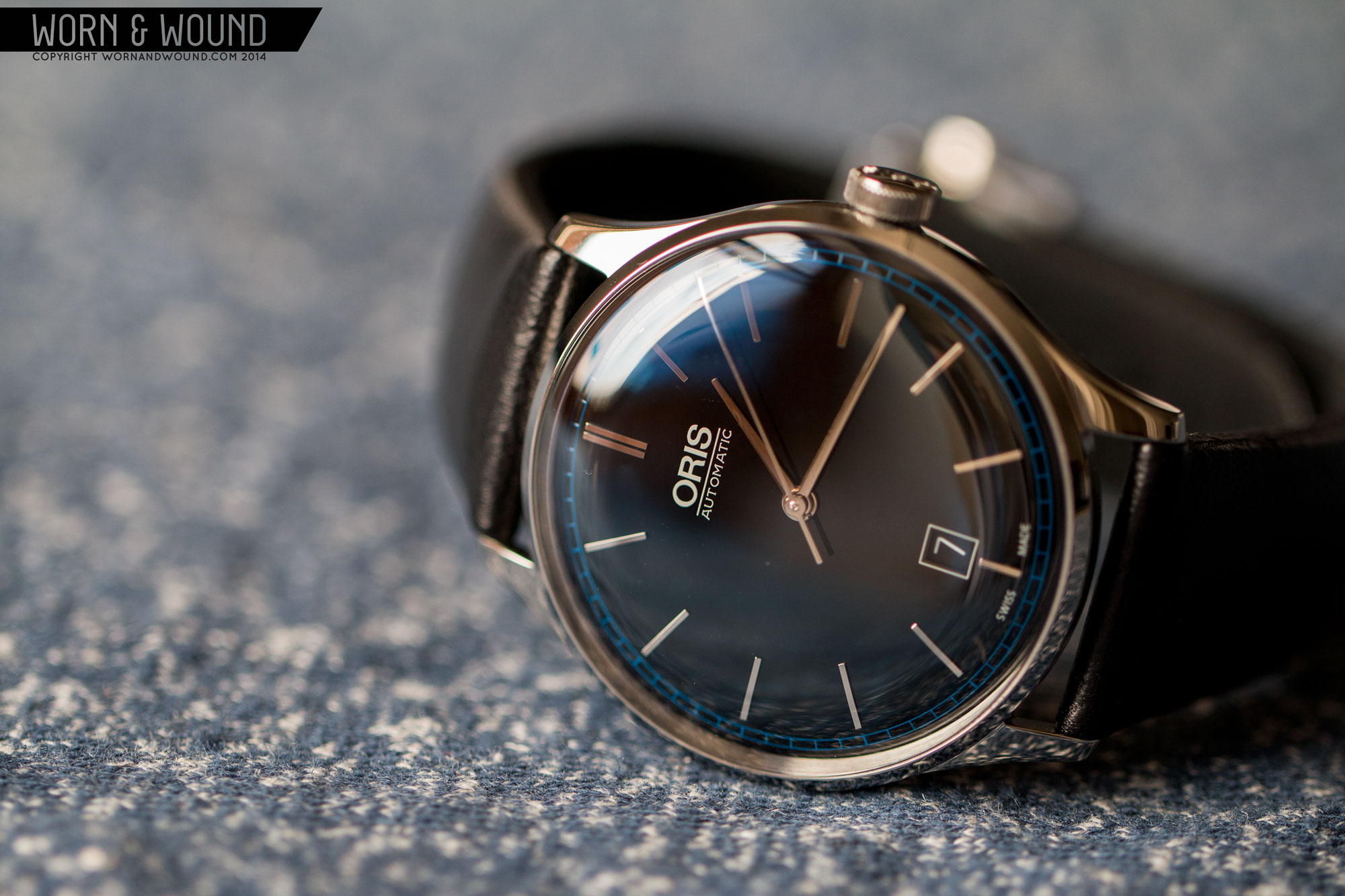
On the outer edge of the dial is a blue train track index for the minutes/seconds. As said in the intro, this is really the only Coltrane reference to be found on the watch, referring to his classic album, Blue Train. Looking at it as just a design element, it’s a great addition. The blue is intriguing, adding an unexpected dimension to the design, while still being very restrained. In some lights, the blue is nice and bright, and in others, almost not there at all.
Looking at it as a reference to John Coltrane, it’s clever and well executed. it might not be understood at first glance, but once the connection is made, it makes sense. For those who are Coltrane fans, it’s a nearly invisible reminder of the man and his music. For those who are more interested in just the watch, it’s easy to just enjoy the color and design.
The dial itself also domes slightly, rounding down at the edge, for a vintage “pie-pan” style. The curvature adds some dimensionality to the dial, playing off of the domed crystal. The minute and seconds hands are curved as well, further emphasizing this. Both the minute and hour are thin, polished steel sticks that taper ever so slightly, while the seconds hand is a hair thin wisp. All work with the style of the watch.
Straps and Wearability
The John Coltrane LE comes mounted to a 20mm black leather strap with no stitching. It’s a truly luxurious leather strap, with a full grain, super clean wrapped edges and a sueded back. There is plush padding in it as well, making it thicker than expected. The stitch-free design keeps it very classic and understated, not taking away from the watch. It’s also very tapered, coming down to 16mm at the clasp. Lastly, the strap is fitted with a Bader style (same type C Ward uses) deployant, which is very easy to open and close, and gives the watch a very clean look on the wrist as it hides the tail underneath.
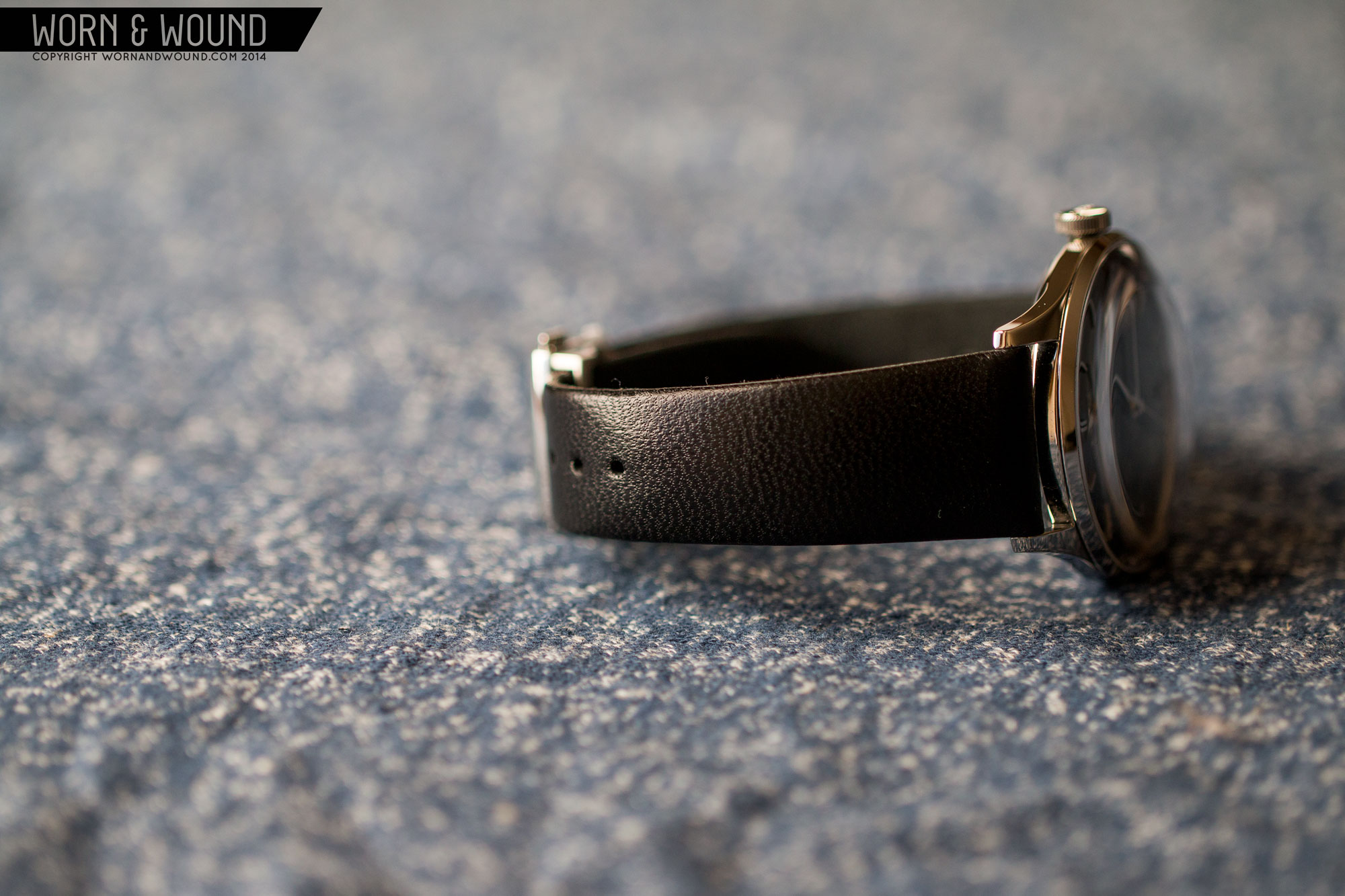
The Coltrane is a pleasure to wear. It’s perfectly sized sitting comfortably on top of the wrist. My wrist is 7″, and I think it would easily fit wrists both smaller and larger. 38mm also does not feel or look small in any way. It’s actually a fairly substantial watch, especially given the added height from the crystal. The 20mm lugs and strap add some mass as well. In the end, it has a vintage look but a modern and fairly robust feel.
Watches this style are easy to pull off as dress/formal watches, but also more business/casual. It’s perfect with a grey or blue suit or blazer and a white oxford, or with a sweater and some jeans. The hint of color on the dial adds personality and a tone one can play off, bringing out blues in other items.

Conclusion
As a clean, vintage styled dress watch, the Oris John Coltrane is abundantly successful. It’s simple and to the point and gets the little things right. The size is spot on, the hint of blue is cool and the crystal is magnificent. The fact that it’s tied into the musician John Coltrane is kept as a secret detail for the owner. One that they can share with others or keep for themselves. As a celebration of an artist, especially one who is deceased, Oris’ approach is respectful, and doesn’t try to overly use that person’s image or name to embellish the watch. When you think of modern “ambassador” watches that are typically garish and an insult to the eyes, the Coltrane shows how a brand with taste can approach the topic.
So, there is a lot to like about the watch. The one drawback, and granted it’s a significant one, is the price. At $2,200 MSRP, the Coltrane is a bit pricey for what it is. Yes, it’s executed as well as one might ever hope, but for a watch powered by the Sellita SW-200, it’s expensive. While it’s possible they are doing some modifications or decorations to the movement, they don’t make that clear. When compared to the Hamilton Intra-Matic, which is quite similar but at half the price, one does begin to ask where the additional cost comes in. In reality, that’s a very complicated question, but a major factor is brand positioning, Oris being an entry-level luxury brand, and the fact that this is a limited edition. While I firmly believe that this watch would be satisfying to those who are not necessarily Coltrane fans, I think the cost will most make sense to those who really want that aspect.

Picked up this one at almost half the price
Awesome looking watch. Where did you find it so cheap?
What is the model of this ball watch?
This is a Ball Trainmaster Eternity, they’re very nice
I agree that it’s overpriced. But Oris is not a “no name” brand and it’s also not part of the Swatch Group.
Thanks for the review.
It looks very nice…I am really drawn to the lovely domed crystal.
I wonder how it would compare in person to an edition of the Hamilton intra matic? Some of the design cues are similar.
Gorgeous piece, but I’m not sure about the pricing of it
This watch has quite a lot going for it, Hits all my design boxes & a band that fits the style just right. Blue tracks, very nice.
I suppose I’m the one that will have to mention the Orient Bambino…
But I’m a big fan of this particular Oris – it’s a spectacular minimal design and that blue chapter ring is an awesome detail.
I guess my only gripe is perhaps the underlined, all-caps ORIS logo. It looks austere and purposeful on their more tool-oriented watches, but here, I dunno – it just looks out of place, almost at odds with the overall aesthetic. Maybe it’s just me. This watch just begs for a low-key, vintage logo.
I’m normally the guy that blathers on about price, but I’m coming around to understanding that it isn’t always purely quantifiable.
It’s a gorgeous watch, better looking than the alternatives you mention – in my opinion. But indeed a shame about the price !
I really really like this style of watch. What this one have as a plus compared to the others that are similar is the blue around the edge. However, as many others, I find it too expensive given that the alternatives are a lot cheaper. I don’t really mind which automatic movement is in there, as long as it’s good quality stuff.
That being said, what are your thoughts about the TravisLeon crowdfunded watch? This watch is less domed, but larger and of course a lot cheaper.
Mmmmm…Daddy likes Coltrane…Baby likes Miles…MMmmmmm.