


 Featured Videos


It’s been a while since we last had an Alpina watch in for review, and much has changed at the brand since. Our previous encounter was with the Alpina Startimer Pilot Manufacture. I liked just about everything about it, especially the manufacture movement within and modest price tag, but had one gripe… it just didn’t feel like an original design. For everything it had going for, this one aspect just kind of undermined it. It seemed odd to me that brand with manufacture capabilities as well as a rich history and archive, would make something derivative.
Well, they seemed to have caught on as at the last two Basels they’ve begun to push their new Alpiner line, which draws inspiration from within. There are now many models within this series, such as their modern 4-line, which utilize their in-house GMT complication as well as in-house Flyback chronograph, and their vintage inspired models. It’s the latter we’ll be taking a look at today with the somewhat dryly titled Alpina Alpiner Chronograph Automatic 41.5.
These watches caught my eye when they were first released as they simply felt more stylish than anything else they had. There was a focus on the little details that make a watch nice, such as the crystal shape and dial colors, rather than an attempt at something flashy of overly masculine. They also were more modestly sized with 41.5mm cases, which is apparently important enough to earn a place in the very name of the watch. Powered by the AL-750, which is a re-titled and re-rotored Valjoux 7750, this Swiss-made watch comes in at $2,695, making it a bit pricy, but within expectation for the brand.
Alpina Alpiner Chronograph Automatic 41.5 Review
 Case: Steel
Movement: AL-750 (Valjoux 7750)
Dial: Warm Gray
Lume: Yes
Lens: Sapphire
Strap: Leather
Water Res.: 50M
Dimensions: 41.5 x 50 mm
Thickness: 14.3 mm
Lug Width: 21 mm
Crown: 7 x 4.4mm
Warranty: 2 Years
Price: $2,695
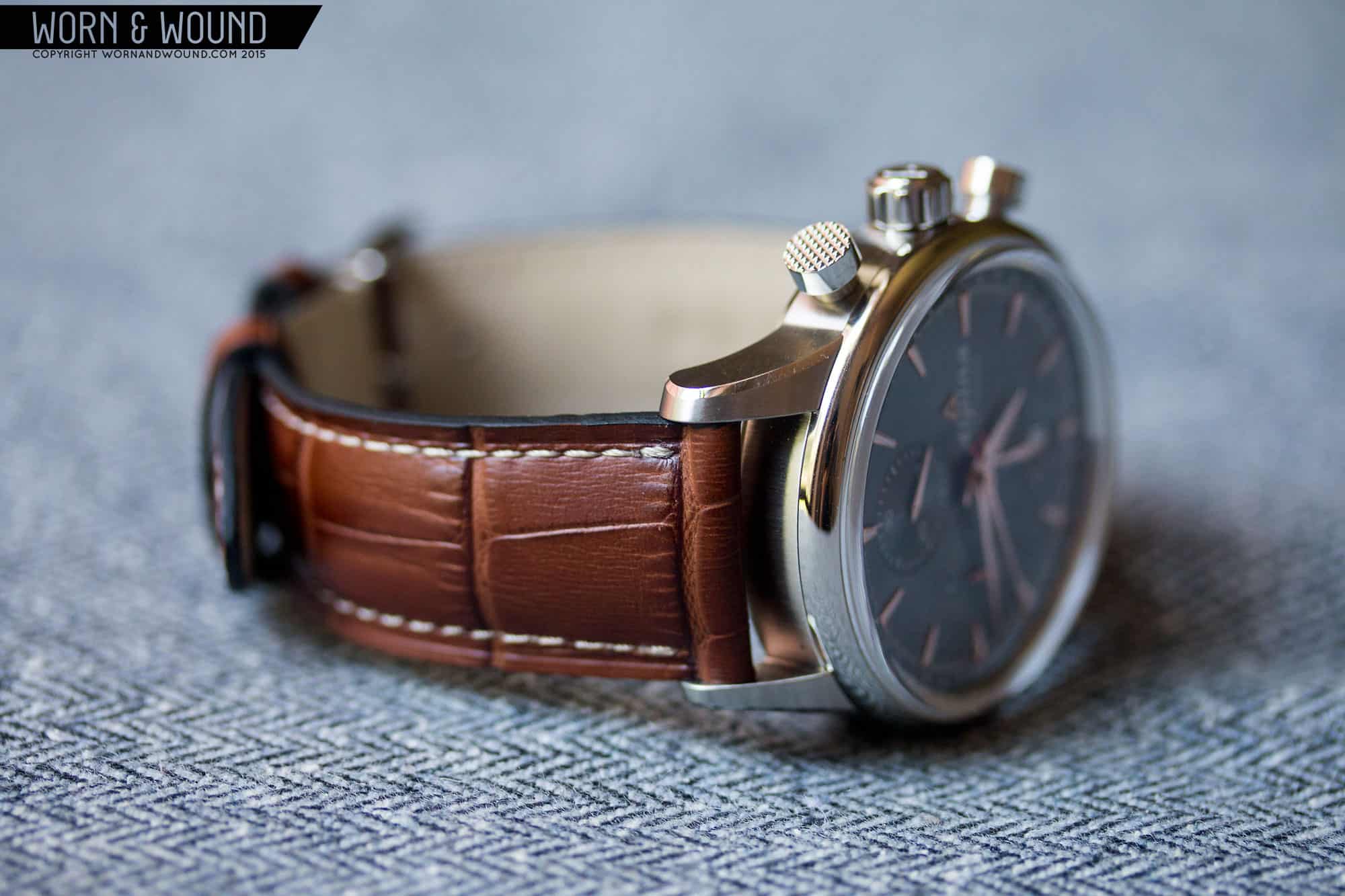
Case
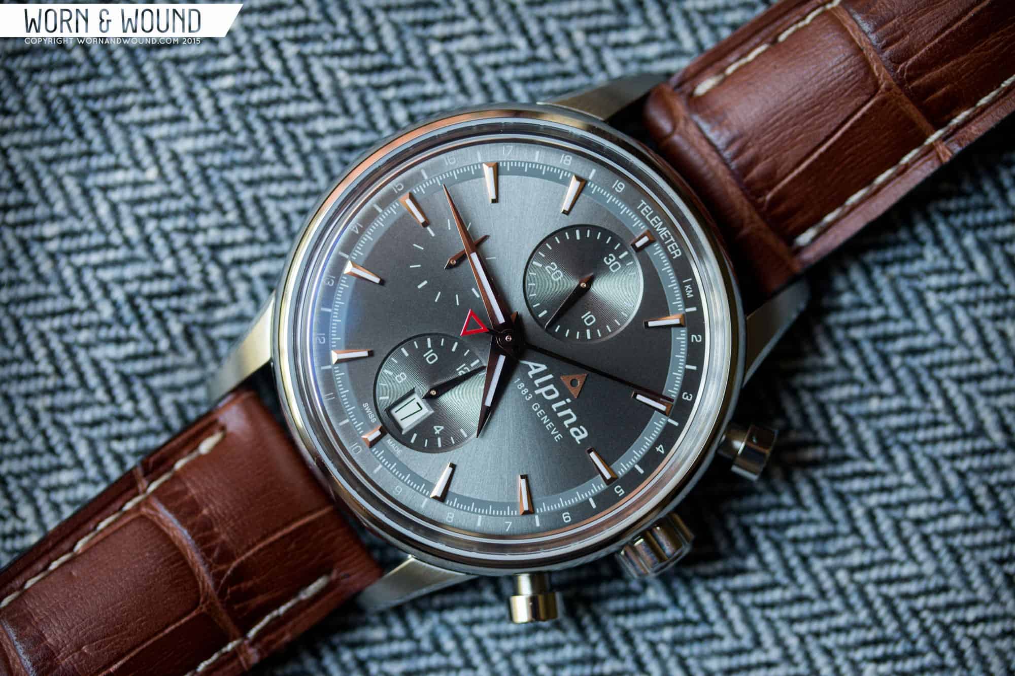
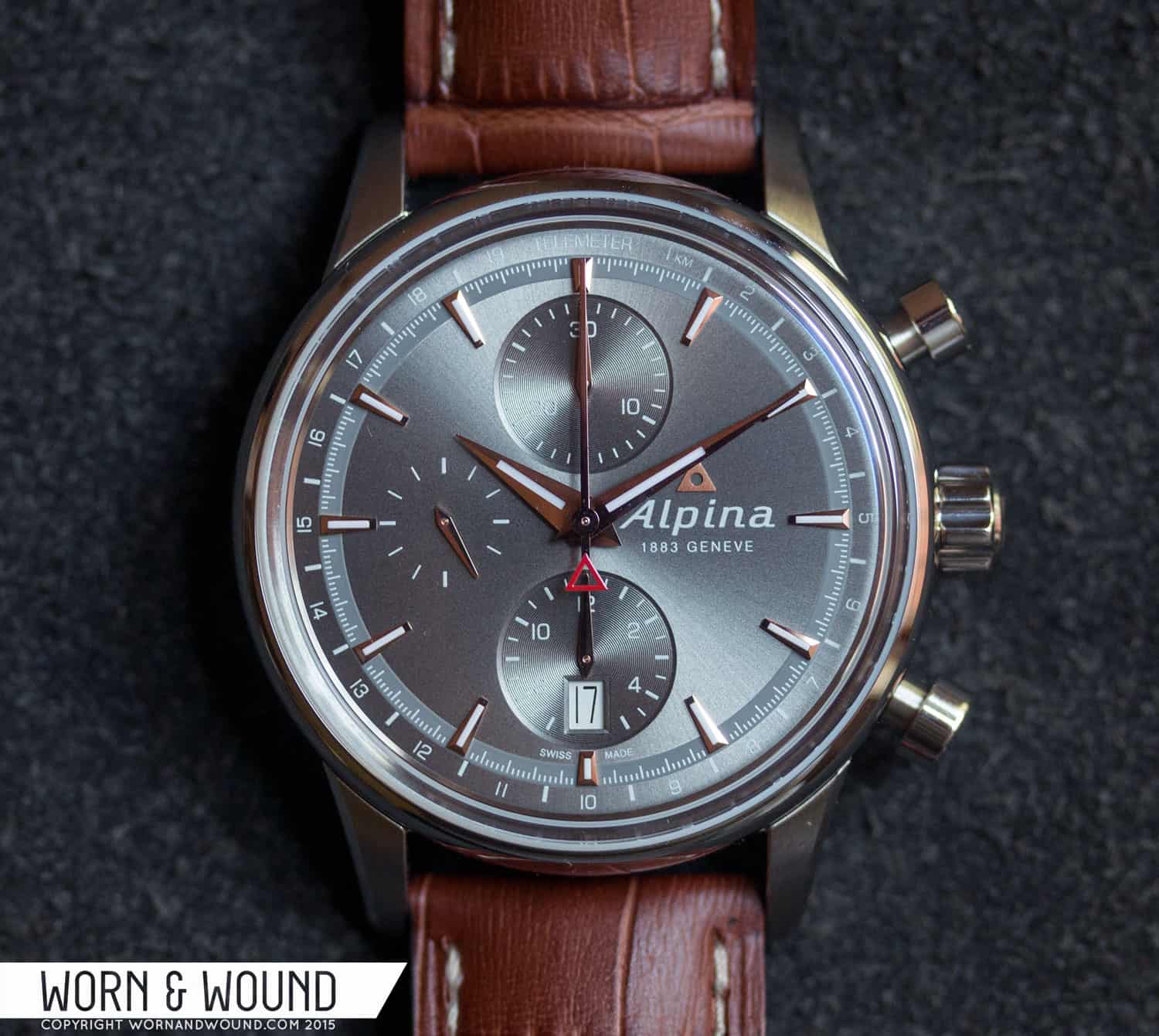
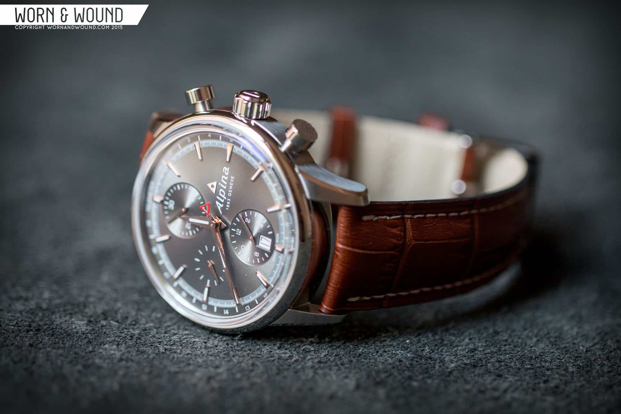
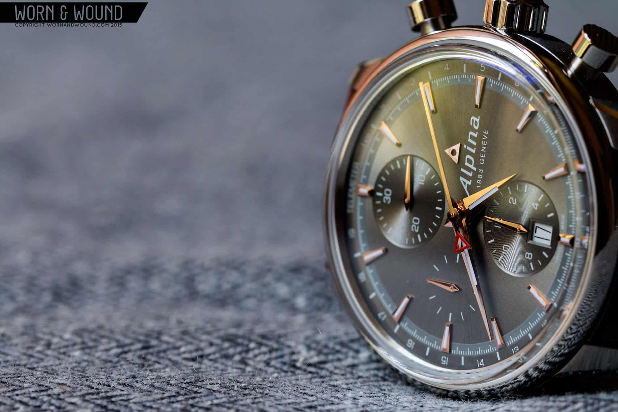
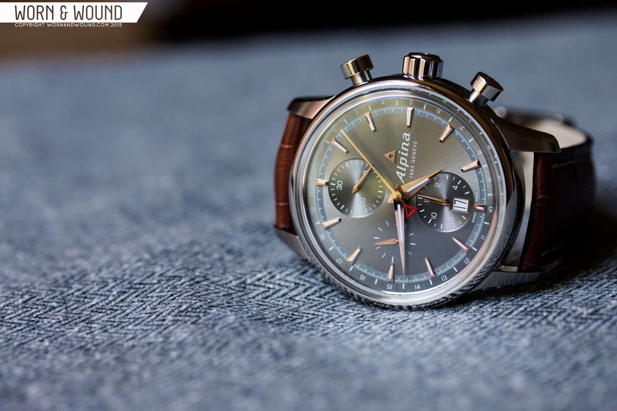
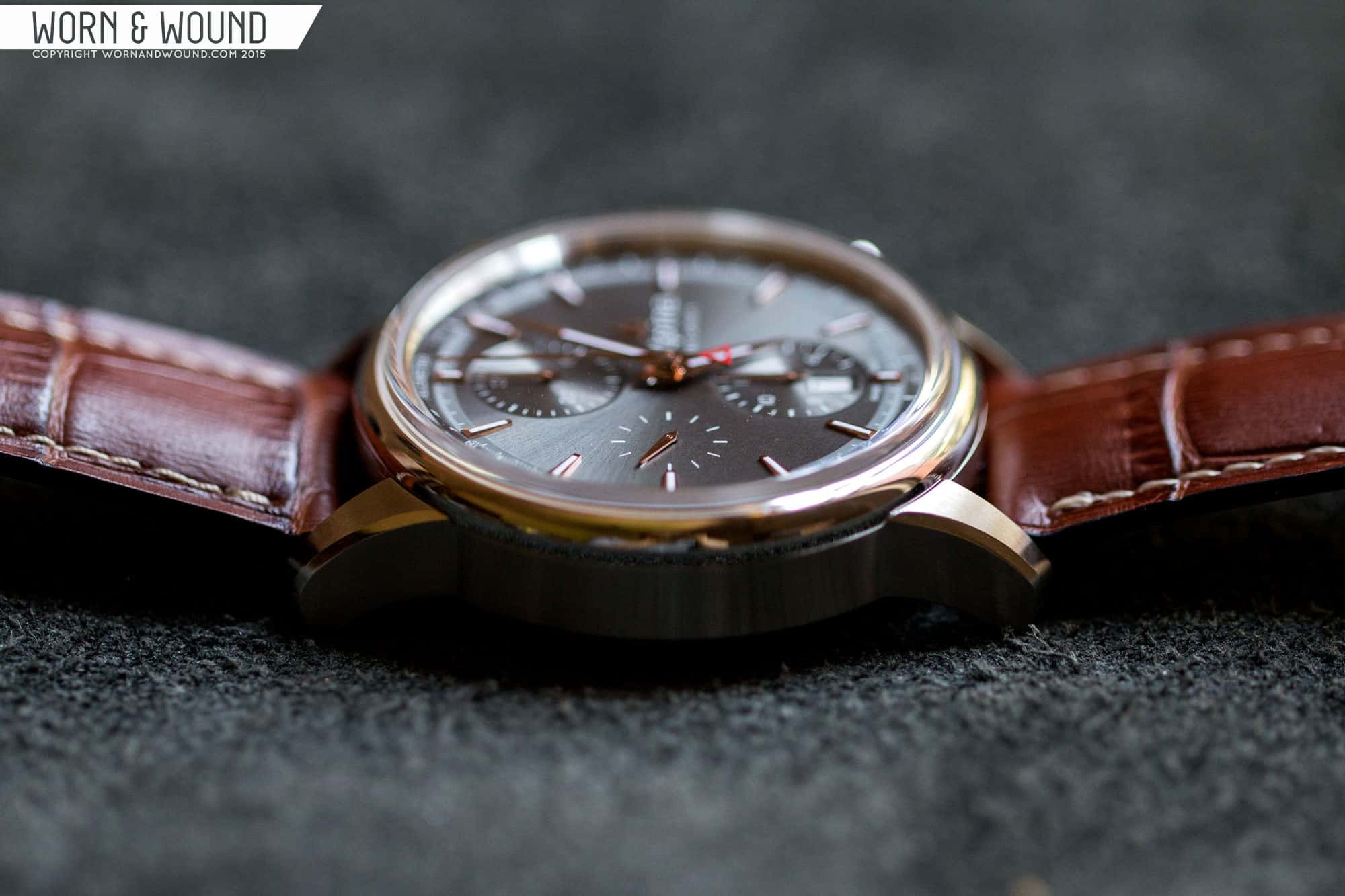
The Alpiner Chronograph has a clean case design that is elegant, but sporty. Coming in at 41.5 x 50 x 14.3mm (to the top of the sapphire) it’s medium/large though on the small side for Alpina, who lean toward the 44mm mark. This is because the design draws on their heritage, thus they wanted to size it in a more vintage way… while 38 – 40 would have been more apt, the case is well proportioned and thus a modern interpretation. The biggest nod to vintage designs is actually their crystal, which they describe as a sapphire box. It indeed comes straight up from the bezel, then sharply turns into a gentle dome, thus you get a sort of acrylic look. It’s a nice touch.
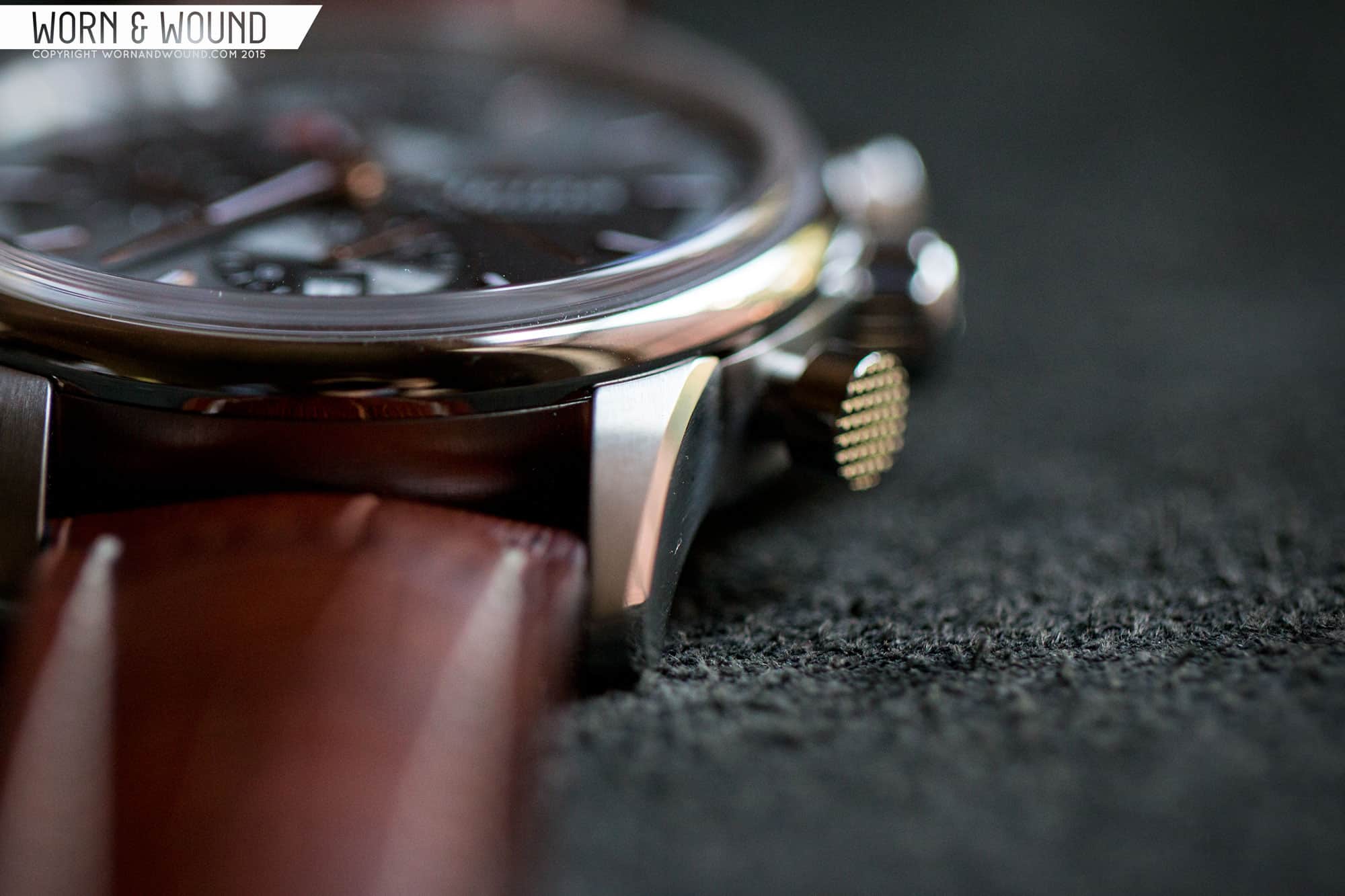
The case design itself is very simple and accentuated by some well executed finishing. The lugs are long, with a gentle curve and on their outer edge. They come up above the bezel ever so slightly, which gives a more finished look. The sides are slab with horizontal brushing, which contrast the full polished bezel. The nicest detail is the polished bevel on the lugs, which add just the right amount of glint in the light. Overall, the edges are very sharp, especially where one finish meets another.
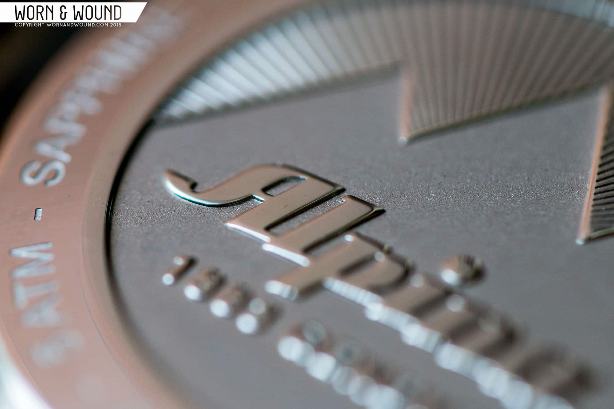
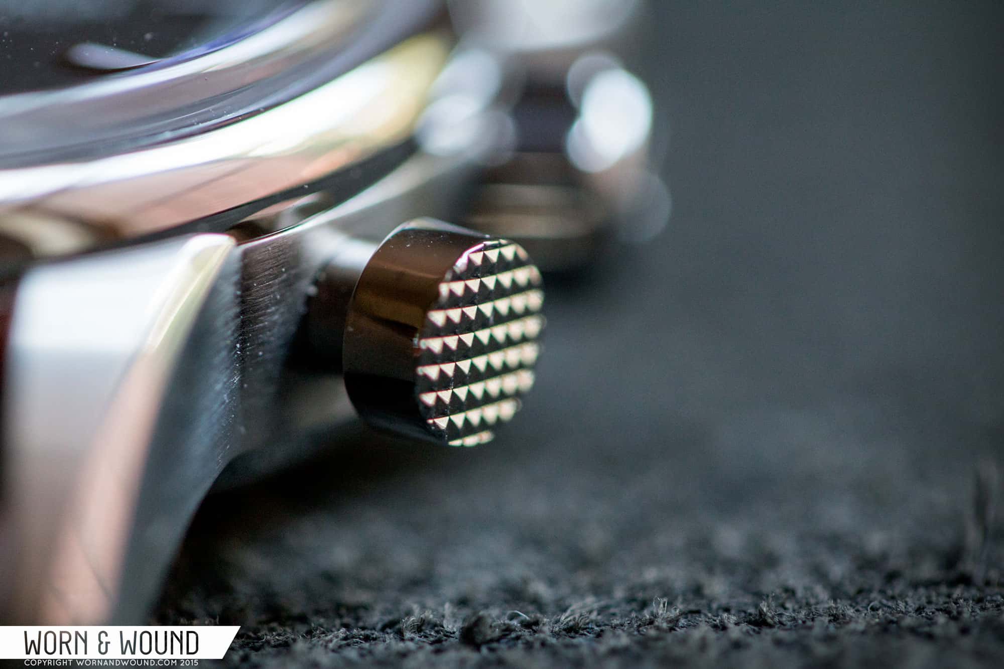
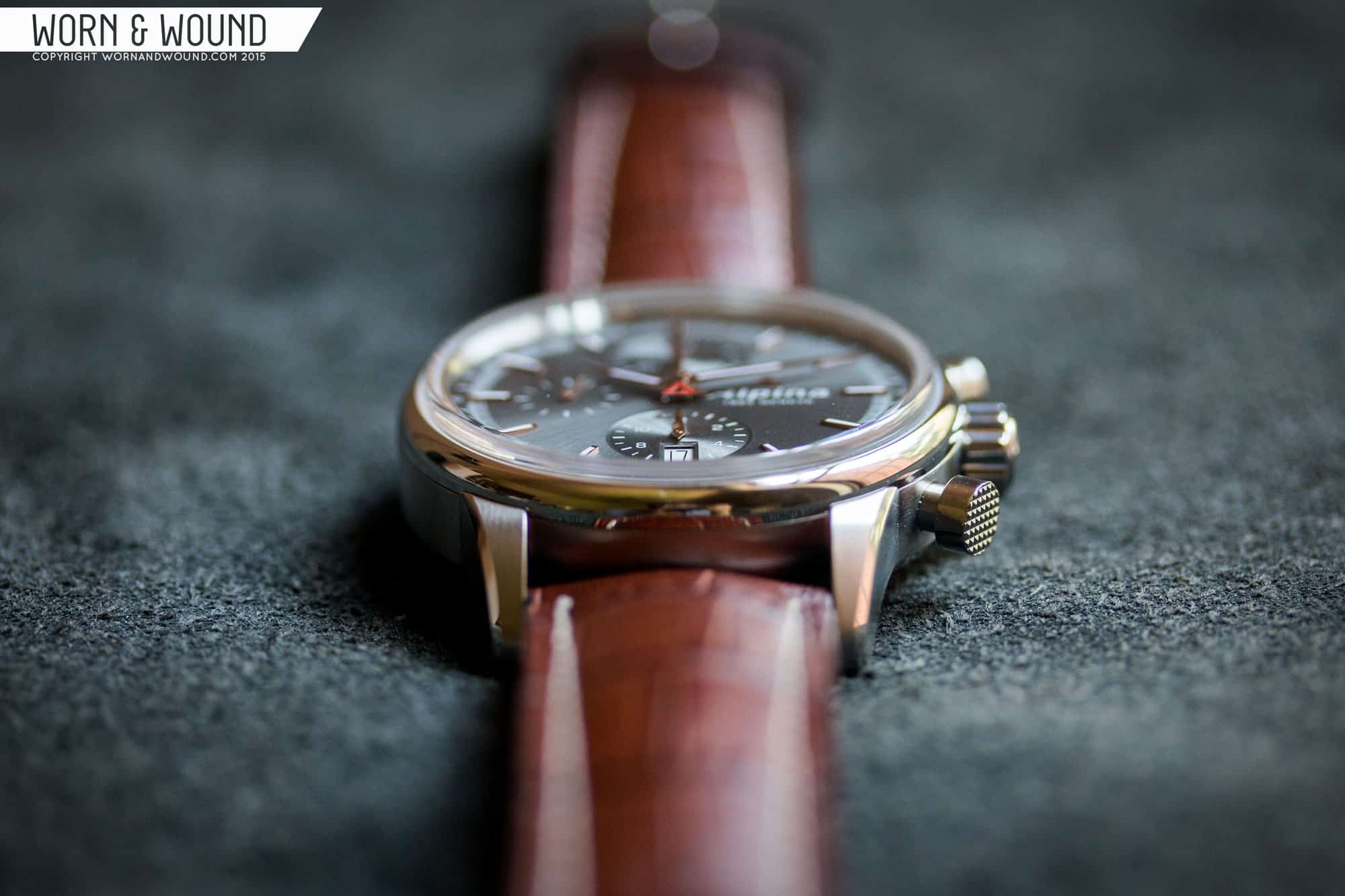
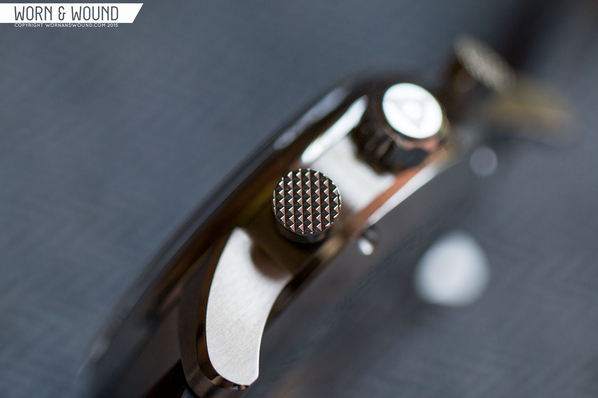
On the right side are the chrono pushers and the main crown. The pushers are a classic plunger shape with a nice diameter of 5.4mm. More over, their flat end has a knurled texture that beckons to be touched. Little details like this add the right amount of ruggedness to the watch, reminding you that it is a sport watch at heart. The crown comes in at 7 x 4.4mm, and has deep, wide grooves. It’s easy to grasp and turn, though a bit tricky to pullout given its polished finish. On the outside surface is the Alpina triangle logo, which is one of my favorite brand logos.
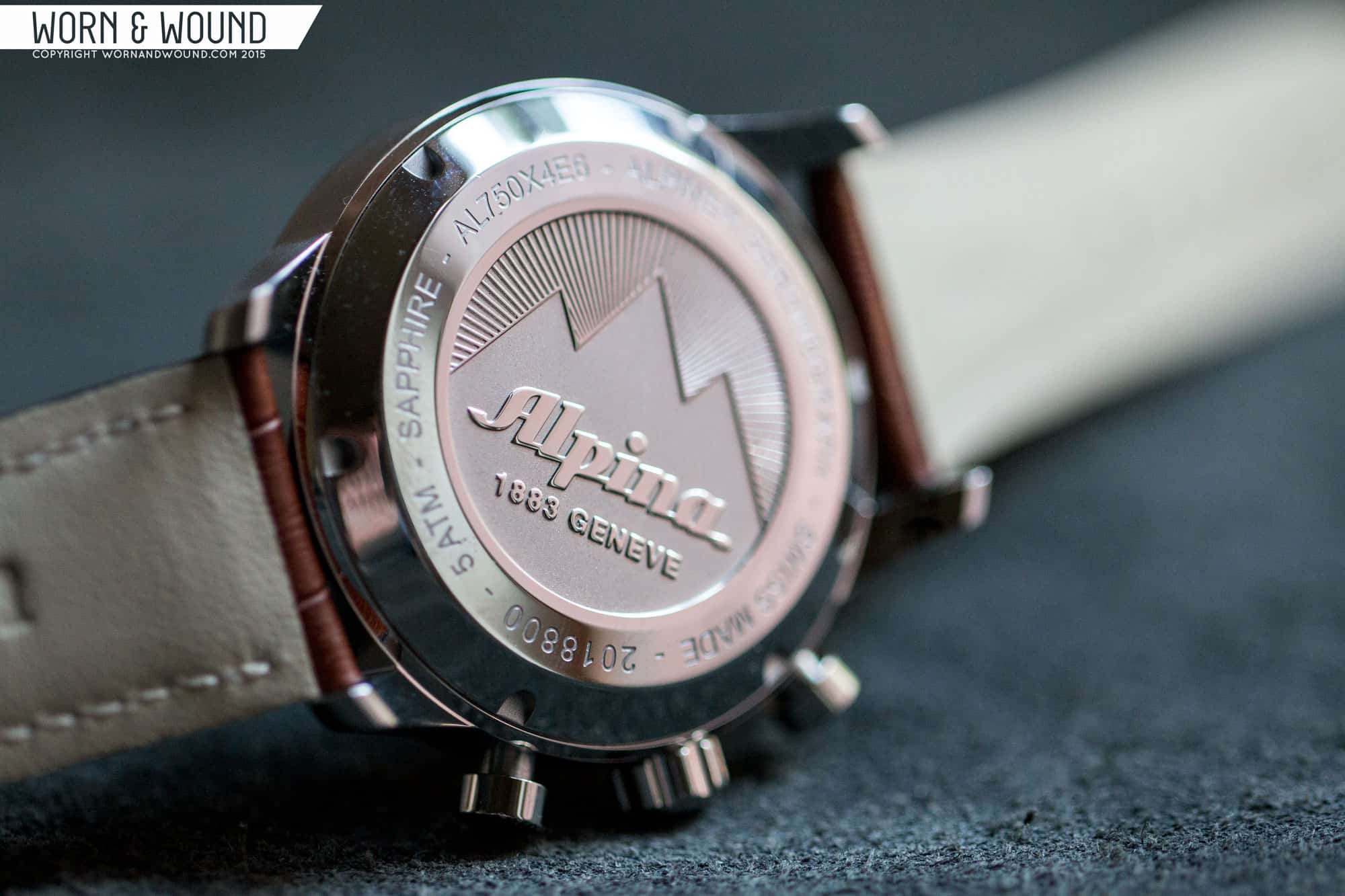
Flipping the watch over, you have a gorgeous solid, screw down case back. In the center, is a very deep engraving with the original Alpina logo set in some mountains with rays of light beaming out over head. Simple, but well executed, giving the watch a complete look.
Dial
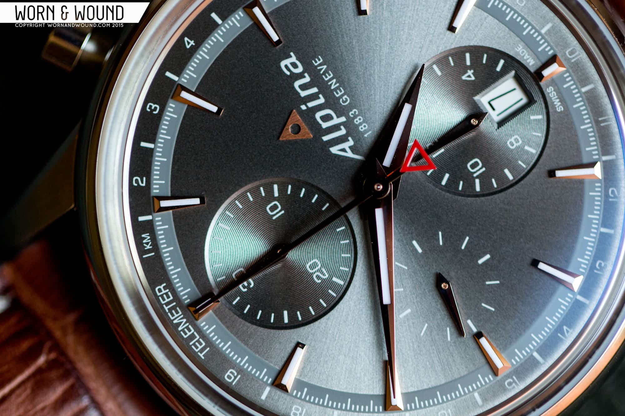
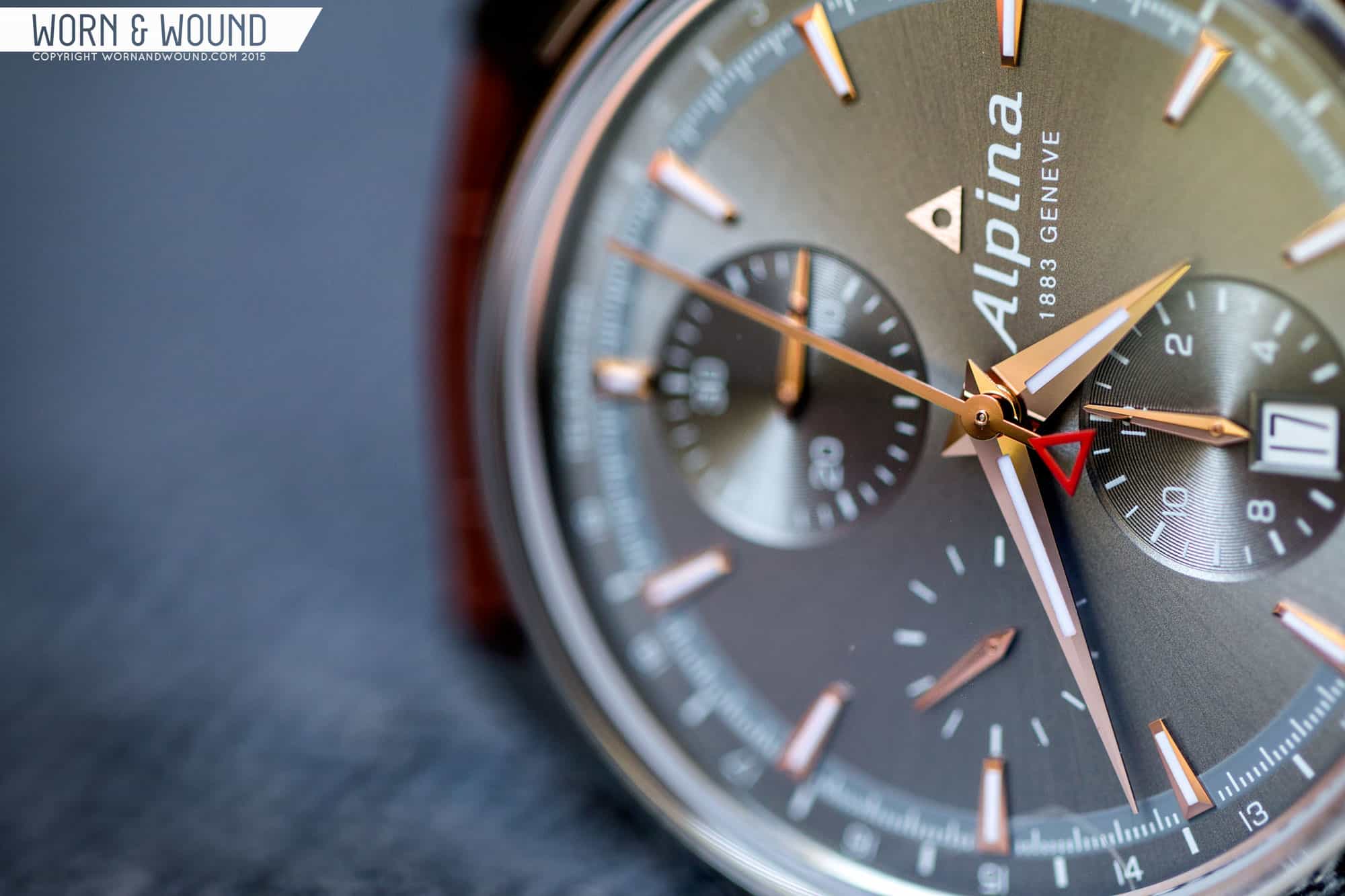
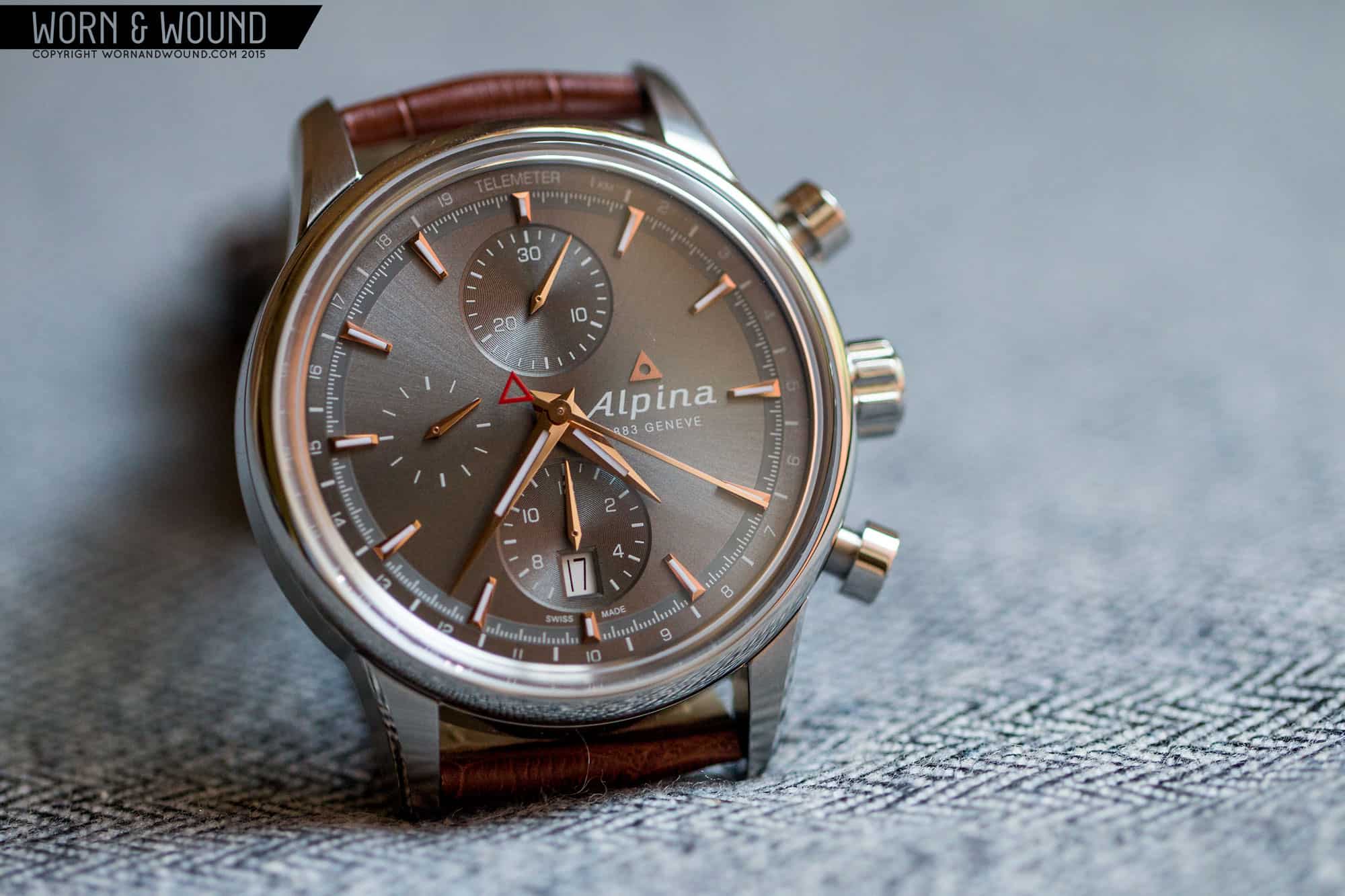
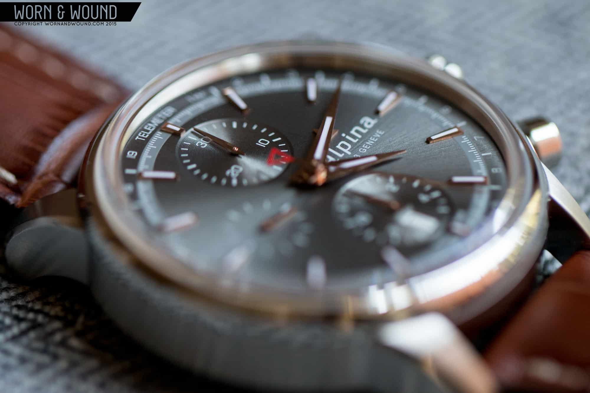
There are various color options for the Alpina Alpiner Chronograph, including sun ray black, a deep blue and a sort of panda-style as well, but we went with their gray and rose gold. This is one of those color combos that works so well, you wonder why you don’t see it more. Yes, the rose gold might dress it up too much for some or just be unappealing to others, but I find its inherent preciousness is toned down by the gray. Of course, not just and gray would work as well. The gray here is warm, with distinct brown tones, and is textured with a sun ray pattern, giving it more depth.
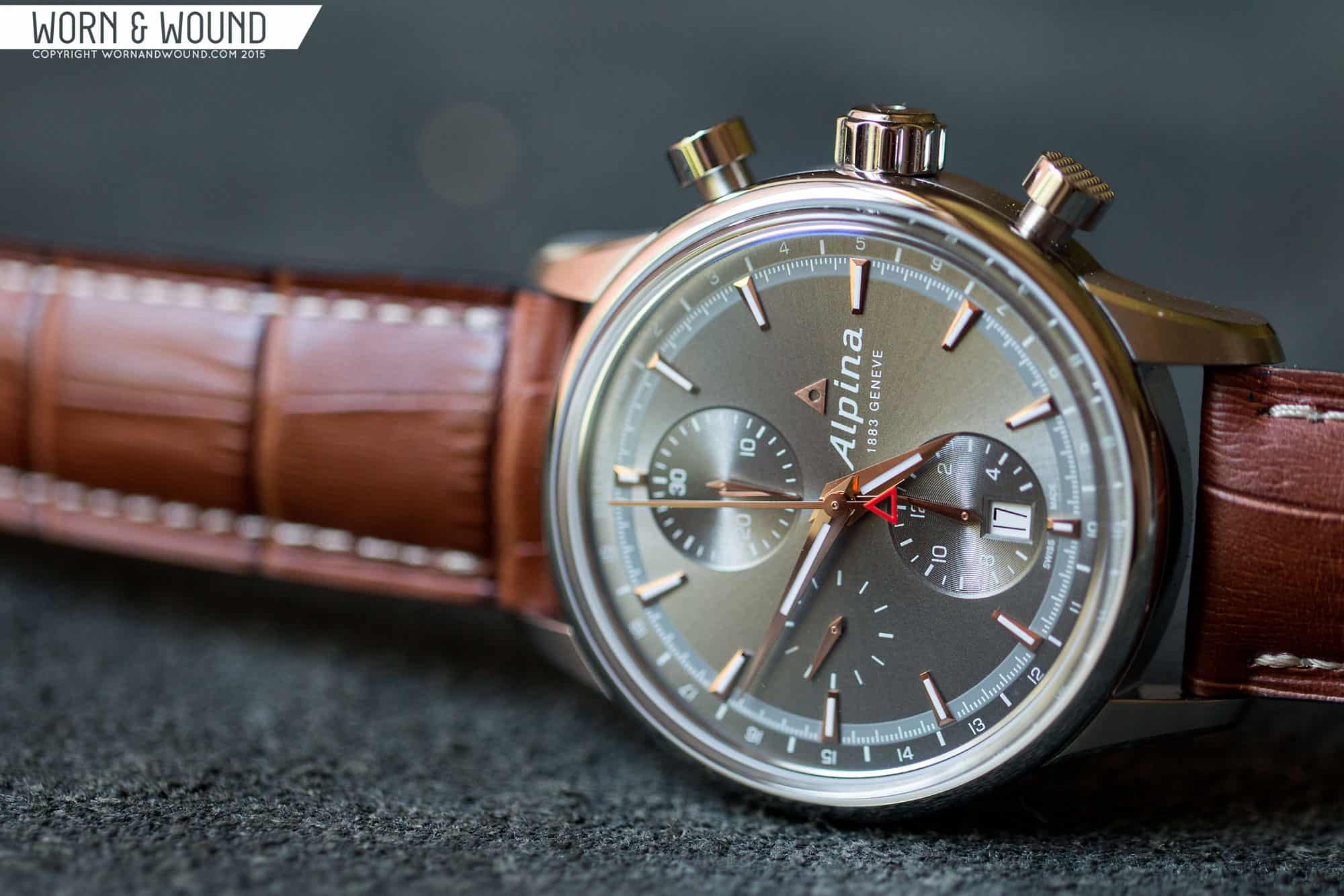
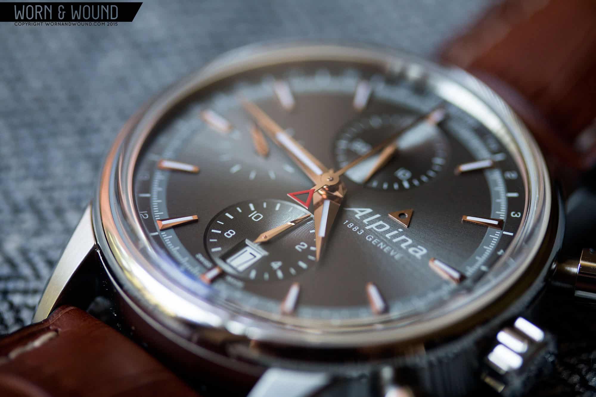
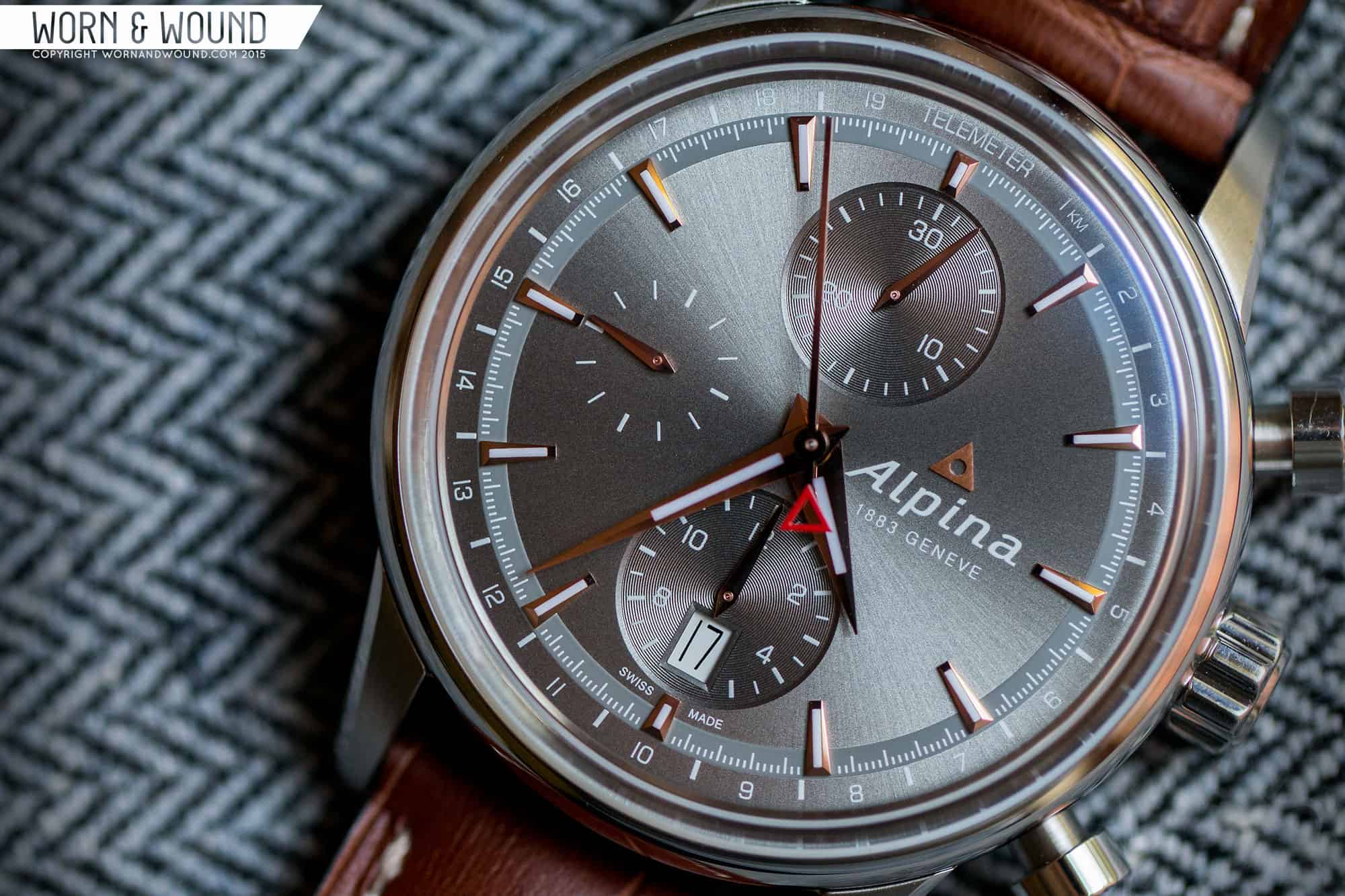
The dial itself is simple at a glance, coming across with an obvious vintage feel, but reveals more complexity under closer inspection. The primary index consists of small tapering applied markers in rose gold with lume strips. Each marker is faceted on all sides, making them reflect light in dramatic ways. Between each marker are white lines for the minutes and chrono-seconds, broken down to 1/5th increments. Interestingly, there is a break in the surface here, where it switches from umber gray sun ray, to a lighter, matte gray. This makes the white markers jump out, and creates an interesting play in textures.
On the very outer edge of the dial is a telemeter scale for use with the chronograph. Far less common than a tachymeter, telemeters are a fun throwback that actually measure the distance of something via light and sound. The most obvious use is during a storm. When you see a flash of lightening, start the chronograph, and stop it when you hear the thunder. The scale should read the distance of the strike in kilometers. Considering neither tachys or teles are really useful for day-to-day life, I have no preference with having one or the other. What I do like about telemeters though is that the index itself has equally spaced units, so they end up looking very clean.
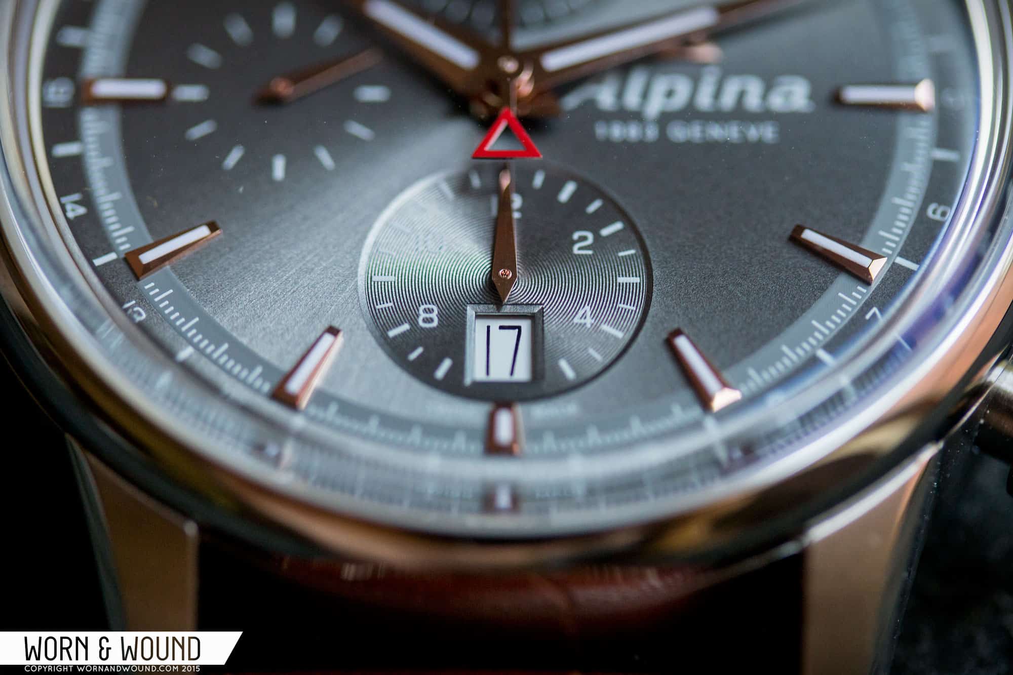
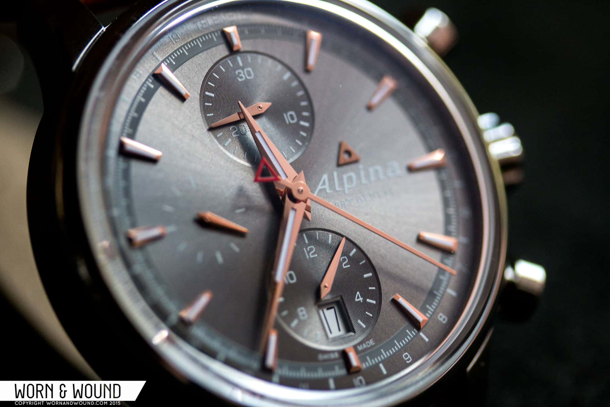
At 12, 6 and 9 are sub-dials for elapsed minutes, elapsed hours and active seconds, respectively. The chronograph sub-dials are both depressed into the surface and textured with concentric circular graining. This makes them stand out from the rest of the dial. Because they are located at 12 and 6, it also puts an emphasis on a vertical line through the watch, giving it an overall symmetrical feel. Both sub-dials feature small white numerals and white lines. The active seconds sub-dial is printed directly on the surface and features white lines at intervals of 5 seconds, getting bolder every 15. This lighter execution makes the seconds a second priority at a glance, and helps keep the balance of the design.
Just above 6, inside of the 12-hour chronograph counter, is a date window showing a black on white date. In this instance, the non-matching date doesn’t bother me, as it works with the gray surface, but I imagine a silver surface with black might have worked a bit better. Regardless, I like the location of the date as it fits with the layout. At 3 is the Alpina logo in white with a small applied, rose gold triangle logo above. It uses up the empty space that would otherwise be there, and balances out the sub-dials.
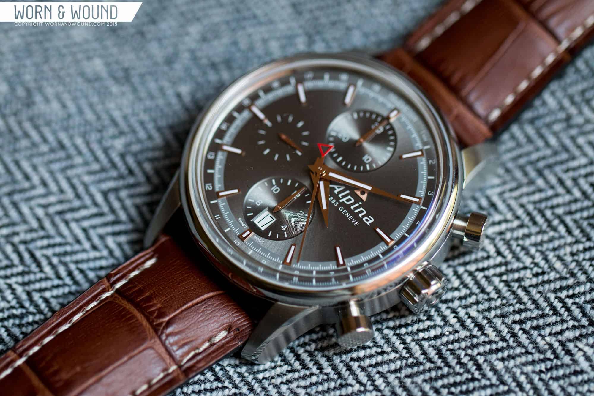
The hands on the Alpiner chronograph are all in polished rose gold, matching the markers. The hour, minute and sub-dial hands are all Dauphine style, with a slight dimensionality. The hour and minute also feature a touch of lume. This style of hand works well given the vintage styling as it is both bold an elegant, especially in rose gold. The chronograph seconds hand is a thin stick, also in rose gold, with a red Alpina logo counter weight. This touch of red is a nice accent on the dial.
Straps and Wearability
The Alpina Alpiner Chronograph features 21mm lugs (yeah, I know) and comes mounted to a faux-gator leather strap in honey brown. The strap tapers a bit and features off-white stitching. The color looks with the dial, bringing out the warmth in the gray and gold. That said, for the price of this watch, I really think it should have been actual Gator, which would have had a more luxurious look and feel.
On the wrist, the Alpiner wears well. It’s not a small watch, but it also isn’t big, and the size kind of makes sense for a chronograph. It’s not meant to be a dress watch, despite its more formal elements, nor is it a rugged tool watch. It’s sort of this happy medium that is a vintage-sport concept, which works as a business-casual design. On my 7″ wrist I found it sat well, and had a masculine appeal. It’s a tough tall, though that’s typical for a 7750 chronograph, which might be tricky under a tight shirt sleeve, but for something a touch more casual it would work.
It’s a very attractive watch, simply put. It’s well styled and proportioned. Nothing looks odd or out of place, and that dial just sings with the warms tones that emanate from it. The box sapphire also adds to the overall look and feel, giving you the sense that there’s a thick piece of glass over the watch, especially along the sapphire’s edge. The little polished touches, and those awesome knurled pushers add intrigue to the exterior where it is often missing. It’s an easy watch to become enamored with. A slight strap change, perhaps to burgundy cordovan or Gator (if you can find a 21mm…) and the look would really fall into place.

Conclusion
There is a lot to like about the Alpina Alpiner Chronograph Automatic 41.5 (you need to pause for a breath after saying that). In fact, I like everything but the price. At $2,695 there’s just a lot of competition, especially for a chronograph, and while this one totally succeeds at the look and feel it was going for, I’d probably spend my money on something with more technical features, but perhaps that’s just me. There’s also the fact that their own manufacture time-only watches are the same price. That said, that price is the MSRP, and one could likely find it for less if they were eager to buy it… and if they did, I know they’d be satisfied with it, as it’s well made, finished and styled.

Moreover, it’s exciting to see Alpina get on the right track. The brand has so much potential, especially as one of the few independent Swiss brands of scale, and the only thing it was really missing was a proper design identity. While these watches might still be a touch too generic-vintage, they are at least not derivative of other brands. Their Alpiner 4 collection, which is becoming the flagship of the brand, has a much stronger identity still. In fact, I think that in-house flyback might have to be next in queue for review.

Pics are still not working for me. Very disappointing.
41.5?
Hm, I think I might be able to live with that. But I’d want to try it on the wrist first.
Reminds me of the watches Victorinox used to make before they decided to make ‘fashionable’ hockey pucks.
I like it!
“then sharply turns into a gentle dome.”
This sentence is totally messing with my brain.
Handsome watch. Pity it would be a bit too big for my 7″ wrist.
I really like this one but I paid $750 for my Hamilton Khaki Pioneer Chrono, with a beautiful grey dial and a modified 7750 featuring a 60 hour pour reserve. Offers pretty much everything this one does and more, along with branding that has a better resale value IMO. I’m still finding it a bit hard to jump on the Alpina train but they are tempting me.
I am really sorry to revisit this article so long after it was posted, but I am extremely interested in this Alpina line, but can’t decide between the Blue dial and this Gray dial reviewed here. Do you think the Gray dial could successfully be worn with the stainless bracelet that is provided with other models in this product line? I am leaning yes, but wanted another perspective as I don’t want the dial to get washed out by so much metal.
Thanks for any input
I have the panda dial version, and I think the grey dial is more liable to look washed out with the bracelet?
Thank you very much for your input. I actually have a gray dialed oris aquis, which I love, especially up close. But I often think that it probably just looks like a silver/gray blob to anyone else. The Alpiner has more contrast with the rose gold accents, but I do appreciate your feedback. I have not been successful in finding any AD (or anyone else) with the blue dial to see in person.
I’ve ordered two Alpinas in the last month due to W&W reviews. I’ve currently got the Startimer Pilot Manufacture on wrist and, despite the somewhat derivative design, I absolutely love it. I just placed an order for the watch reviewed in this article – the panda dial version – and am eagerly awaiting its arrival.
The watch loving side of me thanks W&W profusely for alerting me to a brand I would’ve otherwise overlooked. The side of me that should be saving rather than spending shakes a fist at W&W for covering such cool watches.