


 Featured Videos


If a new mechanical chronograph is an exciting thing to see from a brand you like, a column-wheel mono-pusher is almost mind-blowing. A few weeks ago, Longines announced their dryly titled Column-Wheel Single Push-Piece Chronograph ref L2.800.4.53.0, and the mix of a cool movement and a sharp, early 20th-century aesthetic, made it really stand out. Part of their Heritage line, the new watch draws directly from what many might consider to be the “heyday” of Longines’ own history; the 13ZN caliber chronographs for the late 30’s – 40’s. First made in 1936, the 13ZN was a manufacture caliber from the brand that was available in many variations in its life; defining what a high-end chronograph should be.
At a glance, one might see the new watch and think, well, that’s Longines trying to pull off the Patek look, but it is in fact correct to the period of the source watches. From the wide tachy, to the leaf hands, down to the slender and almost stern type-face, all are pulled from the 30’s and 40’s. It’s a look that is often copied, but rarely correctly executed, as it defines a certain luxury aesthetic. With the historical tie in, Longines’ own eye for detail, and the sheer class of a through crown mono-pusher, it comes across well here; creating an accessible, though not inexpensive opportunity to obtain a modern watch with these looks. It’s attainable luxury through and through.
Featuring a decorated Longines’ L788 (ETA A08.L11) automatic column-wheel mono-pusher caliber, sapphire crystals and a genuine gator strap, the L2.800.4.53.0 has an MSRP of $3,150. This is inline with Longines’ other watches, such as the glorious Heritage 1973 we reviewed last year, and is to be expected from a Swiss-Made automatic chronograph meant for retail.
Longines Column-Wheel Single Push-Piece Chronograph ref L2.800.4.53.0 Review
 Case: Steel
Movement: Longines L788
Dial: Black
Lume: No
Lens: Sapphire
Strap: Genuine Alligator
Water Res.: 30M
Dimensions: 41 x 49 mm
Thickness: 14 mm
Lug Width: 20 mm
Crown/Pusher: 6.5 x 5.5mm
Price: $3,150
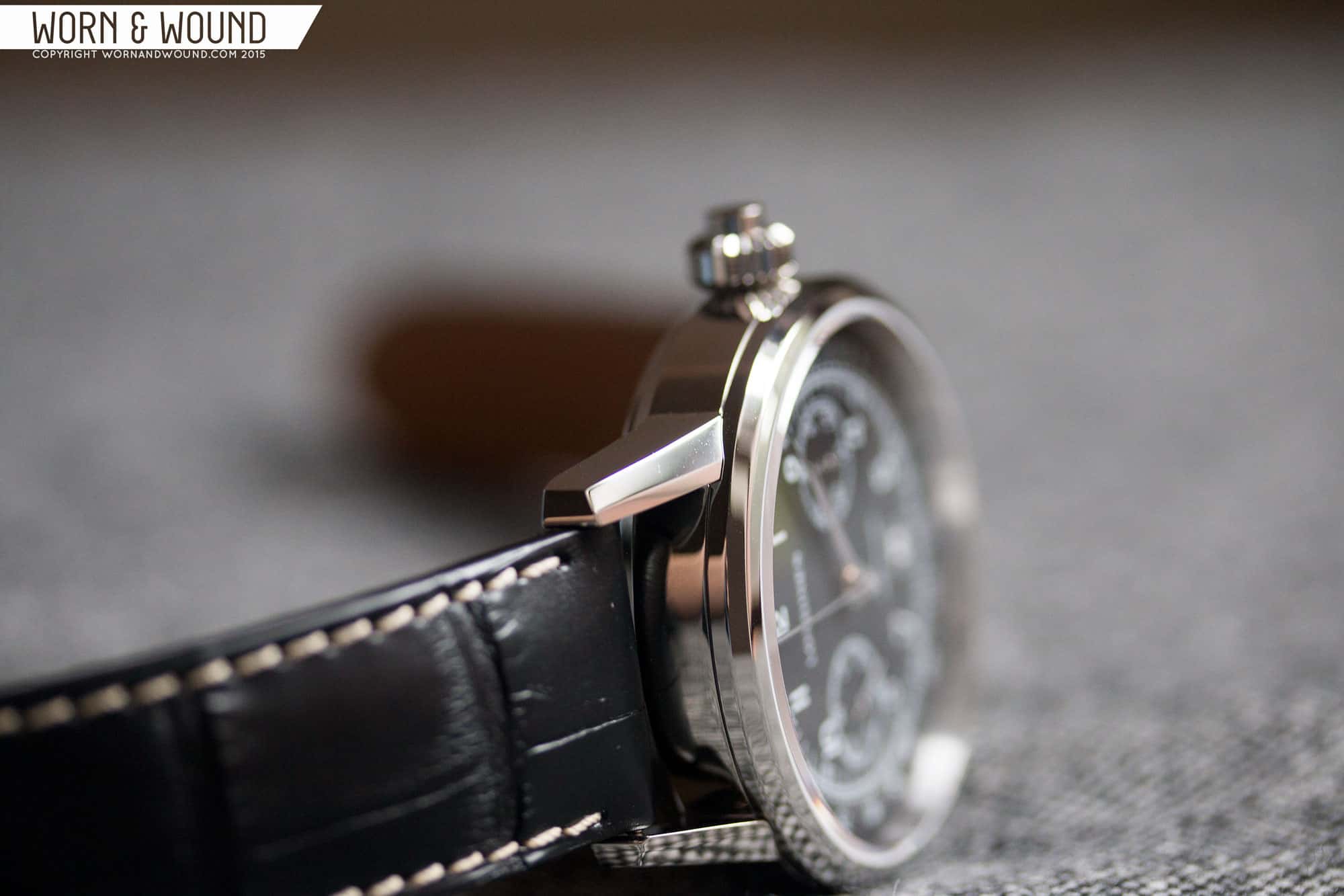
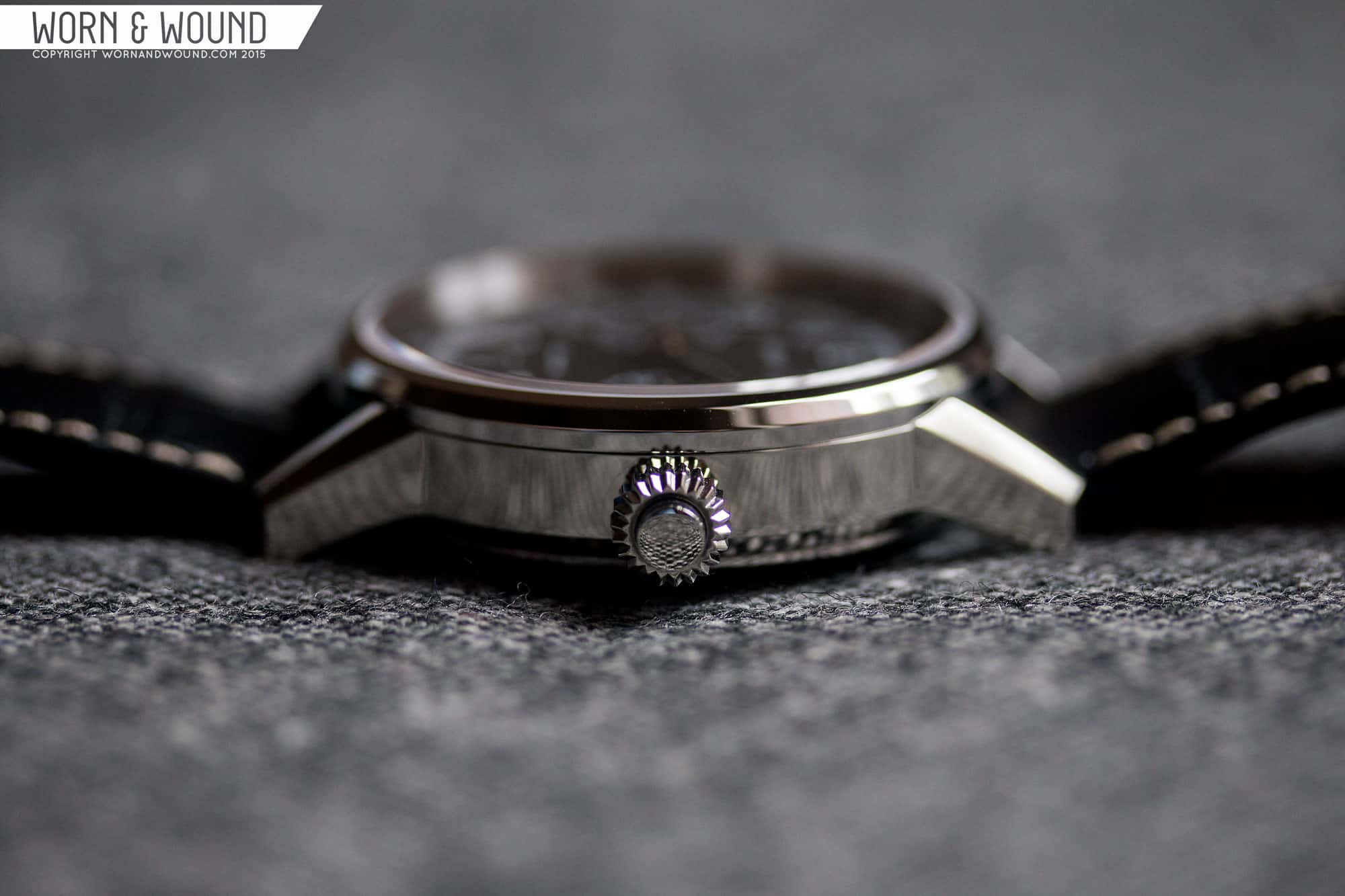
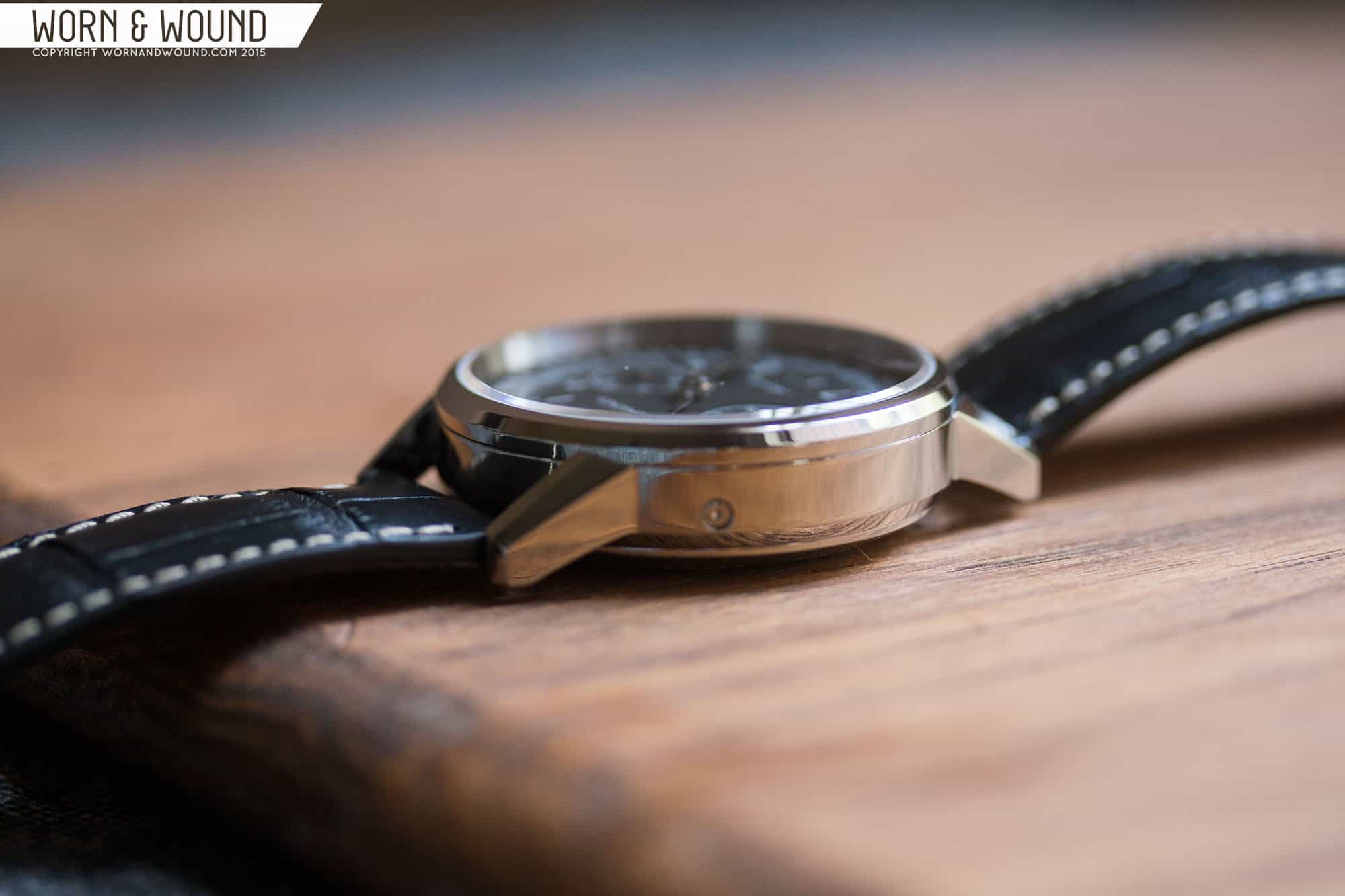
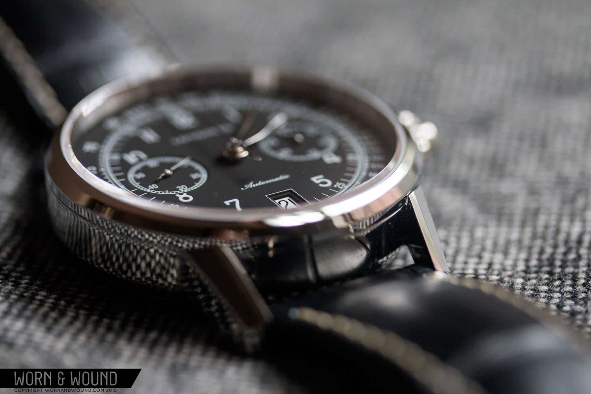
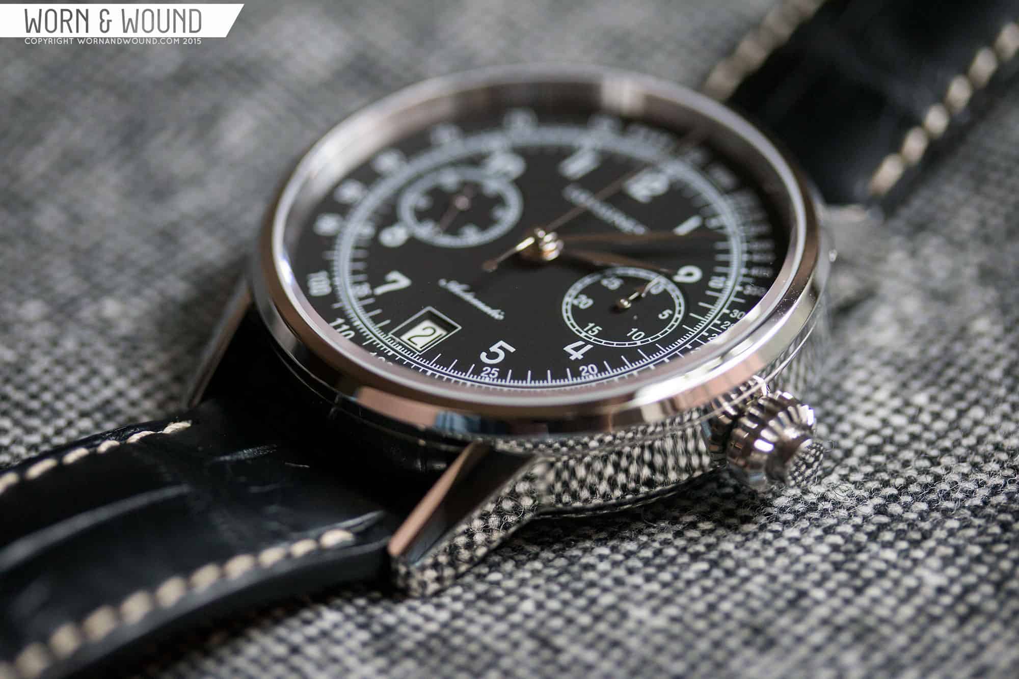
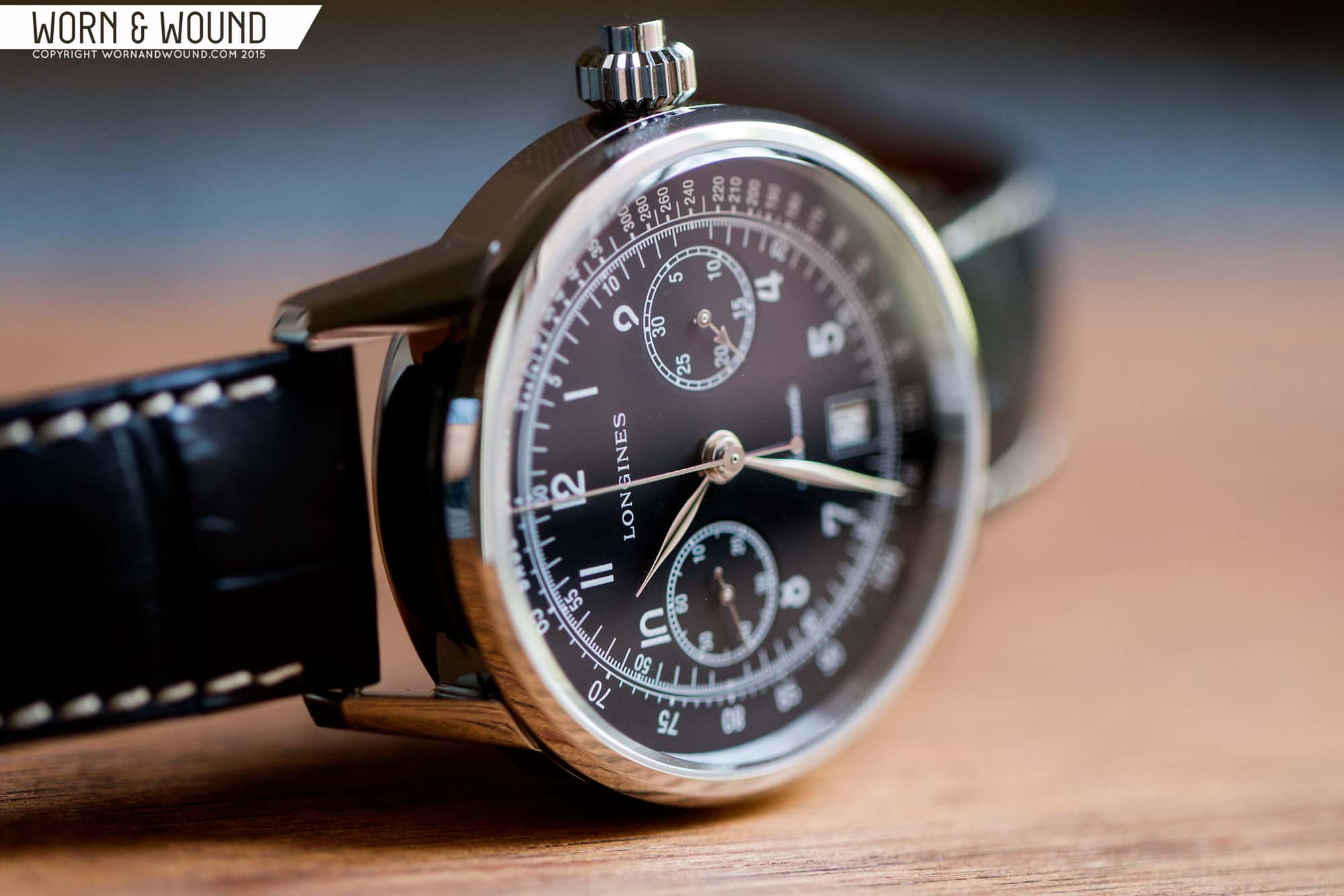
Case
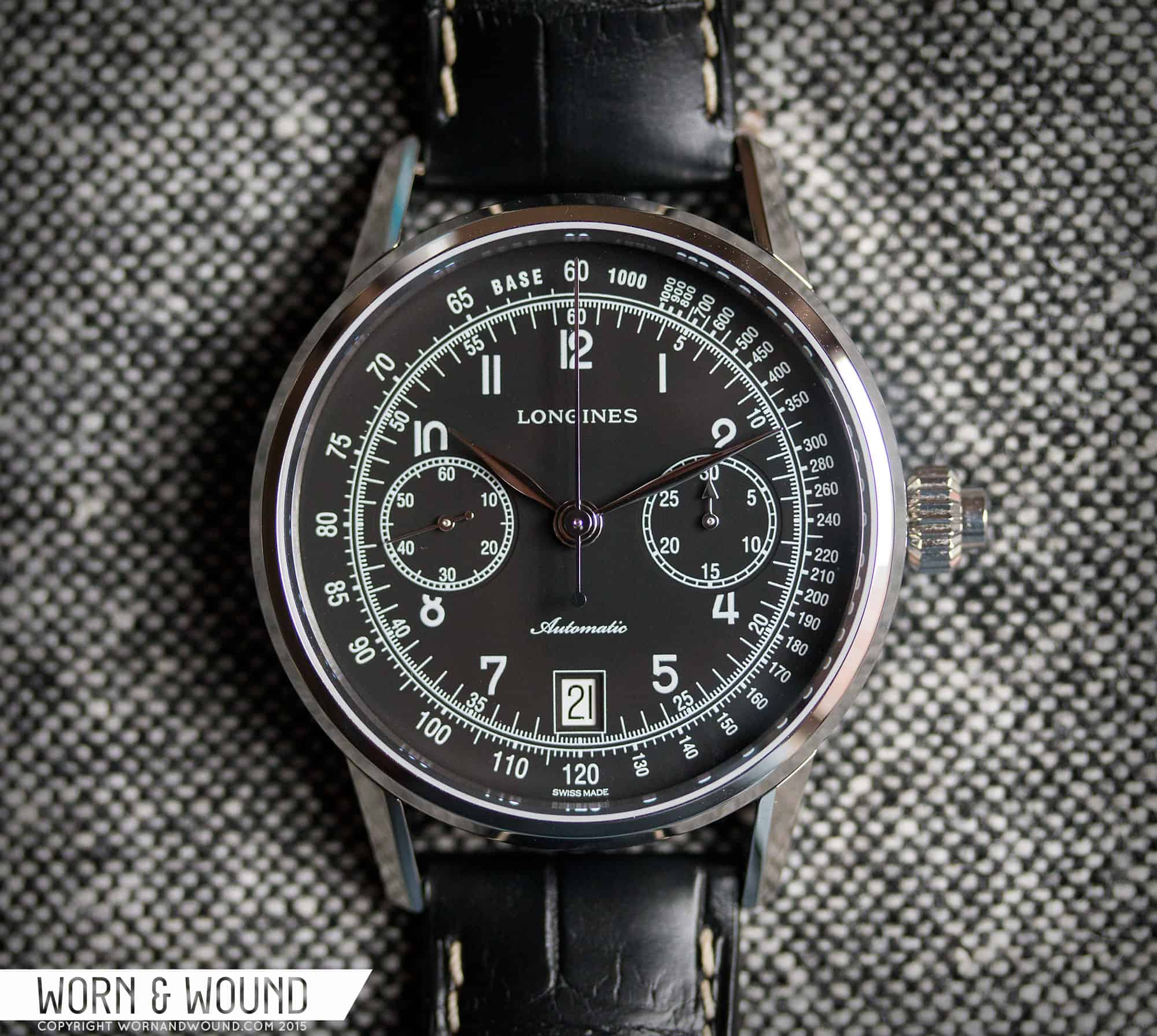
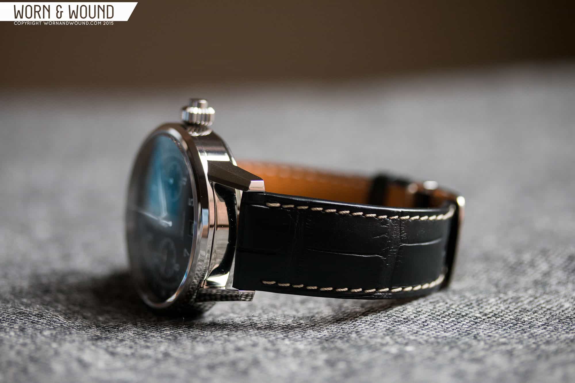
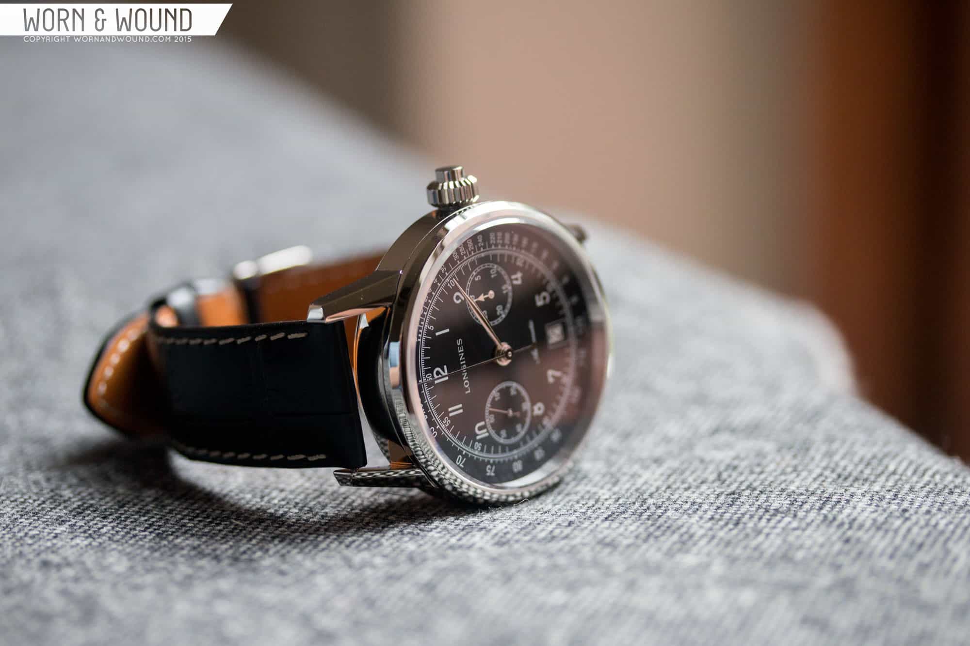
The case of the L2.800.4.53.0 is simple and elegant, gaining personality from some very attractive lugs. The first thing you’ll notice about the watch is that it’s fairly large. Coming in at 41 x 49 x 14mm, it has a sporty profile to say the least. Of course, that isn’t totally inappropriate for the style, which is “sport” of another time-period. That said it’s larger than its historical counter-parts, which would have been closer to 35mm. It’s also not far in diameter from some of the modern haute-heavy-hitters, such as the Patek 5170, which tend to hover in the 39.5mm range. The size is clearly based off of the L788 movement, with proportions coming from sub-dial locations and movement thickness. As such, while not a small dress watch, the proportions are very in tune, creating a piece that looks “right”, at least interns of width and length. I do wish they’d create a manual-wind version of this movement, saving a few millimeters in height as 14 does feel a bit tall.
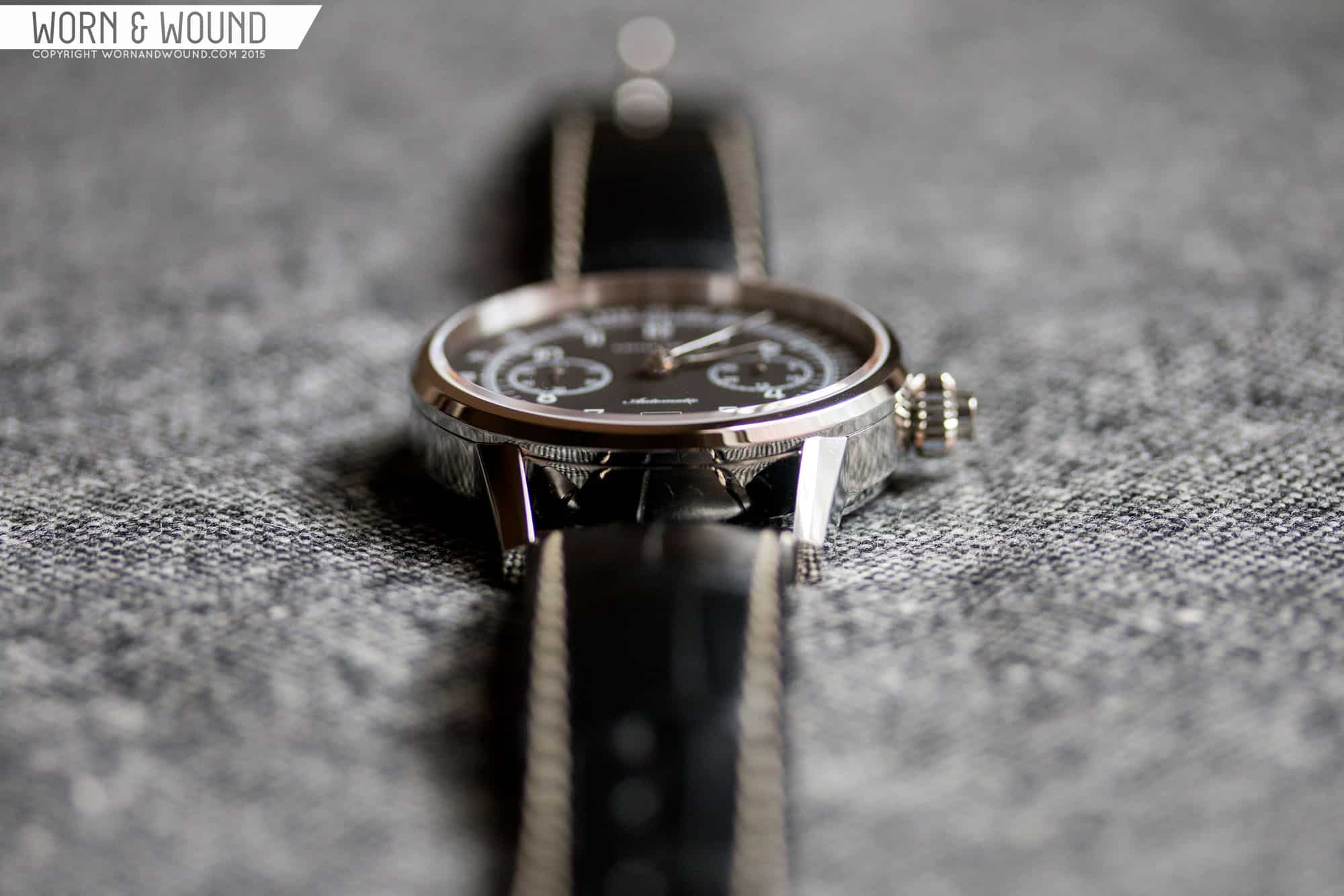
The design itself is fairly modest. The middle case is a cylinder with slab sides, capped with a thin bezel with a nice wide bevel. The lugs are a bit more unique, coming in at an angle, creating a tapering gap. So, while the lug-width at the strap is 20mm, where it meets the case it’s closer to 22mm. This isn’t something you see very often (the Nomos Orion being the only other that comes to mind) and it’s a simple and attractive way to make the lugs more interesting and appear longer. The lug geometry is then very angular, with various bevels and flat surfaces creating sharp and pleasing curves. The whole case is polished, making the various facets and bezels glint in the light.
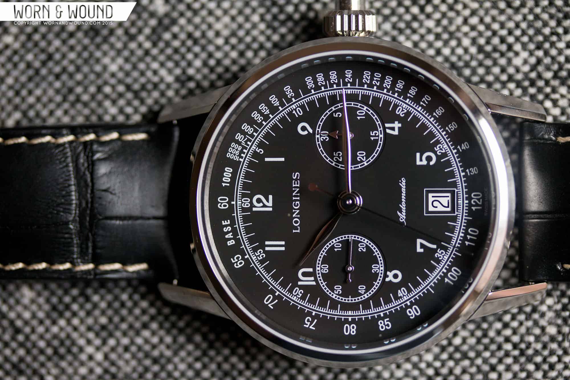
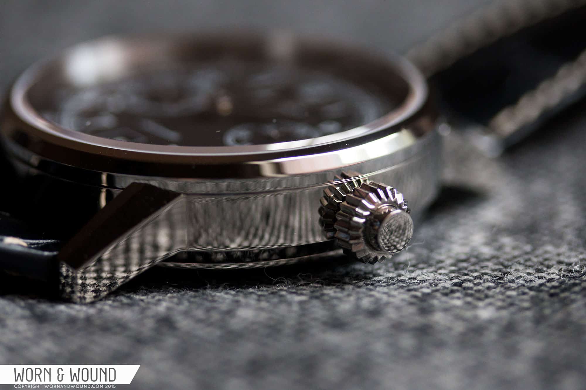
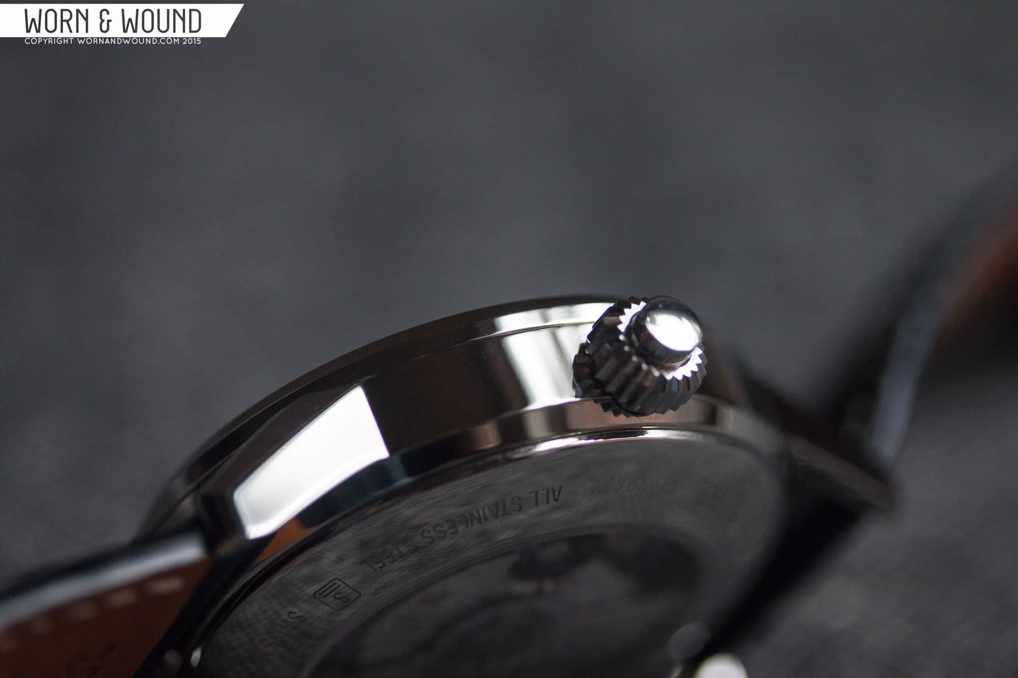
At 3 is the single pusher/crown, measuring 6.5 x 5.5mm. It has a classic mono-pusher design with a clean cylindrical pusher coming out of a thinner, coin-edged “crown”. It’s fairly subdued in its execution, with no real special attention paid. That said, it suits the watch’s style and design. By lacking the classic chrono-pushers, the watch has a cleaner, more formal look. By ten is a sunken pusher used for changing the date, removing that function from the crown all together. It’s an innocuous detail you’ll only notice when you need to use it.
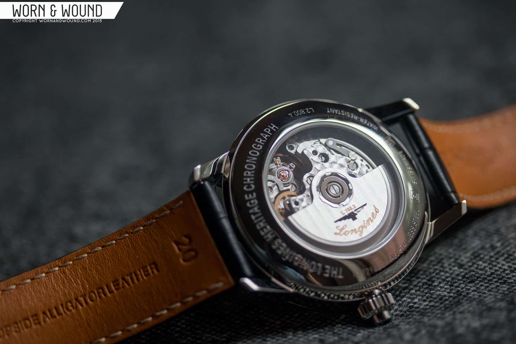
Flipping the watch over, you have a display case back showing off the L788 movement within. Longines/ETA decorates the movement nicely with perlage throughout and a big blue column-wheel and their branded logo, which is vertically striped with cote de Geneve. It’s a nice view to say the least, made even more engaging by the column-wheel.
Dial
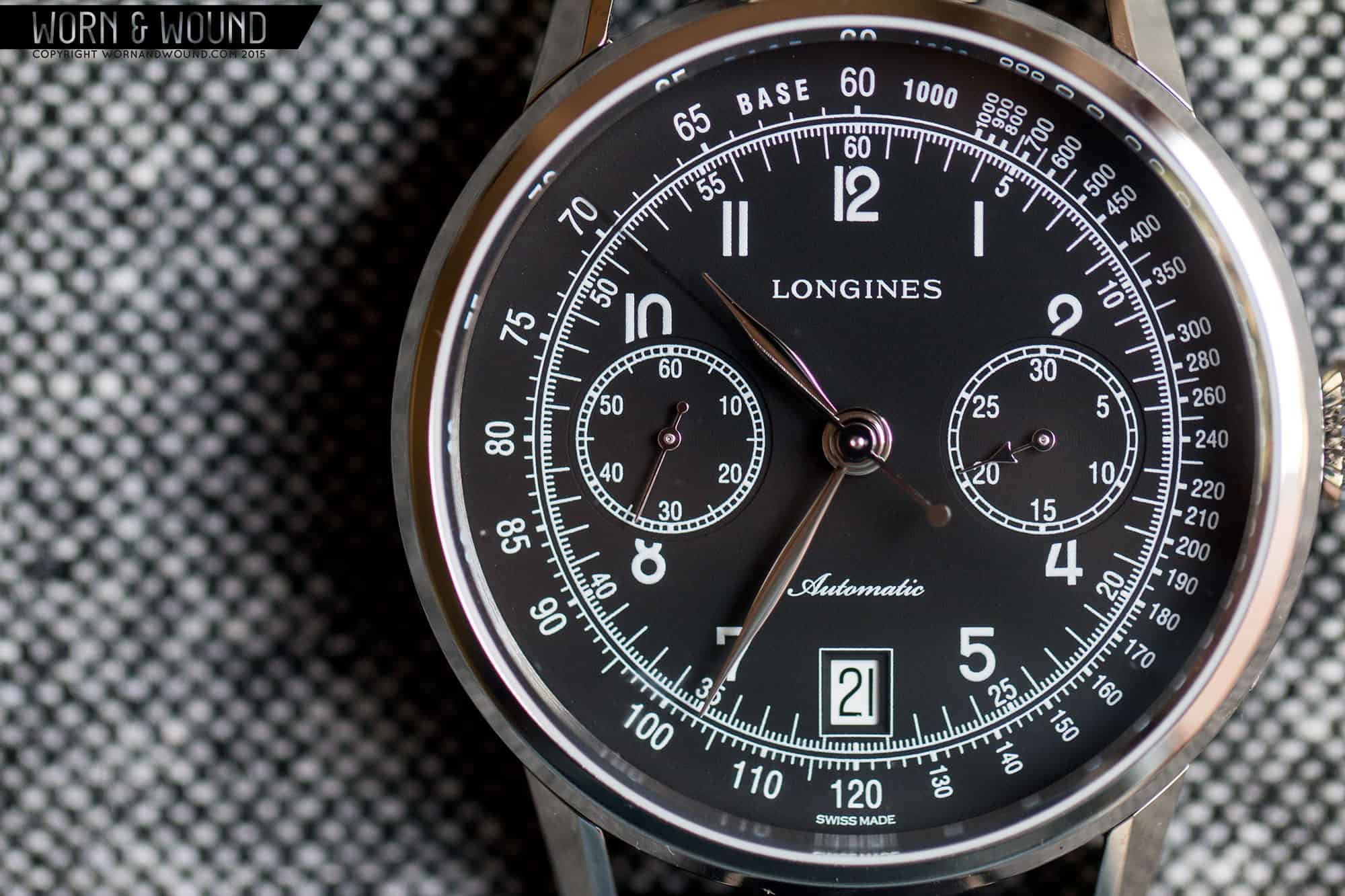
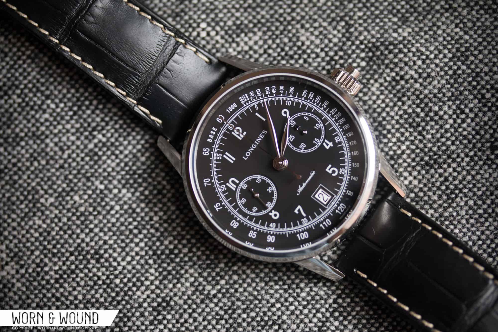
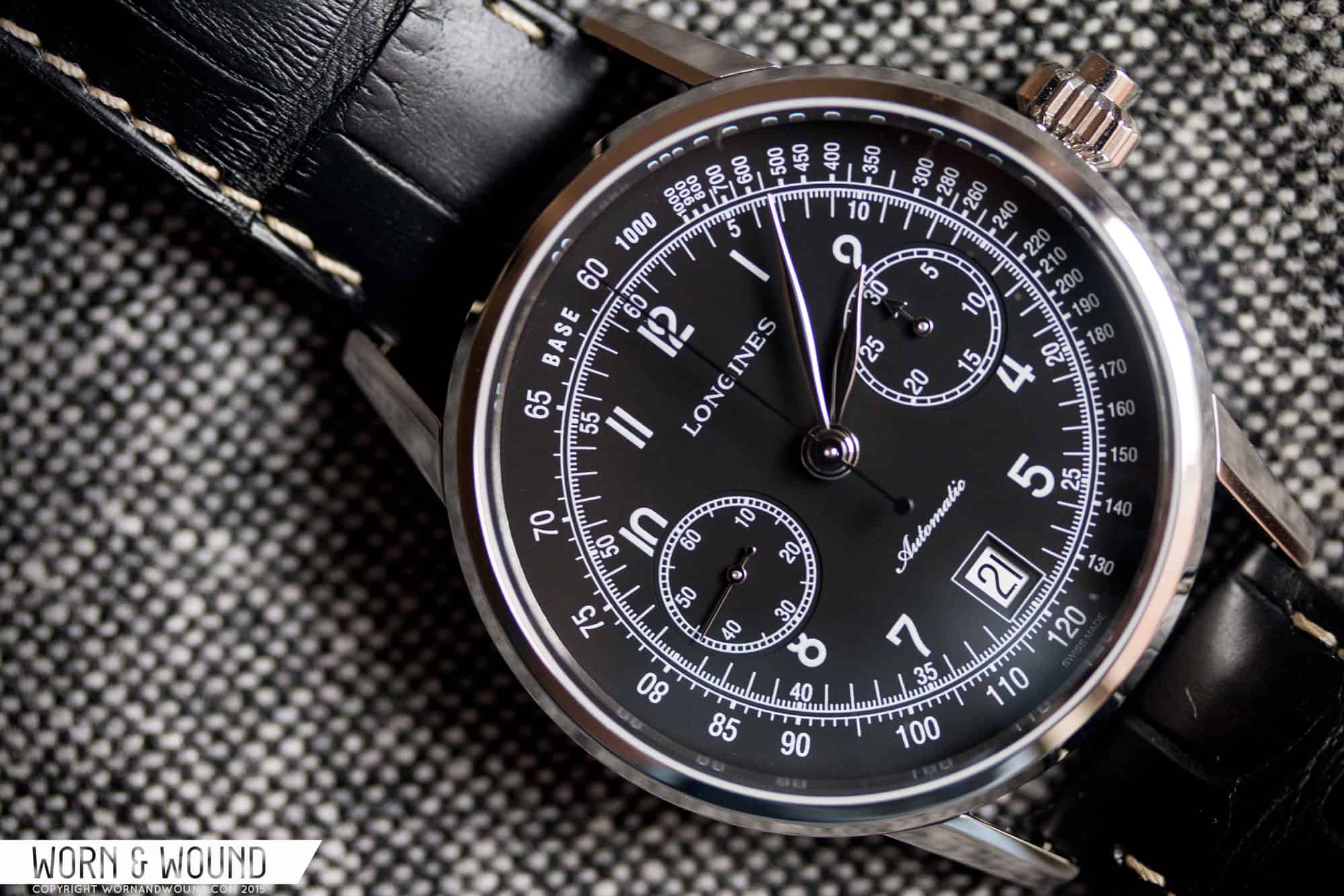
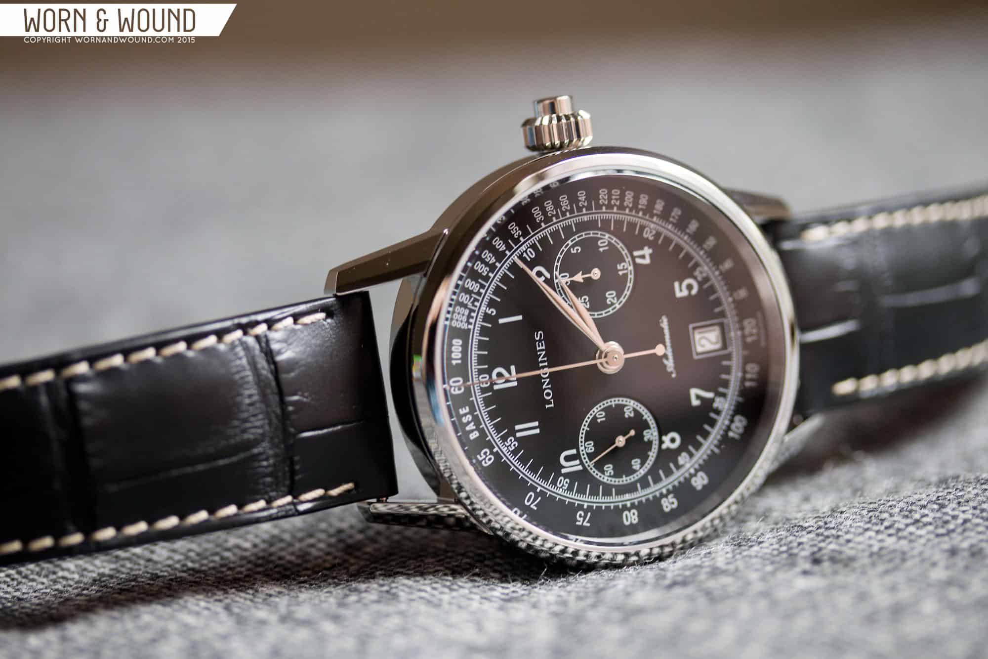
As mentioned before, the dial captures that 40’s aesthetic by staying true to the original elements as well as layout. They smartly took into consideration the locations of the sub-dials and date window to create something very balanced. The black dial has an almost stripped down feel, with simply a matte surface and white markers. I at once like and dislike this. On one hand, the simplicity of the approach is very clean, lacking in fussiness or ostentatious details. It’s sort of honest and true. On the other, it feels perhaps a bit flat, or like it’s missing something. With the more robust case, I just ache for a bit of texture. As we saw on the Hanhart Pioneer Monocontrol, which took a classic, albeit military design, and dressed it up with graining and slight shifts in dial height and surface texture, it only takes a little bit of detailing to really elevate something. With that said, on the white dial version the sub-dials are actually silver, perhaps with slight graining, so it’s only the black dial with this pseudo-issue.
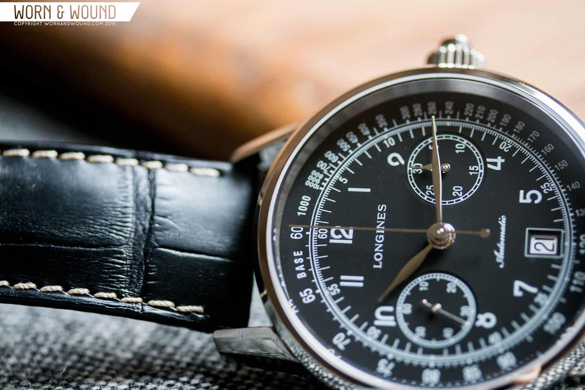
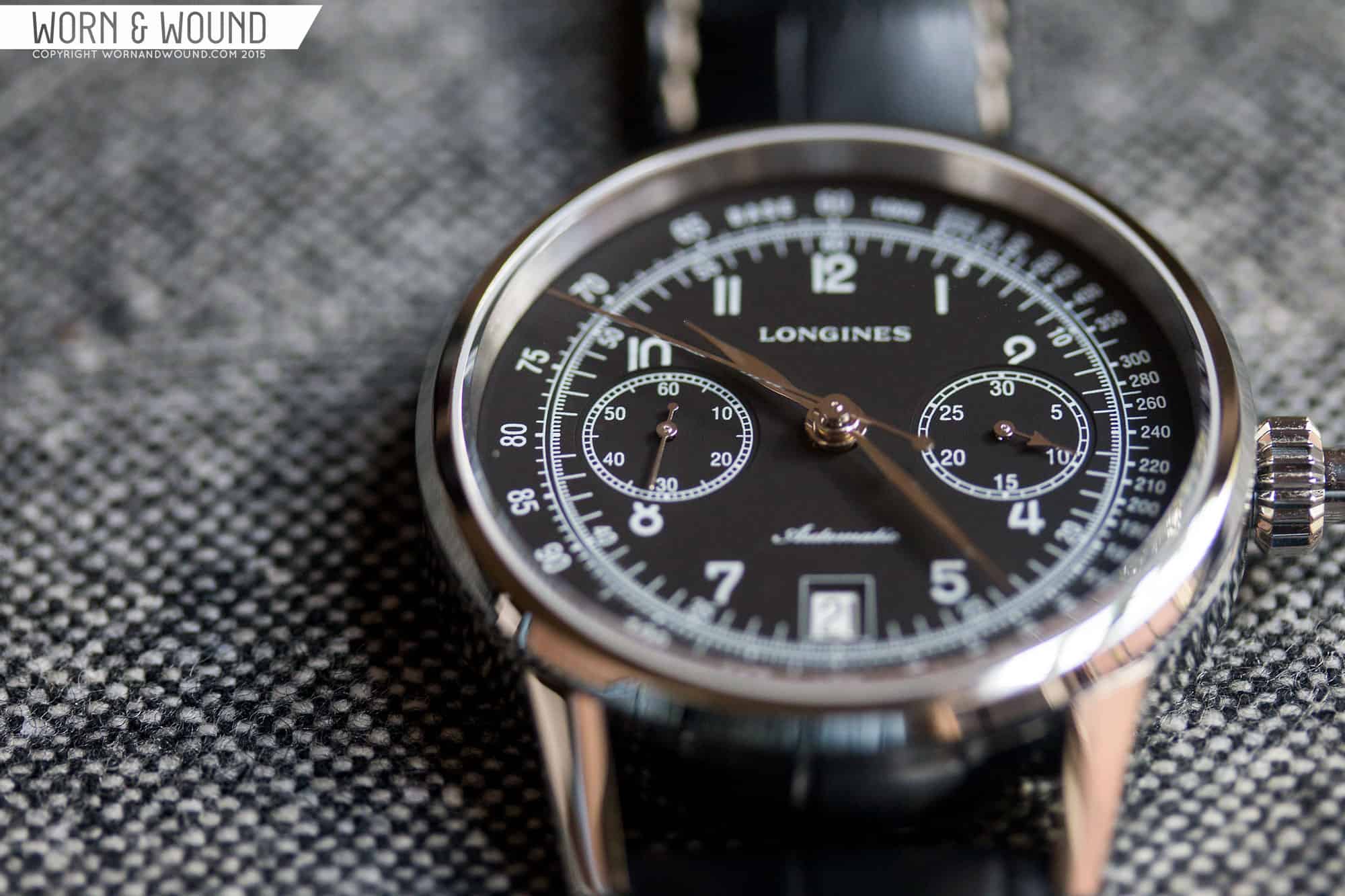
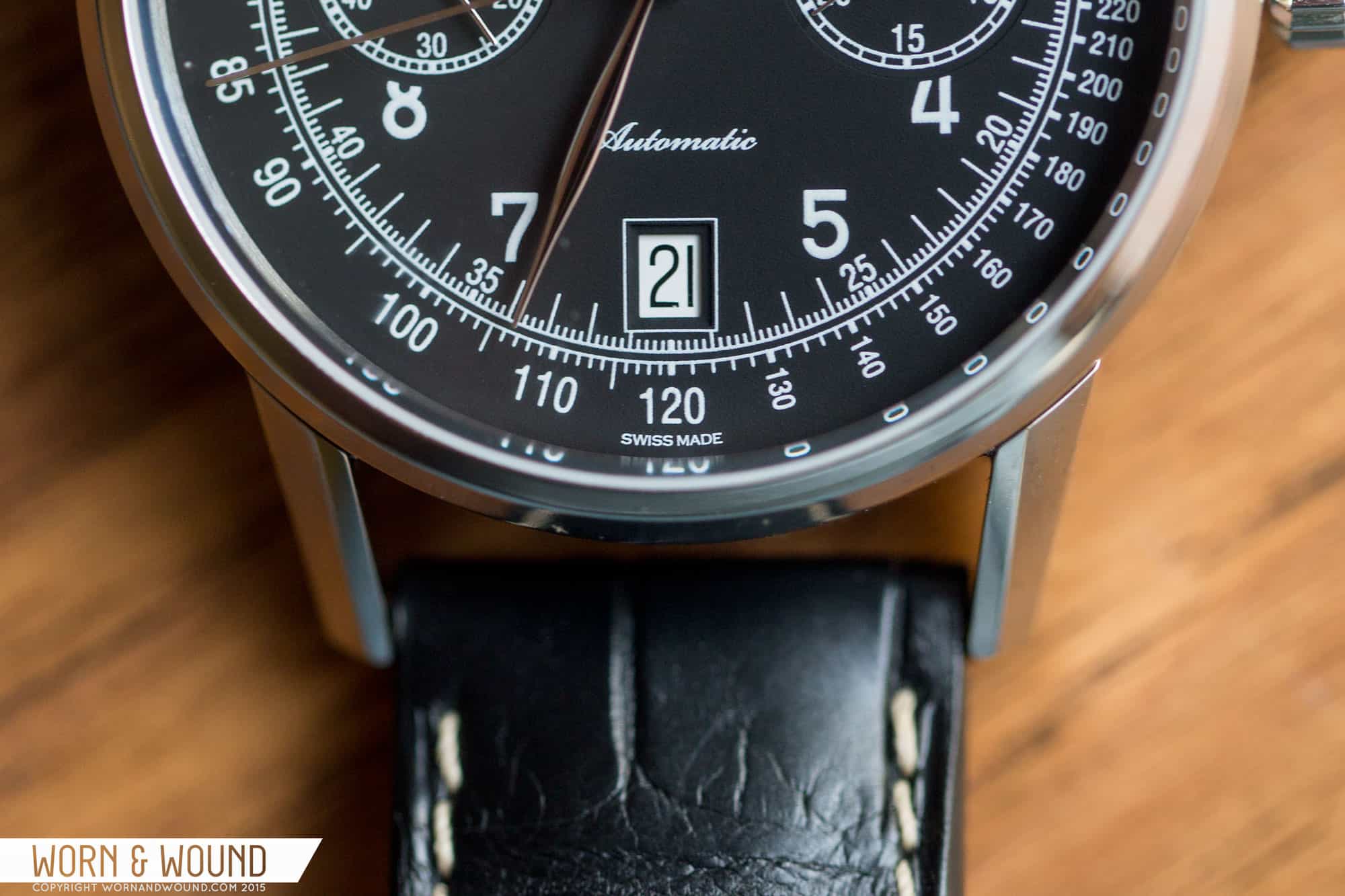
Looking at the indexes, there’s actually a lot going on with a substantial amount of details. The primary index consists of hour numerals in a clean, almost Bauhaus typeface, skipping 3, 6 and 9 for sub-dials and dates, and slightly cutting off 2, 4, 8 and 10 also for the sub-dials. Sometimes cut off numbers bother me, but here they don’t. They feel balanced, and enough of the numerals are present to be legible. Encircling this index is a minute/seconds index with small numerals every 5 units, lines per unit and 1/5th sub-seconds for the chronograph. The line are then all connected by a white line creating a border to this almost inner-dial.
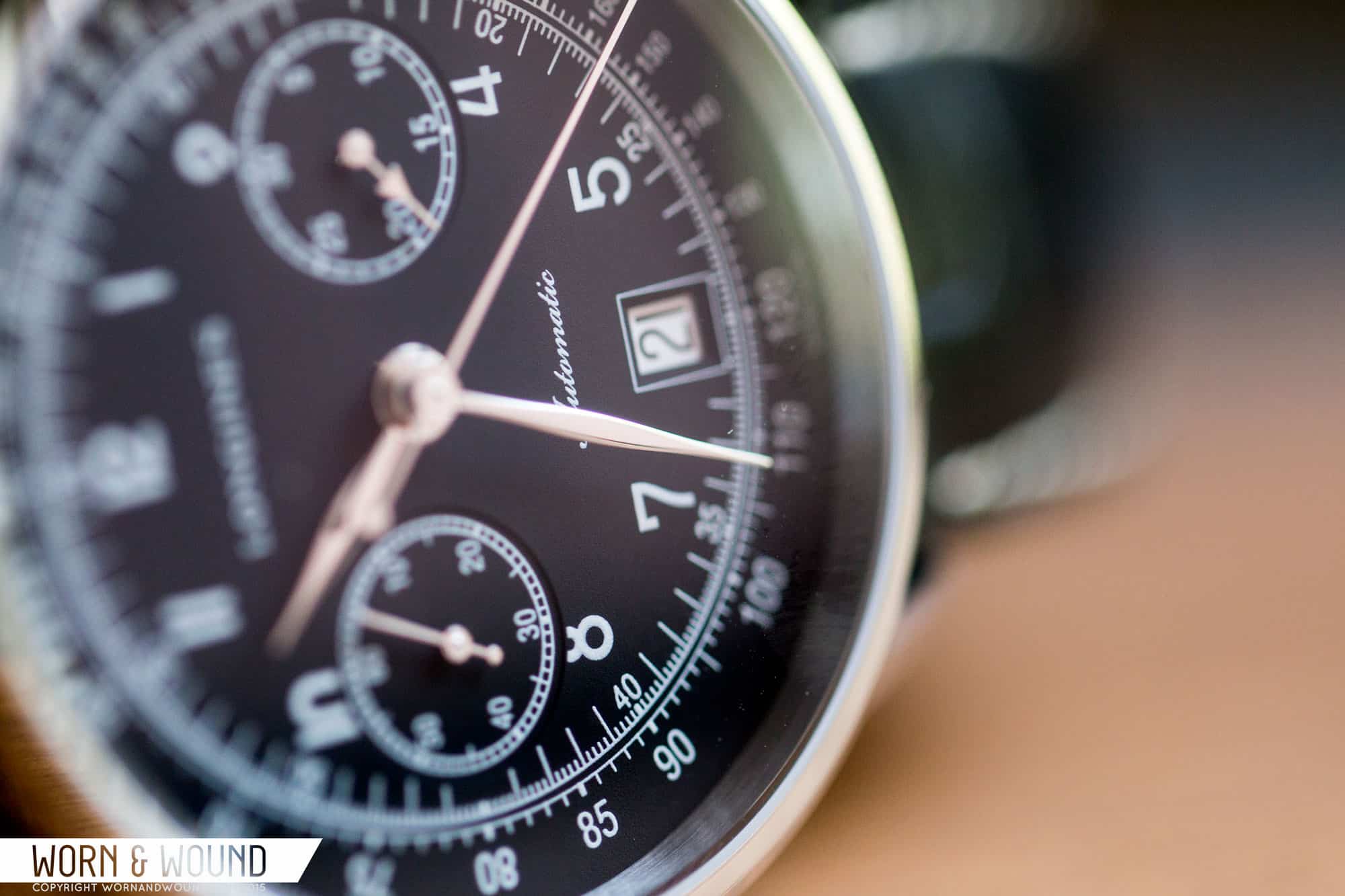
At 3 and 9 are the 30-minute counter and active seconds, respectively. In staying with the original aesthetic, they are relatively small sub-dials, but feel perfectly in proportion for the dial. Both feature small numerals circled by ladder indexes, closing them off from the dial around. At 6 is a date window, featuring a black on white date disk, bordered by a white line. In true Swatch group fashion the watch just had to have a date window, but at least it’s placed correctly. It’s not too high or too low, but rather occupies the correct area. Being centered, it also doesn’t ruin the symmetry brought by the sub-dials.
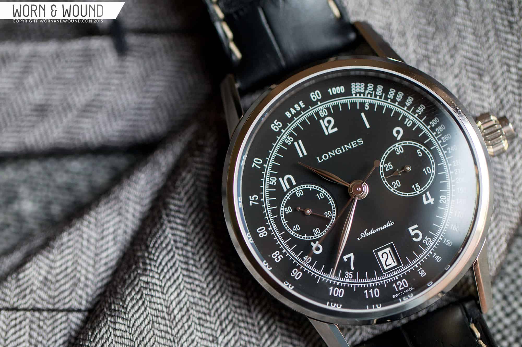
The outer most index is a wide and dense tachymeter, adding a technical and sporty element to the design. Reading “Base 1000” at the top, the tachymeter starts with numerals running away from the center of the dial, needing a wide area. At 120, which aligns with 30 seconds, the numbers turn, running tangent to the linear index within. Being that it’s unlikely for the tachymeter to be used or read with regularity, it becomes an aesthetic detail, adding density to the outer edge of the dial.
The hour and minute hands are beautiful flowing leaf shapes with Rhodium plating. It’s really the perfect, elegant shape for this dial, and once again stays true to the source material. The central chronograph hand is a thin stick with a circular counter weight. Because it’s quite thin and the material is so reflective, this hand almost disappears against the black dial when not in use. The small seconds hand has a similar design, miniaturized, while the 30-minute counter is a small arrow.
Movement: Longines L788
Powering the watch is the L788 caliber, which despite being made by ETA is exclusive to Longines. Like the L688.2 we saw in the Heritage 1973, it’s an automatic column-wheel chronograph, based on the Valjoux 7750 platform. The big difference is that this one features mono-pusher control, meaning that it starts, stops and resets via one button. On top of that, it’s a through crown type, rather than a single button type, giving it almost the illusion of no pushers at all. This is only the third mono-pusher we’ve reviewed on w&w, as they are very uncommon. In the context of this watch it works very well, upping the visual appeal, adding something mechanically interesting, and paying homage to early chronographs. Flipping the watch over, you also get to watch the column-wheel in action, turning as you start, stop and reset it.
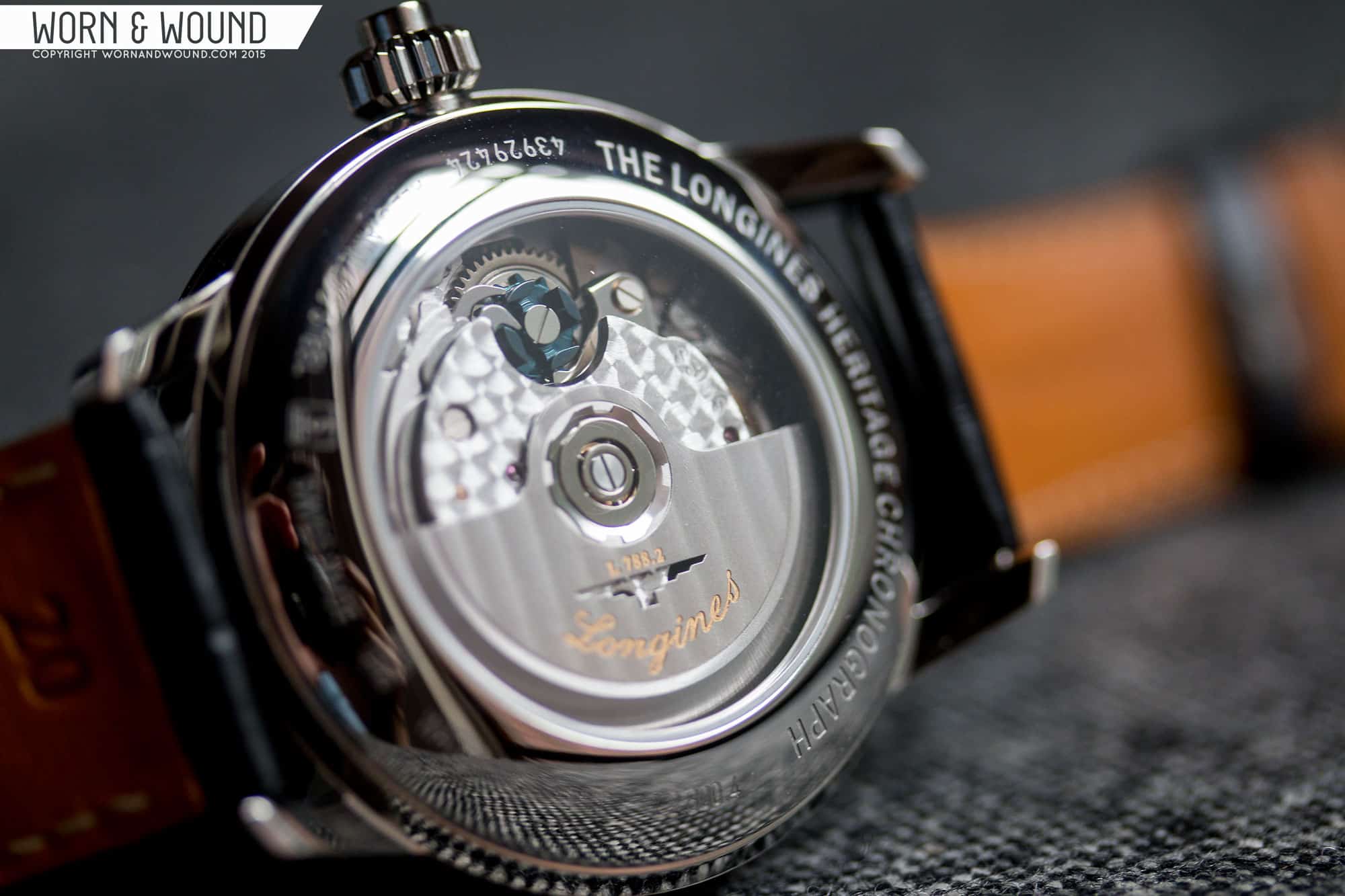
The L788 features 27-jewels, hacking, hand winding, date, chronograph, mono-pusher, 54 hour power reserve and a frequency of 28,800 bph.
Straps and Wearability
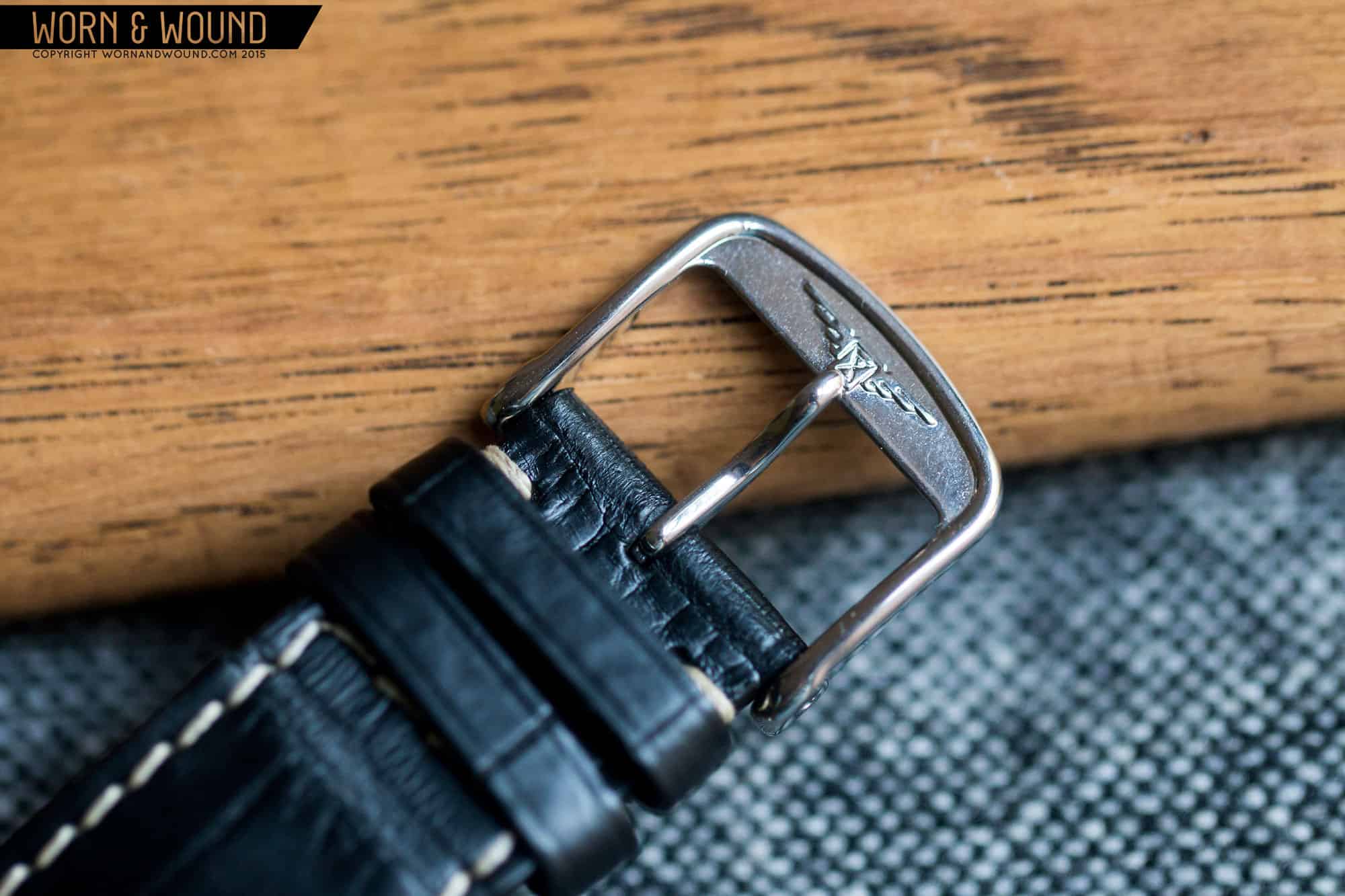
The L2.800.4.53.0 comes mounted to a 20mm tapering, genuine alligator strap. It’s a slightly tapering design, with heavy off-white stitching. It’s a beautiful strap that is nice and thin, with just the right amount of padding in the center. Gator can be very formal, and while this watch can certainly be dressed up, there is something generally wearable about, so the use of off-white stitching was a nice touch. It simply makes it more versatile out of the box.
I was surprised by how well the watch wore when I first strapped it on. Though it’s larger than one would expect for the style, the watch is well proportioned, so it looks like a logical size. Unlike a dress watch that is inflated to 41mm, the Longines’ makes sense at this size. It’s elegant and refined, but masculine with a lot of presence. In particular, the lug-to-lug of 49mm sits well, even though the lugs look like they’ll be too long. The height is the only dimension I take issue with as it does feel tall. As I said before, if they made this as a manual wind, it would be perfect.
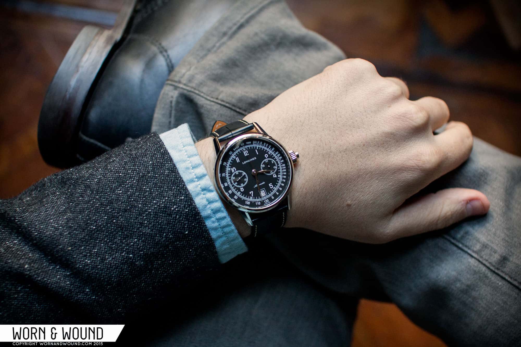
Aesthetically, the watch is definitely more formal than a typical sport watch, but it’s also sportier than a dress watch or chronograph. And though it’s based on vintage designs, it doesn’t scream vintage to anyone who doesn’t know what chronographs from the 40’s look like. So, in the end, it’s this very versatile business/casual design. It looks great with a blazer, oxford and khakis for something with a bit more presence that can be worn just out, at the office or at a meeting. At the same time, it’s not “rugged” in the way other sport watches are, so it might look a bit odd with jeans and a t-shirt. I imagine to dress it up a bit, a nice mesh bracelet would really make it stand out.
Conclusion
With the Column-Wheel Single Push-Piece Chronograph ref L2.800.4.53.0 (really needs a nickname) Longines has created a great option for those looking for that 40’s luxury aesthetic, and love their chronographs too. The design really works, and while there are a couple of things I wish I could see changed, the overall concept is spot on and the execution is top notch. The dial is very satisfying and legible, and while a touch more texture might have brought it more to life, what matters most is the graphic layout. In this case it’s just so well balanced that it’s beyond reproach. Everything is where it should be and sized just right. The case is then simple and elegant, made more interesting with those gorgeous lugs. The mono-pusher is really the cherry on top, making it stand out from the crowd all the more.
At $3,150 MSRP, it’s not cheap, but it’s priced as expected, and wont disappoint. It’s also really the best option for a mechanically interesting chronograph in this style, as other similar looking watches tend to be north of $50k… So, yeah, slight savings there, and while the watches aren’t really comparable, at least this watch is also true to Longines heritage and not just “in the style of”. The real challenge this poses though is which to choose between the 1973 and this model?

I was wondering when we’d see this review 😛 Really cool piece!
I have really fallen for the more recent Chronographs coming from the Longines heritage collection. This is no exception! I would spring for this watch in an instant if it wasn’t for the Longines Pulsometer Chronograph that was revealed at Basel. It is the closest I’ll get to having a watch with the A. Lange & Söhne 1815 aesthetic.
Phenomenal watch! I never actually use my chronographs, but if I had one of these, I’d certainly find something to time.
Love how it looks, but the thickness is really unfortunate. It’s thicker than my SKX, which is an iso-certified dive watch and orders of magnitude cheaper. I’d have trouble wearing it.
It many respects it’s “functional but dressy and/or dressy but functional” look reminds me of the Sinn 104.
Hi Worn and Wound, thanks for posting another great review. I found this article through the Watchville smartphone app, by the way.
I really love the Longines Heritage line. When you say this model looks a bit like a Patek of the same era, you aren’t kidding. I did a double-take when I read another article on the Patek 5370, which itself takes cues from 1940-1960s pieces. He’s a photo from monochrome-watches.com:
https://d23x6d9cx8qezf.cloudfront.net/library/uploads/2015/05/Patek-Philippe-Ref-5370-Split-Seconds-Chronograph-4.jpg
What in the world does this have in common with the Longines?
It’s black?
It has a pusher on the crown?
1. The article itself mentions the visual similarity between the Patek and Longines pieces in the second paragraph: “At a glance, one might see the new watch and think, well, that’s Longines trying to pull off the Patek look”
2. If you can’t visually see that the two watches are similar, then you should really see a medical practitioner.
Would have been a devastating piece if hand-wound, thinner and a bit smaller. With almost 15 mm thickness and 50 mm length it reaches my biggest dive watch. Make it <12 mm and 38 mm, and this would rock.