


 Featured Videos


A few months ago, I wrote an article about a Swiss brand that had quietly developed their own, fully independent (nothing from ETA, Swatch, etc…) serially produceable automatic movement over the course of 7 years. At first, I didn’t really believe what I saw, but after reading up and speaking to one of the owners of the brand, I was amazed. They were really doing something extraordinary, though not many people, at least in the US-blogosphere, were talking about them.
The brand was Horage, and their goal was to kickstart a line of watches that used their in-house movement the K1. Well, technically the movement is made by Accurat Swiss, but it’s all under one umbrella. They succeeded, which will help get this movement out there. But, this wasn’t the only watch Horage had made. In fact, they had an existing line of watches already for sale, manufactured by them. Some of these watches used sourced movements, but one featured their K1, the Autark, which is German for independent.
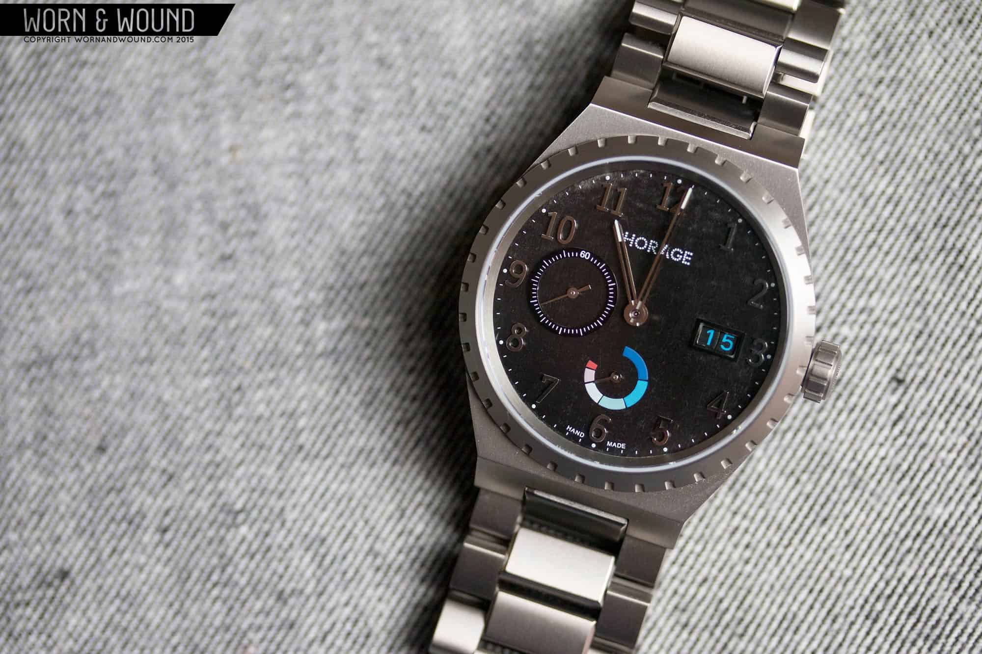
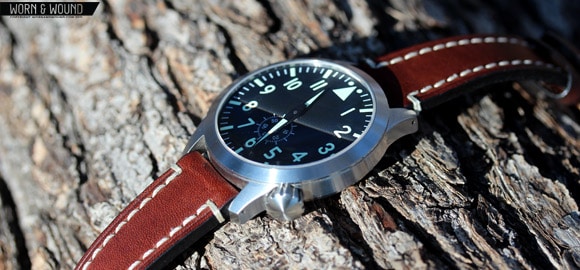
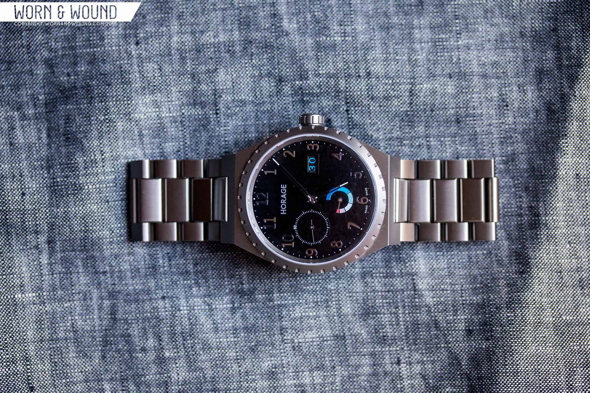
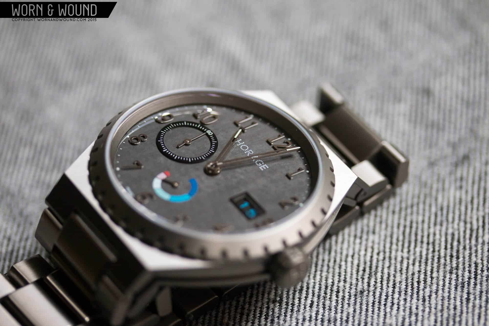
On top of being in-house, the K1 has some remarkable features. One of which is that is has a modular design that allows various complications to be added to a base movement with relative ease (in watch making terms). The Autarky was designed to show off the complications, featuring sub-seconds, power reserve and big date, as well as Horage’s general manufacturing capabilities. This 39mm titanium watch is expertly crafted in all ways, with some of the crispest lines and flattest plains I’ve seen in some time.
So, I had to try one out. Now, this watch is pricy at around $3.5k (USD w/o VAT), but when you look at what it is, what it does, the details of the movement, the build quality, etc, the price is inline with the market. That said, Horage/Accurat Swiss’ goal is to make the movement, eventually, more affordable, but that’s depending on their growth and output capacity. As such, you could see K1’s down the line is watches for less. As for now, the Autark is the best example available and definitely worth a closer look.
Horage will be at our Wind-Up: New York City event, showing their watches, talking movement as well as having live demos, so be sure to come and check them, and the K1 out in person.
Horage Autark Review
 Case: Titanium
Movement: Accurat Swiss K1
Dial: Carbon
Lume: Yes
Lens: Sapphire w/ ar
Strap: Titanium bracelet
Water Res.: 100M
Dimensions: 39 x 47 mm
Thickness: 10.5 mm
Lug Width: NA
Crownr: 6 x 4mm
Price: 3900 CHF w/ VAT
Case
The solid titanium case of the Autark immediately brings 70’s sport watches to mind. It’s barrel shaped with a decorative bezel, integrated lugs and perfectly machined facets and lines. It immediately brings to mind the Genta classics; the Ingenieur, the Royal Oak, the Nautilus… but more than even those, it’s reminiscent of the slightly less popular but equally gorgeous Vacheron Constantin 222, with its signature toothed bezel. On one hand, Horage might have played it a bit close to the VC, but on the other all of the details are different and it looks like nothing else on the market right now. As such, I’d consider it inspired by a classic, especially since the dials are world’s apart. Furthermore, the Rolex Oysterquartz from the 70’s had a very similar design as well, demonstrating that this was more of a trend than anything else.
The case measures a delightfully svelte 39 x 47 x 10.5mm. When you see a watch like this with what might have been considered “small” dimensions a few years ago, you realize just how delusional everyone was. This watch is big enough to look sporty and masculine, yet small enough to feel refined and elegant. The proportions a harmonious throughout. I wouldn’t change it a millimeter in any direction.
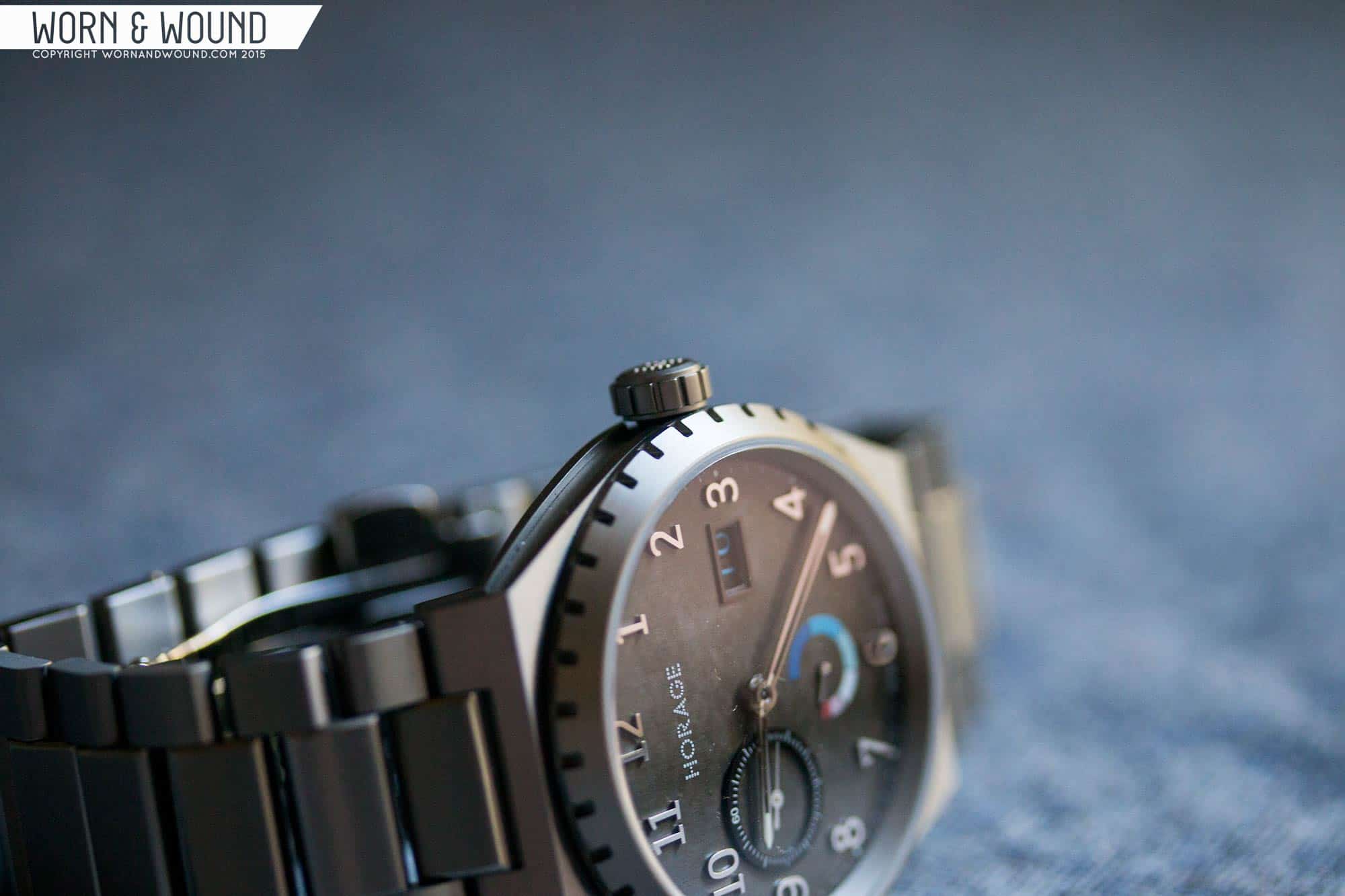
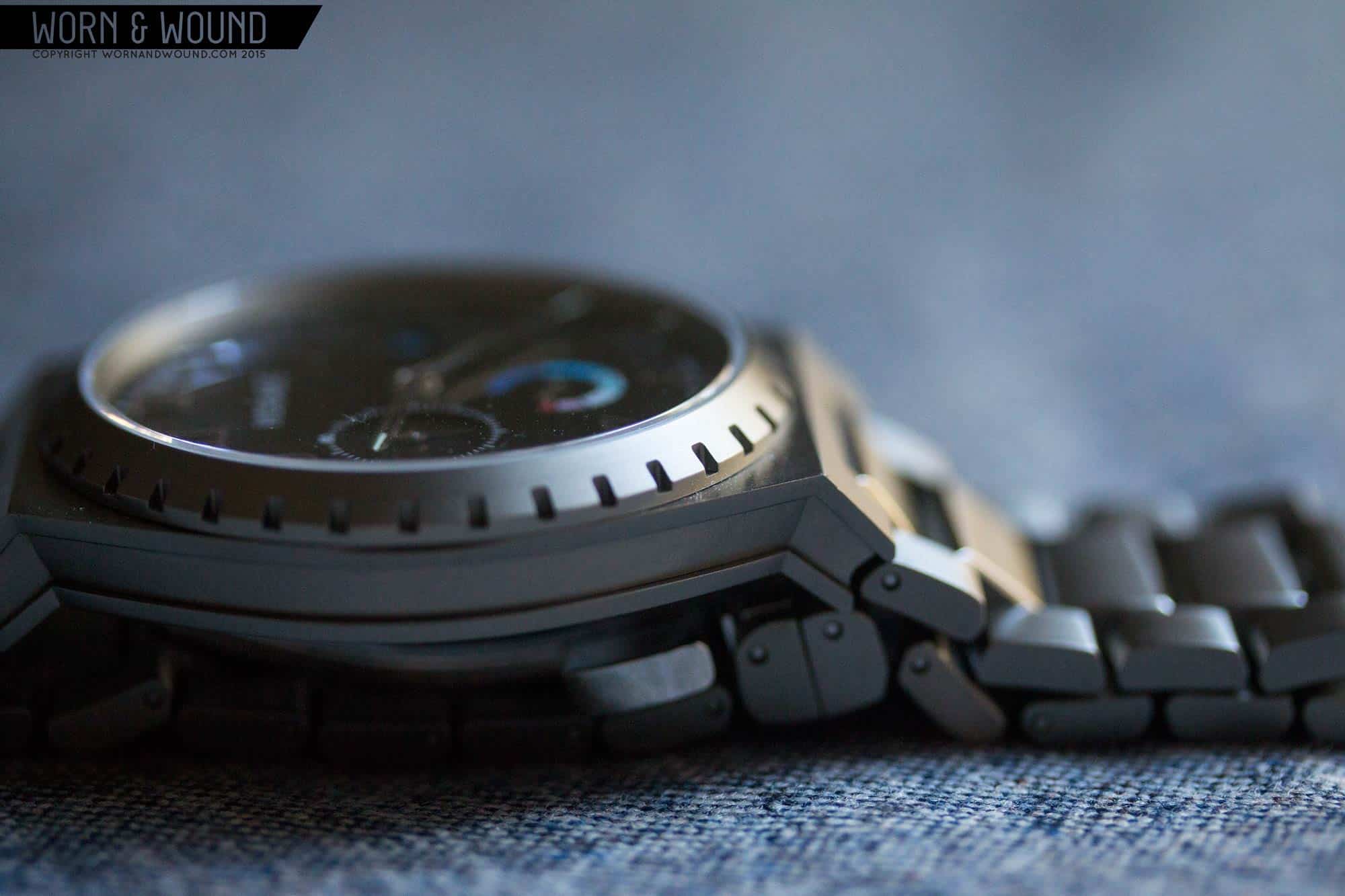
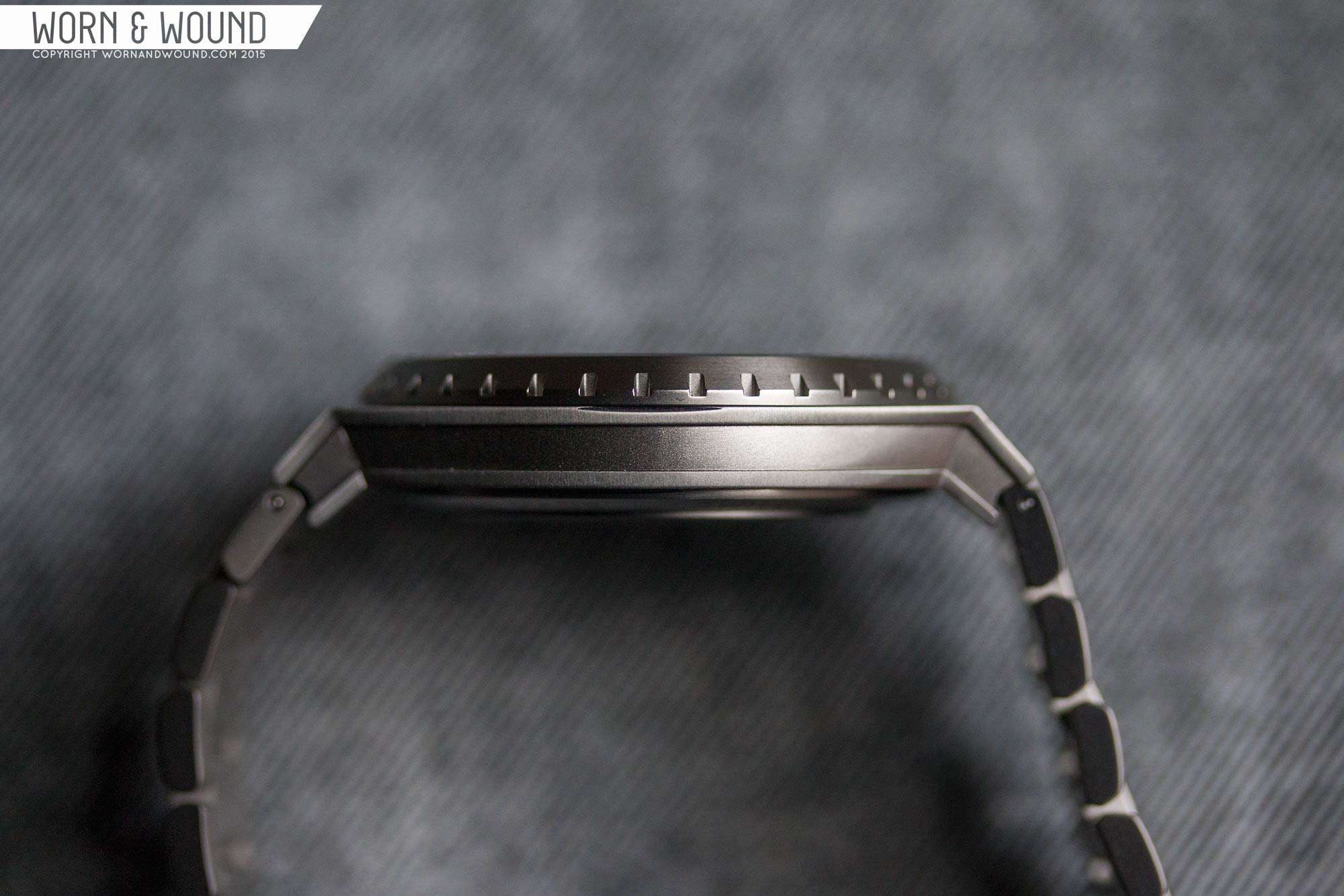
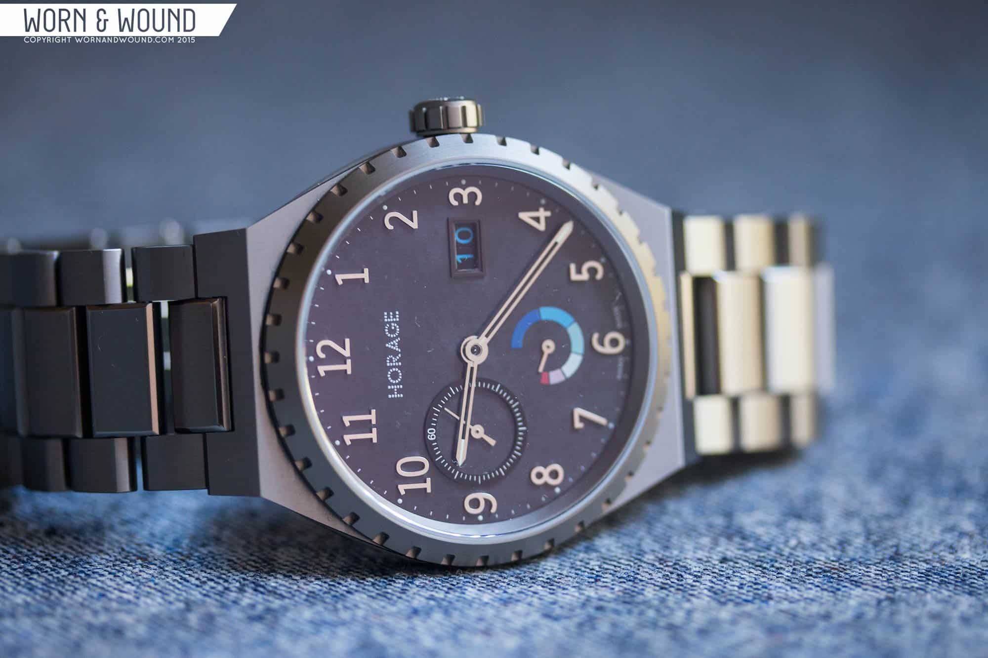
The design is simple at a glance, but has a few interesting details that give it personality supported by immaculate machining. This latter point really matters in the look and feel of the watch. The case and bracelet in particular have perfectly sharp lines and flat surfaces, with clean satin/brushed finishing and the occasional polished bevel (on the bracelet). From above, the case has a classic barrel shape, ending in a sharp facet that angles down, becoming the integrated lugs. The bezel that sits on top has a notched design, giving it some texture. It’s a purely aesthetic detail as the notches don’t line up with anything.
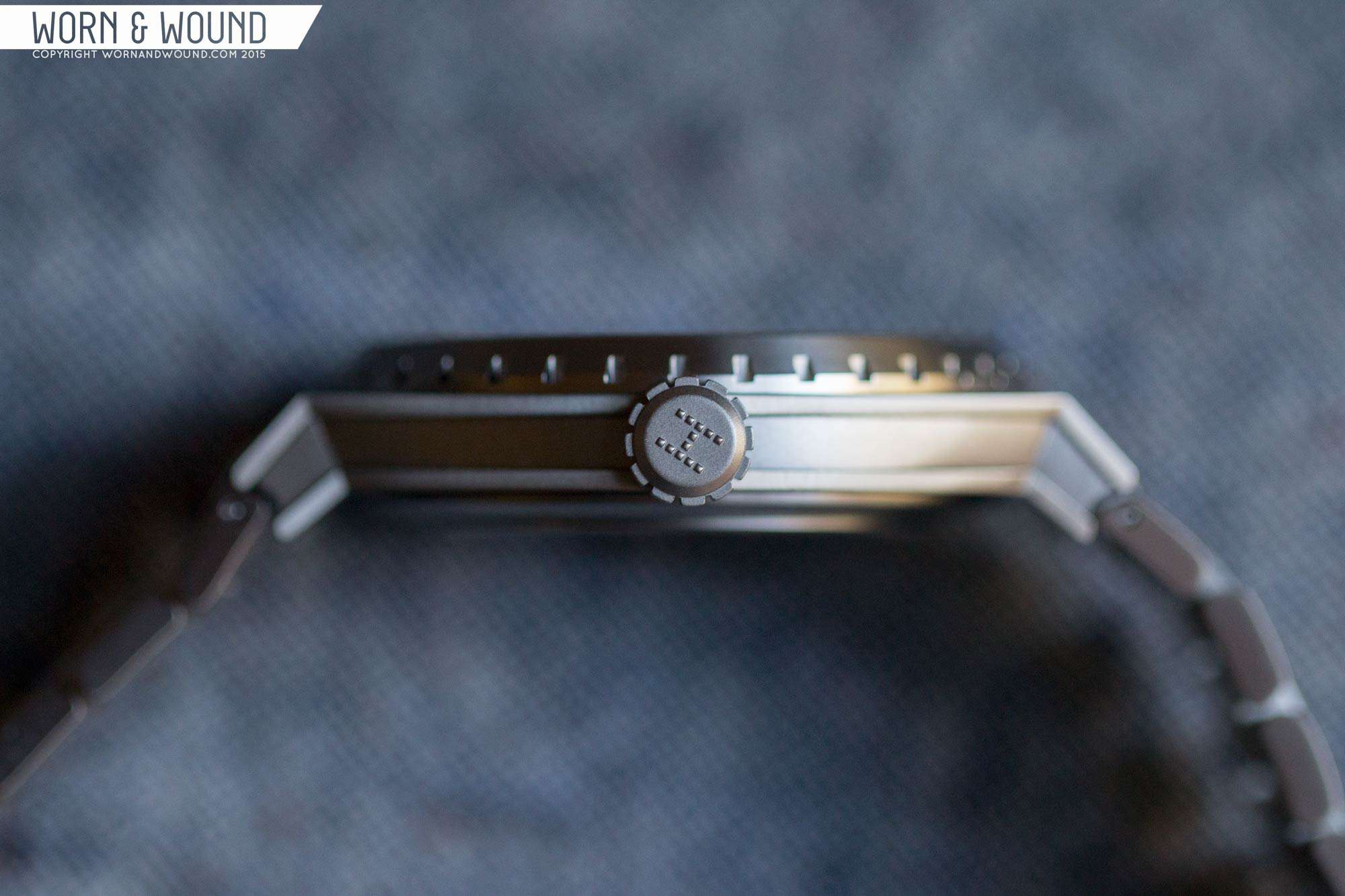
Looking at the case from the side, things get a bit more detailed. The middle case actually has a long groove running along both sides from lug-to-lug. This makes the already thin central case seem thinner and adds a simple but effective aesthetic detail. It’s another place where the quality of the machining is apparent as even the internal corners are perfectly sharp. The general proportions are worth note as well, with the central case being thinner than one would expect, and the bezel balancing that out by being a touch thick, but in a good way as it gives the watch some more mass and robustness.
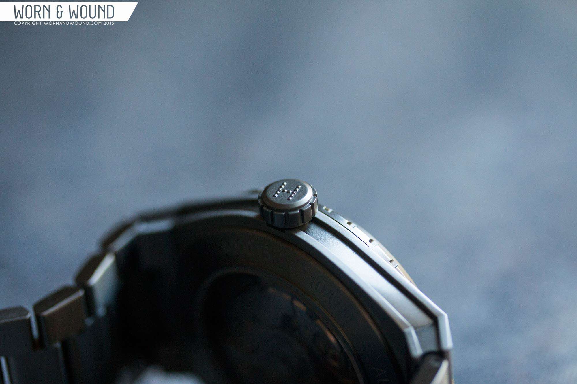
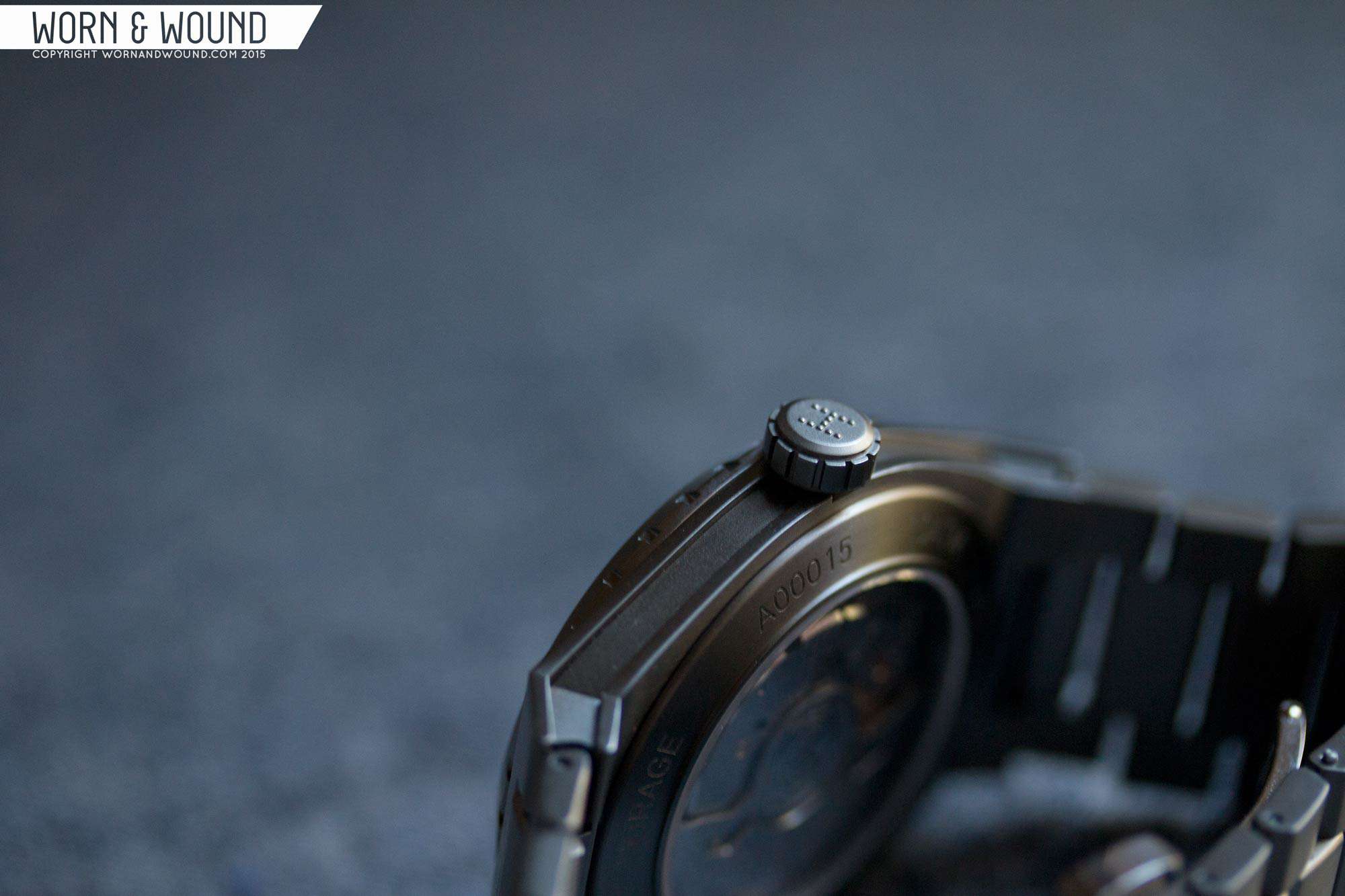
The crown off of three measures 6 x 4mm and is push pull. Screw down might have made the watch feel a bit more solid, but since there is a power reserve on the dial, I found myself wanting to wind the watch a bit more than normal. The crown itself is simple but well executed, with grooves for grip, a slight bevel on the outside edge and then the Horage dotted H logo in relief.
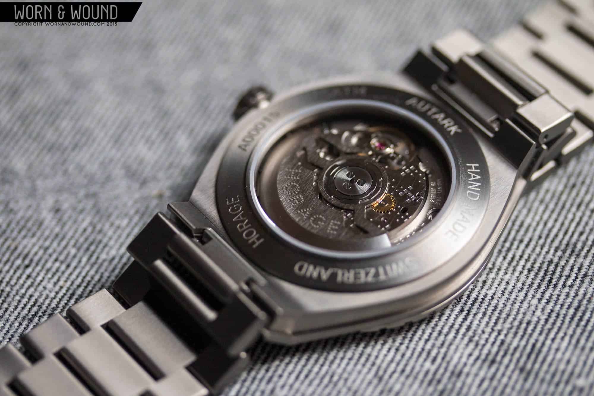
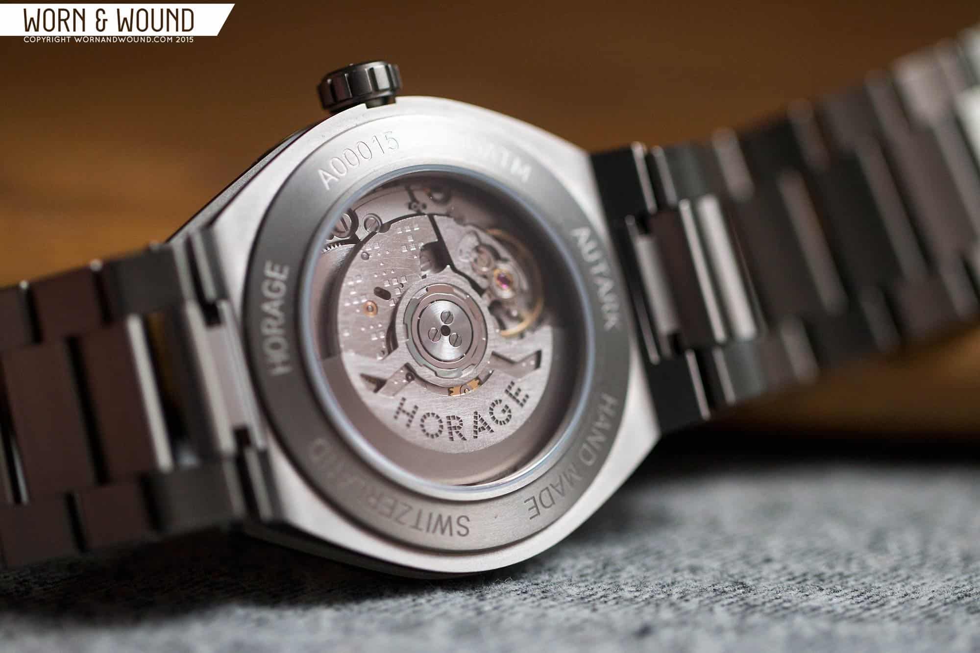
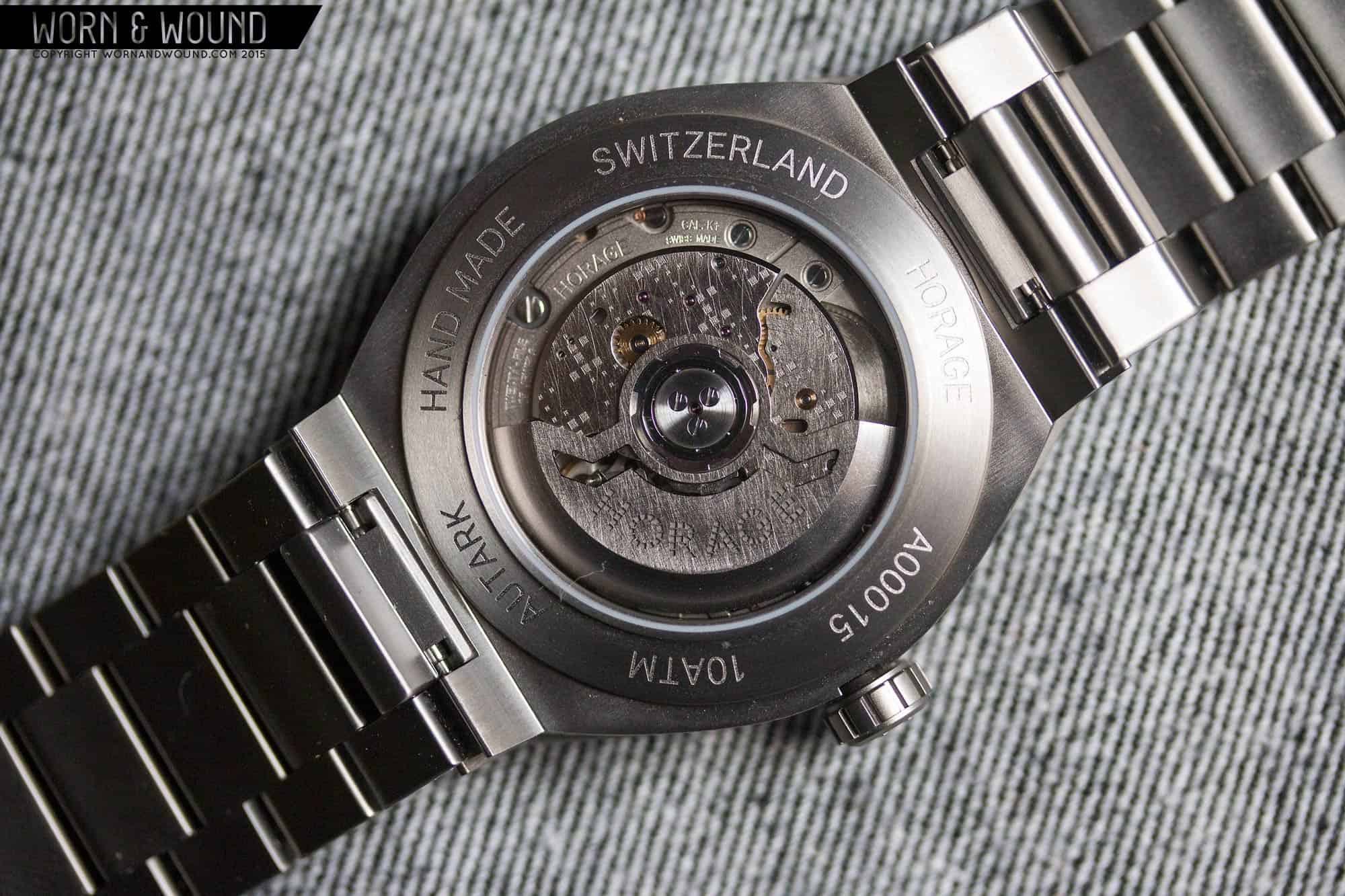
The caseback is snap-on, and features a wide display window. Around the window are various details about the watch, most notably is the use of the term “hand made”. Through the window you get a decent view of the K1 movement. It’s similar, but different from other movements you’ve seen, looking almost like a mix between a 2824 and 9015 in terms of general architecture. It’s lightly decorated with etched in patterns and an almost scratchy sanding, rather than the more typical stripes and perlage. As such, it’s sort of understated and industrial, but in-line with the brand and the goal of the movement, which is to be a work horse not a show horse. To be honest, it could have been hidden, but this is their first watch to use the movement, so showing it is to be expected.
Dial
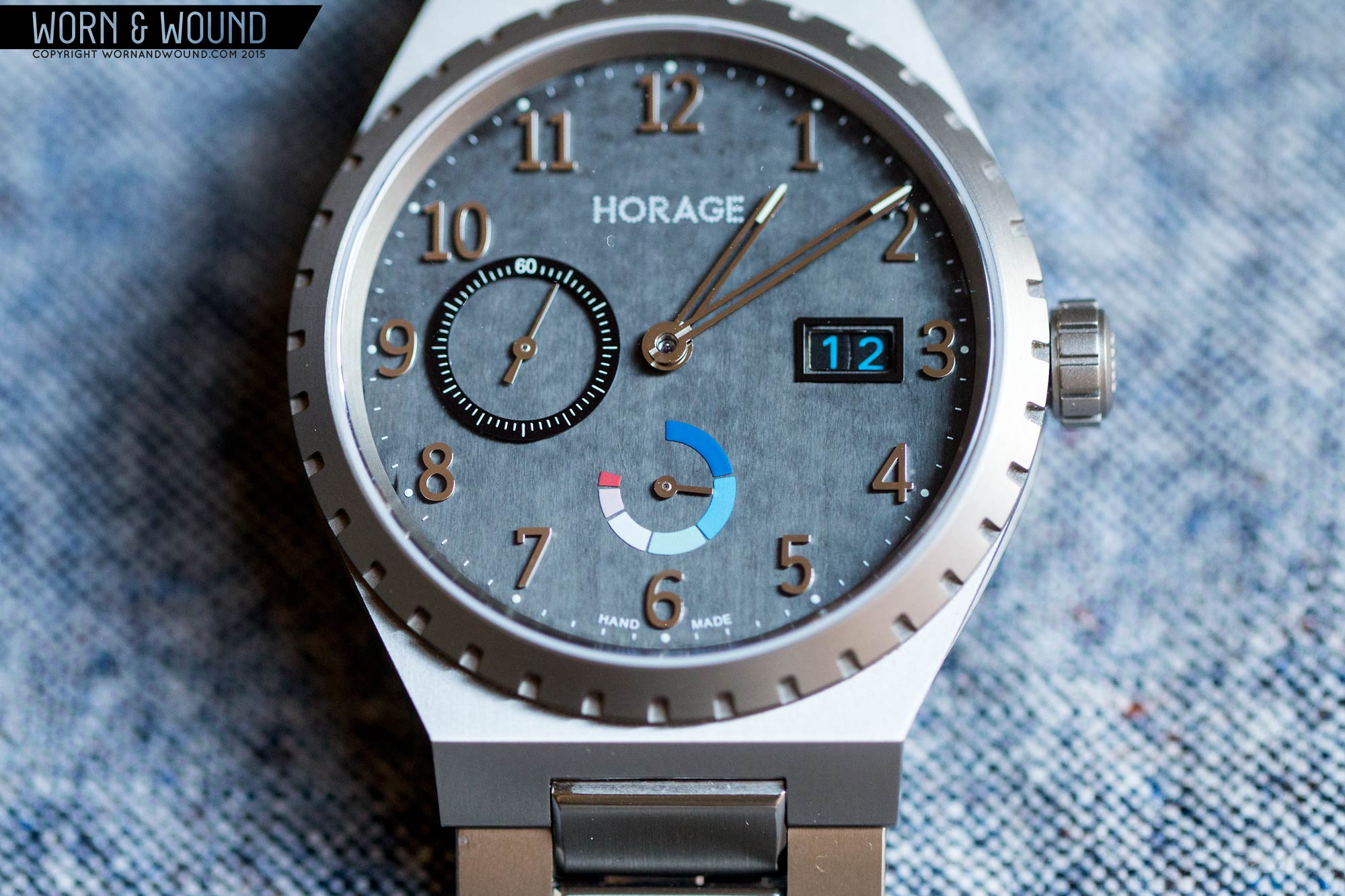
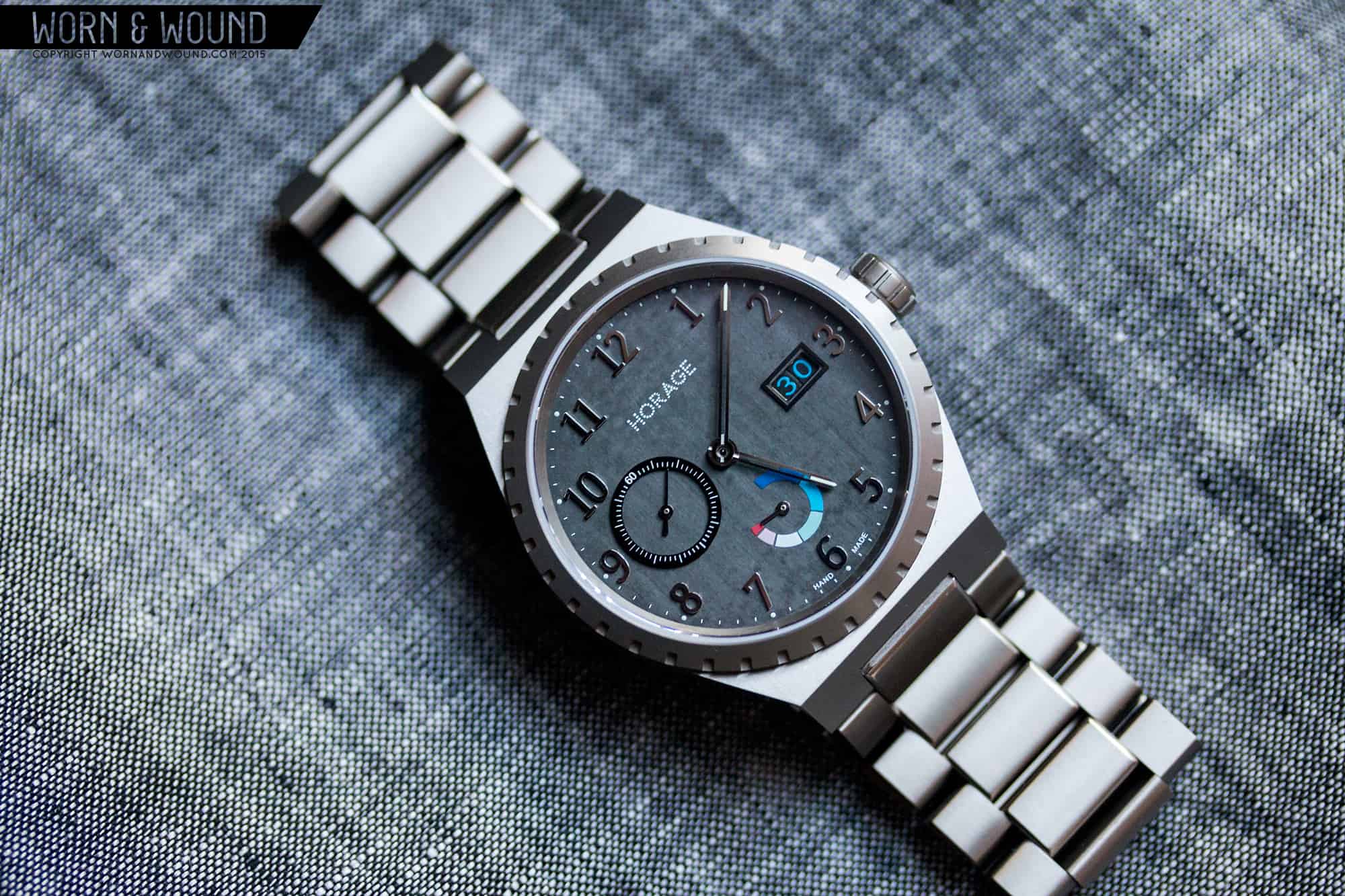
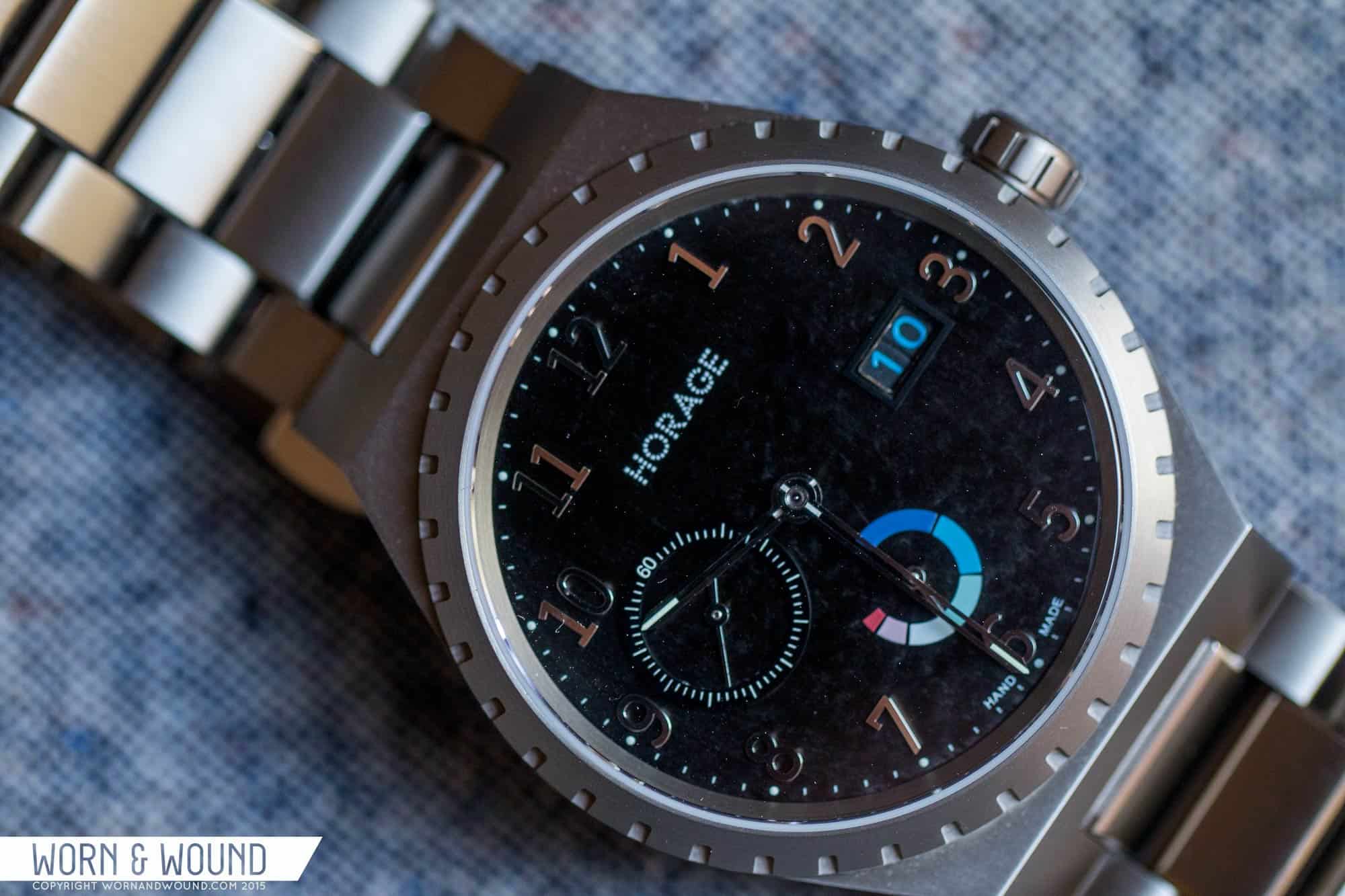
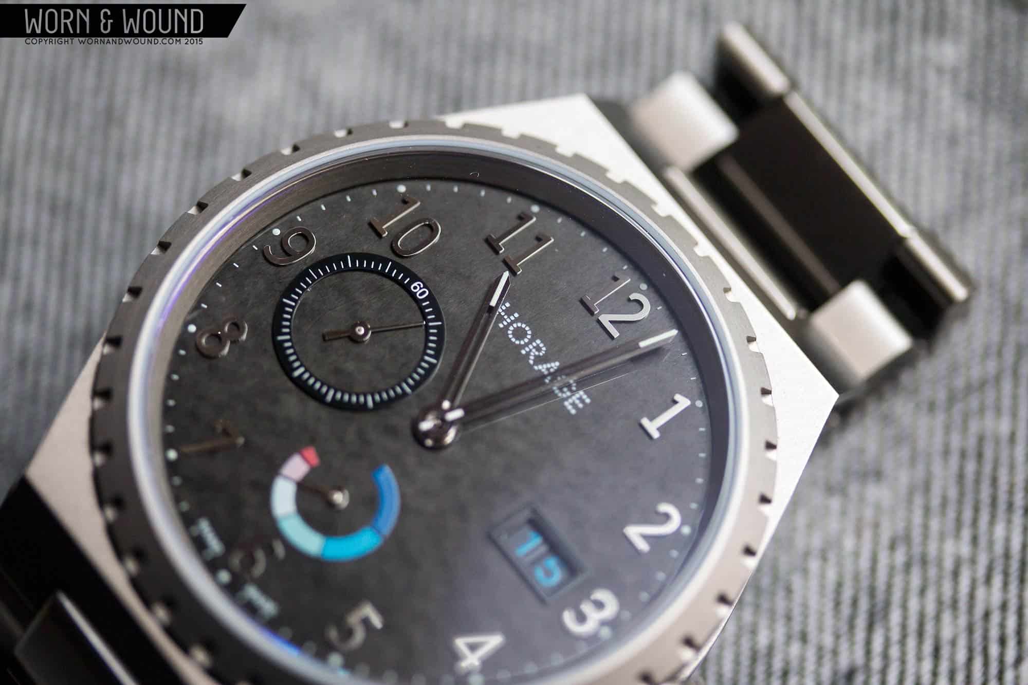
The Autark is available in either Rhodium white or a Carbon black. These aren’t fancy names, but rather describe the material of the dial. The model seen here is obviously the Carbon black, and what’s quite striking about it is that material more resembles some sort of stone than what I would normally expect of “carbon”. It shimmers and shines with random flecks that catch the light. Sometimes it’s deep black, yet in some light it’s almost a gun metal gray. It’s a pretty striking material that while attractive I question if it should be used for an entire dial. The reason being it’s a bit over powering, and at times interferes with actually reading the time, as the hands get lost in the reflections.
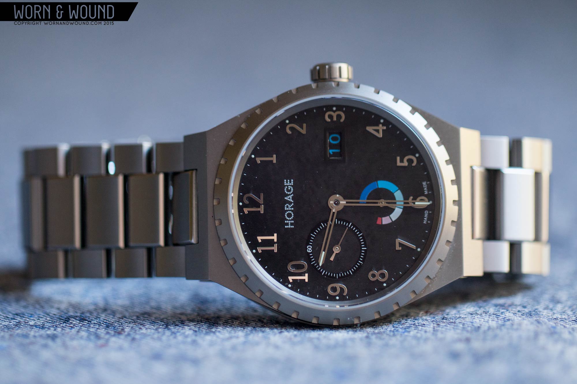
The design itself is also a bit quirky. They used this watch to show off their movement, the K1, and it’s modular capabilities, so they fit in a sub-seconds at 9, a power reserve at 6 and a big date at 3. That’s all of the modules for the movement at once, which while cool, could arguably be overkill, with one or two modules at a time being ideal. But before we get into each, the primary index consists of large applied numerals in polished steel. This gives the watch a very different look from the Gentas, one that is somewhat less “luxury” or more day-to-day in style. A bit hard to explain, but to my eyes, the numerals are less about style and elegance than sheer legibility. With that said, by being polished they can actually be hard to see against the carbon dial, making me wish they were brushed to have a more controlled reflection.
On the very outer edge of the dial is a minute index of small white dots, getting larger and having lume at intervals of 5. This index almost disappears amidst the rest of the dial, though I was surprised by the potency of the lume in the small dots. When charged, they are piercing little lights along the edge.

Each of the complications is executed in its own way. A nine is the sub-seconds dial, which consists of an applied black ring with a white index, and a silver hand. The index has a 60-numeral followed by dashes getting larger at intervals of 5. This is a cool way of creating a sub-dial in general, but it was also a smart way to get it to stand out more against the carbon dial.
At 6 is a power reserve which is printed directly on the dial. Here’s where things get a bit stranger. The power reserve is a hair larger than 3-quarter circle, with zero-power at, if you imagine a watch dial, between 9 and 10. Full power is then at 12, and the hands sweeps clockwise back to zero as/if it runs out of power. The index itself is then illustrated through a rainbow of sorts, going from red for empty, to dark blue for full, hitting a range of pinks and bues in between. While it’s obvious if the watch is wound or not, the logic of red to blue is a little odd, and the index adds, in my opinion, a bit too much color to the dial. It perhaps if the sub-seconds hadn’t been there, or the big date, the added presence from the color would have been desirable, but here it just overwhelms.
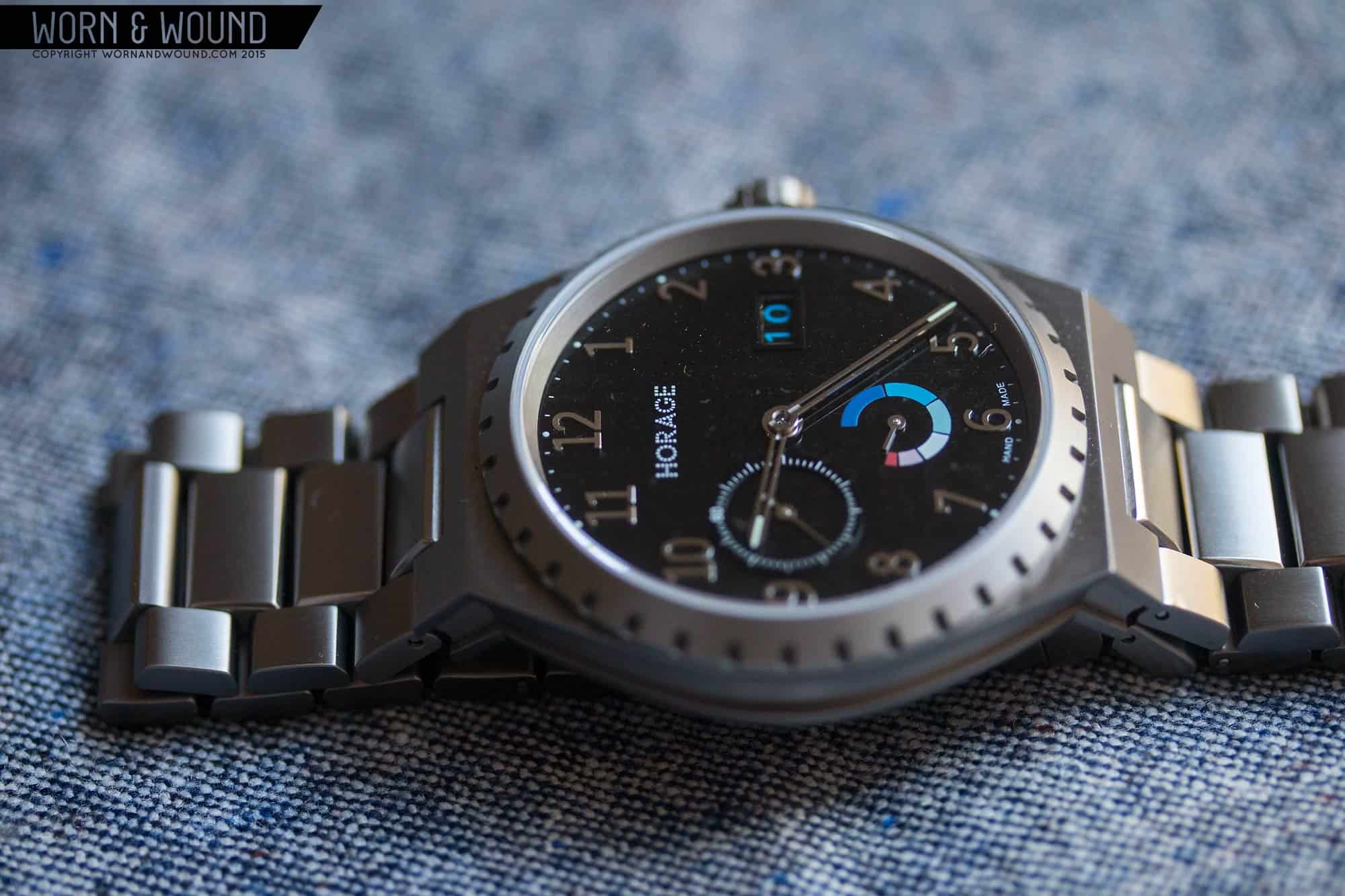
At 3 is a window showing the big-date complication. It is larger than your average date, using a disk for the tens unit and a disk for the ones unit, though it is perhaps a bit smaller than other big dates I’ve seen. That said, it’s very visible, especially since they used a piercing blue for the humerals set against the black surface. It’s an odd choice, again, emphasizing the color in the power reserve. Obviously, I like that they customized the date (one would expect as much from the manufacturer of the movement), but it’s almost too playful and sporty for the watch. It just doesn’t gel with the price tag and the elegance of the case, in my eyes. In fact, the same could just be said for the dial as a whole. It’s interesting, has some cool elements, but it feels transplanted from another watch.
The hour and minute hands have a unique design that is quite attractive. On Horage’s site, they refer to them as “diamond cut” which perhaps speaks to their precise machining. If so, it looks great. Both hands are thin forks with a sliver of lume towards the tip, and a matching sliver of finishing towards the center of the watch. So, what you have is sort of skeletonized, and has a very delicate but technical look. It’s a cool design that I wish was more reflected in the dial itself, perhaps in applied markers.
Movement: Accurat Swiss K1
Inside of the Autark is Horage/Accurat Swiss’ own K1 automatic movement. I highly recommend reading my article on this movement, Introducing the K1 Caliber: Picking Up Where ETA Left Off, to get a background on the brand and the movement as there is a lot to say about it. The K1 is an independent answer to the ETA 2824-2 and the limited amount of movements available on the market. Developed over the course of 7 years, it’s a new movement that we’ll hopefully see not just in Horage’s but in watches from various brands looking for a Swiss-made automatic. What’s really cool about it is that they designed it to use modules for the complications (small seconds, date, big date, power reserve and central seconds) making a lot of variations possible, and features an in-house (in the sense of developed by them with partners rather than under their literal roof) silicon escapement. It’s a very modern movement in more ways than one, which is something that is lacking from other movements in the space.
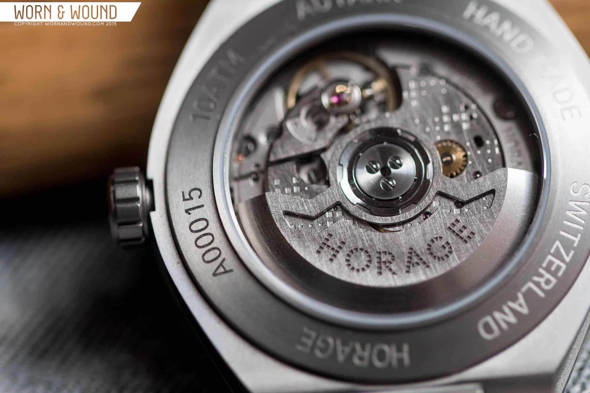
As far as the base specs go, the K1 features 25-jewels, a tungsten rotor, hacking, hand winding, silicon escapement (palette, escape wheel and hairspring) coated in mono-crystalline nano diamonds, a frequency of 25,200 bph, or 7 beats per second and a 56-hr power reserve. The silicon components are really quite rare still in a movement that is intended to compete with the 2824, when produced at scale. The complications seen here are then are drop-in modules. So, as said, we have sub-seconds at 9, power reserve at 6 and big date at 3, which is controlled through the crown rather than a pusher.
It’s very cool to be able to have all of these functions so long as the design allows them to be harmonious. More than that though, the modular design allows brands to design various concepts around a single movement, and then alter the movement to fit their needs in-house, rather than ordering each variation separately. Once/if they add GMTs and chronographs, this single movement could support a brand’s whole catalog.

In practice, the watch works like any other and keeps good time while doing it. I had no issues with it in terms of accuracy or power reserve. The only thing I noticed was the sub-seconds hand stuttering, sort of like what you’ll occasionally see on a 7750, which is due to indirect drive and that (going to try to decipher technical talk here) they didn’t use “brakes” on the second hand as that could create inaccuracy and draw more power.
The decoration is meant to be different from the norm. You have a pattern of etched H’s composed of little squares on a surface that is almost rough and scratched looking from a coarse brushing. The same brushing is on the rotor as well. This is intentional, and meant to impart an industrial look. That said, this sample watch is from an earlier batch and they have since toned that down a bit. For me, I like the concept, but the execution was perhaps not far enough. Either it’s very rough and utilitarian, or elegant and classical. For a watch this price, I do think people would expect something more towards the latter, with either perlage or cote de Geneve.
Bracelet
The solid titanium bracelet on the Autark matches with its integrated lugs, making it, at least at this time, the only strap option for the watch. It’s beautifully made, matching the quality of the case. The three link design is attractive, and they’ve thrown in polished bevels on the center links to really make them pop. The bracelet also features Horage’s patent pending U-flex, single fold clasp. It’s an interesting design that, like a butterfly clasp, gives the bracelet a seamless quality, but opens more simply to one side. It’s truly a very nice and comfortable bracelet, but I do have one issue and that’s that it is straight. Barrel shaped watches really look best with tapering bracelets (see all of those Gentas) and they continue the flow of the case around the wrist. As is, it’s elegant, but just a bit too wide.

Wearability
On the wrist, the Autark is a pleasure to wear. The size is perfect, and the material just makes it very comfortable. Well proportioned barrel cases are really delightful. They have presence and mass, but shorter lug-to-lug length, typically, thus they sit well. The watch looks good on the wrist too. The detailing of the case really stands out, giving it an interesting, sculptural look. The dial then adds a lot of reflection and texture to the mix. The carbon shimmer, the hands and numerals glint; they contrast the deeper gray of the titanium for a range of grays.
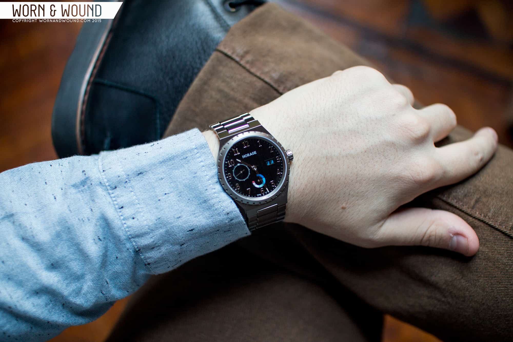
At it’s heart, this is a gentleman’s sport watch, which always lean more towards dress than sport in actual use. So, while not a formal dress watch, it’s certainly welcome under a blazer sleeve, in the office, etc. At the same time, it’s casual enough, especially with the hints of color from the dial, to look decent with jeans and more relaxed attire. It’s pretty versatile, in the end, though it definitely exudes a certain 70’s style, so you ought to be into that from the start.
Conclusion
The Autark is a tricky watch to review. There’s a lot going on inside and out, so coming to a real conclusion about it is difficult. I love aspects of it. The machining and finishing of the case and bracelet are beyond reproach, and though the case hints at others, it’s a very cool design that I’d welcome on my wrist. The dial has components I really like, and the over all look is intriguing, but I want to see them separated, and perhaps used in a different case. I want something more toned down for this one. In fact, one of Horage’s other watches, the Omnium, uses the same applied numerals, and they make more sense in that watch’s round case.
Then there’s the movement. The K1 is this awesome and almost unheard of achievement for any brand, let alone a new one to accomplish. The Autark shows off some of what it can do by way of packing in a few complications. In fact, the Autark really is a show case to demo the movement. But the real magic of this movement isn’t in this isolated watch, it’s when it gets used by other brands as an alternative to ETA, Sellita, Soprod, etc…
With a price tag of around $3.5k, the Autark is an expensive watch. On one hand, a Swiss-made watch with an in-house movement with a silicon escapement is always going to be pricey. If Tudor hadn’t unveiled theirs, I’d say it was unheard of, but the difference is scale of the brands does account for something. On the other, the movement here is meant to eventually be an affordable alternative to others… but that doesn’t mean inexpensive. It’s probably going to remain in watches in the $2 – $4k range for sometime. Looking at the other aspects of the watch, in particular the case, the Autark delivers as well as anything I’ve seen. It’s just perfectly machined. If the dial just exuded the same class as the case, and the bracelet tapered in to continue the flow, I think it would in fact look and feel like a $4k watch. As is, it’s close, I just want a touch more refining.

I’m always very happy to see a new watch brand doing something revolutionary that actually makes sense. While there are plenty of design elements that I don’t personally like, the whole concept of what they’re doing is refreshing and NEEDED in today’s watch arena. Putting my subjectivity aside, the movement is what’s really exciting here. If they market all their advantages intelligently, they’ll have the potential of becoming a powerful competitor to ETA, Selitta…….etc. In fact, I wouldn’t be a bit surprised if Swatch didn’t try to buy them.
We are not for sale;-) We just love what we do and we hope this fresh breeze we can bring to the watch world will last for a while. As the name says AUTARK… no need to be sold to anyone.
I am very impressed. In this price range for an original in house movement automatic with high tech features from a small, independent brand, it is a remarkable achievement. I think of Damasko and their DK10 and thought nobody else could pull it off, but Horage has — and they’re going for a “workhorse” movement that other brands may buy and use. Wow. Now that’s ambition!
The watch in question certainly does have interesting aesthetics — the dial is overall a little incongruous. Zach writes: “…this is a gentleman’s sport watch, which always lean more towards dress than sport in actual use.” That seems right. I noticed the mention of a GMT module. With this very striking and unique case design and with a GMT, this could be a terrific Rolex Explorer 2 killer. But without a Burger King crown, no silly “superduper extradillyishish officially certified chronometer” script, no attempt at Mercedes association hangover from the 1950’s hand, no unpleasant baggage. I am sure that Zach Weiss and staff could help with the dial design of a Horage Explorer.
Now back to the Damasko DK10. My current favorite topic. When are they going to send Worn and Wound a sample to review?
Thanks for compliments. Yes Damasko has also done a good job. We focused a little more on modularity and industrialization as well as small size and thinness so that we can be more flexible in our future of creating our dream product line-up with a realiable own movement.
We would love to make GMT happen, but therefore we first need to make sure we have all our movement stuff under control. This is a tough thing to do.
I am happy that people here understand the watch world and our work and that a silly chronometer certificate is not a guarantee for a valuable product. Time change so does the watch world.
Let´s see what kind of dial looks the next evolution of this Autark watch will bring. We are happy about all input here
why should i buy this, and not the new tudor north flag?
Of course the Tudor North Flag is a nice watch to buy too. it is different look, different tech and different brand. So good to have both if the budget allows it;-)
One very important reason to buy this watch!
Because you support a small brand like HORAGE with passionate people who invest heavily in making good products. Tudor in contrast does not need to worry about anything, they belong to a 5 billion revenue Rolex company. Also fine, but we think the watch world should stay diversified and so it is good that people like you support us. Finally people should not all wear the same watches if there is only a few companies left, so Zach and his team would be out of business 😉
So people who work for Rolex are not passionate people who invest heavily in their product? And we shouldn’t buy Rolex or Tudor because they are rich already? Hmmm …. I could be wrong, but I believe people will buy good products, big brand or small brand.
I am sorry that I did not express myself clearly enough. I have great respect from a company like Rolex who is indeed investing heavily into products. I did never say that these people would not be passionate either.
If you have started a company by yourself, you for sure know how difficult it is to grow a company in a stable size and that early adopters who believe in a young brand are very very important. Without the trust of these early customers it is impossible to succeed and many brands with very good products and passionate people fail in this stage because out of whatever reason they do not get enough supporters in early days. So I think supporting new things is very important for our society and its diversity. Shitty products anyhow should not have a good future in a connected world.
So a good product is a must first!
But how do you judge a product to be good? I still think physical inspection is still a must and finding out if something has a certain level needs time. Especially in watches the departing line between good and taste is very blur.
just stumbled across our little conversation again. btw. Did you buy the Tudor finally? I took a look and tried it. Nice watch. Just a little thick in my opinion as the movement itself is +6mm high compared to our 4.9 this is quite a difference and perhaps one of these reasons why people would by our Autark;-) If you are in for small light weight watches we are the choice, if you like bigger more heavy ones perhaps the Tudor is the better choice.
I thought the reviewer was kind regarding some of the design choices.
I think the reviewer has excellent skills and deep knowledge about watches not only when it comes to the outer design and look, but also he is able to understand and judge on the technical execution of our products which is far more challenging then just saying like it or not. Perhaps his taste is different on the dial side than ours;-) That´s life… but we are sure there are enough people out there who like the dial exactly because we made it like this. Actually we know it already considering the feedback from existing customers and visitors of the #windupnyc event this weekend.
The new movement is exciting– I hope they’re successful in selling the movement, that it proves to be durable, and that others start adopting it. The build quality does indeed look excellent, and worthy of demanding a price in the $3-4K range in the current market. And the 39mm size is perfect for a dressy sport piece.
But the design of this particular watch…well, you’re being nice by saying “quirky.” It’s a mishmash that makes little sense conceptually, doesn’t work in practice, and at least in this color scheme, looks hard to read (obviously a cardinal sin for a watch). As much as the technical aspects of this are intriguing, I’d go for a Nomos or a Sinn, or even a Grand Seiko, at this price point. Any of those would easily match the build quality but would actually be nice to look at.
hmmm hard to answer this one. I am not sure if it is a cardinal sin if watches are not only made for reading them, but we agree the readability could be improved with brushing the numbers… However we think the carbon shine matches nicely to the shine of the numbers. If we make the numbers stronger this incredible unique look of the uni-directional carbon might be gone. It is more or less impossible to transport this shine through a picture however
As always there are many tastes and designs as well as cultures around this planet and some people like it others don´t.
When it comes to readability of the same watch perhaps one should take the Rhodium dial into account. We found out it is a “hate-love-thing” between carbon and rhodium. One side goes only for carbon the other one only for Rhodium.
http://www.horage.com/horage/Collections/Detail/collectionType/autark/articleID/25
Appreciate your response, Andreas. The white dial is definitely more legible, so thanks for the link. I do happen to think that’s very important, since watches aren’t just for looks; I actually use mine to tell time in business meetings and the like, and I need to be able to tell that time at a glance so that I’m not being rude to others in the meeting by staring at the watch. I don’t like the combination of the hands, the color on the power reserve subdial, and the clashing fonts on the brand name and numbers. It just doesn’t all work together for me–like clashing colors. As you say, design is an individual thing. My tastes tend towards the more conservative in watches–there are many watches that others love that I do not.
As I said, it looks like a very high quality piece, and the movement is terrific. I wouldn’t mind buying a watch with this movement in it (but a different design), and I wish the company luck.
Hi @theuqbar:disqus thanks for motivating and I am sure during the evolution of this model we will find ways to calm a version down for the people who are more on the conservative side when it comes to the watch face. Just need some time to figure out without leaving our identity.
All our watches have some similarities, some of them are a bit more on the calm side some more on the tech side… Overall we define our style as something like “modern-classic-technology”.
Which means:
– modern has a little bit more edge in the look
– classic means our watches will be round
– technology is function itself or the use of special materials.
Along these guide lines we want to develop our watches. Perhaps the modern is a bit too much for some of the people as it also involves some more color in this case as you recognized.
Surprisingly people like Rhodium very much, but when they see the carbon dial they buy the carbon – kind of paradox. Somehow carbon has a special appeal especially when it is executed like this. No printing, forming or plating technique can copy this color as Zach recognized. And it is damned hard to make it like this. btw the carbon raw material we got from a bicycle manufacturer as it is a high strength grade carbon usually not used in the watch world and we had to develop the process together with the dial company as there was no way to buy it. Nobody has ever used it like this. Took some time to figure out how to get the single fibers straight during the curing process.
For comparison the Rhodium dial here. But in any case I recommend to come to the WindUp this weekend and have a close personal look on the carbon. In case someone is around… And we also have our watch maker with us to take apart watches there… Live…
Come over to #windup in New York City Wooster Street 101 and see them in real. Nothing beats reality when it comes to look and feel.
Nice event from #wornandwound this weekend
There is a market for a brand new, Swiss made, advanced, modular, workhorse movement if Horage can compete on price and quality with Soprod, Sellita, and Eterna. But the watch itself is just not great looking and I suspect these guys would have a better business proposition if they focus on manufacturing movements without all the extra overhead involved with designing, sourcing/manufacturing, and marketing complete watches, not to mention they will have to operate their own service centers down the road.
From a business perspective, the passion for the product is great but it seems like they should focus on their obvious strength, which is movement production. Leave the watch design, marketing, and service to the many existing companies that already do it better, and plow your money back into building out more production capacity. The movement is the compelling business case, not the watch.
@r_s_g:disqus I read some of your comments on Disqus. You seem well informed about the watch world and seem to have clear opinions of what brands should do. However I am wondering that you are able to judge so quickly on what kind of business we should put ourselves into. Usually business strategy is a very difficult and challenging process and needs years to materialize in stable business.
I assume you are not fully aware what it means to compete with the likes of Selitta and Eta and how the Swiss watch industry works. Not a single brand with a certain purchasing power to fill manufacturing capacity will buy a movement from a newcomer. It takes a long long time to win over the trust of the Swiss OEs. This “dry” and unpredictable period adds to the massive investment needed to scale manufacturing into the 100ds of thousands in order to reach their price levels. In numbers this roughly means +50 million USD invest… This is not the smartest way to built a business I can assure you;-)
Without our own brand this movement would not exist and Horage products are crucial to understand the movement quality and business good enough until we can decide to scale. It also gives us the needed time to ramp up production and interact with real world consumers. We think this is very important, because at the end of the day watches are bought by people and not by brands or retailers. Nothing is so valuable as feedback on our movement from the normal watch wearer. No lab on this planet can replace the real world experience.
We love our brand and our products and we are very proud that we are among the few companies being able to act freely without any limitation of the moods of the watch industry.
We do this business with a very long time horizon and we do watches in the way we like them. As one of the people said here we make products that are “subtle” and we are blending modern with classic looks adding a serious doze of material and manufacturing tech. Our products work on the wrist and not only like so many others on a glossy picture.
We like it this way and our products reflect this way. If people like our stuff it is fine and we are open for all input, if not they are free to buy other watches which fit their expectations.
Our daily job is actually designing and manufacturing watches on behalf of many Swiss watch brands ranging from mid to high luxury levels and there is a significant chance that many people in these forums might have a product in their collection which has been designed, refined or partly produced by some of our people especially Julia Hou one of the sought after Swiss watch designers with more than 20 years of watch design experience who created blockbuster products that generated millions of revenue for mid and luxury brands. These people usually are not the ones which show up on adds of a brand, but they do the job and they know what they do very well. At Horage one can talk to these people… at most other companies there is no access to the core because they do not have this core inhouse;-). Isn´t this interesting? Wouldn´t this be a reason to have a closer look on what we really do and why we do it?
I had a chance to see these up close at the Wind-Up NYC event. This watch, as well as all of the Horage watches, actually look much better in person than they do in pictures. That being said, the Autark is by far my least favorite.
As far as design choices go, one thing I really want to commend the designers on is the font choice for the numerals of their watches. Its very subtle, but they really add alot to the overall effect of the watch.
@notfunny2u:disqus thank you very much for identifying our work as subtle. This is exactly what we are and what we want to be. Our products do not just react on the first simple “comparing-view-habit” with what we humans have seen or know already, they request the second view and the skilled quality eye to understand and enjoy its sophistication.
Most watches are made to look nice on a picture because they have been designed in a graphical way, but then turn out to fade in their excitement once they are worn for a while.
We design different. Our watches are made to be worn for a long time and that they always again release something new to its wearers. This is a tough thing to do for a designer, but our Julia is pretty good in this art, otherwise many of the most expensive watch brands in Switzerland would not call her up for designs and design refinements;-)
Yeah, we do not have the scale to run down production cost so far as Tudor can do it and we would have to down spec it, which we did not want to. Especially our 5 piece case design and the material Titanium all over is driving the cost, but we want the watch to have this look and so we have to accept certain cost 😉 That´s life… but worth an investment
Andreas – where is this watch made?
I presumed that was the case at this price, I was just curious as to why you chose to write ‘hand made’ on the dial?
“Hand made” this is kind of a little joke, because first of all all things are pretty much made with peopl´s hands even when you machine stuff someone is using hands (a reminder of the overused word manufacture…). Second we think that Swiss made is not a real classification for our watch company. We are Swiss of course, but as a bunch of global citizens with friends all over the world in all types of ethnics, we do not take being Swiss too serious. For many of the Swiss companies it is the only justification to exist. Or some other companies just ask a private label company to execute some design and then say it is Swiss made although many of them have never really built their company in Switzerland neither have they done anything on the watch by themselves. You are the second one (the first one was Zach.) we met who asks;-)
I’m sold, one of the most endearing answers I’ve heard, thank you.
I find that I have a natural suspicion of watch companies now, from Shinola to Bremont to Uniform Wares, it’s all marketing. I have nothing against Chinese manufacturing, but I wish they would be honest about it!
I hope you go far, I have a feeling you will.
For me, at least, the lower contrast silver dial suits this case better than the black dial. A few small changes could make a big difference for the black dial, for example: white or silver date and power reserve scale, and a brushed finish on the applied numerals (bonus points for a brushed surface with polished edge bevels).
I feel they fit in here very well. Just nice but damn hard to make a picture on the carbon dial without confusing the camera.