


 Featured Videos


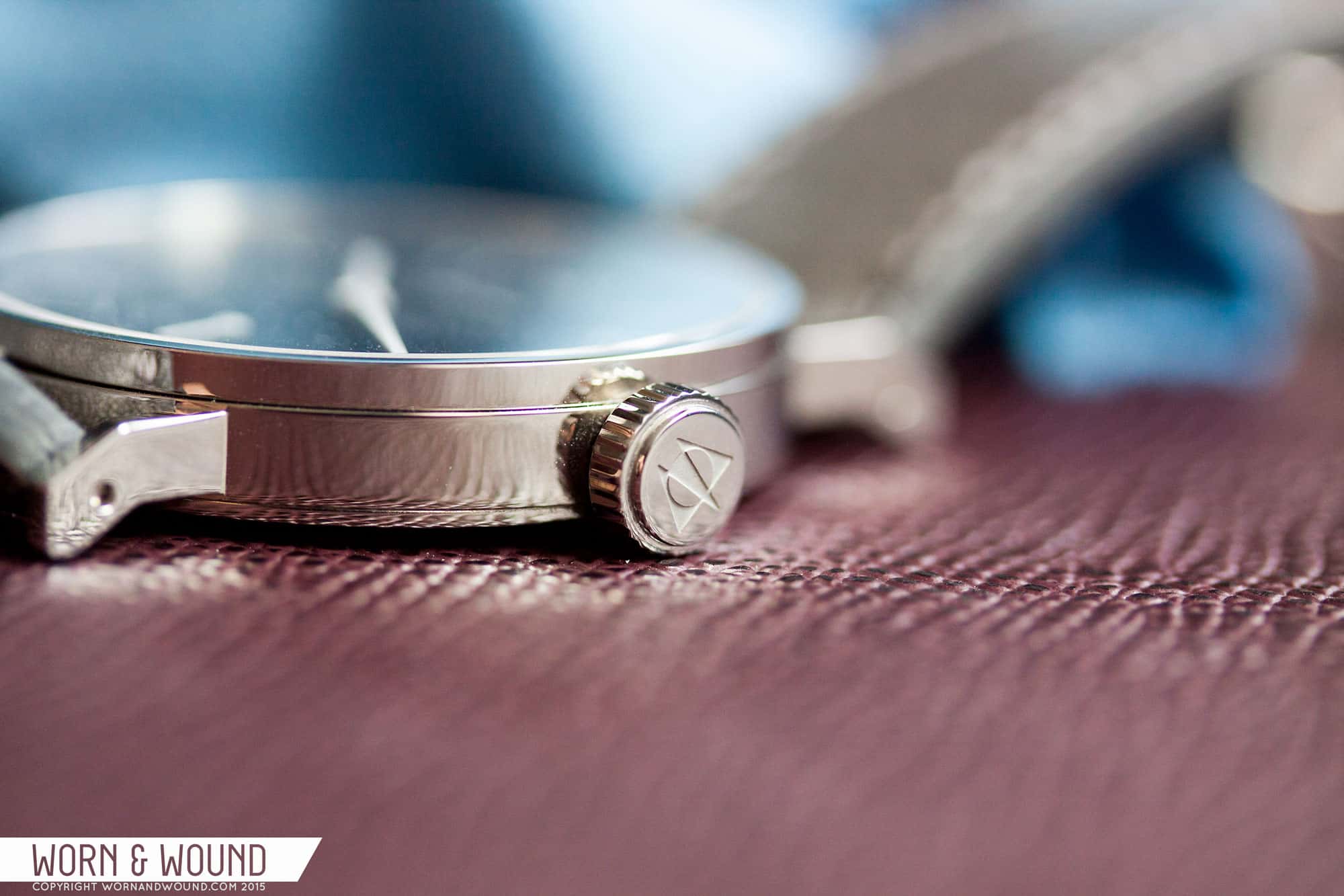
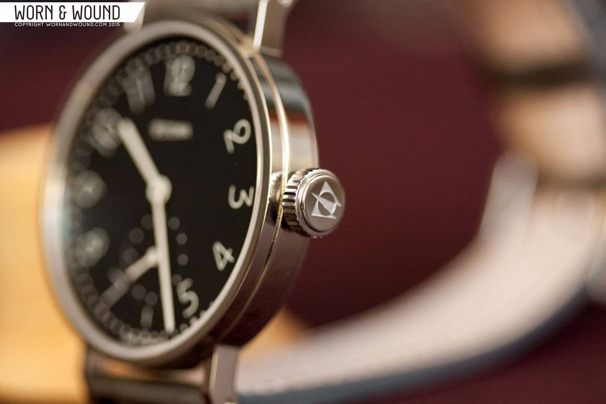
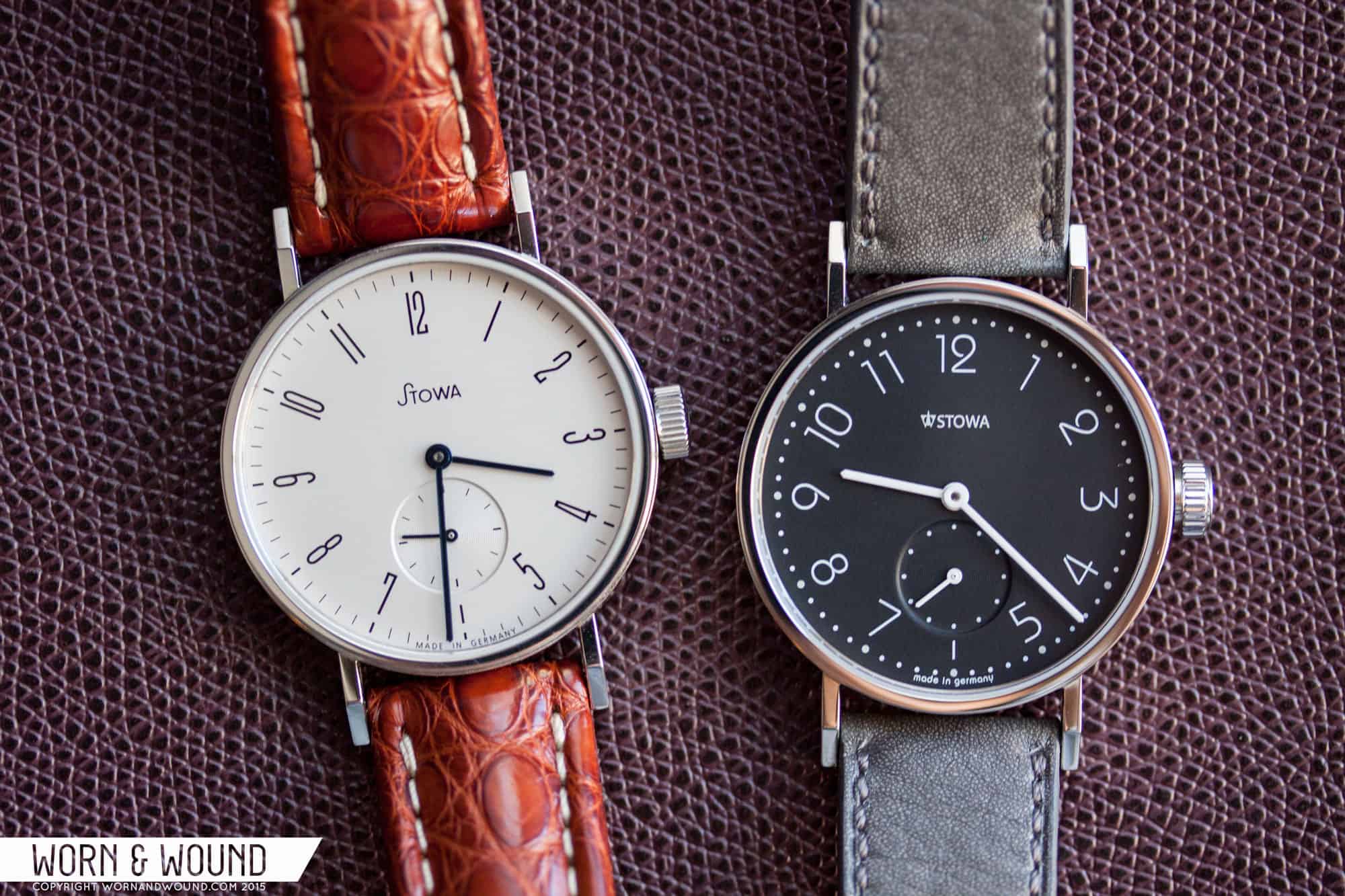
Around this time last year, Stowa released the Antea “back to bauhaus” series. The “b2b” was an offshoot of the classic Antea line, which itself pulls inspiration from a watch Stowa first produced in the 1920s. The b2b was yet another product born of the collaboration between Stowa and famed German designer, Hartmut Esslinger, who also designed the Rana and Stowa’s new logo.
The b2b series was not without controversy, however. Some longtime Stowa fans were puzzled by the release, questioning Schauer’s direction for a brand that had for nearly 20 years produced timepieces based on tried-and-true designs from its historical catalogue. The trepidation online was also likely compounded by the fact that Stowa had recently made other changes that proved to be divisive, with the most obvious example being the aforementioned logo redesign.
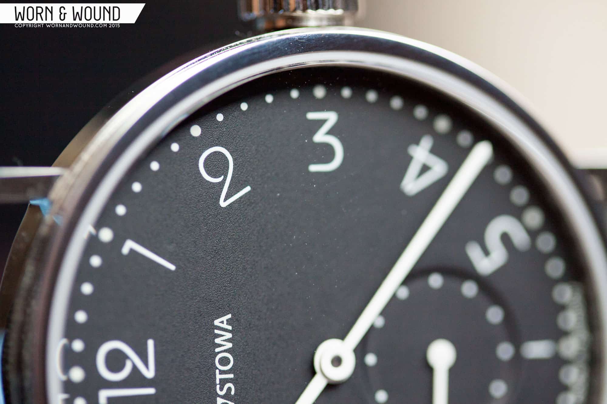
Others–and I include myself in that group–were intrigued by the release. Few reservations aside, I liked the concept on paper, especially the myriad of color options and the dial redesign, but I have to admit that the press release photos left a lot to be desired. Nevertheless, as a huge fan of both Stowa and Mr. Schauer, I wanted to reserve judgment until I saw the collection in person. That was finally realized at Baselworld 2015, and with the watches on wrist, any lingering concerns quickly dissipated. We knew that we had to get one in for review.
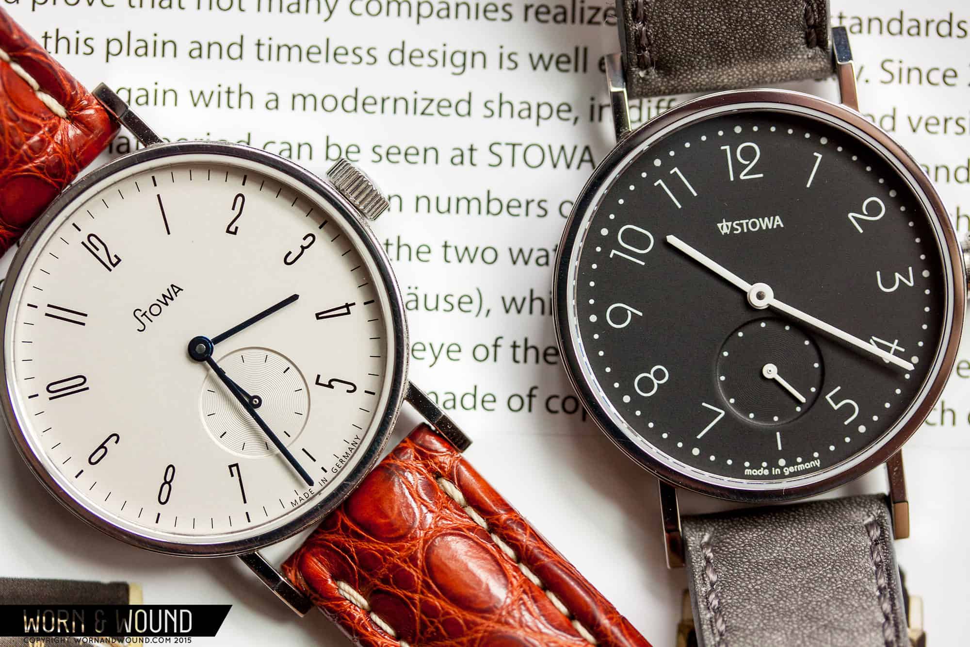
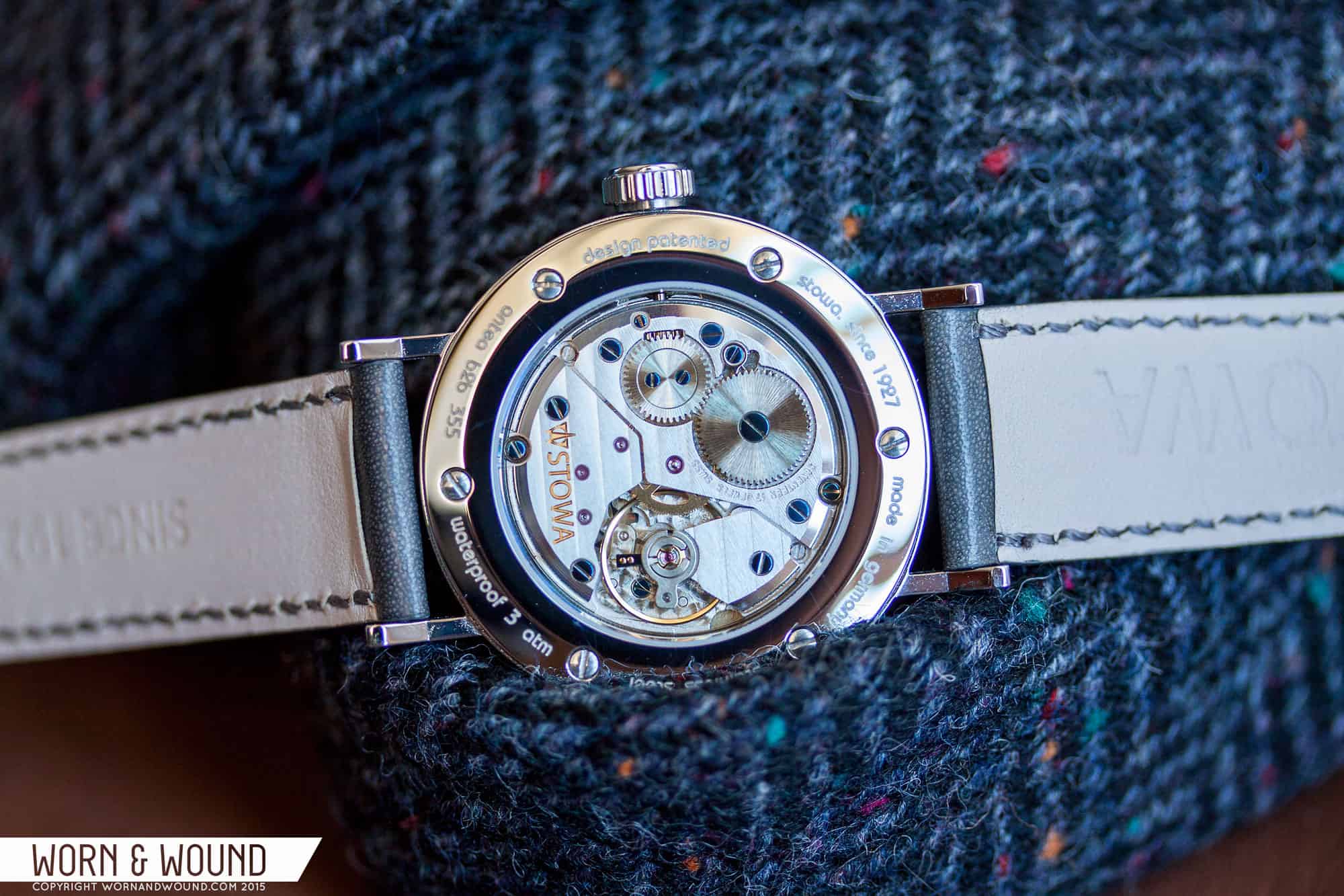
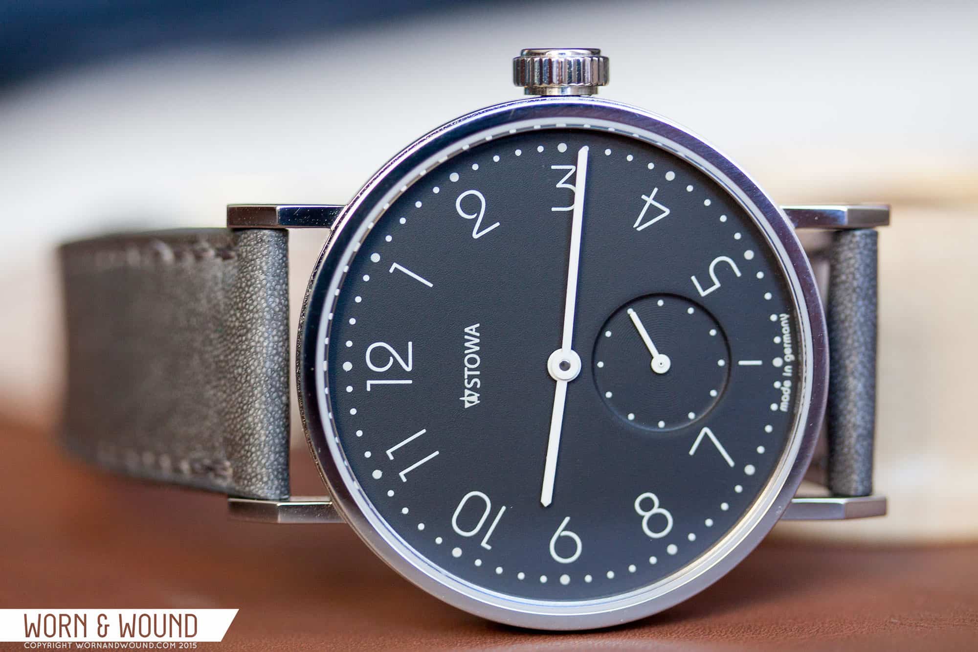
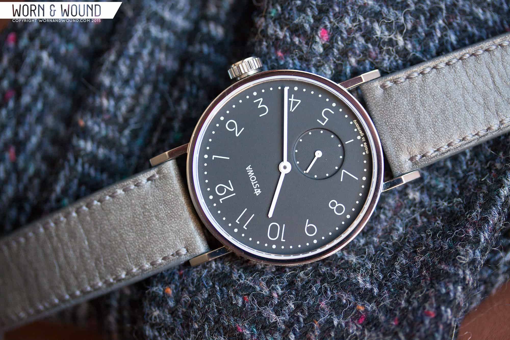
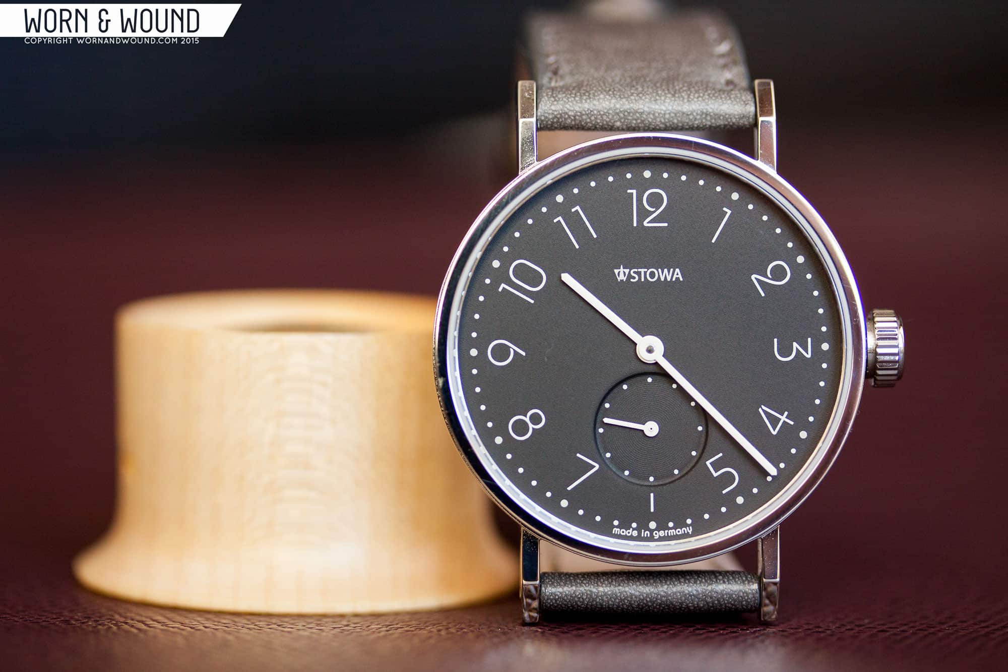
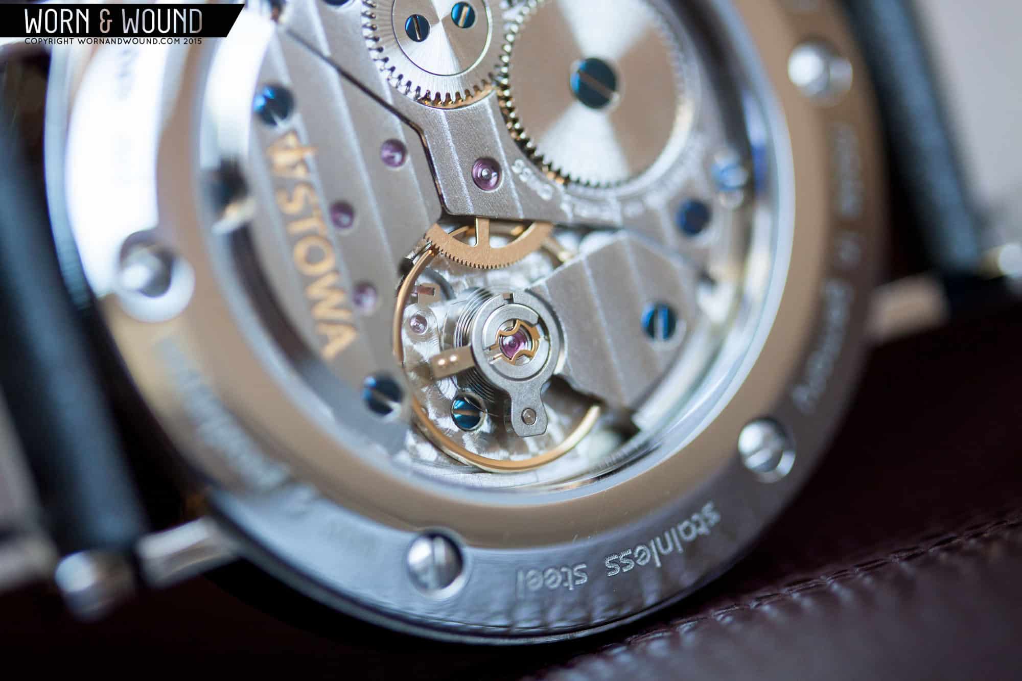
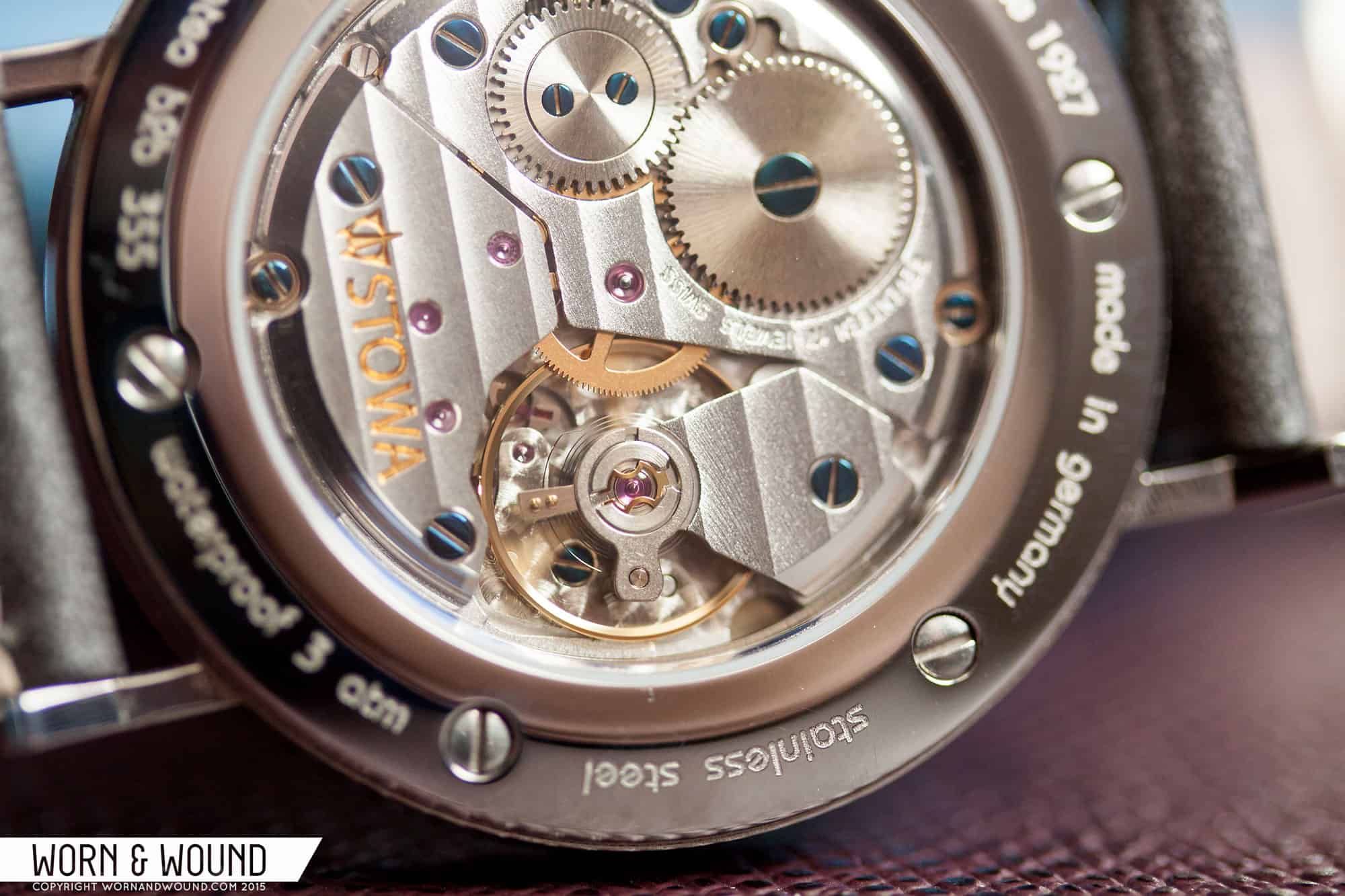
The b2b series comes in three primary styles: the 355 features a 35.5mm stainless steel case and is powered by an ETA/Peseux 7001 top grade movement, and both the 365 (36.5mm case) and the 390 (39mm case) variants come equipped with an ETA 2824-2 top grade movement available with or without date. All three styles exist in 6 distinct colors: black, white, brown, green, blue, and pink. The watch being reviewed today is the black 355 currently available from Stowa for €950, or €798,32 (approximately $850) excluding V.A.T. for those of us outside the European Union. Let’s take a closer look.


whats your wrist size?
6.75″
Absolutely gorgeous watch. Stowa with the help of Esslinger has found its definitive place in the new wave of Bauhaus watches. The font, hands, texture of the dial and printing – all play together so well. I was also skeptical about the case, but no longer, after seeing your live photos. The finishing of the movement and case, dial quality- everything is amazing, even the strap looks special. The only little issue is that “STOWA” could be written in matching Bauhaus STD font, as you have mentioned. But its not a dealbreaker for me. I put Stowa b2b on the second best place for Bauhaus watches, just after Nomos Metro; but regarding the bang for the $, it is clear winner.
Thanks! Stowa did an exceptional job with this line.
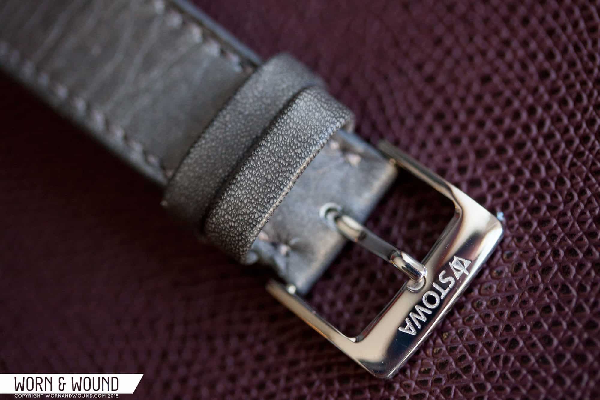
I believe it would look just terrific on Shell Cordovan strap, color 8
For me, as a german, with bauhaus inspired watches on every corner, is the “back to bauhaus” thing ridiculous.
I’m not sure how you interpret it, but to me, it means they are going back to their Bauhaus roots for design inspiration. Not sure how the fact that there is a Bauhaus watch on every corner makes that ridiculous.
“My one thought, and this is more of a musing than it is a critique, is that it would have been cool to have “STOWA” displayed in the same Bauhaus STD typeface found on the rest of the watch.”
This is not a reasonable criticism. The typeface is just as much a part of the logo as the logomark itself. No competent brand would *ever* change the typeface in its logo just to match the typeface used elsewhere in the design.
And that’s why it is a musing and not a critique. Though this is not unheard of when it comes to special editions and such.
It looks good, but I feel like Nomos does this style better.
this is a great looking watch! nice review
Where to buy in the US? The site I found was in another language, so I just wanted to be sure I’d be purchasing from an authentic site.