


 Featured Videos


A couple of years ago, we put a piece together about Padron Watch Company, a one-man show out of Minneapolis. Leo Padron, said one-man, welcomed us into his watch making studio, where he designs and assembles his line of affordable and unique watches (yes, he’s a watch maker). It’s worth a read to learn a bit more about the man and his brand. At the time, he was just finishing up a successful Kickstarter campaign for his Tessera timepieces, one of several such projects. Now, he is currently at the end of yet another successful campaign for an update to the Tessera, named the Selby.

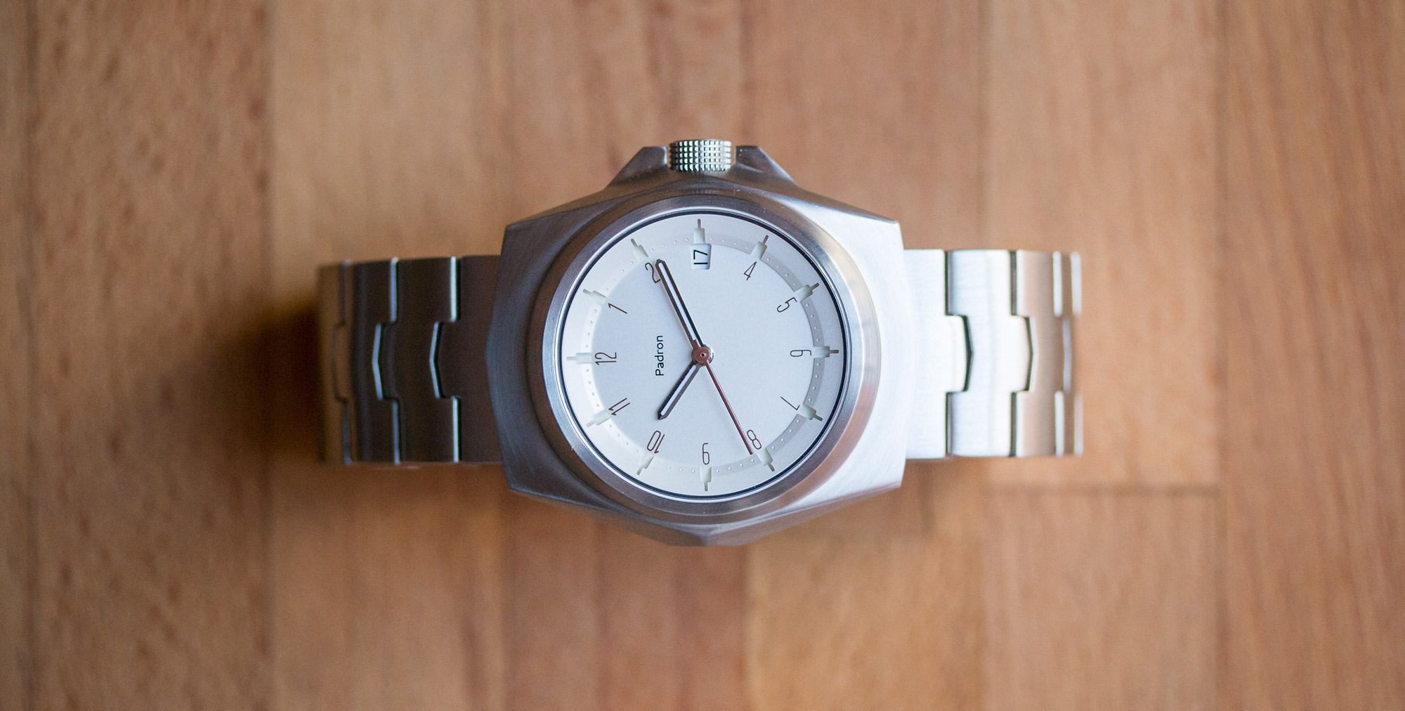
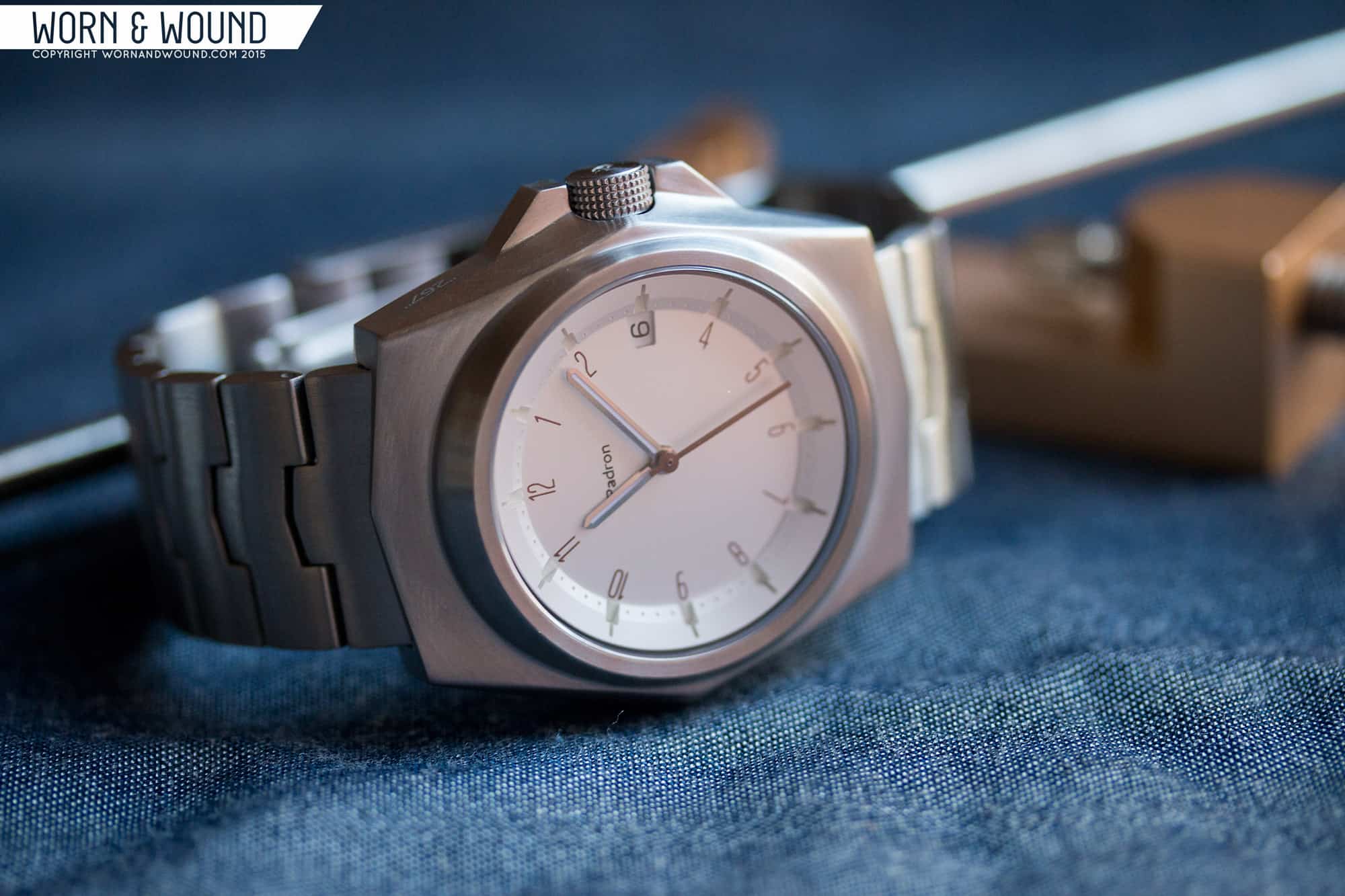
What caught my about this watch, all of Padron’s watches for that matter, was that it’s totally his own vision. His watches are unique and almost bizarre, and while not for everyone, have an undeniable charm. Furthermore, in a sea of watches that seem to be slight variants on an idea or two, his bold designs are a nice change of pace. The Selby was actually the most low key of the bunch, in my eyes. Gone were the signature large circles on the dial, a real love-it or leave detail, and in their place a much more subdued, nay classic, dial. That said, with the faceted, geometrical case, the dial makes for a sort-of “space age” watch, with a retro-future aesthetic that (and this could be a few too many hours of playing Fallout 4 talking) really spoke to me.
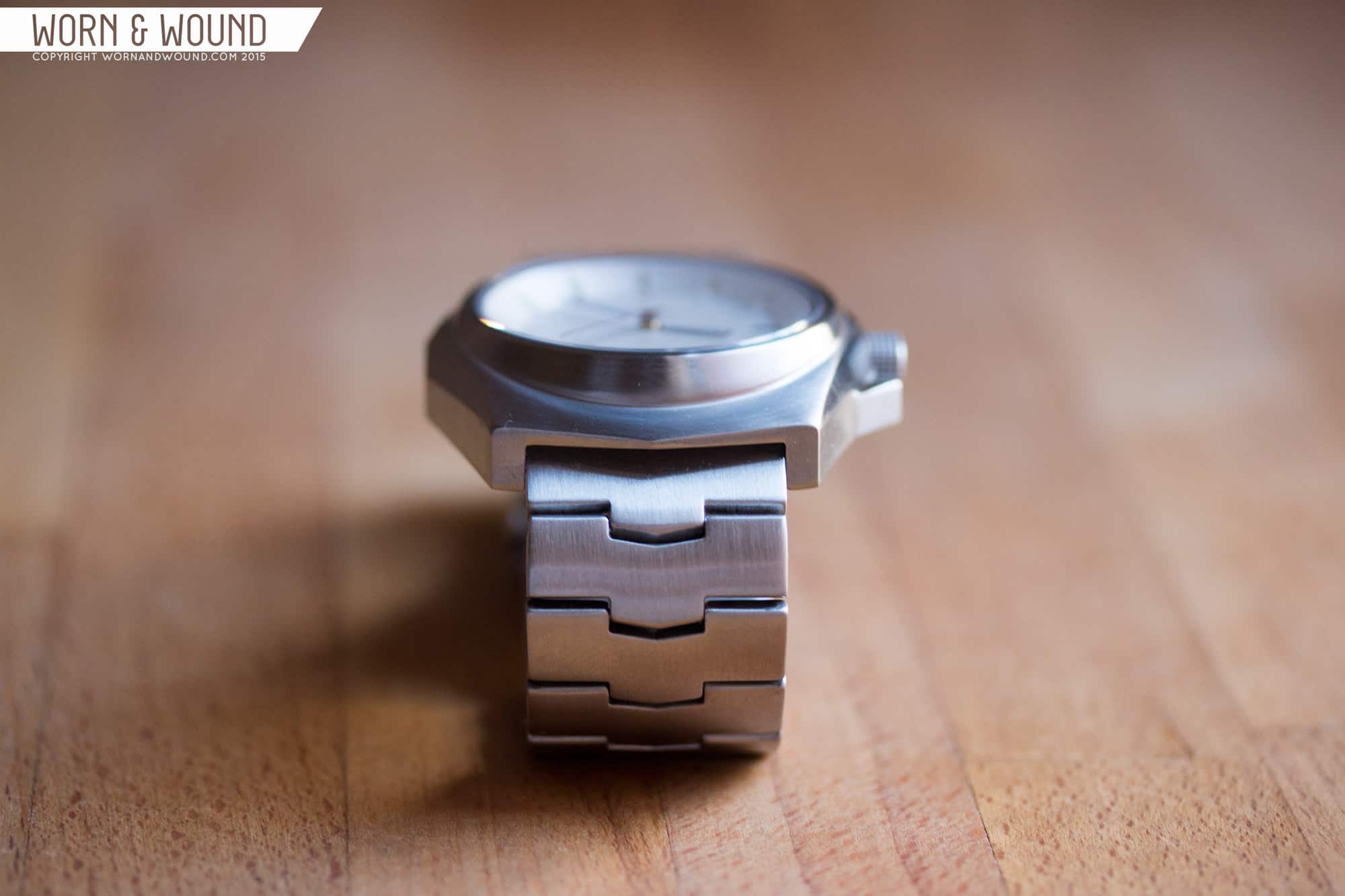
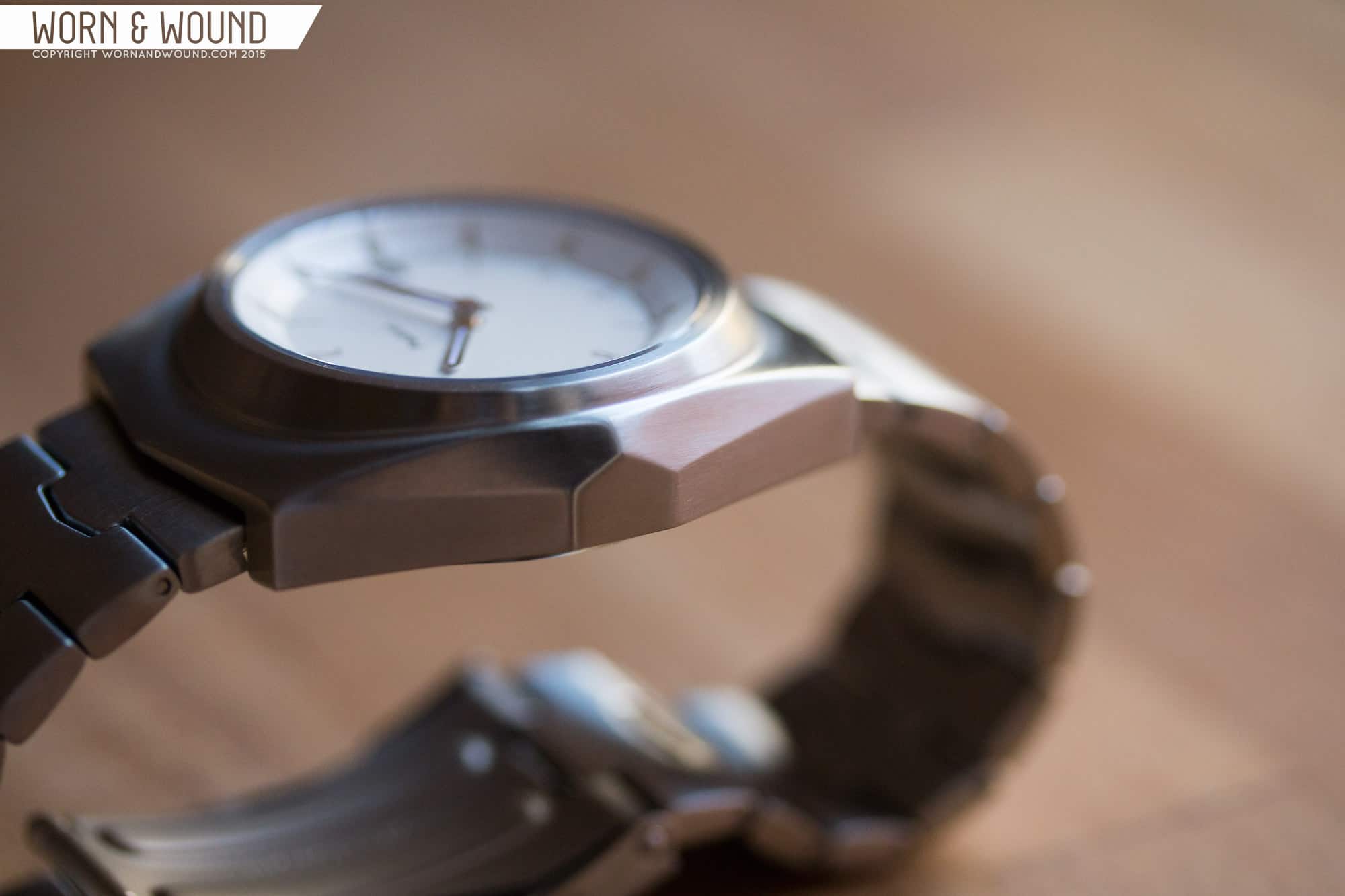
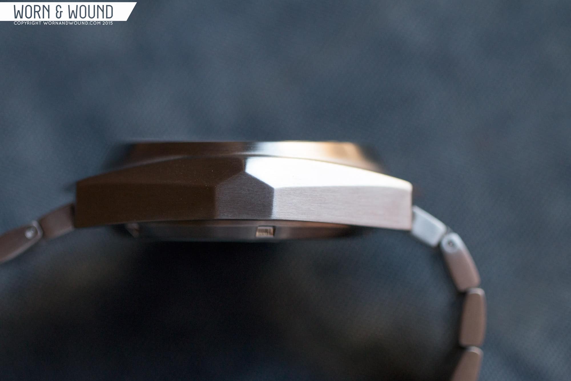
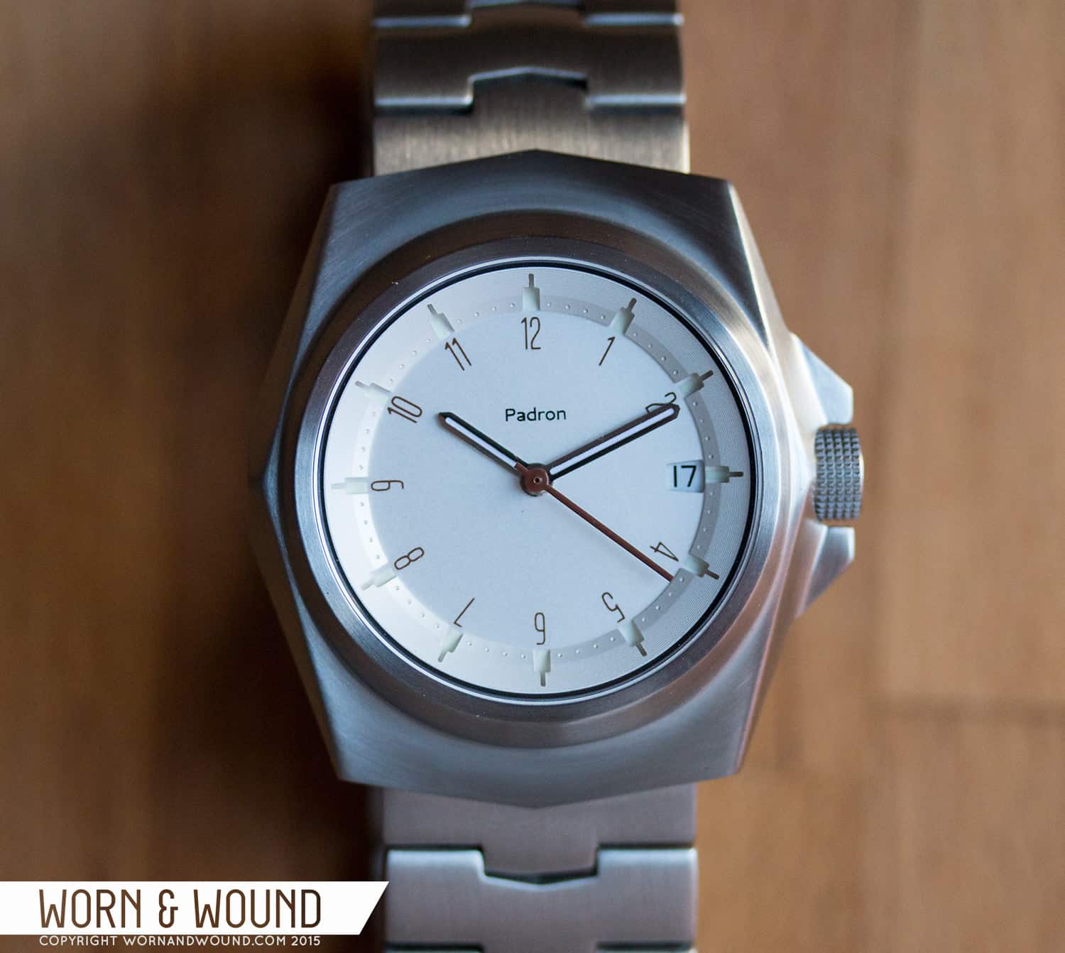
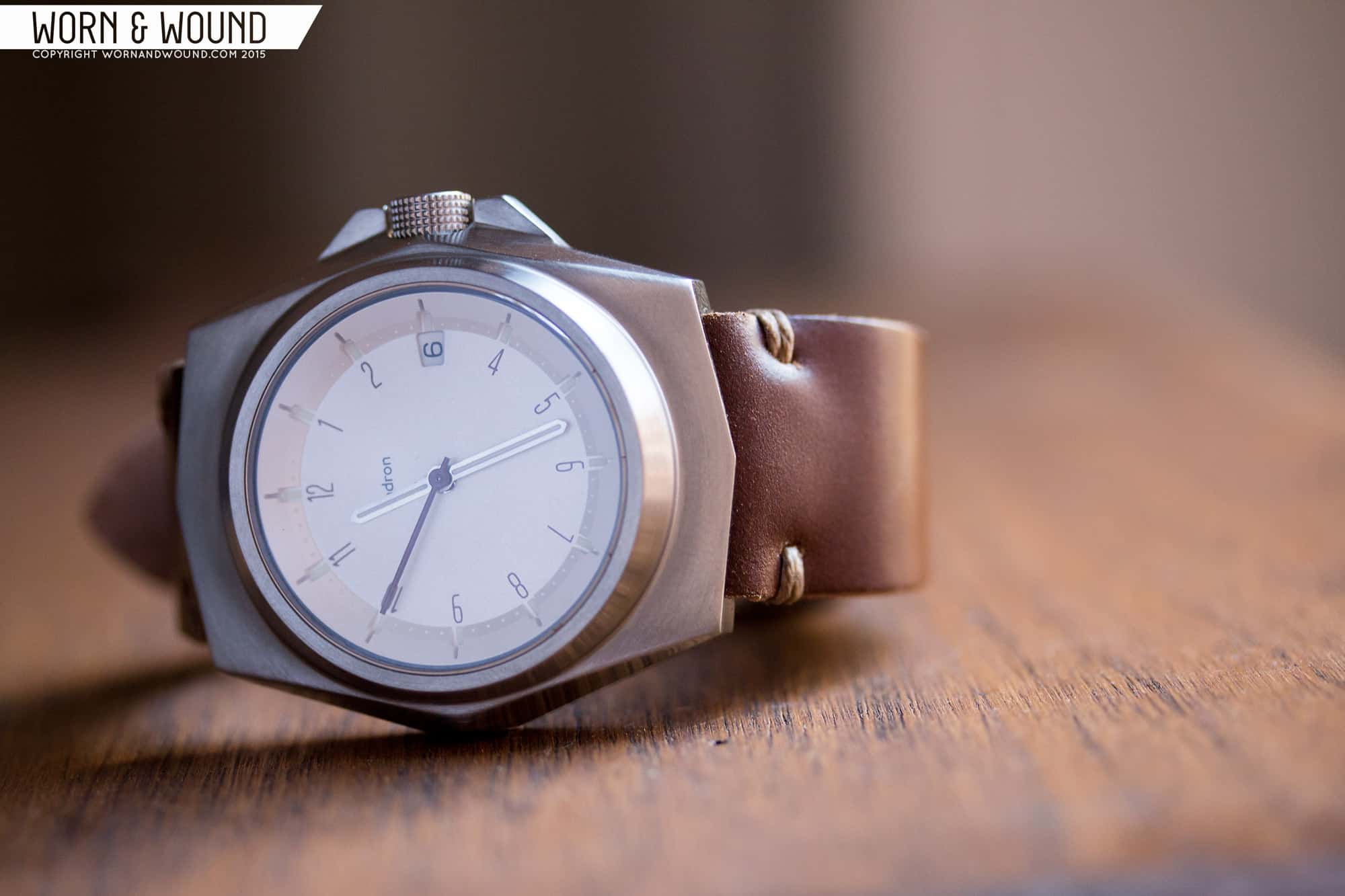
To say the case design is striking is an understatement. It’s 70’s, it’s sci-fi, it’s not really like any other case I’ve seen. It’s essentially a barrel, but rather than rounded, all sides are planes though the top surface arcs from side to the other… It’s like he took a classic barrel, ran it through a low poly-count filter of some-sort, and then machined the results. Measuring 42 x 45 x 12mm, it’s a stout and solid watch that wears smaller, sort of like lugless watch as the lugs are hooded, than you might expect.
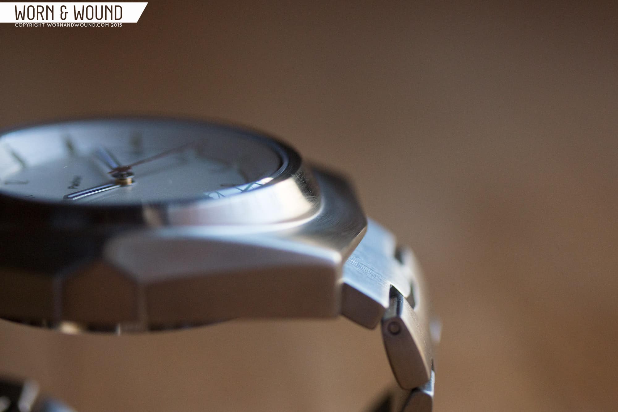
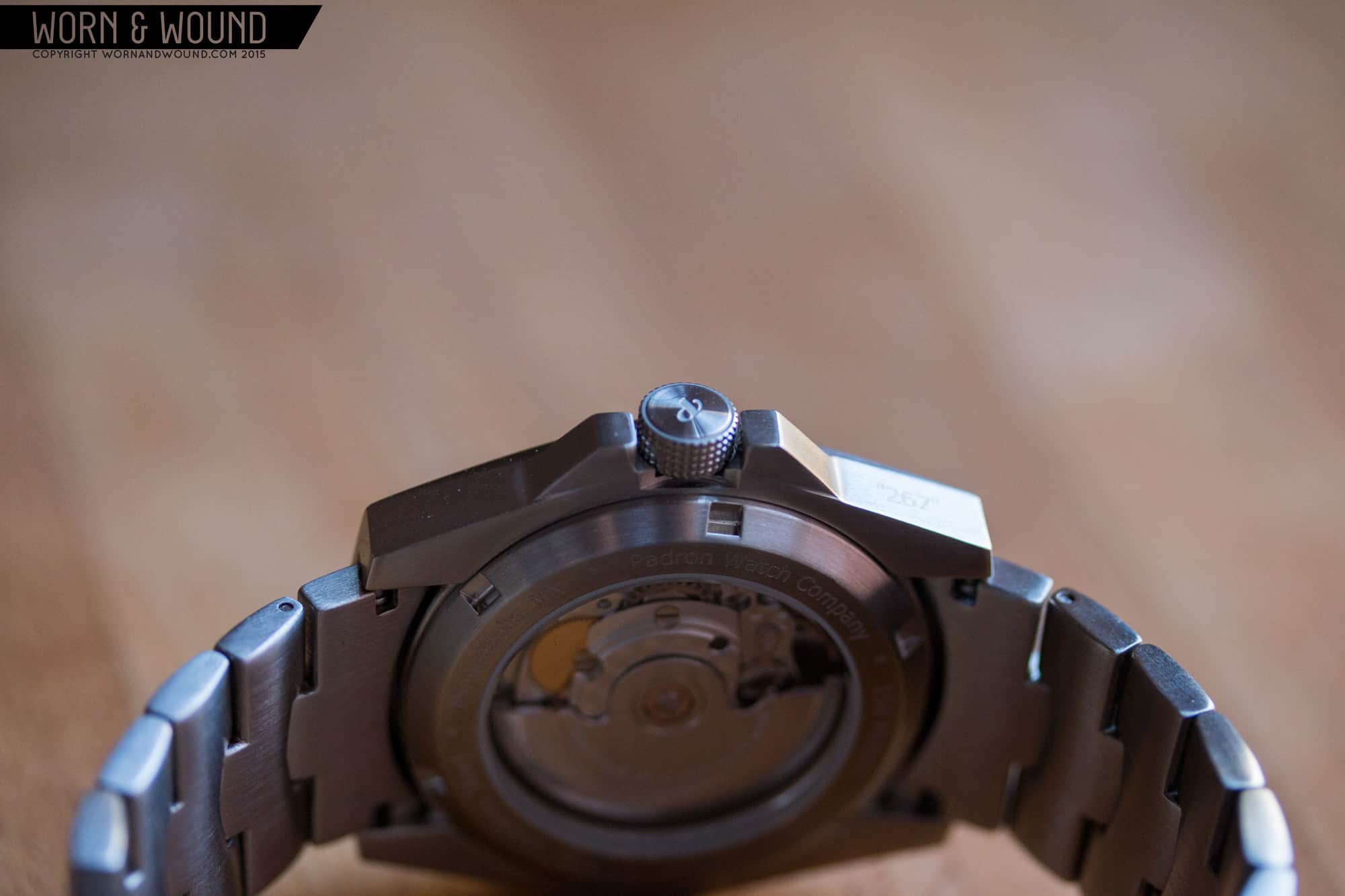
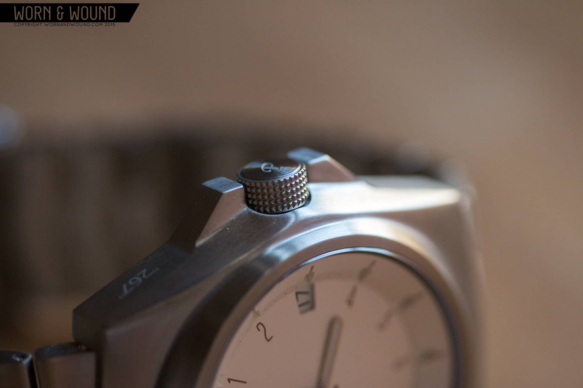
The construction is interesting as the mid-case and bezel are one piece, though the design makes the bezel look like its emerging from the mid-case. As the top surface arcs, getting thicker towards the center of the watch, more bezel emerges. It’s a cool detail that gives the watch a sculptural feel. Furthering that, the non-crown side has this great moment where the various planes from the side of the case would meet, but are flattened out to create a sort-of home-base shape. The crown-side does things differently, as there is a screw-down crown where the planes would meet, and there are chunky crown guards that sandwich it. The crown is nicely done, with knurling all around and a small stylize “P” on the flat side. The knurling is very nice to the touch.
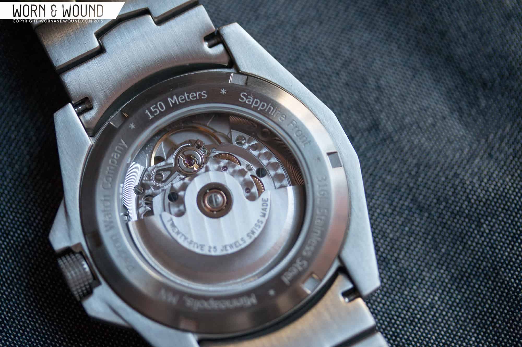
The display case back has a thin rim with various watch details you’d expect, though 150M stands out to me, as that gives this watch a nice depth rating to play with. Through the crystal, you’ll get to see either a Top Grade ETA 2824-2 (seen here) or a Miyota 9015, depending on which option. It’s cool that Padron gives the choice allowing for two different prices. That said, he keeps the prices very low regardless.
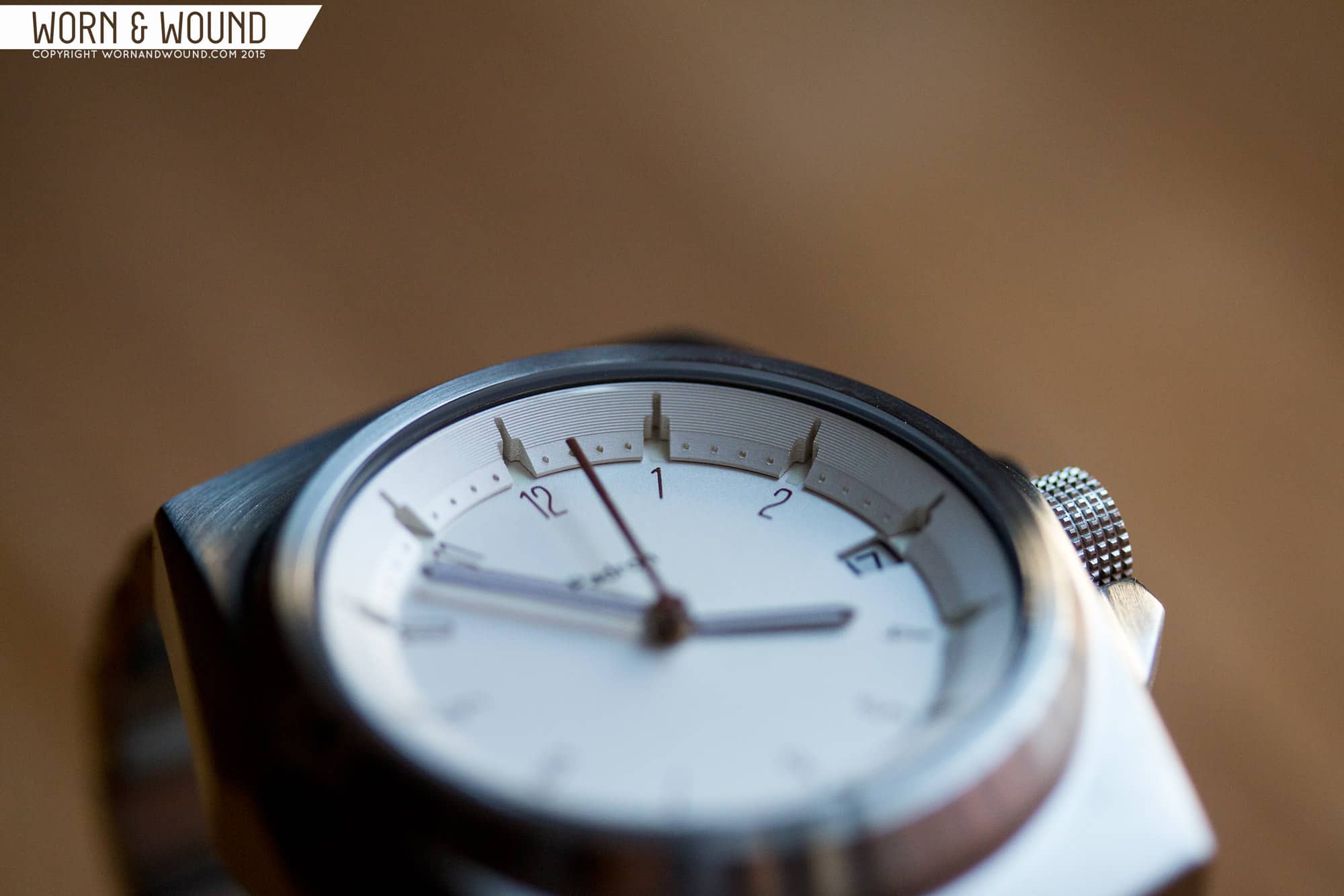
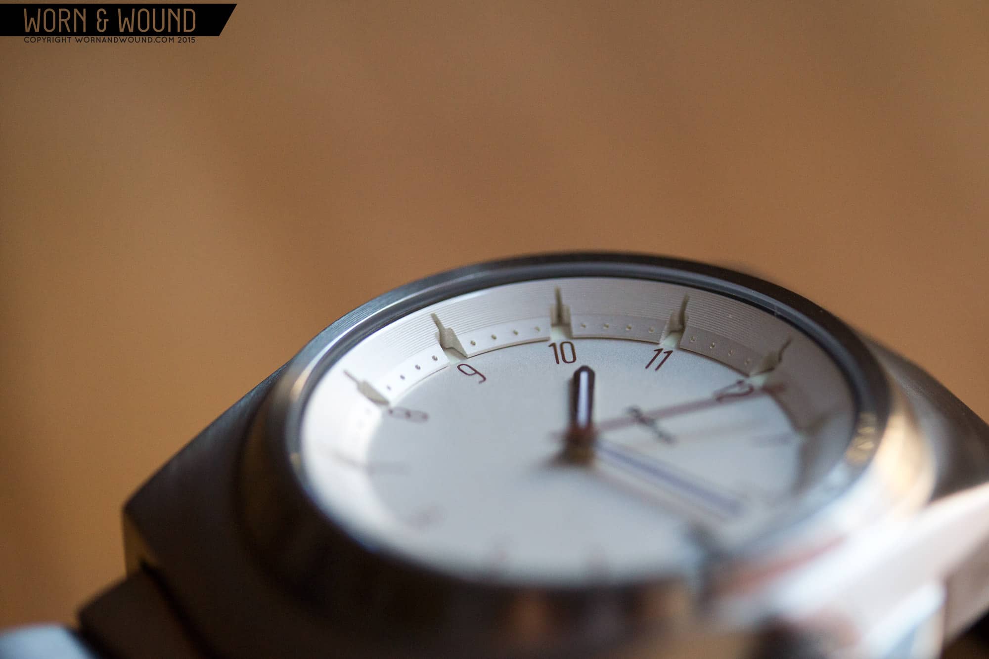
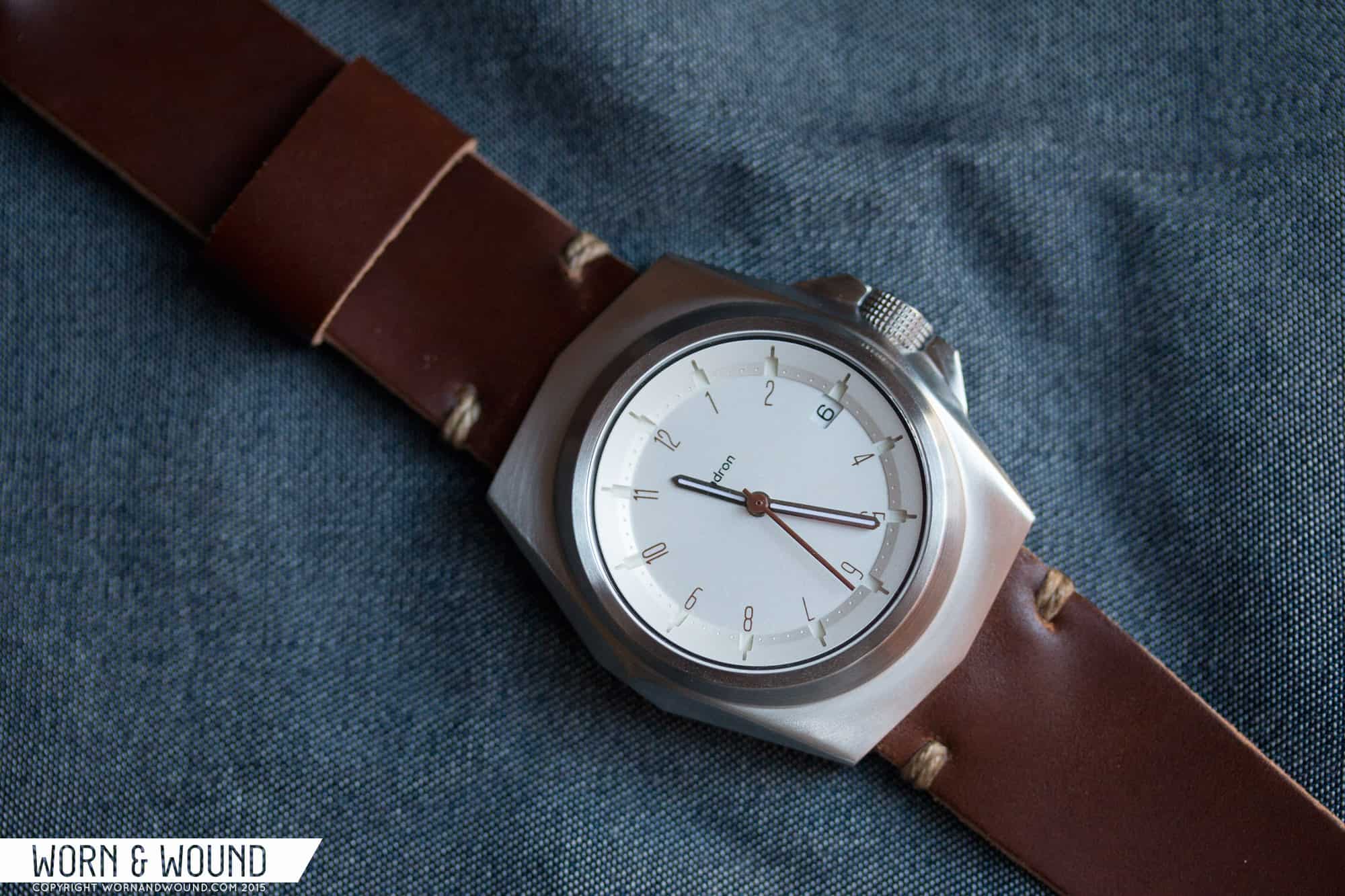
Moving into the dial, it’s surprisingly interesting given how little is actually going on. On this version, the dial is a pale silver with an almost matte finish. On the lower surface, there is an hour index of dark brown numerals in a thin, sort-of Bauhaus font. The numbers rotate with the angle of the hour, and aren’t corrected from 4 – 8 (they are upside down). It’s simple, well proportioned and looks good. The use of brown is unexpected but a good choice. It looks a bit softer against the silver than black would have, and furthers the 70’s feel of the watch. At 3, in line with the hours, is a date window showing the black on white date. The window itself has a keystone shape, which helps integrate the date into the dial. It works nicely.
On top of the main surface is a tall, wide chapter ring that uses texture and cutouts for become an index. It’s a really interesting design, adding to the space age-ness of the watch. The ring consists of graining for 2/3’s of its surface, then the last third is matte, like the dial, and has small embossed dots for each minute/second. The hour/5-minute intervals are then large cut outs, going through the entire ring. These cavities are wide for about 1/2 the ring, and then become thin slivers.
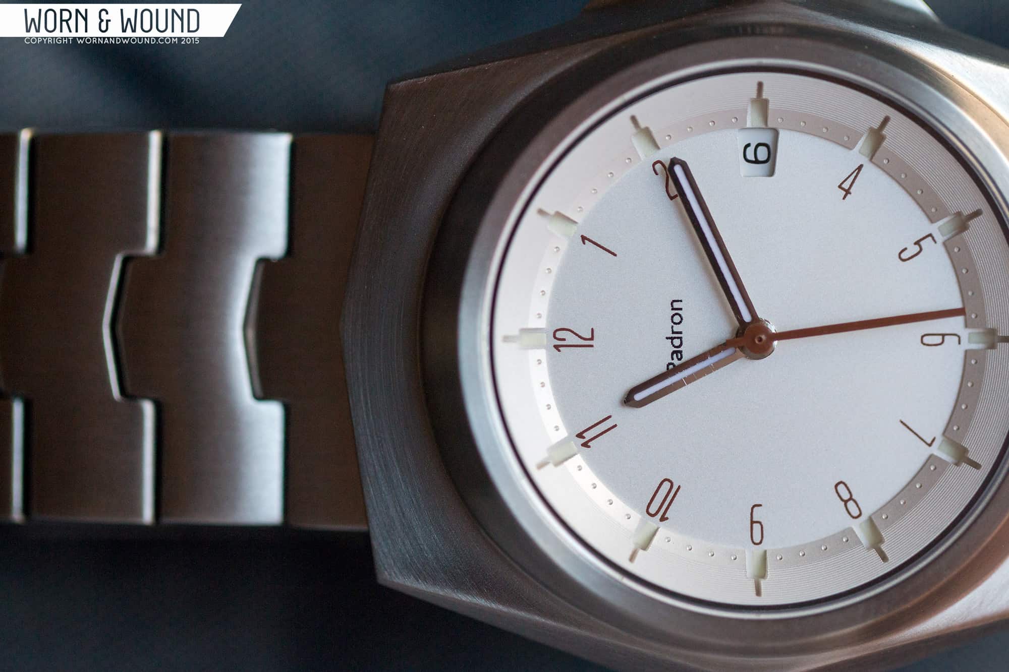
I really like this concept as it very clearly marks the various units of time, but uses a non-traditional method. And by being physical, it adds to overall sculptural feeling of the watch. In each of the crevices made by these cutouts is a small rectangle of lume, which are fairly imperceptible at first. When charged, though, they are quite potent, adding some useful legibility in the dark.
The hands are very simple. The hour and minute are fairly thin swords out of polished metal. They are both lumed and glow well. The seconds hand is a stick in a brown that matches the numerals on the dial. I like that the color matches, though the hand itself feels a bit too plain, and bit short or stubby.
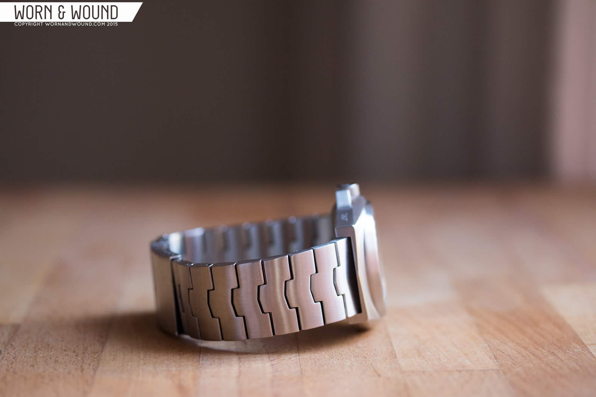
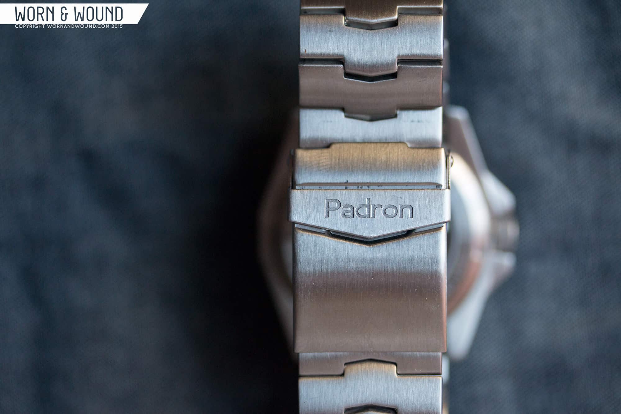
The Selby comes on a 22mm bracelet of their own design. It consists of single-piece links that connect via pins that passthrough a chevron shaped connector, thus simply chaining together. I was very glad to see it was a unique design, and not just another oyster style, or something typical. It work with the case shape, creating a more complete concept. The links are also nicely shaped with a gentle roundness which is on both sides. Overall, it’s a nice addition to the package, though I wonder if a tapered design might have reflected the case angles a bit more.
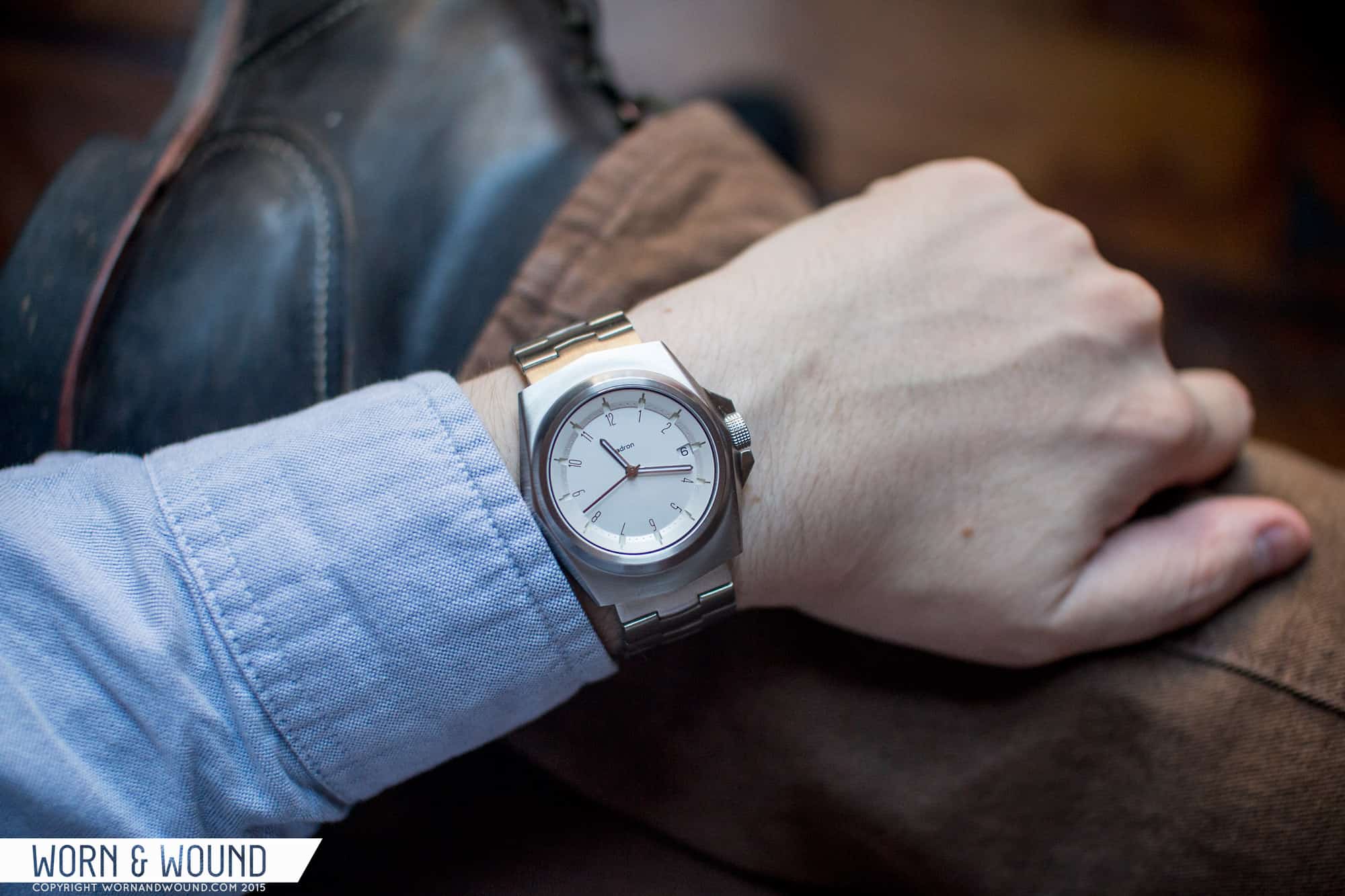
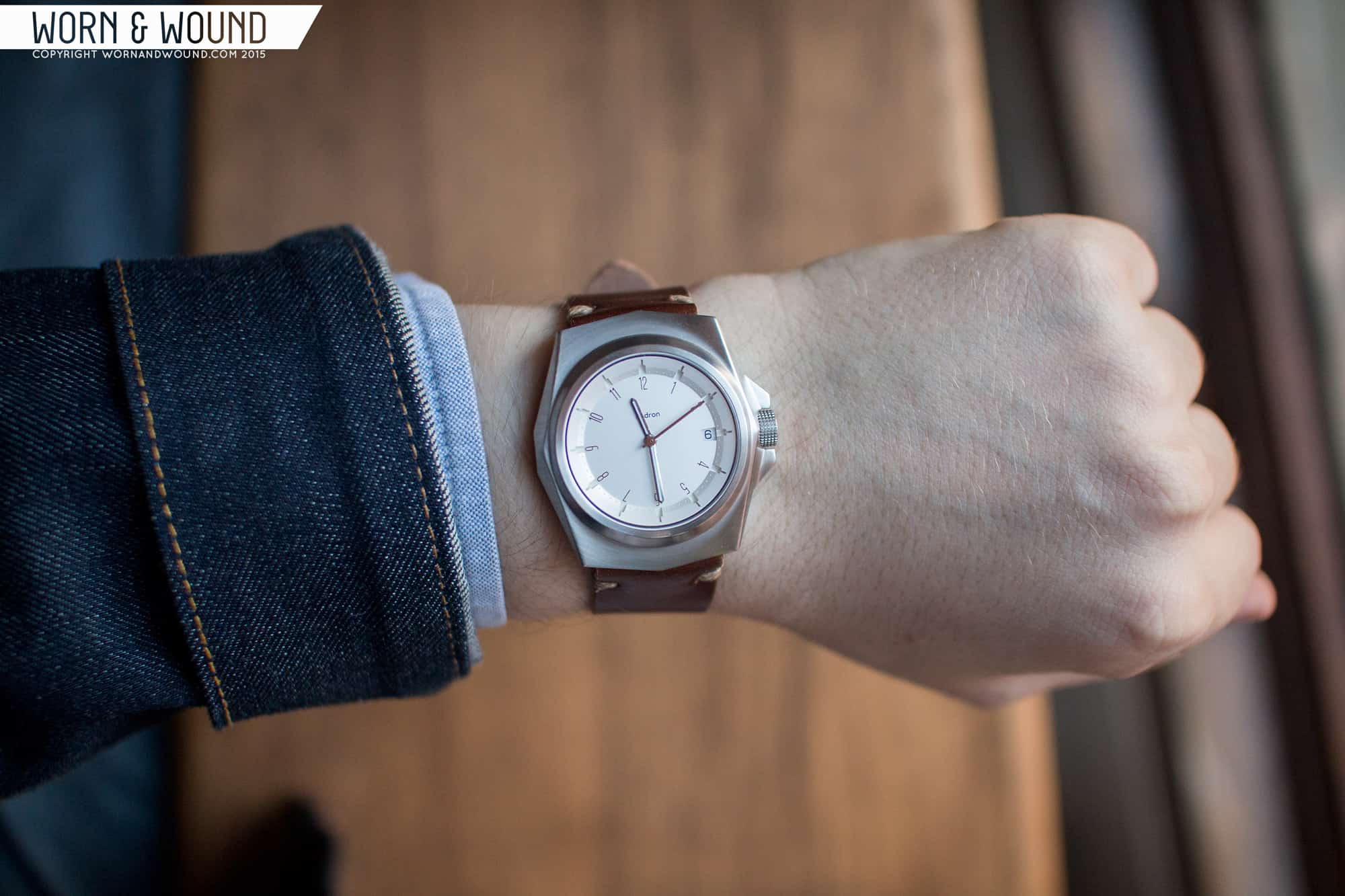
I did try the watch on a leather strap as well. Actually, one of our Tobacco Shell Cordovan Model 2’s as it perfectly matched the brown of the numerals. The watch looks great on a strap. The little point that comes out above the lugs is a cool design detail that is more pronounced over leather.
In both cases, the watch wears very well. Its shape is so different that it doesn’t really compare to other 42mm watches, but to me it wears small. Certainly 45mm lug-to-lug is on the low side, so that will fit smaller wrists. As such, it seems like the right size for the watch. It’s nice and sporty, but not garish or extreme. Certainly something with such a funky shape runs the risk of being too showy, but Padron kept it modest at the same time. At the end of the day, it’s still a modern sport watch meant for day to day wear.
All said an done, the Padron Selby is a very cool watch. A watch that, unlike too may others, is genuinely a unique design. Padron doesn’t do stock parts, and it shows in everything. The best part, though, is that the aesthetic is his own. He’s not trying to really fit into any preexisting category with this, which makes it more special and interesting. Sure, to me it’s sort of sci-fi, sort of 70’s, but that’s me making sense of it. It’s its own thing, which is great. Will it be for everyone? No, but different concepts rarely are.
All that said and done, it’s also a really good value. Through their kickstarter campaign, which ends on Dec, 18th 2015, the Padron Selby that’s shown is available with a 9015 for $389 or with the top grade ETA 2824-2 for $596. Both are great prices, but $596 for a top grade ETA 2824 is incredible (second time this month we’ve seen inexpensive 2824s…hmmm). Add into this that Leo Padron is assembling these himself in MN, giving them that homemade touch, and those prices are even more remarkable. Either option is good though if you like the design. After the campaign, the prices will raise to $519 and $728 for the 9015 and 2824, respectively. The $519 is on par with other 9015’s, but the $728 is still a great value.
There is also a PVD version available with a black dial with blue numerals, and I believe you can do either dial in each case. Looking forward to seeing more from Padron in the coming years. As the US market grows, he’s poised to be doing interesting things.


I really like this, it’s unusual, but not outrageously designed. It’s not over the top and not screaming for attention. But the details are really nice. I love that chapter ring!
I don’t know what happens. Earlier today when I saw this review I thought the Padron watch is almost ugly.. Now, when I look at it second time, I can’t believe it, but I find it sooo intriguing, original and absolutely attractive. If it continues to grow on me, I will have to buy it 🙂
I bought the Hennepin for my husband but have since stolen it and wear it almost exclusively. I paired it with the ostrich band and LOVE IT. I get comments on it all the time. I am going to buy my husband a Tessera but the Selby is pretty intriguing. It has a banker’s sensibility.
Hmm, the Selby + leather band. I think I love it.
I thought about Selby. I still continue to like it very much. But… It looks undeveloped somehow to me. I don’t like the fact that the bezel and the case are one piece. The font on the dial is bauhausish and I am not really sure how well it goes with the case and bracelet design aesthetics. Otherwise it is pretty unique and remarkable and the movement is just great As I analyse my latest purchases – two quartz, one Miyota and one Seagul movement I understand that for me watches are mainly visual objects and that I actually don’t care that much about what’s inside. I can honestly admit that this watch has stricken some very important points, but in the end it failed to climb over the rim of my watchbox 🙂
Simple. Unique. Classy. And with two (2) very good motors.
Well designed and well executed. Good job Mr. Padron.
Very good job.
This will be a classic for sure. It’s original and the value is is insane!