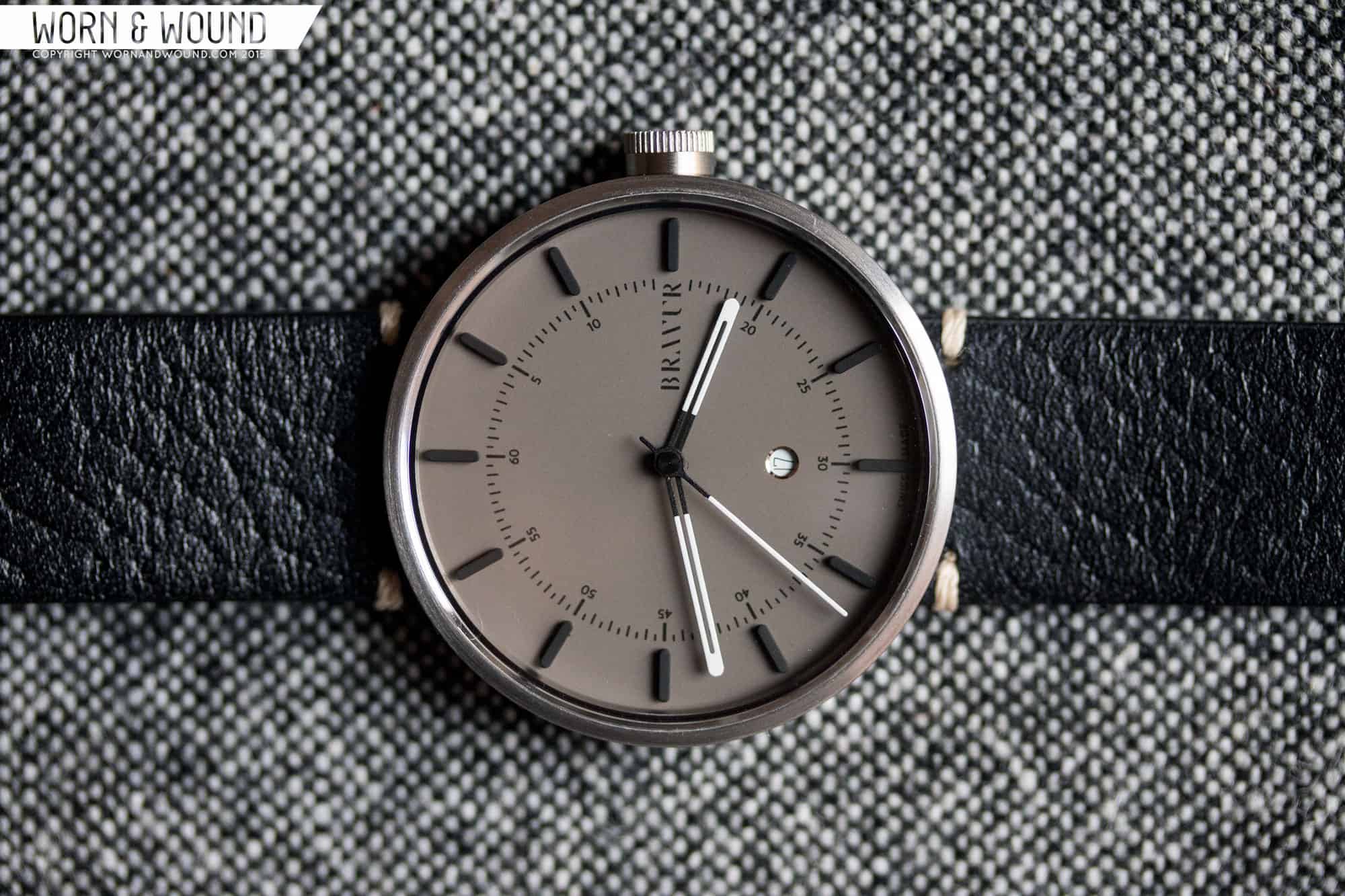
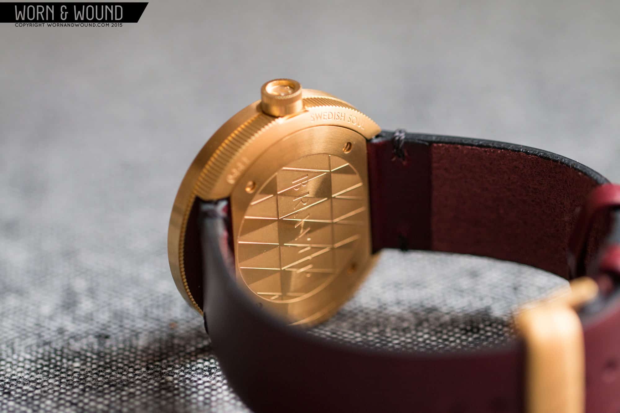
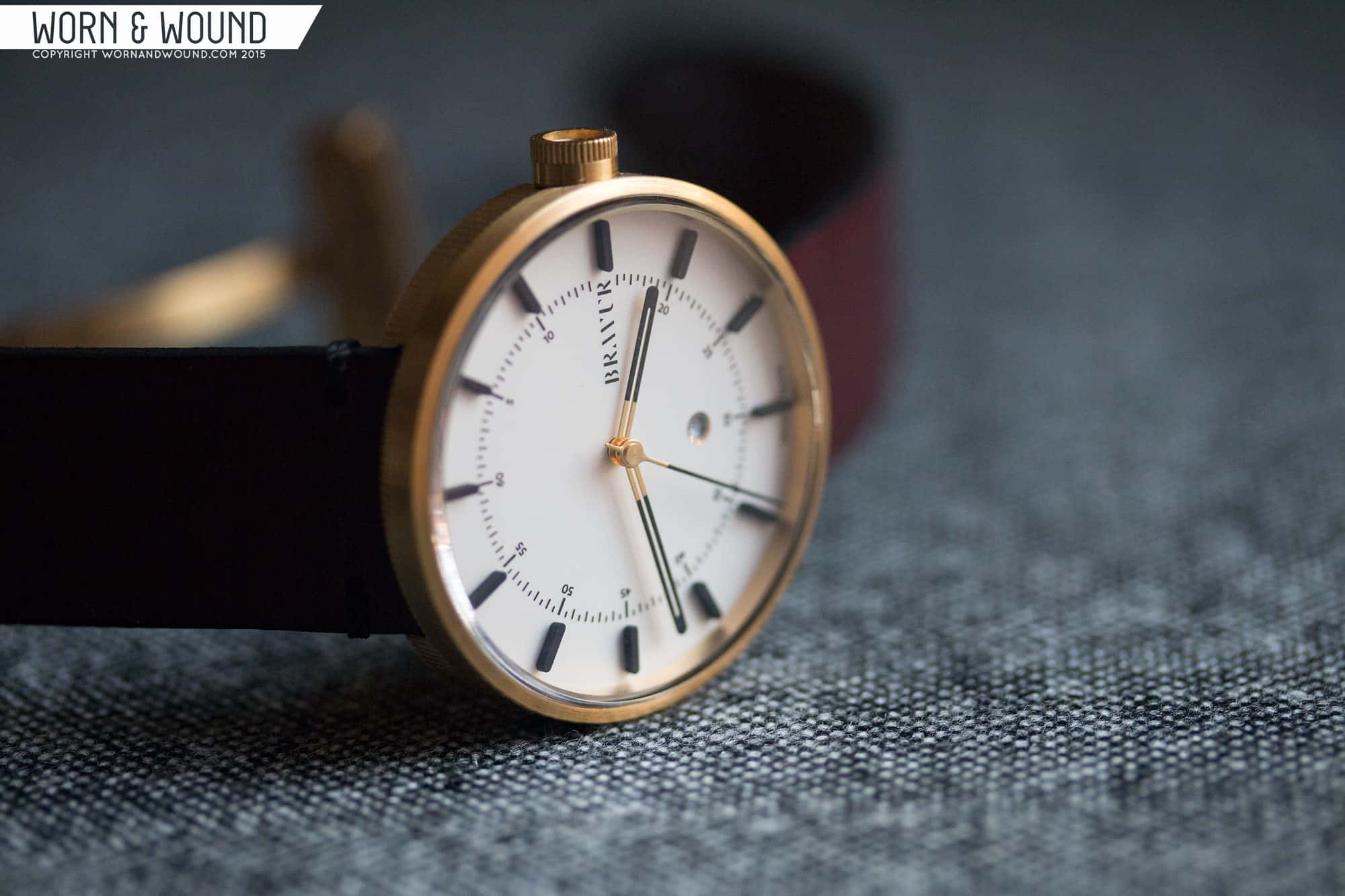
Hands-On with the Bravur BW002

About two years ago, we reviewed the first line of watches by the Swedish brand Bravur, the BW001. Their unique take on a modern minimal design, backed by a great case, made the watches successful pieces, though their prices were a bit higher than desired. Recently, they released a follow up model, the BW002, which takes their aesthetic into even cleaner territory. While co-exisitng with the previous watch, I do get the feeling that BW002 is an evolution on their aesthetic concept. As such, there are small differences that feel like improvements throughout the design. It’s a bit smaller and more sparse, perhaps simpler in general, but comes across a bit tighter and more harmonious. With a slightly reduced price tag starting at $625, the BW002 is still on the high side for a quartz, but has many great features with taking a closer look at.

BRAVUR_BW002_BW001

Advertisement
$625

Hands-On with the Bravur BW002

Case
Steel
Movement
Ronda 785
Dial
Gray + SIlver/White
Lume
No
Lens
Sapphire
Strap
Leather
Water Resistance
5 ATM
Dimensions
38mm
Thickness
9mm
Lug Width
20mm
Crown
6 x 3mm
Warranty
2 year
Price
$625

Case

The case of the BW002 takes cues form its older brother, the BW001, but is stripped down in both size and decoration. Coming in at 38 x 9.2mm (to the top of the domed crystal) this lug-less case is quite a bit smaller than the BW001, but like that watch, due to its large diameter, wears larger. It’s actually the perfect size for the watch, with proportions that all feel just right.

BRAVUR_BW002_CASE5

The design and construction have changed a bit too, but are similarly well executed and clever. The case is split in half, with the lower half having a fluted texture, and the upper half just being cleanly brushed. I love the texturing they did on this and the previous model, which sets the watches design apart. On the previous model, there was a ring of contrasting material that separated the halves, which is gone here. It’s something I also loved about the original, but didn’t miss on the new watch. It’s a cleaner, simpler design without it.

Previously, the case back actually included the lugs, but since they are absent, the slots for the straps are cut through the lower half. This sets the removeable area of the case back in, which takes the shape of truncated circle, but still has ample room for their diamond patterned art. It’s a motif I like that adds to the watch as a whole. The 6 x 3mm crown is a push/pull type, and has a design that mimics the case as a whole. The half towards the outside is textured with fine teeth, while the inside is flat. As with the BW001, the outside surface is deeply inset, featuring their AV logo within the crown. Another cool detail. Since the crown is a cylinder, it can be a touch hard to pull, but they added a tiny indent on the case back allowing you to get your nail behind it.

BRAVUR_BW002_CASE4

Design apart, the quality of the case goes a long way in the look and feel of these watches. Yes, they cost a bit more than you might expect, but when you see and feel the quality of the case, that price begins to make more sense. The machining is just perfect, and the details are all just right. Everything from the light, clean brushing on the bezel to the gorgeous chamfer and dome of the sapphire.

Dial

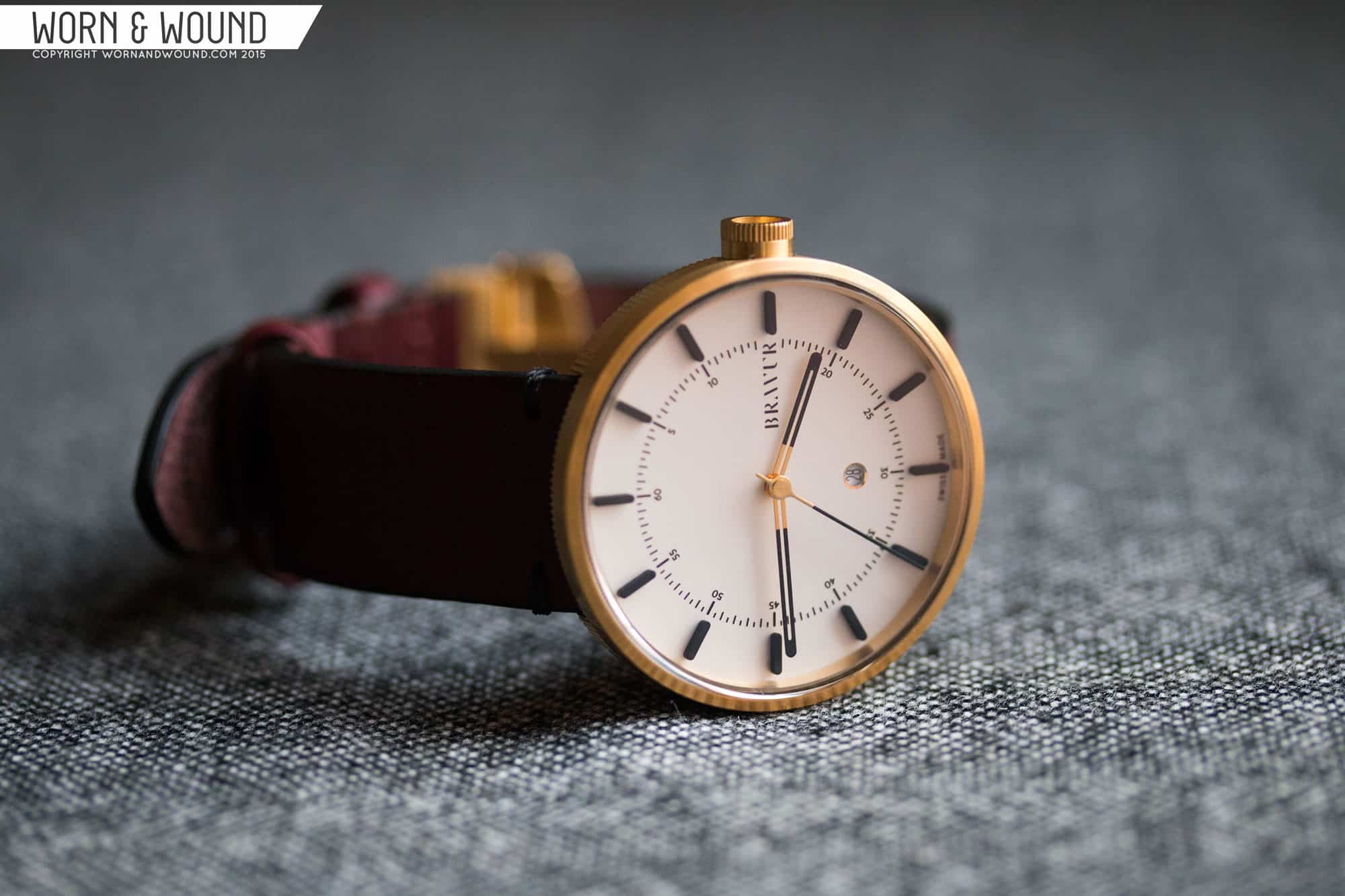
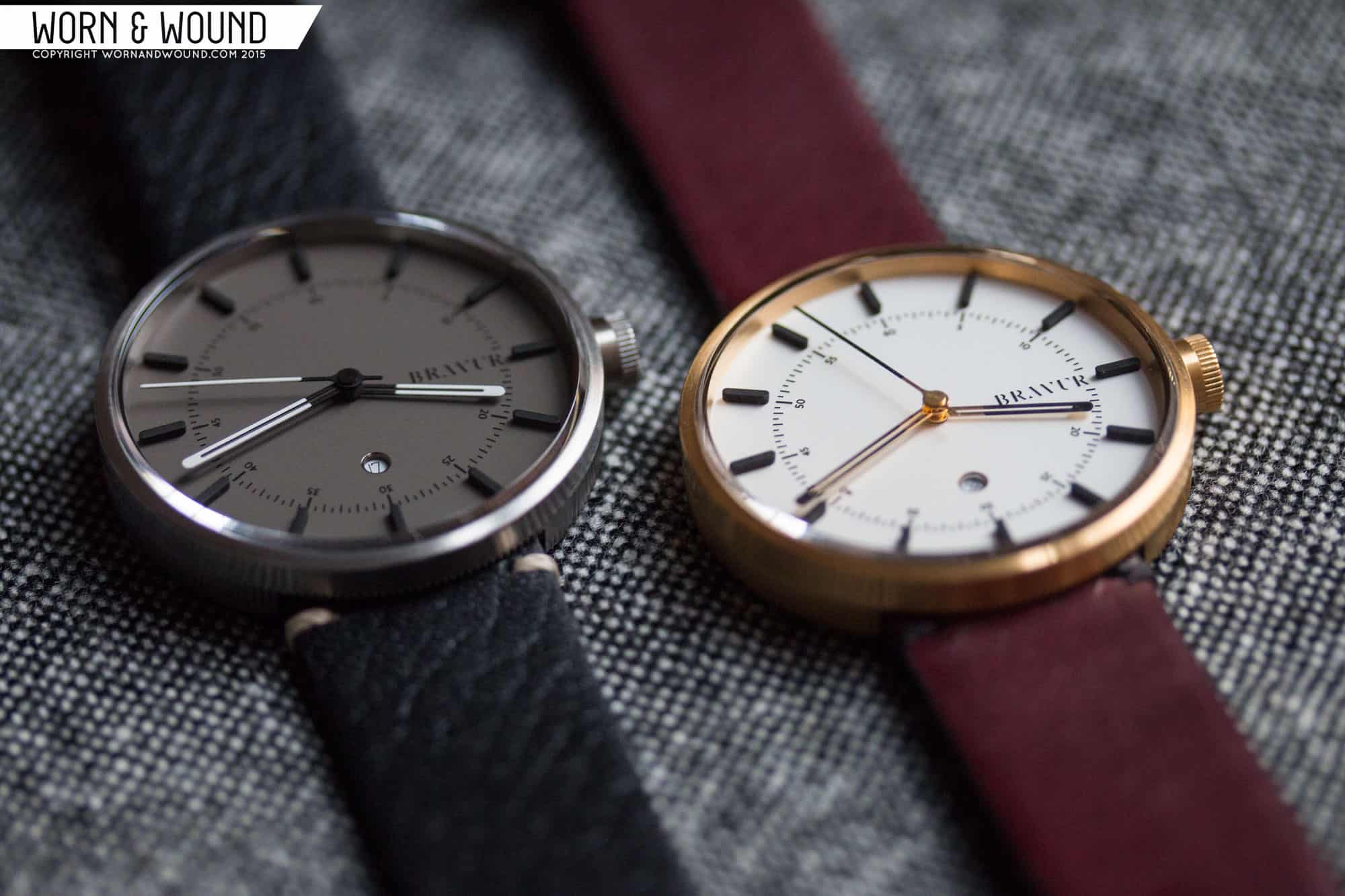
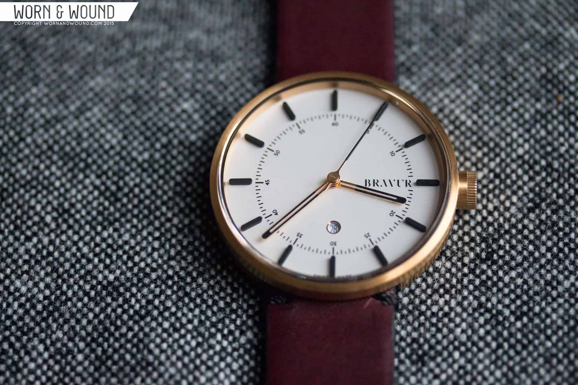
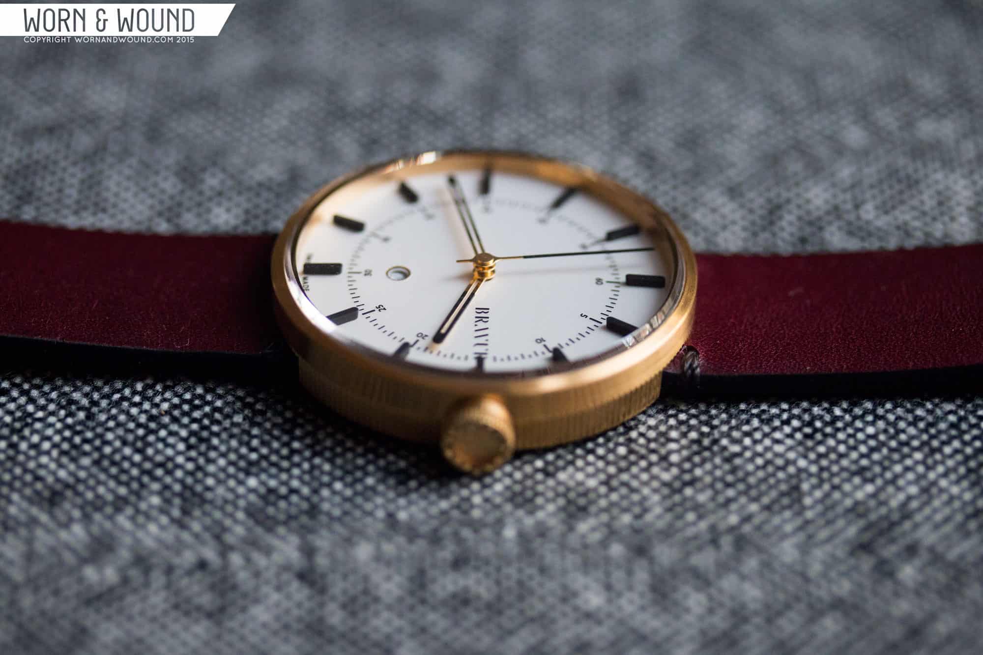
Similarly to the case, the dial of the BW002 is strongly related to the BW001, but is reduced graphically for what is actually a more successful design in my eyes. The layout is about the same, there is an applied hour index encircling a printed minute/second index. The logo is at three and the date is at 6. Rather than numerals for the hours, they went with tall black rounded rectangles. It’s a great look that simplifies the dial, but maintains legibility. Often applied markers have a vintage feel, but the execution here in matte black has a very modern feel.

BRAVUR_BW002_DIAL10

The inner index went from a striking double index to a more classic style. It’s clean and unfussy, making it read easily. Looking at the two watches side by side, while the BW001’s index is more unique, the subtly of the BW002 works better overall, further making the watch feel like an evolution on the original design.

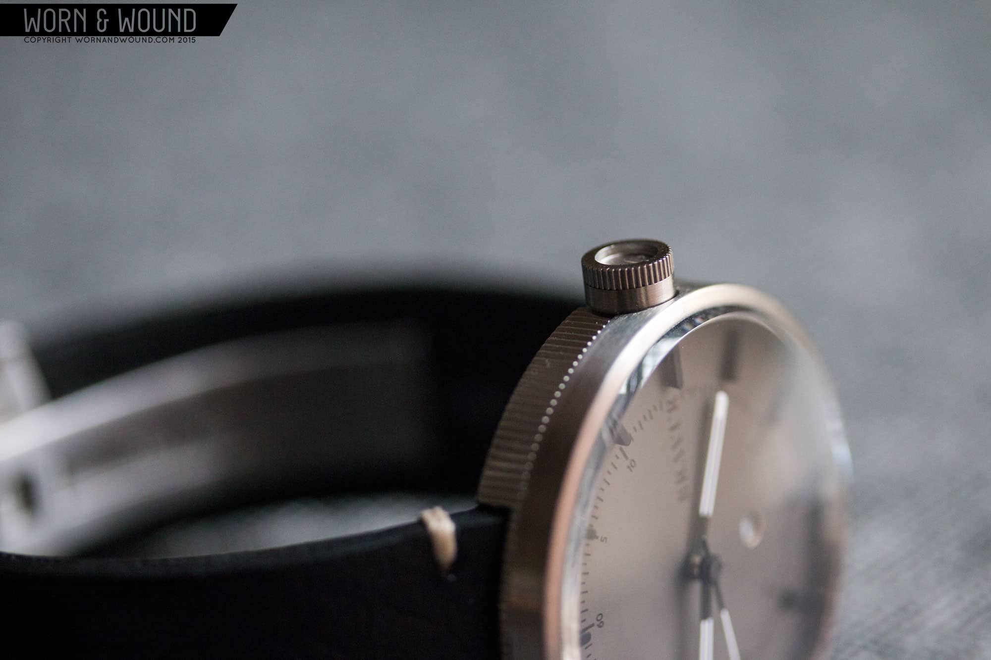
They used a different, likely smaller movement this time, the Ronda 785, which places the date closer towards the center of the dial. It would have been too far in on the BW001, but here is just about perfect, not interfering with any index. While I love the placement, the window is tiny as are the numerals. I can read it, but if you need reading glasses, etc, it might just be a blur.

BRAVUR_BW002_DIAL9

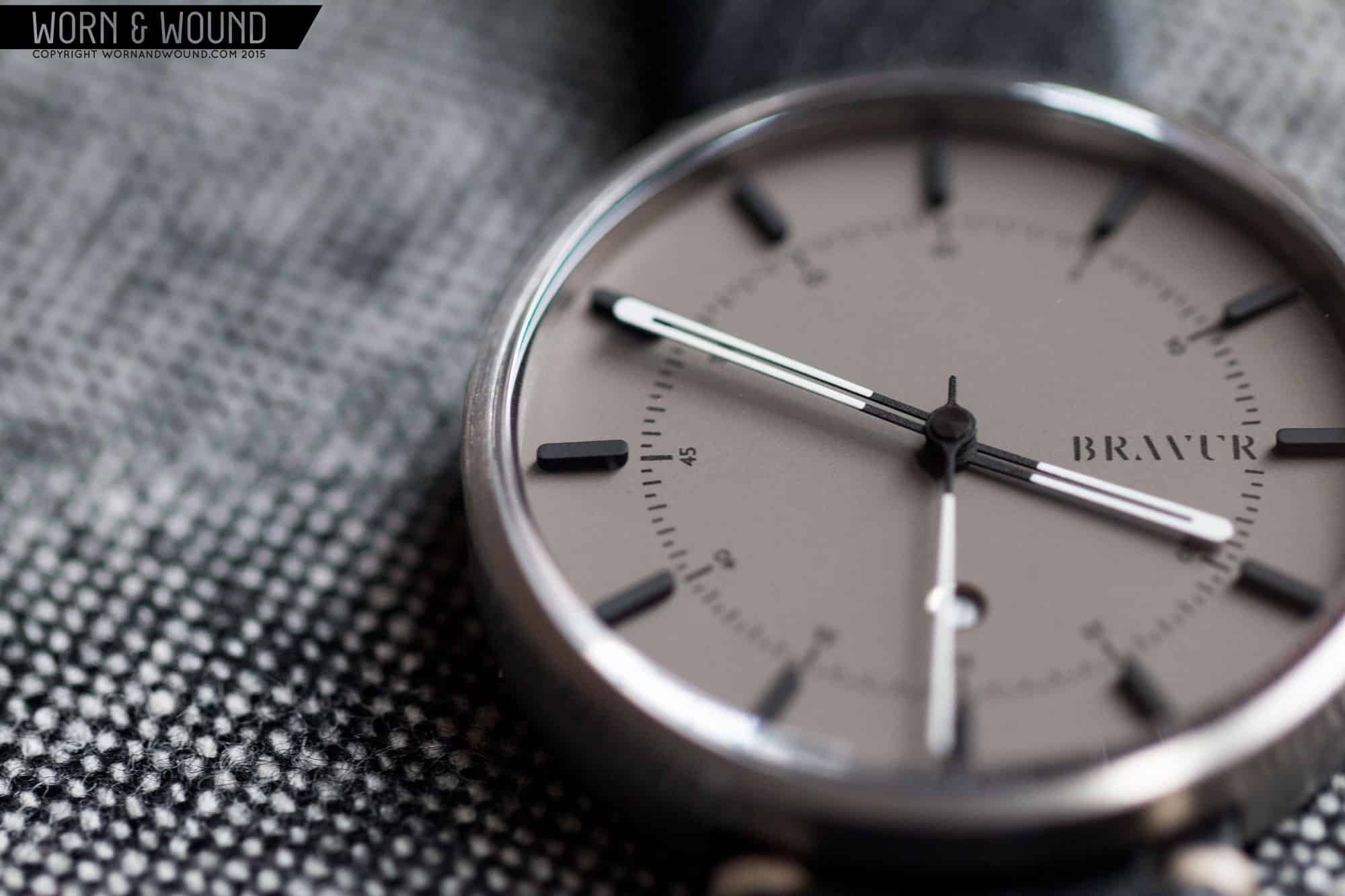
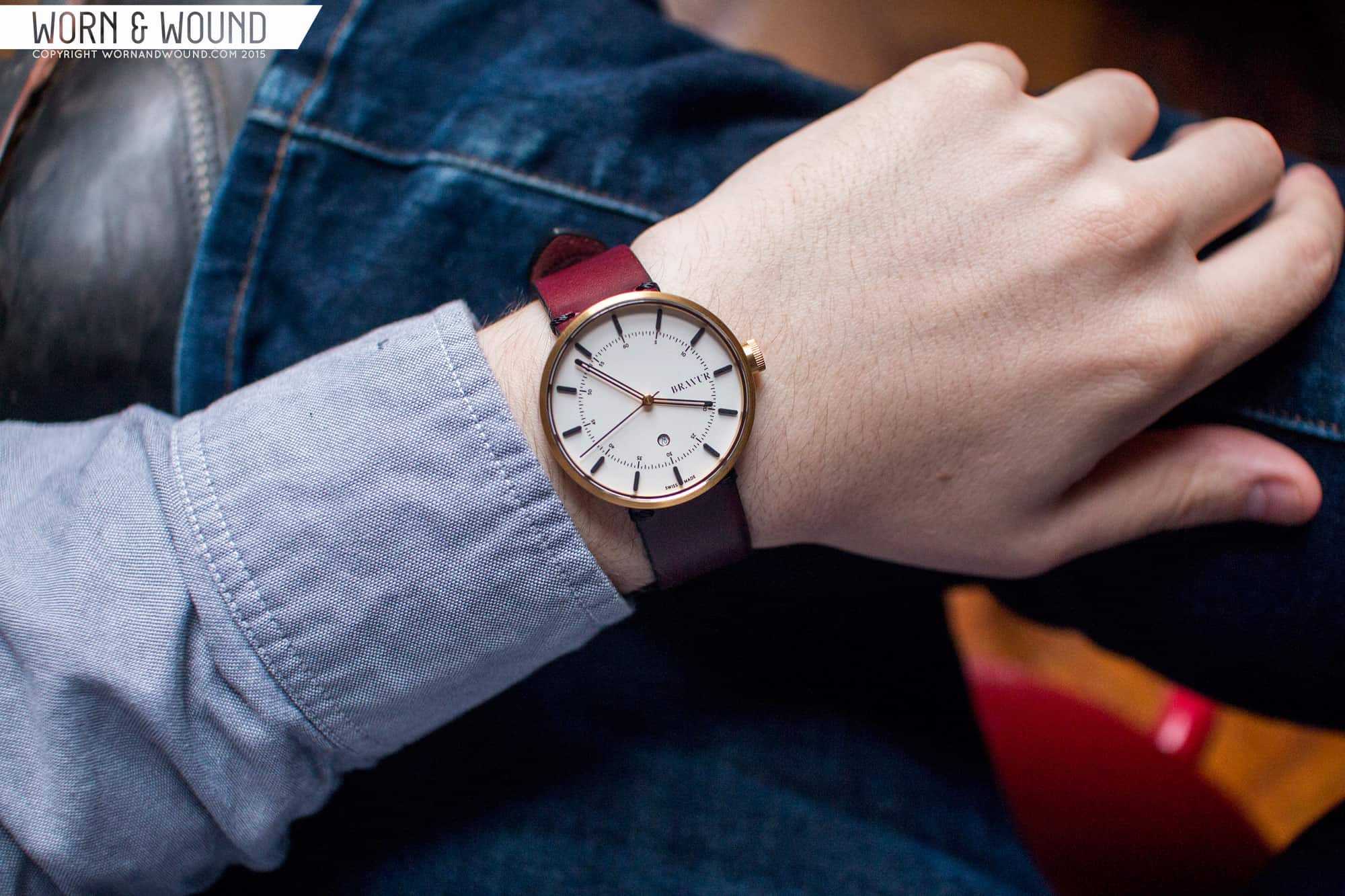
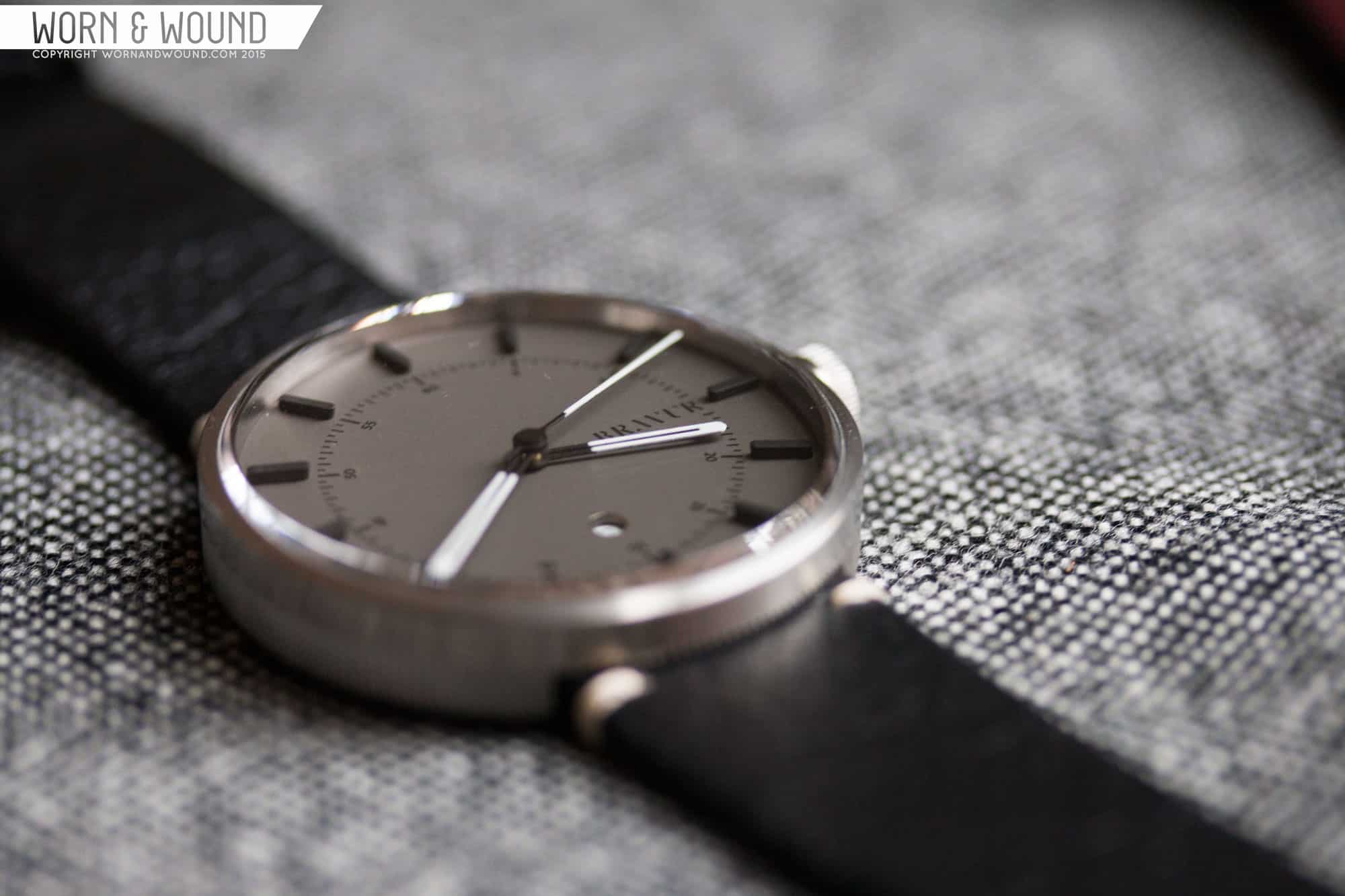
The handset of the BW002 is very attractive. As you guessed, it’s a riff on the previous models, but far more elegant to me. The hour and minute are long, fairly thin skeletonized sticks with rounded tips. They are just about the exact same width as the markers, making them align nicely. The second hand is then a thin stick with a small counter weight. My favorite feature however is the two-tone coloration. On the light dial, the hands are gold towards the center, then matte black. This touch of gold in the center of the dial adds a nice glint of warm light, while the black jumps of the dial in high contrast. Similarly on the gray dial, the hands are black towards the center then white for legibility.

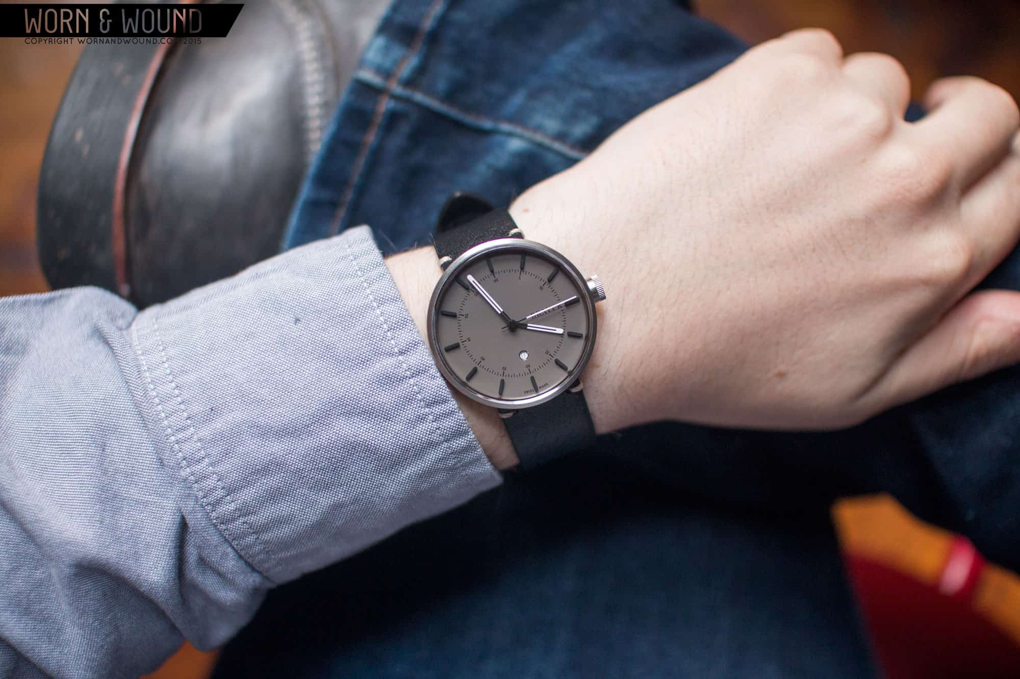
Speaking of the dial colors, they come in either graphite gray or silver white. The graphite gray is paired with black markers and indexes, for a stealthy look, while the silver white also use black for a more graphic and contrast look. I do prefer the latter as the gray is a bit hard to read, though quite good looking.

BRAVUR_BW002_DIAL6

Straps and Wearabilty

The BW002 uses the same 20mm straps as the BW001. They are vintage styled, and come in a variety of colors you can choose from when ordering. They are made of either Swedish or Italian leathers. Additionally, you can go for a Perlon or steel mesh. On the models received, one was a burgundy with black edges, and the other straight black with a pebbled texture. They are unlined and I did notice some coarseness to the back surfaces though that didn’t bother me when on my wrist. Their leather straps all come with signed deployant clasps that match the finishing of the cases. They are decent clasps, though I find them uncomfortable on the wrist.

On the wrist, the BW002s wear very well. I recall the BW001 feeling a bit large at 41mm due to the large dial. Here, it makes the 38mm case work perfectly. Wide, and flat, the watch reads much larger, giving it great presence. Since cases seem smaller without lugs, I was concerned before seeing the watches that they’d be too diminutive, but they really work. As such, it’s a very well-balanced size for a uni-sex watch.

BRAVUR_BW002_WRIST1

Looks wise, the watch really works for me. Though the dial is minimal, the black markers draw the eye in, and the handful of other well-balanced details keep you attention. Similarly, the case is at a glance little more than a cylinder, but when you see the fluted side causing a ripple of light and shadow, and the edge of that crystal glint, you realize there is more there. I was particularly fond of the gold case model as it didn’t feel like “dressy” gold, rather more like a yellow metal. Brass could have been a nice option too. Paired with the silver white dial, which has a touch of metallic reflection too, black markers, which contrast and add a touch of something more masculine, and the tiny bit of gold from the hands, there was this great rhythm of texture and color through out.

Conclusion

The Bravur BW002 is a great follow up to their initial watch. By reducing the size and minimizing some elements throughout, they actually made a somewhat more balanced and successful watch. Not to degrade the BW001, which is very nice in its own right, but the BW002 just works so well. It’s successfully minimal, while not feeling cold or unoriginal. The latter detail is particularly important, as there are other brands out there that do something similar, at least on paper, but the Bravur designs are not derivative, and their focus on case detailing and finishing makes them a bit more of a watch person’s watch.

BRAVUR_BW002_DIAL4

Coming in at $625 to start (with Perlon) $675 as pictured with leather, they BW002’s come in a bit cheaper than the BW001. The price being a bit of a sore point for a quartz. While I think the “if it uses X movement, it should only cost Y” argument is a bit tired, with simple 3-hand quartz, there is a threshold as good automatics quickly becoming comparable. That said, these are watches for retail and they compete with brands like Uniform Wares, who are also in the “luxury quartz” games. And this watch offers a lot in all other ways, and certainly was not a cheap watch to produce, so it being more than your average quartz is to be expected. Furthermore, at this thickness, etc, the mechanical movements available would likely have required some level of redesign. In the end, I think Bravur did a great job with the BW002, which is something I’d happily wear. If the price is not a concern, then you’ll be very happy with it.

Images from this post:
Related Reviews
Zach is the Co-Founder and Executive Editor of Worn & Wound. Before diving headfirst into the world of watches, he spent his days as a product and graphic designer. Zach views watches as the perfect synergy of 2D and 3D design: the place where form, function, fashion and mechanical wonderment come together.
wornandwound zsw

11 responses to “Hands-On with the Bravur BW002”

  1. Roman K. says:

    $600 for quartz!?! Not sure if I’m missing something here. Where’s the value?

    • Elijs Dima says:

      In the design.

      • Quietstorm121 says:

        marketing gimmick.

        • Elijs Dima says:

          And… if one’s subjective personal opinion is that the Dieter Rams Braun designs are less appealing than this one?

          I did not mean that the makers of this put all the extra profit into hiring designer names. I meant that they made this design, there’s nobody else making a watch looking exactly like this (unlike the many, many, many Rolex design-alikes), so they can ask however much they want. If someone ends up liking this design, they will have to pay this price for it to get it. Whether that price ends up justified or not… that depends on how much the buyer actually likes the design. That’s where the “value” of this watch is.

          • Roman K. says:

            So this is a fashion watch? Like Michael Kors? The most important part of a watch is a movement, than materials and design puts it together. But hey if someone pays $600 for it, good for them. But personally I would never do such thing. Plus I hate changing the battery.

          • bjs314 says:

            The problem is, while very attractive, it isn’t an original design. Those Braun watches previously referenced are the muse behind Uniform Wares and hundred other brands. If anything, this watch “ruins” some of the classic elements of this style, rather than building upon them.

            In any event, I think the point is that if you could wear an award winning design, from the originating brand that produces reliable watches, less expensively and you’re into quartz movements, why would you buy this? If you want to spend more, Braun has $600 quartz watches in a similar style that have considerably more features. Of course value is subjective. Unfortunately, so is common sense.

            I like quartz watches. I’d pay $600 for the right now. This ‘aint it.

  2. 6R15 says:

    At least it doesn’t have undersized hands, one of my bigger peeves for any watch, especially prevalent on quartz watches…

  3. Quietstorm121 says:

    600+ for a quartz? ugh no thanks

  4. Nelson says:

    The boring watch definitely does not worth $600.

  5. Isaac says:

    maybe Martin Shkreli would buy it? seriously, why would Wornandwound debase itself so much by showcasing a $95 watch at $600? An automatic Zelos under $250 puts this to shame

  6. Abby Yih says:

    decorous and handsome. if sale them in retail store,it will be better to display them in customized watch showcase