


 Featured Videos


It’s hard to believe sometimes that Christopher Ward has only been around for twelve years. In a little over a decade the brand has managed to establish itself firmly in the enthusiast conscience, at a very competitive price point, and consistently produces attractive and impressively featured watches. Recently, however, the brand has become more ambitious than ever, producing new in-house movements and complications like this one- the Christopher Ward C9 Moonphase. The C9 Moonphase is C Ward’s first moonphase watch, and despite sharing many elements with the rest of the C9 line it represents a bold design departure from the mostly uniform world of moonphases. Equipped with the impressive calibre JJ04, a customized ETA 2836-2 with an in-house moon phase module, the C9 Moonphase is an intriguing proposition on paper at $1780, but is it just as impressive in the flesh?
Christopher Ward C9 Moonphase Review
Christopher Ward C9 Moonphase Review
Case
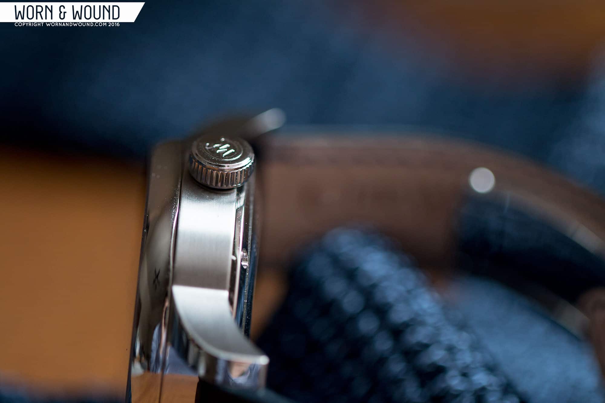
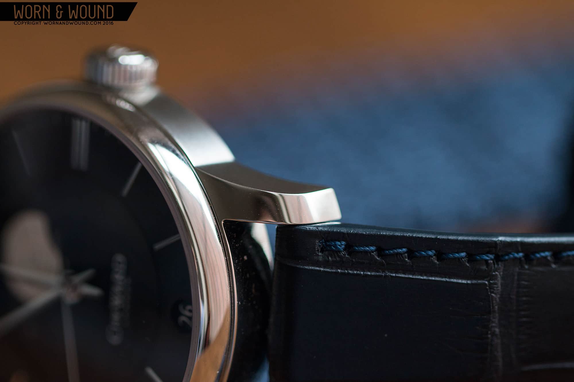
We’ve seen this same case here before in our review of the C Ward C9 5-Day SS Chronometer, and the fact that it works this well with two very different designs is proof of its charm. It’s classic, elegant, and beautifully executed with a mix of polished and lightly brushed elements. The wide-set lugs give it a modern stance, but curve downward enough to keep its largish 48mm lug-to-lug length feeling compact. The contrast between the mirror finish of the bezel and lug tops and the lightly brushed case sides adds some visual interest, and the transition between the two is extremely sharp.
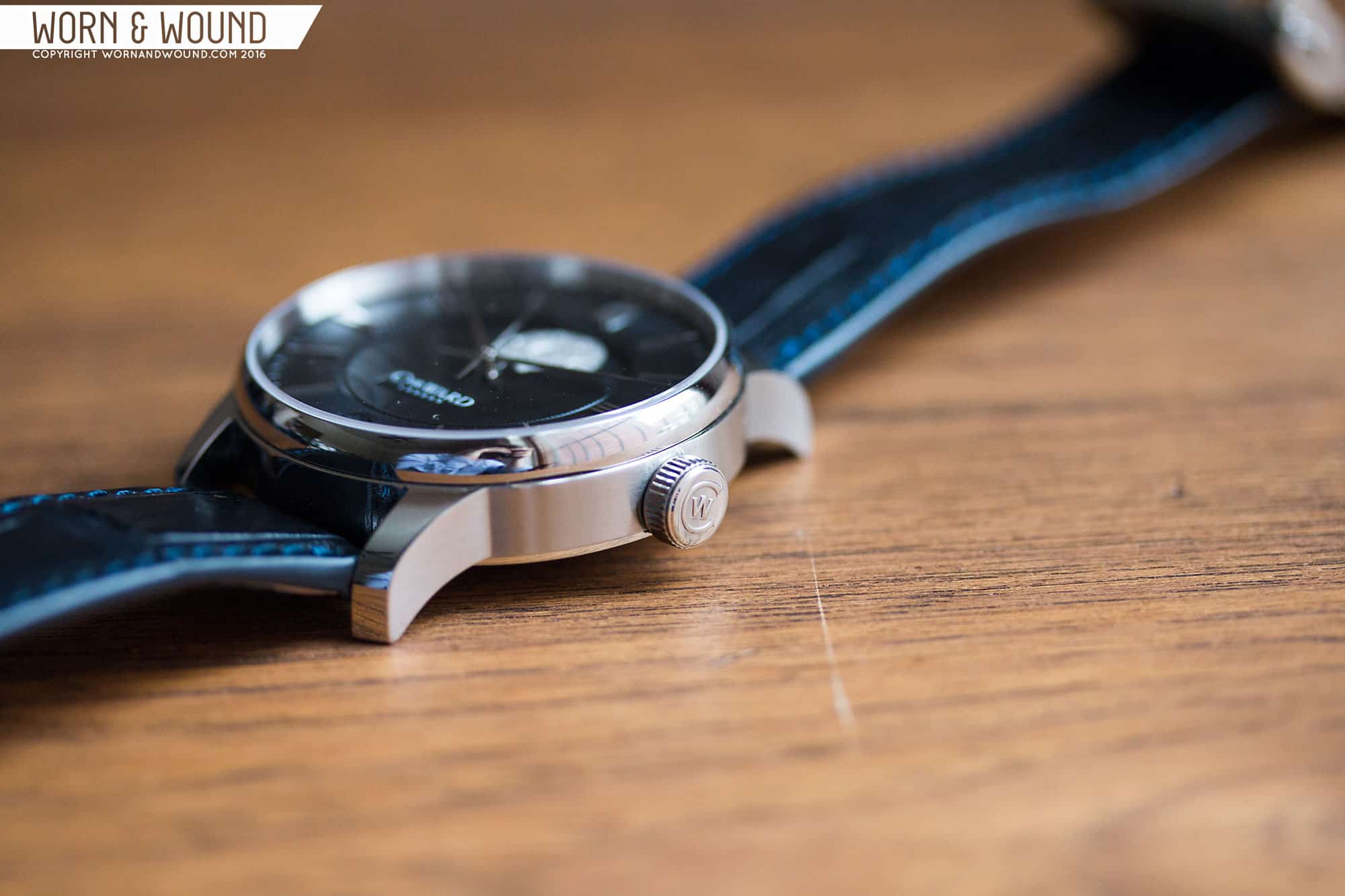
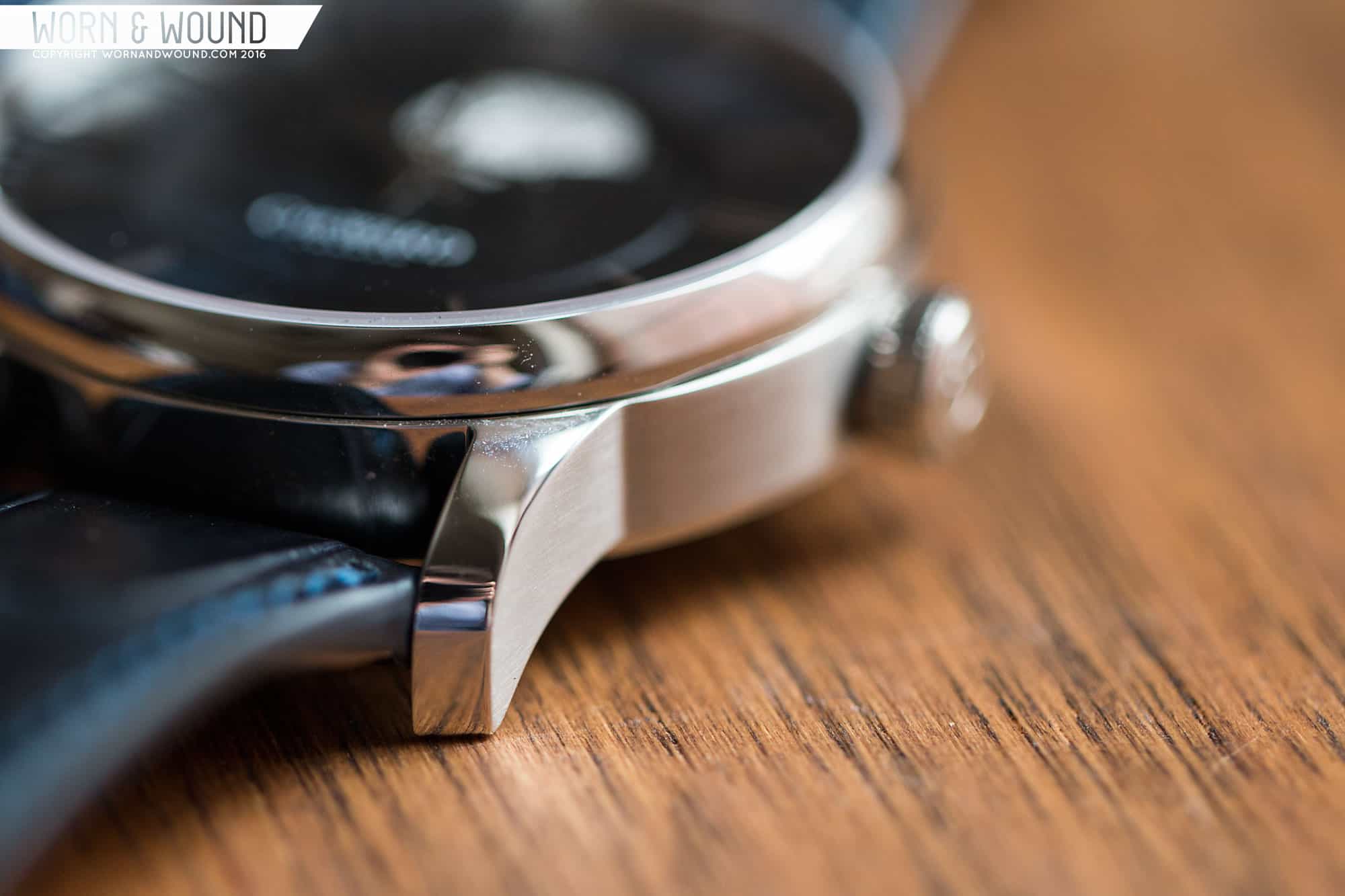

Moving to the crown, the C9 Moonphase offers a 7×3.5mm signed cylinder with a slightly stiff winding action, preventing accidental crown movement. On the back side, a polished caseback surrounds a display window for the attractive JJ04 heart. The casebook itself is remarkably clean, with only two lines of text interrupting the mirrored surface- a serial number for the movement, and a “Swiss Made” label.
Dial
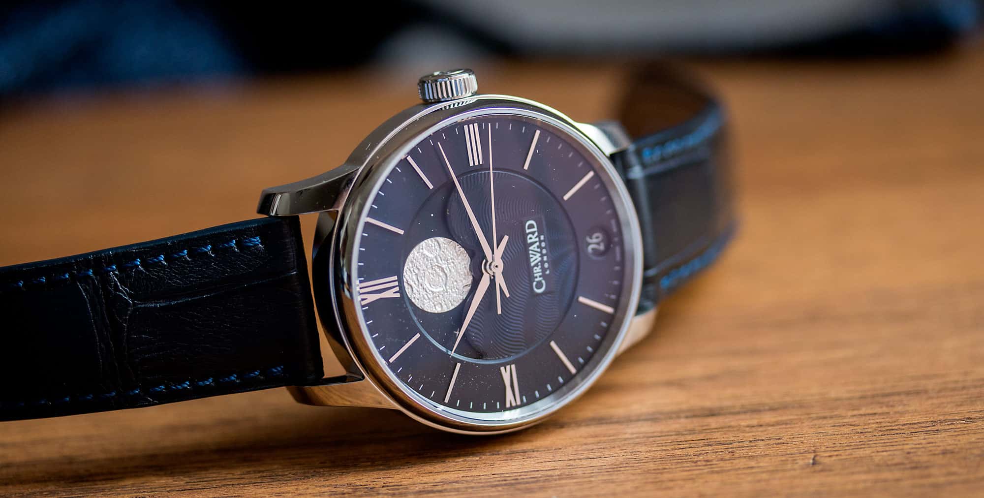
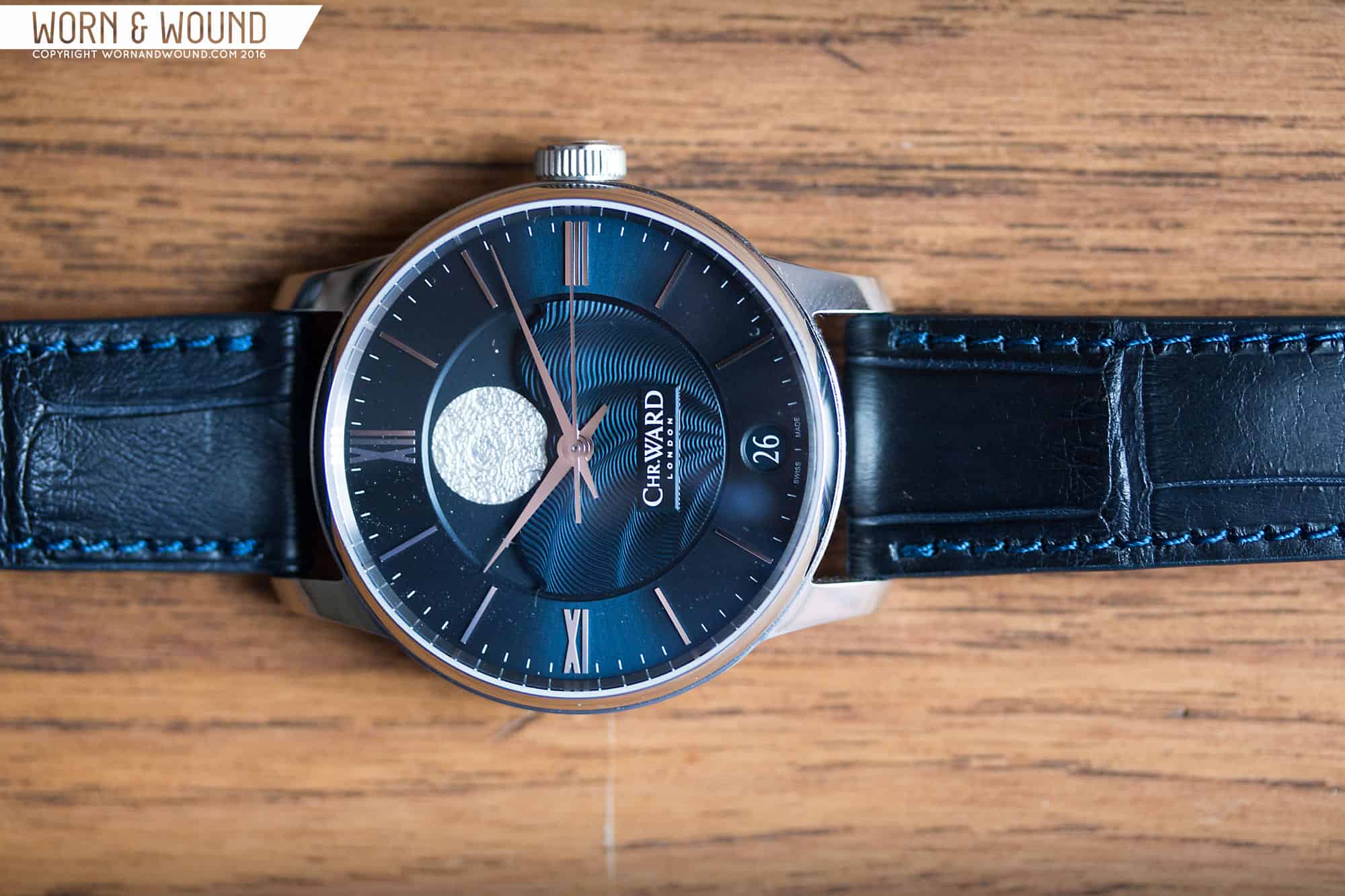
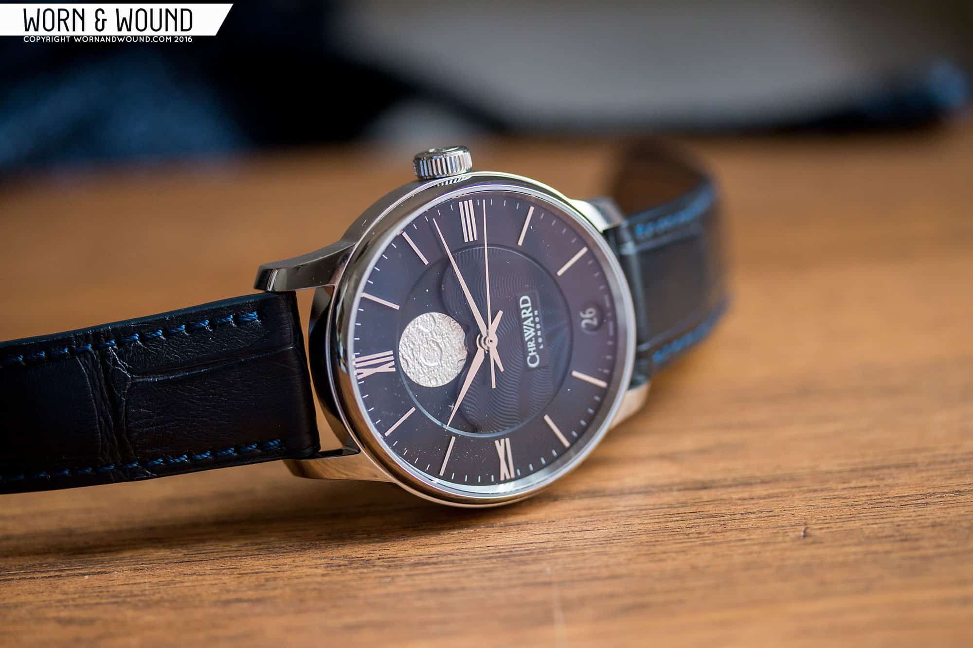
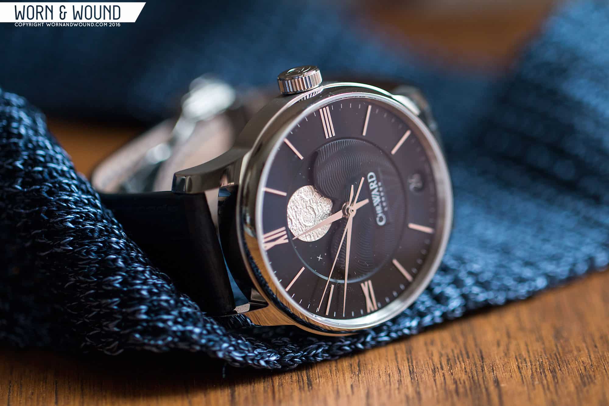
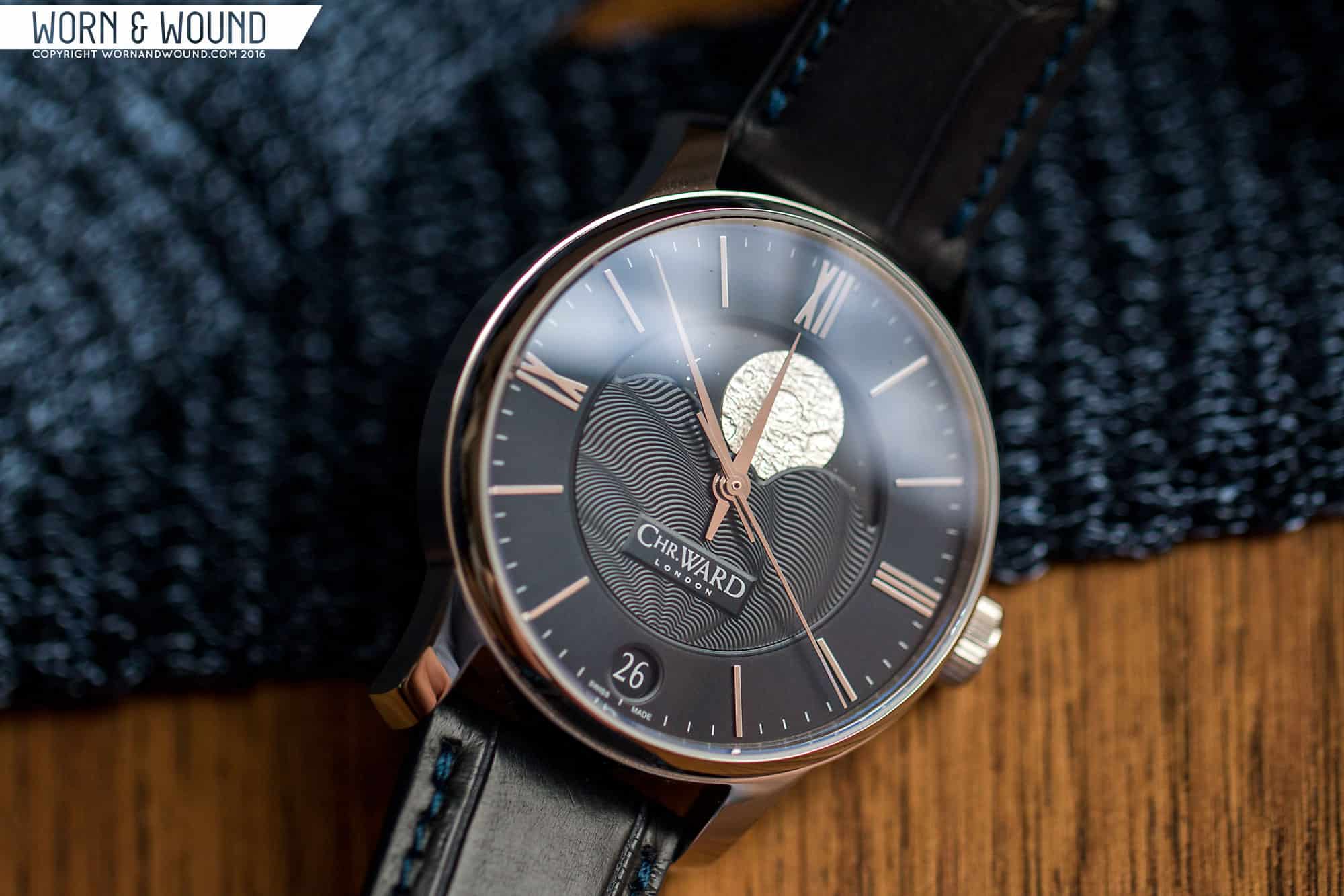
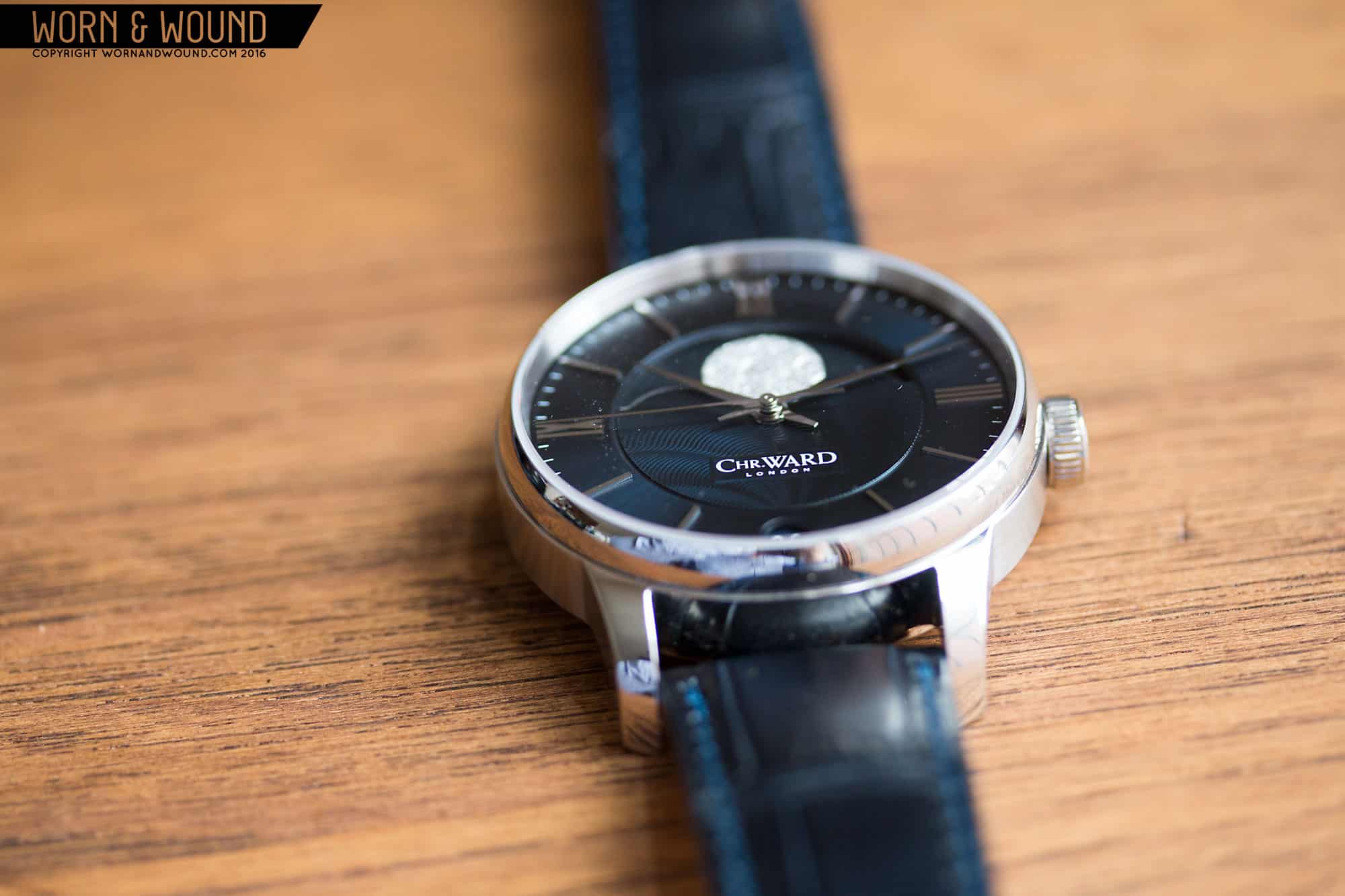
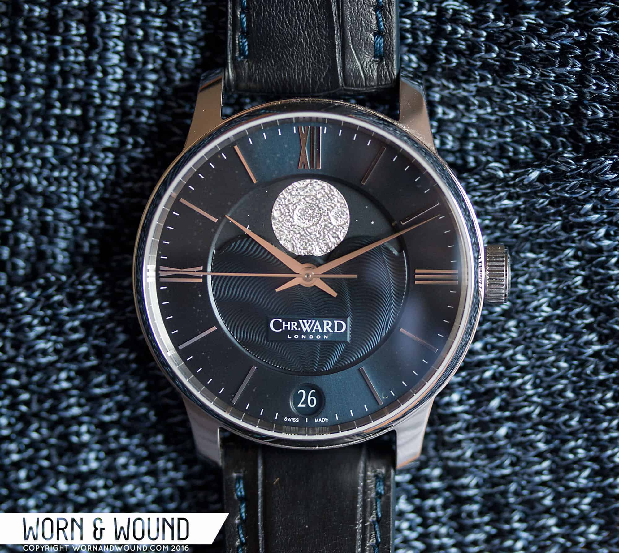
The dial is really where the C9 Moonphase comes into its own. Like the case, it draws several elements from other parts of the C9 line, namely the handset and markers from the C9 5-Day Automatic, but blends them together with bespoke parts to create something that has to be seen in the flesh to be truly appreciated. The deep midnight blue of the main dial appears almost matte under some lights, and it’s only under special circumstances that the restrained sunburst pattern shows through. When it does, however, it adds an extra layer of dynamism to a design that is already bold but extremely tasteful.
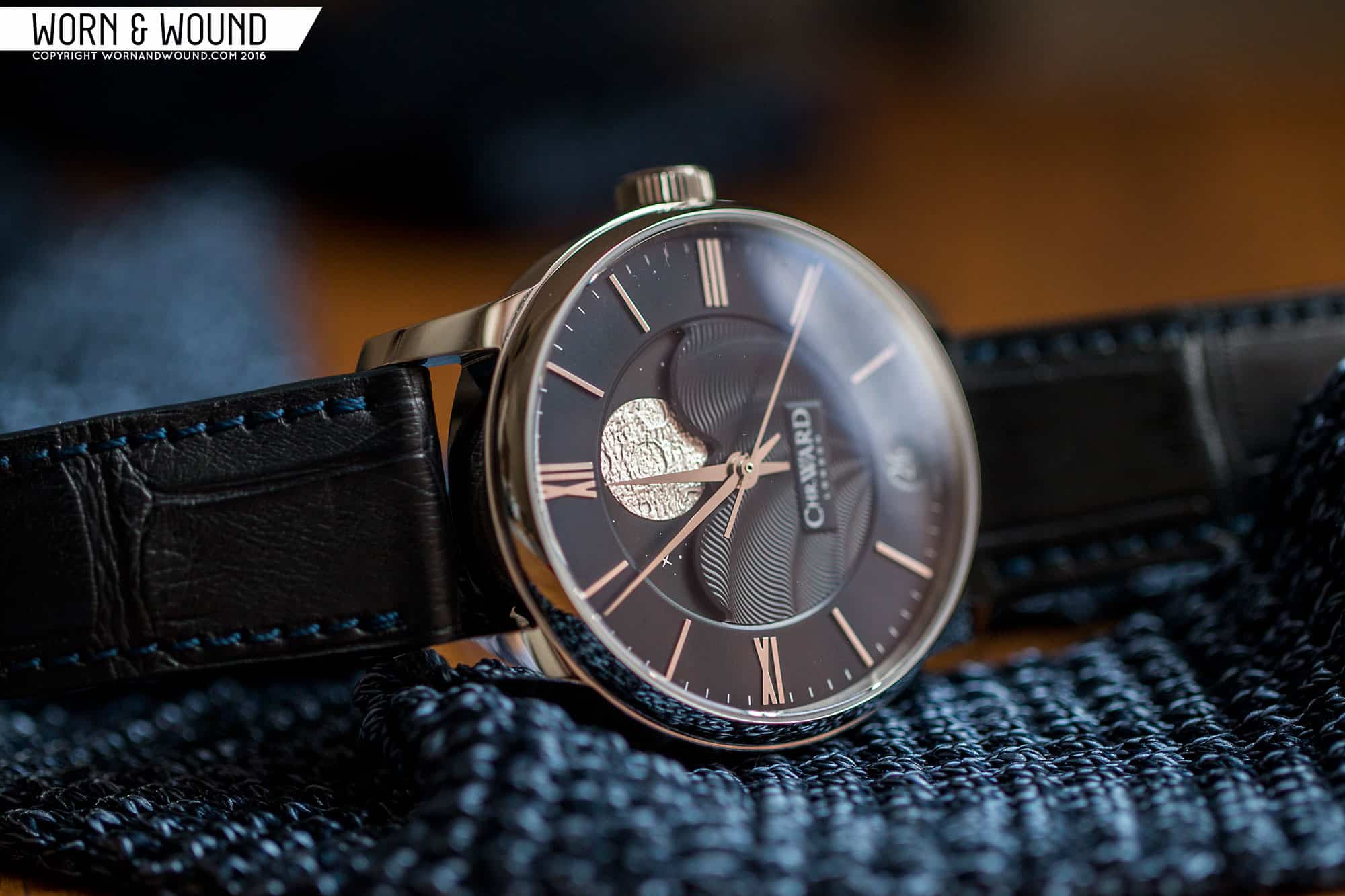
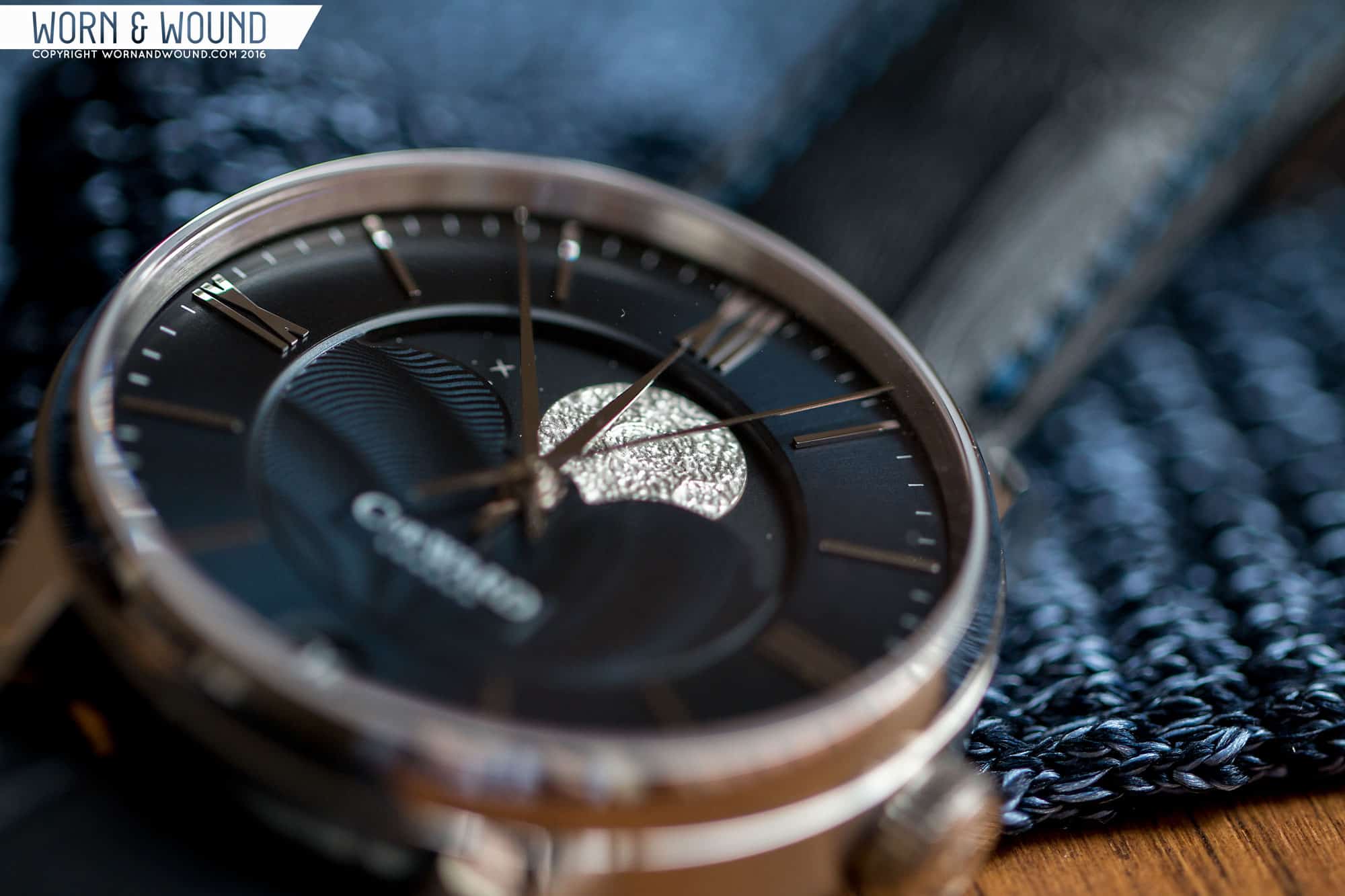
Polished needle-style hands add to the refined mid-century feel, especially when coupled with the applied indices. These indices, slender Roman numerals at 12, 3, and 9 coupled with thin batons, are something I honestly wasn’t expecting to like. I’m usually the last person in the world to like Roman numeral dials, but their clean, sans-serif execution here looks almost architectural. The indices also visually frame the centerpiece of this watch- an oversized guilloche center section, styled after the tides of the ocean, underneath the largest, most brilliant moon phase indicator I’ve ever seen.

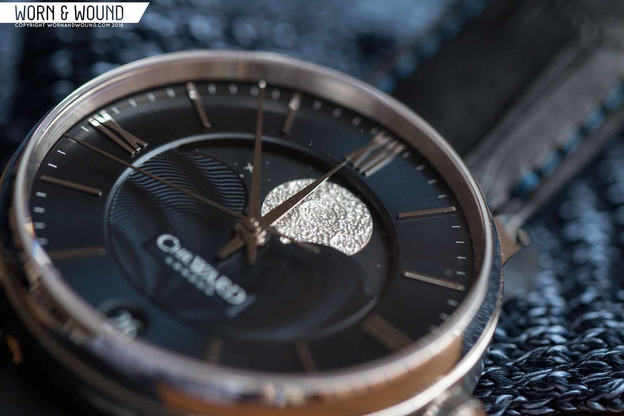
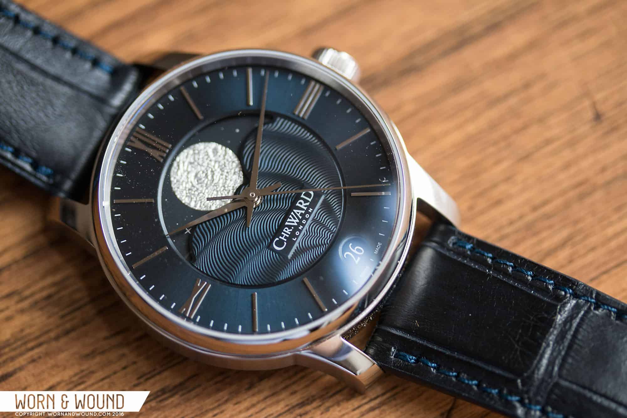
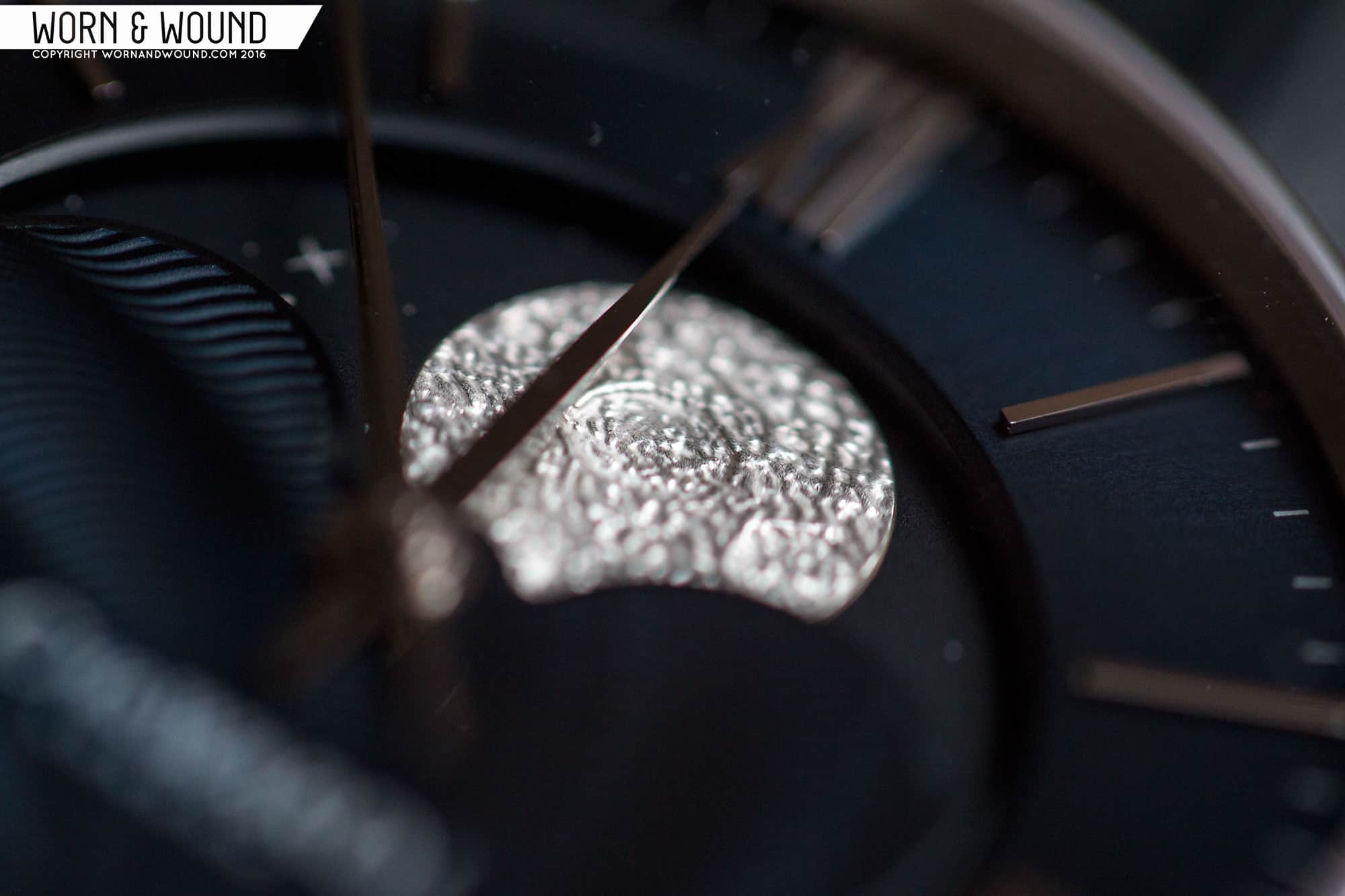
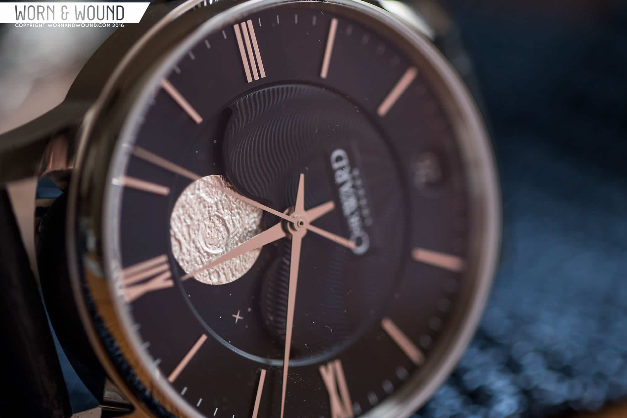
The moon, rendered in stamped nickel, shines brightly even in darkness, displaying deep craters and shimmering highlights. This moonphase indicator takes a very different approach to the traditional moonphase layout (small indicator at 12 or 6), creating something more dramatic and eye-catching, but not at all tacky or tasteless. Only two other moonphases I’m familiar with, Arnold & Son and Ochs Und Junior, use this layout, and both cost several times what C Ward is asking. It’s a dial that, despite being brand new, wouldn’t look out of place on a watch from the 1950s. In terms of dial text, the C9 Moonphase takes a minimal approach, with only a small raised plaque in the guilloched section displaying the Chr. Ward logo. A small, clean date indicator at 6 finishes the look.
Movement
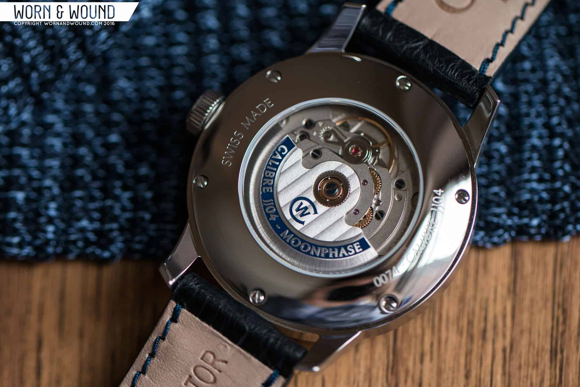
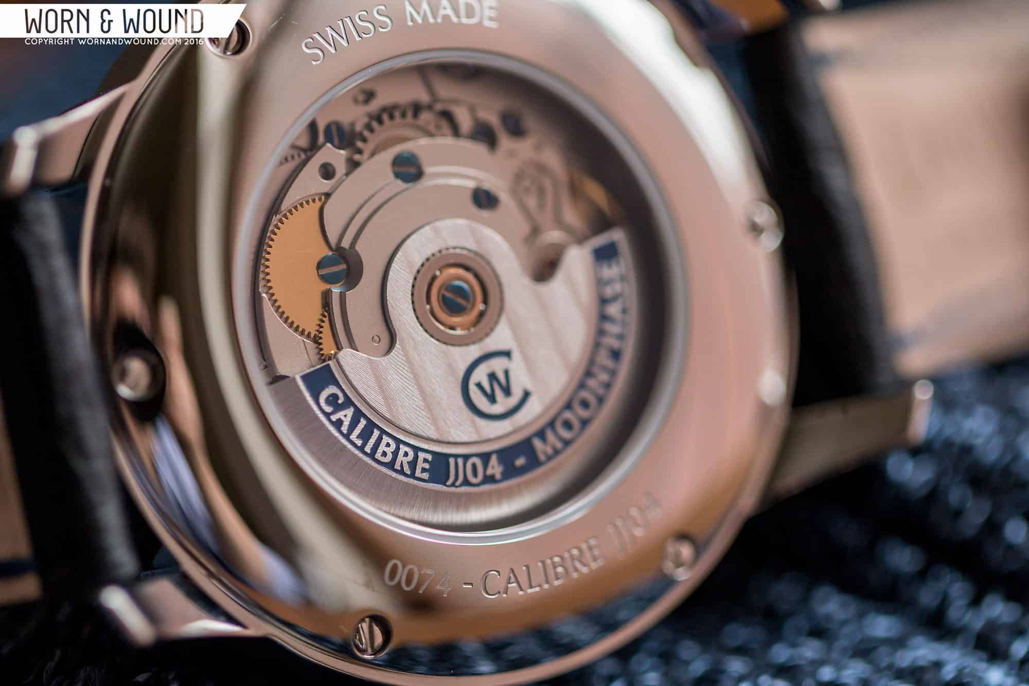
At the heart of the C9 Moonphase is the 26 jewel Calibre JJ04, C Ward’s fourth in-house modified movement and their first ever moon phase complication. Built on a ETA 2836-2 base, the JJ04 adds a proprietary moonphase module designed by C Ward’s in-house movement wizard Johannes Jahnke. Jahnke’s module, run by two separate gear systems, allows for continuous movement of the moonphase indicator as opposed to the usual once-a-day jump. This, according to C Ward, allows the moon to be accurate to an impressive one day every 128 years.

In terms of day-to-day accuracy, the JJ04 offers a high beat 28,800 bph sweep, lending an impressive level of precision. Thanks to the display case back, the C9 Moonphase also gives us a glimpse of this movement at work, and it’s a very handsome one. The signed rotor proudly displays both “Caliber JJ04- Moonphase” and Côtes de Genève, while the rest of the movement is laid out in several layers, exposing much of the JJ04’s inner workings. Blued screws add an additional upscale touch.
Straps and Wearability
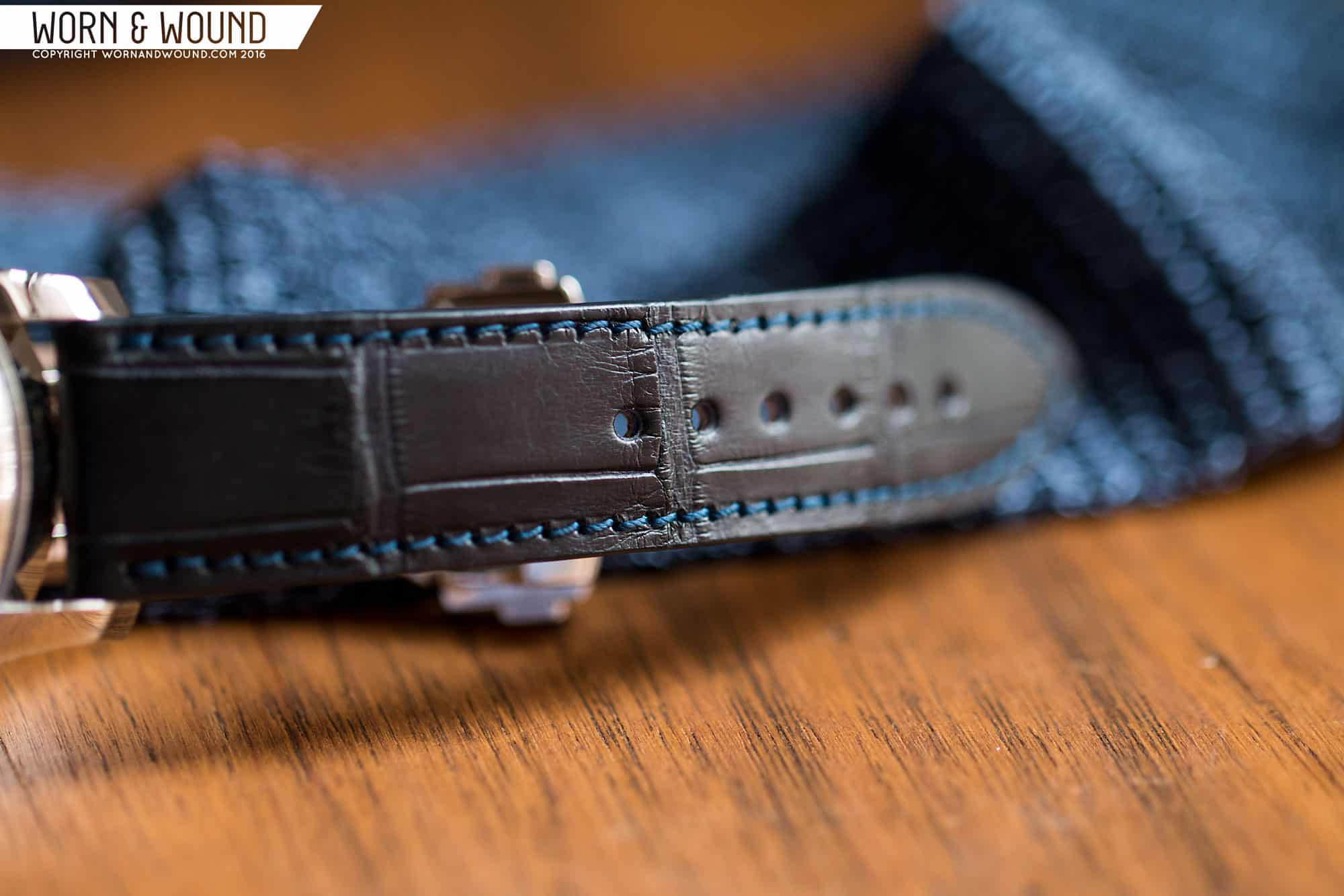
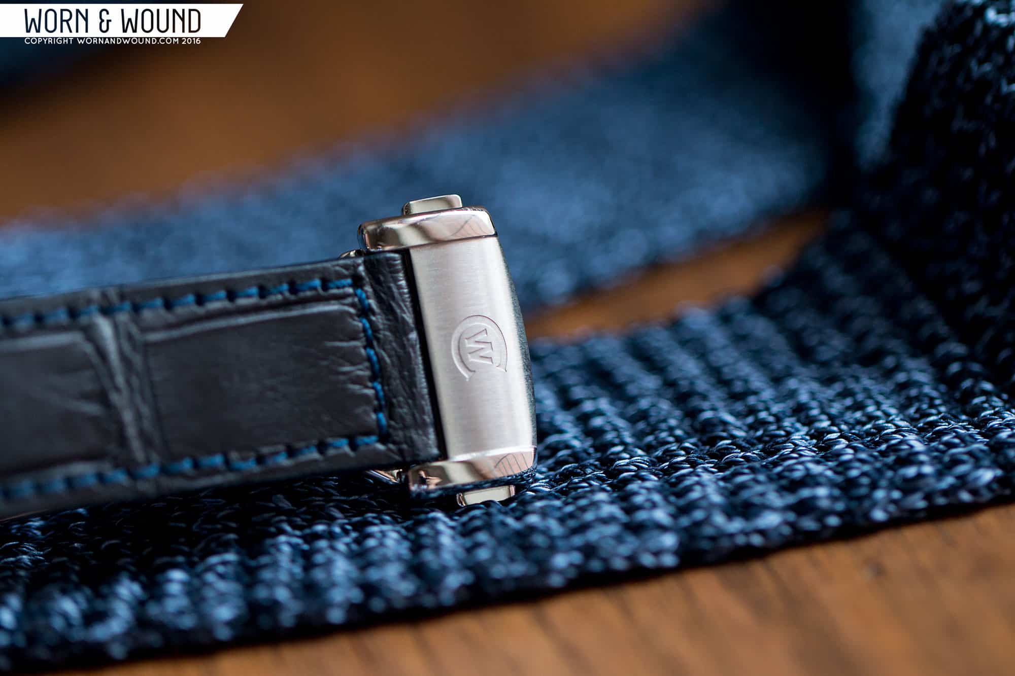
The C9 Moonphase is available either on leather, alligator, or a stainless bracelet. While all 3 are solid choices, it’s my opinion that this watch was made for an alligator strap. Luckily our tester came on a nearly black midnight example that plays off the dial well. The quality of the strap is top notch, with clean even stitching and a deep pattern, but the Bader deployant it’s mounted to nearly steals the show. The mixture of brushed and polished elements is superb, the CW logo is razor sharp, and the clasp itself is a joy to operate. If alligator is not your style, however, the C9 Moonphase would pair well with a Milanese bracelet or even a light tan leather strap to contrast the dial.
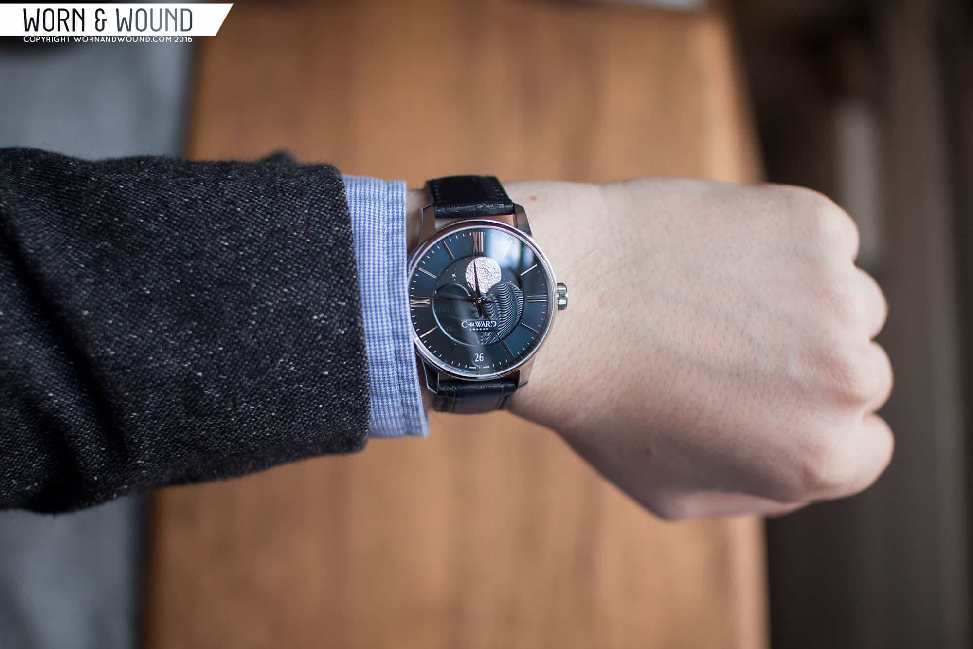
Its 40mm size strikes a great middle ground on the wrist, large enough to feel modern, but small enough to be wearable even on my 6.75″ wrist. In terms of versatility, though, the C9 Moonphase is definitely an upscale piece. It’s a watch that made me want to dress better, if that makes any sense, and one that definitely feels at home in a suit and tie environment. Business casual attire isn’t out of the question here, but it wouldn’t necessarily be the right call for your next t-shirt and jeans occasion.
Conclusion
It’s strange the way the mind associates things sometimes. When the C9 Moonphase was announced a few months ago, my first thought (after “Good lord, it’s gorgeous”) was about music- Brazilian jazz, of all things. At first, I dismissed it as a random figment, but the more time I’ve spent with the C9 Moonphase the more the comparison seems apt. Jazz music, at its core, is all about variations on a theme. A melody is introduced, altered, and rearranged for a variety of different instruments before coming through again in its original form. The C9 Moonphase represents that ethos on several levels.
Physically, it’s a variation on the C Ward C9 theme, sharing a case, crown, handset, and indices with other members of the C9 family, but plays with them in new, exciting ways. It takes the supporting instrument of a moonphase indicator and gives it a solo, placing it dead center and allowing it to take up the majority of real estate on the dial, but keeps the fundamental design intact. Brazilian jazz in particular takes the concept of variations on a theme and makes it bolder, more rhythmic, and brings its own personal flair without sacrificing any of the class of the original. Once again, the Christopher Ward C9 Moonphase cleaves close to this concept.
At the same time the C9 Moonphase was announced, we received the press release for the Frederique Constant Slimline Moonphase, and naturally we compared the two. While the FC was a gorgeous traditional execution of a moonphase, C Ward took the Brazilian jazz approach- louder, more visually arresting, but nonetheless refined and sophisticated. It’s a brilliant move for C Ward to enter the moonphase game like this, setting themselves apart from the pack while emphasizing their new standard of quality in finish and movement. A central moonphase complication is a surprisingly rare layout, appearing only in a handful of other designs all costing far more than the C9 Moonphase, and this unusual arrangement helps create a stunning whole.
At a starting price of $1780, it’s certainly not cheap, but it’s a piece that undoubtedly carries the quality and visual stopping power of watches costing very much more. As such, it’s an excellent value for the money, and more than once during my time with this one I’ve considered selling off parts of my collection to own it. It’s one that by all means, I shouldn’t like- I’ve never been a huge fan of moonphases, I generally hate Roman numeral dials, but despite all this the C9 Moonphase has me absolutely captivated. Mark my words, you’re looking at a future classic.

I like the art deco motif of this watch. I also prefer this version of the watch. I think it has a more accurate moon phase than the Arnold and Son Perpetual Moon watch. I think they have a winner here.
I like Chr Ward watches, there are some good looking ones out there, this being no exception. Whilst I admire them in some respects, they’re (albeit budget) luxury watches, and if you’re going to drop a grand plus on a watch, you don’t want the equivalent of a Lidl logo on it. Or at least I don’t. But then that leaves me in a tricky situation because I can’t afford the watches with the waitrose logos on them.
The watch is aimed at those who appreciate it for what it is, not those who seek to impress others with frippery. Much in the way that the man who orders a Robert Smith, despite very few people knowing what it is, would never consider buying a diamond encrusted Rolex.
Address your insecurities and you will enjoy life more fully. ;~}
It’s a shame that such a prominently featured moon disc bears no resemblance to the actual face of the moon, despite all the “deep craters and shimmering highlights”. A small detail, but one written large on the face of this watch.
Wow, what a bold move with this moonphase design. C.Ward watches, although newer on the market feel like they’ve always been here.
Chr.Ward makes strong effords, I can see constant development: each new line is more and more appealing. However, some drawbacks don’t let me consider them seriously:
1) Most of their watches are too thick and bulky. Take this moonphase watch – looks massive from the side, while such kind of watches should look elegant. 13.3 mm is too much, it has to loose around 4 mm to become less bulky.
2) Diameters are a bit too much for my taste. Even this one would look more elegant sized at ~38 mm.
3) The logo… It still sounds like fashion brand for me and looks cheap. They could at least develop some nice applied logo of rhodium plated metal.
4) Caliber finishing is just a joke: blued-like screws on unfinished rough plates? Blued-like logo… Just cover it with nondisplay caseback with nice engraving – would look much better.
5) Straps look cheap. Take Baume & Mercier Clifton for example – more or less same category, but straps make it stand out.
1. I agree. While I like this watch a lot, it should be much thinner.
2. I would settle on this size, but think 38-39mm is more intune w/ a gentlemen’s watch of this kind.
3. I had to get used to it. Although in general, I think the font style logos of most $4,000+ watches look terrible, and its obvious people are ignoring it.
4. Aww. I kind of like the blue painted caseback finishing. Original.
5. It looks cheap in the photos, but in person CW strap usually look great.
6. I think the crown looks bland. I would have enjoyed something with rounded edges and some stronger etching to drive home the elegance of this watch.
7. I’m starting to think date windows only belong on quartz watches. It’s super annoying to set the date on an automatic. Especially if you only wear it 1-3 a month. Just do away with it entirely.
All in all, B+ effort. Looks like it would be beautiful in-person.
i like this watch quite a bit, great review. Do you think the cost will come down at all?
Beautiful and unique moonphase design!
Nice photos, Zach. To take it to the next level, you may wish to look into focus stacking in order to greatly increase the depth of field. See this site: http://www.heliconsoft.com/heliconsoft-products/helicon-focus/