The Art of Time: Taro Tanaka and Seiko’s “Grammar of Design”

Welcome to the second installment of “The Art of Time,” w&w’s ongoing series exploring iconic designers within the watch world. Last time, we discussed the value of the outsider’s perspective in watch design through the lens of Giorgetto Giugiaro. While a non-watch designer can breathe individuality and life into a piece, there’s also something to be said for a unifying brand vision. Having a unique, easily identifiable look for all watches across a line can be a great asset to brand identity. It helps to give the overall line a feel of quality and care, and it’s the kind of thing that can propel a company to great success.

tarotanaka-Seiko
Taro Tanaka

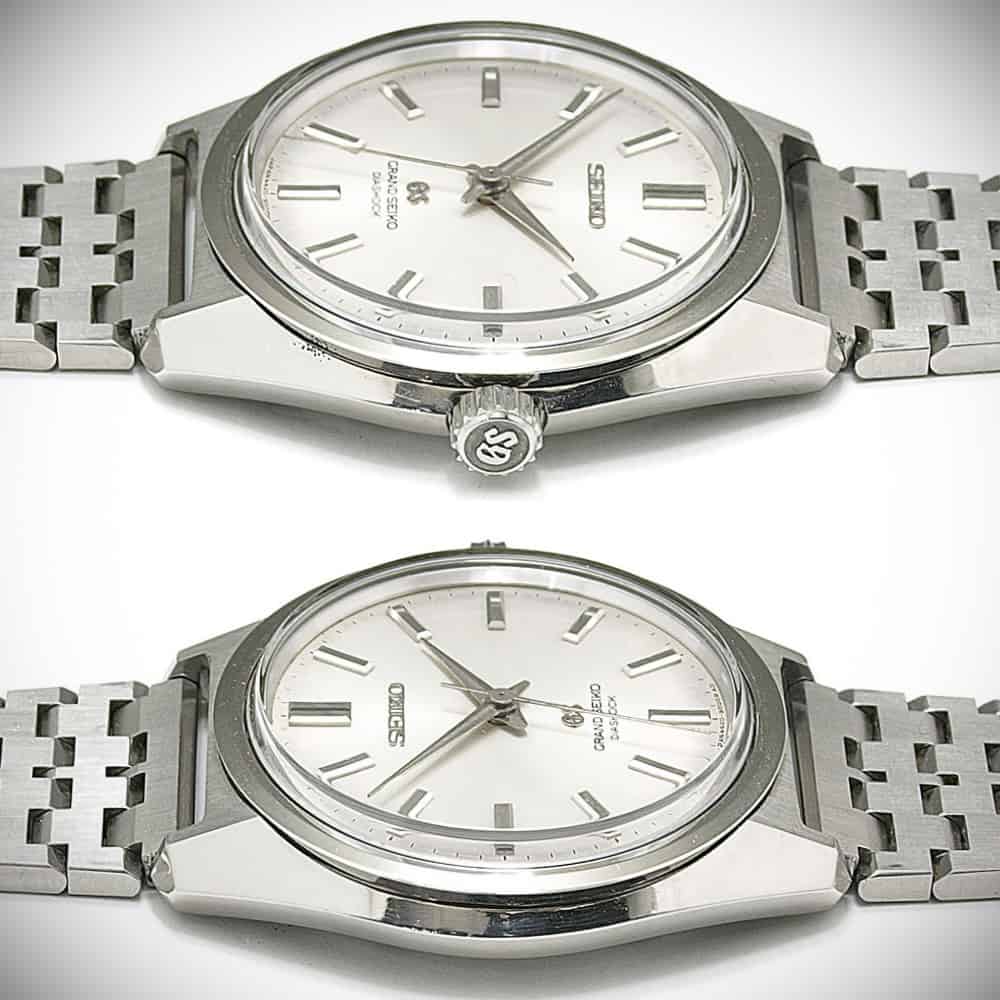
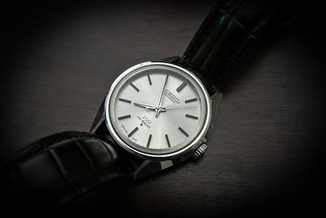
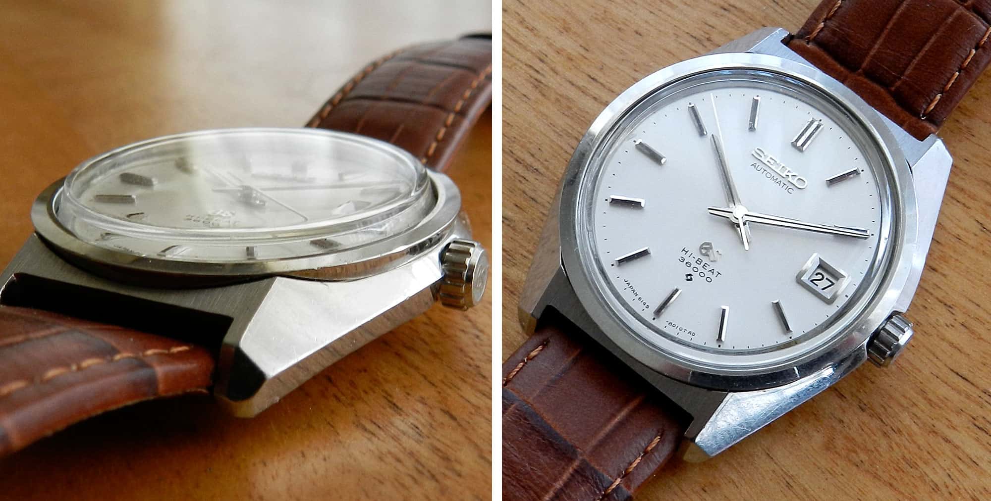
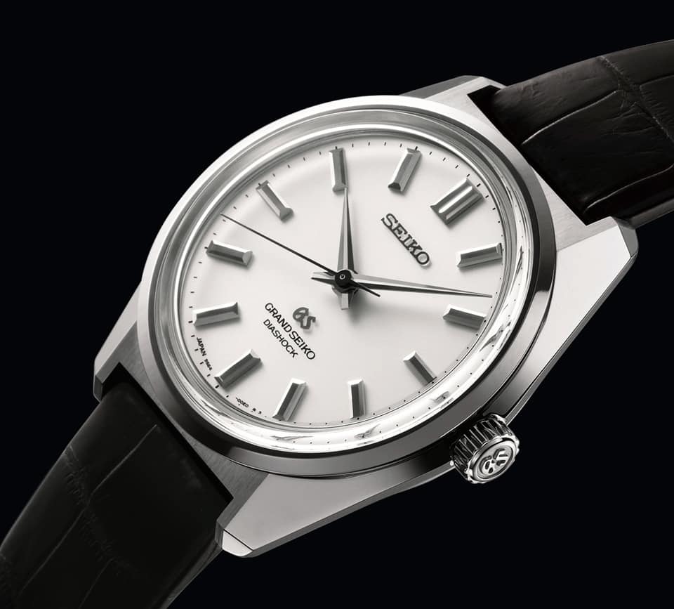
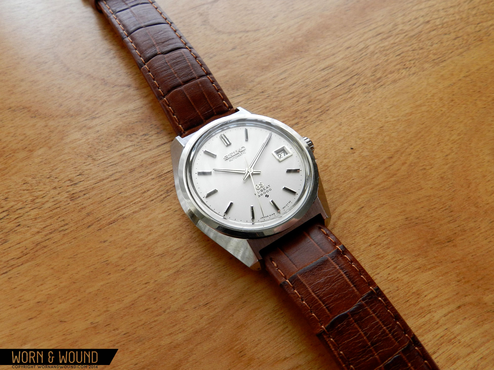
Taro Tanaka is in too many ways an unsung hero of the watch world. We’re fond of chronicling the history of Seiko here at w&w, especially its stunning rise through the industry ranks from the early ‘60s to late ‘70s. Most of the time, this incredible growth is attributed to the brand’s innovation—the development of the iconic cal. 6139 chronograph movement, their successes in producing chronometer calibers, or the explosion of their diver line with models like the 6105, just to name a few. That’s certainly a fair argument to make and many certainly do, but to overlook the contributions of their designers would be to overlook half the story. That half—the artistic side—rests on the shoulders of Taro Tanaka.

Advertisement
Daini Seikosha, 1949

In the 1950s, Seiko was already hugely successful in Japan. They had been producing wristwatches for the Japanese domestic market since 1913, and were far and away the largest domestic brand by volume. Seiko’s international sales, however, were a very different story. While the pieces themselves were well-made, they did little to distinguish themselves in store displays from their Swiss rivals. Designs were generally simple, with round cases and basic lugs coupled to drab, standard dials. Within the corporation, there wasn’t even a design department until 1956; up to that point, the only people designated Seiko’s “designers” were those responsible for making dial printing materials. For the first three years, Seiko’s design department was responsible only for dial designs, and the cases were handled by an entirely different group of people.

All that changed in 1959. In that year, Seiko brought onboard Taro Tanako, a recent design graduate and the first trained designer to be hired by the brand. Tanaka’s approach was holistic, and from then on the Seiko design studio moved beyond dials to encompass the entire watchmaking process. According to him, the main problem was making Seiko watches—especially the brand’s high-end Grand Seiko and King Seiko lines—stand out on shelves above their competitors. Tanaka wanted to outshine the Swiss, figuratively and literally.

GrandSeiko44209000
Grand Seiko Seiko 4420-9000

Inspired in part by the art of gem cutting, Tanaka delved into the philosophy of watch design. By 1962, he developed a series of rules for just that; he called it the “Grammar of Design.” The “Grammar of Design” boiled down to four basic tenets. First, all surfaces and angles from the case, dial, hands, and indices had to be flat and geometrically perfect to best reflect light. Second, bezels were to be simple two-dimensional faceted curves. Third, no visual distortion was to be tolerated from any angle, and all cases and dials should be mirror-finished. Finally, all cases must be unique, with no more generic round case designs. Tanaka’s new design agenda led to more stringent manufacturing controls on Seiko’s end, which Tanaka believed was fundamental to match the quality being put out by the Swiss. This pared down philosophy began at the top with Grand Seiko and King Seiko first receiving the benefits, the former unveiling the 4420-9000 in 1967. These early watches still stand as the purest examples of Tanaka’s philosophy, and have rightly earned their collectible status.

Inspired in part by the art of gem cutting, Tanaka delved into the philosophy of watch design. By 1962, he developed a series of rules for just that; he called it the “Grammar of Design.”

As an example, let’s break down the King Seiko 5621-7030. This is far from the most famous or expensive “Grammar of Design” piece, but its elegant simplicity is the embodiment of Tanaka’s philosophy. Viewed from above, the bezel is impossibly minimal, no more than a flat polished circle. Until you look at it from the side, it’s easy to miss just how elemental the bezel is. From there, the bezel forms a cylinder running all the way through the center of the case and continues by the outer edge of the case back.

KingSeiko_5621-7030

Visually, it’s as if the outer case and the integrated lugs are bonded later to this cylindrical base. The rest of the case elements are beautiful in their own right, flowing seamlessly from lug to lug in an unbroken flat curve. The lugs taper to fine points, swelling out to a wide mirrored surface in a curve that, to me at least, call to mind the end of a sword. Surfacing here is minimal, but razor-sharp. A small, flat bevel on the inward edges of the lugs continues the mirror reflectivity of the bezel when viewed from above, while an abrupt, slightly inward break halfway down the case side helps to remove visual weight.

GRAND_SEIKO_61GS_slide1
A later Grand Seiko 6145-8000, 1970

Once again, everything is polished here to maximize interaction with the light. The dial is similarly reflective, with a silvery sunburst finish. Dial text is tastefully minimal, but features eye-catching applied logos for both Seiko and KS. The thin applied indices are perhaps this watch’s best example of “Grammar of Design” surfacing. At first glance they appear to be minimal black rectangles; a closer look reveals tiny bevels along the edges and mirror-polished sides, making them glitter like jewels at an angle. The hands are narrow beveled dauphines, split by a thin black line and finished with yet more mirror polishing. Taken as a whole, the design is focused around the concept of reflection and interaction with light, a common theme across “Grammar of Design” watches.

GrandSeiko-44GS1
GS 44GS – a reissue of the 4420-9000, 2013

This philosophy guided Seiko’s design practices from 1962 all the way to the late ‘70s, and while it may have started in the premium lines the “Grammar of Design” eventually trickled throughout the brand, all the way to Seiko 5. Tanaka’s touch (in case design at least) can be seen in many of the most iconic classic Seikos from the period, including the Lord-Matic, 6139 Pogue, 6138 Bullhead, cushion-case 6105, and countless others. It may not be the most obvious brand design (that award would probably go to Rolex), but it played a major part in shaping Seiko into the giant it is today.

Click here for more great w&w series.

Related Posts
Hailing from Redondo Beach, California, Sean’s passion for design and all things mechanical started at birth. Having grown up at race tracks, hot rod shops and car shows, he brings old-school motoring style and a lifestyle bent to his mostly vintage watch collection. He is also the Feature Editor and Videographer for Speed Revolutions.
seanpaullorentzen
Categories: