


 Featured Videos


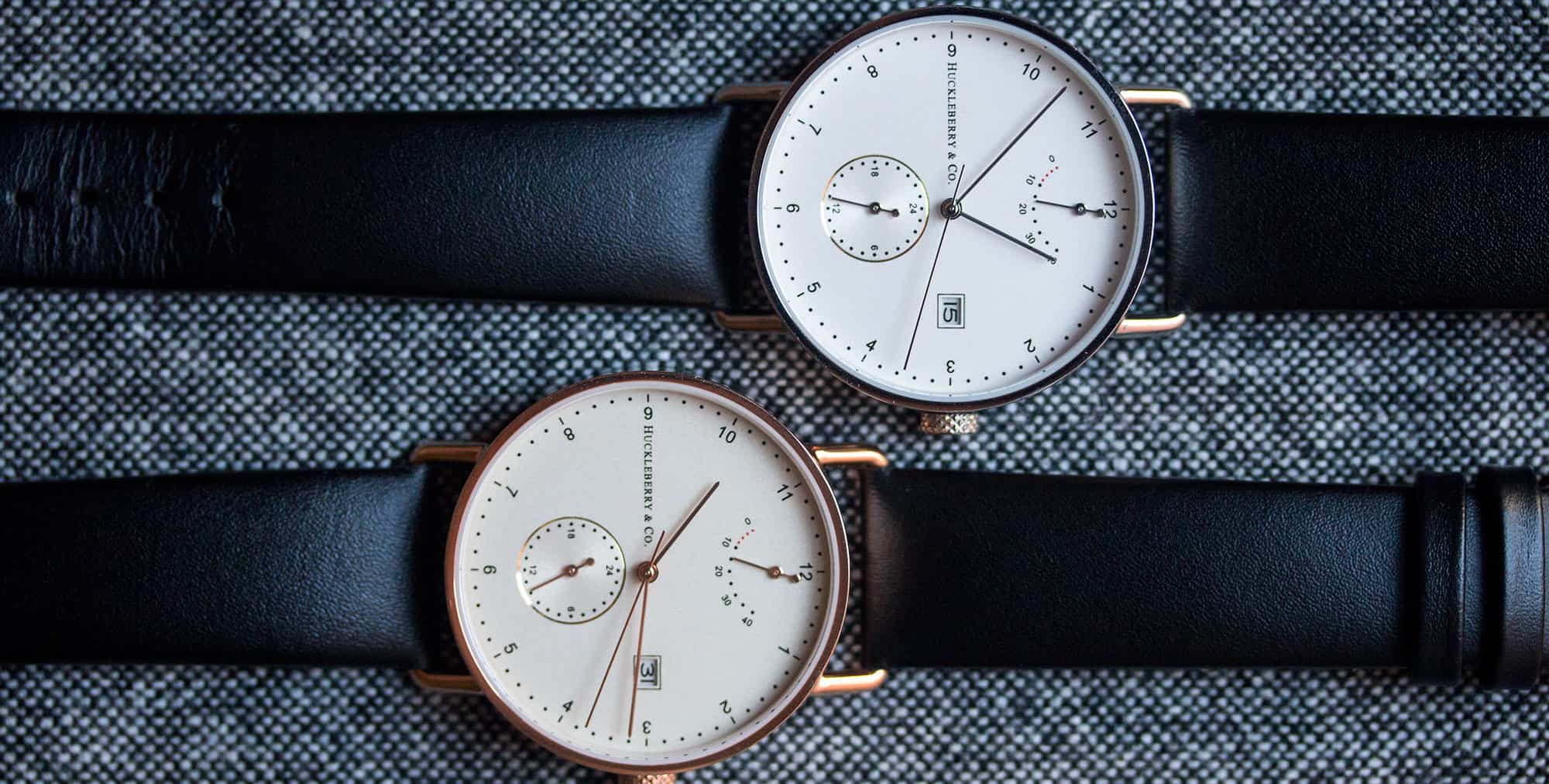
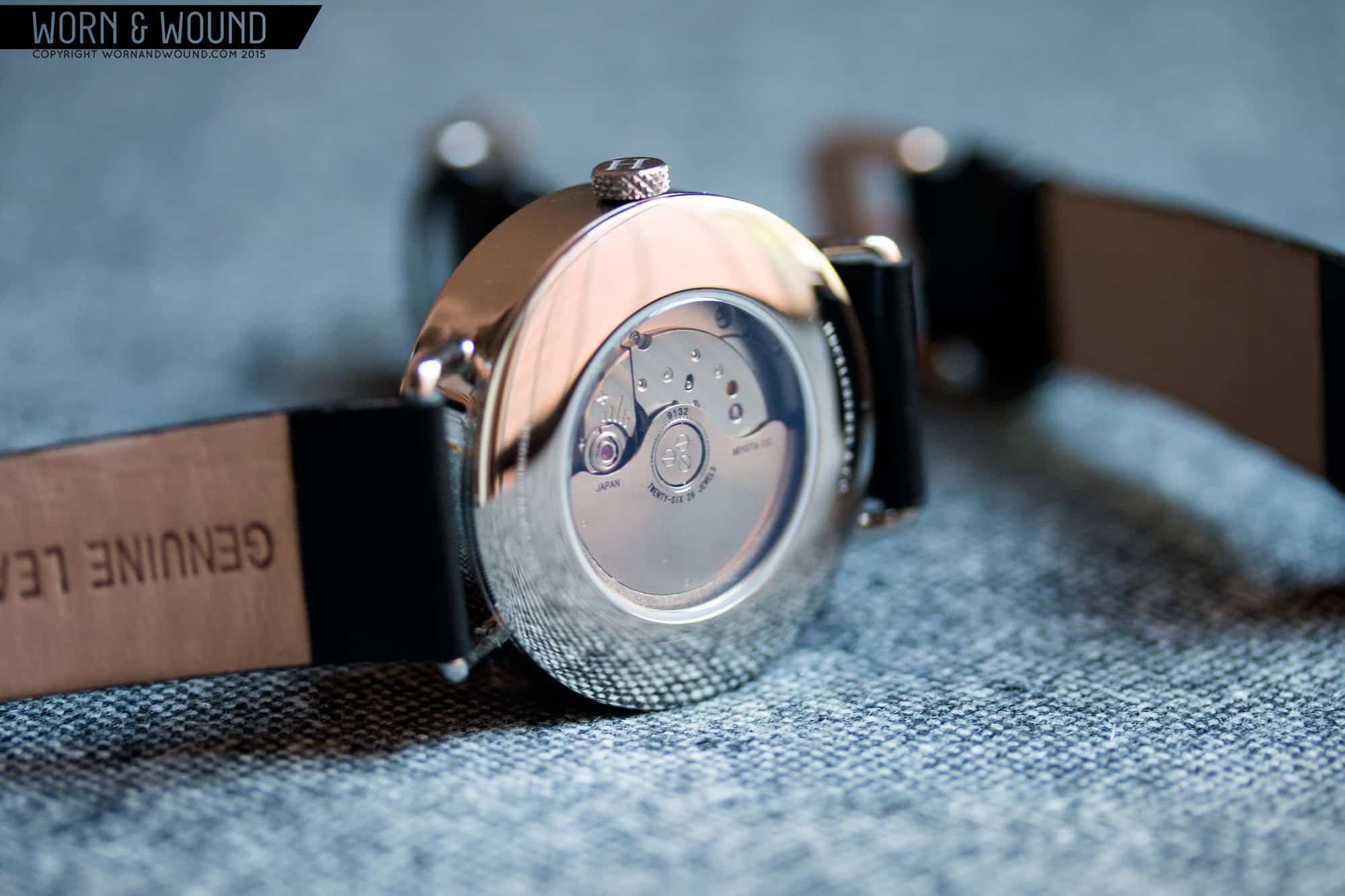
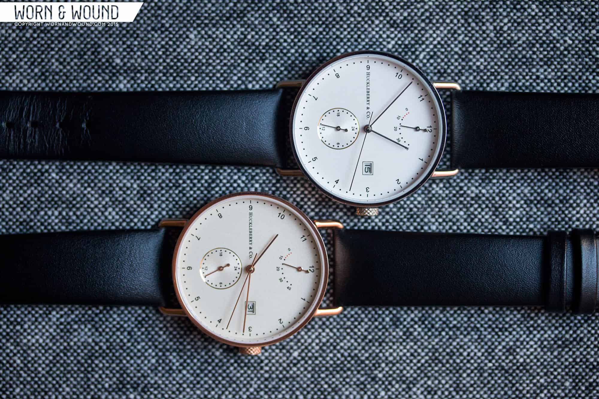
As a fan of minimal and more graphic designs, when a brand comes along that offers something stark, clean and automatic I always take note. Most recently was Australian new-comers Huckleberry and Co. with their Archibald watches. These Bauhaus-inspired watches had appealing layouts with an emphasis on simplicity and negative space, but to spice things up included 3 complications thanks to the Miyota 9132 movements inside; power reserve, a 24-hr sub-dial and a date. The result is a very intriguing watch with an air of sophistication and restraint not often found in a brand’s first design. I had the opportunity to try them out for a few days and here are my thoughts.
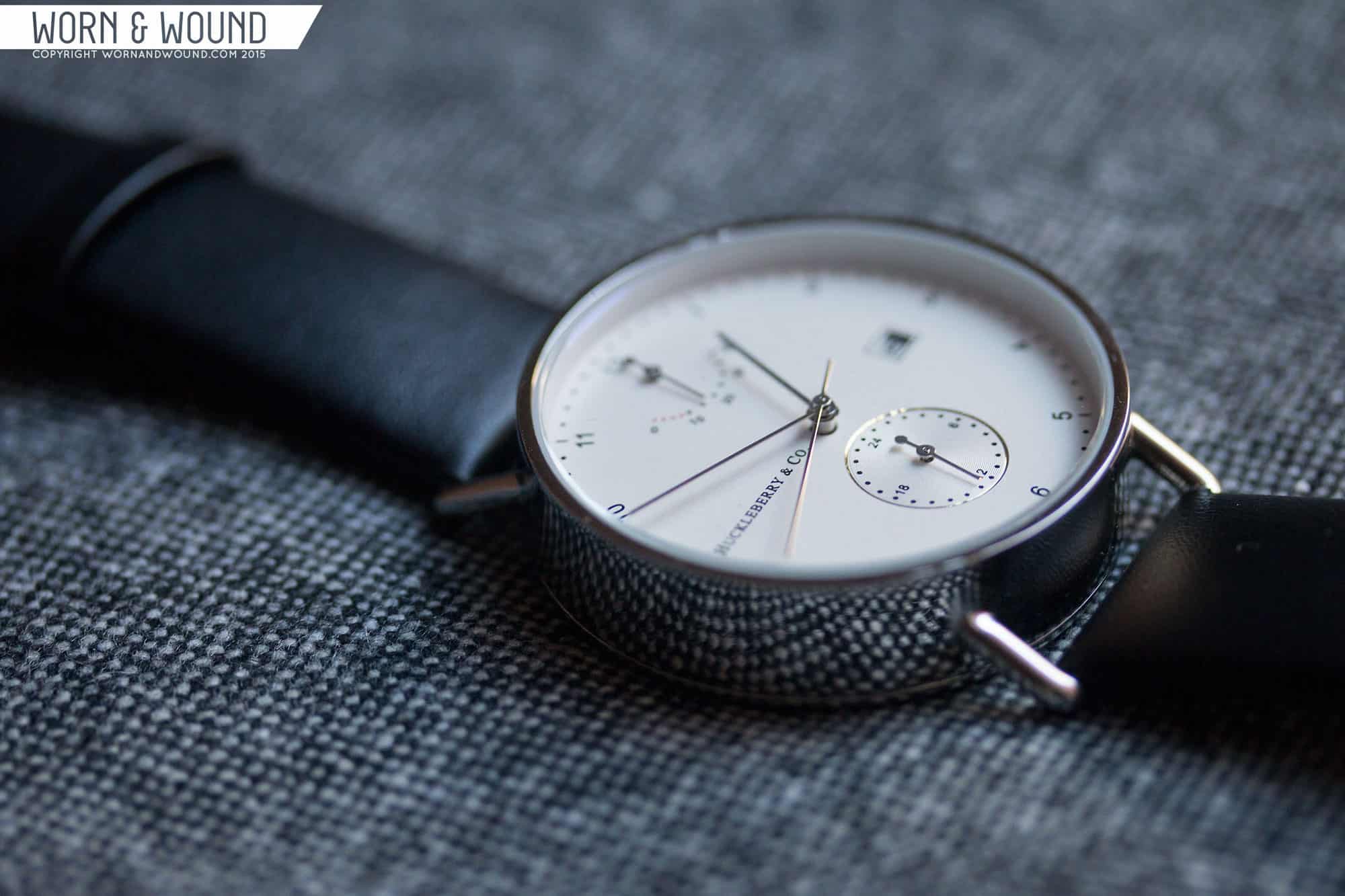
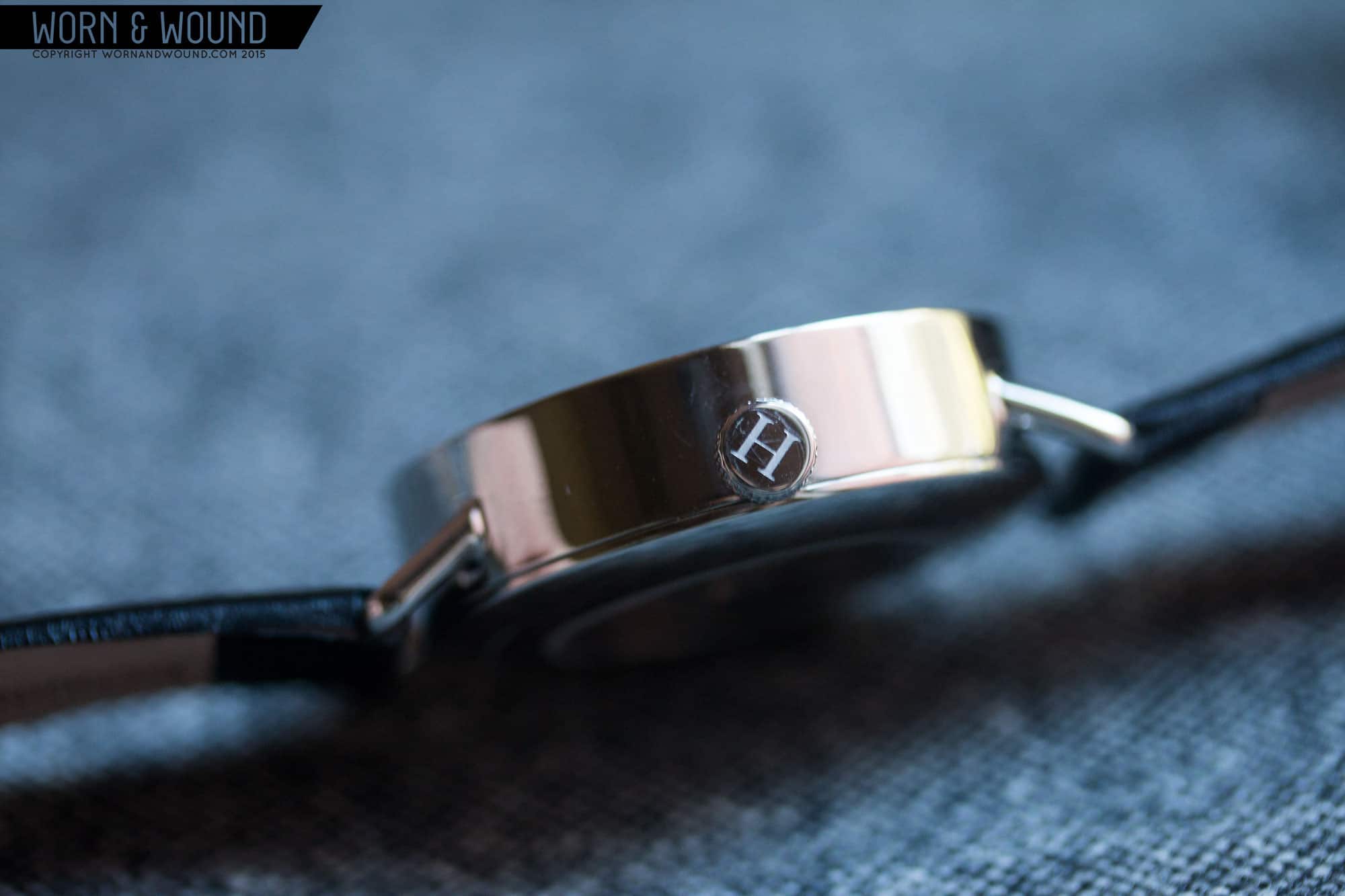
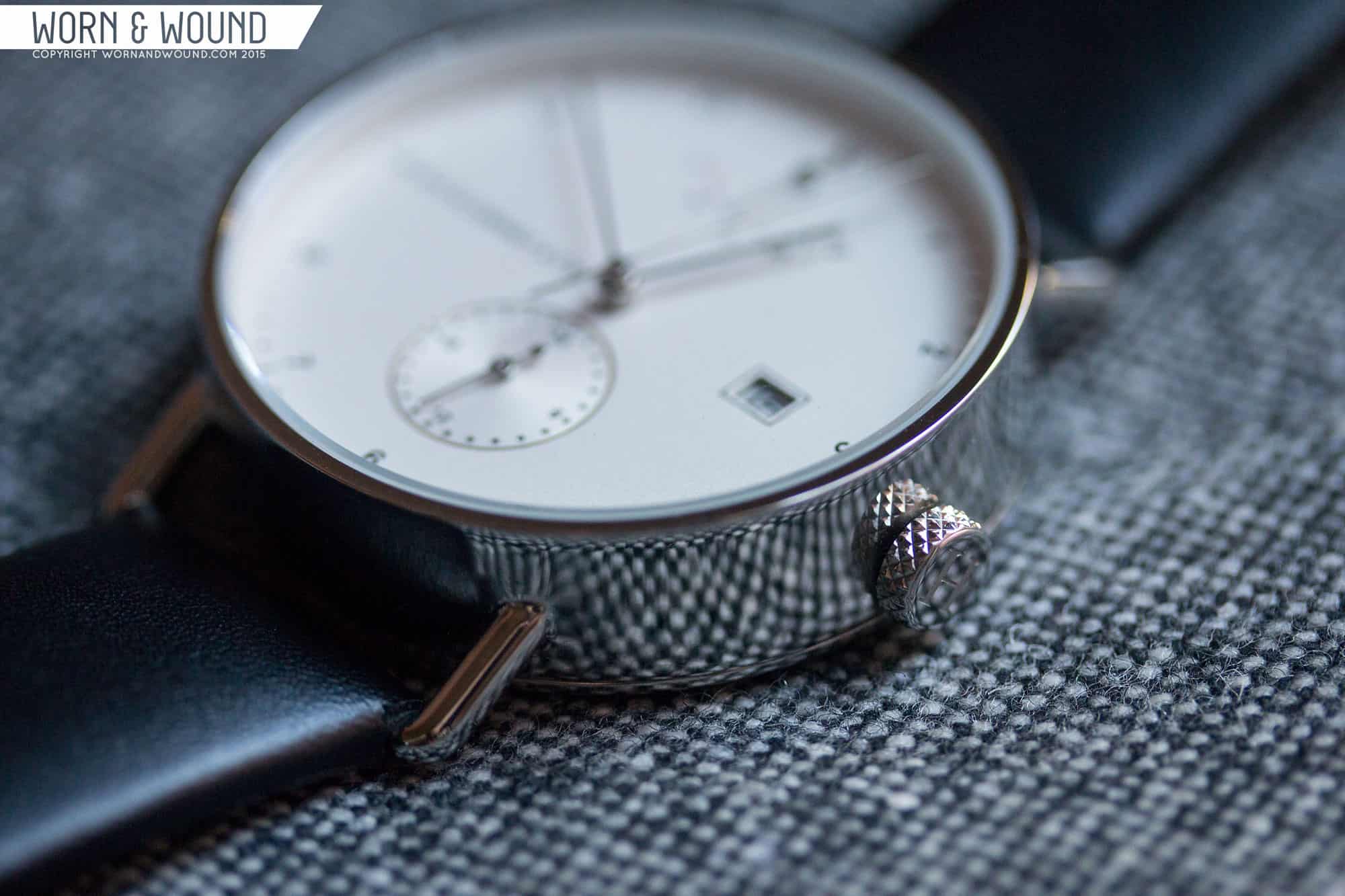
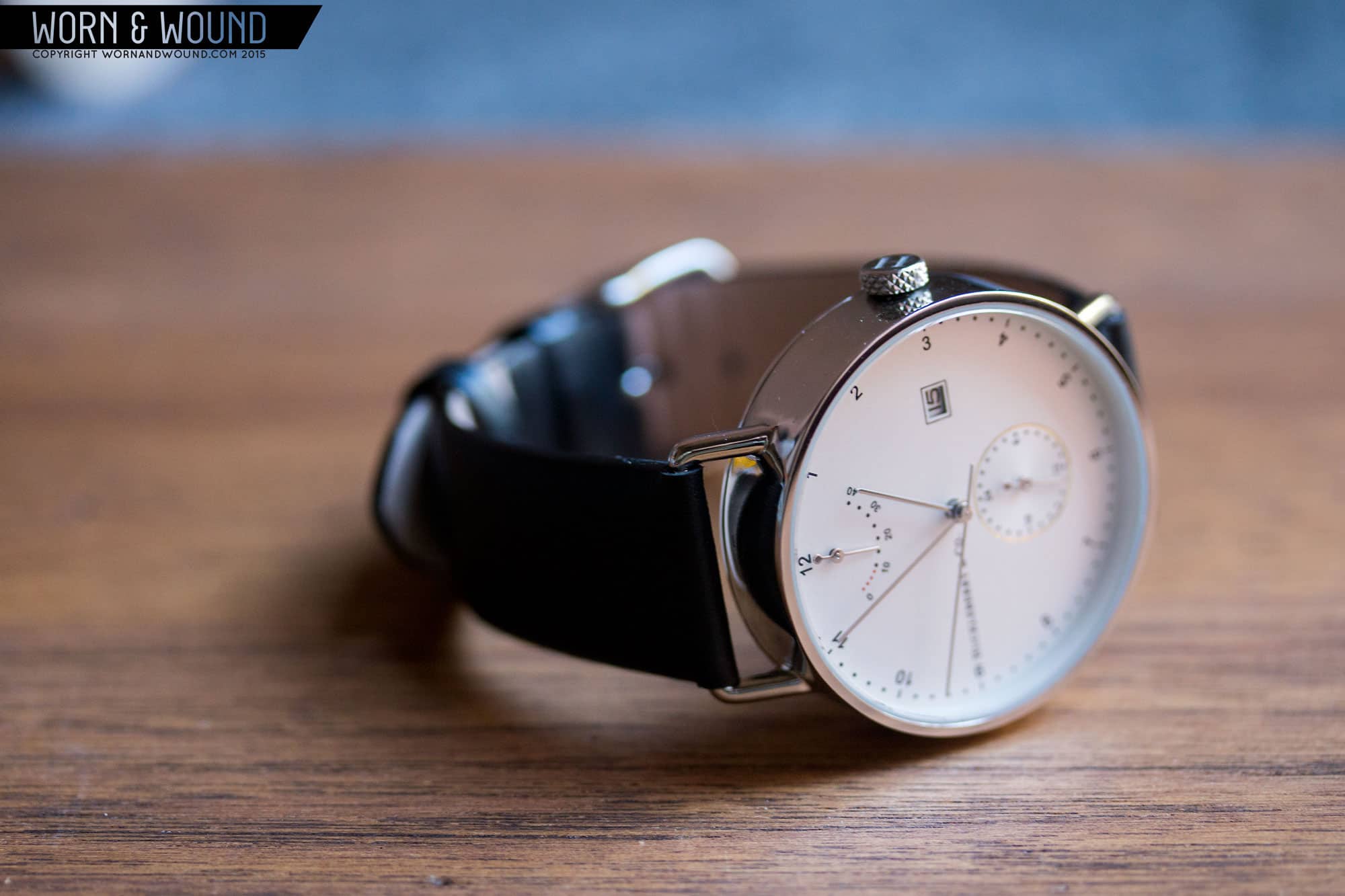
The first thing you notice about the case is that it seems quite tall. It’s a 40mm cylinder with wire lugs, making the diameter reasonable, allowing for just the right amount of dial real estate. It stands 11.7mm tall, which is hardly the thickest watch we’ve seen, but it looks taller than it is. This is because the case is a two-part construction; central-case and case-back. There is no bezel to speak of, so there is no breaking line on the way up the slab sides. It’s clearly an intentional design choice given the watch’s focus on simplicity. At first it’s a bit startling, but in practice doesn’t effect how the watch is worn very much and has a certain to-the-point appeal. That said, it does put a lot of focus on the quality of the case itself, which is fully polished in either the steel or rose gold option.
As such, I found myself wishing the case was brushed, as slight variations in the surface of the polish were very noticeable and that amount of polished surface area is a touch on the blingy side. It’s possible they went with full polish because of the wire lugs, which are molded directly into the case. There could have been case engineering concerns that led to that solution, but as we’ve seen on both the Hamilton Khaki Navy Pioneer and Autodromo Monoposto, some wire lugs are actually welded internally and fed through, which could allow for different finishes as the central case could be brushed before the lugs are added.
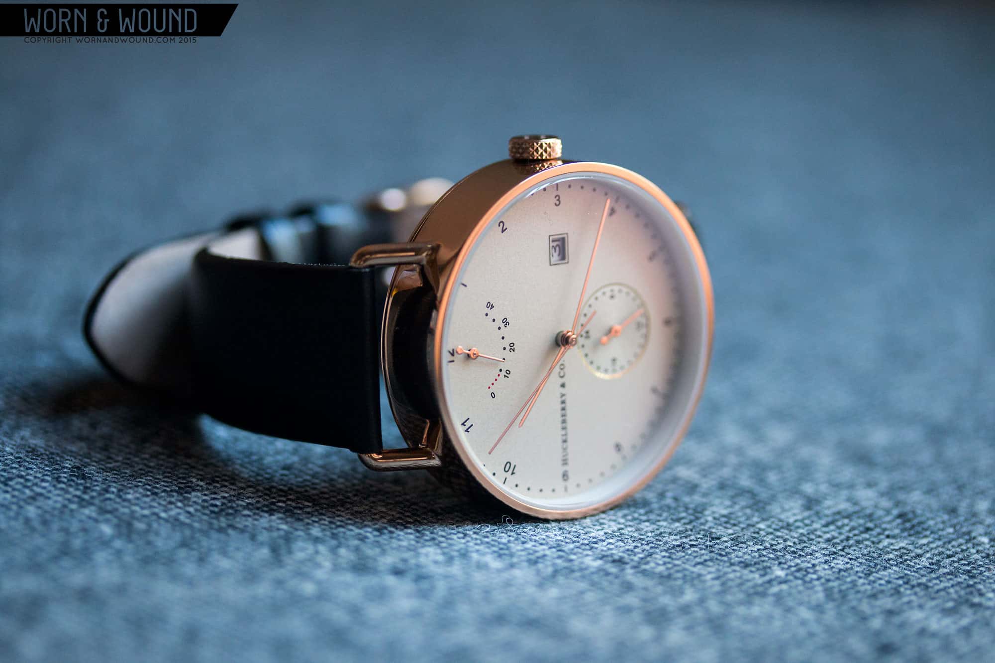
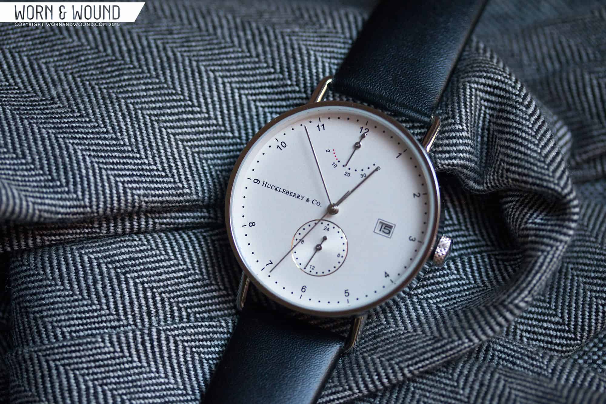
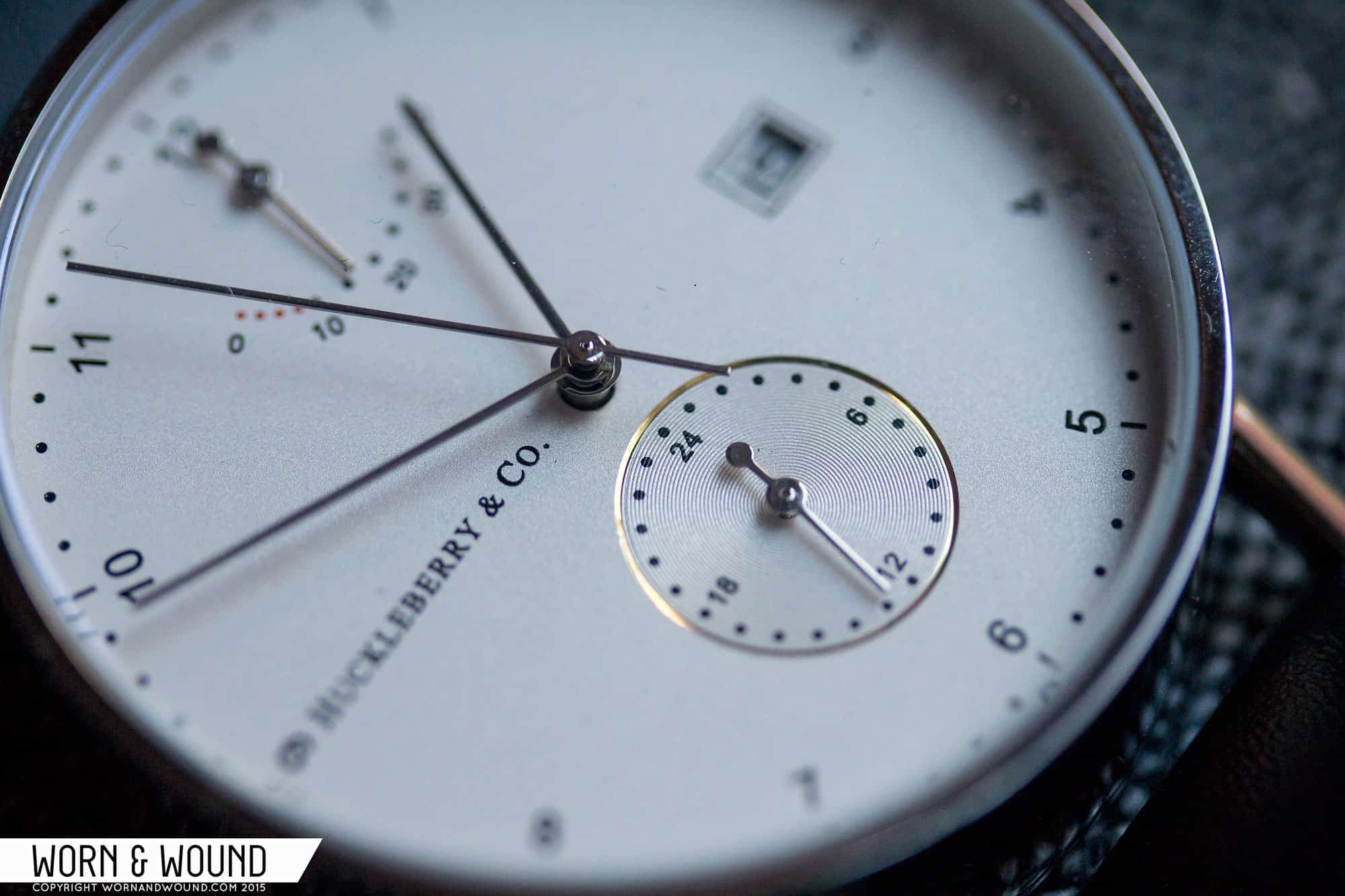
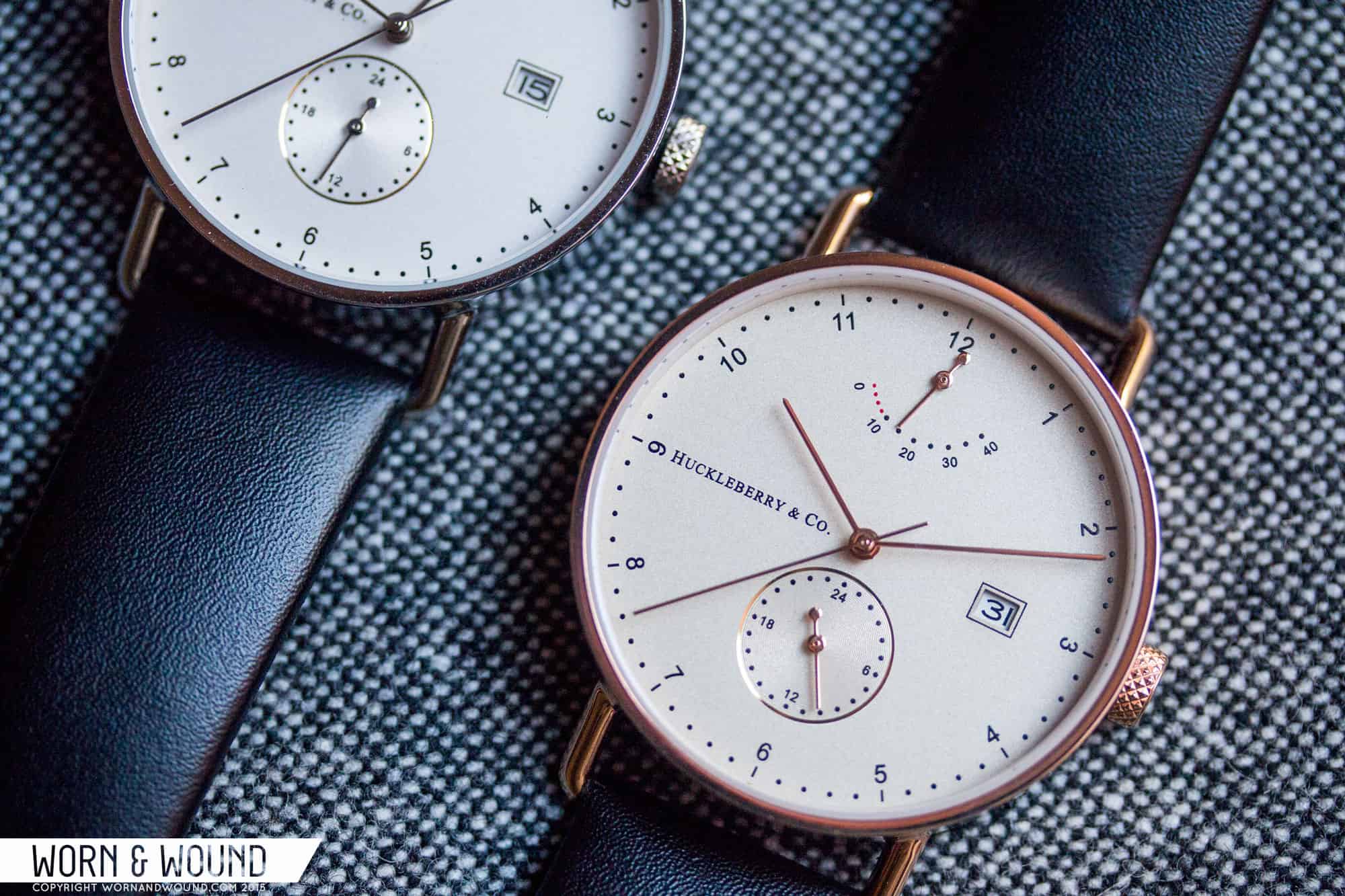
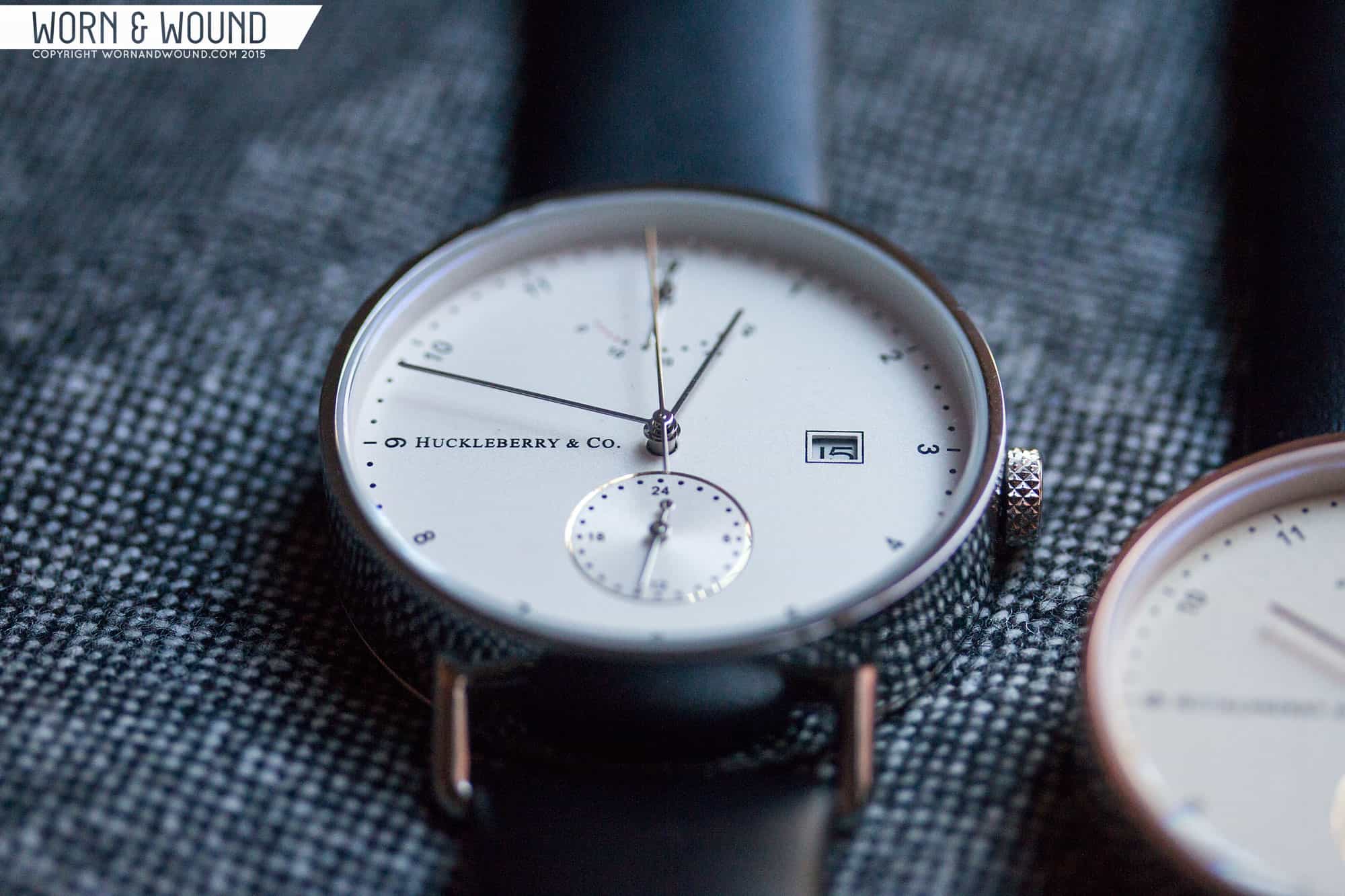
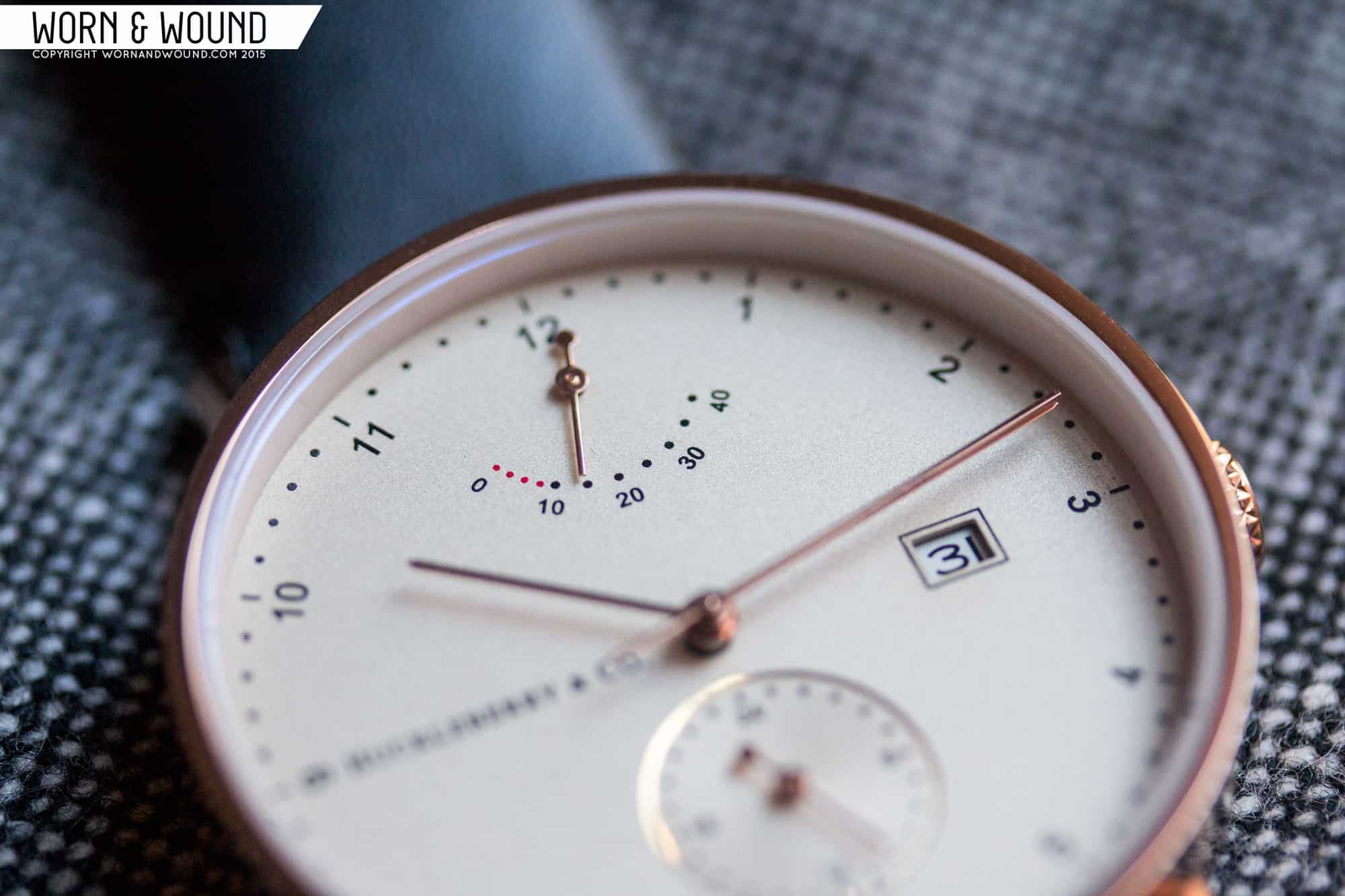
The dial is the real winner of the watch. It’s expertly laid out, sizing the various elements just right, leaving the perfect amount of space between… even the date window, which floats between the center and 3, feels like it’s in the right place, balancing the logo off of 9. The hour index is pushed way out to the edge of the rather large dial, and consists of small sans-serif numerals with rotate per the angle of the hour. Encircling them is a minute/second index of lines at intervals of 5 and dots per individual minute/second. Everything is kept very small, but manages to still be perfectly legible.
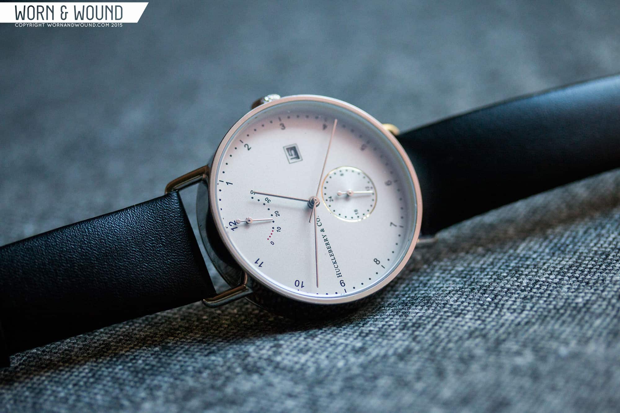
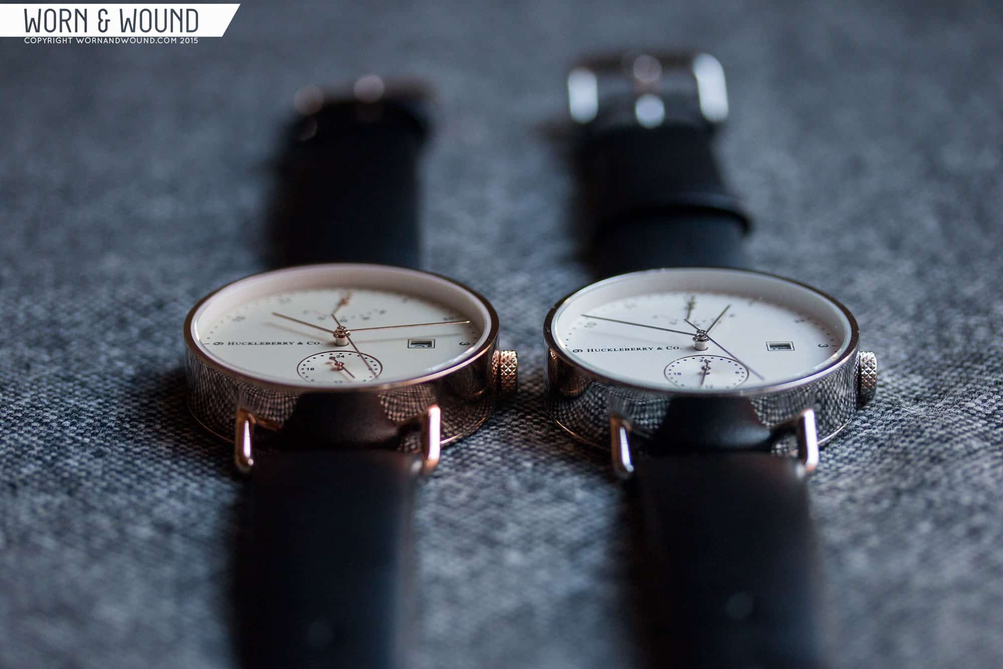
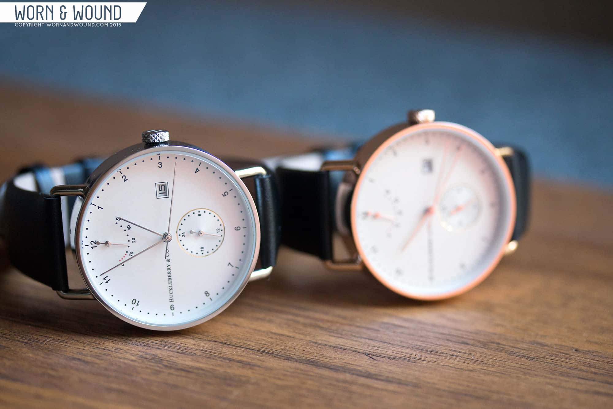
Just below 12 is the power reserve, which is a complication I love to see. It’s executed in similarly restrained style as the main indexes with small numbers and marks. Things get a bit more decorative with the 24-hr sub-dial at 6. It’s depressed into the dial and features concentric circular graining throughout. Then is an almost decadent touch, the edge of the sub-dial has a polished metal ring matching the case’s color. I happen to think it’s a beautiful detail that brings the dial to life, and adds a sense of quality. The 24-hr sub-dial consists of dots per hour and numerals 24, 6, 12 and 18. As is the trend, it’s well balanced and executed.
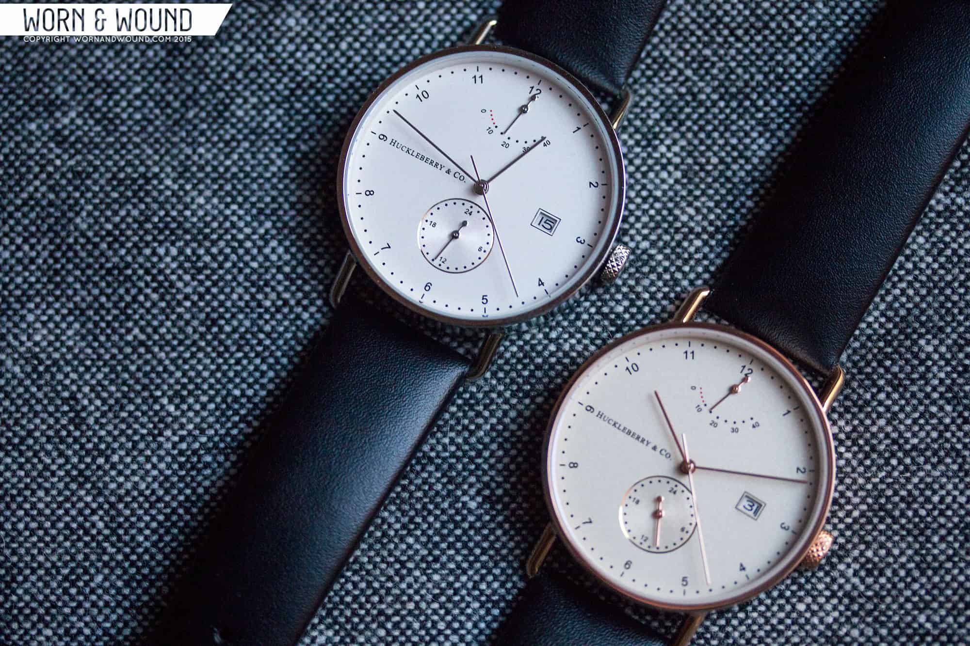
Most of the details between the two versions of the watch are the same, save the hand color and surface color. Starting with the latter, the steel case has a slightly opalescent white/silver dial. It has just enough texture to not be a standard white, yet it’s not metallic enough to be fully silver. The rose gold dial is similarly between things, ending up a very light champagne color. Though I might choose the steel case over the PVD due to personal style choices, the champagne dial was my favorite of the two. It’s so slightly warm and colored that it almost seems like it has an internal glow. It’s just gorgeous.
The hands themselves are very simple sticks. The hour, minute and seconds are very similar, but are easily distinguished by overall length, and the seconds in a hair thinner. The sub-dial hands are also both sticks, but with small circular counter-weights, which give them a touch more presence. There is one detail about the dial I was not a fan of. It might be a bit tricky to see in the photos, but along inside edge of the case, and leading down to the dial is a white plastic tension ring. In images it sort of blends in with the dial, but in person, it’s more noticeable, and while I understand the need of the ring, as there is no bezel or taper to secure the dial, a metal ring would have looked much nicer.

On the wrist, the Archibald wears very nicely. 40mm with wire lugs feels quite tame, though the watch does have a lot of presence as it’s nearly all dial. The height, as I said, looks more dramatic than it is, as 11.7mm really isn’t that bad, especially against a 40mm diameter. Aesthetically, it’s a very sharp looking watch. Whether worn more casually or as an office watch it works well. It’s the kind of style I personally could wear everyday as an alternative to my more sporty or military pieces. It’s very refined, and a style that, in being stripped down, sort of works with everything.
As is the way of things these days, the Archibald was launched on Kickstarter and received full funding within 6-hours. Currently, Archibalds in steel and rose gold are still available for a paltry $290 (410 AUD) per watch, with a final retail of about $350 making them incredibly affordable. While a great price and great deal on a very attractive watch, it makes me wish that a bit more was spent on finishing and details like the tension ring, as clearly they had room to go up. Regardless, should you be looking for something clean and minimal designed with by a trained graphic eye, the Huckleberry & Co. Archibald is very worth you consideration. The fact that it has a reliable automatic in it is icing on the cake, as so many of these more minimal graphic watches tend to be quartz powered. Definitely a brand to keep an eye on.

