Hands-On with the Vibrant Baltic Tricompax Chronograph

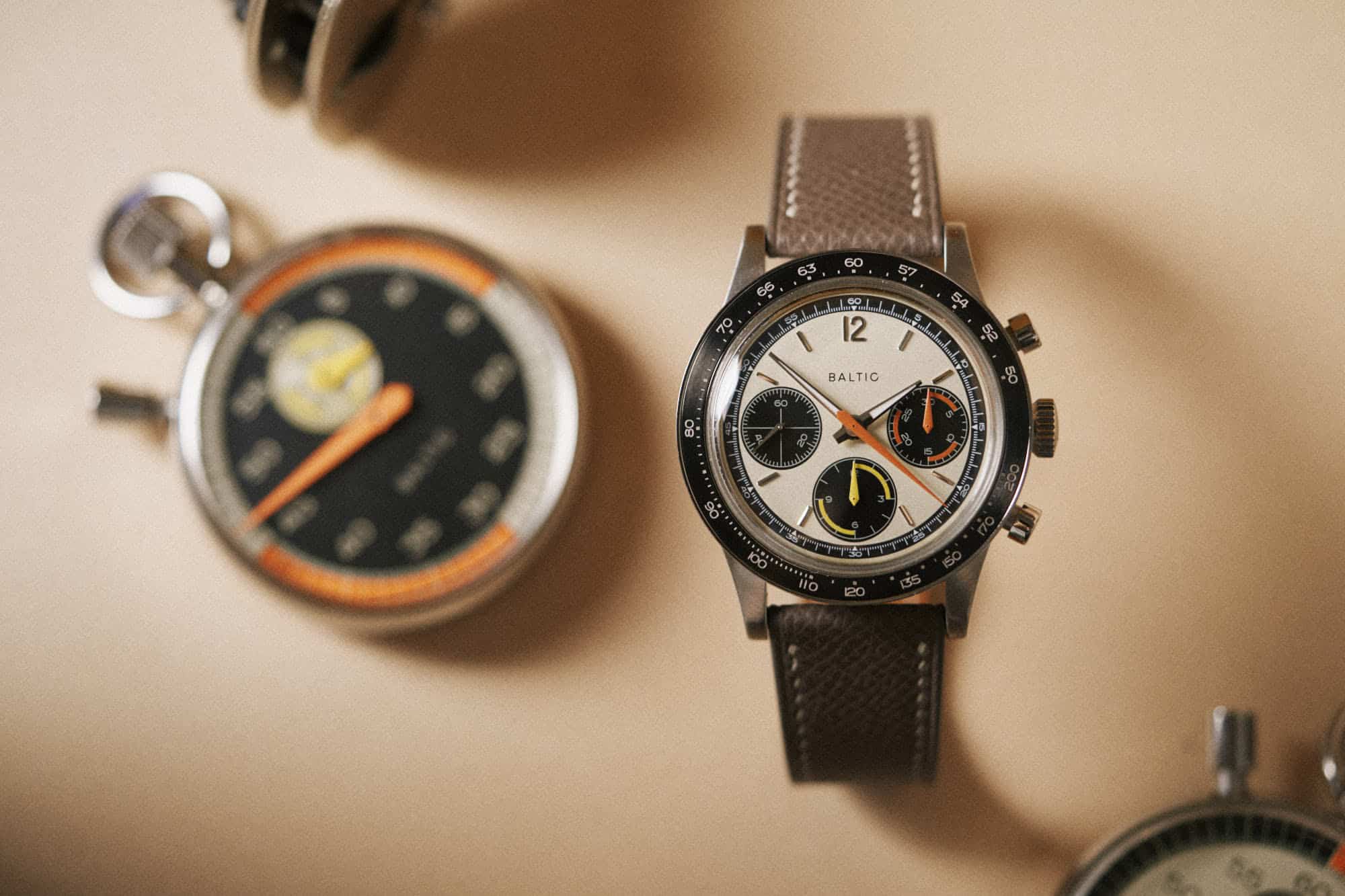
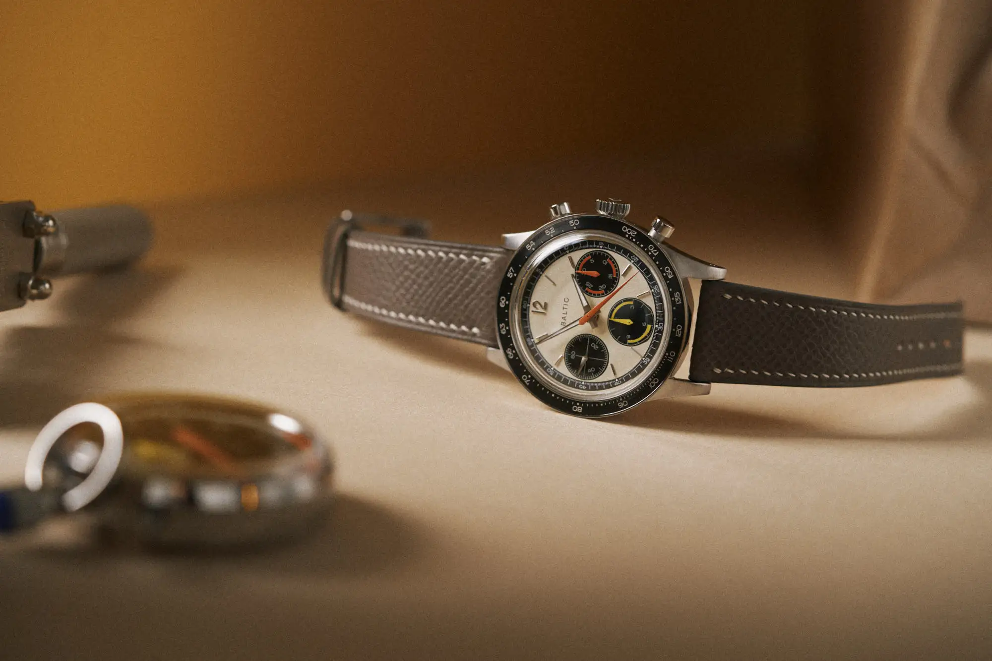
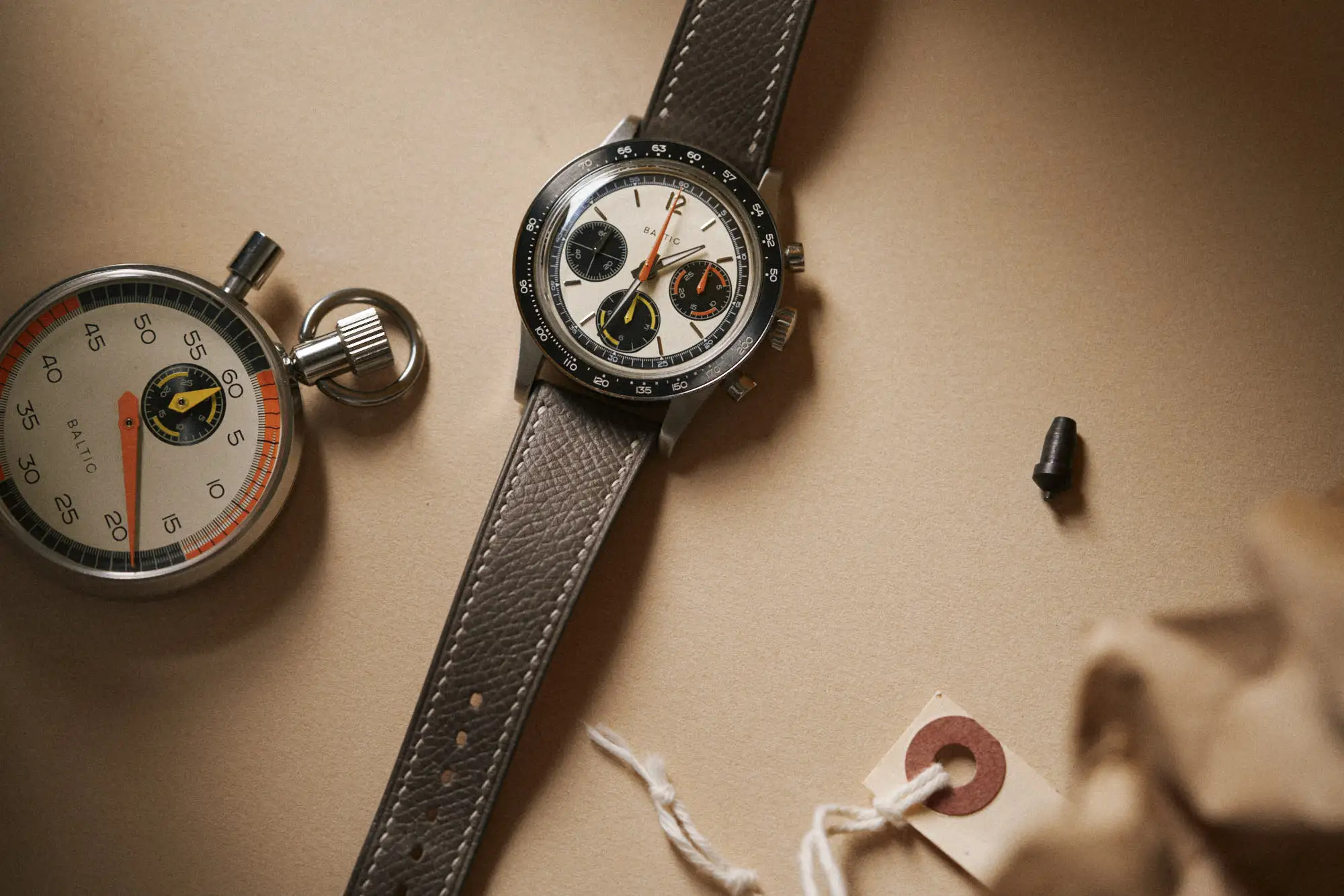
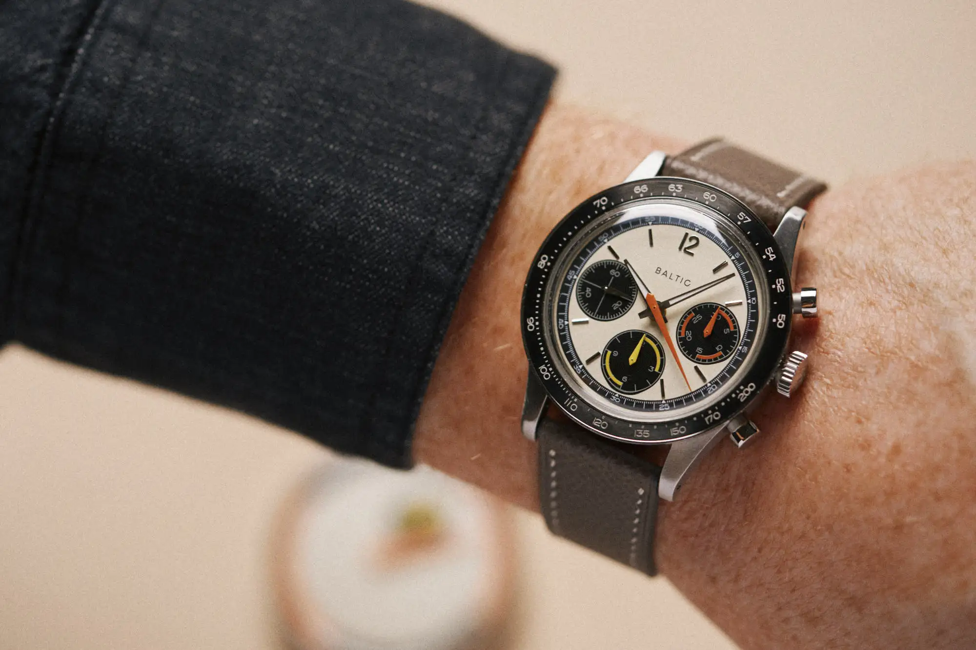
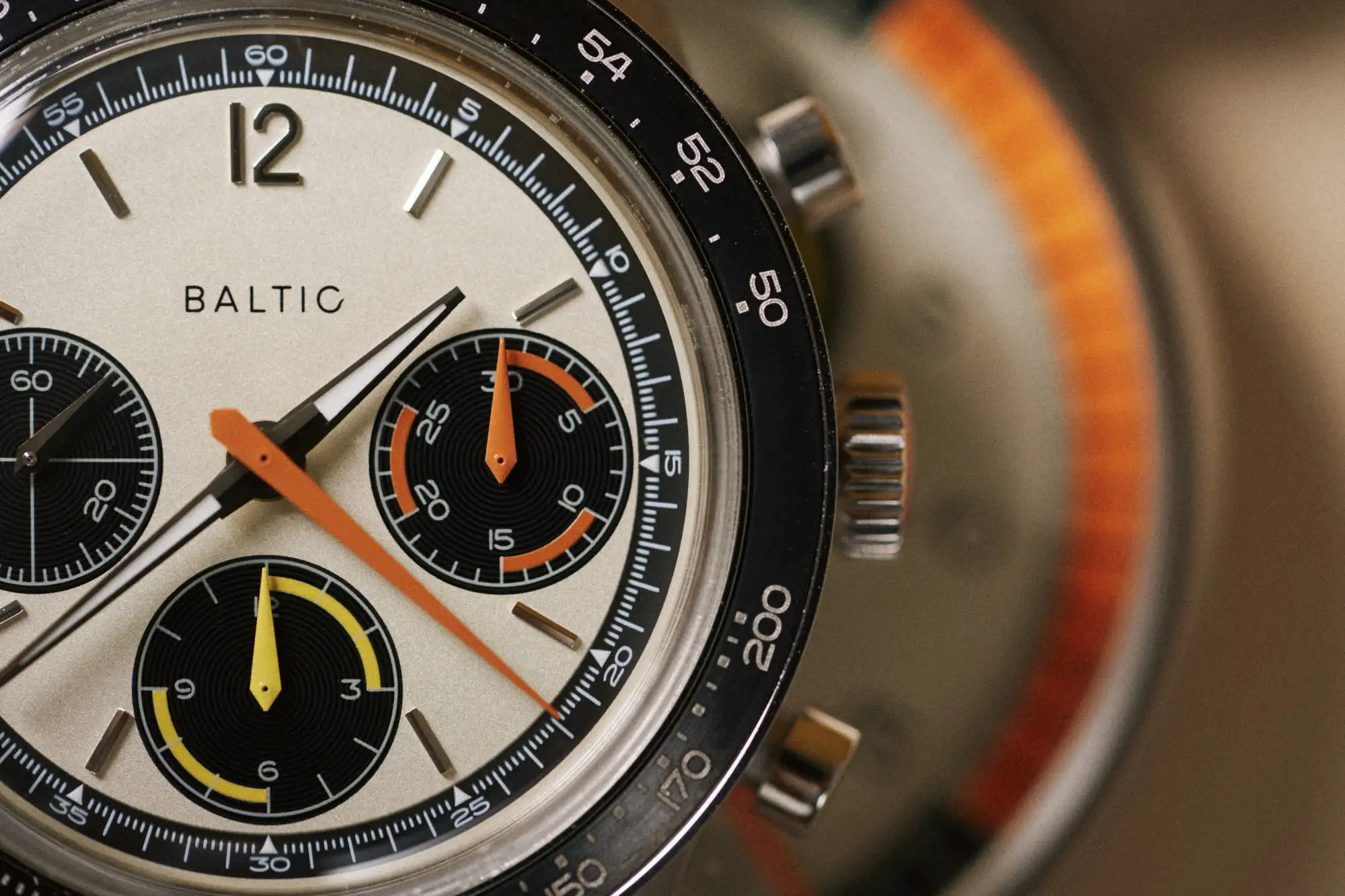
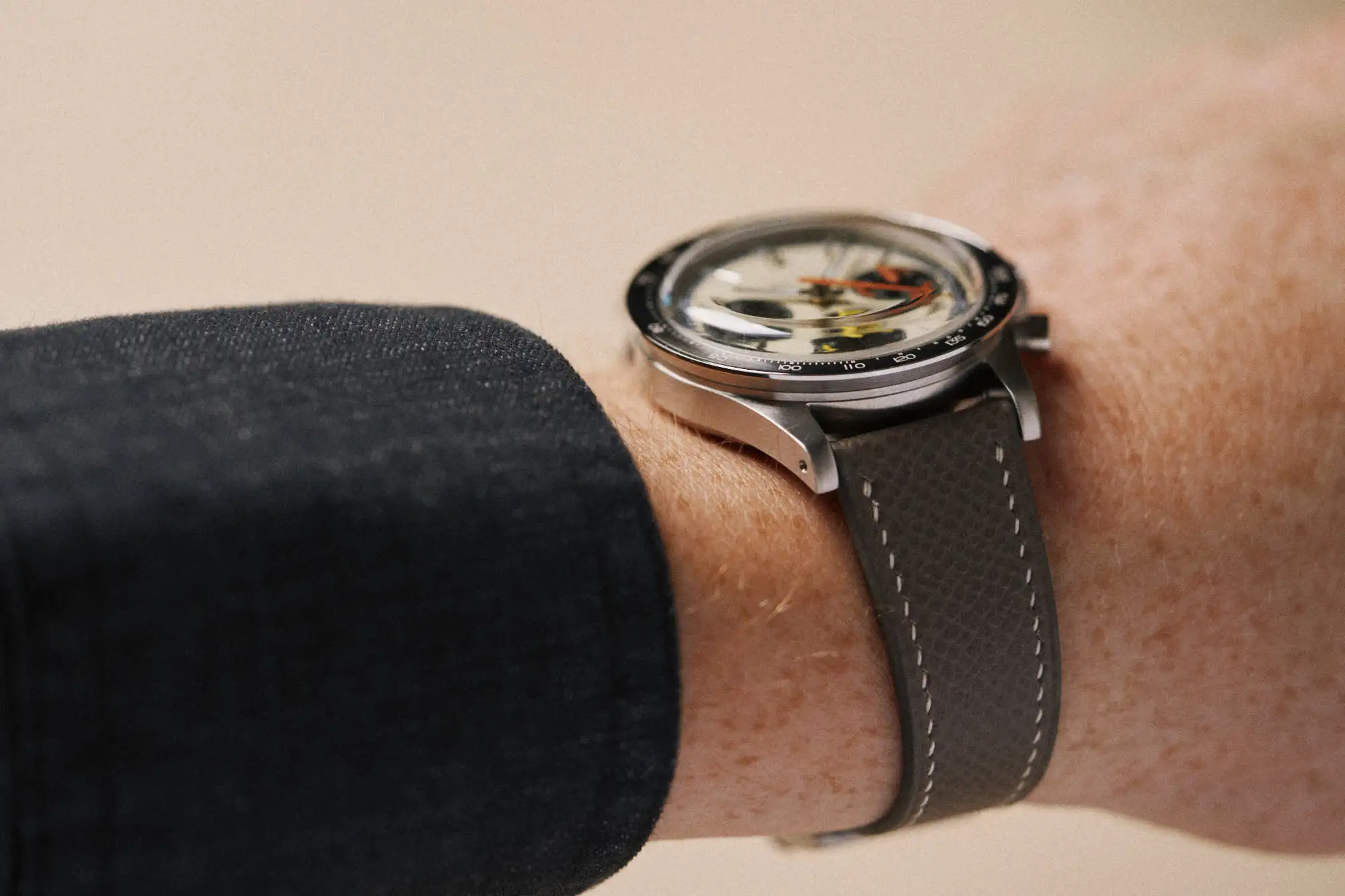
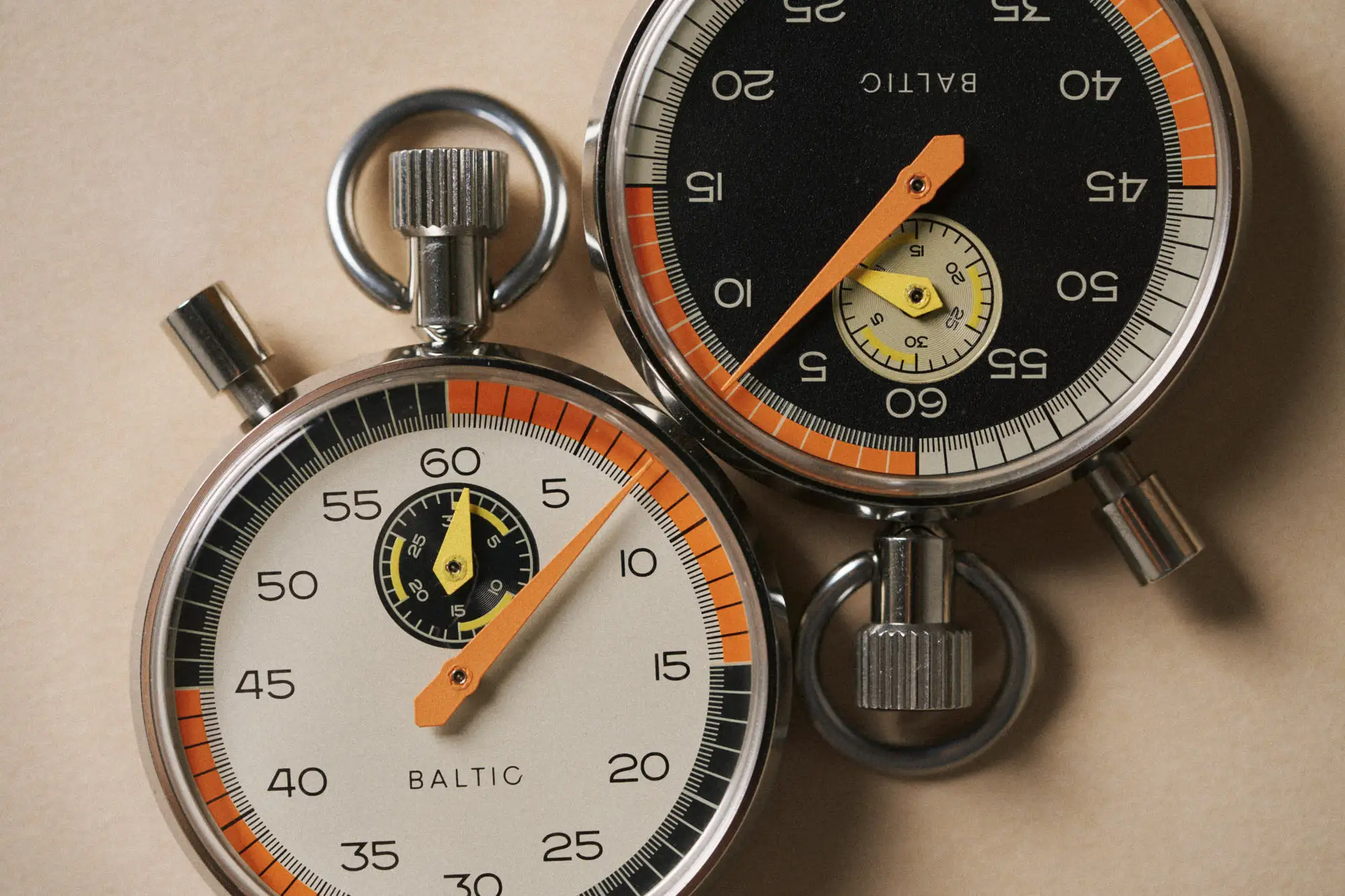
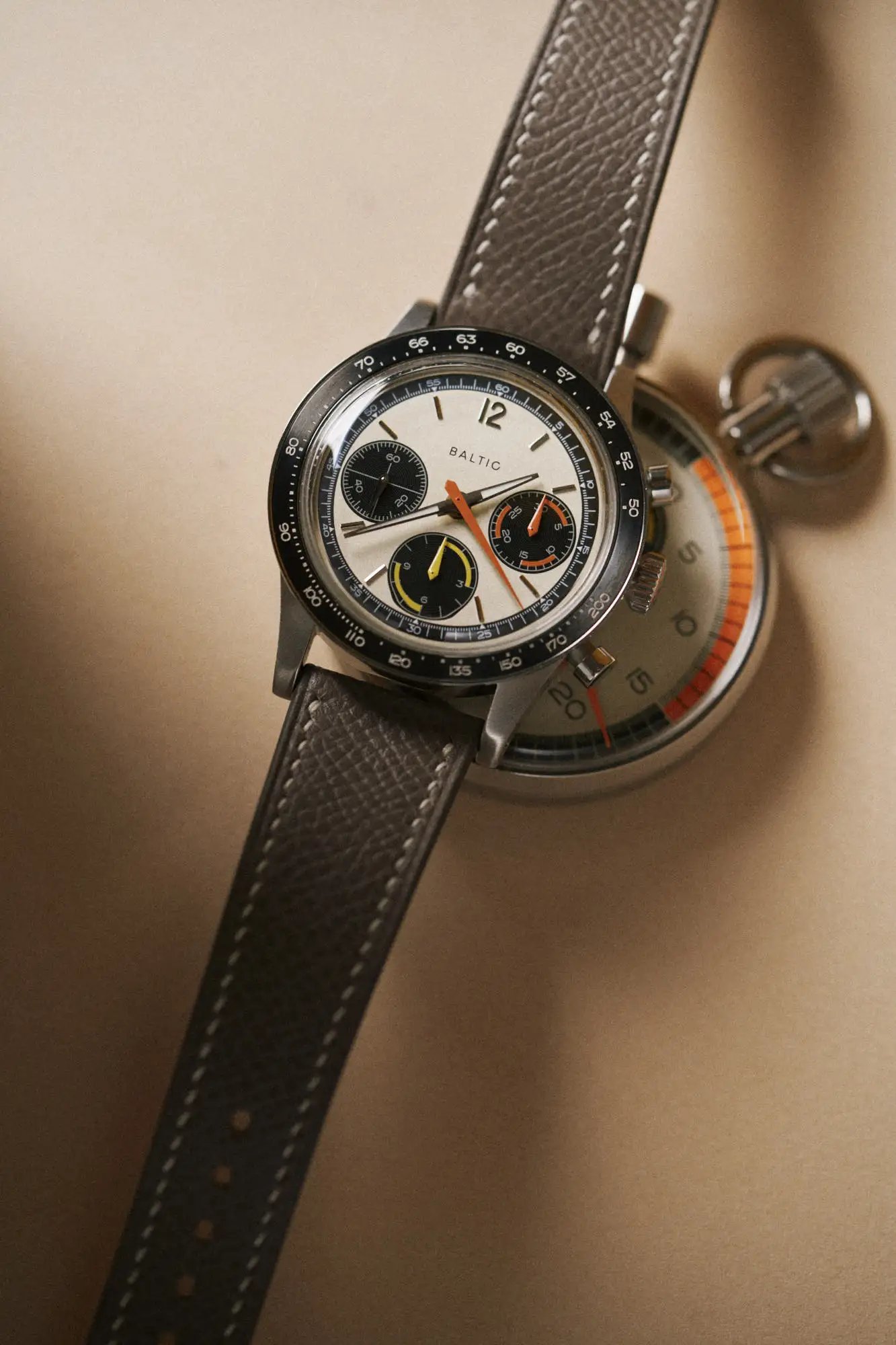
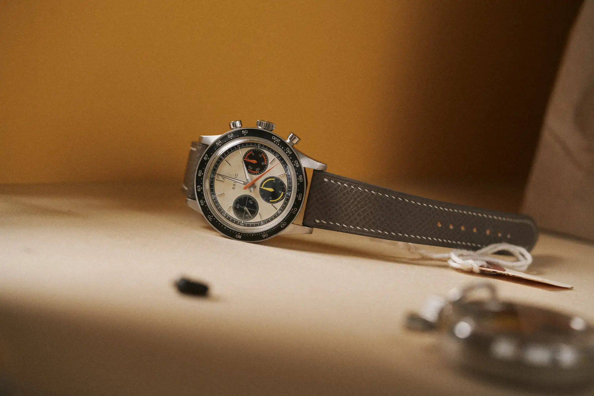
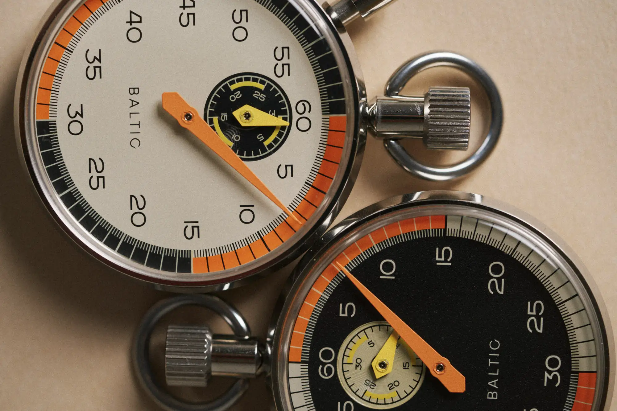
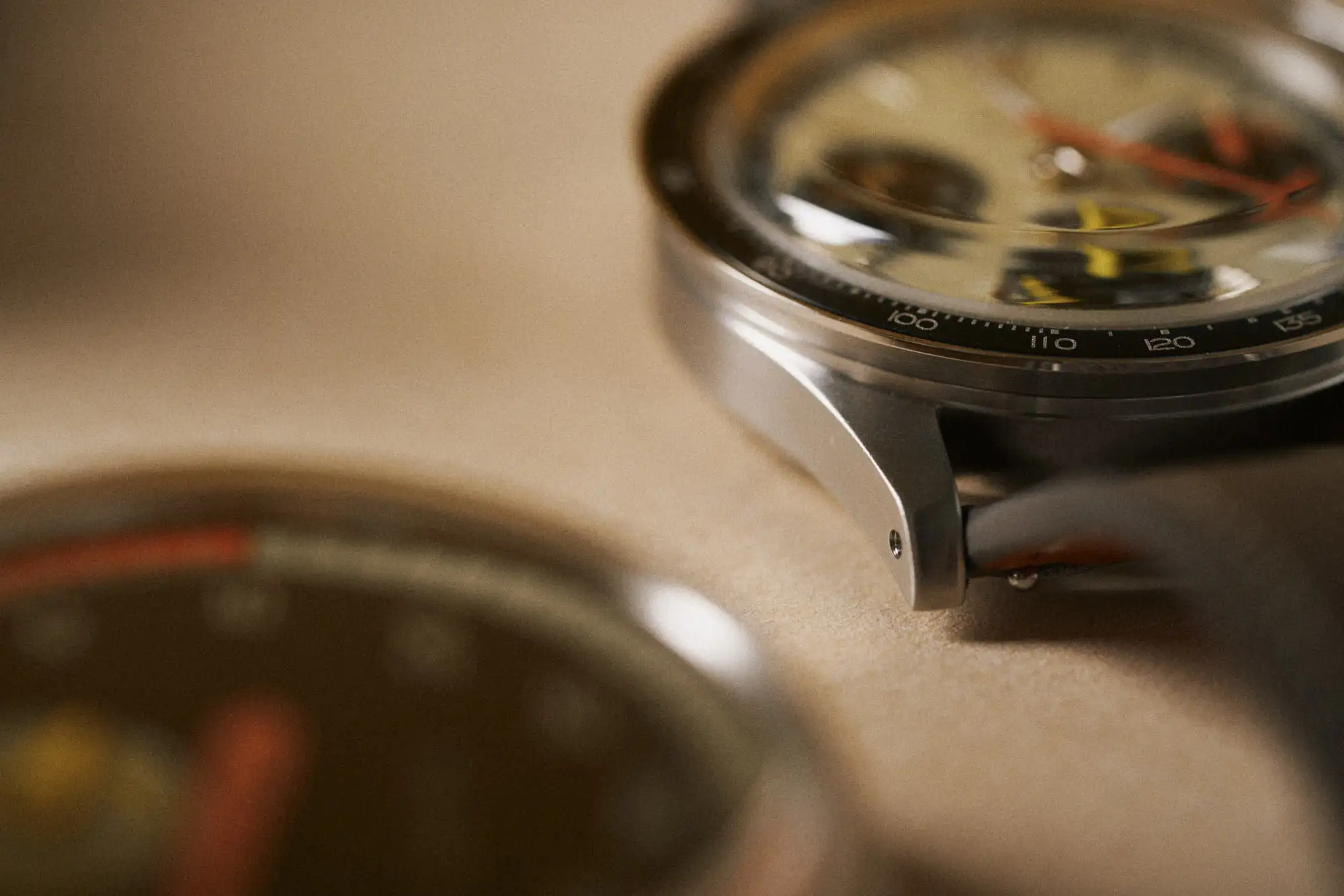
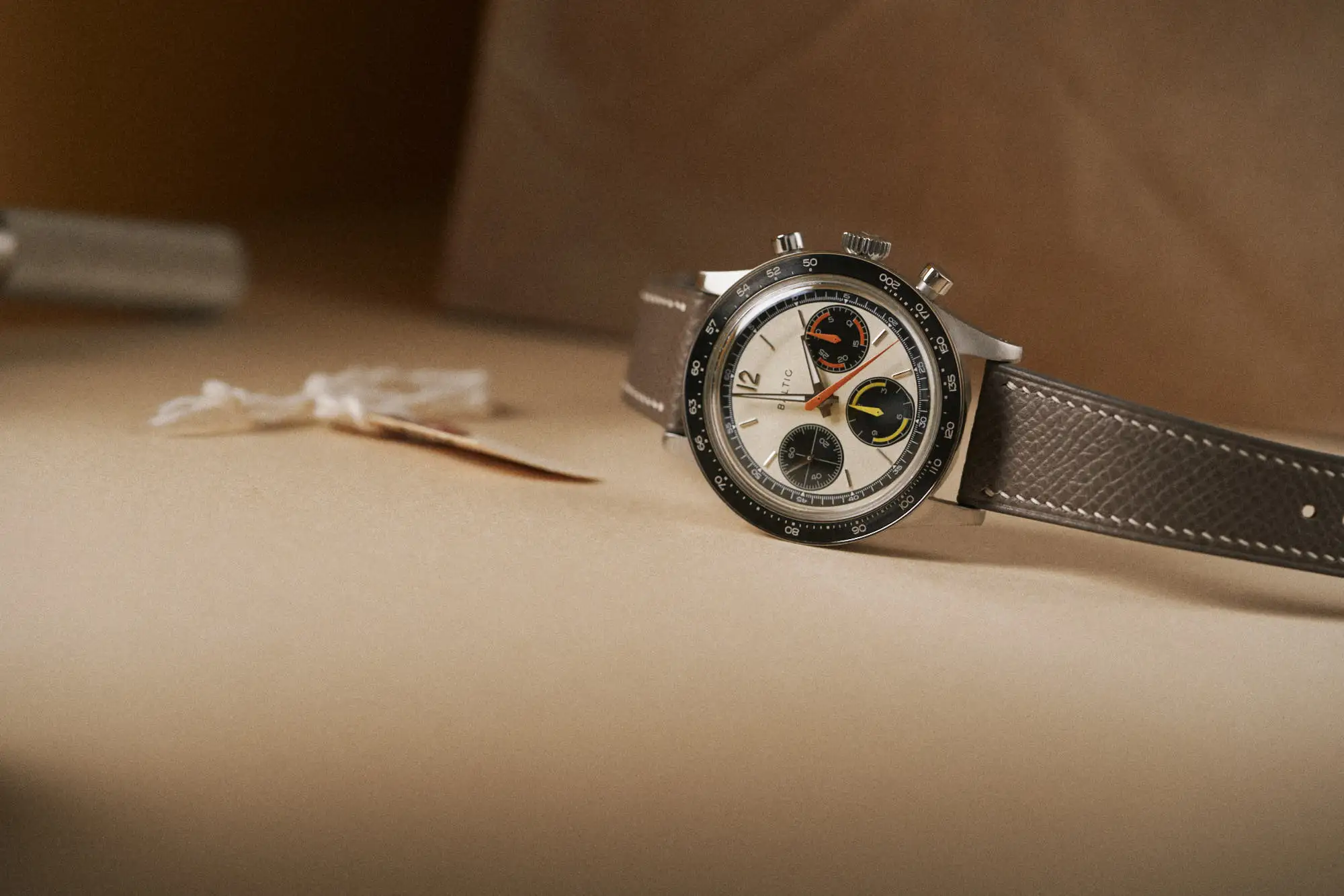
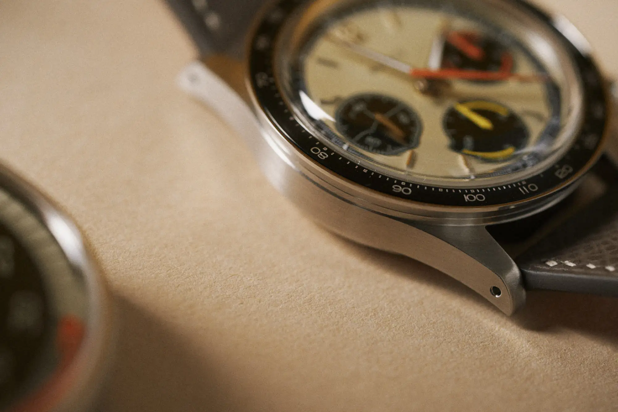
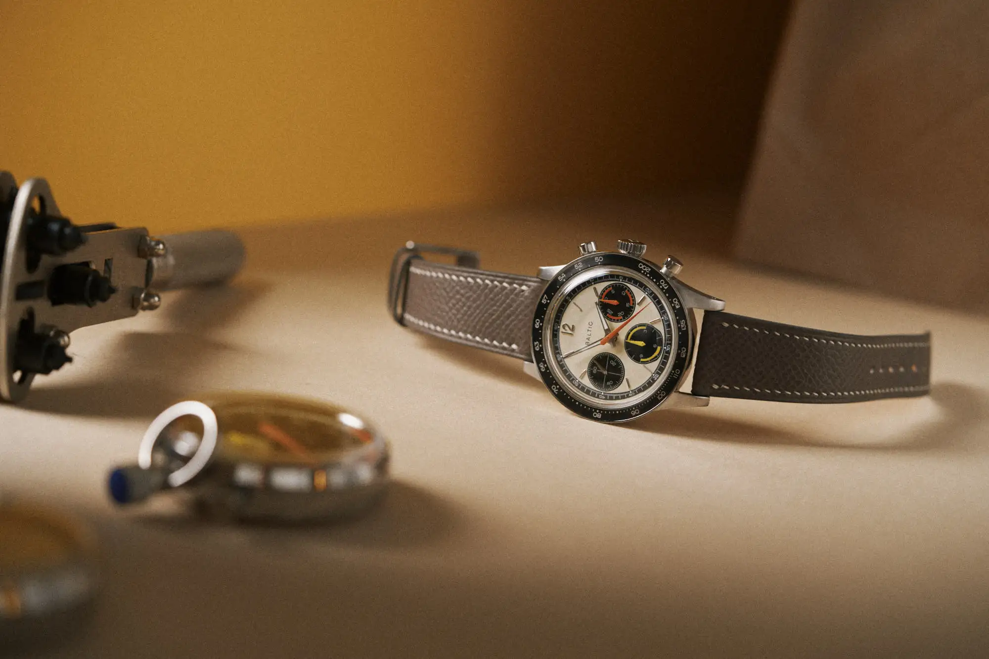
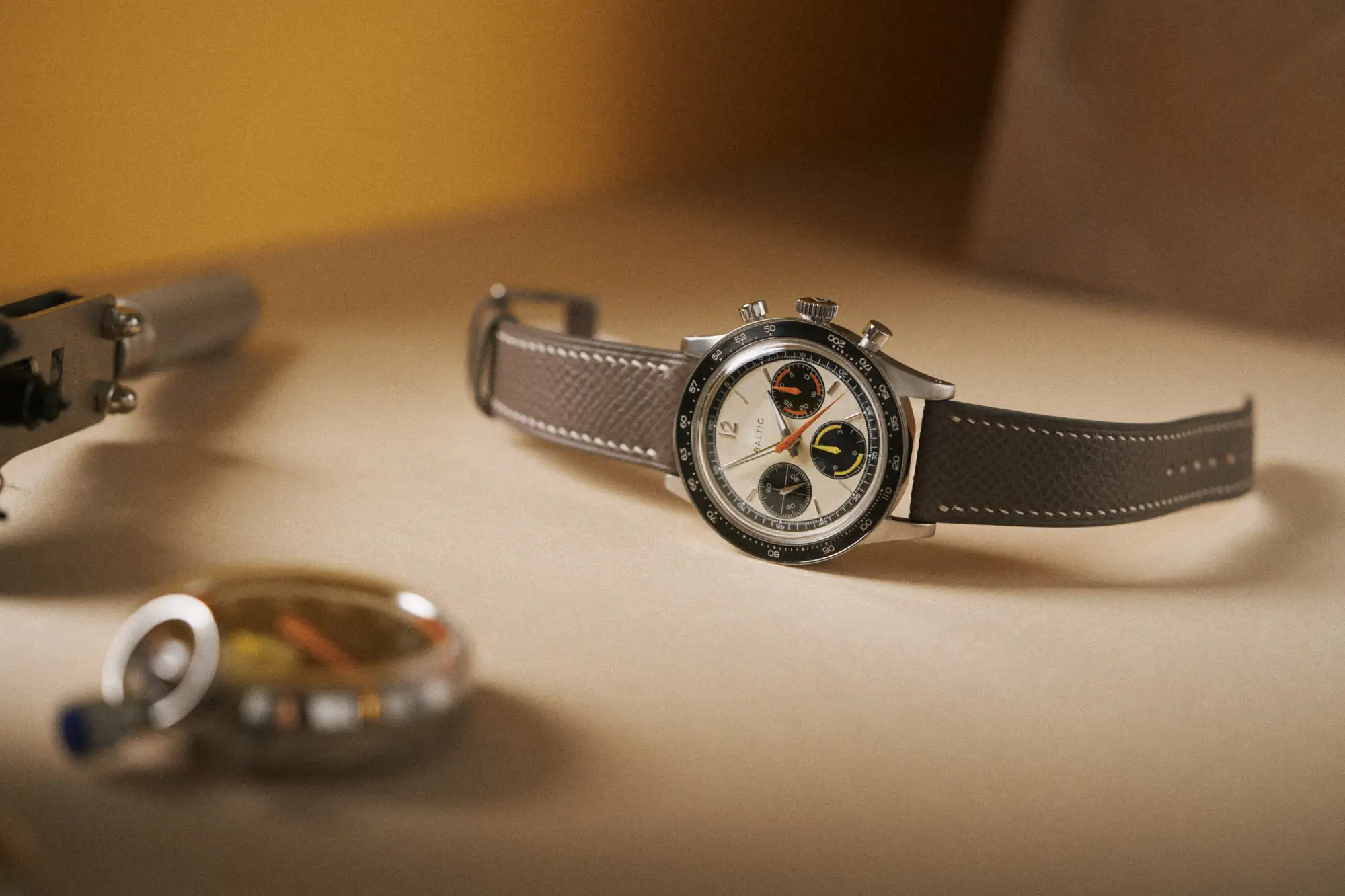
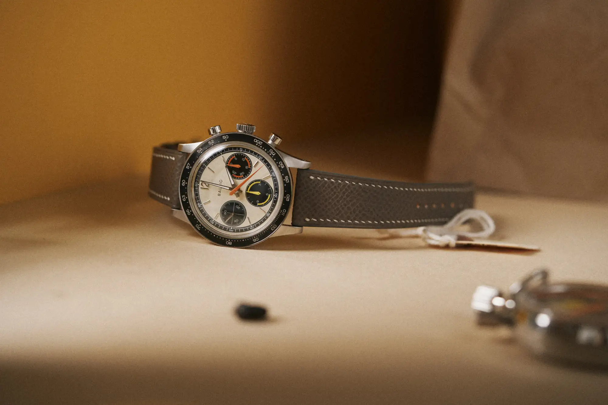
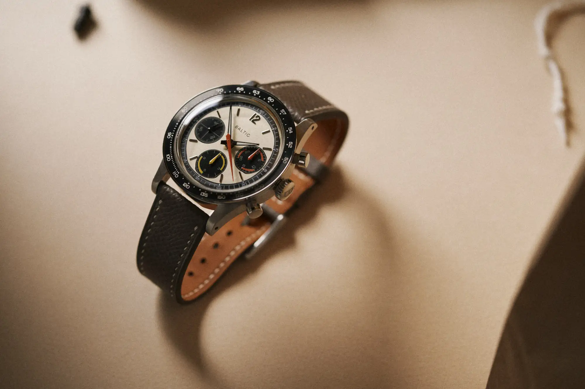
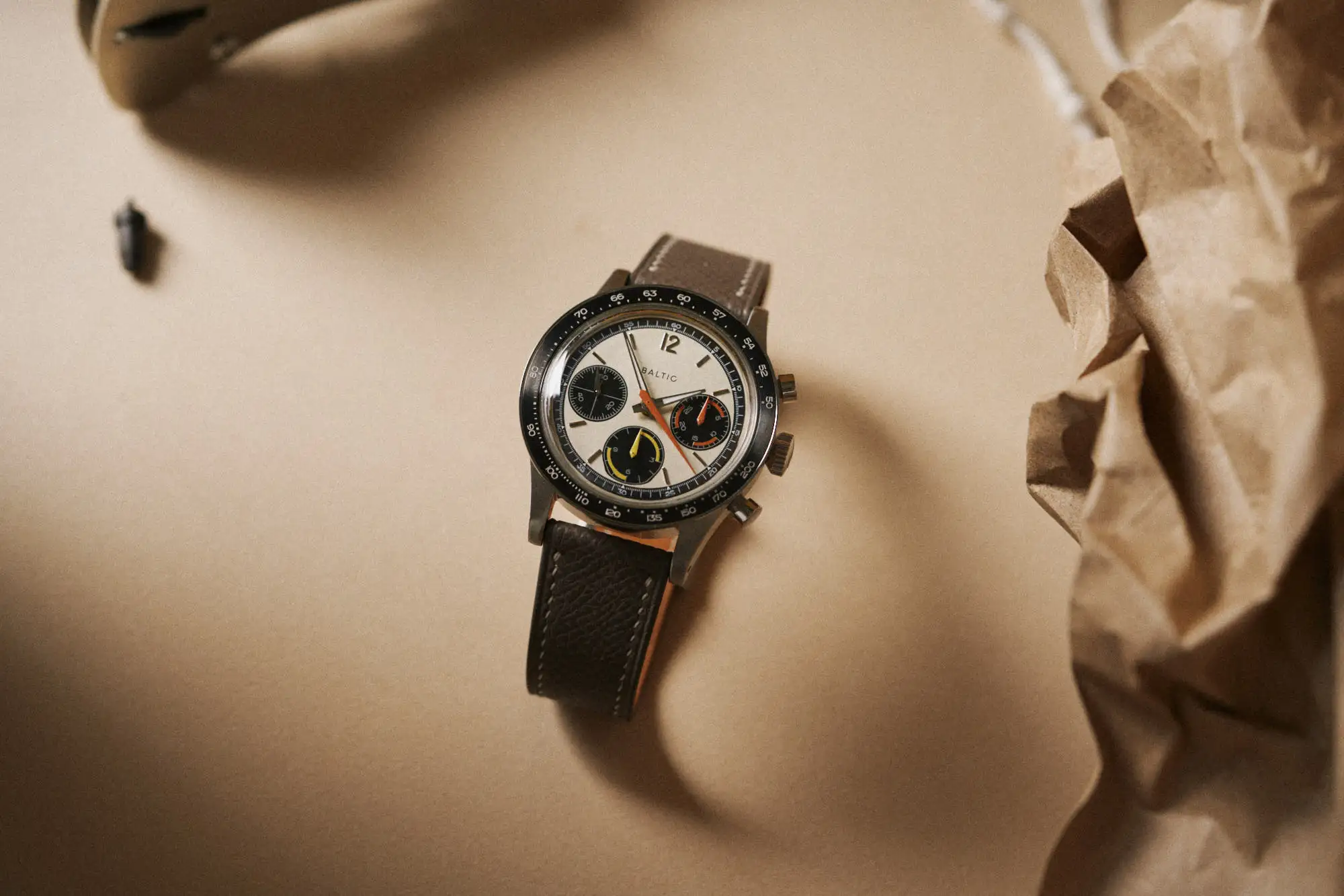
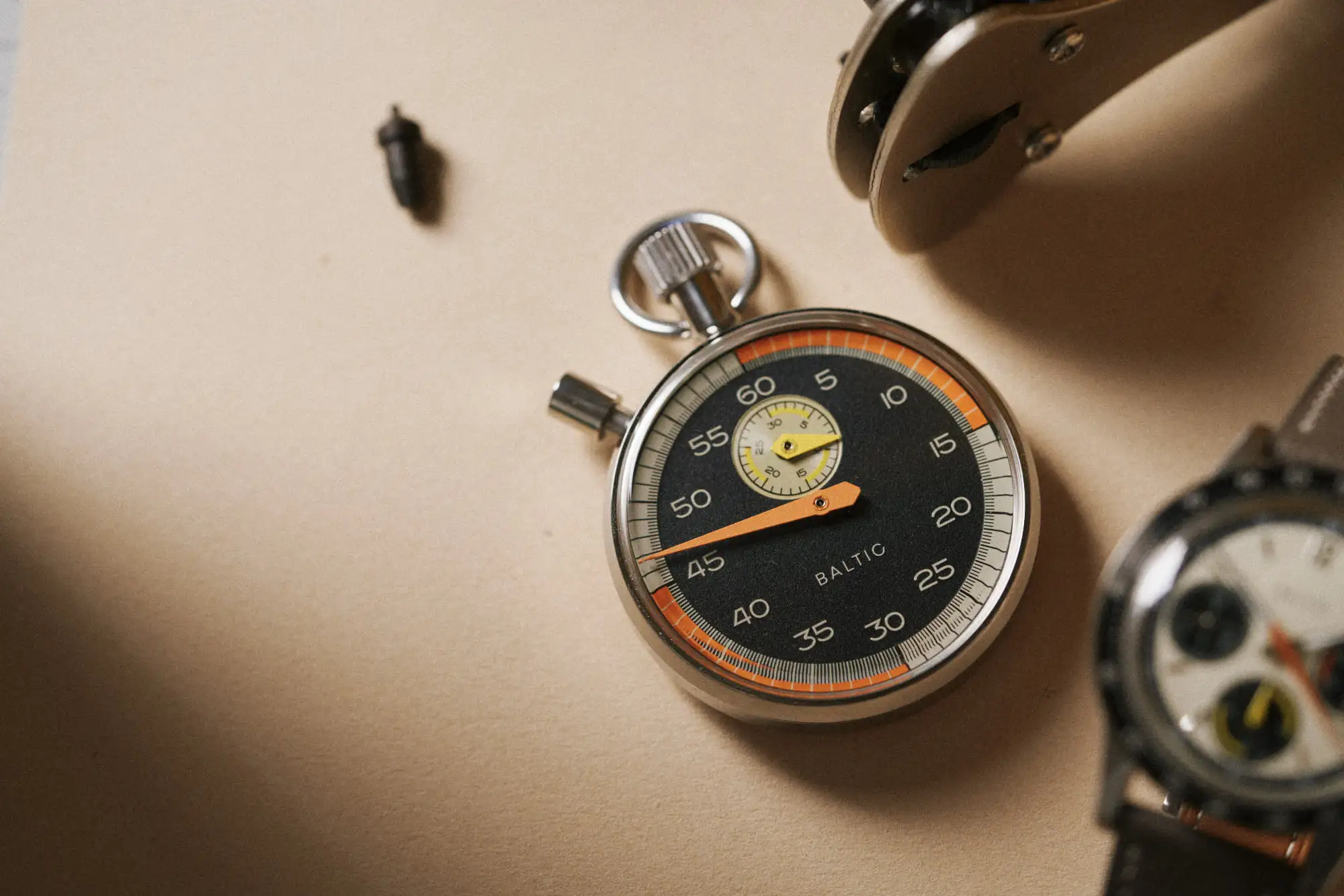
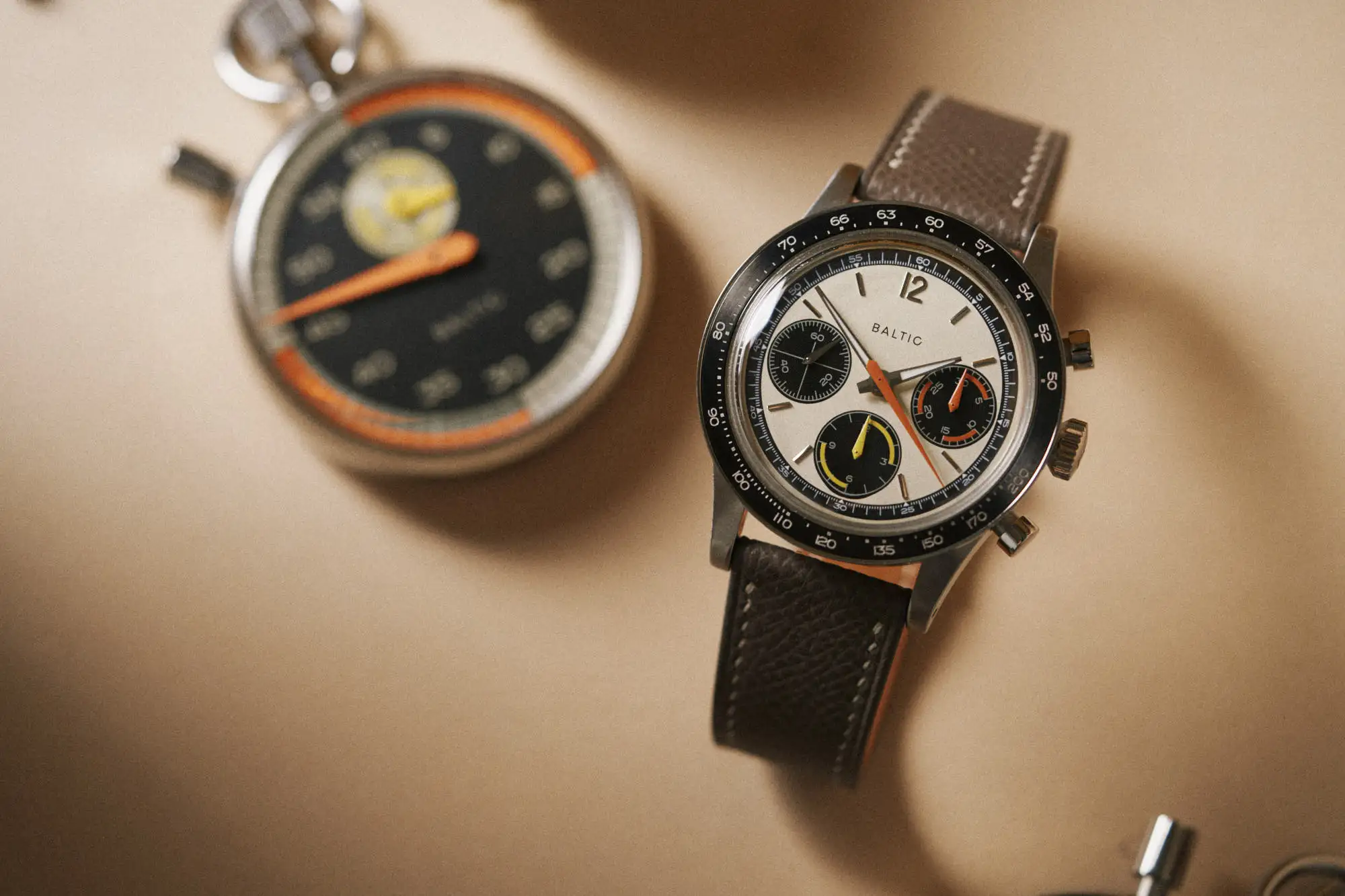
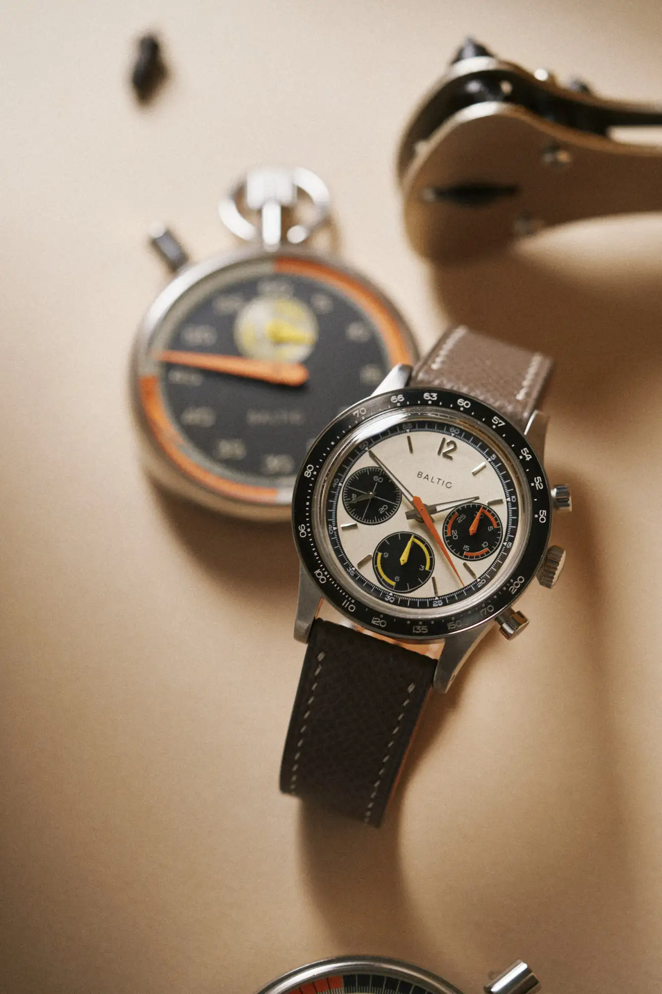
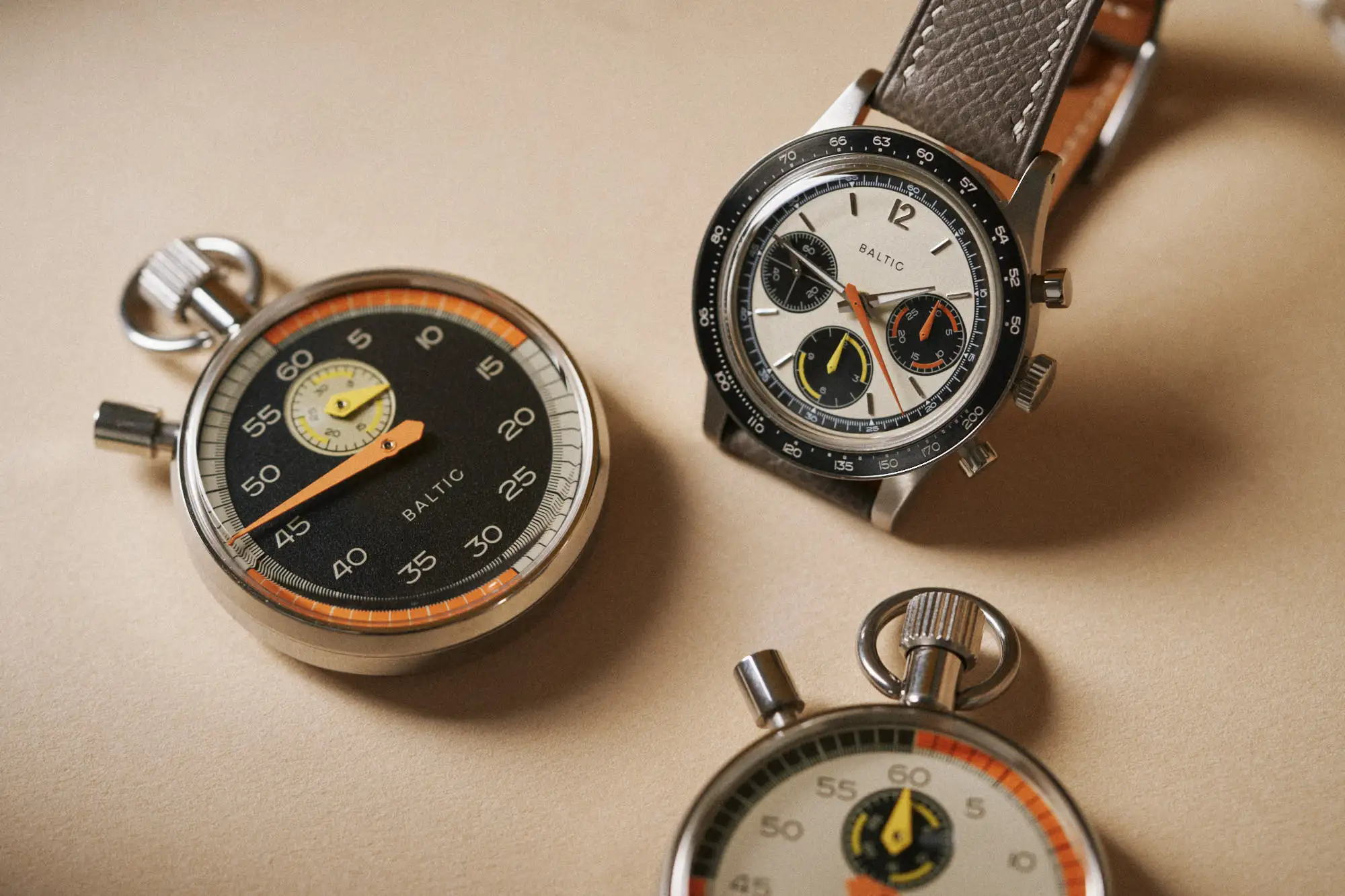
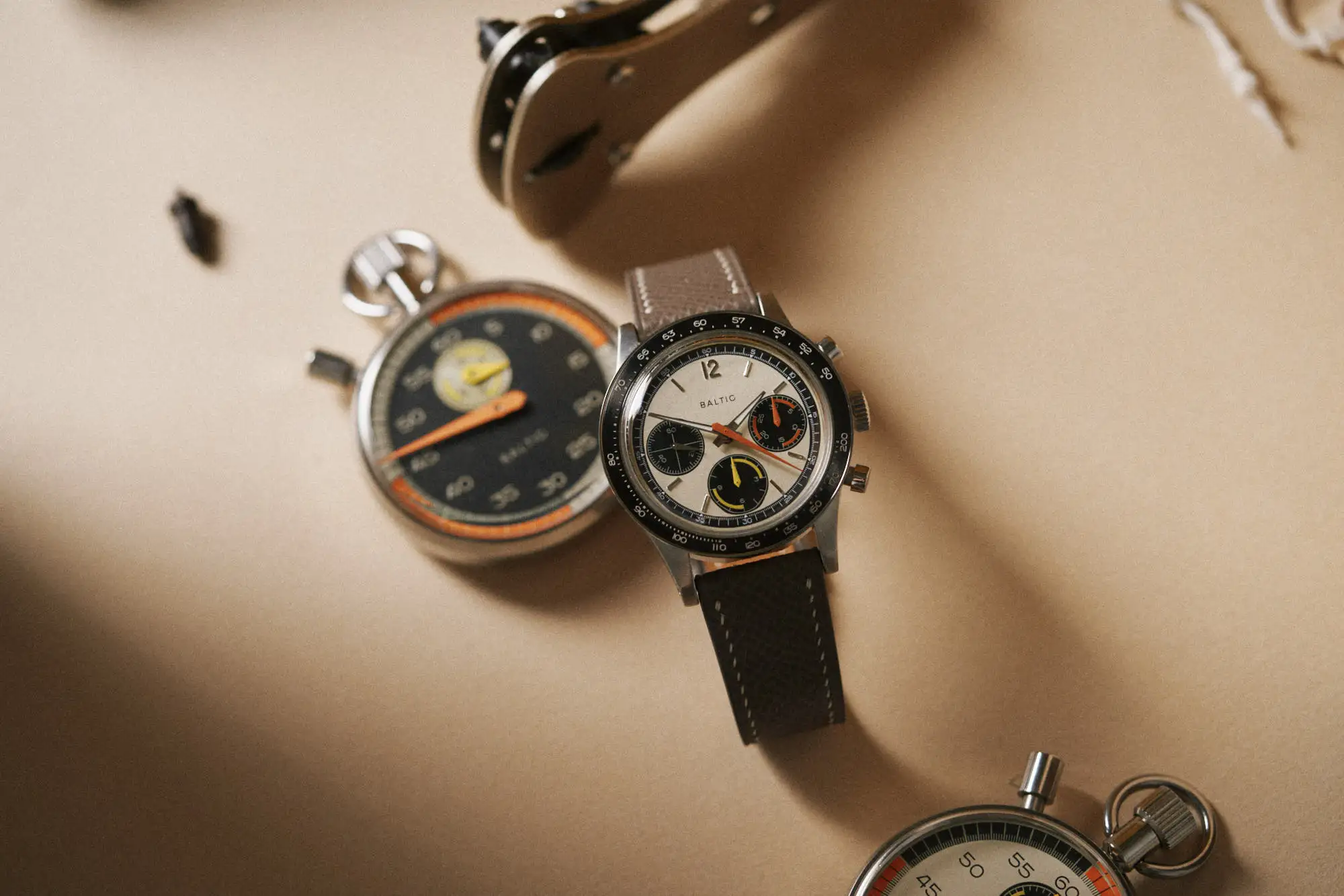
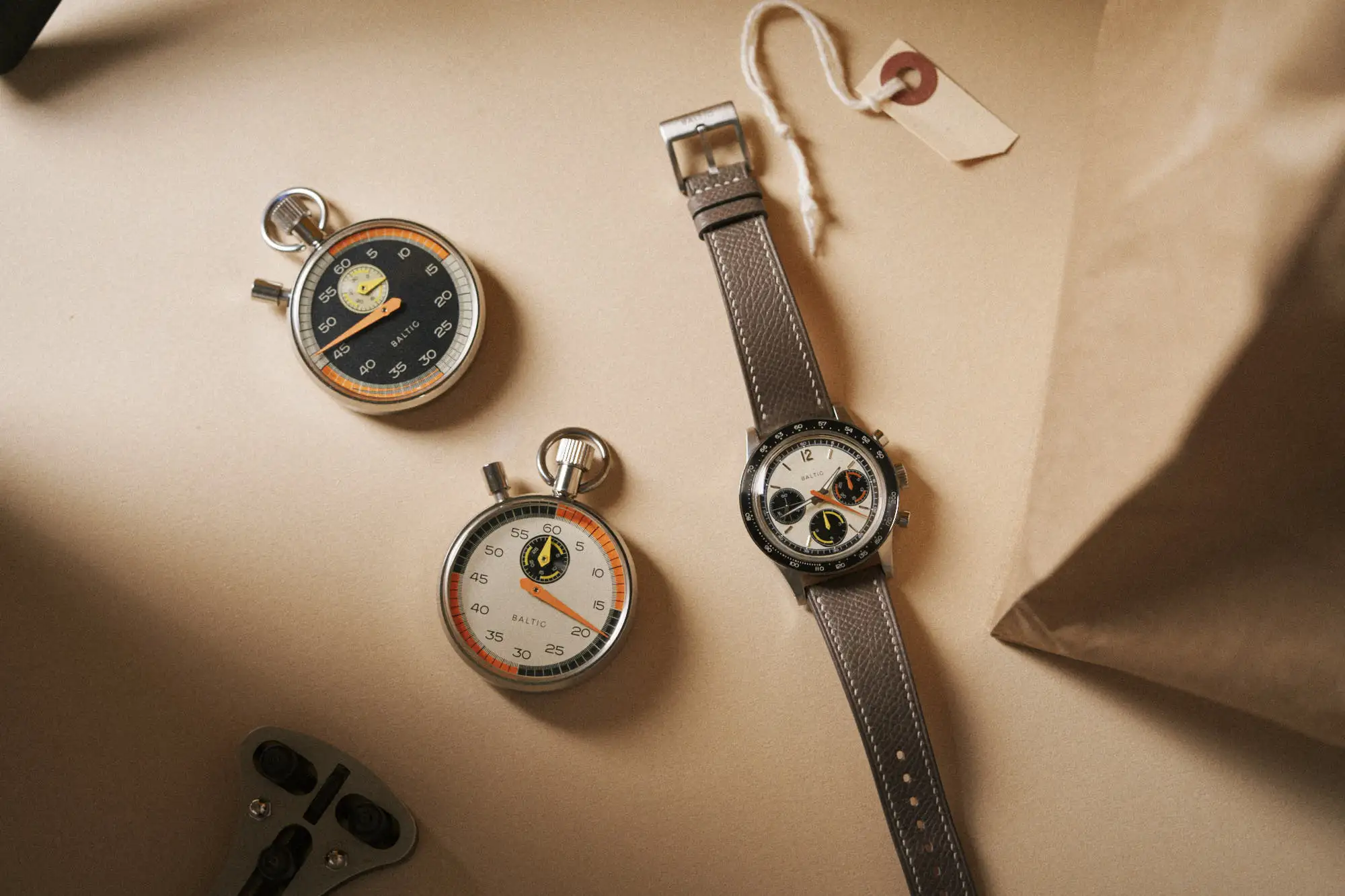
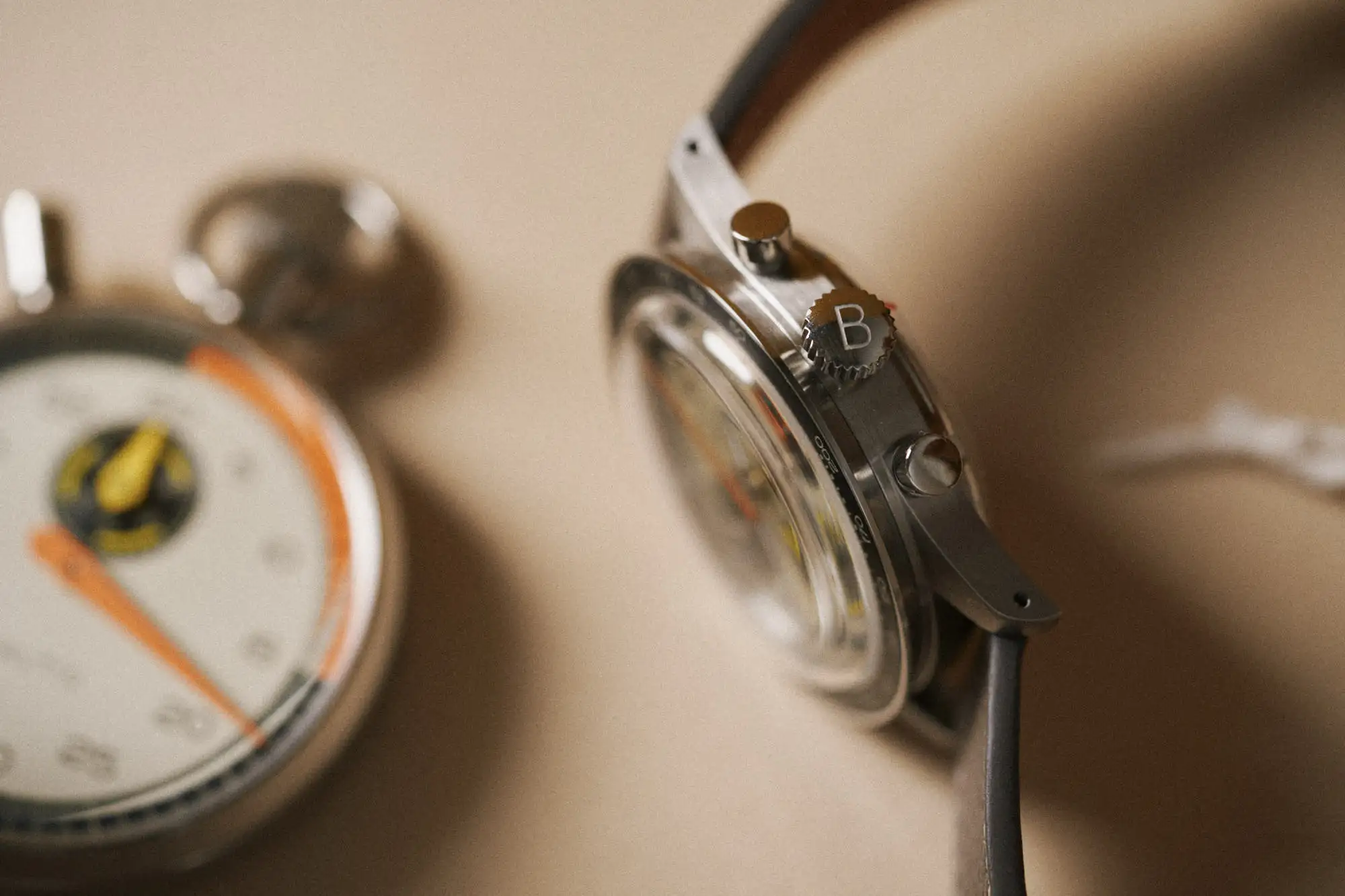
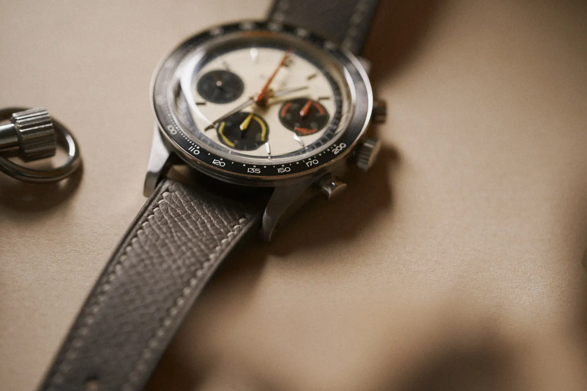
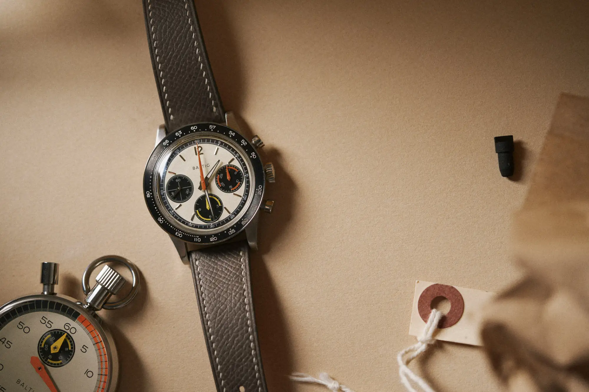
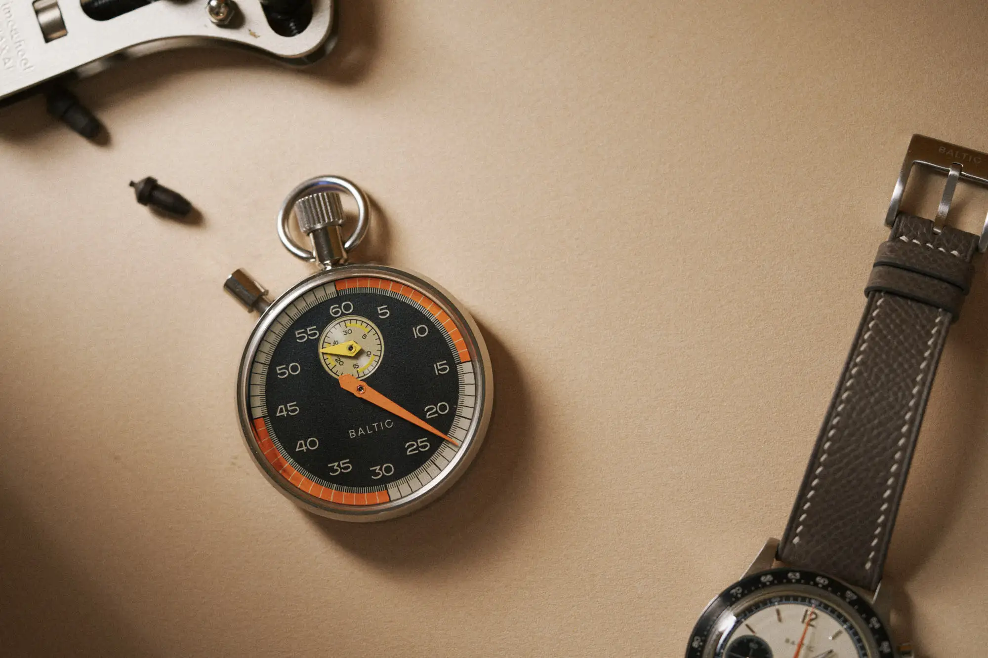
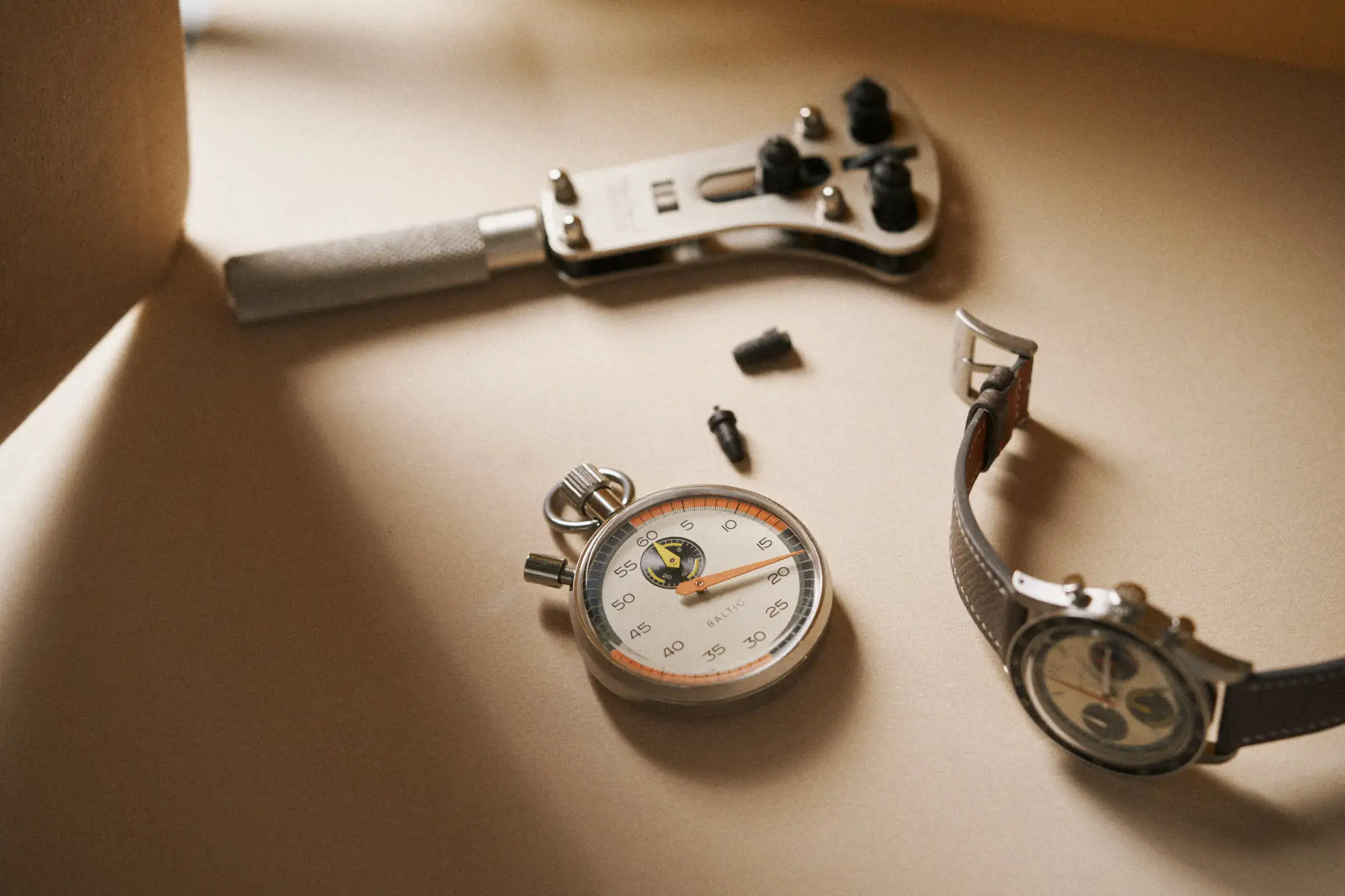
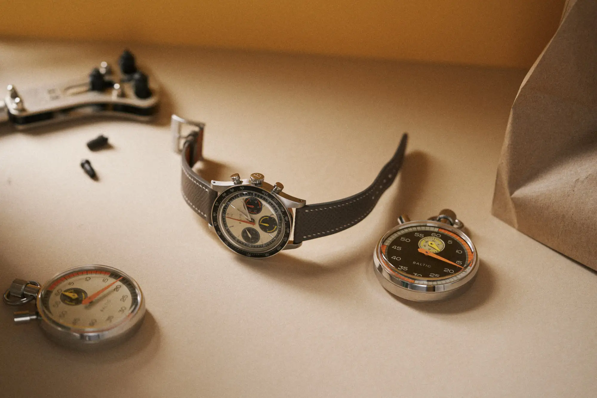
Last week Baltic took the lid off its latest LE, a colorful chronograph called the Tricompax. Zach and I gave our immediate reactions right here, and since then we’ve had some time to get properly acquainted with the watch. Leading up to its commercial launch tomorrow, we’re bringing you a more in-depth hands-on with the Tricompax. This will focus on the watch alone, though the full kit includes a pair of flyback stopwatches as pictured. 

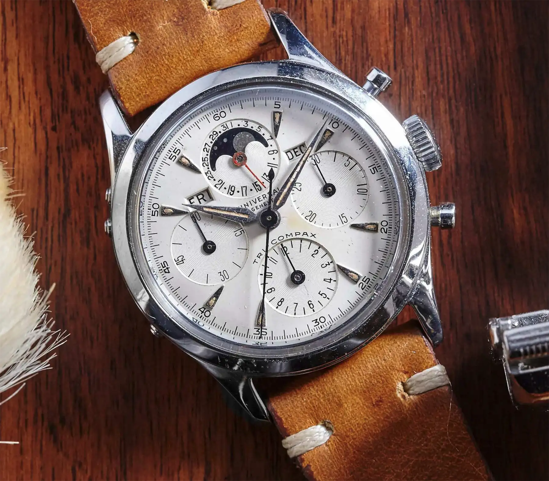
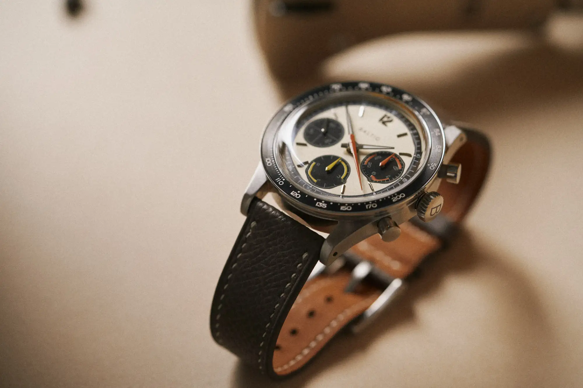
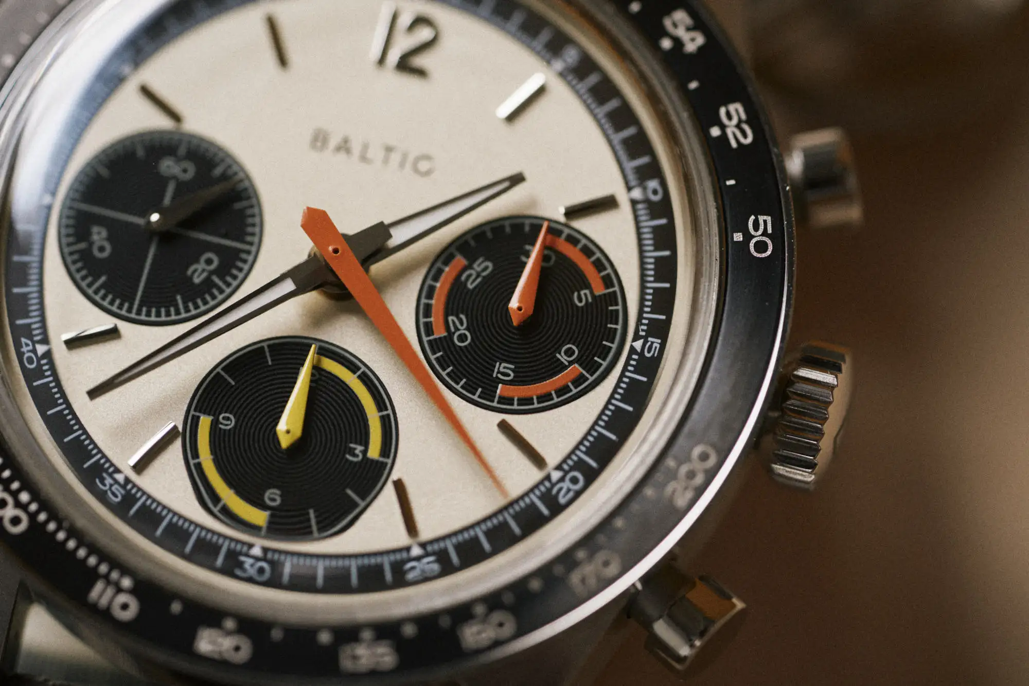
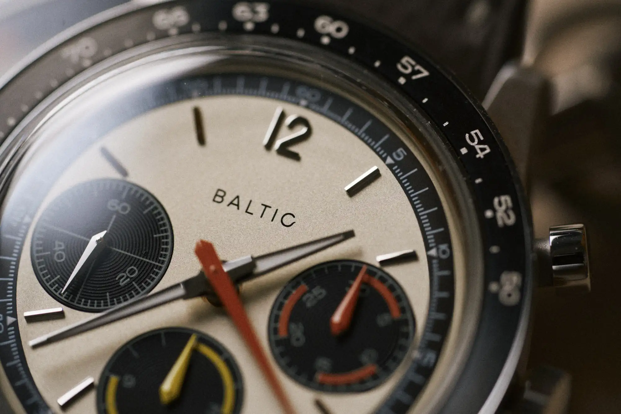
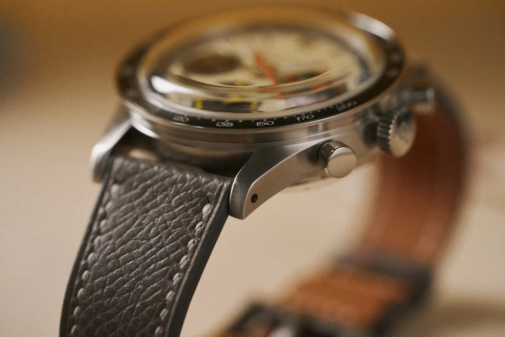
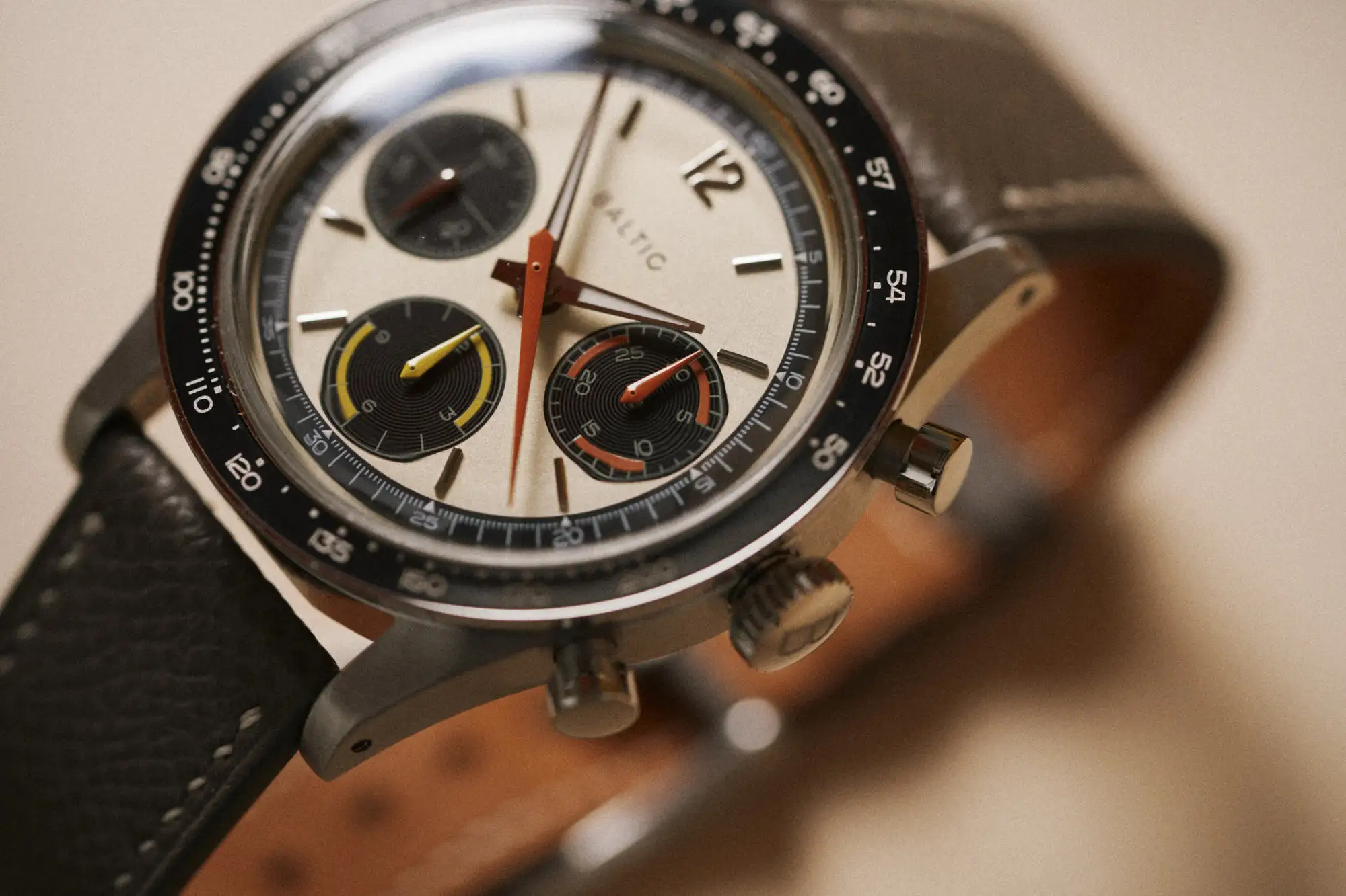
I’ve never really thought of myself as a chronograph guy. I don’t seek them out or feel particularly compelled to own watches with this complication. Aesthetically, there’s a lot of components to be accounted for, and things rarely come together to achieve balance (to my eye). That said, they allow for more creative opportunities, and bring a level of engagement for the wearer that most other watches don’t. And when they work, they really work. Whether it’s the colors they use, the mechanical engineering they display, or the layout they employ, a great chronograph hits a bit differently than other watches. Maybe I am a chronograph guy?

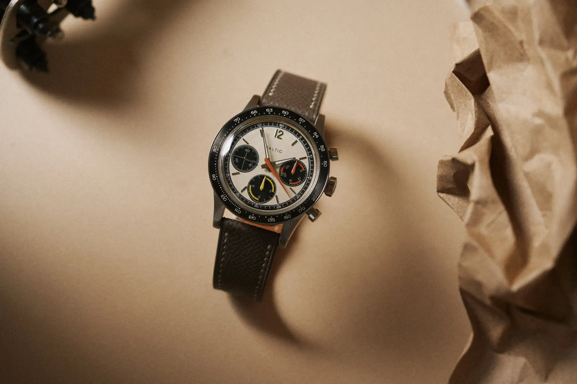
The Baltic Tricompax is a watch that instantly brought a smile to my face. It relies on simple but effective visual codes that we often associate with spot watches of the ‘70s. This is not a throwback or vintage inspired watch, though. At least, it doesn’t read that way. The Tricompax opens a new chapter for Baltic’s visual identity, and if you’ve followed the brand over the years, you’ll know that’s something they don’t take lightly. They are clear about their inspiration, and what they’re trying to capture with their watches. This has led them to design watches akin to some of the all-time classics, but somehow distinct. The Tricompax, in my opinion, is their most mature offering to date in this regard.

Advertisement

A quick aside here on semantics and the label ‘Tricompax’ that Baltic is using here. As you can see, this watch does not have three complications. The Compax language was initially used by Universal Geneve, with the Tri-Compax sitting at the apex of the collection, featuring a suite of complications: a chronograph, a moonphase, and a calendar. The three complications earned it the Tri-Compax name. The Compax was a three register chronograph, while the Uni-Compax was a two register chronograph. The Tri or Uni prefix did not denote the number of sub-dials, and there was no Bi-Compax. 

The Universal Geneve Tri-Compax. Credit: Analog Shift

So what gives with Baltic using the Tricompax nomenclature? Well, my suspicion was that it had to do with the fact that, as a package, this watch represents three separate chronograph timers: one in the form of the watch, and two in the form of the pair of flyback stopwatches that come with the watch. However, according to Baltic, they are indeed using the word to denote the three different subdials on the watch. They are aware that it is not the traditionally correct usage of the word here, but hope to popularize the term in a new light. Make of that what you will, but I don’t see it as something prospective owners should be losing any sleep over.

The Tricompax is a time and chronograph only watch, not even a date window in sight, and that suits me just fine. It’s as simple as they come, even opting for a hand-winding movement to power the thing. That’s not to say this is a boring watch, but the creative energy has been applied to the essential components, and there’s nothing that distracts from that. There are no extraneous elements that you might find yourself wishing weren’t there down the line (well, save for one, maybe). This feels like a conscious decision on the part of Baltic, and there’s no “well, it needs this or that to do well commercially”, just a fun concept brought to life exactly as it should have been.

The dial of this Baltic works in harmony with the bezel and crystal. They don’t feel like separate components, and as a result the watch appears slightly larger than the numbers might suggest. It begins with the bezel, which has a polished lip framing the aluminum insert. This is the widest point of the watch, and where the 39.5mm measurement is taken from. The whole bezel assembly flares out to this point, and the measurement from the actual case wall is 38mm on the dot. The viewing area of the dial is a touch smaller than the Black Bay Pro sitting next to me, which is a 39mm watch, so in total it is a very compact watch, but that bezel lip outlines the widest area of the watch for a bit more visual oomph. 

The double domed sapphire crystal manages to find a great balance between cool looks, and refraction free viewing of the dial. It catches just enough light to be noticeable, but never hinders legibility as a result. Even at an angle, distortion is managed neatly, and you never feel like you’re missing anything. The only component under the curvature of the crystal is the minutes and seconds chapter ring, which is white printed on black, and remains visible. 

The center of the dial is the real star of the show here. It may look beige in flat pictures, but it’s closer to a buttery silver with a slight reflective quality. It is a beautiful color decision and is a clear nod to aged white dials seen within vintage watches. It doesn’t feel vintage here, but rather a part of the full palette which hosts black, orange, and yellow within. The timing hands and totalizers are where you’ll find the colors applied, with the seconds and minutes receiving orange, and hours receiving yellow. The minute totalizer gets alternating orange highlights to break apart each 5 minute segment, and likewise the hour totalizer uses yellow to distinguish 3 hour segments. The color makes an impact here, but it doesn’t take over the joint. There was clearly some restraint at work.

Each hour gets a polished applied baton, with a single 12 stoically residing at the top of the dial. The markers give a whiff of Daytona vibes here, but that lone Arabic numeral at the top reigns it back. Likewise, the only word mark in sight is the Baltic logo. Thankfully, they resisted any temptation to put the word “Tricompax” above the hour totalizer, which would have been pushing a touch too far, in my view. The simple layout of the dial on the whole means there is no conflict with the applications of orange and yellow. It’s colorful enough, but doesn’t feel like a eyefull, even at a glance. It’s easy to read and understand, while embracing a touch of flair in the process. 

The only break from the pleasant environment they’ve created on the dial is the white printing within the chapter ring at the edge of the dial. On the sample we received, it’s stark white, while the printing in the subdials is, well, less so. It’s the only bit of contrast to the established colorway that’s barely noticeable, and this is me being very nitpicky here, but it’s something your eye will gravitate toward if you find yourself staring at the dial for any length of time. If anything, it’s more legible that way so it may well be intentional. Whatever the case, it’s not enough to put a dent in the overall execution of the dial. 

The steel case is fully brushed, and gets a narrow lug design that comes to crisp points at its edges. There are no polished chamfers here. The transition from the top of the lug to the horn at the tips of the lugs is slightly unresolved, leaving a dull bend of sorts that would be my only point of contention with the case. The lugs are drilled, but the provided strap has quick release spring bars so I never had to utilize them.

The heads of the pump pushers are fully polished, as is the head of the crown, which features what looks to be a laser etched “B”. The single B done in the brand’s very modern typeface feels a bit generic and I could certainly do without it on the crown, but it’s a choice that doesn’t interfere with the rest of the watch, and it’s a consistent design choice that appears throughout their catalog. Again, pretty nitpicky stuff. 

Baltic is using the Sellita caliber SW510 M in the Tricompax, a manual winding, cam operated chronograph with a hair over 60 hours of reserve. This is a movement I’ve encountered a number of times over the years, and even features in my own watchbox within the Massena LAB Uni Racer. It may not be considered fancy or beautiful, but it’s performed reliably in my experience with it. This is a movement that appears in a variety of watches, from the likes of Nivada Grenchen and Hanhart, to Oris and Christopher Ward, with prices that range from ~1,700 to ~$4,500. Given that, I think the Baltic coming in right around the $2,000 mark feels right on point (despite some of the reactions I’ve seen online). 

There’s no doubt Baltic has increased their profile in the past 18 months. The sale of their 1/1 Pulsometer Monopusher Chronograph at the prestigious Only Watch (which realized CHF50,000), and the release of their MR01 collection, were both landmark events for the brand, and has certainly put them on the map of a broad range of collectors and enthusiasts in the process. Coming into this year I remarked that they were one of the brands to keep an eye on, and they’ve certainly taken advantage of the momentum they’ve created for themselves. The Tricompax is exactly the kind of watch I wanted to see from them, and it’s a watch that holds up to an increasing amount of scrutiny. My only hope is that they continue to remain true to their accessible sport watch roots in building on this foundation. 

The Tricompax will be limited to 300 units, and will be available to order from Baltic as of 10am Eastern on August 26th. The full kit includes a pair of hand held flyback stopwatches, and a steel flat link bracelet not pictured here. While not everyday practical, the stopwatches bring a lot of personality to the forefront, not to mention added value to the total price tag.

Advertisement
Images from this post:
Related Posts
Blake is a Wisconsin native who’s spent his professional life covering the people, products, and brands that make the watch world a little more interesting. Blake enjoys the practical elements that watches bring to everyday life, from modern Seiko to vintage Rolex. He is an avid writer and photographer with a penchant for cars, non-fiction literature, and home-built mechanical keyboards.
blake_buettner
Categories: