


 Featured Videos


Yesterday, BREW Watch Co. returned with their third series of watches dubbed the Café Collection. This latest from the brand consists of two watches, both somewhat of a departure from past releases (however, those who have followed the brand will certainly see the evolutionary track of the design).
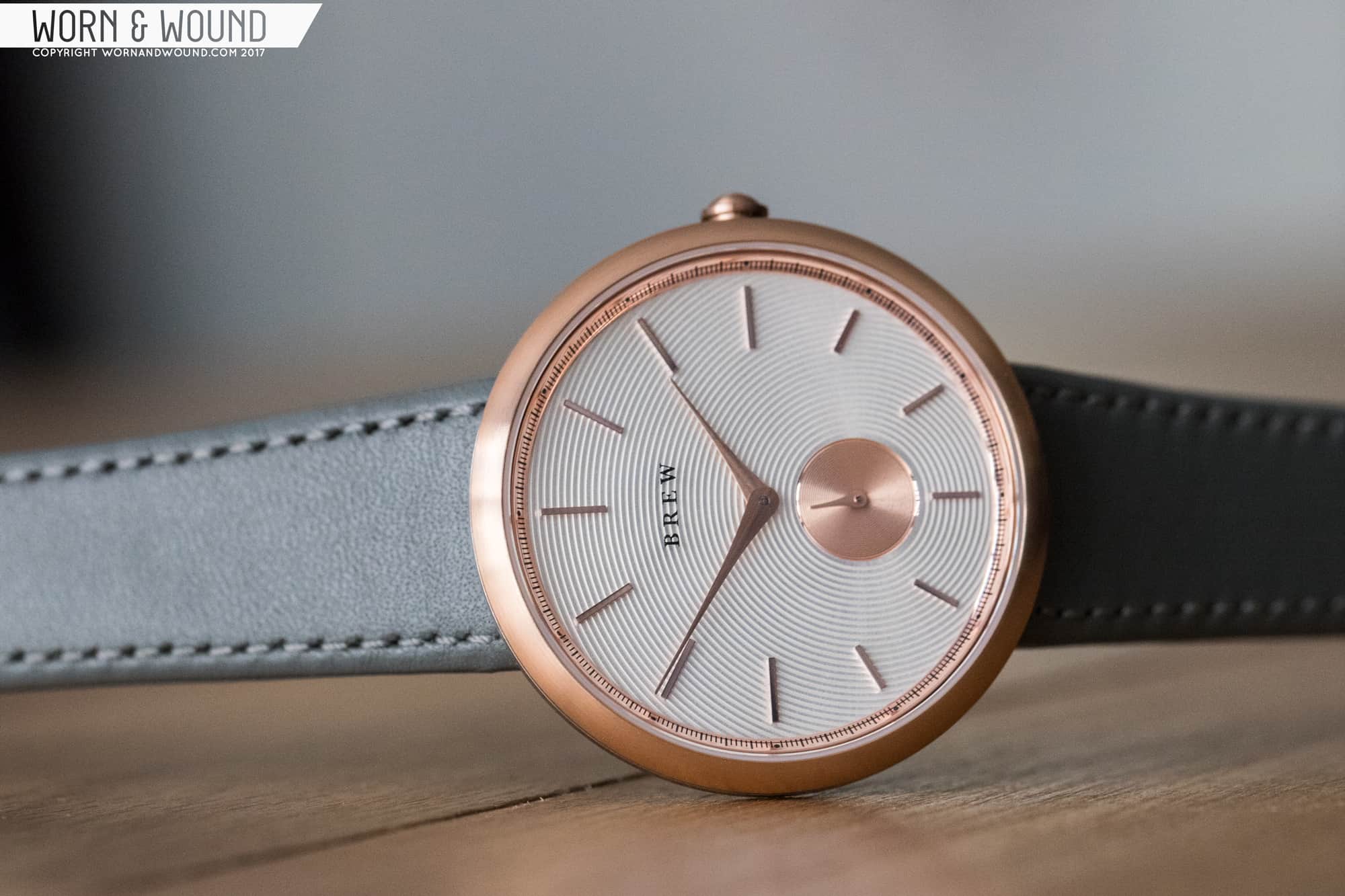
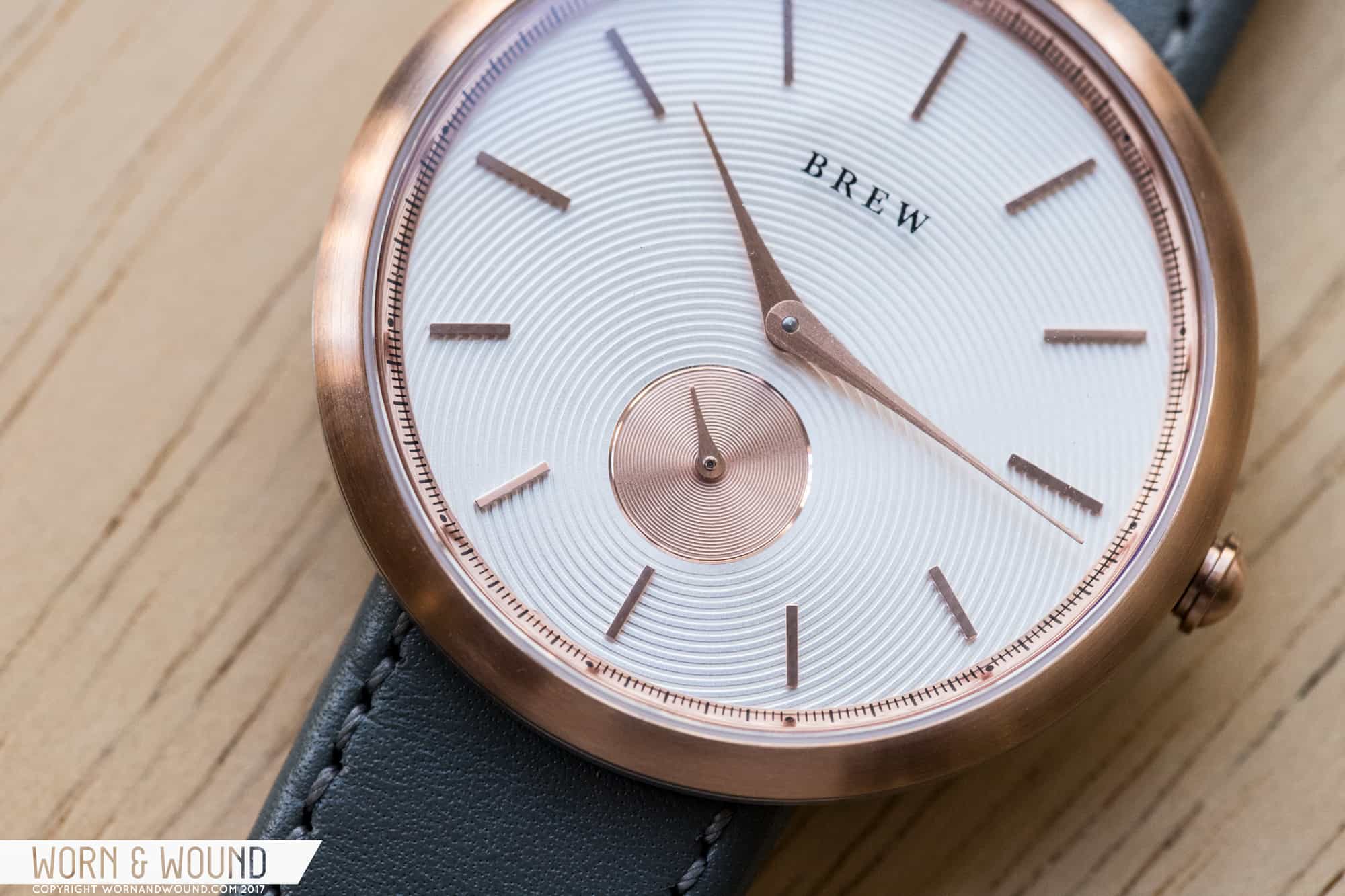
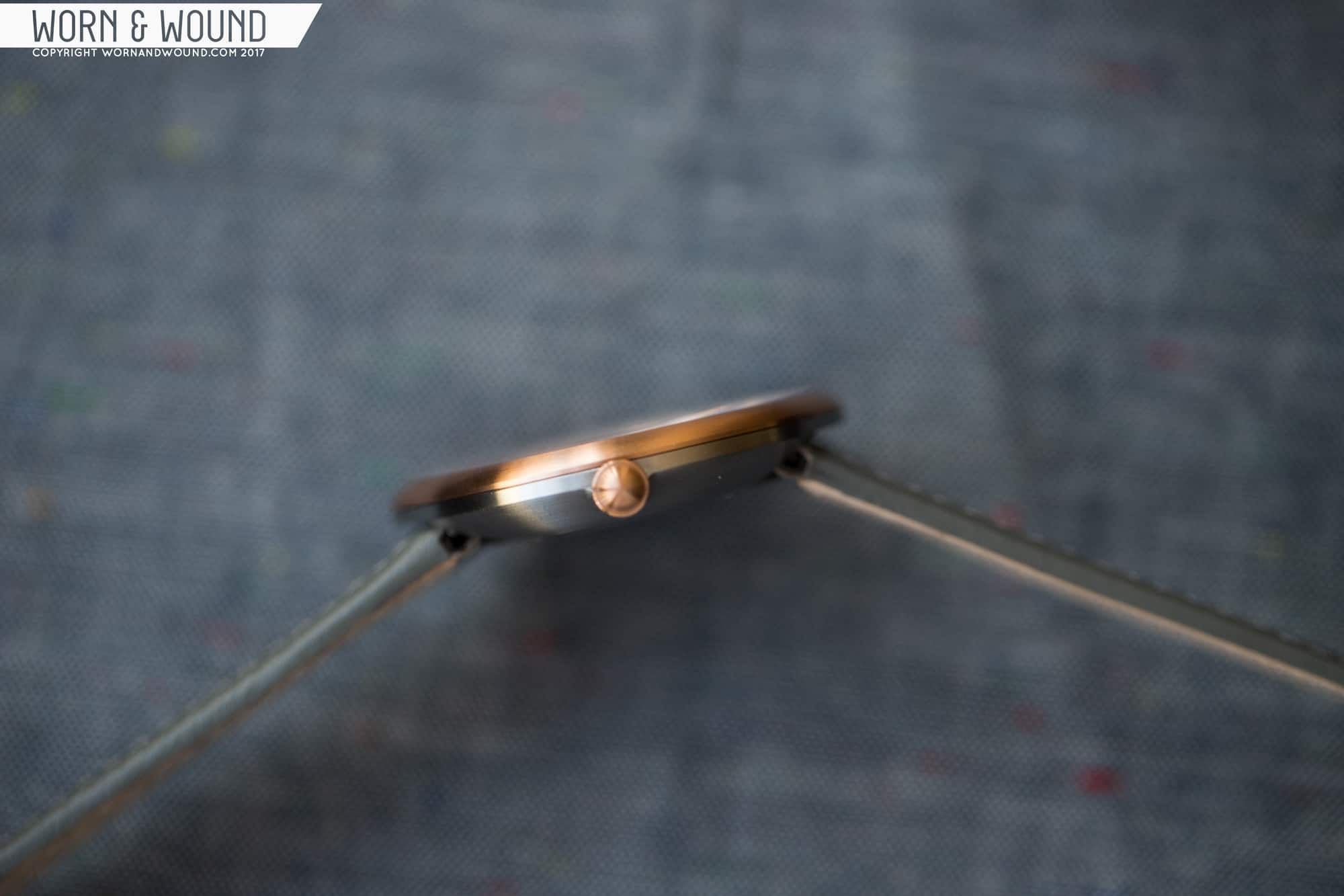
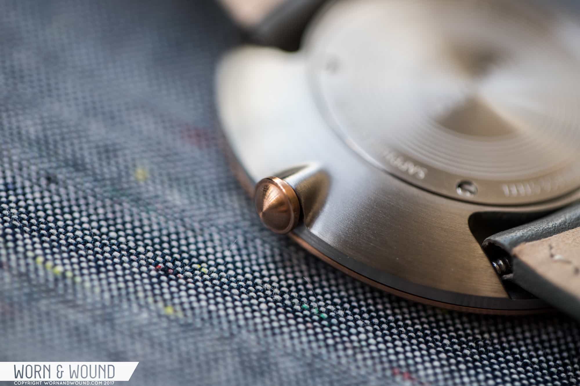
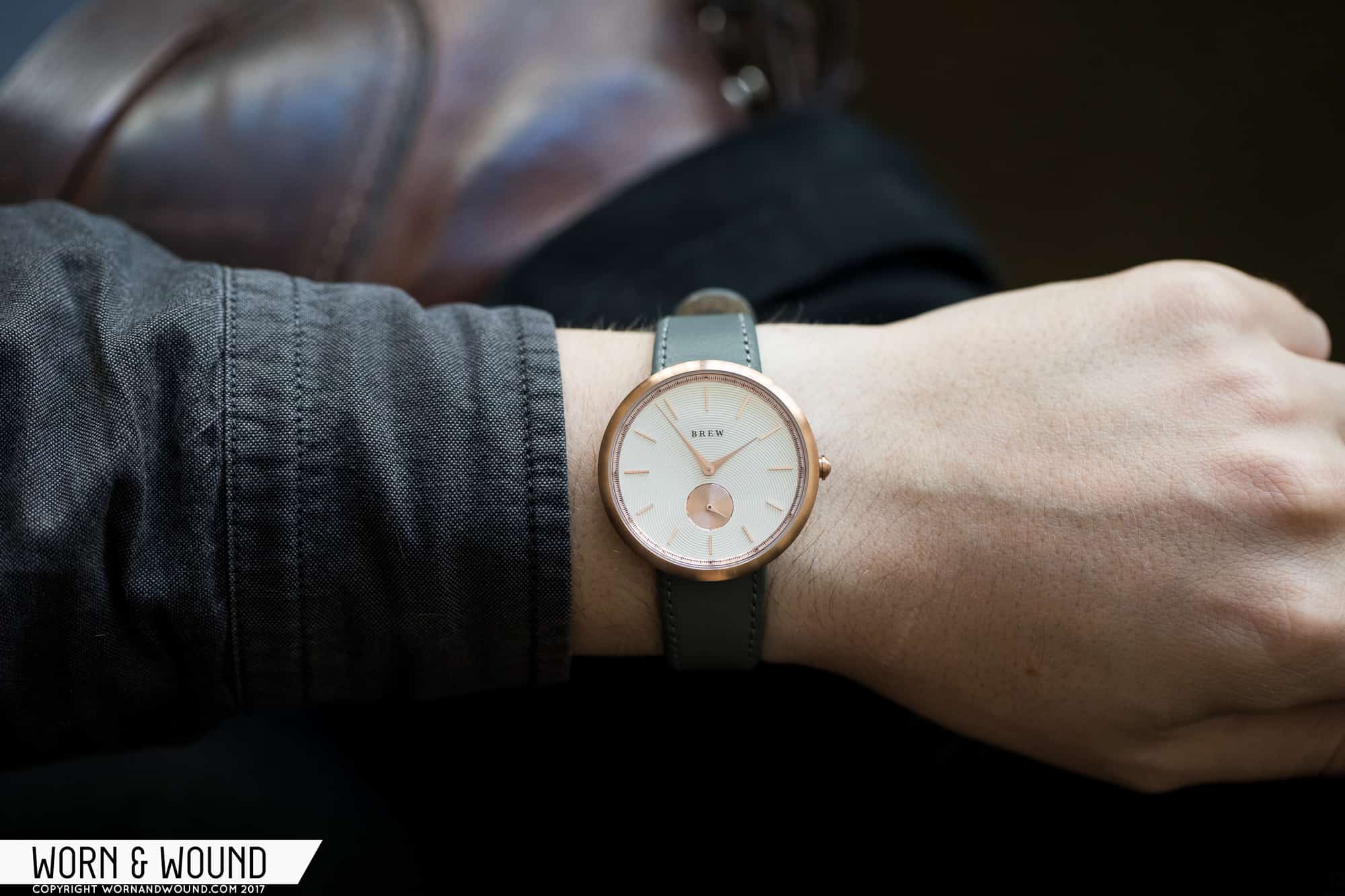
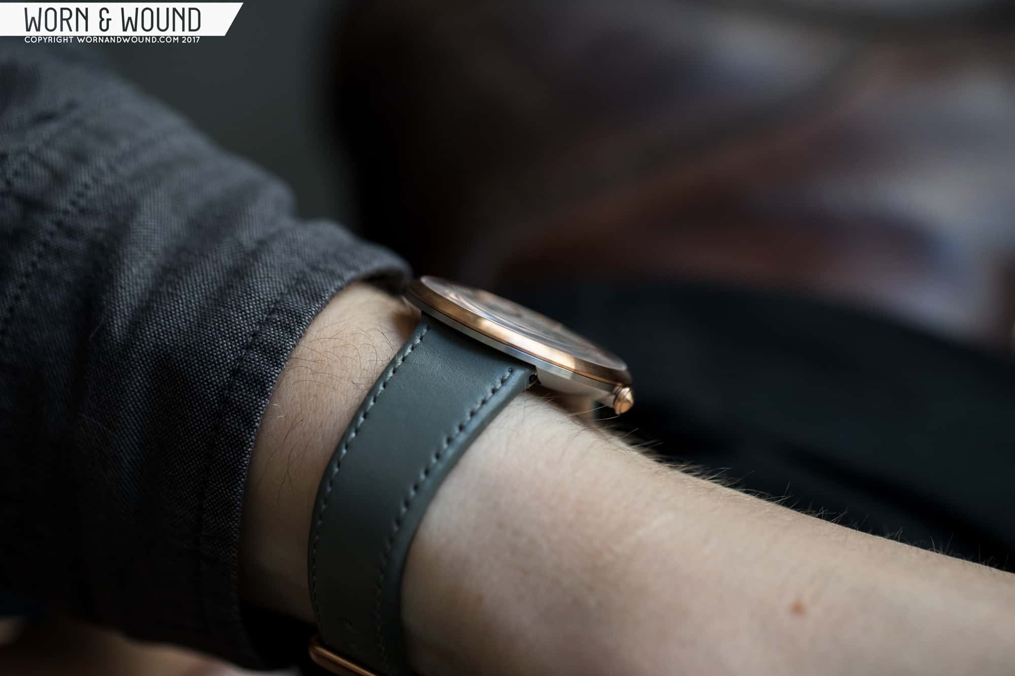
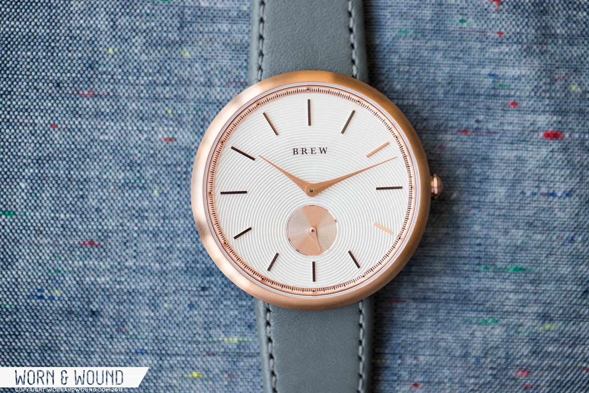
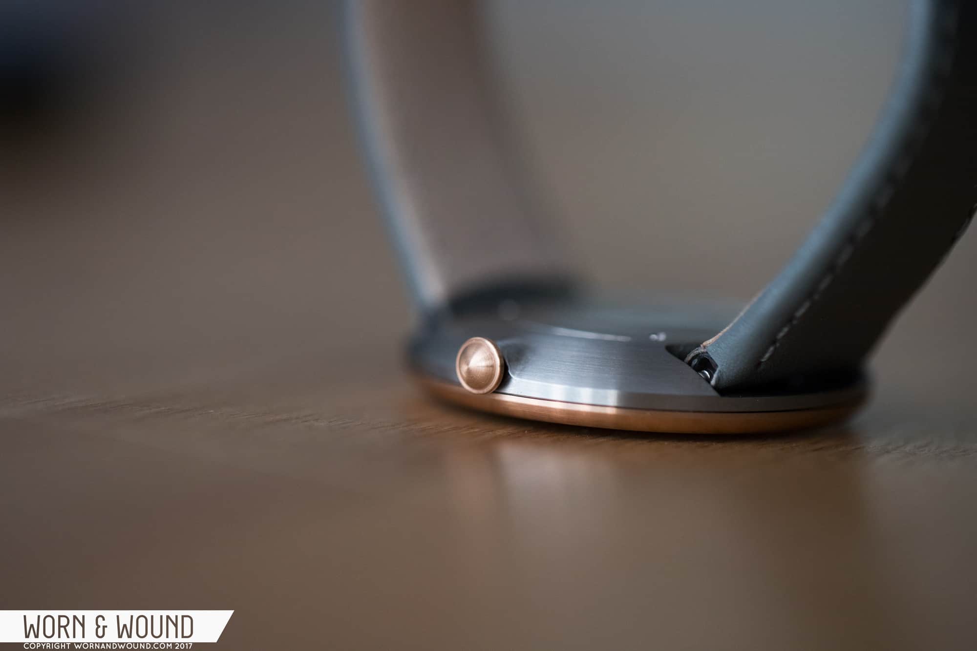
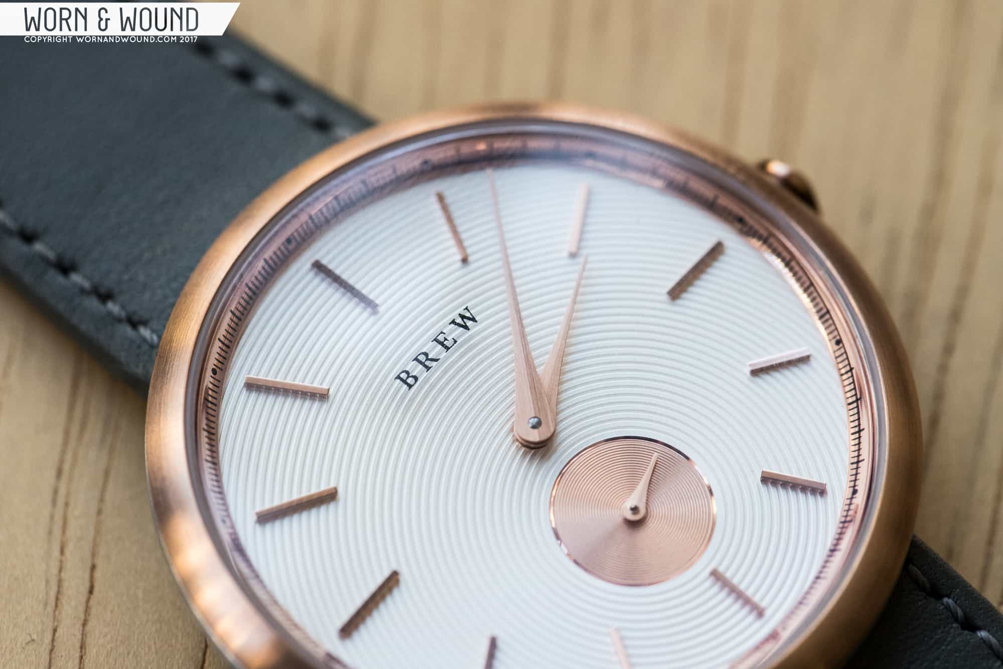
The first of the two is the Latté, which features a white dial, and the second is the Classic Espresso, which has a black dial. Both come housed in a two-tone case, where a rose-gold bezel sits atop a brushed stainless steel mid-case.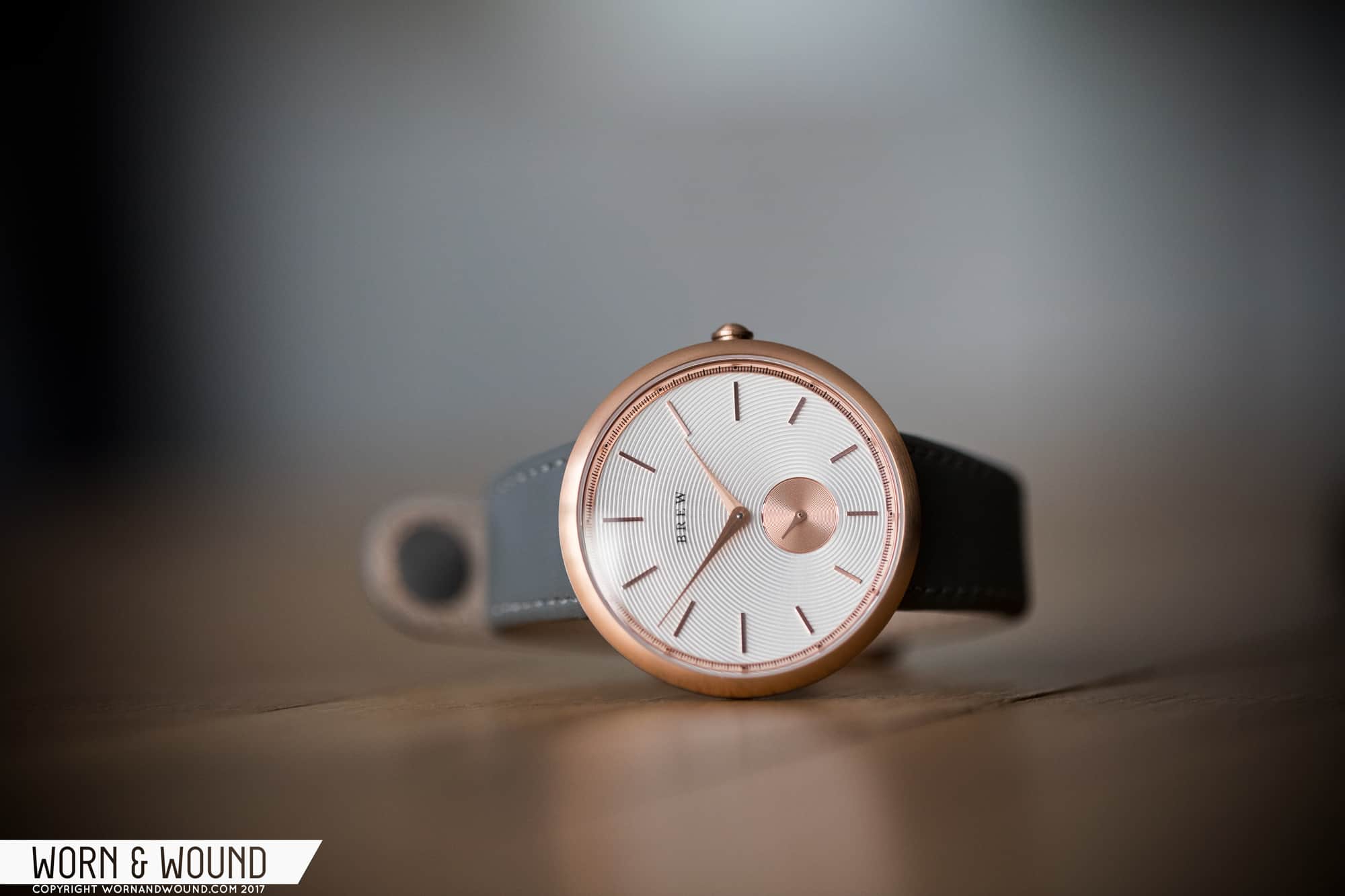 Thinness is the name of the game here, which is why designer Jonathan Ferrer went with a Ronda 1069 Slimtech quartz movement (that, and it helps keep the price down). The case measures just 7mm tall against a width of 38mm, so the proportions are spot on. The lugless design also helps pull in things quite a bit, and the bowl shape gives the watch a great ergonomic on-the-wrist feel. A domed sapphire continues the rounded lines of the case. Overall, the design is expertly restrained, even down to the smaller crown that, despite its size, is easy to manipulate.
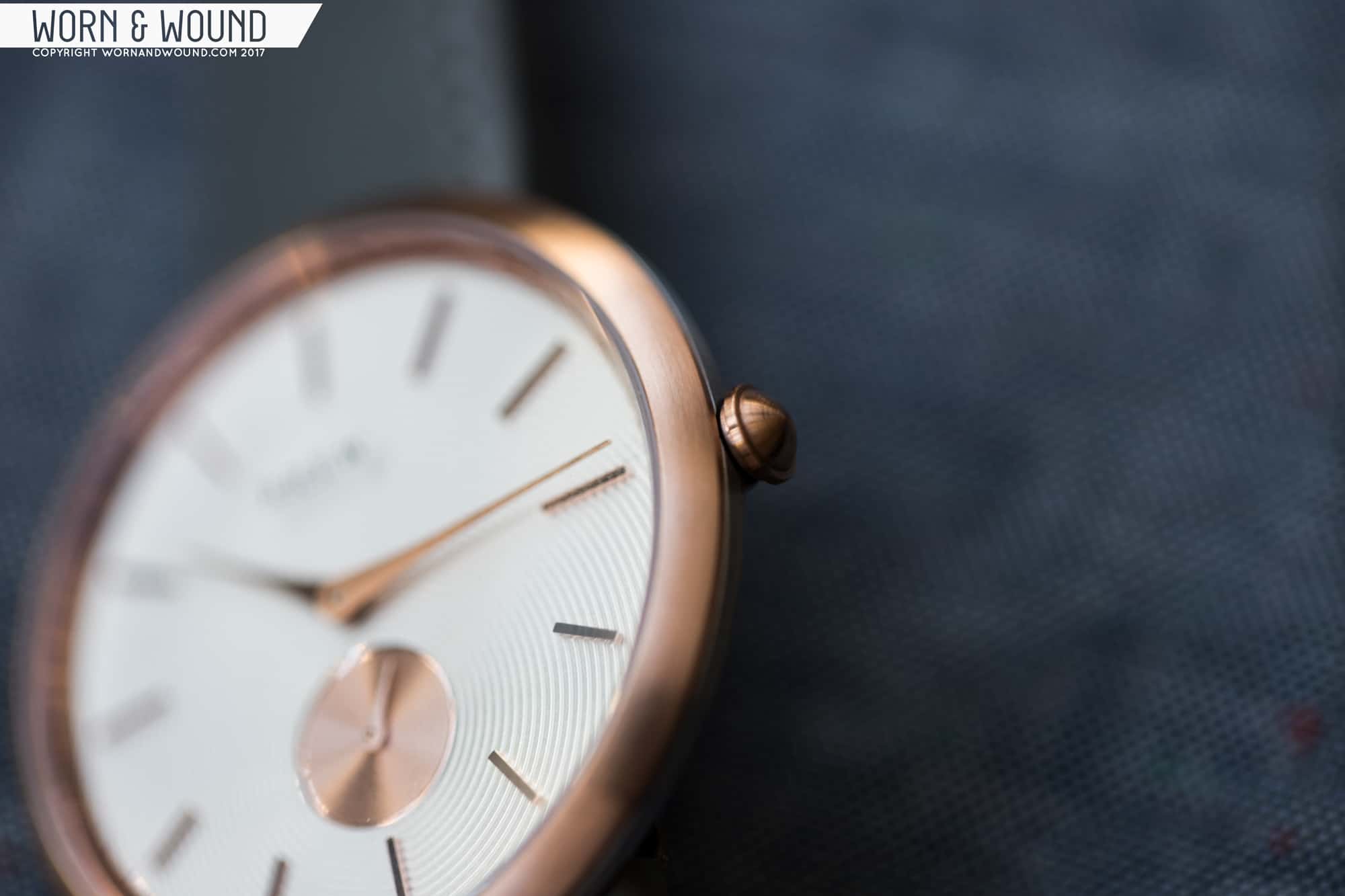
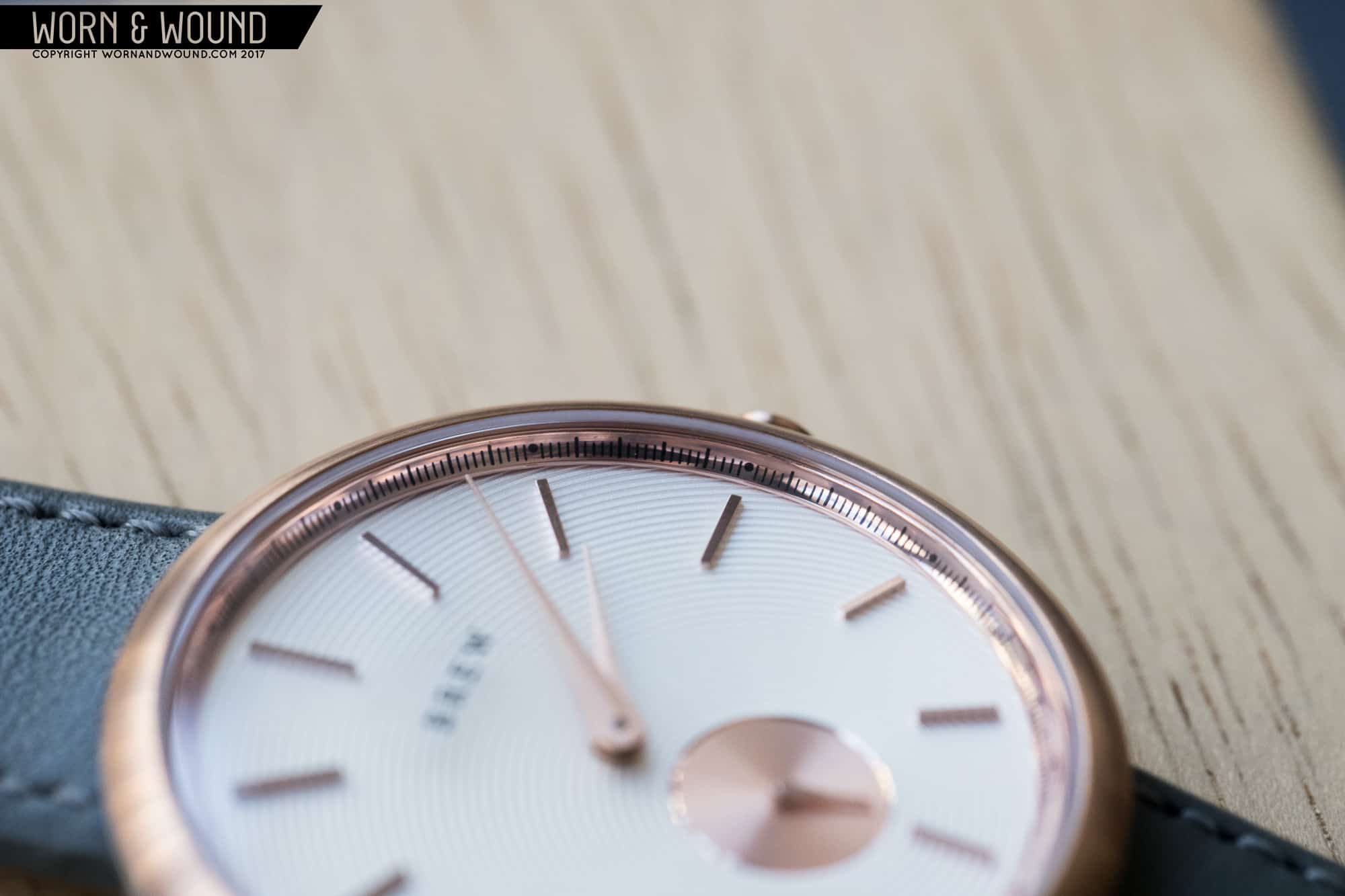
Then there’s the dial. The first thing that draws your eye in is the sub-seconds dial above six, from which concentric grooves (or ripples, as Ferrer calls them) radiate out across the entirety of the dial. Then you have the brushed teardrop hands that are perfectly paired against the indices, which are longer from nine to three to balance out the weightier lower portion of the dial. Along the very edge of the dial is a chapter ring with larger markings for the minutes/seconds, something that’s largely unnecessary here as far as legibility or facilitating timekeeping go, but it is nevertheless visually appealing. The “BREW” logo is printed on the crystal, but more on that detail a little later.


