


 Featured Videos


A couple of weeks before Basel, I had the pleasure of getting to see a watch that, if it were possible, would have made my jaw hit the floor. That kind of watch that makes you unintentionally ignore the very nice PR person who is showing you it, because you get lost in all of the little details you need to examine and absorb.
Then, at Basel, I had the chance to see it again, along side of color variations, and it confirmed that, yes, this was one of the most stunning watches I’ve seen in a while. The watch is the Junghans Meister Telemeter, and it’s a watch to take serious note of. Not only does it singularly hit so many aesthetic pleasure centers, it’s an interesting departure for this old and epic brand.

If you’re a regular reader of worn&wound, you will have seen Junghans mentioned a few times, first in a general article on the Meister line, a series of watches that mixes the best of minimalism, vintage and dress, followed by an article on two of the Max Bill collection, arguably the most famous line of watches the brand produces. In both instances, you are dealing with watches of pure design; elegant and refined. Best of all, they are accessibly priced, giving everyone the opportunity to their beauty and timeless style.
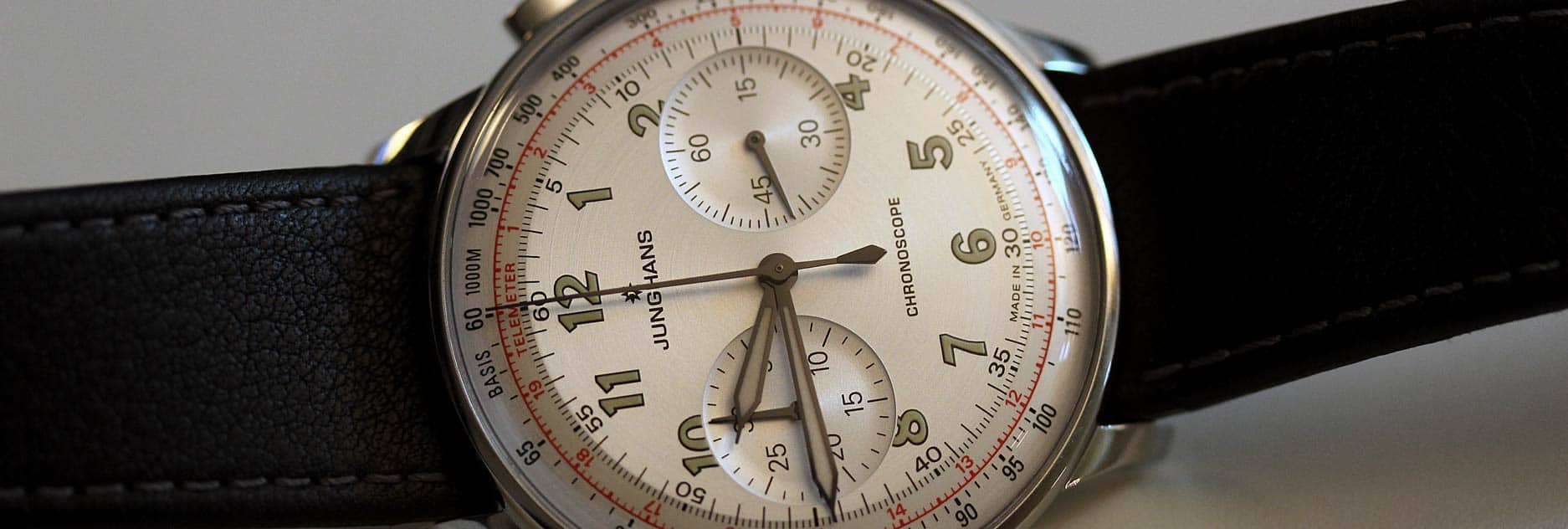
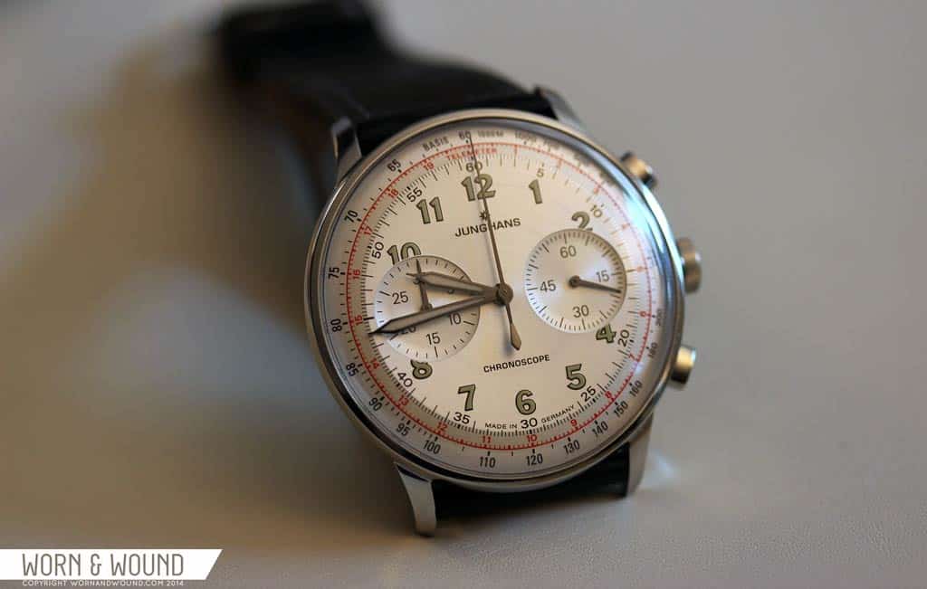
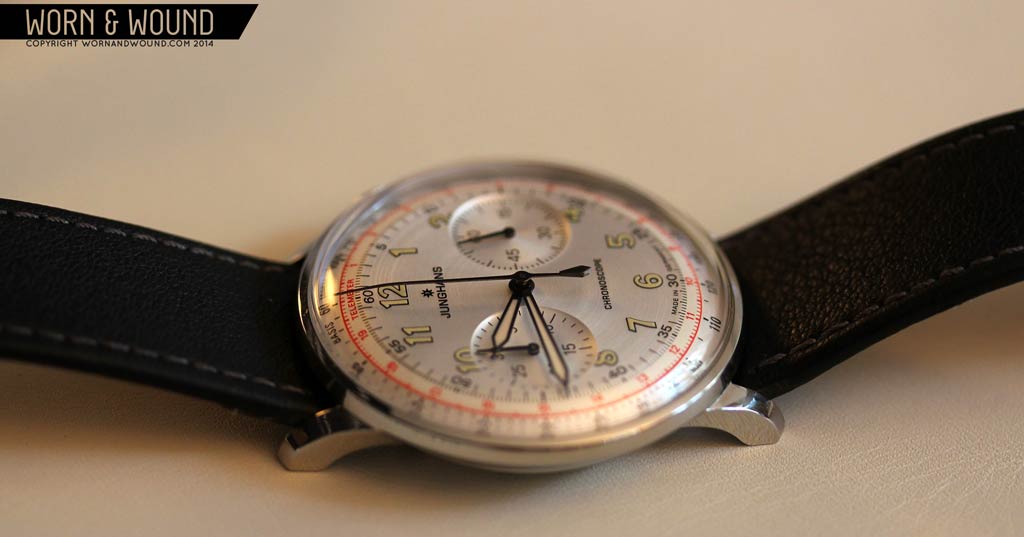
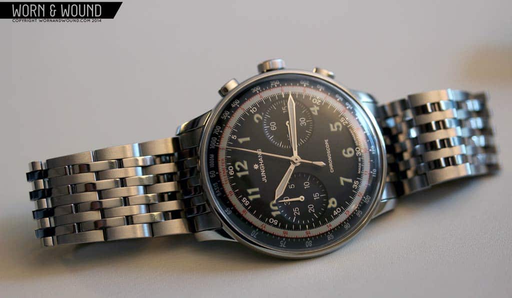
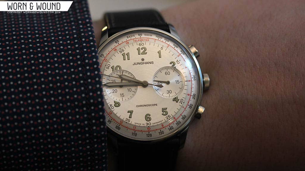
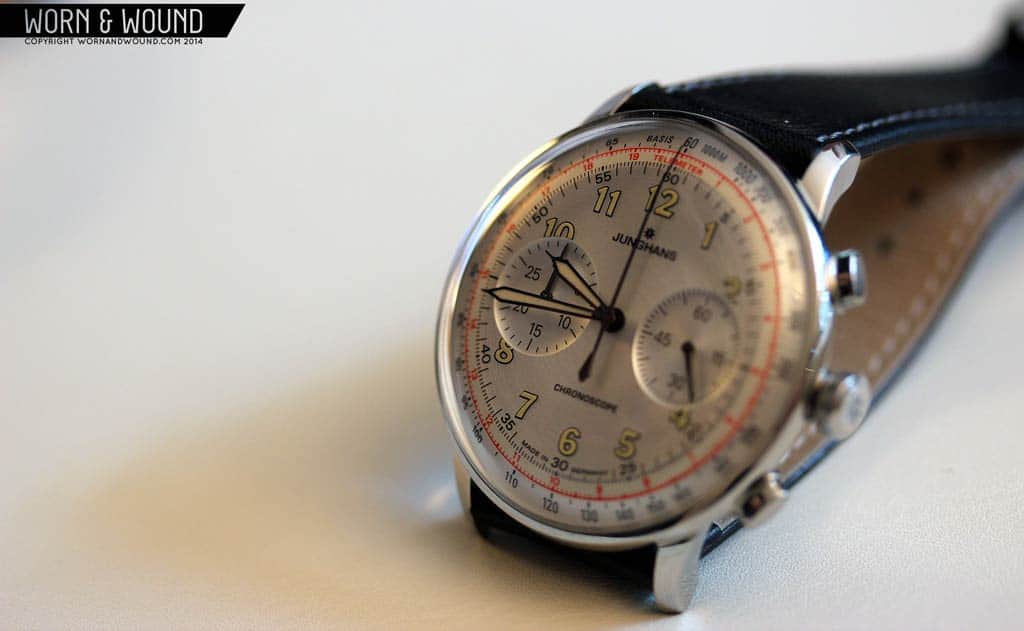
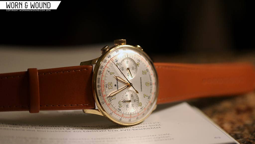
The Meister Telemeter stands out from the collection, as it takes its styling cues from a sports watch from the 1950’s. The dial, at a glance, is a throwback to those beautiful early chronographs with large numerals, sub-dials at 3 and 9, and a series of reference scales around their perimeter; one for the tachymeter and the other for the telemeter. A telemeter, for those unaware, is used to measure the distance of an object with sight and sound. The classic example is when you see lightning, start the chronograph, and when you hear thunder, stop it. The reading on the telemeter will tell you the distance in the units specified (kilometers, here, i believe).While tasteful and well-balanced, there is a fair bit going on. The rest of the Meister line in comparison is very paired down, utilizing a vocabulary of pencil thin lines, applied markers and negative space.

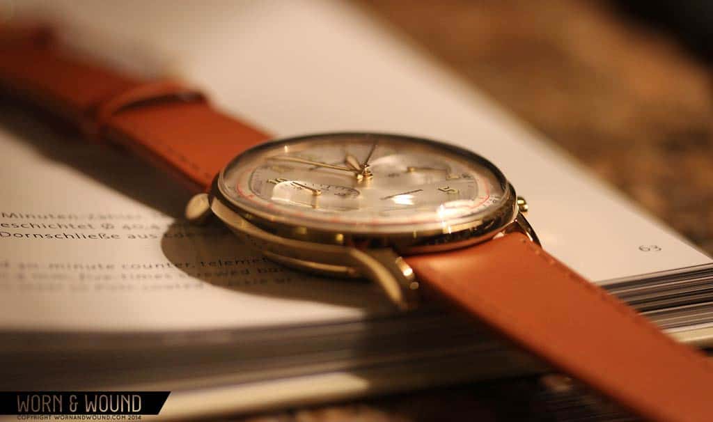
Yet, it fits in very well with the line, as they kept the thin, well proportioned case, and beautifully domed acrylic crystal intact. It’s an enjoyable change of pace that will open up the line to even more tastes. For those of us with an inclination towards vintage, this is one of the nicest contemporary pieces in recent memory. They pulled out all of the right details to nail the look, didn’t betray it with a date-window, and modernized it in other ways. For one, they upped the size to 40.4mm, which is nice sweet spot for a chronograph. Smaller than your typical sports chronograph, yet a touch larger than a dress watch or vintage watch. This makes it wear with more presence.
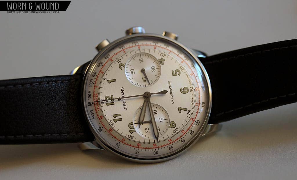
It also let them maximize the dial, which you’ll be thankful for. Junghans is one of the few brands that manufactures cases and dials in-house. That, paired with the fact that they’ve been at it for over a century, makes them really good at it. This might sound like hyperbole, but when you see these in person, you’ll notice that the details are nicer and a bit different from what you typically find. For one thing, on all of the Meister line, the sub-dials look like shallow bowls, rather than the typical stamped area with circular graining. The edge where they meet the dial is incredibly sharp and crisp, which is simply an impressive detail that speaks to quality.
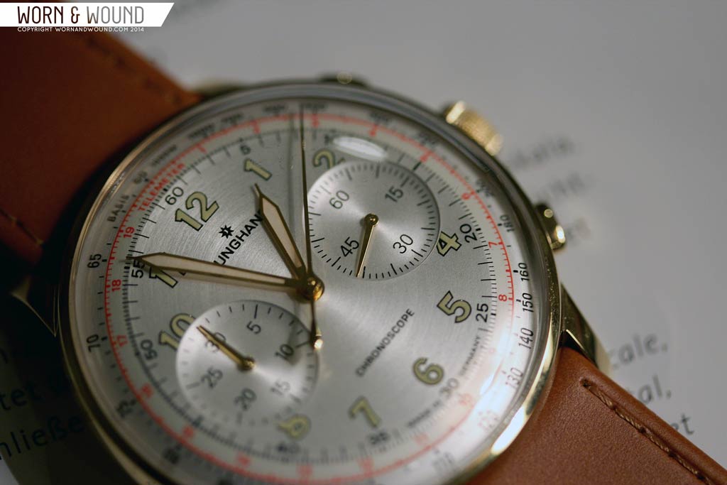
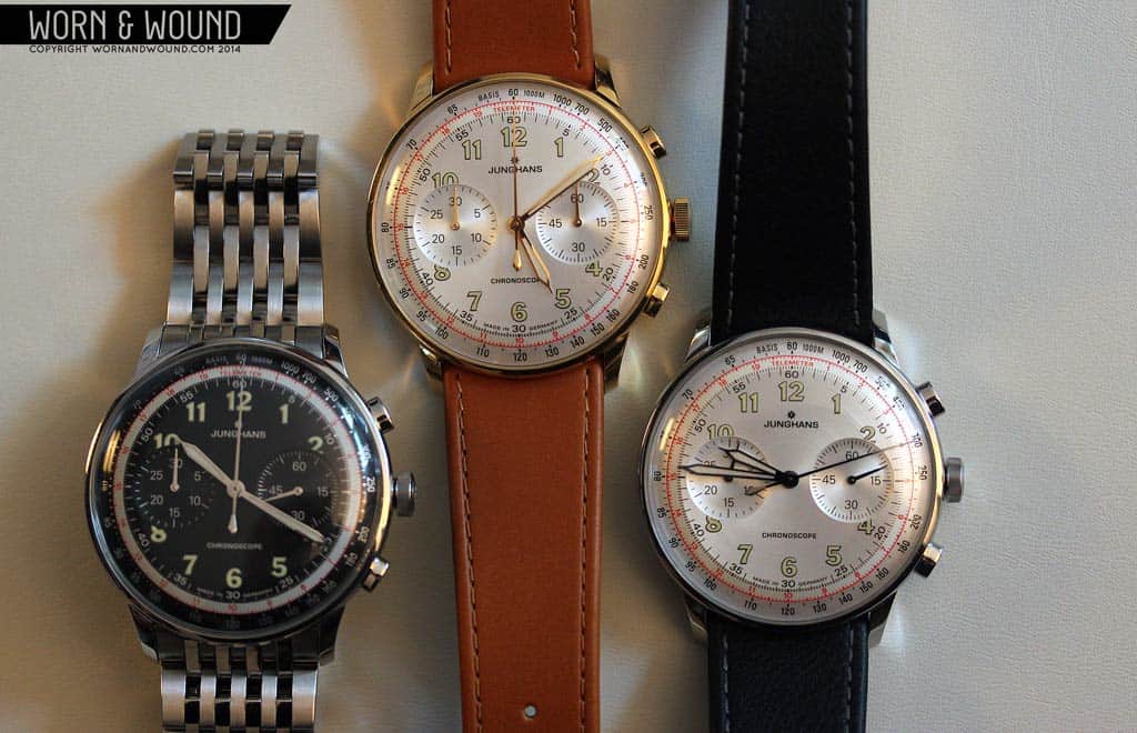
On the steel and gold (PVD) cased models, the dial surface, which is steel grey, has circular brushing. This adds a level of finish that is very uncommon on a dial. The subtle hint of texture and depth it adds takes the design to another level. Pair that with the sub-dials and the pie-pan shape (flat in the center, curved towards the edge) and you have a dial in a class of its own.
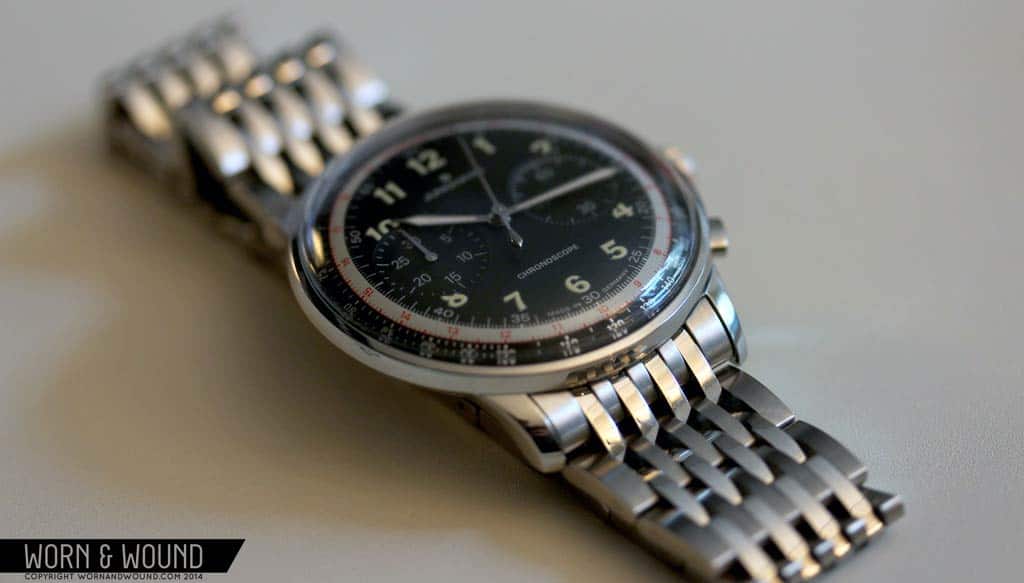
Like the other Meister watches, the case is bowl shaped, which makes the 12.2mm thickness wear more easily. It also emphasizes the domed acrylic crystal, which adds to the vintage appeal. Another nice and very appropriate touch was the use of thin, rectangular pushers. In hand, these feel very nice against your thumb when depressing them. They also look less bulky on the case than circular pushers would have looked. Inside of the watch is the J880.3 movement, which is a rebranded ETA 2892 with a Dubois Depraz 2030 chronograph module. The movement, which is properly decorated, can be seen through a display case back.
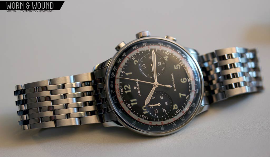
Each variation of the Meister Telemeter has its own appeal. The black dial is the sportiest, and comes on a gorgeous and unique steel bracelet. The gold seems adds a level of dress to the design and really has that “my grandfather’s watch” look. The steel, which is our favorite, is simple and understated, perhaps looking the most technical. The monochromatic steel on steel combo brings out the accent colors on the dial, namely the cherry red telemeter scale. The Meister Telemeter is a bit higher priced than others in the line, but well priced for its level of finish, at $2,581 for steel and $2,711 for the black with bracelet and gold PVD models. Available soon.
—
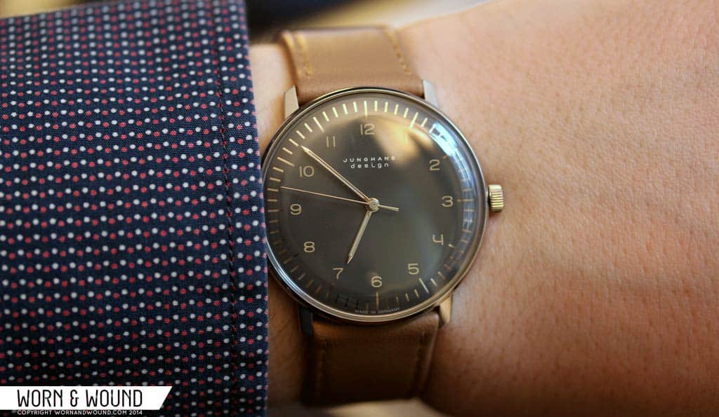
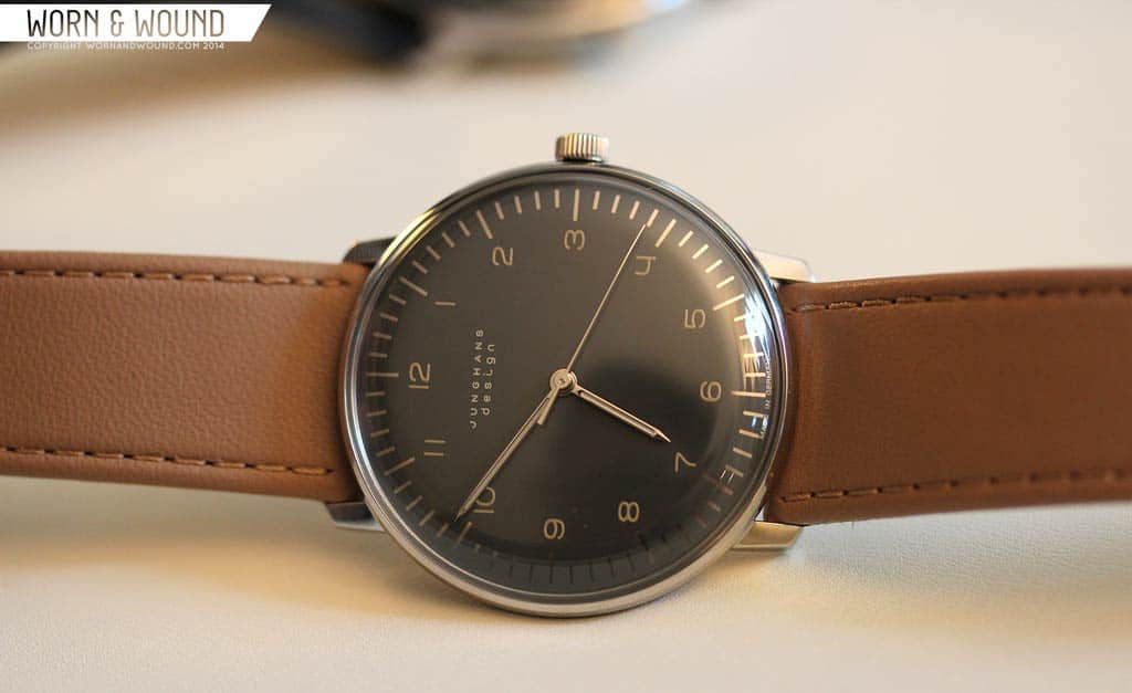
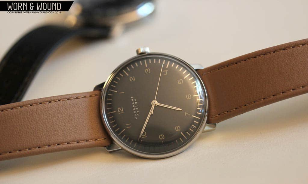
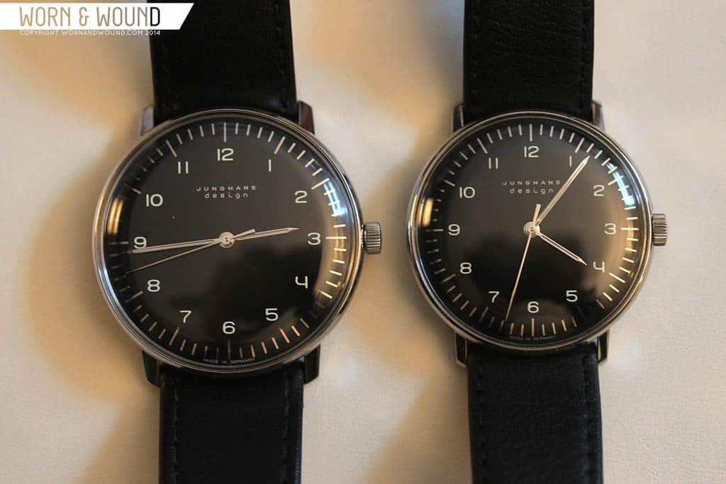
On another, exciting note, Junghans revealed some new Max Bill models. By new, I don’t mean new designs, but variations. First, they took the original design, which is simply dashes and numerals, and for the first time made it available in their 38mm automatic version. This is just one of those watches that when you see it, it makes you say “forget about chronographs, moonphases and all that other stuff”. Well, maybe. Regardless, it’s just right.

But perhaps more exciting than the size increase, is that they also made a new color variation. It’s actually a hard palette to describe as everything was very subtle. Rather than a black surface, they went with a dark, warm grey, which is polished anthracite. The outer index is then mirrored which could either look black, or white depending on reflections. The numbers, then are a creamy, off-white. The overall aesthetic is warmer, softer and more earthen than the standard palette. While not the classic version, I found this immediately very appealing. Paired with the 38mm size, which is ideal, this watch just exuded style though I might swap the tan strap for a Color 8 (burgundy) cordovan. $1,031, available soon.
by Zach Weiss


