


 Featured Videos


Mondaine found themselves in a tricky situation. They produced and have produced for sometime one of the most iconic and easily recognizable watches on the market; the Swiss Railway Watch. The image of that dial, with its bold black markers and large red lollipop hand is synonymous with the brand, even though the design itself was from decades earlier and is still in use as the official Swiss Rail clock. The situation though doesn’t have to do with that watch, it has to do with what comes next. Like a band with a great first album, how do they follow up? They couldn’t meddle around with fleeting designs and fads that are forgotten a year later; no, they needed another icon.
In fact, not just another icon, a Swiss icon, and they picked just about the perfect one: Helvetica. Designed in 1957 by Swiss designer Max Miedinger, Helvetica is the most used typeface (period). It’s everywhere, and in the last few years has had its day in the sun thanks to the wonderfully made documentary “Helvetica” by Gary Hustwit, which revealed the sheer domination of the typeface in visual culture. It’s the standard, it’s the default, it’s something that is a part of your daily life whether you know it or not (I’m typing in it at this very moment). Some say it’s overused and generic…and they have a point (having worked in a graphics department I can tell you that Helvetica is the typeface your lame boss or client tells you to use because they think it’s cool), but as starting point for a line of Swiss watches with the intention of creating an icon, it’s ideal. Mondaine was not trying to make something of the now, but of the past, present and future, and what more could they ask for than something that surrounds everyone already.
And, to be fair, it’s attractive, simple and elegant. It might not have the personality of other typefaces, but it’s the standard, modern, sans-serif typeface. It just works. Whether in bold for signage, light for a touch of elegance on a package or normal in body text, it gets the job done efficiently. But, the question we’re concerned with is, how does it translate into a watch design?
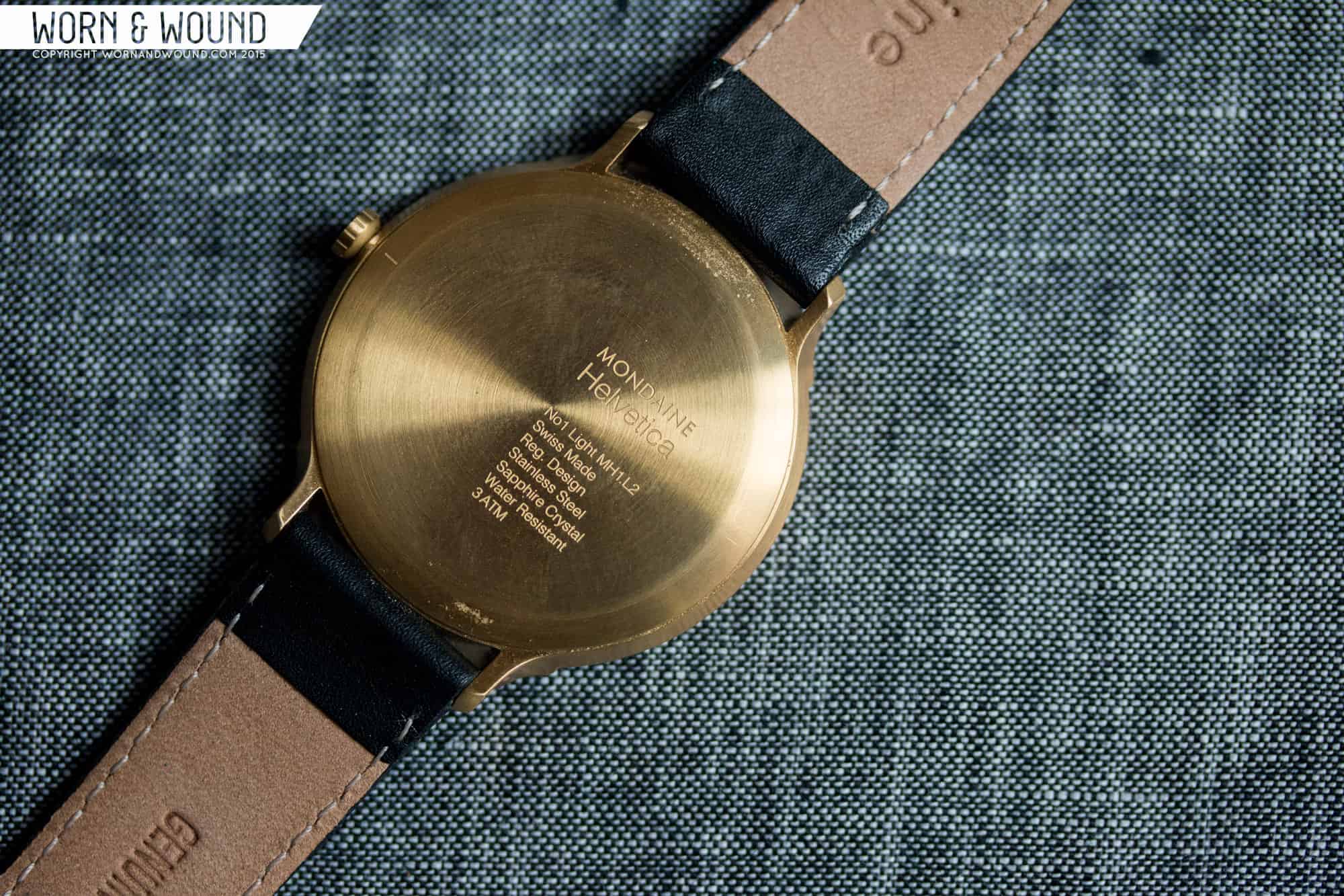
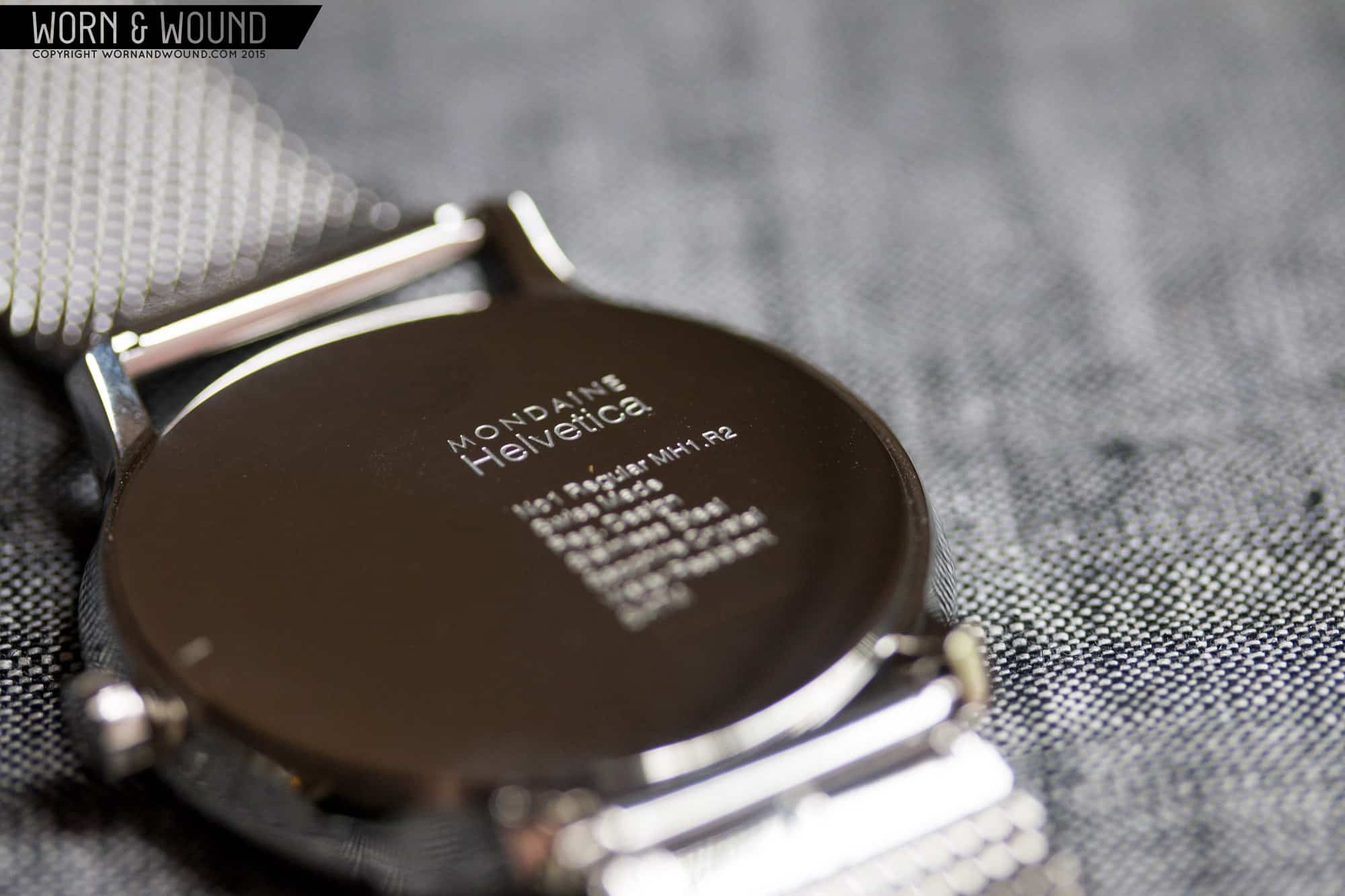
I have to say, Mondaine’s designer, Martin Drechsel, was pretty damn clever in his execution of what is a pretty daunting task. The result is the Mondaine Helvetica No. 1, a series of 3 watches, each based on a different weight or font of Helvetica (font and typeface were originally different things, Helvetica being the typeface, bold being the font. But nowadays they are pretty interchangeable). From small and elegant to large and aggressive, you have light, regular and bold varieties. Within each are then more options, creating a very expansive line, all with Helvetica at their core. Currently they are all quartz powered and feature sapphire crystals.
Cases
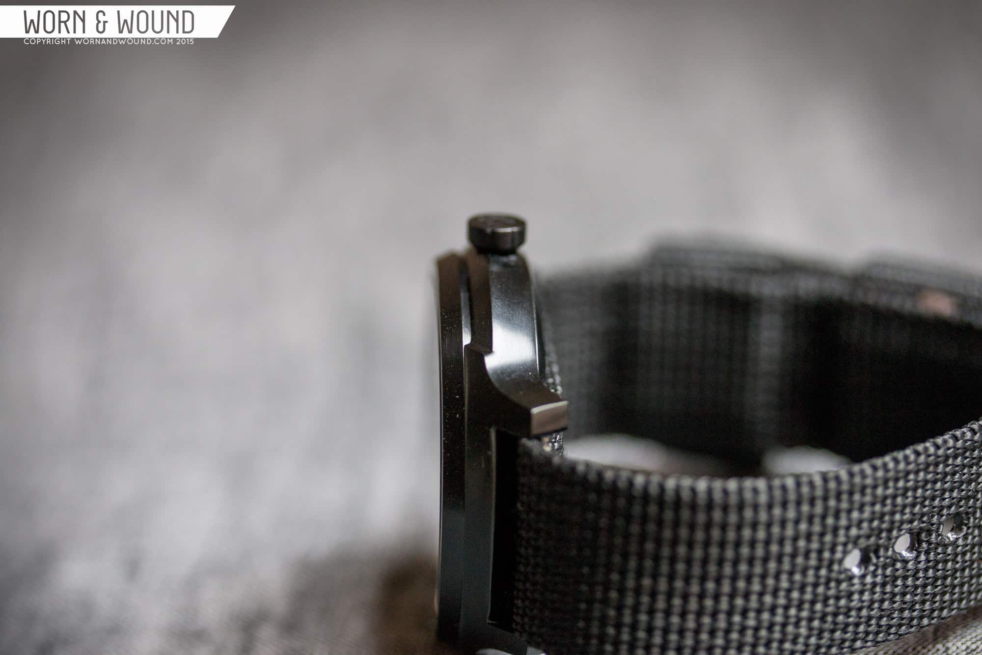
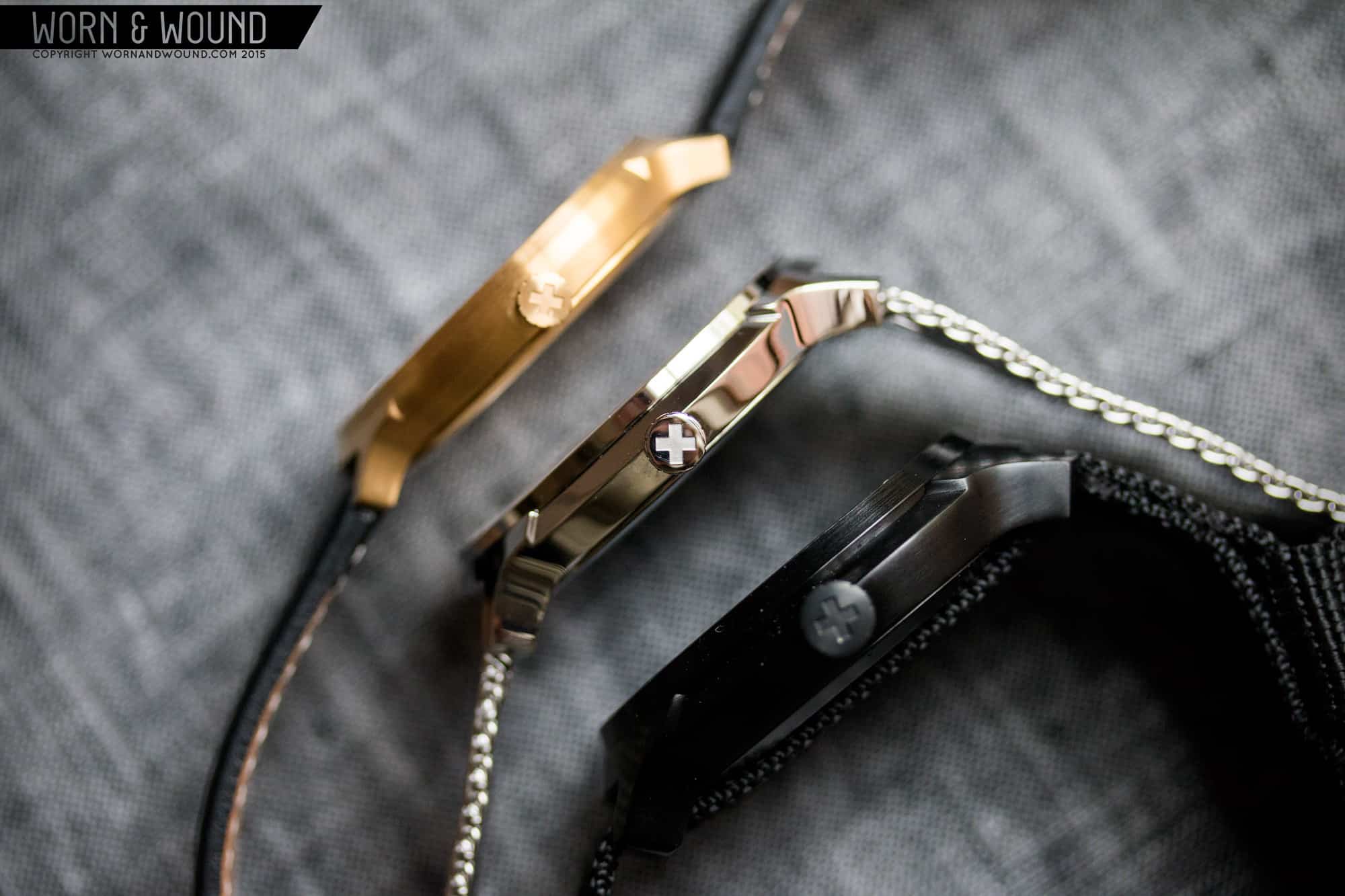
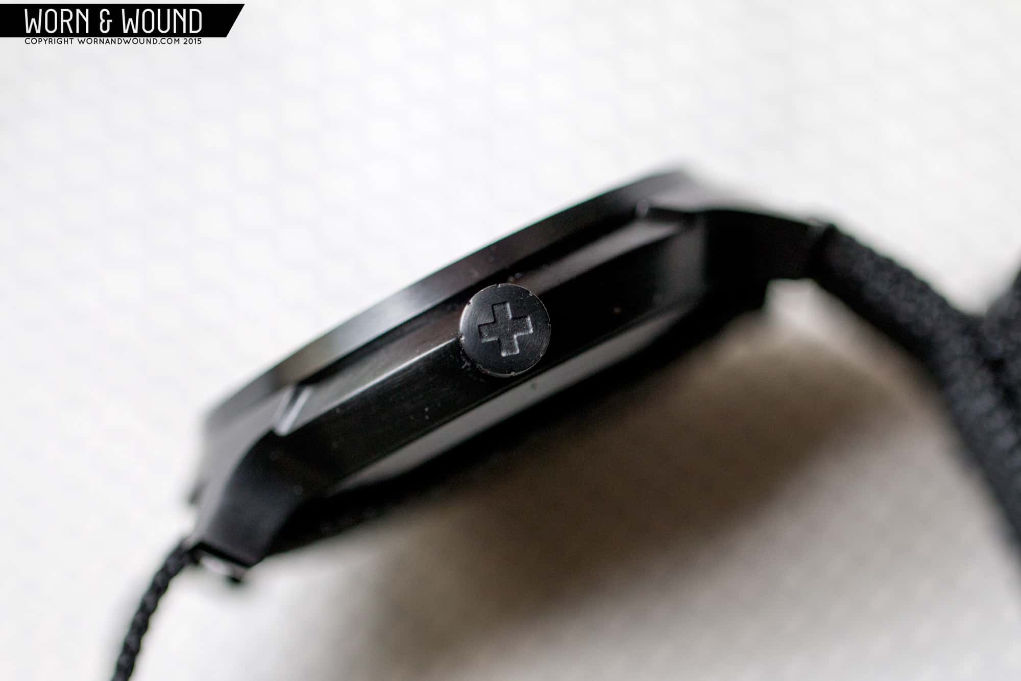
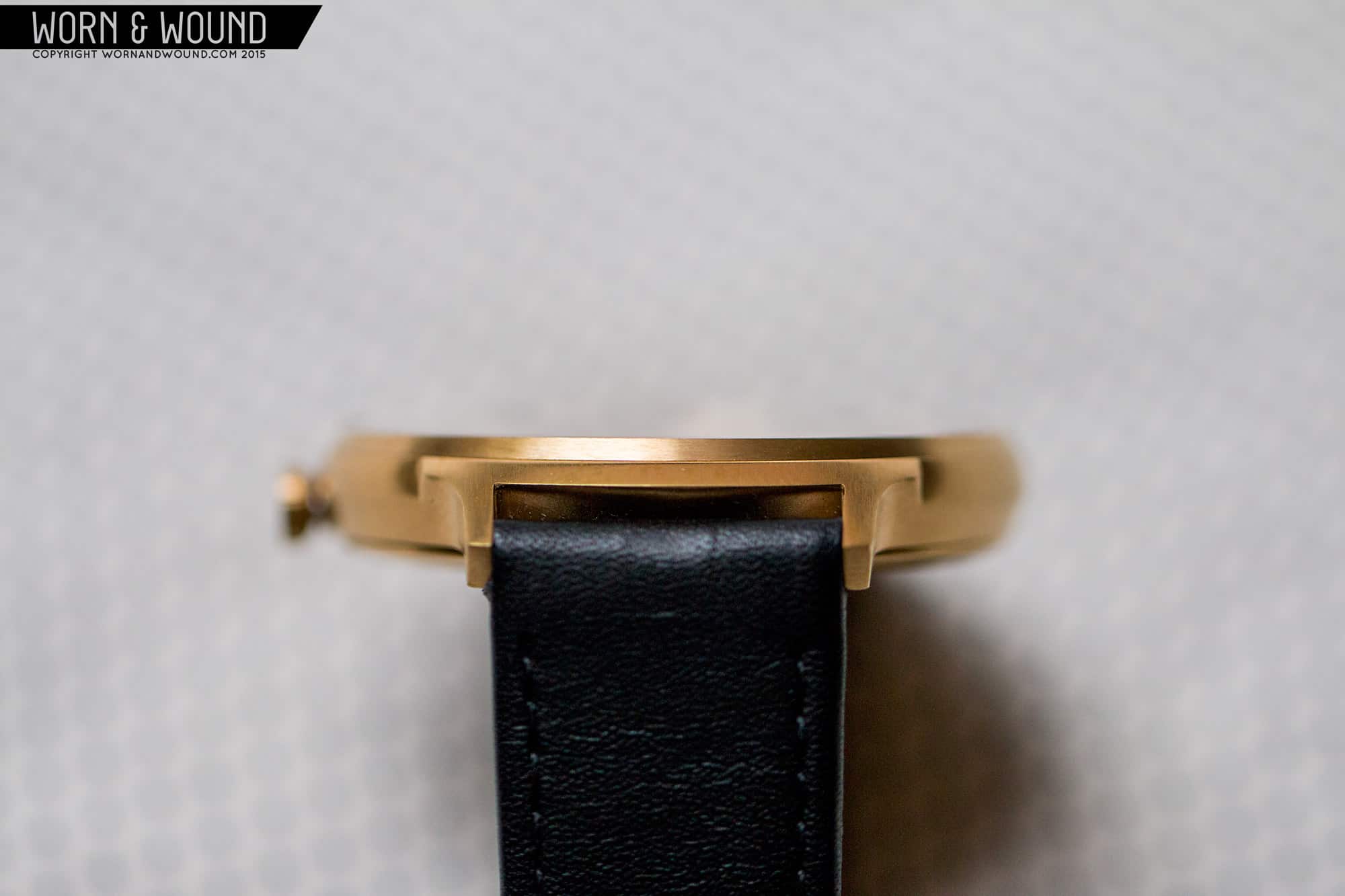
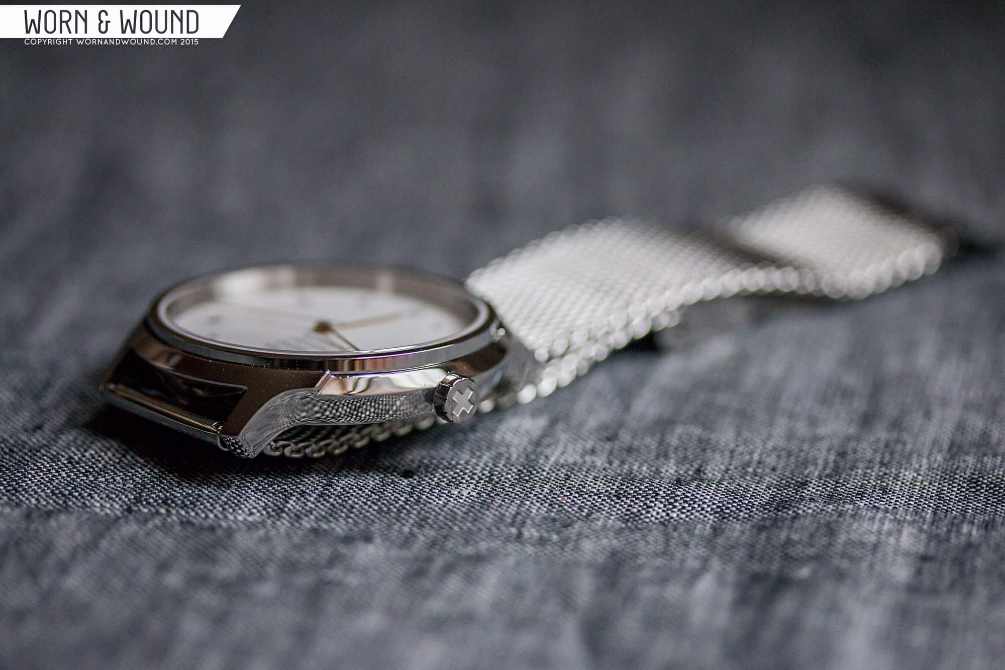
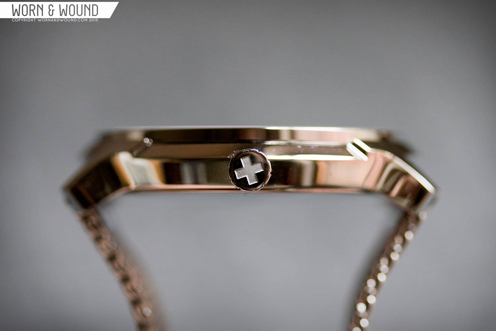
The most overt, but still tasteful use of Helvetica is on the lugs. The 1 numeral has been integrated into the design such that the crossbar creates the lug. The number is raised in relief from the case body, and mirrored about itself creating both sides. While the number is visible once you have been told to look, it isn’t obvious. instead it creates an interesting detail that adds complexity and texture to the overall case.
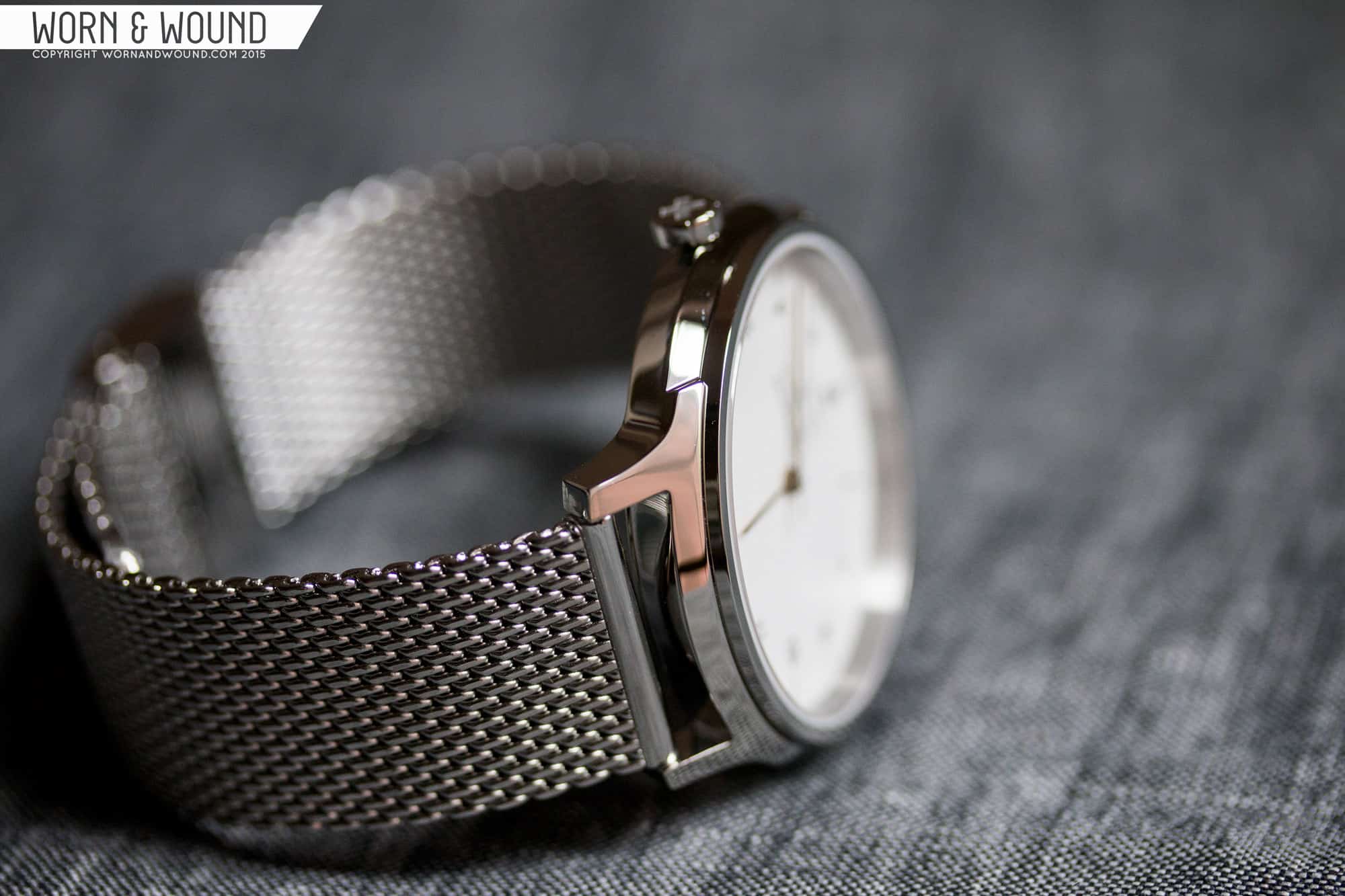
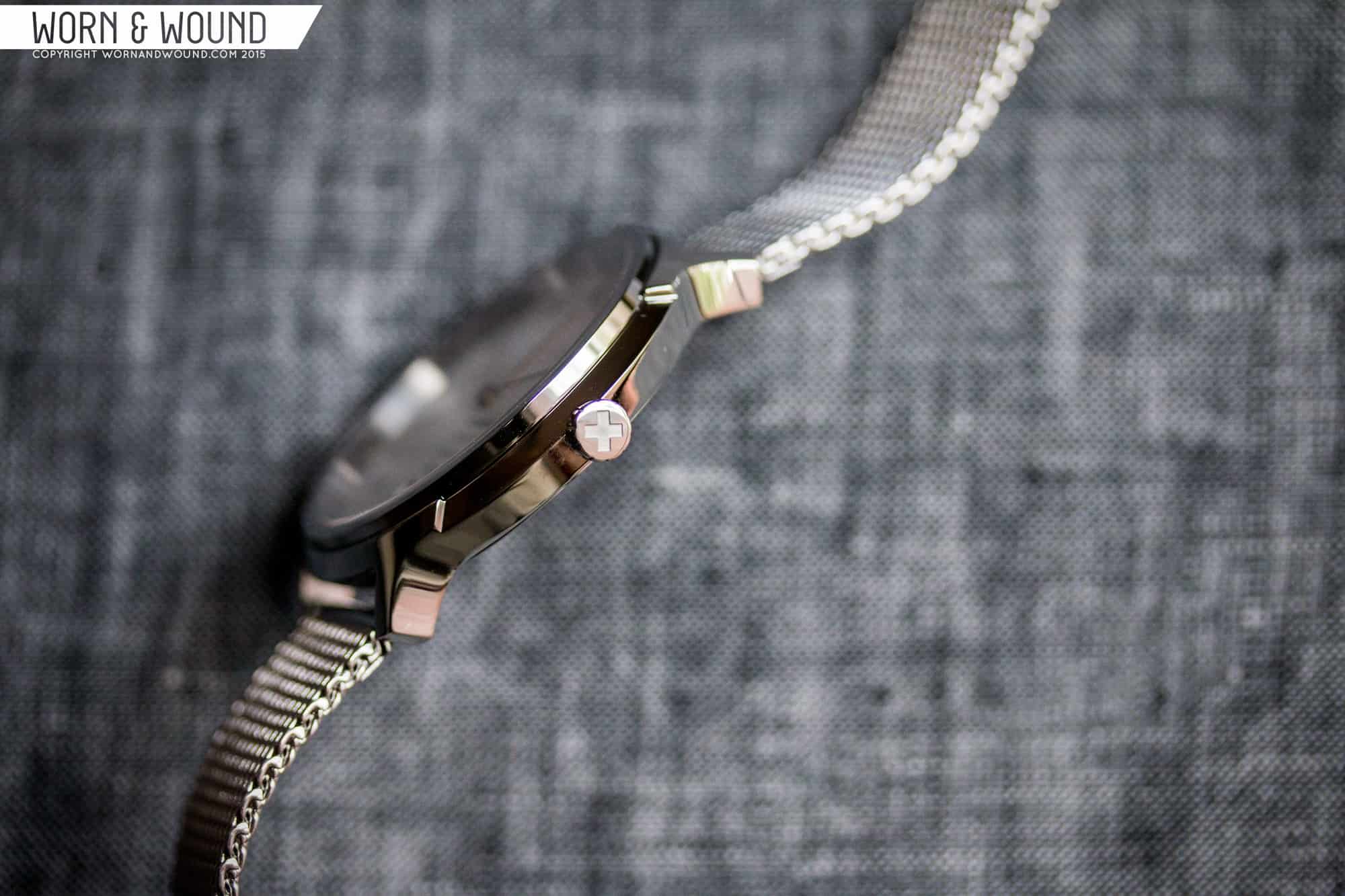
The rest of the case is still pretty intriguing. These aren’t cookie cutter cases with slab sides and nothing to look at, rather they are quite sculptural, with a sides that come to a point, then quickly bevel in meeting the bezel on the top, or case back on the underside. This results in a lot of facets, which depending on the model and the finish, can create dramatic reflections.
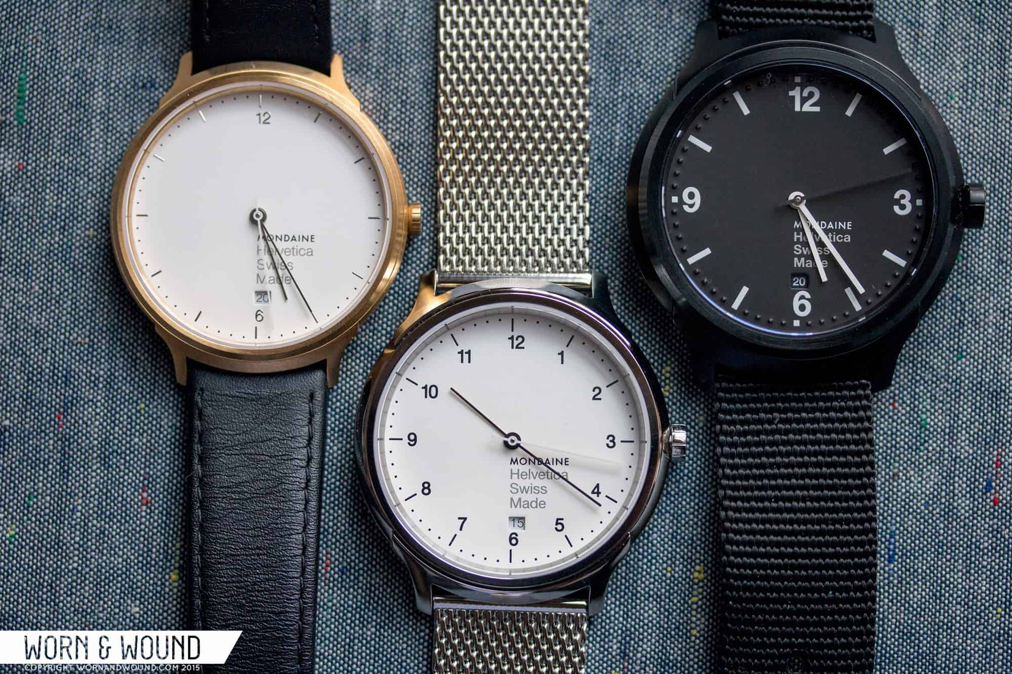
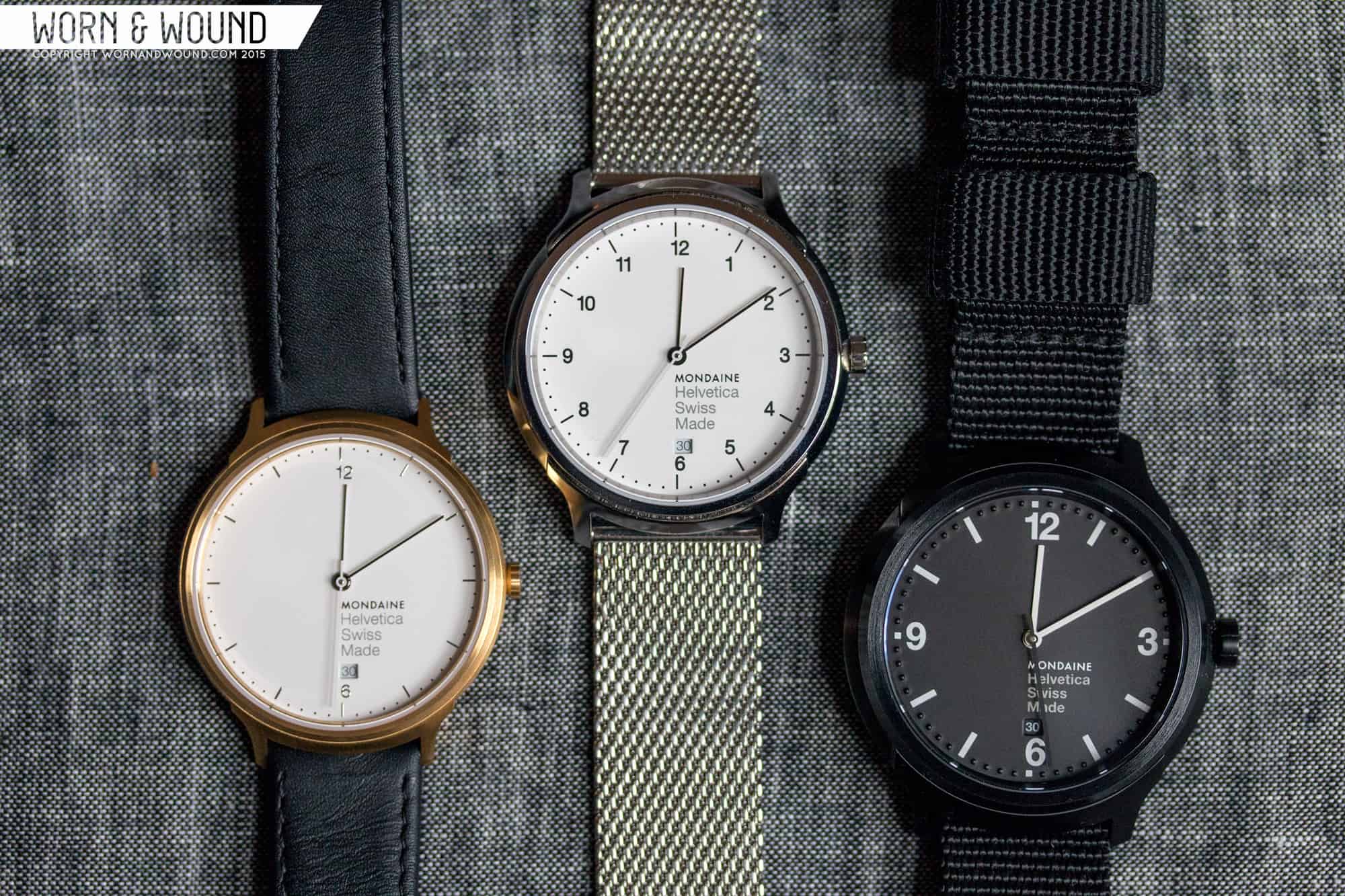
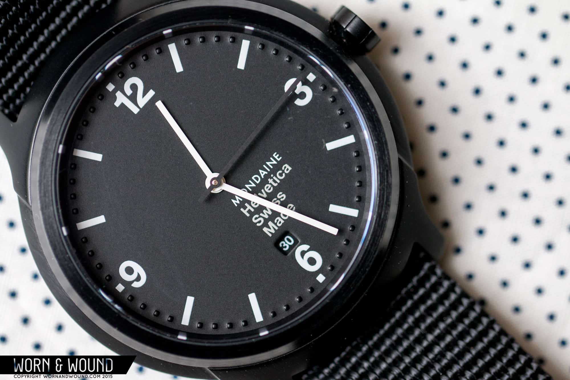
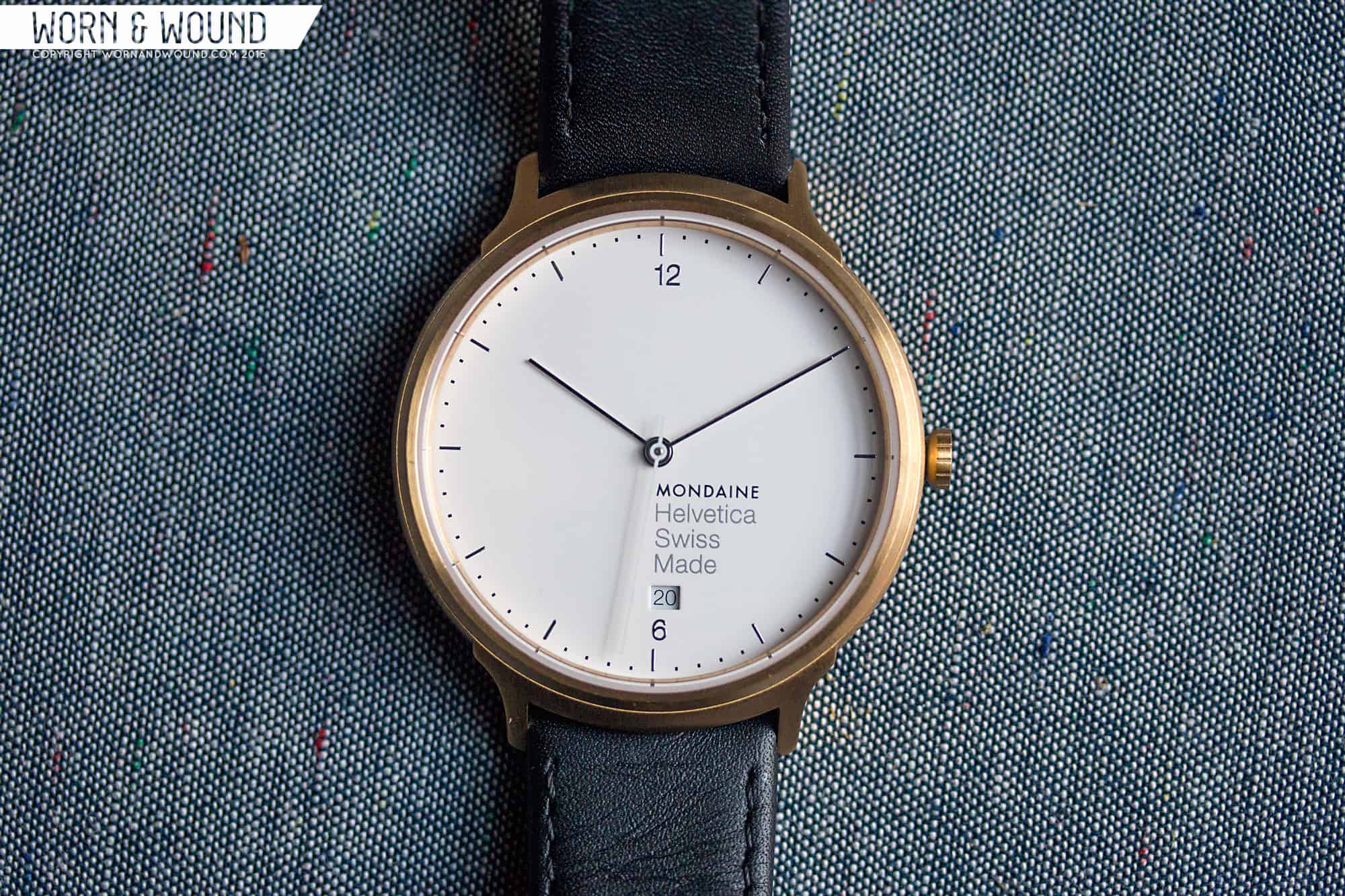
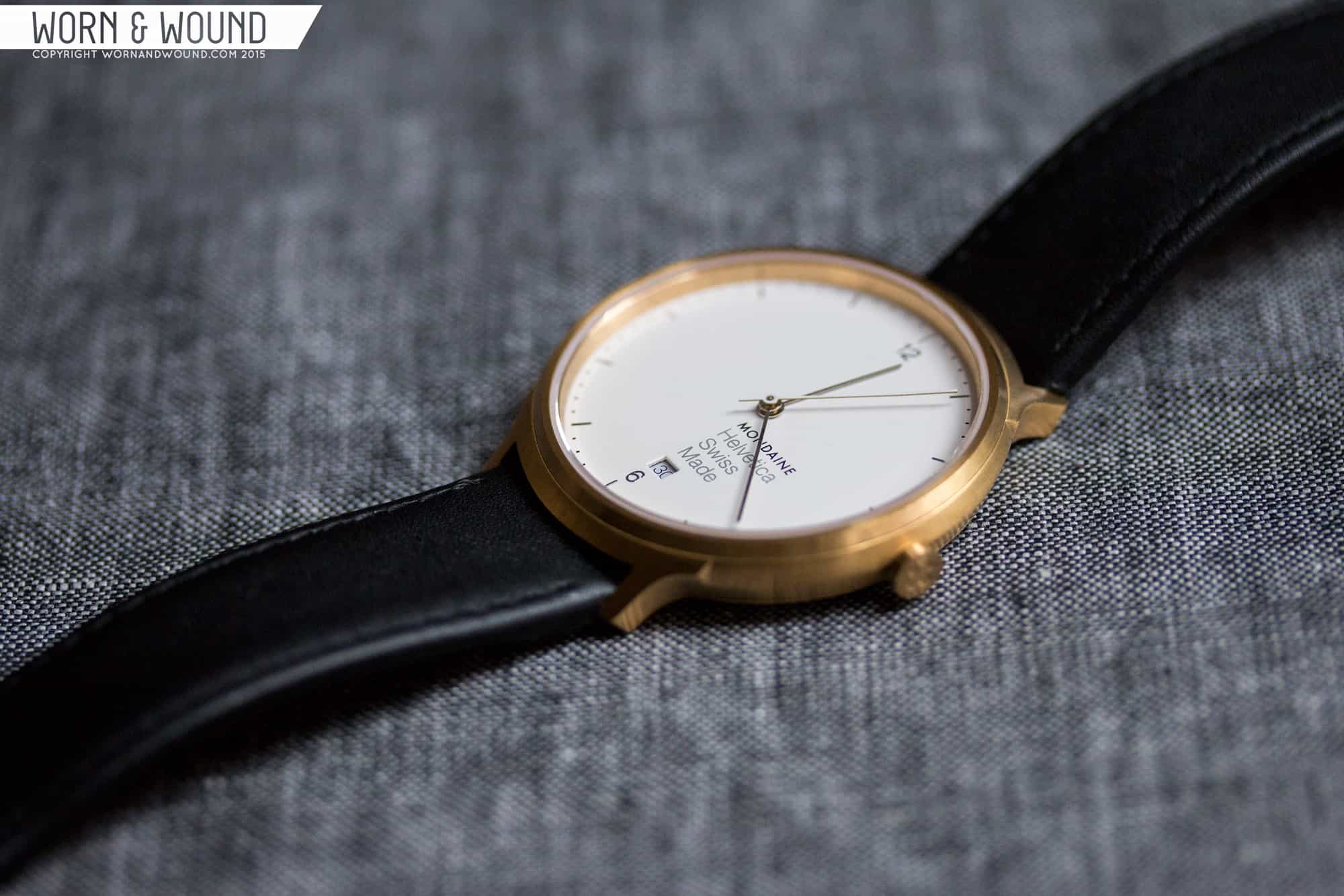
One of the cooler aspects of the case design is how they went about making the three styles. The smallest is the Light, which comes in two sizes, 26 and 38mm. But it’s not just the size that distinguishes it from the others, rather the proportions are different, giving it a thinner wall and smaller crown, for a lighter look. The Regular bumps up to 33 and 40, with a yet thicker wall, giving it more substance a bit more masculinity. Lastly, and perhaps the most surprising of the bunch is the Bold. At 43mm, it’s substantially larger, but also has much thicker sides, giving it a downright rugged and tough appearance.
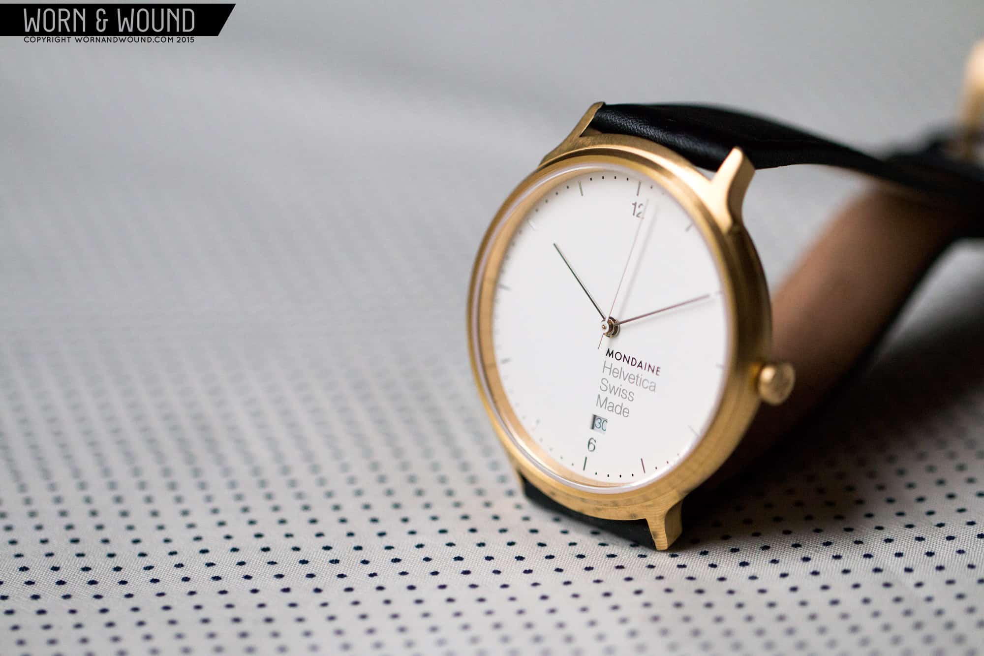
The dials change dramatically too, which I’ll get to in a bit, but it’s kind of fascinating to see how one concept can be tweaked for very different effects. They clearly share DNA, and build on a mid-century modern feel, but range from minimal dress watch to strong sport watch. They also have varying finishes depending on the model, which effect the look as well. We got to see a brushed gold, high polish and PVD black. The gold gave the Light model a vintage feel, which while not my first choice of finish, did work with the more diminutive design. The high polish on the Regular case made it sleek and modern, almost architectural. Lastly the PVD on the Bold reinforces its name and adds an unexpected tactical twist.
Dials
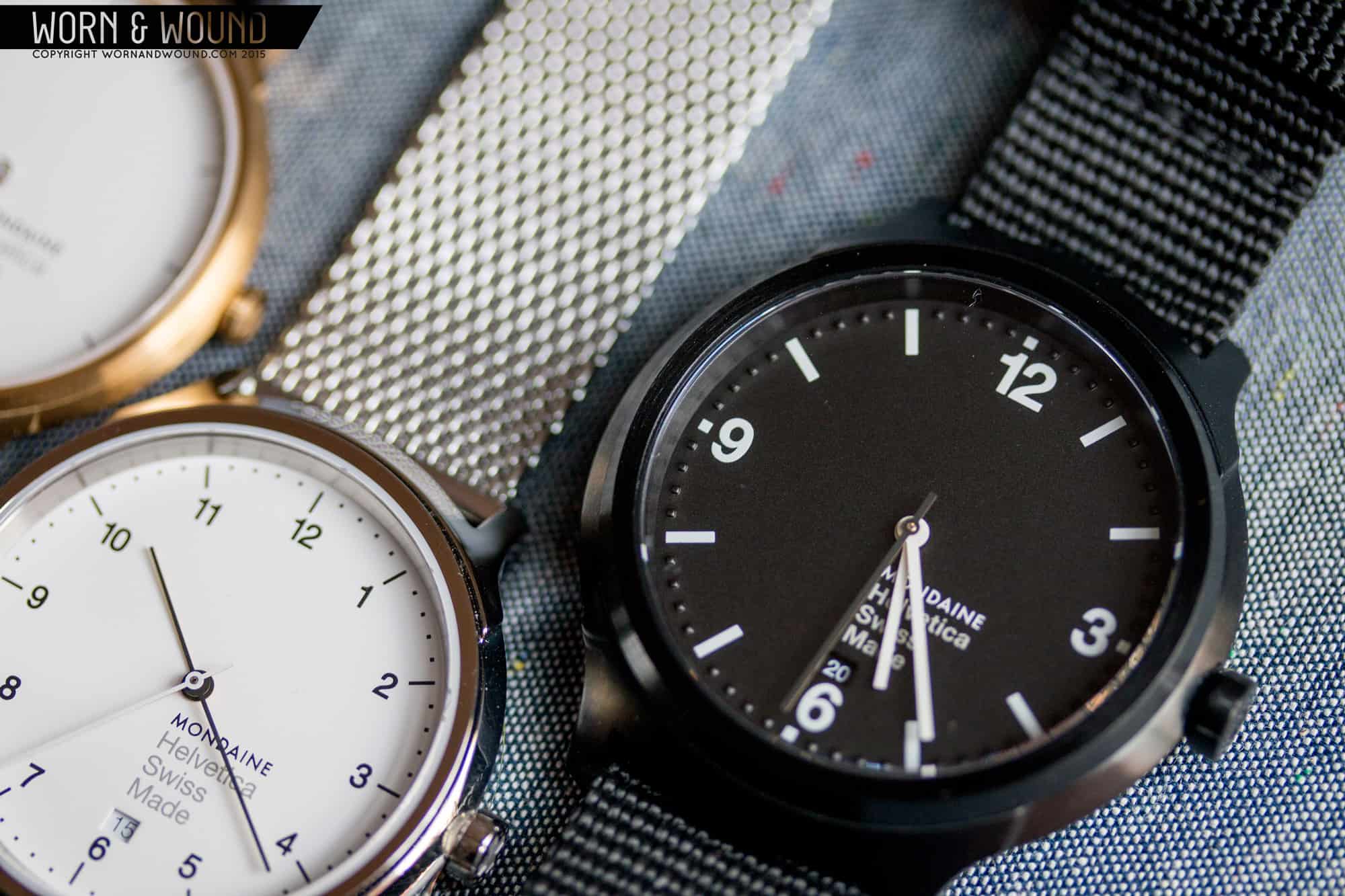
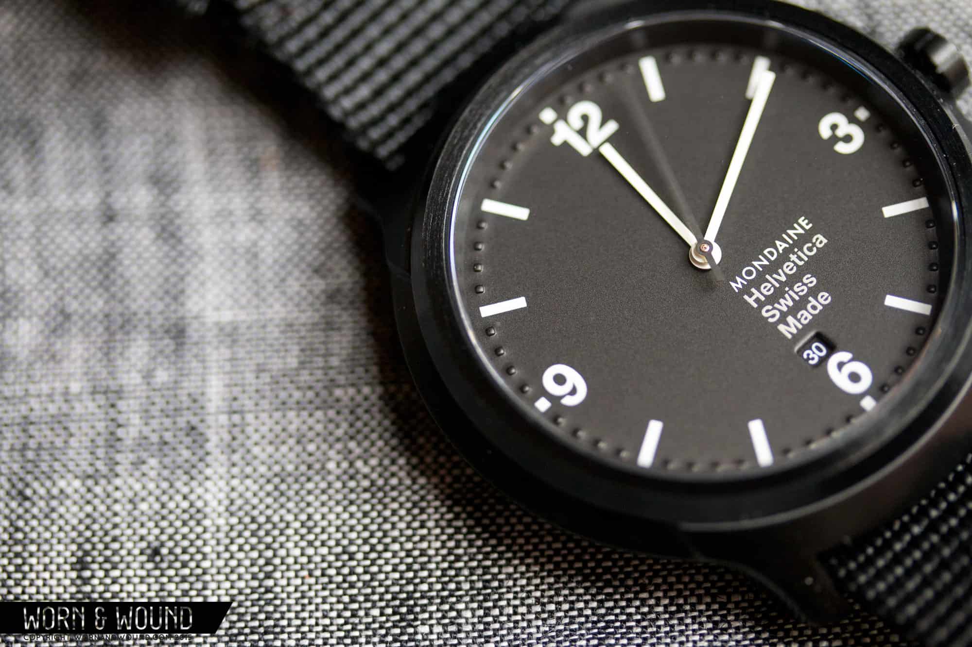
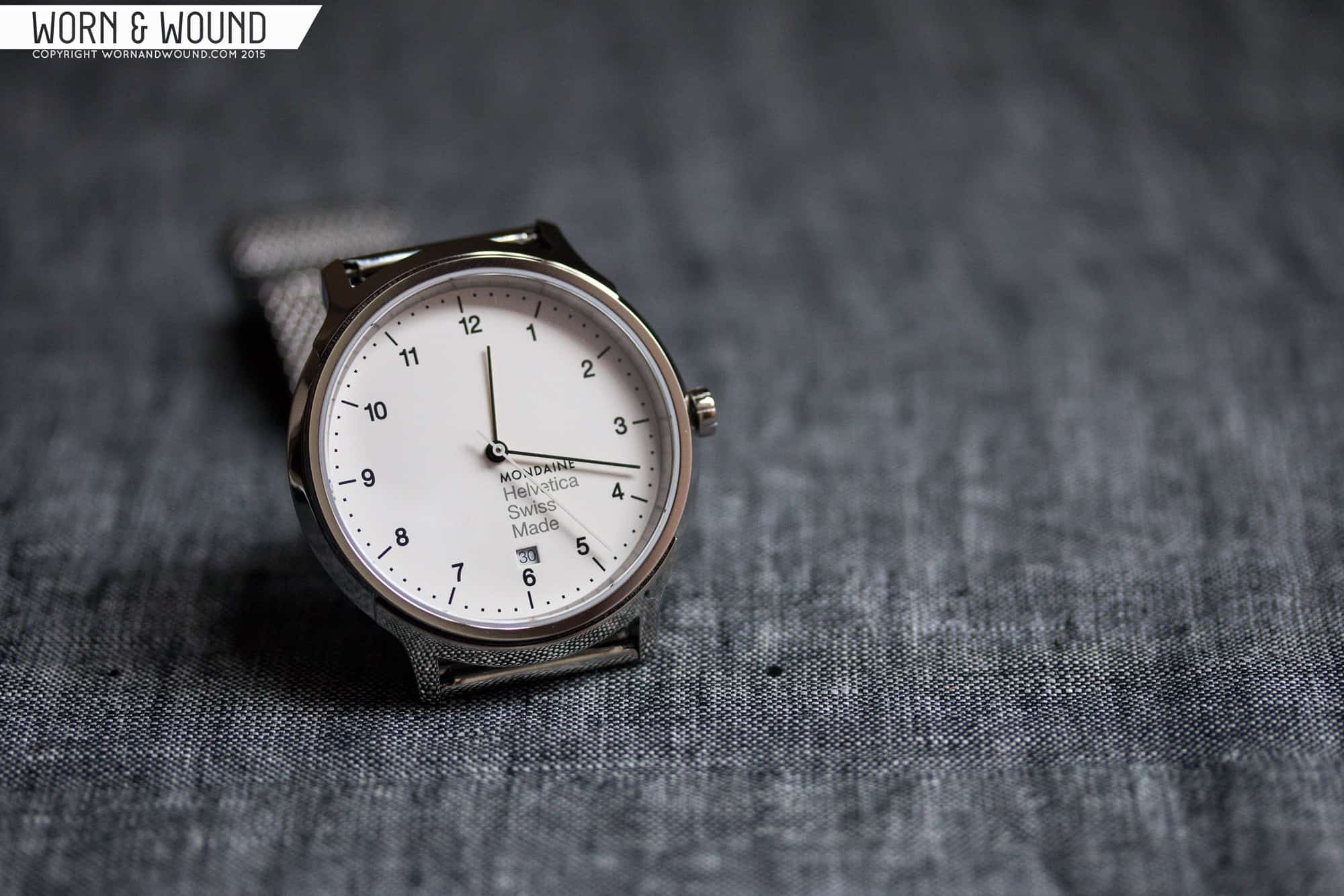
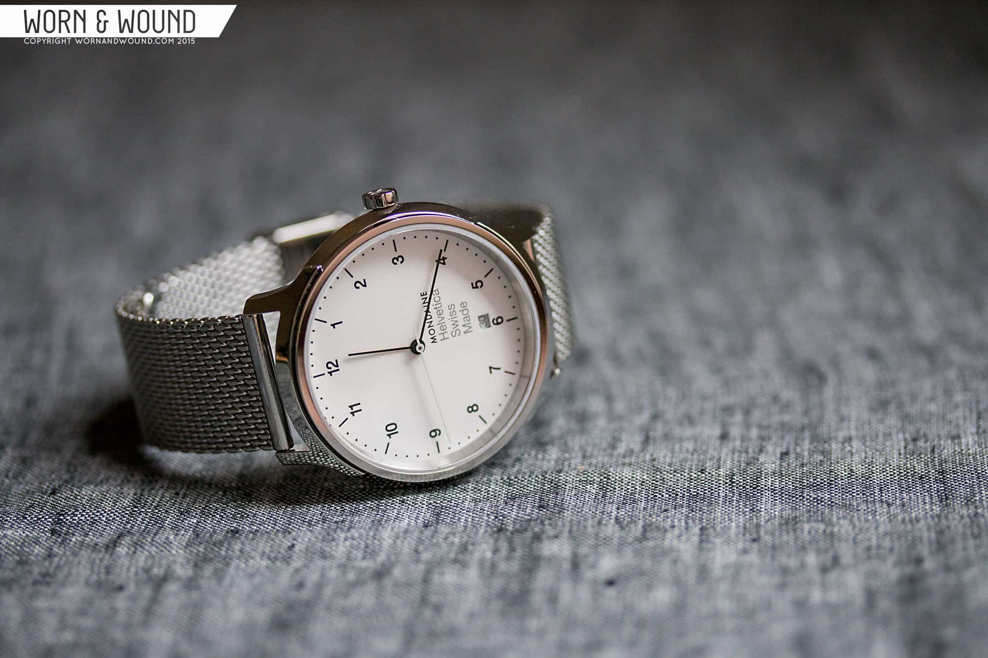
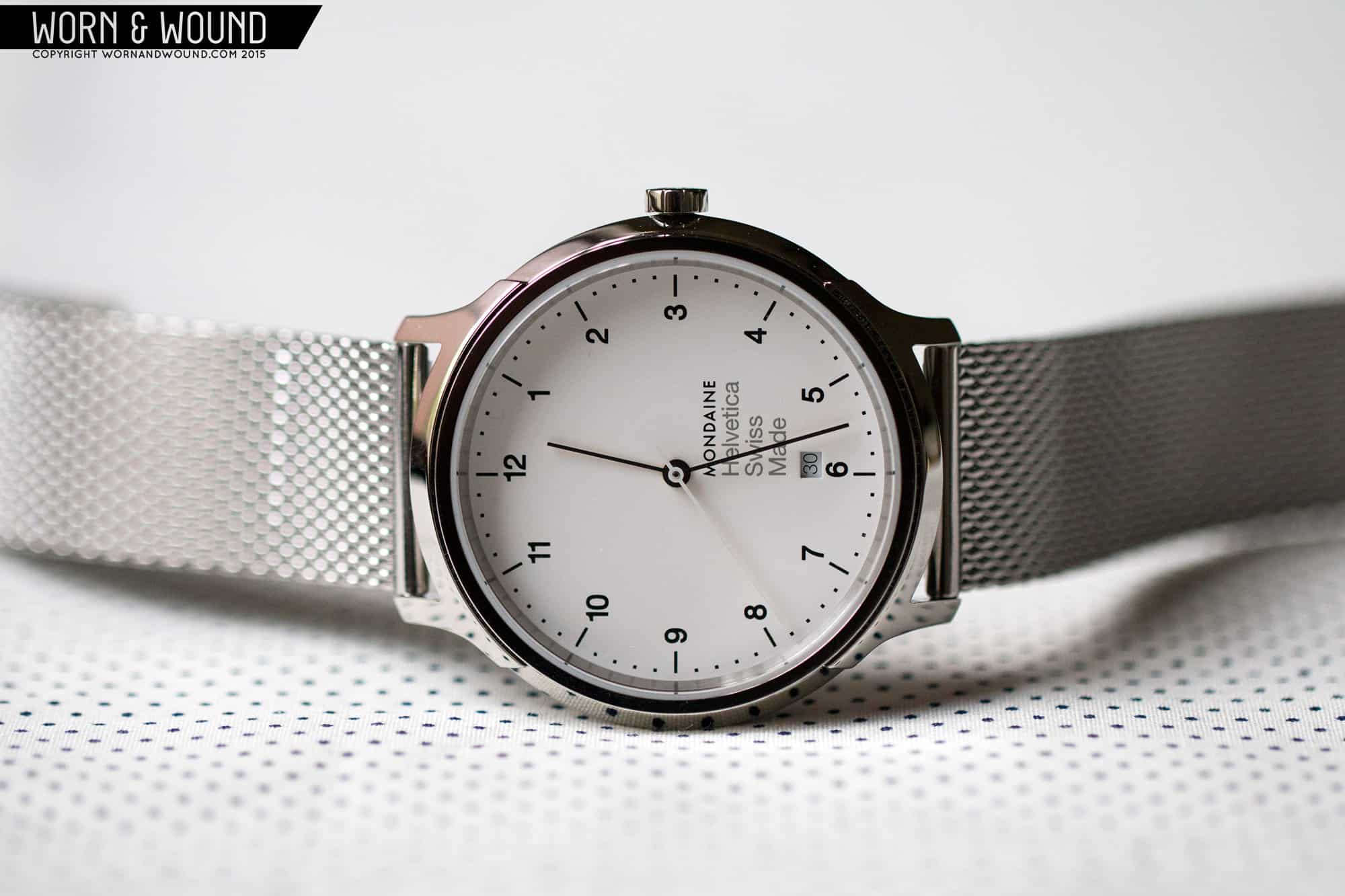
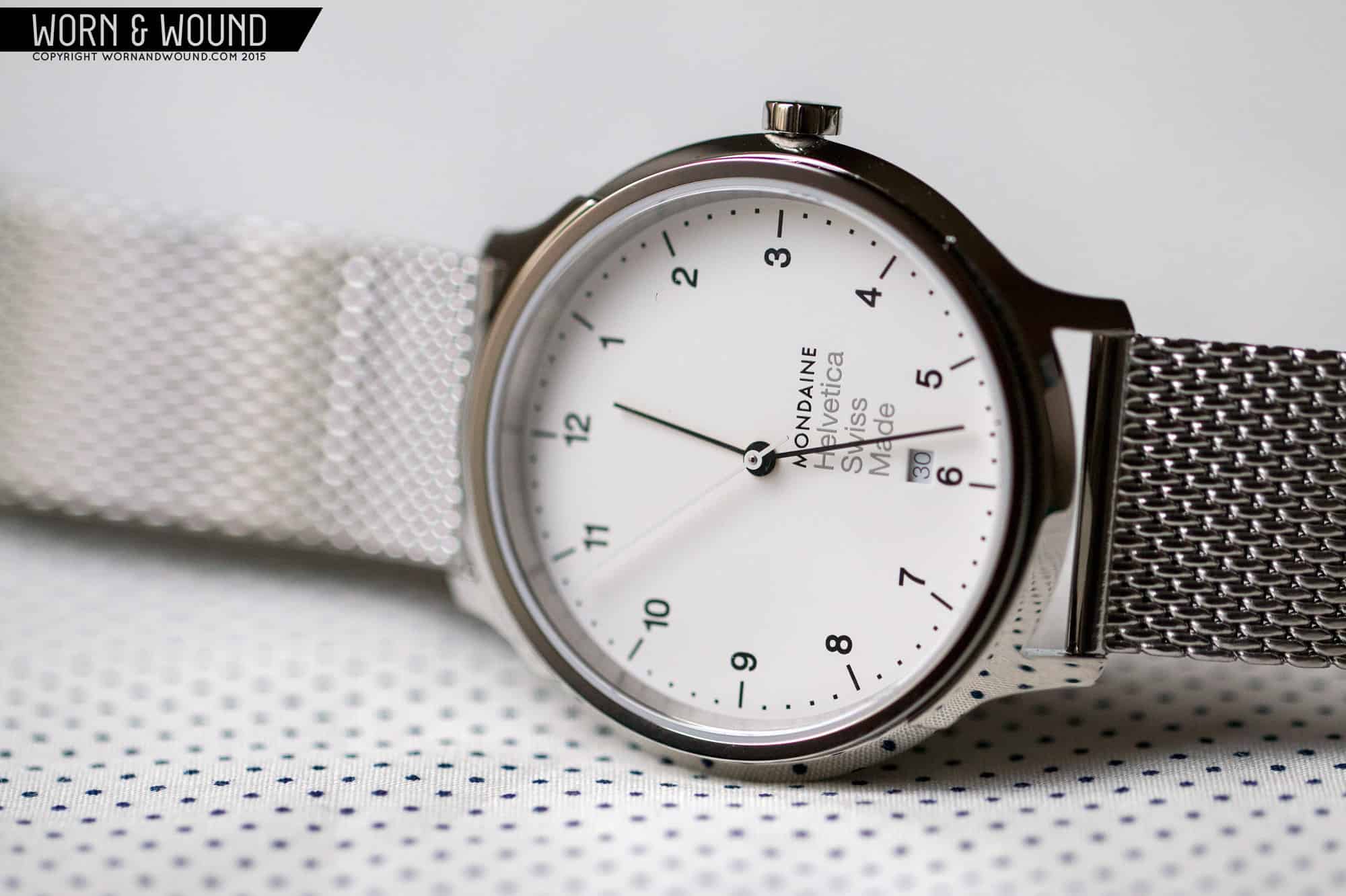
There are clearly common elements across the three models, including using Helvetica, but once again through clever proportioning and layout, they manage to create three distinct styles. Other than numerals, they all have dashes marking hours or five minutes/seconds intervals, and dots marking individual minutes/seconds. With the addition of numerals in the font that matches the watch’s name, It’s a simple vocabulary that maintains an overall clean and minimal aesthetic across the board. They also all have stick hands that too correspond with the weight of the font.
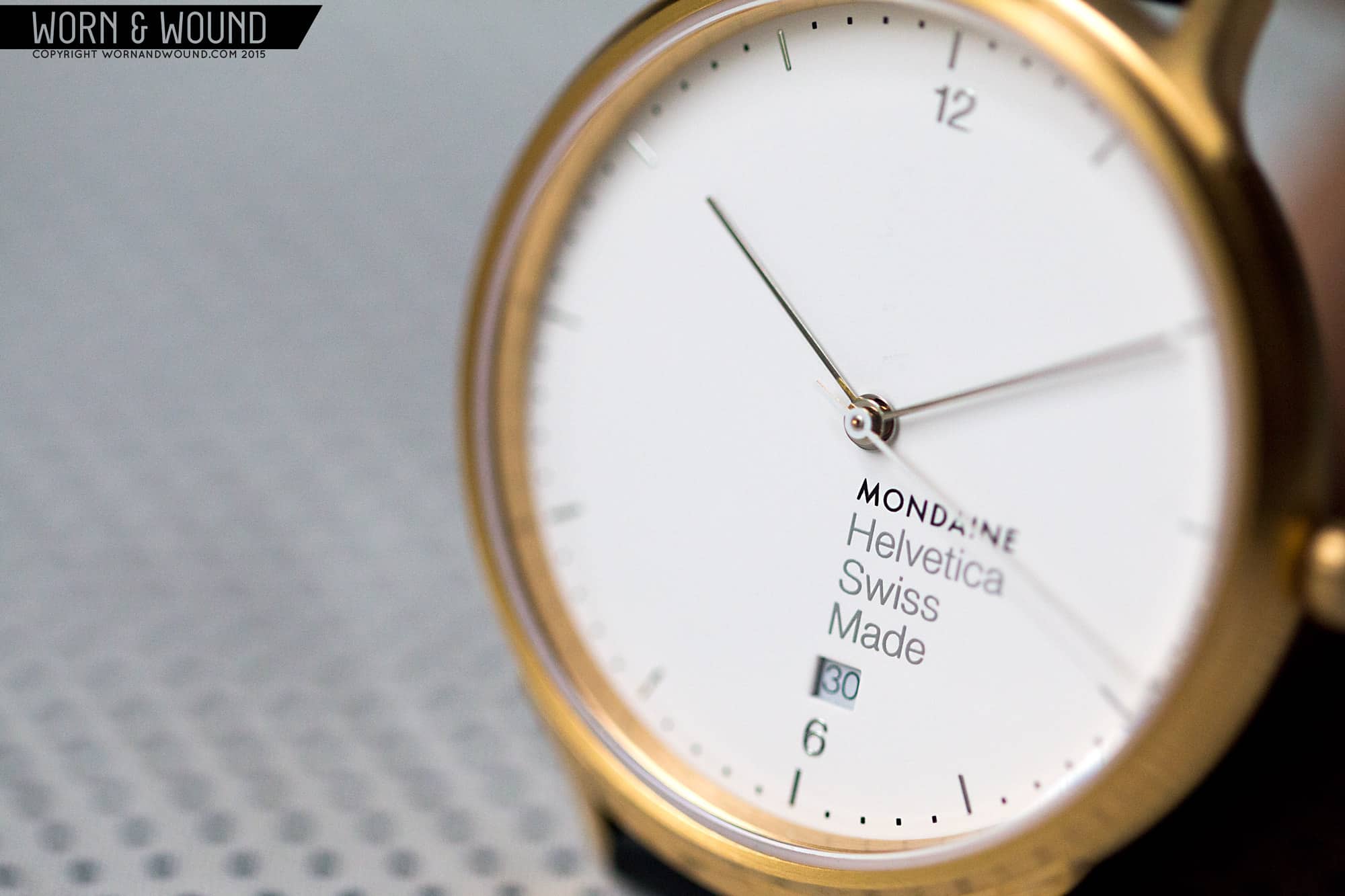
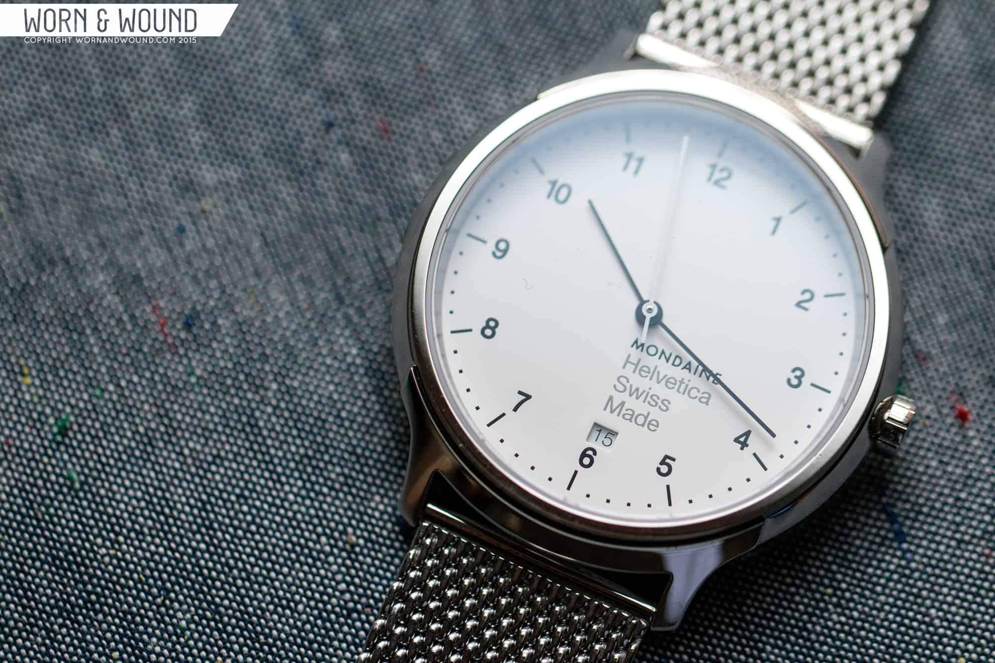
That part is simple, the more challenging aspect is the use of left justification on the dial. Playing off of their typographic source, they decided to break the convention of centering the 6 and 12 numerals, as well as the date and dial text and instead left justify them against a center line. The result is that they kind of look off center, which doesn’t detract at all from the body text, but takes some getting used to on the numerals. I personally like that they did it, as it has a unique, modern effect. I also always like to see custom date executions that work with the watch concept, which is so rare to find.
The Light dial is the most sparse with only 12 and 6 numerals, and an index of small dashes and dots. There is a lot of open space, giving it a stark yet serene appearance, but the proportions feel right. It’s not too empty or cold, the numbers are small, but still have presence. The dial text and date do add a lot of weight to the lower right quadrant of the dial, perhaps dominating the dial a bit too much. That said, its creates a graphic center point that emphasizes Helvetica. Overall it’s a very attractive dial that when combined with the thin case comes across as elegant and airy.
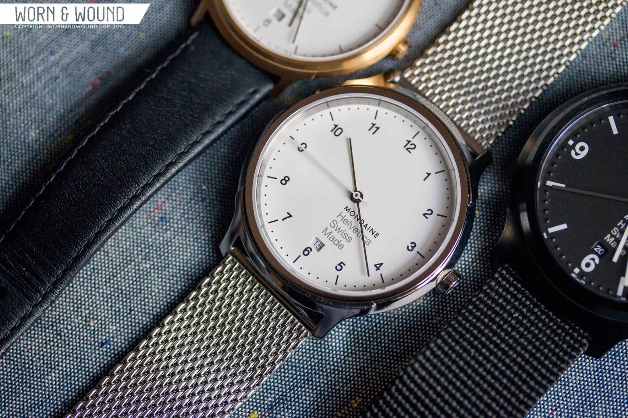
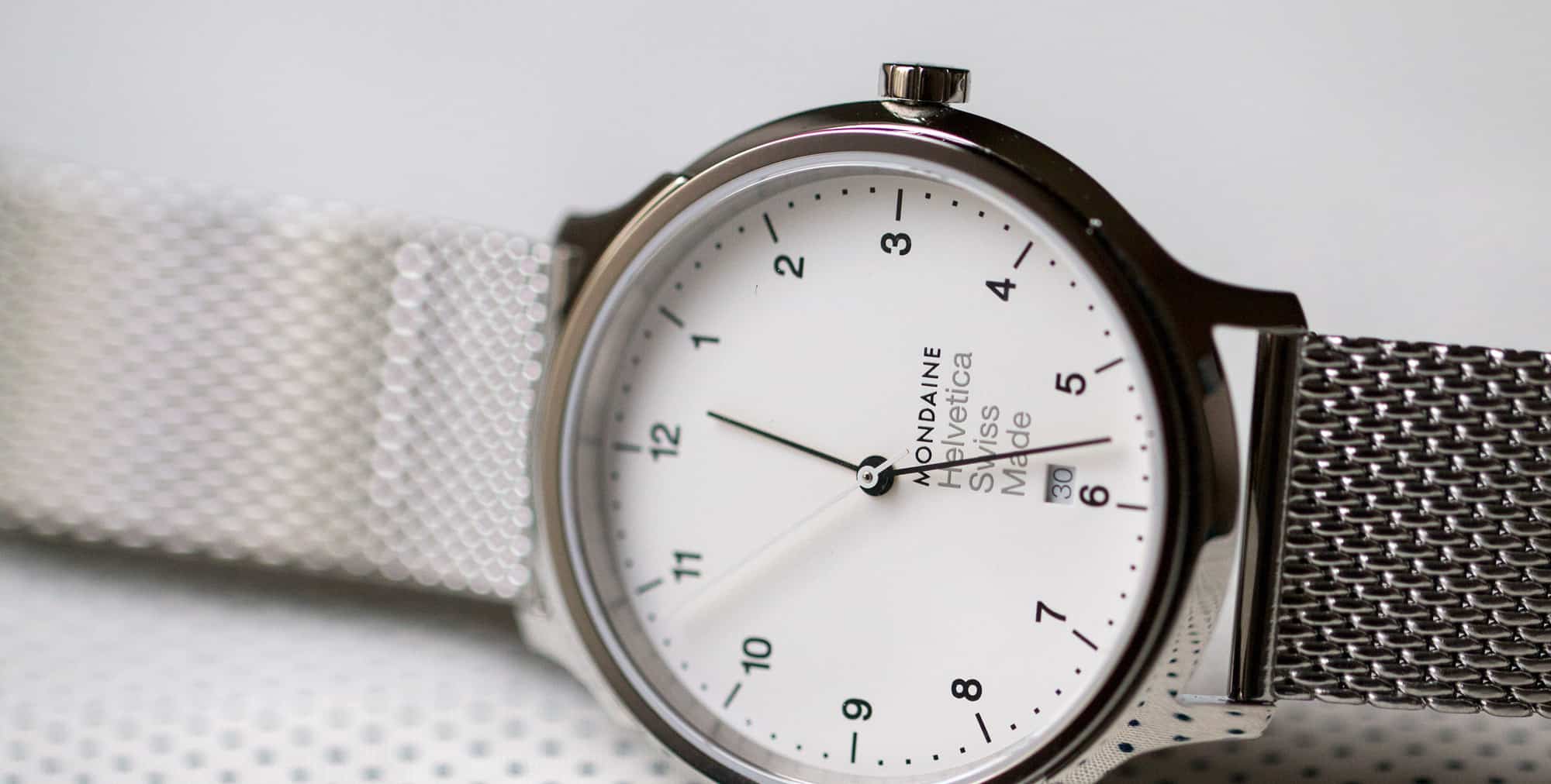
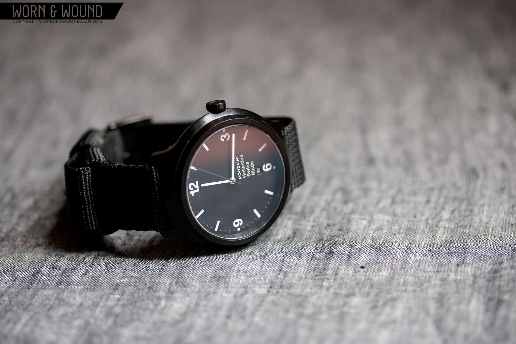
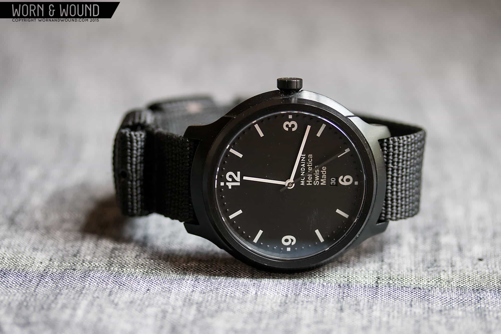
The Helvetica No. 1 Regular is clearly meant to be the daily wearer of the group. It’s not big or too small, it’s minimal, but contrasty and has superior legibility. The main index has all 12 numerals, equally weighted. Surrounding this is the index of dots and dashes that are still fairly thin and small, though have thickened up a bit from the Light dial. Once again, there is a decent amount of open space, but thanks to the full numerals, it doesn’t feel empty at all. The block of text is still there, but similarly feels more balanced out by the numerals around.
I find this one very attractive, albeit plain. It’s like they took the most standard concept of a watch dial and tweaked just enough to be stylish. To some, it might not be tweaked enough and since Helvetica is generic in its own way, that doesn’t help, but to my eyes it works. It’s a smart looking watch that airs on minimal, but has just enough personality to be interesting. That said, it’s not the only watch that looks like this, some Brauns in particular come to mind, but it’s a good option for clean and classic.
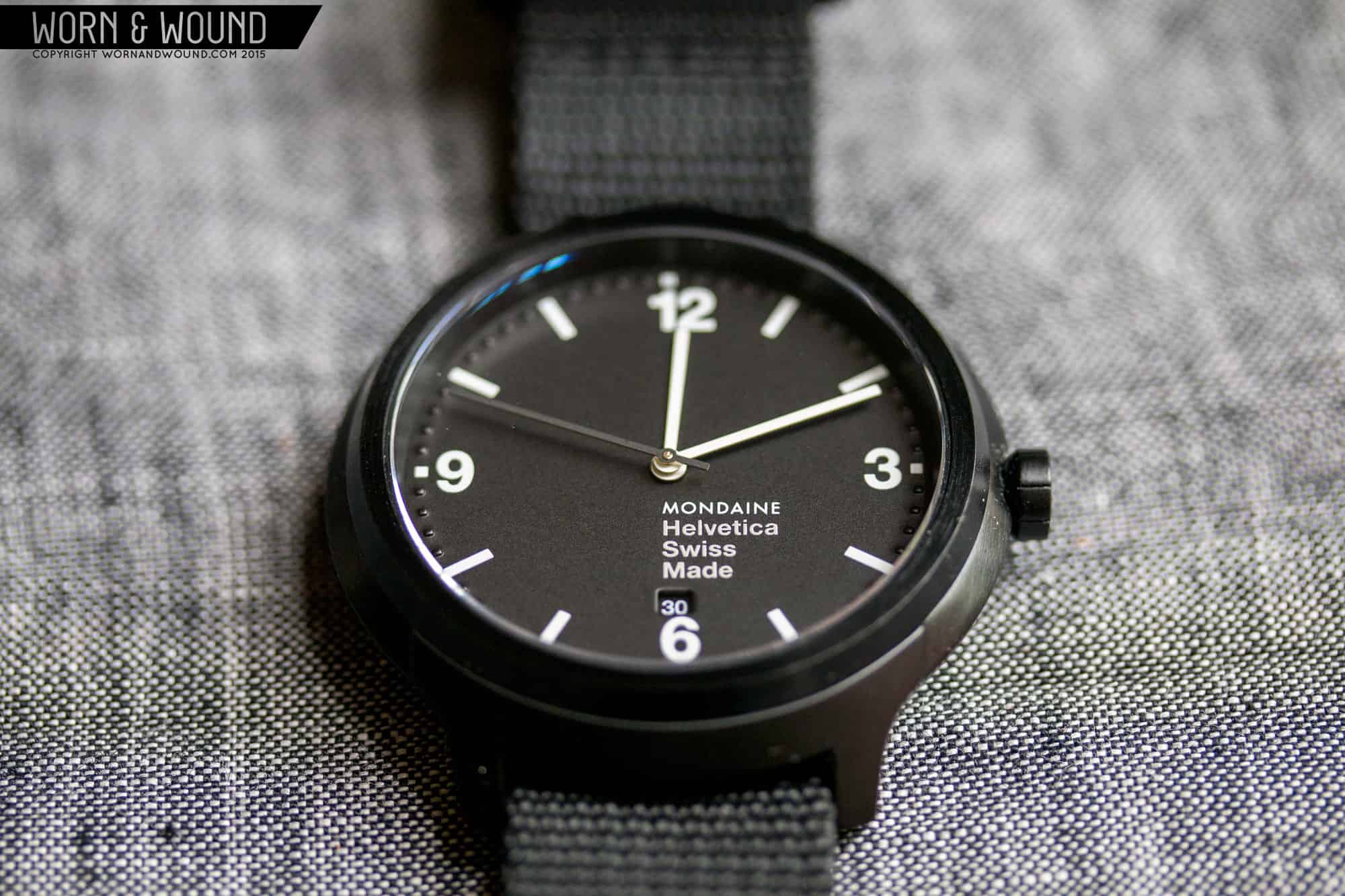
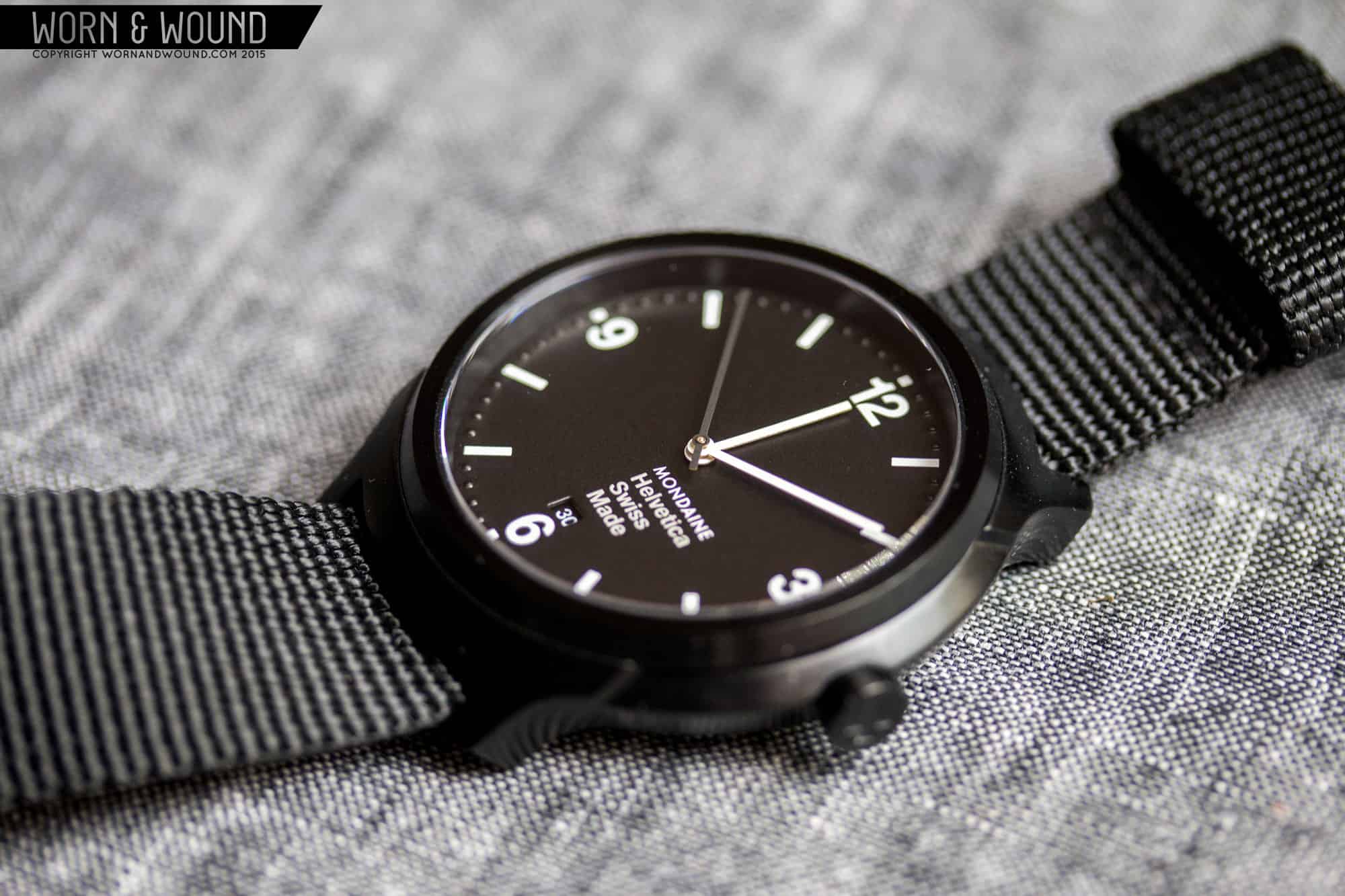
The Bold was really the most surprising of the group. Utilizing an “explorer” layout of 12, 3, 6 and 9, the numerals are not only bold, but quite large, giving them a lot of impact. The surrounding index also has a curious execution. The large rectangles are printed, balancing the numerals, but the dots are actually dimensional peaks, pushed up through the dial, and in the same color. As such, they are just texture, playing with the light, and at times are almost invisible. This puts a lot of emphasis on the numerals and rectangles, but doesn’t leave the space open either. It’s a cool and unexpected detail that simply looks good.
While still clean and minimal in a fashion, the Bold is…well, bold. It lives up to its own name, so it’s not sparse or empty. Rather it is quite energetic and even sporty. Combined with the larger case, which was PVD on our sample, and a nylon strap, and it also felt pretty masculine. This wasn’t as much of a “design” watch as a some sort of modern twist on something tactical.
Straps and Wearability
There are a plethora of strap options with these watches, and once again we got to try a few. The brushed gold Light was paired with a tapering 18mm black leather strap. This is the obvious choice for the design and looked right. On the wrist, the Light wears small. Though 38mm would be large for a vintage dress watch, for a modern one it’s just fine, but the sparse dial, thin case and quartz movement make the Light feel smaller than it is. To be honest, the gold on the sample kind of throws me off, as I’m just not a gold person, and I can’t help but feel like it’s a bit too feminine for me. The steel case version with milanese would probably be a very different experience.
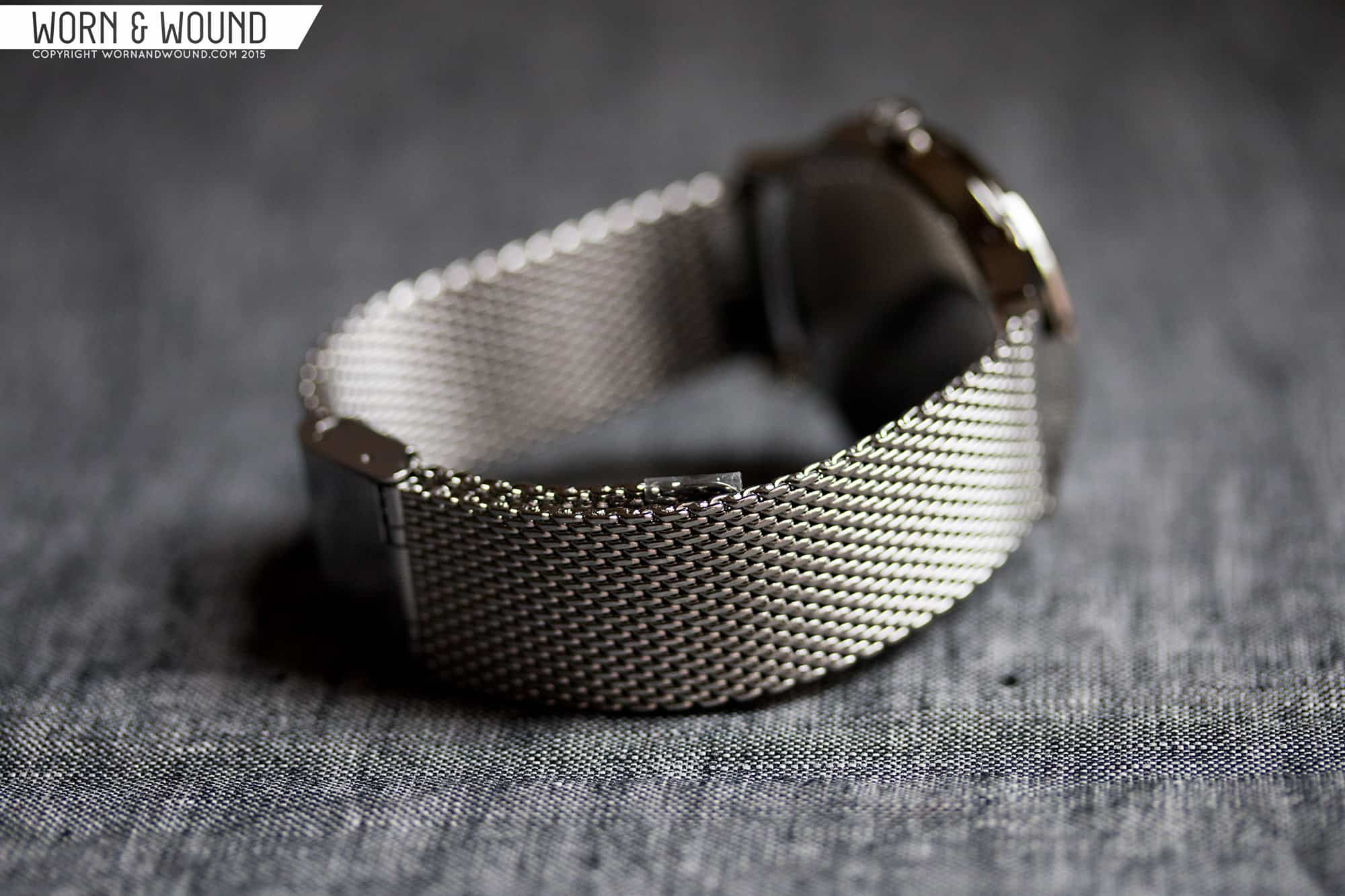
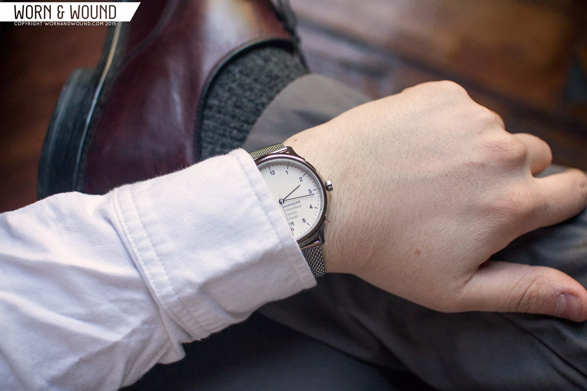
The Regular was my favorite to wear, as it pleasantly sits in the middle size wise, has enough presence but not too much and looked good with whatever I was wearing. The sample I had was fitted with a 20mm milanese mesh, that worked very well with the polished case. It gave the watch a bit more of a stern, architectural feel, but that’s something I like, so I enjoyed it. It’s just such a clean and almost strict watch, like it’s some sort of government issued civilian model, that I found it added a sense of structure to an outfit. I usually go with more rugged watches on worn-in leather, or vintage dress/casual pieces that wearing something almost sterile had an odd appeal. This is definitely a watch you can pull off more formal attire with as well.
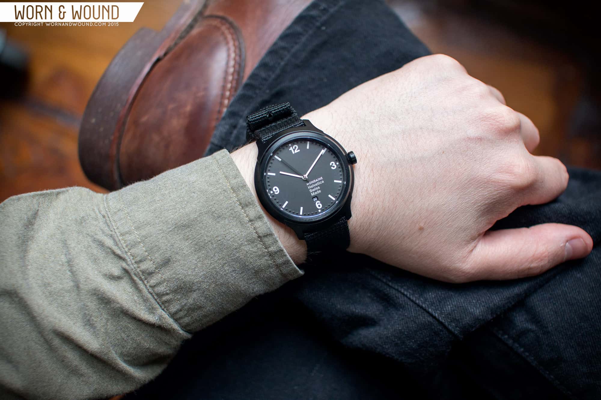
The Bold in PVD comes on a pretty cool strap. It’s a heavy, but soft 20mm black nylon pass-through strap that has wide nylon keepers. At 43mm, the Bold is decently large, though the proportions of the case, and the black coating, make it wear a bit smaller. Nevertheless, it’s substantial giving it an aggressive presence. It ends up feeling like some sort of military or pilot’s watch, rather than a museum watch, or a watch that is about a typeface. And that’s not a bad thing, as I think this could have a wider appeal. This version was definitely on the casual side of things, looking good with jeans, boots, etc… The white dial version that comes with a leather strap, though I didn’t test it, looks less aggressive and more “designy”, so that might be the best model for someone looking for this size and dial, but less aggressive overall appearance.
Conclusion
So, did Mondaine do it? Did they make another icon? Well… only time will tell. The watches certainly are successful in their own right, the concept is great and the execution is decent as well, but they wont become icons overnight. Mondaine has a long battle ahead, where they need to keep the watches relevant and top of mind for many years in order for them to become as recognizable as the Swiss Railway watch. To that end, I wonder if having multiple versions will help or hinder the process. Perhaps if it was paired down to just the Regular, then that one model or type could be put at the forefront until they catch on.
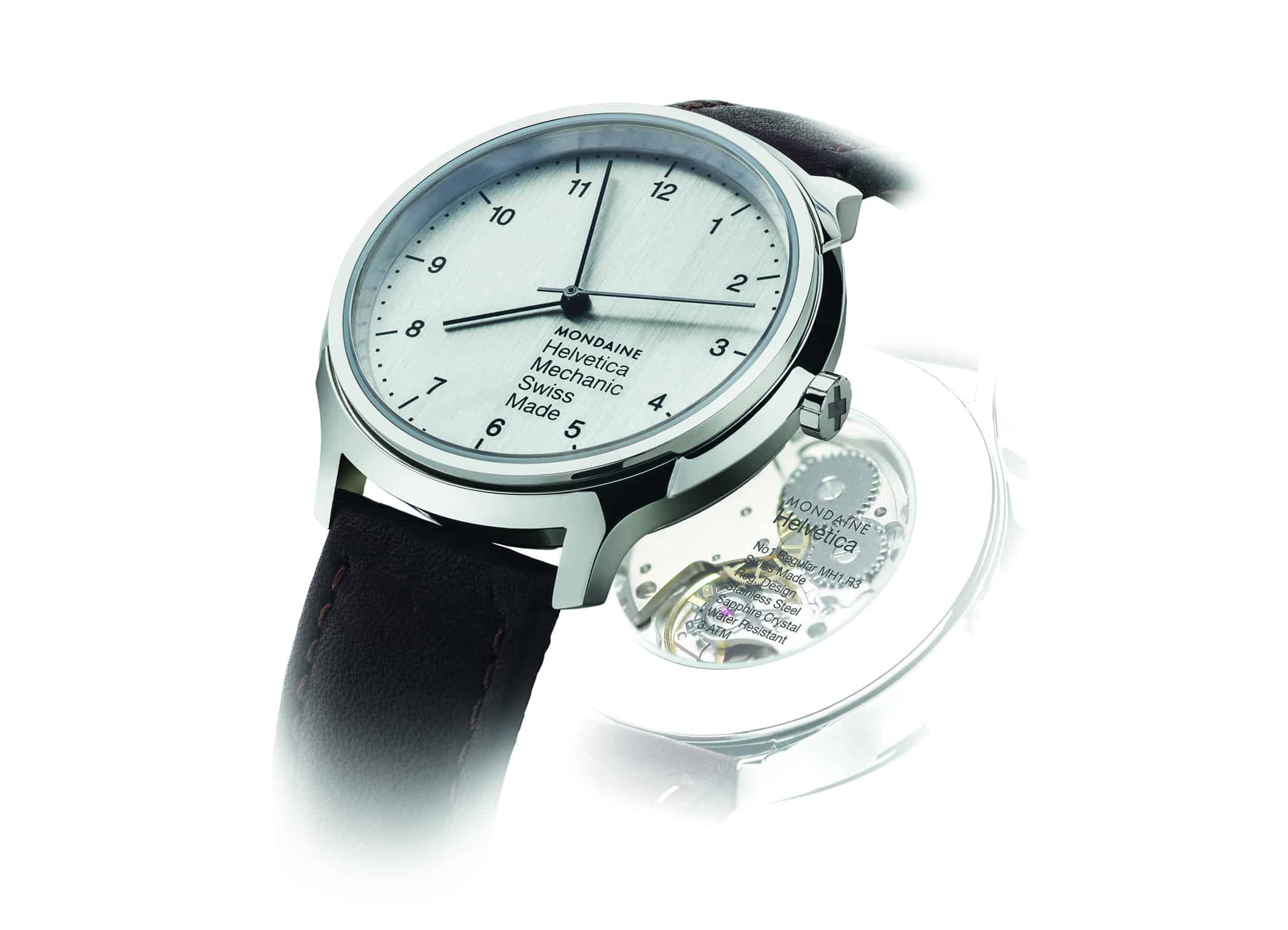
Currently all of the watches are quartz, which is to be expected, but mechanical versions are planned, at least for the Regular model. There is a hand-wound model debuting this fall that is presumably powered by an ETA 2801. Pricing TBD, but that’s a model I could seriously see owning. There is also the seriously cool “Smart” version that uses the MMT platform, which I talked about a few months ago. That takes the Bold model, and adds a sub-dial for date and health tracking. The additional sub-dial really does it for me, making that easily the nicest looking health tracker on the market.
Pricing of the current models ranges from the upper two hundreds to the mid fours. The Regular and Light models as tested both go for $380 while the Bold PVD goes for $420 from Twisted Time. This puts them on the high side for a quartz, but the price is to be expected considering they are Swiss-made and available at retail. I look forward to seeing how Mondaine continues to develop the Helvetica watches, and make them a new classic. There is a lot of potential, but at the moment, while very likeable, they are not at a point to contend with the like of Max Bill’s or even their own Railway watch.


