


 Featured Videos


Most brands that seemingly come out of nowhere tend to take a subtle approach to their entry into the watch market. An ad here, a viral campaign there, but not usually a full on marketing assault. Well, Bomberg, whom we ran a brief intro to not long ago, appeared out of the void and isn’t taking a back seat on building brand awareness. In Basel this year, though they were not in one of the official halls, Bomberg managed to obtain adverts all over the city, including a full wrap around some of the trams that lead from the main train station to the BaselWorld convention center. And with one look at their watches and marketing materials, which include aggressive maxims and photos of tattooed boxers, you can tell that subtlety is not in their brand DNA.

Yet despite this go-for-the-jugular approach, Bomberg does not plan on being available in the US in the near future. In fact, their current primary focus is on distribution in Central and South America. So, if you happen to live in the states and fall in love with the watch in the review to follow, sorry buddy, but you’ll have to find a creative way to get your watch. That being said, non-US distributed watches do tend to show up on watch forums from time to time if the watch is popular enough.
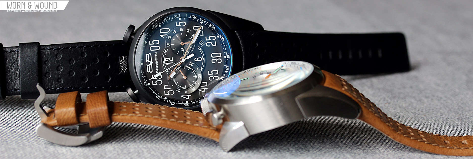
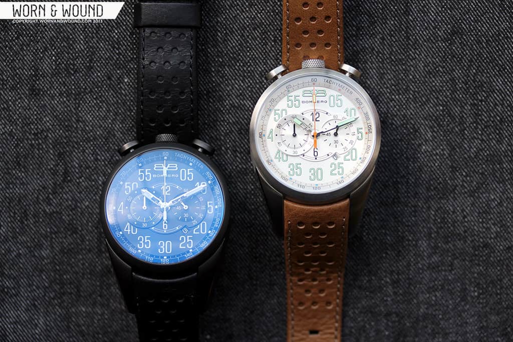
Anyway, none of this would matter if the watches were dull, and I can assure you, love it or hate, the 1968 is not a dull watch. This vintage inspired bullhead chronograph is one of the most aggressive watches we’ve come across, with a case design that is utterly unique and a dial that seems like it belongs on the dash of a muscle car. Bomberg sent us over 2 version of the watch to take a look at, a steel version that runs $625 and a PVD version that goes for $675. Both feature Miyota OS11 Quartz chronograph movements, domed mineral crystals with sapphire coating, leather straps and not even a drop of modesty.
 Case: Stainless Steel / PVD
Movement: Miyota OS11 Quartz Chronograph
Dial: Silver / Black
Lume: Yes
Lens: Domed Sapphire
Strap: Leather
Water Res.: 100m
Dimensions: 44 x 54 mm
Thickness: 15 – 18.5mm
Lug Width: 22 mm
Crown: 8 x 3mm
Warranty: NA
Price: $625 – $675
Case
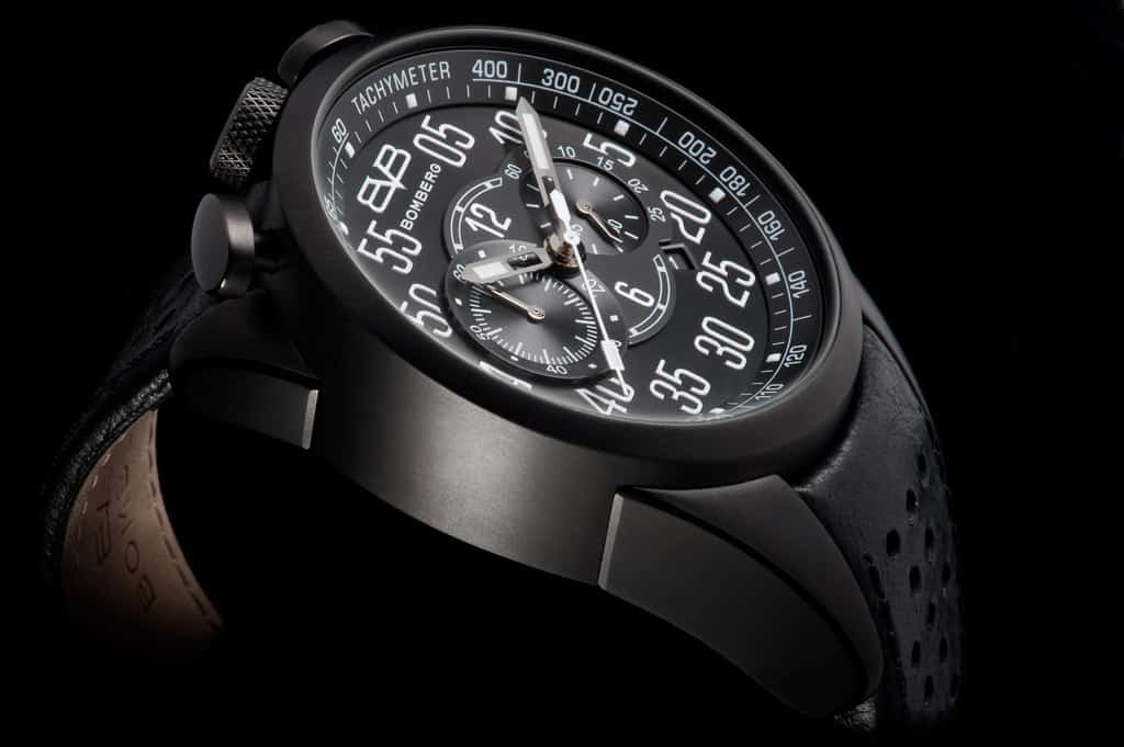
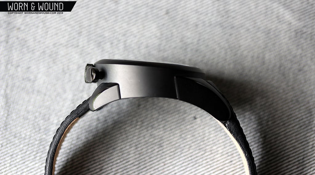
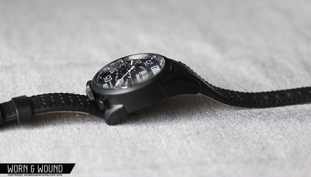
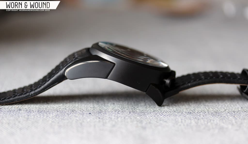
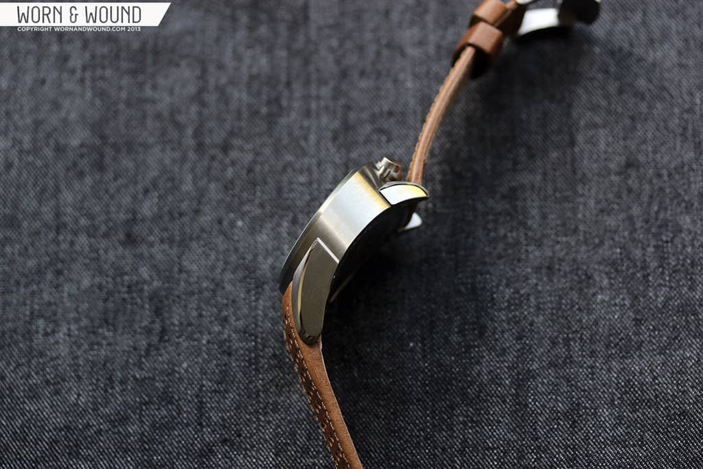
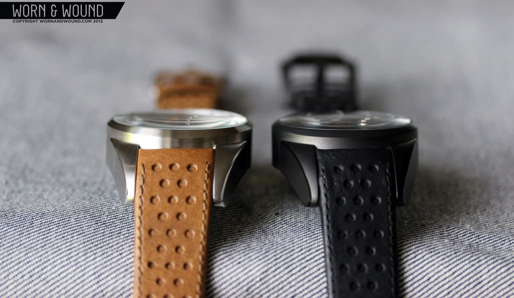
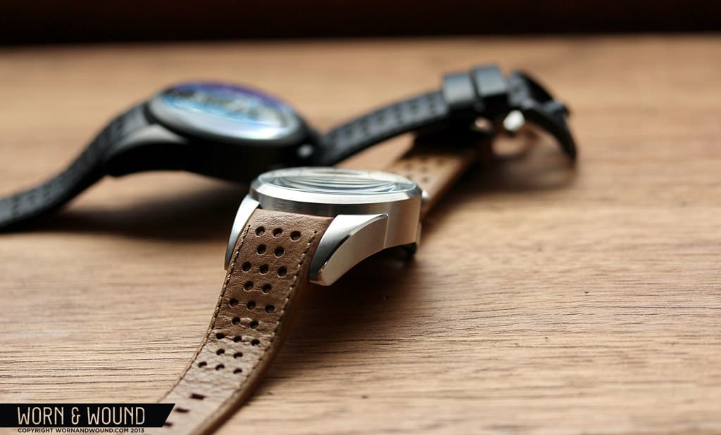
When you first see the 1968 there is a moment of confusion. You see the somewhat classic shape (cylindrical center with lugs on either side) but the proportions are all off. The top lugs are stubby and the bottom lugs are wildly long. The crowns are on top and the dial seems to lean towards you. Take a look at it from the side and things only get weirder, as the line of the bezel is at about a 10 degree angle from where you expect and the bottom of the case and lugs have a single continuous curve that looks more aggressive than aesthetic. It’s as though the watch was filtered through a Dalí painting, where it melted and distorted.

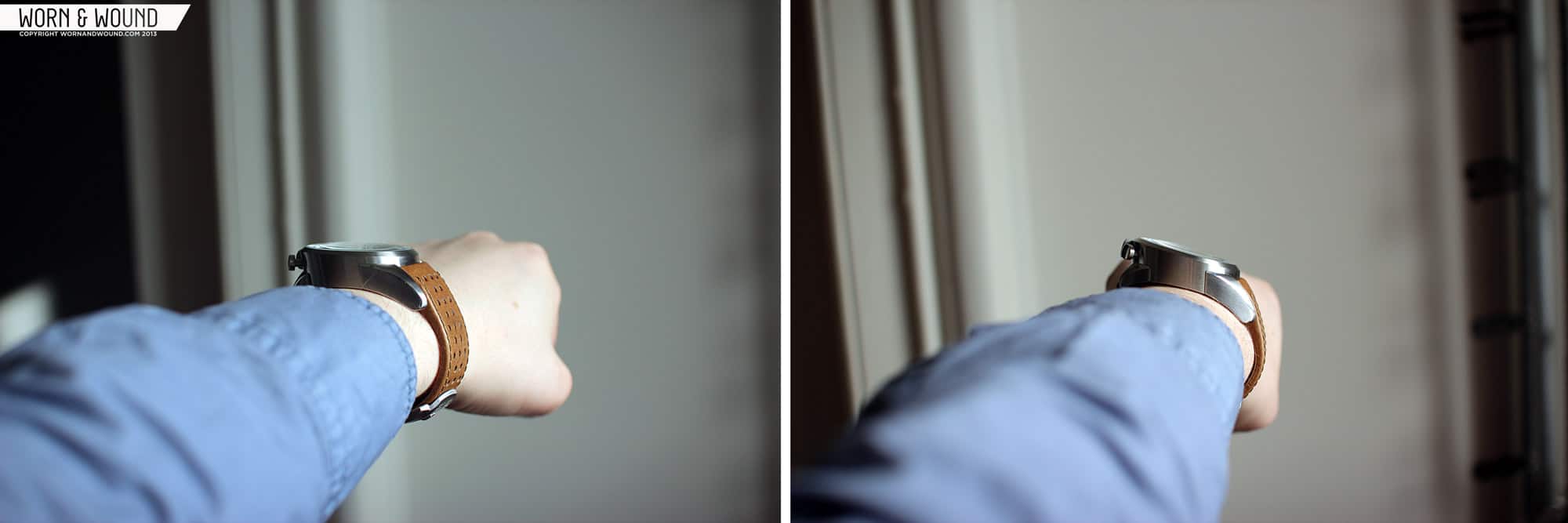
In fact, the watch doesn’t really make sense until it is on your wrist. Only then do you realize that the bizarre case design is about fitting the watch on your wrist. The curve on the bottom allows the watch to hug your wrist tightly, the angled dial allows the wrist to be turned less in order for the dial to be seen and the snubbed top lugs allow for easier access to the 12 o’clock mounted pushers.
For those new to the concept, this is called a bullhead, which as the name of the watch indicates, was a somewhat popular case design in the mid to late 60’s and perhaps into the 70’s. Brands such as Omega, Tissot, Seiko and many more had (mechanical) bullheads in their lines that were often inspired by motorsports. There currently seems to be a trend towards this design as several brands have released bullheads this year, including Omega and Tag Heuer. The cool thing about a bullhead is that if you take the watch off your wrist, you can hold it in your hand and use it like a stop watch. Bomberg did a great job implementing this by allowing for the half of the strap that attaches at the top to fall away easily. Other than that, they are just very unique and often a bit bizarre.

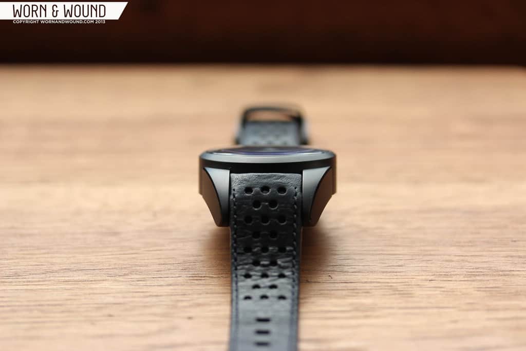
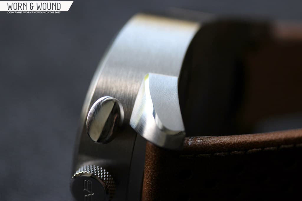
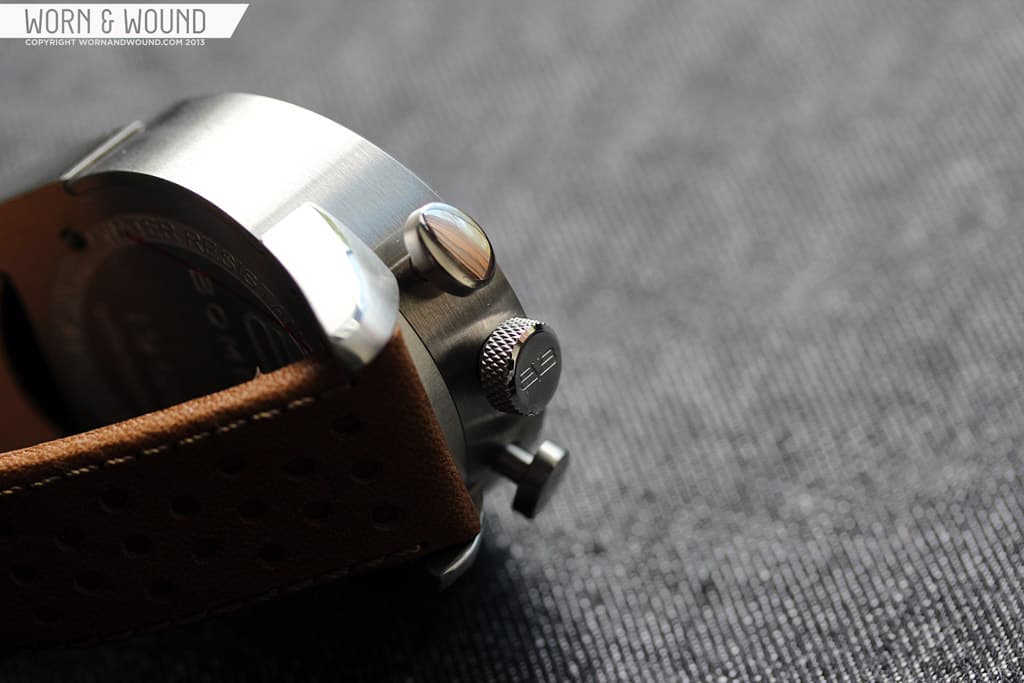
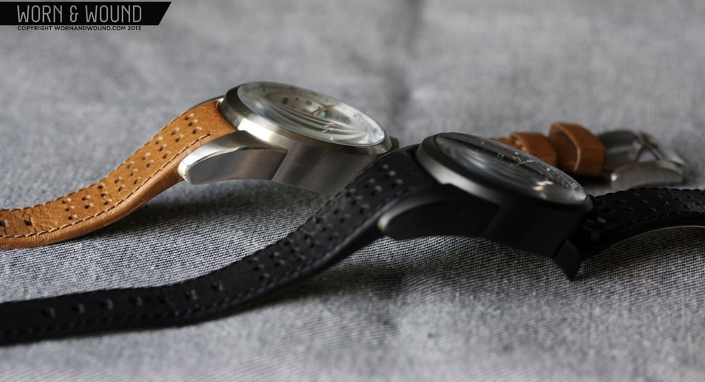
The case itself measures 44mm in diameter, 18.5mm at its thickest point and 15 at its thinnest. The lug-to-lug is 54mm, but that is a bit deceptive as the asymmetrical design and dramatic curvature of the case bottom makes it wear differently than other watches, so it seems shorter than 54mm. The watch also features a 22mm lug width, though given the design, I think you’ll only be able to use Bomberg straps on the watch. The case has minimal finishing on it. Perhaps this was smart as anything additional could just drive the case over the top, but I felt that there could have been more done. The watch features beveling along the edge of the lugs, which is nice, but the big slab of steel that is the side of the central case felt too unadorned.
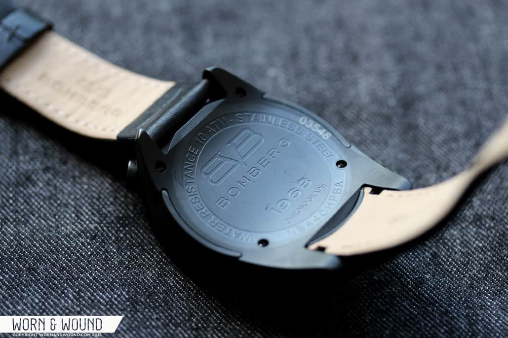
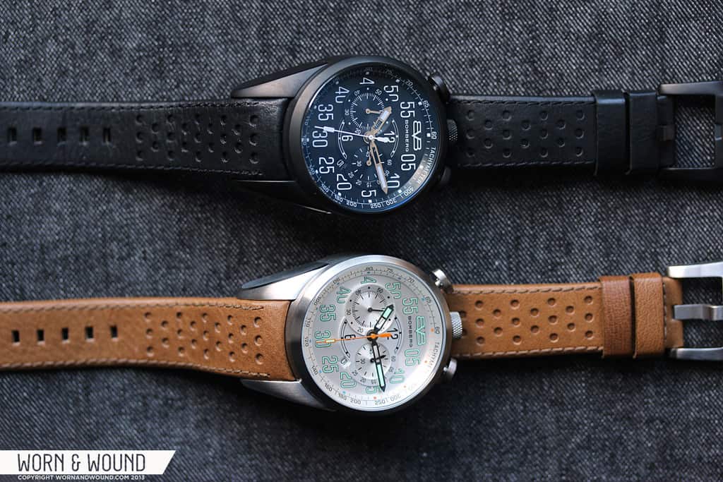
The case assembly is actually very interesting in that the lugs are part of the screw in case back rather than the central case. Thus, it seems as though it would have been possible to have differing finishes between the two. That being said the matte black PVD model felt more complete. The PVD, which is well applied, gives the wild curves of the watch a meaner and more aggressive feel. The steel version feels very closely inspired by automobiles, but the PVD version has touches of fighter jets and stealth helicopters.

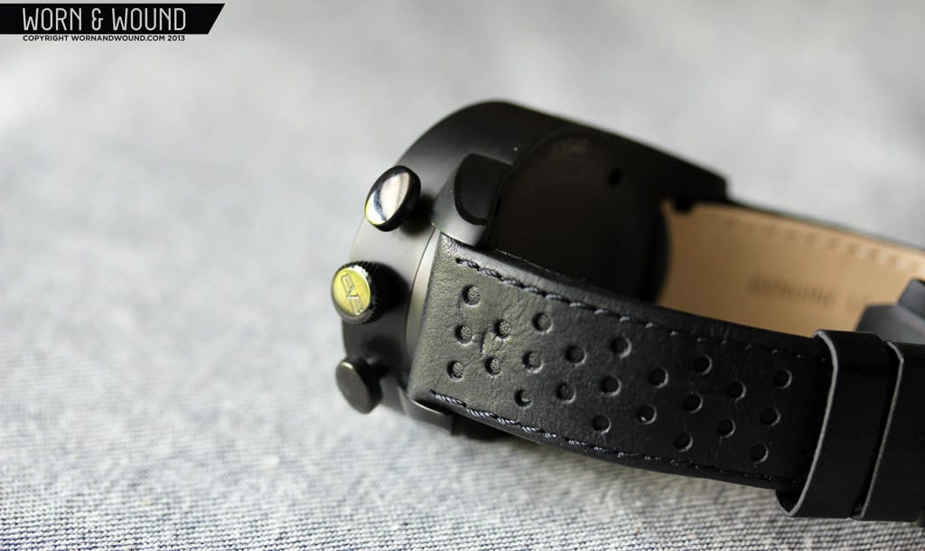
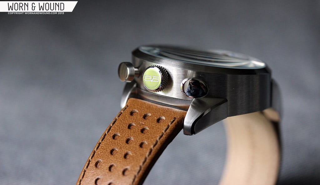
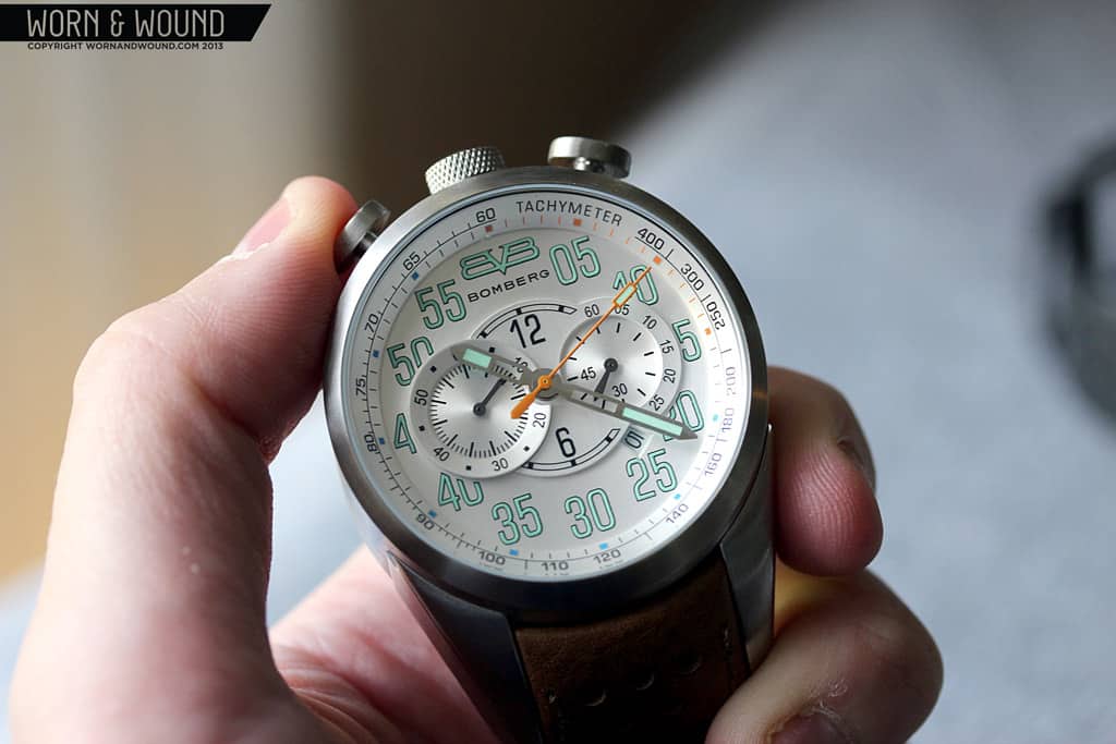
The crown at 12 has a nice knurling to it that is both attractive and allows it to be more easily grasped and a Bomberg logo on top. Part of me wishes it were screw-down, given how exposed the crown is and that you are unlikely to use it often as this is a quartz watch. The chrono-pushers at 11 and 1 are both oval shaped, polished on top and satin on the side. They suit the look of the watch, but they don’t feel as sturdy as the rest of the case. Though this likely has more to do with the movement, the pushers do not have a satisfying click when engaging, pausing or resetting the chronograph.
Dial
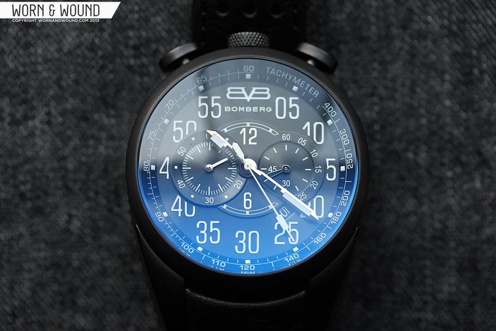
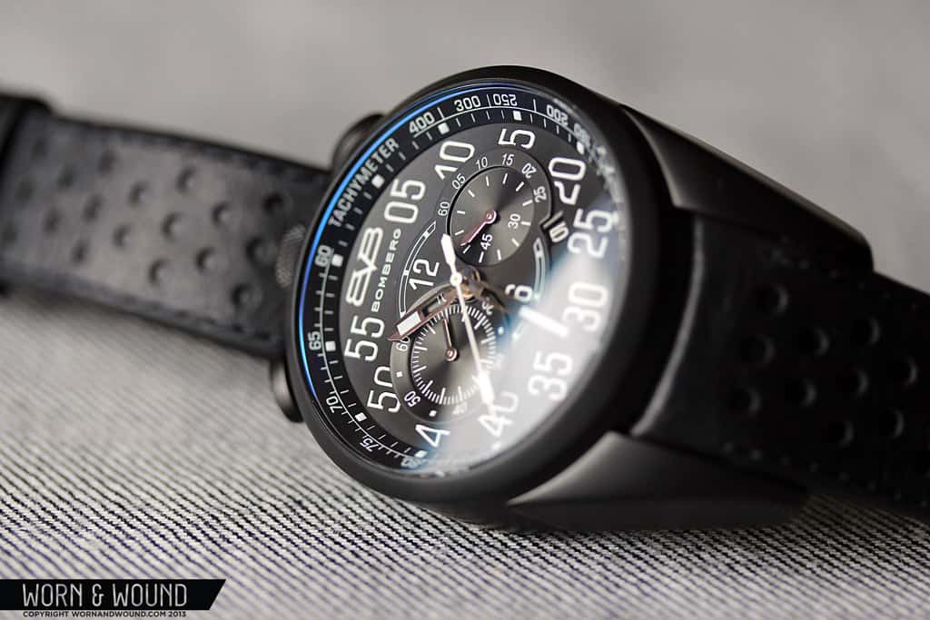
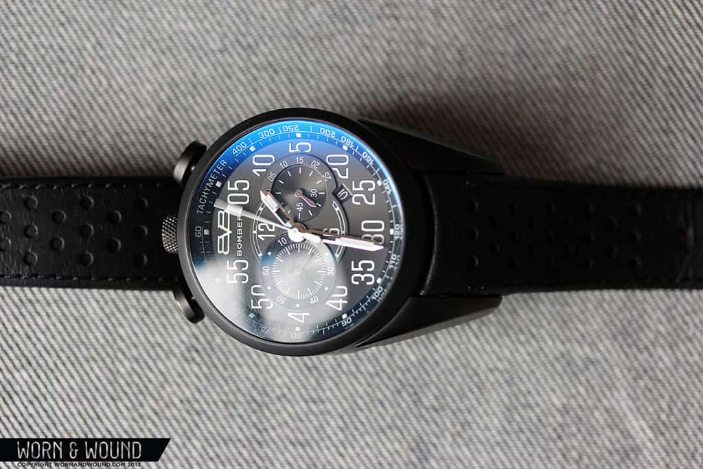
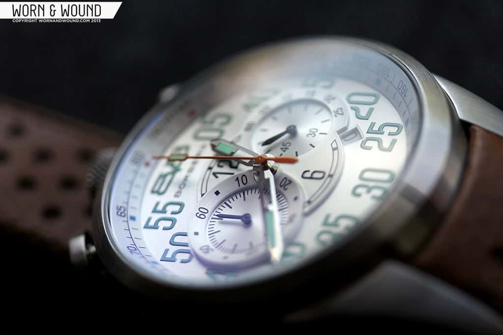
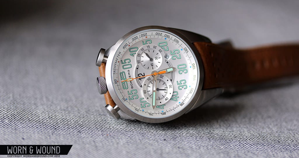
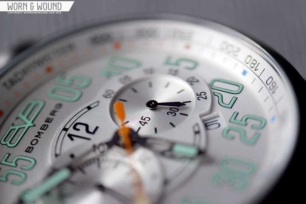
Once you get past the case, if you are capable, you can move on to the dial, which offers yet another slew of intriguing elements. At a glance, the dial of the 1968 is without a doubt very busy. In fact, that tends to be the first thing people say when they see it. The primary index, which is focused on minutes/seconds, consists solely of large digits in a strong font, and a large Bomber logo at 0/60. This index immediately calls to mind tachometers and other dashboard gauges. While the digits are a bit oversized, I don’t think they would work smaller. This is an aggressive watch by nature, and anything delicate would look inappropriate in contrast to the case design. On the periphery of the dial is an angled chapter ring that displays a tachymeter, also reinforcing the racing theme.

Moving to the center of the dial, things get quite interesting. Rather than simply printing the sub-dials on the main dial, or impressing them in, they added a molded plate with various textures and surfaces to create something more dynamic. On the 3 o’clock side, you have the active seconds hand which sits within the plate, under the highest surface. The index for the seconds is broken up in a strange way, where 60 – 25 are outside of the inner dial, but 30 and 45 are within. On the 9 side is the 60 minute chronograph totalizer. Unlike the rest of this plate, the index of this dial is on angled ring. This visually distinguishes it from the rest of the dial, which helps with visual organization.
On the center of the plate is a partial hour index. They designed it to basically look like the hour index was there, but that the active seconds and 60-minute totalizer cut through it. The partial index has numerals for 12 and 6 and marker 11, 1, 5 and 7. It’s not a particularly functional index, and perhaps adds to the sense of business, but I imagine without it the center would have felt bare. One very nice detail on the dial is the placement of the date window. It is nested under part of the curve of the active seconds dial. I honestly didn’t realize it was there until I examined the dial closely, which is nice as it manages to be a discreet functional element.

The hands of the 1968 are strong and masculine without being over the top. The hour and minute hands are straight sword style, which are half skeletonized/ half lumed and the active seconds hand is a small steel roman sword style without lume. The chronograph seconds is a straight stick hand with a rectangle of lume towards the tip. On the steel model this hand is orange while on the PVD model it is white. Lastly, the 60-minute totalizer hand is a very simple straight sword of polished steel. There is lume present in the main minute/hour index, on the minute and hour hands and on the chronograph seconds counter. All in all, the lume is pretty weak on these watches. One interesting thing, however, is that on the steel watch the lume is pale green while on the PVD it is pale blue.
Movement
 The 1968’s are fitted with Miyota OS11 quartz chronograph movements. This is a simple bi-compax chronograph movement with date and a stated accuracy of +/- 20 seconds a month and a battery life of approximately 3 years. In my time of using the watch, I experienced no issues with the movement in terms of loss or gain of time. While I understand the necessity to use a quartz chronograph on a watch in this price range (yes, I do wish they would use a SeaGull ST19 on this, but that is unlikely to happen), I do think that with the existence of mecha-quartz movements, such as seen on the Techné Sparrow Hawk II, there are better options that would make the chronograph more functional. Also, as stated before, the watch doesn’t have a satisfying click when engaging or resetting the chronograph, and actually has no click when pausing.
Straps and Wearability
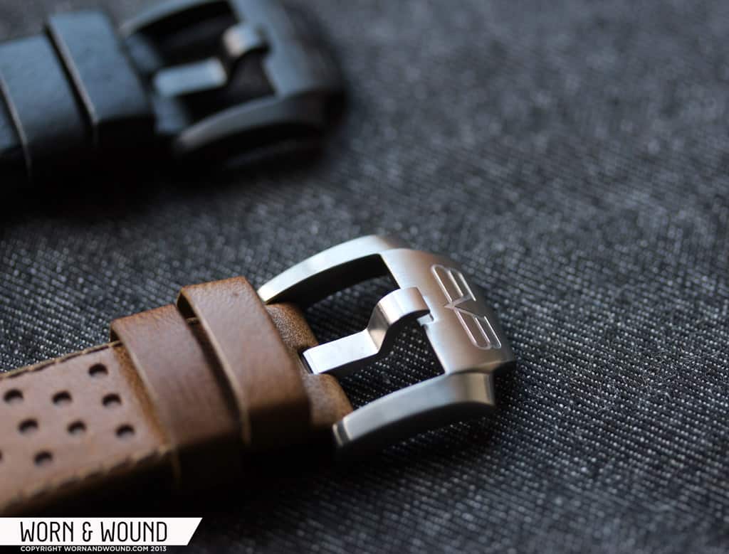
The 1968s come mounted on very nice rally style straps that are designed specifically to fit this watch. The leather is very soft and comfortable, and the construction seems to be good. An interesting detail of the straps is that rather than perforating all the way through to get that telltale rally strap look, they did a perforated top layer only. This definitely gets the style of a rally strap across, but has its own unique character as well. Both straps are also fitted with a Bomberg buckle, which is beautifully designed. It’s a fairly chunky buckle with some interesting flared curves and tapers. However, the nicest thing about the buckle is that when the watch in on the wrist, the buckle sits flush against the strap, continuing the natural curve of the leather.

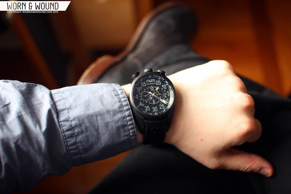
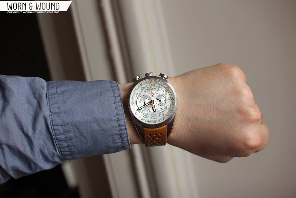
As I had said before, the watch doesn’t really make sense until you put it on. When you strap the watch on, you realize that the form is driven by the shape of the wrist in a very literal way. The contour of the bottom of the lugs and caseback wraps around the wrist, gripping it tightly. The shorter top lugs and longer bottom lugs make the dial and bulk of the case sit off center, towards the top of your wrist when looking at the watch. As such, the weight of the watch is in a strange place that makes the watch feel like it is going to rotate over the side of your wrist. The contoured case, however, keeps it in place.
While I appreciate the intention here and certainly the effort to do something different, I did not find it particularly comfortable. It is hard to ignore the sensation of the watch touching so much surface area of your wrist, and the off center weight makes it feel like it is going to slip over the side of your wrist even though it isn’t. That being said, like a very heavy dive watch, it is possible that you will simply get used to that feeling after a couple of days/weeks. It is also entirely possible that you simply will not have the same reaction I did.

Apart from this, the watch is pretty wild looking when on your wrist. First off, it’s very big and tall. At 18.5mm at the top edge, this watch towers on the wrist. The long, fang-like, bottom lugs are striking to say the least, and the generally dramatic asymmetrical tilt of the dial gives the watch a strange profile. And that’s not to say it’s bad looking. In fact, it’s pretty awesome, if it’s a look you like. Wrist presence doesn’t quite describe; wrist shock is more apt. This isn’t a watch for those who don’t like to be noticed. It’s a conversation starter and a design that elicits strong reactions. I
In steel, the colors and tan strap give the watch a somewhat lighter and softer appearance. Though there is nothing vintage about the shape and feel of the watch, the mix of pale green, orange and silver does emote a 60’s aesthetic. Conversely, the matte black PVD is mean and modern. The black makes it much sleeker and seemingly a drop smaller. It’s hard to say which is more appealing. On one hand, I find the colors of the steel version make it more wearable with a normal outfit. On the other, the attitude of the black version is hard to match.

Conclusion
The Bomberg 1968 isn’t a watch for everyone. It’s a love it or leave it design that doesn’t compromise on its boldness. It’s big, dramatic and kind of crazy looking. Frankly, it’s a good thing that it’s polarizing, that means the design was pushed far enough. Whenever brands try to please everyone, they end up with something a touch bland. The 1968 is anything but. As far build and execution goes, for the most part everything is spot on; the dial is clean and sharp, the case is rugged. The crown and pushers leave a bit to be desired and I do wish they had mixed up the finishing a bit on the large slab sides of the case, but that’s not a deal breaker.

For $625 and $675, these are pushing the limit of what a quartz chronograph without special functionality can cost, but you can clearly see and feel the value in other areas. That being said, as I had mentioned in the intro, Bomberg has an aggressive marketing campaign in the works and these prices are retail, so they actually are lower than what many other brands would charge. Either way, they’re not available in the US currently, so don’t run to your local store to pick one up.
Lastly, it’s worth noting that they make 39mm and automatic 3-hand versions. I had a brief chance to see them in Basel, and yes, the 39mm is more tame and more suitable for thinner wristed individuals. The automatic version, which is powered by a Miyota 8215, keeps much of the same aesthetic, though is a drop more tame since it lacks some of the sub-dials.
By Zach Weiss

I love, are they planning a auto version?
Yes! Actually, there already is one though it is not a chronograph… I updated the last paragraph to include a link and some details.
That is one seriously over-compensating watch.
Interesting asymetrical side profile though.
I like the look of the case and how it looks on the wrist but the main thing is where can i buy it. So far i had no luck finding online retailers.