


 Featured Videos


Occasionally we come across brands that challenge the notions we have regarding watches and value. In the conversations we have, it’s easy to overlook perhaps one of the most critical aspects of any watch, and dismiss it as not being a core value adder. That facet of a watch is simply design. A general term unto itself, this includes everything from the fine details to overall aesthetic to branding. It’s so easy to get caught up in what movement is inside, what material is X or Y, we overlook that a watch’s design might be derivative or a bit generic. We strive to look at an eclectic array here on w&w, but how often do we relate a detail to something from another watch, another point in time? Don’t get me wrong, that approach has great value as well and I often love many of those watches, but isn’t there and implicit value in something new? In the process of getting there?

This is what intrigues me about Bravur Watches of Sweden. Founded in 2011, their first line of watches became available last fall. Consisting of five models built off of the same DNA, they are rigorously detailed and crafted, yet modern and restrained, in the vein of Scandinavian design. Founder Johan Sahlin and Magnus Svensson are both industrial designers who felt that too many contemporary watches looked the same, by brands lacking unique identities. Furthermore, that too many watches were inspired by the same masculine roots; cars, planes and technical pursuit. Instead, they wanted to create watches that spoke to a modern, urban lifestyle, with materiality that exudes luxury.
To that end, they created Bravur, which from the logo alone speaks to a different style. More of what you’d expect for the cover of a fashion magazine, the all uppercase type is a modern serif font with stems and cross bars that have been eroded, to create a bold and intriguing mark. The “A” and “V” are then reutilized as an abbreviated logo, which are found at various points through out the watch. The logo sets the tone of the brand and the watch, one that is sophisticated with a focus on aesthetics.
Before we get to the watches themselves, it is worth touching on what will certainly be a controversial point: the price. The Bravur watches start at $960 (shipped) and are powered by Swiss made Ronda 715 Quartz movements, which can be found in watches that cost far less. So, the logical question is, why do these cost so much? In their own words, the price “is based on the fact that the watches are exclusively produced in Switzerland in extremely low volumes”. As well as the fact that construction is quite complex (it is, we’ll touch on that later) and the material quality is very high (also true). The volume aspect is really significant in manufacturing. It’s easy to compare this to a Hamilton, whose Swiss made mechanical watches are similarly priced, but the difference in scale is tremendous. One brand is producing thousands of watches, the other a small handful… that changes things dramatically, especially when tooling is involved.

I have mixed feelings on this. On one hand, there is so much to like about these watches, as you’ll see, but being a high-priced quartz makes it feel like it’s a shell. Those of us with mechanical collections know that much of the charm and gravity of a watch comes from the beating heart within. It’s not solely, X costs more than Y, therefore an expensive watch should have X. And in the case of the Bravur watches they could cost more, have a mechanical, and not be scorned for doing so. In the end of the day, it comes down to the target market and audience. The Bravur watches sell at Barney’s, who have a clientele that are looking for style and luxury, regardless of cost and mechanical vs quartz doesn’t play into it. For us having a quartz movement is a large “but” in the conversation. The watches are gorgeous and unique, but…
Bravur Watch Review
 Case: Steel / Black IP / Gold IP
Movement: Ronda 715
Dial: Various
Lume: Yes
Lens: Sapphire
Strap: Leather
Water Res.: 5 ATM
Dimensions: 41 x 48.5 mm
Thickness: 11.5mm
Lug Width: 20 mm
Crown: 6 x 3.45mm
Warranty: 2 years
Price: $960+
Case
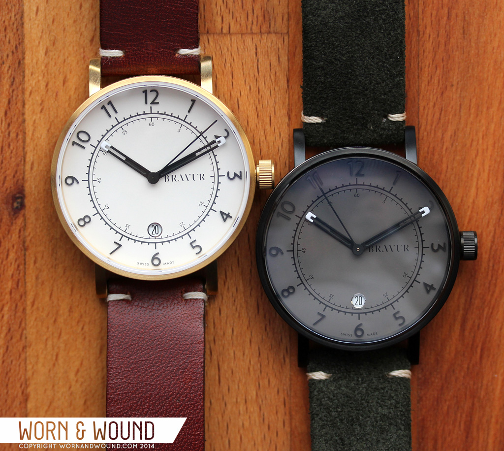
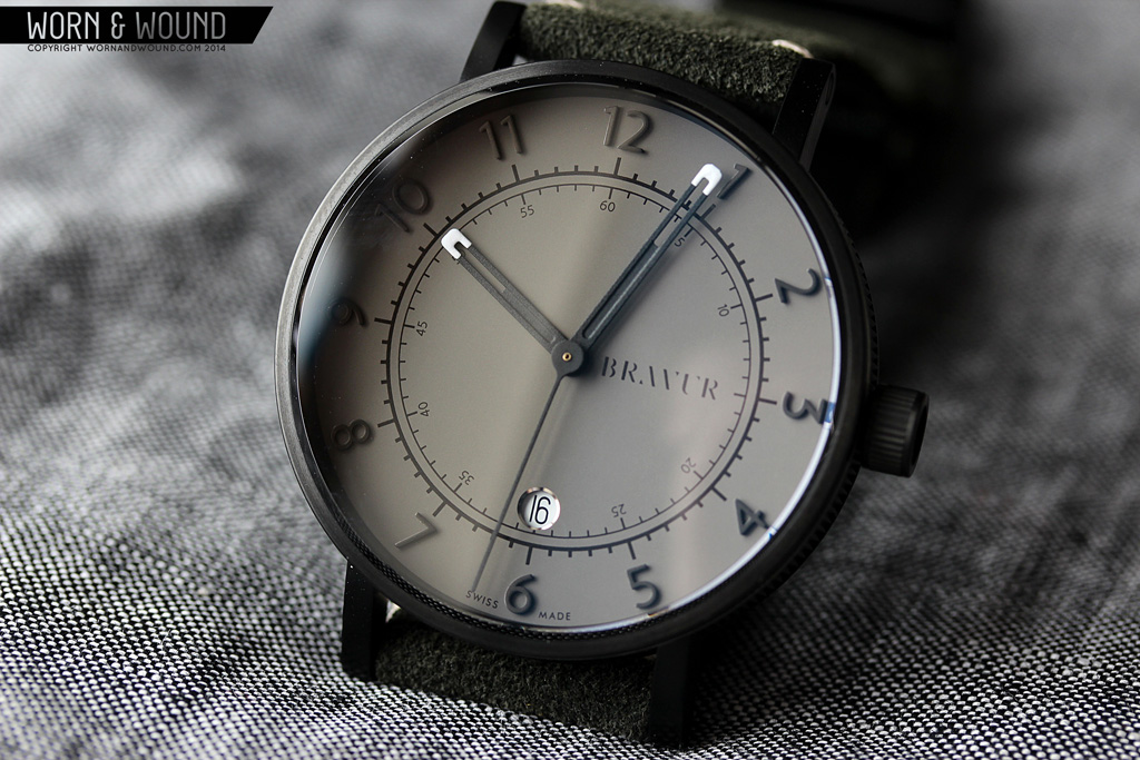
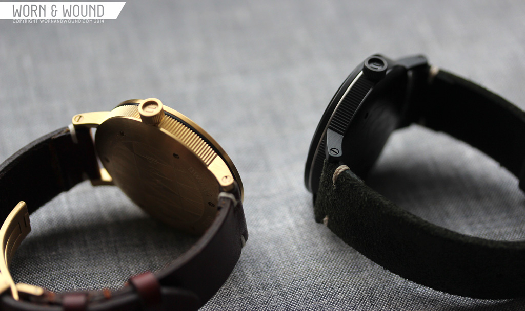
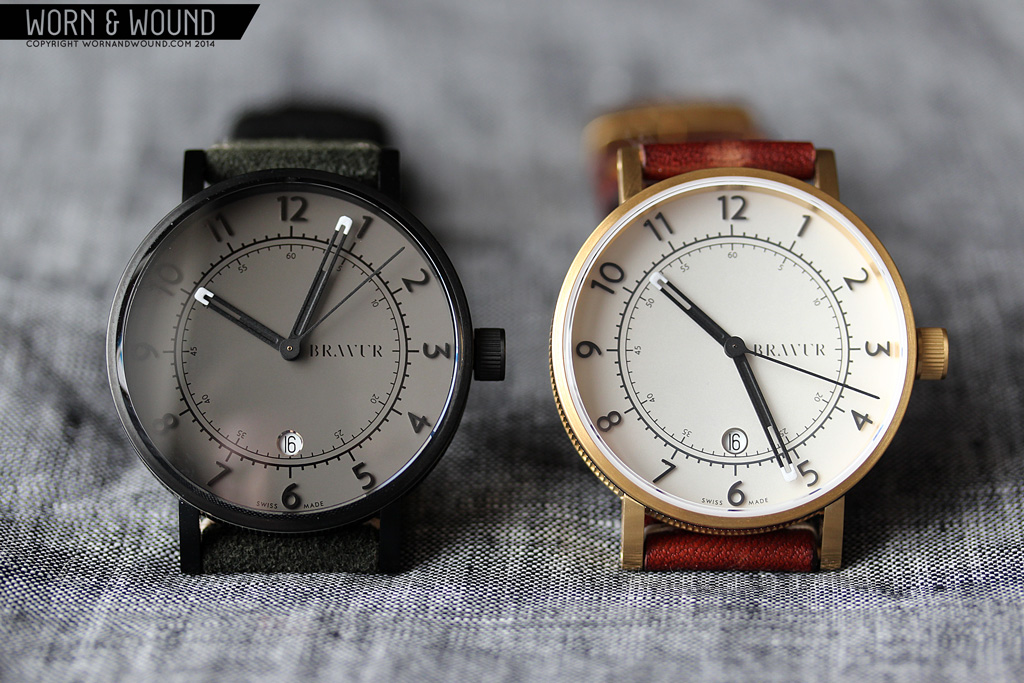
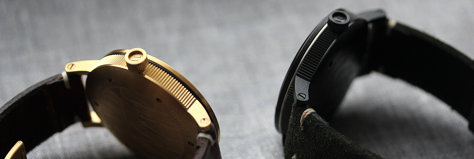
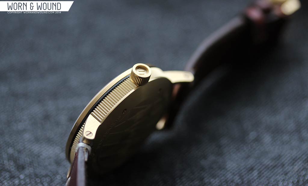
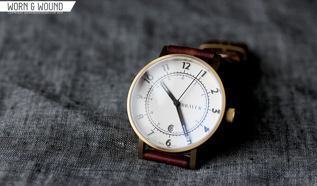
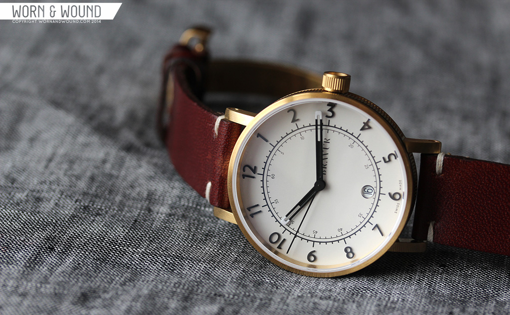
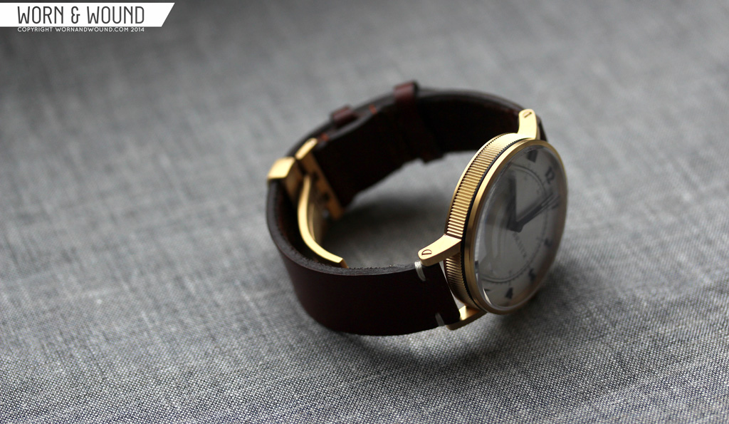
When I first took the watches out of their packaging (which is exquisite as well) I was struck by how elaborate and clever the case design was. I didn’t even get the watches on for several minutes as I poured over the little details of the construction, geometry and finishing. These are breathtaking cases; clearly the eyes and minds of industrial designers were at play. The 316L steel cases, one with black IP and the other with gold, measure 41 x 48.5 x 11.5 mm (to the top of the domes sapphire crystal). A size that suits a modern, medium/large casual watch.

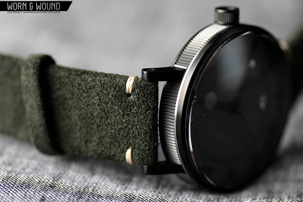
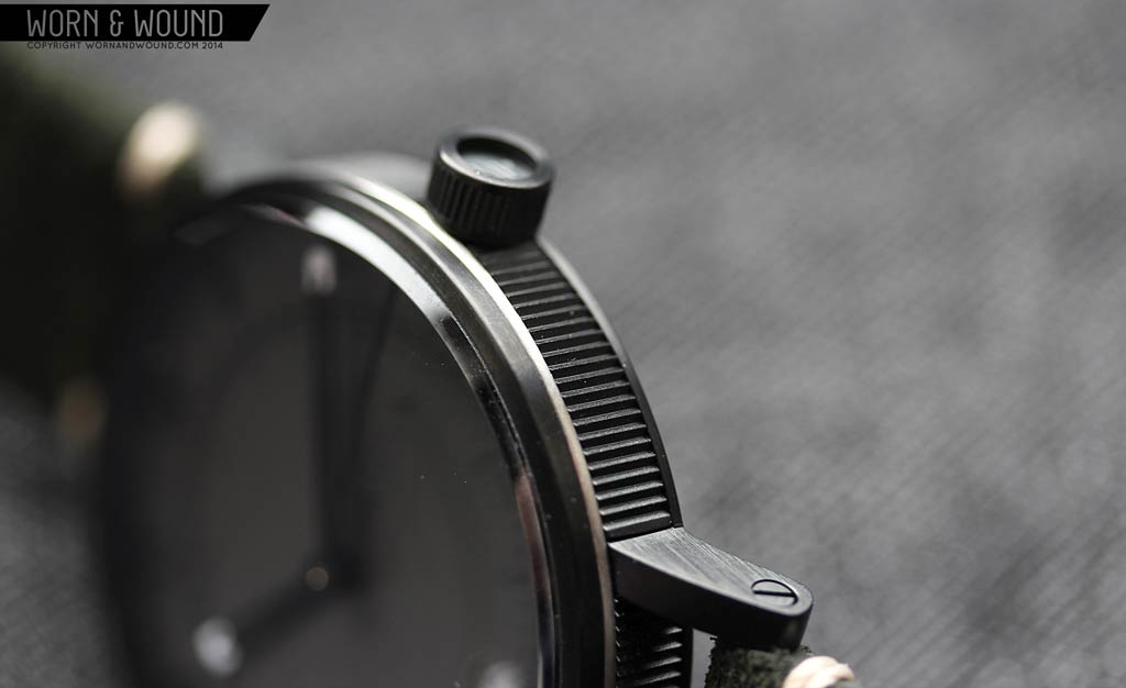
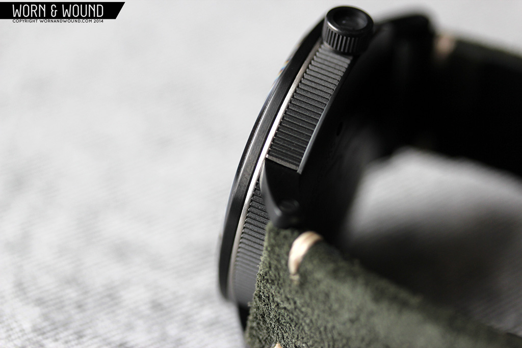
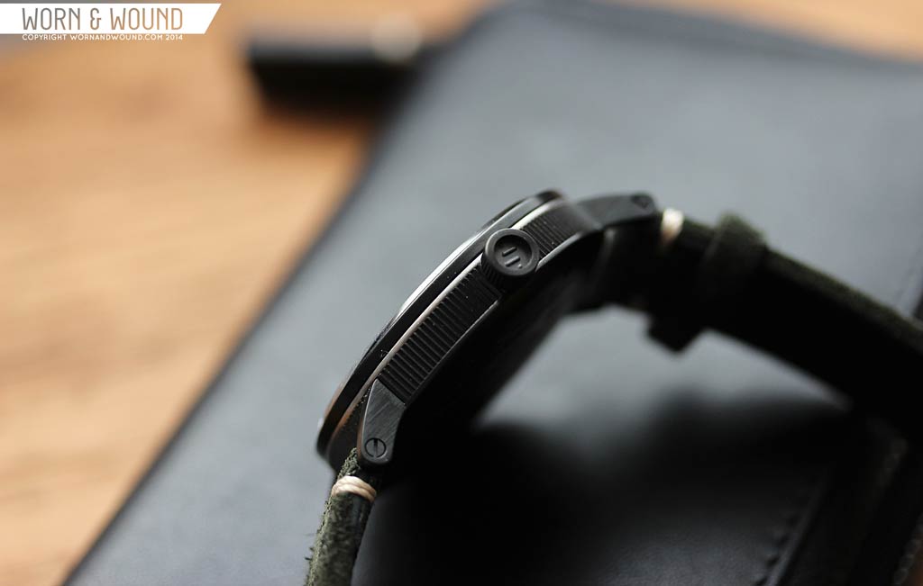
From above, the case seems simple with a cylindrical center and thin straight lugs, all attention focusing on the expansive dial. A slight angle reveals the sheer complexity of the design. A case in at least four parts; there is a case back that includes the lugs, a mid-case with a surprising texture, a contrasting ring (black on gold or steel cases, steel on black cases) and then a thin bezel. The sapphire crystal then steps up with a chamfered edge leading to a substantially tall dome, which playfully distorts the dial at oblique angles. Of off three is a 6 x 3.45mm push-pull crown that also has a multi-part construction.
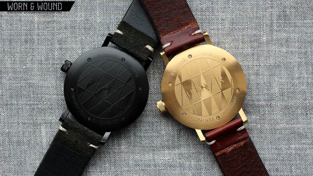
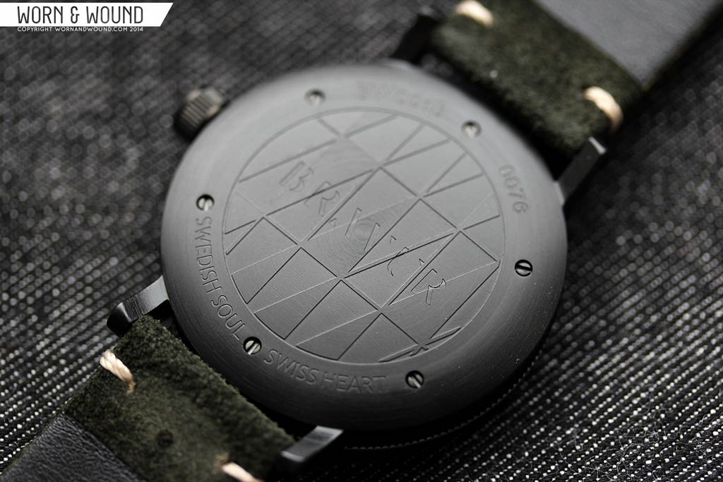
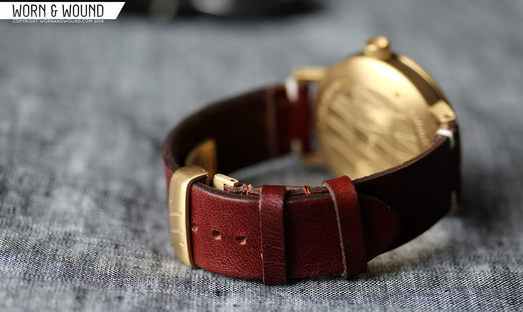
Starting at the bottom, the case back is visually striking, and cleverly crafted. The bottom surface is entirely domed and features an etching that plays off of their various branding marks. Around which there is some text, most notably a brand statement “Swedish Soul, Swiss Heart”. Perhaps the most interesting element is that the lugs are milled from the same piece of steel, going in the case. This allows them to give the lugs a coarse horizontal brushing, that might have been blocked by the case center had they been one piece. The lugs themselves have a simple shape. It’s familiar, but a bit different and detailed with a flat head screw from the screw bars.
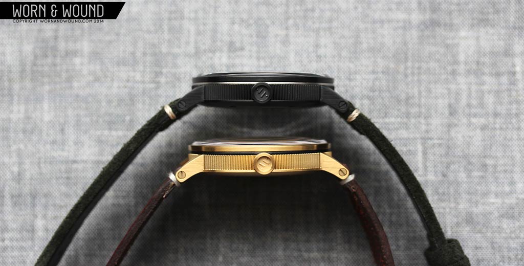
The next level is the mid-case which is utterly unique. Rather than a classic finish, the whole are a features a knurled texture, consisting of fine triangular shapes. Visually, this creates a dynamic surface, each ridge catching light differently and casting their own shadows. Physically, this adds a nice sensory element when handling the watch. Though not the MO for a watch, having substance and texture makes it a better designed object in the round. The knurling is really a distinct aspect to the Bravur watches, one that I imagine was complicated to pull off and expensive to manufacture well.
Getting to the top now, there is a metal contrasting ring between the fluted center and bezel, which aligns with the top edge of the lugs. Entirely aesthetic, but an elegant and attractive detail, the ring is decoration at its best. It adds texture, breaks up the otherwise mono-chromatic case, gives it a bit of a more industrial feel (they say they took some inspiration from vintage camera lenses in the design) which adds to the watches character and simply looks cool. The bezel sandwiches the ring and finishes the case with a simple, understated surface.

The crown at 3 also has a simple appearance, but deceptively complex design. From the outside, it appears to be a straight cylinder with fine grooves, visually complimenting the knurled case, capped by smooth surfaces on either end. Things get curious when you look at the out-side surface, which is concave. Inside the cavity that is formed is the Bravur “AV” logo in relief. In order to achieve this design, the crown is composed of multiple parts fit together with exception tolerances, such that you can’t see where one piece stops and the next starts. Little things like this win me over.
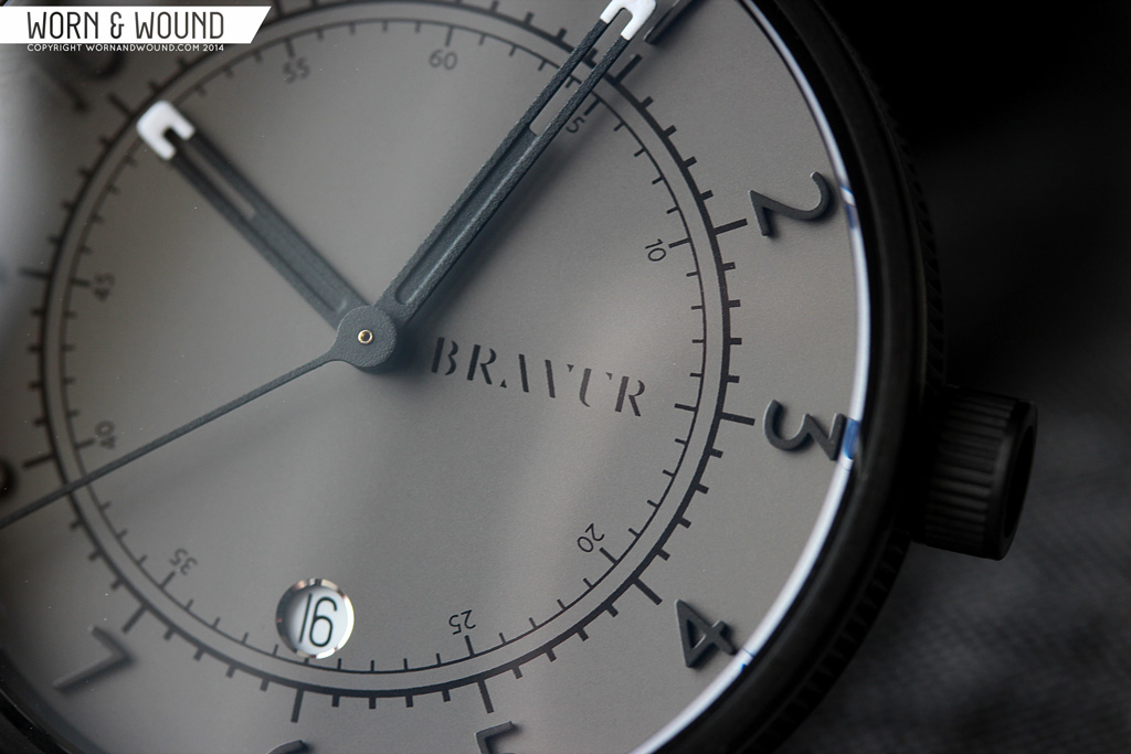
Dial
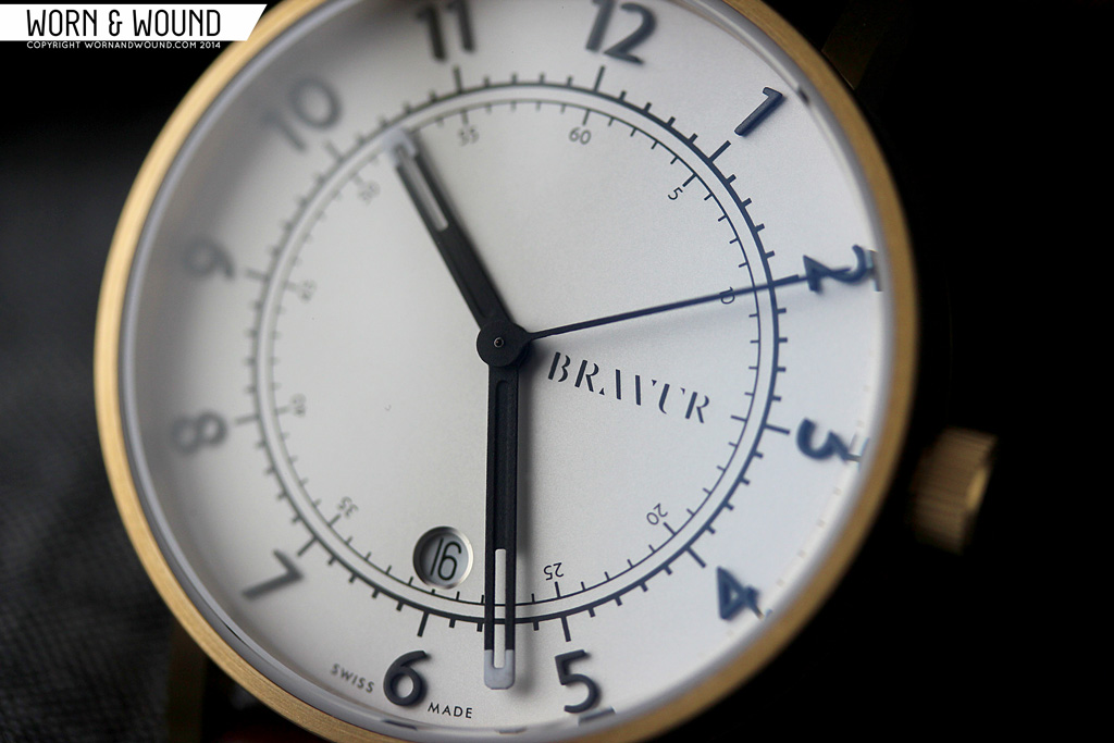
If you ever stop looking at the case, you’ll find yourself charmed by the dial within. The very large dial is similarly an exercise in simplicity and detailing. At a glance, things are very straight-forward. Actually, they are very straight-forward, but the execution is high quality, and the composition mixes things up ever so slightly, as to be a modestly novel take on a dial. As a side note, it’s nice to see a modern brand with a bend towards fashion not try to reinvent the wheel, that is to say change things for the sake of changing them, rather reinterpret uniquely.
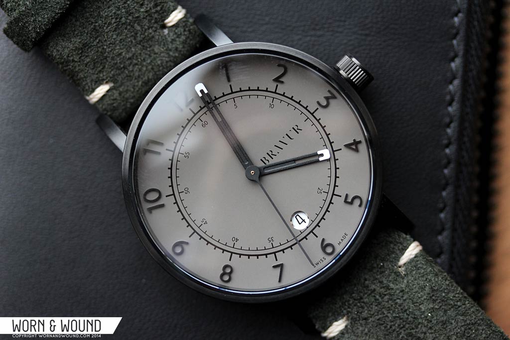
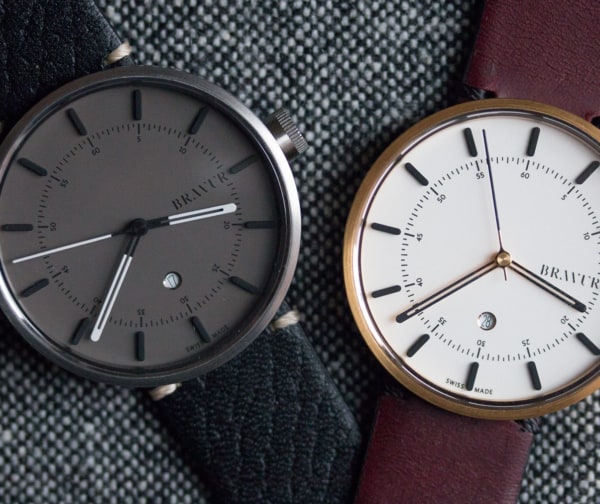
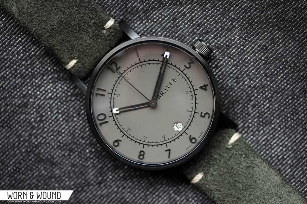
The dial surface color is different depending on the model, grey for the black case, pale silver for the gold. The indexes and hands on both are the same, however. The hour index consists or large applied black numerals which circle the outer edge of the dial, rotating around with the angle. The size and dimensionality of the markers makes them very clear and legible. There’s nothing particularly special about them, but they look good, managing to be bold and spare simultaneously. On the grey dial, everything is less legible by design, but not too hard to read in decent lighting.
Stepping in, you have a set of mirrored indexes, both consisting of a circle with lines protruding from it. The outer index is bolder, with lines pointing out towards the hour markers. The inner index is a thinner weight, with lines pointing in towards the dial center, and features numerals for the minutes/seconds. There is an interesting balance between the hour numerals / outer index and the inner numerals / inner index. One seeming like a shadow of the other. The two circular indexes have a very interesting graphic presence, almost appearing as a logo unto themselves, or reductive illustration. The inverted relationship of the hours to seconds, it is more common for the hours to be closer to the center, works very well with the modern approach of the watch.

Much of the inner dial is left open, but it doesn’t feel empty. Running from the center towards 3 is the Bravur logo, which as I mentioned before is very appealing. At 6, sitting where the 30 numeral ought to be, is a circular date window with a beveled silver edge. This is exactly where it should be. It doesn’t interfere with anything, throw off the balance of the dial or look out of place. It’s subtly integrated and while nicely detailed with a reflective edge, does not overtake. This is especially true on the lighter dial. On the dark grey dial, the white of the date disk does jump out, but there it actually breaks up the dense grey.
The hands are one of the most interesting elements of the dial. The hour and minute are both fairly broad matte black rectangles with white lume tips, a depressed center and an open area towards their tips. The only differentiating factor is that the hour hand ends at the inner index, and the minute extends to over the numerals. On the minute hand the open area reveals the dash of the index it is over, creating a simple and somewhat novel display. The second hand is then a simple matte black stick. The only thing of note there is how the stem of the seconds hand smoothly transitions into the center; a subtle but nice detail.
Overall, the most compelling aspect of the dial is the exacting proportions of the elements and the well balanced layout. Everything feels right for the space it is in. Nothing is too big, or too small. Nothing is hard to read or distracting from anything else. Aesthetically, I think it was smart to step back a bit after the complexity of the case to create something where clarity was paramount. The hands then add a bit more detailing, but not so much as to be the star of the show.
Straps and Wearability
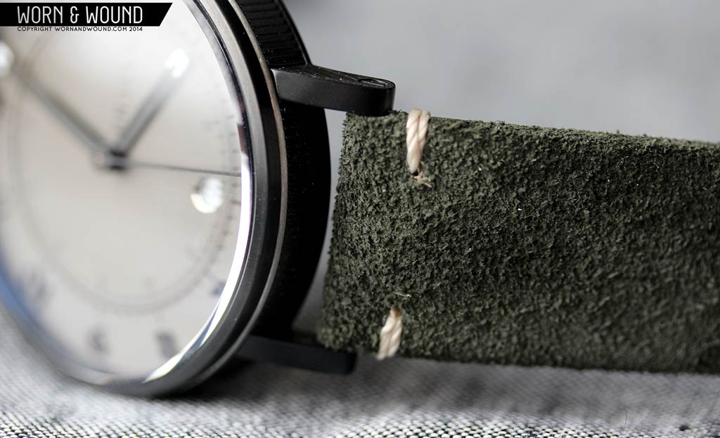
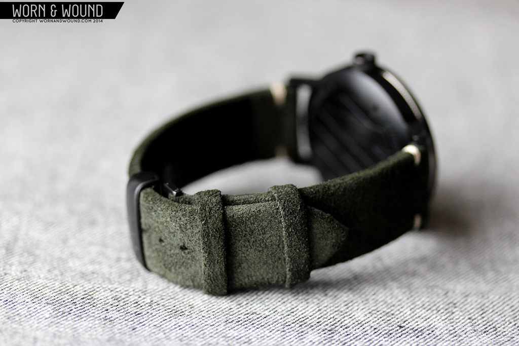
Bravur’s straps are particularly nicely made, and suit the aesthetic of the watches well. They have a simple design with minimal stitching, only having accented knots towards the lugs. The two watches we received were made with different types of leather, and in different locations. When you order a Bravur, you can choose from a variety straps, some adding cost. First, the black IP model came on a dark olive suede. It’s a particularly cool color, reminding me of green/black tattoo ink. The strap is quite supple and soft, and features a black leather backing. The gold model shipped on a brown Swedish vegetable tanned leather. This and the black leather models cost more as they are also made in Sweden…which similarly to producing in the US comes at a cost. The brown leather is not backed, and is a more simple, rugged look.
Both straps come with deployment clasps with matching IP finishes. It’s a nice looking clasp, having the “AV” etched in, that works properly, but I did find that the deployment portion that wraps under the leather and against my skin to be a bit uncomfortable, pinching occasionally. Given the simple style of the straps, I think a thumbnail would have sufficed. Aesthetically, both really look great on the watches, though the olive suede is my favorite of the two. The color is a bit mysterious and hard to describe, it’s subtle overall, but has a bit of masculinity to it. The color of the brown strap is gorgeous too, a real glowing tan, but the white contrast stitching felt too bright and new for me.

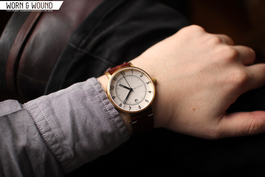
On the wrist, everything pulls together really well. The 41mm case is a comfortable size to wear, though the watch appears larger due to the expansive dial. The detailing of the case is more subtle than it might have seemed in the description, from a distance only adding interesting glints of light as it moves around. Close up, the details are more apparent, but never ostentatious. Naturally, the black IP version is the even more subtle, the contrasting steel ring being the only detail that stands out. The gold surprised me. I’m not a gold guy, and perhaps it’s because with this styling it reads almost as brass, but the yellow color really worked.
The dial is also more exciting when worn then one might expect from something fairly minimal. It’s strong, modern and refreshingly simple. The two colors we tried are fairly different experiences though. The silver is bright and energetic, everything is super crisp and clear. The grey is mute, only revealing itself close up. Honestly, between the two I preferred the silver dial as it accentuated the graphic markers and elements. Style wise, these seem to just go with modern wear. Definitely an everyday casual style, rather than sport or dress, these look right with a canvas Jack Spade briefcase in hand.

Packaging
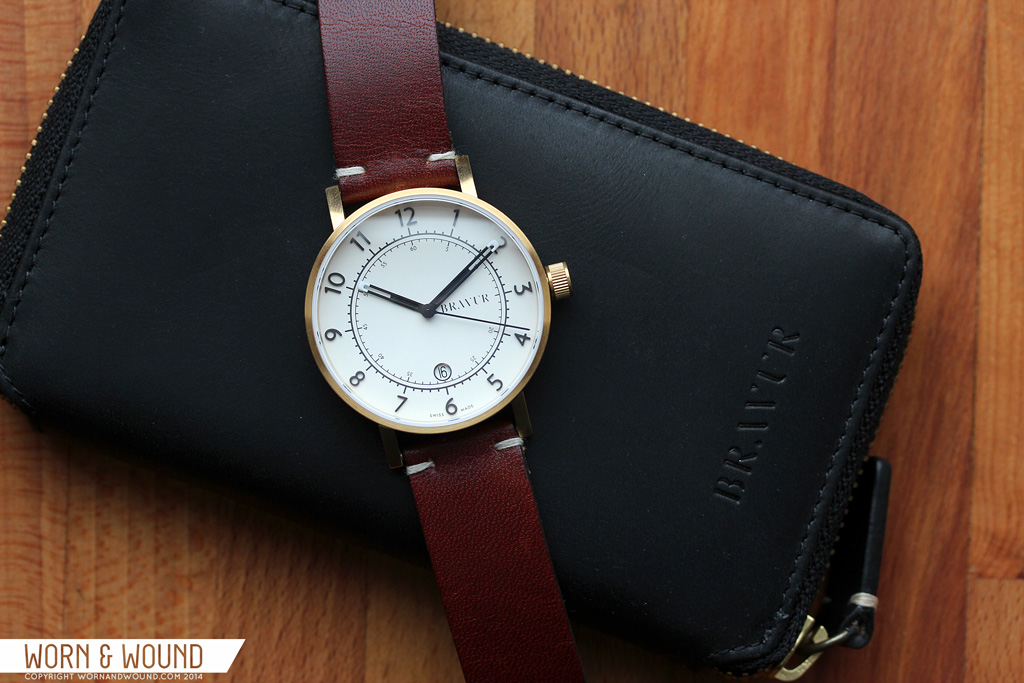
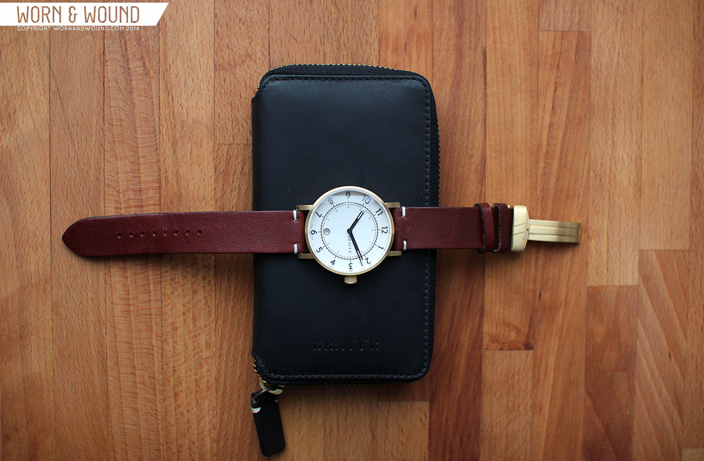
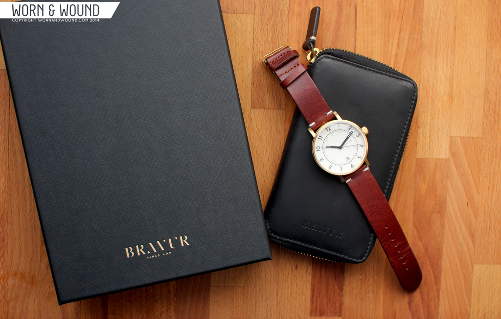
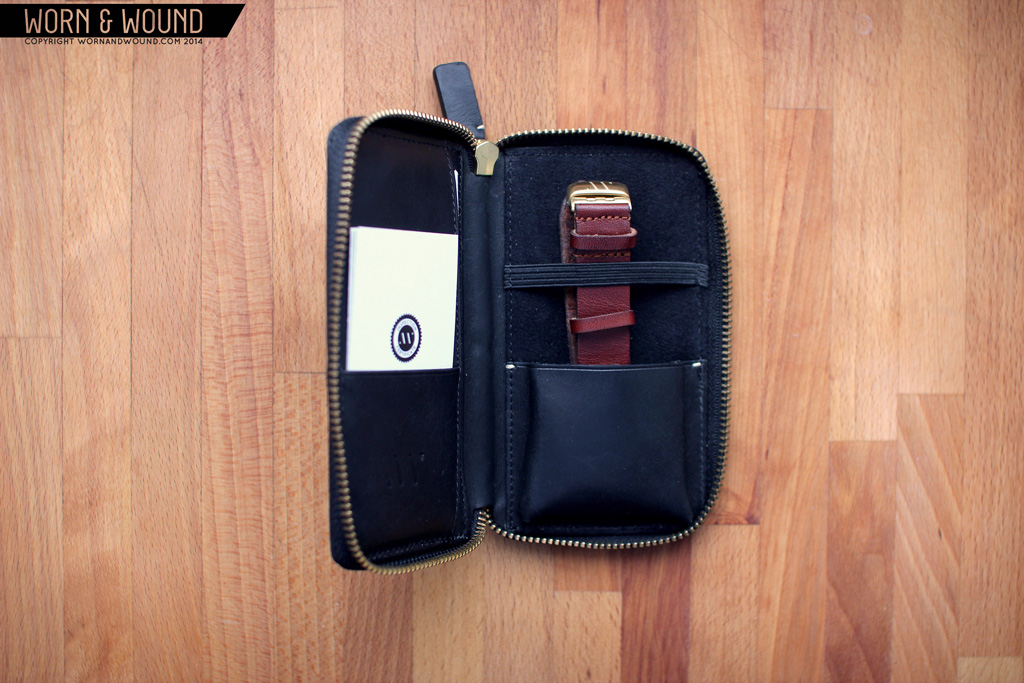
Bravur takes special care with their packaging in obvious and subtle ways. The packaging consists of a large black cardboard presentation box with their logo debossed on the front. Depending on the color of the watch case, the logo will be foil stamped gold, silver or blind (empty). The size and style of the box makes you expect to find an expensive tie inside, rather than a watch. But a watch actually isn’t what you find immediately. Instead, floating in a die-cut insert, is a leather wallet with a zipper. The zipper, like the foil on the exterior, matches the case.

This isn’t your ordinary off the shelf perk with a brand’s name stamped, this is a beautiful product unto itself. Produced by mismo.dk for Bravur, it’s made of black whole grain leather inside and out with a rigid construction and a YKK zipper. The construction and detailing are beautiful, the branding is subtle and the pockets are useful.Take a look at Mismo’s site…cool and expensive stuff. So this actually is probably a $200 watch traveling wallet.
Conclusion
The Bravur Watches are exceptionally cool and unique. I love any object that has details i can get lost in, and all the better that its a watch. The case design in particular is something to behold, especially the knurled sides. It’s impressive, to say the least, that this is their first foray into watch making, considering the level of detail and craft that went into the pieces. The dials then have that soothing Scandinavian restraint that makes for something you can’t get sick of. Great straps and the exceptional wallet that comes with it create one hell of a compelling package. No, the design is not for everyone, but I think for a modern, design minded individual, it will strike a chord.
So, if you love the look of these watches and are willing to pay for the design, the details, the sheer amount of effort that went into them, I am certain you will be very happy with what you receive. In many ways, what they have done here surpasses what we often find at the around the $1,000 dollar price. Everything about the watches speaks to quality and materiality. They have that refined look and feel of accessible luxury that comes about through careful design and good taste. It’s just the movement, the one part they would be buying from another brand regardless, that keeps these from being a total success. At least, to those of us who are stubbornly attracted to mechanicals. Bravur watches did say future collections will likely feature mechanical as well as quartz movements. I personally can’t wait to see that second hand sweep.
by Zach Weiss

What fantastic watches!
The detail – the detail (say like Kurtz in Heart of Darkness)!
Like beautiful jewellery – the case details, the raised numerals, the detailing of the hands.
Bravo!
So… let me get this straight…
Almost $1k for a two-year warranty on a quartz watch with no water resistance?
It looks great. I like the dial and hands and case, and the straps look wonderful, but I will pass. You’re right; it almost seems like the target demographic is wealthy people that won’t think twice about buying a new one in two years…
It has 5 ATM of water resistance, that was my mistake.
What a pity… Such a sexy case and no mechanical movement. It kind of fashion approach – our potential auditorium doesn’t care about the movement… But, wait, no! Make it mechanical – and I’ll immediately jump into your potential auditorium.
I do believe that putting some Miyota 9015 inside wouldn’t make them more expensive – they already cost 1000$ 😉
Yes, what he said.
IMHO the design is beautiful but trendy. Like more of a drive-by than heirloom. I want timeless in my timepiece ha, especially if I’m gonna peel off some four-figure cabbage. I guess Barney’s knows their target but the watch guys I know will grin and pass to the fashion slave at J.P. Morgan lol.
I would rather less expensive packaging and a standard mechanical movement inside, such as a Miyota.
Also on the slate grey dial, I wish the date wheel matched, with white text, or even green to match the olive strap.
Interesting effort nonetheless. I will wait for their second model to see if they do produce a mechanical, before considering purchase.
ETA 2824 at that price (or just slightly above) and they’d sell thousands of them.
Yes, what he said.
i’d be interested to know if they could squeeze in a high-accuracy quartz at a similar price. Omega went down that road in the 70’s, right? does that matter to the target clientele of barney’s? probably not, but it might win over the (very tiny) WIS community if they made a little more effort towards timekeeping.
nice looking scandanavian design though – rigorous, but with a little more flair than german severity (which i love).
Very attractive design, however one of the designers hasn’t done their homework. Either the clearance between the strap and the case isn’t enough, or they should have removed the knurling at the 12 and 6 o’clock position. There is some ugly wear on the strap where it has come into contact with the case. That is going to look terrible in a few months time.
As for the quartz movement, I think that is the such a shame, this could have been my next watch, but I like a few other watch enthusiasts will pass on this visually stunning, but critically flawed watch.
Too bad, great looking watch.
Have the $$ to spend, not on a $1k quartz though.
I refuse to pay 960$ for a quartz watch that was priced that way because it was “exclusively made in Switzerland in low numbers”. Period. Good review however. Well done.