Brellum Duobox Review

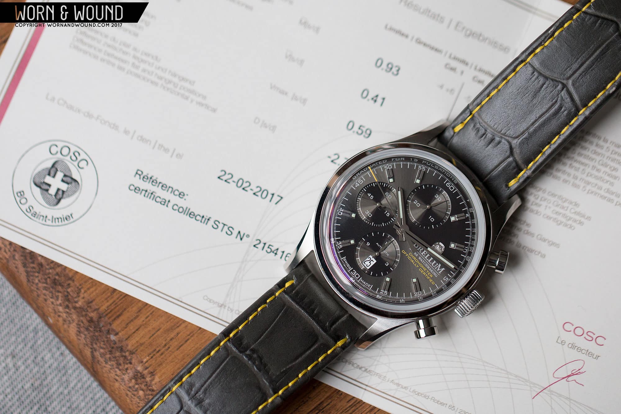
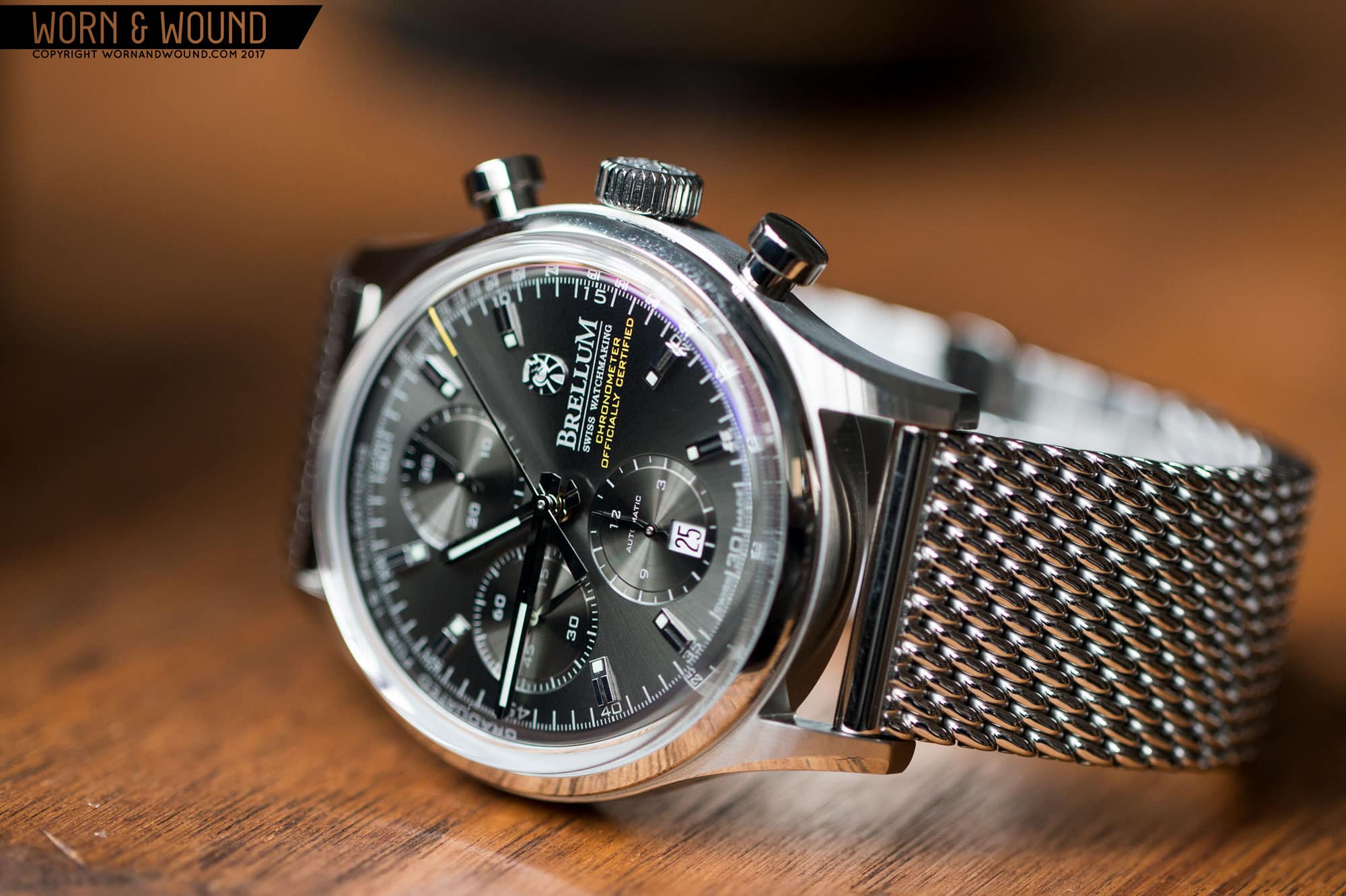
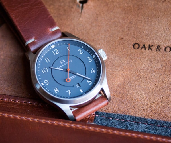
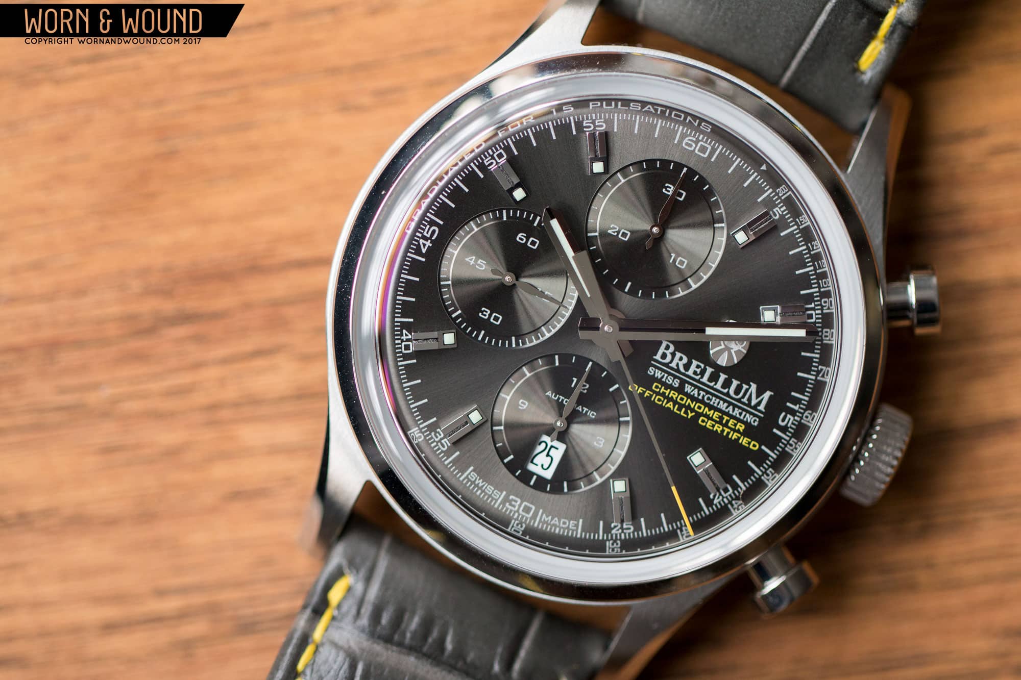
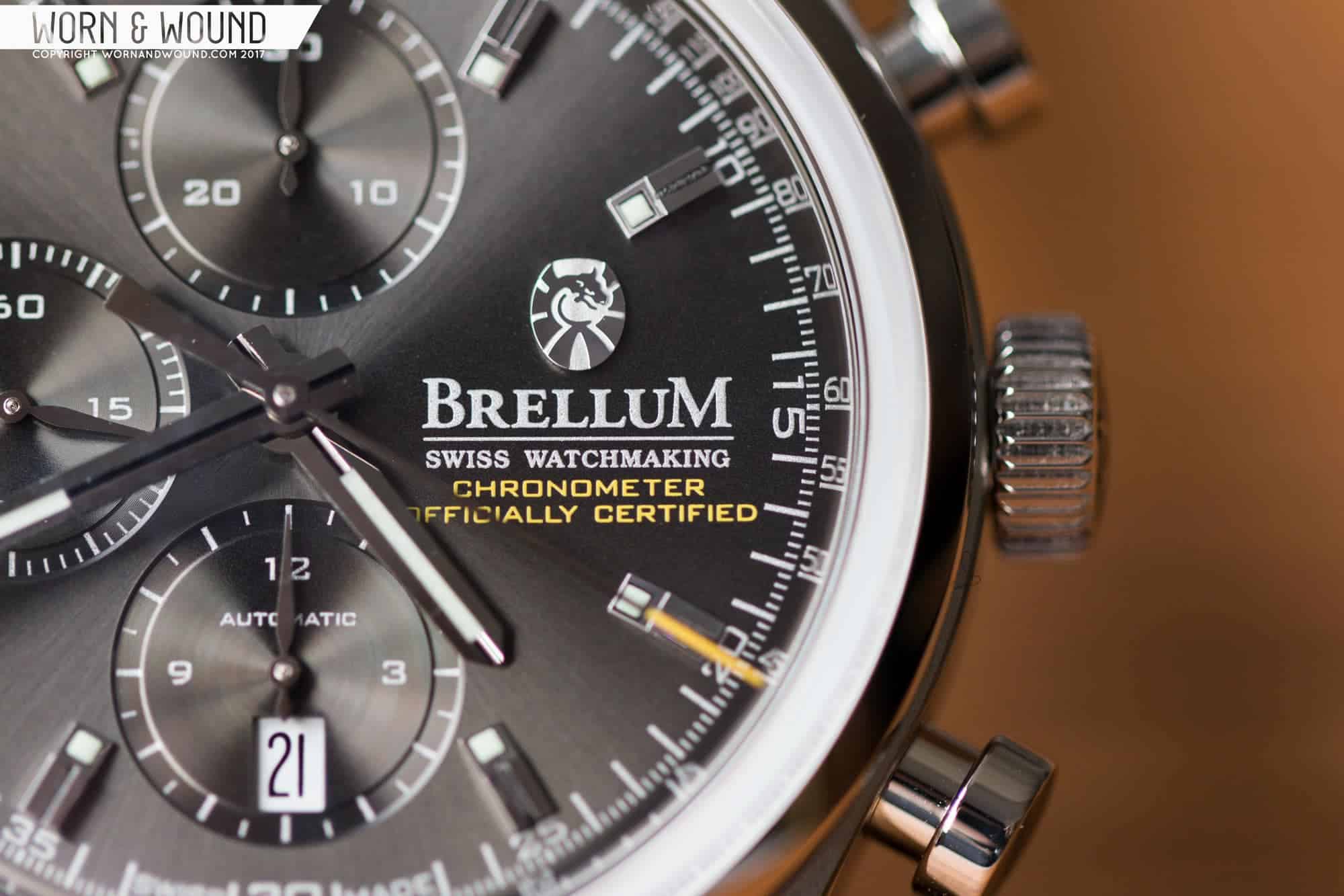
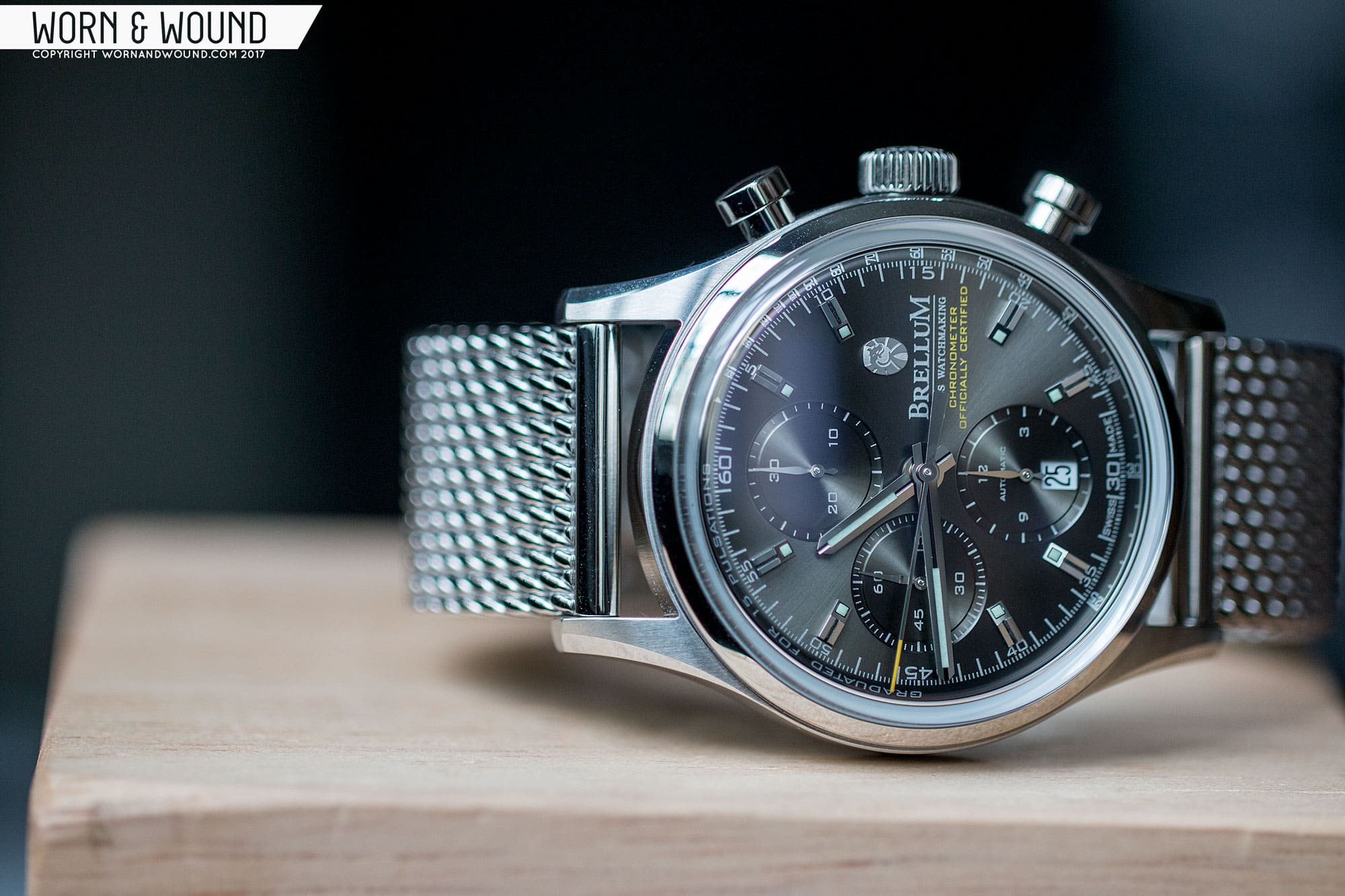
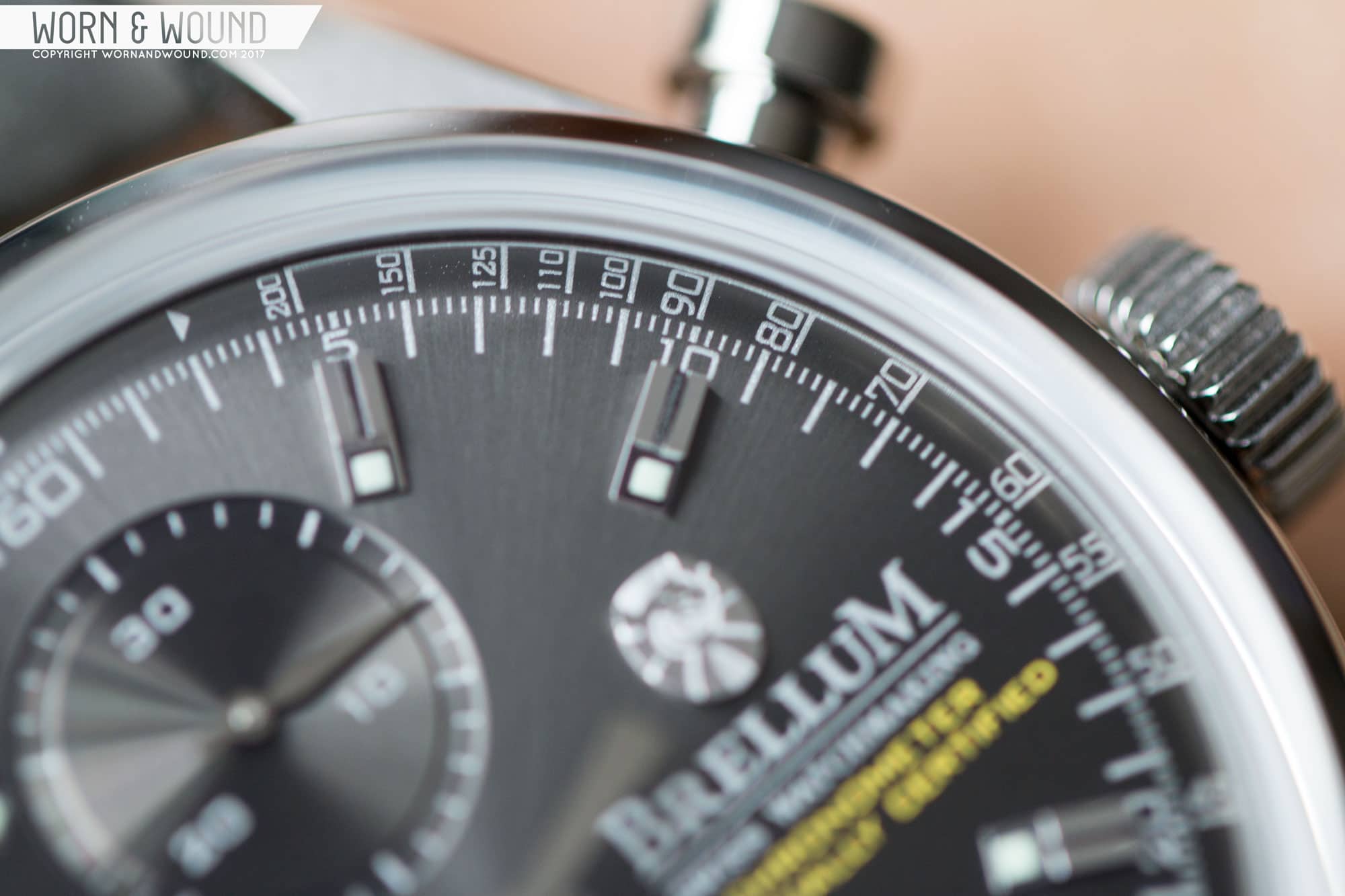
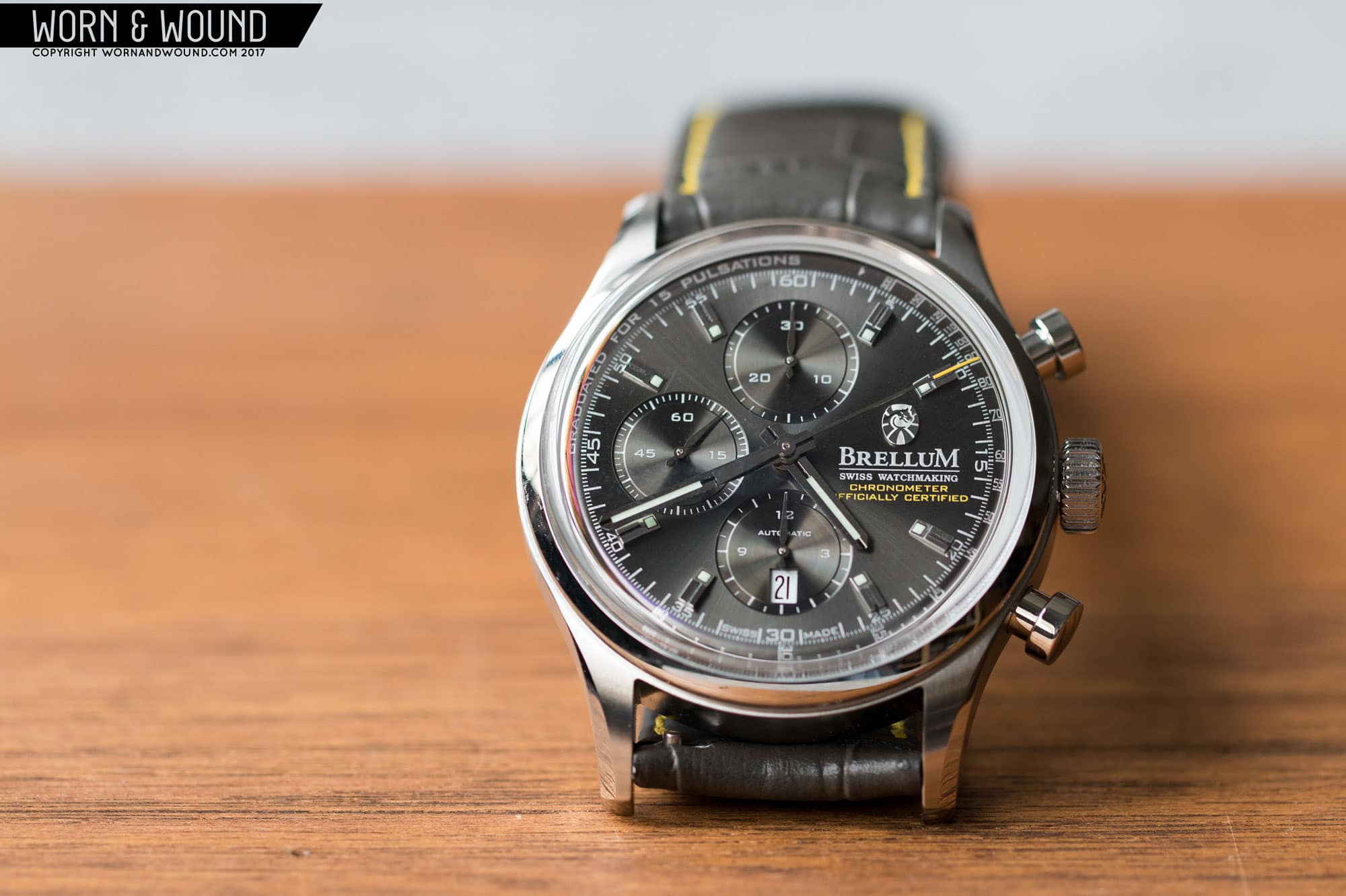
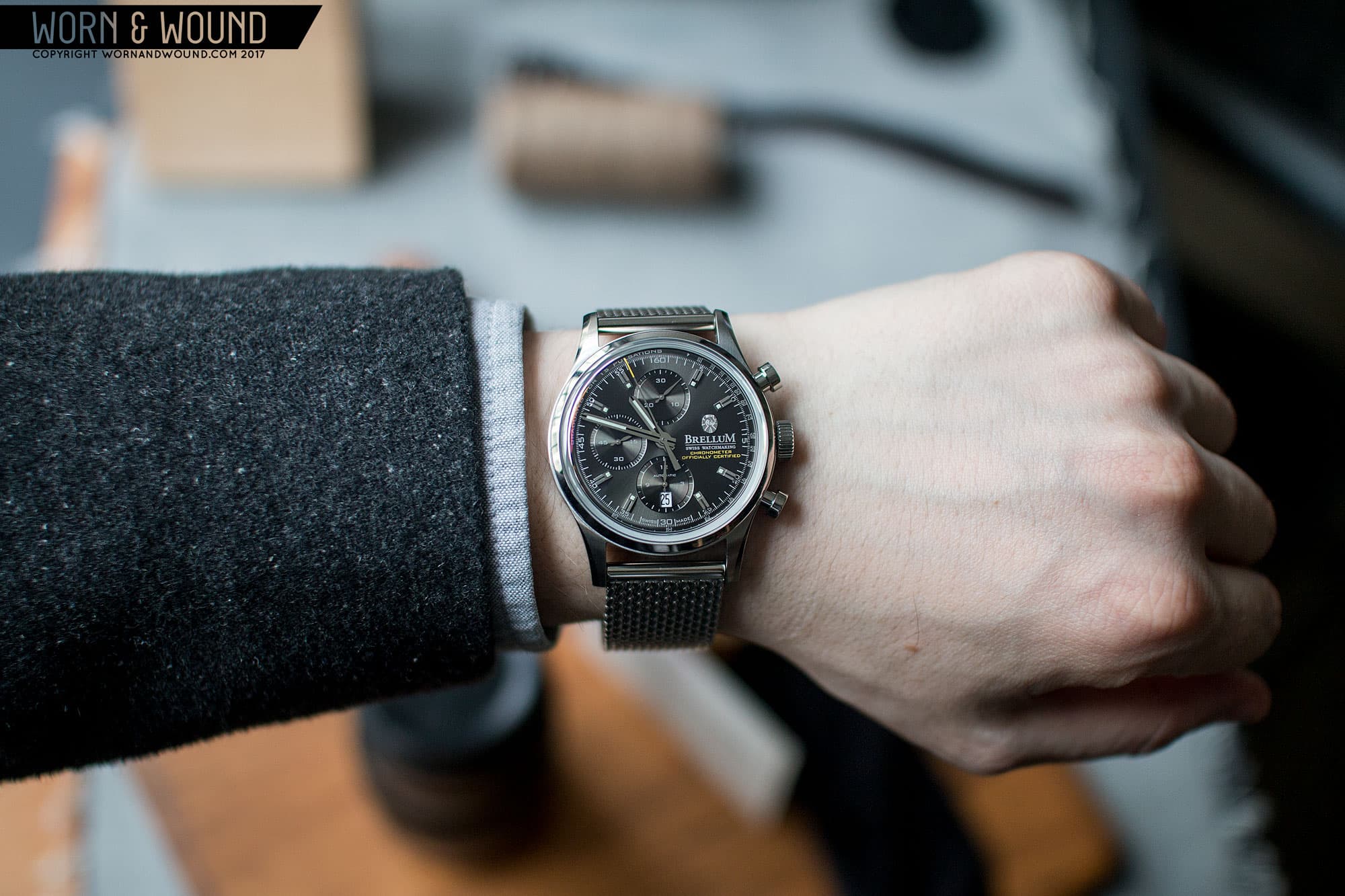
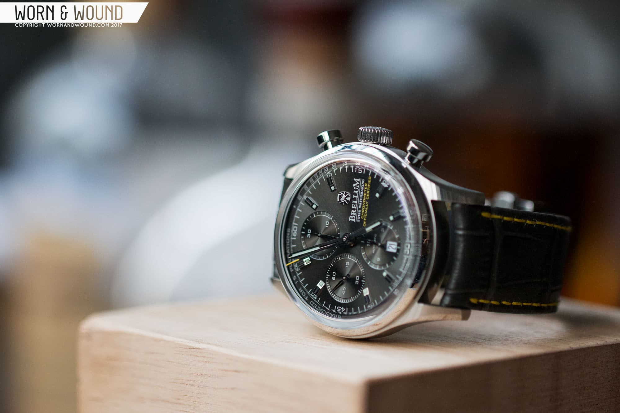
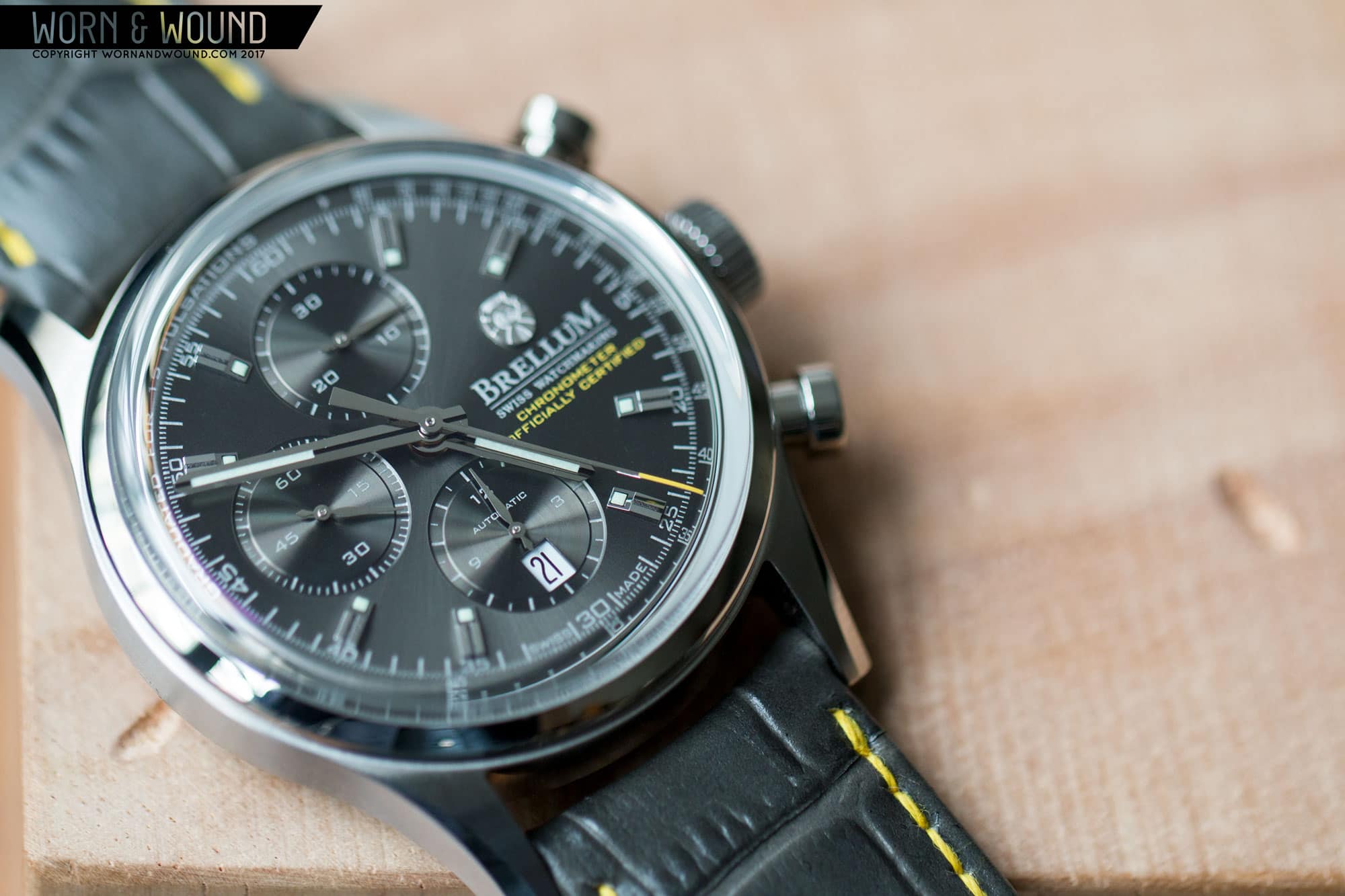
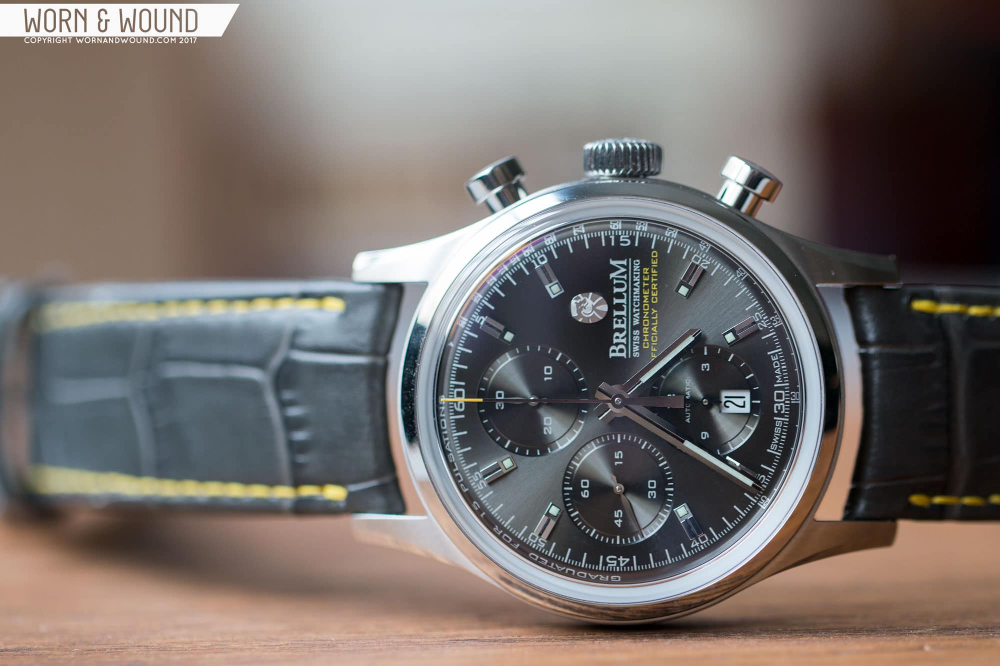
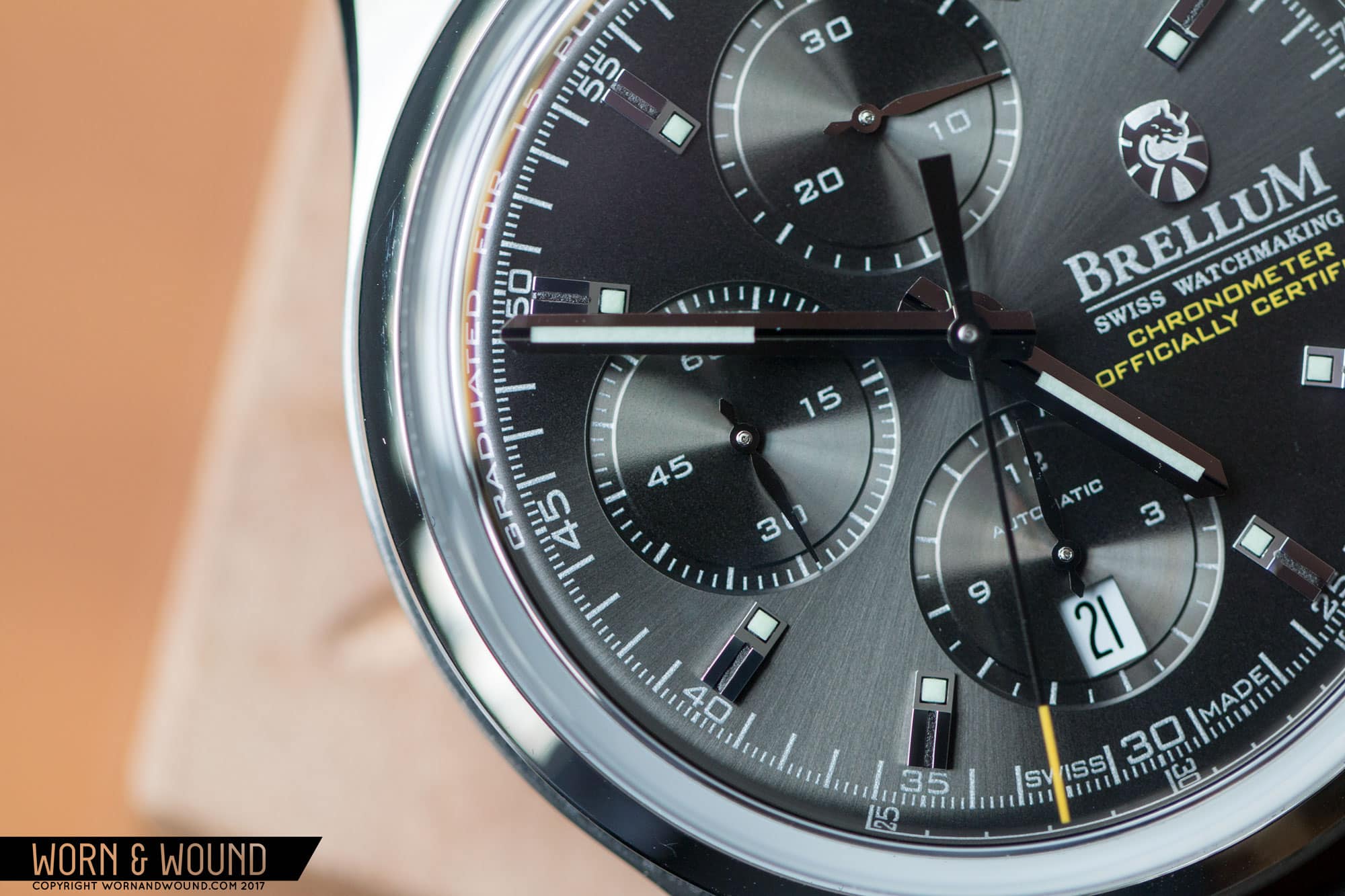
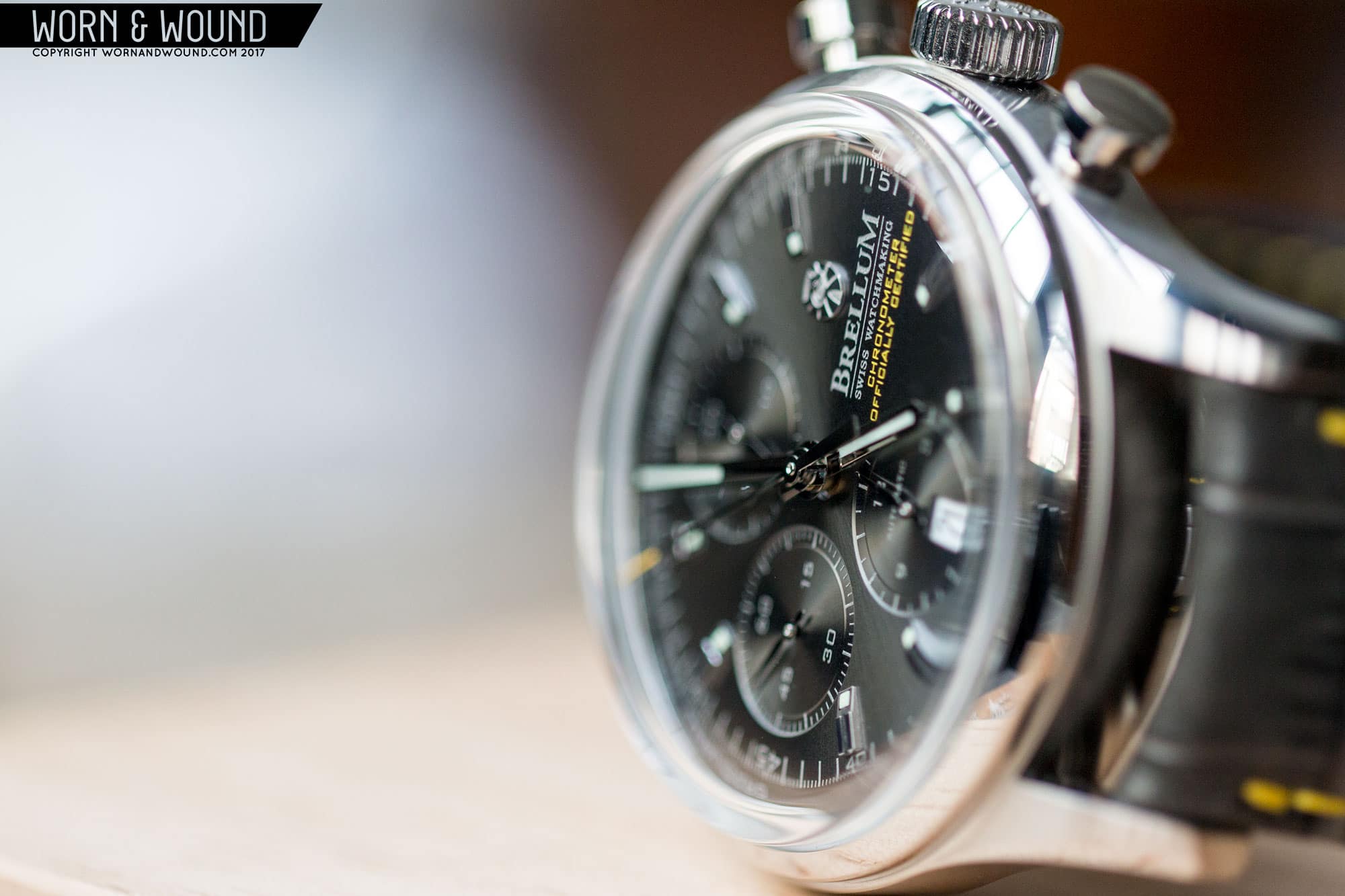
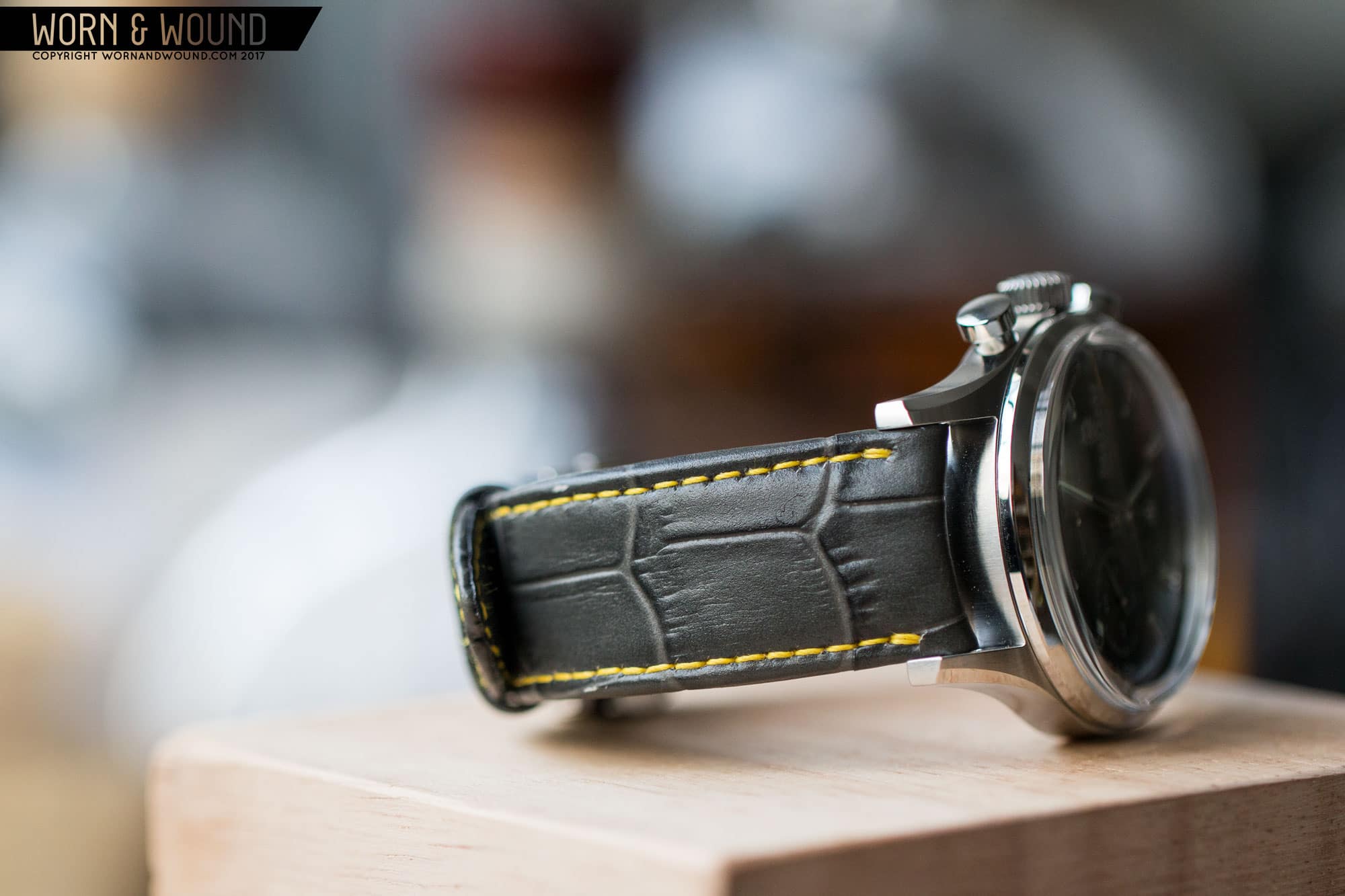
It’s always a great experience when you first see a watch in person that you previously had only seen images of, and the reality of it is far better than you expected. That was the case with the Brellum Duobox, a chronometer-rated chronograph from a new independent Swiss brand. After coming across their site a few times, I knew I had to get one in for review. There was just something about them; some level of balance or finish depicted in their images that said these were high quality watches. That, and the fact that you don’t run into chronometer-rated chronographs very often.

Impressive straight out of the box.

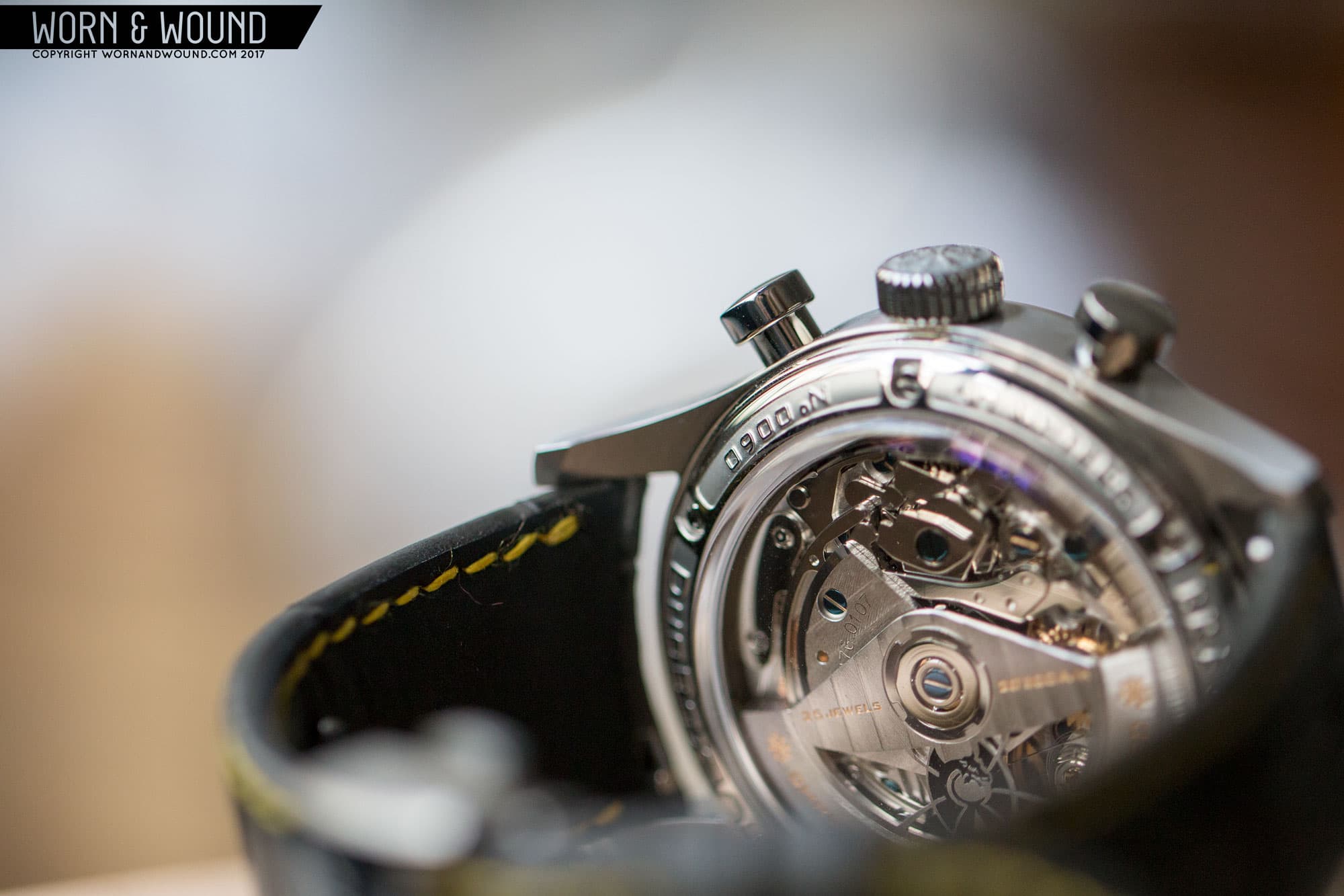
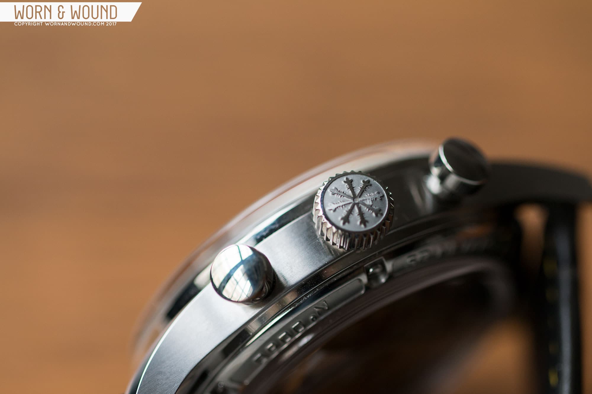
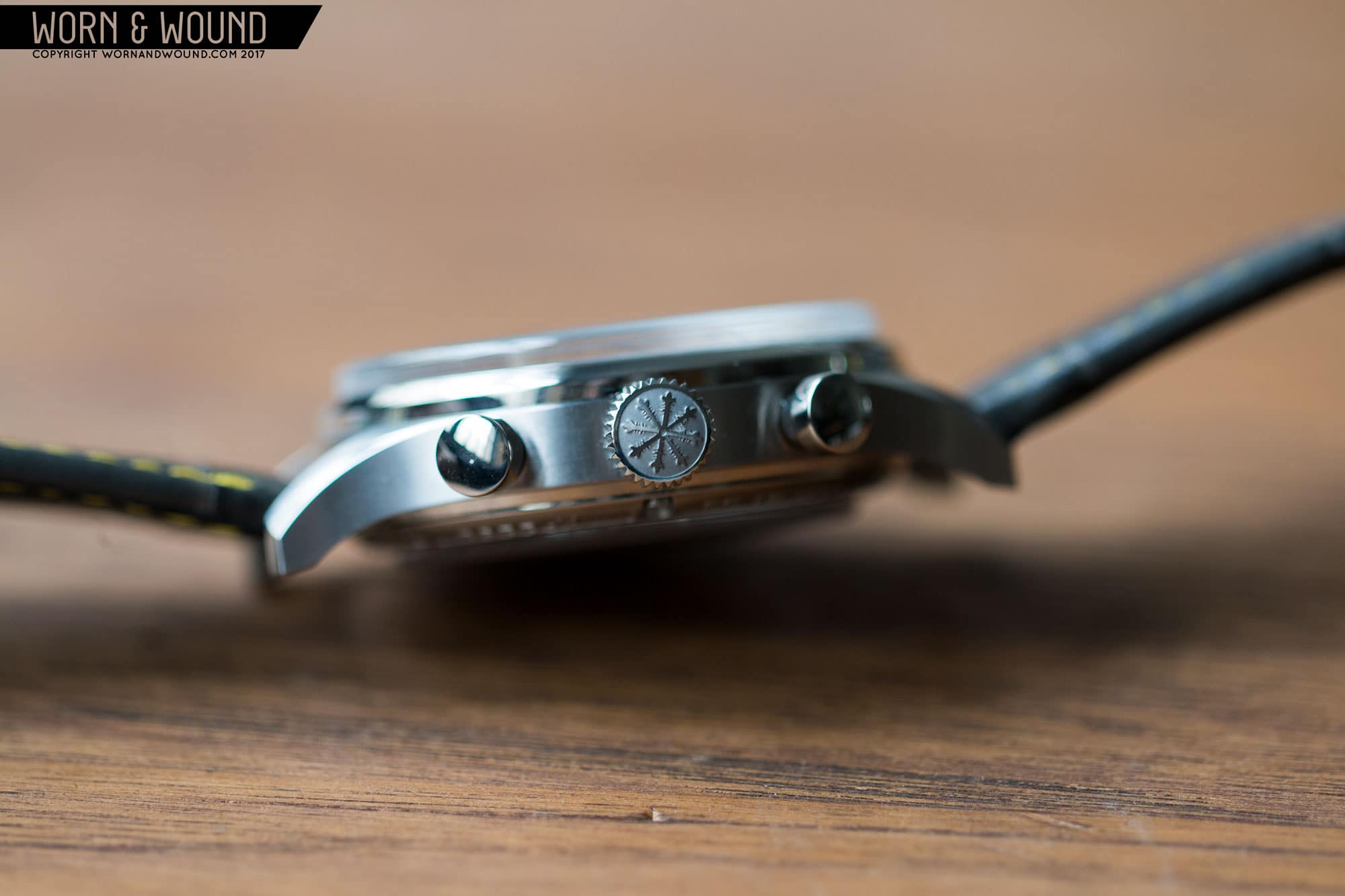
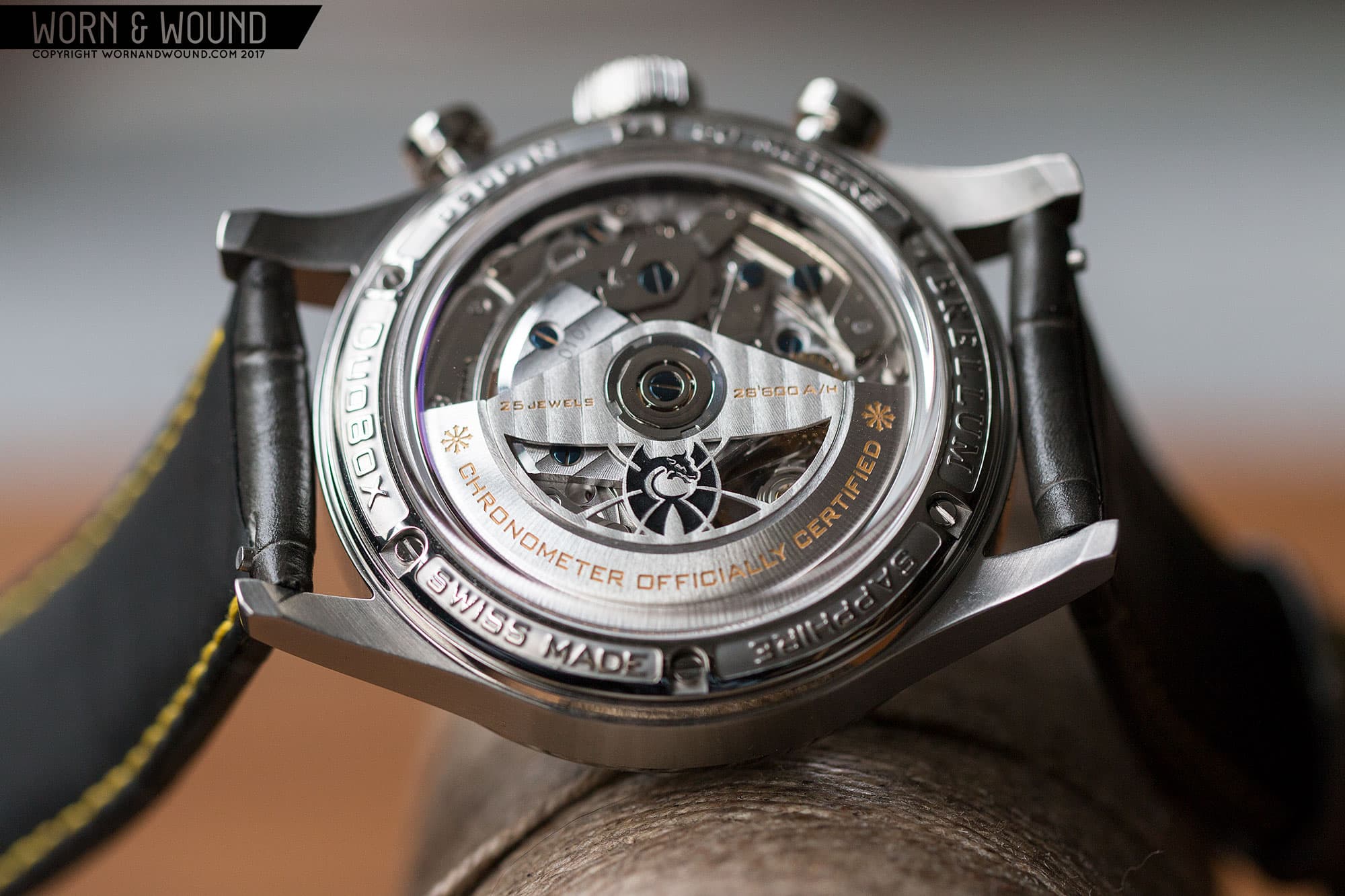
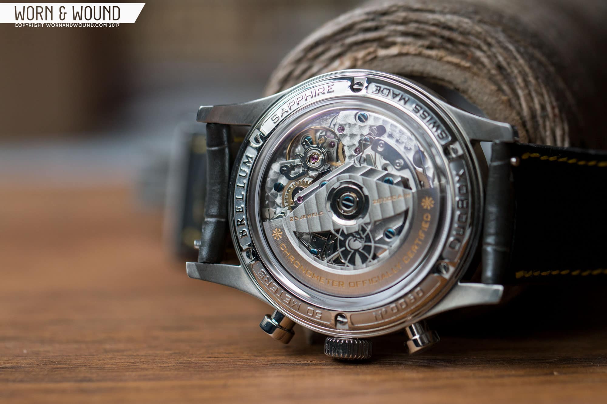
Before getting to the watch, Brellum was founded by Sebastien Muller, a fourth-generation watchmaker based in the Jura region of Switzerland. With 25 years of experience under his belt, Sebastien decided it was time to set out on his own. The resulting first line of watches, the Duobox chronographs, speak to this with fit and finish rarely found in a brand’s first lineup.

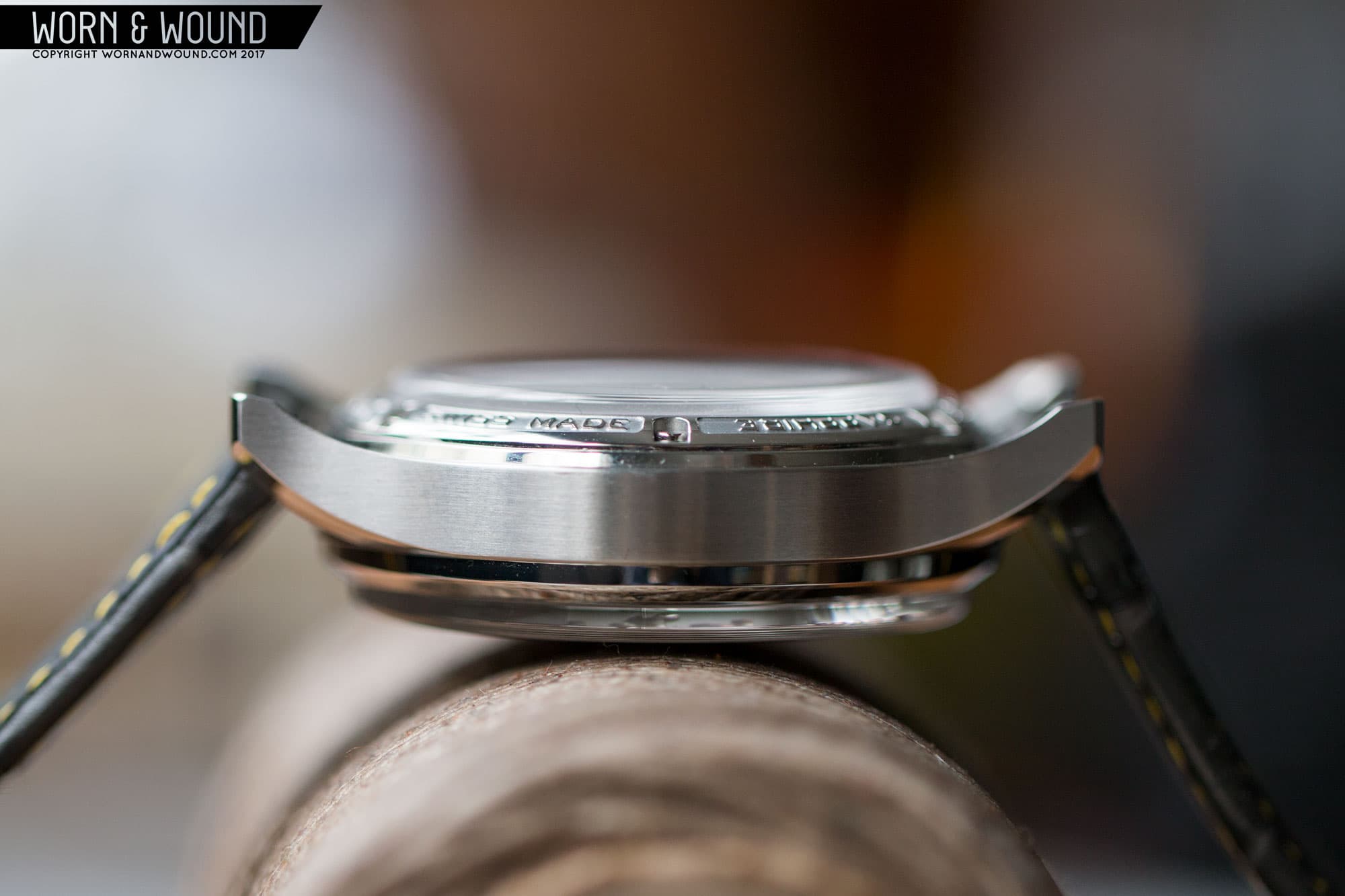
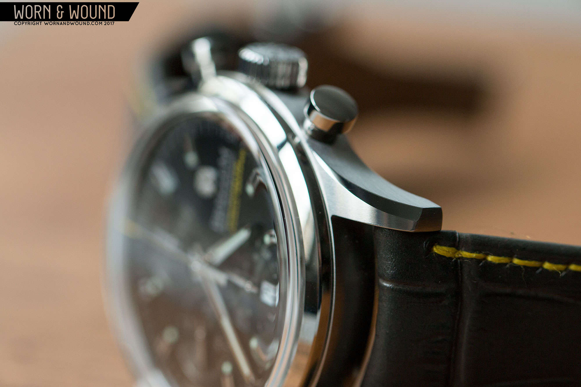
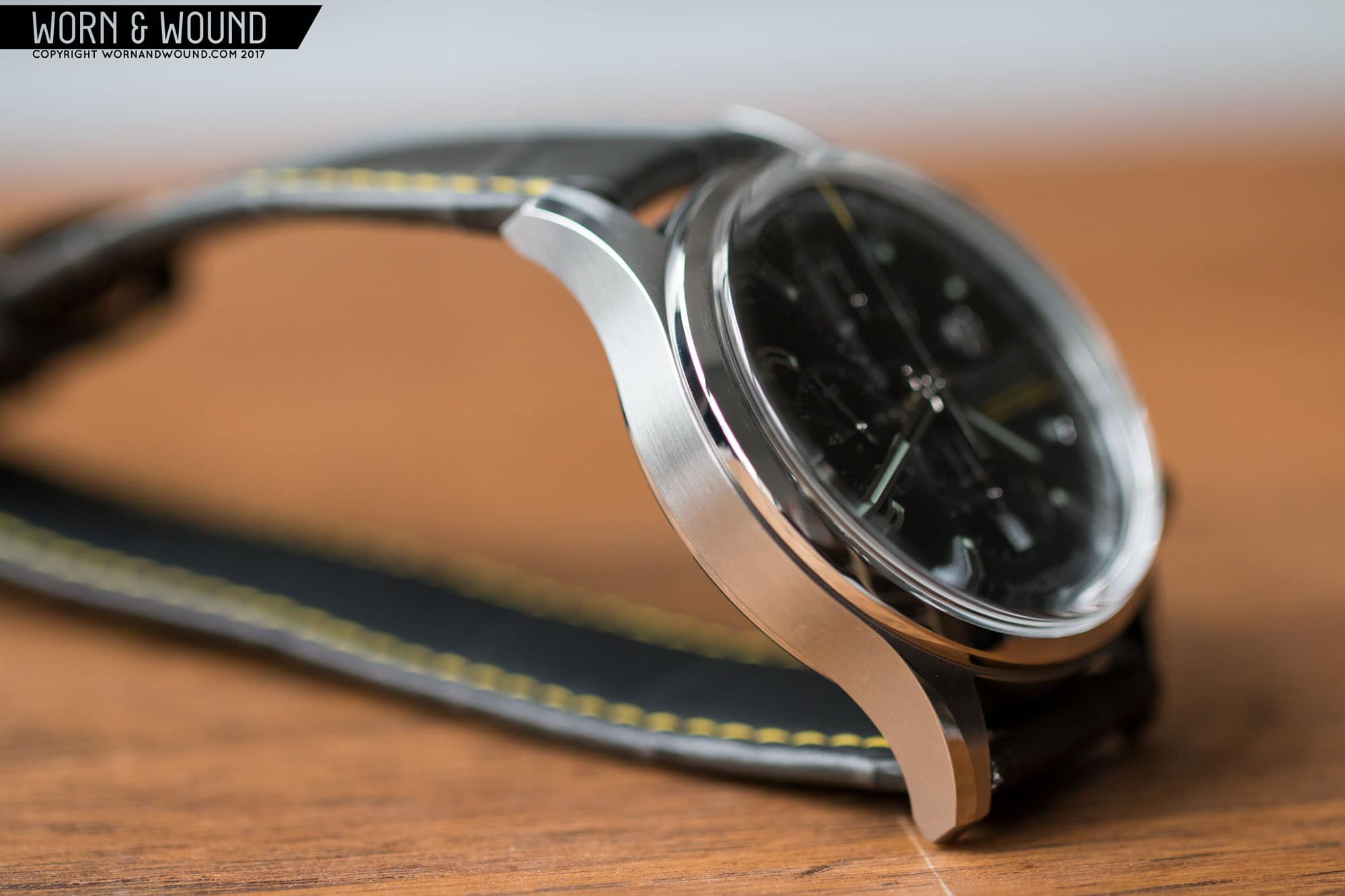
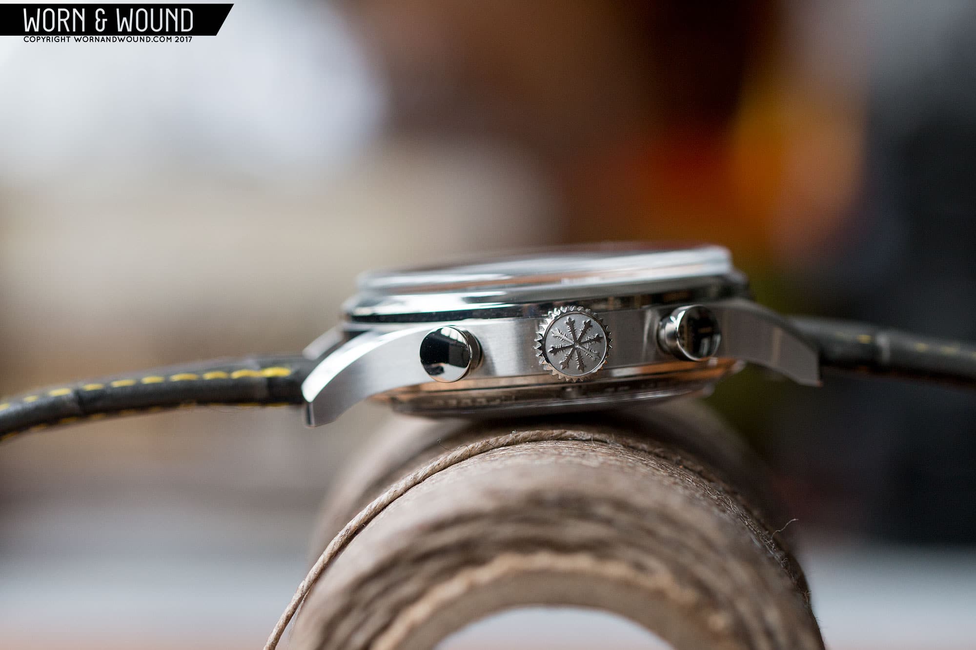
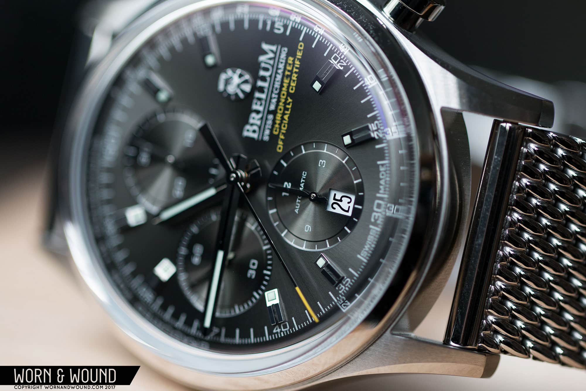
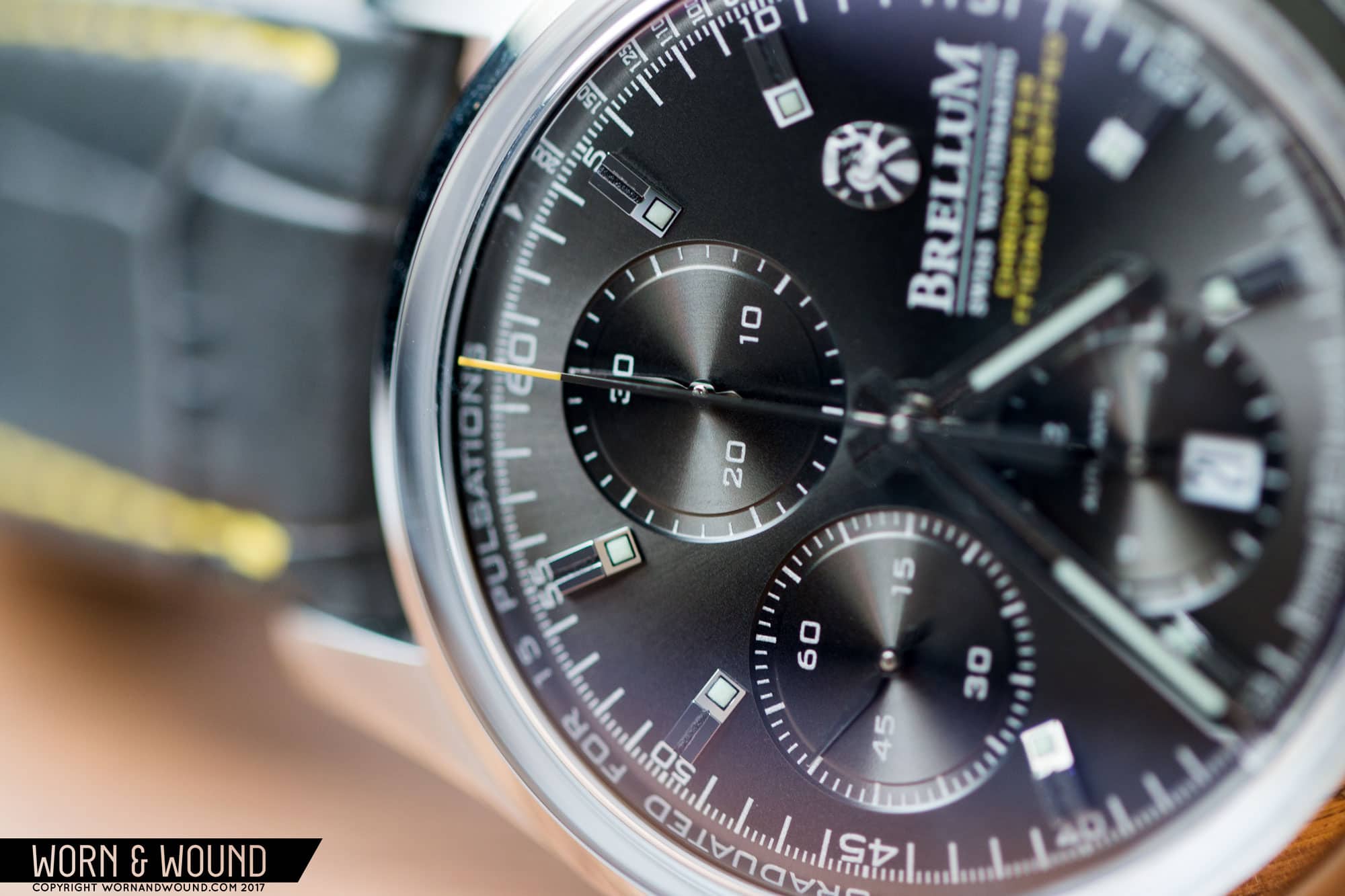
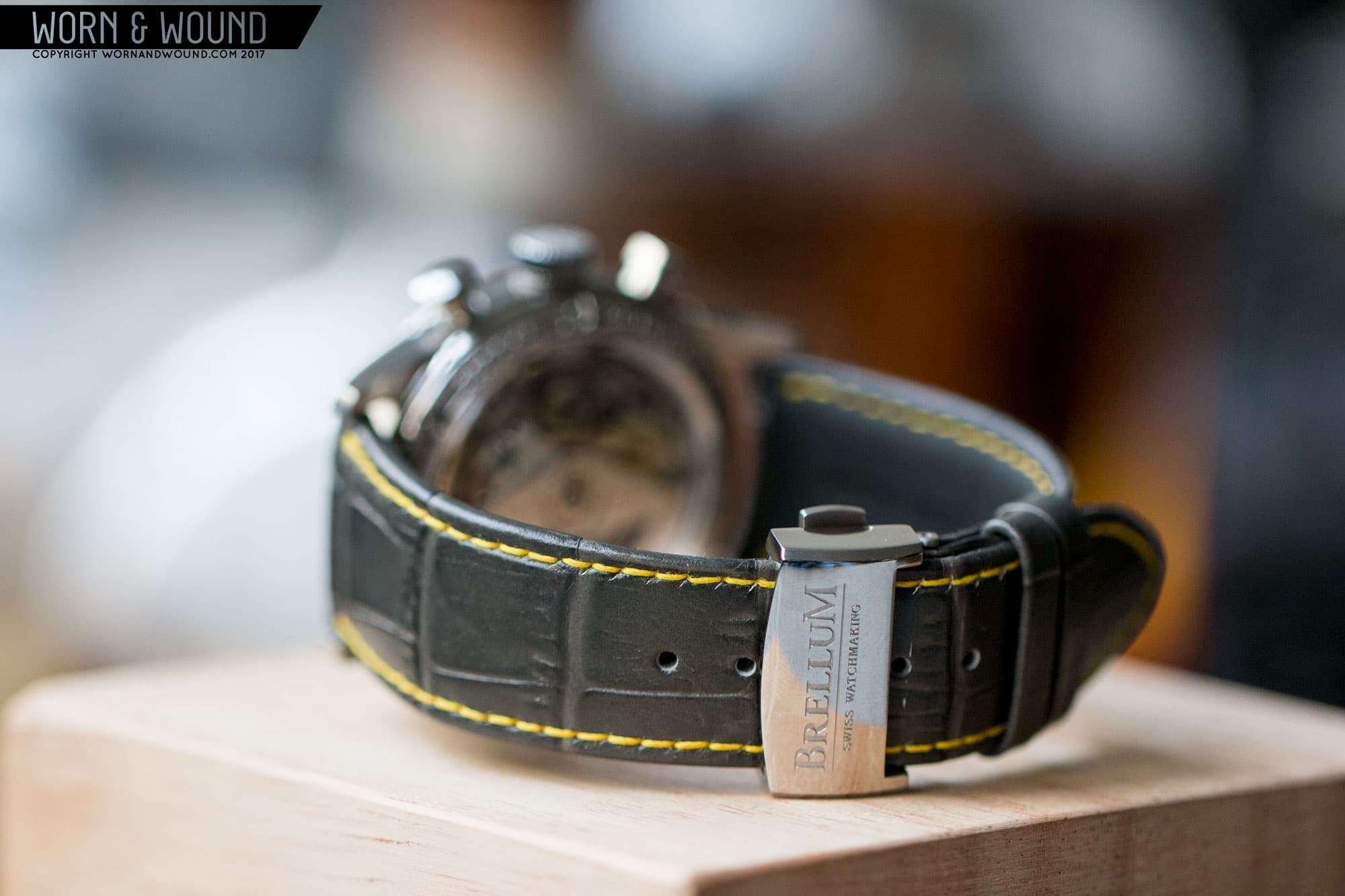
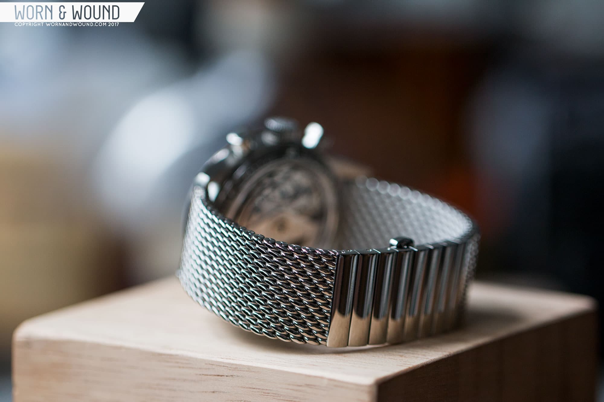
Upon opening the luxurious wooden box that accompanies the Duobox for the first time, I was met with a watch that looked and felt like one from a long-established brand. The watch just glistened, and once in hand and then on my wrist it was immediately entrancing. It’s not a revolutionary design; it’s actually quite conservative. But it has the right cues to be a handsome, classic sport watch. And with a price tag of about $2,200 on leather and $2,275 on mesh, the Duobox chronometer chronographs are priced far below the competition, which makes them all the more intriguing.

Save

Save

Save

Save

Save

Save

Advertisement
$2200

Brellum Duobox Review

Case
Steel
Movement
Valjoux 7750 Chronometer
Dial
Sunray Gray
Lume
yes
Lens
Box Sapphire
Strap
Leather or Mesh
Water Resistance
50
Dimensions
42 x 51.7mm
Thickness
16mm
Lug Width
22mm
Crown
push-Pull
Warranty
Yes
Price
$2200

Case

The case of the Duobox is classic and masculine with markedly good finishing. Measuring 42 x 51.7 x 16mm, it’s a modern sport size, though it reads and wears smaller, more like 40mm. The height is also largely due to the use of box sapphire crystals on both the top and bottom of the watch. For “crystal fans”–which sounds like an odd group, but one I am a part of–these sapphires are truly striking. They have the look of box acrylics from the mid-20th century, coming straight up and out of the case a couple of millimeters before crossing over the dial with a gentle dome. They are uncommon, likely because of cost in general, but pretty unheard of for the case back. The watch name actually comes from the use of these crystals, which is a strange naming tactic, but one that works given the design.

A box sapphire display window, a very unusual feature.

Looking at the case from above, you have a wide polished bezel on top of a slab-sided mid-case with long, slightly contouring lugs. The tops of the lugs have straight brushing with noticeable texture and a polished bevel that gets wider as it reaches the end of the lug. The polished bevel is a particularly gorgeous detail, adding some extra lines and complexity to the design.

From the left side, the height of the crystal and the case brushing is emphasized. The mid-case features horizontal brushing with the same noticeable texture found on the tops of the lugs. Above and below the mid-case you’ll find polished surfaces, which break up the height of the case a bit by creating some lines. On the right side you’ll find the wide-topped chrono-pushers and a 7.5 x 4mm crown. The crown is particularly well decorated, with an intricate symbol (not sure what it is, to be honest) deeply etched in relief and polished with matte steel around. This really makes it pop.

Save

Save

Save

Save

Save

Save

I love the polished bevel.
Clean case finishing.
The profile shows off more crystal envy.
A great view of the back crystal and movement within.

Flipping the watch over is quite the treat with the Duobox. The box crystal in the center displays the chronometer-rated and well-decorated Valjoux 7750 exceptionally well. The movement actually looks like it sits partially within the crystal, or like the room needed for the rotor to spin was created by the box. Either way, it has a great effect that will make you want to take the watch off to enjoy regularly. Of course, it does come at the expense of added height, though on the wrist it’s less of an issue than it sounds like. Around the window is a steel rim with details that have been stamped in and six screws to hold it down. The stamping is very attractive, giving the watch a more high-end and finished feel.

Dial

Continuing with the classic theme of the case, the dial of the Duobox is conservative, but luxurious with excellent proportions and finishing. The watch comes in a few colors: silver, deep blue, black and gray meteor (their name). The sample is in the latter, and it’s gorgeous. It’s a dark, graphite gray with a sunray finish giving it a metallic feel. I find that sunray finishes can sometimes make watches look cheap, but that’s not the case here. The texturing is very fine with the result of giving the dial a very nice luster.

A clean, crisp and balanced dial.

The dial features three indexes; hour/primary, minute/chrono-second and a pulsations scale. The hour/primary index features eight applied markers skipping three, six, nine and twelve. The markers themselves have an astounding amount of detail. They are rectangular, but feature a facet that slopes down towards the dial. On this slope is a lume plot with a super thin black outline. The rest of the marker is then flat, facing away from the dial, but features a split down the middle that is filled with black. They look great, simultaneously giving the watch a dressed up feel and some sporty technical detailing.

Encircling the hour index is the minute/chrono-seconds index, which is printed on the dial in metallic silver. The combo of silver on the gray dial works surprisingly well, having plenty of contrast while not looking as sterile as white would have. On this index, you’ll find numerals at intervals of five, long lines per minute/second and small lines for 1/5th second. It’s a classic index design that works well in this context.

Branding: gone too far, or just enough?

Lastly, you have a pulsations scale on the outer edge of the dial. I was glad to see pulsations over a tachymeter or telemeter as they are less common, and frankly, even though you’re unlikely to use it, it’s still more useful than the other two. Because of the box sapphire, this index does get a little distorted, looking compressed in an odd way, but remains readable.

At six, nine and twelve you’ll find sub-dials for the 12-hour totalizer, active seconds and 30-minute totalizer, respectively. This is the standard Valjoux 7750 layout. The sub-dial design is particularly appealing on the Duobox. Each sub-dial features a channel around a raised area (or rather, the channel is lower than the main dial surface). Within the channel are then markers pertaining to the scale of each sub-dial (hours, minutes, seconds). On the raised area are then the numerals for that index. The results are very clean and balanced sub-dials that while taking up a decent amount of real estate on the dial, as sub-dials tend to do, they don’t clutter it at all.

Save

Save

Save

Save

Save

Save

Luxury attitude.
A pulsations scale, just in case.
The date at six works well.
Lovely slight distortion from the crystal.

At three, instead of the day/date you’ll typically find with 7750s, is a logo and text. This will probably be the most divisive element of the dial, as it’s a lot of branding and text. First, you’ll find an applied logo/badge. At first glance, I couldn’t tell what this was and then I realized the logo was actually a silhouette of a dragon (actually Wyvern, to be exact), curling in on itself. Not a bad bit of imagery. Next, you have “Brellum” in large type with an underline, then part of that text logo, in small type, you have “Swiss Watchmaking”.

Following this, you’ll find “chronometer officially certified” on two lines in yellow. Altogether, it’s quite a lot, and while I quickly got used to it, think it could use some editing. Namely “Swiss Watchmaking” feels unnecessary on the watch, and removing it would allow the chronometer text to move up a bit. The dragon logo is a bit trickier, as it’s a nice looking detail unto itself, but feels like a second logo over the logo, and doesn’t relate to other iconography on the dial.

The sub-dials have an attractive design that makes them highly legible.

Lastly, you’ll find a date tucked away above six, within the 12-hour totalizer. I like this placement, especially since they did away with the day/date. On the gray dial, the date is black on a white disk. It works with the gray, not feeling like too much of a disruption, though I wonder how black or silver might have looked.

Moving on to the hands, for the hour and minutes you have bold monolith shapes that take design cues from the applied markers below (or perhaps vice versa). The hands are both polished steel with a line of black down their centers and a strip of lume towards their tips. I really like the design as it’s not generic, playing off of the vocabulary of the watch instead of classic watch concepts. The chrono-seconds hand is then a silver stick with a yellow tip that curves down ever so slightly towards the dial. The touch of color is appealing. The sub-dial hands are then tiny lances in polished steel. I like the shape here, bringing early Speedmasters to mind, but I wonder if the polished steel on gray is a little low contrast for at-a-glance legibility.

Save

Save

Save

Save

Save

Save

Advertisement

Movement

Inside of the Duobox is the BR-750-1, which is a relabeled 7750 with chronometer rating (if you’re unfamiliar with Chronometers, check our series). Valjoux 7750s should be pretty familiar, the staple ETA automatic chronograph has 25-jewels, hacking, hand winding, date, chronograph function, 46 hour power reserve and a frequency of 28,800 bph. What makes this one stand out is that is has been regulated to chronometer standards and certified by the COSC. Not totally uncommon, but on the rarer side for 7750s and even more so at the price point of the Brellum.

Official bulletin from the COSC.

Furthermore, chronometer grade movements tend to be more decorated, which is the case here. You’ll find blued screws, perlage and cote de Geneve throughout the movement. The rotor has then been highly customized with a skeletonized portion with Brellum’s dragon logo in black. You’ll also find “chronometer officially certified” in a creamy gold color on the lower portion of the weight.

Save

Save

Save

Save

Save

Save

Straps and Wearability

The Duobox is available with either a leather strap with alligator texture or a heavy German-made mesh. I got to try both. The leather strap is well constructed with a slight taper, folded edges, synthetic backing (seems water resistant) and deployant clasp. There are various colors to choose from depending on the dial color, but this one was gray gator with yellow stitching to complement the dial. I like the gray leather though the yellow thread was a bit much for me, and I personally don’t think faux-alligator texture is appealing. If it’s actual gator, that’s one thing, but if you’re going with leather just use high-quality leather. The deployant clasp was particularly nice with sharp lines and perlage graining on the inside surfaces. I didn’t expect to find that and was pleased to see the attention to detail.

Even the clasp is finished well with perlage.

The mesh is really heavy duty, measuring 3.6mm thick. Generally speaking, I like the way the mesh looked with the watch, the drop lugs bring out the case shape and it just has a different, more modern look than a steel bracelet. But, I think this might have been a bit too thick. It made the watch feel like a dive watch on the wrist, rather than a more elegant sports chronograph. Admittedly, that’s purely my taste coming in, preferring something lighter on the wrist. In fact, I rarely wear bracelets, mesh or otherwise, deferring to leather.

On the wrist, the Duobox wears surprisingly well. On paper, it sounds a bit large and a bit tall, but it looks appropriately sized for a masculine sport watch on my 7” wrist. Not sure how well it would work on wrists under 6.5” though, as the lug-to-lug would likely be too much. The height is noticeable, no way around that, but since so much comes from the crystals, it’s less visually significant than it sounds.

Save

Save

Save

Save

Save

Save

Advertisement
The Duobox looks great on the gray leather.
The mesh gives it a more conservative look.

Aesthetically, this watch is pure class. Every angle is handsome, with some detail to get caught up in whether it’s the polished bevels of the lugs, a glint of light from the dial or that hard-to-describe optical effect created by the sapphire at a low angle. It’s truly gorgeous, and a very versatile style as well. It’s inherently sporty given its size, the fact that it’s a chrono and the occasional fleck of yellow, but the overall finish makes it feel dressy as well. I’d definitely characterize it as a gentleman’s sport watch. The gray coloring of the dial is then great for matching with clothing as it will pretty much go with anything.

Conclusion

With many new brands throwing around hyperbolic statements about “disrupting the watch industry” it’s easy to get jaded to the concept. Brellum, without making such bold claims, is actually kind of doing it by bringing the quality of timepieces that typically cost $5k+ down into more affordable territory. The fit and finish of the Duobox is what you expect from a major Swiss house, like Baume et Mercier or Breitling, but at just over $2k. Add in the chronometer-rated movement (with papers) and that value just goes up.

Well-built, well-finished, a good value and photogenic to boot.

But, moreover, it’s really just a very nice chronograph. It’s classic, a touch traditional, but not stuffy or boring. There’s a lot to enjoy, and for someone who wants that real “Swiss Luxury” watch look backed by a high-quality movement, without the inflated price of retail this is a fantastic choice. Needless to say, I’m very excited to see what Brellum will offer in the future.


For more details or to grab one for yourself, head to Brellum.Swiss

Save

Save

Save

Save

Save

Save

Images from this post:

Save

Related Reviews
Zach is the Co-Founder and Executive Editor of Worn & Wound. Before diving headfirst into the world of watches, he spent his days as a product and graphic designer. Zach views watches as the perfect synergy of 2D and 3D design: the place where form, function, fashion and mechanical wonderment come together.
wornandwound zsw
Categories: