Christopher Ward C1 Grand Malvern Review

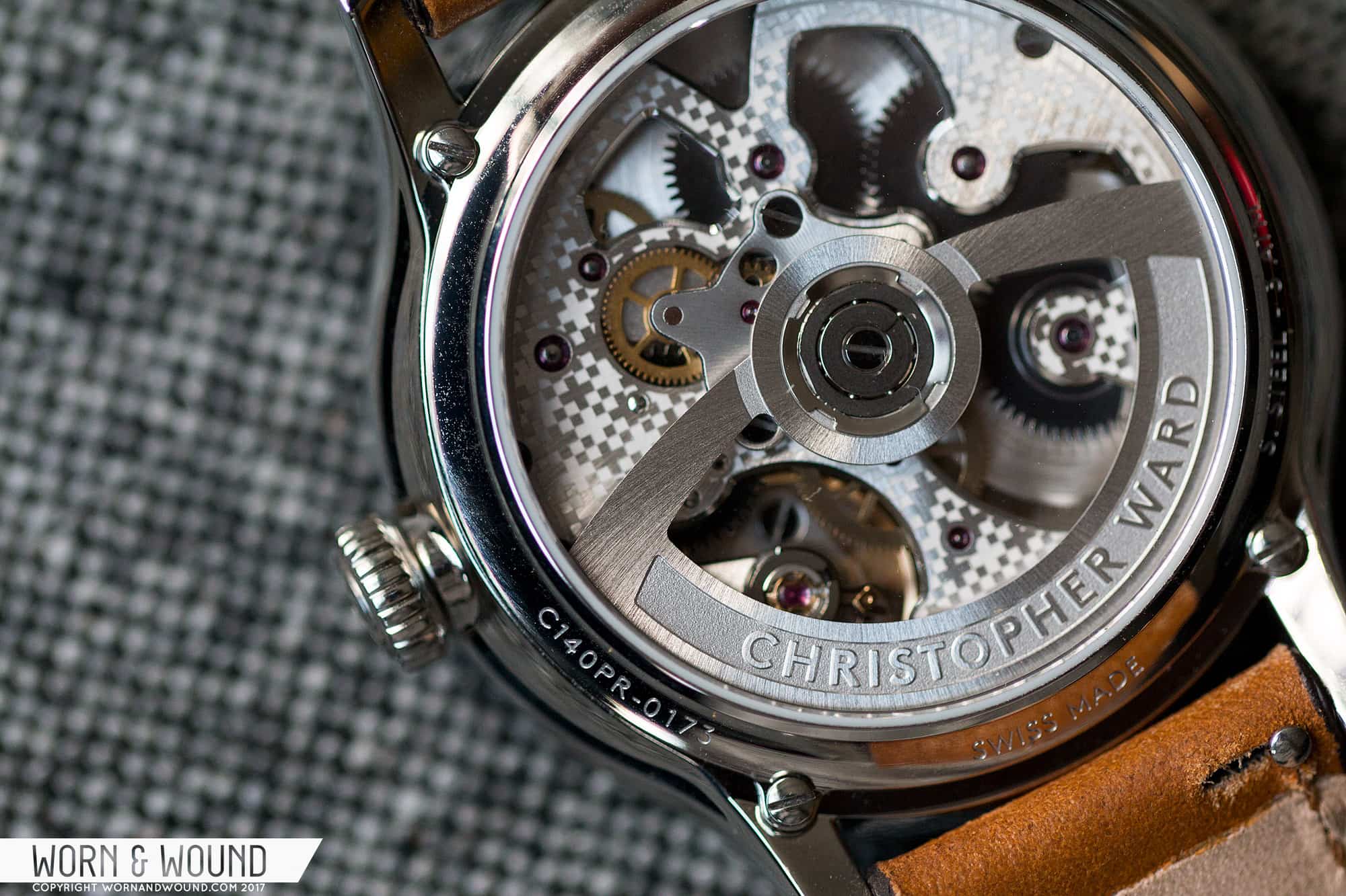
When Christopher Ward first announced the C1 Grand Malvern, I was very excited. Over the last six years, we’ve seen that brand grow and change many times over and after a slight bump with their rebrand, the C1 looked like they were back on track. Great styling, even greater price and featuring their SH21 movement with a new, sexier design; there was a lot to like. Aside from the watch itself, what I was excited to see was a C Ward that had its own voice. It wasn’t derivative of other brands, nor was it “classically” styled. Rather, it was something new, something they could own.


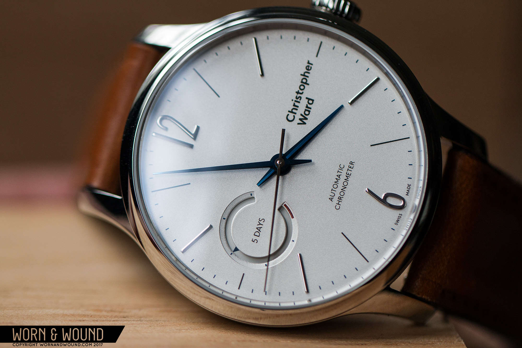
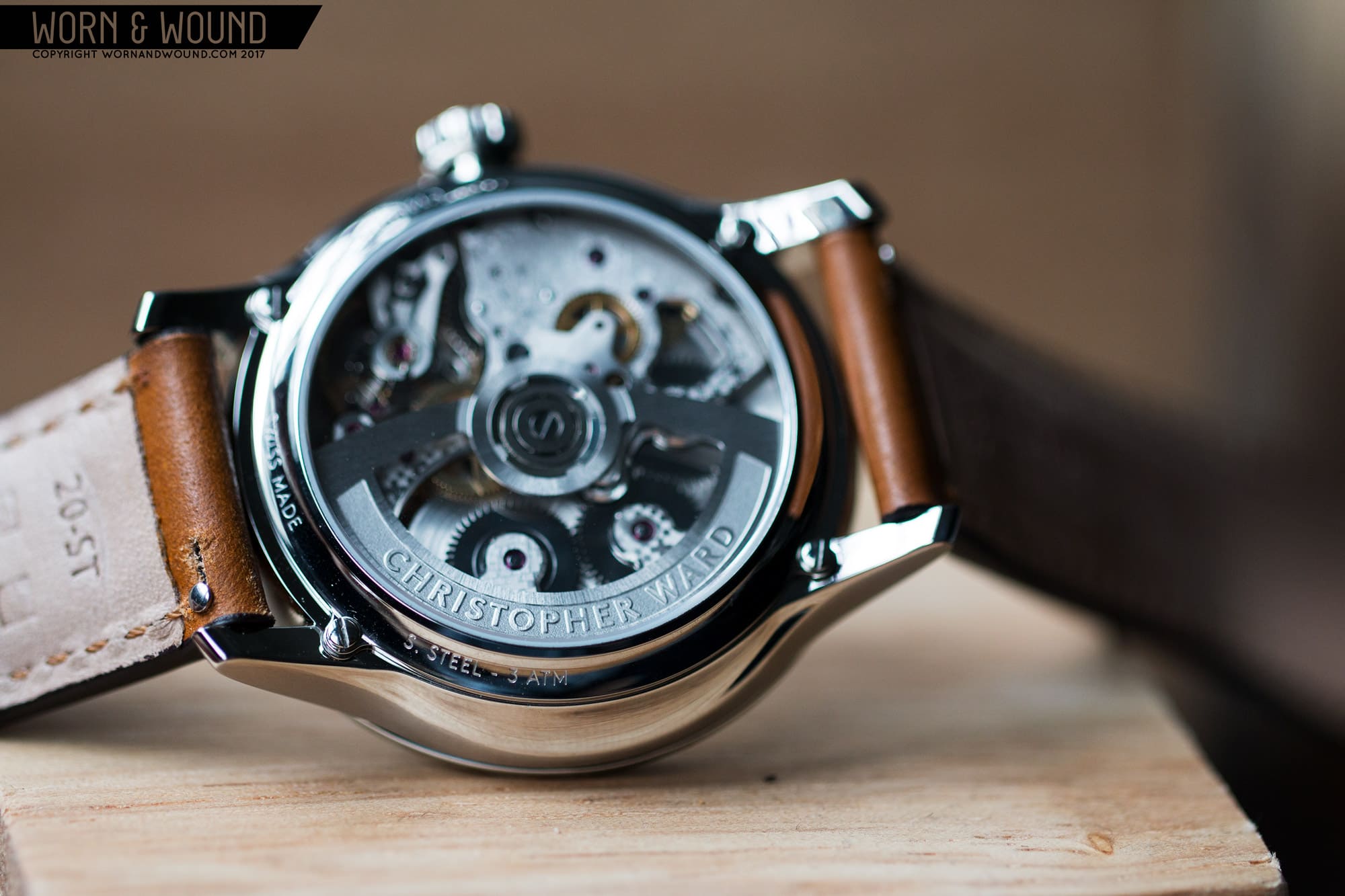
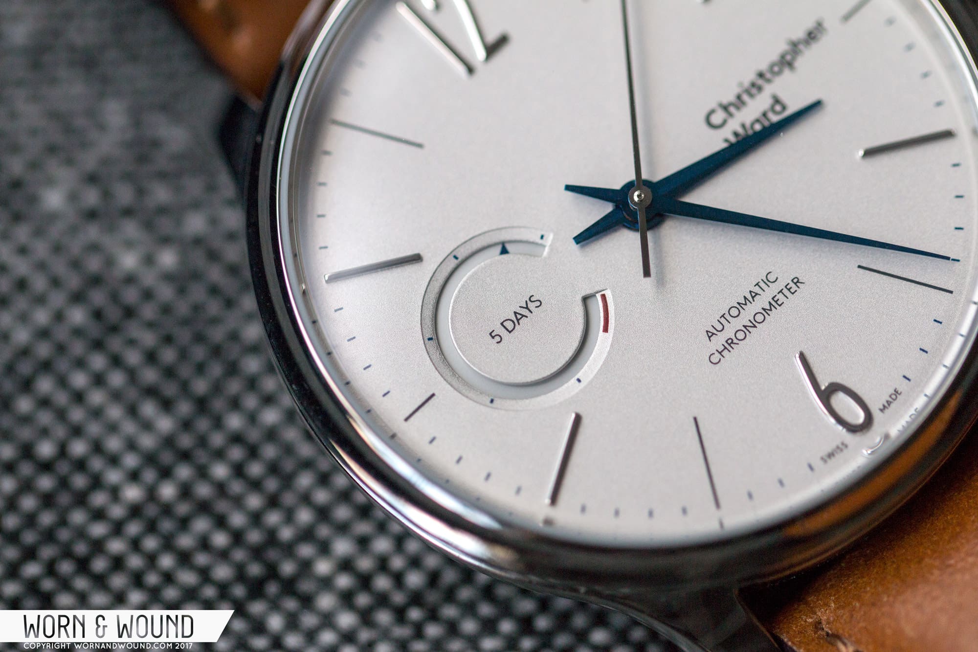
Needless to say, I’ve been eagerly awaiting the opportunity to spend some time with the watch, which has finally come. The C1 Grand Malvern is an evolution on their in-house watches, which have always sported a certain masculine-dress charm. It has their remarkable five-day chronometer movement and a price tag of $1,935, which is actually a bit lower than some of the previous models with the caliber. More over, the design is a new direction for the brand, in both the case and the dial, and just might be a high-point stylistically.

Advertisement
$1935

Christopher Ward C1 Grand Malvern Review

Case
Steel
Movement
C WARD SH21
Dial
Opalin White
Lume
NA
Lens
Sapphire
Strap
Shell Cordovan
Water Resistance
NA
Dimensions
40.5 x 48mm
Thickness
13.2mm
Lug Width
20mm
Crown
Push Pull
Warranty
Yes
Price
$1935

Case

The C1’s case is pointedly modern with swooping lines inspired by the Aston Martin DB9. While the automotive influence is thankfully not literal, the use of seemingly aerodynamic forms gives the C1 a dynamic quality. It’s quite complex too, with no flat faces, a mix of concave and convex surfaces and both polished and brushed finishing. The C1 comes in at 40.5 x 48 x 13.2mm (to the top of the domed sapphire crystal), making it on the large side for a dress watch, but a reasonable size for an everyday watch with formal leanings. That said, the style of this watch comfortably rides between casual and elegant, making it versatile.


From above, the case is fairly classic in design, speaking to the brand’s origins. There are long, tapering lugs with full polish that add an immediate elegance to the watch. The bezel is relatively thin, making for an expansive dial, and seems simple in form. From a lower angle you can see that bezel is in fact concave, which adds complexity both geometrically and in how it reflects light. I happen to quite like the effect. On the right side you have a thin crown with a slightly rounded shape and small grooves for grip. On the outside surface you’ll find C Ward’s new positive/negative cross logo rather than a letter. Overall, it’s a nice crown that suits the case, albeit the branding is odd bringing to mind QR codes.

Looking from the side, the complexity of the case is more apparent as are the DB9 curves. The sides of the case features a deep, arcing scallop shape beneath a line of brushed metal. The scallops are also concave, reflecting the design of the bezel. The result is thoroughly modern and quite attractive. The geometry really activates the sides of case, making the watch more interesting from oblique angles. It’s an interesting design for sure and a vast improvement over their previous, slab-sided cases, though it does have one drawback. Because of the undercuts and the increasing diameter of the case (it get’s wider from the case back to the crystal), it looks a bit top heavy, and being that it’s quite tall, this further exaggerates the issue.

The long curve on the side splits the finishing between brushed and polished
unexpected reflections come from the concave bezel
The slightly rounded crown is appealing
Big view of the SH21

One detail I really enjoyed is a gap between the bezel and the mid-case. I know that sounds weird, but it adds some additional intricacy to the case. Basically, where the bezel attaches to the mid-case there is a line of metal that acts as a stand off, thus creating the gap. You’ll find something similar on Speedmasters, though the effect is different. C Ward and crew did a good job finding simple ways like this to elaborate on the case without adding cheesy or baroque details.

Flipping the watch over, you are treated to a very clear view of their newly re-decorated and aesthetically redesigned SH21 Movement. I’ll get into that more below, but the new decor makes it even more appealing than before to look at. The rest of the case back is very simple, but interestingly, also concave.

I have to applaud C Ward on this case design. It’s different, compelling and a big step up from the previous, too-conservative, cases that were found on the C9 watches. This looks and feels like a case from an established luxury brand, if not better in design. It’s actually quite a fun case with unique curves that will continue to catch your eye after many wears.

Dial

The C1 dial plays off of the previous C9 Harrison 5-Day models, but goes in a more modern and, frankly, attractive direction. There are three version; Black, Blue and Opalin White . The black and blue both feature sunray finishing, while the white is actually a matte silver. I think I have sunray-fatigue at this point, having seen so many watches with dials that style in the last few years that the matte silver stood out as the obvious choice for this review. And, it’s quite attractive, with a pale off-white color that at times appears more metallic.

On the silver surface you’ll find a primary index with large applied 12 and six numerals, and then a series of alternating thin charcoal gray lines and applied batons. This latter detail is curious and at first I wasn’t sure about it, though I’ve come around. Basically, the odd hours are printed lines while the even are batons. Why? I’m not really sure, other than to do something different, but it in the end it has a nice balance to it. Had they all been applied, the dial might have felt too much like a generic dress design, all printed and it might have been too casual or minimal.

Around the edge of the dial is then an index of small printed lines for the minute/second, rounding things out. Unless my eyes were playing tricks on me, this index was actually a dark blue, rather than the gray used for the rest of the index. It’s very subtle and the markers are small, so I had to look at them with a loupe to make the determination. This doesn’t have much of an effect on the dial, but I can’t help but feel like it makes the index stand out a bit more.

The power reserve is an unique and appealing element
The dial surface is called Opalin White, but appears as a pale silver
The minute hand curves down slightly

The most intriguing element of the dial is the power reserve located at nine. Finally, C Ward put a power reserve indicating not hours, but days of energy remaining in the SH21 caliber. While I might argue that this watch aches to be hand-wound, and that having a power reserve furthers that, it’s one of the coolest looking indicators I’ve seen, and it sort of “makes” the watch. Rather than an arcing hand or a disc on top of the dial, there is a c-shaped window (which hopefully isn’t c-shaped for “Chris” as that would be very on the nose) with a beveled edge. On the bevel are five lines, each denoting a day, and then a dash of red indicating near-empty.

Within the window is then a small triangle printed on a white surface, which turns to indicate remaining power. In the center of the complication, on a surface that is an extension of the dial, it simply reads “5 days.” It’s a clever and attractive design, and I have to applaud them for the restraint practiced in its creation. There is no “full,” or no “empty,” nor numerals, nor a boldly printed “power reserve,” rather a minimal amount of information, but more than enough to figure it out.

Other than the power reserve, you’ll find the new Christopher Ward logo at three and “Automatic Chronometer” above six. Regardless of the controversy around their new logo, on this watch, in this context, it works. The watch is more modern and the logo suits that. I don’t love how it’s positioned, and I know this is nitpicking, but I feel like it could be a touch more to the left, and a touch higher, so that the line at three was between Christopher and Ward, rather than being the baseline for Christopher.

The hands on the C1 also play off of the needle hands from the C9, but have been re-designed for better legibility, mainly by adjusting proportions to make the three hands more distinct from each other. You still have the tapering needle shape, which I find appealing, but now the hour is clearly shorter and wider than the minutes, and the seconds hand is then a classic stick, making it more visually distinct from the minutes. On the silver version, the hour and minute are heat-blued steel, always a nice touch especially on a light dial. There is also some additional finishing on the hands, with a brushed stripe down their centers and polished sides. This adds some dimensionality, and gives them a higher end look.

Overall, it’s a very appealing dial that grows on you with wear. The style is a nice blend of class and casual, with good proportions and just enough unique elements, such as the very cool power reserve and alternating markers. This results in a versatile watch that has an interesting relaxed, but luxurious style. It’s formal enough for the office, but wants to be in a more casual setting. And by casual, I don’t mean cleaning the garage, but rather tooling around in a vintage sports car, should you be lucky enough.

Advertisement

Movement SH21

I’ve written about the SH21 a few times now, first when I reviewed the C9 Harrison 5-Day and then when I reviewed the hand-wound version in the C9 SS Chronometer. As in both of those cases, it really can’t be understated how unique and compelling of a caliber it is. In-house, five-day (120-hour) power reserve, COSC-rated, Swiss-made and in a sub $2,000 watch. It’s a big league movement in an approachable package and you’re simply not finding anything else like it at the price point, or a few thousand above.

For the new C1, the basics of the movement stay the same. This version features 35-jewels, hand-winding, hacking, a 120-hour power reserve and a frequency of 28,800 bph. The previous automatic had 31-jewels, so the additional four are likely to do with the power reserve.

What has changed the most, however, are the looks of the movement. Previously, the SH21 featured a large plate over the works with a flat sanded finish and polished screws. The goal was for it to be traditional-British in decor… people responded to it with mixed feelings, saying it was under-decorated. I liked it, but it certainly wasn’t flashy.

The new movement is. The large plate on top has now been skeletonized to create a more dynamic view of the gear train, escapement and barrels. Rather than sanding, the plate has a “Colimaçoné” finish, which is a sort of twisting, sunray graining, with an all-over etched pattern on top. The etching is of their cross-logo, which like the Hermés pattern found on the Slim d’Hermes, adds a certain modern chic to the design. I’ll give them credit for trying something different. I’m not sure if I prefer it to the previous or to more traditional graining such as Côtes de Genève, but it’s still nice to look at. It’s not as cool as what they did in their recent C8, that’s for sure, but it’s great to see that they are now willing to style the movement to the watch. Additionally, the rotor has been redesigned. It now has much more open space to it, allowing for a clearer view of everything below.

Strap and Wearability

Christopher Ward has always done straps well. I’ve definitely admired both their gator and leather straps, depending on what we were reviewing, especially if they featured the Bader deployant, which is, to this day, the best deployant I’ve tried. The new cordovan strap found on the C1 lives up to my expectations for the brand. The top leather is “Camel” colored Italian Shell Cordovan, which has a nice, deep tan color. It features tonal stitching, dark brown edge paint, and natural-colored leather lining. There is some padding in the strap as well, adding some dimensionality to it. It’s gorgeous and goes very well with the coloration of the watch. Unsurprisingly, it’s a $125 strap when sold separately.

On the wrist, the C1 wears very well. In fact, it’s one of those watches that when I first put on, immediately made me say, wow, this feels great. The 40.5 diameter and 48mm lug-to-lug are well-balanced on my 7-inch wrist, and because of how the Bader deployant works, hiding the tail of the strap and creating a clean leather line, it feels almost tailor made for my wrist. The one complaint would be with the height, as it does look and feel a bit tall. Not so much as to ruin it, but definitely noticeable. This watch aches to be manual. Cutting off those couple of extra millimeters for rotor clearance would make the watch sit so well.

Advertisement
The big dial gives it a lot of presence, while the size makes it fit well
gorgeous shell cordovan

In terms of looks, the C1 is also very successful. It’s clean, reserved and very handsome. The expansive dial has a nice masculinity to it, which is achieved through subtle design cues and coloring, rather than any aggressive elements. In fact, there’s really nothing aggressive about the watch at all, which is refreshing. It’s oddly, calm and serene, which in turn exudes a sort of confidence. Like I said, it’s a watch that grows on you. At first, I thought it was a touch plain, but these other qualities have revealed themselves through wear. Lastly, it’s a very easy watch to pair with clothing. The style and neutral palette will make it work with everything from a suit to shorts and a t-shirt.

Conclusion

Previously, I’ve criticized C Ward for not having their own look, and at times feeling a bit stiff. This C1 Grand Malvern remedies that. It’s a Christopher Ward and nothing else. Sure, the branding might be jarring to some, but I think that’s mostly because it’s a sharp turn from their previous branding, which wasn’t that great either. On this watch, which is the best I’ve seen them make, it works better than their old branding would have. Yes, it’s indicative of a future for the brand that perhaps their stalwart and stubborn customer base will find unappealing at first, a new style that in some ways betrays their old philosophy, but the brand needed to find a voice. My issue with the new branding was that it felt a bit generic and looked odd on their old watches. Seeing it here, on this new concept, it’s starting to come together.

Branding aside, it shouldn’t stop you from appreciating this watch. The C1 really is a new bar for the brand. It’s attractive, well-finished, stylish, unique and a great value. With the accompanying strap, which puts most luxury brands to shame, it’s a hell of a package at $1,935. Sure, that’s not cheap, but the value here is so obvious that a case doesn’t even need to be made. Simply put, the watch should cost more, but doesn’t.

Images from this post:
Related Reviews
Zach is the Co-Founder and Executive Editor of Worn & Wound. Before diving headfirst into the world of watches, he spent his days as a product and graphic designer. Zach views watches as the perfect synergy of 2D and 3D design: the place where form, function, fashion and mechanical wonderment come together.
wornandwound zsw
Categories: