Exclusive: Hands-On with the Farer Hopewell Automatic

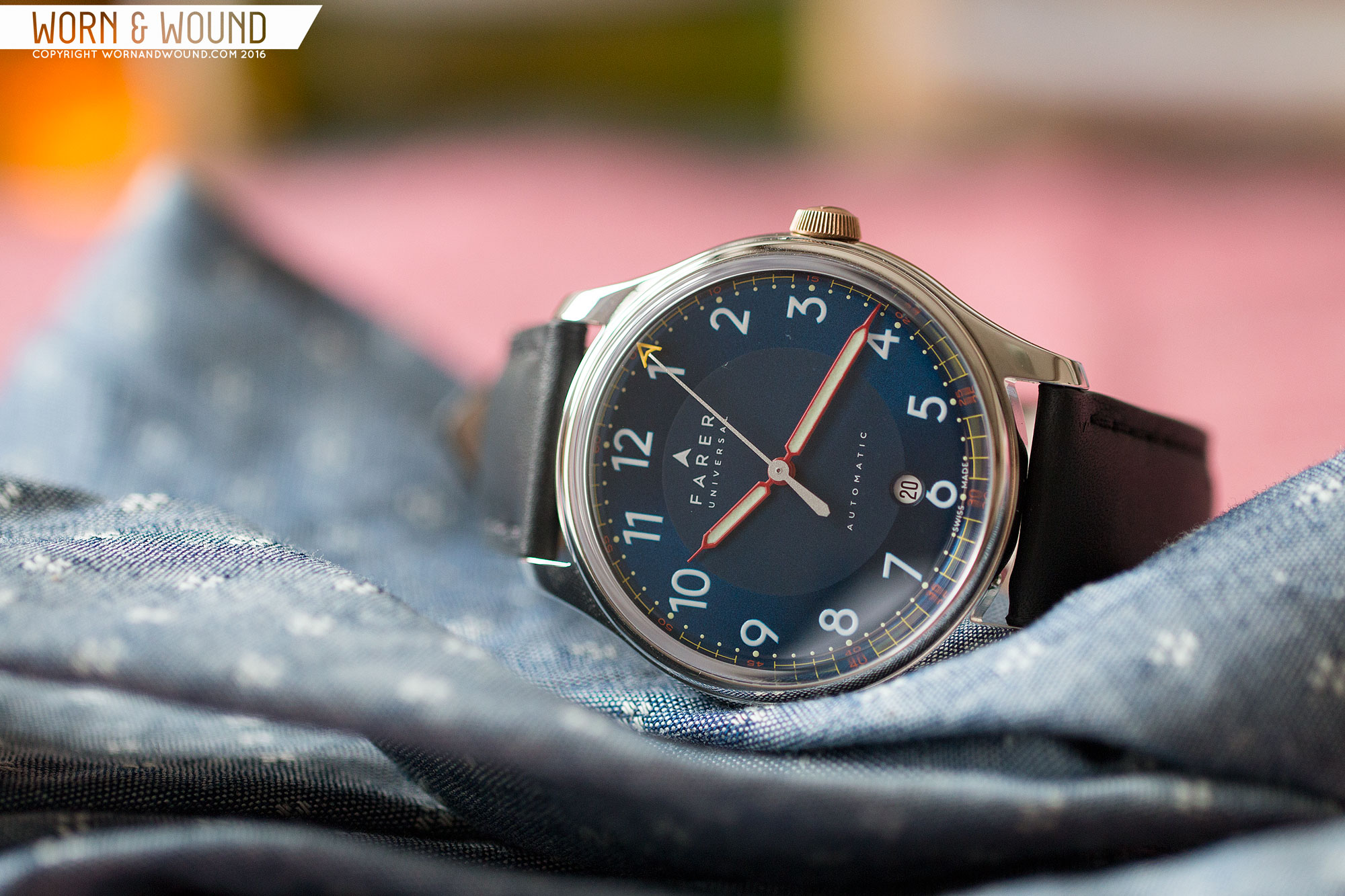
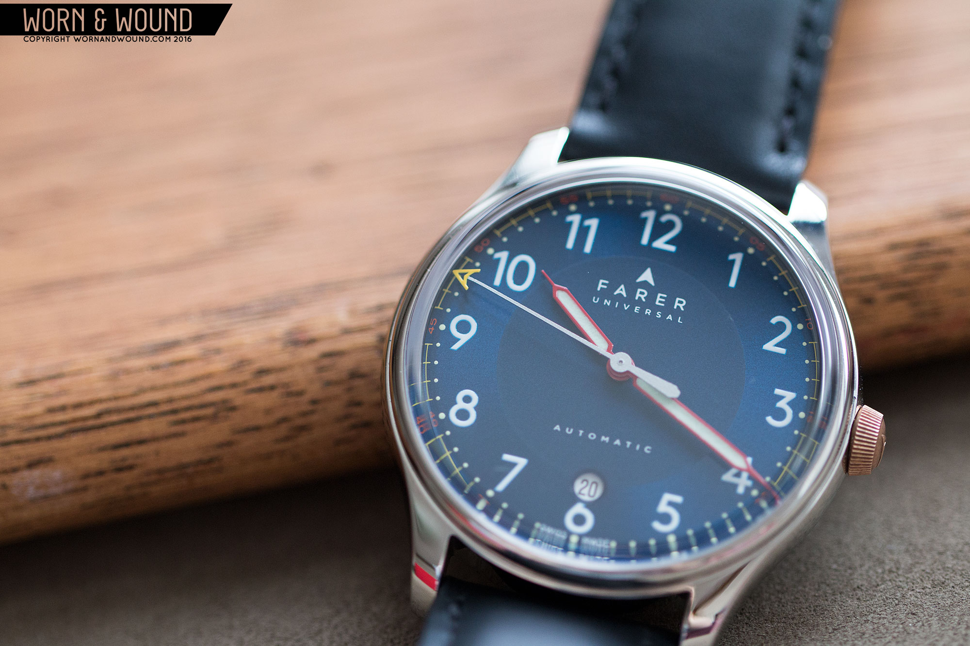
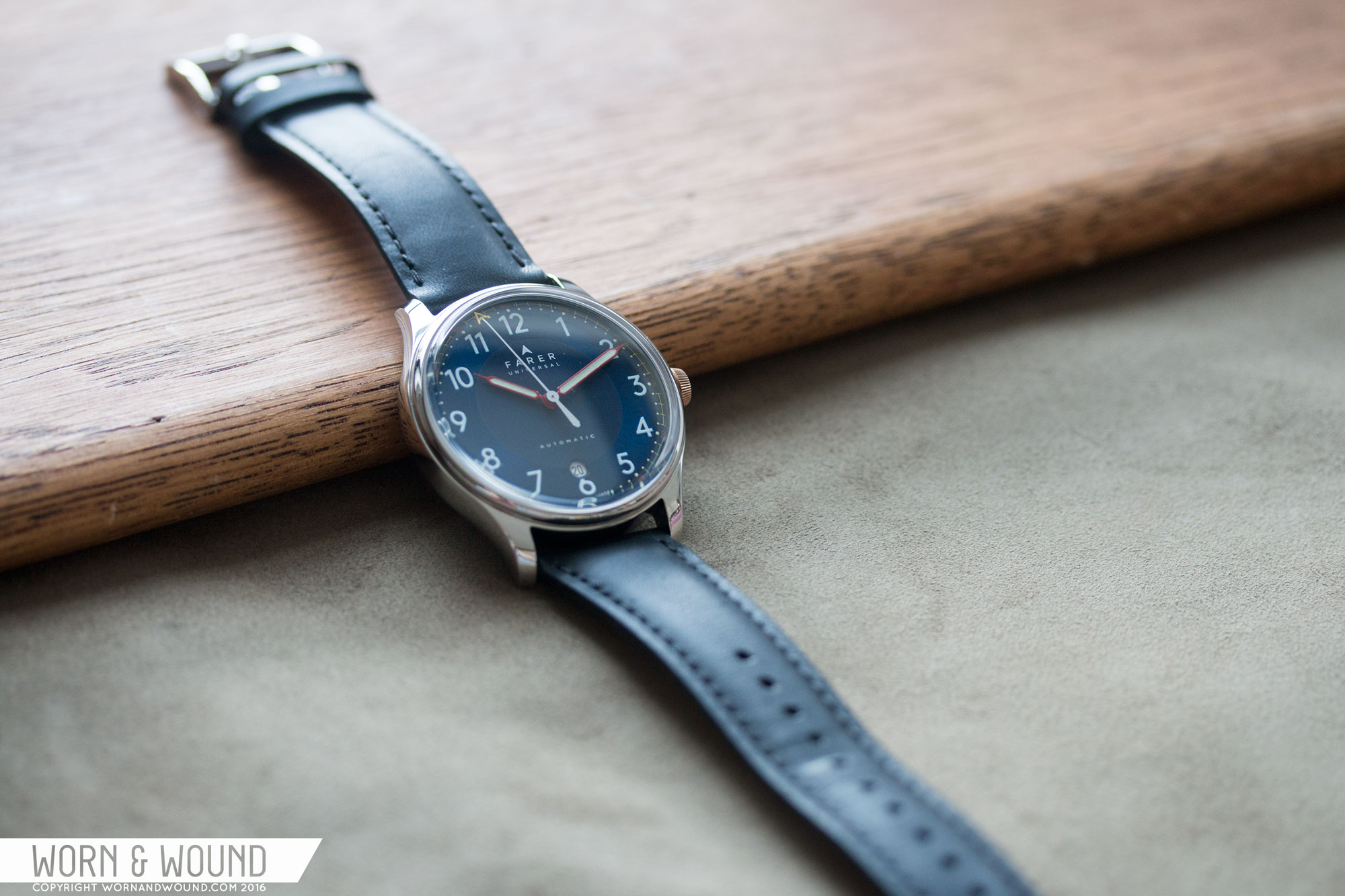
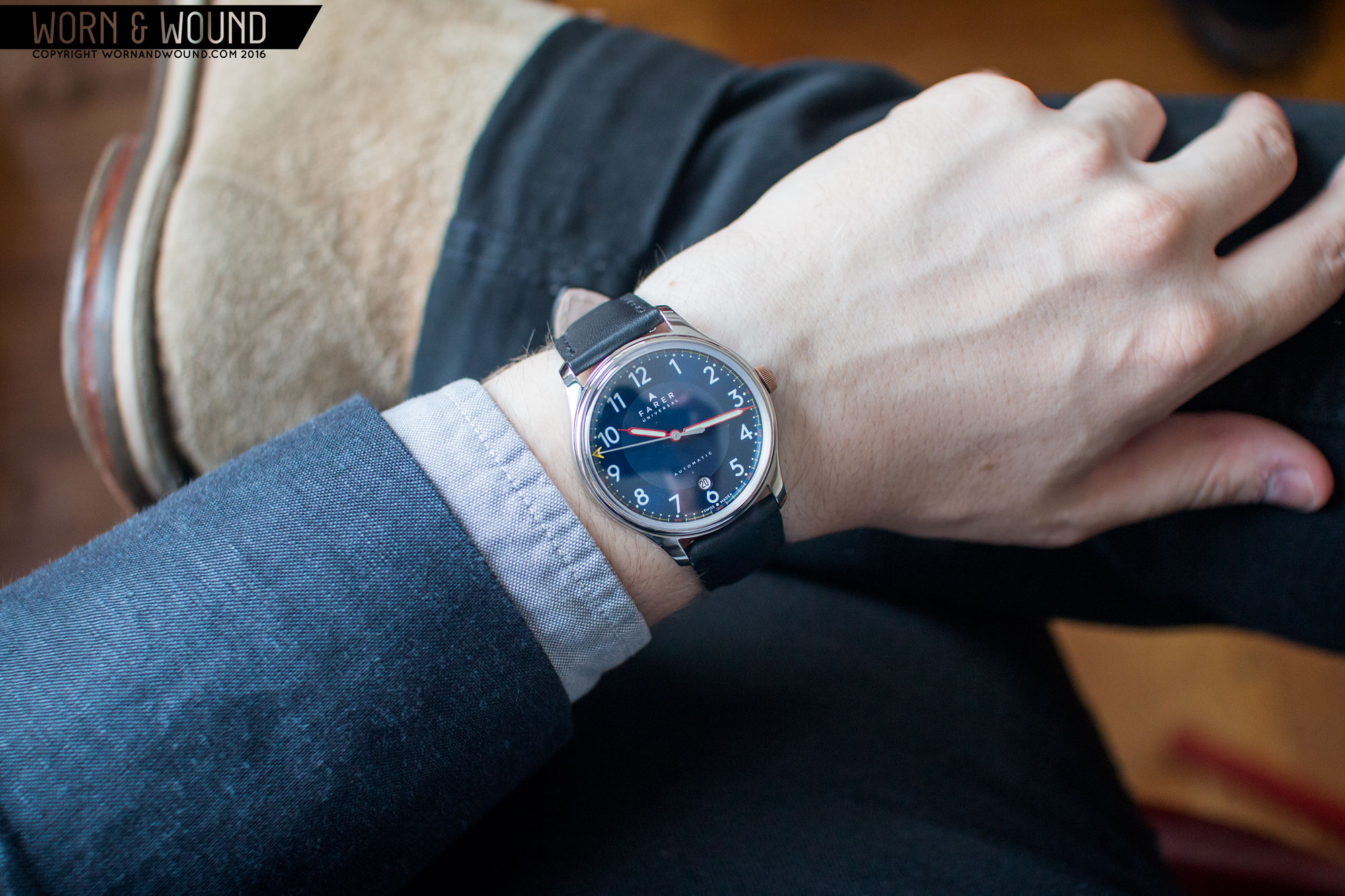
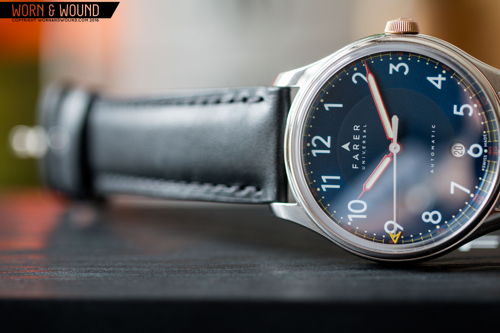
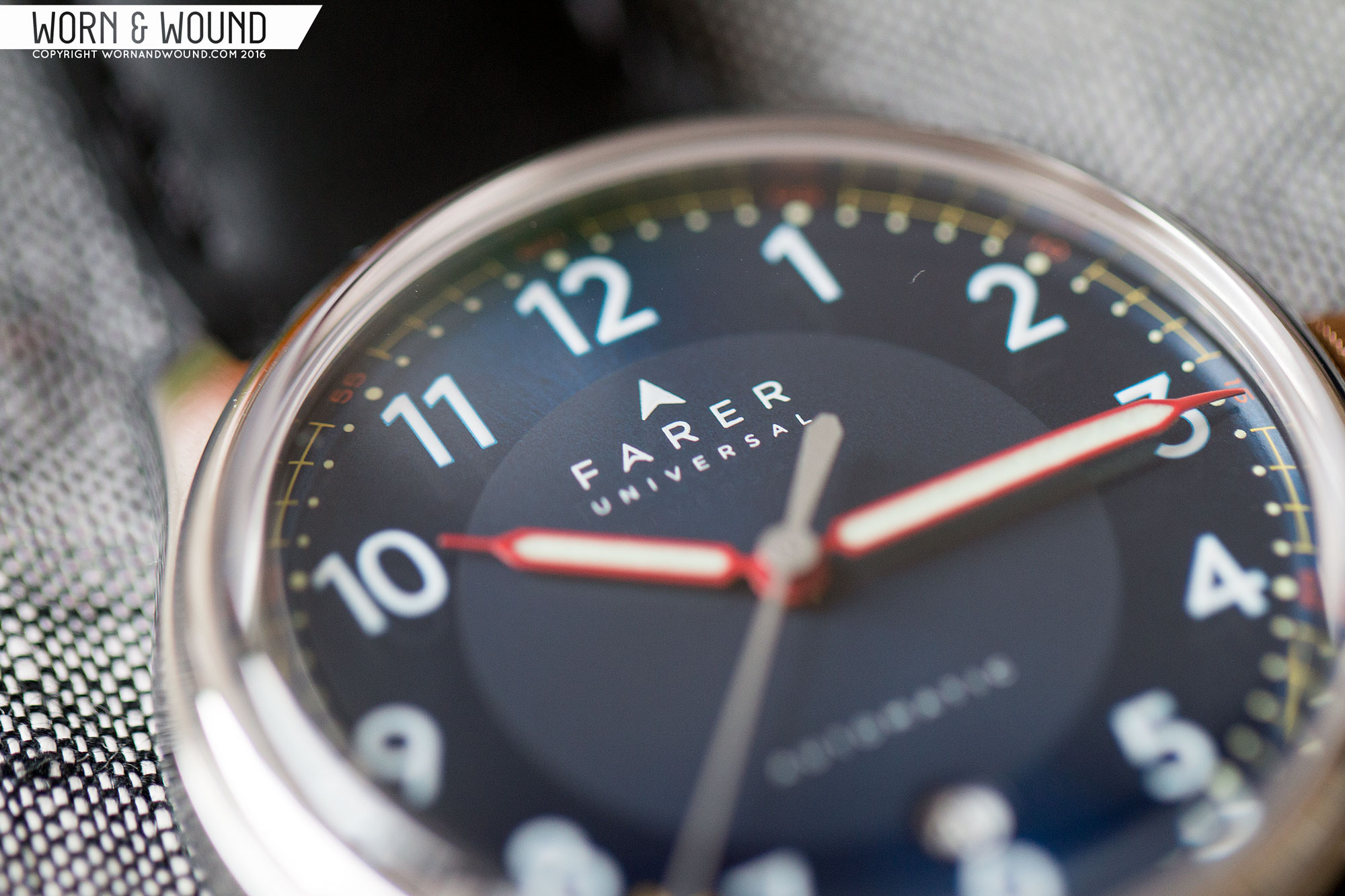
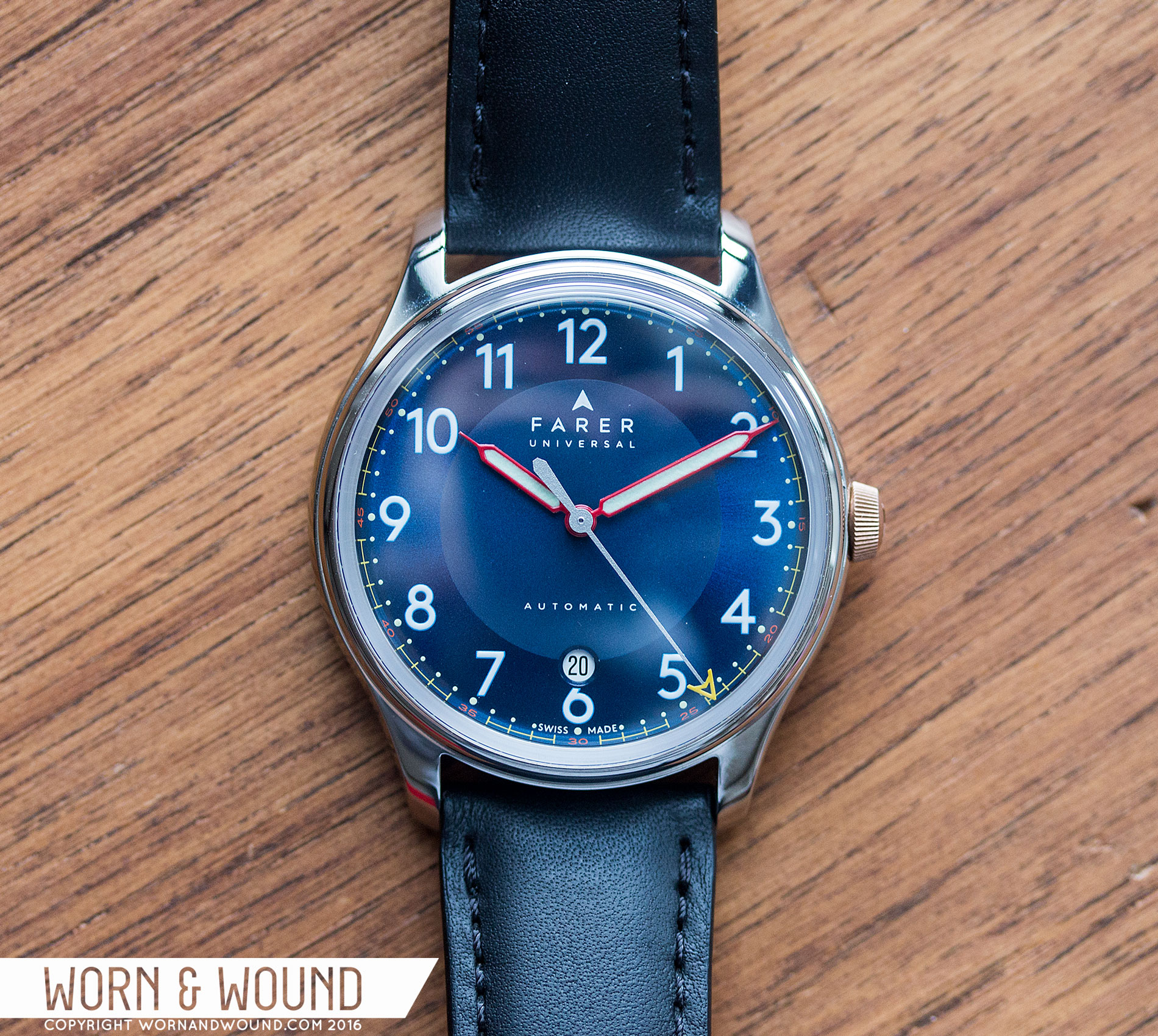
Just a little over a month ago I reviewed the Farer Barnato, a quartz GMT with a playful spin on mid-century styling. The case design and overall aesthetic were very appealing, managing to be a unique take on something vintage inspired. I genuinely enjoyed wearing it, but as with most quartz watches I wished that it had been a mechanical. Well, today I have the distinct pleasure of being the first to show you one of Farer’s newest watch, the Hopewell Automatic.

farer_hopewell_dial_10

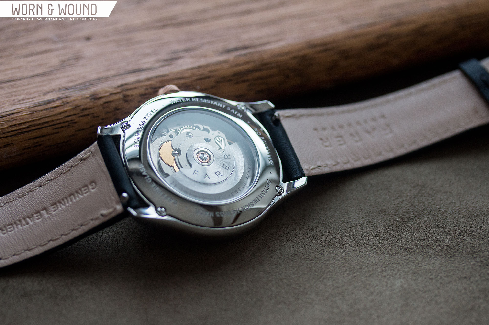
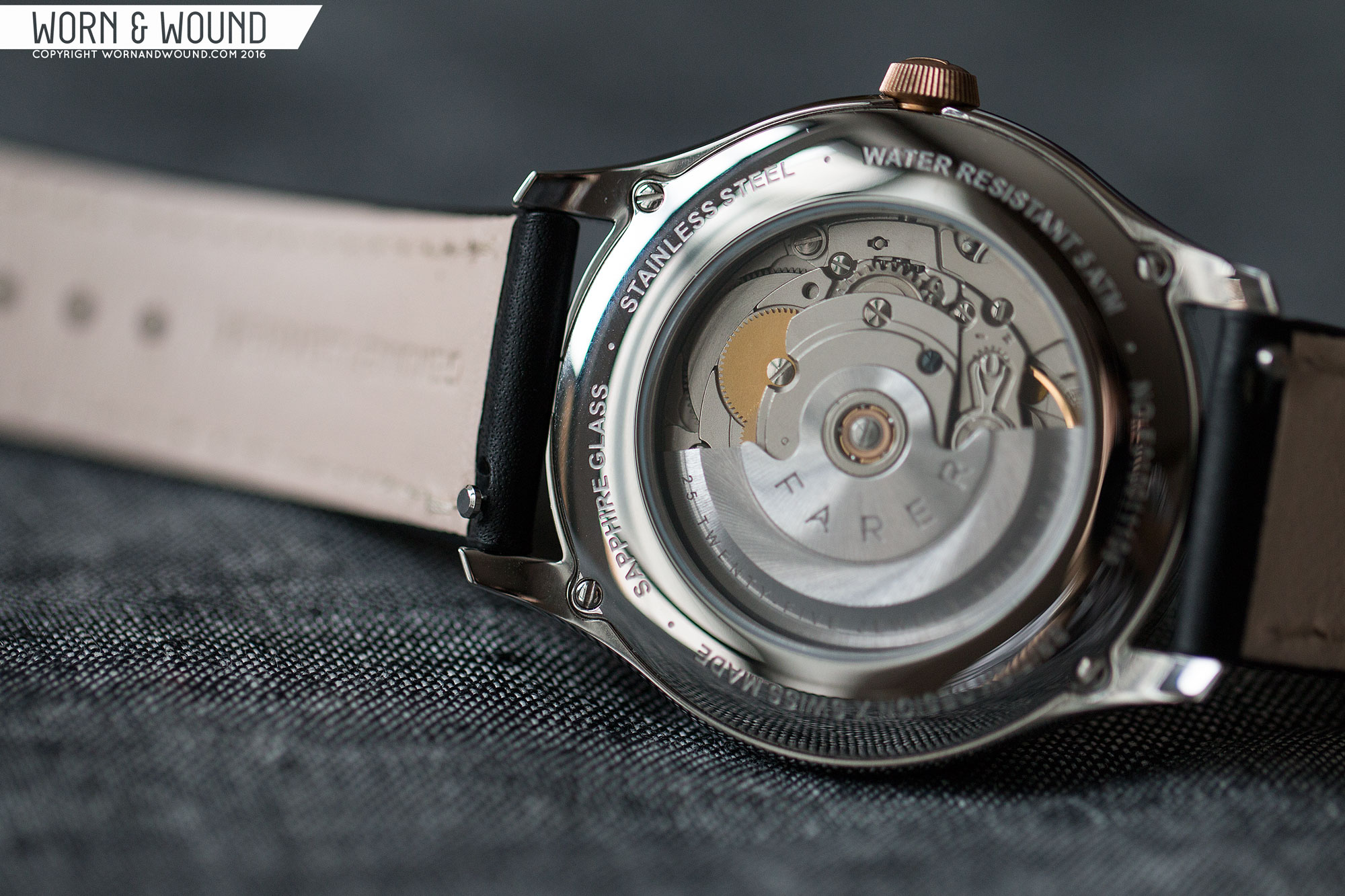
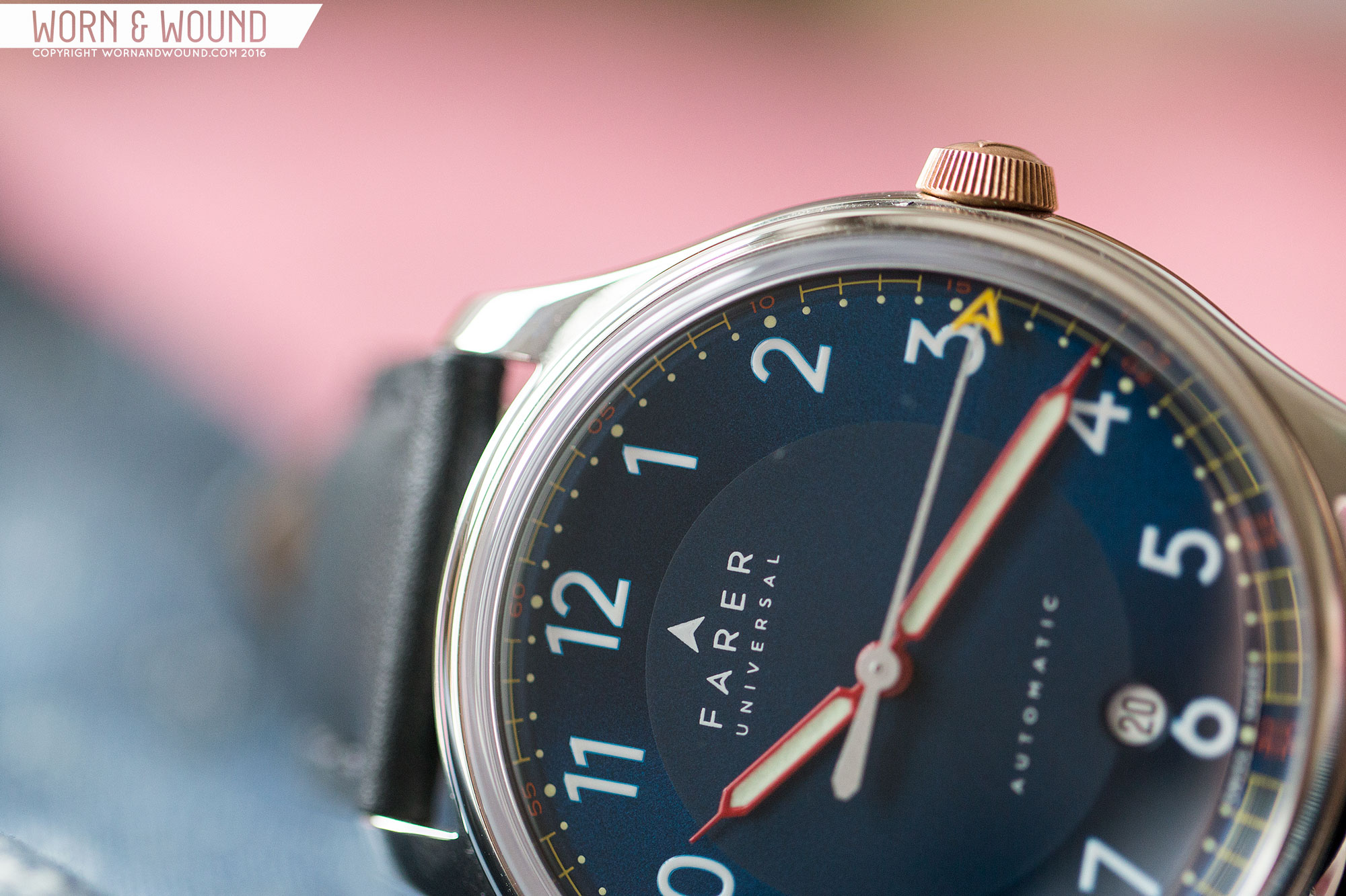
The Hopewell takes many design cues from their existing watches, bearing a clear resemblance to the Barnato, but changes up some details and adds an automatic movement. Powered by an ETA 2824-2, Farer is sticking to their slogan of “British Design x Swiss Made”, and we can’t complain. The classic Swiss workhorse movement, 2824’s are reliable and trusted. They seemingly are making a bit of a resurgence as of late, bucking the trend of the last few years post ETA/Swatch’s pulling back of supplies. We’ll have to see if that keeps up, but in the meantime we welcome some new 2824-2 options.

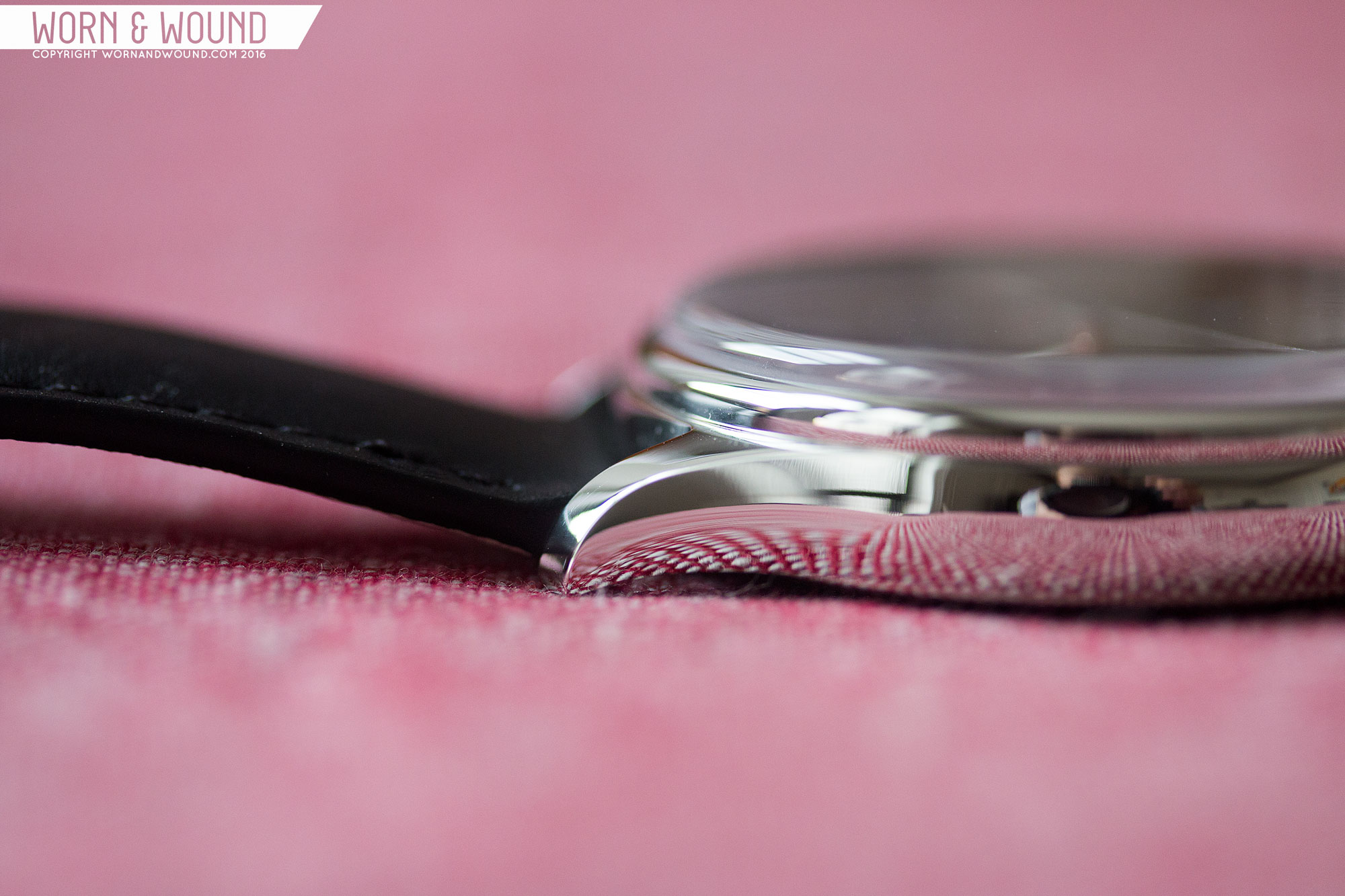
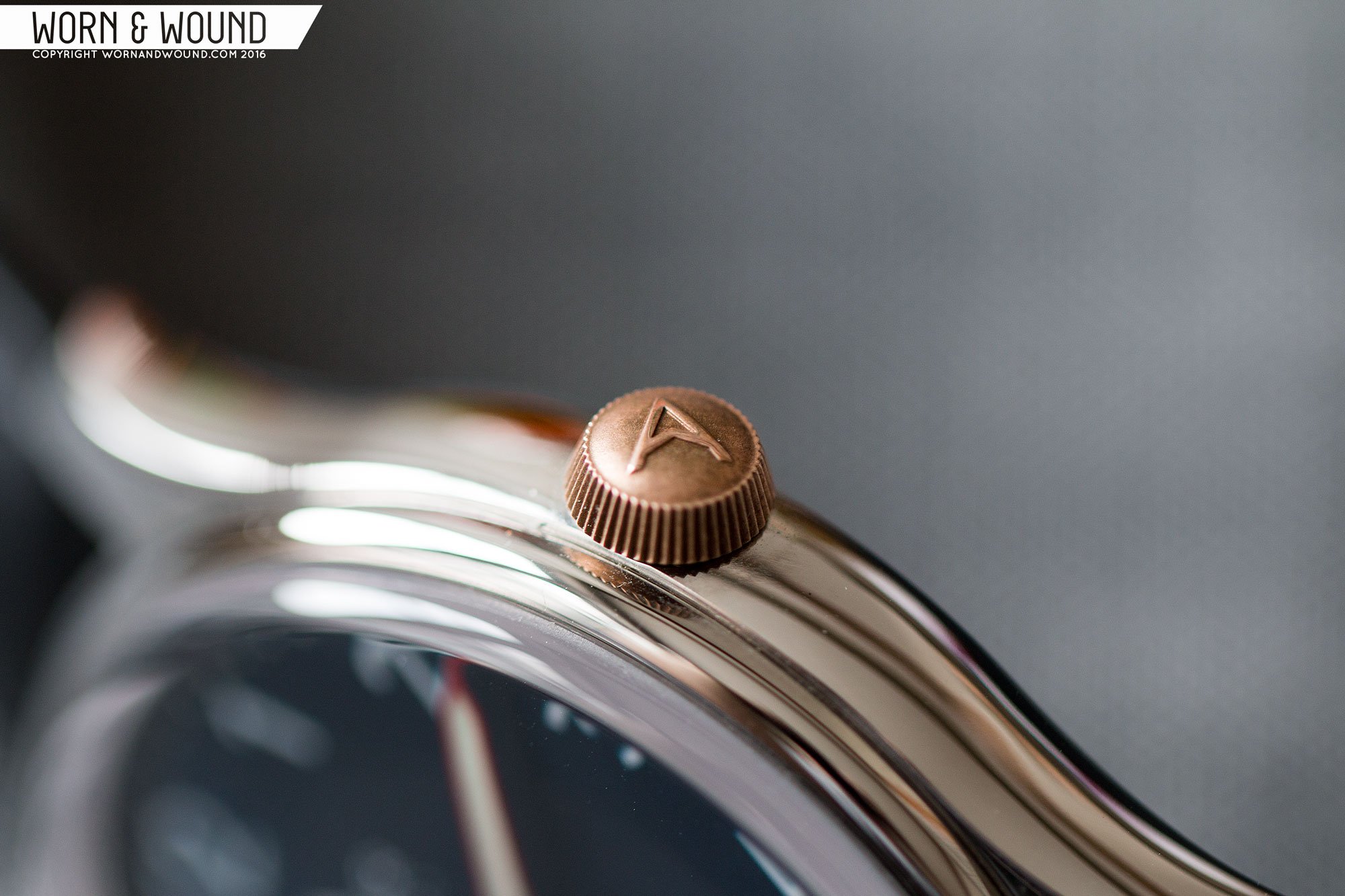
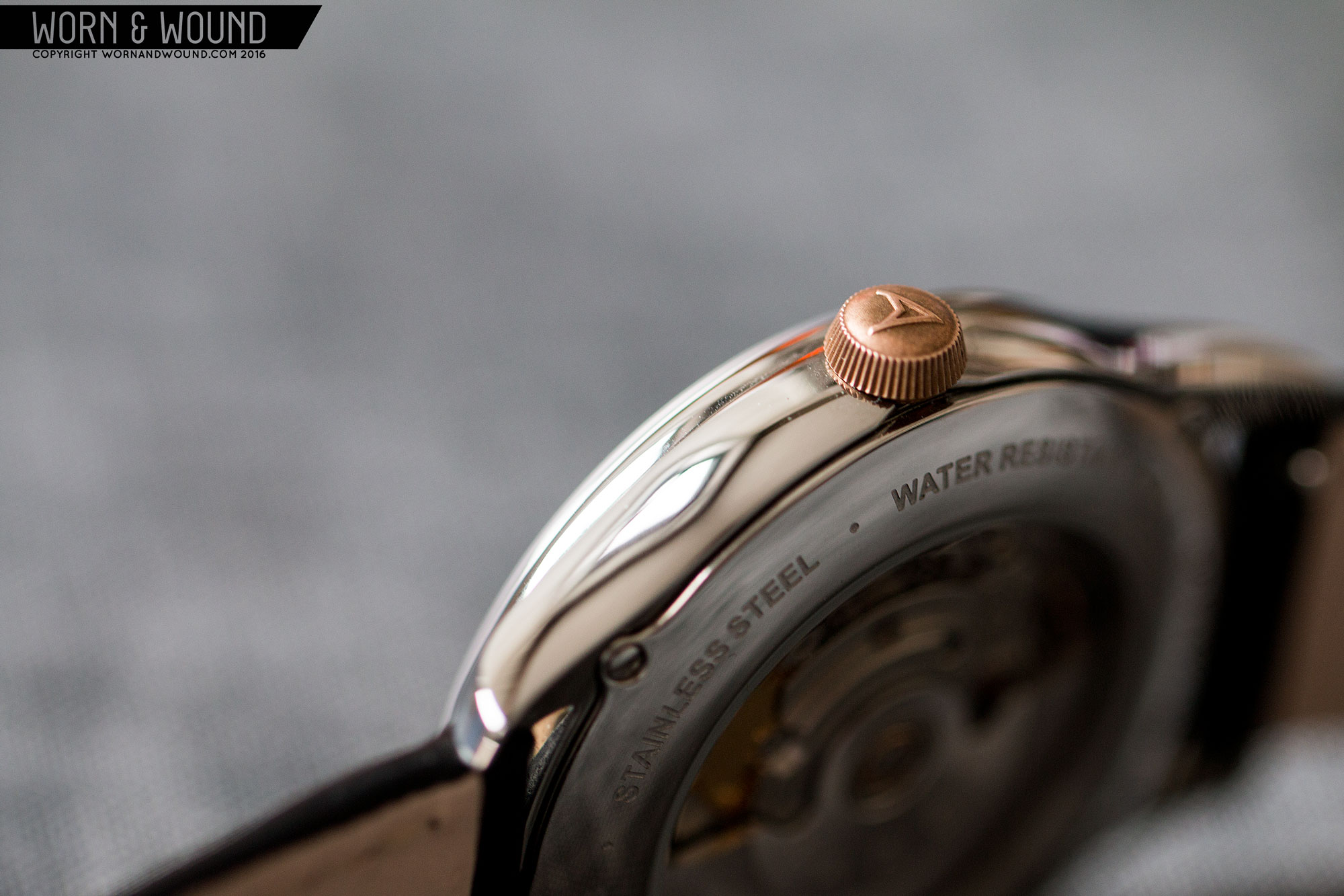
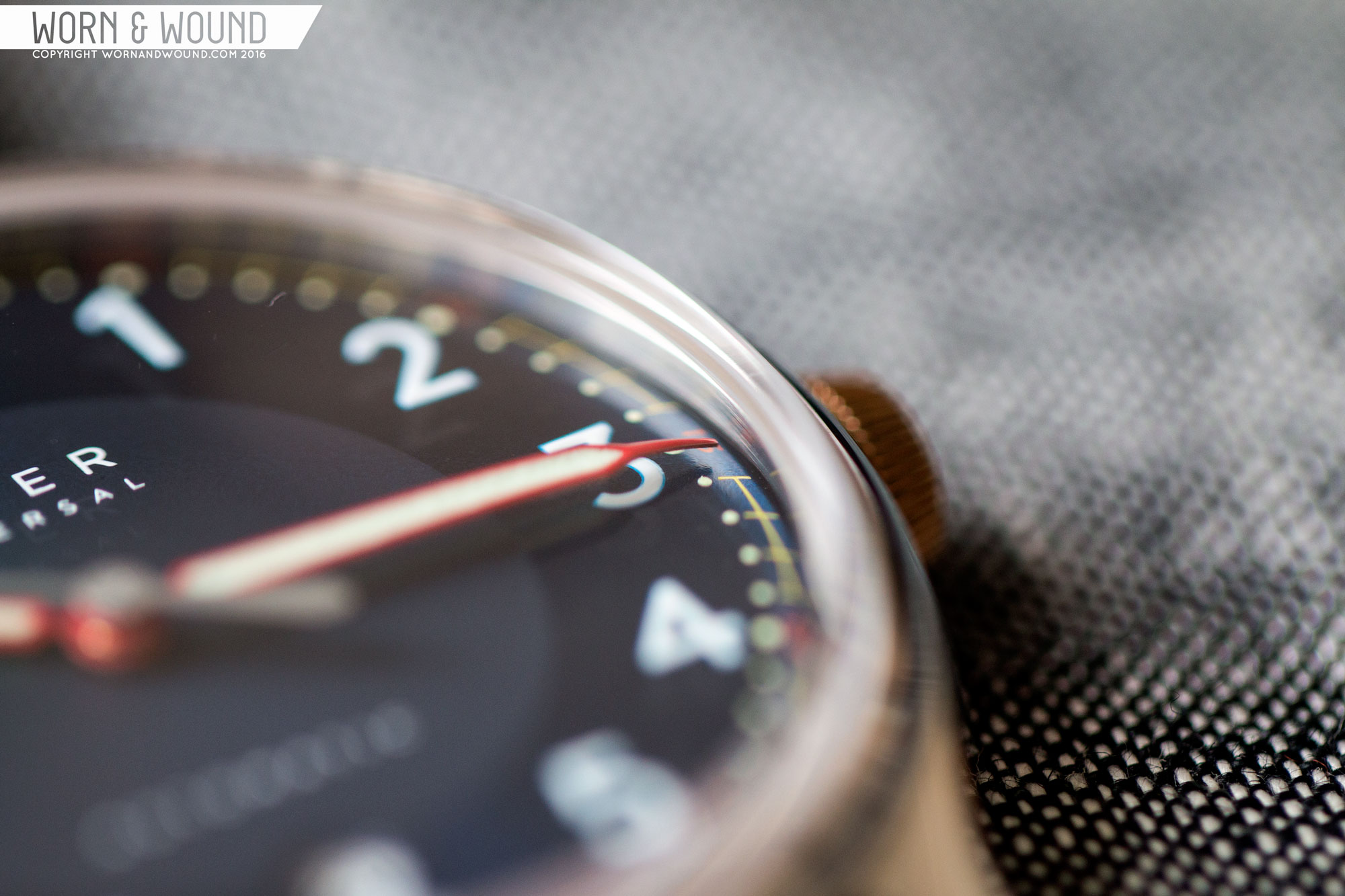
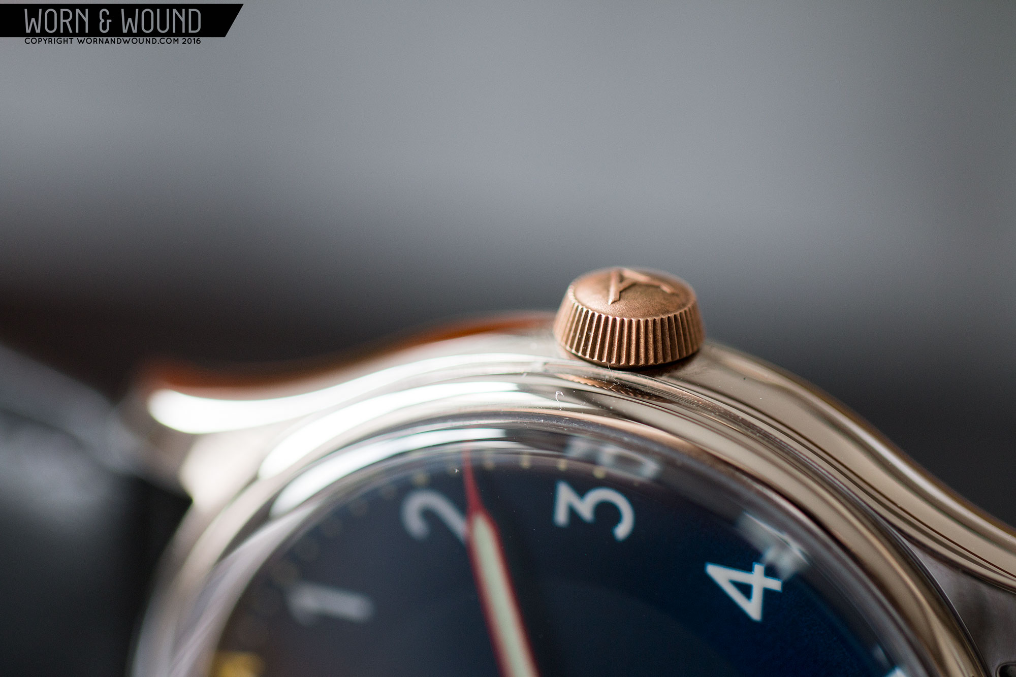
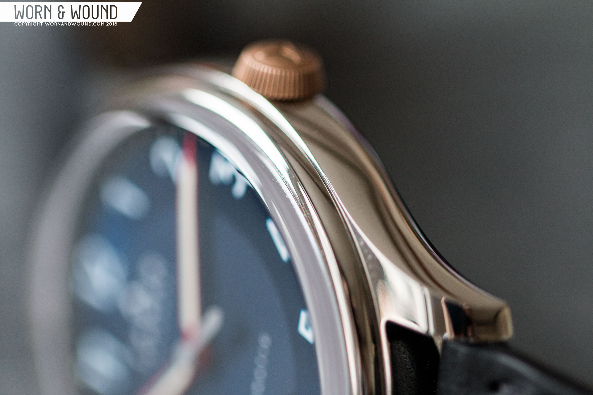
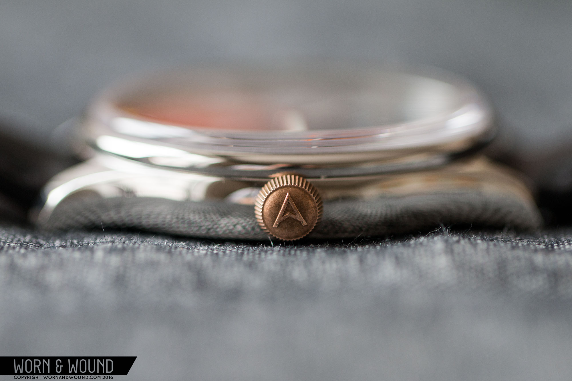
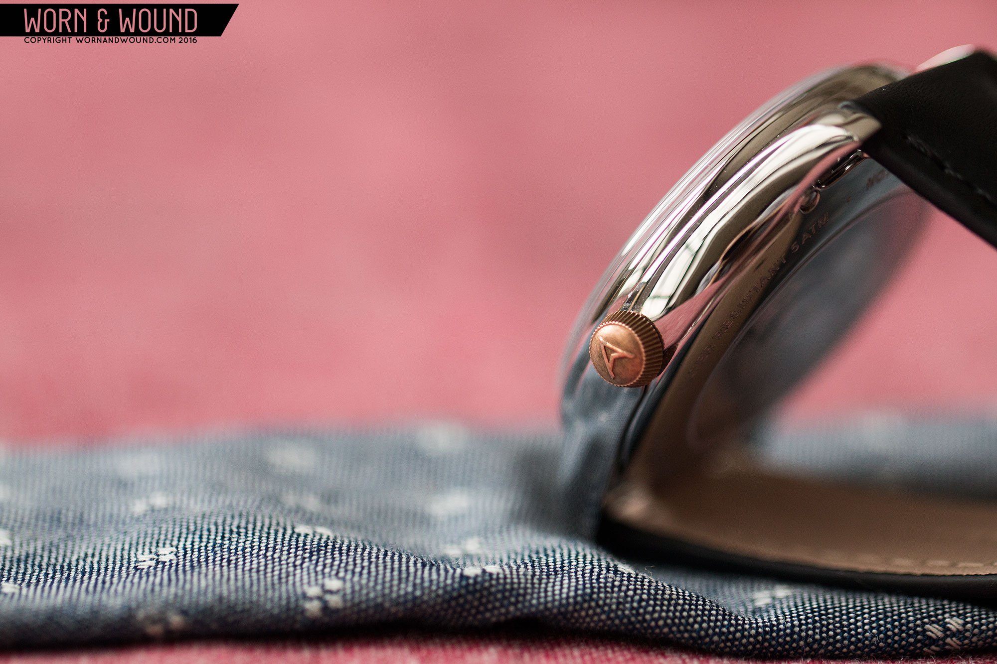
Back to the watch, Swiss insides luckily don’t mean crazy prices with the Farer, which comes in at $1,075. Also included in the Hopewell is an upgraded crystal, now a domed sapphire vs mineral with sapphire coating, sapphire caseback and solid bronze crown (more on that later). $1,075 isn’t cheap, obviously, but it’s very competitive, and given the styling and design quality of the watch, makes it a very serious alternate to some more established Swiss-made brands.

Advertisement
$1075

Exclusive: Hands-On with the Farer Hopewell Automatic

Case
Stainless Steel
Movement
ETA 2824-2
Dial
Blue Sunray
Lume
Yes
Lens
Domed Sapphire
Strap
Leather
Water Resistance
5 ATM
Dimensions
39.5 x 45.8mm
Thickness
11.4mm
Lug Width
20mm
Crown
Bronze
Warranty
Yes
Price
$1075

The case of the Hopewell has the nearly same dimensions and design to the previous models coming in at 39.5 x 45.8 x 11.4mm. As I noted in my previous review, this is a great size for a modern day-to-day watch. It’s small enough to wear well and comfortably, big enough to have presence. It speaks to vintage, but doesn’t quite feel it. The case design is also just gorgeous. It has beautiful flowing lines with rounded sides and bezel. It very much brings to mind the Rolex/Tudor Oyster cases, mixing elegance and sport together.

For the Hopewell, they went with a full polished finish. I usually am a fan of some brushing, but the polish looks really good here, actually adding a bit to the overall perception of value. It really helps accentuate the curvature of the case, and that touch of showy reflection increases the dressiness of the package. Flipping the watch over, you’ll find a display caseback showing off the 2824-2. It’s largely undecorated, though the rotor does have some bright metal plating, the Farer logo and some graining. Given that this is a casual/work watch, having a display makes sense and is appreciated, even if the movement isn’t the sexiest around.

On the right side of the case is Farer’s unique crown. Rather than being steel, it’s actually solid bronze. On the Barnato, it was a brighter, more yellow bronze (likely a plating) that came across almost gold. Here, it’s much more copper in color, giving it a darker, rosier tone. Since it’s solid bronze, it also gains patina. This is definitely a love it or hate it detail, of which I’m in the former camp. A unique detail like this can really help set a brand apart, and make a watch recognizable from a distance. The design itself is also interesting, tapering down in diameter away from the case.

The dial of the Hopewell also bears resemblance to the Barnato, with large numerals, a mix of matte and sunburst finishes and a great use of color, though the proportions and overall design are different. The surface of the Hopewell is a striking blue that changes depending on the light from dark, inky and near black to a brighter, royal blue. This could have been overbearing, but Farer tempered it with a matte blue region in the center of the dial. This is a smart detail that adds depth and texture to the otherwise flat-printed surface.

farer_hopewell_dial_9

The primary index is of large, bold hour numerals in white. When I say large, I mean it. These numerals have a lot of presence and are extremely legible. In the context of the design, I like how playful and unpretentious they are. This watch knows it’s a stylish everyday watch, not a fussy dress watch, so some boldness is allowed. Around the hours is an index for the minutes/seconds that combines several elements. First are a series of lumed dots in an off-white color, getting bolder at intervals of five.

Encircling the dots is then an index of yellow lines and red/corral colored numerals. The yellow sections have lines per minute, with an arc connecting them. The colored numerals then interrupt these lines, creating a nice rhythm of gaps. On top of the blue, the yellow and reds jump out. Also on the dial, within the matte area, is a Farer Universal logo now with added arrow pointer under 12 and Automatic above 6. There is also a date window at six that actually cuts through the “6” numeral.

The location of the date works for me, maintaining the symmetry of the dial, though the cut through “6” is a bit annoying. On the Barnato, rather than putting a hole through the 3, they dropped the numeral and just put a dash. I think that’s a much better solution and would have looked good on the Hopewell as well. I’d also kind of like to see a cyclops, but maybe that’s just me.

For the hour and minute hands Farer went with syringe style in “postbox” red with lume filling. The red really stands out and looks very cool on top of the blue below. Though the watch itself doesn’t resemble a Heuer, this play with colors very much reminds me of watches like the Montreal from the 70’s. The seconds hand is then a matte steel stick with a skeletonized yellow arrow pointer for a tip. The arrow is actually the ‘A’ from their logo, but the branding isn’t too in your face. The use of corresponding colors on the dial and hands is a nice touch, tying everything together.

farer_hopewell_dial_6

On the wrist, the Hopewell wears extremely well, with the additional weight of the mechanical movement making it feel more like a solid, well-made watch. It’s a true everyday watch too, with a size that should work on most wrists and a style that will work in and out of the office. The big numbers and mix of colors are fun while the polished case is a bit more conservative and elegant. They work very well together, and can mix with a t-shirt and jeans or a blazer and khakis. Switching up the strap type and color can also emphasize or subdue the blue.

The Hopewell sample we received came on a black 20mm strap. It’s well-made, featuring a slight taper, folded edges and quick-release spring bars. The leather is fairly matte and even in texture and it features black edge stitching, making it quite plain. Compared to the creativity of the watch, the strap just feels a bit flat and boring. I also wouldn’t personally recommend a black strap with a blue watch. I find it does nothing for the color, where as a brown would help accentuate it and make it feel richer. Luckily, when you get a watch from Farer you get to choose your strap, so that’s an easy fix.

farer_hopewell_wrist_1

All said and done, the Hopewell is a great next step for Farer. They proved with the Barnato and other quartz pieces that they were creative and had a great eye for design, now with the Hopewell (and two other new autos) they are showing they can compete in the mechanical watch world. Actually, not just the mechanical, but the Swiss-made mechanical world and at a very competitive price. While the “Swiss-made” designator might not mean a ton to us with great Asian-made watches, it does mean something to the general public and puts Farer up against some more mainstream and longer established brands like C Ward, Tissot, Hamilton, etc. Given the quality of what they offer, Farer is a very strong and, frankly, more creative alternative.

Images from this post:
Related Reviews
Zach is the Co-Founder and Executive Editor of Worn & Wound. Before diving headfirst into the world of watches, he spent his days as a product and graphic designer. Zach views watches as the perfect synergy of 2D and 3D design: the place where form, function, fashion and mechanical wonderment come together.
wornandwound zsw
Tags: