Farer Oxley GMT Review

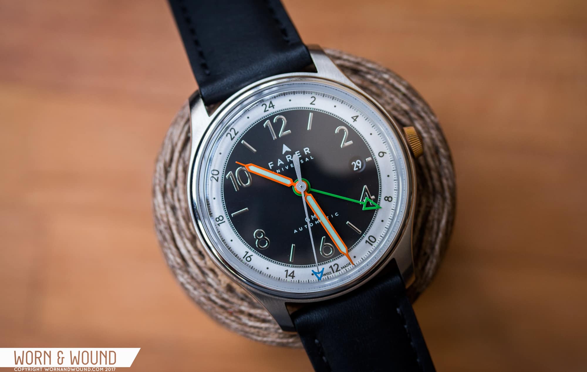
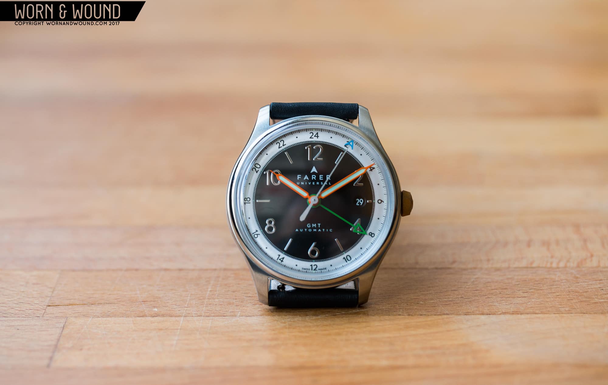
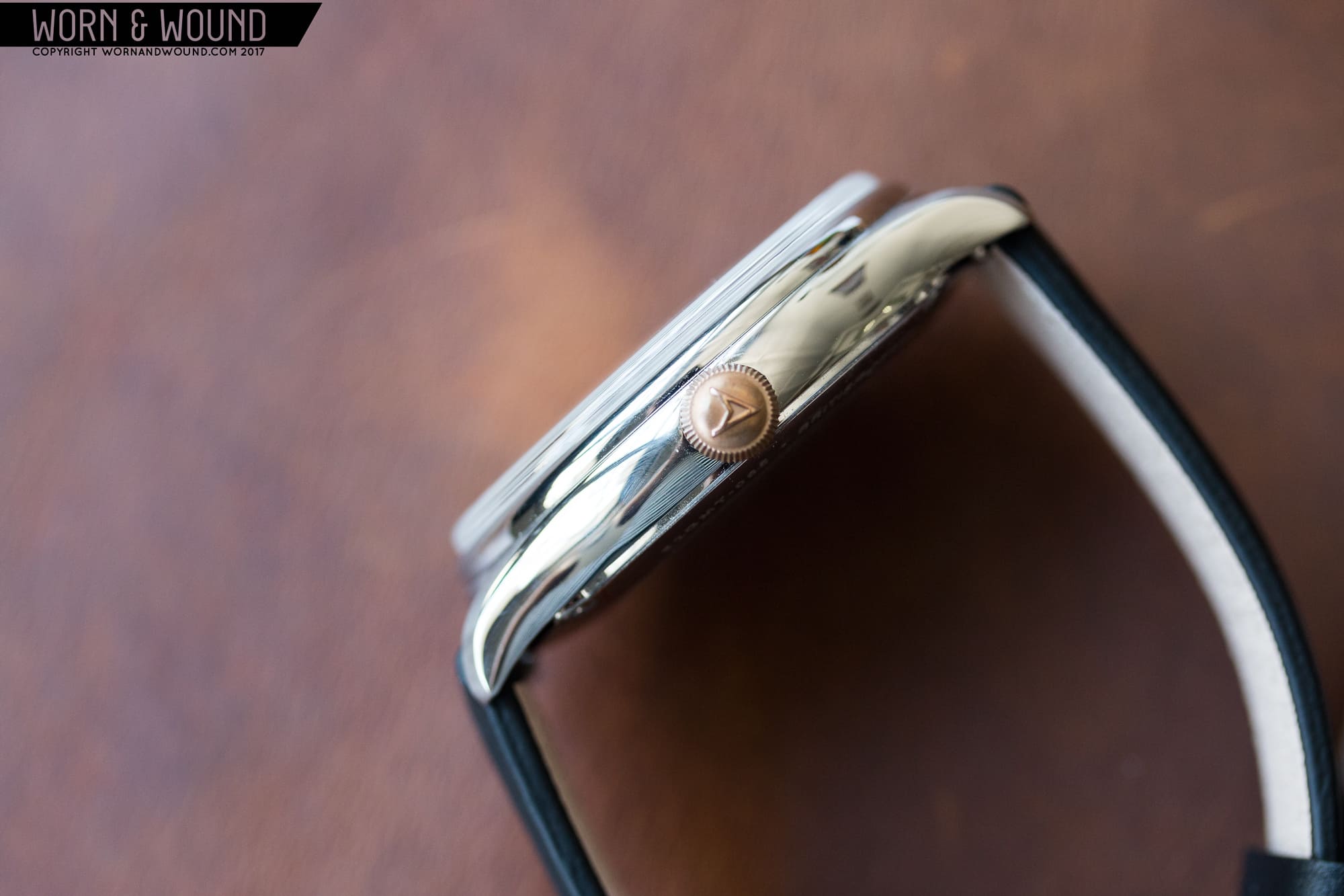
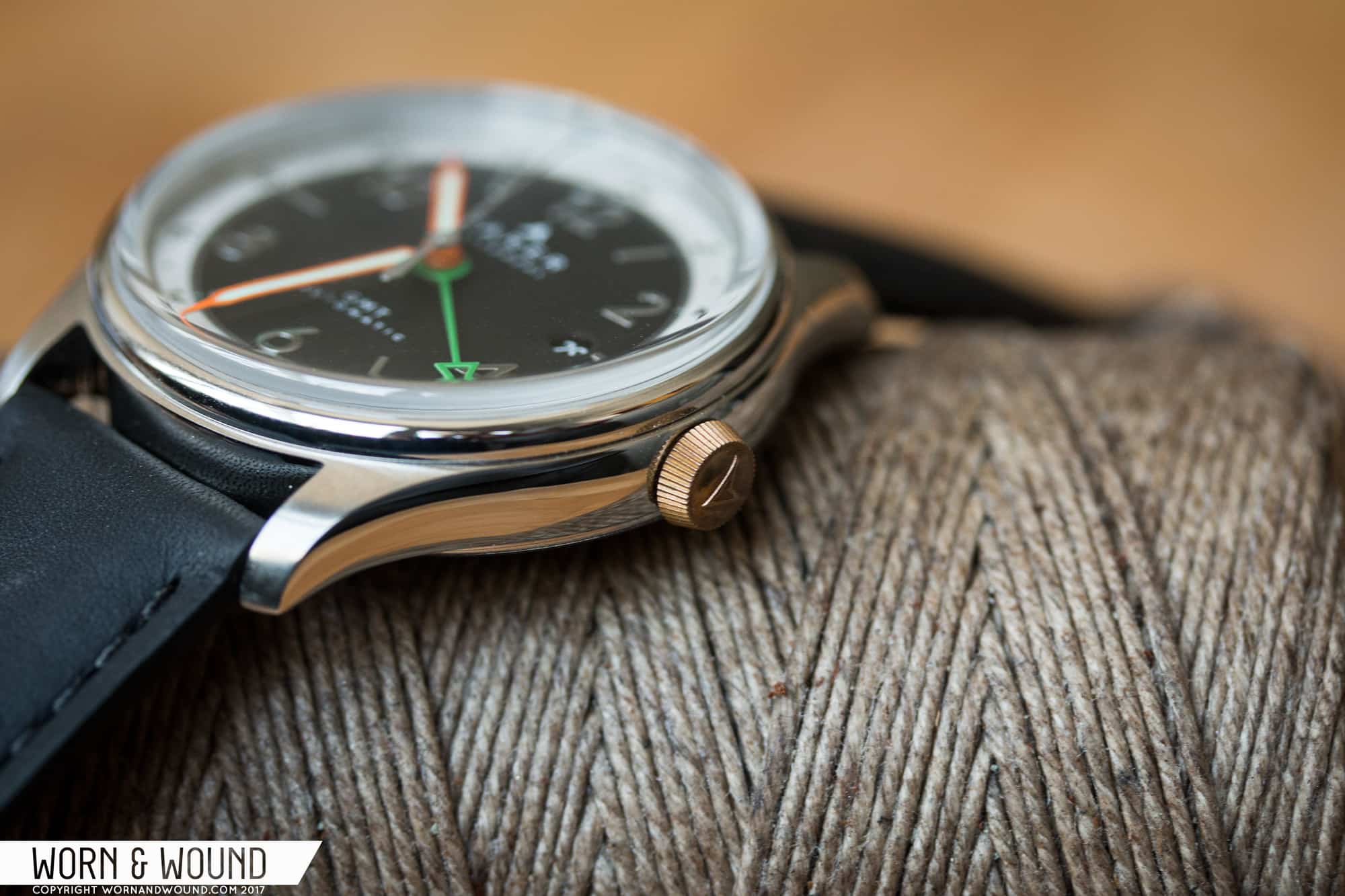
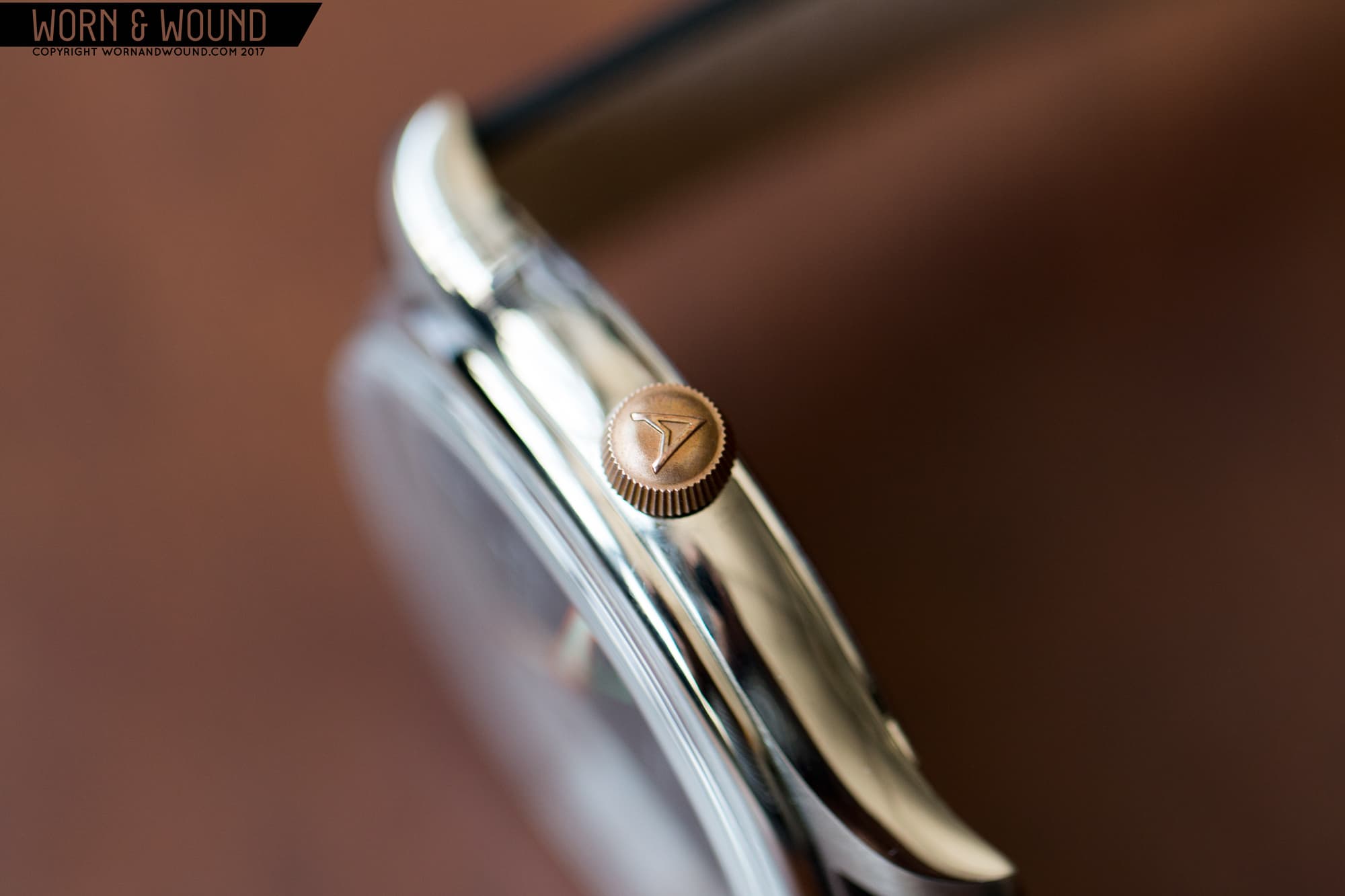
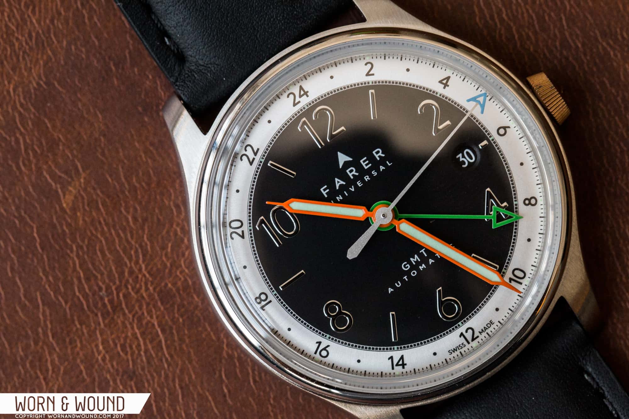
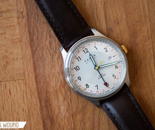
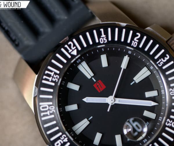
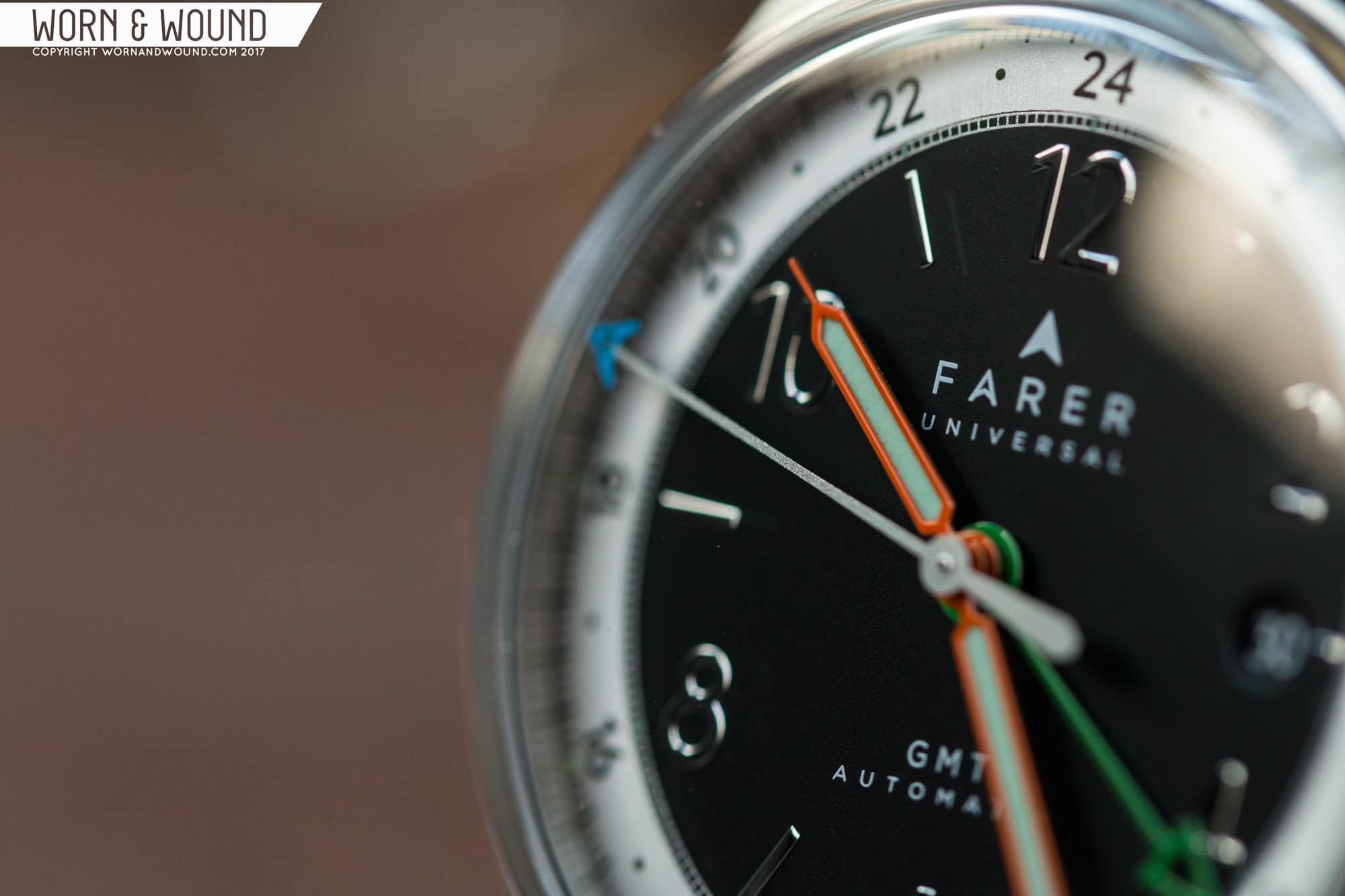
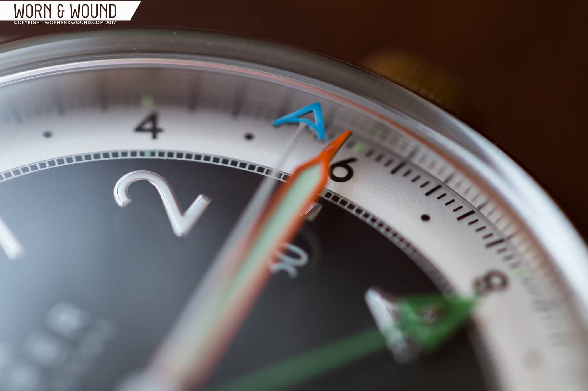
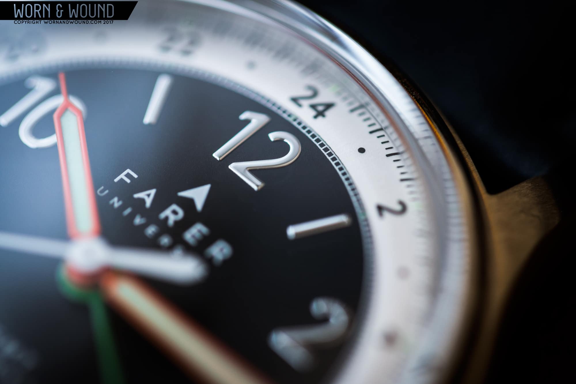
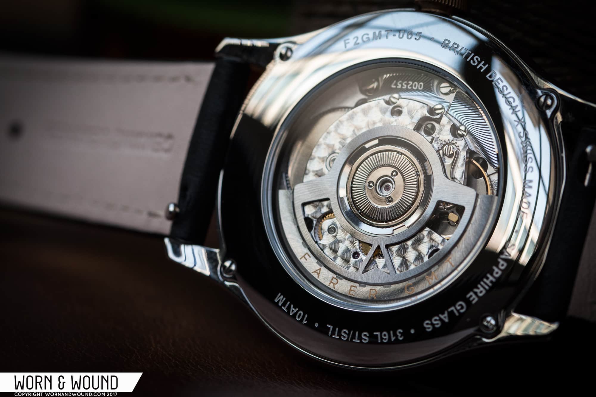
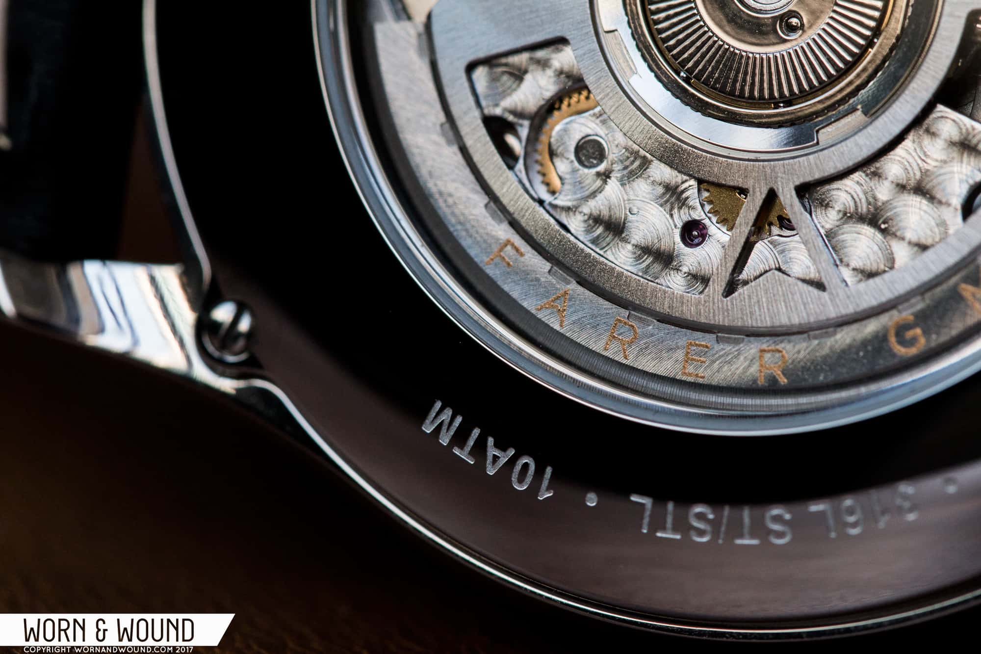
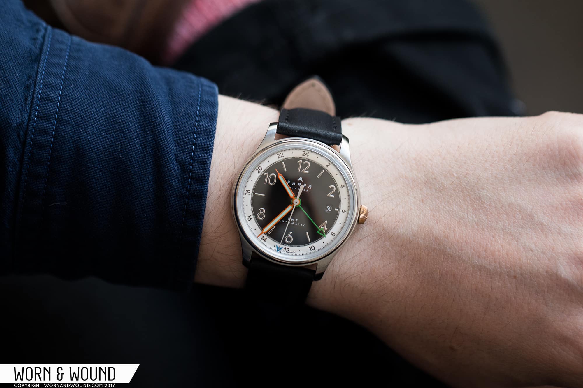
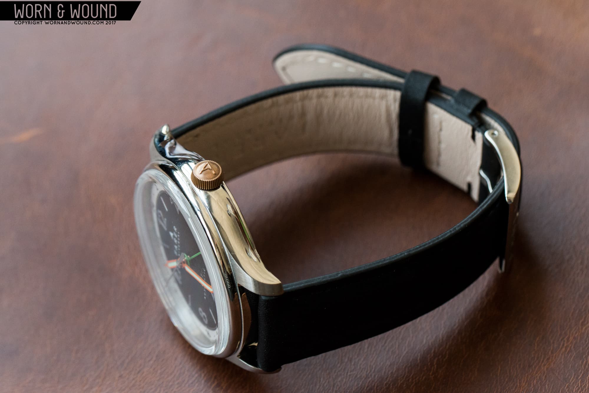
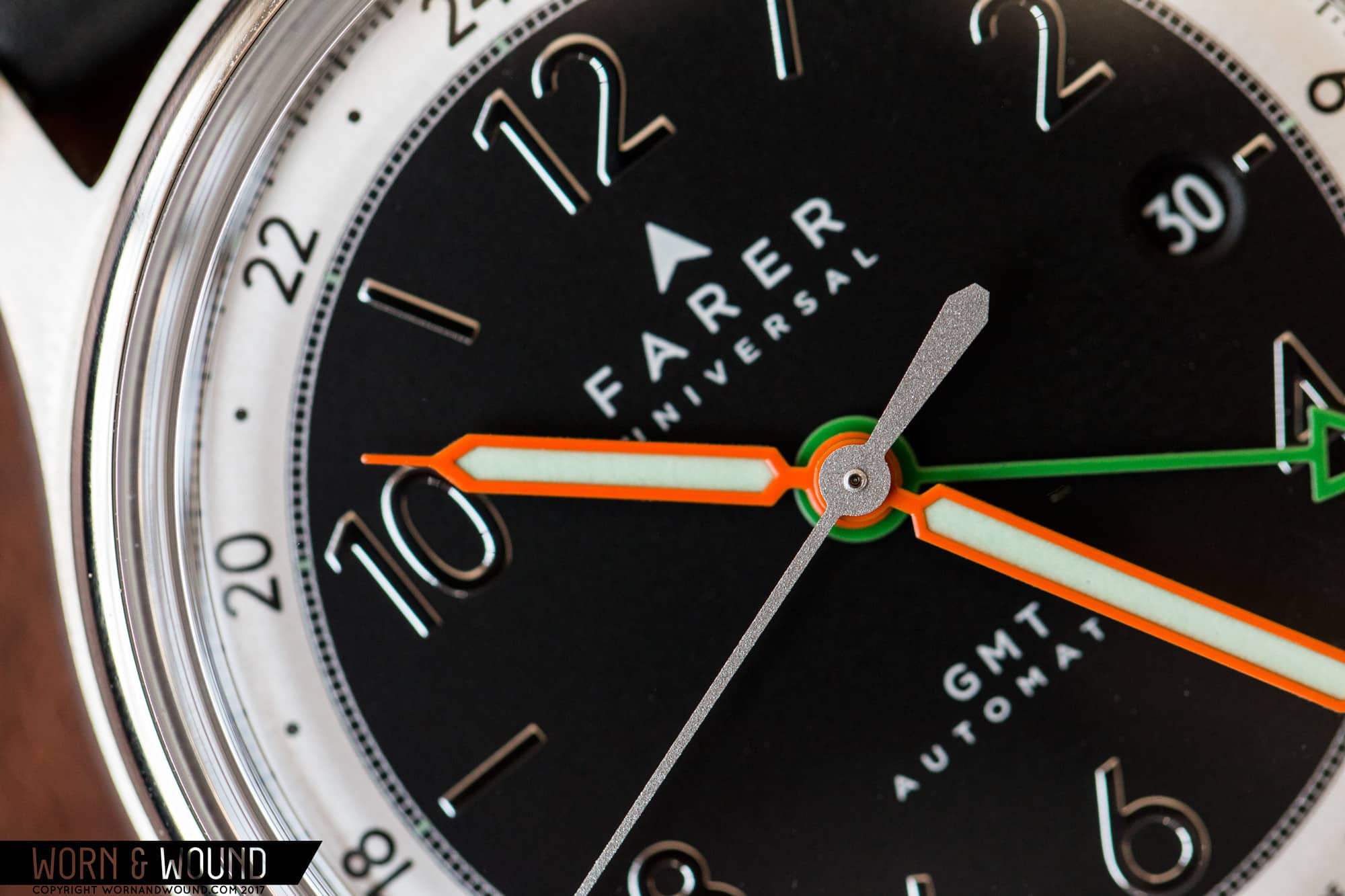
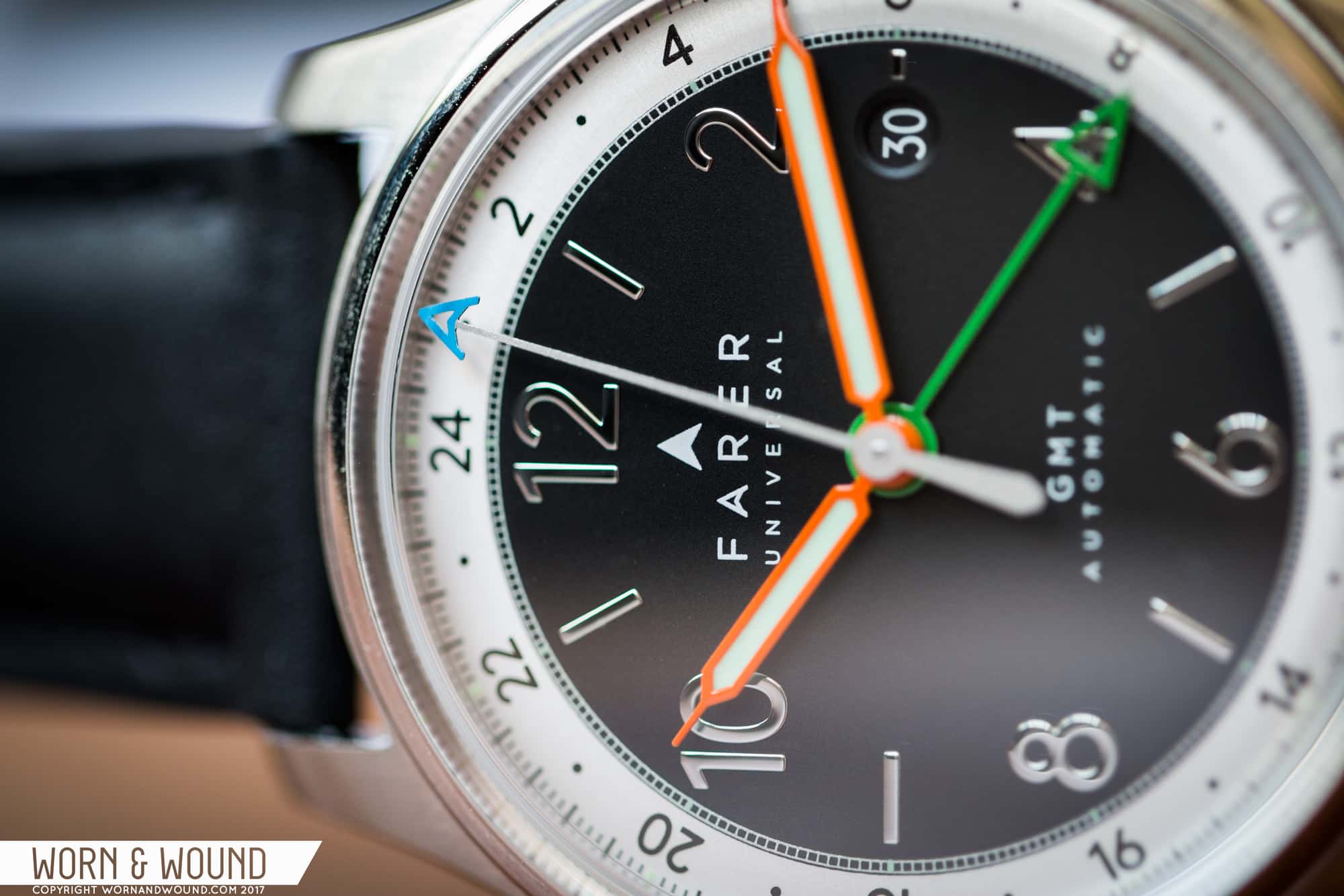
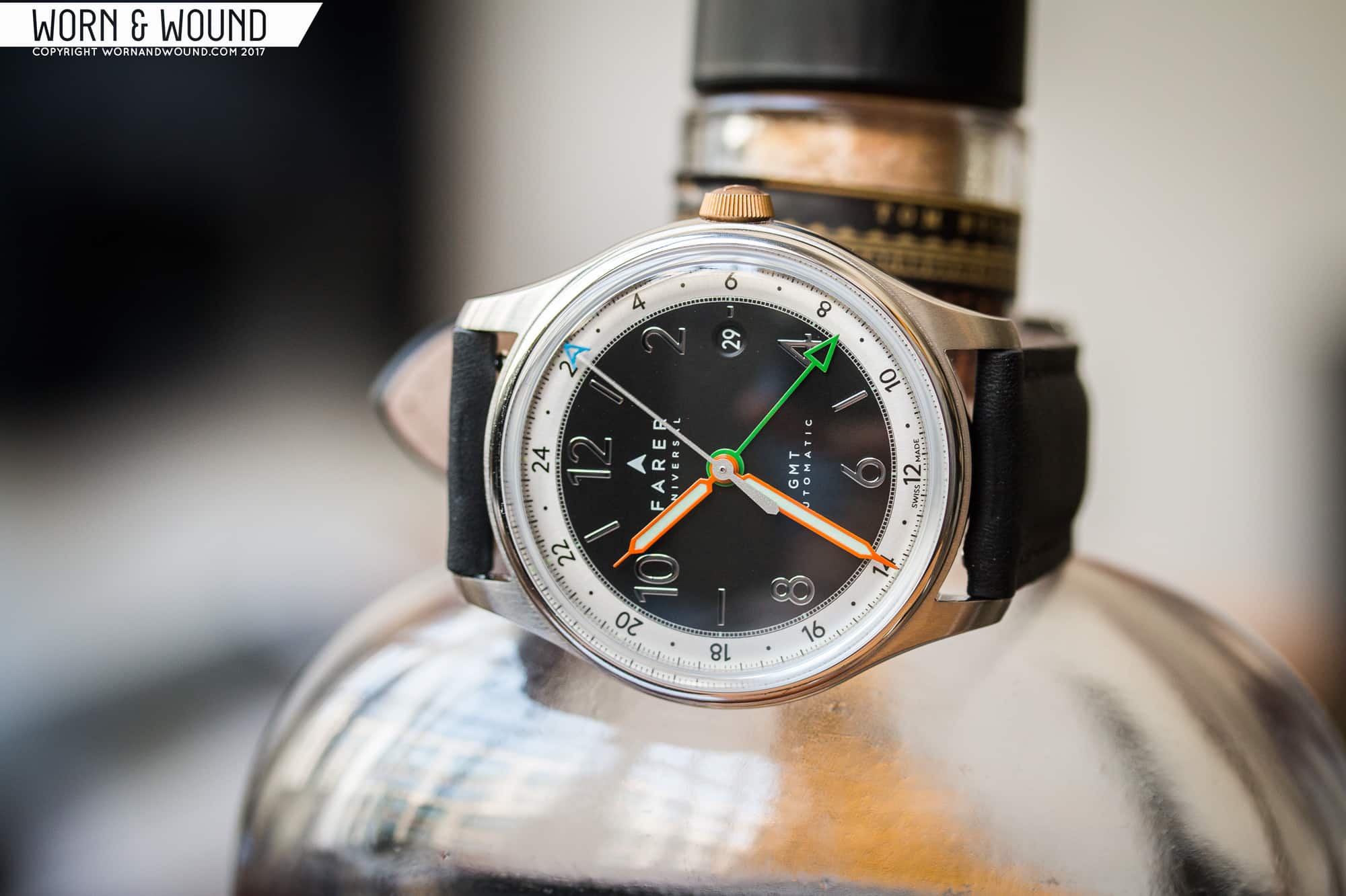
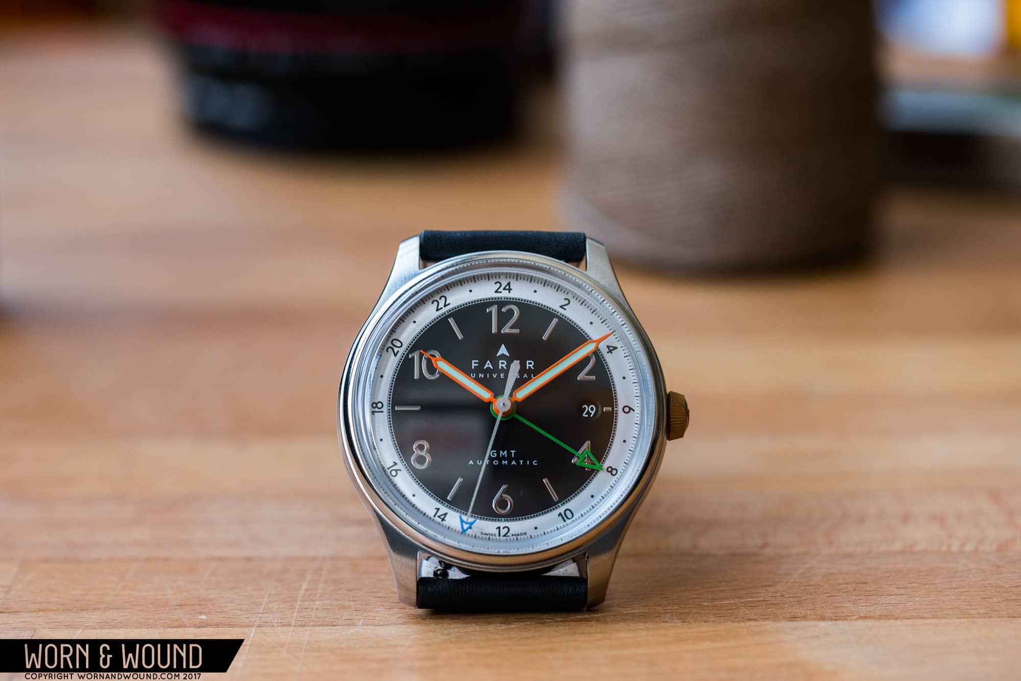
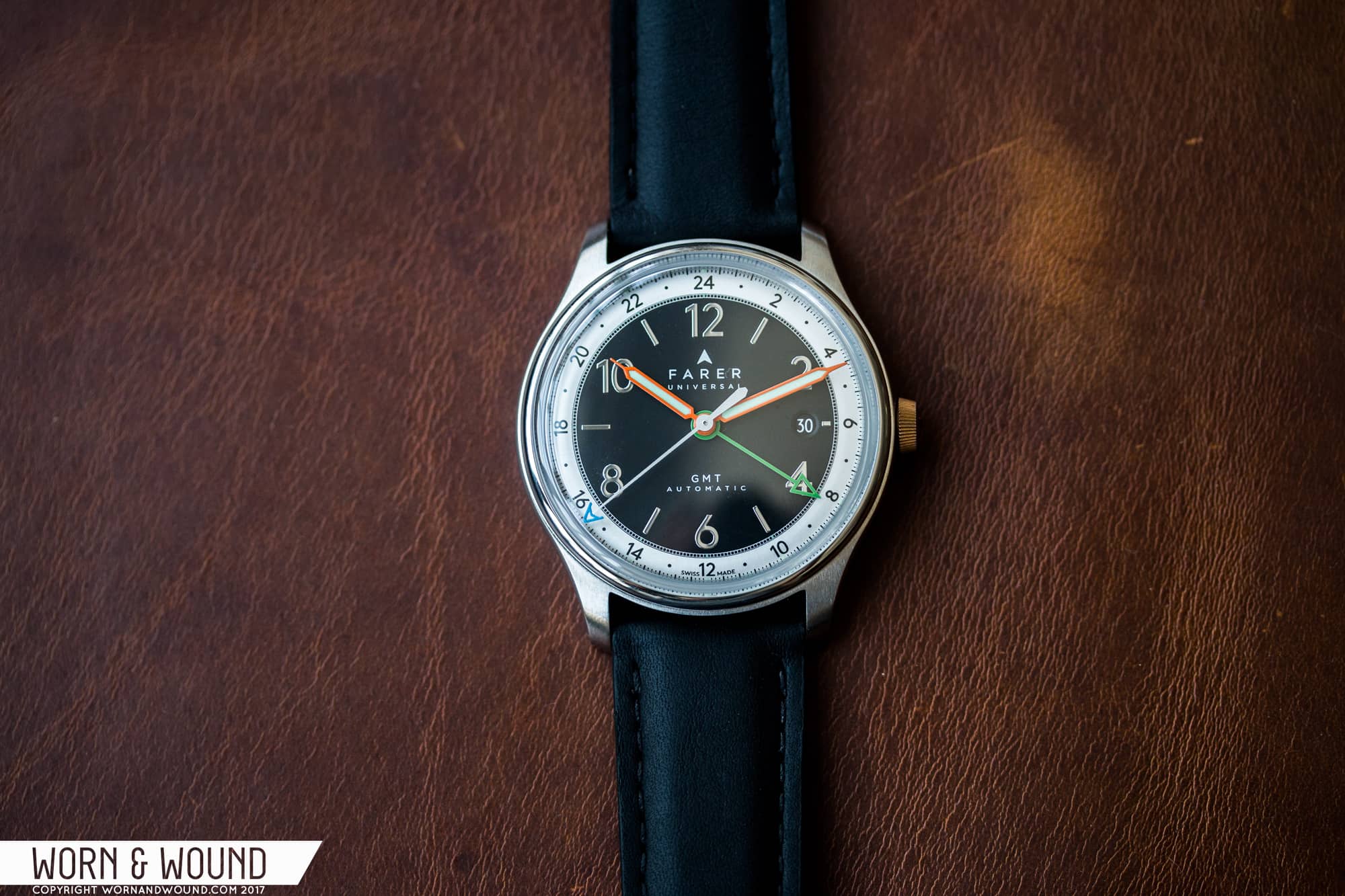
I  have talked at length here on worn&wound about charm before, and how difficult it is to engineer into a timepiece. Today’s watch brings to mind a related, but not identical, concept—character in design. Too little individual character in a watch, and there’s nothing to separate it from a sea of similar pieces. Too much, and the watch runs the risk of becoming garish, difficult to wear or heavy-handed. The key is in moderation: knowing just how much idiosyncrasy to pump into a design to set your brand above the rest, while remaining timeless and usable in any situation. 
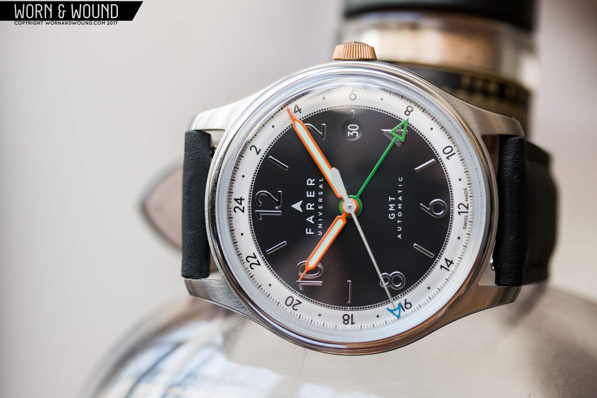
Very few young watch brands understand this idea better than Britain’s Farer, who have built an unmistakable brand aesthetic in no time at all. The purest expressions of this lie in their GMT models, where their bold and clear graphical style is given ample room to play with their signature splashes of color. The Oxley GMT (named for colonial British surveyor John Oxley, the man who first mapped much of Queensland, Australia) sits at the pinnacle of this range, sporting a top-grade ETA 2893-2 heart and a multi-surfaced dial approach. Without any further ado, let’s take a look at how well Farer’s design chops work at the top level.

Save

Save

Save

Save

Advertisement
$1425

Farer Oxley GMT Review

Case
Stainless steel
Movement
ETA 2893-2
Dial
Black/silver
Lume
Super-LumiNova
Lens
Sapphire with AR
Strap
Bridle leather/Milanese
Water Resistance
100 meters
Dimensions
39.5mm x 45.8mm
Thickness
10mm
Lug Width
20mm
Crown
Push/pull; bronze
Warranty
5-year movement guarantee
Price
$1425

Case

The case of the Oxley GMT is shared with the rest of Farer’s lineup, and just like we’ve seen in our previous Farer experiences, it’s a simple concept executed brilliantly. It’s all classic lines from above: narrow polished bezel, flowing mid-length lugs, and an attractive mix of brushed and polished surfaces to keep things interesting. From a side profile, however, Farer’s attention to fine detail becomes apparent. It’d be easy for a case design like this to come off as sterile and boring, but the Oxley subverts expectations so subtly that it takes some time to fully appreciate the execution.

First and foremost in this effort are the case sides. While so many similar designs are content with flat, angular slab walls, Farer softens the form with gently rounded sides accentuated by a brilliant polish. The small step from the side of he case to the bezel also helps here, keeping this smaller case from feeling too delicate on the wrist.

Save

Lastly, there is Farer’s trademark bronze crown. This small, semi-conical crown features the Farer “A” in relief. Though the use of bronze and the shape of the crown have both been a point of contention among enthusiasts, the crown is certainly immediately recognizable. Around back, the Oxley offers a sapphire display window to one of the best decorated movements I’ve ever seen at this price point.

Dial

Like the rest of Farer’s offerings, the dial is where the Oxley really comes into its own. It’s colorful and vintage-inspired while remaining clearly modern and British. The dial itself is a bit of a sober backdrop for everything else going on here. The simple matte black texture is accentuated nicely by the “Astronaut Silver” 24-hour outer ring, while the 1/5 seconds railroad track lends intricate detail and gives a sense of real quality to the dial printing.

Save

In another vintage touch, the dial edges are curved, adding visual dynamism at low angles. The indices, an alternating mix of bold Arabic numerals and lines, are polished to an absolute mirror sheen. The way these things throw light is stunning, and the eclectic combination of numerals and indices works well here. It’s almost playful, when viewed with the rest of the dial in mind.


The handset is another Farer trademark, one that brings home the recurring sense of playfulness. The hour and minute hands are lume-filled syringes in a bright, almost traffic cone orange. Orange, as a general rule of thumb, is an overwhelming color on a watch. It’s damn near impossible to use any more than a splash of the color without disrupting visual balance, but the Oxley’s hands ride that razor’s edge beautifully.

Save

Additionally, these hands have strongly bent tips, adding visual depth to an otherwise quite flat design. The orange is set off by the skeleton arrow GMT hand, rendered in a vibrant green. It’d be easy for these two bright colors to wash out the rest of the dial, but again the key here is in the moderation. The colors act as accents, lending a taste of modern art or even a toy-like aesthetic to the dial. The complementary sky blue tip of the seconds hand adds balance through contrast, while also bringing in the Farer “A” emblem. My one real gripe is with the date window at three. While it’s about as inconspicuous as it possibly could be, with a dial this full already I wouldn’t mind seeing a no-date variant.

Save

Movement

For all the fanfare surrounding the dial of the Oxley GMT, the movement might just be the most attractive part of all. The ETA 2893-2 is a fine, battle-tested engine to begin with, but give it top-grade finishing and bespoke touches by Farer and it becomes something beautiful as well.

While Farer proudly flaunts their British design credentials, their taste in movement finishing is decidedly more Swiss with copious amounts of perlage on the plates. The Farer-branded rotor is equally impressive, with a wide array of polished, brushed, and matte surfaces paired with clever use of the Farer emblem in the skeletonization.

Straps and Wearability

In terms of straps, the Farer Oxley GMT spoils customers for choice. Eight different options are on display here, with four colors of solid bridle leather, three rally straps, and a Milanese bracelet. That said, while the Oxley works well on them all, I haven’t found a better match for this one than the simple unadorned black leather.

It complements the dial nicely without drawing undue attention to itself. With that classic combo, the Oxley GMT is a truly do-anything piece, able to transition from jeans to three-piece suits and everything in between. It’s an ideal choice for the mythical “One-Watch” man. With a modest 39.5 millimeter diameter, that man can be nearly any size as well. It hits the sweet spot of size on my own 6.75-inch wrist, but it has enough presence not to be dwarfed by bulkier wrists either. (The above photograph is showing a 7-inch wrist.)

Save

Conclusion

Overall, Farer is a brand with extremely strong DNA, especially for a company so young. All Farers look like nothing else on the market and absolutely ooze personality, and as a top-of-the-line offering the Oxley GMT presents one of the best combinations of Farer features the brand has ever assembled. Starting at $1,425, it’s not chump change, but for a Swiss-assembled automatic GMT with this kind of design and attention to detail it’s an impressive bargain. Farer

Edit: An earlier version of this review said that each of the GMT models was limited to only 100 units. This is incorrect. Farer has informed us additional deliveries are expect October 2017, and that all will be uniquely numbered (the initial run was numbered 001-100, but additional deliveries in October will be numbered 101+).

Save

Images from this post:
Related Reviews
Hailing from Redondo Beach, California, Sean’s passion for design and all things mechanical started at birth. Having grown up at race tracks, hot rod shops and car shows, he brings old-school motoring style and a lifestyle bent to his mostly vintage watch collection. He is also the Feature Editor and Videographer for Speed Revolutions.
seanpaullorentzen
Categories: