Kronaby Apex Review: A Connected Watch Worth Giving a Shot

Smart watch! Got your attention. Though practically a four-letter word in watchdom, it’s a reality that they have become a part of the fabric of the market. No, they aren’t going to destroy things and no, watch brands don’t need to worry, but they are here and they are here to stay. I personally just see them as a logical evolution of digital and quartz watches. If you’re in the market for one of those, why not get the most up-to-date features, assuming the cost is relatively the same? Not into it? Mechanicals aren’t going anywhere.

But, within those new “smart” features are a wide range of concepts, and frankly some are more interesting than others. I’ve always found the “alert me” and “health tracker” concepts too narrow and redundant. My phone is in my pocket or on my desk 99% of the time, so I see or hear alerts and thanks to the accelerometer in phones and various apps, it’s easy to track steps. What I’d look for is something more suited to my personal needs and something that I could customize as those needs change. Also, and this should go without saying, these features shouldn’t come at the expense of a good looking watch.

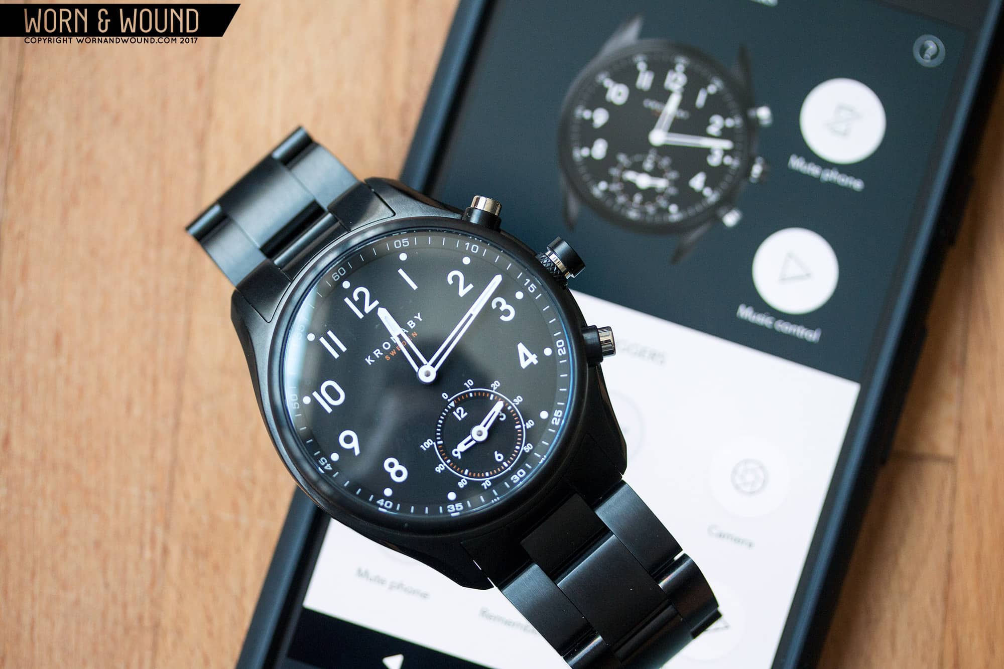
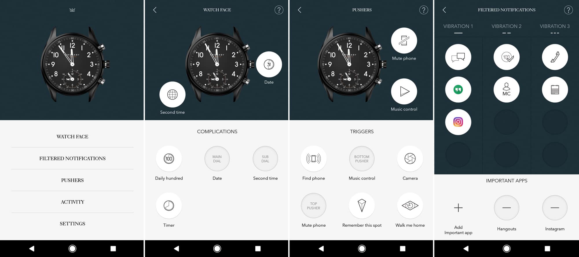
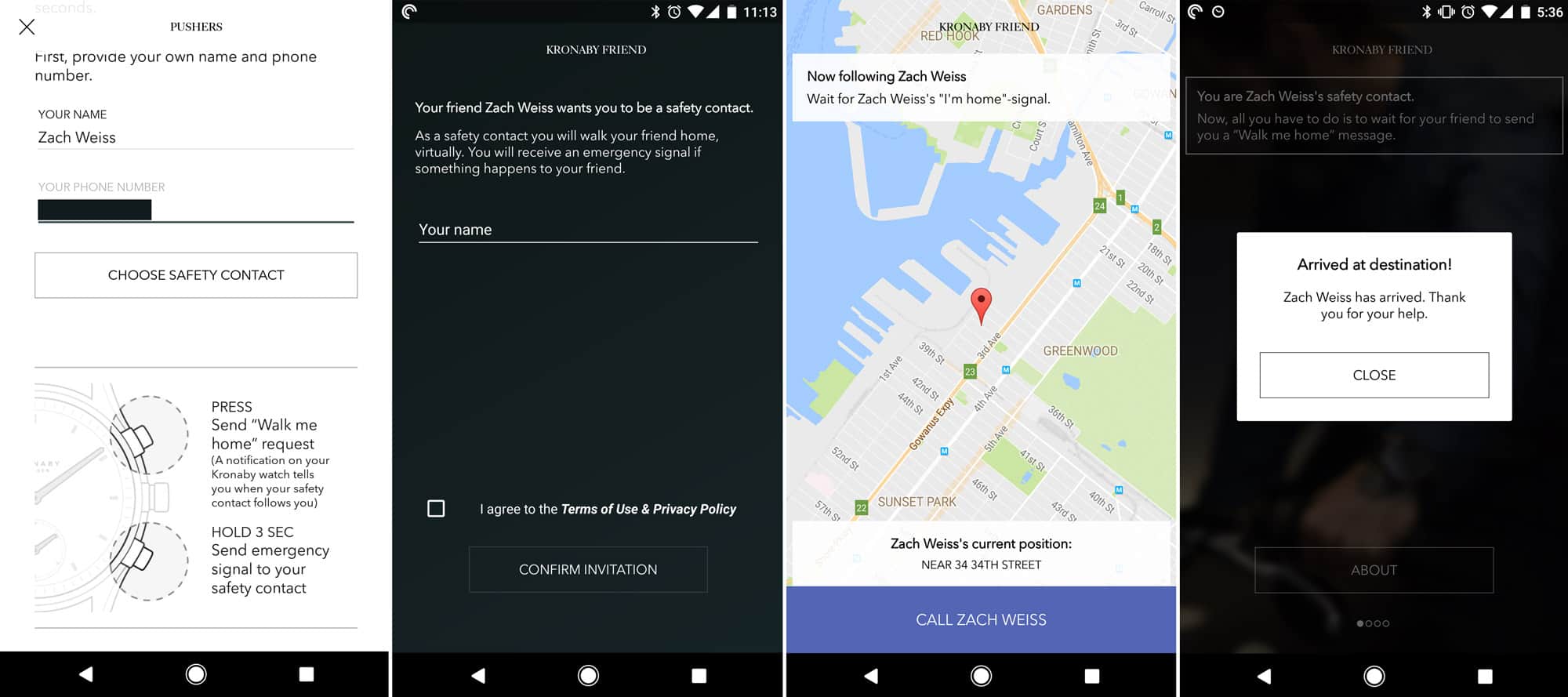
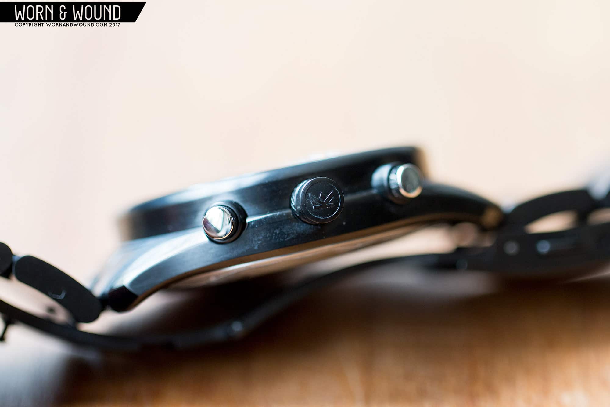
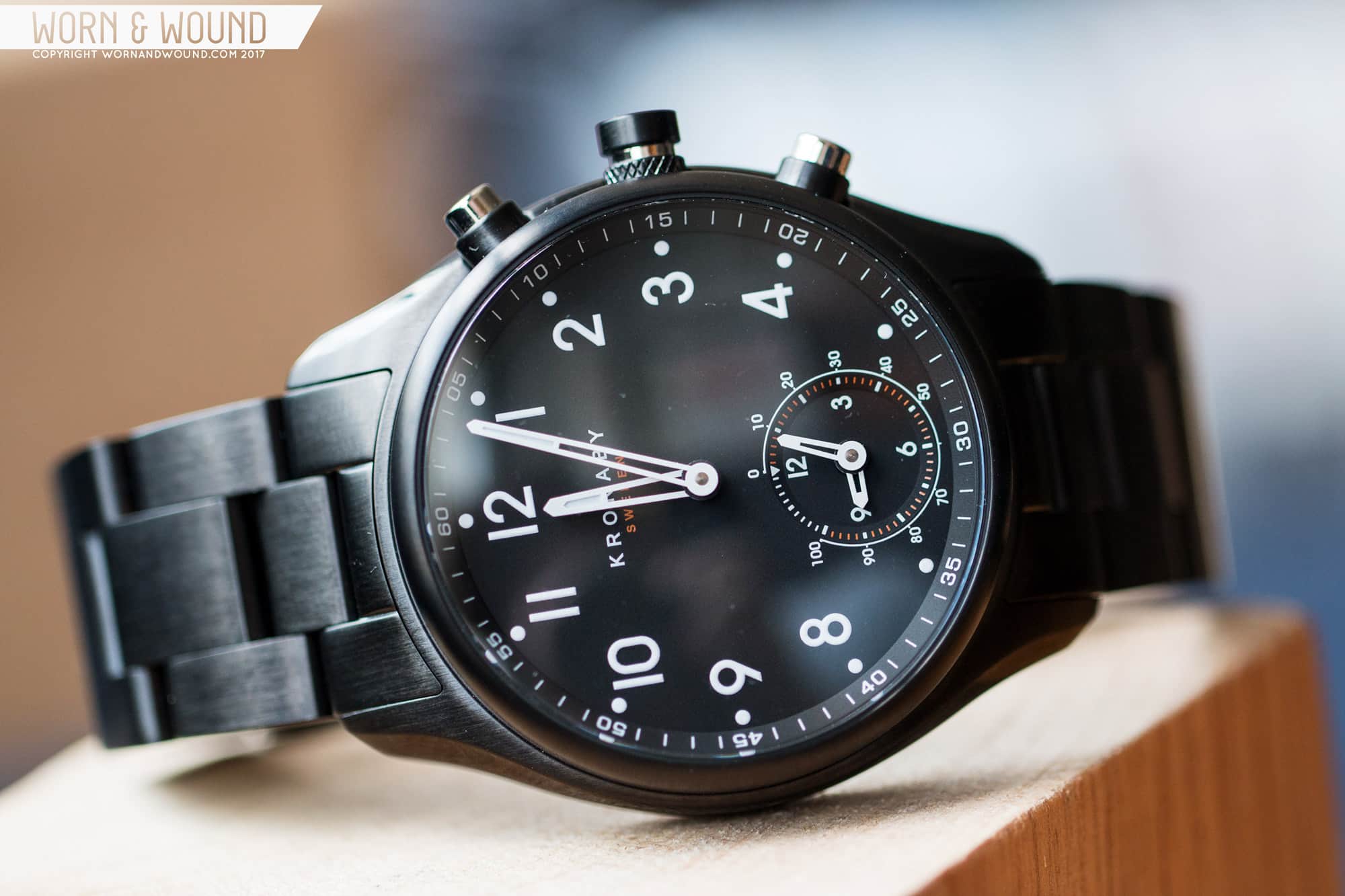
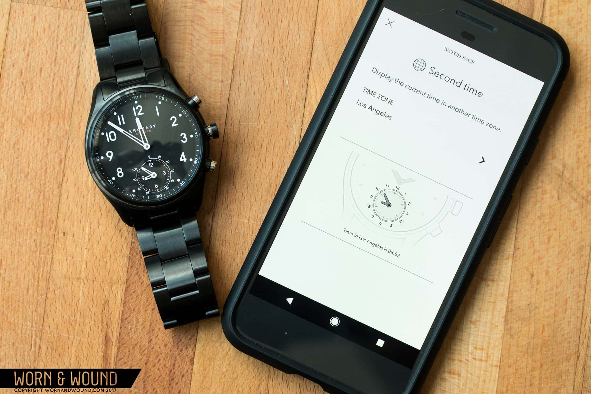
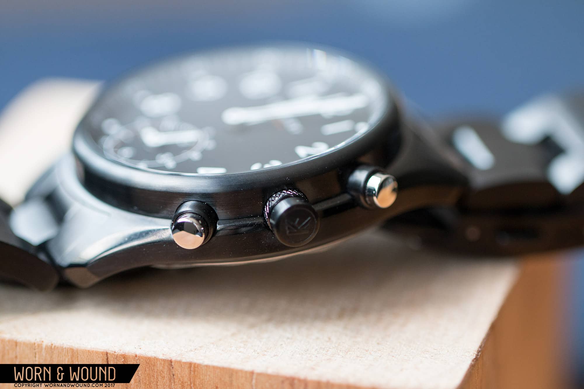
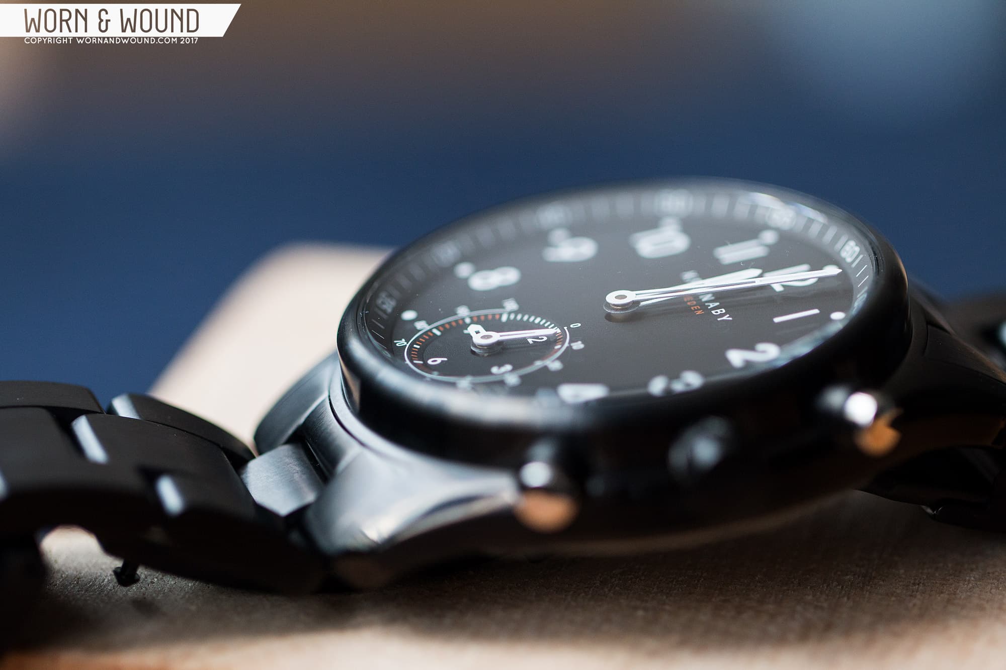
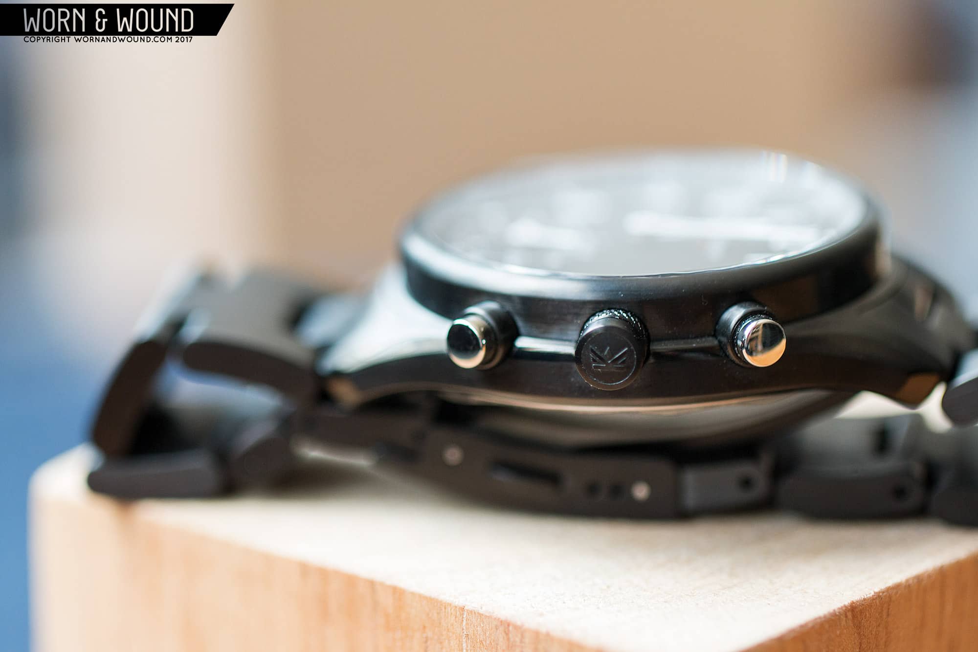
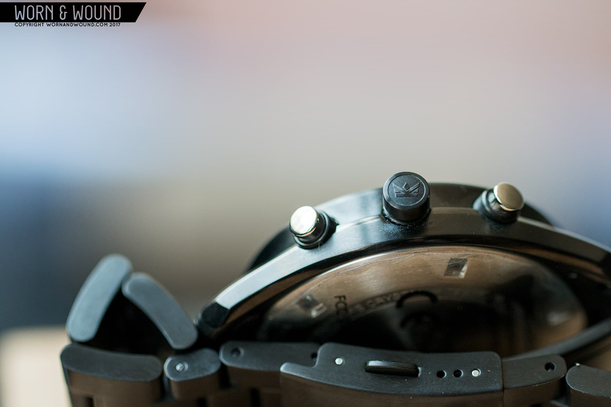
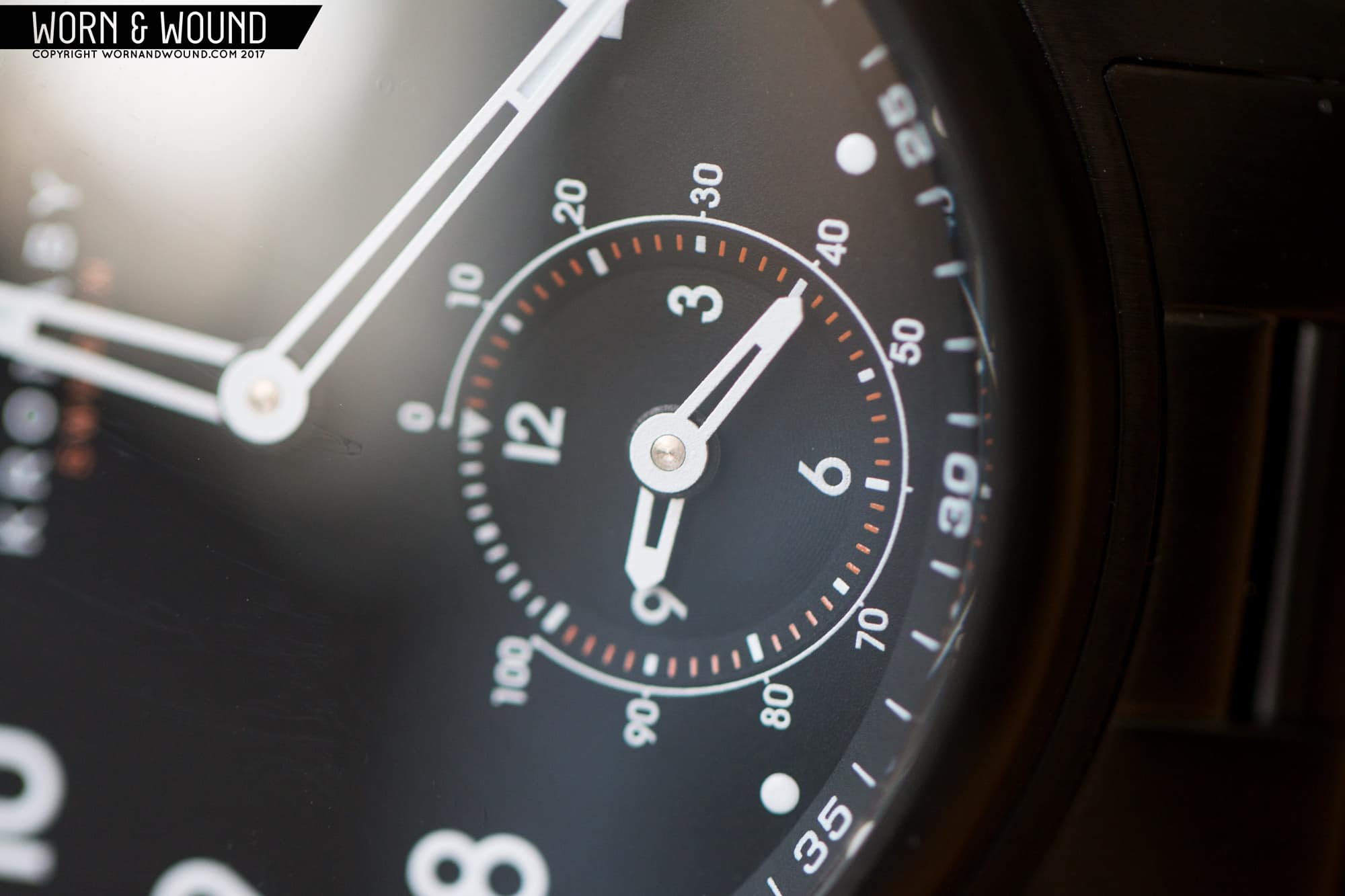
Enter Kronaby, a new Swedish brand of connected watches (note the lack of “smart”–it’s an irritating term and Kronaby is smart enough not to use it) that look like real watches and do, well, what you want them to (within limits). Kronaby is essentially what happens when you take a bunch of cellphone engineers, software designers and team them up with watch designers. With the ability to design and engineer everything from the ground up, which includes their “movement” (more on that later) and software, they were able to create something different that wasn’t tied to a bloated OS like Android Wear, looks good, and at the very least, appealed to this cynical watch reviewer. What got me was that each “complication” or “trigger”, whether a pusher or sub-dial, can have the function of my choosing (from a specific list), and that rather than alerting you to everything, you can filter alerts to only tell you what you want to know or you can eliminate them entirely.

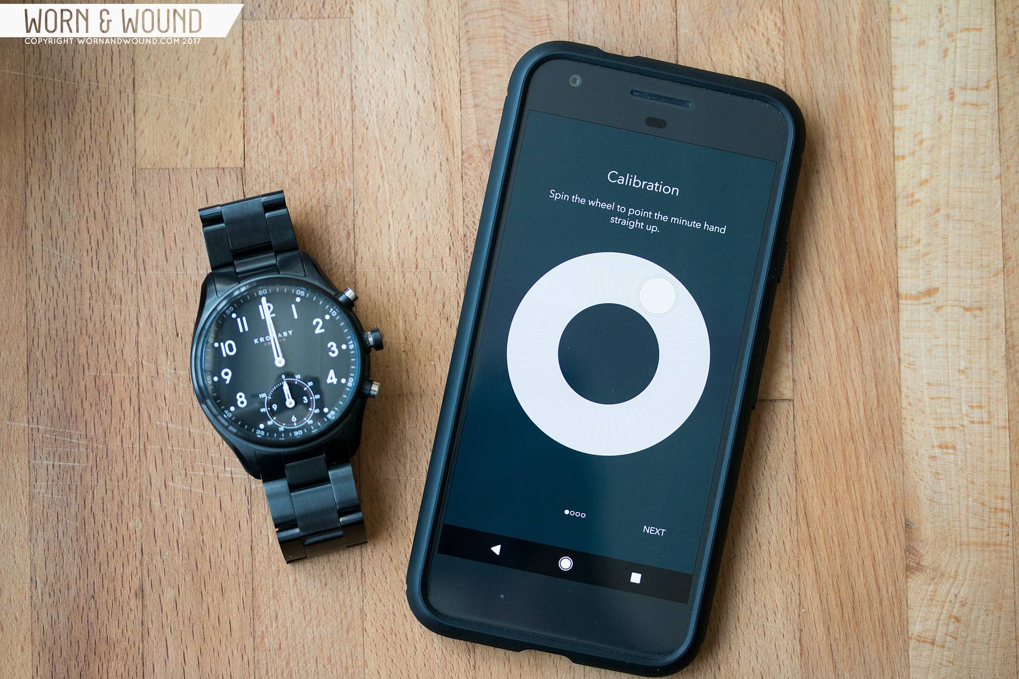
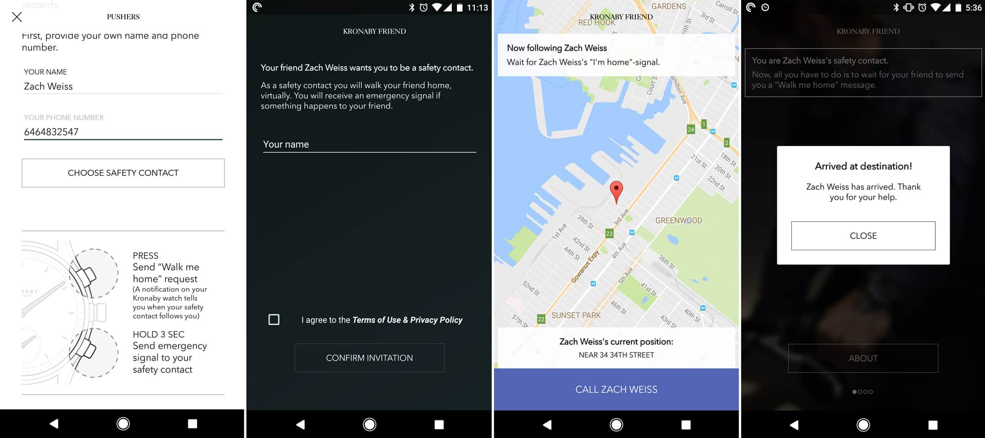
This is the first time I’ve reviewed a connected watch, and upon using the watch it became immediately clear that the physical part you wear is really only half of the story. The software is just as important and is really where the brand shines, so I’ll have to dedicate some time there. Admittedly, I haven’t tried most of the other connected watches out there, such as those by Fossil or Swatch Group brands, so I can’t compare to others, but I was impressed by Kronaby.

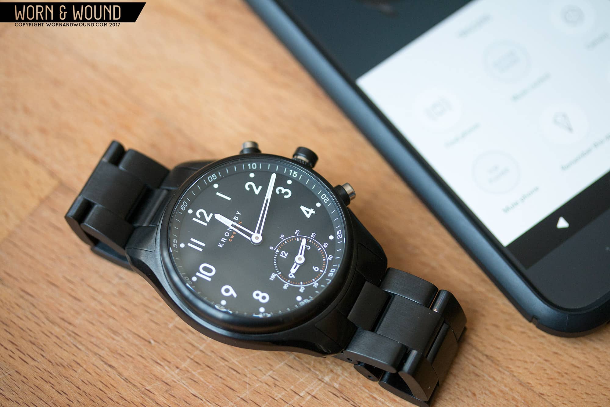
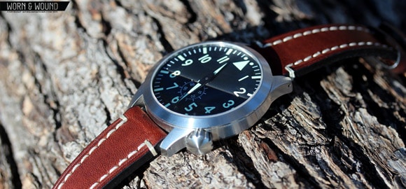
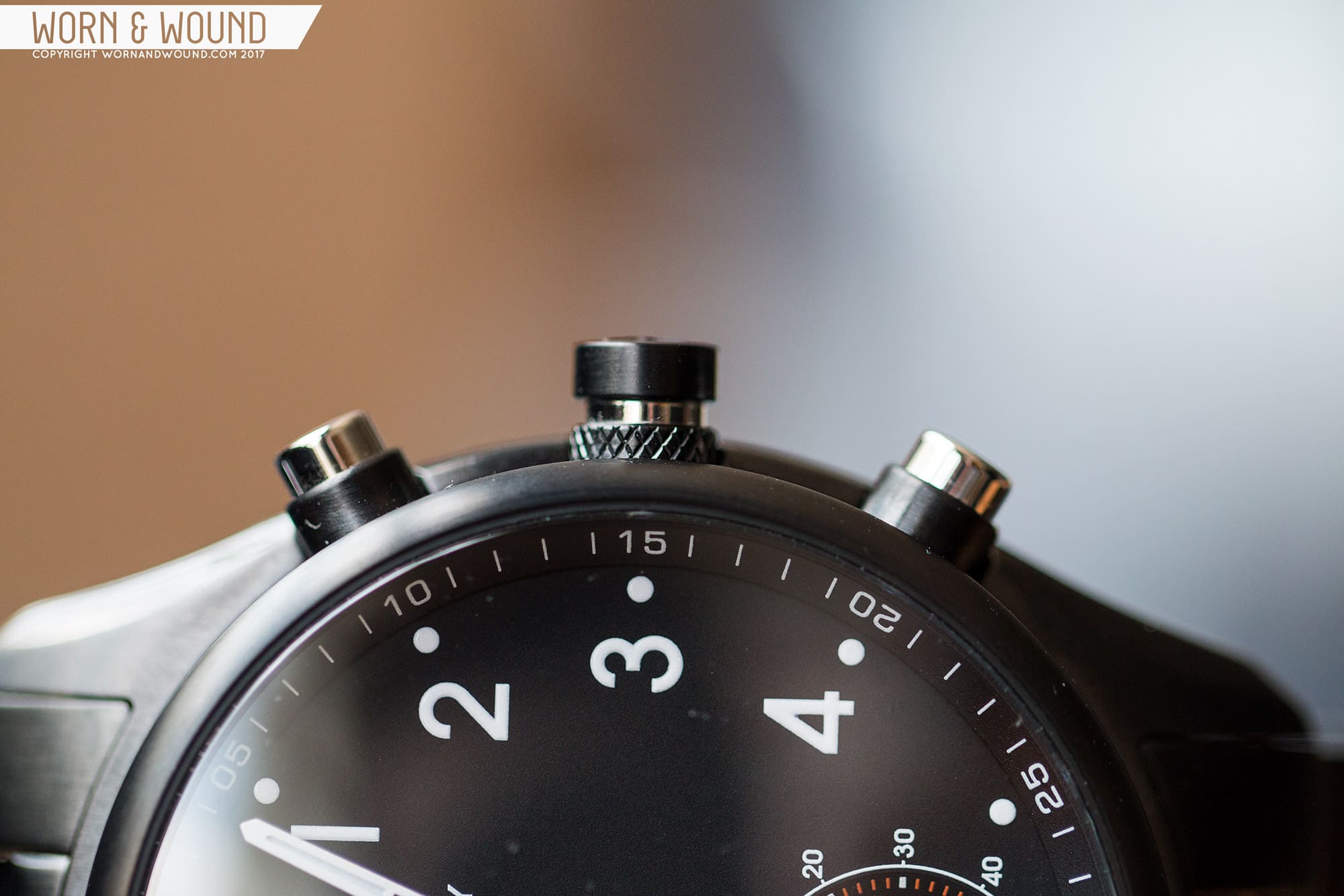
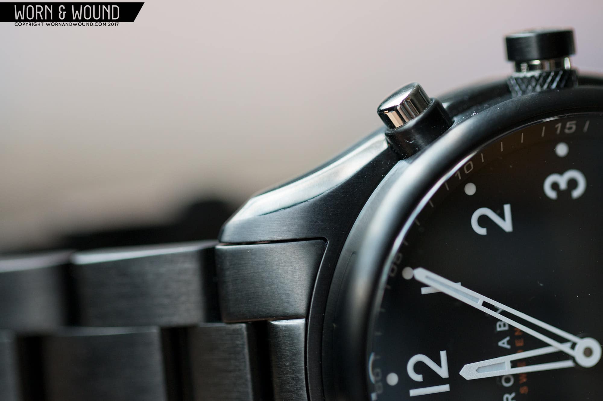
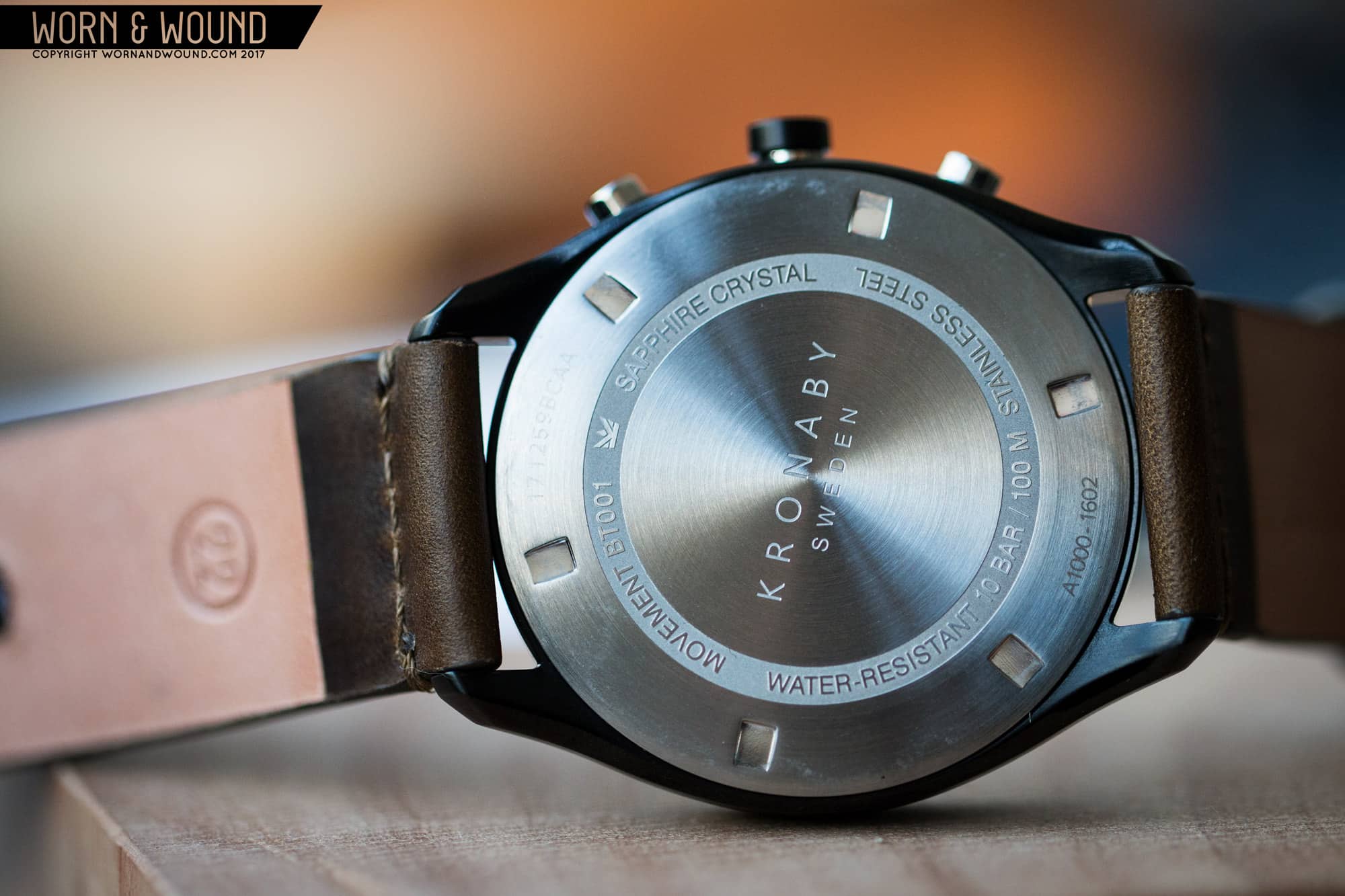
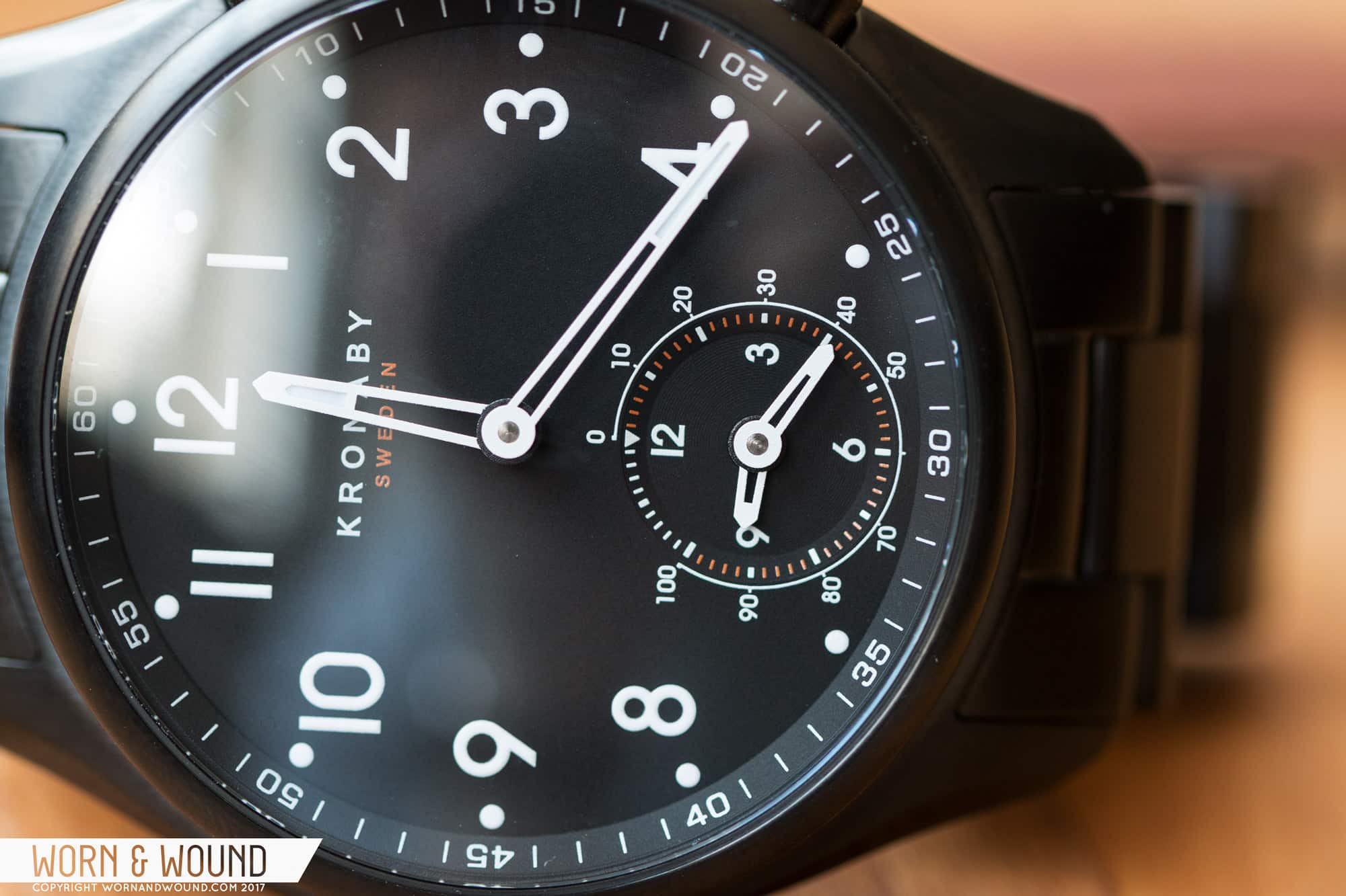
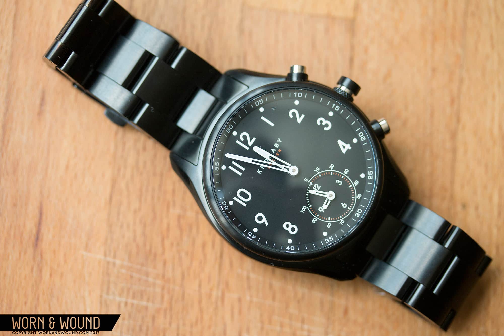
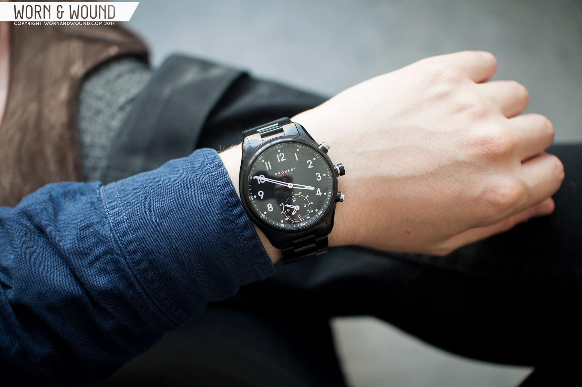
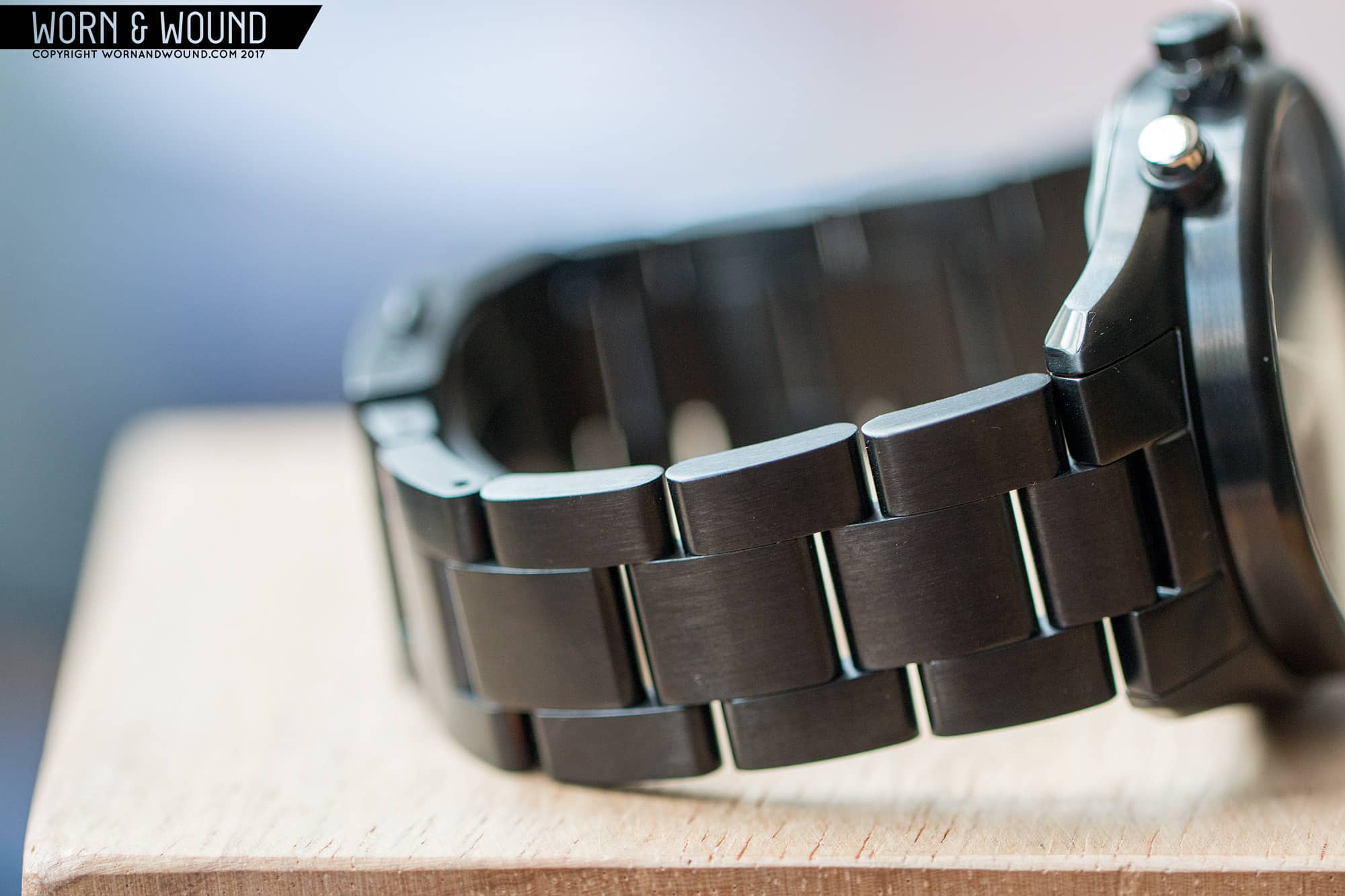
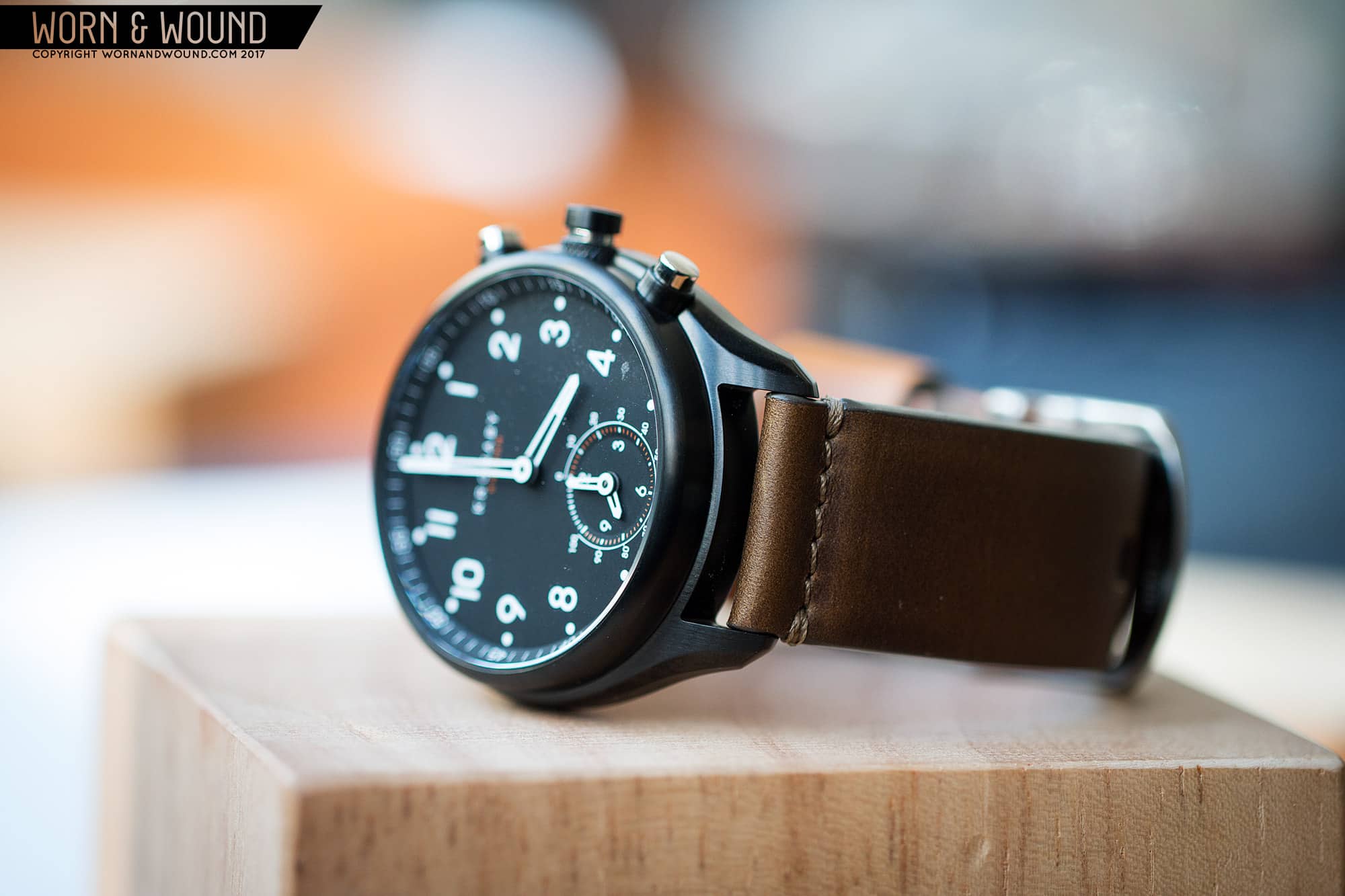
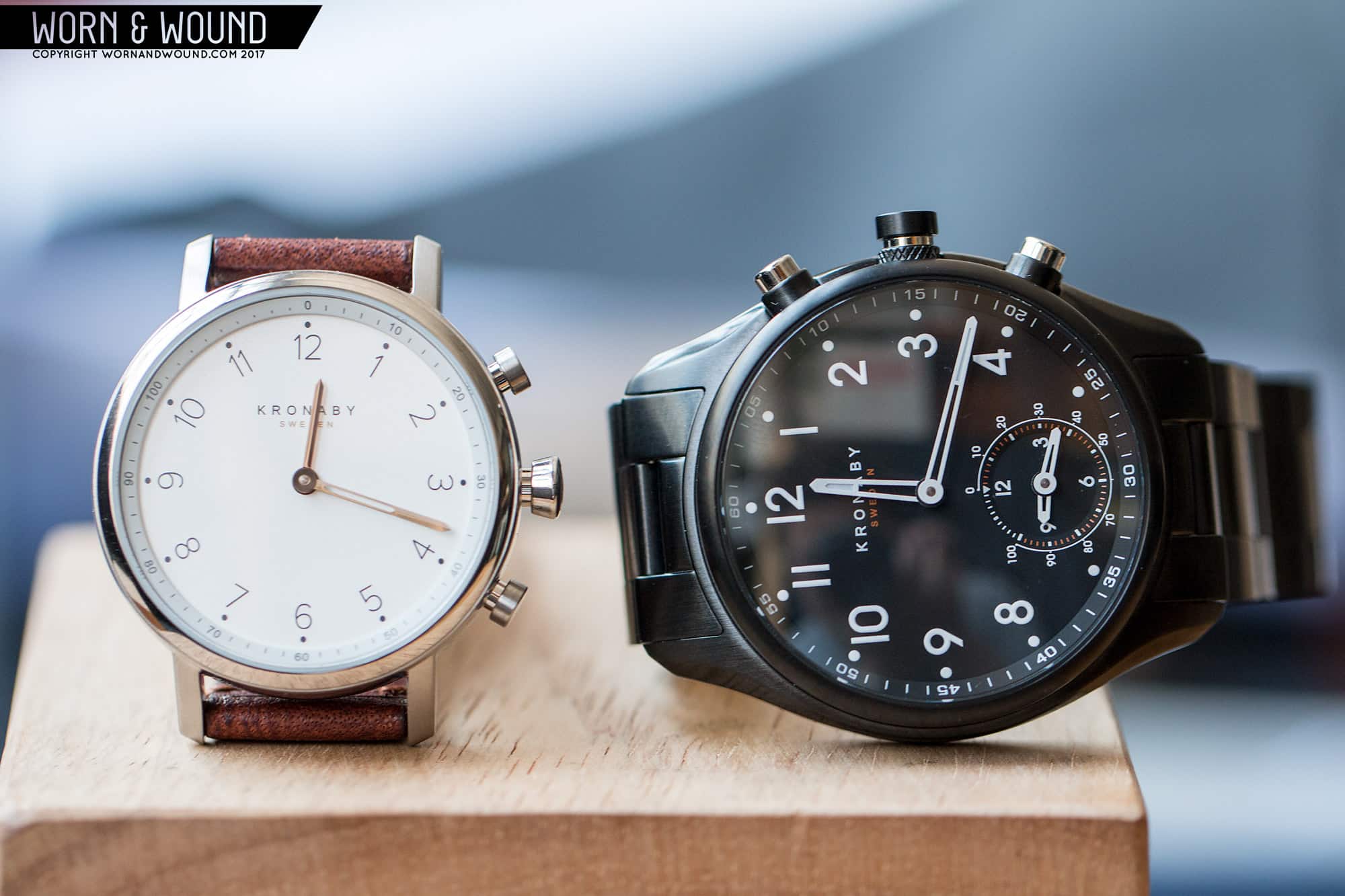
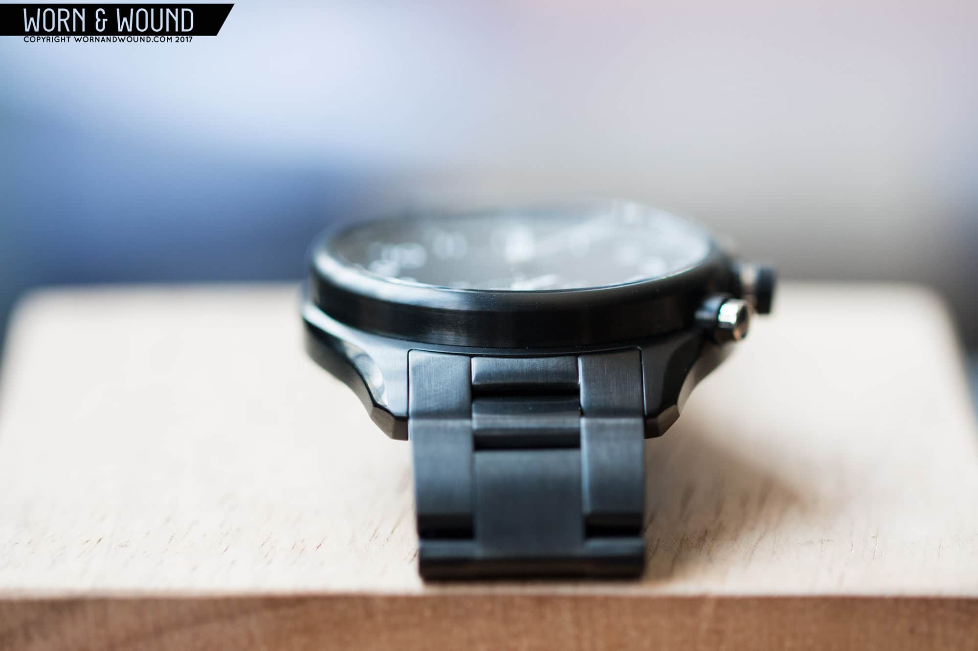
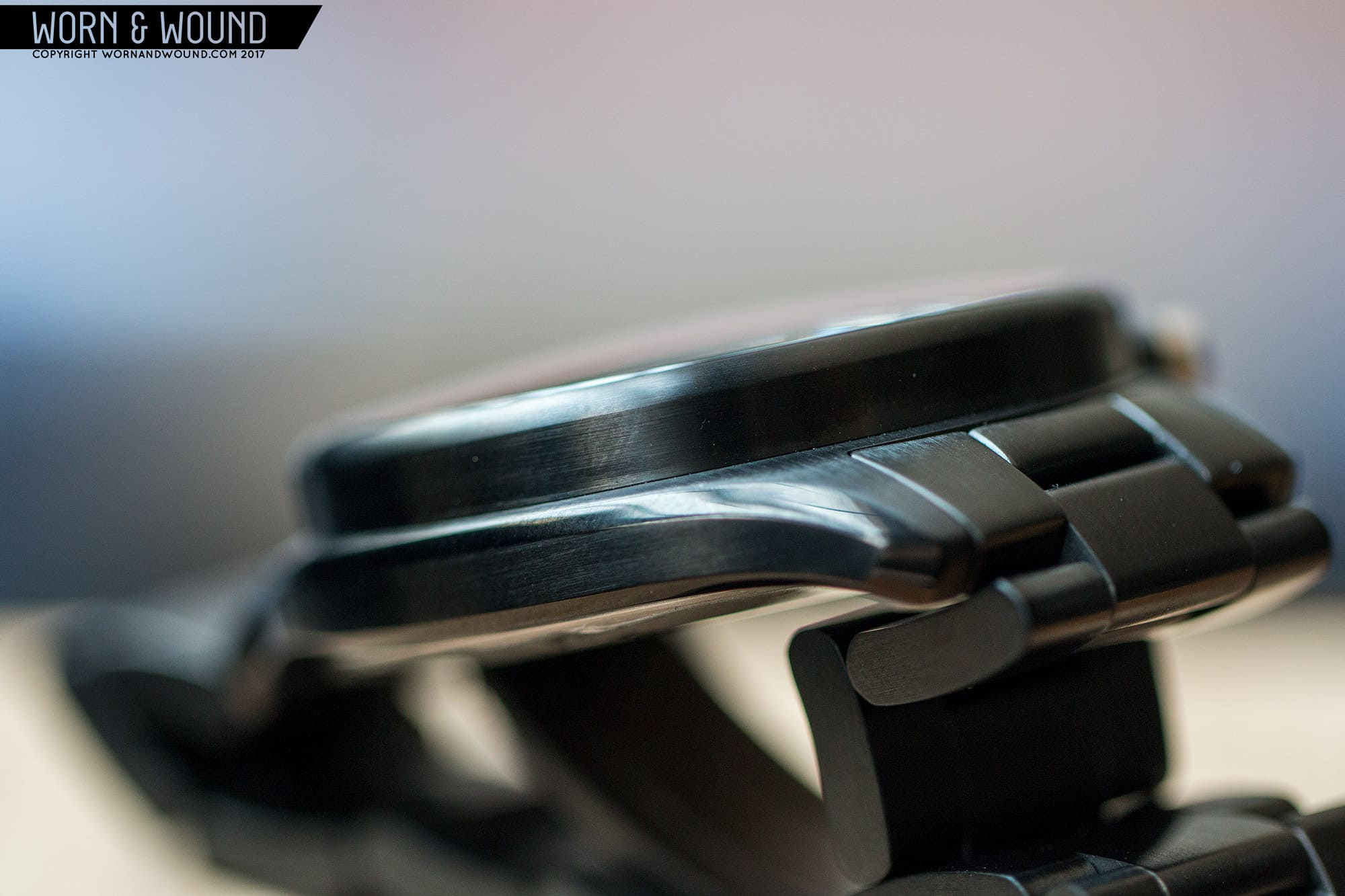
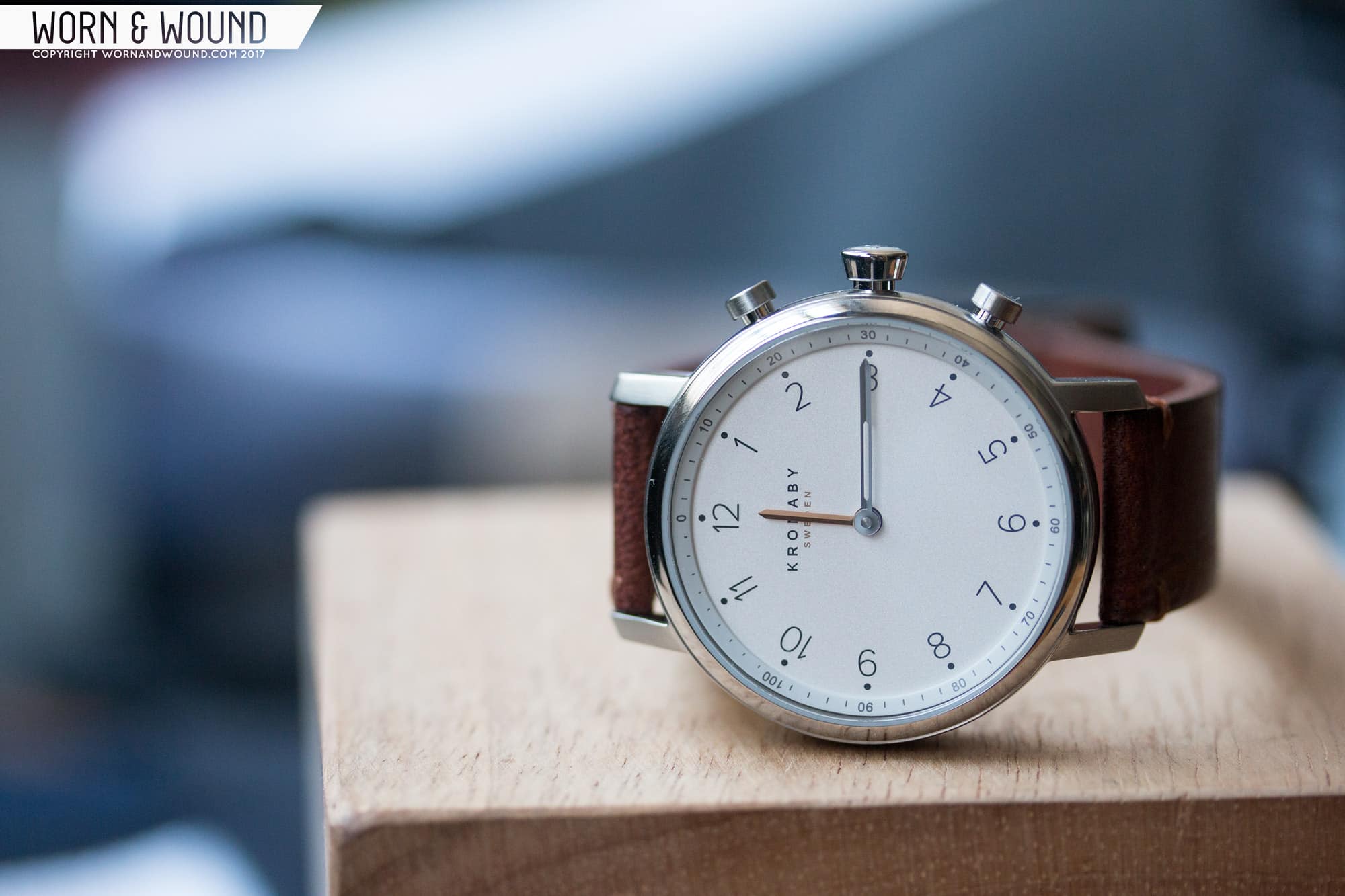
As for the watches, they offer a nice range of styles from two-hand 38mm dressier pieces to beefy 43mm four-handers (two on the sub-dial) ranging from $395 – $675. I got to try out two, but because you can only sync one to your phone, I will focus on the $675 Apex in black. It’s something between a modern pilots watch and a general sports watch, and regardless of its connected functions, is a watch I’d find appealing.

Advertisement
$675

Kronaby Apex Review: A Connected Watch Worth Giving a Shot

Case
PVD Steel
Movement
Kronaby Connected
Dial
Black
Lume
Yes
Lens
Domed Sapphire
Strap
Bracelet
Water Resistance
100m
Dimensions
43 x 52mm
Thickness
13.9mm
Lug Width
22mm
Crown
3 x Pushers
Warranty
Yes
Price
$675

Software and Functionality

Before even getting to the watch, it’s worth going over everything it does and how it does it. In the intro, I referred to the “movement” of the watch, but that language is a bit abstract when referring to connected watches. The watch itself does not keep time, rather it displays it. Inside, is a circuit board with motors, antennae, batteries, etc., most developed in-house and manufactured by Kronaby (all, save the motors, which come from Soprod), which all serve to receive the time from your phone via a bluetooth signal. Of course, should that signal drop, it will continue to display time, but there is no “time-keeping” organ, such as an escapement or oscillator. It’s essentially a puppet, with the app being the puppeteer. Should the time be off, you don’t use the crown, you go to the app.*Update: this is not entirely correct. The watch does in fact have a quartz oscillator for maintaining accurate time when not connected to the phone.

home screen

So, good software is key, and from my experience, Kronaby has really developed something intuitive, easy to use and quite powerful in theory. What stood out to me was just how customizable every detail of the watch is. Essentially each display, actuator and signal (two dials, three pushers and three different types of vibration) are individually set with a range of “complications/triggers” or filters. The complications/triggers range from the obvious, like second-time, to the very unique “walk me home”, which one pushes to tell a select friend that they are walking somewhere, pin points them on a map on the friend’s phone, and enables them to actuate an emergency signal to alert the friend, should something be up.

When you first set up the watch, you go through a simple bluetooth connection process and then calibration of the watch. Should the hands not align perfectly, you can microadjust them via a jog wheel in the app; it’s fun to play with, but thats besides the point. You can return to this calibrator at anytime should things get off.

rotate the jog wheel to calibrate hands

When you move to the main menu, you are presented with a “live” graphic of your watch (displaying correct time, and the current state of your sub-dial) and five menu options: watch face, filtered notifications, pusher, activity and settings. Going through each, when you click on watch face you’ll find a live graphic of the dial with two circles beside the watch, one labeled “main dial” the other “sub dial” (the smaller 38mm watches lack the sub-dial option). Here, “main dial” also refers to the crown pusher, as the dial defers to telling the time, but has a second hidden function that is turned on with the pusher. Beneath that is a list of complications, in this case four items; daily hundred (walking goal), date, second time (chosen from a list of cities around the world), timer (countdown kitchen timer). To set the complication, one simply drags the complication to either the sub dial or the main dial circle. The change to the watch is near instantaneous.

Filtered notifications then has three columns, each with four “slots” for various filters. At the top, you’ll see three vibration times: a long buzz, two pulses and three pulses. From the menu below, you can then drag and drop into each column what you wish to be notified about. This can be as general as calls, silent alarm, step goal, all texts, or as specific as just the texts from one contact or a notification from a specific app, such as instagram or gmail. Or… you can not use this at all should you not wish to be notified about what’s happening on your phone (that’s how I’d use it).

home, watch face, pushers, filtered notifications

Pushers is much like the “watch face” section, but here you set the functions of the top and bottom pushers. The “triggers” here are: find phone, music control (play/pause), camera (shutter), mute phone (deny call), remember this spot (drops a pin on a map) and walk me home. One thing that really impressed me in general was how easy the app led you through various other levels of set up. Using the “walk me home” function as it’s the most extreme as an example, upon selecting it, you are prompted to enter your name and phone number and then select a contact. It auto populates a text message with an invite for that contact with a link that leads the contact to a buddy app. They sign up and you’re good to go. Hit the top pusher and it instantly tells them you are out-and-about and where you are. It takes under a minute to set that all up.

Next, you have activity which is a graphic display of the percentage of your walking goal as well as a menu to change your step goal. It’s pretty much a given that all smart and connected watches will have this functionality, of course with the Kronaby, you can choose not to display it on the watch at all. Lasty, you’ll find settings, which allows you to calibrate the watch, “forget the watch” should you want to disconnect entirely and has various help and about details.

the “walk me home” function in action

The drag and drop mechanism is simple as can be, and actually kind of fun, encouraging customization. I found myself playing with the app in the first couple of days of using the watch, switching out the functions regularly, figuring out what I would use most and how I wanted to use it, which is what I find to be the power in this design. Let’s say you’re about to go for outside for an evening run, then you might want to set the sub-dial to daily hundred, the top pusher to music control, the bottom to walk me home, and the filters to just buzz for your most important contact. Now, let’s say you’re going on a trip, perhaps second time set to the timezone your leaving on the sub dial, date on the main dial, camera and remember this spot on the pushers, and instagram as one the filters to let you know when people like your travel pics. Not being tied to a single set of functions is really what sets Kronaby apart.

Of course, the complications are limited in the end of the day, and there is definitely room to grow. I found the lack of a classic chronograph function surprising as the set up would work very well (seconds on the center dial, elapsed minutes and hours on the sub-dial), but there could be a lot more as well. Volume control via the pushers, temperature display on the sub-dial, annual calendar on the main dial (hands could point to the day via the hours, date via the minutes and month via the hour), perhaps even a silent-minute-repeater type function, where a push of the crown buzzes the hour, then tens unit of the minute and then ones. This would be great in a theatre or for the visually impaired. But here’s the best part, since the brand created their own software, they can add functionality as desired, so the watches will continue to develop and they are actively seeking suggestions from users.

The tall bezel is a unique design feature

Case

The 43mm Kronaby’s feature a case design that is unlike other watches I’ve seen. At a glance, it might appear fairly classic in the sense that there are lugs, a bezel, crown, pushers, etc., giving it a recognizable look, but the actual positioning of things is quite different. Before getting to the specifics, the watch is on the large side, measuring 43 x 52 x 13.9 (to the top of the domed sapphire), though it does wear smaller.

Basically, the bezel is a really tall cylinder that’s about 41mm in diameter, this immediately makes the case read smaller than the actual 43. The pushers are then set into the case where the bezel and mid-case connect, giving them the appearance of coming out of the bezel. They also just look much higher up on the watch than you’d expect, almost being parallel with the dial. It’s a bit odd at first, but I grew to like how it looked. This is a particularly different design detail that I’ve not seen on another watch that I can recall.

curious pusher placement
note the polished steel pushers and knurled collar
the polished bevel adds some needed lines

While on the pushers, rather than remaining PVD, they mix things up and make them polished steel sliding into PVD sleeves. The crown pusher then has a PVD cap and in a very unexpected bit of detailing, a knurled collar. It’s a subtle detail, but one that adds a touch of texture where there normally isn’t. Since there isn’t a “mechanism” within the watch, I wasn’t sure of what to expect from the feeling of depressing one, so I was happy to find they have a nice resistance.

The midcase is then relatively thin and flat, gently curving down at the lugs. The stand out detail here is a polished bevel that runs along the edge, adding some appealing lines and finishing to the case, while further down playing the case’s size. The lines faux-contour the case, making it appear a bit narrower. The contrast between the thin midcase and tall bezel is quite appealing, giving the watch a very sturdy, sporty look and feel. To that end, it also has a 100m WR, which I didn’t expect on a connected watch (thought that might be me stereotyping them as tech rather than a watch).

Advertisement

Dial

The dial of the Apex has a very appealing modern pilot/sport design. It’s clean, highly legible and well proportioned. The surface is matte black and features a primary index of large Arabic numerals, save at five, six and seven, in a typeface that speaks to watches like the Oris ProPilot, yet differs in the details. Each numeral is then accompanied by a small dot, both of which glow. On the edge of the dial you’ll find an angled chapter ring for the minutes. I was glad that the indexes of the main dial are free of any clear tech language or markings. It’s a classic dial layout that serves double-duty for some extra functions, while still being easy to read at a glance.

highly legible

At six you’ll find a sub-dial where things get a bit more complex. The sub-dial can function as a true second dial, featuring both hour an minute hands, so you’ll first notice the 12, 3, 6 and 9 numerals on the lower center surface. There is a chamfer which features an index of markings that double function for reading minutes as well as percentage completion of daily step goal. As such, the first 50 minutes are burnt orange, with contrast white markers at intervals of five.

Around the sub-dial is an open circle that acts as a 100% index, with each 5-minute mark equalling 10%. This is a bit redundant to the orange portion of the index, though I get why it’s there. That said, if they lost it, the dial would be even cleaner, and really have no overt signs of being a connected watch, should that be something you are looking for.

The dial is easy read, despite all the functions it can perform
The sub-dial has a lot of info in a small space, but it’s well balanced
skeleton hands

The Apex features skeletonized sword hands on both the main and sub-dial. They are attractive hands that feature open areas for about 60% of their length, with the rest having some lume fill. The hour and minute are very different lengths, making them easy to tell apart at glance. The sub-dial essentially feature mini-versions of the main dial hands, sans lume. These too work, and are actually quite bold for a sub-dial.

Straps and Wearability

The Apex is available with either a 22mm leather strap or a three-link bracelet. The bracelet, here in matching PVD, is very solid, adding to the sport-watch intention of the design. It has solid end links and a slight taper of 2mm. The clasp is a simple style with two buttons on either side. This gives it a clean look that works well with the more modern feeling of the watch. Overall it looks good on the Apex, though a leather strap does give the watch a more casual feel.

The Apex wears surprisingly well. Despite the 43mm diameter and 52mm lug-to-lug, it fit my 7” wrist nicely, not over hanging or looking too big. That’s not to say it feels small, far from it, it’s a sizable and bold watch, but it’s quite comfortable. The case shape makes it sit really well, as the thin midcase makes it feel flatter than it really is.

Advertisement
fits well
good quality bracelet
on a High Craft – Model 1 Moss

Aesthetically, the Apex really is a winner. Like I said, part of the success of Kronaby is making watches that, well, are just nice looking, and there’s a lot to find appealing about the Apex. It speaks to different styles of sport watch, yet has it’s own flavor. It’s very clean and sharp, with great legibility, and just enough intrigue coming from the typeface, hands and sub-dial to keep your attention. In black, it’s pretty aggressive and definitely best suited to casual clothing, but in steel one might be able to pull it off a bit more business-casual. Regardless, it was very enjoyable to wear as the city heats up with some short, sneakers and rolled up sleeves.

Conclusion

Overall, I think Kronaby has something very promising with their new connected watches. They are easily the best looking connected watches out there I’ve seen, with surprisingly unique designs that will appeal to a wide range of people. The watches also feel like they are from a watch brand, rather than a tech brand in quality. The Apex is a solid, serious sport watch that even without the connected features, would be a nice watch worth taking a look at.

the 38mm Nord for comparison

But, it’s really in integrating these new “connected” features into the designs and allowing you to customize the functionality of the watch to suit your needs and desires that sets the Kronaby’s apart. Once again, I say this with the caveat of not having tried other brand’s connected watches, but from what I’ve seen, they are more limited and focused primarily on health tracking. It’s the other uses, the ones that are more horology focused, like second-time and timer, or lifestyle focused, like dropping map pins to mark cool spots and “walk me home”, that touch on something more conceptually interesting. The fact that the product will keep developing, with new features being added based on users needs, makes me think that Kronaby will find some really unique and “new” ideas for the connected watch.

Coming in at $675, the Kronaby Apex isn’t cheap either, but the price seems fair. The watch is certainly built to the standard one would expect at that price point, and the internals and software are “in-house” for whatever that’s worth. Fossil comes in quite a bit lower at around $200, while FC/Alpina higher, closer to $1,000. From what I can tell, it has them both beat on design and functionality. The 38mm two-handers are a bit cheaper as well. Sure, it’s competing against mechanicals at this price point too, but it’s really a different product. You’re not getting this instead of a mechanical, you are getting it for its features and abilities, which either you want or don’t. If you do, then Kronaby is seriously worth your consideration.

Images from this post:
Related Reviews
Zach is the Co-Founder and Executive Editor of Worn & Wound. Before diving headfirst into the world of watches, he spent his days as a product and graphic designer. Zach views watches as the perfect synergy of 2D and 3D design: the place where form, function, fashion and mechanical wonderment come together.
wornandwound zsw