Mido Ocean Star Review

After years of looking at and reviewing watches on a daily/weekly basis, I’m sometimes surprised by what I end up liking. Sometimes it’s a watch that I expected to be garish or too large, but is tame and fits well. Or a watch that is so simple that I expect it to be dull, but it ends up having a sophistication beyond the sum of its parts. Regardless, I enjoy these surprises as they keep me looking forward to new releases and trying out new watches. 

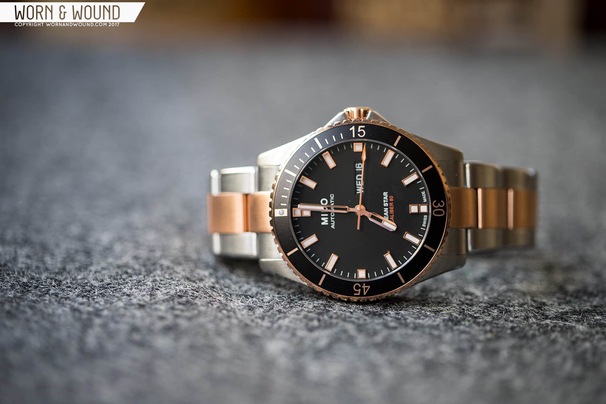
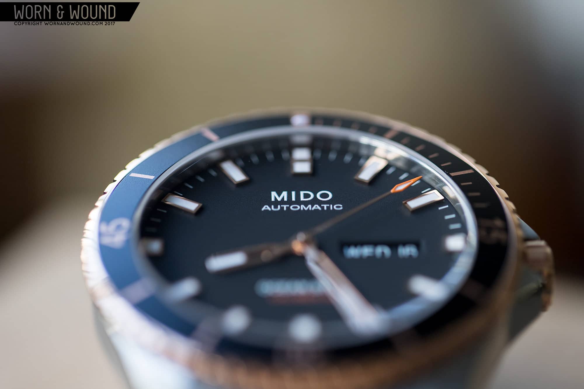
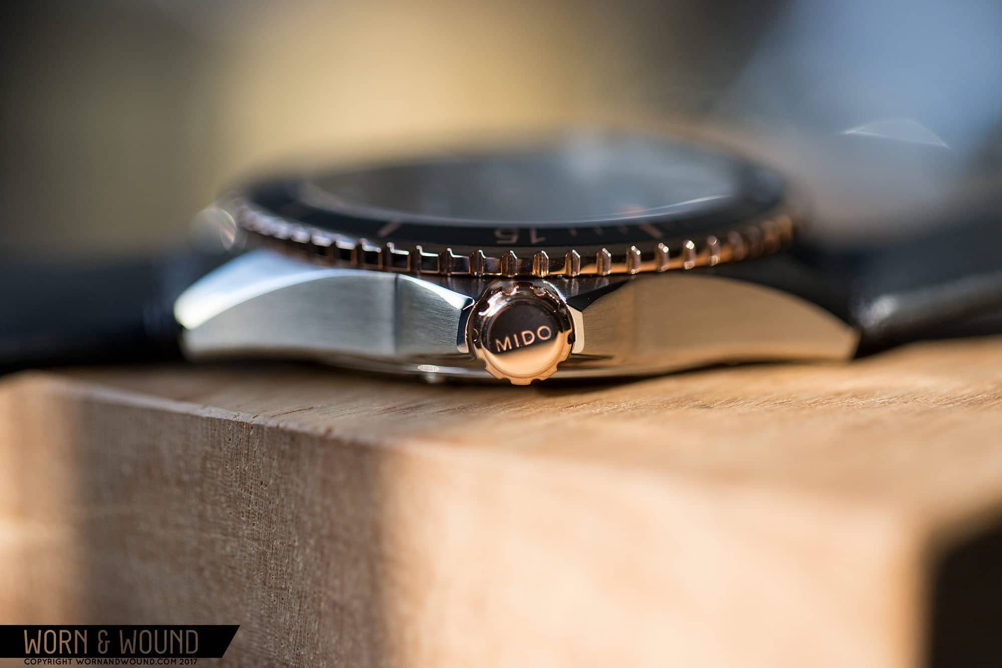
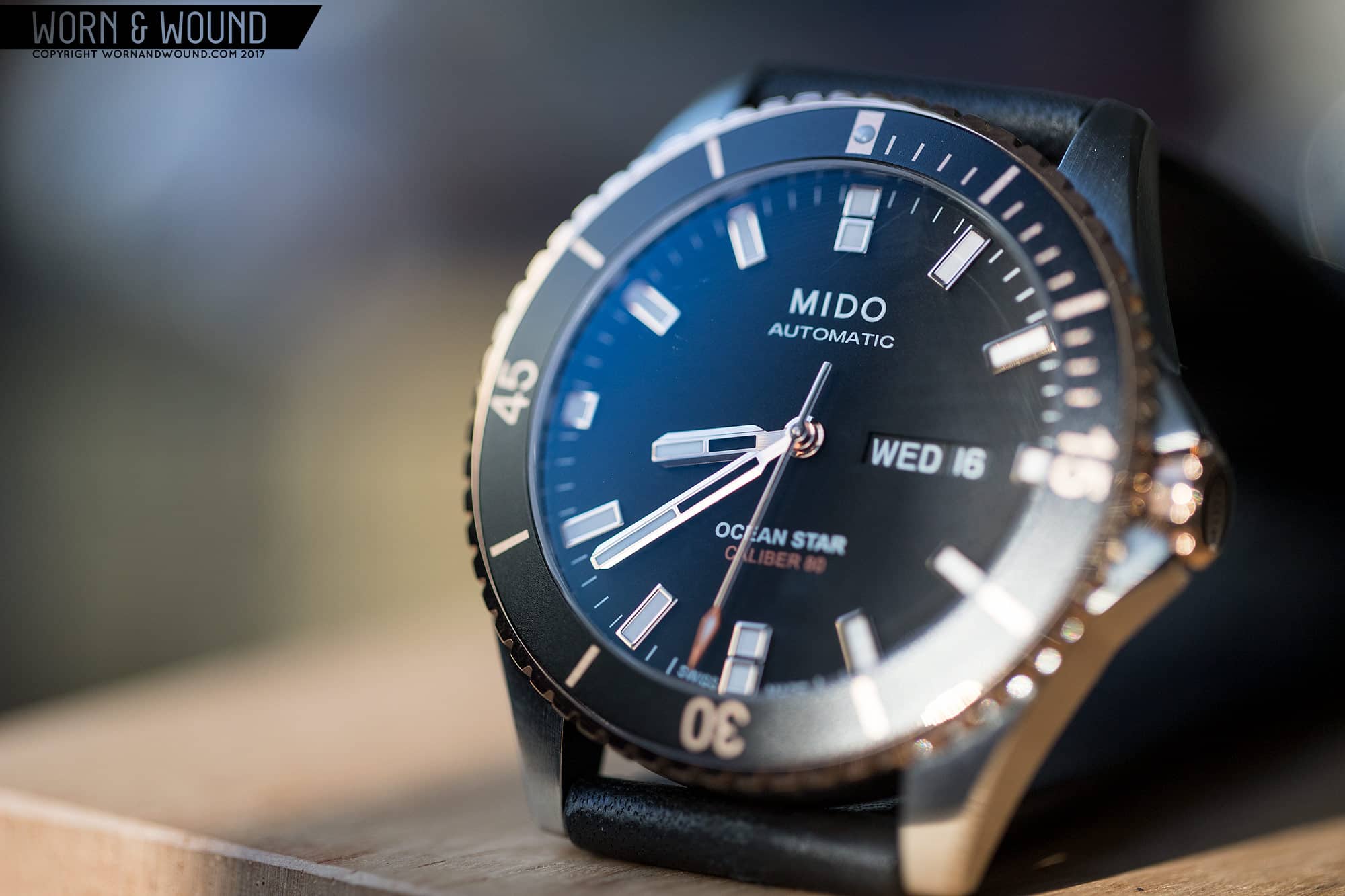
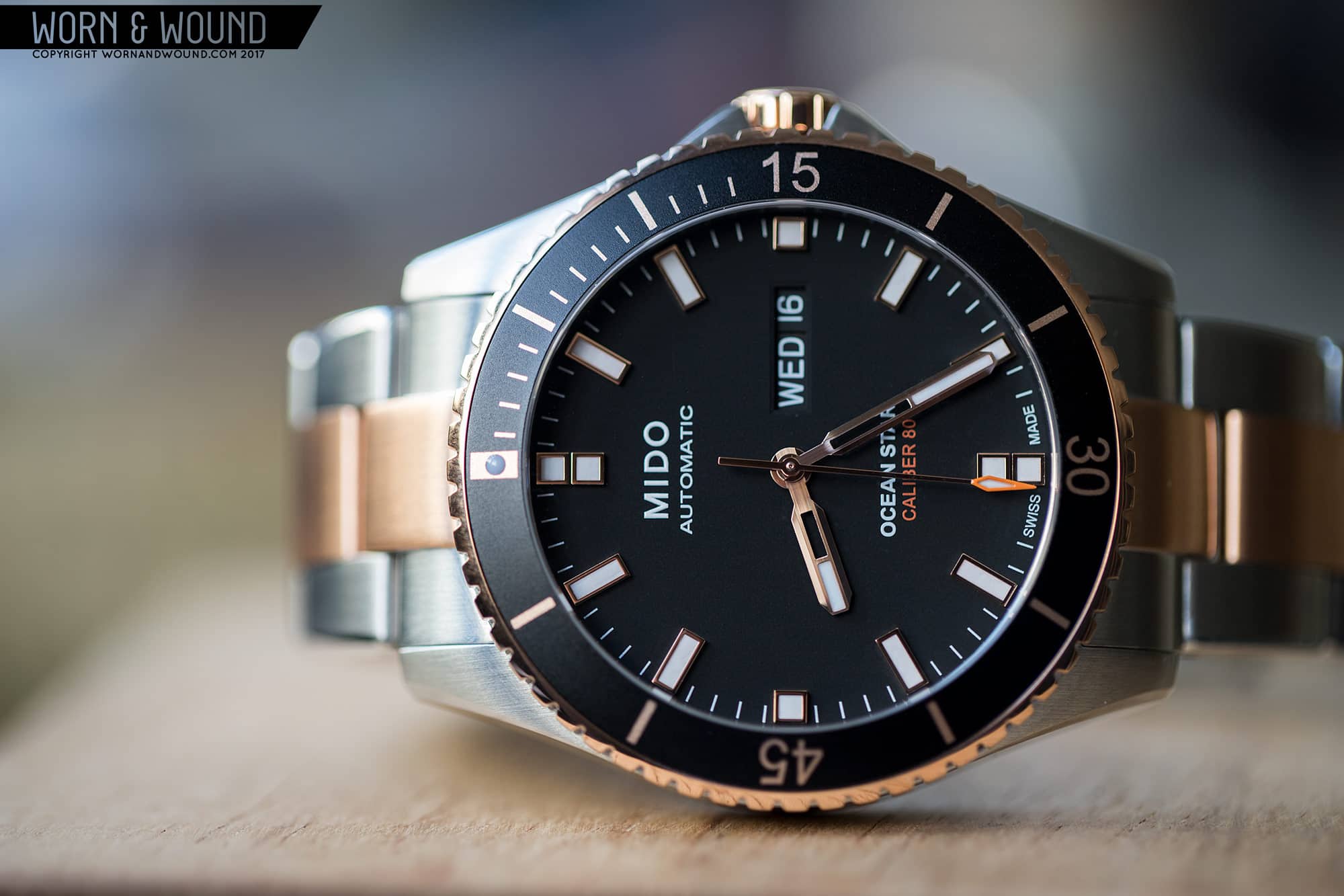
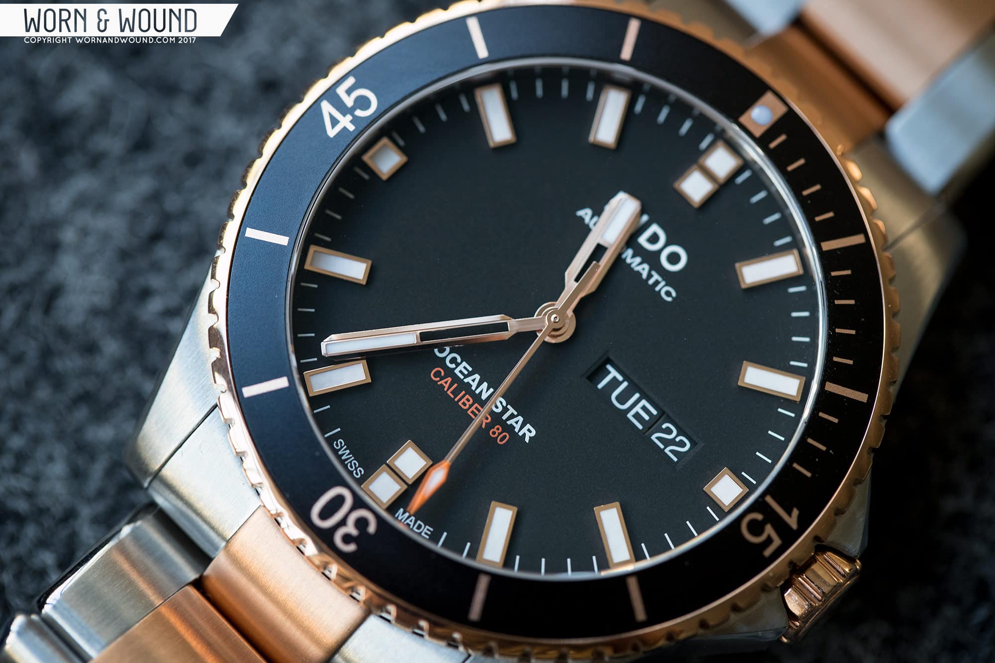
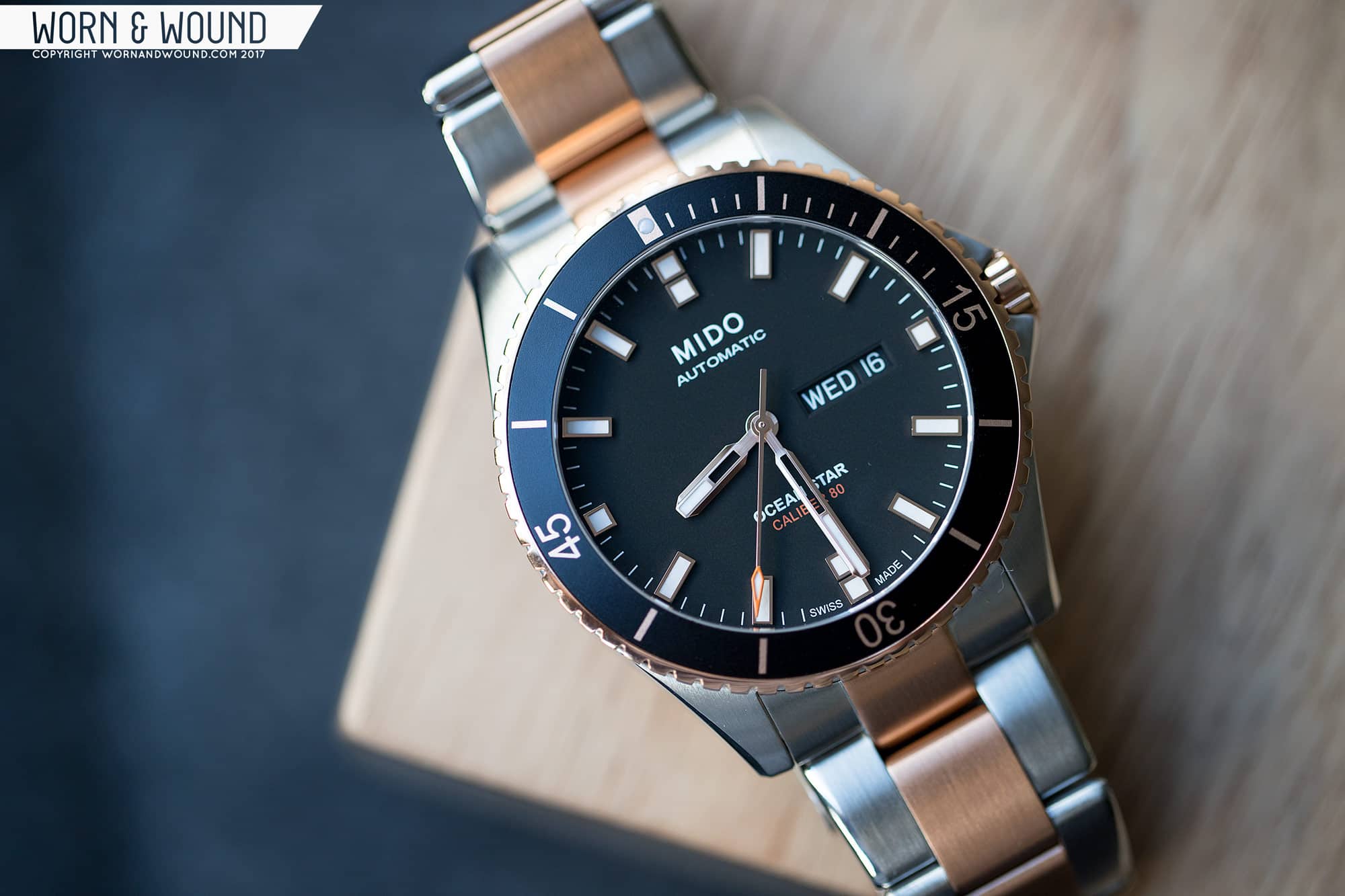
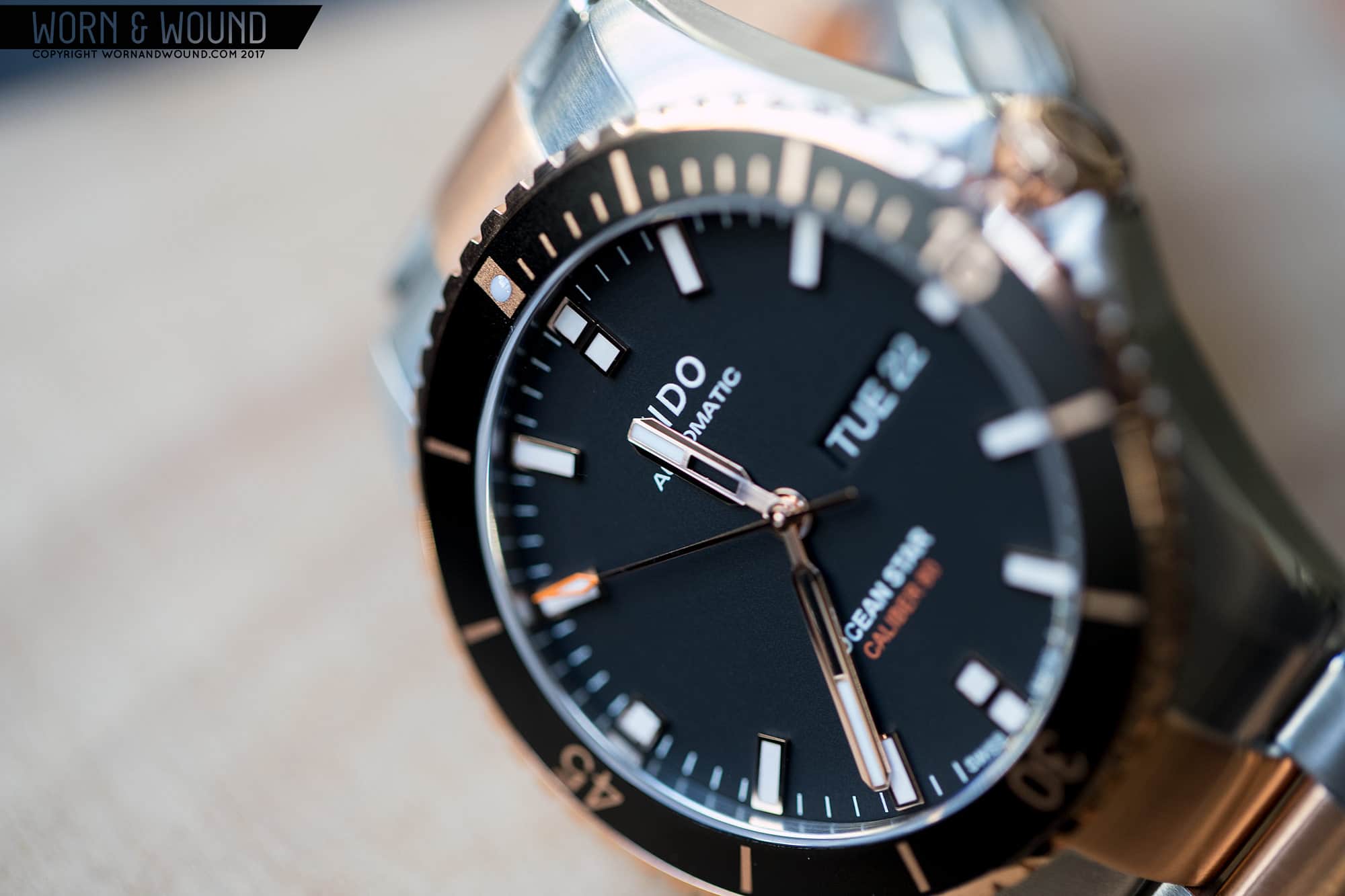
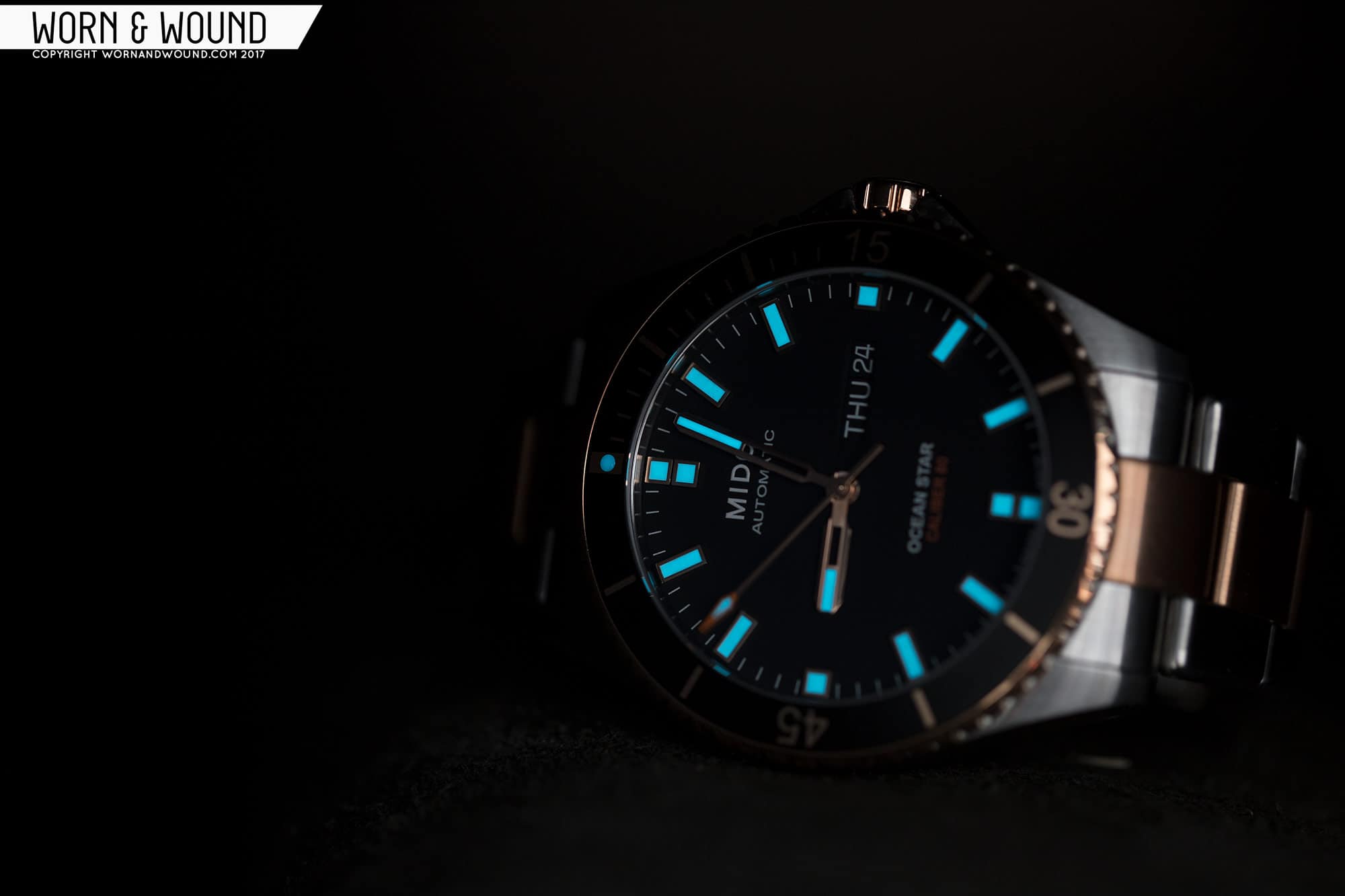
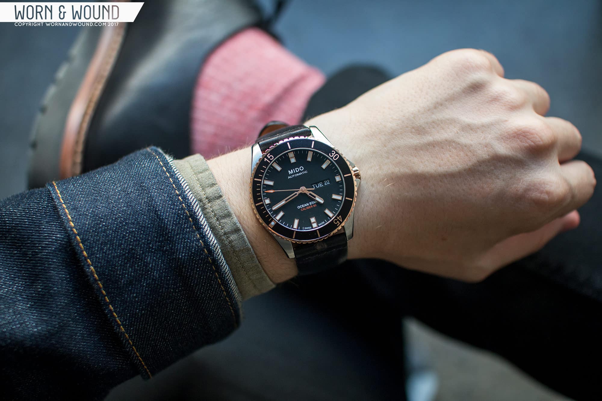
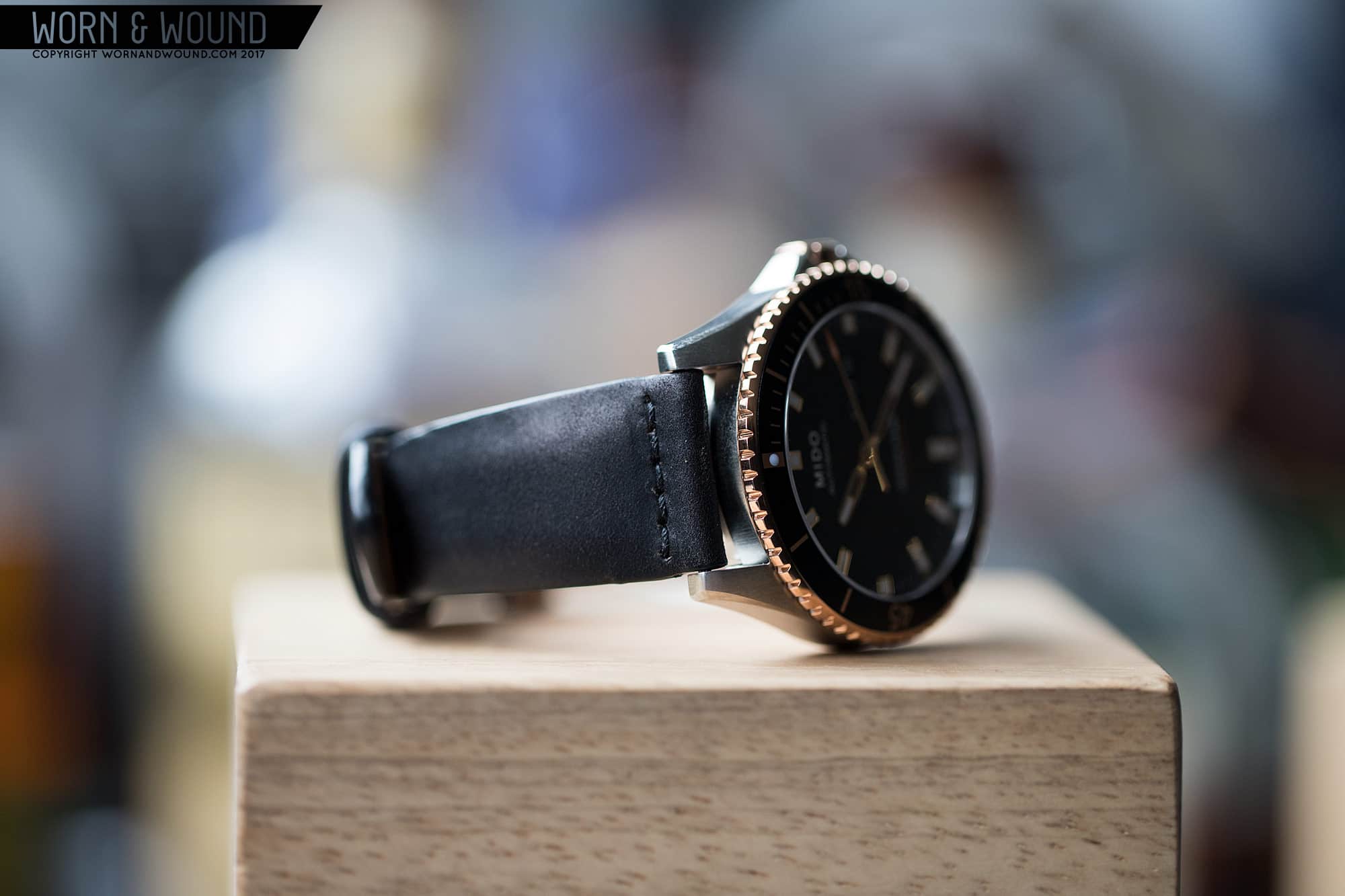
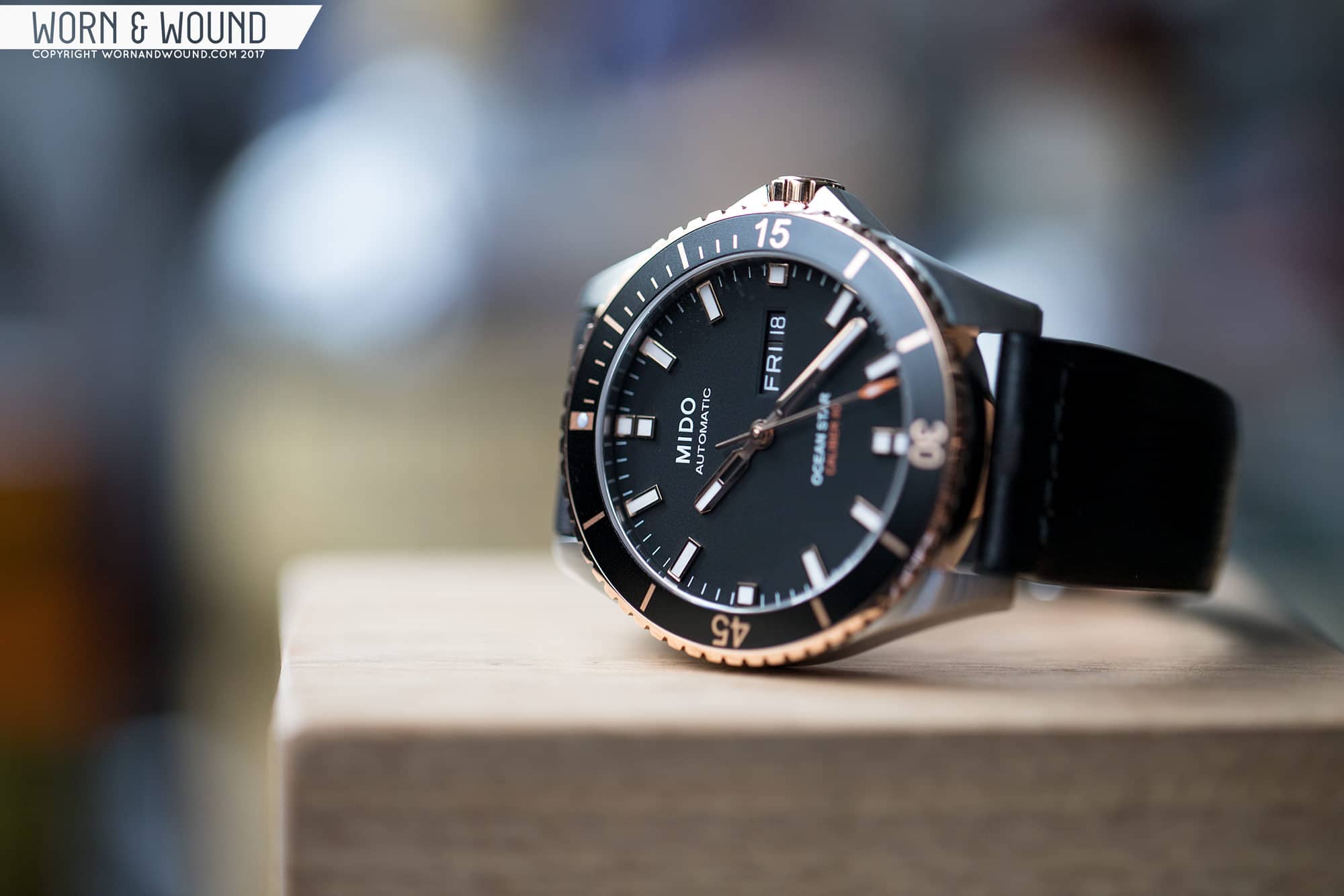
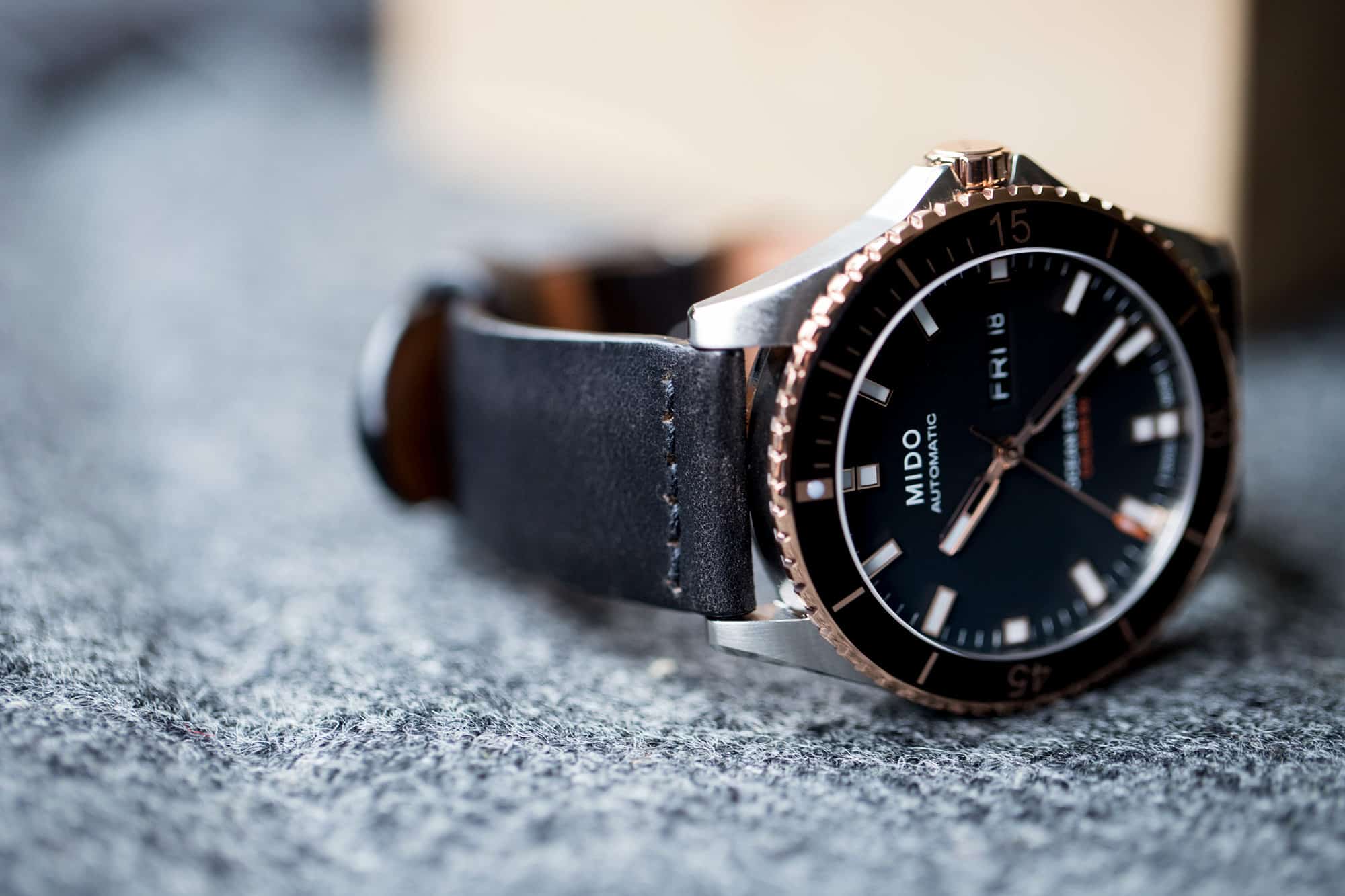
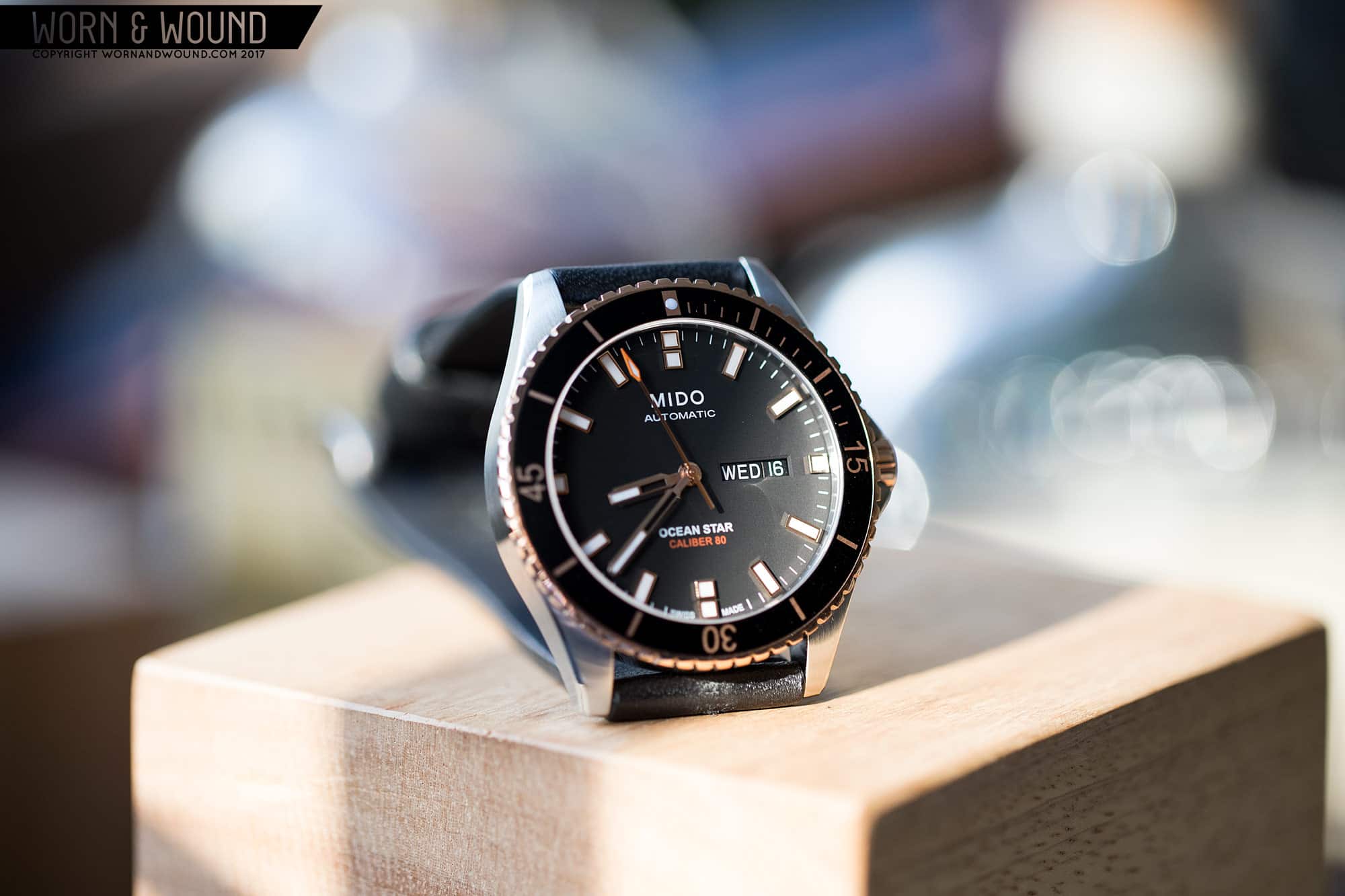
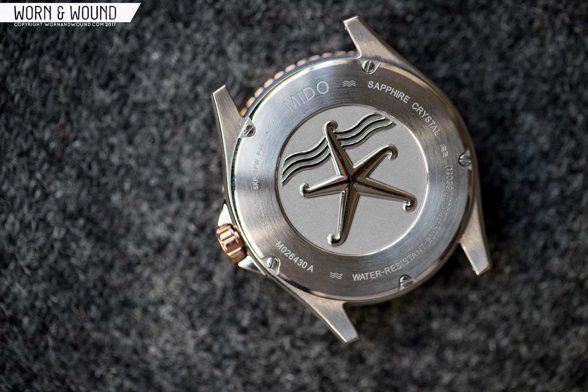
When I first saw the Mido Ocean Star, my reaction was, “Well, okay. Nothing new here, but nothing offensive either, and certainly worth a closer look.” At a glance, the overall layout seemed well considered. There was nothing that gave me an immediate, “Oh, no” reaction for sure, and the aesthetic felt pleasantly modern in a day when everything is trying to be vintage. 42mm is perhaps a touch large, but not over the top. Furthermore, 200 meters of water resistance, a sapphire crystal and one of Swatch Group’s handy 80-hour power reserve movements make it a nice package for around $1,000.

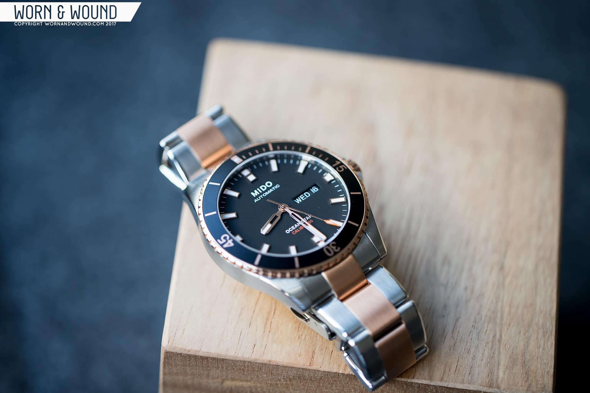
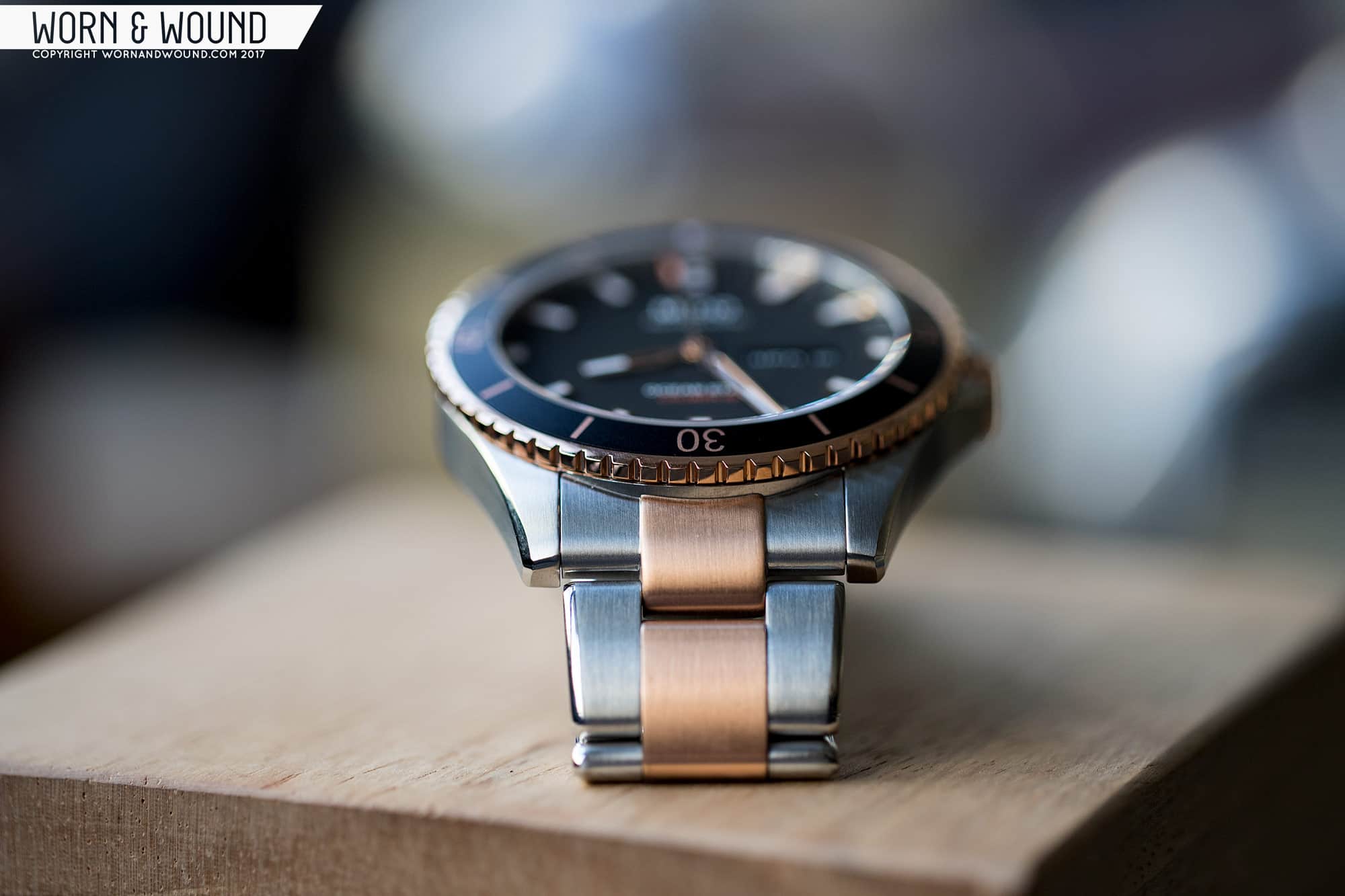
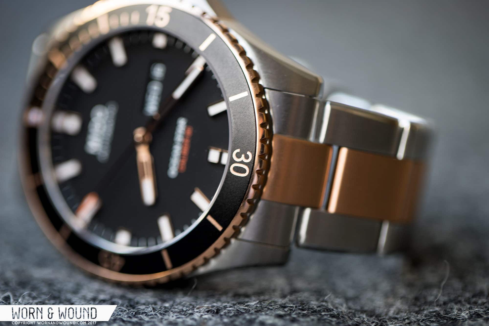
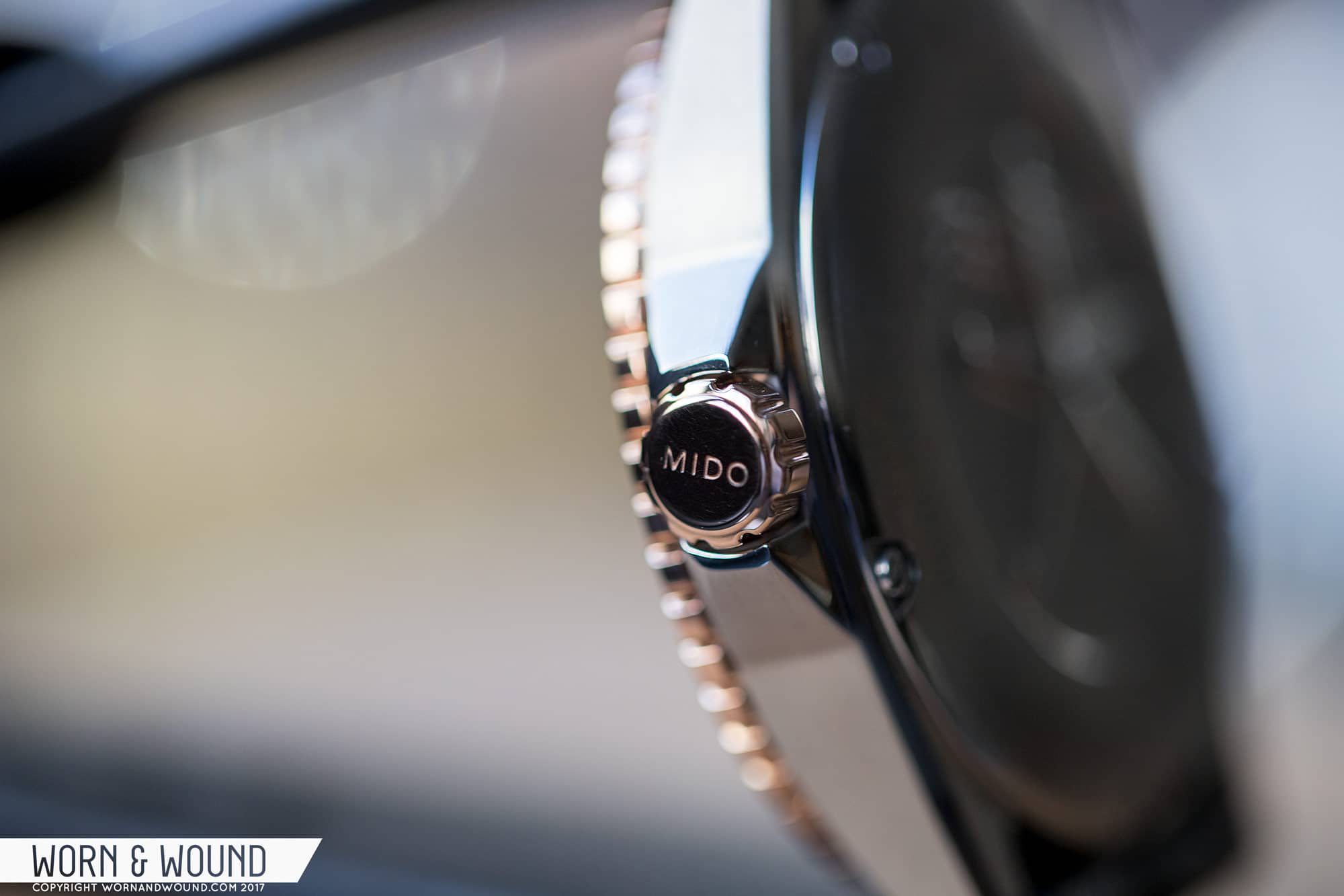
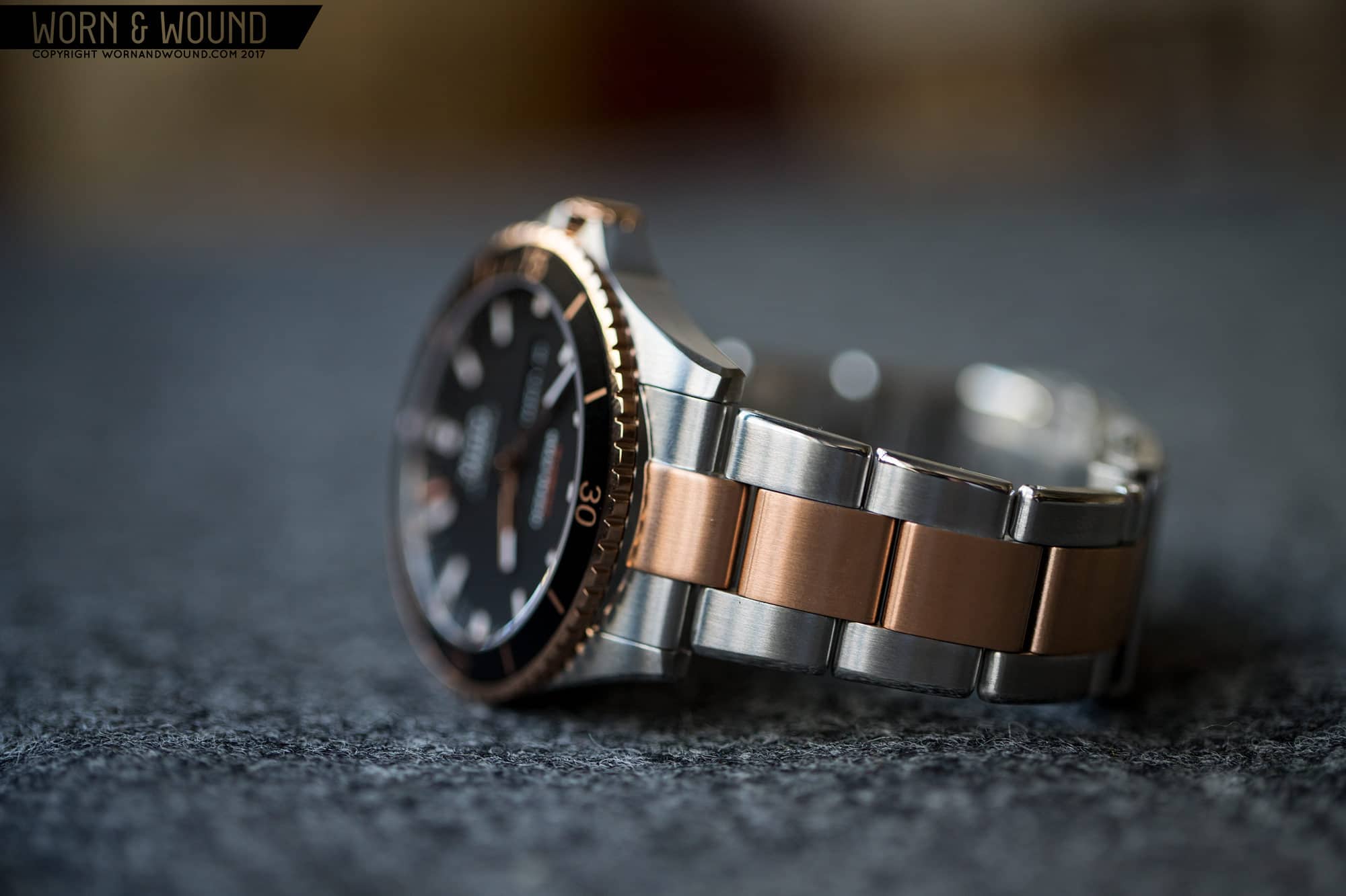
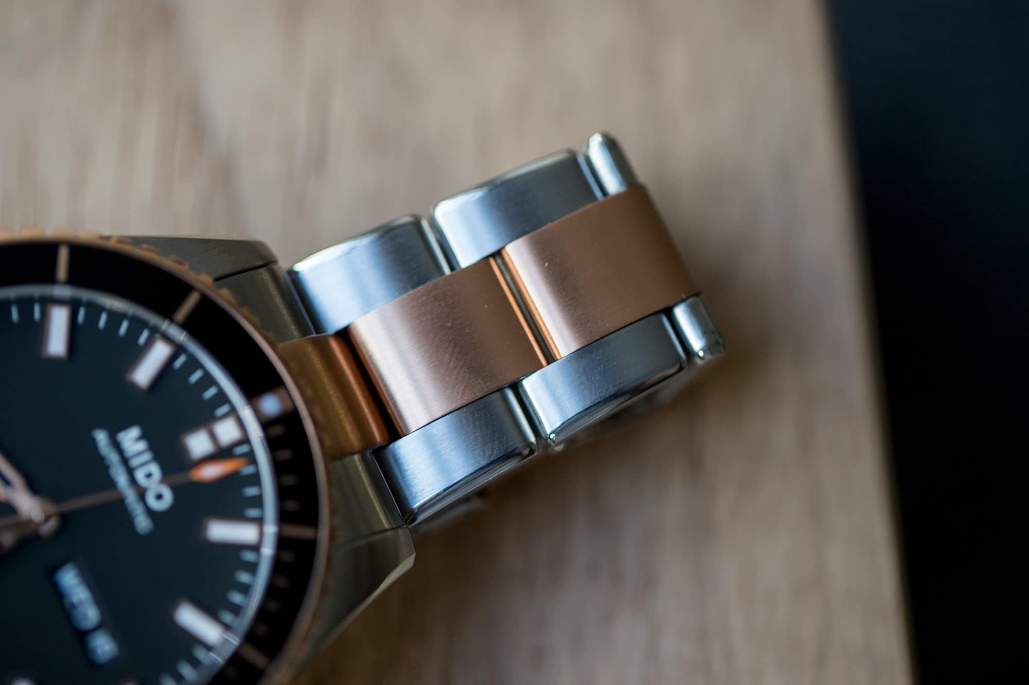
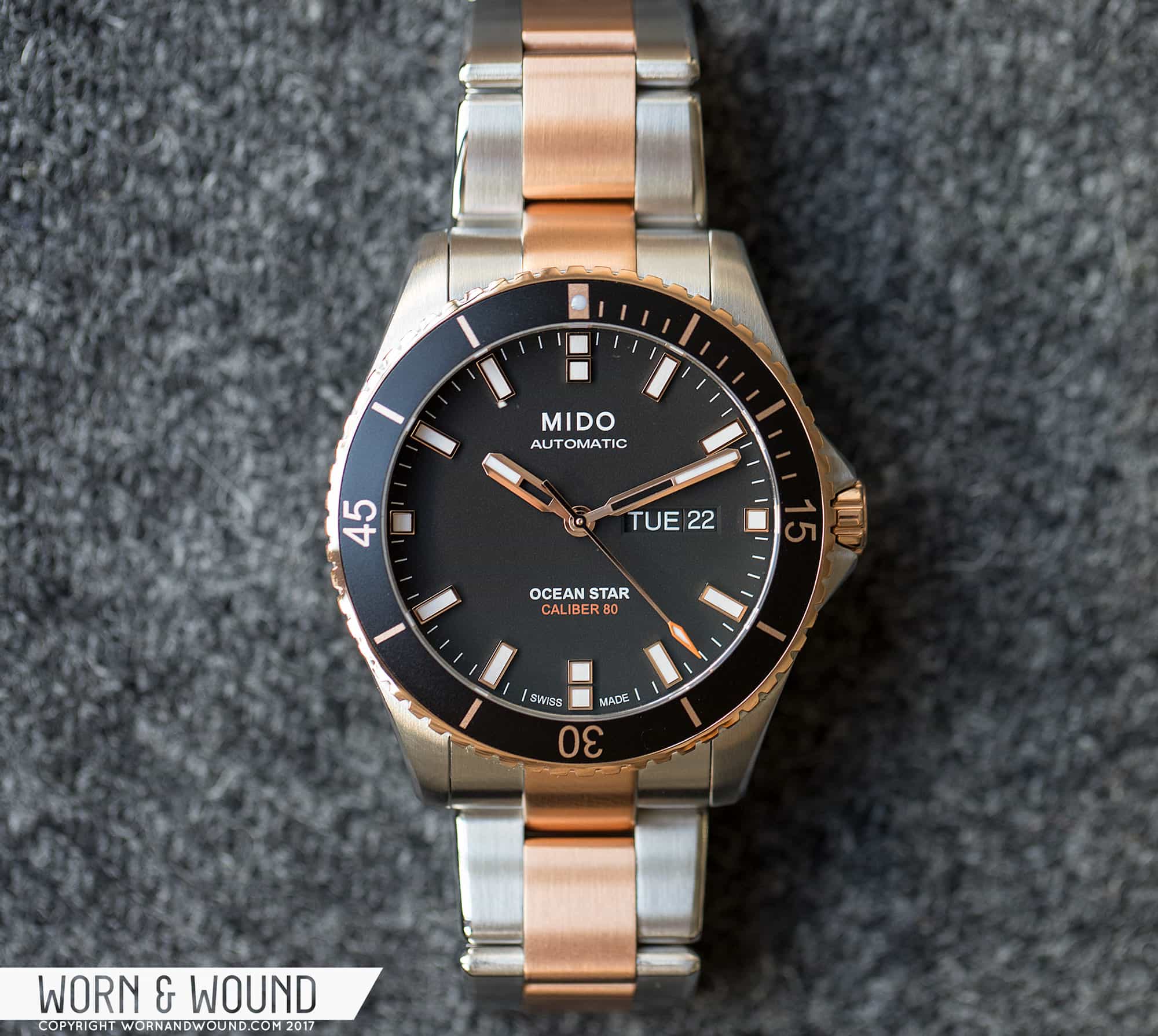
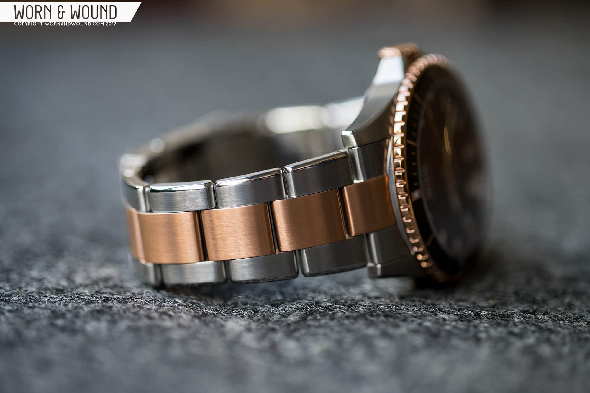
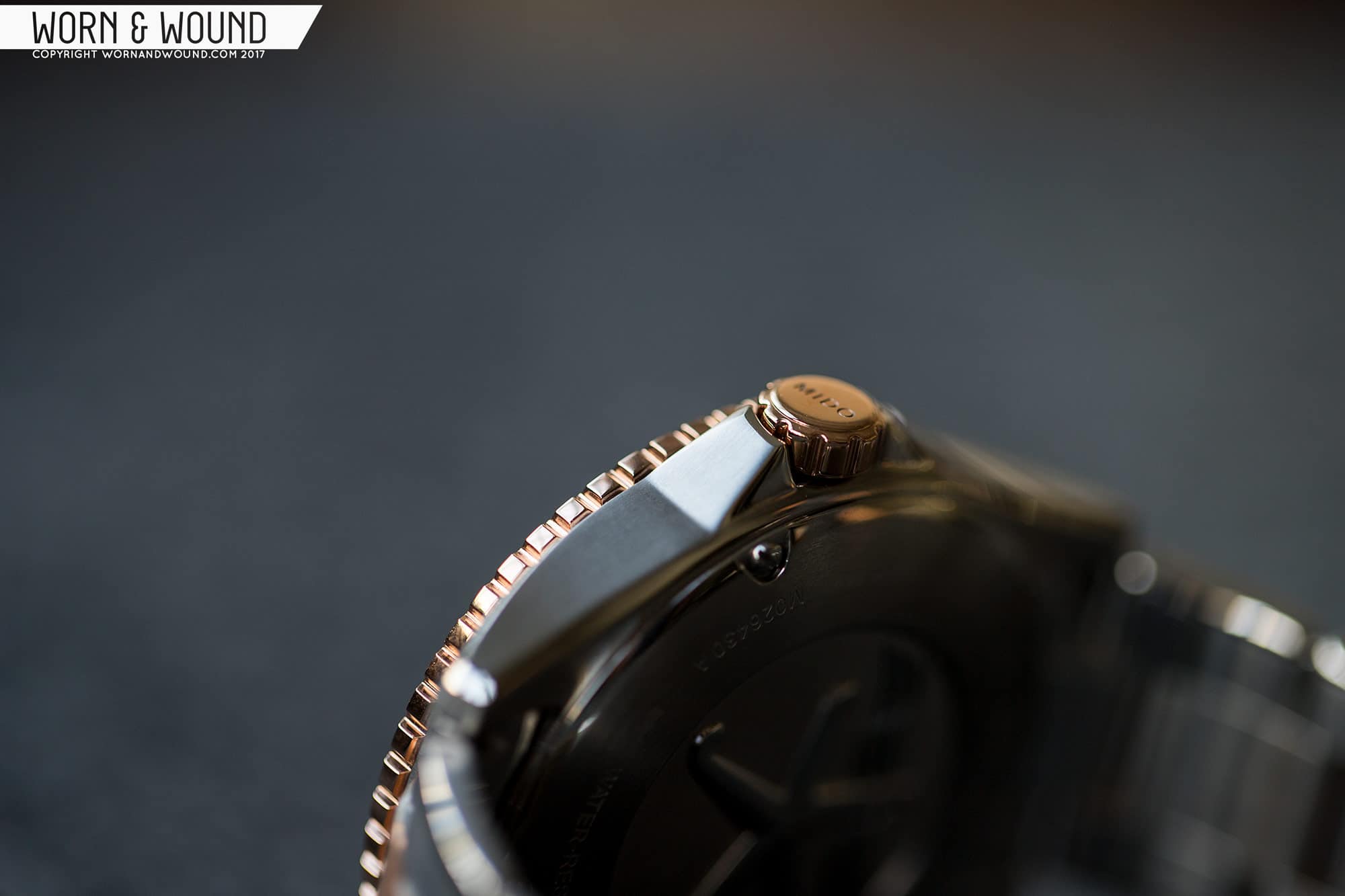
Looking closer at the line, I was also intrigued by the different styles available in the Ocean Star series. There are a couple of standardssteel case with either a  blue or black dialbut there are also some more unique options, too. There is an all-titanium option, which is more toolish than the others, and then two that flirt with gold. One is all around rose gold accompanied by a black strapwhich I get, but it’s not for me. The last, however, intrigued me the mosta two-tone version with a steel mid-case and rose gold PVD bezel and crown.

Why this model? First, it’s a change of pace. We rarely review gold watches or watches with gold elements, and variety is the spice of life, so they say. Second, it simply looks nice, with the gold accents adding some additional detail to the design. Third, two-tone watches are maybe starting to come back in trend. I mean, there was even a NY Times article on the topic that I had the honor of being quoted in (humble brag). That said, the article focused on watches at a higher price point, and that brings me to my final pointwith the recent release by Tudor of the Heritage Black Bay Two-Tone, an immediately very popular new model, it’s nice to have an affordable option in a watch that bears some similarity without feeling derivative.

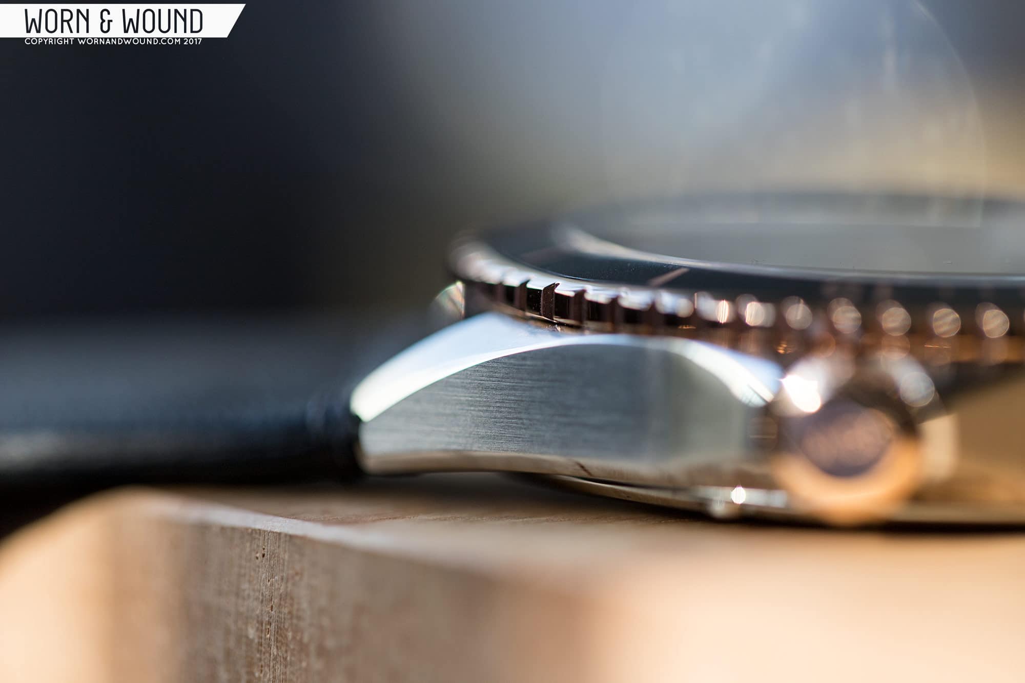
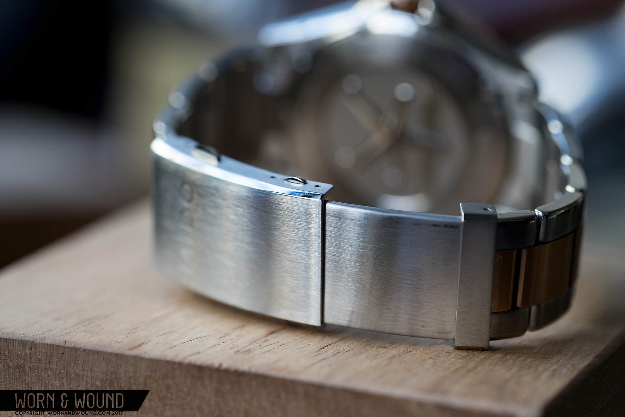
And, as the opening paragraph set up and the following will expand on, I was pleasantly surprised by the Mido Ocean Star. It’s a cut and dry dive watch that leans more towards desk diving than ocean diving, and it has a well-considered and very clean layout. It’s modern and not trendyin a good waybut it also has some vintage elements to the bezel which adds some style. The case and bracelet have some finishing that surprised me, and those hints of gold elevate the aesthetic. At $1,000, it’s not the cheapest on the block, but it’s a nice alternative to watches that cost a few times more.

Save

Save

Save

Advertisement
$1050

Mido Ocean Star Review

Case
Steel + Rose Gold PVD
Movement
Caliber 80
Dial
black
Lume
BGW9
Lens
Sapphire
Strap
Bracelet
Water Resistance
200m
Dimensions
42 x 49mm
Thickness
11.8mm
Lug Width
22mm
Crown
7 x 3 screw-down
Warranty
Yes
Price
$1050

Case

The case of the Ocean Star has classic, masculine lines and is surprisingly thin for a modern diver. Coming in at 42 x 49 x 11.8mm, it’s medium-large and flat, which balances out well. From above, the mid-case has subtle lines with flowing contoured lugs that are nice and thick and crown-guards on the right. The rose-gold and black insert bezel are visually dominating from above, but not overbearing.

From the side, the case shape is exceptionally simple and pleasantly smooth. The mid-case is more or less a slab that ever so slightly curves down at the lugs. This can sometimes create a watch that is too flat and thus doesn’t sit well, but it works on the Ocean Star, not causing any issues. From the side, the quality of the watch’s finishing can also be observed. Top and side surfaces all around are brushed with a nicely grained texture that follows the direction of the surface. Along the outer edge of the lugs, the bottom edge of the mid-case and the tops and bottoms of the crown guards are polished bevels.

The bevels along the lugs are particularly nice, as they flare out as they approach the ends of the lugs, exaggerating the geometry. They then follow the edge all the way around, merging with the bevel underneath. With bevels along both the top and bottom edges of the mid-case, the watch looks a bit thinner. The bevels on the crown guards are a bit less obvious, but I imagine they take away some harshness that could have come from their triangular shape, which suits the more business-casual feeling of the watch.

The crown is screw down and fairly wide and thin, measuring 7 x 3mm. It’s plated in rose gold PVD, as one would expect on a two-tone watch, and features grooves at an interval to reflect the edge of the bezel. The proportions look good with the case, though I did find the crown a bit slippery and difficult to screw back in, as it was a touch tricky to engage the threads.

Save

Save

Save

The bezel, as mentioned before, has a rose gold PVD edge with a black aluminum insert. It’s a relatively thin bezel in terms of inner and outer diameter, though not overly so, and it’s fairly flat too. The edge is slotted for grip with about a millimeter between each groove so that each wide portion aligns with a minute (not that you need to use that, just an observation on how it aligns). It also overhangs the mid-case just a bit, making it easier to grip. The mechanism is a 60-click unidirectional type that has a snappy feel and lands precisely.

Flipping the watch over, you’ll find a solid steel back with a fun, stamped relief in the center featuring a quirky little starfish extending an arm above some stylized waves. The waves and starfish are dimensional and polished, while the background is flat and etched matte. I imagine this is a design that refers to some vintage piece. Around the art are the etched details you expect to find, and six screws holding the back in place.

While making grandiose comparisons is not of great value, the case of the Ocean Star does get right two of the biggest issues I had with the Black Bay; the height and the polished sides. The slim profile of the Ocean Star is one of its best design features, making it wear nicely and giving it a sleek look. The brushed sides then eliminate the fingerprint issue, they look more appropriate on a sports watch, and they further emphasize those beautiful bevels.

Save

Save

Save

Dial

Moving to the dial, you’ll find a well-balanced and surprisingly elegant take on the dive standard. Because of the medium-width bezel, the dial is relatively large for a 42mm diver, which is actually quite nice. Everything has room to breathe and is clear and legible. The dial surface is matte black, as to be expected, on which you’ll find a primary index of applied markers. The markers are square at three, six, nine, and 12 (doubling up at six and 12) and rectangular for the rest. They all feature rose gold surrounds around a core of white lume. They are not overly done, coming straight up off the dial and not adding too much gold to the show.

Between each applied marker are four white dashes for the individual minute/second. And that’s it for indexes. I quite appreciate the simplicity of the design and the balance of the proportions. At first, it seems almost too plain, but I came to appreciate it as a restrained and, frankly, mature design. The use of small squares as accents at the poles also gives the watch just enough of a different look from other classic dive designs that it feels like its own spin.

On the surface, you’ll find minimal printing. There’s “MIDO” and “AUTOMATIC” at 12 in white, and “OCEAN STAR” and “CALIBER 80” in white and orange, respectively, above six. The light use of burnt orange for the “CALIBER 80” is a nice touch that plays off of the warmth of the gold surrounds, and being a subdued orange, it doesn’t take attention away from the other elements.

Between three and the center of the dial lies a day/date window. Because of the wide dial, this window falls pretty much centered on the axis of the hands and the edge of the dial. As such, it looks like it’s positioned exactly where it wants to be. Additionally, the day and date are presented in white on a black surface, helping the window blend into the dial as best as possible. It’s all very well done, and the choice of using a day/date movement instead of just a date movement was the right choice for this watch. Had it just been the day, the centering effect would have been lost, and it would have ended up with a “floating” date.

Save

Save

Save

The bezel insert also has a classic layout, with perhaps a touch of vintage flair. Emerging from the matte black aluminum you’ll find rose gold linesbold at intervals of five, numerals at 15, 30 and 45, and smaller marks for the individual minutes from one through 14. At the origin is a bolder rectangle with a small lumed pipthe only lume on the bezel. No complaints here as the insert works well with the design. The dial’s openness is reflected in the bezel. Marks and numerals are used sparingly, with nothing feeling too dense or busy.

The hands of the Ocean Star pull the watch firmly into modern territory. The hour and minute are a complicated shape starting with a narrow stem connecting to the center axis, then flaring out and continuing straight before terminating in a three-sided tip. The bodies of the hands are then skeletonized for the first half, and they’re lumed for the second and feature brushed centers with polished sides. They are very attractive and dynamic. They are both in rose gold as well. The second hand is a more standard design with a thin stick arm leading to a slender pointer tip that is painted orange and filled with lume. Once again, it’s that tame burnt orange that complements, but does not distract.

The lume on the Ocean Star is BGW9 or an equivalent, appearing white when in the light and blue when in the dark. The lume glows well and evenly between the hands and applied markers.

Save

Save

Save

Advertisement

Movement

As the dial of the Ocean Star somewhat cryptically indicates, inside is one of Swatch Group’s 80-hour power reserve movements. Based on the 2824/2836 (the latter being the day/date version), the Caliber 80 is a 25-jewel automatic with day, date, hacking seconds, a frequency of 21,600 bph and the aforementioned 80-hour power reserve. Additionally, the movement in the Ocean Star is Elaboré-grade with a NIVAFLEX NM mainspring, ELINCHRON II balance-spring and it has been adjusted in three positions.

Straps & Wearability

The Mido Ocean Star comes mounted to a steel bracelet with a 3-link design, though it appears for some models there is also a rubber strap version. The bracelet is quite nicely made and finished, with medium-coarse brushing on all top surfaces and a surprisingly nice polished bevel along its edge. I typically am not a fan of polished bracelet details, which are usually a bit over the top (such as the whole center link) but this works nicely, accentuating the bracelet’s taper from 22 down to 19mm.

Another surprising feature is the clasp, which is a large diver type with two sets of push buttons on it. One set opens the clasp and the other releases the extension. We’ve seen this type of clasp before, but to my memory, only on micro-brands. Lastly, the bracelet features single-sided screw-bars in the exchangeable links, making sizing the bracelet super easy. This should really be the standard.

closed
extended

Aesthetically, it’s a nice looking bracelet, but it does feature a lot of rose gold. This is typically the case with two-tone watches (such as the Black Bay). The majority of the gold is on the bracelet and not on the watch head, and frankly, it’s too much gold for me. So, I tried the Ocean Star on some 22mm black leather straps, which quickly became my preferred method of wearing the watch. The black leather turns the gold from an indicator of luxury to a subtle accent that actually adds to the overall masculinity of the watch.

On the wrist, the Ocean Star wears well. When I first saw “42mm,” I thought the watch might be too big, but 42 on a diver still works well, as the bezel helps compress the watch visually. 40mm is still my favorite for a diver, but the Ocean Star doesn’t look or feel too big. It also has a very reasonable 49mm lug-to-lug length, keeping it from over-spanning the wrist. And then there’s that delightfully tempered 11.8mm thickness. It can’t really be understated what a difference the height makes. Nearly 12mm isn’t “thin” by watch standards, but it’s on the thin side for a diver, and it makes the watch wear nice, low and close to the wrist for comfort.

Advertisement

Aesthetically, the watch is a success as well. It’s just a very clean, no fuss dive watch with a modern, restrained look. It’s not too aggressive or too sporty, and it’s not too minimal or too boring. It’s just a well-balanced and very wearable watch. It also has markedly good finishing, which you don’t need a loupe to see. The two-tone version, which might not be for everyone (but Mido offers other options in that case), has a charm that is hard to put your finger on, yet it’s definitely there. The mix of rose gold accents and black pulls the watch more towards a business-casual sports watch design, not by forcing a formal element, but rather by feeling adult, for lack of a better term. Sure, it makes the watch more of a desk-diver, but that’s not really a concern for yours truly. From a purely color perspective, the hints of warm metal amidst the otherwise black and cold steel adds some nice texture, disrupting the otherwise neutral tones.

Conclusion

As I said in the intro, the Mido Ocean Star is a watch that left me pleasantly surprised. On the surface, it’s a bit plain, but what it lacks in inventiveness it more than makes up for in wearability, versatility and simple execution. Most watches we see, not all but most, have that one detail that nags at the end. A date window, a dimension, and block of text, etc. But the Ocean Star doesn’t have any of that. It’s non-offensive in the best sense, and because of that and its clean design, the watch is a true chameleon that can become a part of any outfit and easy to wear every day, whether in jeans or a suit. Some watches want to be the star of the show, which has its time and place, but the watches you/I end up wanting to wear the most blend in and support their surroundings.

On a Black High Craft Vintage. Otto Bluchers courtesy of Rancourt & Co

Throw in the fact that it’s from a large brand and has the support network that comes with that, and that it has an 80-hour movement based on the workhorse 2824, and you’re presented with a winning package. Ranging from $850 for the all steel version on the rubber to $1,050 for the version reviewed here (MSRP), the Ocean Star offers a decent value. There are likely watches with similar specs for less, though I doubt they’d compete on finish quality. The look and feel of the Ocean Star are that of a watch that costs more. In the case of the two-tone version, should that style pique your interest, it’s definitely a more affordable way to get that look without sacrificing quality.


Click here for more on the Mido Ocean Star

Images from this post:

Save

Related Reviews
Zach is the Co-Founder and Executive Editor of Worn & Wound. Before diving headfirst into the world of watches, he spent his days as a product and graphic designer. Zach views watches as the perfect synergy of 2D and 3D design: the place where form, function, fashion and mechanical wonderment come together.
wornandwound zsw
Categories:
Tags: