Nezumi Voiture Review

Vintage is dead, modern is the new vintage!.. Now that I have your attention, it’s no small secret that vintage watches have a certain charm and appeal that is often lacking in modern timepieces. From more modest sizing to more adventurous designs to simply more variety in movements, the catalog of watches from the 50’s, 60’s, 70’s are a treasure trove of great timepieces. And, everyone apparently knows this… In the last few years the vintage market has boomed, and many timepieces that were once obtainable have become pieces to save for, while the pieces we used to want to save for have become out of reach. And those that were out of reach?.. Well now they are now stratospheric.

While it’s great to see some watches get the credit they deserve, and to know that many collectors have watches that have gained value tremendously, I can’t help but be disappointed in knowing that some watches will just never grace my collection or my wrist. Whether this is because they simply cost too much or because they now just don’t feel quite worth it (i.e. $1,500 for a watch that was $600 a year ago) they result is the same. I, and I’m sure many of you, don’t just by watches as investments. We buy watches to wear them and enjoy them, because their aesthetics appeal to us and they reinforce our personal styles. The more valuable a watch becomes, the less it’s about that enjoyment, to me at least.

So, what’s a collector to do? Well, it’s pretty obvious, look to modern watches. As the vintage market boomed, so has the trend to take cues from the past and build them into modern pieces. In the industry at large, this has been piece by piece, with many a watch getting close to that vintage charm, but not quite hitting it. Luckily, micro brands with their bolder design decisions and greater ability to respond to trends have made great strides. And this brings me to the actual topic of this review, the Nezumi Voiture.

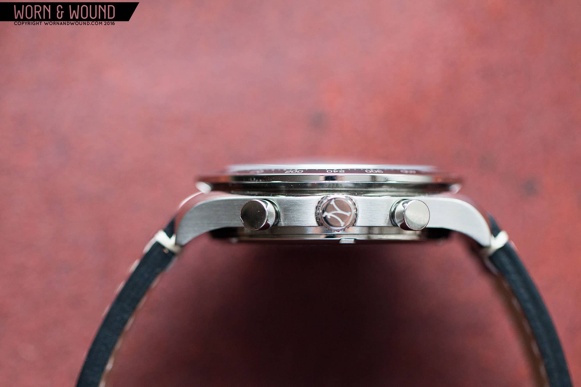
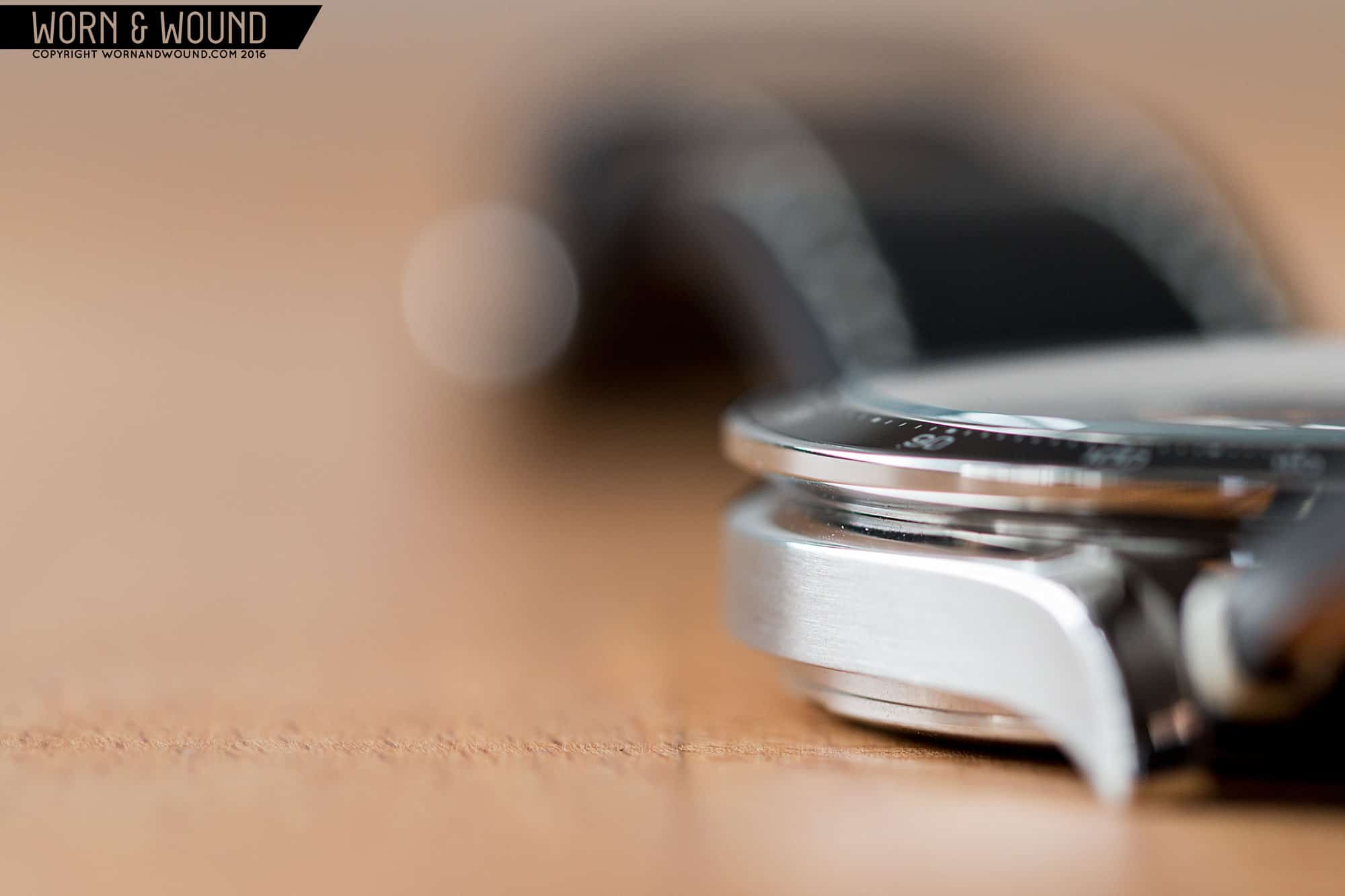
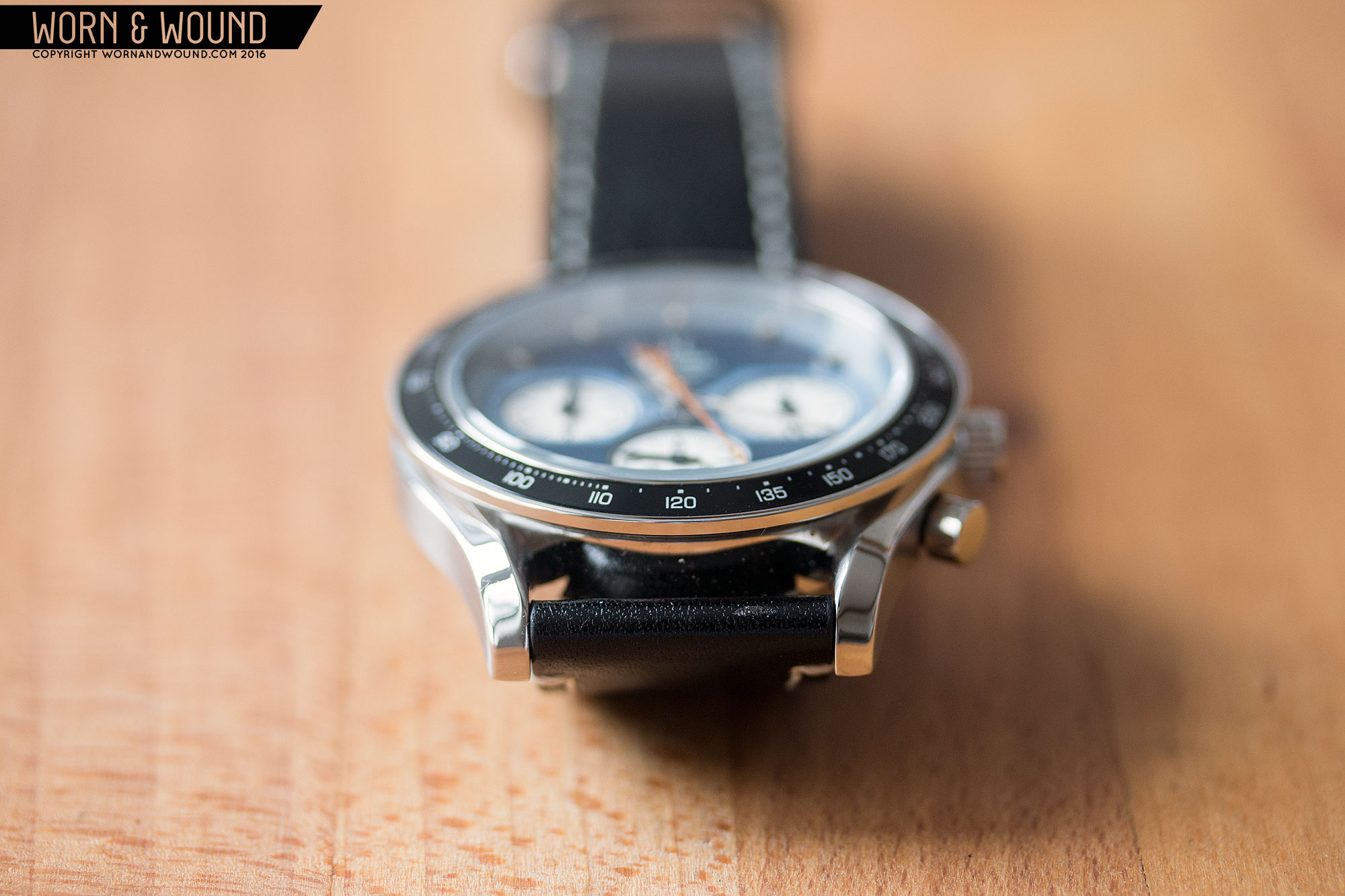
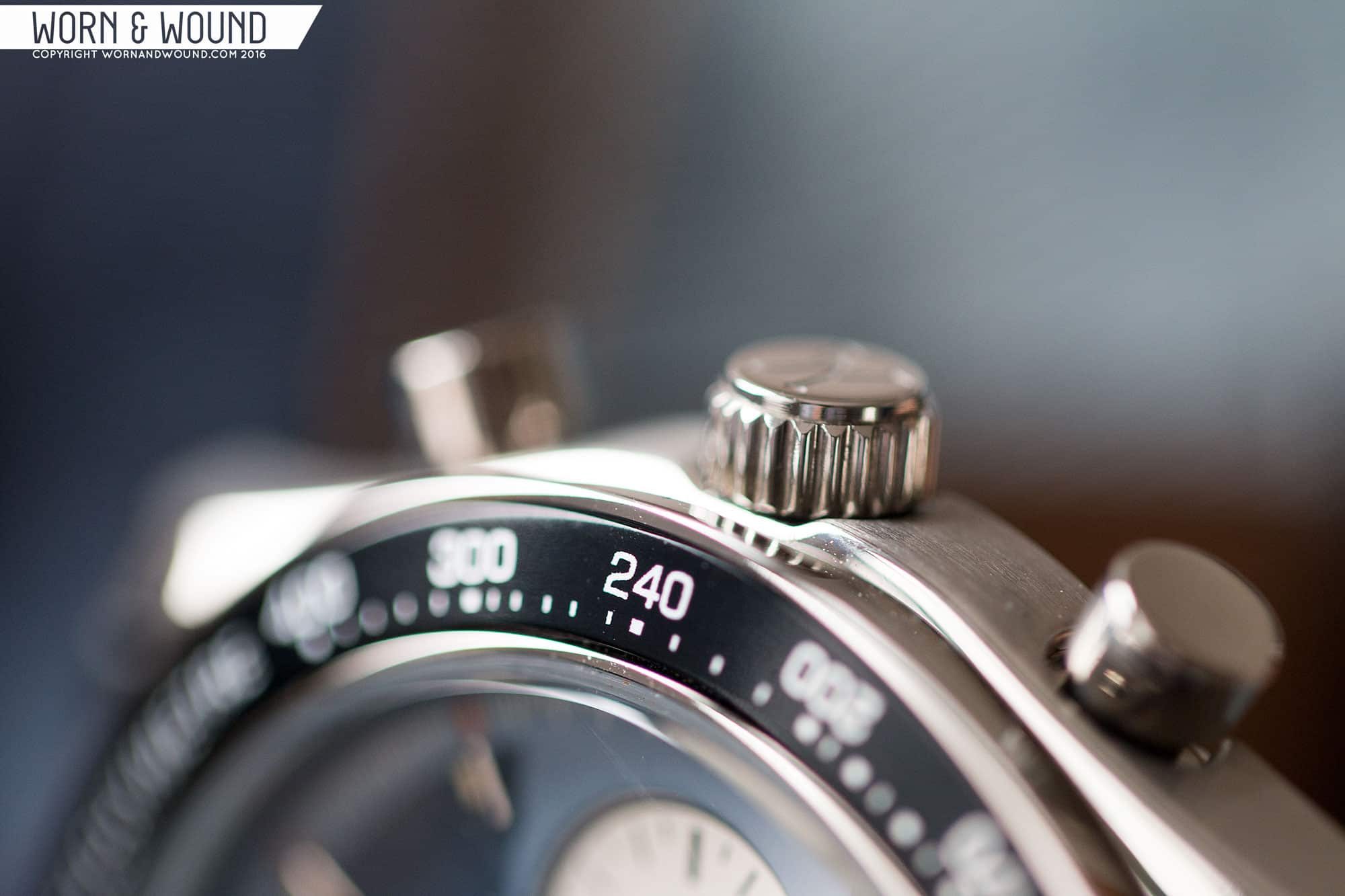
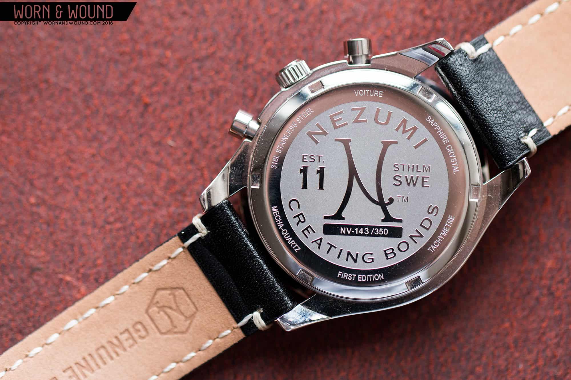
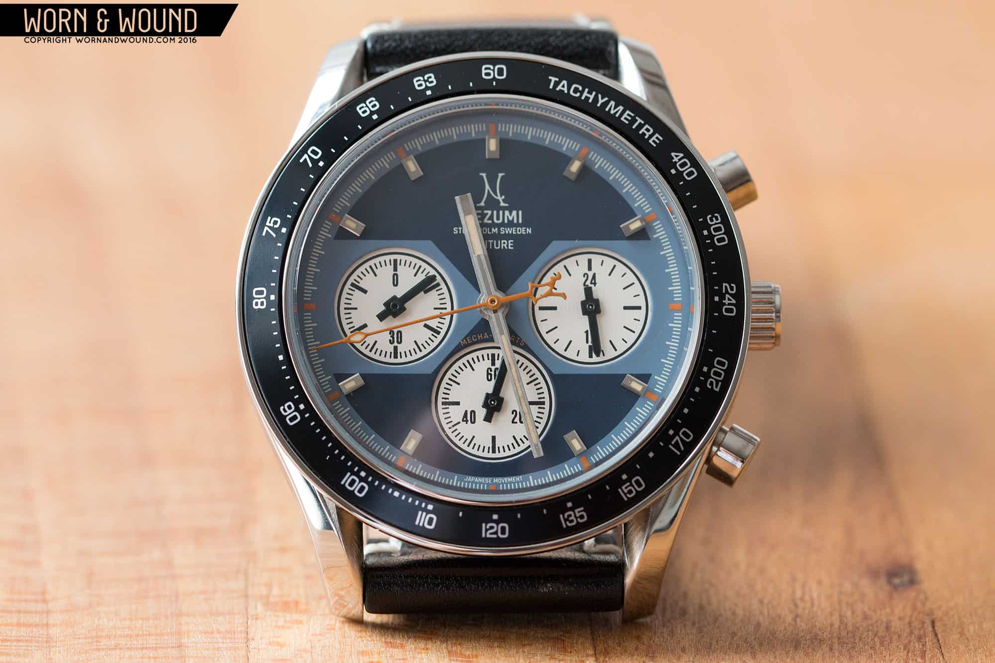
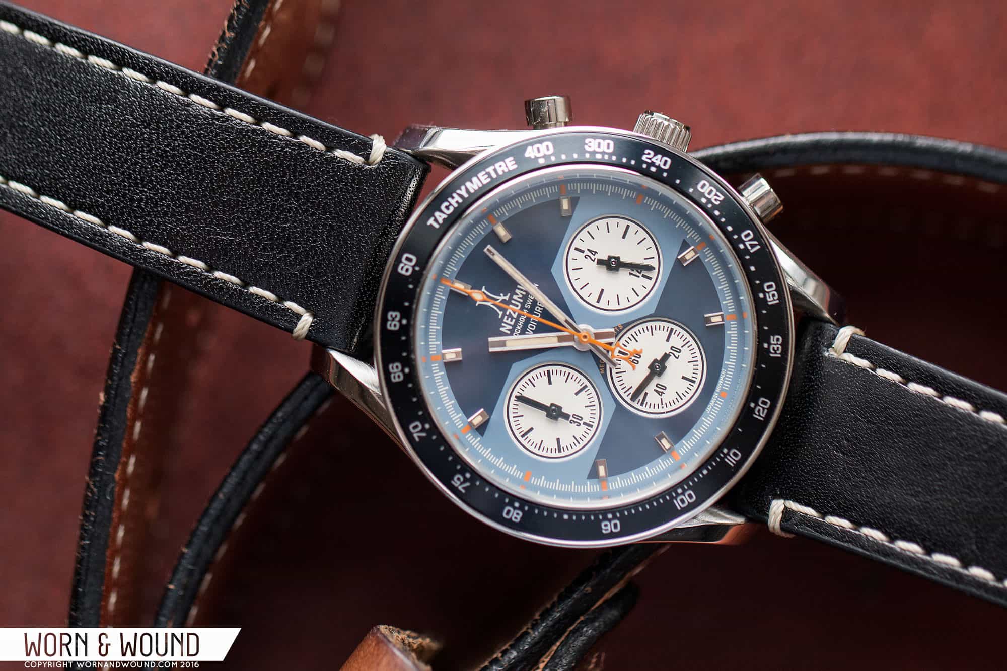
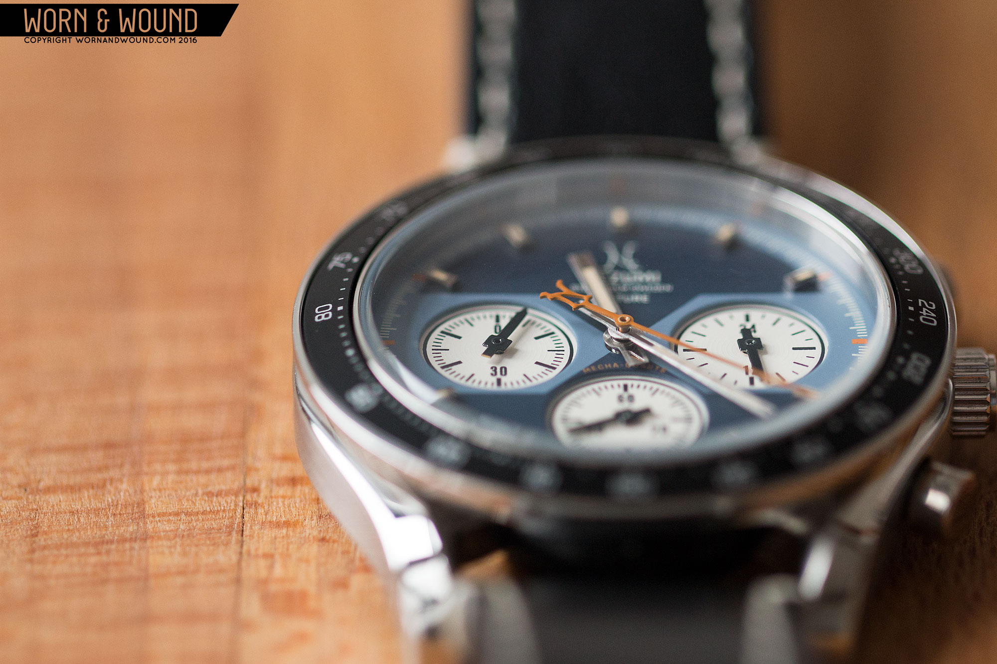
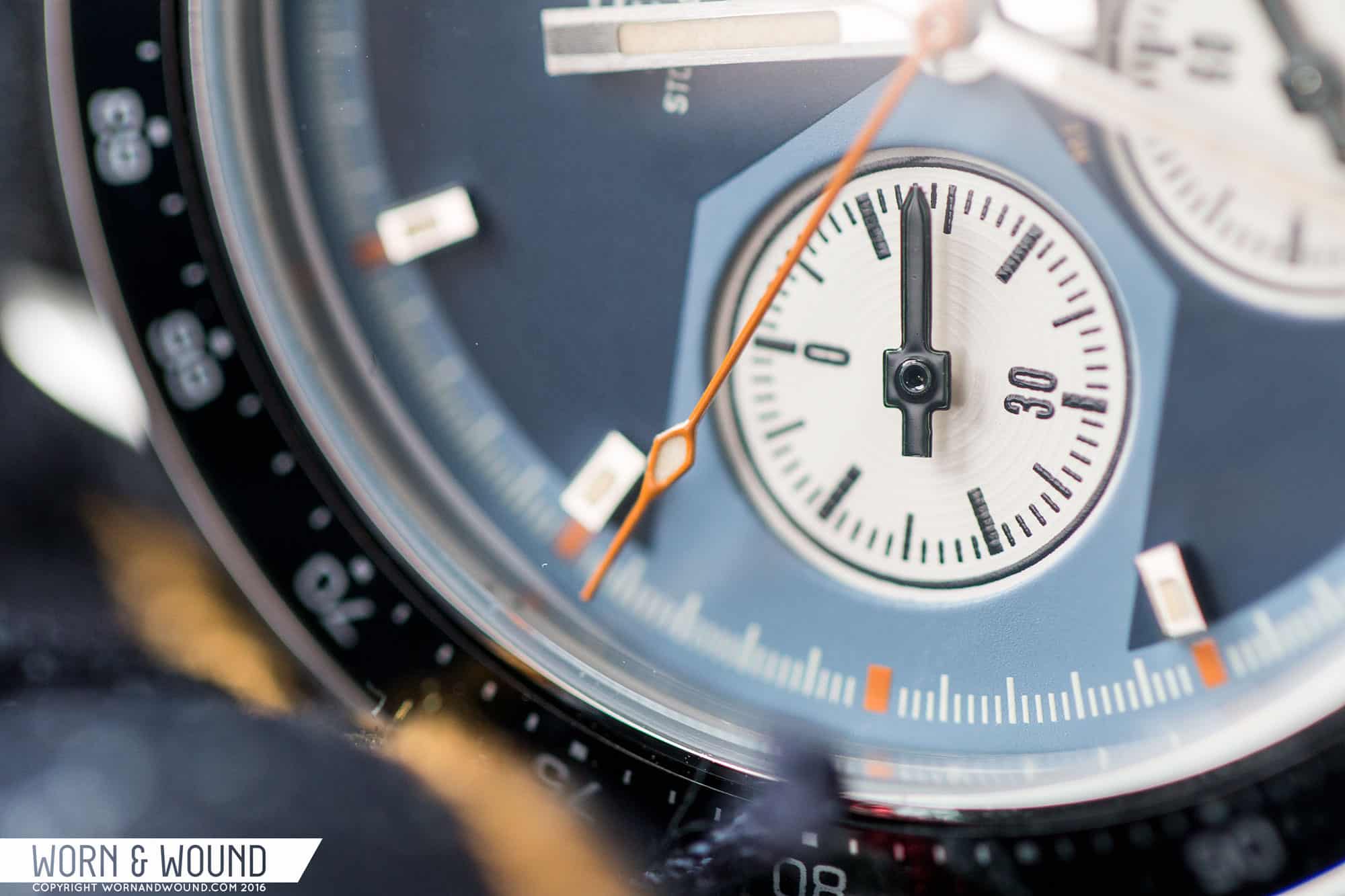
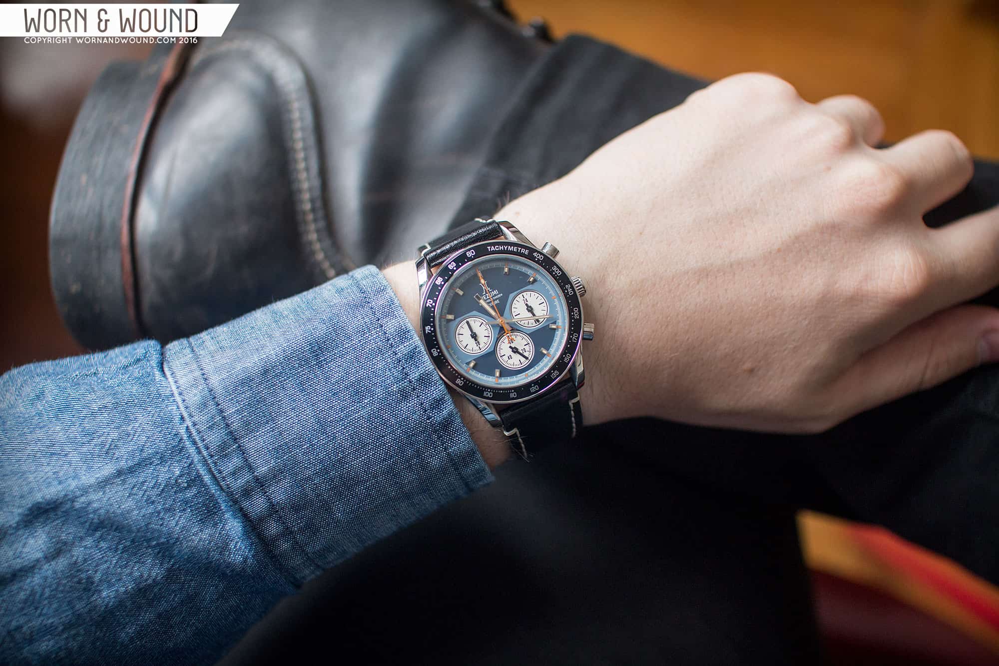
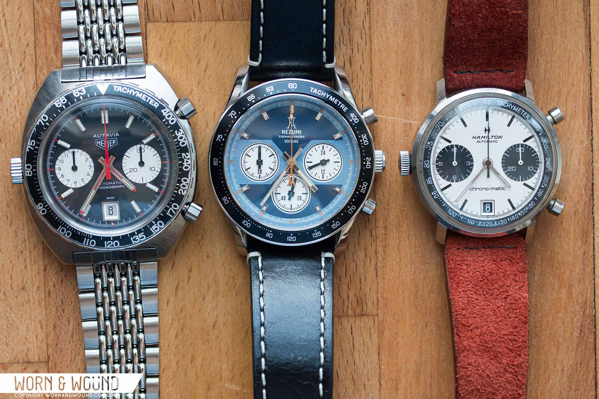
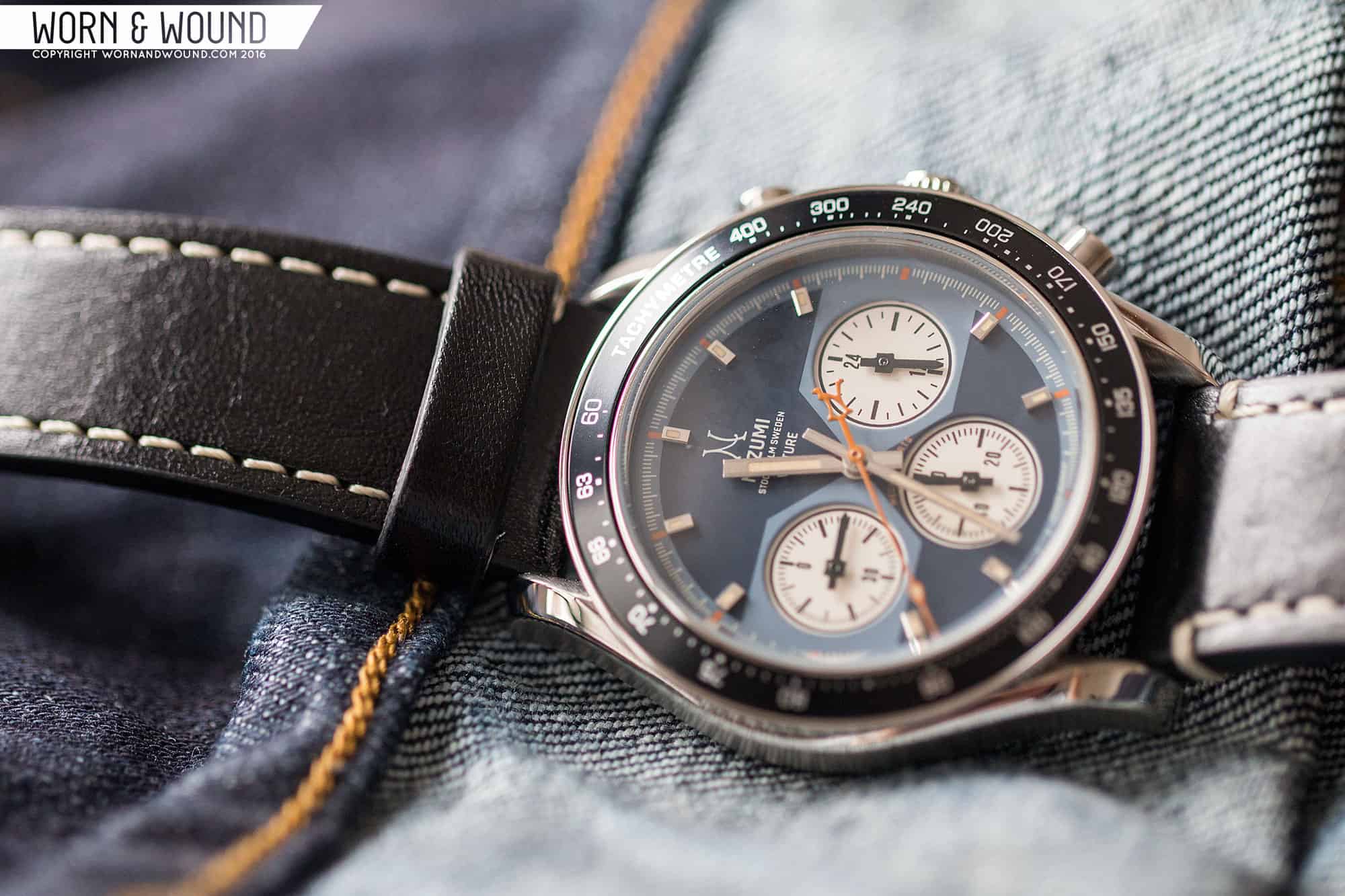
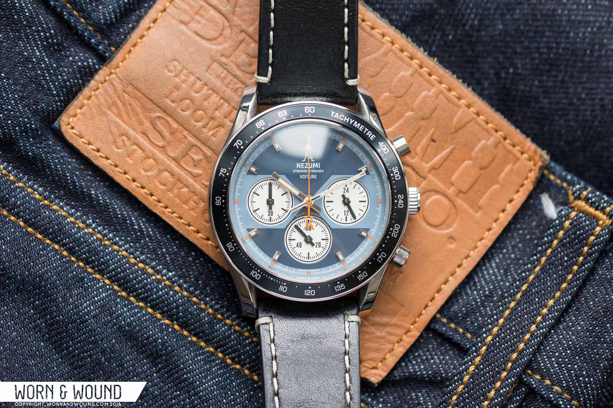
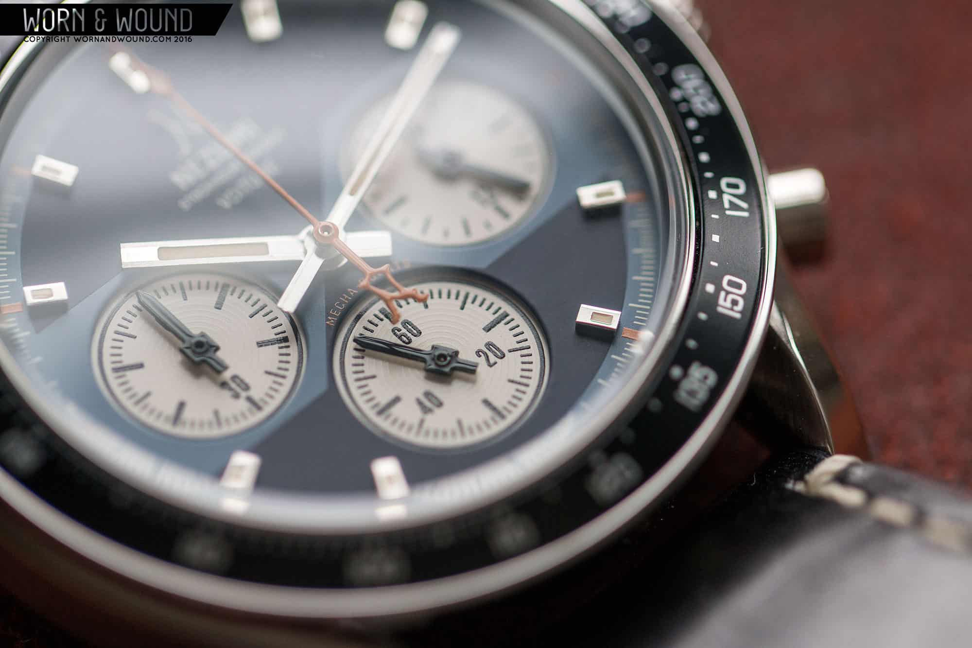
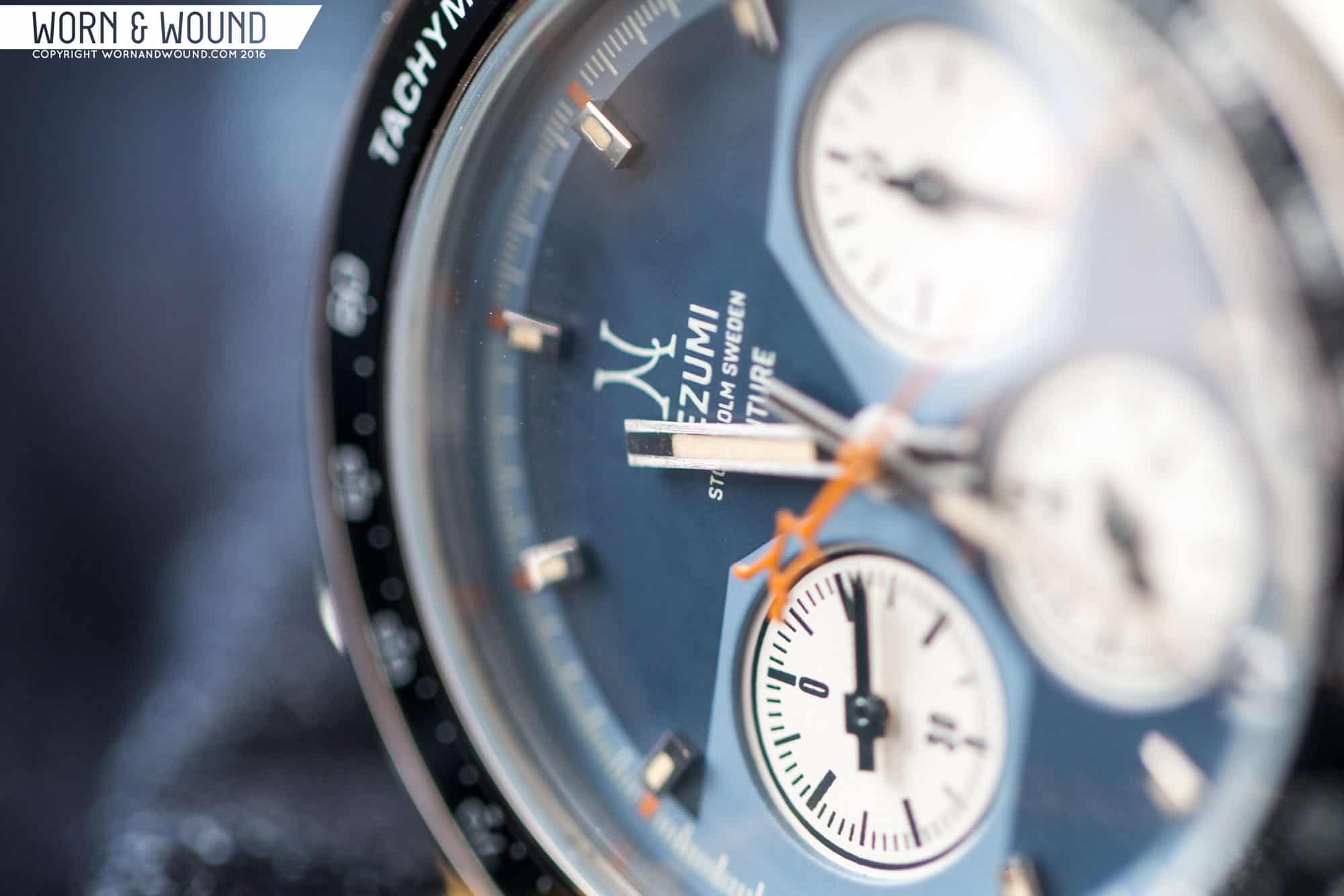
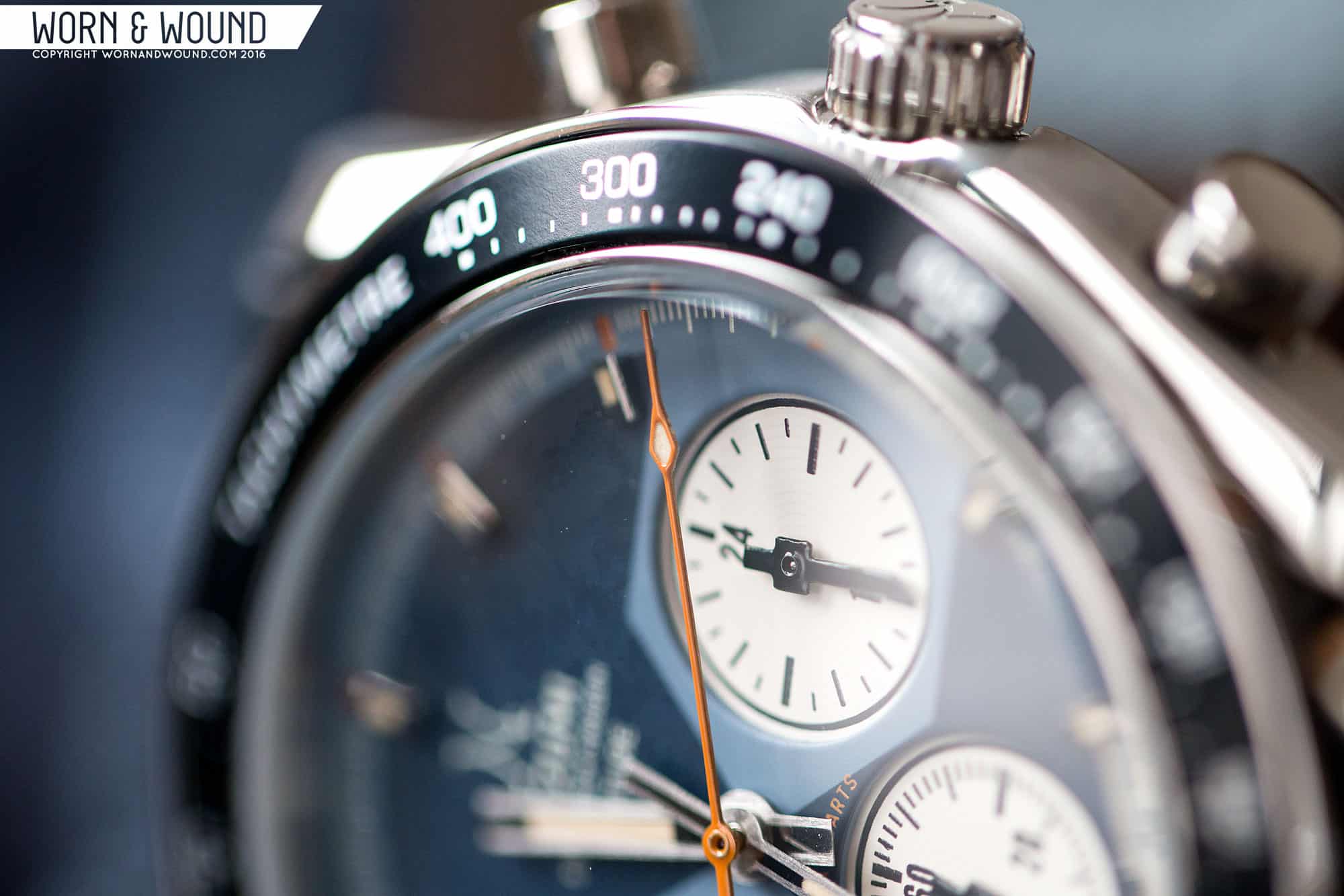
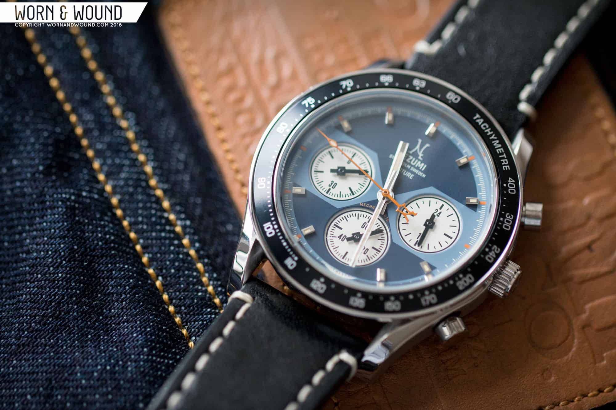
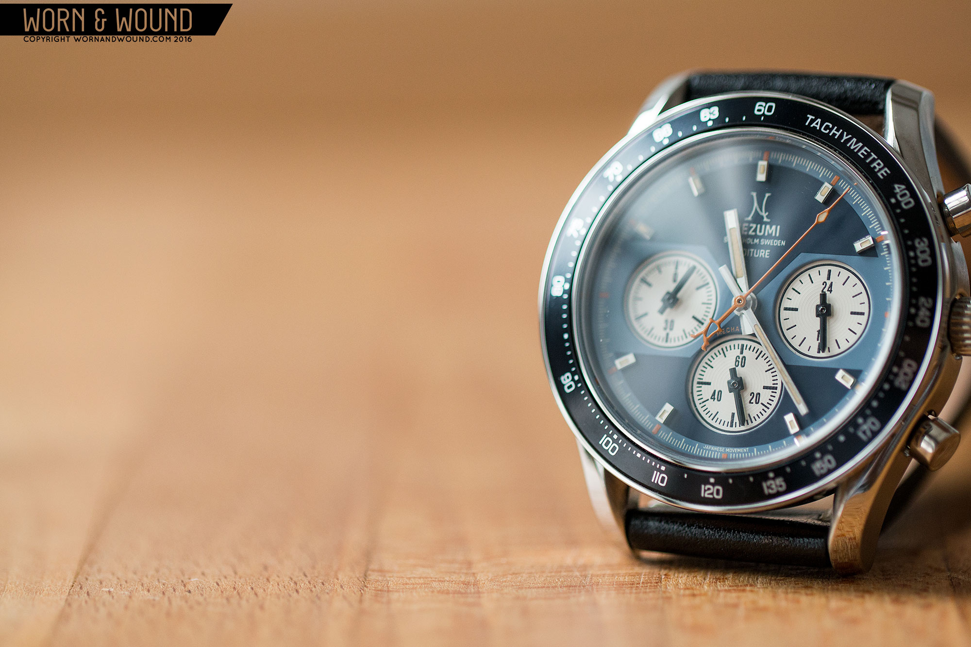
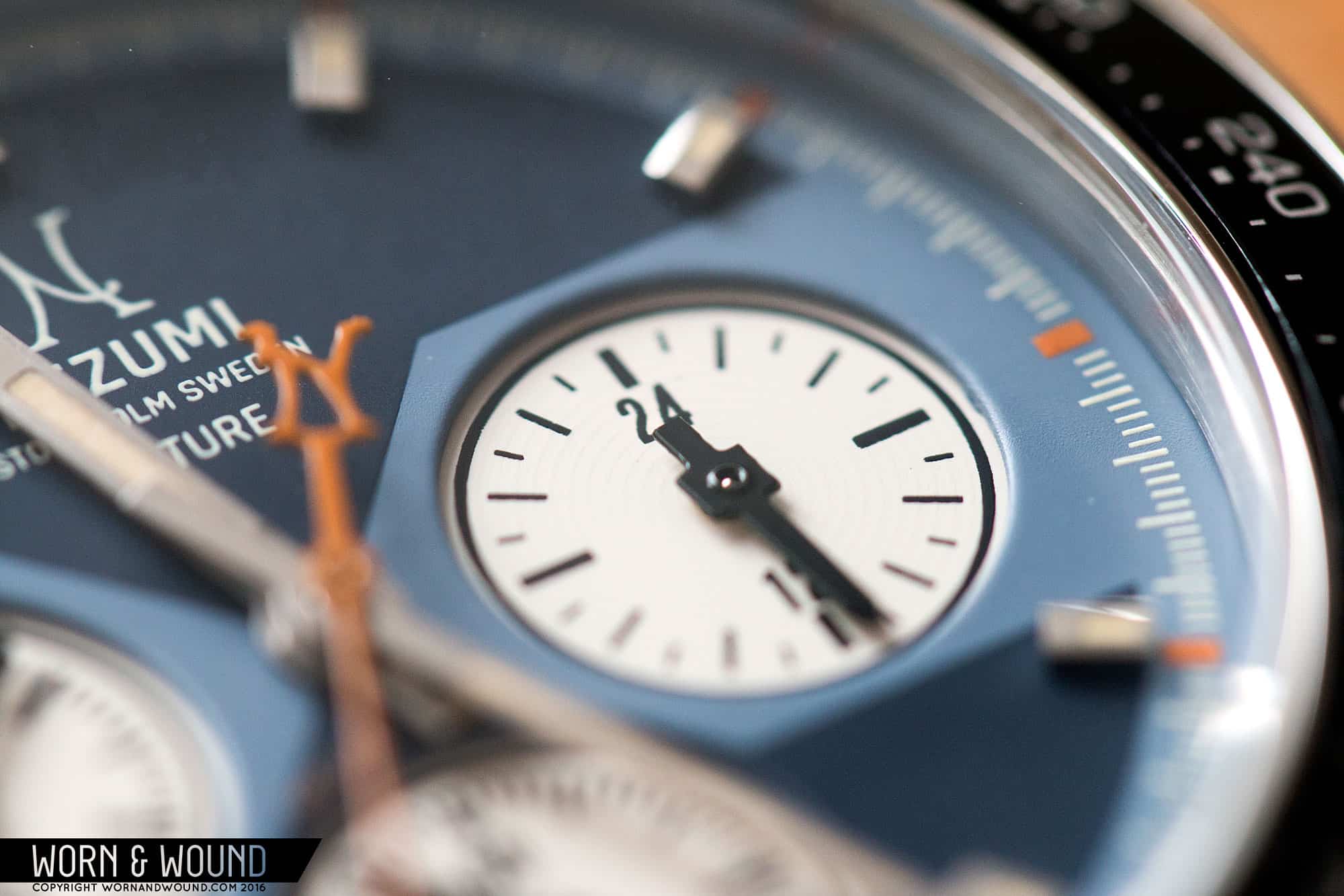
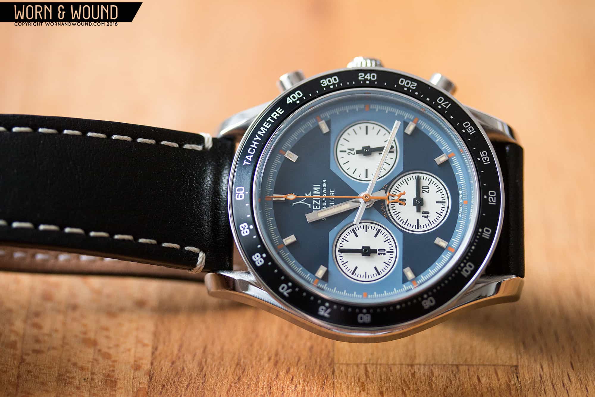
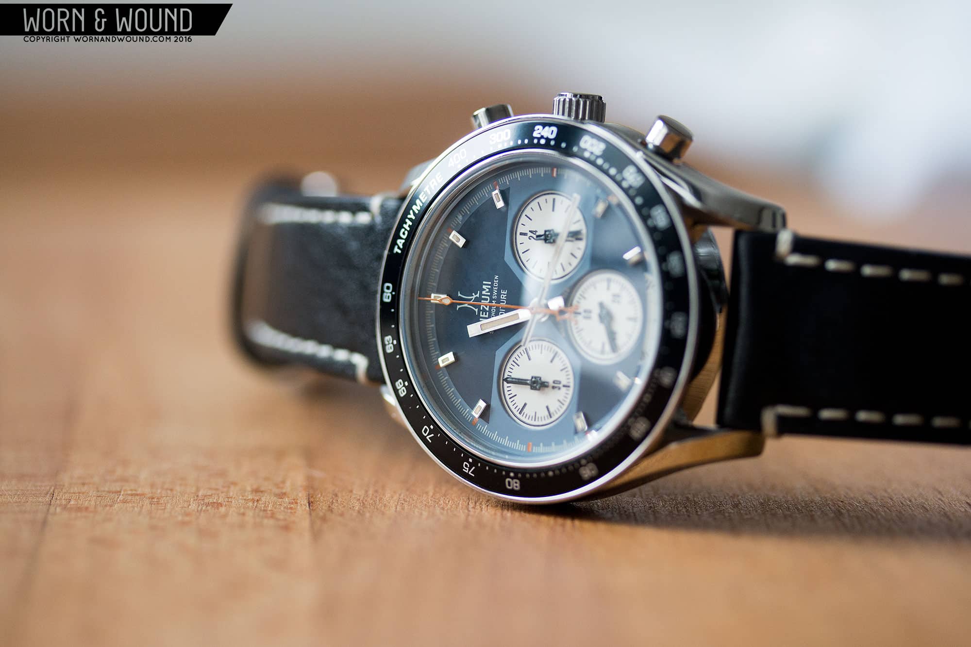
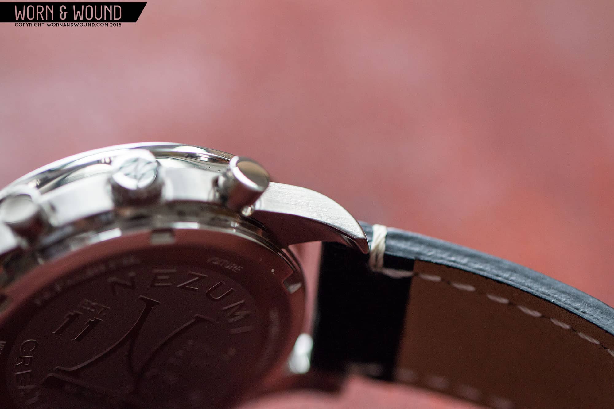
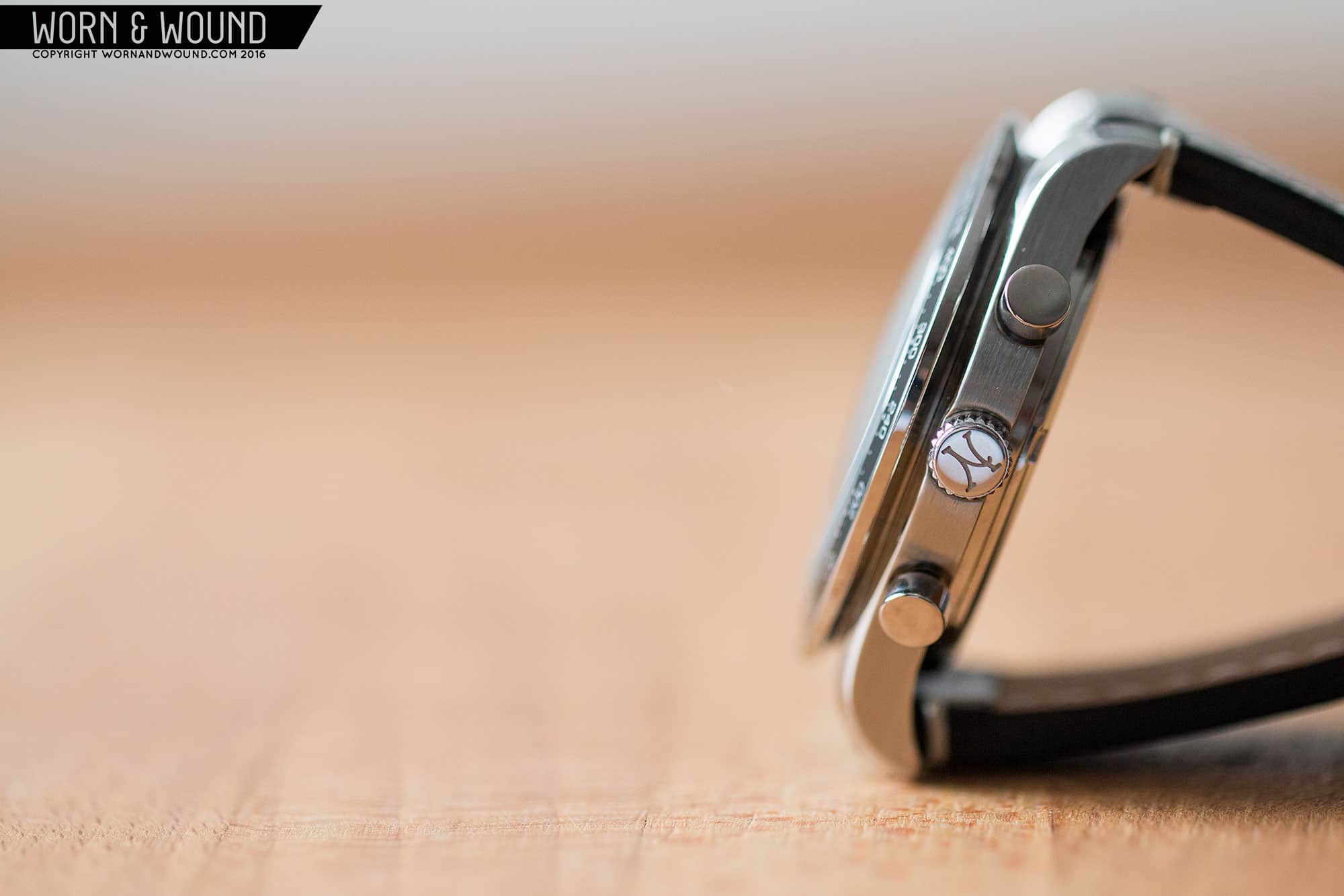
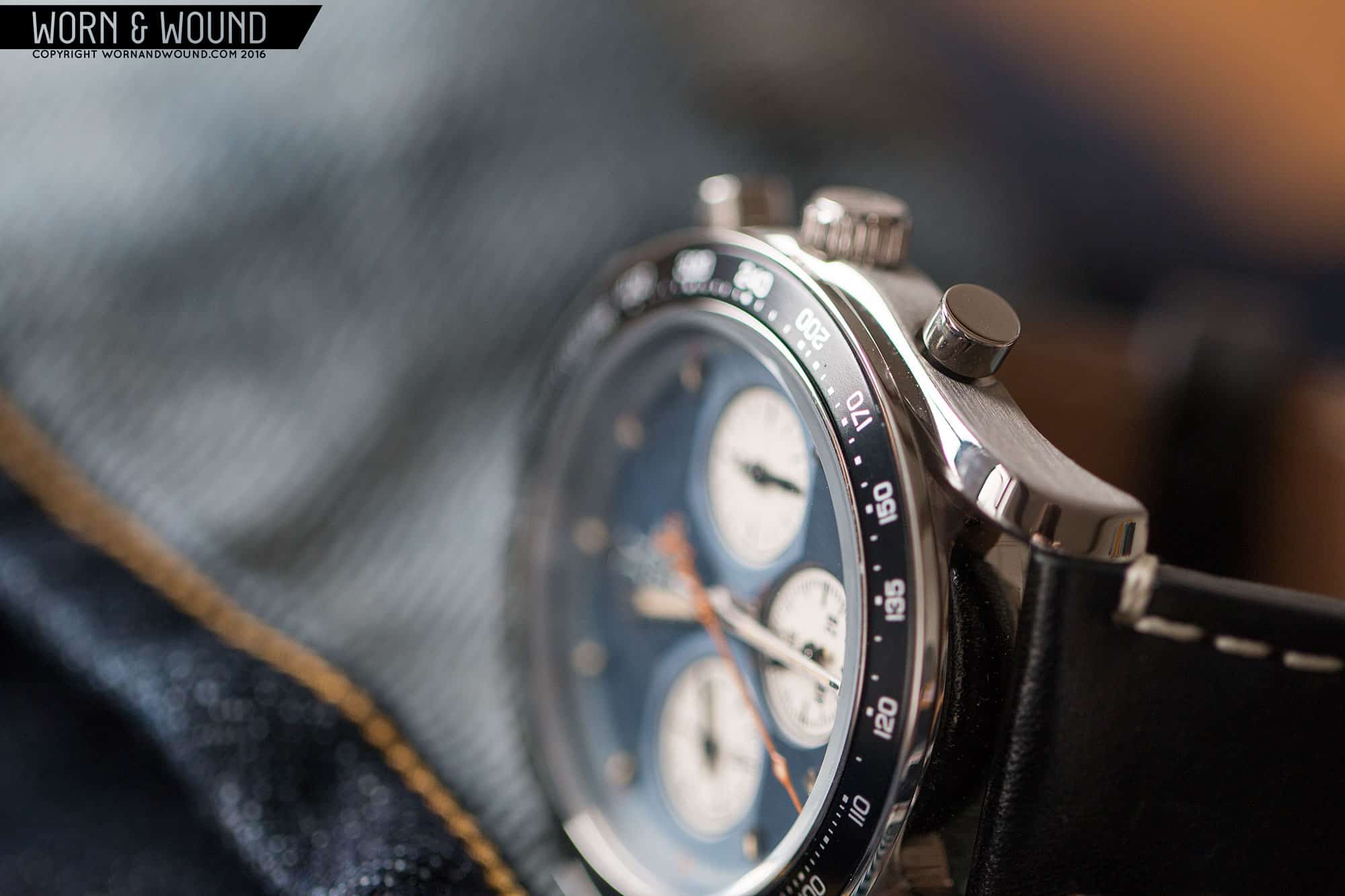
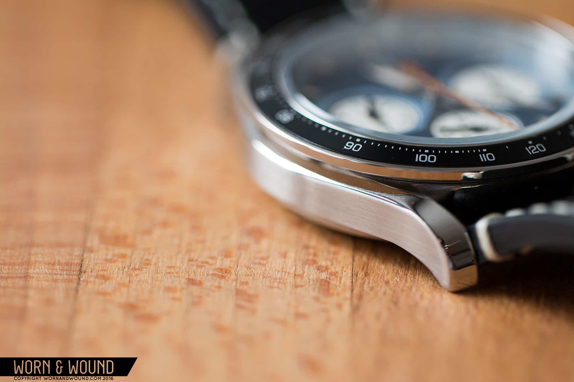
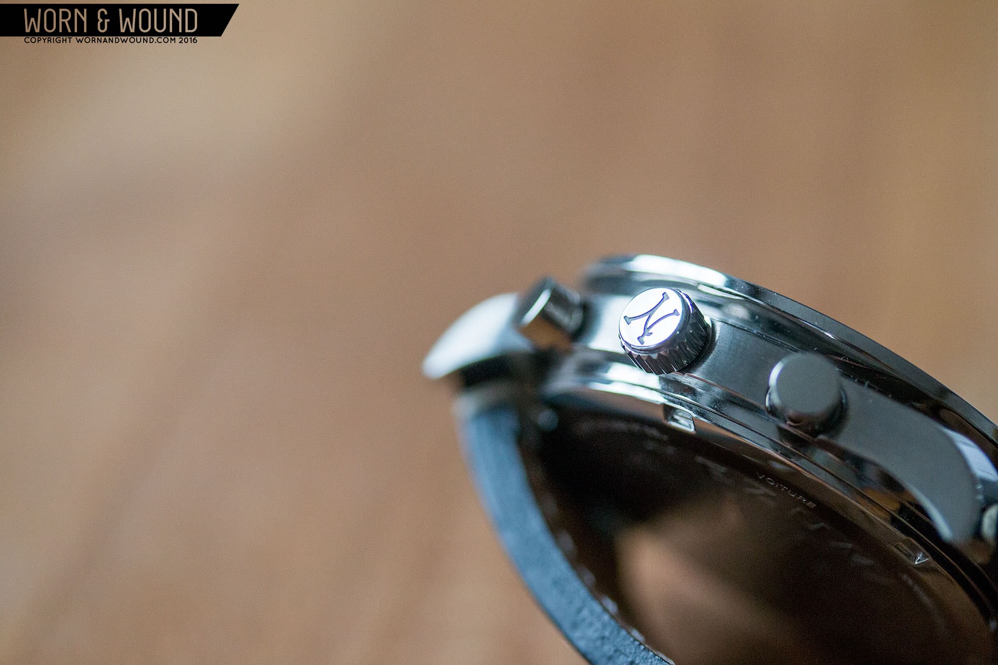
We first introduced Nezumi Studios just a touch over a year ago, as they were preparing to launch on kickstarter. Fast forward, they succeeded, and their first run of 350 watches, broken into 3 colorways, is all but gone. The watch, the Voiture, had an immediate appeal to vintage chronograph appreciators. It spoke to some classic designs, namely that of the Omega Speedmaster and the Universal Geneve Compax, while still having its own style. It was sized well for a modern throwback at 40mm, featured the now-more-common Seiko Meca-Quartz VK63 movement, a sapphire crystal and an extremely reasonable price tag. Now, Nezumi is launching their second edition of the Voiture, which includes some minor changes. The pre-order price, including VAT, is 295 euros with a final price of 395 euros, which come to about $260* $290 and $360 $400 w/o VAT respectively.

nezumi_voiture_pack_1

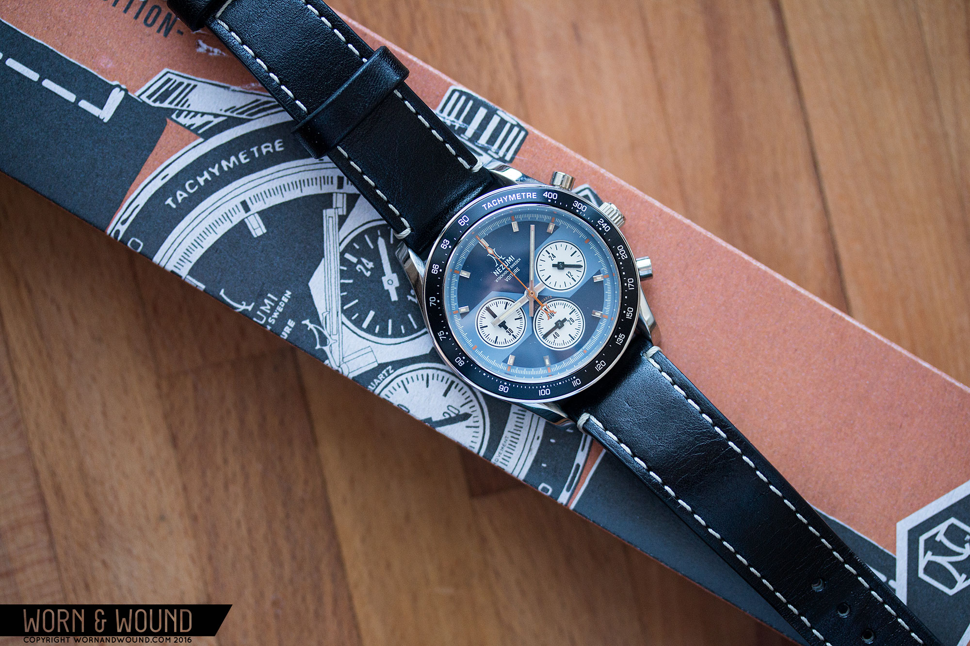
I’d been eagerly awaiting the opportunity to try one out, so when the “blue” model arrived, I was very excited. The watch delivers in many ways, starting with the packaging. Around the protective inner box is a paper sleeve with a gorgeous vintage styled illustration of the watch on a burnt orange background, bringing to mind the boxes of old Heuer. The watch itself is striking, truly calling to mind some of my favorite vintage watches, without aping them or feeling derivative.

Advertisement
$360

Nezumi Voiture Review

Case
Steel
Movement
Seiko VK63
Dial
Blue
Lume
Yes
Lens
Domed Sapphire
Strap
Leather
Water Resistance
50M
Dimensions
40 x 47mm
Thickness
12.7mm
Lug Width
20mm
Crown
Push/Pull
Warranty
Yes
Price
$360

Case

The story starts with the case, which features many cool details that suck you in. Coming in at 40 x 47 x 12.6mm (to the top of the domed sapphire), it’s a great size for a chronograph, new or old, with an external tachymetre bezel. 40mm puts it between the UG Compax and a classic Speedy Pro. Having tried on the UG Compax before, they are quite petite, which has its charm, but likely less mass appeal. Speedies come in at 42mm, surprisingly large for the era.

nezumi_voiture_case_12

Looking from the top down, a few things jump out. First is the wide tachy bezel, which features an aluminum insert in a steel rim. I’m a sucker for external tachys as they visually pull the dial out to the edge of the watch, creating an overall bolder design. Next is the twisting/bombé lugs, which give the whole case a sense of motion and tension. It’s as though the bezel is pushing the steel of the mid-case until it rolls over. Twisting lugs are a beautiful, sculptural detail that aren’t used often enough.

Looking at the case from the side, you get a better sense of the complexity of the design as well as the quality of the finishing. The case has been cleverly broken up with some strong undercuts and lines where parts meet, which helps the case seem thinner. The bezel is particularly stunning. It’s a saucer shape with a huge undercut that clearly speaks to the construction of some vintage pieces. The insert angles up and flows into the domed sapphire, which has a somewhat more modern feel to it, but finishes the case off nicely.

The mid-case is a plank of metal that turns down at the end creating lugs. The upper edge has a wide chamfer, which curls over, creating part of the twisting effect. The case sides are brushed horizontally with a slightly coarse grain which is contrasted by the polished chamfer. The nook that is created on the inside corner of the lugs by the twisting design is brushed as well. For the price, this play back and forth of finishing is really great, especially since it’s well executed.

On the right side of the case are pushers at 2 and 4 and a crown at three. The pushers are a classic design with a broad cylinder connecting to a narrower one, just before entering the case. The crown is then a simple push/pull design with a toothed edge for grip and a Nezumi “N” logo on its outer face. Flipping the watch over, you have a solid case back with a deep etched area featuring some graphics. On the second generation version, this will be moulded.

Dial

The dial of Voiture closely pulls from the UG Compax watches, but has some unique twists that give it its own personality. There are three models, two of the Panda variety and the blue one seen here. I found this one particularly appealing as the use of two, muted blues is quite unique, and the use of color, in general, was a bit more exciting. The main surface consists of a dark blue and light blue, both matte. Both have a desaturated, calm quality to them, which is a nice contrast from some of the louder blue dials that have come out in the last few years.

nezumi_voiture_dial_9

The lighter blue runs along the perimeter of the dial and then criss-crosses the center of the dial. This is a particularly interesting detail of the dial, as it speaks to some of the stranger chronograph designs, such as the Bulova Surfboard or Yema Rallygraf, which had odd shapes connecting the chronograph sub-dials. On the Voiture, the faceted hour-glass shape creates almost a mask across the dial, emphasizing the sub-dials at 3 and 9. This graphic in particular gives the Voiture a different look and feel, keeping it from being an homage to something specific rather than an era.

Getting into the details, on the dark blue area you’ll find the primary index of small, but tall applied blocks at the hour, save 3, 6 and 9. Each marker is polished and has a cream-colored lume filling that is slightly off center. On the light blue area is a minute/chronograph seconds index consisting of burnt orange lines at intervals of 5 with off-white lines per minute/second and smaller liners per 1/5th second. It has a classic racing watch look that speaks to Heuers as well the Compaxes. The burnt orange used was a perfect choice. Often orange is used to be loud, but here it’s far more subtle, contrasting the blue without overpowering it.

At 3, 6 and 9 are sub-dials for the 24-hr hand, active seconds and 60-minute counter, respectively. Obviously, this layout differs from the vintage norms, which would have had a 30-minute counter and a 12-hour counter. The sub-dials appear very deep, because they are actually a layer beneath the top surface, sandwich-dial style. This creates a very sharp and dramatic step down that makes the sub-dials really pop. Each sub-dial consists of an off-white surface with a mix of black markers and numerals, all encircled with a black line. They are cool looking, for sure, with a more bold take on the sub-dial than what would have been found on vintage chronos.

On the dark blue surface is some text. At 12 is a Nezumi “N” logo, followed by the brand name, “Stockholm Sweden” and then “Voiture”. It’s a decent amount of text, but the layout and positioning makes it work. Above the sub-seconds dial, in arching text vis-a-vis “Daytona” you have in orange “Mecha-Quarts”, yes, there was a typo at the factory, and they switched the z to an s. This caused a small stir, but was overweighed by the fact that it’s almost entirely unnoticeable and it doesn’t effect the watch itself. It’s also one of those details that, while annoying when new, becomes an enjoyable quirk. Regardless, it will be corrected on the second edition.

nezumi_voiture_dial_8

For the hour and minute hands, Nezumi went with straight rectangles with mixed finishing, that have a solid, bold look. The minute is long and the hour is short and a bit wider, as to be expected. Both have polished lines and a lume strip down their centers with matte on either side. It’s a nice amount of detailing that adds to their look, and once again great to find on such an affordable piece. The chronograph seconds hand is a thin stick in burnt orange with a lumed diamond toward one end and a Nezumi “N” logo as the counterweight. Logos as counterweights can sometimes be too ornate, but this didn’t bother me. It’s very thin and doesn’t seem overly decorative.

The sub-dials all feature blocky sword hands. These are a fun departure from the norm, having an almost pixelated look to them. Sword hands are generally any straight hand with a pointed tip, but these also have handles and guards. Another fun detail that adds to the watch’s personality.

One last thing; no date. There is no annoying date window cutting through the wrong place, breaking the symmetry of the dial and interrupting the blue surface. I feel like I’m always making excuses for date windows or trying to picture a watch without one… Nezumi must have gotten the memo that not every watch needs one.

Advertisement

Straps and Wearability

The Voiture first edition came mounted to a 20mm black leather strap with straight cut sides and a constant taper that leads to a blunted tip. It’s about 3mm thick and made of seemingly decent leather. It’s not a bad strap at all, better than many I’ve seen on a watch under $500, though it’s not the most exciting thing on earth. That said, it looks fine with the watch. For the second edition, however, they are switching to a rally strap, which is the obvious right choice for a watch this style. The buckle here was also generic, but will be upgraded to a custom design as well.

If the Voiture is sexy on the table, it’s downright gorgeous on the wrist. This is where the whole vintage/modern conversation comes back. If you’re looking for an aesthetic over investment and provenance, but still want a good watch, this gets the job done. I’ve worn the Voiture quite a bit and it’s wonderful to wear. It’s sized and proportioned very well. As I said, 40mm is an ideal diameter for a watch with an external tachymeter bezel, as is compresses the dial a bit, making the watch appear smaller, while still having edge-to-edge graphics for presence. In this instance, it gives just the right amount of real estate for the sub-dials to feel balanced. Nothing is worse than when the sub-dials feel to close to the center of a watch.

nezumi_voiture_wrist_1

The 47mm lug-to-lug then makes sure it wears proper on top of the wrist, while the split up side makes it seem thinner. Since it’s quartz, it’s also fairly light, making it all around a very comfortable and easy watch to wear. Aesthetically, it gets across that vintage-cool that is quickly become less obtainable from actual vintage. The mix of colors on the dial with the added texture from the sunken sub-dials and applied markers mixed with the twisting lugs and big bezel… it gets it all right. It’s one of those watches you keep staring at and playing with throughout the day. And it looks amazing with jeans, boots, etc… and could be dressed up or down within limit. All around very versatile and extremely stylish.

Conclusion

nezumi_voiture_vintage_1

So yeah, I really like the Nezumi Voiture. For people who are looking for vintage style without vintage prices, it’s one of the best to date. And for the price, around $260 $290 preordered, $360 $400 regular, it’s astounding. It’s great looking and clearly not made of catalog parts, with finishing and a general level of complexity that make it look like a more expensive piece. The more I think about it, the crazier the price seems, considering it has a domed sapphire as well. This watch could easily be $500 and I’d have the same reaction to it. It’s the little things that make a huge difference and with the Voiture, it’s simply good design. From the proportions to the dial colors, it’s all finessed just right. Looking forward to seeing what they have in store for the future.

*updated with correct USD pricing w/o VAT

Images from this post:
Related Reviews
Zach is the Co-Founder and Executive Editor of Worn & Wound. Before diving headfirst into the world of watches, he spent his days as a product and graphic designer. Zach views watches as the perfect synergy of 2D and 3D design: the place where form, function, fashion and mechanical wonderment come together.
wornandwound zsw