Review: Baltic Aquascaphe

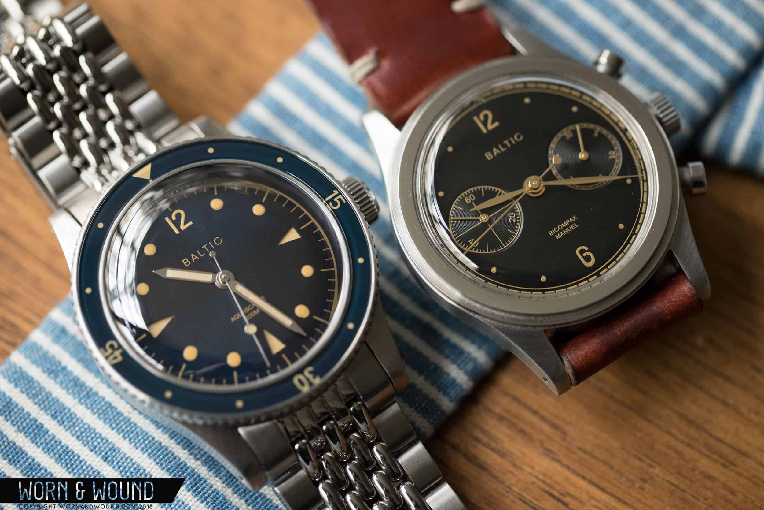
When Baltic released their Bicompax chronographs last year to great fanfare, I don’t think they imagined the challenge they would be creating for themselves. How do you follow up a hit track when expectations are already at such a high? Some brands just wouldn’t bother—not for a while at least. They’d permutate that success until they exhausted it. But Baltic, except for one set of limited edition chronographs that sold out almost immediately, decided to take the hard route and go for an all-new model, the Aquascaphe.

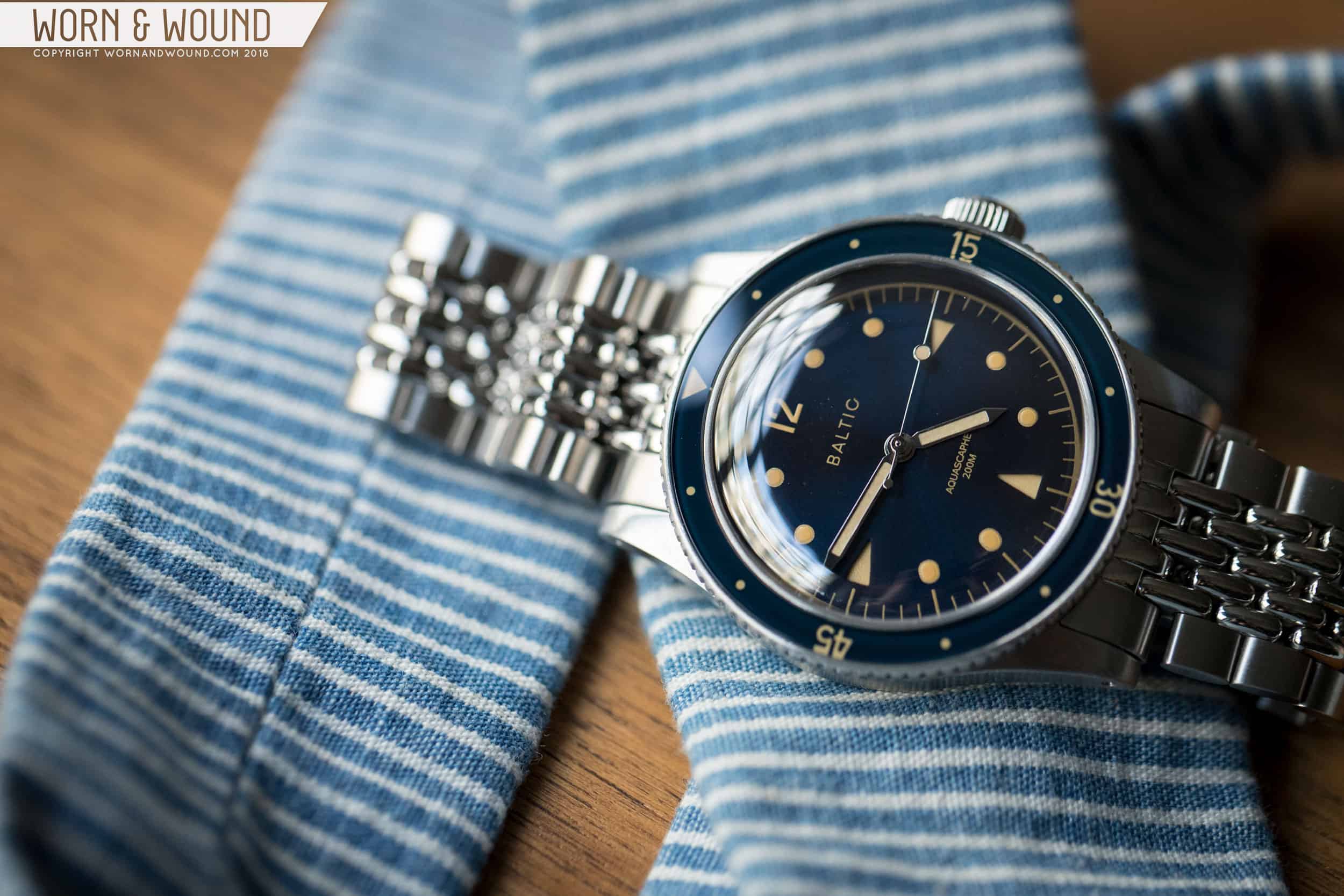
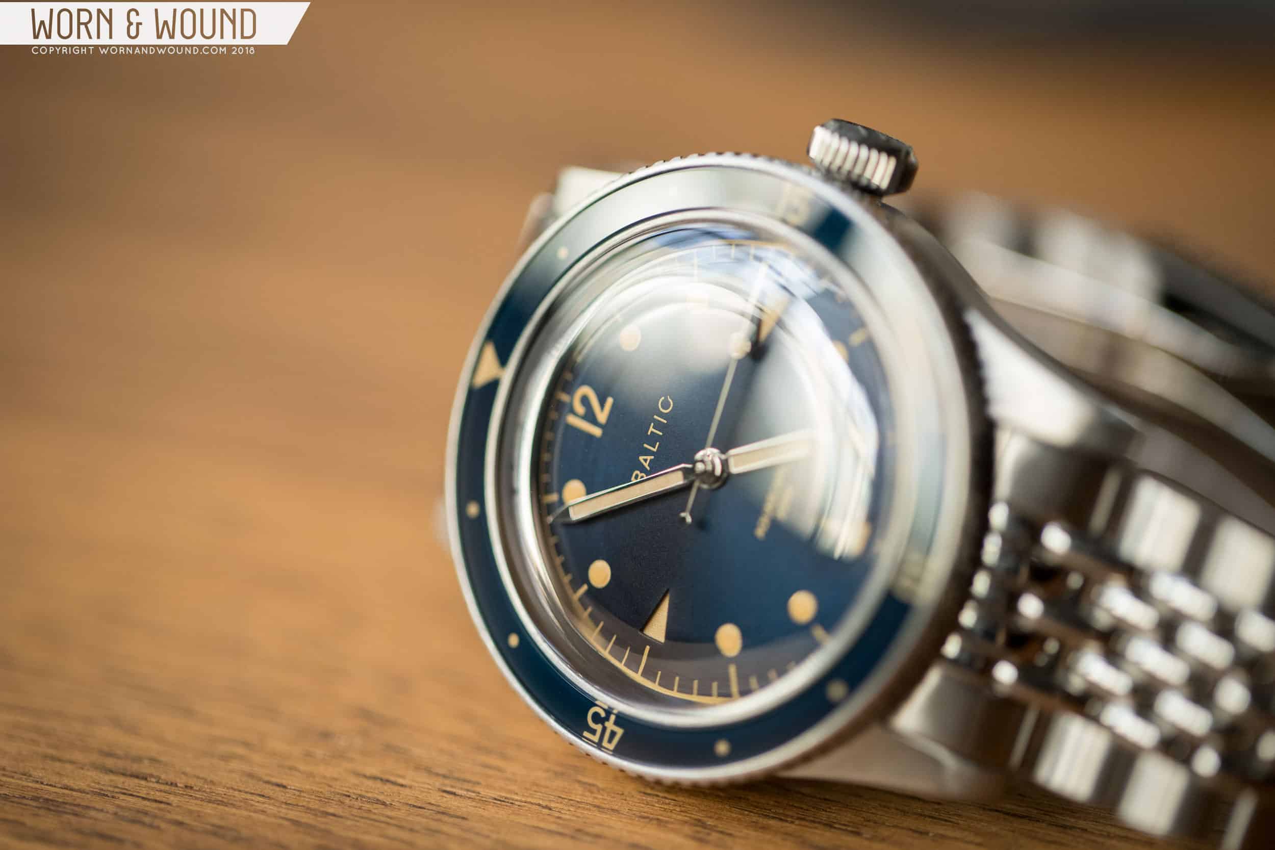
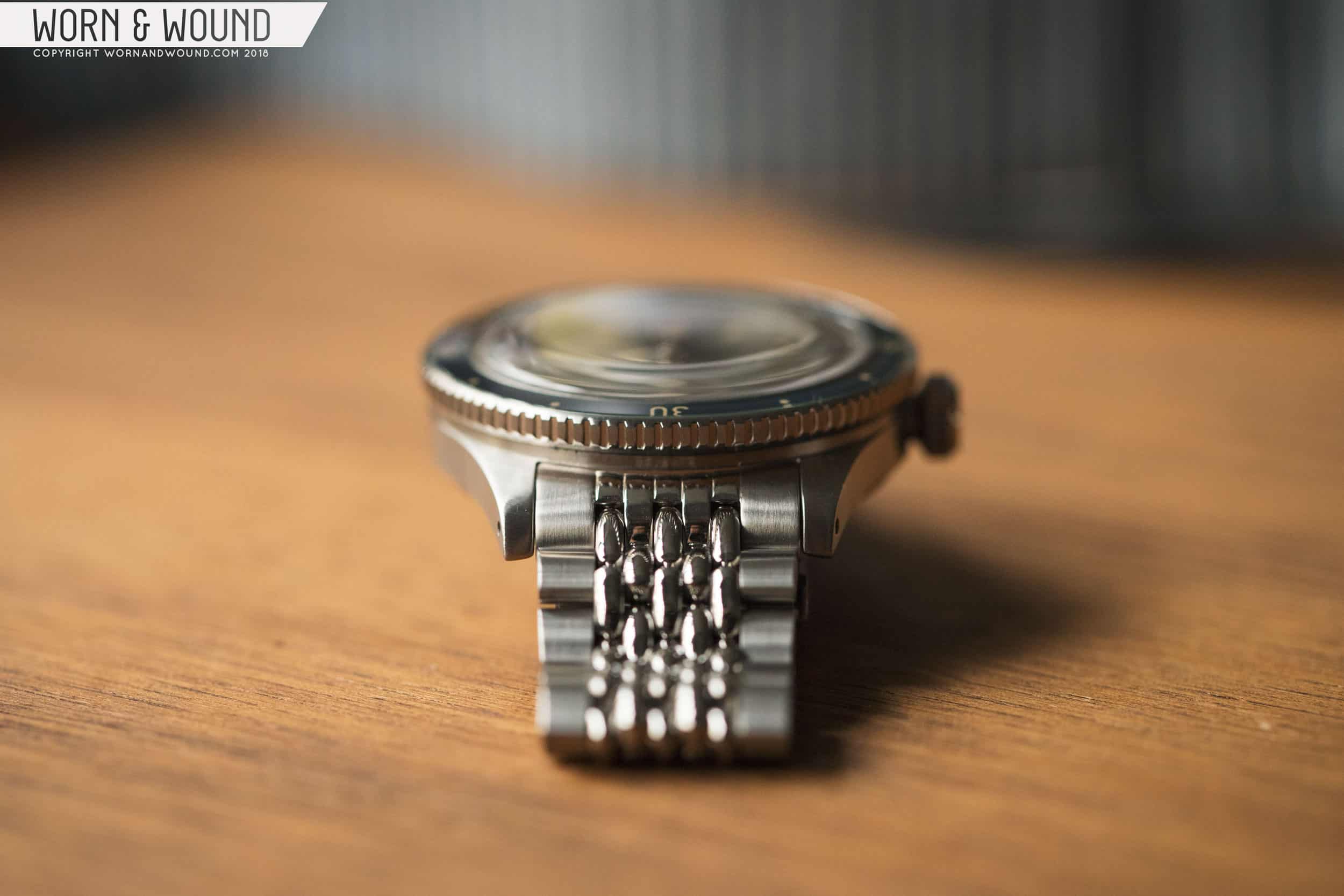
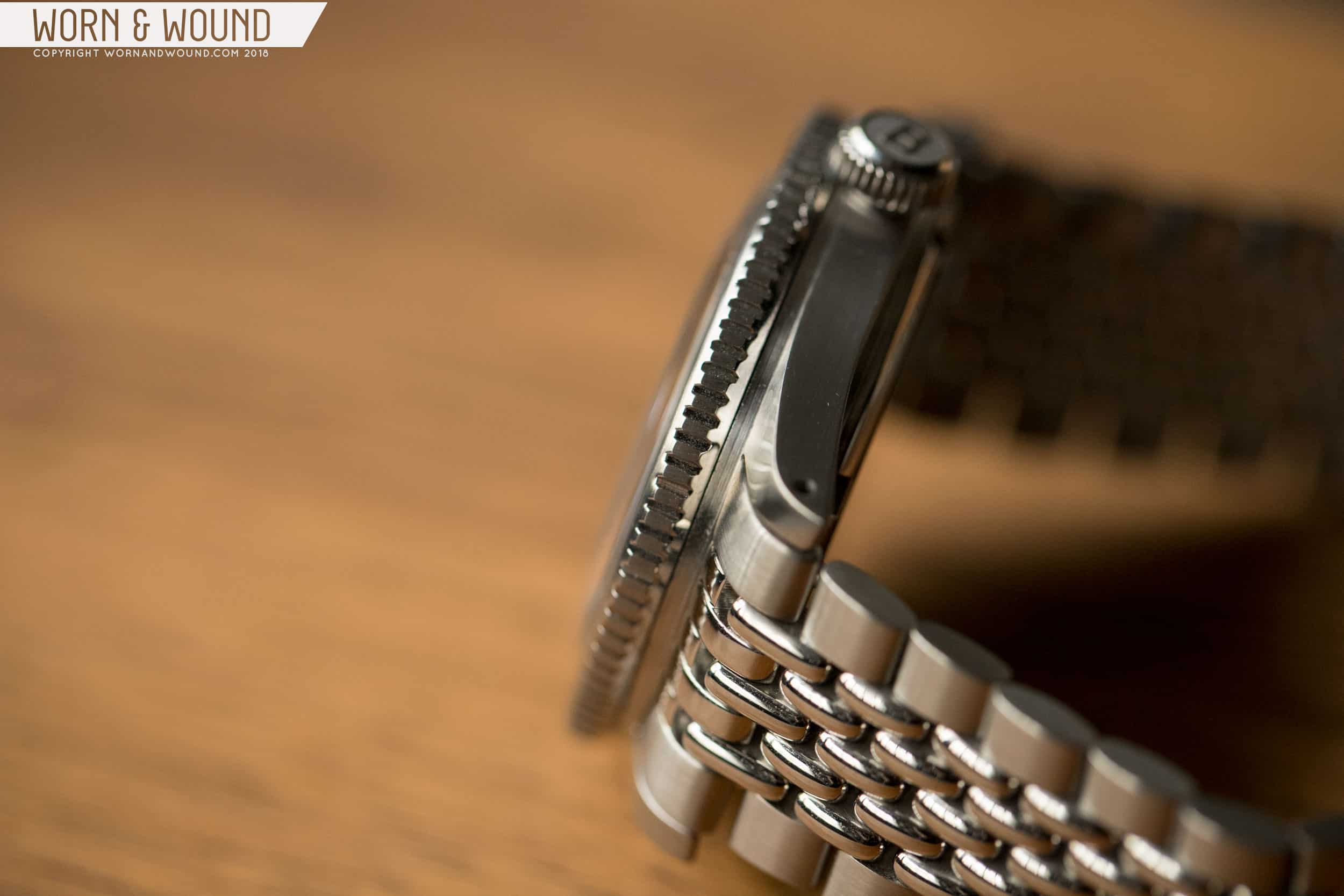
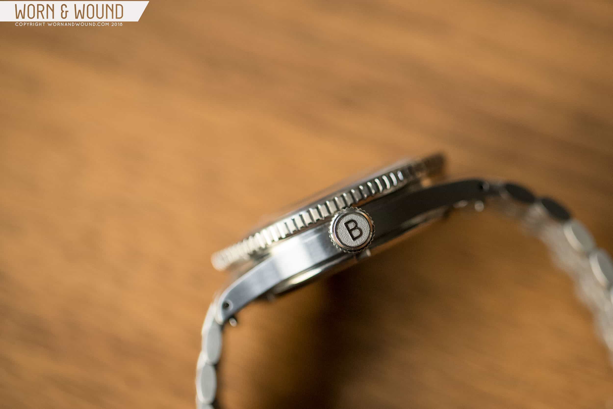
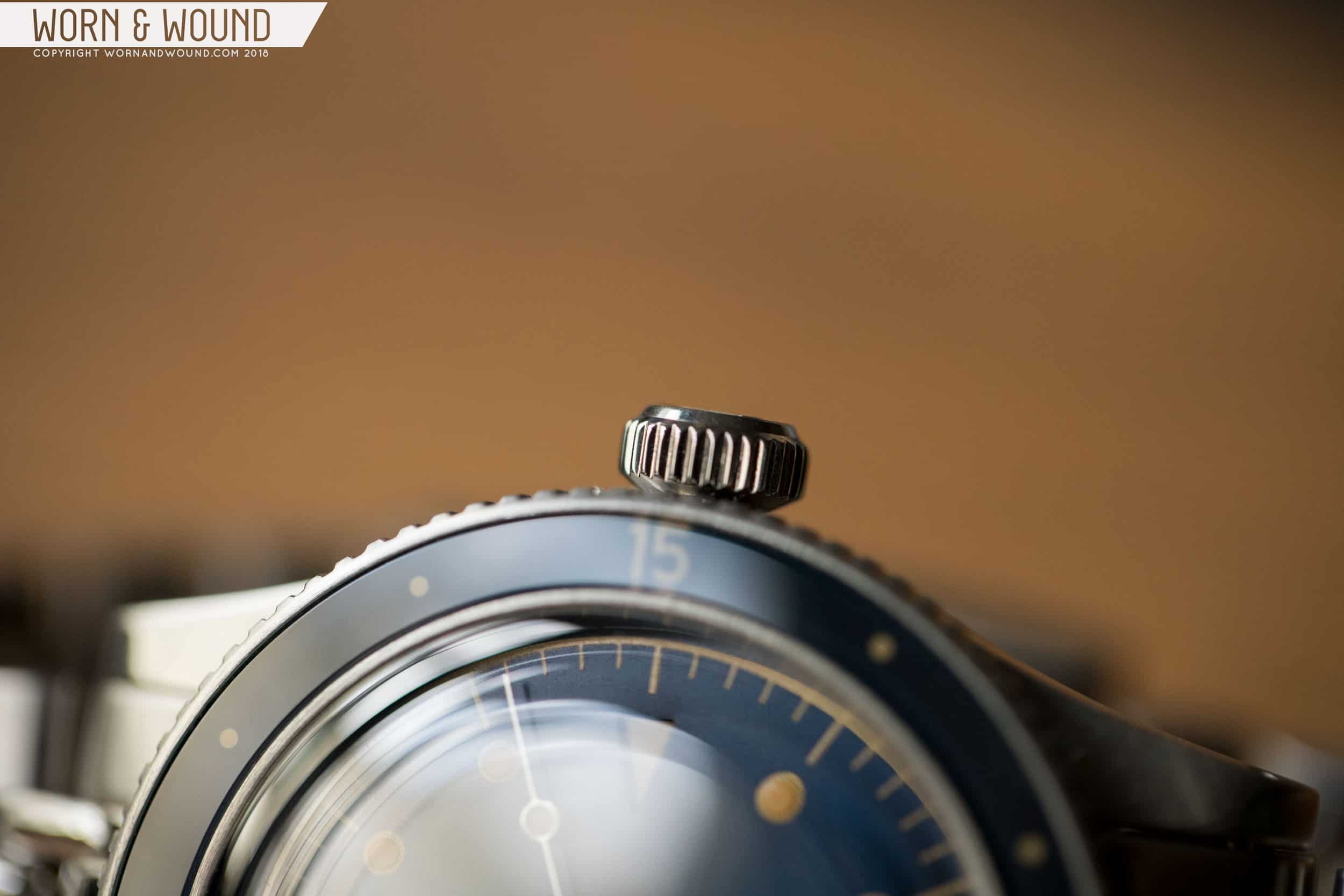
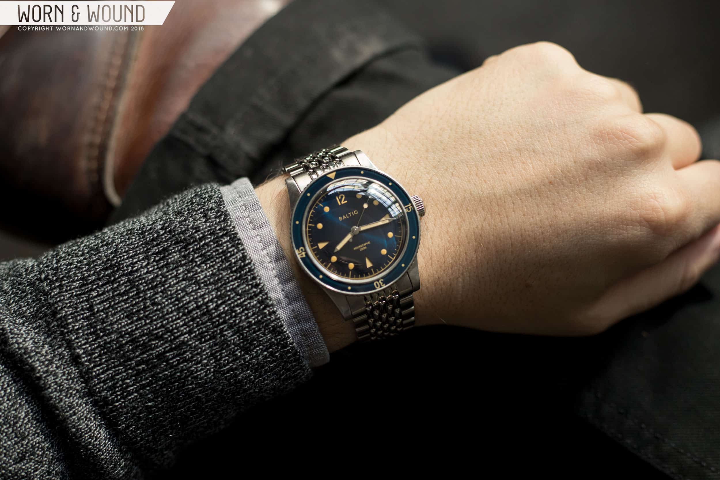
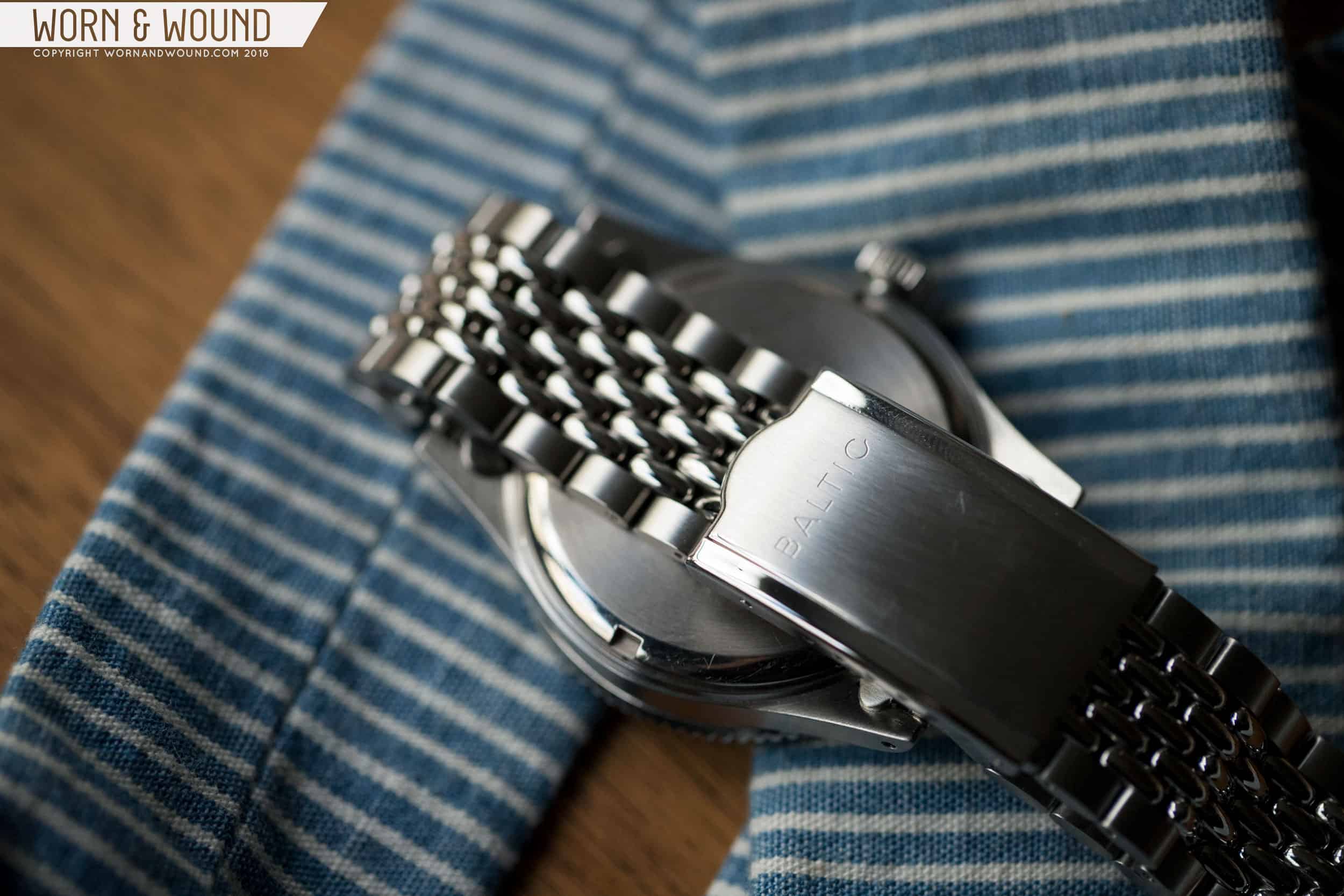
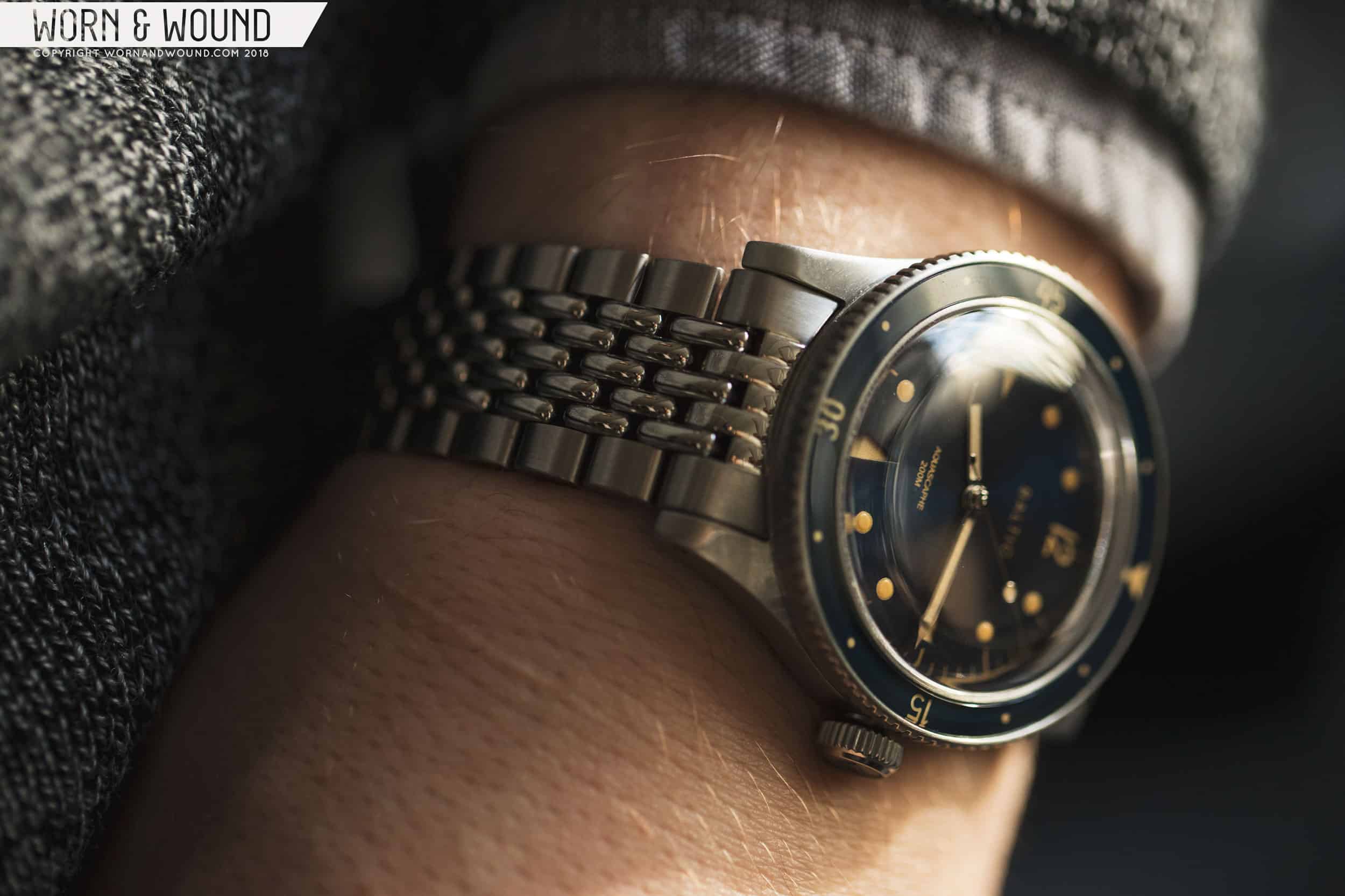
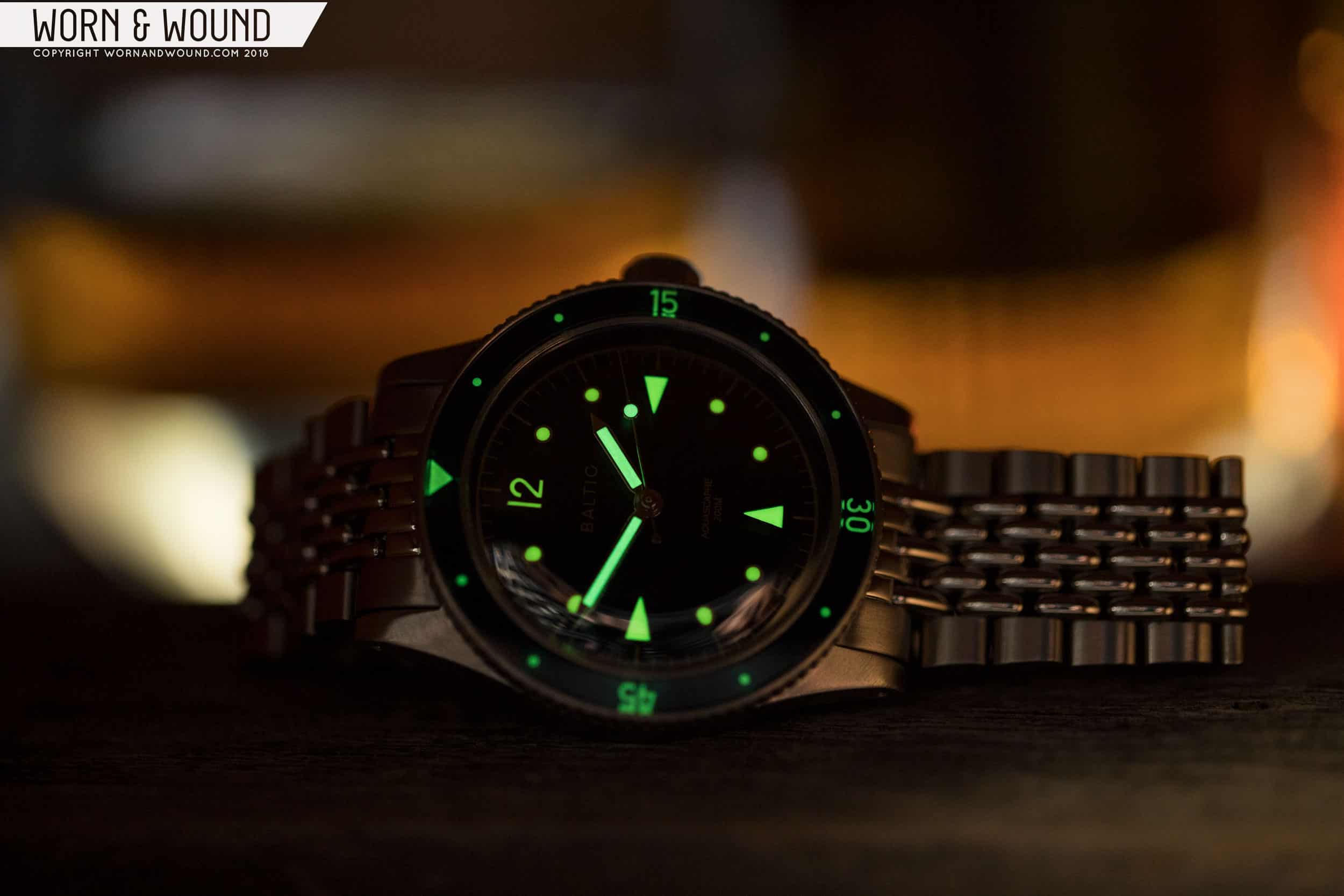
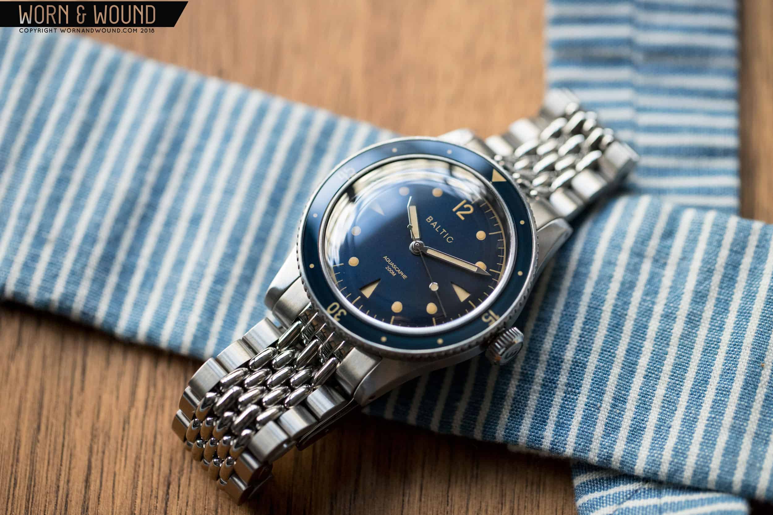
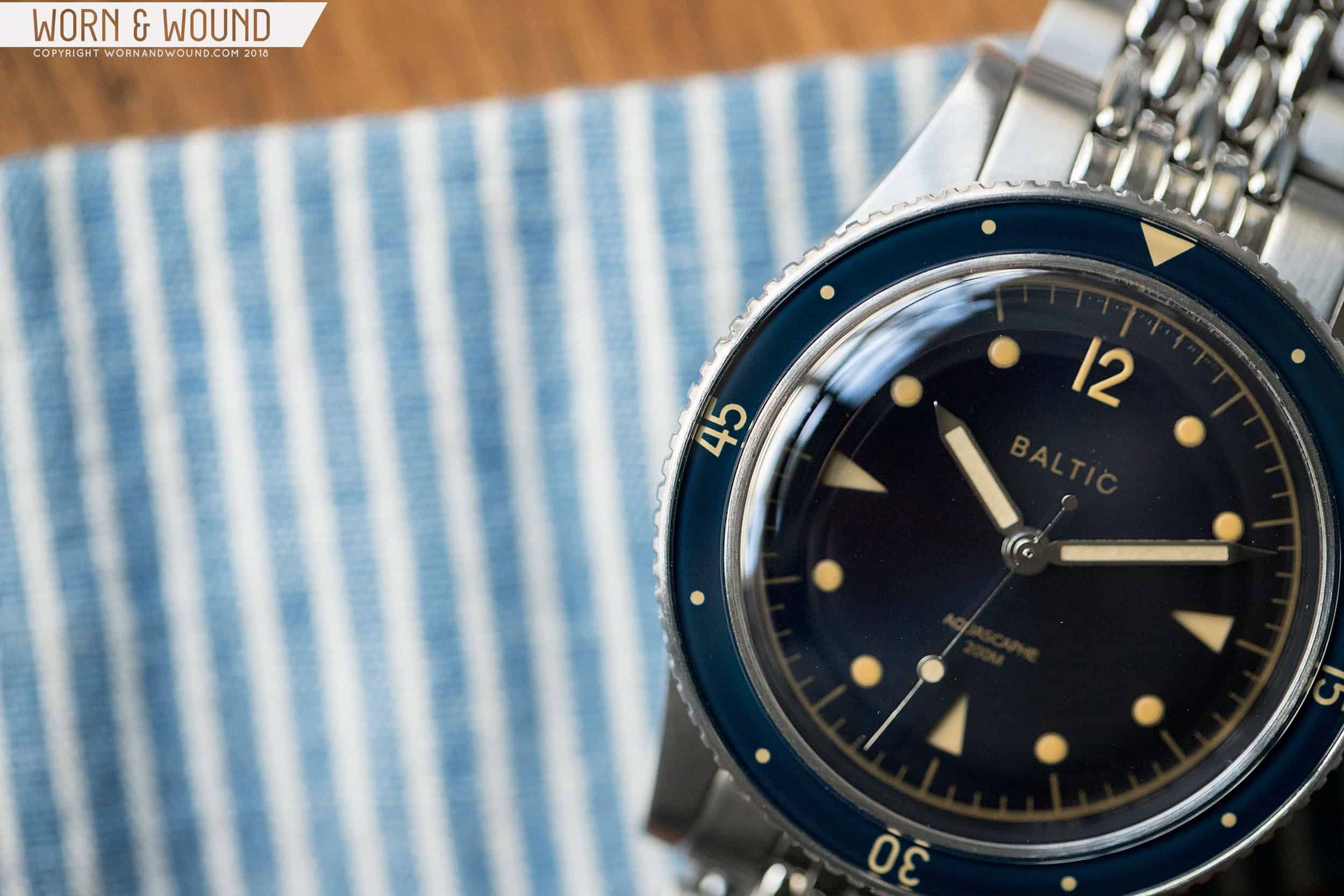
Based on mid-century dive watches, the Aquascaphe mixes a keen eye for details and style with the increased stats sought of a solid tool watch, such as a sapphire crystal and bezel, screw down crown, and 200 meters of water resistance. Though this is a new model for the brand, Baltic didn’t entirely return to the drawing board. There is a common design language here shared with past models, resulting in a familial look and, more importantly, the same mid-case design. The Aquascaphe is a  winner at 38 millimeters across (39 at the bezel), 47 millimeters lug-to-lug, and 12 millimeters thick. Baltic nailed the details and case proportions here, giving the watch an attractive, vintage look and also making it enjoyable to wear.

Advertisement
$550

Review: Baltic Aquascaphe

Case
Stainless steel
Movement
Miyota 9039
Dial
Blue Gilt (also available Black Silver and Black Cream)
Lume
Super-LumiNova
Lens
Domed sapphire (Internal AR)
Strap
Beads-of-rice bracelet and tropical rubber
Water Resistance
200 meters
Dimensions
38mm x47mm
Thickness
12mm
Lug Width
20mm
Crown
Screw down
Warranty
Yes
Price
$550

What’s really remarkable about the case design is how Baltic managed to make the watch look and wear thinner than it is. The mid-case is deceptively thin, with long lugs that are set low. There is a small break that then leads into the bezel, which has a narrow bevel, before rising up with a slatted edge. This gives way to the domed sapphire crystal, which adds literal height, but not visual. On the flipside, the case back protrudes only a couple of millimeters. Because of the thin lugs/mid-case, breaks between the details, and changes in width, the eye reads the watch as much thinner than it actually is. On the wrist, it looks and wears much the same.

The dial is pure Bathyscaphe, as the slightly-too-on-the-nose name would suggest, but it’s given some signature Baltic detailing as well. You’ll find the same 12 numeral on the Aquascaphe as the Bicompax and HMS models, immediately unifying the catalog. There’s also a series of familiar lumed dots with printed outlines and triangles. In an interesting, albeit seemingly unnecessary, detail, Baltic made the triangles cutouts with lume visible on a layer underneath. Creating this sandwich effect does add some texture to the dial that is appealing, though I wonder if the added manufacturing complexity was worth it. It’s also worth noting that the lume is pretty potent considering the small area of application. Additionally, the dial features a printed minutes/seconds index around the outer edge of the dial that ties it all together while adding some necessary legibility.

Moving to the bezel, the insert is decidedly thin, which works well proportionally. The issue sometimes with smaller divers that feature heavier bezels is that larger bezels can make a dial look too small, and that ultimately makes the watch feel diminutive. That’s not the case here, as the thin bezel gives the dial plenty of room and then adds a certain restrained complexity to the overall piece. In vintage style, the insert is stripped down with numerals at 15, 30, and 45, a triangle at 0/60, and very small dots for the remainder. Rendering the bezel in sapphire was a nice touch, too, especially at the price point.

The Aquascaphe comes in three colors: Black Silver, Black Cream, and Blue Gilt. Black Silver appears to be the most modern of the group with white lume, light gray printing, and a matte “grainy” dial. Black Cream is a step into neo-vintage territory, mixing cream colored lume with light gray printing and a matte “grainy” dial. Blue Gilt, which is pictured in this review, mixes a dark-blue sunray dial with cream lume and matching faux-gilt paint. This last combination was my favorite from the Bicompax series, so it’s no surprise that I’m drawn to it here as well. The mix of the cool blue with the warm gilt creates something special, as it somehow subdues both colors and creates a unique balance. White lume or print might have made the blue too bold.

Powering the Aquascaphe is the Miyota 9039 movement, which features automatic winding, 24 jewels, hacking, hand-winding, a 42-hour power reserve, and a frequency of 28,800 bph. This is essentially the 9015 without a date complication or date position in the crown. The 9039 is a great choice as it’s reliable, thin, more economical than Swiss options, and by being a true no-date movement it doesn’t have that inelegant phantom stop.

The Aquascaphe comes with one of two strap options (both during the pre-order): a tropical rubber strap and a “beads of rice” bracelet. Both make complete sense on the watch, though we only got to try the latter. It’s a well executed bracelet that has a vintage feel as the beads of rice design offers more flexibility than other styles. Additionally, it’s quite thin, which adds to the overall comfort of the watch.

So, does Baltic have a Godfather 2 on their hands or a Jaws 2: The Revenge? The answer is clearly the former. The Aquascaphe is a successful followup to Baltic’s initial watches, adding dive functionality, build quality, and style while allow Baltic to maintain a cohesive brand image. It’s different enough from their first watches to justify its existence, while having enough in common that if you like or own those watches, then you might come back for this one as well. Of course, the pricing doesn’t hurt either. At around $550 on rubber and $620 on bracelet during the pre-order (increasing about 20% percent after the pre-order), the Baltic Aquascaphe is also a great value. Baltic

Images from this post:
Related Reviews
Zach is the Co-Founder and Executive Editor of Worn & Wound. Before diving headfirst into the world of watches, he spent his days as a product and graphic designer. Zach views watches as the perfect synergy of 2D and 3D design: the place where form, function, fashion and mechanical wonderment come together.
wornandwound zsw