Review: Lorier Falcon II

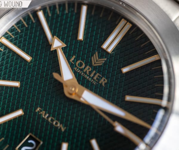
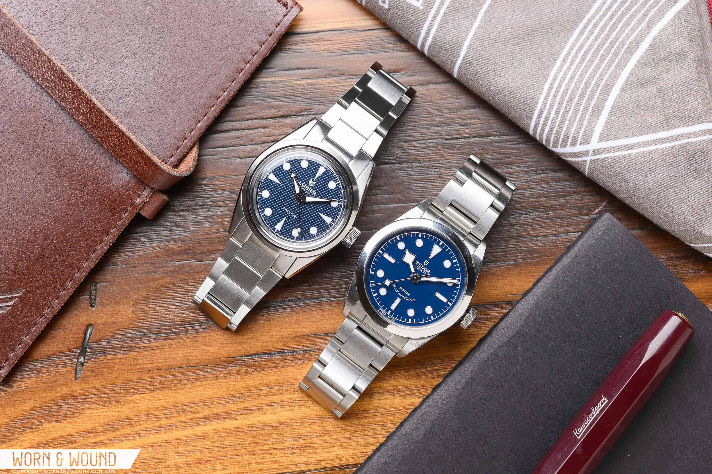
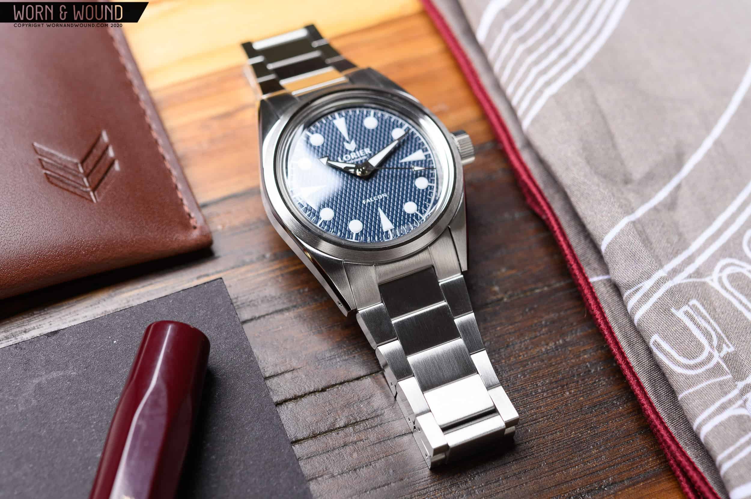
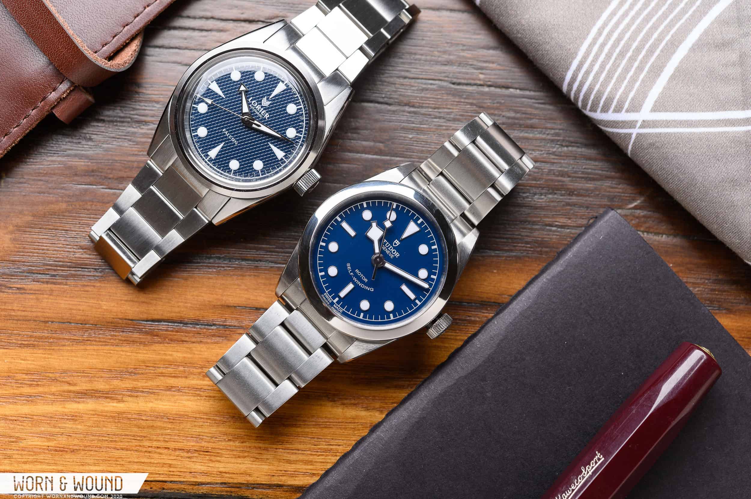
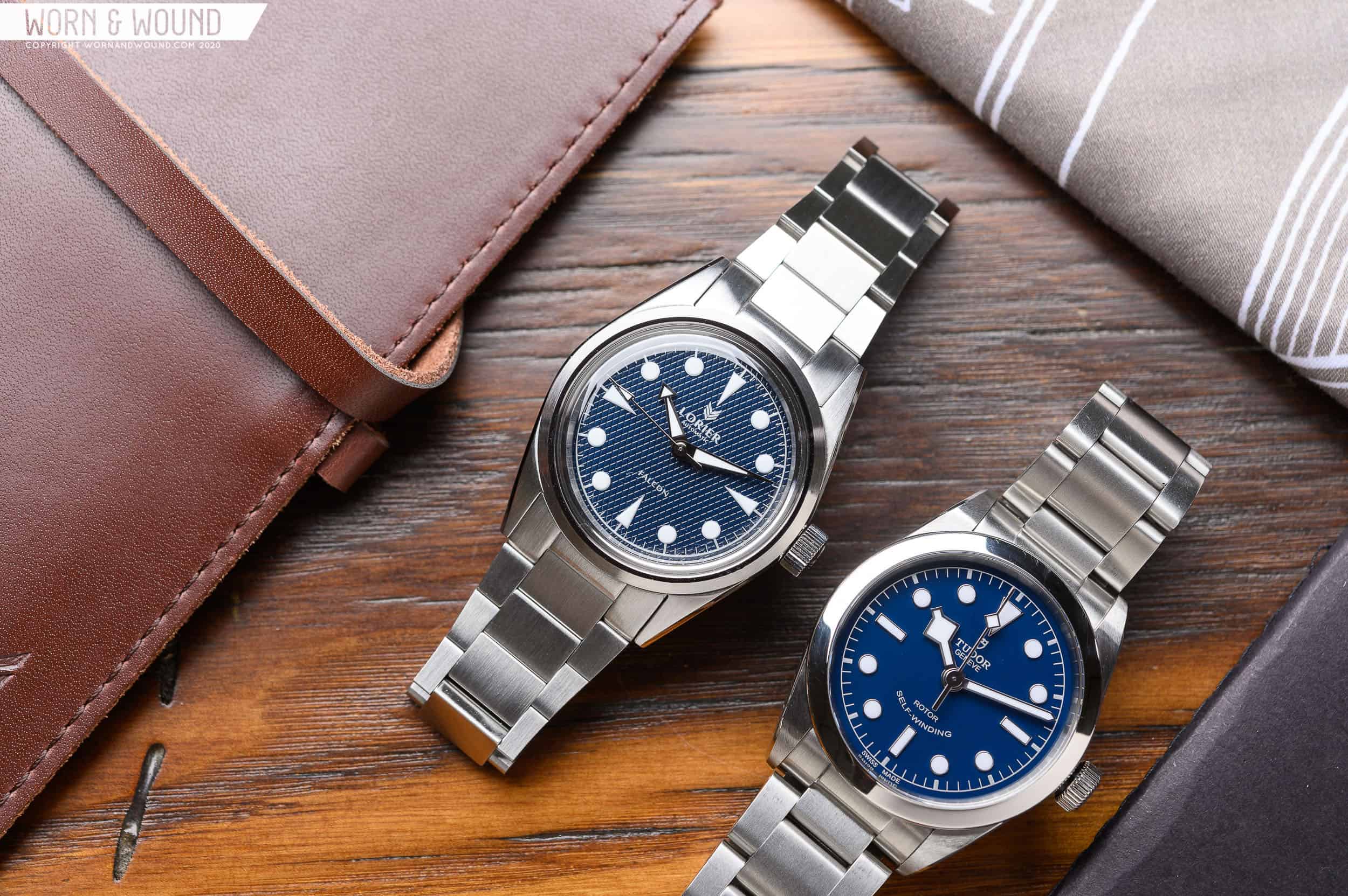
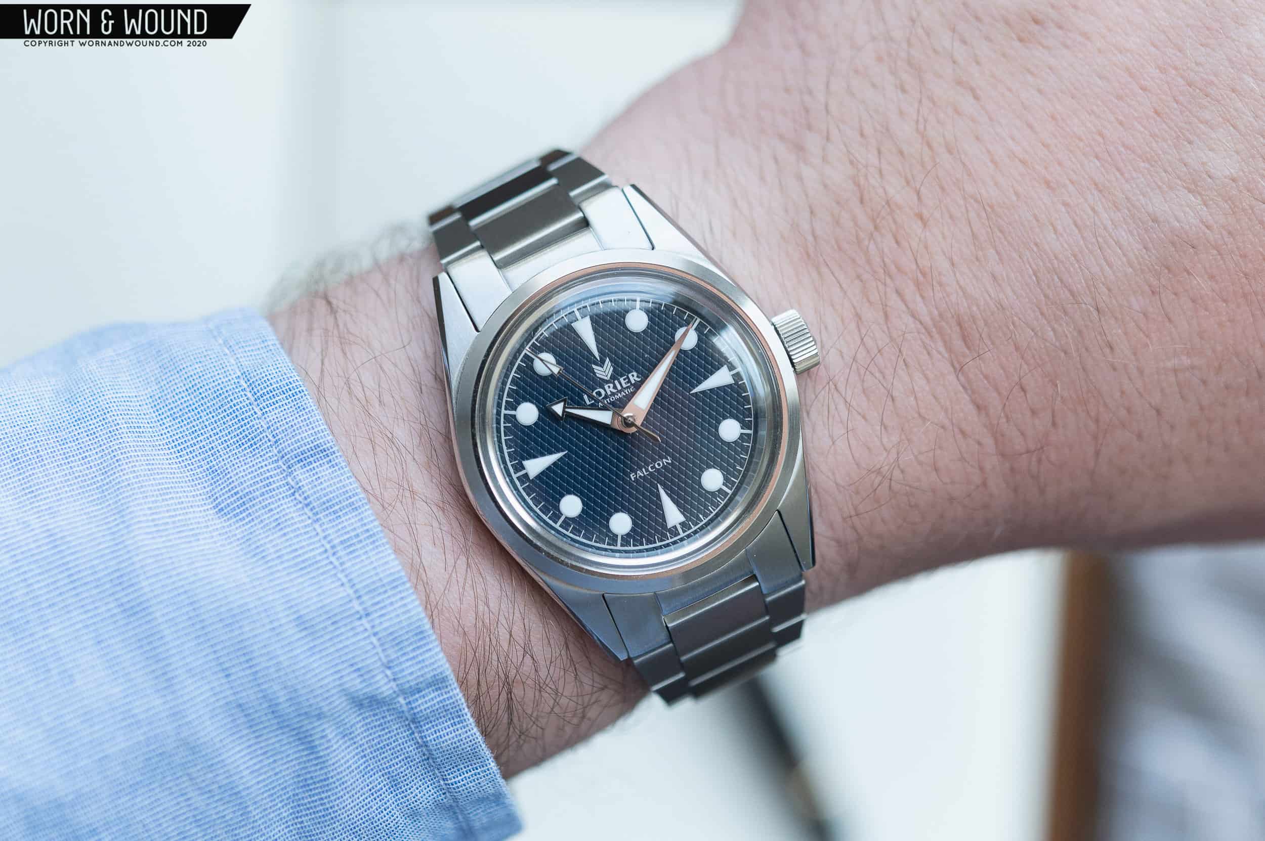
It’s always nice to see a brand revisiting a popular model. Sure, it’s great when they add a new color way, or make a few small tweaks. But that’s not the case with Lorier’s new Falcon Series II. It’s more of a complete overhaul than a minor change, and I’m so glad to see it. While I could spend plenty of time comparing the updates of the new model to the older one, Lorier has already taken care of that in their extensive blog post outlining all of their decisions. This review is approached like it’s of a brand new watch, because in a way, it pretty much is. 

If you’re not familiar with Lorier, now is the time to do your research. They’re a two-person brand based out of NYC. Lauren and Lorenzo of Lorier (no way that alliteration was by accident) are some of the most passionate and friendly people in the scene, and a stop by a watch meetup or a WindUp Watch Fair can confirm that. Their line of watches draws inspiration from vintage models, but they’re by no means in homage territory. Lorier’s watches stand on their own, and the watch community has backed that up with their hard-earned cash. Quick sell outs of new models were common fare when ordering a Lorier, and they’ve improved that approach as well with a wait list system that keeps you updated every step of the way. They’ve done a lot of things right, and the Falcon Series II is one of them. 

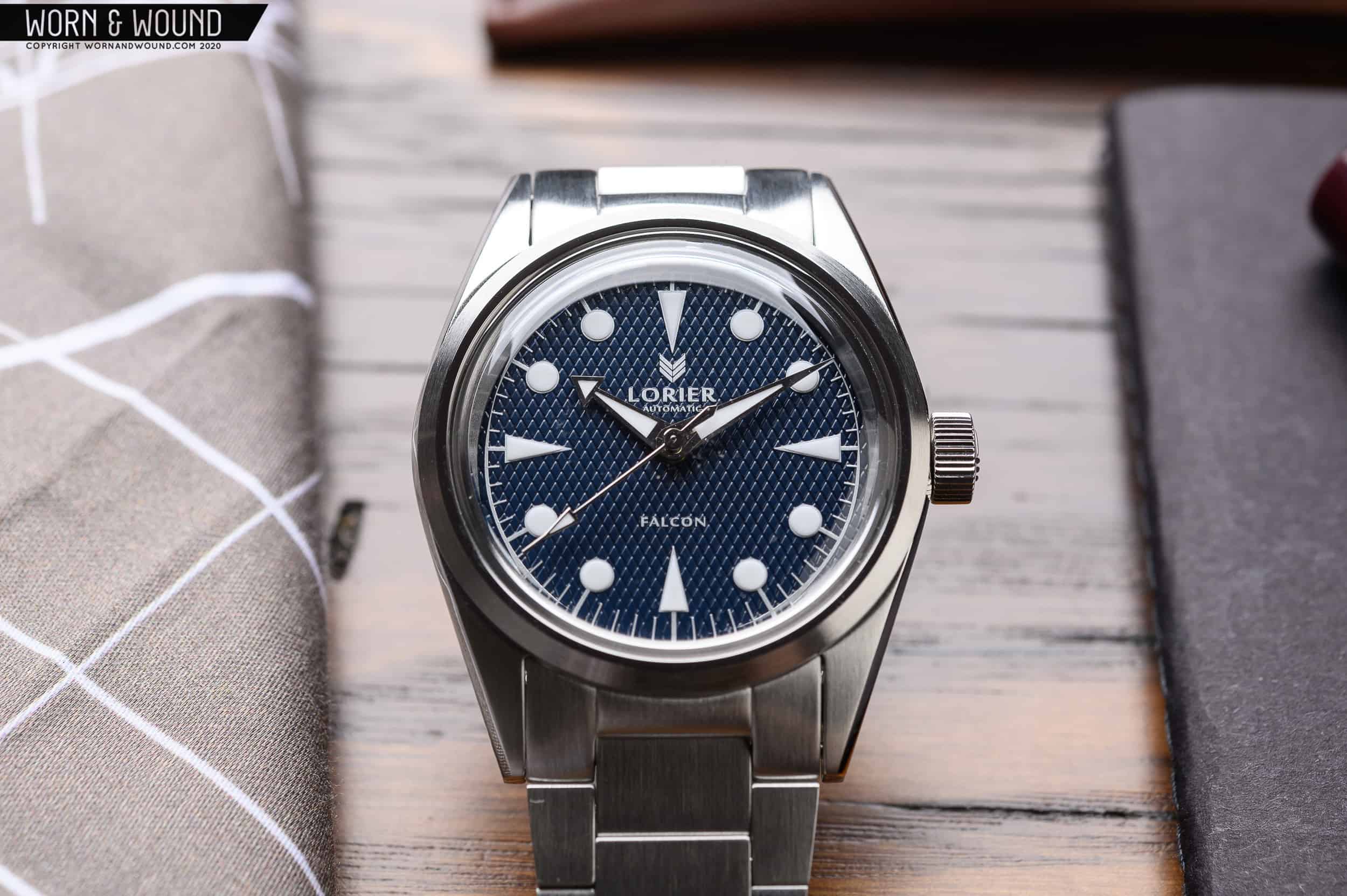
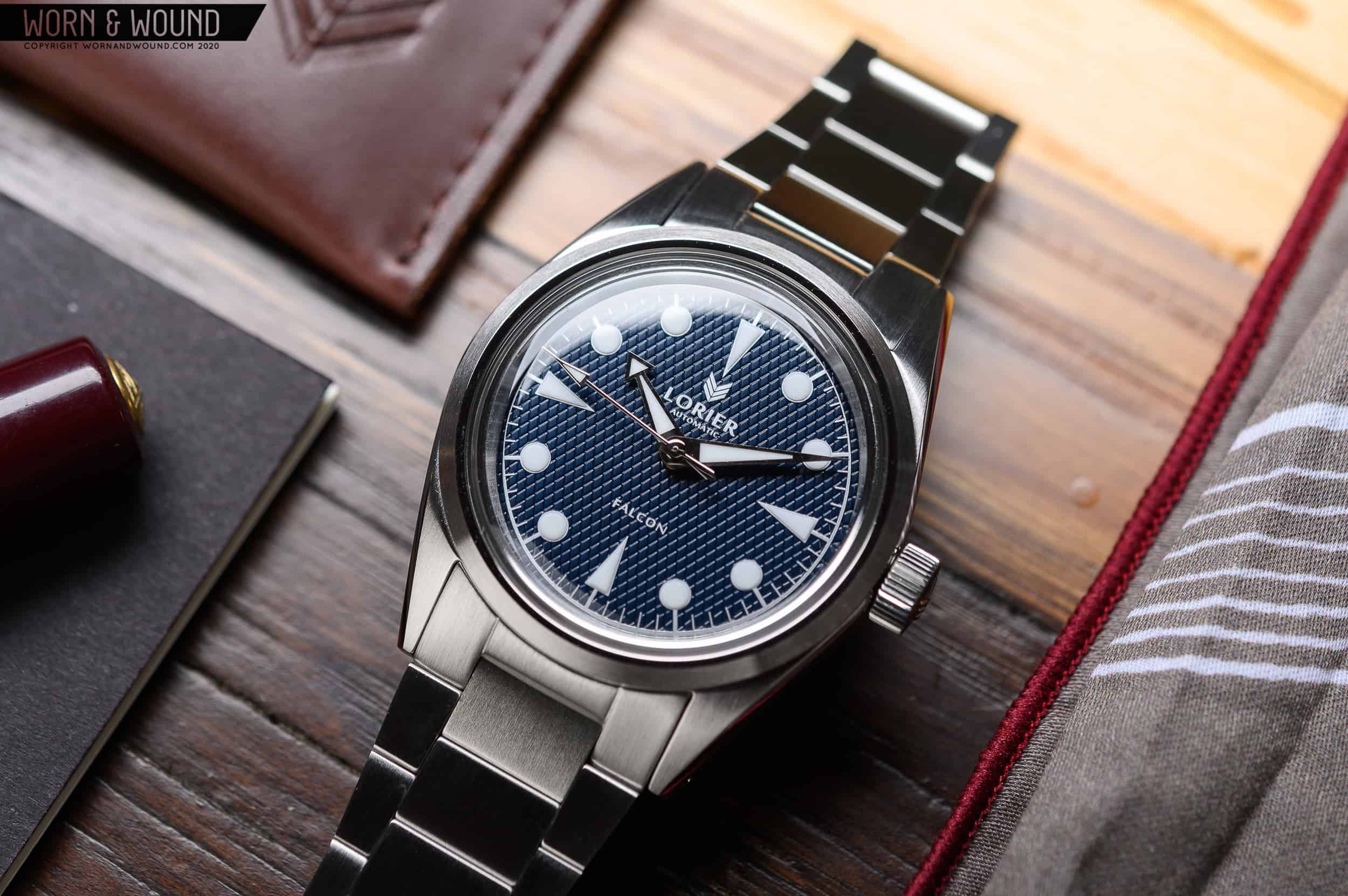
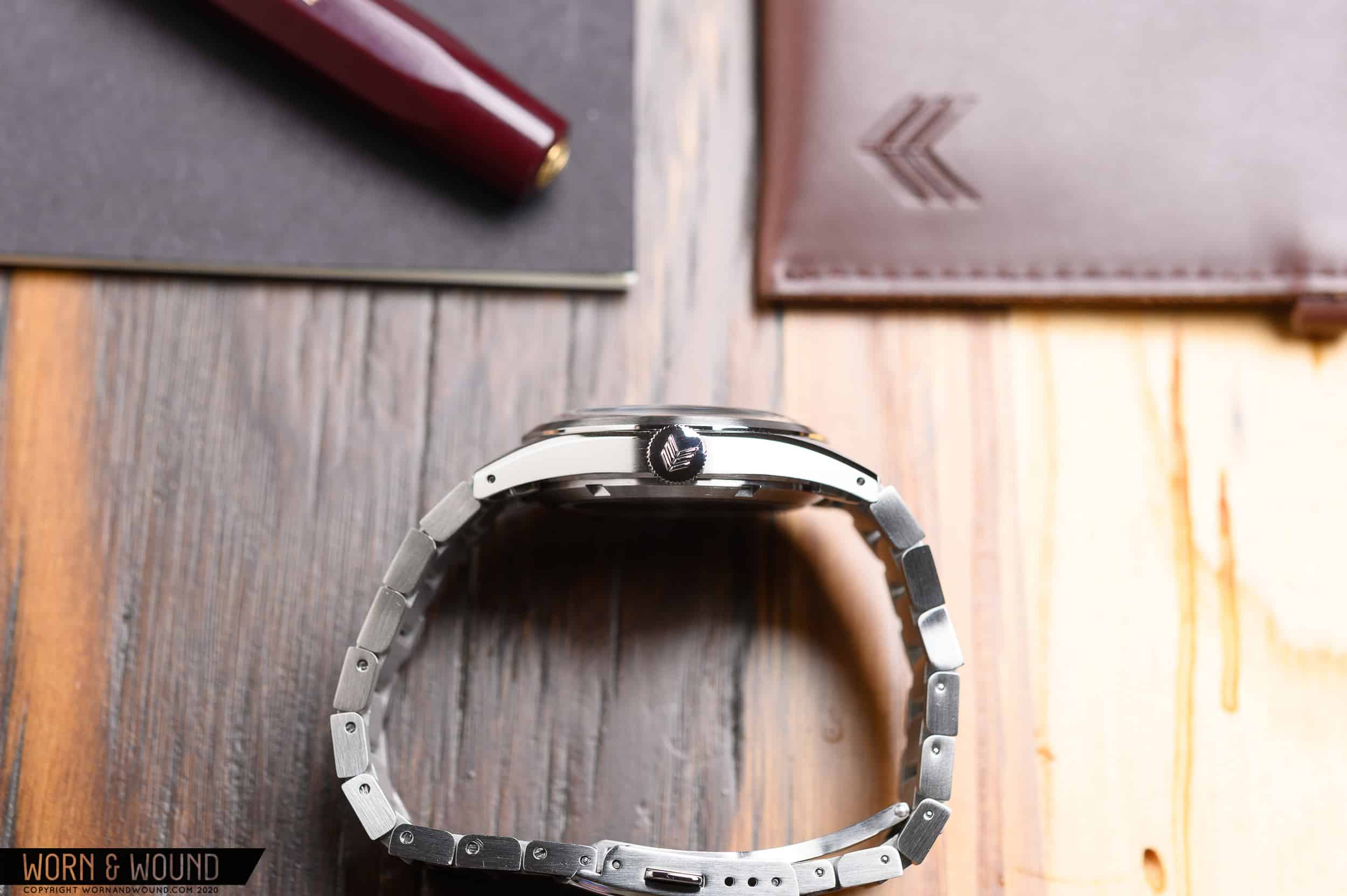
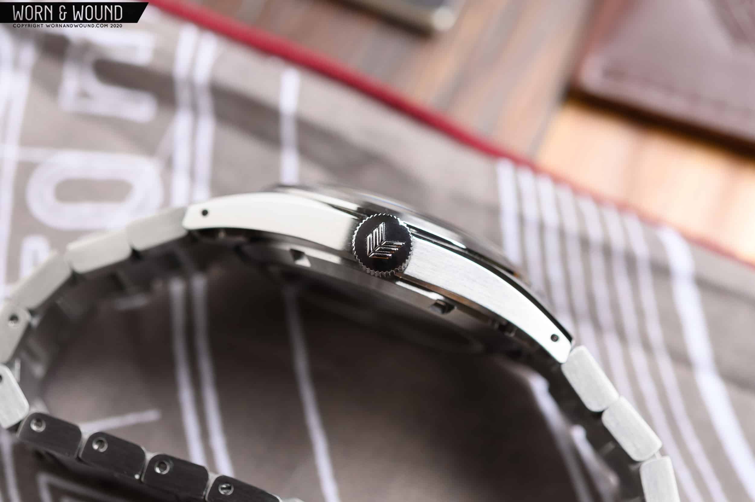
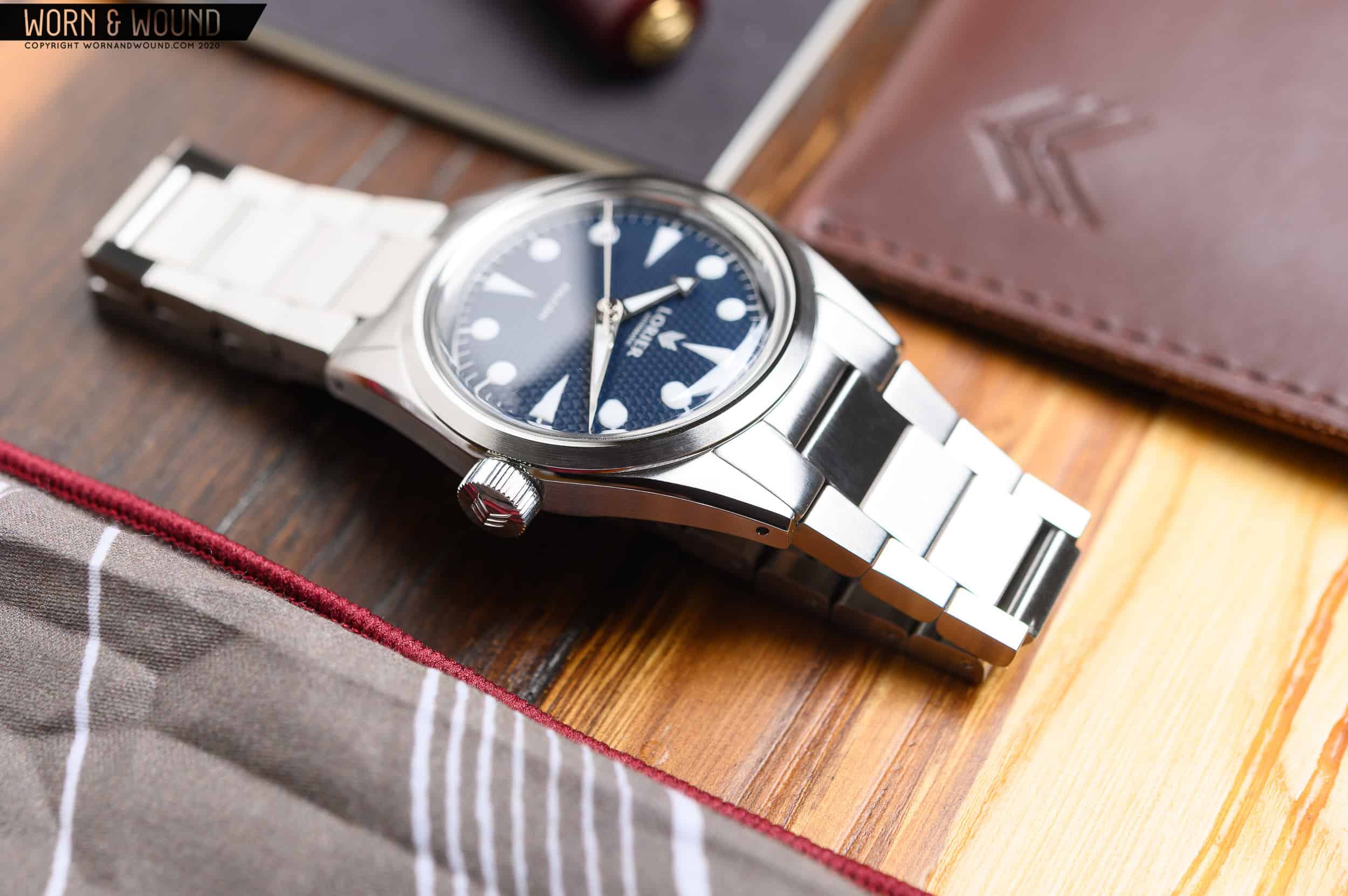
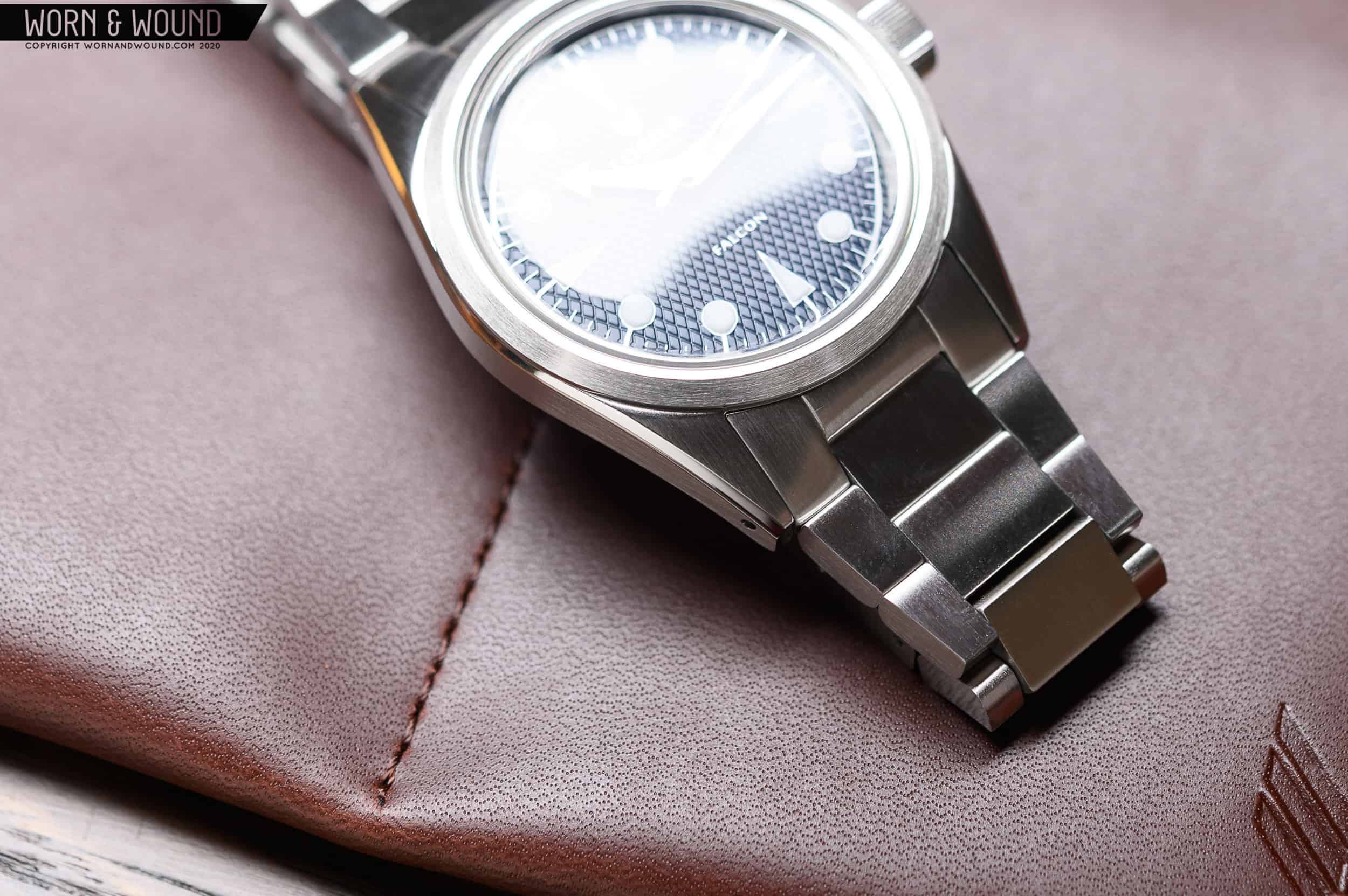
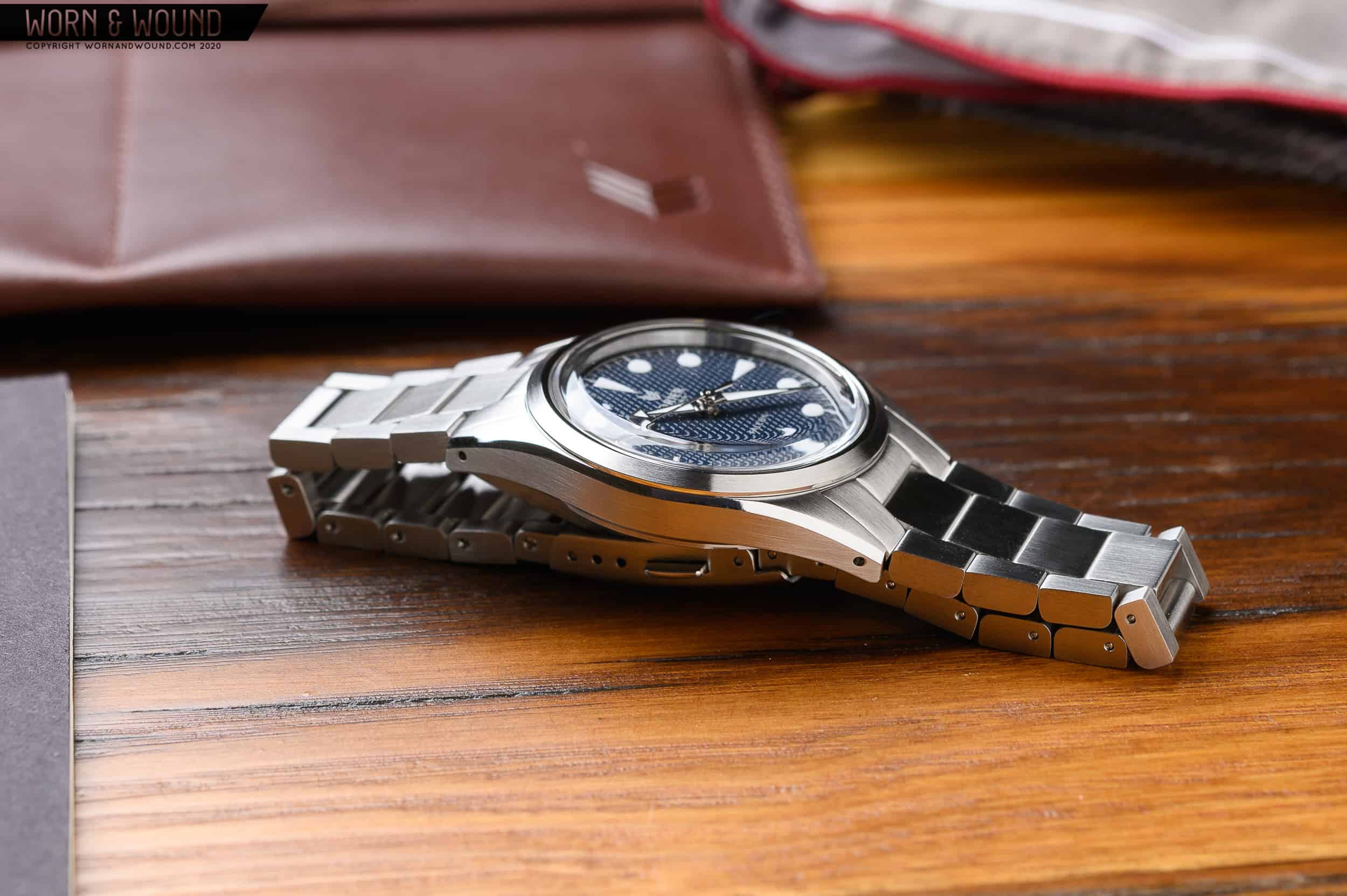
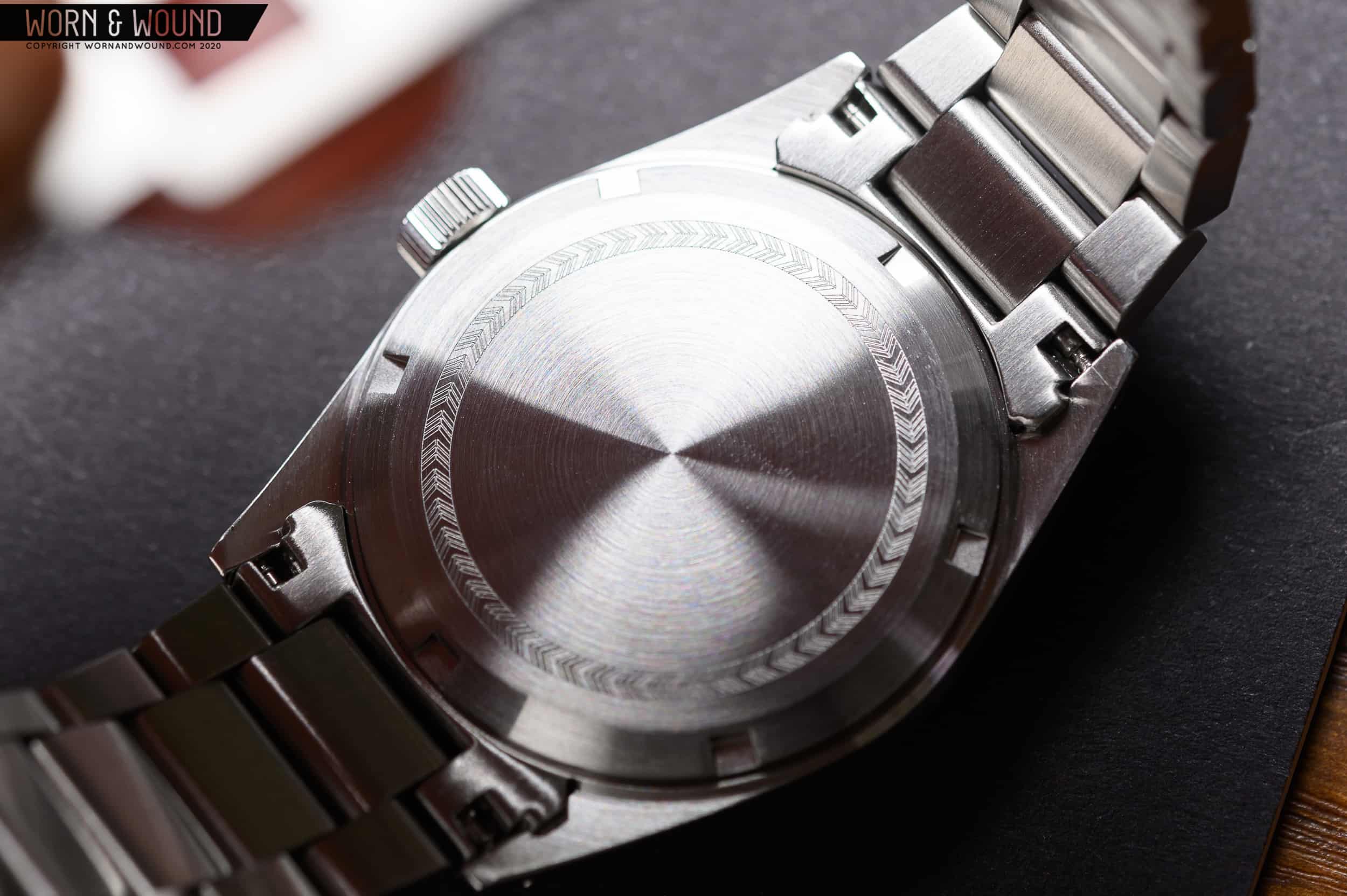
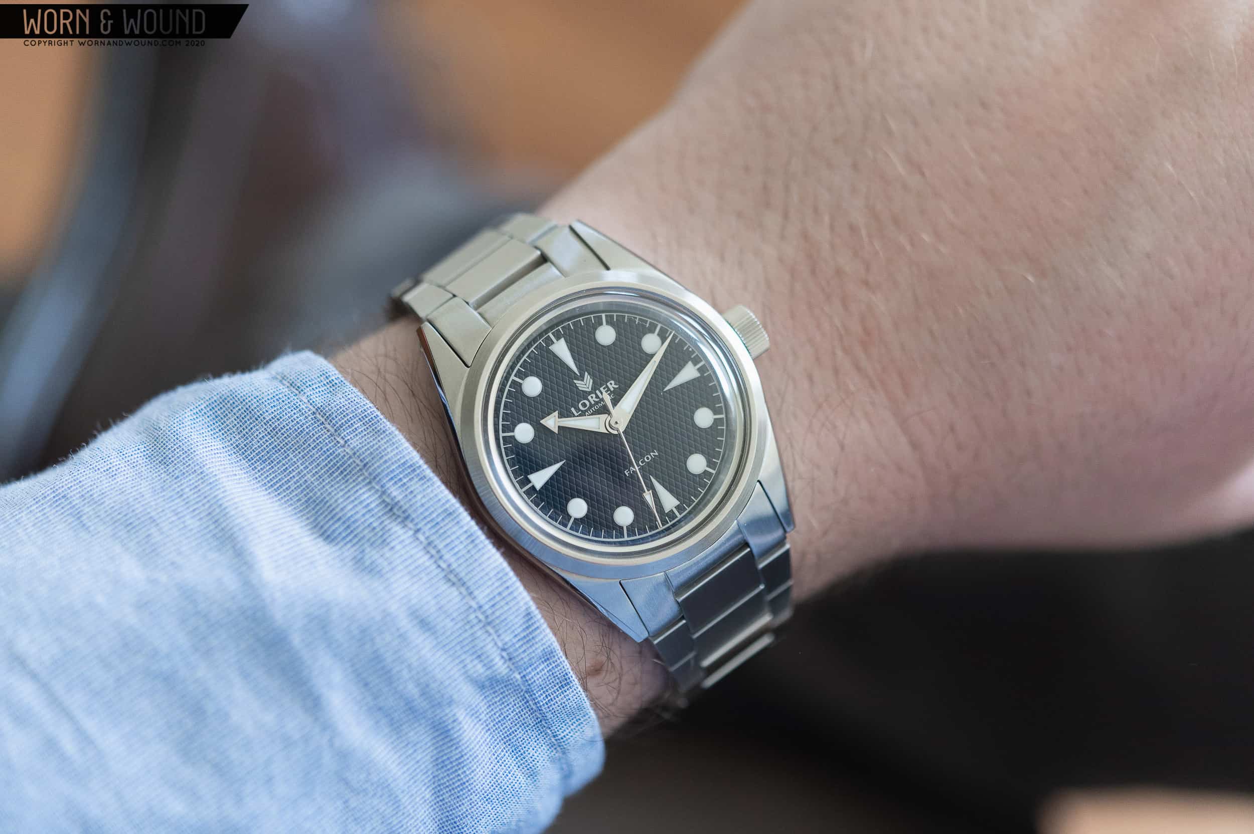
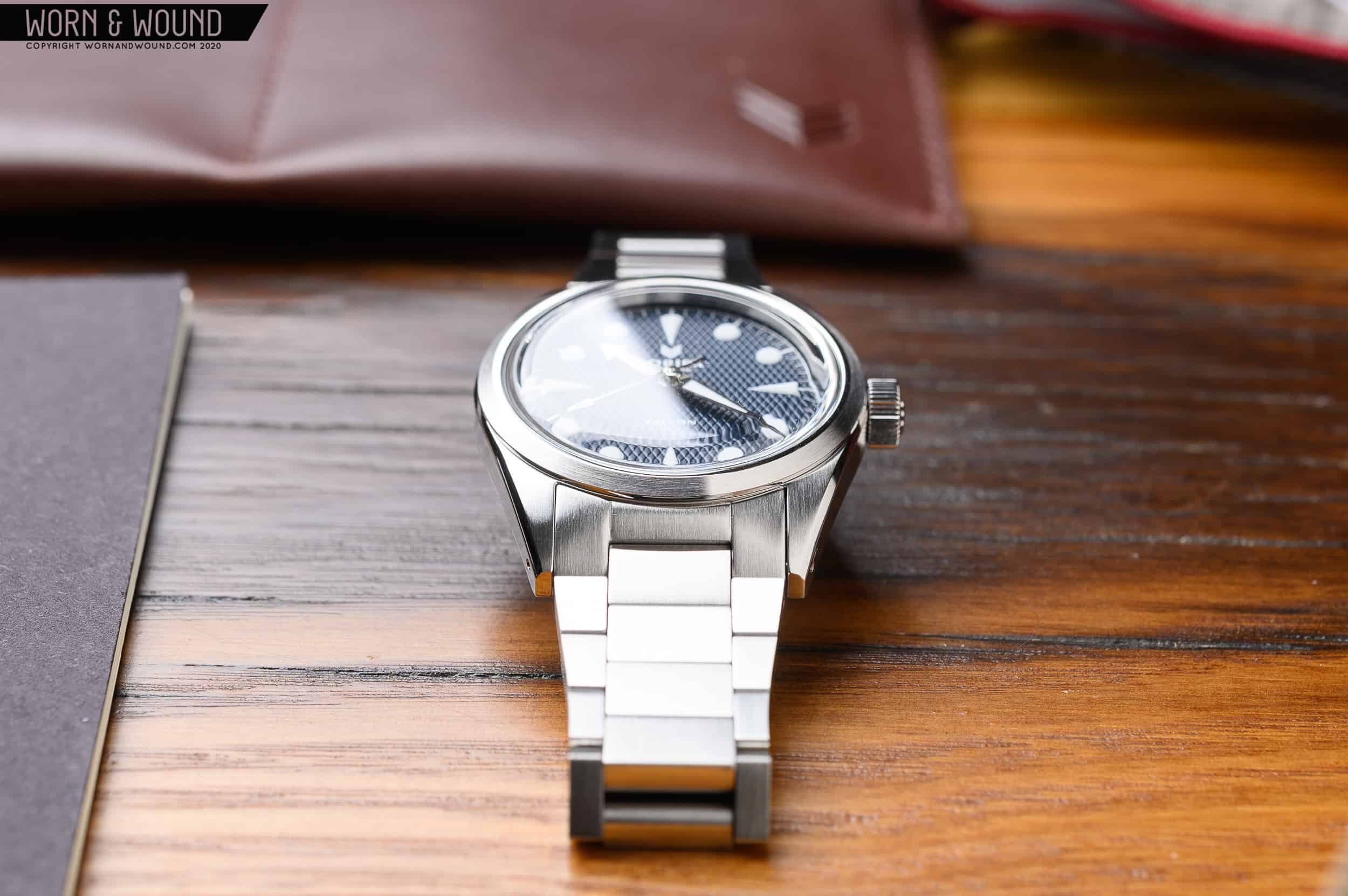
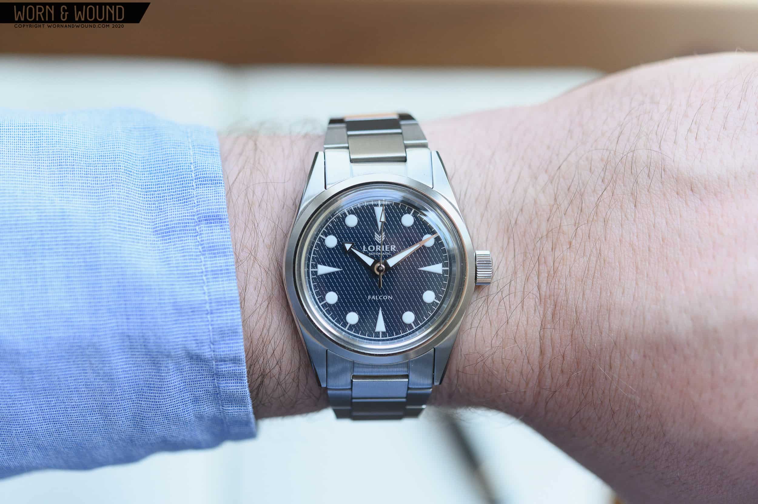
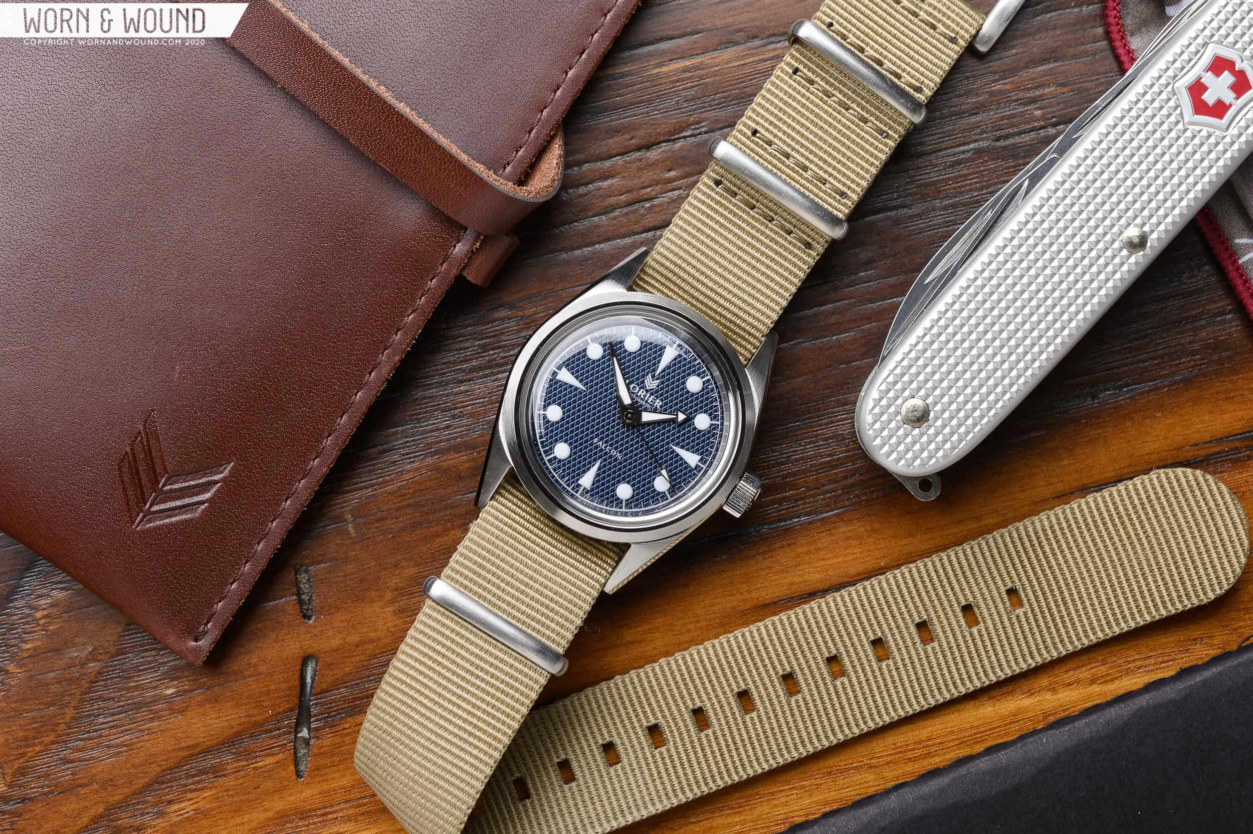
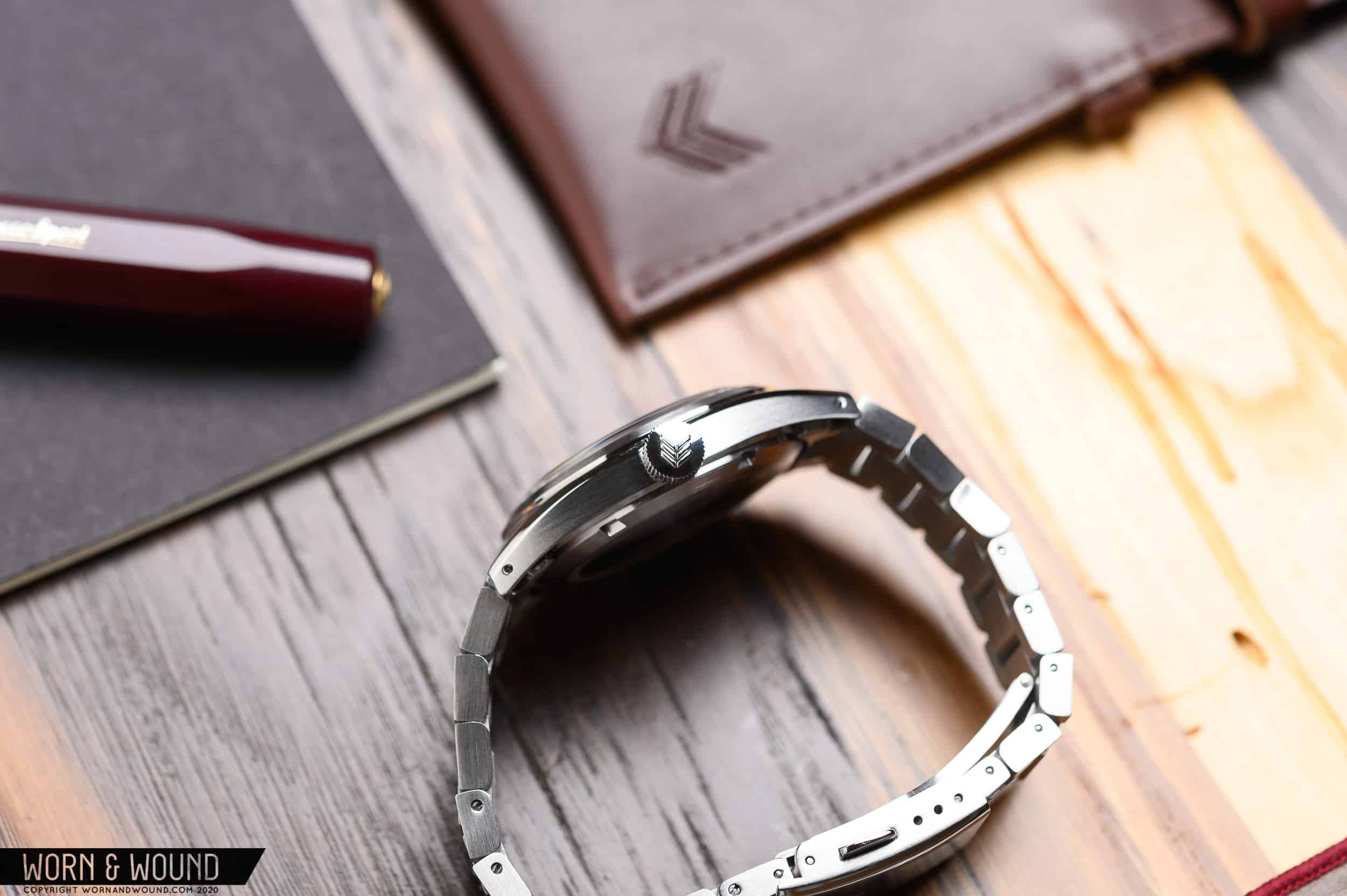
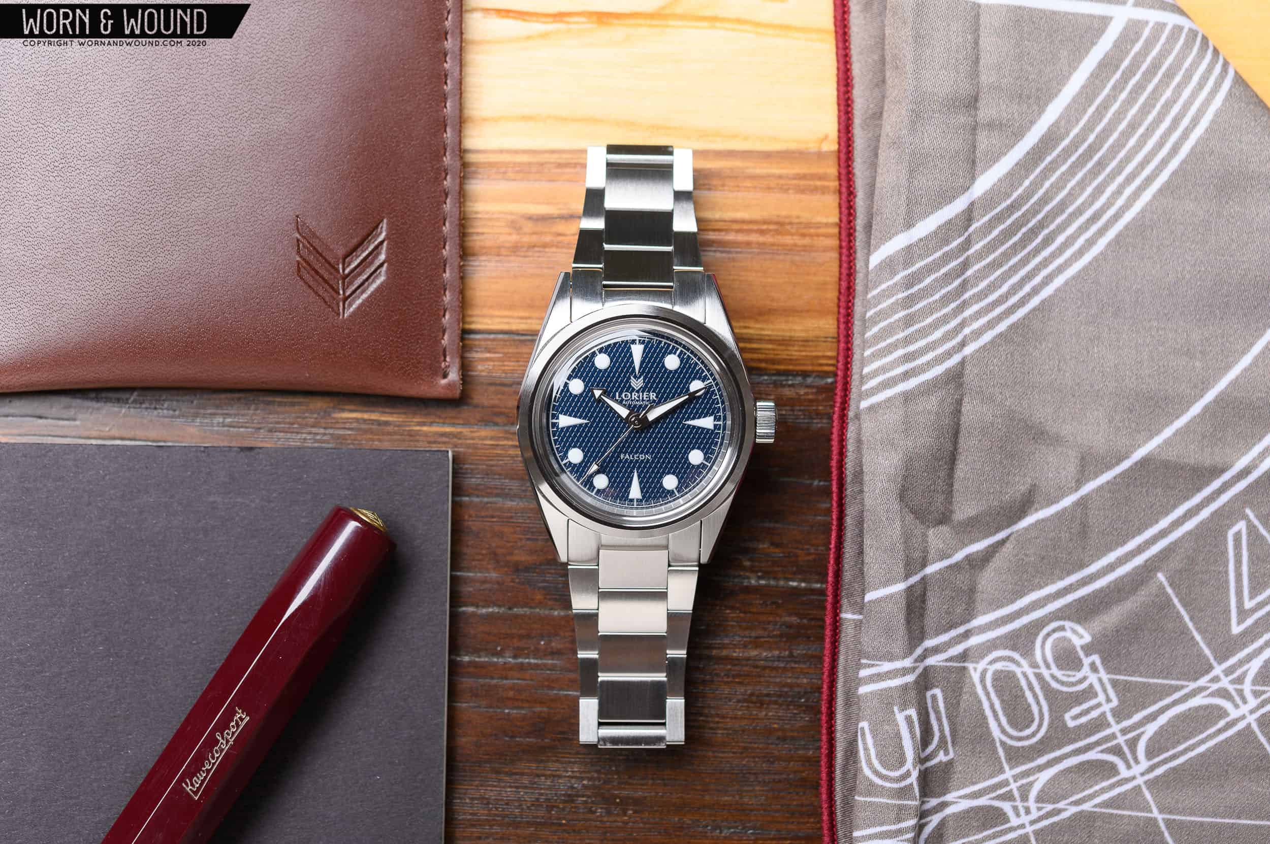
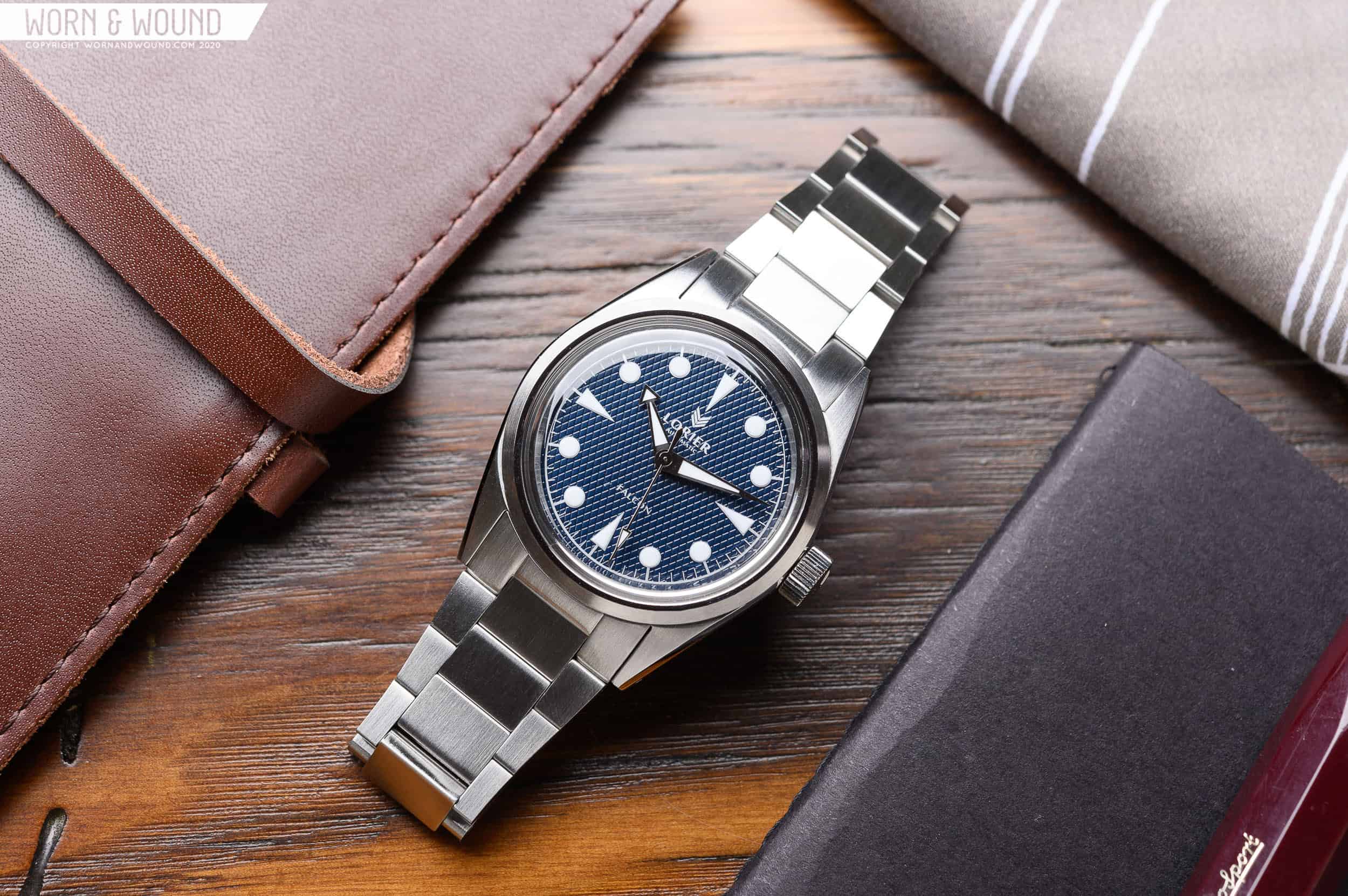
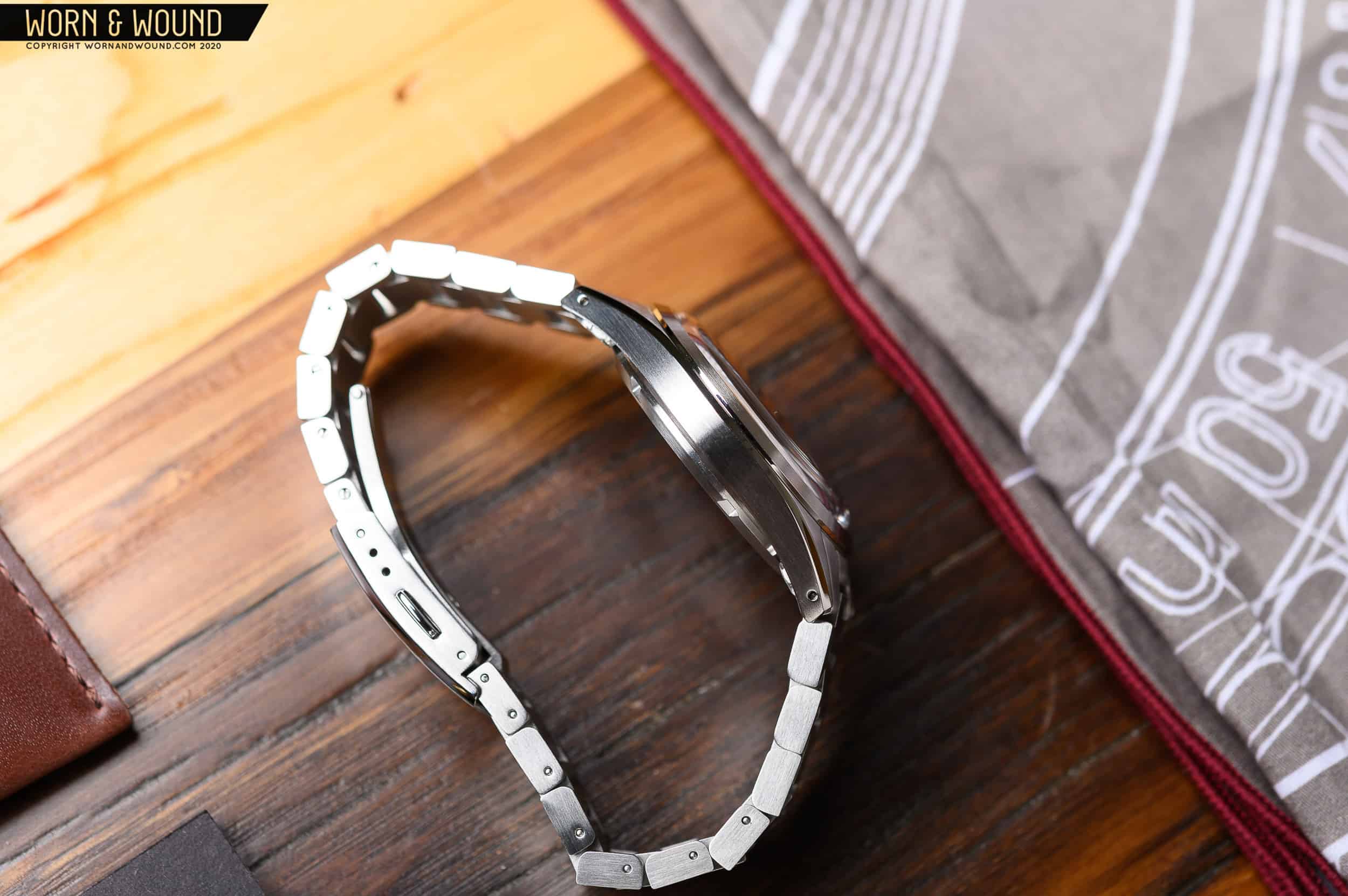
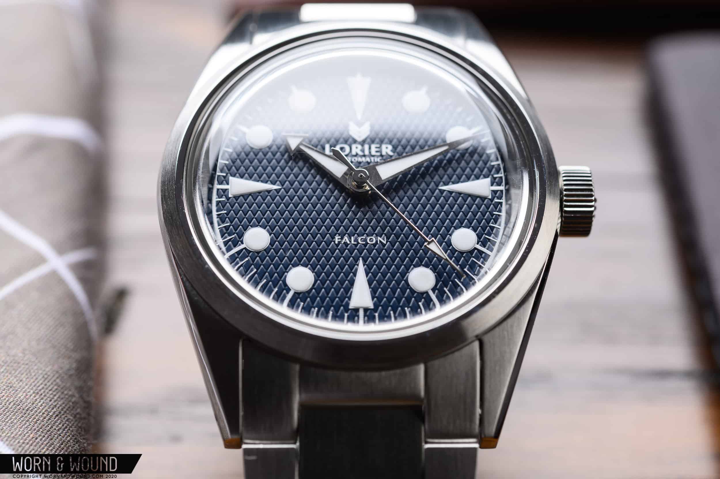
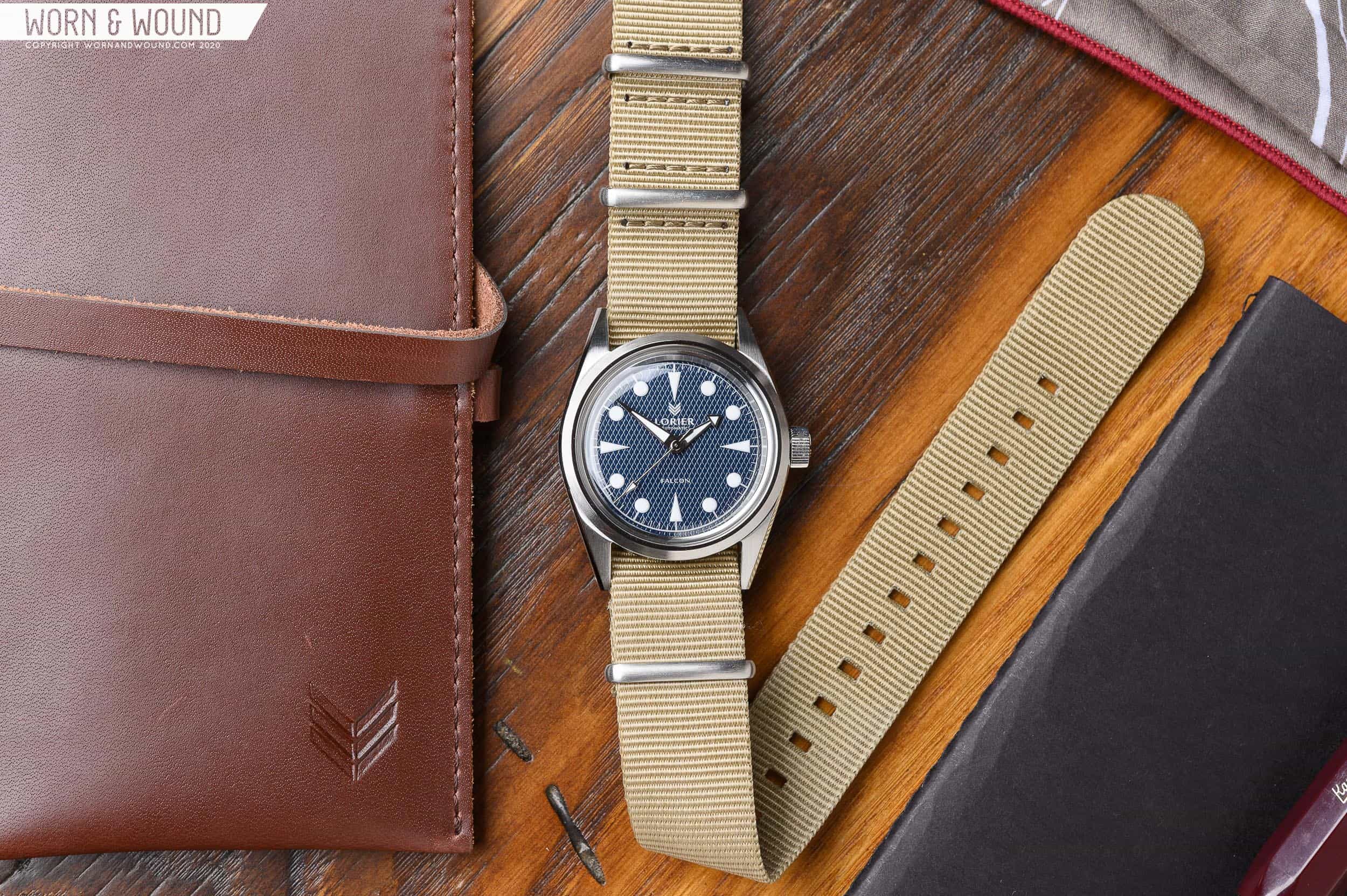
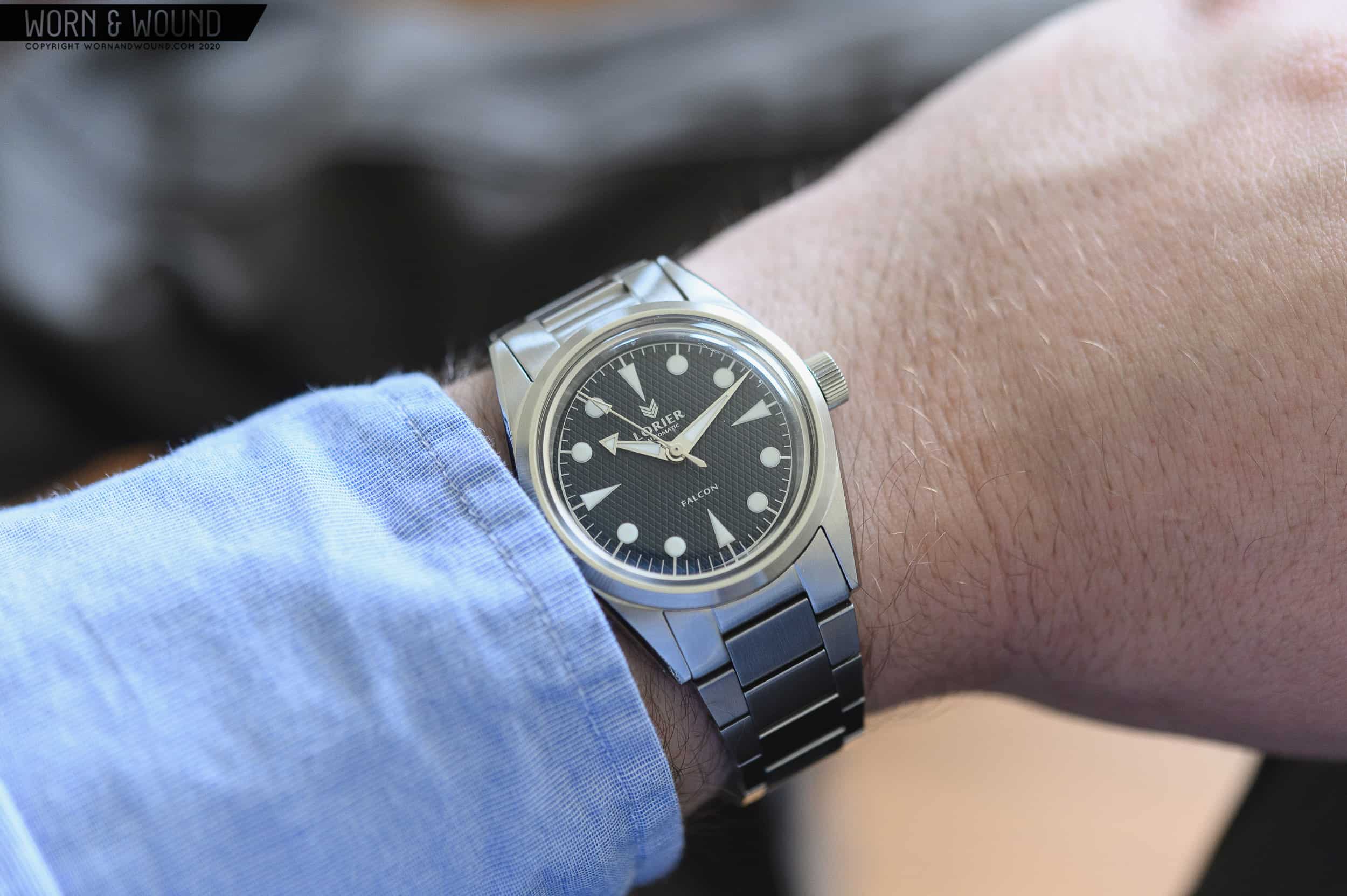
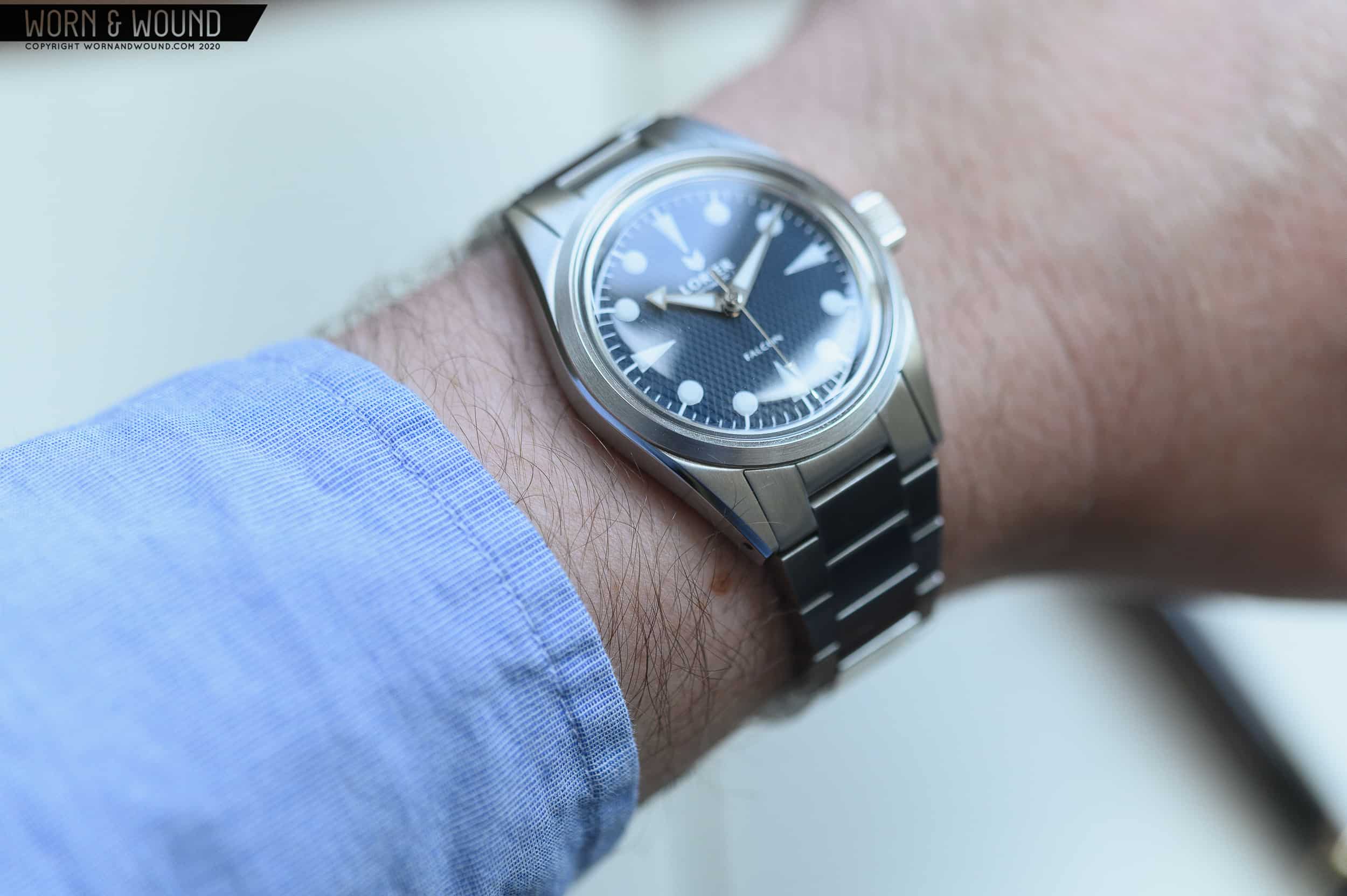
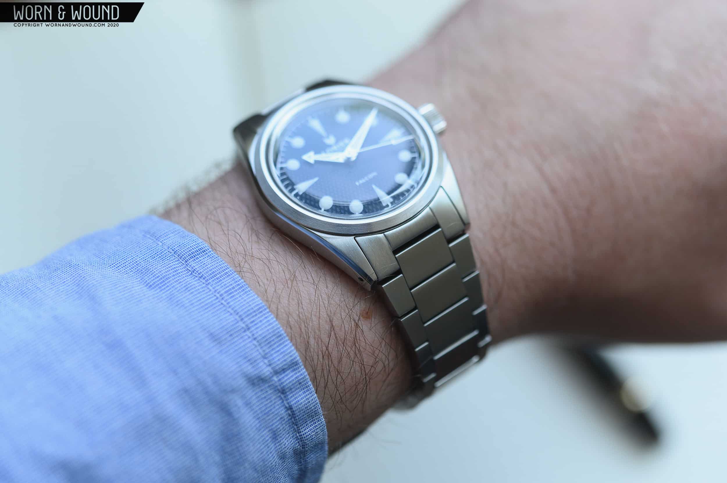
The idea behind the Falcon Series II is that it could be a watch for all aspects of your life. Slim and sleek for when you dress up, yet durable and practical for some adventuring. It boasts an 11mm thickness (2mm of which is the domed acrylic crystal), which wears remarkably well on the wrist. It’s held there by a fully articulated bracelet that blends both modern and vintage design with ease. One of the best parts? It’s quite affordable. At $499, the Falcon Series II punches well above its weight in terms of design and finishing. Let’s take a closer look at this new offering from a brand that’s really starting to hit their stride. 

Advertisement
$499

Review: Lorier Falcon II

Case
316L Stainless Steel
Movement
Miyota 90S5
Dial
Waffle, Blue
Lume
Yes
Lens
Acrylic
Strap
Bracelet
Water Resistance
100 meters
Dimensions
36 x 44mm
Thickness
11mm
Lug Width
20mm
Crown
Screw down
Warranty
Yes
Price
$499

Case

Slim and sleek are two things that a sports watch should be. If you’re using your watch during some outdoor activity, whether it be swimming or hiking (or let’s be honest, just a good ol’ fashioned walk through the park), it’s nice when your watch stays out of the way. From catching on a backpack strap, to getting snagged on some fishing line, the opportunities for your watch to get in the way are endless. What I’m really getting at is that I appreciate a slim watch that’s built to take a bit of a beating. The Falcon Series II is housed in a 316L stainless steel case that measures in at 36mm wide x 44mm long x 11mm tall. It features a mix of brushed and polished surfaces and a domed acrylic lens protecting the dial. Let’s break down the case a bit more…

The previous iteration of the Falcon measure in at 39mm wide by 48mm lug-to-lug, whereas the new Series II measures in at 36mm by 44mm long. The change on paper may not sound all that crazy, but the difference in the metal is quite drastic.

Contributing to the slim appearance, the 11mm thickness of the Falcon’s case is a bit deceiving. While technically, it’s 11mm tall, 2 of those millimeters are made up by the acrylic domed crystal. Since the top ~20% of the watch is clear, it gives the appearance of sitting that same percentage lower on the wrist. In profile, you’ll notice that there’s  roughly 2mm of crystal, 2mm of bezel, 5mm of mid case, and 2mm of case back. The case back nestles into your wrist, leaving the mid case to be sitting flush.

Really, when you break it down, there are only about 7mm of visible steel contributing to the thickness of the watch. In comparison to Tudor’s Black Bay 36 (more on that later) with its slab sides, the Lorier’s balance of case elements allows it to wear much thinner on the wrist. The Falcon II is certainly less imposing throughout daily activity. The gentle curve of the mid case hugs your wrist, making the transition between case and bracelet smooth. It just wears so well.

Appearance and dimensions are only half the battle. Luckily, the finishing on the Falcon Series II has just as much to talk about. When looking at the dial of the watch, the first thing that stood out to me was the brushed bezel surrounding the dial. It is slim and unimposing, transitioning nicely from the crystal to the dial. There’s a small polished flat surface closest to the dial that really makes the dial itself pop. The slope of the bezel is brushed, giving it a more subtle look and providing some camouflage for the inevitable scratches that usually occur on bezels. The lugs are brushed vertically, with a polished bevel that runs the entire length of the watch.

Acting as a nice transition between the top of the case and the sides, this slim polished strip really helps highlight the lines of the case. Each of the lugs end at a flat surface, and are drilled for quick and easy strap changed.  While my Tudor BB36 is heavier on the polishing (slab sides, wider bezel), the Lorier’s brushed approach is a bit more low-key (in a good way).

The sides of the case feature a brushed surface. At 3 o’clock, a large, grippy crown extends out of the side of the case. Adorning the flat surface of the crown, you’ll find Lorier’s logo slightly elevated from the rest of the surface. The lack of crown guards and large crown give off some heavy vintage vibes, and they fit in well with the rest of the case.

Dial + Hands

Unless we’re talking about the breakfast food, I’m not much of a waffle guy. Waffle pattern dials were popular back in the 1950s and can be seen across a small range of Rolex, Omega, Longines, and the like. The pattern on the Falcon II is a diamond-style waffle, closer to an Eggo versus the wider, more squared off pattern seen on a standard Belgian or waffle maker waffle. The look on the Lorier makes sense, especially given the references they looked at for some inspiration.

A new spin on the classic waffle dial

On the blue dialed version we’re looking at today, the waffle pattern is a bit intrusive. It’s quite reflective and obscures the logos and hands a bit, detracting from the legibility of the watch. While it’s by no means hard to read, I’d personally prefer a more subtle waffle effect, or a matte dial with the pattern. Looking at photos of the other models, the pattern looks to be about equal on the green, and a bit more subdued on the black and white models. I’m sure some like the pattern just the way it is, and it is well-executed and even across the dial.

To read the time, you’ll be looking at a custom set of hands that are designed by Lorier. They’ve become a bit of a signature for the brand, as they’re used across the entire line. In the previous review of the Falcon, Zach described them as a “modified alpha hand with a rounded back” for the minutes, while the hour hand features a small arrow at the tip to differentiate the two quickly and easily. The seconds hand is slim throughout the mid section with a slim arrow tip at the end, counterbalanced by a wider part at the opposite end. The outline of the hand set is rendered in silver, while the inside is filled with white lume. Something about the polished hands and the waffle dial make them a little tough for me to read. I do like how they approached the indices though.

On the Series I Falcon, the indices were applied rectangular bars with hash marks in between. The Series II takes a much different approach, with circular printed lume plots for the hours. At 12, 3, 6, and 9, there’s an elongated and sharp triangle to differentiate the cardinal numerals. There’s a chapter ring around the outside of the dial with silver hashmarks every 5 minutes, with a slightly longer and bolder mark connecting the ring to each of the markers. They look a little bit like tiny trees, with a pine tree every 3 hours. If there was a little break between the hash mark and the lume plot, it would look a bit different. Another thing of note is the quality of the printing on the dial. It’s remarkably crisp, despite being printed on a patterned surface. The hash marks and lume all look great. Lorier opted for BGW9 lume, and applied it with a nice heavy hit. Turn the lights out, and you get a nice teal blue glow.

Advertisement

A topic of contention when discussing Lorier watches is their use of acrylic crystal over a domed sapphire. Well, that’s a position that I’ll stand with Lorier on. An old school acrylic crystal just looks so good. While sapphire is durable and highly scratch-resistant, it just cant replicate the warmth and subtle distortion that the plastic resin crystal is capable of producing. Lorier outlines their choice in acrylic on their site (https://www.lorierwatches.com/pages/crystal), and I totally agree. It just gives the watch that added level of charm.

Movement

Powering the Falcon II is Miyota’s 90S5 movement. It’s a no-date version of the more widely known 9015. The movement beats at 28,800bph, giving the seconds hand a smooth sweep around the dial. The lack of date allows the movement to come in at a thinner height. Higher clearance for the hands also allows for a heavier application of lume, as the hands are set slightly higher above the dial than other movements in Miyota’s lineup. The main reason for using this movement in the Falcon is the slimness of the movement, and I’m glad that Lorier opted for thinness over a more affordable movement or one with a date feature.

The overall slimness of the watch is an important part of how well it wears on the wrist, and the movement allows the design to achieve that goal. Personally, I tend to pick no-date watches. Working at a desk, there’s a computer in front of me 90% in the time, and usually checking the date once in the morning is enough for me. Miyota’s 90S5 is a logical choice for a sub-$500 watch. It’s a great balance between features and affordability, fitting in well with Lorier’s ethos.

Strap + Wearability

Strapped to the Falcon Series II is the same 20mm to 16mm tapered flat link bracelet that Lorier uses across all of the watches in their lineup. With a background in manufacturing, I can understand making the most use of a single part across a product line. Since the previous iteration of the Falcon was closer in size to their other offerings, the 20mm lug width worked on the 39mm version with no noticeable issues. With the smaller 36mm case, the lugs feel just a bit too wide in proportion to the rest of the case. For me, it’s not a deal breaker and I understand wanting to use the same bracelet across the line to keep material and R&D costs down. If you switch the watch over to a strap, the effect is a bit more pronounced than when worn on the bracelet. Again, it’s not the end of the world, because the bracelet is pretty damn good.

What really stands out is the vertical brushing on the surface of each link in the bracelet. As you rotate your wrist, the light catches the outer links, then the inner links in an alternating pattern. The resulting effect is visually very interesting. It almost looks like a chase light working its way down the bracelet. It’s a bit hard to describe. What I’m really getting at is that the bracelet looks great. You miss out on some of the depth and shine, and this “chase light” effect when looking at photos of the watch. If doing the “wrist roll” reveal on Instagram is your thing, the Lorier bracelet has got you covered. The bracelet is definitely better in person than in photos.

Flip the bracelet over, and you’ll notice a medium-sized clasp. Not too big, not too small. Depress both buttons on the clasp to open it up, and a simple push on the flat surface of the clasp will close things up. The hinge in the clasp is thick steel and feels premium. The clasp cover is finished like the case with brushing on top and a polished bevel on the transition between top and sides. On the side of the clasp, there are three micro-adjust holes to dial in the fit. Lorier says the bracelet can accommodate up to an 8” wrist, and it fits my 6.75” wrist just fine.

The Falcon II is especially comfortable on a nylon strap
Advertisement

On the wrist, the watch wears extraordinarily well. It’s slim, light, and comfortable with just enough heft to know that it’s there. The watch head is balanced well with the bracelet, and the gentle curve of the case hugs your wrist, while the restrained 36mm size hits that goldilocks-style sweet spot between large and small. Put it on a strap, and you’ll get a slightly different experience. I popped it on a light weight woven nylon single-pass strap and the watch practically disappeared on wrist. It’s nice that the watch is as versatile as the designers intended it to be. You can definitely wear it with a suit, and it’s equally at home on a nylon strap for more casual wear.

Comparison

It’s hard to not compare the Lorier Falcon Series II to the Tudor Black Bay Heritage 36. It’s even easier to look at both of them when I have the Tudor in my personal collection, in blue nonetheless. First things first, the Lorier definitely stands on its own. It’s different enough from the Tudor to not call it an “homage”. There are elements about the Tudor that I like better, like the curved lugs, applied indices, snowflake hands, smooth dial, and incredible bracelet. There are also things about the Lorier that I prefer as well. I like how the case is broken up better than the slabs on the Tudor, the large crown without the awkward crown tube, and I even prefer the domed acrylic to the flat sapphire on the BB36. The Tudor is a bit more stout and has some noticeable heft, while the Lorier is sleeker and lighter on the wrist.

The Black Bay 36 and Falcon II share a case size, but are very different watches

Perhaps most critically, the Lorier is $499 and the Tudor is $2950 on a bracelet. Is the Tudor six times better than the Lorier? That’s a tough question and personal preference, budget, and where you find value in a watch are going to answer that — not a watch reviewer writing his opinion on the internet. The bottom line is that Lorier is bringing a fun, functional, value-driven 36mm sports watch to the world with excellent design and features at a very reasonable price. If you have your heart set on the more expensive Tudor, it’s probably worth saving up for. This goes for any watch: chances are, you’ll still end up wanting the one you had your eye on even if you pick up the fill in.

Conclusion

Even though I just made a comparison of the Falcon Series II to Tudor’s Black Bay 36, the Lorier really does stand on its own. It’s a handsome watch that’s plenty versatile. It looks just as good on the sharp flat link bracelet as it does on a nylon strap. A few nit picks over lug proportion and dial pattern aside, those are mostly personal preference rather than technical or design issues with the watch. For $499, you’ll be hard pressed to find a 36mm sports watch that’s as good as the Lorier.

A new waitlist system with updates and batch delivery estimates is up on the site, so getting your hands on the Series II should be a little bit easier/more straightforward than previous models. I’m a big fan of what Lorier is doing, and it’s very clear that they’re continuing to build up their fan base through the release of well-designed and affordable mechanical watches. Lorier

Images from this post:
Related Reviews
Ed is a Long Island-based writer and photographer with an affinity for watches, fountain pens, EDC gear, and a great cup of coffee. He’s always looking for the best gear for the job—whether it be new watch, pen, flashlight, knife, or wallet. Ed enjoys writing because it’s an awesome (and fulfilling) way to interact with those who share the same interests.
Categories:
Tags: