Review: Seiko Prospex SPB077

Seiko is one of, if not the only brand with the ability for every new release to cause a stir in the enthusiast community. Whether it’s a new color of an existing watch or a whole new model, the reaction is immediate. Sure, not every watch they release is a universal hit, but each finds a niche, gets a nickname, or ends up getting some level of cult status. This is particularly true with their Prospex divers, which, since becoming available in the US, have been at the center of the Seiko hype train.

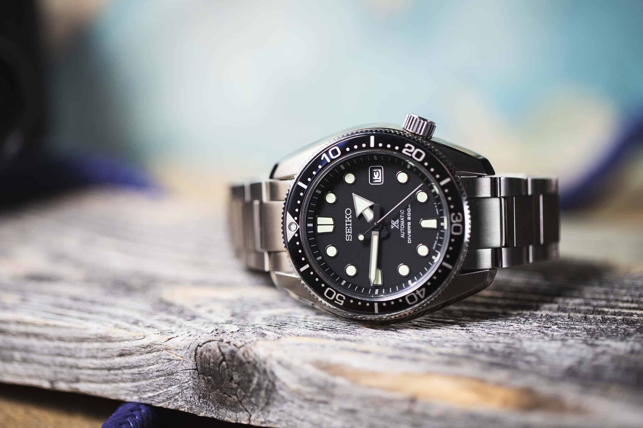
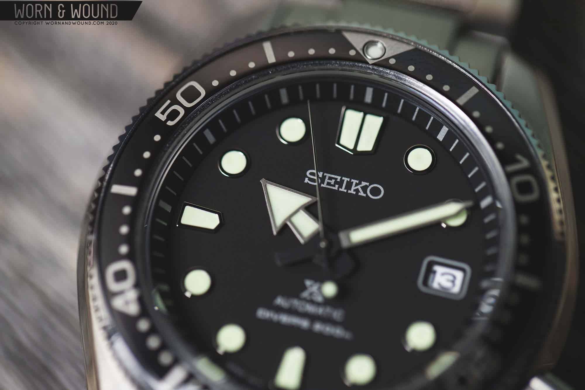
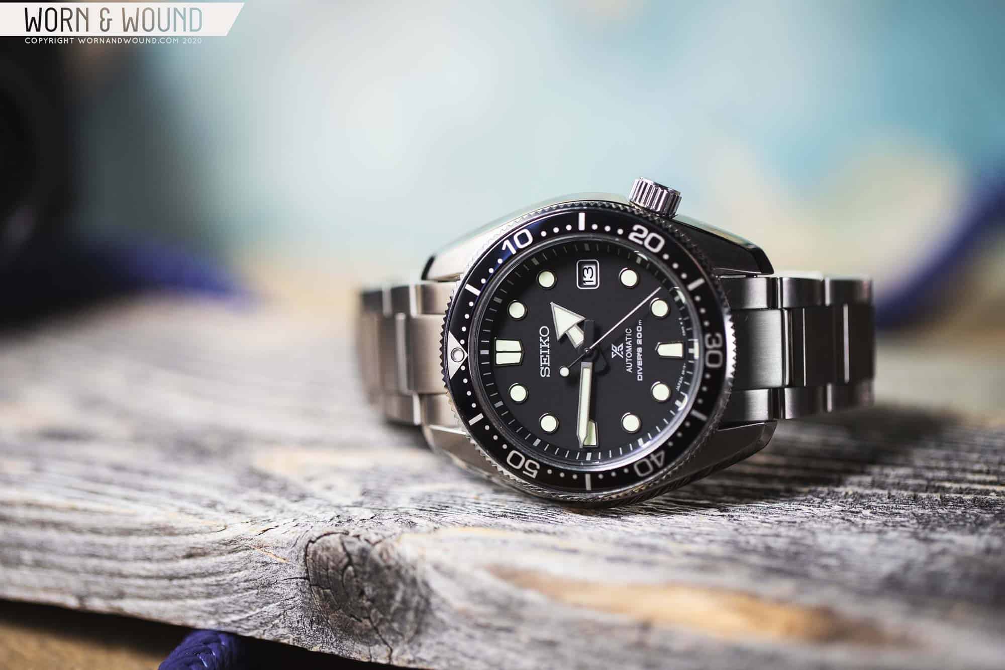
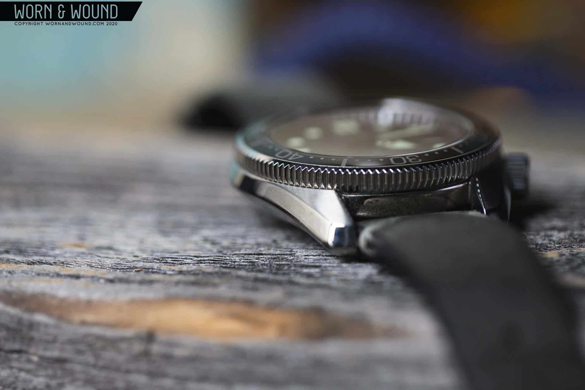
At Baselworld 2018, Seiko announced the SLA025, a high-priced, high-beat, limited edition re-interpretation of their iconic 6159 diver from 1968 for its 50th anniversary. Though not quite as well-known as other mid-century divers, the 6159 is very rare, goes for a mint, and has informed the design of many Seiko dive watches in the 50+ years since its debut. Namely, the MM300 Marinemaster, which sported a very similar case and dial.

Let’s get this out of the way – the SPB077 wears very well

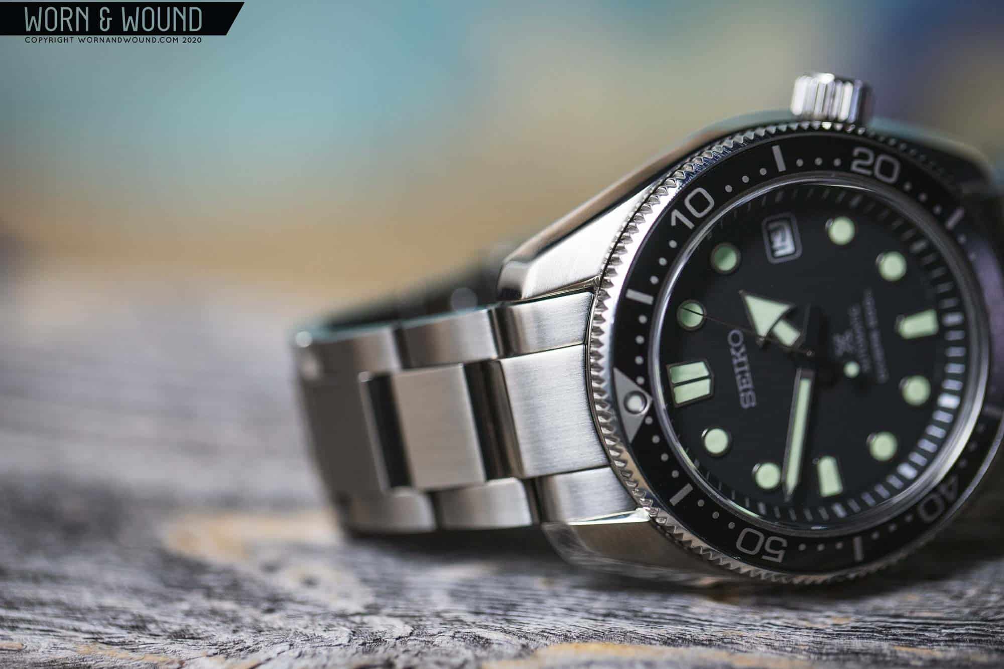
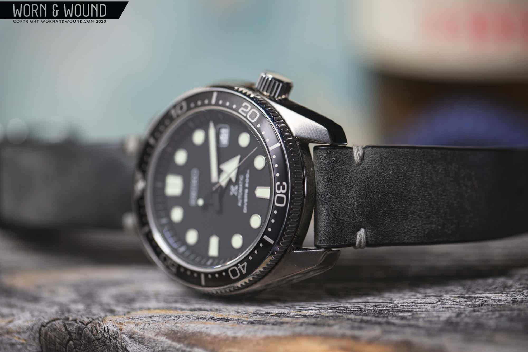
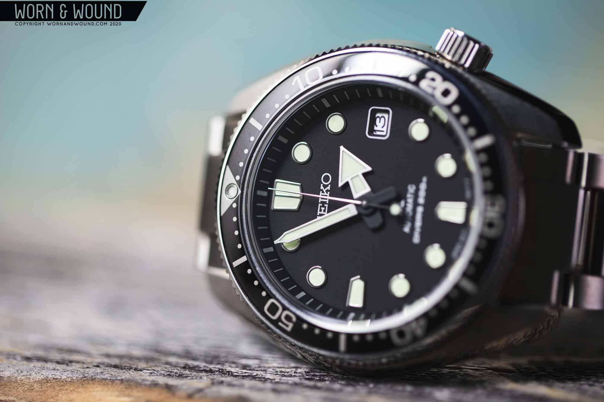
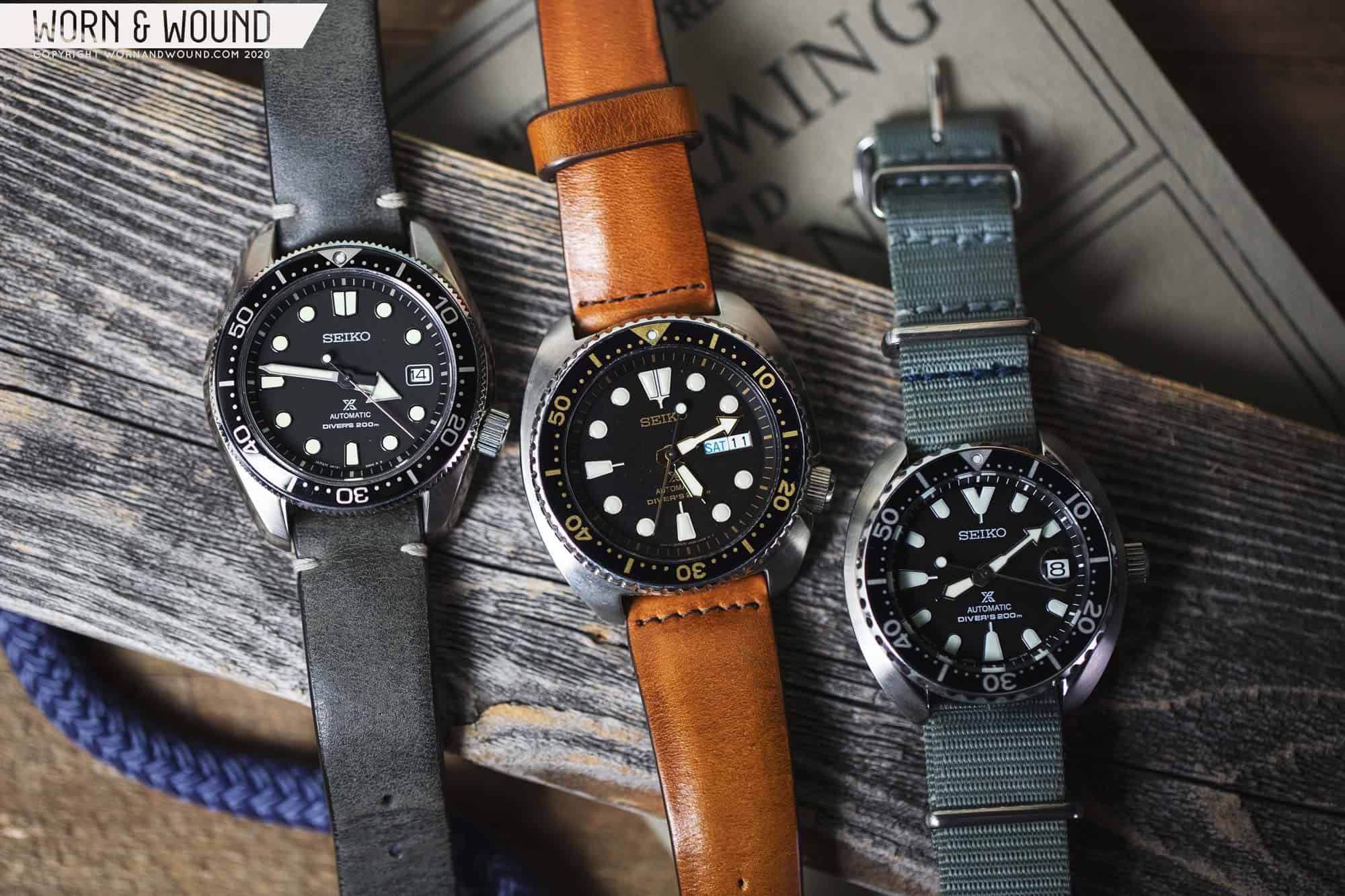
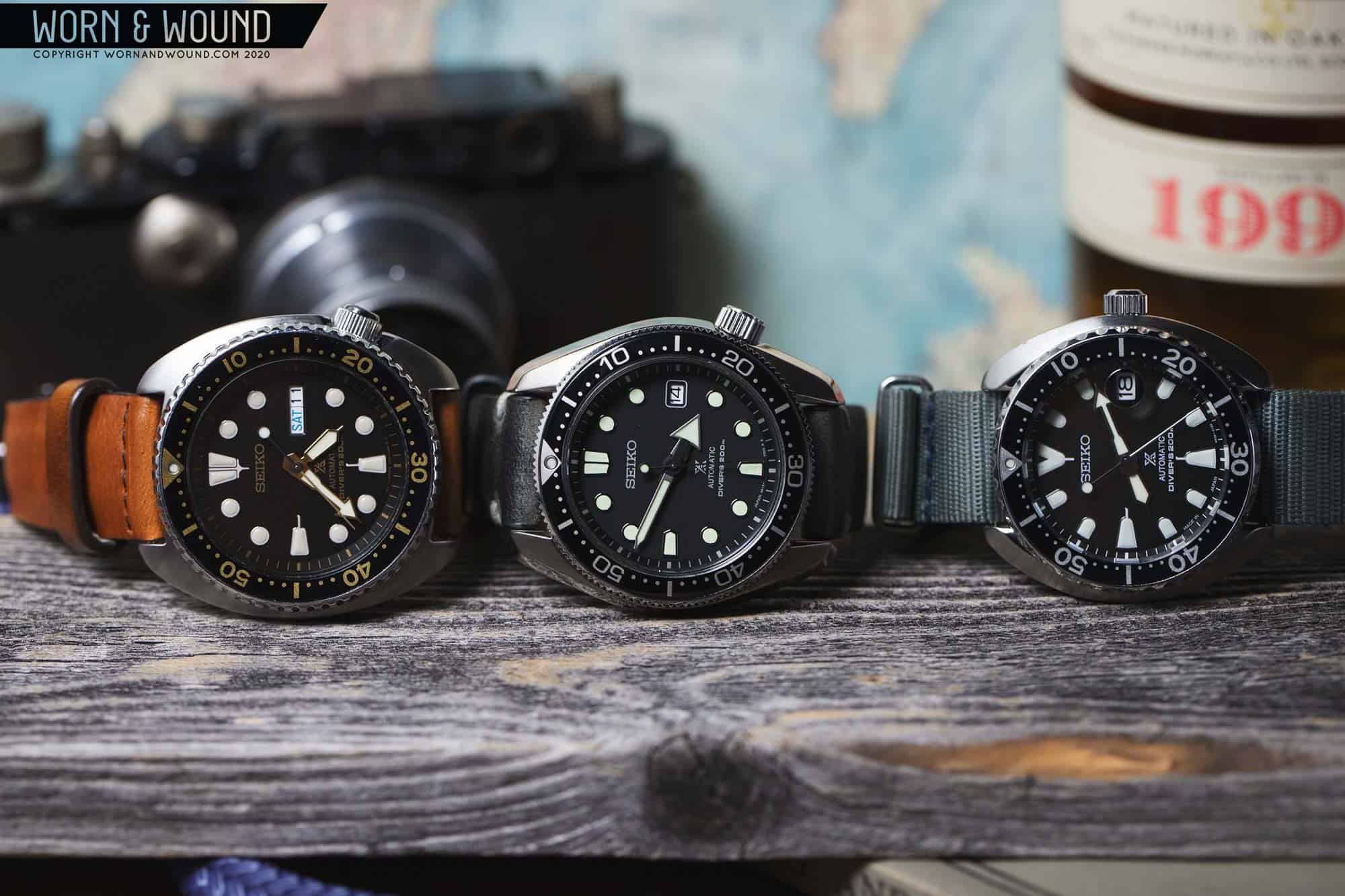
As was Seiko’s MO for a few years, when they’d release a limited edition recreation, they also would release a more affordable, open edition with a modernized aesthetic. These watches are often the true cult favorites, as value has always been at the core of Seiko’s charm. So, in 2018 alongside the SLA025 came the SPB077 and 075 loosely dubbed the MM200s. Featuring very similarly styled cases, these were the first time the 6159-esque aesthetic was made more obtainable.

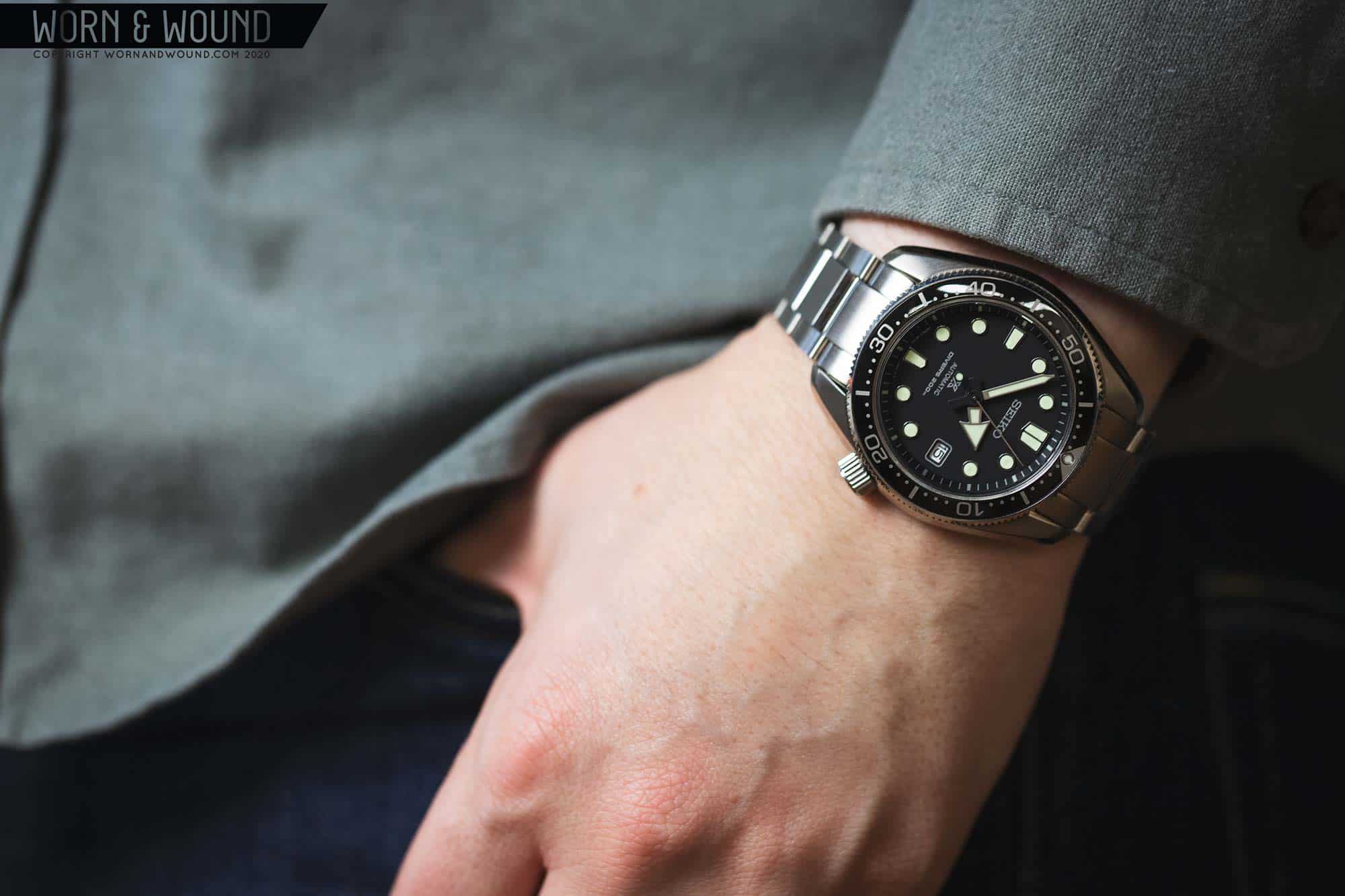
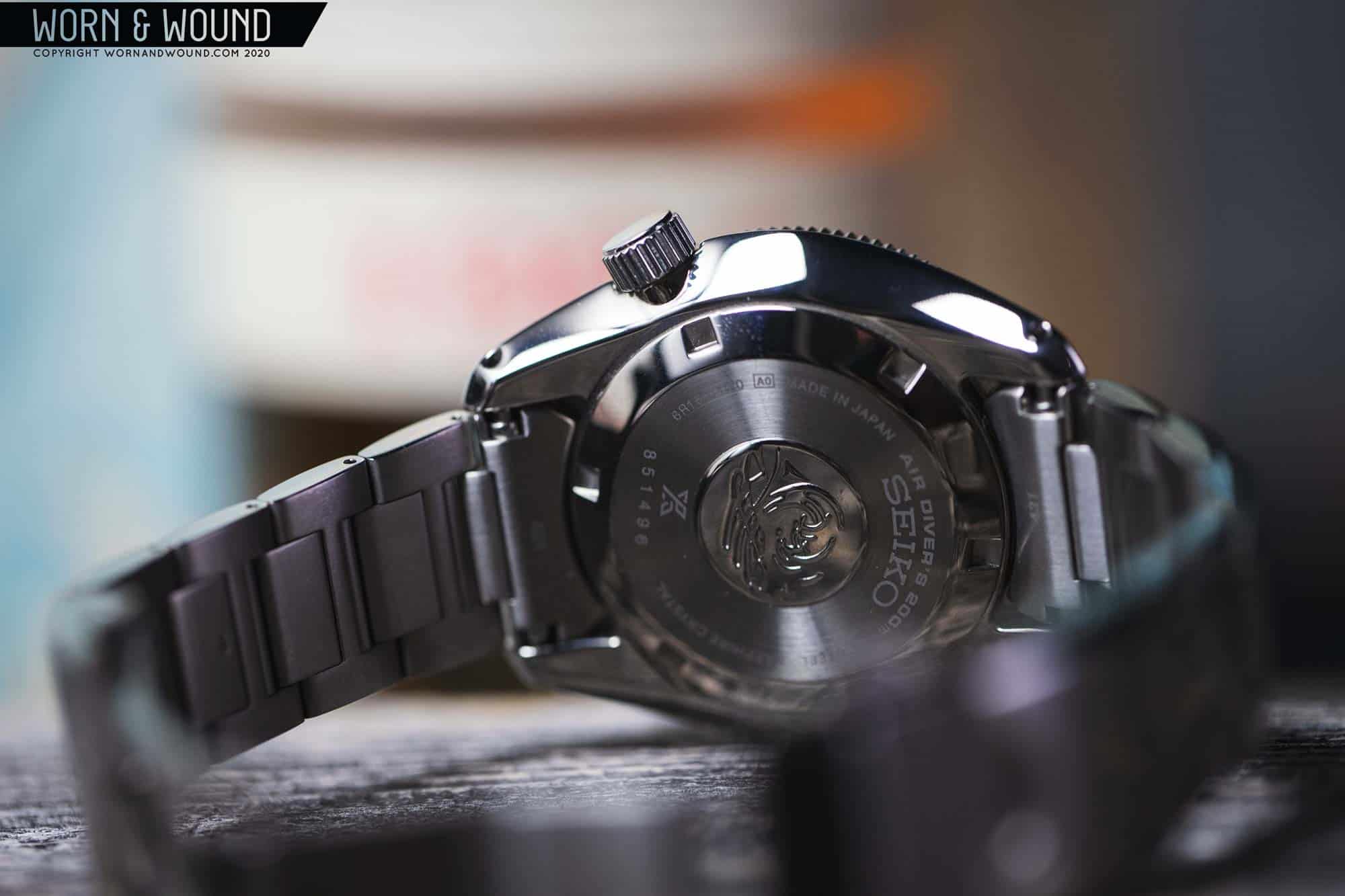
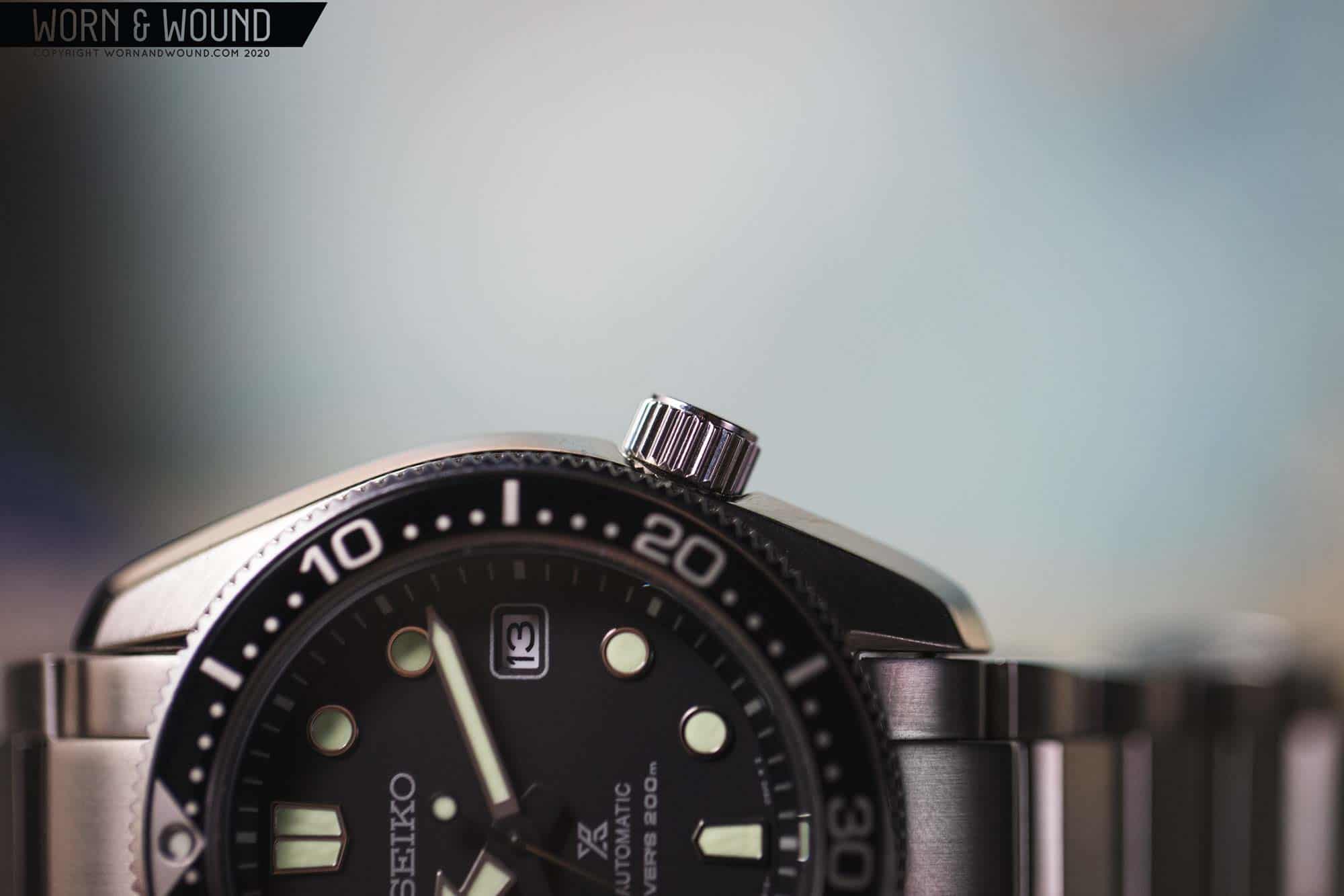
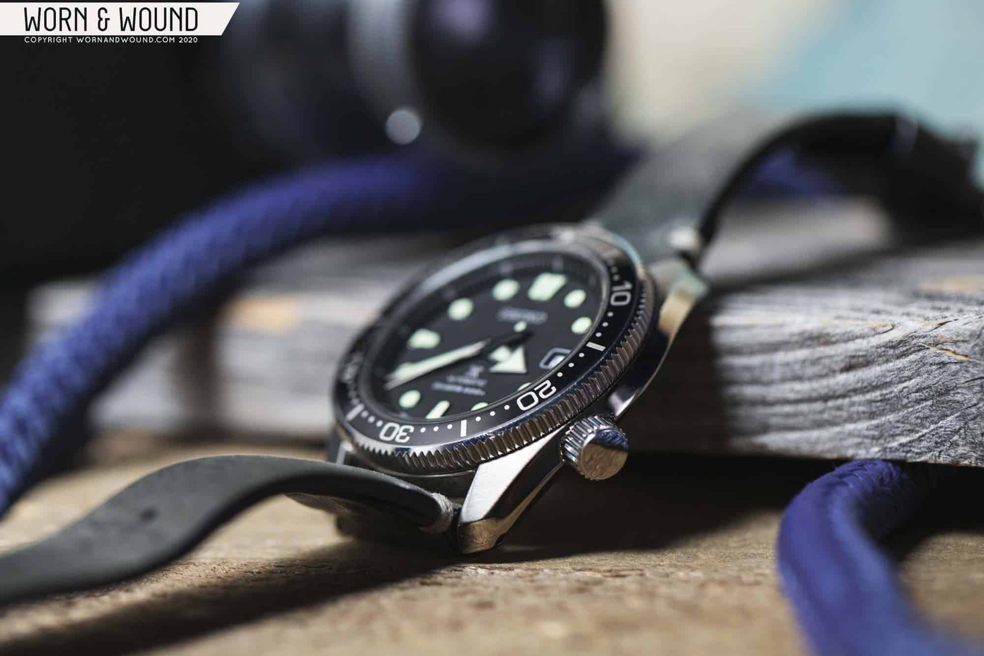
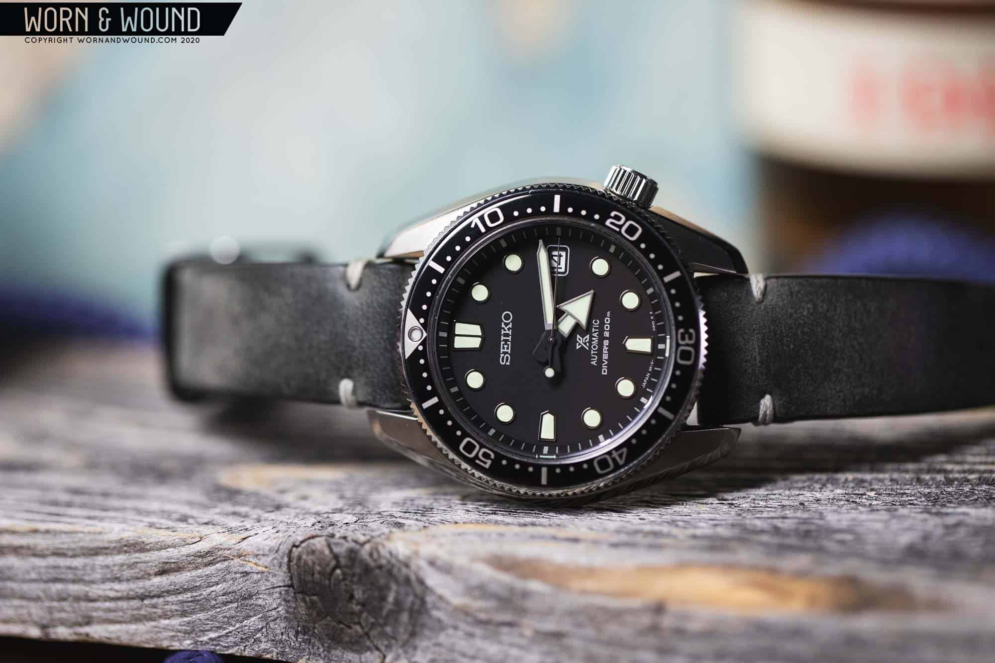
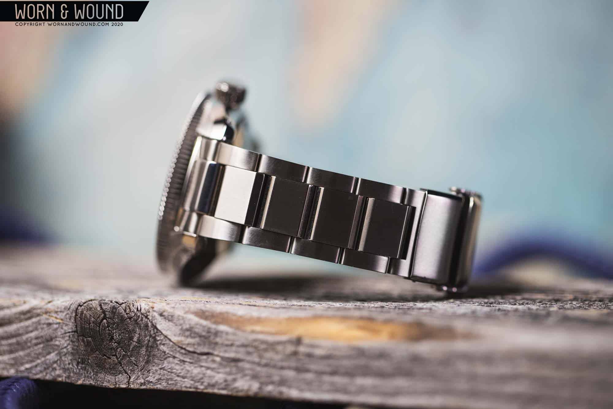
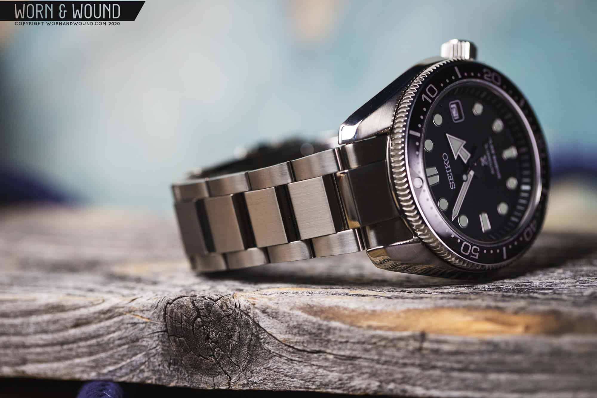
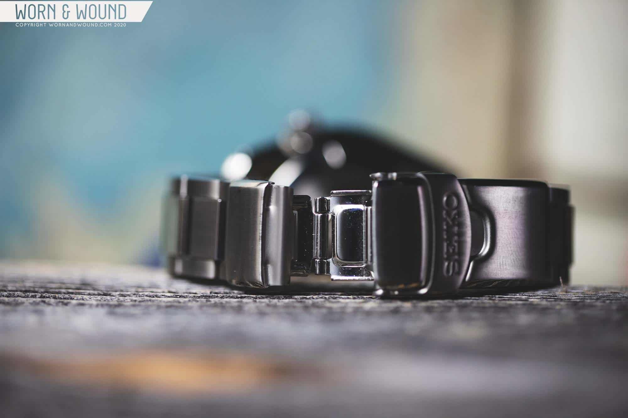
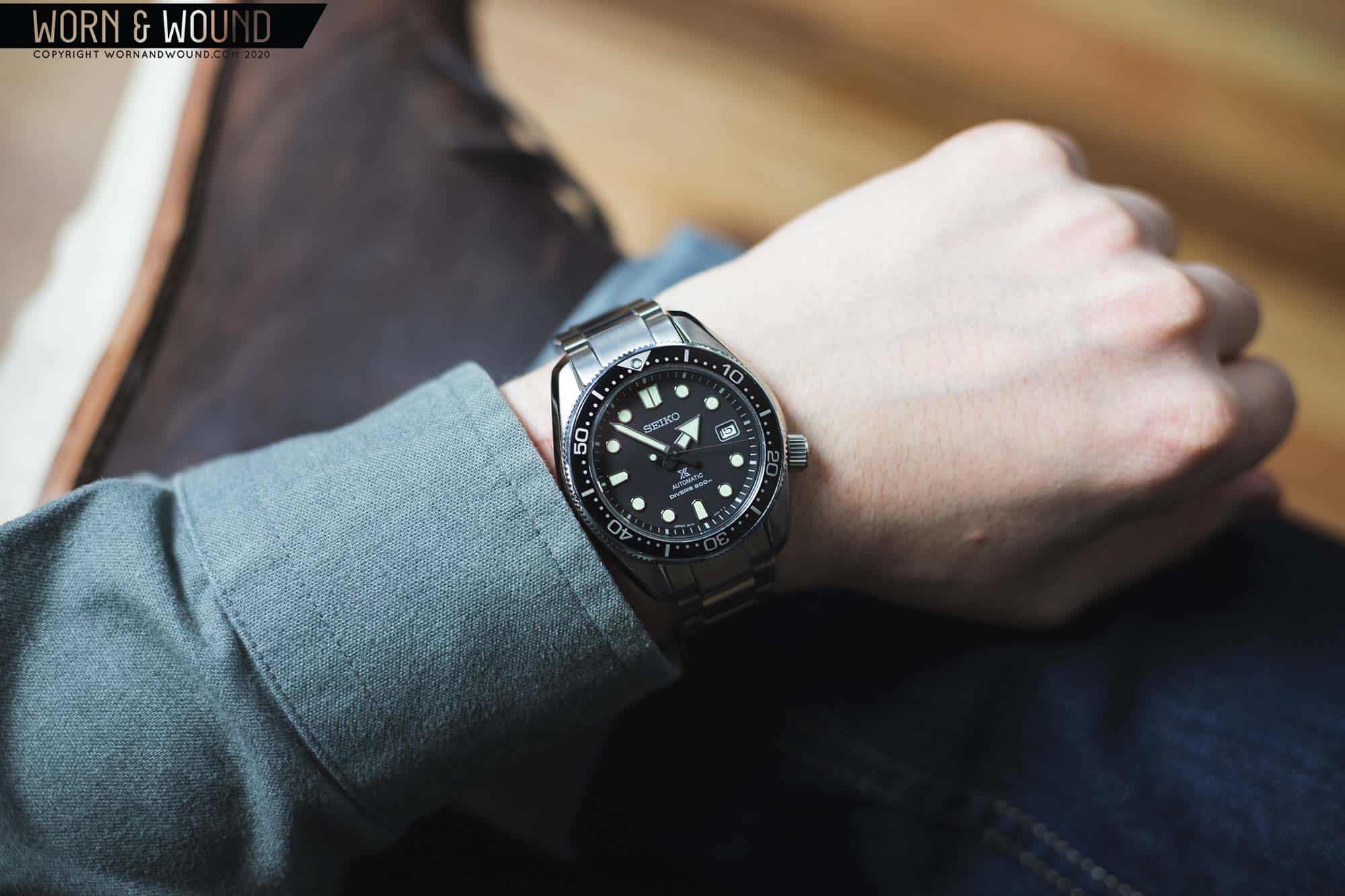
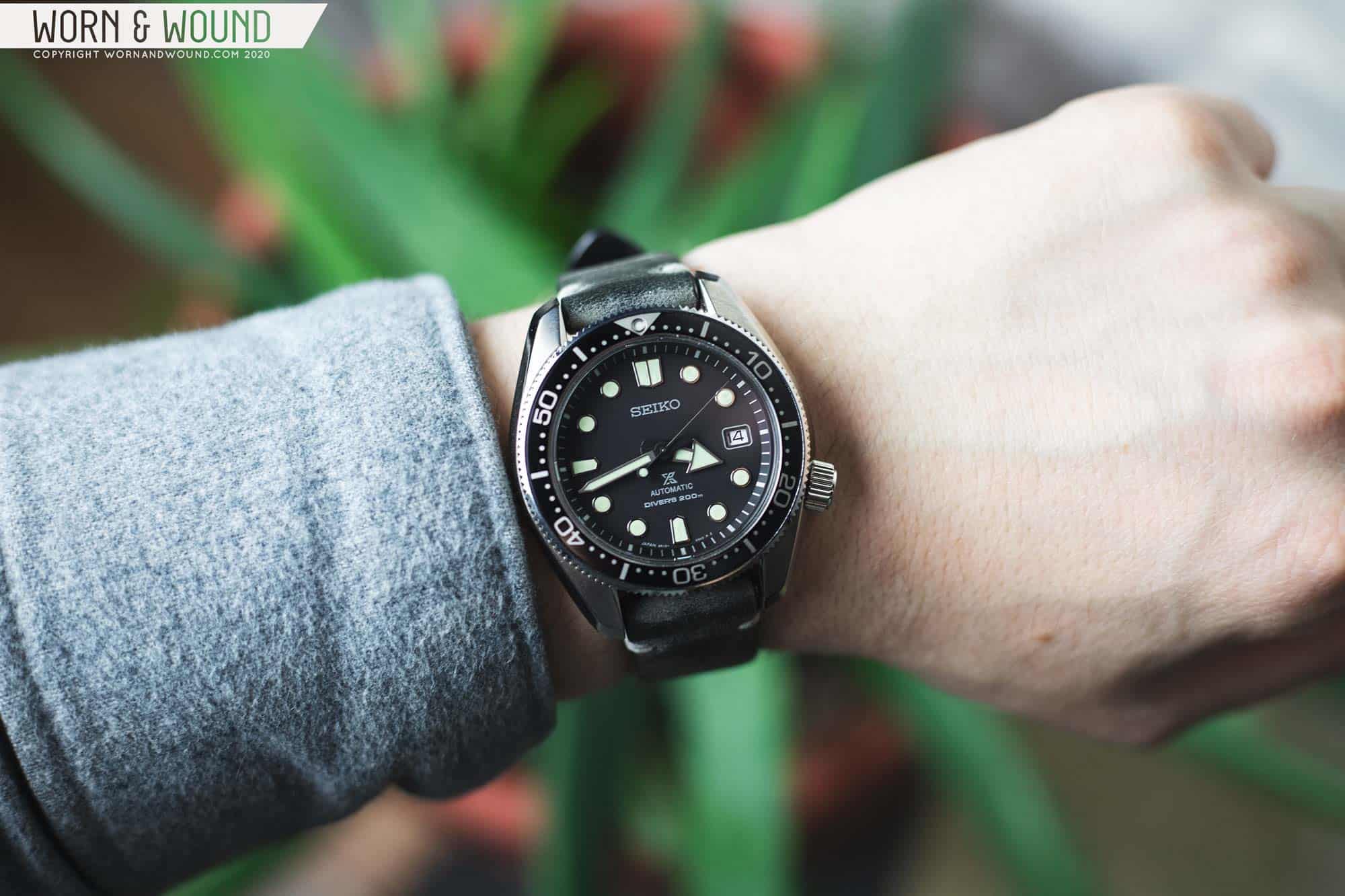
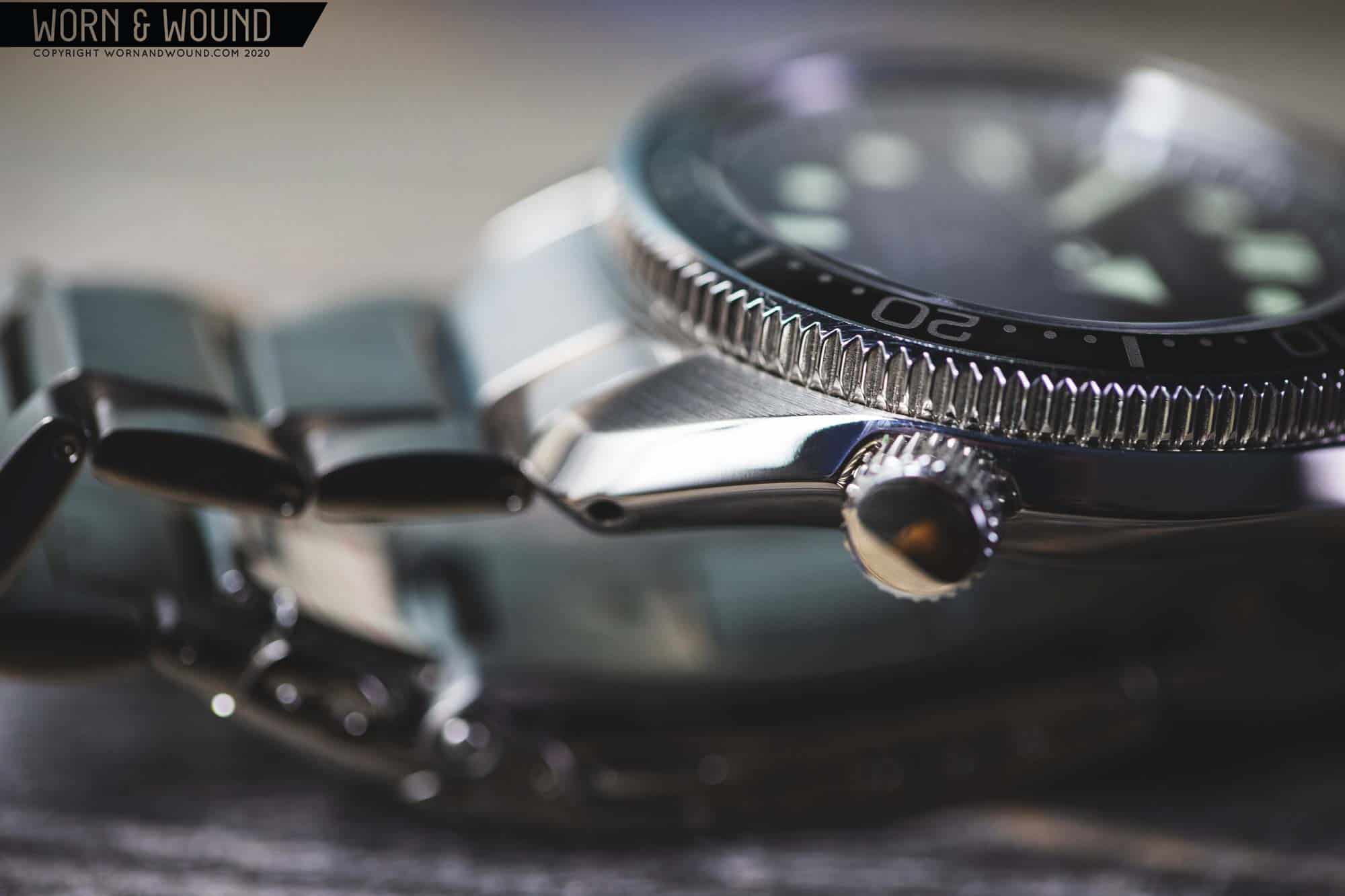
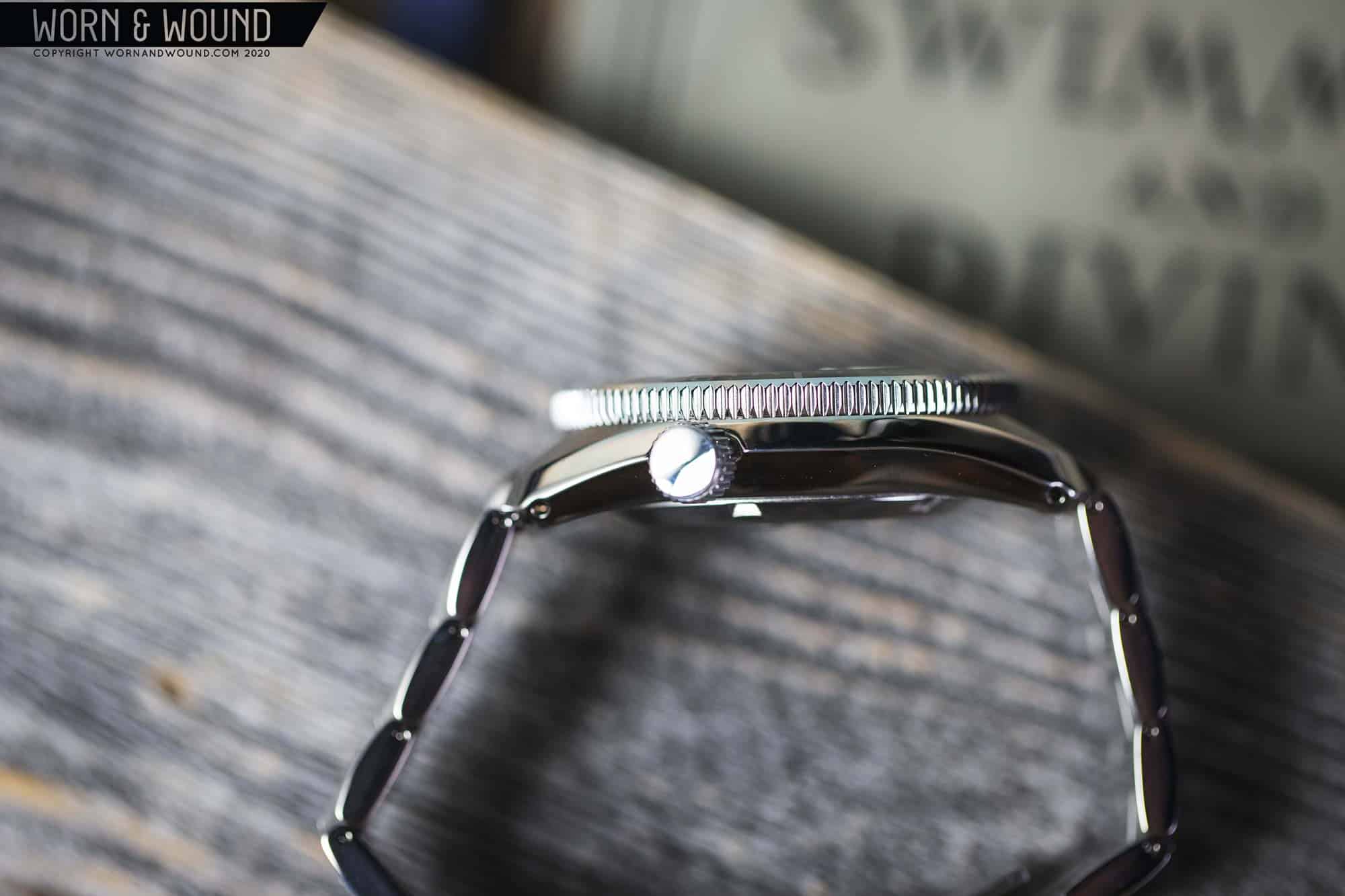
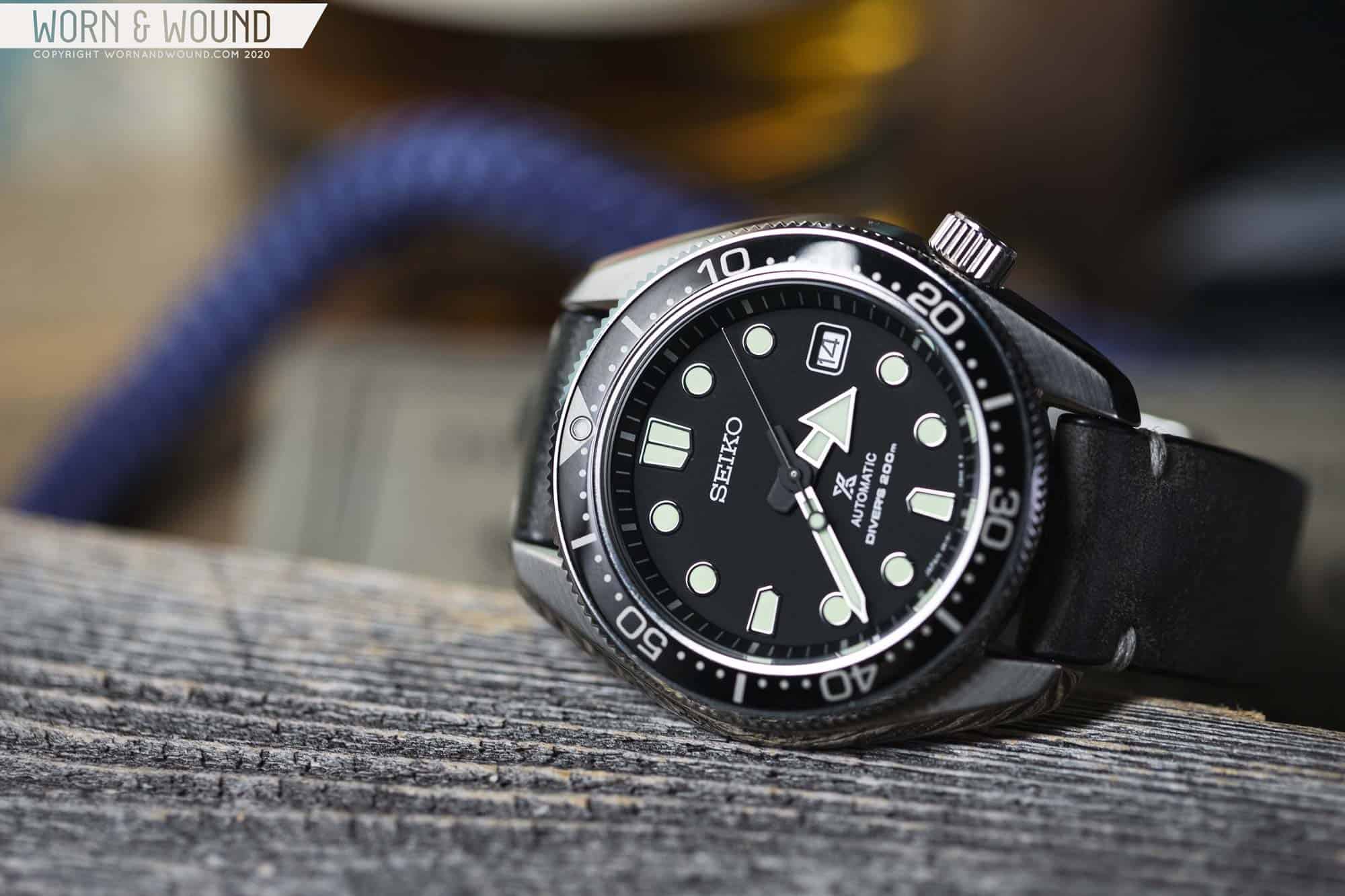
As a fan of the MM300, I was very excited to see the SPB077. I’ve always loved that case design, with its broad lugs and wide bevels, but on the wrist, I felt it was too large for me. That and a price tag in the thousands always kept me from seriously considering picking one up. The SPB077 (077 from here on out) solved both of these issues. The case is still large, but thinner, making it more comfortable and arguably the easiest 44mm watch to wear ever. And the price tag was more tolerable at $1,050 (the 075 is $850, but it doesn’t include a bracelet).

Big and Bold – the SPB077

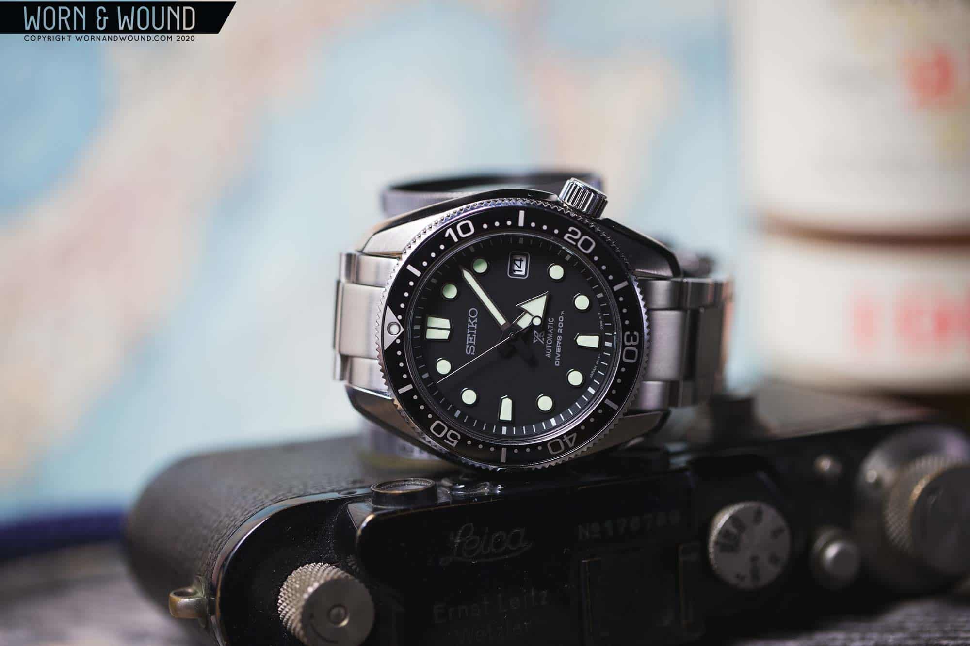
Long story short, I picked one up, and that’s the watch I’ll be reviewing today. I’ll warn you in advance though, while there are things I really love about this watch, there are also aspects I found disappointing. That’s normal, of course, as nothing is perfect, but the question that kept coming to my mind was whether or not the 077 at $1k was worth the premium over its less pricey Prospex siblings. Let’s find out.

Advertisement
$1050

Review: Seiko Prospex SPB077

Case
Stainless Steel w/ Dia-Shield
Movement
6R15
Dial
Matte Black
Lume
Lumi-Brite
Lens
Sapphire
Strap
Steel Bracelet
Water Resistance
200M
Dimensions
44 x 50mm
Thickness
13.1mm
Lug Width
20mm
Crown
Screw-Down
Warranty
Yes
Price
$1050

Case

Let’s start with the star of the show, the case. Generally speaking, if there was a single feature to Seiko watches that keep bringing me back, it’s their case design. This is as true for vintage pieces as it is for the modern ones. Their cases have their own language, one that is more creative and evocative than what typically comes out of Switzerland. Rarely are slab sides found, bevels are broad and aggressive, crowns are offset and undercuts make the whole thing more wearable. The 077 case is a perfect example of this, managing to mix size with style and ergonomics.

Measuring 44mm x 50mm x 13.1mm, the 077 is not a small watch. In fact, I’d go so far as to call it quite large on paper. Yet, due to a mix of proportions, curves, and design features, it wears and looks smaller than those dimensions would indicate. One detail that works towards this end is the 20mm lug width. At 44mm, 20mm is quite narrow, which is an effect of the massive lugs. The result is that the watch appears to taper dramatically, creating a thinner overall line around the wrist.

The lines of this case are like magic

Looking at the 077 from above, it appears to have more classic lines with its long, pronounced lugs than some of its siblings, like the Turtle or Tuna. What sets the design apart is the wide bevel that runs at a consistent height from one end of the lugs, around the mid-case and to the other side. The result is what looks like a barrel-case that has been taken to a grinder, as though they were trying to sharpen the sides to a knifepoint. This also works toward the thinner appearance, as the case sides drop off past the bezel and make the diameter look limited to the bezel grip.

From the side, you can see just how dramatic this edge really is. Rather than slab sides, the whole watch comes to a point, and then quickly recedes. From the top it creates the illusion already mentioned, and from the side it cuts the watch in half, slimming it down visually. It also adds to comfort, as there is an undercut that allows your wrist to flex. This is a design feature you’ll also find on the Turtle, and it similarly creates a more comfortable, wearable, large-sized watch here.

The lugs makes the watch
Solid case-back, 200m diver
Screw-down crown at 4
The broad polished bevels really catch the eye

At not-quite-four, you’ll find a large, offset crown. While Seiko isn’t the only brand with offset crowns on their divers, it is a feature I’ve come to expect and enjoy. Though a sizable cylinder of steel, by being just a few degrees off-center it never digs into the wrist. The slightly quirky look adds to the toolish nature of the watch as well, which I like.

The bezel is tall and quite pronounced, with a toothed edge and slightly rounded geometry, making it comfortable to turn. The mechanism is 120-clicks and uni-directional, and about what you’d expect from Seiko, which is to say, functional, but not overly impressive. Seikos, in my experience, never have the most satisfying click or precise alignment. The insert of the 077 is gloss black with matte gray markings and a lume pip at 0/60. It is appealing to the eye and lends a slightly higher-end and more modern look to the 077.

A leather strap accentuates the lugs

One of the selling points of the 077, and likely part of what accounts for the higher price point, is the use of Dia-Shield. A mysterious detail, Dia-Shield is said to increase the hardness of the steel case by 2-3x. To be clear, it’s not actually hardening the metal, but rather it’s a hard coating on the surface of the metal, and that’s what prevents scratches. There are clear-DLCs out there, so this is likely a similar, but proprietary process. Regardless, it does effectively reduce scratches, but doesn’t prevent them. In the course of semi-regular wear, which is a couple of times a week over a few months, the expected nicks and marks were significantly lessened, but there is one noticeable scratch on the bottom right lug. As I don’t recall any significant hits, this likely just occurred during normal wear.

Dial

The dial of the 077 is, well, a typical Seiko Prospex diver dial — minimal, legible, functional, and effective. But exciting? Not so much.The surface is matte black, on which you’ll find lume-filled applied markers with polished surrounds. The six, nine and twelve-hour markers are squared arrows with large circles in between and a date window at three. The chapter ring, which stands at a steep angle to the dial surface, features a minute/seconds index of silver lines that get thicker at intervals of five. Using the angled chapter is always an effective choice as it visually connects the dial and the bezel.

Legibility above all else

And that’s pretty much it. The Seiko logo is at twelve, white the Prospex “X” is above six, followed by “Automatic” and “Diver’s 200m.” If you look at other Prospex divers, they generally all follow this same dial format with variations to the shapes of the markers and colors. Something that surprised me about the 077 is that while it may be a more expensive watch, the dial execution was actually less impressive than on some of the less expensive Prospex watches I’ve seen. The 077 lume looks rough, like it was filled in with a trowel, showing some textural inconsistencies as well as a concave meniscus effect, creating a darker area towards the center of the marker. It is worth noting, however, that the Lumi-brite lume is still highly effective, glowing seemingly all the time.

On to the hands. An immediate point of controversy, the 077 features a modern handset that doesn’t sit well with everyone. The hour hand is a large, exaggerated arrow shape while the minute is a straight sword with a pointed tip. Both are matte metal with black bases and feature copious lume fill. The seconds hand is then the Seiko standard whisp-thin stick with a lollipop on the tail end.

Matte black with applied markers
Big arrow hour hand
Slightly rough texture to the lume fill
Classic Seiko – easy to read

So, why the controversy? Well, there are a few factors. First and foremost, it’s a dramatic departure from the blocky straight swords of the 6159 and MM300 lines. In fact, they bear no resemblance. Second, people simply seem to not like the hour hand, calling the over-the-top arrow form simplistic or child-like. Lastly, and this is the one I personally find to be an issue, it’s a generic handset that Seiko uses across several watches from the SPB077 to the 62MAS-inspired SPB053 to various Tunas. The issue here is that it’s not designed to correspond to any single watch, thus not fully feeling at home on any. They tried to create a blanket dive-watch solution, and in doing so took away from one of the key features of these watches — their respective vintage histories.

That said, in use, the hands do their job and do them well. You aren’t going to mistake the hour for the minute, and they both really pop off the dial. Whether you like how they look is up to you. I got used to them, which is to say I don’t love them, but I don’t despise them either. However, I do find it a bit odd that so much visual emphasis is put on the hours, where typically on dive watches the minutes get the spotlight. Just think about “Plongeur” hands, which in shape, size and color make minutes the star.

Advertisement

6R15 Caliber

The 077 is powered by Seiko’s 6R15 caliber, which you’ll find in other mid-tier Prospex divers such as the SPB053. The 6R15 is a 23-jewel automatic with hacking, hand-winding, date, 50-hr power reserve and a frequency of 21,600bph. On the surface, it can be a bit difficult to tell the difference between the 6R15 and 4R35, which largely comes down to the mainspring alloy. The 6R15 features SPRON 510, which in turn allows for a tighter daily accuracy of -15/+25 vs the 4R35’s -35/+45 (specs via The Watch Site) seconds a day and 50 vs 40 hours of power reserve.

Bracelet

The 077 comes mounted to a steel bracelet. It’s a three-link design with a 2mm taper from lug to clasp. At first glance it looks Oyster-esque, but it actually has a distinct link shape. The side links are rounded in a traditional way, while the middle link has flat, brushed top surfaces with flat polished bevels. This gives the bracelet an overall more aggressive look that suits the watch well.

The bracelet quality is very nice with solid construction, good finishing, and a Dia-Shield coating like the case. The clasp is less substantial, typical for Seiko, but it does feature micro-adjustment and a diving extension. Generally speaking, it’s a good bracelet that has no real faults. It works with the design, doesn’t feel like an afterthought, and features an end-link that doesn’t take away from the great lugs. My only issue is comfort, because on the bracelet it’s a hefty watch, and I found myself needing to take it off during the day to let my wrist breathe, especially during the summer.

Heavy Duty Steel Bracelet
The faceted middle links make the design
Extension

As such, I prefer to wear it on leather or nylon, which leads me to my only issue here, which is that you can’t get the 077 on anything but the bracelet. I don’t quite get Seiko’s strategy with offering different colors with only one strap option, forcing you to pay a few hundred more for the black dial, or conversely, having to find the bracelet after the fact if it wasn’t the standard option, like on the blue bezel 075 variety. Knowing that I generally find bracelets uncomfortable, I would have opted for a rubber strap instead.

Wearability

Regardless of what strap or bracelet you end up wearing the 077 on, you’ll be amazed by how well the watch wears. When I look at my wrist even as I write this review, I just don’t believe it’s a 44mm watch. I don’t wear 44mm watches, but here I am enjoying one. Not to rehash the case section, but the curves and proportions of this watch are magic. In other words, don’t shy away from the 077 if you, like me, only wear smaller watches — you’ll be pleasantly surprised.

44mm, but wears so well
Pleasantly thin too

Aesthetically, well, it’s a rugged Seiko diver with an aggressive design, so it looks pretty damn great. The continuous black circle created by the dial, chapter ring, and bezel is striking, while the dramatic lug design adds something almost weaponized to the mix. The pale green lume also jumps out at any viewing angle, making the 077 very easy to read at a glance. That said, I find myself looking at the case more than the dial. Sure, I look at the dial to read the time, but in terms of the style of this watch, it’s all from the case. Maybe that’s ok, but for me it feels like a bit of a disconnect.

MM200 (SPB077) vs Turtle (SRP775) vs Mini-Turtle (SRPC35)

So, as you might be able to tell, I’m not really totally won over by the dial. It’s functional, but in a generic diver kind of a way, and when put up against the case, with its dynamic lines and abundance of personality, the dial just lacks in comparison. Between that and the price, it makes me wonder, is the 077 worth it when compared to some of its less expensive brethren?

MM200, Turtle, Mini-Turtle

Enter the SRP775 Turtle and SRPC35 Mini-Turtle, both “lower” end Prospex watches that can regularly be had for under $500 (usually much less). From a cost perspective, both of these watches feature Hardlex rather than sapphire crystals, both have aluminum bezel inserts, both feature the 4R series movements and not the better 6R, and neither has Dia-Shield. So, some seemingly significant differences on paper. But, the question really is, in use, how much do these differences matter? From my personal experience, and I’ve worn all three fairly extensively, they amount to very little.

Sure, the movement accuracy and increased power reserve are nice, but -15/+25 seconds a day is far from chronometer specs, and 50 hours is not even a full day more juice, so I wouldn’t argue they are worth another $500. Dia-shield is nice, but I’ve managed to still scratch it, and I don’t mind the day-to-day scratches I find on the 775 and C35 as the wear adds to their rugged charm. Conceptually speaking, I prefer sapphire to Hardlex, but in practice I’ve yet to damage the latter, so it seems suitable for my needs. Honestly, the only feature that was really noticeably better on the 077 was the bracelet, as the ones that came on the 775 and C35 were cheap in comparison.

You really can’t go wrong with any of them

But here’s the kicker. If you didn’t know that one watch costs a lot more than the others, then sitting on a table next to each other you wouldn’t be able to tell either. The overall execution in terms of finishing and construction, barring bracelets, is about equal. Actually, I might give a couple of points to the Turtle as the lume features a very appealing molded shape that gives it a more consistent and higher-end finish. And, well, I prefer the Turtle handset as well. Then in terms of case design, the 077 is my favorite, but the 775 and C35 are not far behind. All are distinctly Seiko, all wear exceptionally well, and all look really good on the wrist, especially for larger watches. And that’s just a matter of taste; there is no functional advantage to any.

So, what’s the takeaway here? Well, the heart wants what the heart wants, so nothing should dissuade you from any of these watches, but if the price tag of the 077 is keeping you from committing, then I can say with great confidence that you can go for the 775 or C35 (or any of the other Turtle / Mini-Turtle variations), be just as happy, and not be concerned with it being an inferior product.

Conclusion

In the end, the Seiko Prospex SPB077 “MM200” is a bit of an odd bird. On the one hand, it features one of the best diver case designs I’ve tried. It successfully takes the cool geometry of the famed 6159/MarineMaster 300, slims it down so that it’s far more wearable, and cuts the price significantly while at it, making it more accessible than ever before. On the other hand, the case takes so much of the spotlight that the dial ends up feeling like a supporting character in terms of both design and execution. So, while I was very excited to purchase the 077, I’m not sure if it’s a watch I’ll end up keeping.

That said, for those of you who are looking at the 077 and thinking “damn, that’s the watch for me,” fear not. It is still a great watch at the end of the day. It’s feature-rich, robust, wears well and looks great on the wrist. It’s rugged and capable of taking whatever you throw at it, plus the lume is insane. The Dia-Shield will keep the watch looking fresh longer, and the 6R movement is a step up from the 4R. So, while I found in practice those features didn’t add to day-to-day wear, over a longer duration and more consistent use, they could end up paying for themselves.

On a Stone Model 2 Premium Strap, my preferred way to wear the 077

And perhaps the issues I had could be resolved simply by getting a different version. Since my purchase of the 077, the SPB105 was released, which features a metallic green dial with gold hands and highlights. Nothing boring going on there. And should you be adventurous and okay with tearing up your warranty, I’ve been told that the hands from the SBDX017, an older generation MM300, fit the SPBs as well for a little modding action. In other words, there are options. Seiko Prospex

Advertisement
Images from this post:
Related Reviews
Zach is the Co-Founder and Executive Editor of Worn & Wound. Before diving headfirst into the world of watches, he spent his days as a product and graphic designer. Zach views watches as the perfect synergy of 2D and 3D design: the place where form, function, fashion and mechanical wonderment come together.
wornandwound zsw
Categories: