Review: Seiko SPB153 “Captain Willard” Reissue

Seiko’s 6105-8110 “Captain Willard” is one of the most recognizable and sought after vintage Seiko divers. The watch was worn on screen by the fictional character Captain Willard, portrayed by Martin Sheen in the cult-classic “Apocalypse Now”. The funky case shape is immediately recognizable. It’s broad, flat, and has a crown guard like no other. While the dial and bezel are busy, they remain legible and functional. It’s a perfect watch for a military character to wear, as it’s built like a tank and values both function and form. And let’s not forget that awesome “traffic light” seconds hand with its polygonal plot of lume and bright red dot sweeping around the dial. The watch is a classic for good reason. The mix of screen time, unique design, and solid feature set made the 6105-8110 a prime candidate for a modern refresh at a more accessible price point than the likes of the SLA033.  

As soon as the new Seiko SPB153 aka “Captain Willard” hit the market, I was dying to get my hands on one. Seeing the funky case shape and hearing some positive buzz about the watch only made this yearning worse. Fortunately, I’m in the watch journalism business and we had one inbound. After a very professional process of “calling dibs”, the watch was in my hands for this review. Immediately, the case shape jumped out at me. The oblong shape and humped crown guard reminded me immediately of the humble ocean sunfish (I vote we nickname this one the “sunfish”). The fish gets a bad rap for being an odd shape, but in spite of that, they’re incredibly capable. They’re able to travel up to 16 miles per day, leap out of the water, and like the SPB153, dive to depths up to 200m. Resemblance to this funky fish aside, this modern interpretation of the Willard reminds me not to judge a book by its cover. Let’s dig into the nitty gritty of the watch.

Advertisement
$1100

Review: Seiko SPB153 “Captain Willard” Reissue

Case
Stainless Steel
Movement
Seiko 6R35
Dial
Green Sunburst
Lume
Seiko Lumibrite
Lens
Sapphire, inner AR coating
Strap
Black silicone rubber
Water Resistance
200m
Dimensions
42.7 x 46.6mm
Thickness
13.2mm
Lug Width
20mm
Crown
Screw In
Warranty
Yes
Price
$1100

Case

Measuring in at 42.7mm wide, the stainless steel case on the SPD153 “Captain Willard” is narrower than it looks. It measures 46.6mm from lug to lug, while clocking in at a reasonable 13.2mm thick. The case is treated to Seiko’s DiaShield hardening, with brushing on the top surface of the watch and a polished surface on the wedge-like case sides. What makes the case of the Willard so unique is the asymmetrical case with its large, pronounced hump taking up nearly a quarter of the circumference of the watch. This hump acts as a crown guard, protecting the crown from bumps and accidental manipulation. This guard is the most recognizable feature on the vintage 6105-8110 that this watch is modeled after. At first, I thought it would get in the way, but some clever case design and contouring keeps it in check. While the case looks sharp and broad from above, check it out from the side and you’re in for a surprise.

The polished finishing adds a smooth touch to the bottom and sides of the case, helping it mesh comfortably with your wrist. It nestles into the center of the wrist just right, and stays out of the way while moving, all while providing a unique look. The shape of the lugs is interesting too. Where the strap mounts to the case is more like a cutout in the circular design than it is a formal lug. It makes the strap look almost integrated. Speaking of the strap, you can swap these out quickly and easily thanks to the drilled lugs. I love the utilitarian look and functionality of a drilled lug, plus, having the ability to turn a paper clip or thumb tack into a strap changing tool is kind of nice. 

Mounted to the top of the case, you’ll find a unidirectional rotating dive bezel. The bezel has a smooth and subtle clicky action. It’s not snappy or loud, but more muted and dampened. The action of the bezel is adequate and firm, but my personal preference leans towards a snappier unit.  A polished coin edge runs around the outer circumference, which makes it easy to grip. It extends ever so slightly past the cutout for the strap, making it especially easy to grasp at 12 and 6. Inside the bezel, you’ll find a green aluminum insert that’s true to the one on the original version of the watch. Large Arabic numerals are used on the 10 minute marks, while elongated hash marks hit on the fives. Small dots make up the space in between the larger bezel features. I have a feeling that their presence is more for design than they for precision, as there are only three dots between each of the larger features. At 12 o’clock, there’s a large triangle that has a lume pip inside, making it easy to tell where your zero point is when using the timing bezel in both light and dark conditions. Just inside the bezel sits a sapphire crystal which features a welcome bevel cut into the outer edge. The original watch had this same cut, and it’s nice to see it carry over to the new model. I love the subtle distortion around the outer edge that the angled sapphire provides.

Dial & Hands

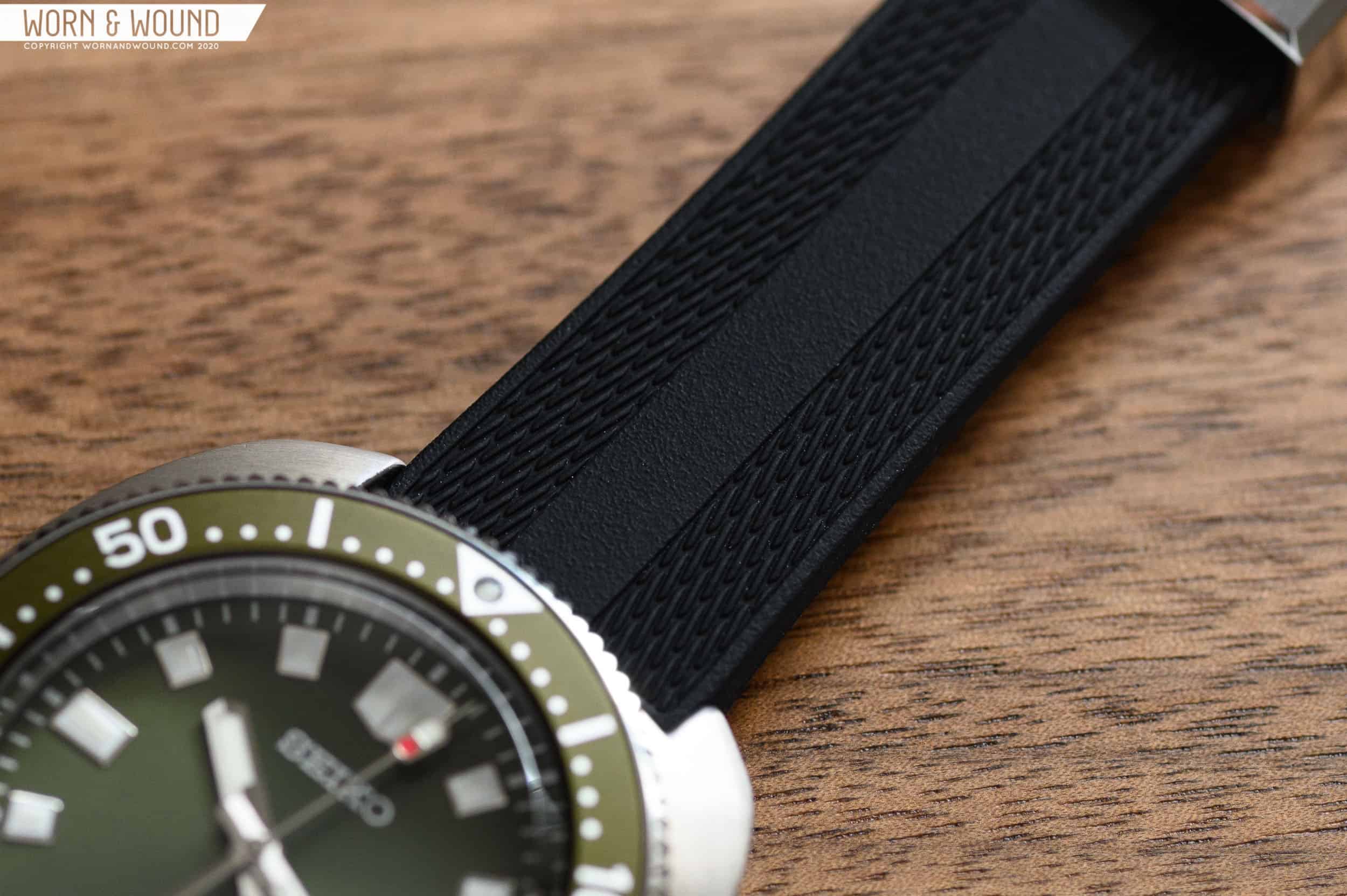
The execution of the dial and hands is exceptional on the Willard. While not identical, they represent a faithful enough recreation of the original dial on the 6105-8110, down to the very cool stop light seconds hand. Let’s start first with the dial itself. While I’m sure the black dialed version of the watch is even more faithful to the original, the sunburst green version that Seiko came up with is simply stunning. A sunburst pattern in the base surface of the dial plays with the light, depending on the angle at which you’re viewing the watch. It varies from a shiny bright green, to a deeper shade of army. At some angles, the sunburst effect is less pronounced. No matter how you look at it, the base dial is a treat to look at. There’s no formal rehaut on the dial, which is made up for with a printed chapter ring. Moving inwards, you’ll find a set of applied polished indices from one through 12. At 12, there’s a double wide index that terminates at a point on the bottom. It’s a bold way to denote 12 o’clock and does a great job of standing out from the pack.

In lieu of a three o’clock marker, there’s a date window that’s rendered in black text on a white background. It balances out the slightly elongated 9 o’clock index nicely. The date window features a sharp beveled edge, giving it an intentional look. I do take issue with the text on the dial. The Seiko logo at 12 works, but the Prospex “X” logo does feel a bit out of place here given the inspiration. Seiko is no stranger to funky little logos, whether it be the “SQ” for Seiko Quartz, regal “GS” on Grand Seikos, or the suggestively-shaped Oscillating Quartz logo. On the Willard, we’re treated to the newest Prospex “X” logo, and it may be a bit too modern looking for such a vintage-inspired watch. Under the “X”, there’s the words “AUTOMATIC” and “DIVERS 200M” just so you always know that yes, this is an automatic watch, and yes, you can also dive with it. Another niggle I have is the dial on the green example is the ever-so-slightly mismatched color between the bezel insert and dial. The bezel reads a bit more yellow, while the dial is more neutral. It’s not immediately visible in all lighting scenarios, but once you see it, it’s hard to un-see. Was this a purposeful design choice? Hard to say. The shades of green are just different enough to notice, but not different enough to determine if this was intentional. The more I wore the watch, the less this quirk bothered me. 

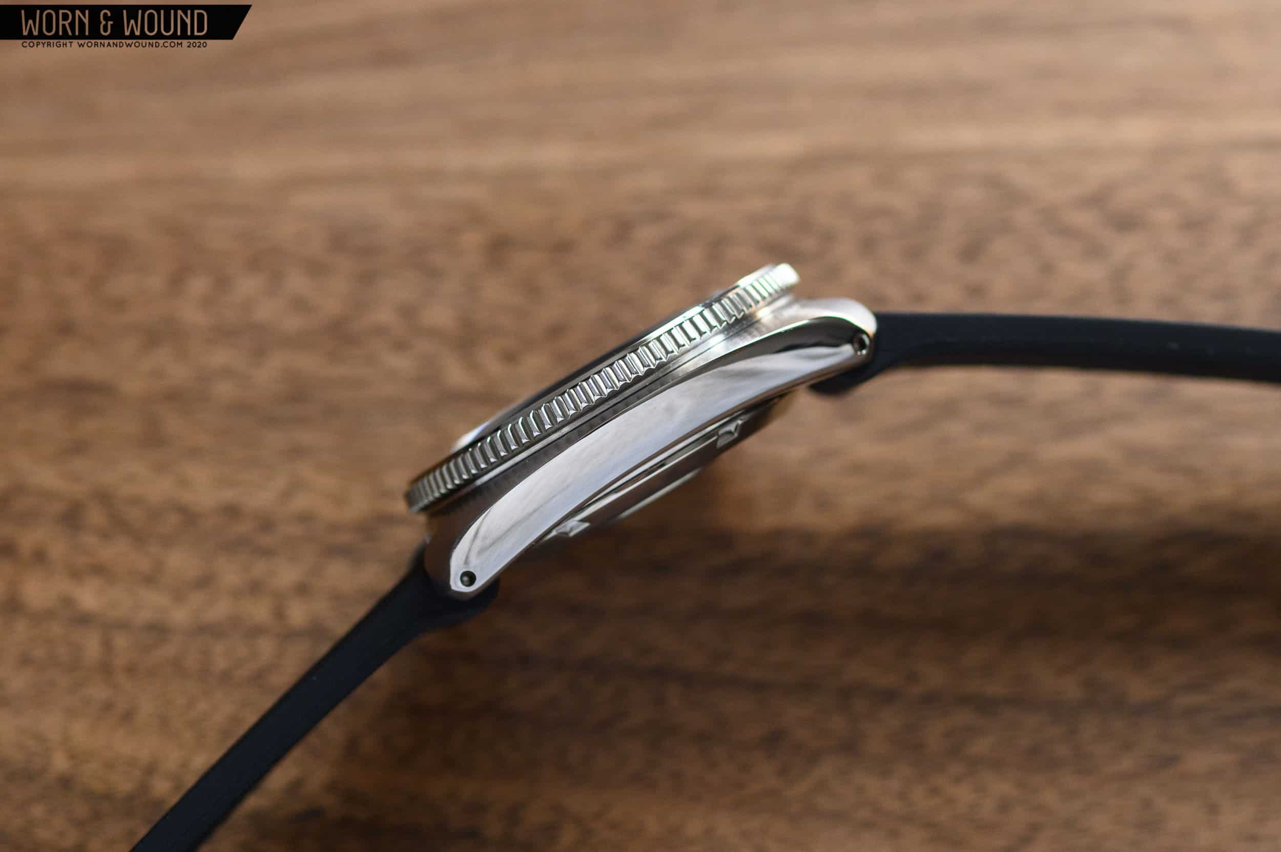
What I believe is the shining star of the watch is the gorgeous hand set crafted by Seiko. The hour and minute hands are rectangular with a rounded side closest to the mounting post. Each terminates in a slight point at the end. The hour hand is a bit more squat and wide, while the minutes hand reaches out towards the edge of the dial. A plot of lume that mirrors the shape of the hand fills each. There’s a lot to love in the finishing employed by Seiko here. Each is split down the middle — one half gets a brushed treatment, while the other is highly polished. Not only does this finishing technique add some classy visual flair, but it also helps with legibility. The added contrast goes a long way in separating the silver hands from the green dial. True to the original seconds hand, the one used on the SPB153 features a very unique lume/paint plot at the end. This traffic light style plot features a polygonal recess of lume that’s accompanied by a circular red dot of paint. For such a small pop of red, it really goes a long way. I love how it looks with the green of the dial and bezel. Execution of the dial and hands are well above Seiko’s entry level divers. There’s some higher end techniques being used here, and seeing the watch in the metal cements the fact that this isn’t your standard $300ish Seiko we’re talking about.

Movement

Inside the SPB153, you’ll find Seiko’s 6R35 automatic winding movement. Seiko’s movement features an impressive 70-hour power reserve, which is the main selling point of the movement. It’s great to be able to let a watch sit for a few days between wears and not have to go back and wind it and re-set the time. The movement is hand winding, has a hacking seconds hand for precise setting, and beats at 21,600bph for a smooth seconds sweep. There’s 4,800A/m of magnetic resistance thrown in as well. A date feature resides at the 3 o’clock position, and is able to be quick set for convenience. Seiko’s spec calls it out as -15/+25 seconds per day, which places it squarely in “not great, not terrible” territory. To me, the improved power reserve is the main selling point, however. On the forums there are plenty of discussions revolving around the 6R35, and it’s quite divisive. Some think it’s a great movement, while others find the accuracy unforgivable. To me, you’re getting a solid and reliable in-house movement, with hacking seconds, a date, hand winding capability, and a class-leading power reserve, and that’s a win.

Strap & Wearability

Keeping this beautiful oblong hunk of metal to your wrist is a vintage style silicone rubber strap. Seiko has really stepped up their rubber strap game from the days of the stiff, wrist-rubbing rubber dive bands from 10 years ago. The black silicone rubber is textured on the top and bottom. Up top, there’s a textured stripe running down the middle, flanked on either side by a rope-like pattern with a raised border on the edge. Below the strap, you’ll find a pebbled texture that looks almost like dry, cracked ground. This texture helps the strap from sticking to your wrist and chafing throughout the day. It will also help to a small degree with draining off water and sweat should you and your Willard really get “in the shit” up river, perhaps tracking down a rogue (and insane) military colonel who wears a bad ass bezel-less GMT. The strap keeper is very high quality as well. It’s adorned with the Seiko logo on the flat brushed surface, surrounded by a polished bevel on the edges. The signed buckle is also a step above what you’d expect. I understand that the strap should be long enough to wear over a wetsuit, but that renders it a bit long for everyday wear. On my 6.75” wrist, there’s quite a bit of extra strap hanging out. 

On my wrist, the SPB153 wears beautifully. Going in to the review, I wasn’t really feeling optimistic like it would fit me well, or be very comfortable for that matter. Boy, was I wrong. First, let’s talk about fit. An oblong dive watch with a huge, weird looking hump as a crown guard doesn’t really sound like something that would be anywhere near sleek on my 6.75” wrist. The case measures in at 42.7mm, which is just a hair larger than the ubiquitous 42mm measurement of most dive watches on the market. Initially, I was a little worried that it would be bigger and more imposing, like the 44.3mm SRP775 “Turtle” that used to be part of my collection. Turns out, it’s not. The contours of the case, relative slimness (13.2mm), and moderate 42.7mm x 46.6 dimensions result in a surprisingly comfortable watch. It looks a bit large in photos, but doesn’t feel that way at all. On the side of the case, the watch angles up and away from your wrist. There’s some case magic going on with the crown guard that keeps it even slimmer and allows very easy access to the crown itself.  I found myself forgetting the watch was even on my wrist, which is a testament to the comfort. Honestly, the strap got in the way more often than the watch itself. I found myself wearing it most on a nylon single pass in dark brown. It’s a watch I could easily find myself wearing daily just based on comfort and style alone.

Advertisement

Conclusions

All of my preconceptions about the SPB153 being a large and unwieldy watch were shattered by spending some time with it. The proportions of the case are near perfect for what it is — a 200m dive watch. Sure there are smaller and slimmer out there, but nothing with the unique case shape and crown guard of the SPB153. The contoured sides of the case are surprisingly organic in shape, and result in a watch that’s supremely comfortable on my 6.75” wrist. On a lightweight nylon strap, I found myself forgetting it was there. Something that rarely happens when you’ve got a dive watch on. Case finishing is a step above your standard entry level Seikos and is on par with the asking price of $1100. Looking at the watch, you’ll be drawn in by the green sunburst dial, and stick around to admire the polished applied indices with their generous hit of lume and the fantastic hand set. A capable movement inside keeps the watch ticking for an impressive 70 hours when fully wound, with adequate accuracy. Overall, the SPB153 is a compelling option for a premium dive watch from Seiko. The $1100 MSRP is on par with what the watch has to offer, and upon handling it, I was won over immediately. Fans of the original 6105-8110 will love this modern recreation, especially if they intend to wear the watch diving. Seiko is really hitting it out of the park with their 2020 reissues, making them even more true to form than past iterations, with some solid upgrades that result in some incredibly tempting tool watches.

Images from this post:
Related Reviews
Ed is a Long Island-based writer and photographer with an affinity for watches, fountain pens, EDC gear, and a great cup of coffee. He’s always looking for the best gear for the job—whether it be new watch, pen, flashlight, knife, or wallet. Ed enjoys writing because it’s an awesome (and fulfilling) way to interact with those who share the same interests.
Categories: