


 Featured Videos


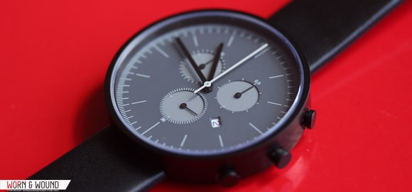
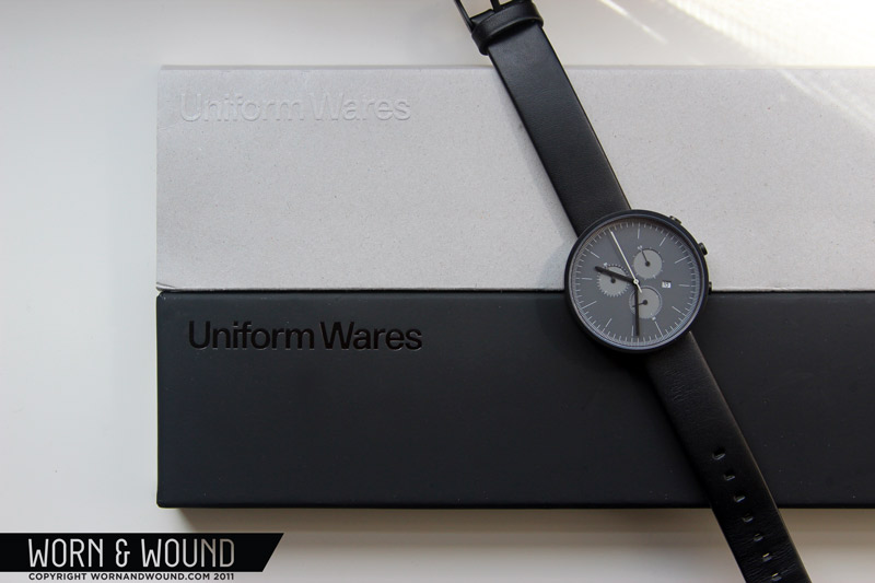
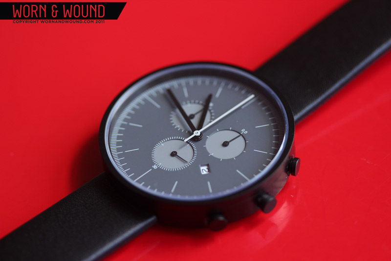
The Uniform Wares 300 Chronograph is where fashion meets function in watch form. The design of this watch mixes the precise eye of a trained industrial designer with contemporary fashion sensibilities. The lines of the watch are sharp and mechanical with an emphasis on geometry and proportions. The pallet of the watch is monochromatic and understated but far from dull. It is at once stylized but restrained, striking but understated and a welcome change in pace from more traditionally styled watches.
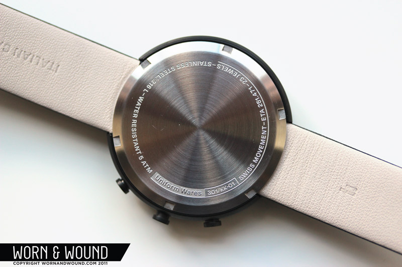
 Case: Matte Black PVD 316L Stainless steel
Movement: ETA 251.471 23 Jewel Quartz Chronograph
Dial: Brass – Matte Greys / Matte Grey Indexes
Lens: Hardened Mineral Crystal
Case Back: Screwdown
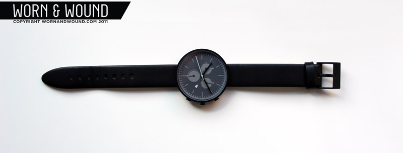
Strap: Black Italian Calf Leather
Water Res.: 50 M
Dimensions: 42mm
Thickness: 10.80 mm
Lug Width: 18mm
Warranty: 24 months
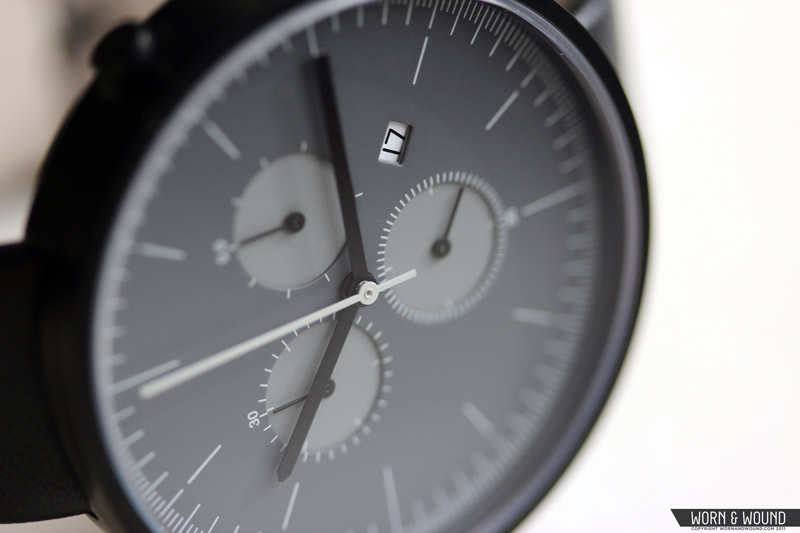
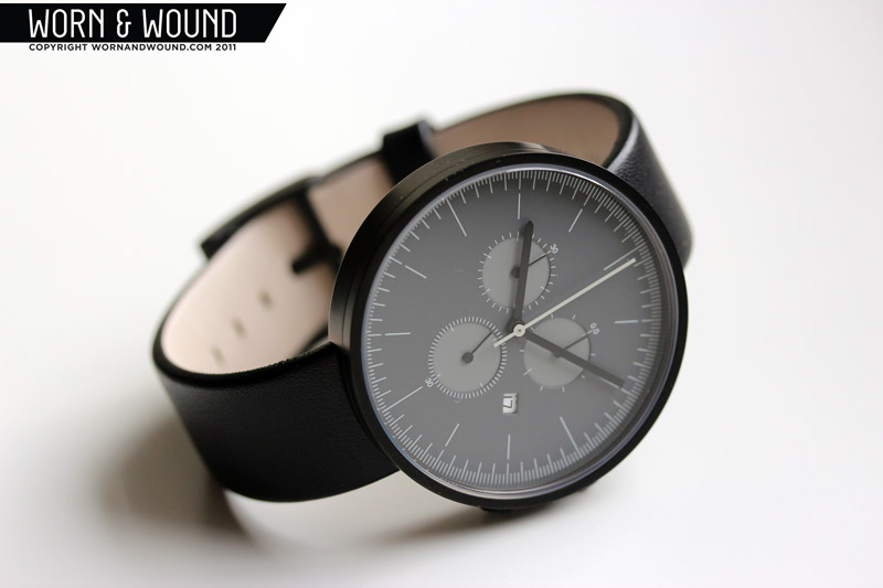
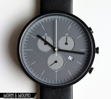
The aesthetic of this watch is riffing on the Bauhaus style, which can be most notably seen in the watches of Max Bill and Dieter Rams. Function was unquestionably a priority in the design of the watch, as every mark is clear and the indexes mark to fractions of a second, but not at the cost of cleanliness or style. The subtle balance of line-weight, color-contrast and spacing, that is to say the graphic design of the dial, becomes the primary focus of the watch and therein the star of the aesthetic. There is literally no ornamentation that is unnecessary (see note later), not even a logo, to take away from the various indexes and dials. Considering that the watch has a total of 6 hands with 3 sub-dials, the legibility and lack of busyness is a real achievement.

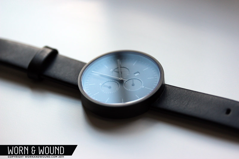
On this model of the 300 the main dial is deep matte grey that, though dark, has plenty of contrast to the black PVD case and hands. The sub-dials, which are cut-through to a second layer, are a matte middle grey. The indexes and chronograph seconds are then a very light grey. The relationships between the shades of grey seem to be some precise ratio (not something I can confirm by eye) like a 25% change per layer from black to the lightest grey. The overall effect is that of a harmonious pallet where no single tone out weighs another. The other nice aspect of this pallet is that it has a softer feeling than an all black watch or an all black dial, making it more versatile in one’s wardrobe. Sometimes all black watches are too bold, and in staying with the generally understated design of the watch, it stands out but does not scream.
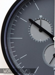
 The main index if the watch is a series of lines of varying lengths. The shortest are 1/5th second, then there are the main second/minute markers, then the hour markers, which are set in by a small gap/break, and lastly the 12-3-6-9 or quarter hour marks. Oddly, since the movement is a quartz, the chronograph seconds is not precise to 1/5th a second (there is however a 1/10th sub-dial), thus making those markings the only superfluous detail of the watch. However, aesthetically, they add to the overall precision look. The sub-dials are marked with very small light grey ticks that are both on the main dial and the second mid-grey dial underneath. The sub-dials read as follows: at 3 there is the 1/10th second counter, at 6 is the main seconds and at 9 is a 30 minute counter. The only numerals on the face, except for the date, mark these sub-dials with a 0.0 on the 1/10th counter, and 30’s on both the seconds and minutes. Giving you enough information to be able to read the dials with out adding too much text.
 The sub-dials are probably the most distinctive feature of the dial and logically so, since the 300 is Uniform Wares’ only chrono. Though the movement determines the spacing and layout of the dials, the proportions of the dials to the overall face and the subtle coloring are what make them graphically so interesting. I also really like that they seem to be clustered very tightly towards the center of the watch in an equilateral triangle about the center, where the points of that triangle would perfectly line up with 2, 6 and 10. This sort of implied geometry is part of what makes every line and detail feel so intentional and diligently planned.
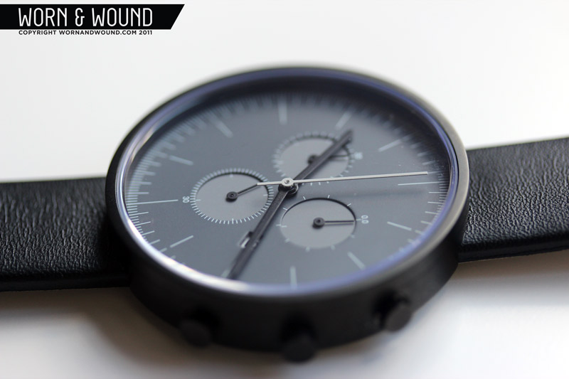
The 42mm case of the watch is coated in a matte black PVD and, once again, has no frills. The lug-less design allows for the case to be a perfect circle, which plays into the precise geometry that defines the look of the watch. The face edge of the case has no bevel, creating a perfect 1.5mm black rim, which gracefully sets off the grey tones within and maximizes the dial diameter. The bottom edge bevels into the case back, which also has a beveled edge, creating a more ergonomic surface against the wrist. The chrono pushers and crown of the watch are as simple as can be, with a sort of T-shape and measure a fairly small 4mm in diameter. The lens is flat and made of a hardened mineral crystal.

Powering the 300 is an ETA 251.471 23-Jewel Quartz chronograph movement, which is part of the ETA normflatline of movements. Here is a cool little page with illustrations of all of the parts. Uniform Wares chose a high quality quartz for this watch that has some unique features. First, there is a 1/10th second dial that allows for pretty precise timing, certainly more precise than one normally needs. Second it features a quick time-zone change function that is part of the date setting function. I’ll admit, I didn’t read the instructions before I tried to set the date, and this caught me off guard at first. Basically, with the crown pulled out one stop (A position), you can jump forward a full hour at a time with out effecting the minutes, hence time-zone change. In order to change the date, you just keep cranking 24hr turns until you have the right date. The 251.471 has an estimated 24 month battery life and an accuracy of +/- 15 seconds a month.
 The 300 is simply an extremely nice watch to wear. It is comfortable, fairly light and nicely sized at 42mm with an 18mm strap. The lack of lugs helps temper the size of the mid-large case, which is quite important since this watch, and the entire Uniform Wares line, is marketed as unisex. I think this is a very smart move for the brand since it further reinforces that the watches are about a sort of pure design aesthetic, which is about form and function and not gender. And they achieve this aesthetic in strides. The watch is, above all else, extremely good looking. It has a presence that no other of my watches have. Like I said in my intro, the 300 is where fashion meets function, and what I mean by that is that it successfully blends what I like about museum shop watches and watch-nerd watches. On one hand, it feels like a highly tuned designed object steeped in contemporary style that is meant to compliment your Alden shoes and APC jacket. And on the other, feels like a real watch, paired down to a very pure and simple state.
 There is one caveat, however: the 300 runs in the $700-$800 dollar range. For those aware of the watch market, a $700-800 dollar quartz chronograph with a mineral crystal lens is a tough pill to swallow. I mean, you can get a Maratac automatic Pilot with sapphire for just under $200 or a Lum-Tec M33 chronograph (also quartz) for about $500. So, is the 300 worth it? Well, that is up to you, but I think so and this is why. First you have to consider that Uniform Wares is a small brand that has created their watches from the ground up. They are not just ordering cases from China, putting in new faces and slapping a logo on them (they don’t put logos on them regardless), they have designed and manufactured everything but the movements. So, you have tooling and development playing a role here. Then they also sell their watches retail, which drives up pricing. Though they are using quartz movements, they are using high quality components, and in the case of the 300, it allows them create a thinner, lighter chronograph.
Lastly, you have to consider the marketing and positioning of this product. I feel like a parallel can be drawn between their watches and Jack Spade bags. They are simple and understated, not made out of fancy, but rather high quality materials. They cost more than you’d expect, but are very well made and extremely well styled. They are for people who are willing to pay more for that sort of perfectly finessed object that suits their look. Do I wish they would extend their line into mechanical watches in the future? Of course, but the point is that these are not cheap quartz watches by any means, and if the look intrigues you, I say go for it.
Thanks for reading, enjoy the gallery!


Is it possible to change the strap on this watch? Or are you stuck with using the supplied strap?
Great looking watch….I love the simplicity of the design.
Hey Tim,
You can, though I believe you might have to remove the case back…so you’d probably want to bring it to a jeweler.
Here is what appears to be a Uniform Wares watch on a Nato strap.
http://a.yfrog.com/img739/2166/1xlki.jpg
I have a similar question to Tim above. I’m looking to buy a 300 series watch and combine it with a j.crew strap. Is this possible?
Hi Ryan,
The assembly of this watch is atypical, in that the strap actually goes under the case back, leading me to think you would not be able to install a ribbon strap. That being said, I don’t have the watch on hand any more, so I can’t give a definitive answer. It could be worth writing [email protected] for more details
-Zach
I received a 300 series watch as a gift. It worked perfectly for 3 and a half years and then suddenly stopped working. Uniform Wares have said the watch needs a complete movement replacement. Has anybody had this problem?