Review (with Video): Omega x Swatch BioCeramic Speedmaster MoonSwatch Mission to Jupiter

This is not a review I could have predicted writing. Not even close. If you had told me that in my lifetime, let alone within 11 years of starting Worn & Wound, I was going to be reviewing a plastic, quartz Speedmaster that only costs $260, I would have laughed. Hell, even if someone had asked me if I thought such a thing would happen, I would have laughed and said, “sure, when monkeys fly out of my butt.” But here we are in 2022, and I am writing this review. A review of perhaps the most Worn & Wound watch I could ever imagine. I suppose if the last few years, nay months, have taught me anything it’s that we live in a timeline where the unthinkable is probably what we should expect.

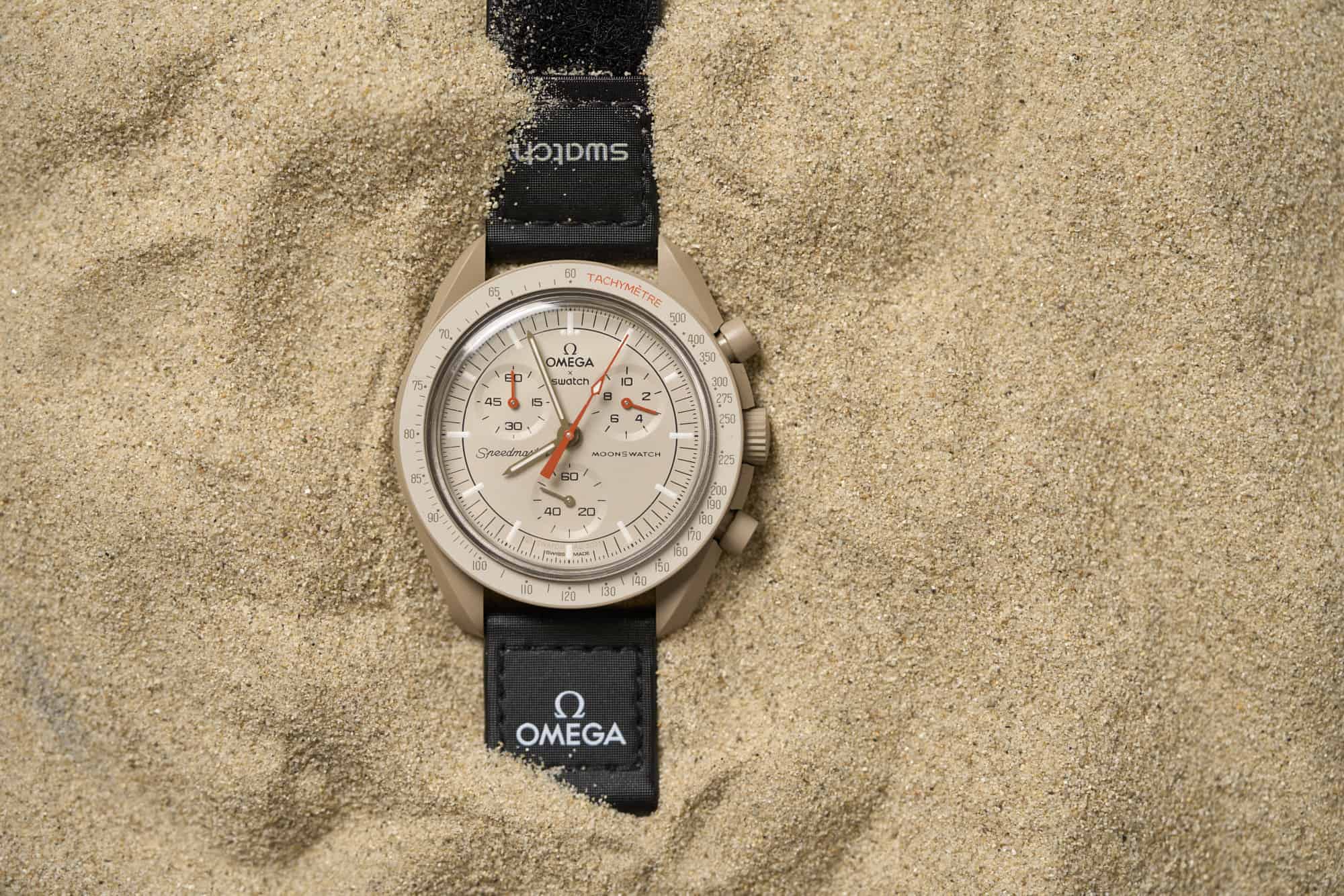
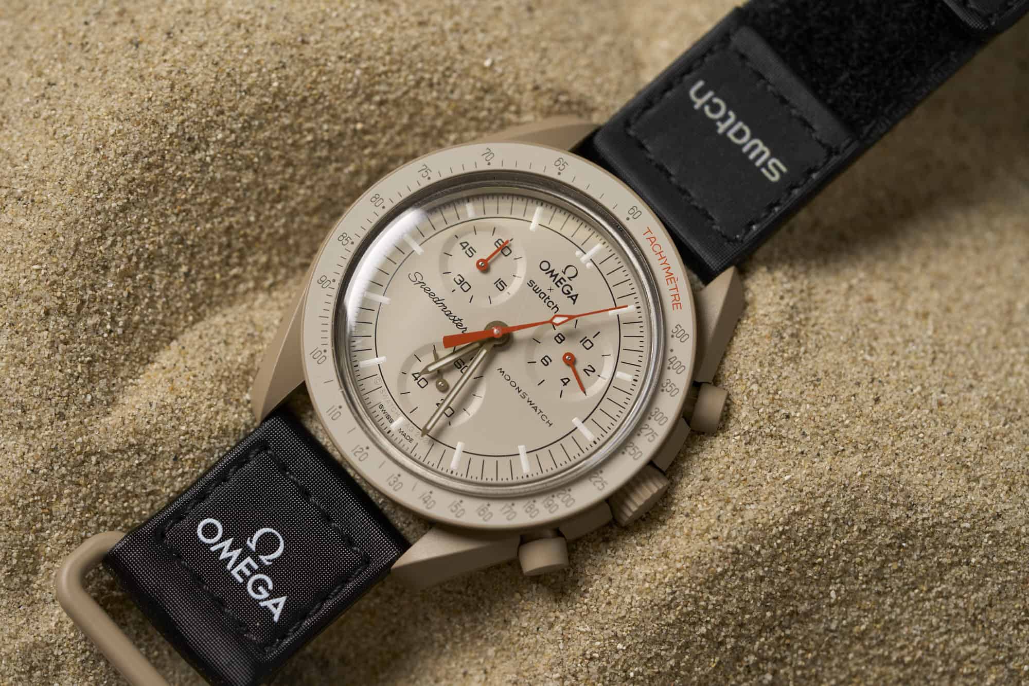
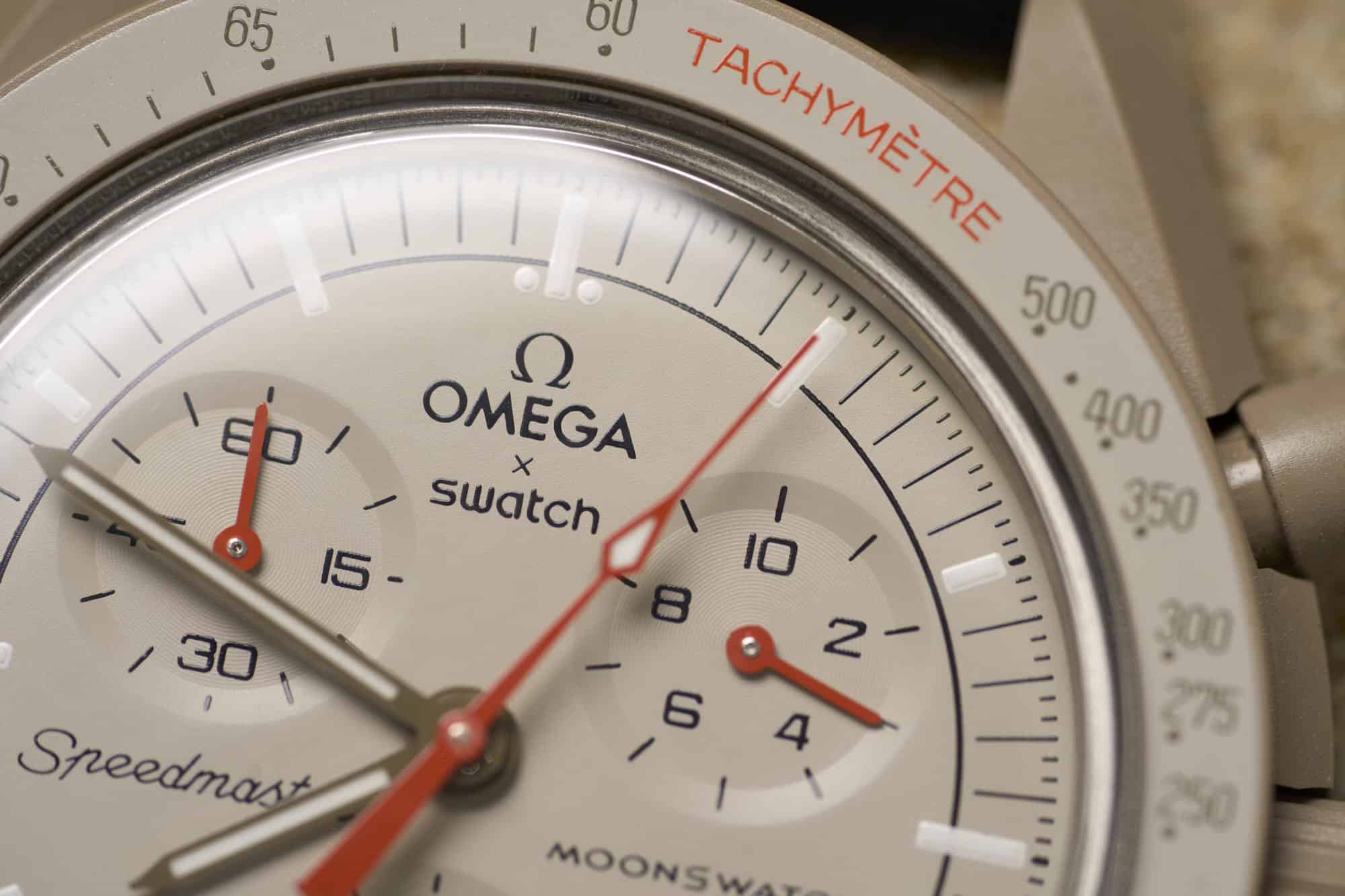
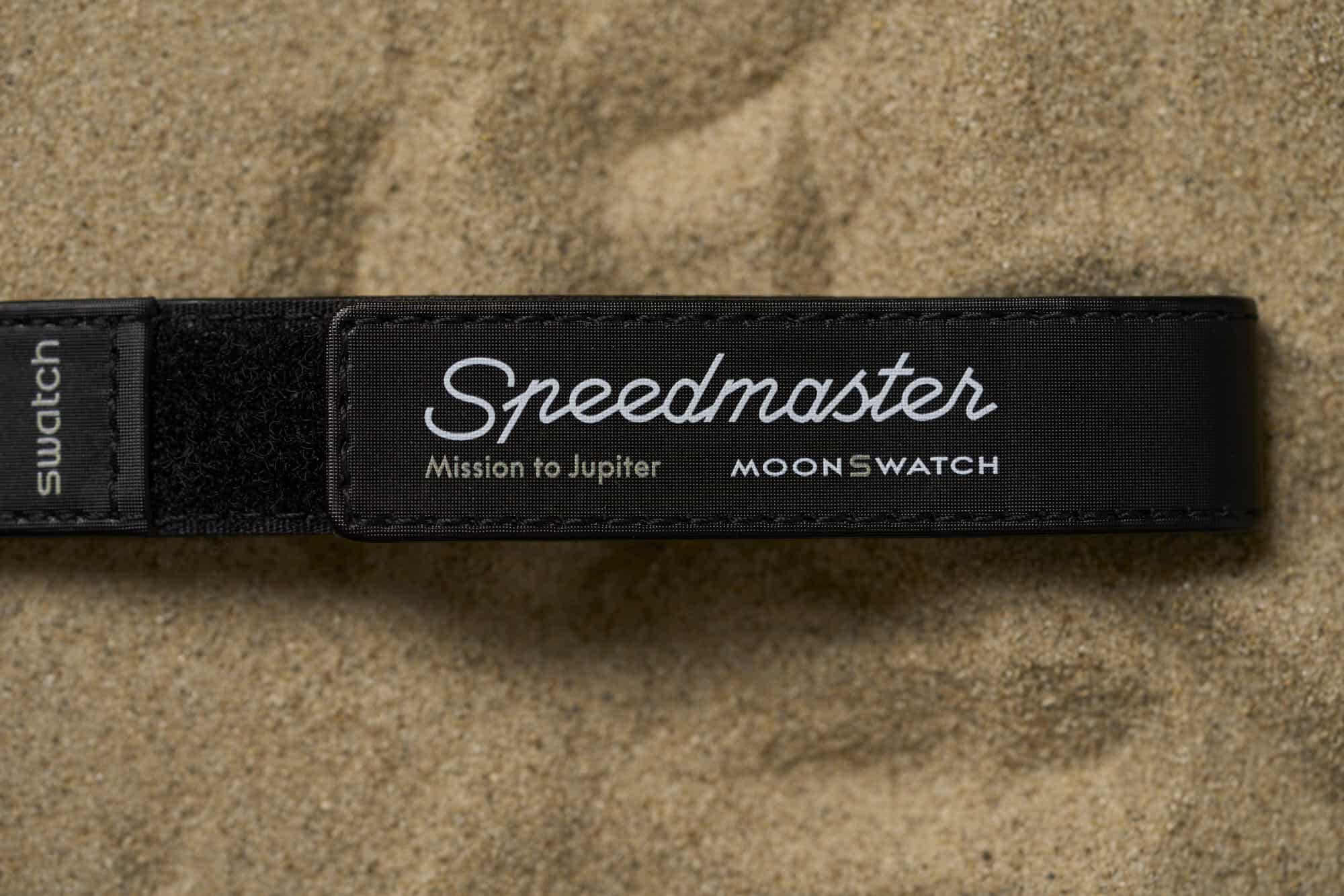
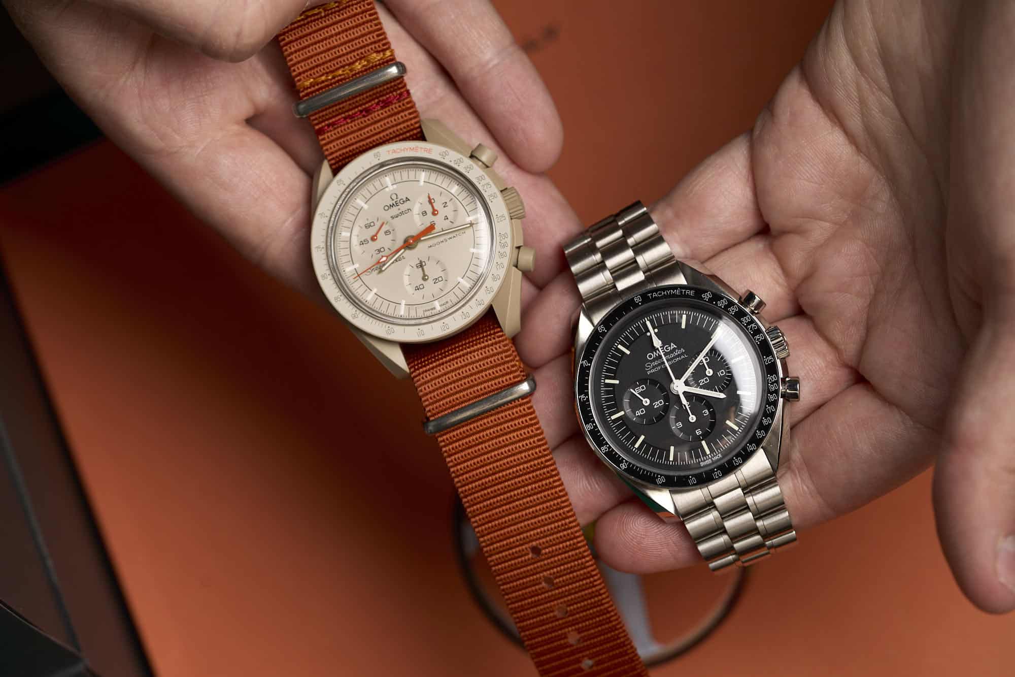
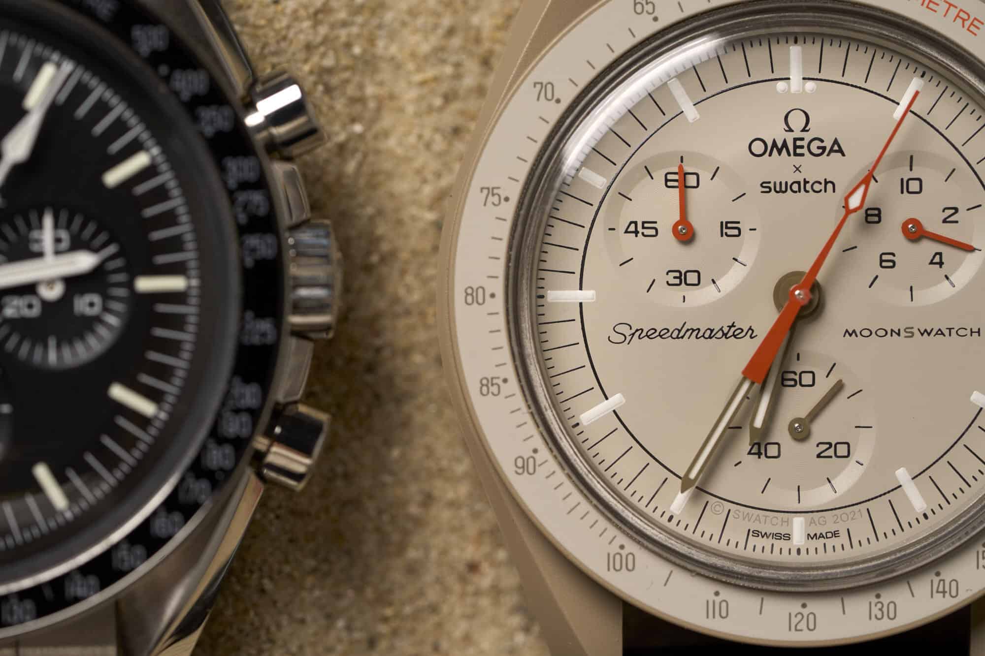
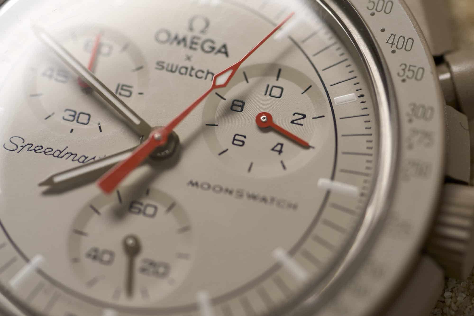
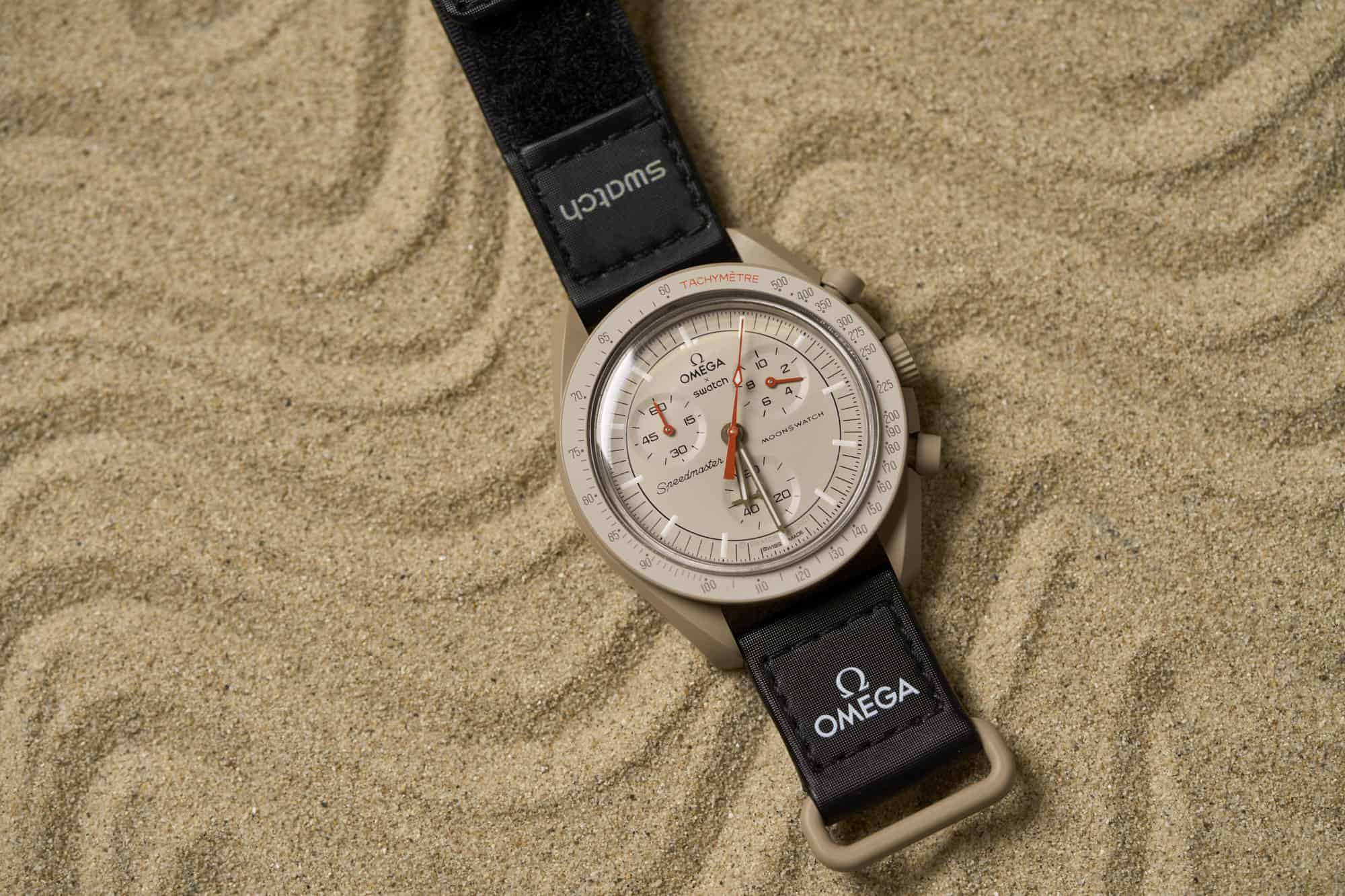
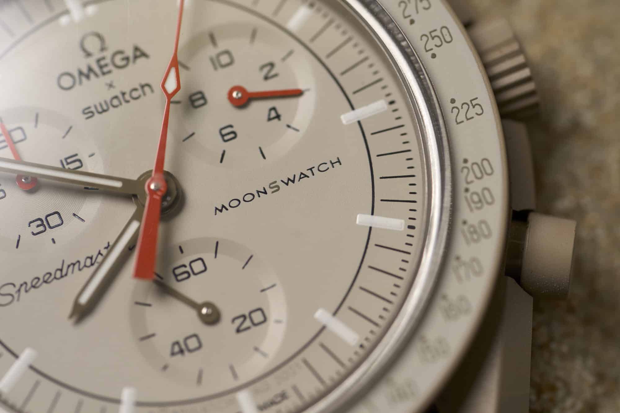
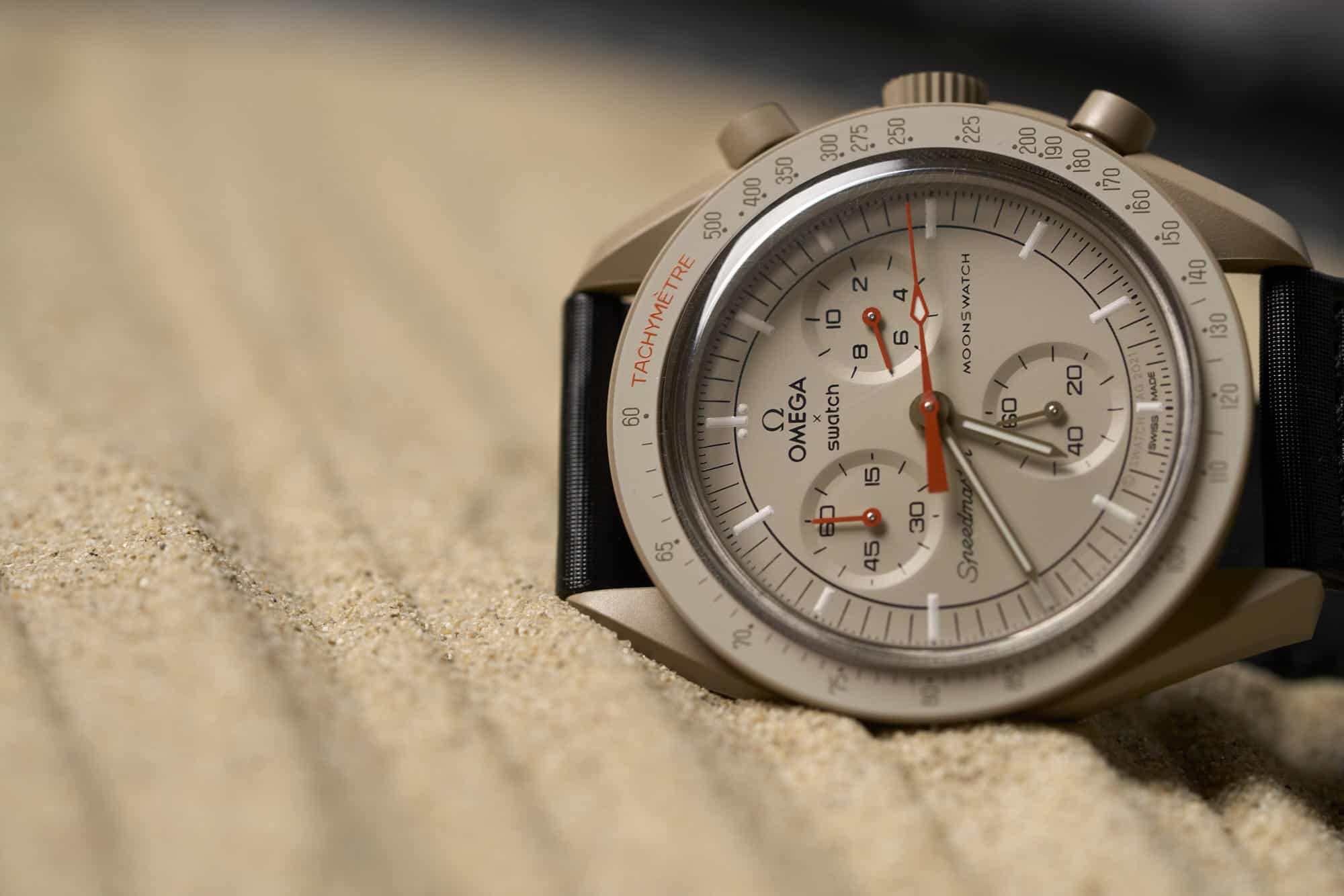
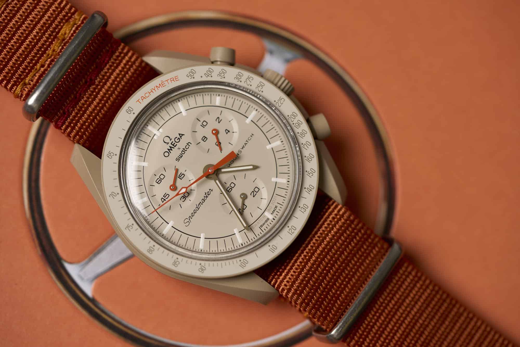
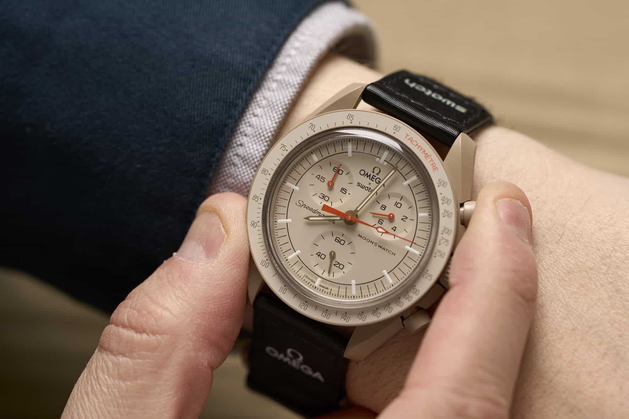
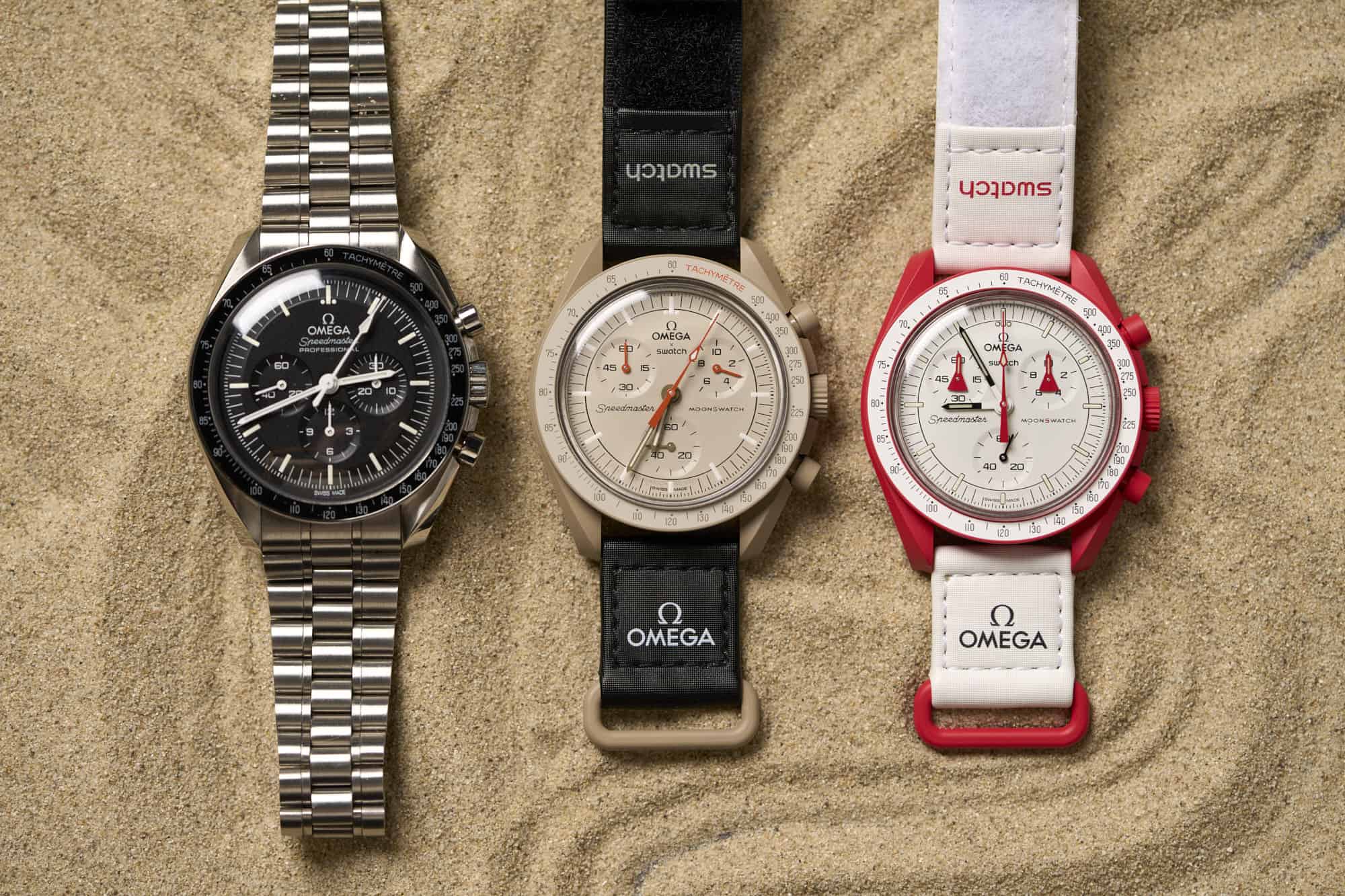
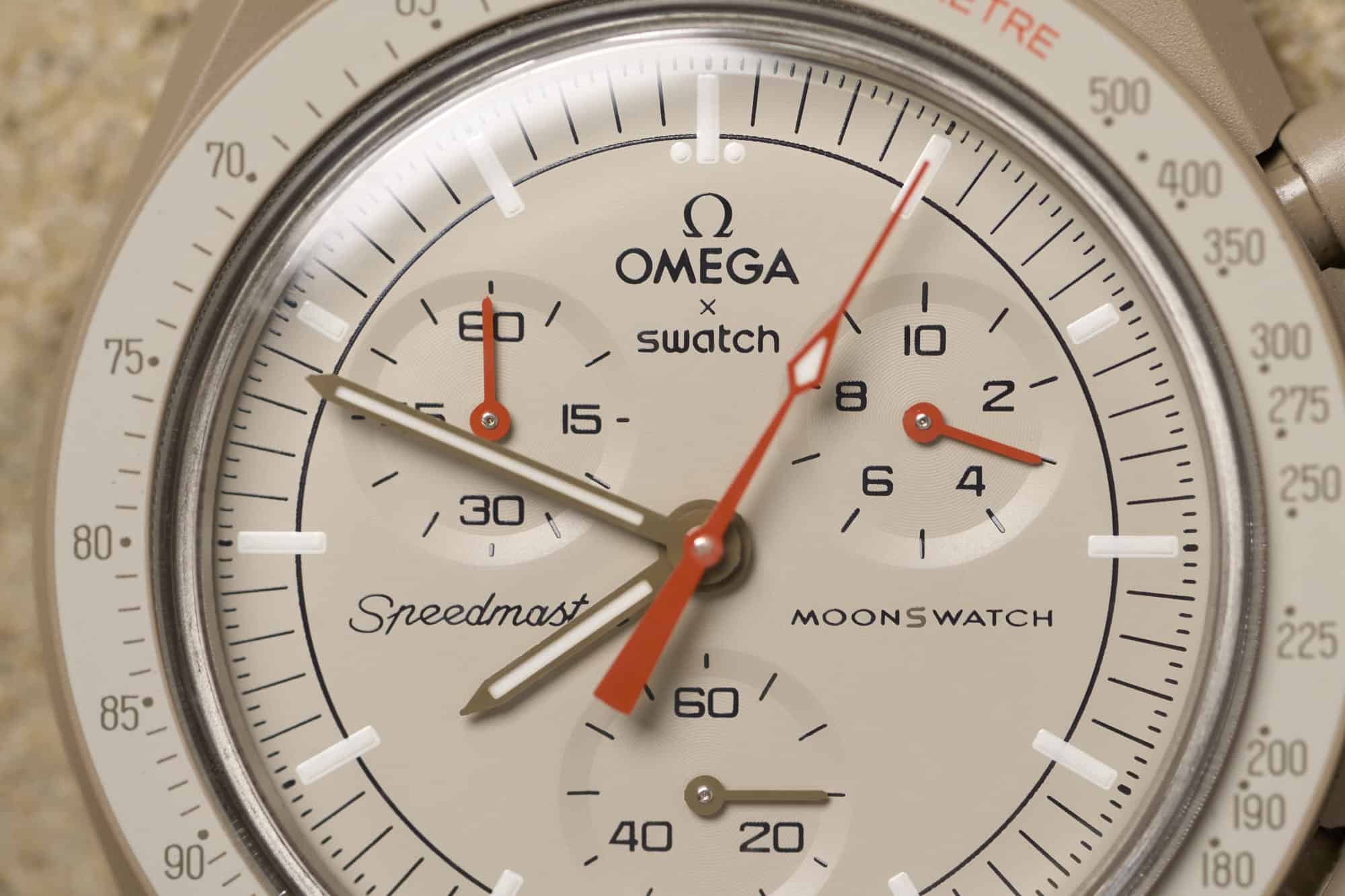
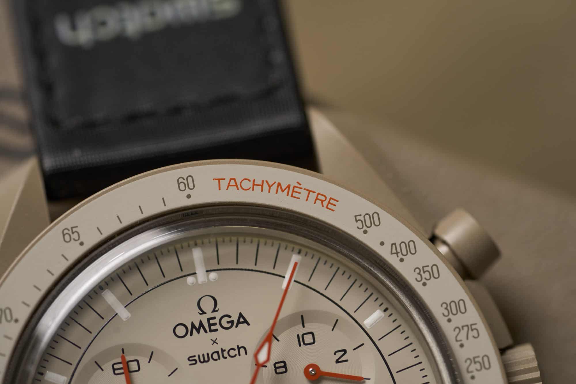
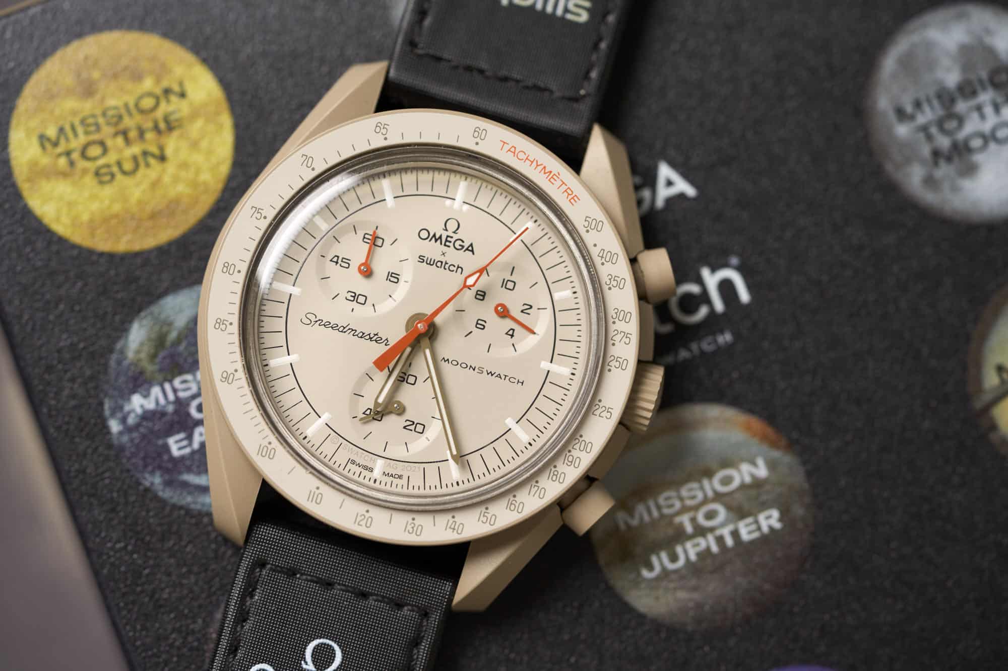
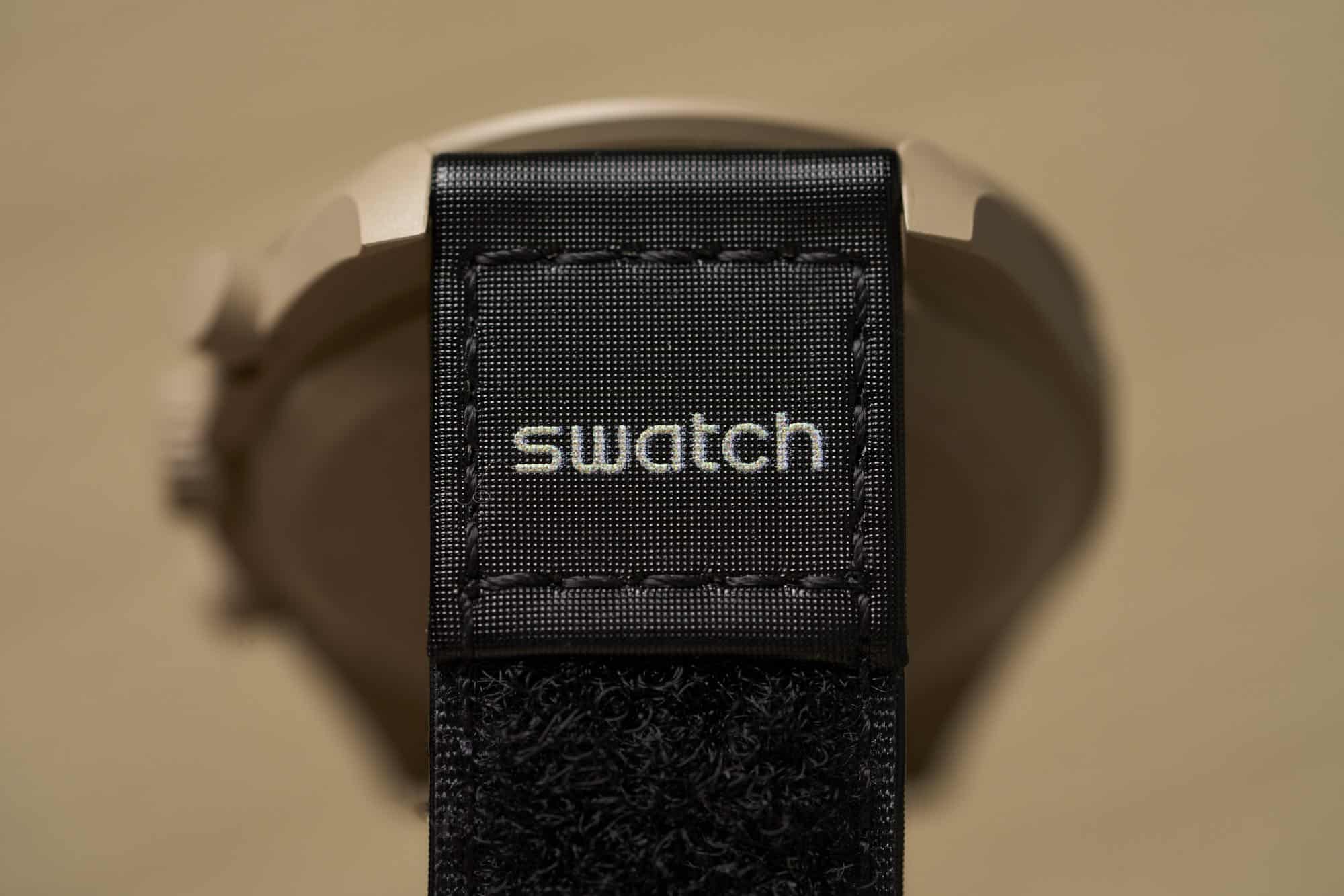
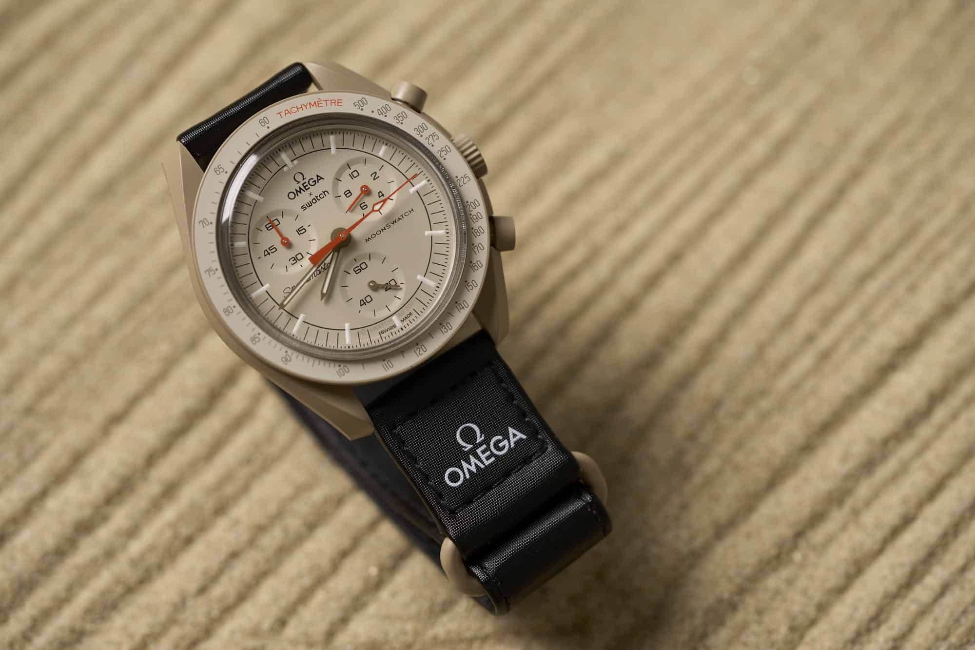
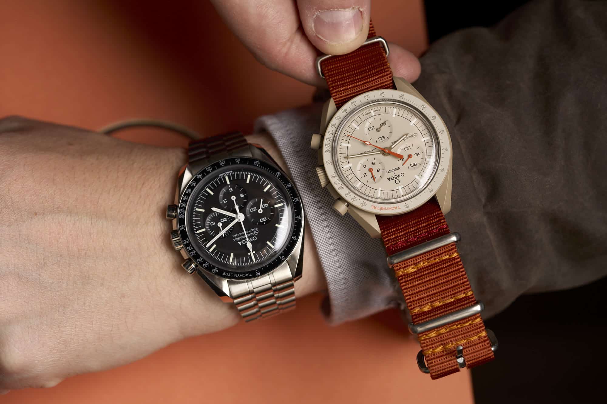
It’s far from breaking news at this point that on March 24th the Omega x Swatch BioCeramic Speedmaster MoonSwatch was released. A series of 11 timepieces in a variety of colors, all based on the Speedmaster Professional case and design, each inspired by a different body in our solar system. Reactions ranged from pure joy to utter confusion to misplaced rage. No matter the reaction, they were big, and reached well beyond the confines of the watch enthusiast crowd.

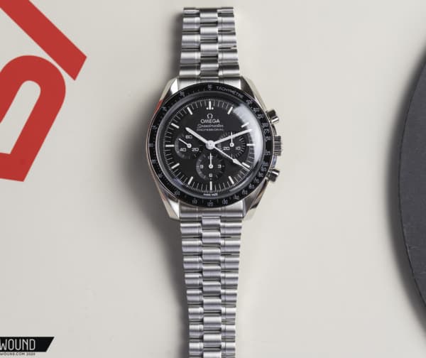
This was a global event by two household brand names. One known for accessibility, irreverence, and color (and saving the Swiss watch industry), the other for luxury, quality, and perhaps the most iconic watch ever produced. A watch that is synonymous with one of humankind’s greatest achievements. An achievement that loses none of its mystique as decades pass. Landing on the Moon. The hype was palpable and infectious.

And then, chaos ensued. Wildly unanticipated demand led to a near-disastrous launch. Crowds pushed, mobs charged, long lines of hopeful folks left without watches and a bitter taste in their mouths. Even more learned there wasn’t any point in trying, at least for the time being. It’s not what any of us wanted to see, putting a cloud over what should have been one of the most joyous launches in watch history. The ultimate watch crossover. A watch revered by many, but available to few, reconceived to be accessible at large. A blow to the exclusivity and elitism that surrounds watch collecting like a bad smell.

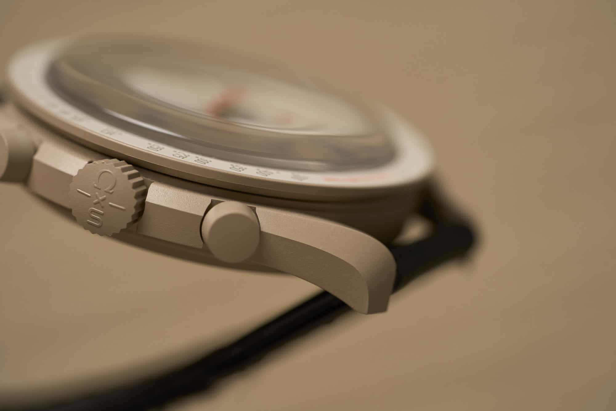
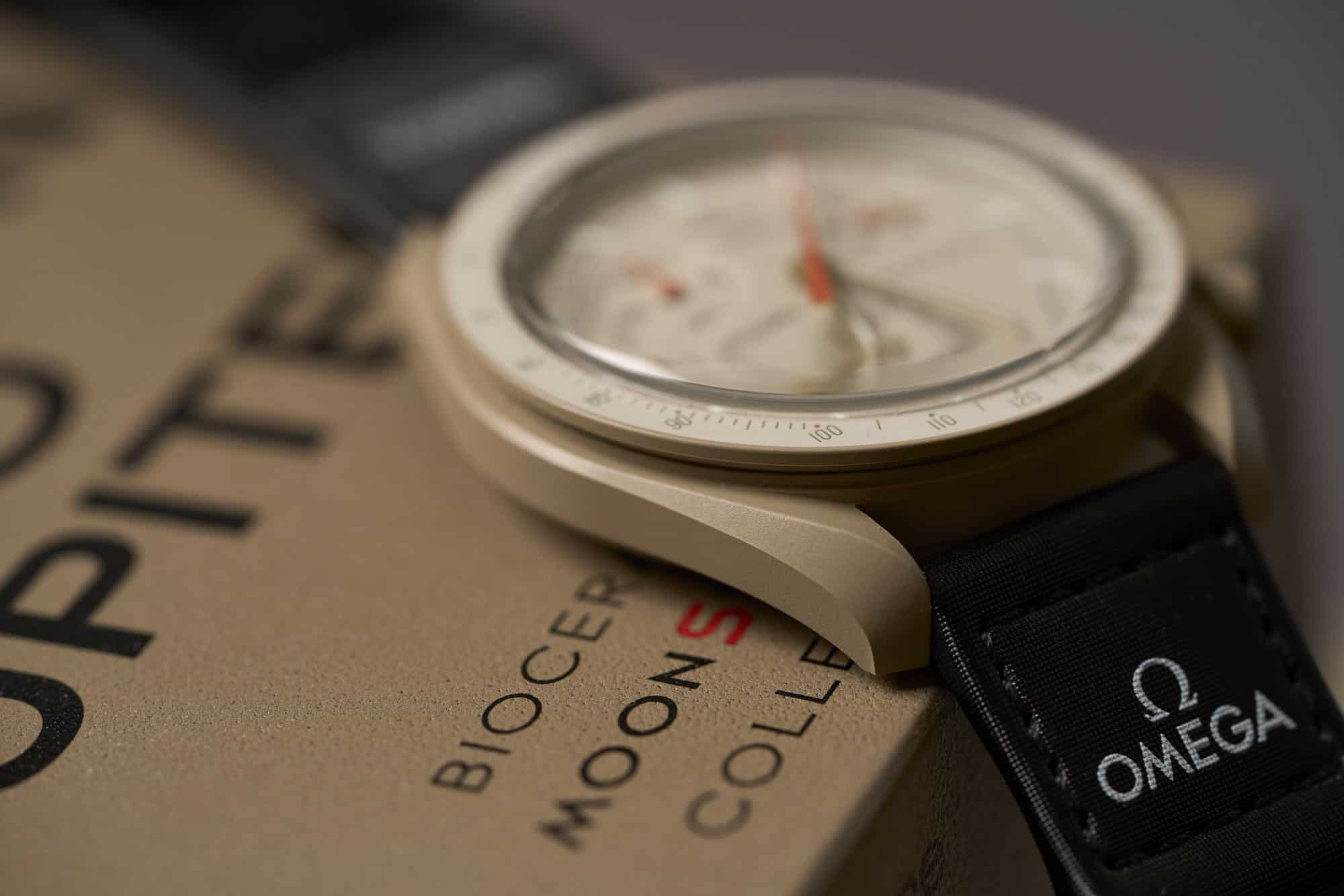
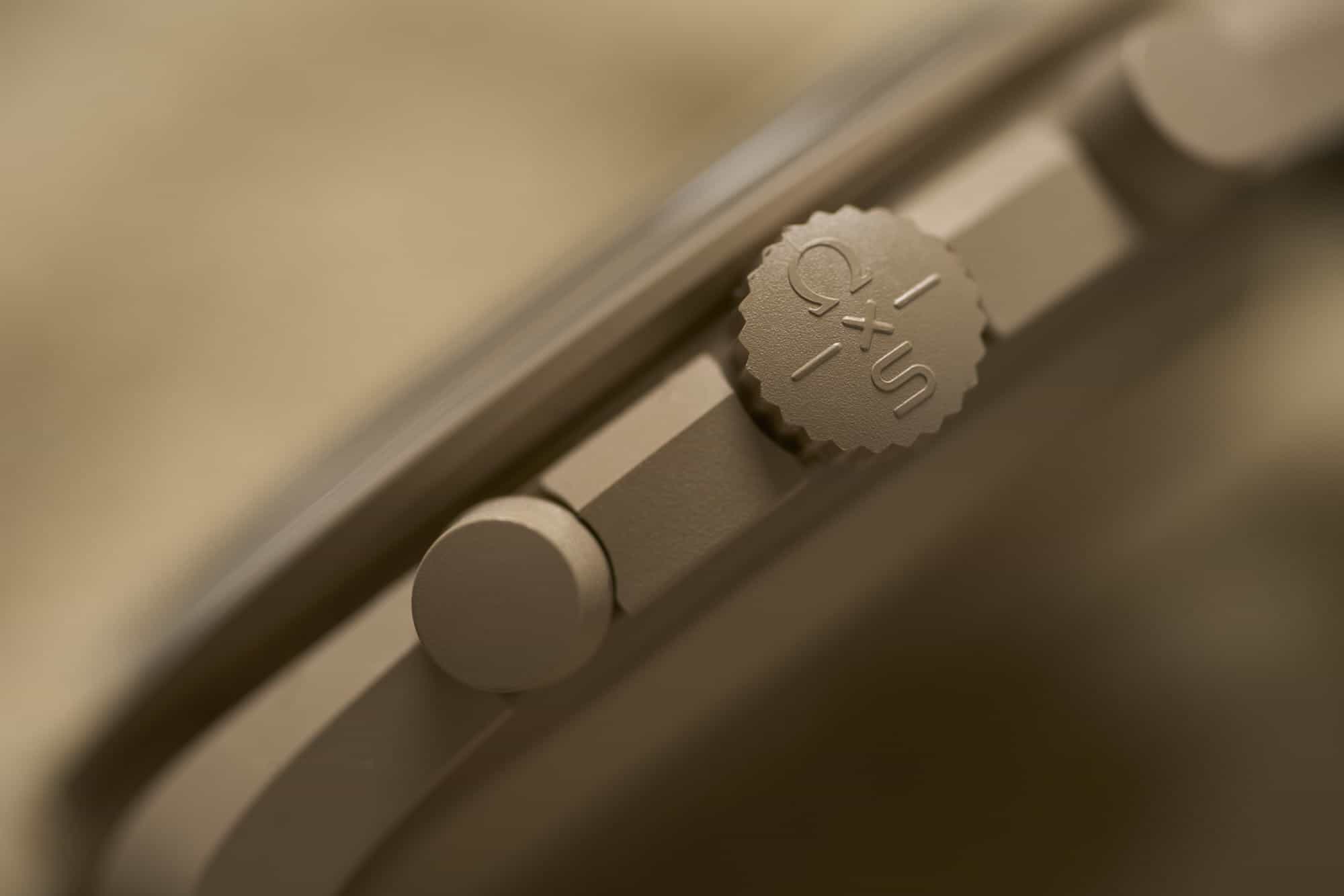
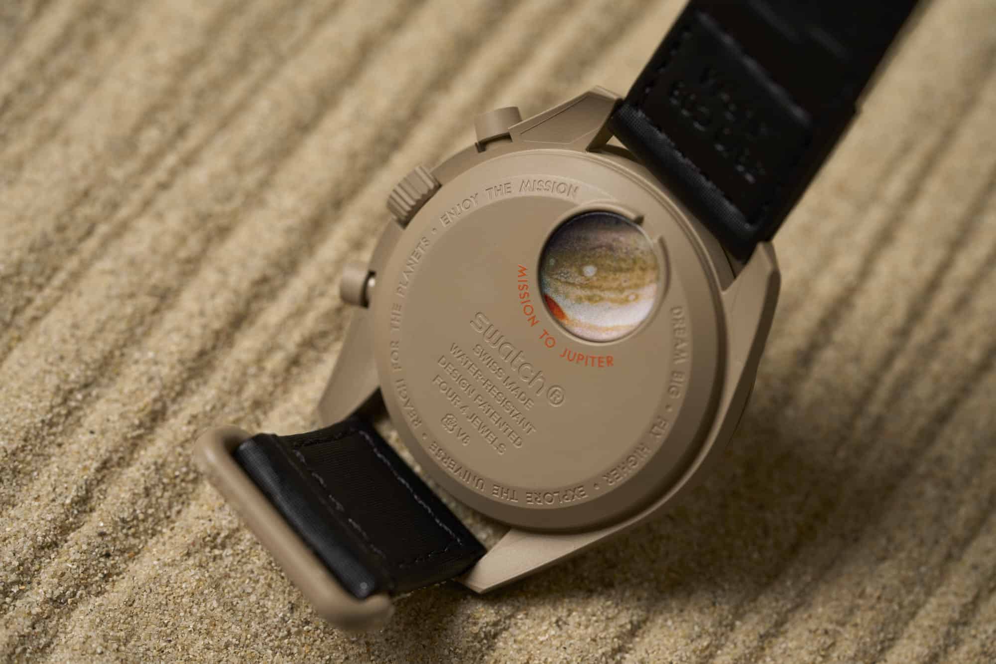
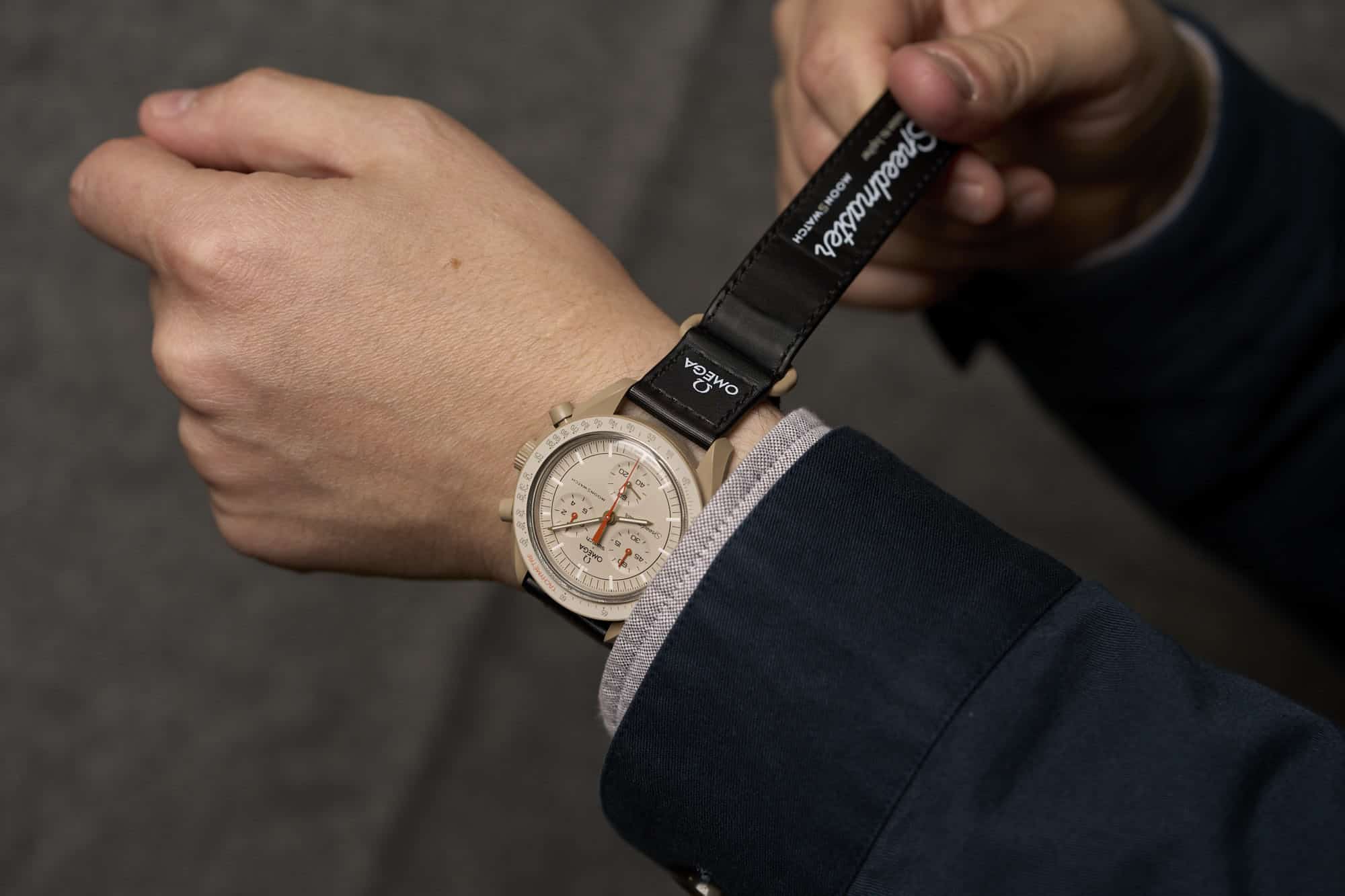
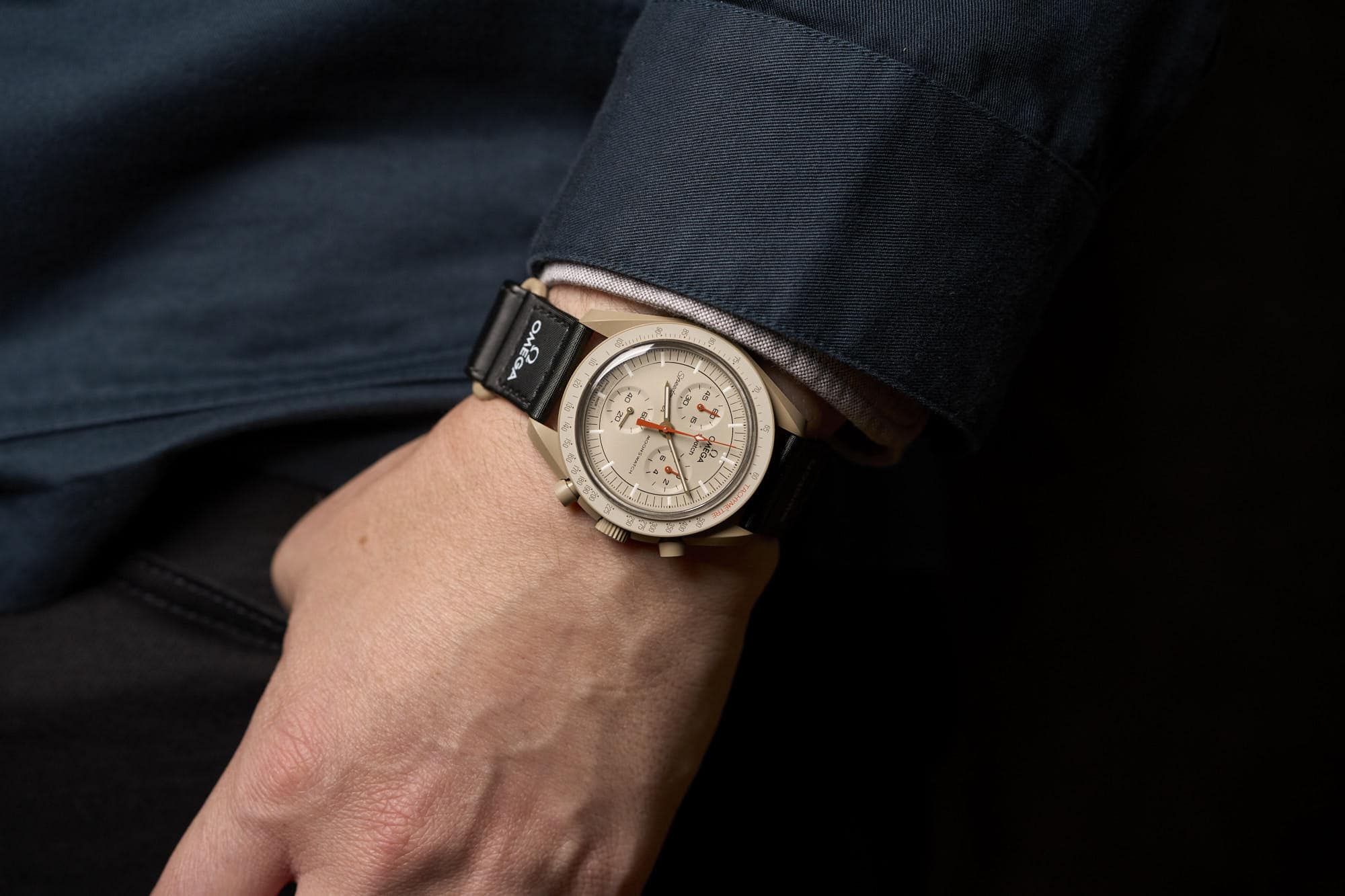
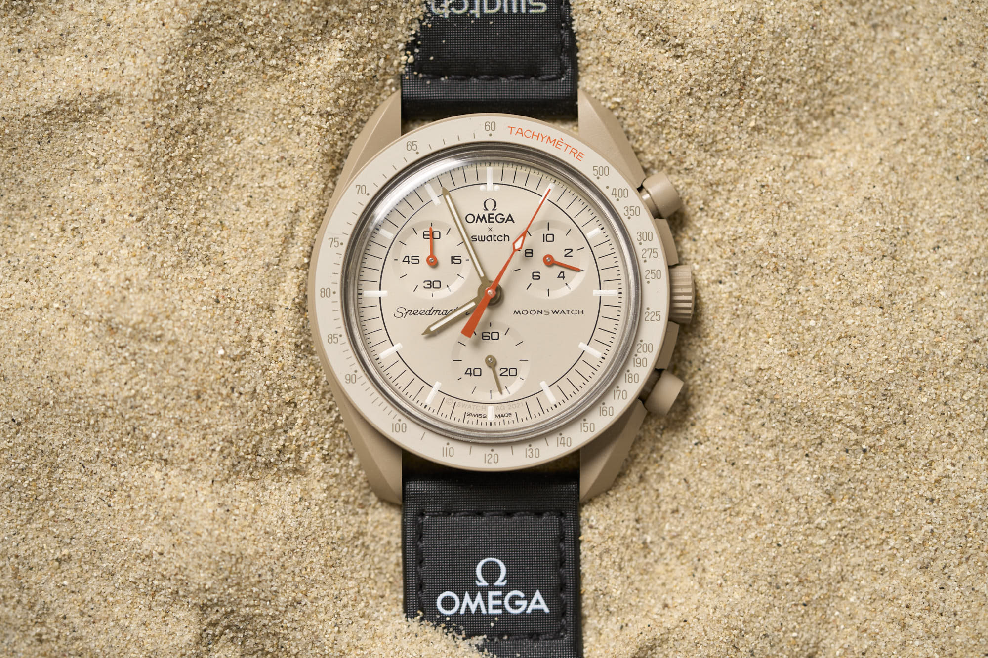
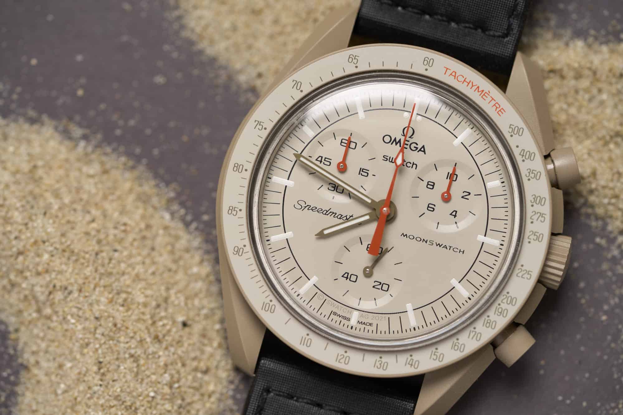
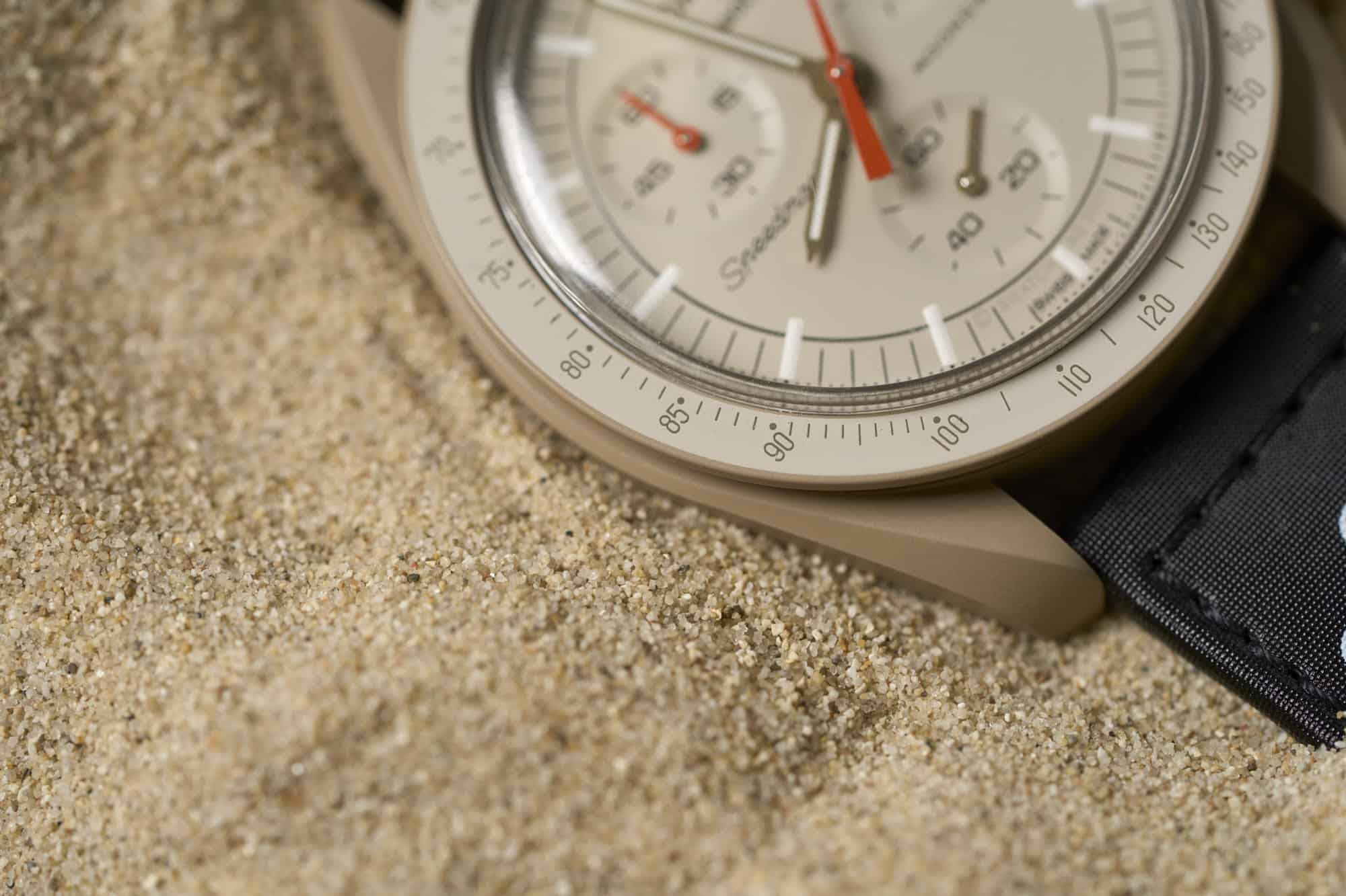
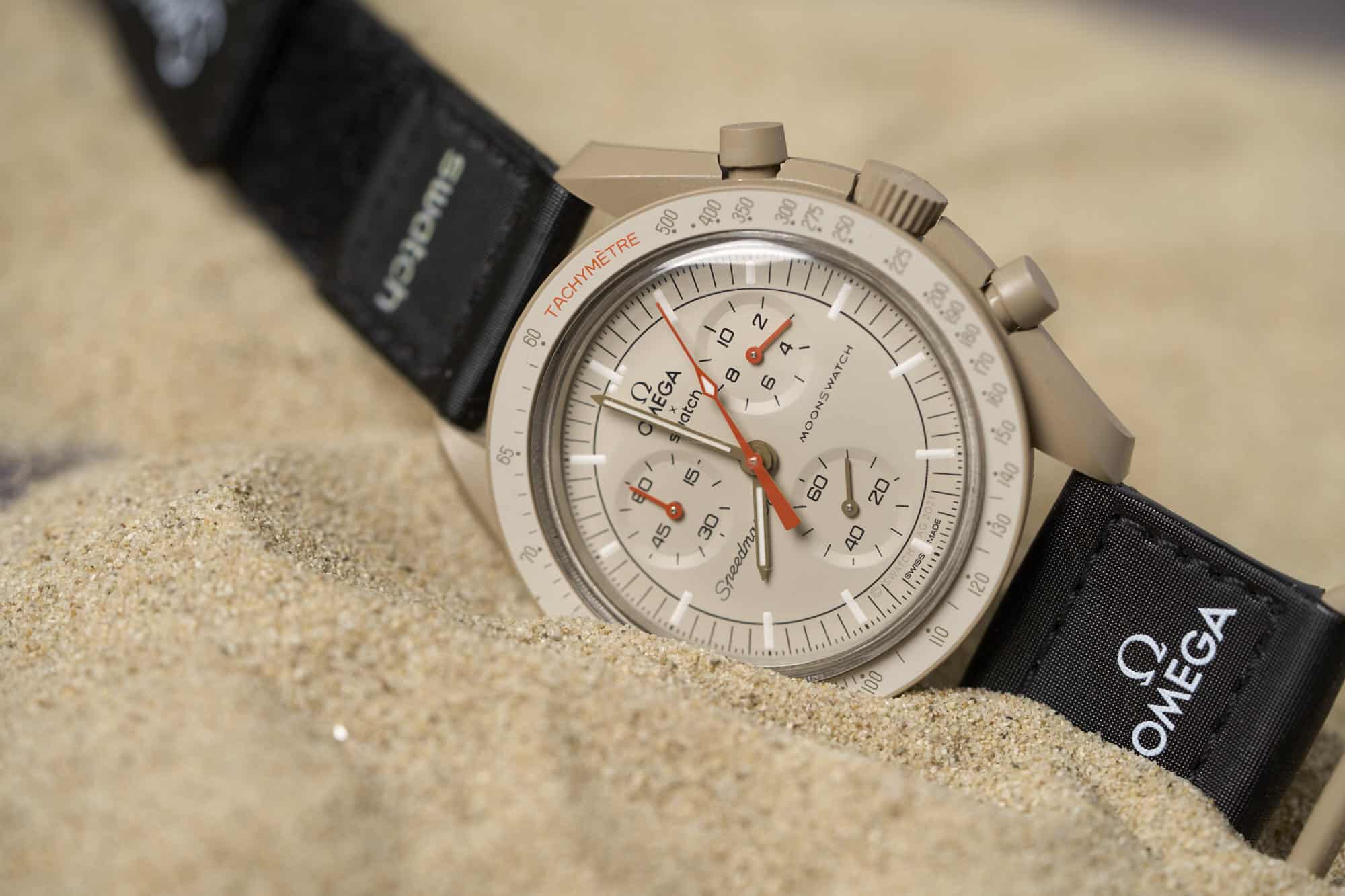
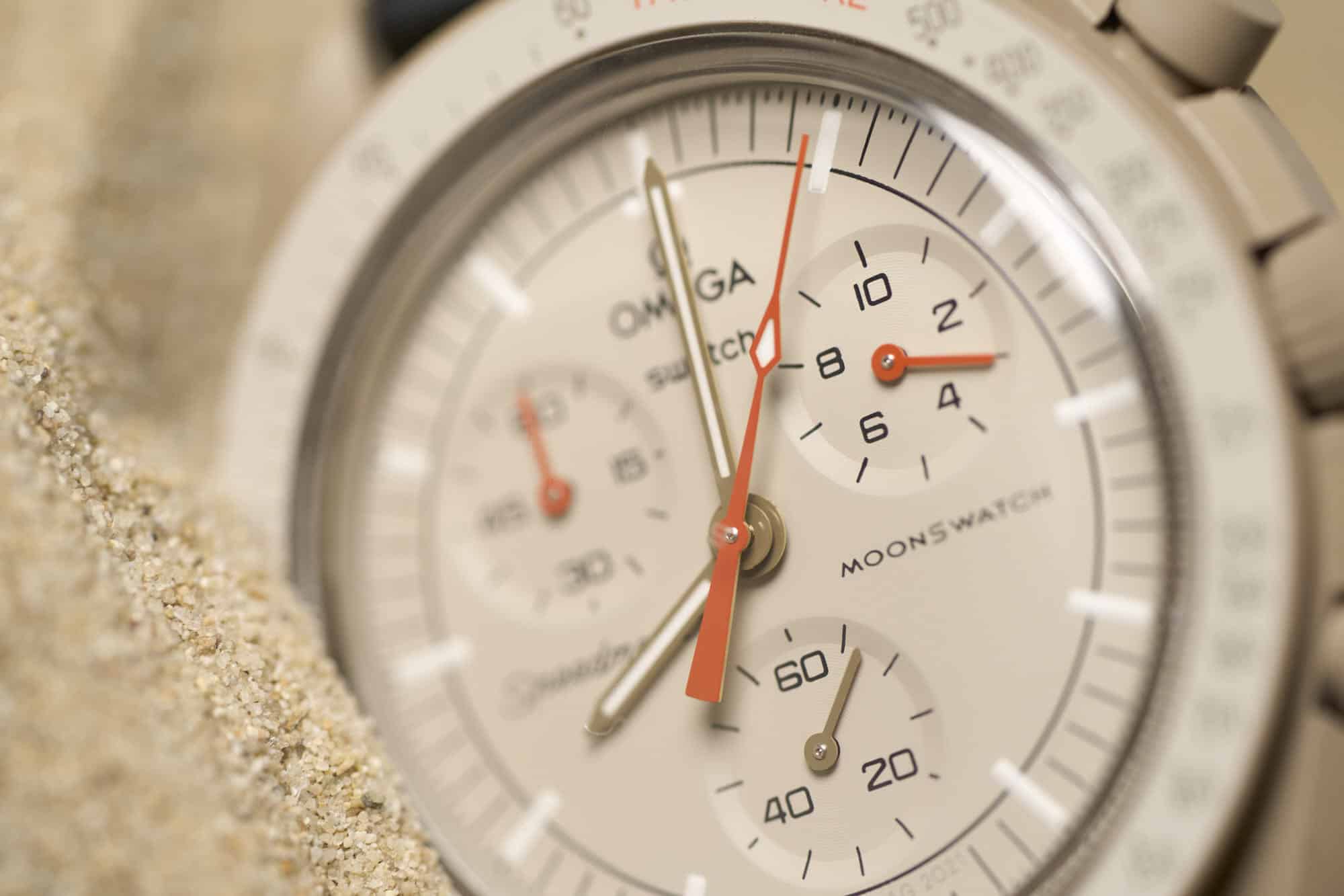
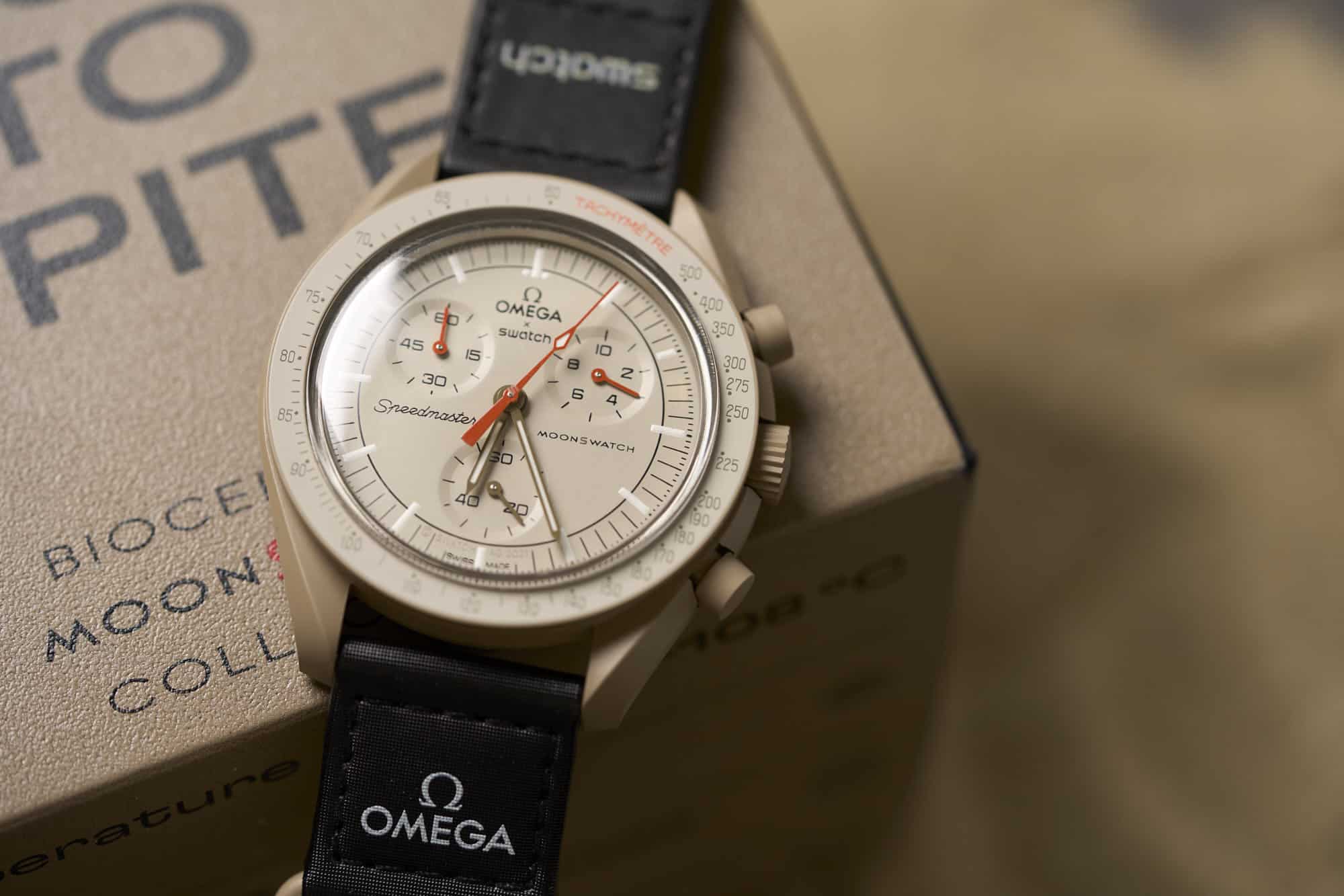
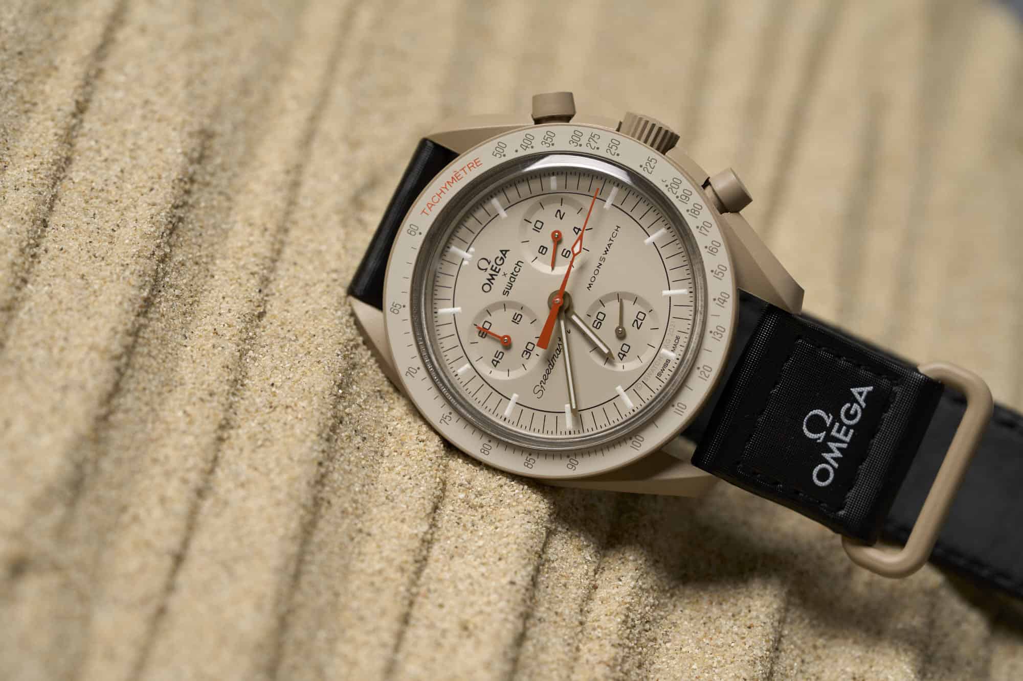
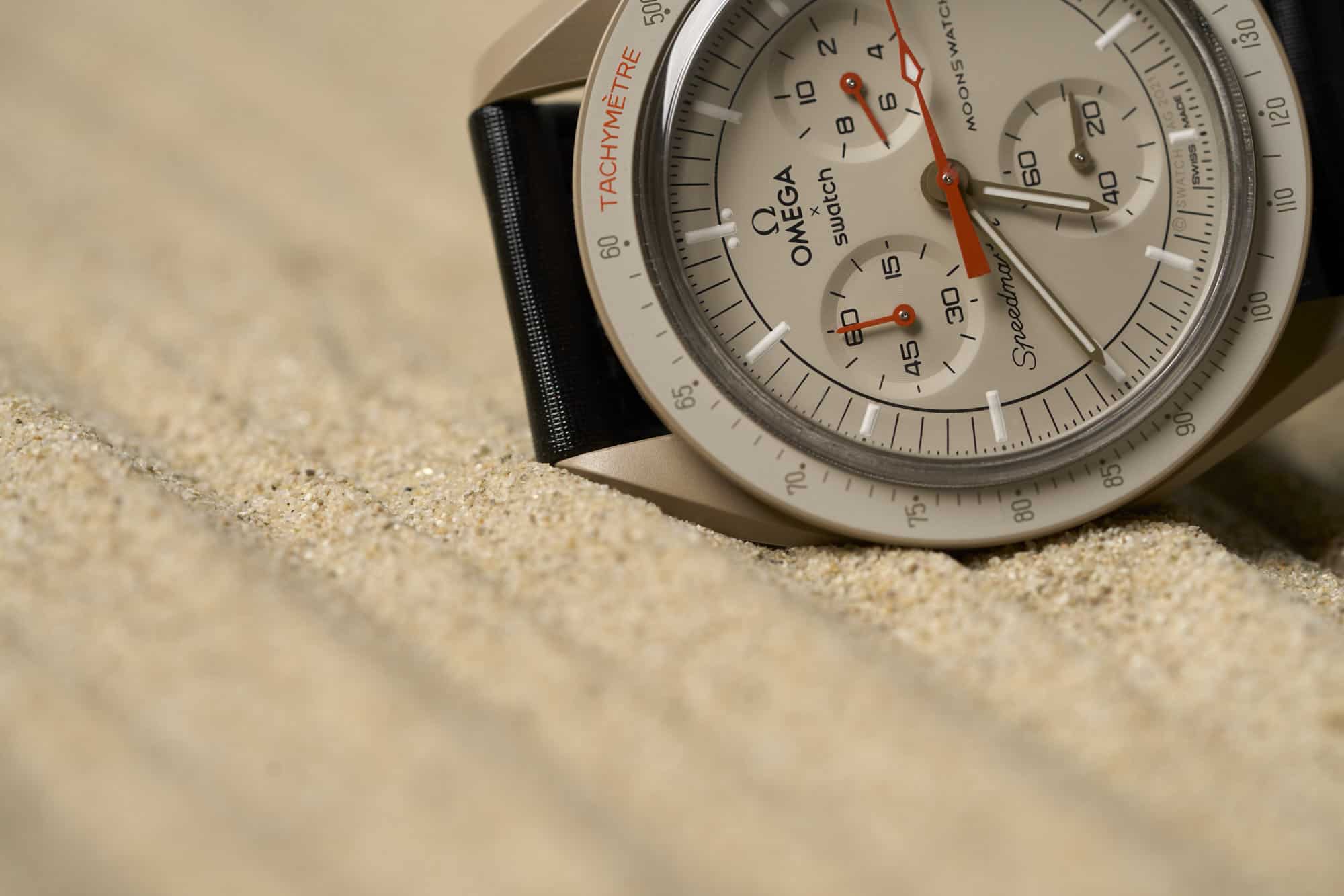
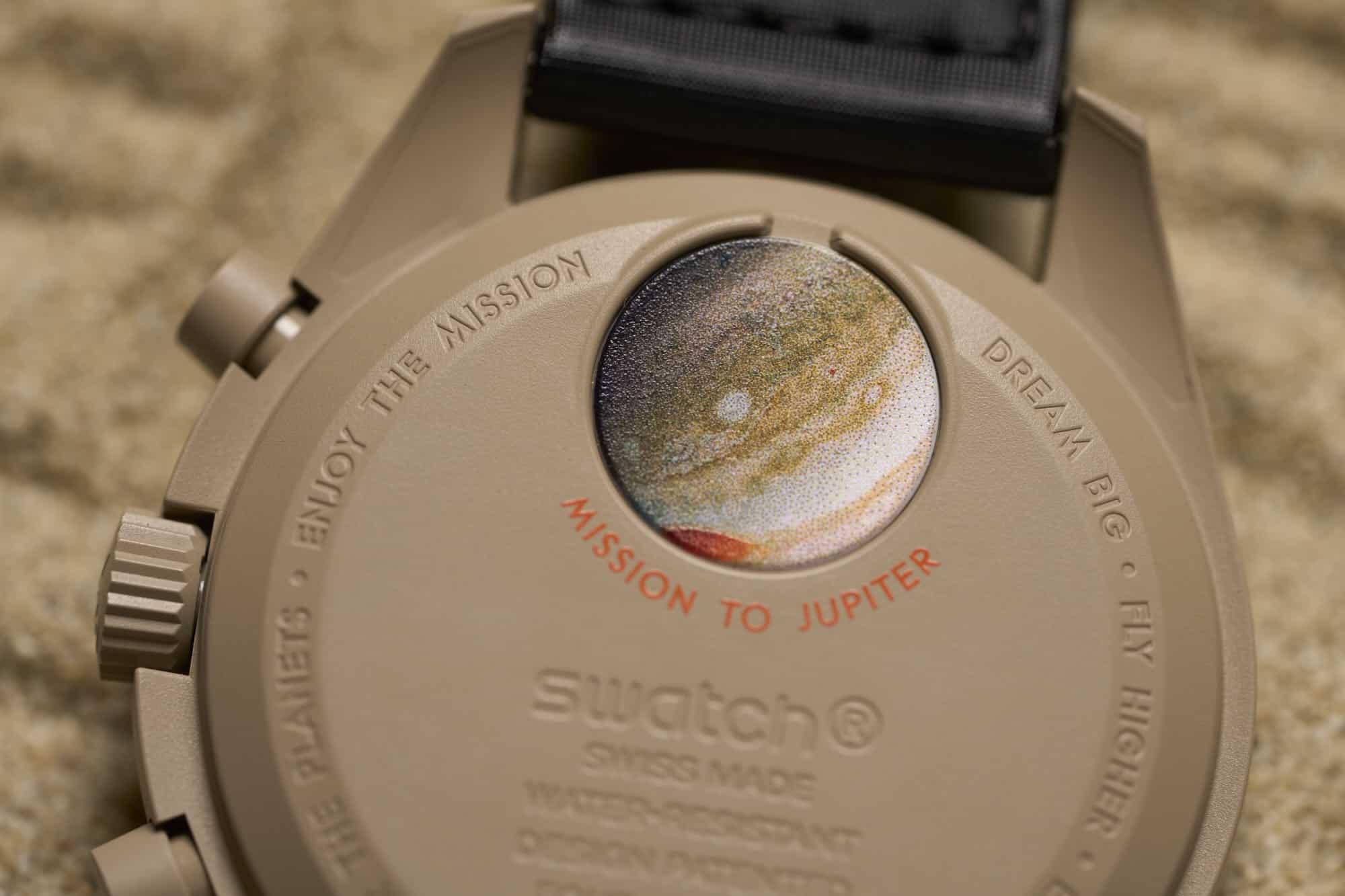
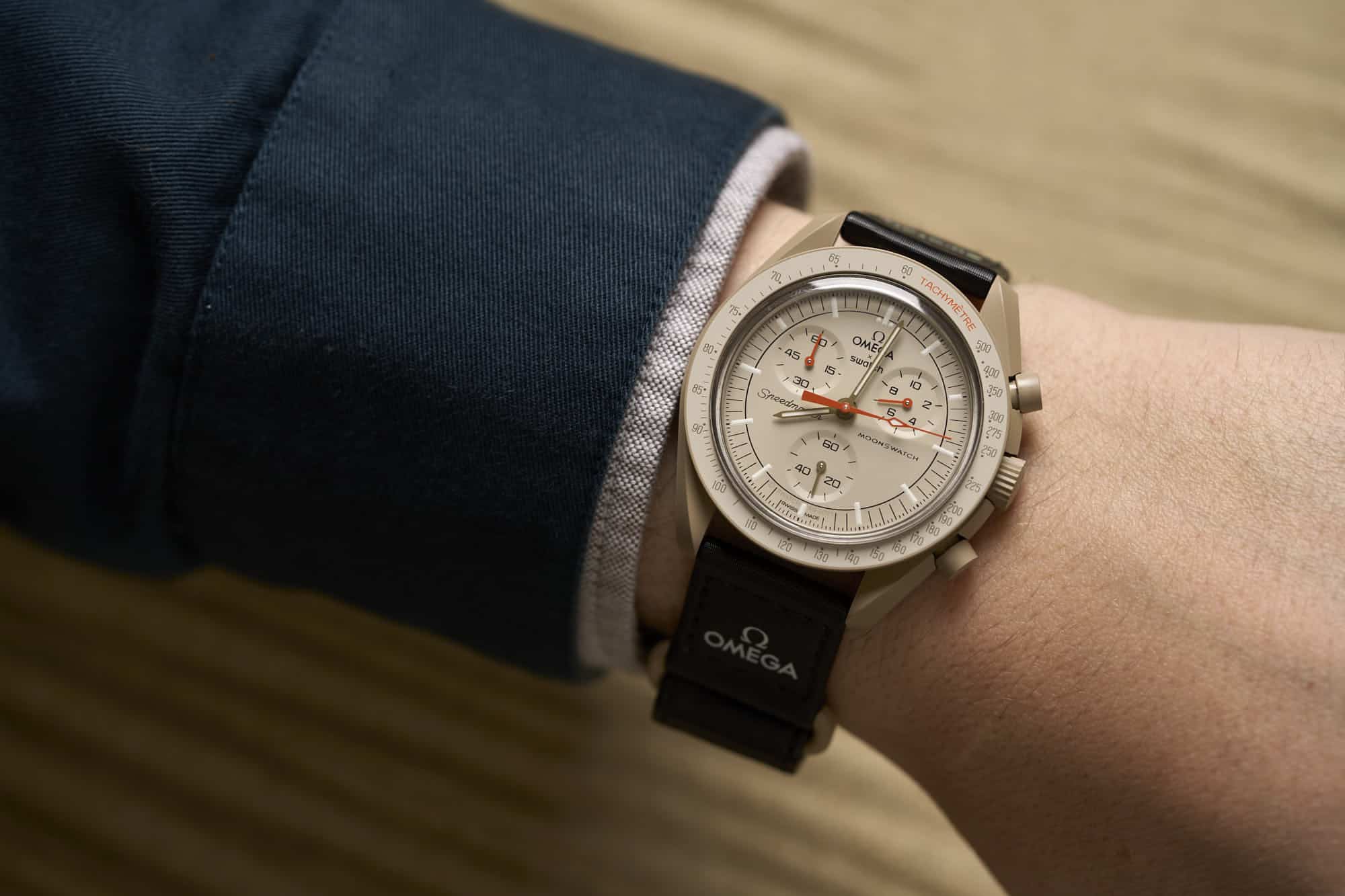
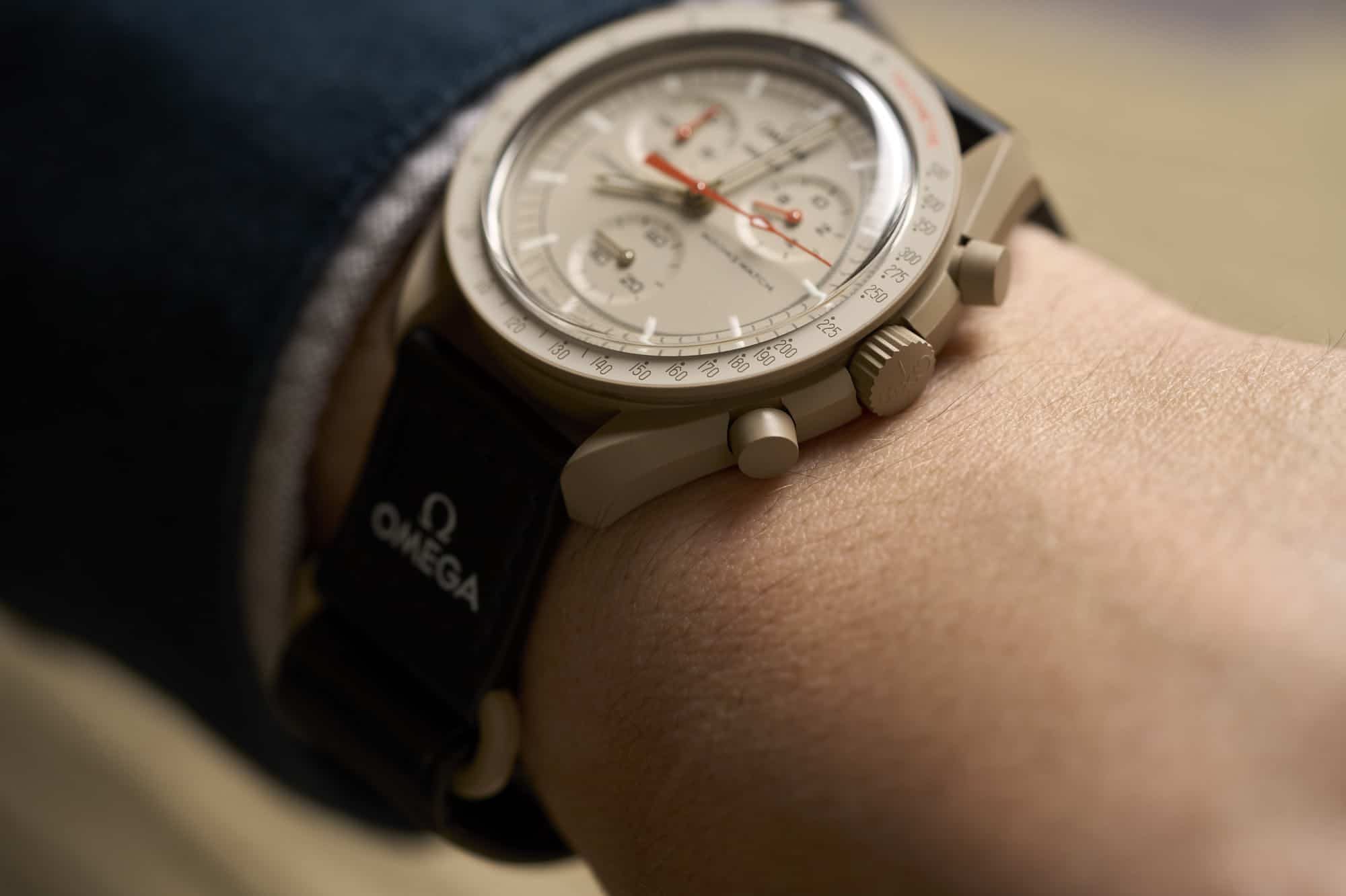
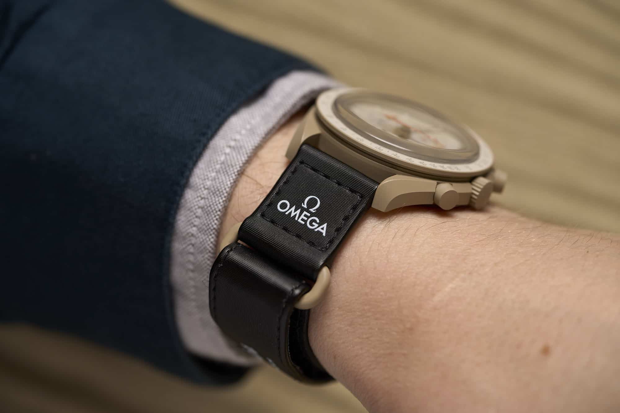
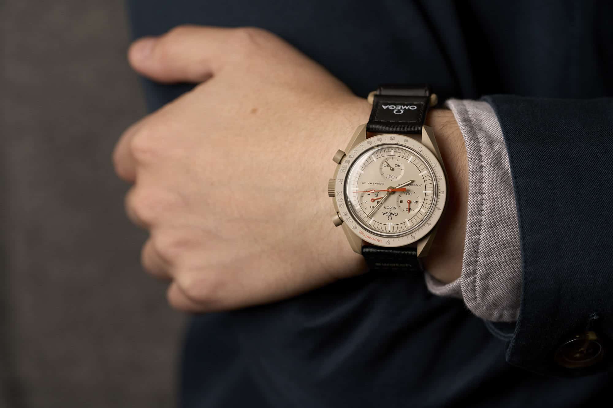
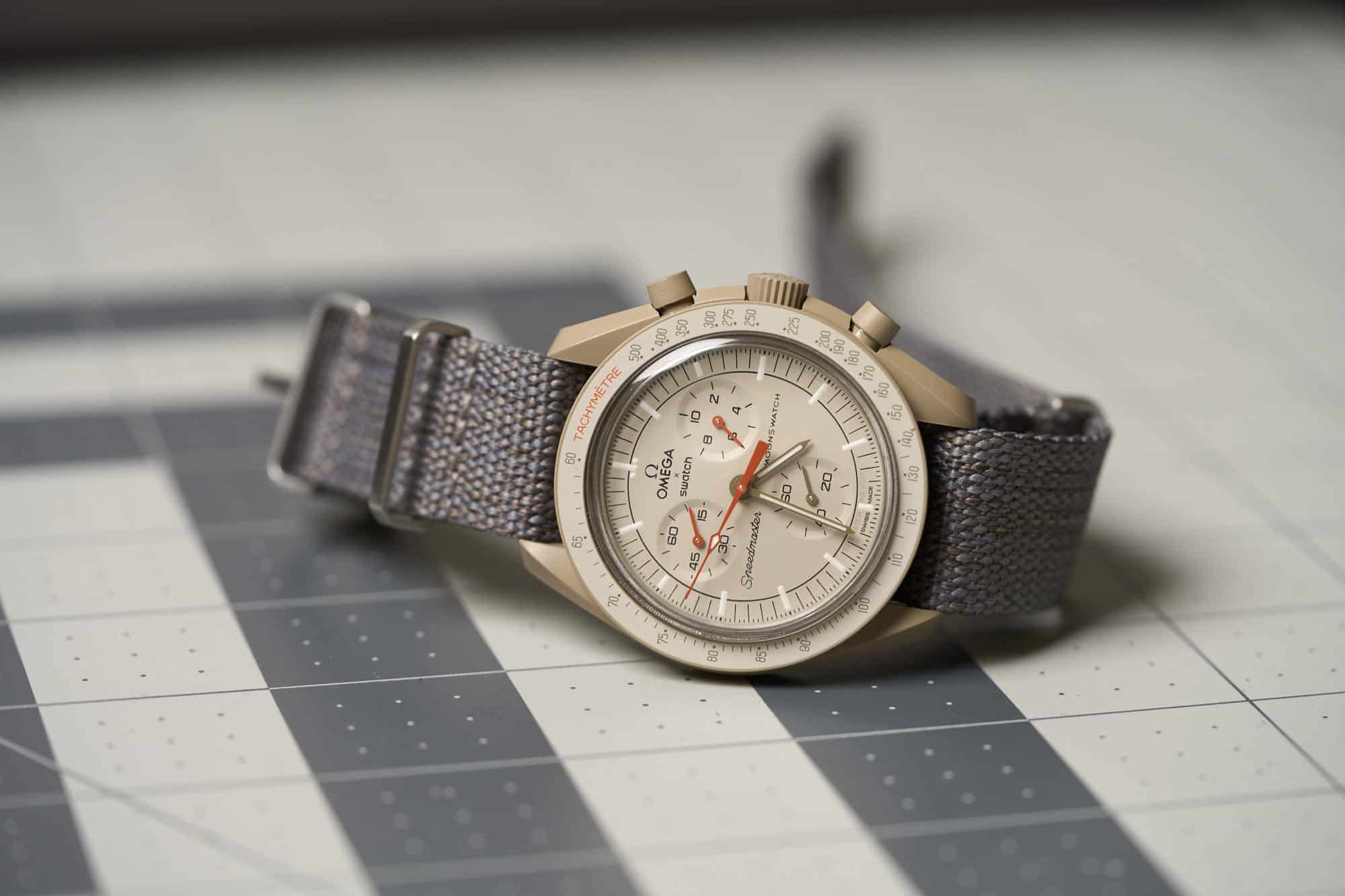
Things have since calmed down. The launch is no longer a headline. And while there has yet to be a full-scale restock (though there are rumors of stock trickling in), for those willing to pay a little more they are available. Keep reading on whether or not they are worth it above MSRP… Now, we can get back to what matters, the watch itself and not the hype around it. With the excuse of writing this review (hey, it’s a good excuse) I did go the second-hand route and picked up a Mission to Jupiter to try, wear, and (spoiler alert) really enjoy over the last couple of weeks. So, I’m going to review it like I would any other watch. A $260 quartz chronograph made of Bioceramic by two of the largest watch brands in the world.

Advertisement

Branding

Before diving into the watch itself, I want to take a look at its branding, as it’s actually a feature, and clearly a big part of the story. This, as you know, is a collaboration between sister brands from within the Swatch Group, Omega, and the eponymous Swatch. One brand made and sold it, yet it’s the design and provenance of the other. On the dial, you’ll find a lot of logos, and an unclear sense of which is the dominant brand. Omega gets first billing, and is actually the larger of the two brand logos, despite not being the retailer.

This is cool. Omega really leaned into this collaboration. I guess it was sort of an all-or-nothing situation given the scope of the project (and to be fair, they have the same owner), but given that they are the luxury brand who, by some logic, would have an “image” to protect in terms of markets and price points, making their brand dominant is a statement. This doesn’t feel like a one-off collaboration, like some “fashion brand x sneaker company”, it’s a serial product that will eventually be on thousands of wrists. It says “there is now a $260 Omega.”

Furthermore, Speedmaster is actually on the dial, as is MoonSwatch. Before getting to a bit of the confusion that causes, the fact that Speedmaster is on the dial feels like a really big deal to me. It would have been one thing to make the MoonSwatch, branded as such, and say elsewhere it was inspired by the legendary Speedmaster. Honestly, that’s what I would have expected based on my preconceived notions of how luxury brands protect IP. That would have made the connection, but kept things separate. But instead, it’s right there on the dial. This isn’t a lookalike, it’s a Speedmaster, and it’s now a part of that historic family of products.

The use of MoonSwatch does add a bit of confusion, however. Should we call this an Omega x Swatch Bioceramic Speedmaster? Or an Omega x Swatch Bioceramic MoonSwatch? Or even Omega x Swatch Bioceramic MoonSwatch Speedmaster? Maybe just MoonSwatch? On Swatch’s website, they are just called the Bioceramic MoonSwatch Collection. Well, I guess it’s all interchangeable, which is the issue.

In the end, there’s what the brands call or want to call it, and then what collectors call it. I think MoonSwatch is probably the fastest, but I kind of like Speedmaster MoonSwatch, as the latter replaces “Professional” in the context, which is saved for only the manually wound, 42mm models tested/used/approved by NASA (mostly). Nevertheless, don’t be surprised if I interchange them throughout the review.

The logos go back and forth on the various other accouterments. The packaging actually has fairly little branding, save large S and Ω symbols on its sides and Omega x Swatch on the bottom, nestled within the 11 celestial bodies representing the watches. The strap, once again, puts Omega in focus by branding the portion of the strap that attaches below six. Speedmaster then gets dominant branding underneath. SpeedSwatch forever.

Case

The Speedmaster’s twisted lug case is the stuff of legends. It has remained largely untouched since replacing straight lug Speedmasters in 1963, and for good reason. It’s exotic, sensual, and can be beautifully finished to a luxurious effect. It’s also proven. It went to the friggin Moon. Though typically made of steel, it has been rendered in everything from titanium to precious metals to ceramics* in its near 60 years of production. Now, in 2022, a new material gets added into the mix, the unexpected Bioceramic, so let’s take a quick look at what that is. (*Zirconium)

Bio- can be defined as “relating to life,” or organic. Ceramic is generally defined as a material that is molded from inorganic and non-metallic materials, and hardened by high temperature. Thus bioceramic is sort of an oxymoron in that it’s a combination of organic and inorganic. In terms of the specific material, Swatch defines it as ⅓ bio-sourced plastic and ⅔ ceramic. This further confuses things as plastic is typically considered a synthetic, man-made material. In this instance, that is still true, but the source is castor oil, which is heavily processed, and thus “bio”. The ceramic in this mix is still Zirconium Dioxide, or Zirconium, which is the same material you’ll find on most ceramic watches.

What’s the result? Well, it’s either fancy plastic or affordable ceramics, you pick. Objectively speaking, you would be hard-pressed to find the difference between bioceramic and another plastic, or ceramic for that matter. It’s temperature neutral, it’s rigid, it’s lightweight, it holds an edge well. Given the price of the watches, however, I imagine it’s much easier and cheaper to work with, as well as color (something that is a noted challenge with ceramics, though a benefit). It likely lacks the brittle nature of pure ceramics, yet I also somehow doubt it’s as hard or scratch resistant as ceramic, though I’ve yet to put that to the test.

To be fair, other than the finishing you’ll find on something like a ceramic Zenith Defy, or a Speedmaster Dark Side of the Moon more relevantly, high-end ceramic watches also often feel like plastic. It’s an odd material as it lacks a certain sensation of permanence and solidity that even a lightweight metal like titanium has. That can be a bit of a hard pill to swallow on a four or five-figure watch, but on a $260 watch, it’s less an issue. We are more used to plastic at this price point. The variety of colors the material allows for alone justifies its use, especially in the context of a watch that is typically thought of as steel.

This was very much part of the appeal of the Mission to Jupiter. While not a vibrant or even unheard of color in watches, a khaki Speedmaster is something I could have only dreamed about, let alone bought. But, here it is, and it was only $260 (well, MSRP). The vivid blue of the Mission to Neptune, or the rich red of the Mission to Mars, allow the case to be pushed even further into unheard of, exotic territory.

Other than the color, the case itself is largely what you expect from the Speedmaster “Pro” style. Coming in at 42mm x 47.2mm x 13.2mm (including the box crystal), it’s almost exactly the same as the current co-axial Speedmaster. And other than the weight (more on that later), wears just about the same as well. That is to say, it fits great.

The Speedmaster is one of the most wearable “42mm” watches because that dimension takes into account the asymmetrical right side of the case. This isn’t news to Speedy fans, but for those out there entering the Speedyverse via the MoonSwatch, it’s very worth noting. In fact, a better dimension for the case is 39.8mm, which is the diameter of the bezel. When you look down at the watch, this completely flat surface is more dominant than the edge of the mid-case, so it reads like the end of the watch itself. 39.8mm is a happy medium in my book. Add in the tolerable lug-to-lug, and you have a watch that just wears well.

Part of what amazes me about the MoonSwatch is that it doesn’t just look like a Speedmaster from the top down, the whole case has been recreated. Every curve, every nook, every undercut. From the flare of the bezel to the eagle-bill silhouette of the lug when seen from the side, to that iconic twist from above. You don’t miss out on any of it. And whether in steel, platinum, or bioceramic, it’s gorgeous. I will say the lack of contrasting polished surfaces does change the dynamic feel of the twisted lugs, but polished plastic tends to look a bit cheap, so going full satin/matte was likely a good choice.

To that end, they even went so far as to etch an “S” into the crystal where you’d find an Omega symbol on acrylic Speedmaster Pro models. It’s a cool detail that is meant for those who are aware. The crystal, too, lacks nothing in terms of shape (or how easy it is to scratch, regrettably). The crown and pushers are in line with Speedmaster standards as well, with the crown just about matching the diameter of the Speedy Pro. One slight adjustment is that the pushers are set a bit wider on the MoonSwatch as per the movement.

The biggest departure is found on the caseback, which lacks the typical Speedmaster markings. Instead, there is text molded into the back along the outer edge reading “Dream Big, Fly Higher, Explore the Universe, Reach for the Planets, Enjoy the Mission.” At the center is a full Swatch logo as well as some details, including the ETA shield and Swiss-made. The star, or planet, of the show, is the battery cover, featuring a semi-photorealistic full-color print of Jupiter over the hatch. It’s an awesome detail and I love that it’s there. It would have been so easy to do something generic and forgettable, as so many case backs show, so this attention to detail is appreciated. Accompanying the planet, in bright orange text, is the name of the watch “Mission to Jupiter”.

Dial

If the case is a close recreation of the Speedmaster, save color, the dial is a loose interpretation. This is partly due to the movement in use, which required a reorganization of the subdials, but also because they weren’t shying away from a little fun with these. They still draw closely from the Speedmaster language, but, especially in terms of color, they are their own thing.

The Mission to Jupiter goes for a tone-on-tone palette, bringing the drab khaki of the case through the bezel and into the dial. It’s striking if muted. As such, the dial is close to the sandy tone of the case, but not quite the same. To my eyes, it’s a touch lighter, and creamier, for lack of a better term. Around the outer edge of the dial is an index of thin black lines the same weight and seemingly length as that of the Speedmaster Pros. Interestingly, there are ⅓ second marks, like on the 3861 model, though the chronograph seconds hand only ticks once per second. I think that can get a pass for looks and balance though. At the hours are rectangular lumed bars, with the signature dots at the base of the marker at 12. The markers at two, six, and ten are shorter than normal to accommodate the subdials.

Moving in is then a curious detail, a full black circle. This line marks where the “step” of the dial would be on older Speedmaster models, as well as the most recent. For decades, the transition was softer, for a more gradual domed effect. I’m a bit split on this detail. It’s not the same, clearly, as the line that is created by a physical depression is subtle, essentially perceived as light and shadow. The line is kind of abrupt, and distracting, adding no depth to the dial. It does, however, segment the dial, separating the subdial region from the outer index. Perhaps this helps the eye organize information. Needless to say, I would have preferred a genuine step, or a lighter weight line.

Advertisement

At two, six, and ten you’ll find the 1/10th second counter, active seconds, and 60-minute counters, respectively. These sub-dials are pressed into the dial, featuring a flat surface and beveled edge. They are all executed in classic Speedmaster style with the same typeface and lines. That said, the layout is obviously radically different, and kind of throws your head for a loop at first. I’m so used to three-six-nine or six-nine-twelve chronograph layouts on three register chronos, that this just feels off. It sort of stretches the dial vertically, which actually gave me the sense that the dial was an oval for the first day of wearing it. That went away, and I eventually got used to the look.

In terms of the design of the sub-dials, they look the part, and there isn’t really much to say about their design (the 1/10th second is neat, but I’ll get to that in the movement section), except that I have one kind of big issue here. The 60-minute counter lacks individual minute marks, having marks at five-minute intervals instead. Why, oh why would they do this?

A 60-minute counter is actually a great feature. It’s much more useful than a 30-minute counter, especially when there is no 12-hour counter. But to leave out the individual minute marks makes it kind of useless, unless you happen to land on a mark, or are just using it as a general indicator of passing time. For the record, the 30-minute counter on Speedmaster Pros have all of the minute markers. Further emphasizing this lack of precision is the 1/10th second counter just beside it.

As to the why, well, I’d say it’s logically a visual balance issue. Had that sub-dial had dashes per minute, even if small, it would have become quite dense, and out of balance with the other sub-dials. The active seconds sub-dial also lacks individual second marks, but there it matters less. I just think they made the wrong choice here as it does affect the usability of the watch, which does not align with the spirit of the Speedmaster.

Moving on, I already discussed the branding, but visually it has an interesting impact on the dial. The logos and flavor text balance out the triangular layout of the sub-dials by essentially being an inversion of the same shape. Though the typefaces/logo designs are very different, the width of “Speedmaster” and “MoonSwatch” creates a sense of symmetry. This all comes together for a fairly balanced overall layout.

The hands too are in keeping with the classic Speedmaster design, once again with the noted difference of color. As a nod to the Ultraman, the chronograph functions are all highlighted with deep orange. It’s a great shade of orange as it’s not too bright, nor fluorescent, rather having a rusty sort of tone. It also goes very well with the sandy color of the dial and case. The hour, minute, and active seconds hands are all dark khaki-colored, which also looks very nice and is a bit unexpected. I always like it when the hands on a watch are color coordinated by their functionality, so this setup makes me quite happy. There is lume on the dial and the hour and minute hands, but it’s mediocre at best.

While not technically a part of the dial, the tachymeter (errr, tachymètre) definitely acts as an extension of it so, I’ll include it here. No surprises, thankfully on the tach. It’s classic Speedmaster, down to the dot over 90. The use of orange for the tachymètre text is also a nice touch. The only kind of odd thing about it is the application. As it’s not a metal insert or molded markers filled with paint, it seems to be some sort of decal or transfer. This gives it a slight sheen that I don’t love. I’m also curious about its durability.

Movement

Inside of the MoonSwatch is… well, an ETA. It doesn’t say anywhere on Swatch’s site, that I can find, the exact caliber. The case back does have the ETA shield, as well V8, indicating it’s a Swiss origin movement, and four jewels. According to Caliber Corner, who has done some sleuthing on the topic, it’s most likely an ETA G10.212, which at least in terms of layout and functionality, does seem likely. Or, at the very least, is the basis of what is in the Swatch. It also appears to be in all current Swatch chronographs.

With that ambiguity in mind, what you have is clearly a chronograph with hour, minutes, and chronograph seconds about the center of the dial. You then have sub-dials, as already stated, for a 60-minute counter, 1/10th second counter, and active seconds. The chronograph seconds, when activated by the pusher at two, ticks once per second. However, when you stop the chronograph, the 1/10th second hand will jump to one of the various marks on its sub-dial, indicating a much finer precision. While a sweeping seconds hand is more aesthetically pleasing, actually reading the fractions of a second is typically kind of difficult. In that way, this setup is an improvement. I know this is hardly the first quartz chronograph to do this (actually, the Seiko 7A28 released in 1982, which was the first analog quartz chronograph, also had a 1/10th counter), but hey, it’s been a while since I’ve played with one.

Another cool function, though common in quartz, is the split timer built-in. While this doesn’t have the second hand associated with a rattrapante, by pushing the reset pusher while the chronograph is running, the chronograph seconds hand will freeze in place, and the 1/10th second hand will jump to the correct position for when the chronograph was stopped. Push it again, and the seconds hand will jump forward accounting for the time that had elapsed. Rattrapante actually means “catch up,” which still applies here.

There is a first stop on the crown, which at first seems to control nothing, as there is no date, however, there is still a function. With the crown in first position, pressing the top pusher adjusts the the 1/10 sec-hand, and the bottom pusher the center chrono-seconds hand, should they get out of place. Similarly, with the crown in second position, the top pusher will adjust the 60-minute hand.

Advertisement

Straps and Wearability

As part of the Speedmaster theme, Swatch/Omega recreated the also iconic NASA velcro strap as the default strap for the MoonSwatch. For reference, the Omega version of this strap, which Blake Buettner reviewed, is $190 dollars, so nearly the cost of the whole MoonSwatch. When you pop open the box for the first time, it’s undeniably cool to see it there. It’s thematically on point and it looks good on the watch. Each has been color-coordinated for the “Mission” and features a case-matching bioceramic (I imagine) ring. The use of Omega and Speedmaster branding further pushes it home that is more than plastic lookalike. Yeah, it looks great. Unfortunately, it’s not a pleasant strap to wear.

They did a great job making it look the part, but texturally, it’s not an appealing experience. It’s stiff, and plasticky. It doesn’t want to drape like fabric or nylon. It’s also quite awkward to put on as the watch is very very light. If you attempt to loop the strap through the ring while the watch is on your wrist, the lack of heft keeping the watch down and the stiffness of the strap makes that almost impossible. Instead, you need to feed the strap through ring a little first, then slide it over your hand, and then tighten. Once on, things aren’t much better. It feels abrasive against your skin, and the stiffness makes it awkwardly kink out at the keeper.

To be honest, it kind of tainted my initial reaction to the watch as the lightness of the watch head plus the feeling of the strap made the whole thing seem lower quality than it is. Conveniently, it has 20mm lugs and uses traditional springs bars, so off came the strap, and on went some nylon. What a difference. I first put it on a Crown and Buckle Matte Supreme, which are like the pajamas of watch straps, and then I began enjoying the watch itself.

That’s when it started to feel like a Speedmaster, albeit a very light one. But, that then became a bonus too. It’s a watch you can forget you’re wearing, which is certainly not the case with a metal Speedmaster. It’s an odd bonus, but not a bad one, and will likely push it forward in my watch box for the summer. As I said before, the watch also wears really well because it’s a 42mm Speedmaster, at least in my experience and on my 7” wrist. But, only the Mission to Jupiter looks like the Mission to Jupiter.

I definitely have a thing for drab, earth tones, as well as khakis and tans, especially when mixed with black (and I have a growing collection to prove it). When I first saw the 11 MoonSwatches, it was the one that immediately jumped out to me. In person, it’s a weird colorway that takes a little getting used to, but when paired with the right strap, looks really awesome, and unlike anything else.

From the muted C&B Matte Supreme Tundra, which is a gray mixed with warm flecks, to the vibrant Rust ADPT, to classic black leather, it takes to straps well, each playing off of the khaki tones differently. Some browsing on IG will show a lot of experiments with strap choices for the MoonSwatches, from leather to fitted rubber, etc. I’ve yet to see something bad, even the time Buettner tried the Mission to Mars on a bracelet.

Other models are quite striking on the wrist as well. At Windup Watch Fair San Francisco 2022 I spotted a couple, one wearing the Mission to Mars, the other the Mission to Uranus. They looked awesome on their wrists with their everyday casual clothes. Luckily, they were also kind enough to let me snap wrist shots of them. It might be partially because they are still so new, but they really stood out in a crowd where everyone was wearing something cool.

Advertisement

Conclusion

The Omega x Swatch BioCeramic MoonSwatch Speedmasters are not perfect watches. They are weird and idiosyncratic by design. There are some flaws, like the lack of minute markers, that I think were avoidable, and others, like the strap, that were ambitious attempts that likely lost out because of price restrictions but help tell a story. That I can excuse. Overall though, for the price the Mission to Jupiter, and I’d think by extension the other 10 MoonSwatches, are incredibly fun, stylish, and conceptually amazing. It’s hard to quite put it into words, but there is a unique novelty to wearing a plastic Speedmaster. A luxury watch from a famous brand with great historical significance that looks great, and doesn’t cost an arm and a leg. Well, when they are available, that is.

And that brings me to the last facet of the MoonSwatch, the price. $260 is 4.33% of the base price for a current Omega Speedmaster Professional (cal 3861). It’s also at the very top end of Swatches, which hit $270 for a Sistem 51 Irony. Personally, I think $260 is a completely fair price for this watch. It’s seemingly more complex than your average Swatch, given the case construction, strap, etc, and, in my experience, the quality has been totally fair. If the watch had been less expensive, would I have complained? Certainly not, but also given the brands involved, I would have expected something more expensive.

Is there a stigma around plastic, quartz-powered watches that make people think they should be dirt cheap? Yes, but that’s related to post-quartz-crisis attitudes and commodity watches. Many brands make quartz watches in this price point and higher, from G-SHOCK to Marathon. Can you get a steel, mechanical watch at this price point as well? Yes, Seiko 5 and others are out there too. Price comparing can be a bit of a trap, so I wouldn’t go down that hole if you just like the watch.

In terms of buying second-hand, well that’s a trickier question. I was able to get the Mission to Jupiter for about 2X MSRP on StockX. I would have rathered paid MSRP, but I wanted to write this review. At the time of finishing this review, the Mission to Jupiter is actually available for less than I paid. Unless you’re impatient (and I can get that), I think it’s worth waiting to pay retail for these. As stock becomes available, the aftermarket values will come down dramatically, so it’s purely paying more for convenience.

No matter how you look at it or want to buy it, for Speedmaster fans, whether they have Speedies in their watch boxes or just desire to get one someday, the Omega x Swatch BioCeramic Speedmaster MoonSwatches are a worthwhile pickup. They are a new take on the iconic design, an unexpected detour on a historical path that opens up the watch to a whole new market and fanbase. And, the colors are just rad. Swatch

Images from this post:
Related Reviews
Zach is the Co-Founder and Executive Editor of Worn & Wound. Before diving headfirst into the world of watches, he spent his days as a product and graphic designer. Zach views watches as the perfect synergy of 2D and 3D design: the place where form, function, fashion and mechanical wonderment come together.
wornandwound zsw