The Seiko 62MAS Family – Three Generations Compared

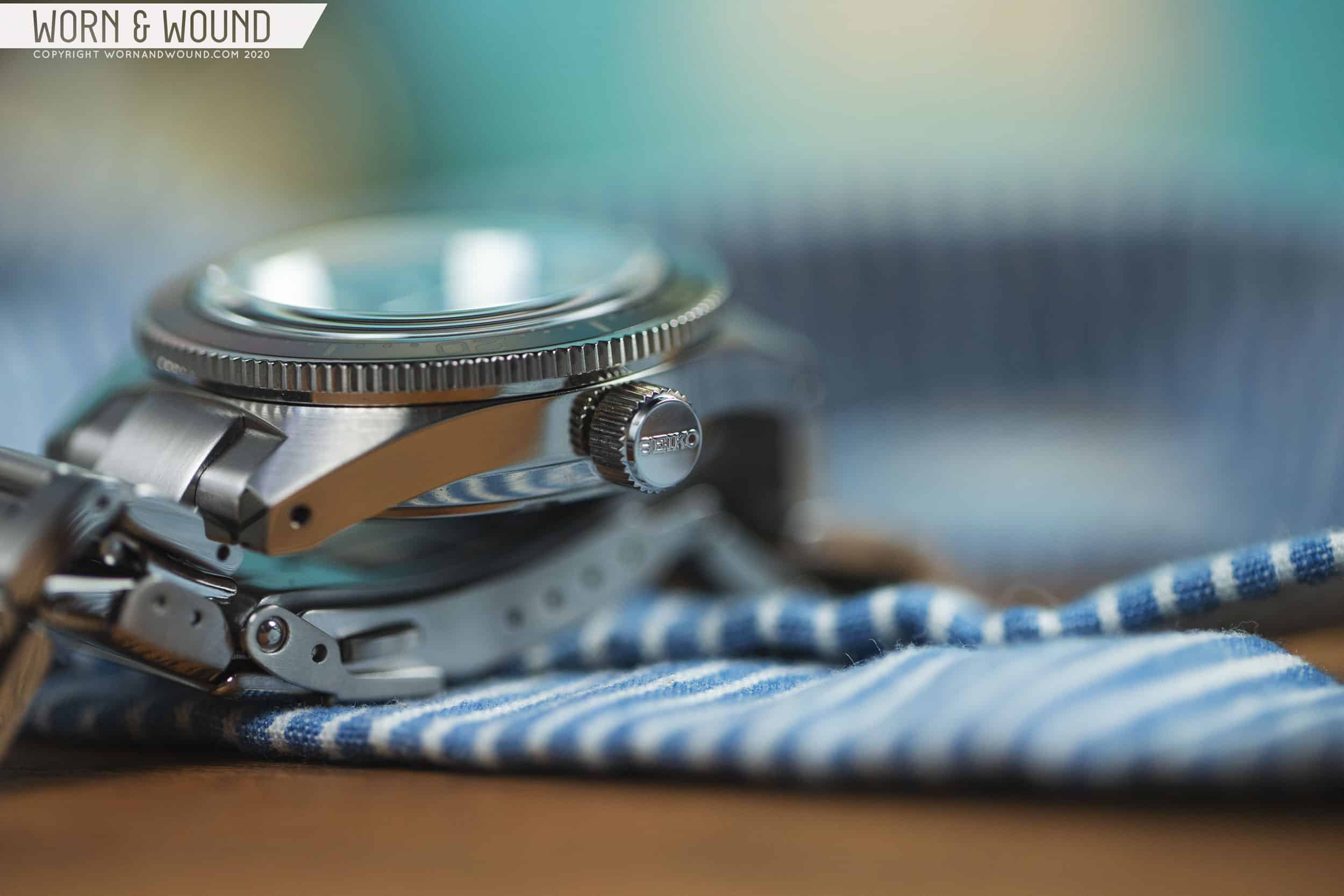
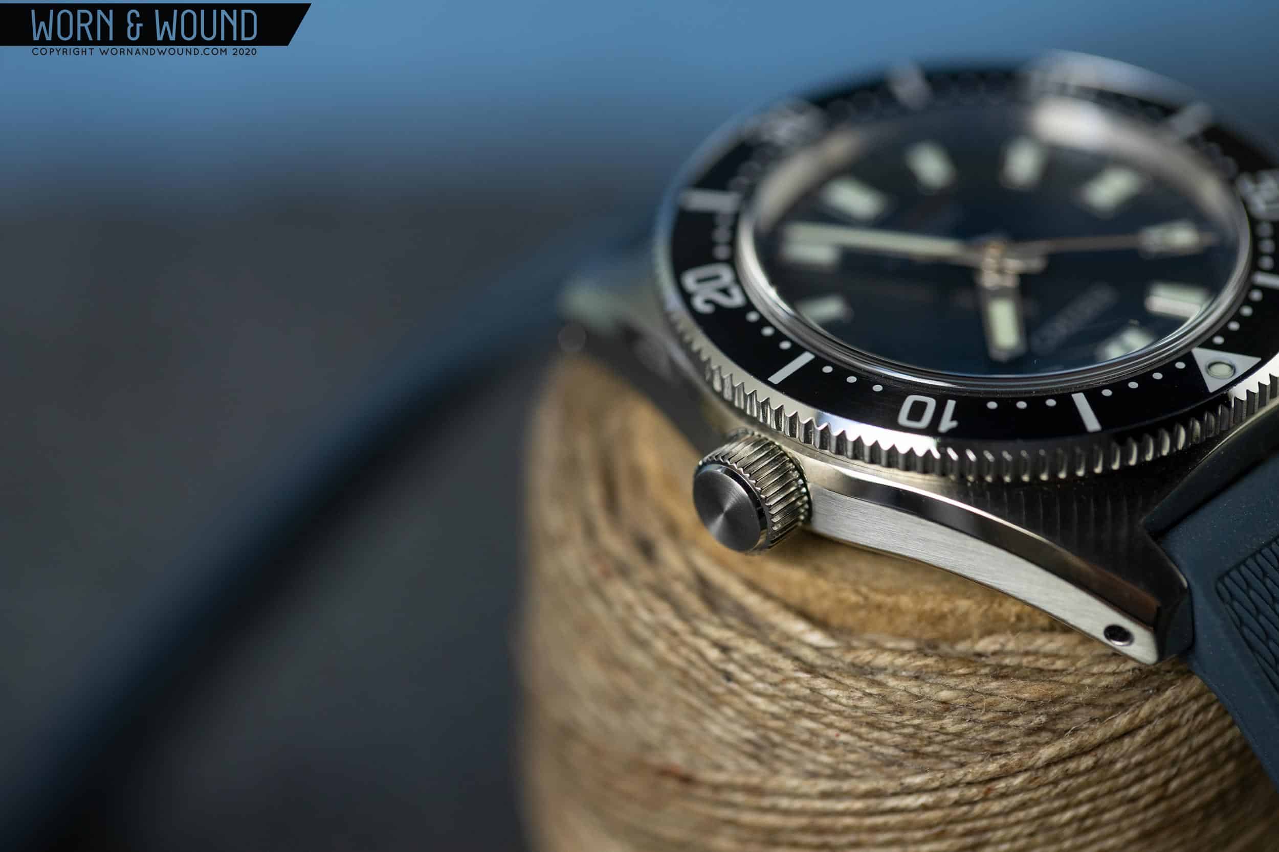
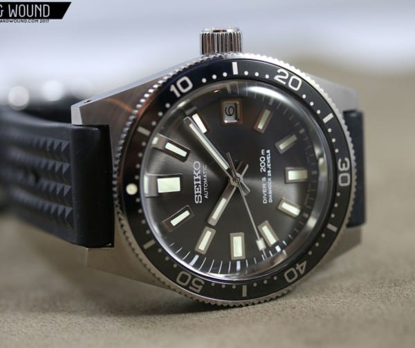
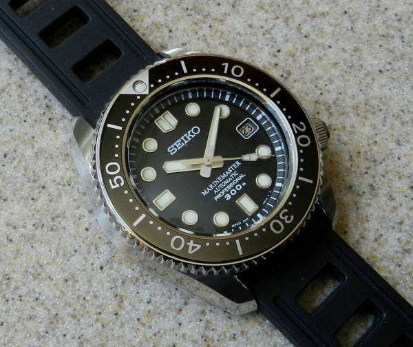
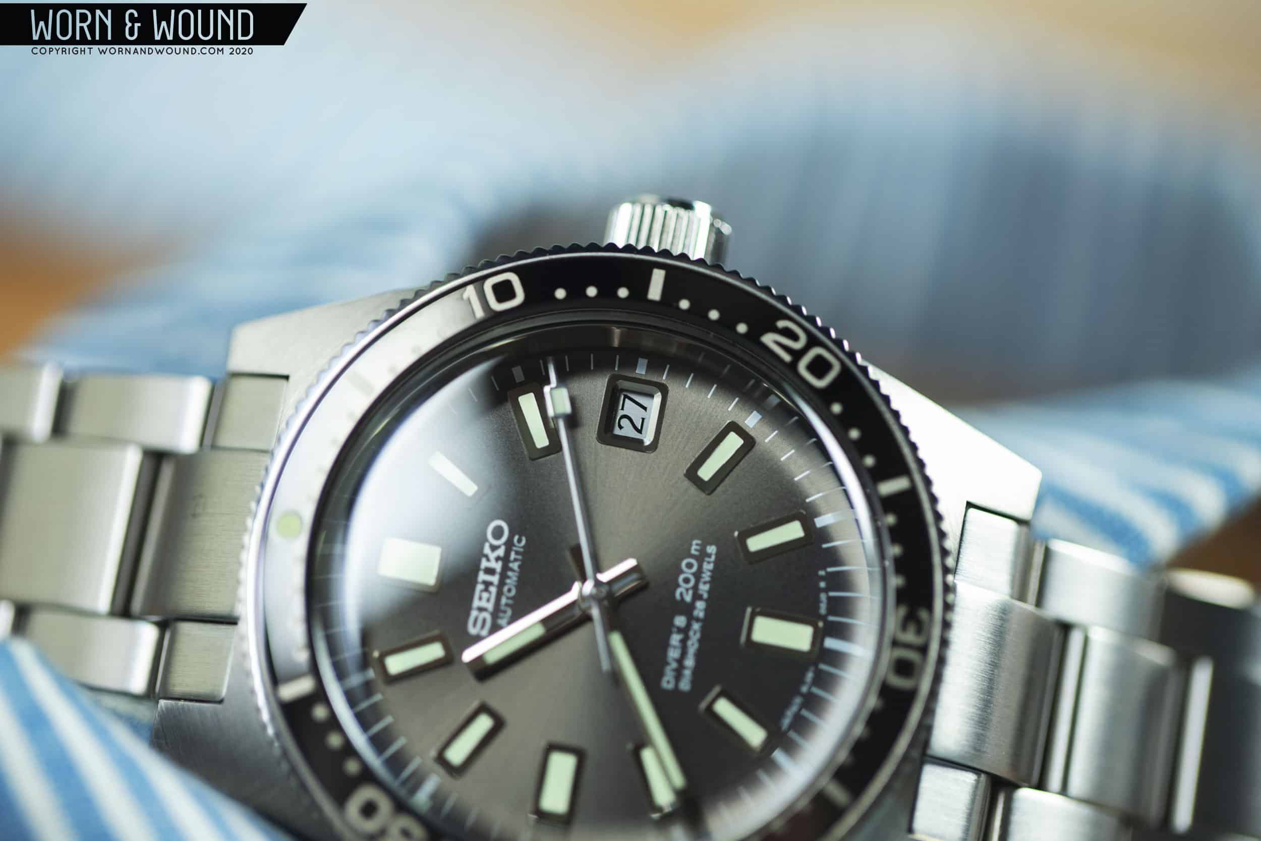
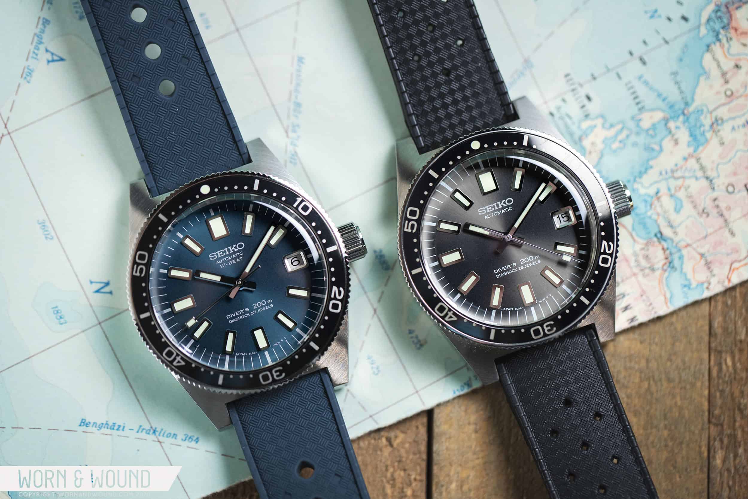
This is likely the third or fourth time I’ve told this little story, but for those who missed the previous articles, when Seiko announced the 55th Anniversary diver trilogy earlier this year they buried the lede. Alongside that set of high-end limited editions was a more affordable watch, the SPB149, which was a modern reinterpretation of Seiko’s first diver, the 62MAS. While not as exotic as those other watches, it was obtainable, and as far as we could tell from details, a winner (which I later confirmed in my review). While a limited edition itself, its very existence also suggested that it might be the start of a new family of watches. That was confirmed as well.

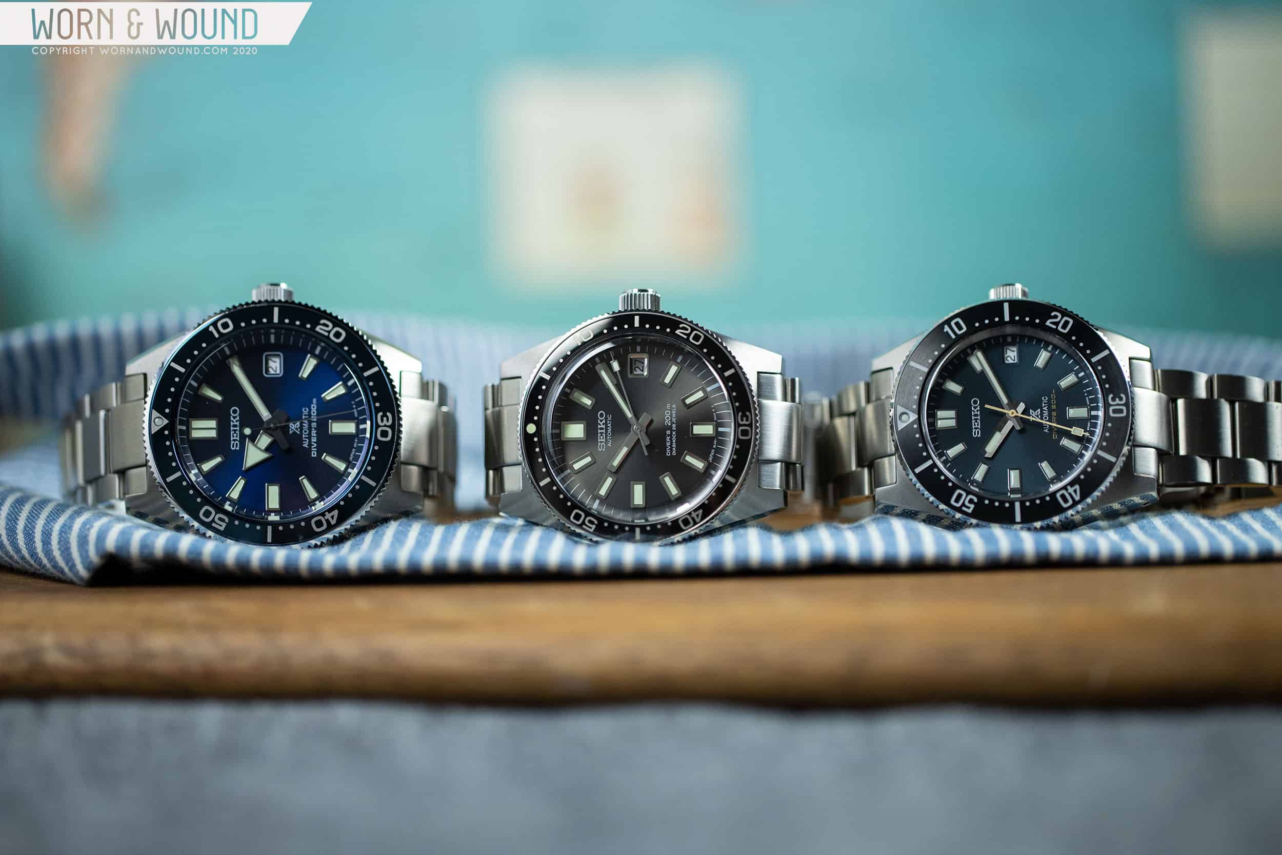
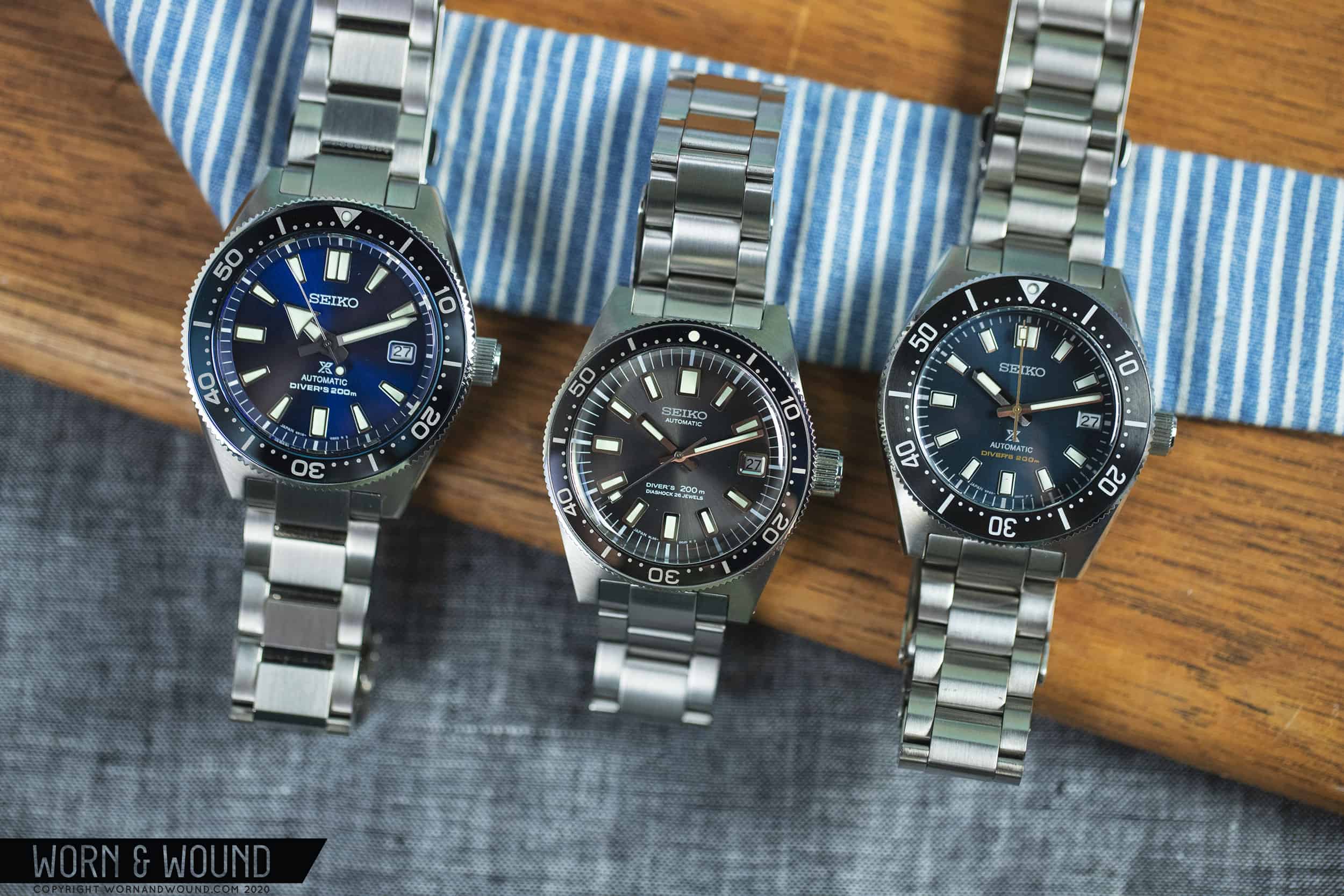
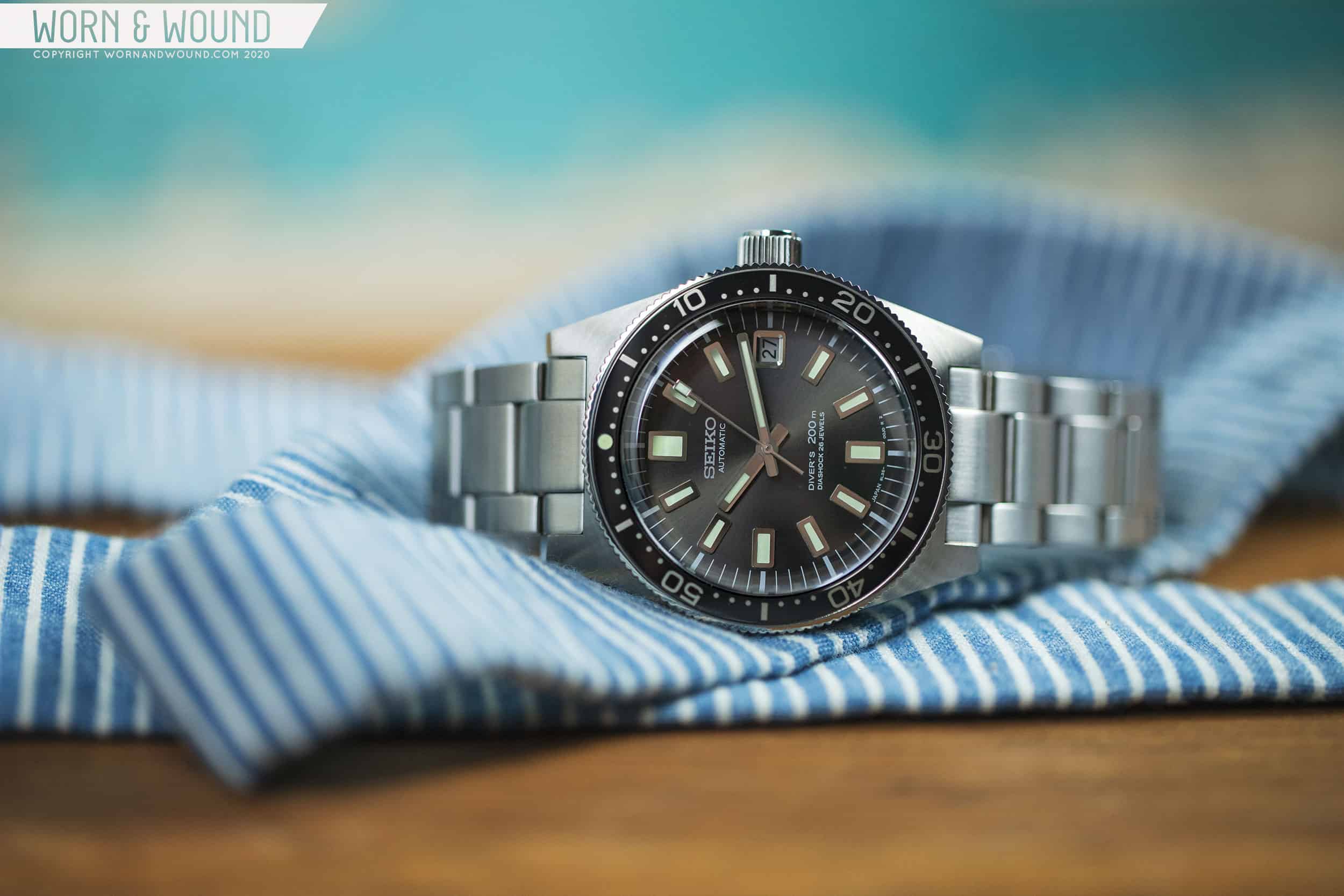
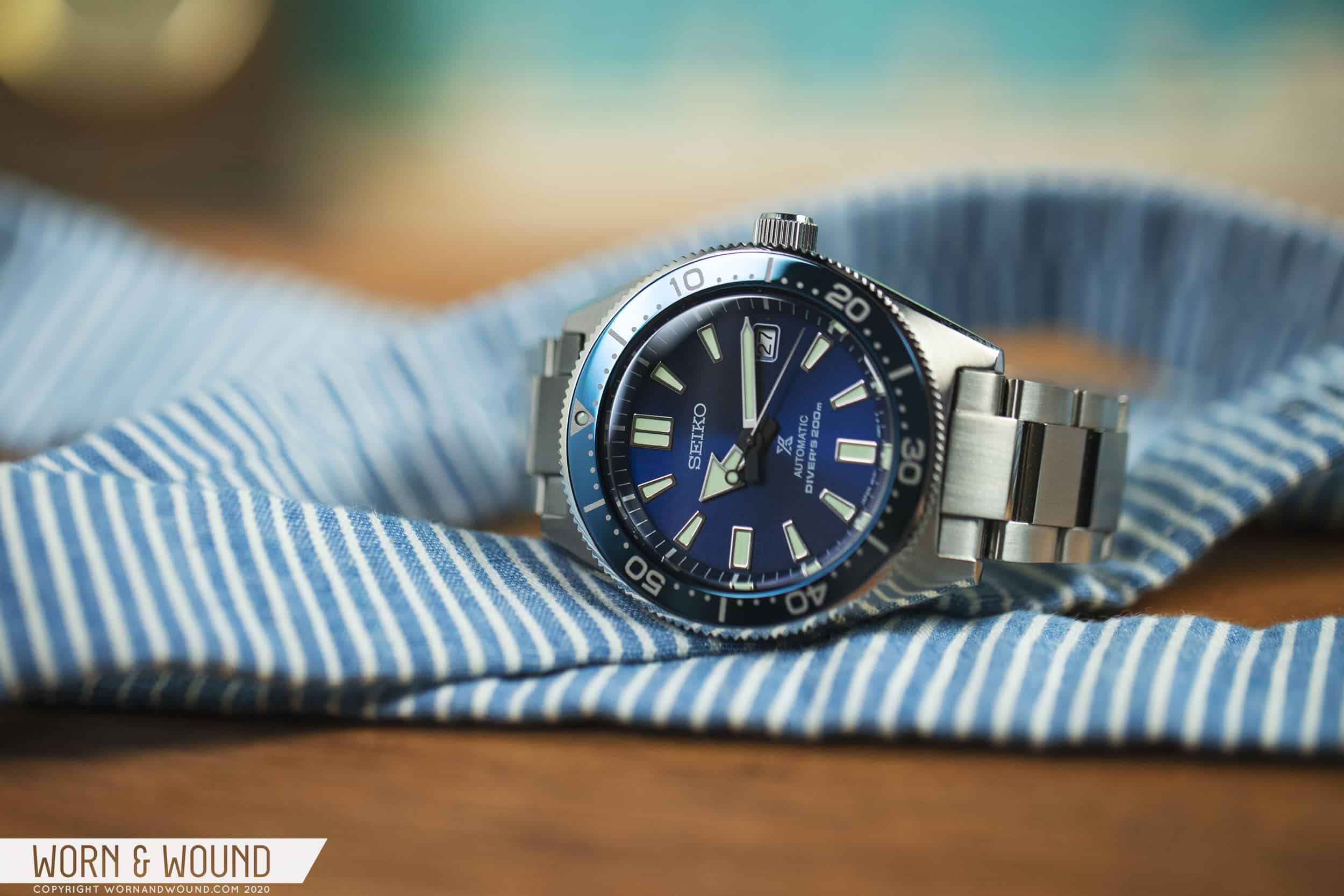
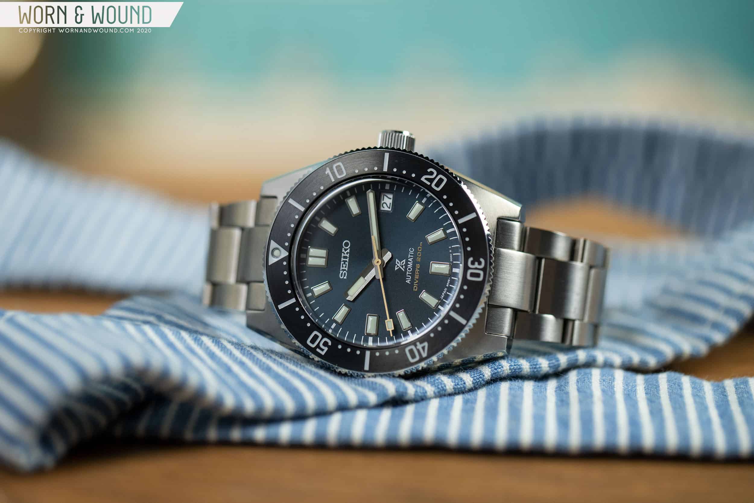
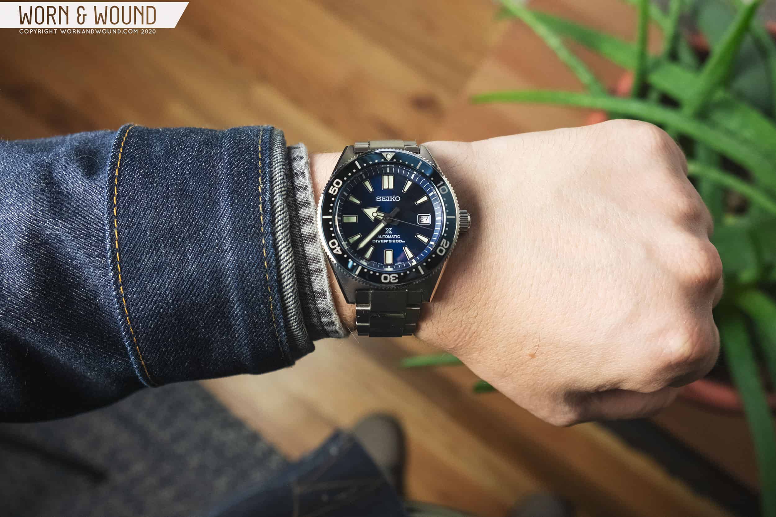
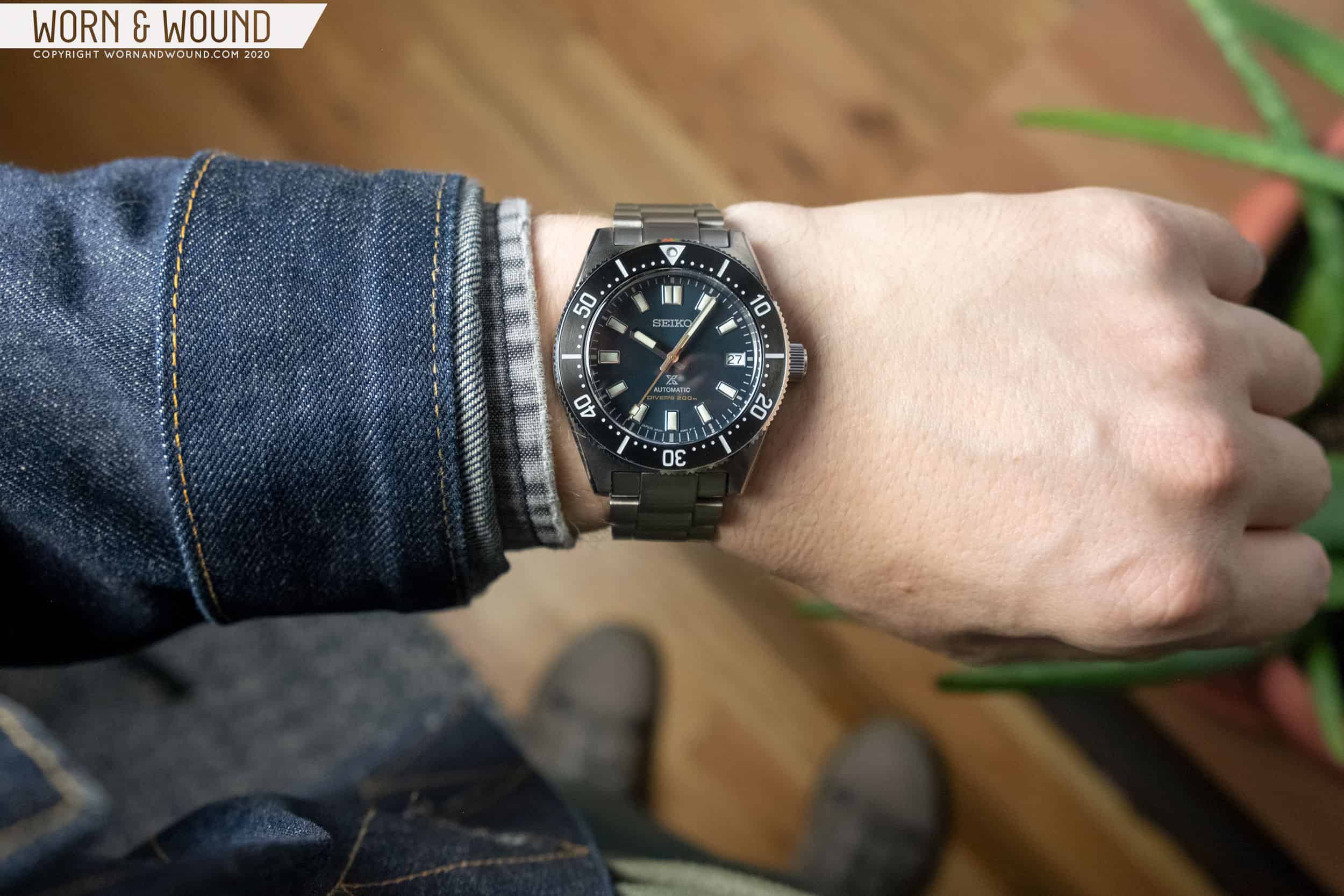
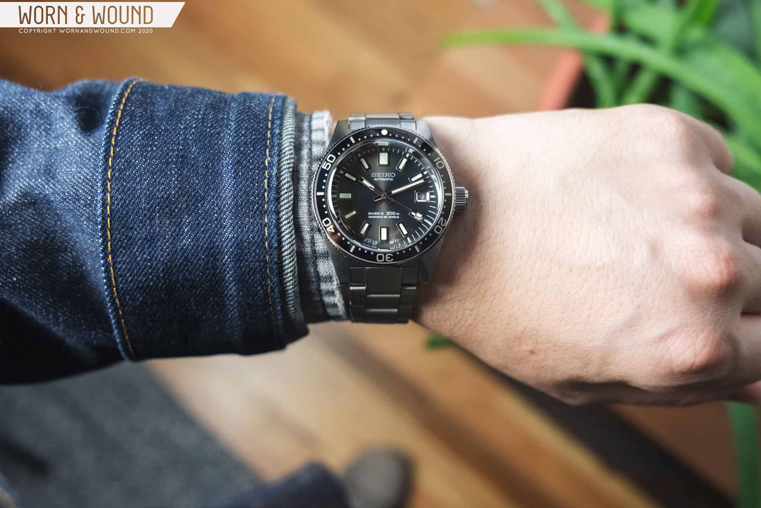
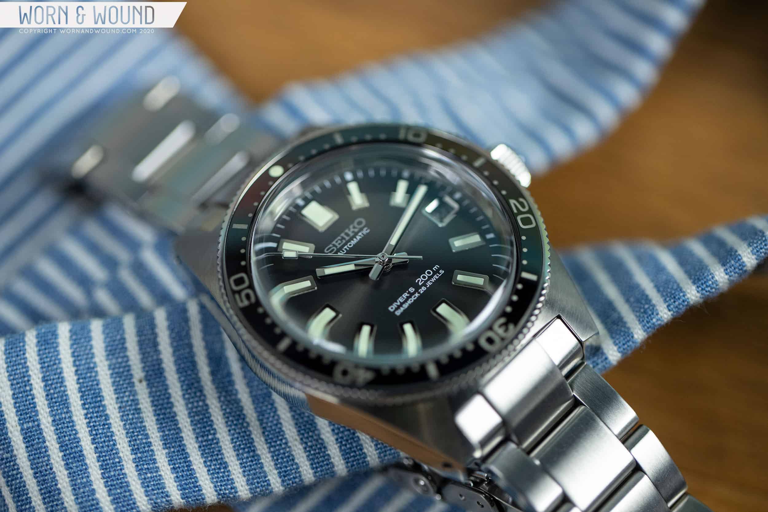
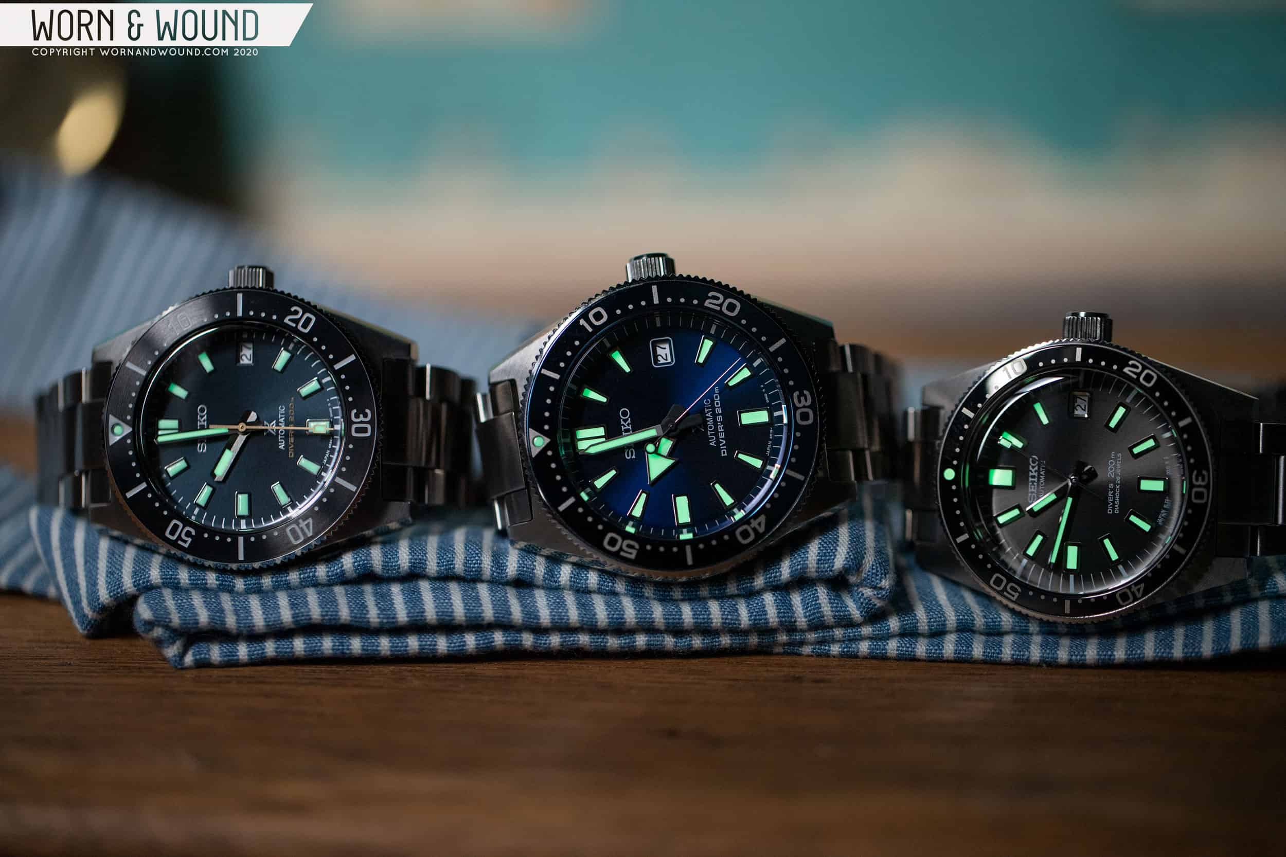
The release of the Seiko Prospex SPB14X watches came as a bit of a surprise not because the watch or design itself is that different, but because Seiko had released a watch that, on paper at least, was designed to achieve the same goal just a couple of years prior – make an affordable, modern interpretation of the 62MAS. Those watches, the SPB05Xs, were crowd favorites as well. This brings me to the premise of this article, a comparison of three modern Seikos based on the iconic 62MAS: the SPB149, SPB053, and the SLA017.

The SLA017, SPB149, AND SPB053

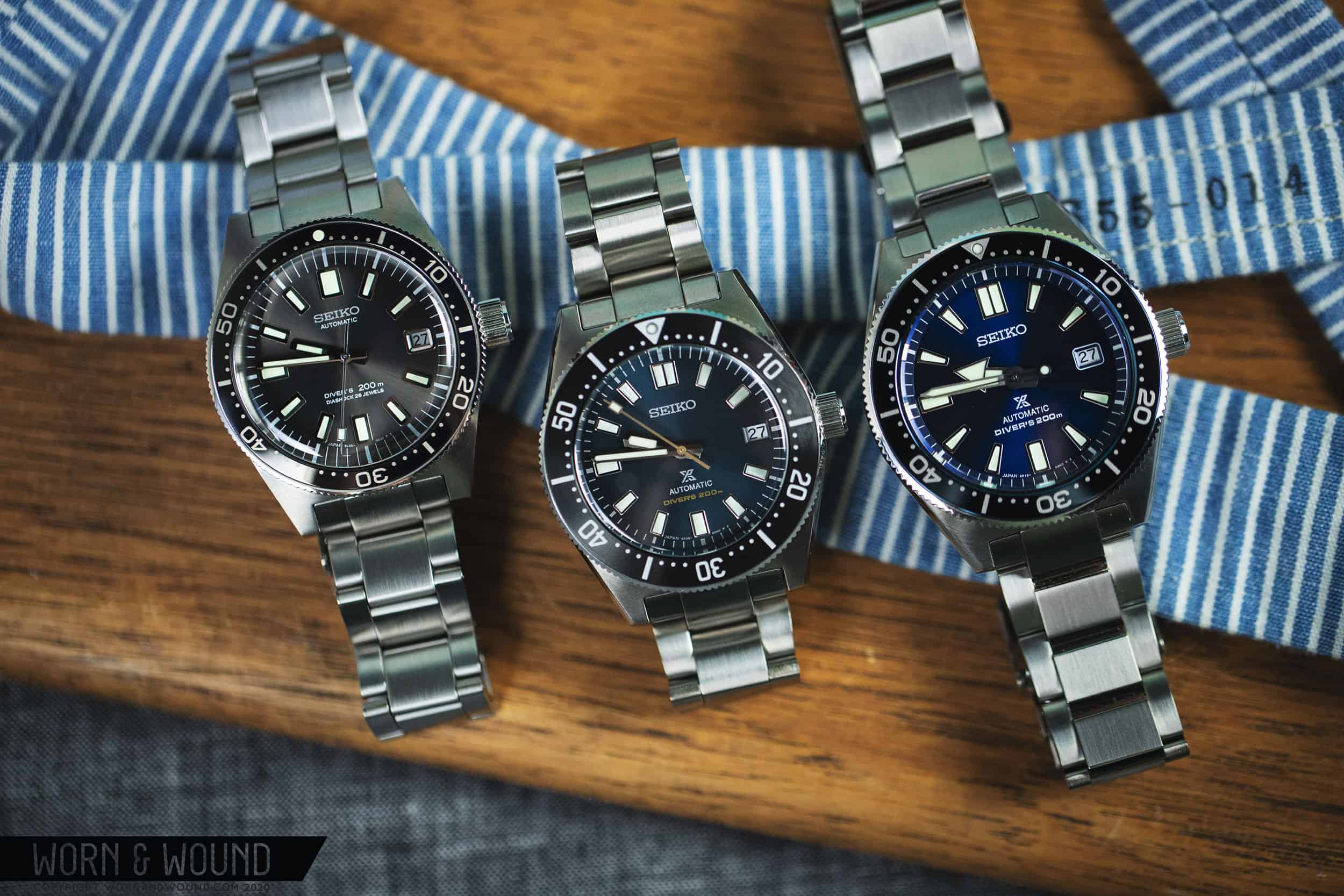
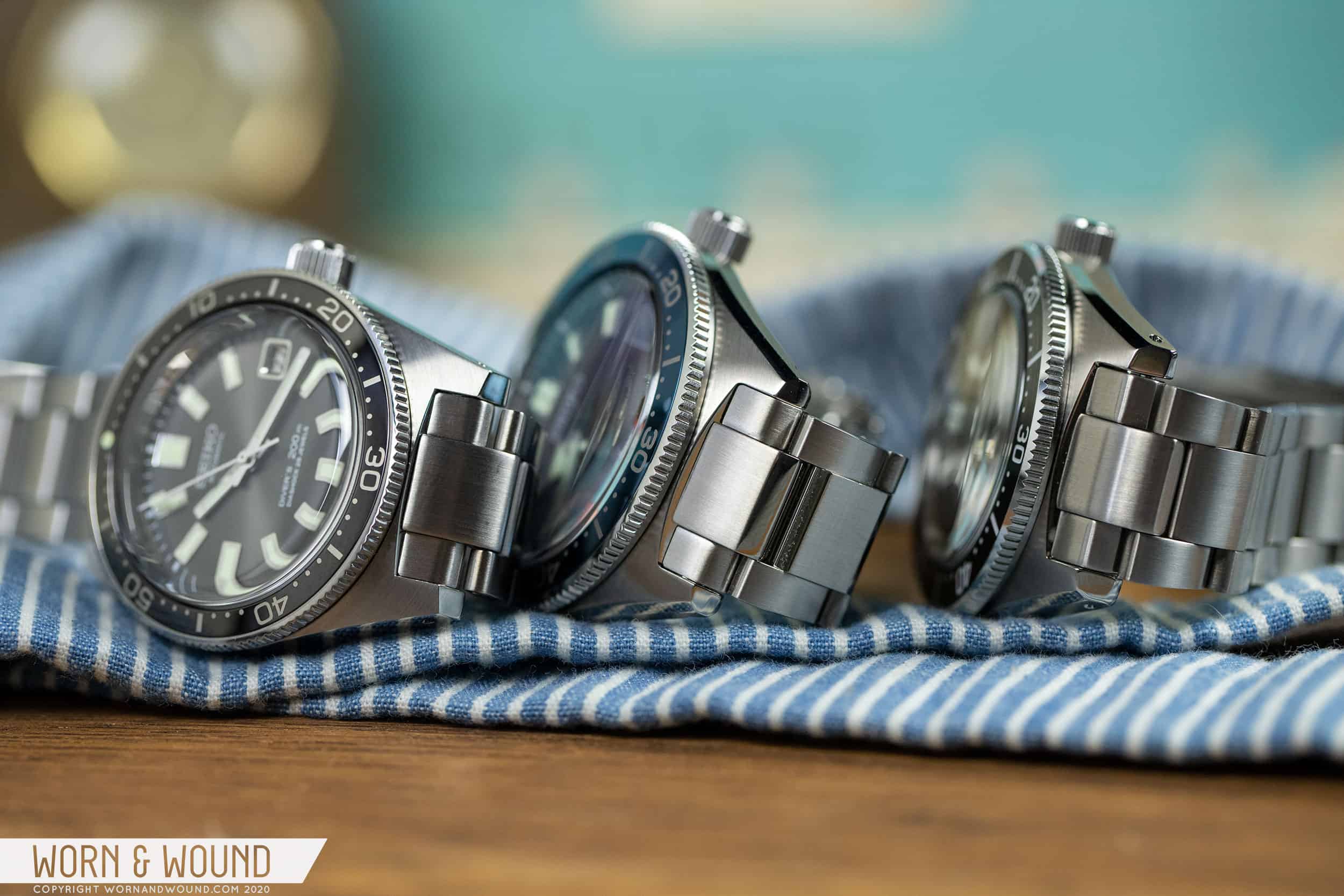
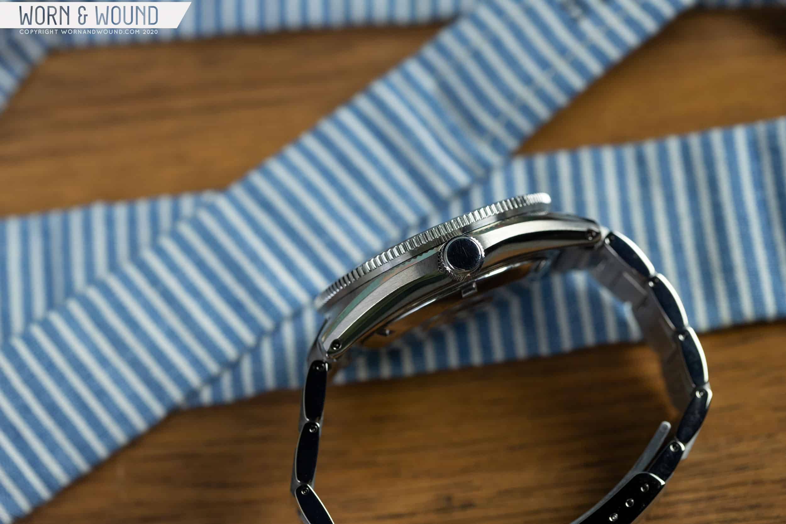
Three you say? Well, while the most relevant comparison is between the 149 and the 053 as they are contemporary competitors in Seiko’s line up, the 017, which is decidedly more expensive and higher-end (by Seiko standards) serves as a nice counterpoint, as it’s the “truest” recreation of the 62MAS in the group. Let’s kick this little exercise off with the cases, as with Seiko, the cases tend to make the watch.

Advertisement

Cases

With its stubby, squared-off lugs, thin bezel, and three o’clock crown, the 62MAS is very much a diver of its era. Probably the most “normal” looking case in Seiko’s diver history (mentally compare it to Turtles, Willards, 6159s, Tunas…) its skin-diver style is charmingly retro to a modern eye. With the three watches being compared, you have the traditionalist with the 017, as it stays closest to the original’s design and proportions though comes in larger at 39.9mm. The 053 is the tank of the group, with a commanding 43mm diameter. The 62MAS DNA is still present, but more distant. The 149 is the next-gen. It bears an at-a-glance resemblance to the 62MAS and is modestly sized at 40.5mm, but differs in many ways as well.

THE DISTINCTIVE SQUARED-OFF LUG

For the 017, Seiko stayed very close to the original but added 2mm in diameter, bringing it to a still acceptable 39.9 x 47 x 14.5mm, with a box sapphire crystal accounting for some of the height. The proportions and general geometry appear to have remained the same. The bezel is still notably thin and the sides are completely flat slabs, though they taper in ever-so-slightly. The crown at three appears massive in comparison to the case as well. What makes the 017 really stand out in the group is the quality of the finishing. While none of these watches are slouches, the brushing on the top surface of the case is especially gorgeous, and the case edges are razor sharp. One detail worth noting is that the more dramatically shaped box sapphire crystal on the 017 also creates the most distortion of the group.

The larger 053 comes in at 43 x 49.7 x 14mm. Many differences are immediately apparent though the same fundamental silhouette still exists. The crown is still at three, the bezel is thin-ish though proportionally thicker, and the lugs are squared off. Something a bit curious about this watch is that despite the diameter, Seiko went with a 20mm lug width (the 017 is 19mm). The result is a more dramatic taper to the lugs that makes the case feel almost oblong at its widest point. With the 053 Seiko also ditched the fully slab sides for a more curvaceous (and typically Seiko) profile with bevels and undercuts, giving it a modern appearance.

The 053 flaunts gorgeous case lines
The high-polished slab sides of the 017
The well-balanced 149

The 149 is sort of in between the two, but it’s really much closer to the 017 than the 053 at 40.5 x 47.8 x 13.9mm. Once again, the overall blocky shape is present with the stubby lugs gaining some heft over the 053’s thanks to the proportion of the diameter to the 20mm lugs. In a marked change, the bezel is much wider than that of the 62MAS or its modern siblings. Though a controversial move, it makes sure that the 149 is not just a recreation, but rather its own watch. It also gives it a more modern and aggressive look. Like the 053, the sides of the case features bevels and undercuts, but also has a slightly more pronounced flat portion, making it a bit chunkier overall.

While the 017 is the winner in the finishing department, it’s worth noting that the 053 and 149 are pretty impressive as well. I recall the finishing of the 149 really striking me upon first removing it from the box, but to be honest, the 053 is just as good. The latter was even more surprising to me as I found the SPB077, which is a whole different model but of the same generation as the 053, less than exceptional. Regardless, both models feature nicely textured brushing and clean polished bevels.

Dials, Hands, and Bezels

Following the theme of the cases, the dials and bezels of the three watches all draw on the 62MAS (as arguably most Seiko divers do) with varying degrees of similarity. As you’d guess the 017 stays true to the original. The 149 and 053 both do a good job at hinting at the original design but have some notable variations that take into account their sizes as well as their more contemporary intentions, with the 053 straying the furthest.

variations on a theme

As the watches get larger, the markers appear to gain more of a taper, likely to help balance out their respective case sizes. So, the 017 has rectangular markers, though some have slightly tapered lume plots. The 053 features larger much more dramatically tapered markers, save at 6, 9, and 12. Given the larger diameter, had they all been rectangular, the markers might have been overwhelming. That said, the tapering is dramatic enough to really change the overall look of the dial. The 149’s markers are nearly the same size as the 017’s but features less metal and a more visible taper, save at 6, 9, and 12, retaining more similarity.

The 053 is the only watch of the three to feature a chapter ring. A small part, it makes a world of difference on the dial, and while a clear departure from the 62MAS, makes sense on the 053. In order to keep a relatively thin bezel, they need to make the dial aperture quite wide. Given this larger diameter, the chapter ring helps compress the dial a bit, which could have been overwhelming had it run all the way to the edge. It also gives the watch a sleeker and modern look, which in general it seems the 053 was going for.

The SLA017 stays very true
The SPB0153 Takes the most liberties with some modern dial features
The SPB149 combines a fairly loyal dial with a new bezel direction

While the dial designs are fairly close, the handsets of the three watches are quite different. Once again, in keeping with the 62MAS, the 017 has rectangular hour and minute hands with slight facets and rounded corners, and a stick seconds with a lume filled rectangle. Though simple, they are beautifully finished. The 053 goes a completely different and modern direction with a large arrow hour hand, straight sword minutes, and stick seconds with counterweight lume. A controversial handset, it clearly states that the 053 is only meant as a loose interpretation of the 62MAS.

Once again, the 149 comes in to split the difference with a handset that is both modern but clearly related to the original. The hour and minute hands are fence post style with shallow points, and feature split polish and matte finishing. Though not the rectangles found on the 62MAS, they are closer in form and scale than the 053’s hands, which bear no resemblance. The seconds hand is then nearly identical to that of 017.

Simple, but beautifully detailed

All three of the bezels have the same general layout alternating dashes with numerals and small dots. The typography of the 017 and the 053 is similar with wide numerals and slightly squared zeros, though the 053 clearly uses the bold font. The 149 goes for a tall and narrow type that feels different enough to be a whole different typeface. Though another departure, it works well with the wider bezel insert.

Advertisement

Movements

Three watches, three movements. The 017 is a higher-end Prospex model, enabling it to use Seiko’s 8L35 movement. Designed specifically for dive watches, the 8L35 is closely related to the Grand Seiko 9S55, though it lacks the GS’s high-end finishing and regulation. The 8L35 features 26-jewels, hacking, hand-winding, date, 50 hours of power reserve, and a frequency of 28,800bph.

The 053 features the 6R15, while the 149 features the 6R35, two generations of one movement architecture. Both are automatics with date, hacking, and hand-winding. The 6R15 has a few versions, with either 23 or 24-jewels, all with 50 hours of power reserve. The 6R35 has 24-jewels and 70 hours of power reserve, with this latter detail presumably being the main selling point.

On The Wrist

As a fan of smaller dive watches, and watches in general, it should be of no surprise that the 017 and 149 fit my 7” wrist fairly ideally, by my standards. So, let’s take a look at the 053 first, as at 43mm, it’s outside of my typical comfort zone. Seiko’s designers really are capable of working magic with larger cases, as the 053 still wears very nicely. It’s decidedly larger and bolder, but not overwhelming or uncomfortable. If I were to compare it to another watch, it feels oddly similar to a Speedmaster in scale. The only issue I could see having over the long term would be with the crown at three, as it did dig into my wrist on occasion.

The 053 is the biggest, but is still remarkably wearable
The 149 combines vintage style with modern sizing
The 017 wears very well and packs more presence than you’d expect

The 017 and 149 wear very similarly. Both hovering around 40mm, they don’t look or feel small, even if they are on the small side for modern Seikos. In fact, I’d go so far as to say both still have solid wrist presence, and air on the side of modern in scale and appearance (which is to say that to the untrained eye/non-Seiko aficionado, their vintage DNA might not be immediately apparent). Though being the smaller of the two, the 017 actually feels a bit larger, which I attribute to the dial being larger compared to the bezel, and the harsher lines of the case. The bevels of the 149 soften its appearance from above ever so slightly, pulling in the case.

Conclusions

Three watches, all with the same historical origin, executed in three different ways. The 017 is meant as modern-replica, and it achieves this. It has the looks, but feels and wears very much in a modern fashion. It also boasts more luxurious finishing and a higher-end movement, elevating the design from a once simple tool watch to a symbol of the brand’s achievements in the 50+ years since. And while no longer available at retailers, Seiko actually released three watches with the same format this year: the hi-beat SLA037 and the blue-dialed SLA043J1, both of which feature “ever-brilliant” steel cases, as well as the Seiko x Beams LE, which features a black dial for the truest 62MAS look yet, and the least made at 300 units.

The SLA037 with its older brother

The 053 and 149 are then spiritual successors meant to take the idea in different directions. The DNA is present, but mixed in are new ideas and goals. They feel younger – like the creation of a different generation. They are clearly the grandkids. And while similar in some ways, different enough in the ways that count to be very much their own watches. I am curious to see with the advent of the 6R35 if the 6R15 will continue to be produced much longer, and if not if models like 053 will be retired as well. If so, the 053 might be an interesting watch to add to your collection to mark a transitional time in Seiko’s modern dive watches. Seiko Prospex

Images from this post:
Related Posts
Zach is the Co-Founder and Executive Editor of Worn & Wound. Before diving headfirst into the world of watches, he spent his days as a product and graphic designer. Zach views watches as the perfect synergy of 2D and 3D design: the place where form, function, fashion and mechanical wonderment come together.
wornandwound zsw
Categories:
Tags: