


 Featured Videos


I love watches! And I love to complain! Therefore, I love to complain about watches. Especially those in my collection. Now don’t get me wrong: I’m crazy about most of my watches, but there’s always a little something that annoys me. It could be a graphic element; the size of a case; dim lume; a date that doesn’t snap over precisely at the stroke of midnight; or other little glitches too numerous to list. Perfection has always eluded me. Until now, that is.
 Case: Polished Stainless
Movement: ETA Unitas 6498-1
Dial: White Enamel
Lume: N/A
Lens: Domed Sapphire
Strap: Alligator
Water Res.: 50m
Dimensions: 42mm
Thickness: 10mm
Lug Width: 22mm
Crown: 6 mm push-pull
Warranty: 1 year
Price: $800 (apprx)
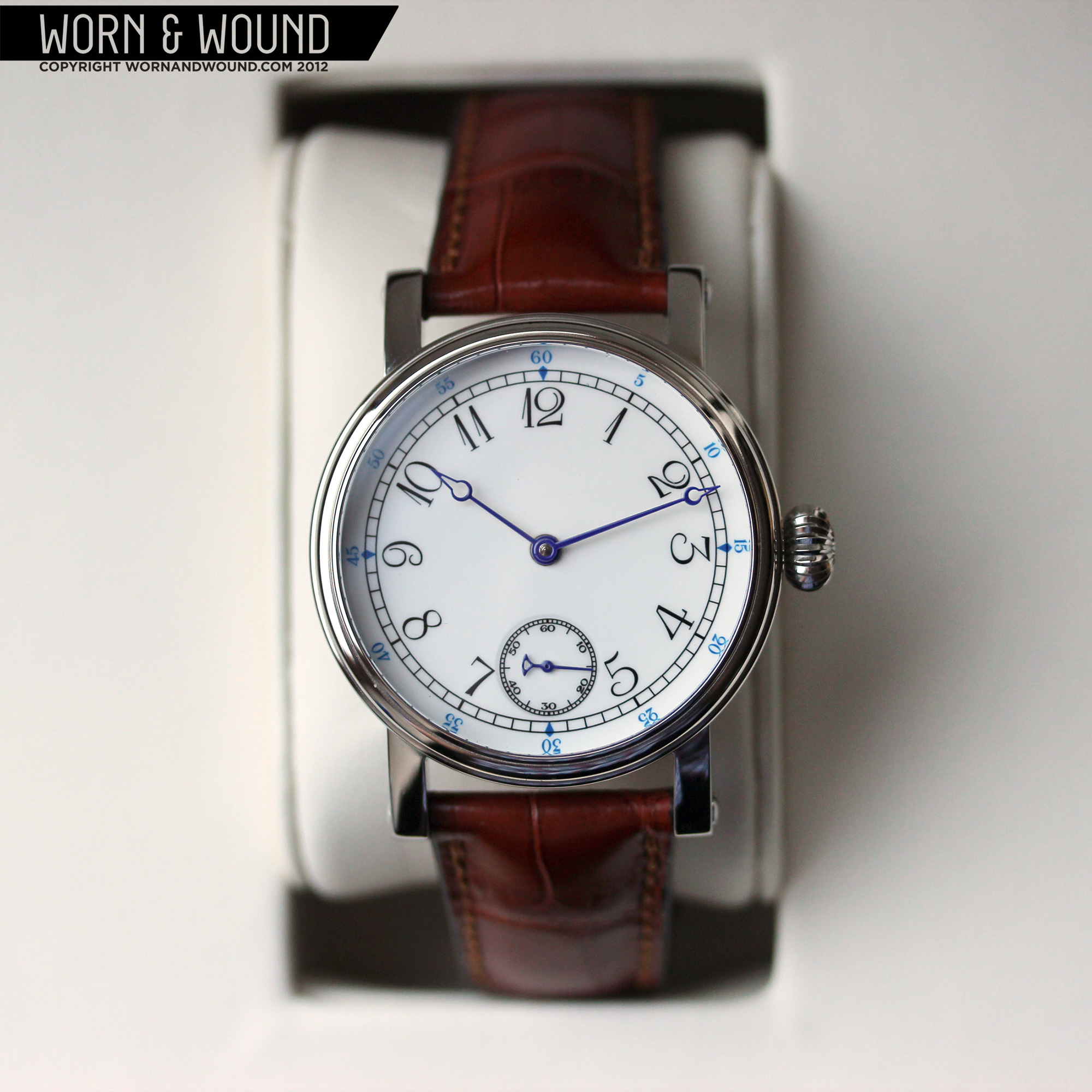
April 24 was my birthday, and when I got together with my wife and kids for dinner, I expected to get a shirt, some colorful socks and maybe even the obligatory sweater. What I got instead almost gave me a coronary: a Tourby Marine, one of my most desired grails. When I opened that large, heavy, maple box with its beautifully constructed key lock and hinges, I couldn’t believe my eyes. I had received a watch that presented me with a new dilemma: there was nothing to complain about. In absolutely every respect, the watch is perfect.

Until that moment, I had never actually seen a Tourby. Sure, I had gazed at photos on their site, as well as on blogs and forums. But you know how deceiving a photo can be. What with Adobe Photo and such, anything can be made to look fantastic. So I always wondered if a Tourby in the flesh would exude the Teutonic penchant for details I sensed from the pictures.
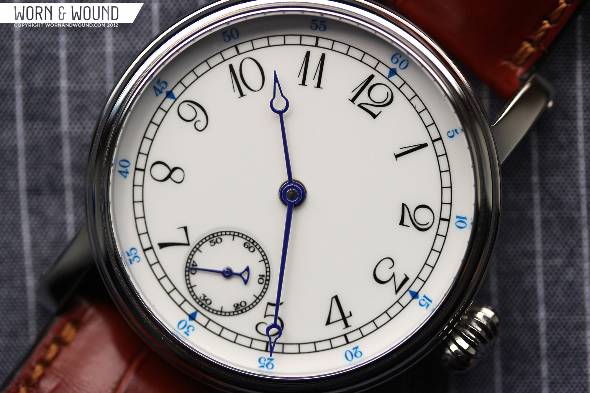
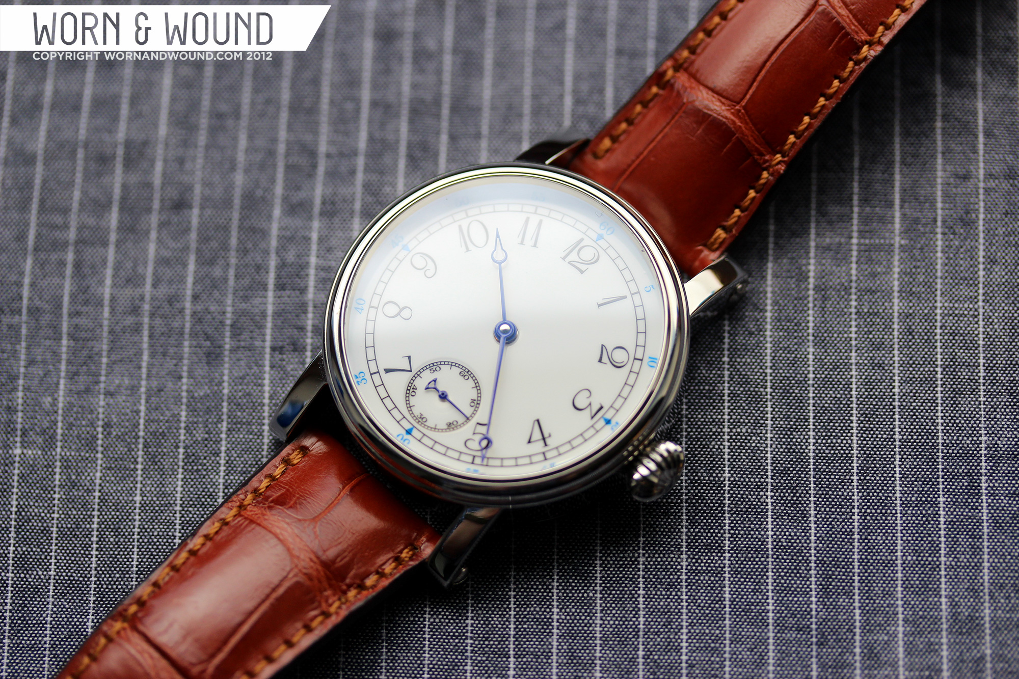
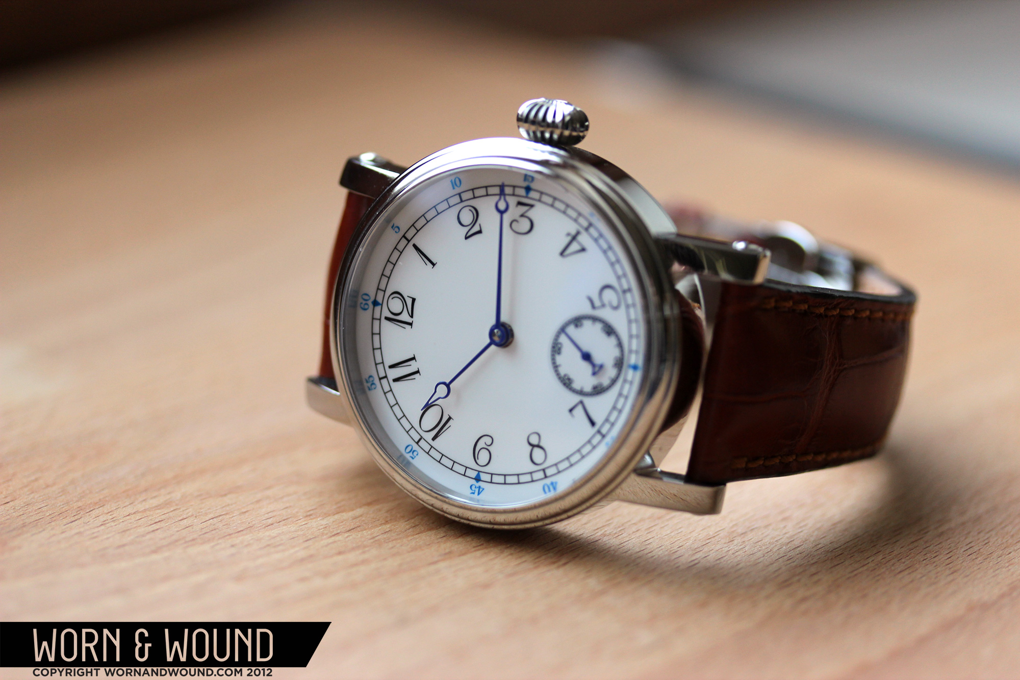
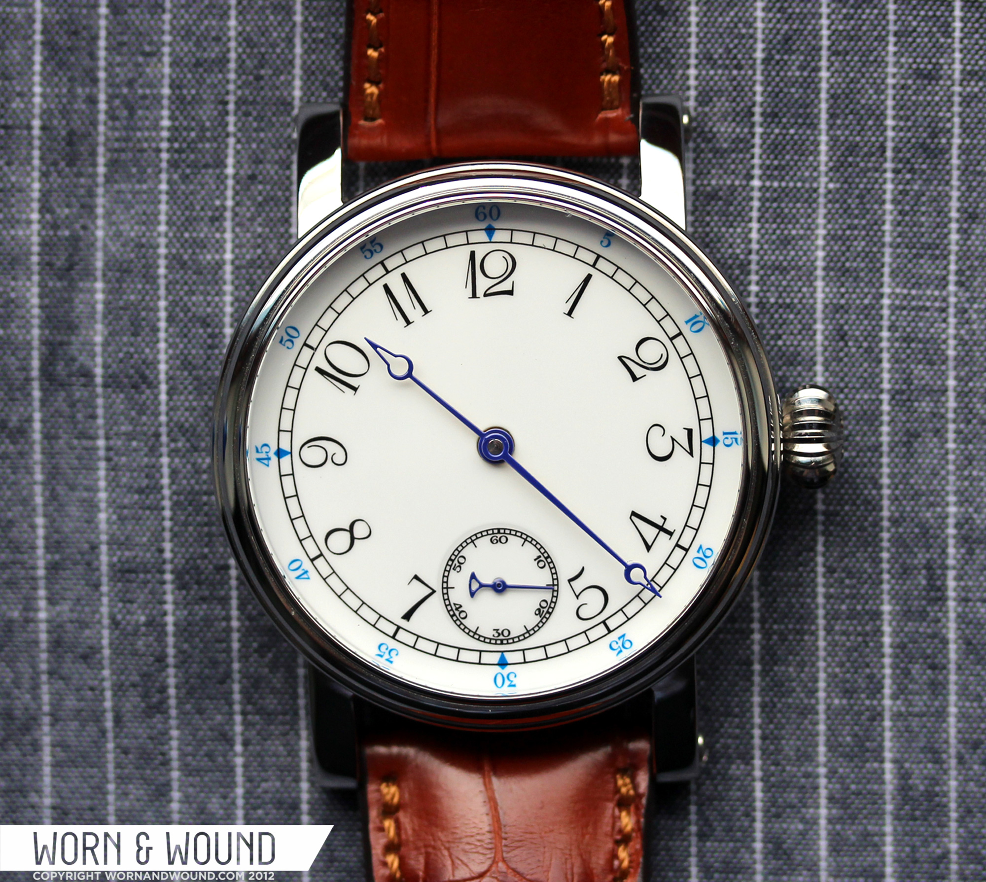
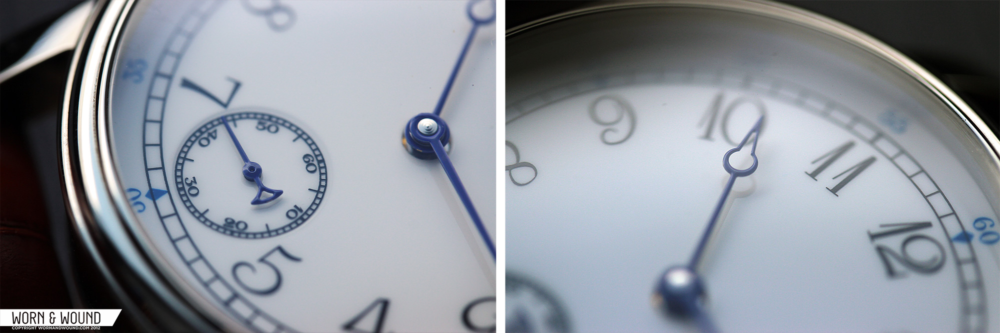
 Well, the pictures don’t do it justice. The watch is a masterpiece in every sense of the word. Before I even held this creature, I stared intently into its face. Beneath its gently domed sapphire crystal, every detail is in perfect harmony and proportion. Yes, it captures all the classic elements of what has become traditional Marine styling. But it takes this theme and bends the rules with elegantly unique hour, minute, and seconds hands. Then it goes a step further with numerals that bring a sense of humor from a bygone era. Just take a look at the accompanying picture.
Notice something that’s missing? Look carefully. There’s no Tourby logo. And no “Made In Germany.” Another reason why the dial is so clean and simple. The logo is engraved on the back in the tiniest of lettering – a true testament to Tourby’s integrity and self-confidence. Of course, if you want their logo on the dial, you can order it that way. Bad idea.
One thing the worn&wound camera won’t be able to faithfully capture is the deep, almost mystical luster of the enameled dial. It definitely reminds me of the well-worn warmth inherent in many antique pocket watches. For that matter, the whole thing itself reminds me of a classic pocket watch, which is quite refreshing.

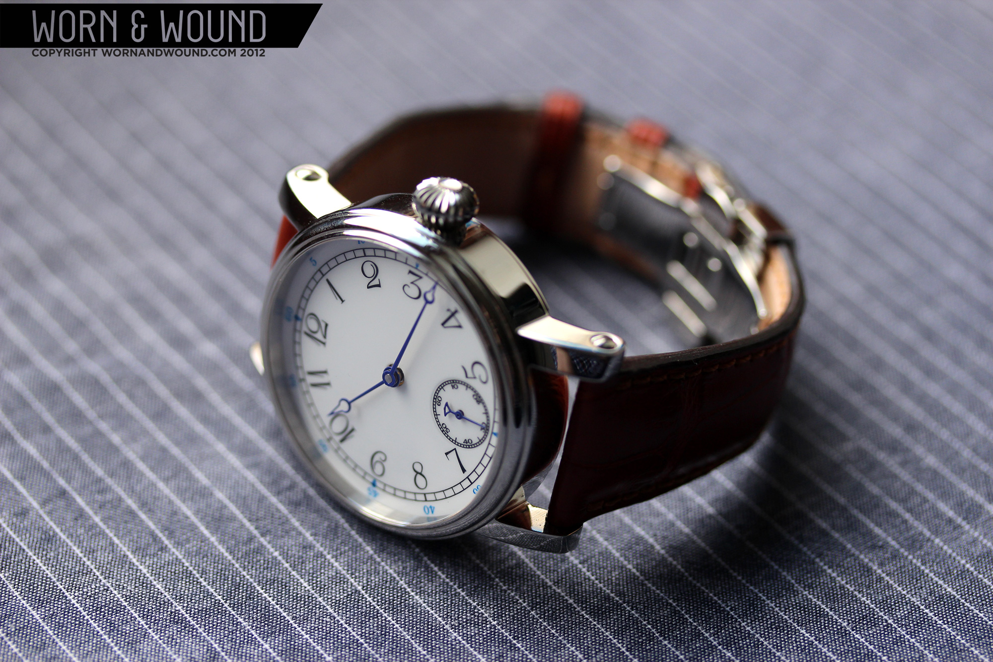
After staring at the dial for God knows how long, I slipped the watch off its comfortable little cushion and realized its full presence. Everything about the case is also precisely proportioned – from the curved and rounded strap lugs, to the onion crown, to the minimal, beveled bezel. Upon very close inspection, it’s all too apparent that the folks at Tourby are fanatics about detail. The craftsmanship is superb, on par with watches of much higher value. There’s absolutely nothing left to be desired. Never thought I’d say THAT about any watch!
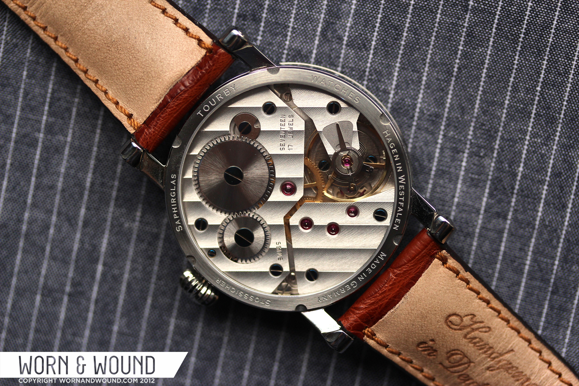
 Flipping the watch over reveals an expansive sapphire window, providing a full view of the hand wound ETA Unitas movement, complete with deep blued screws and Cotes de Geneve stripes. While some of you snobs out there may use words like “common, simplistic and mass-produced,” I prefer to think of the Unitas as “utterly reliable, rugged and time-honored.” And considering the heritage of this movement, nothing could be more appropriate for this watch.
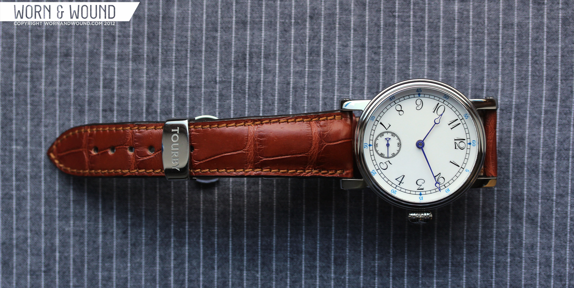
Finally, I removed the Louis Erard chronograph I was wearing, which by now seemed quite insignificant in the scheme of things, and strapped on my Tourby. (Love saying “MY Tourby!”) Measuring 42mm in diameter and a scant 11mm high, it sits comfortably on my wrist, with plenty of room under my shirt cuff. In fact, after a few minutes, I didn’t even sense it on my wrist. Most of my watches range from 38 – 40mm, but MY Tourby doesn’t seem any larger. And to think, I could have had something to complain about.
The time is incredibly readable in practically all lighting situations. No, there are no spots of lume anywhere. That would have been blasphemy with this watch. As far as accuracy goes, after about a month and a half of constant wear, it has only gained around a minute and a half. Honestly, I don’t care about extreme accuracy, or even moderate accuracy, for that matter. Were that my goal, I’d dispense with my mechanical marvels and opt for a boring quartz watch or simply consult my phone. In these days, where everything strives for perfection, it’s a pleasure to wear a bit of old world imperfection. Amen.

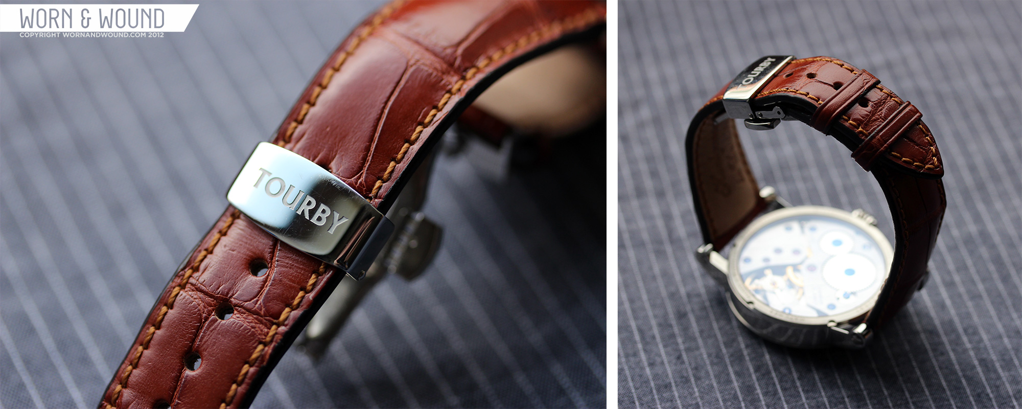
The strap. Yes, the strap. Must talk about that. The watch arrived on an all-black calf style that reeked of German craftsmanship. That would have been entirely sufficient, but my family also gave me one of Tourby’s full-cut Louisiana alligator straps in a rich, golden brown. After just a few days, I switched to this strap, and what a difference it made. Thanks to the sturdy, screw-in strap bars, changing was relatively simple, and I don’t have to worry about a spring bar popping out. Yeah, I worry about things like that. What’s more, I would have been perfectly happy with a standard buckle closure, but the strap came on one of those deployant jobs. It’s beautifully crafted and very easy to use.
All things considered, I couldn’t be any happier. I love classic watches, and this is an incredible example of the genre. With its clean, simple, time-only dial, unadorned case, hand-wound Unitas movement, and purposeful German ambiance, it’s a watch that transcends time.

Now, is there anything for me to curmudge about? Actually, yes. Since I received this awesome Tourby, I’ve only taken it off while showering and sleeping. So all of my other watches are just sitting, collecting dust. I feel guilty that the Tourby is the only one I desire to wear. What’s going through the mind of my Submariner, Chronoswiss, Tutima, Muhle and so many others? This is all so unfair.
Oh, and one more thing that I’ll direct to you readers. Does anyone have any history on the Tourby company? I’ve scoured their own site as well as the internet and have found nothing. NOTHING! Therefore, until I know better, if any admirer asks me about my watch, I’ll say that the company was founded in the early ninteenth century by Baron von Tourby in a distant corner of the black forest.

You call yourself a curmudgeon? To quote a reddit user,
“First off: the orientation of the numerals. The reversal 2-3-4 is truly awkward. The 8-9-10: less so. But still. Second, the typeface, to my eye, is so ornate and disparate, as to look straight out of a very bad faux antique toy watch. The placement of the numerals on the dial is also off: the “7” sits too low and too close to the subdial, the “12” sits too high and is veering off to the left. Furthermore: the blue diamond-shaped marking at the quarter hour positions are odd. Finally, the hands are overly decorative yet again.”
I don’t mean to spoil your parade, and i know it was gift and all, but this just goes to show that a good camera can make any watch look nice, but it will also show the things that are wrong with the object.
To me, your utter praise for this watch, combined with the fact that you certainly have more interesting and rare pieces in your collection, points to this being an advertisement for Tourby, and less of an article. You even went as far as to ask the reader to google Tourby for you, as if your article wasn’t enough of an exposure to the brand.
I don’t know exactly what is happening here but i think at the very least you should stick to comedy. This article is certainly not helpful for wornadndwound’s image as unbiased reviewers of affordable watches.
@Dave
the numerals are awkward, because it is an typical marine watch. The old historical German marine watches had the numerals “rounded” so you can read the time from every angle. So this watch is historical correct. You will see this design on CHRONOSWISS too. I wouldn´t agree that the 12 sits too high and the 7 is too low??? For me it looks perfect!!!!!
regards
Hannes from Germany
I agree that this watch is a beautiful piece. Simple & Unique. I’m sure most watch Snob would make comments like Dave, but I would rather have something like this then an over hyped brand any day.
Your comment about the screw in lugs say enough. You never really changed them yourself, because they are a nuisance! I’ll take spring bar lugs over these screw in types anytime.
I like the watch.
I agree with the writer. The watch is perfect. Can someone tell me where to buy it in North America
The watch is nice enough, I guess, but their website is a hot mess. They seem only to have 5 or 6 basic designs; even so it’s hard to get an overview of their offerings, and of which options go with which watch, and for how much.
One of their designs is the hugely over-copied “flieger”, which they call a “pilot” as though that’s the only pilot design there is.
The site will say that something is “decorated” and then not be very clear about what is decorated, or how.
Options are scattered all over and inadequately described.
And how is it that a “Custom” watch can be “Out of Stock?”
The strange numbers on the Marine may be authentic, but I think I’d want readability to trump authenticity, it that case.
Overall, I’m not impressed enough with the company to spend $2000 with them.
Nice work dude. check
A little late reading this, but I’ve found one major design flaw that you will never forgive. The numerals 9, 10, 11, 12, 1, 2 & 3 face inward and 4, 5, 7 outward. That’s fine. BUT WHY IS THE 8 FACING OUTWARD? THE 8 AND THE 3 SHOULD BE FACING THE SAME WAY!
One of either the 8 or the 3 should be the other way around.
That is an amazing watch, although the prices have gone up quite a bit since then.