Hands-On With The Delightfully Colorful Farer Carnegie Chronograph Sport

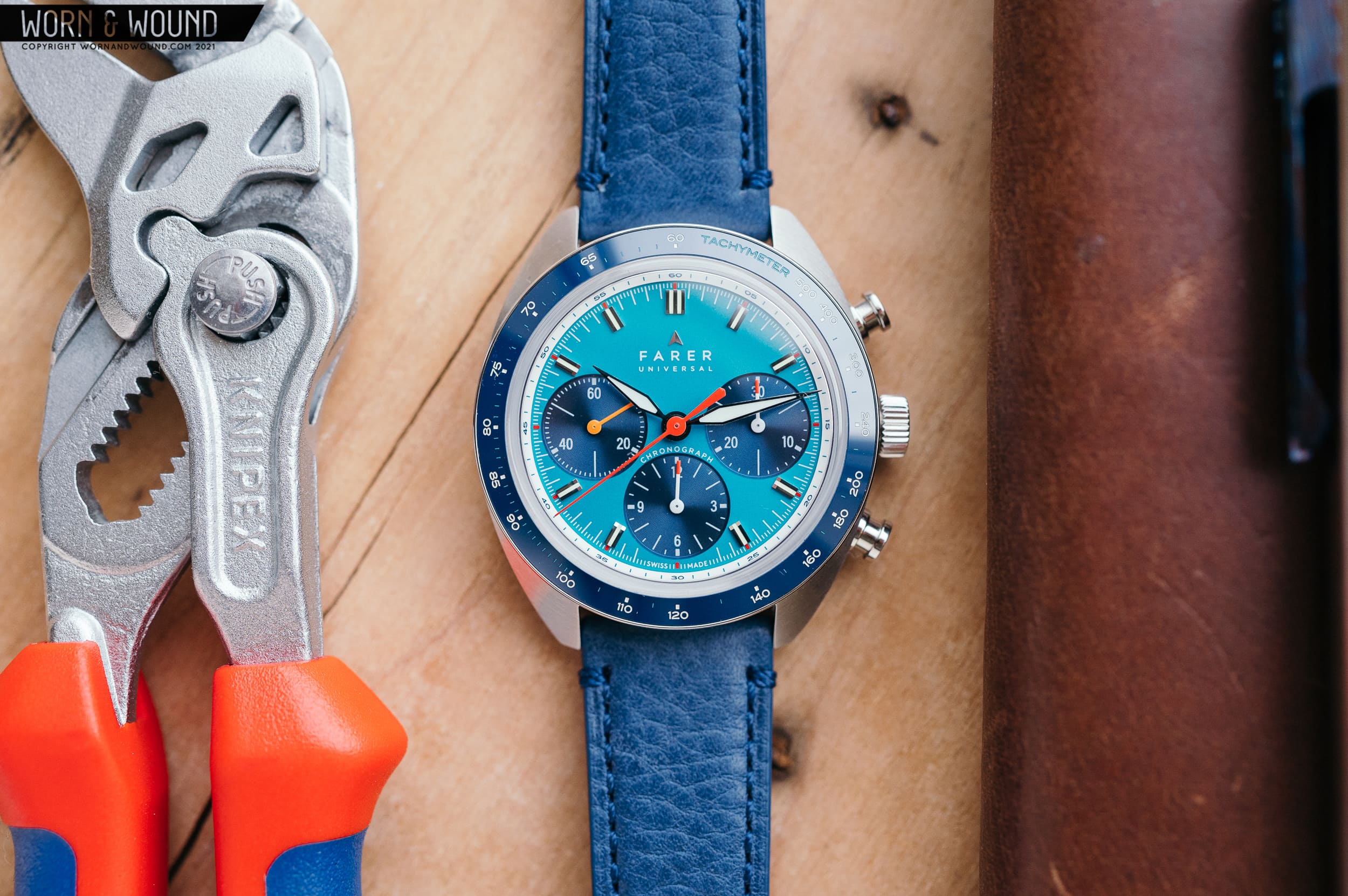
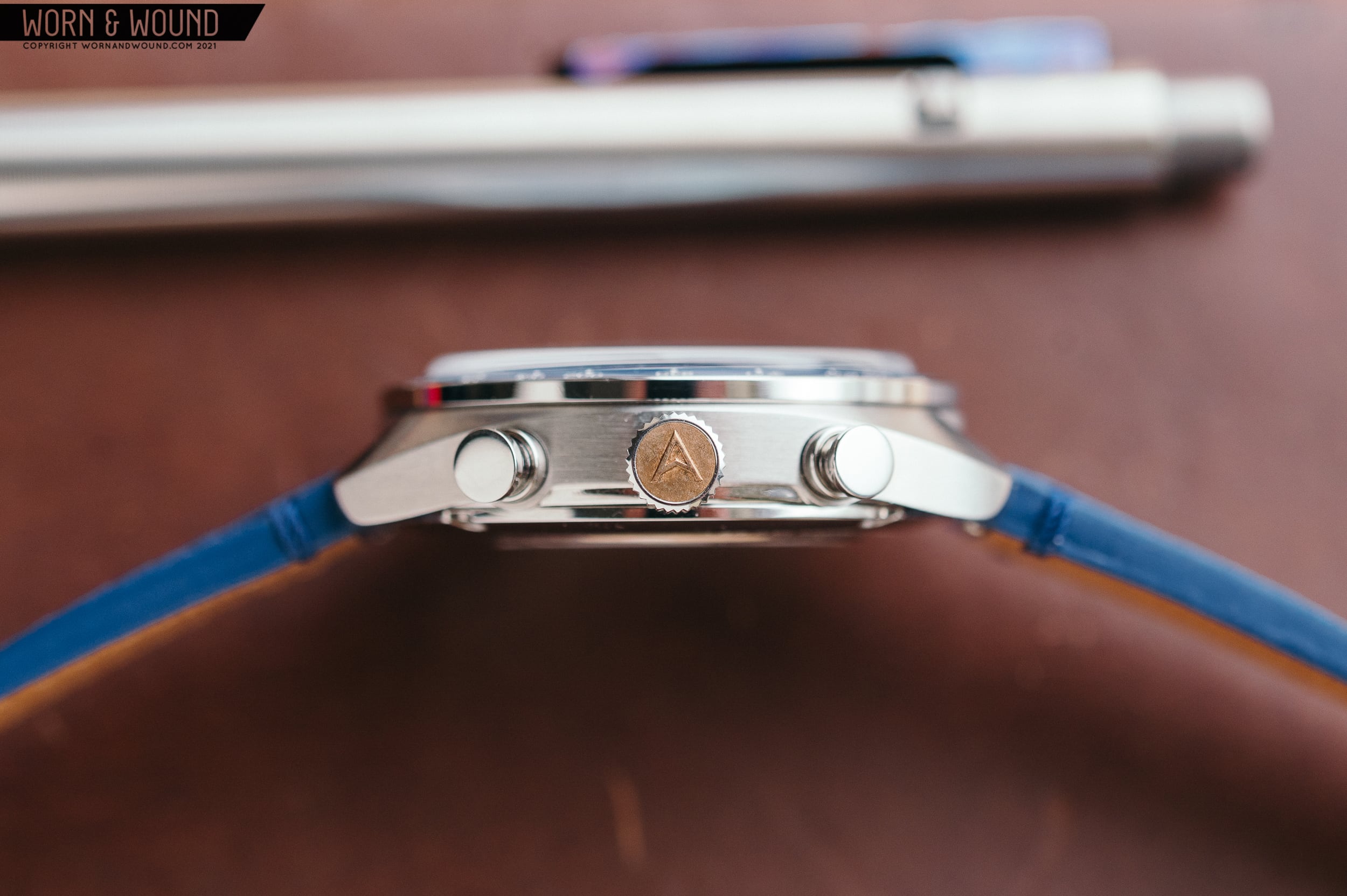
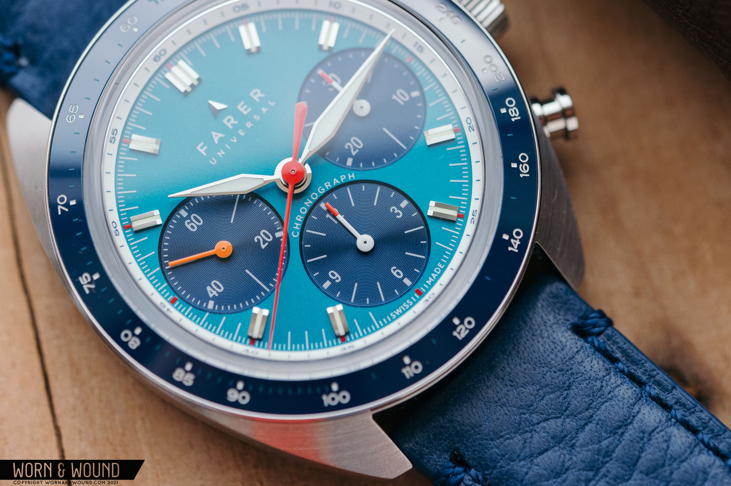
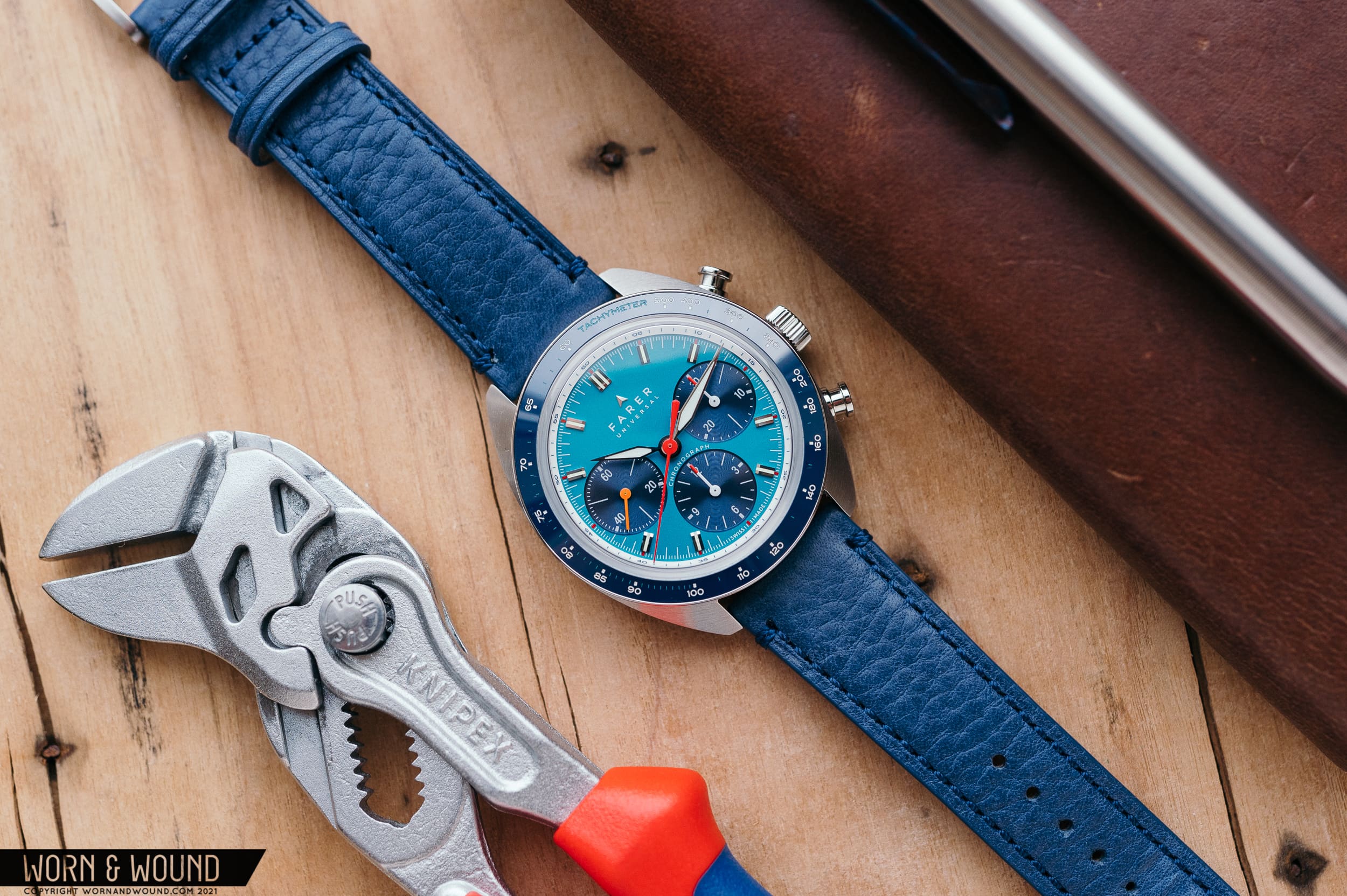
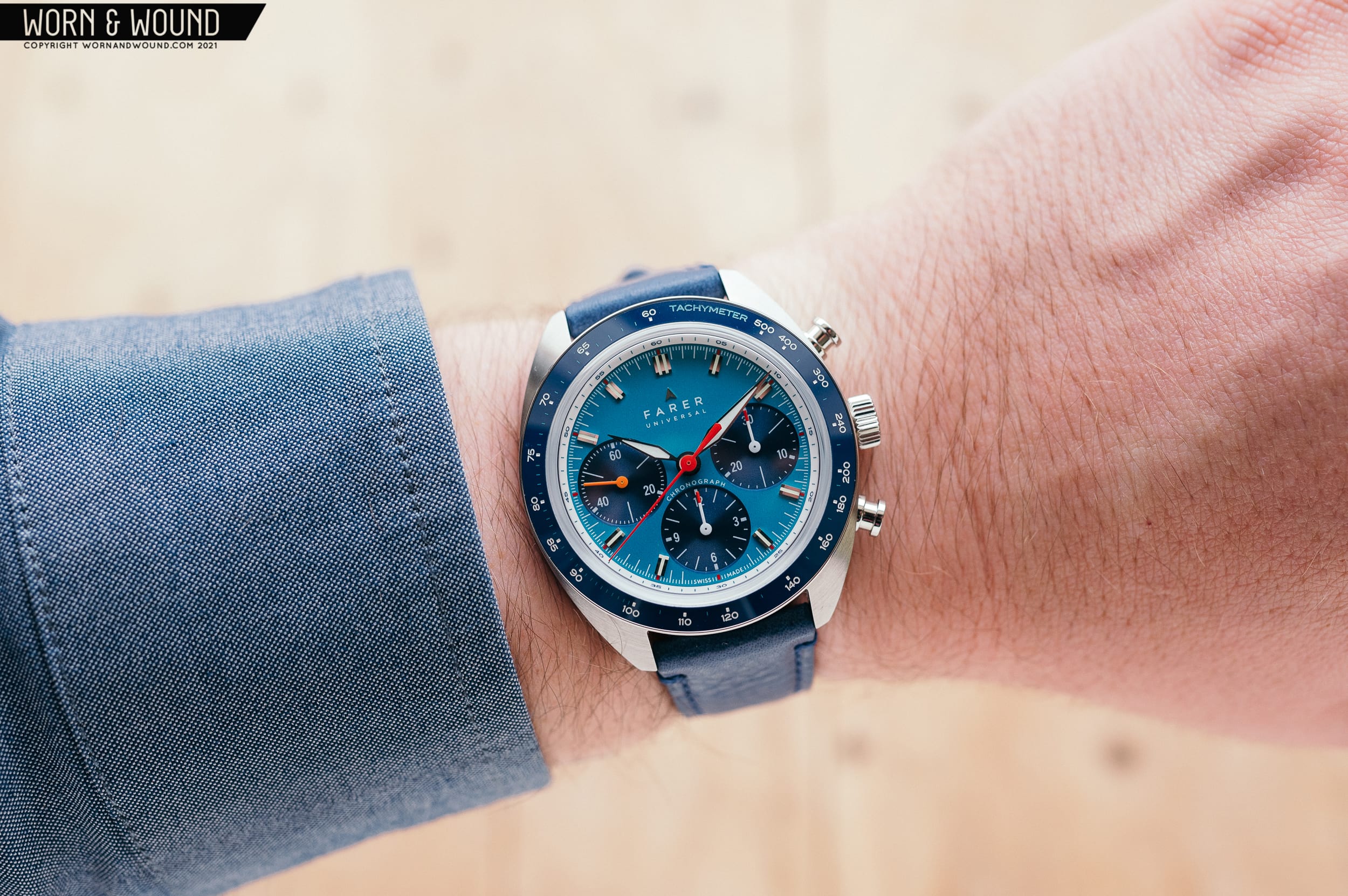
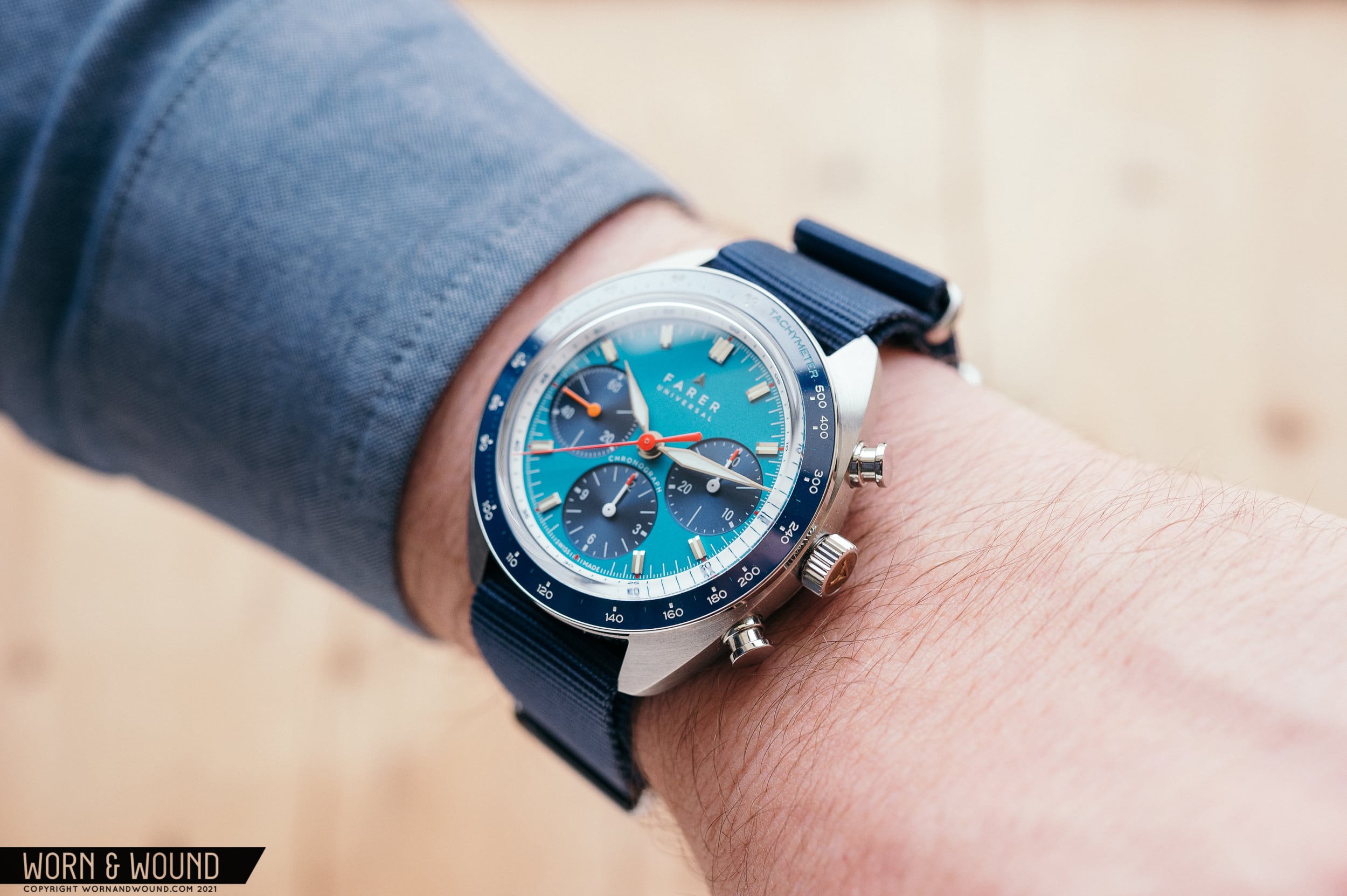
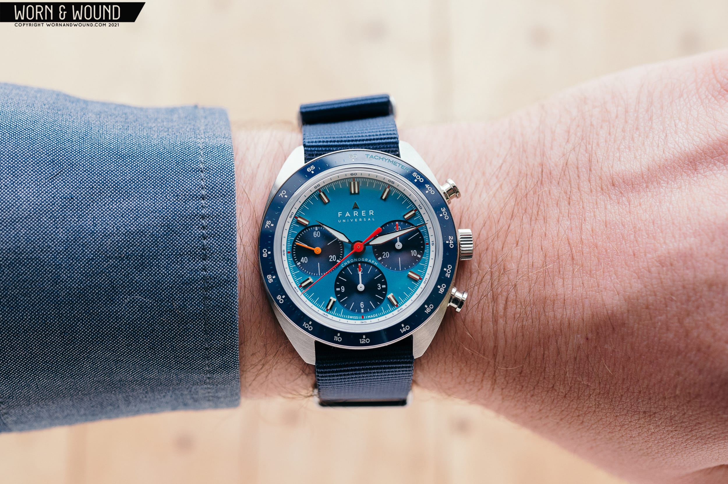
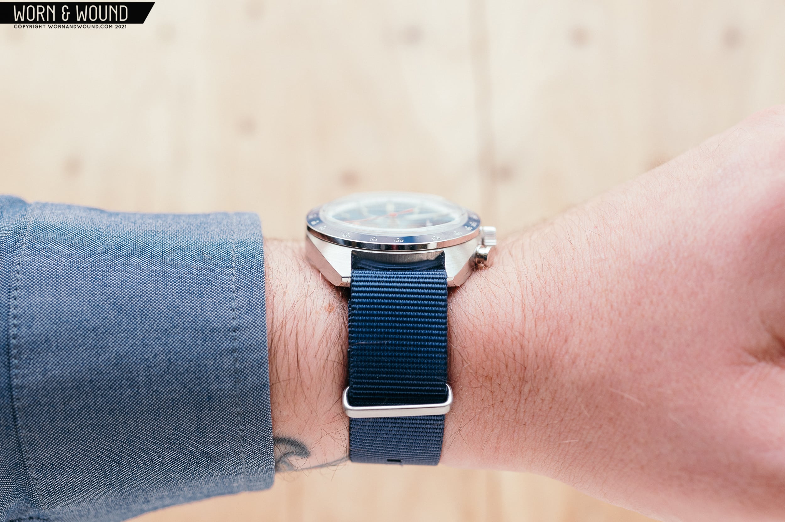
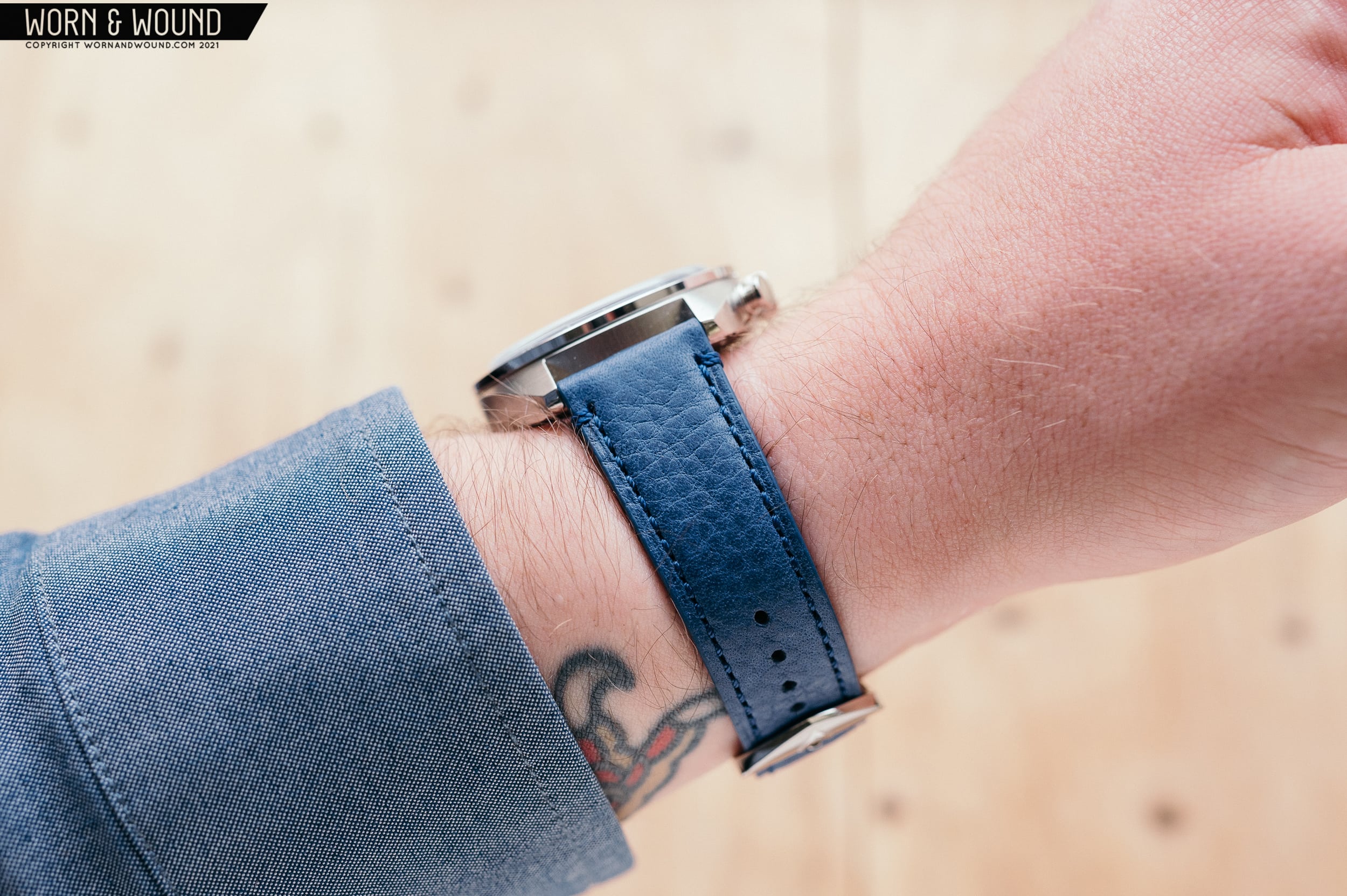
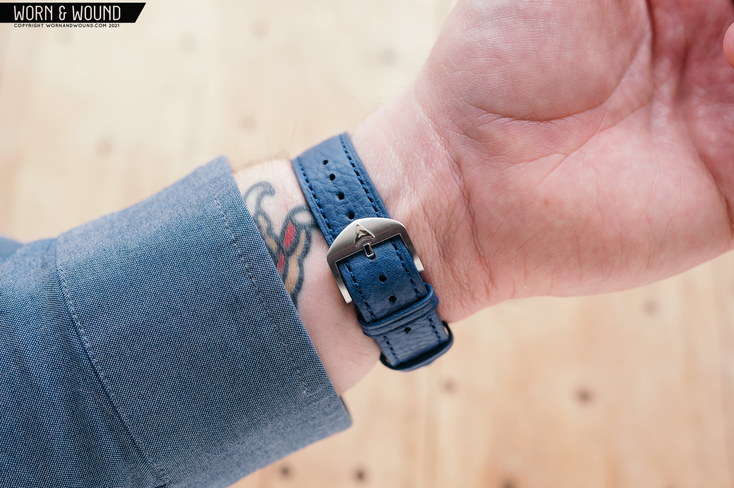
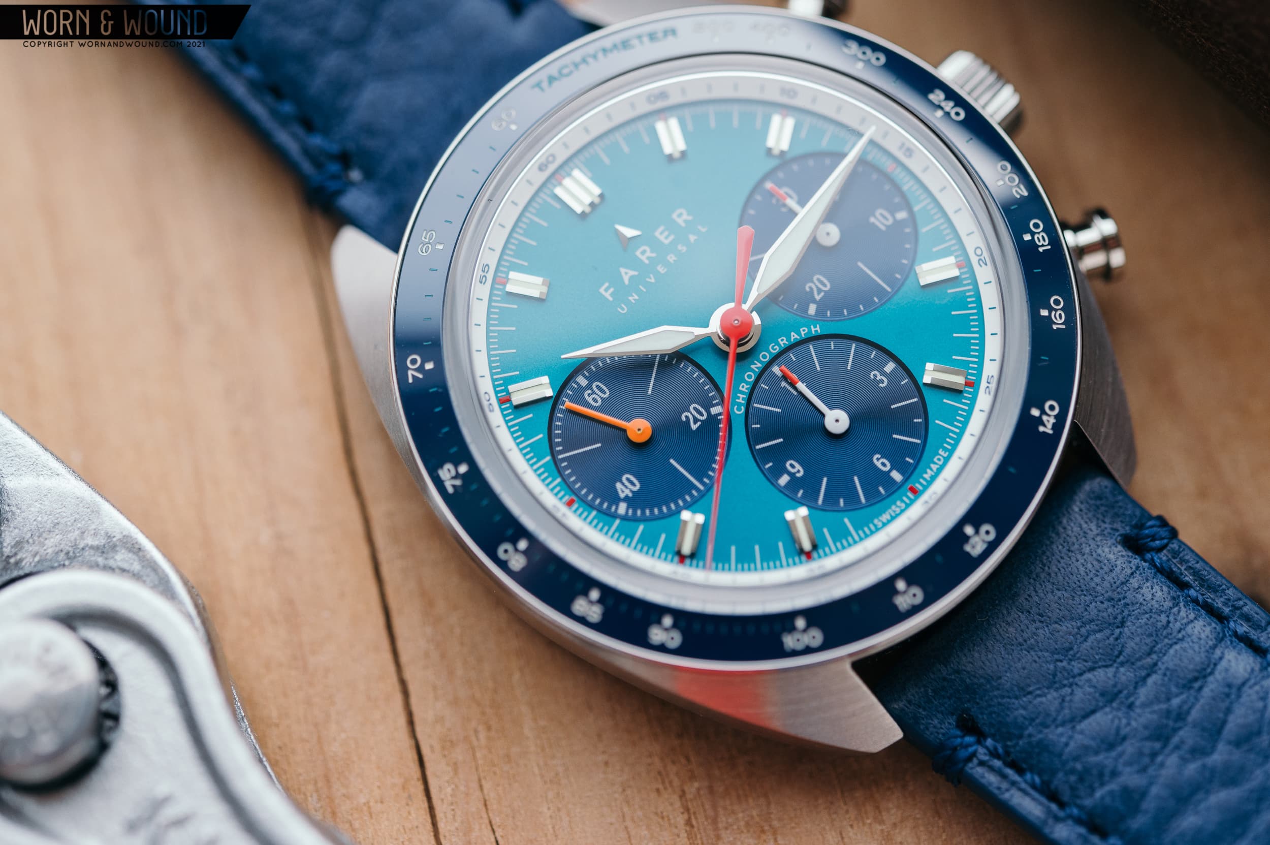
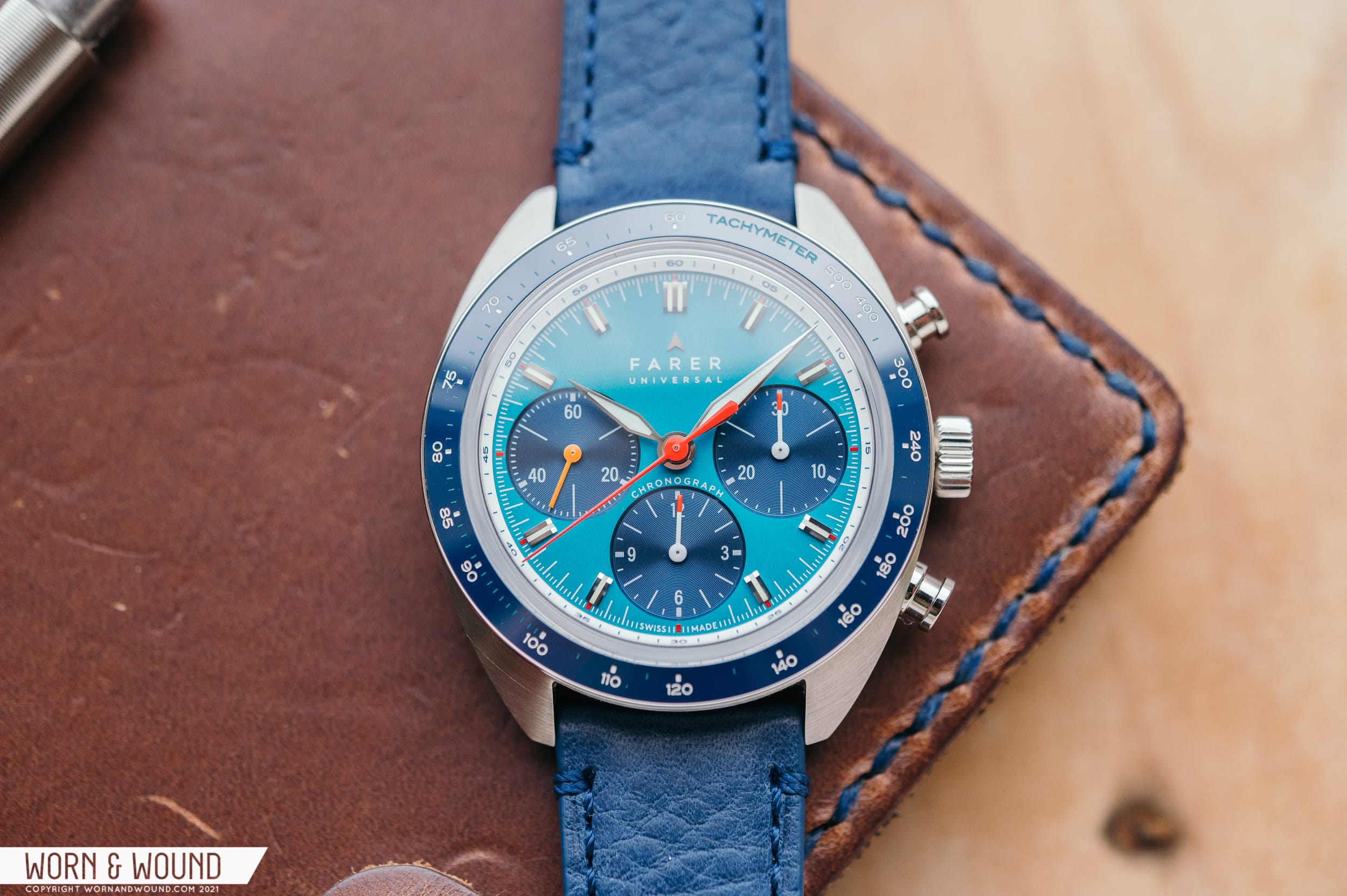
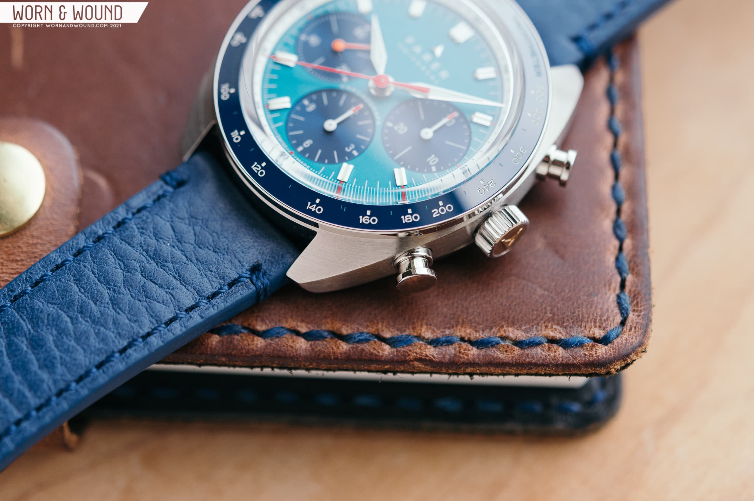
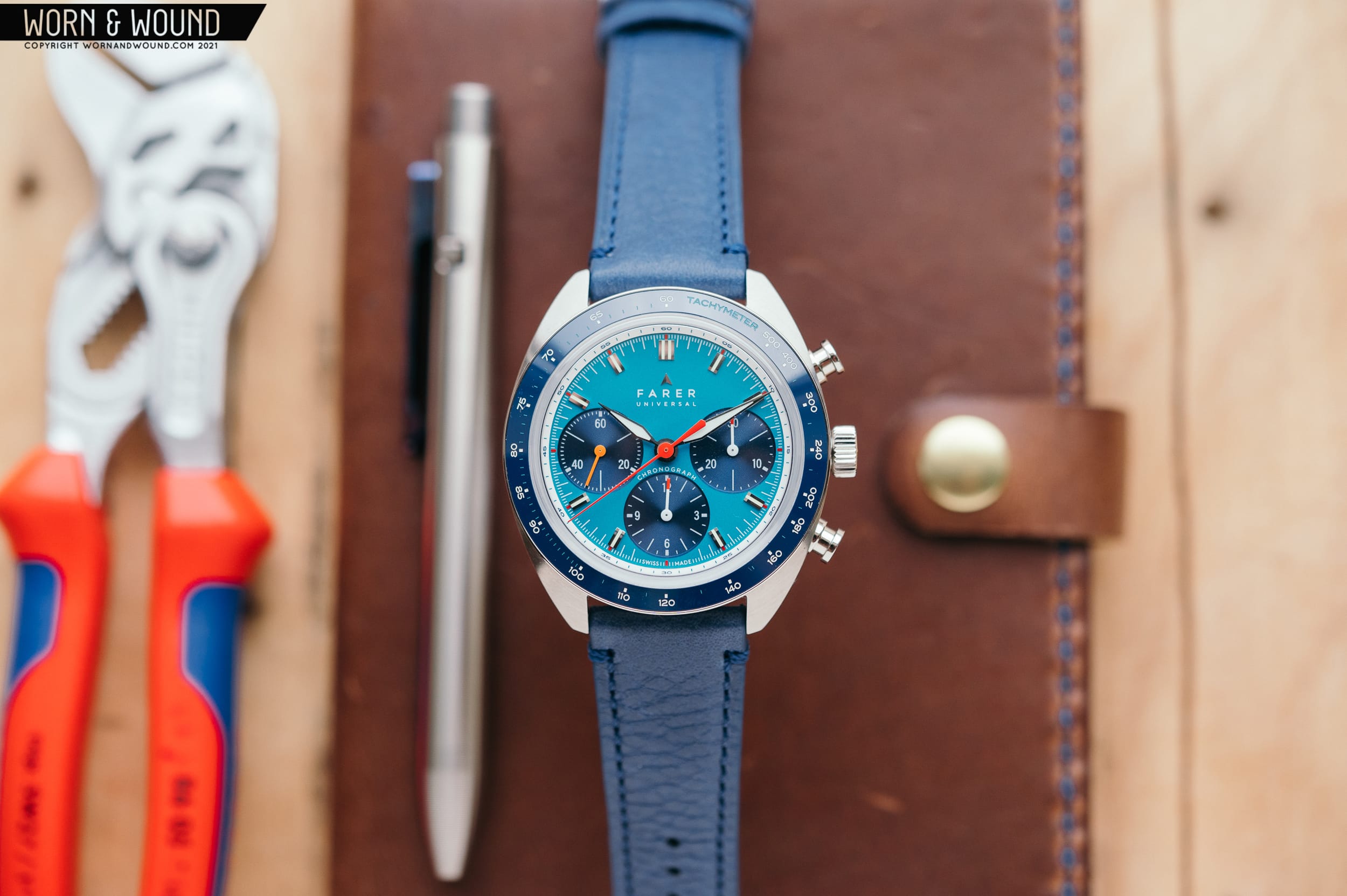
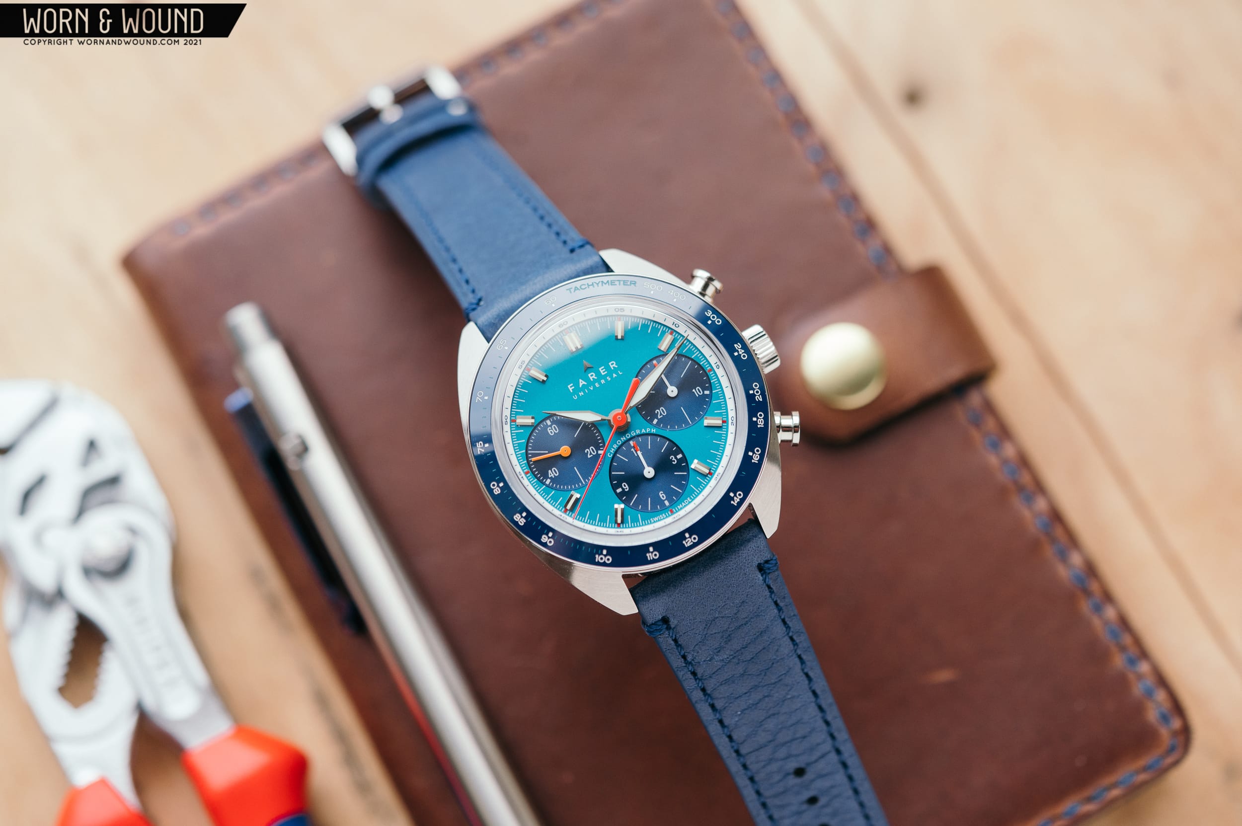
If you’ve read any of my reviews on this site, you know I tend to mention accents as a “welcomed pop of color”. On a watch like the Farer Carnegie Chronograph Sport, a “pop of color” doesn’t really apply, since the entire thing is an explosion of blue, red, orange, and steel. Farer’s Carnegie is anything but subtle, and this fun, sporty chronograph really does an excellent job of embracing color. Named after the only UK Olympian to win a medal at the 1928 St. Moritz Winter Olympics, the Carnegie bears the name of David Carnegie. He earned the bronze medal while flying down a naturally formed ice canyon known as the Cresta Run on little more than a board with some blades on the bottom. The sporty chronograph’s teal and blue dial is reminiscent of glacial ice, and the timing functions go hand in hand with racing. 

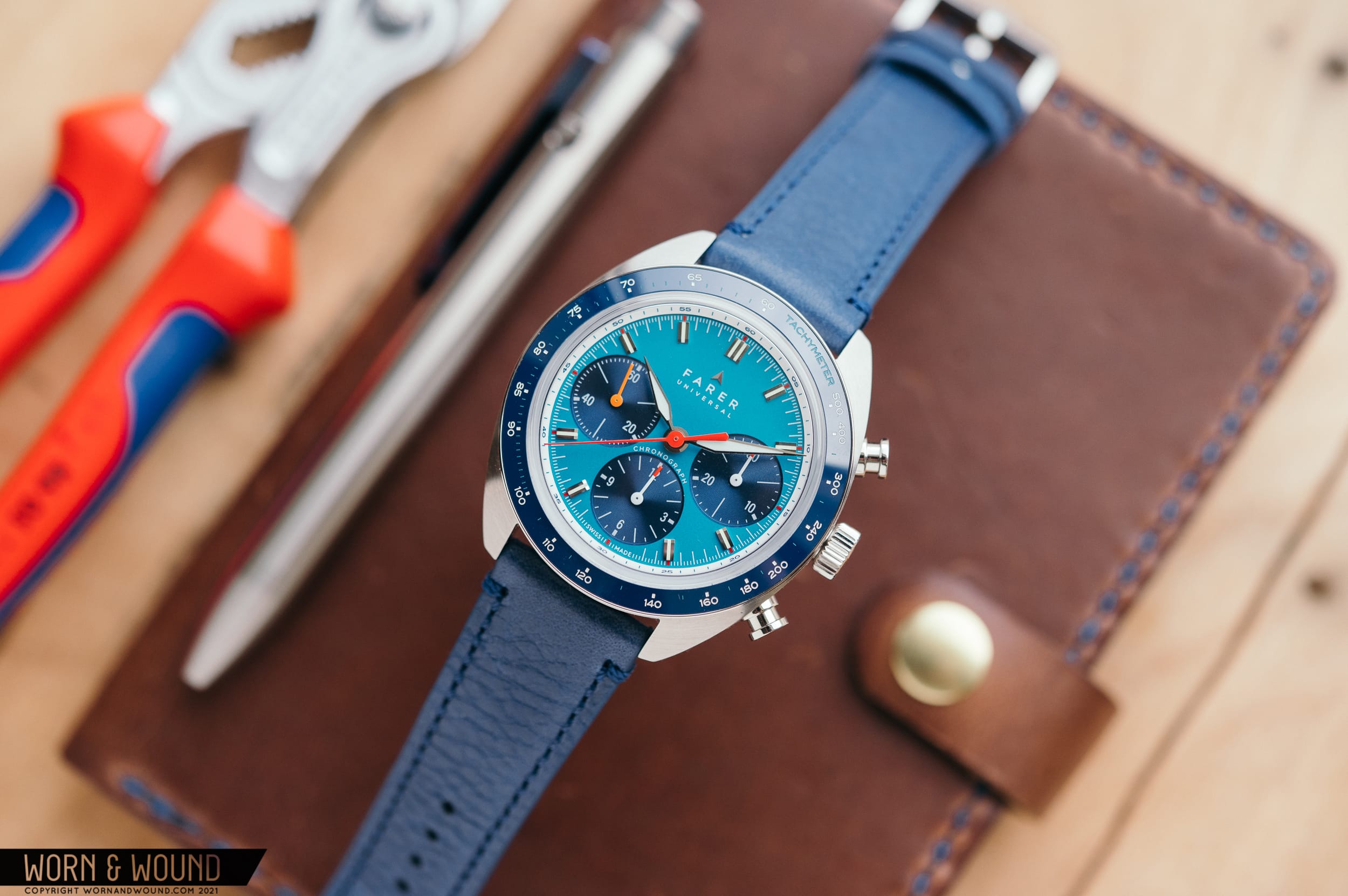
Today, we’re taking a closer look at the Carnegie model. Zach Weiss reviewed the similar Bernina model back in 2019, which you can check out right here. Both watches are built on the same case, contain the same movement, but feature drastically different dials. Let’s take a closer look at the recently-restocked Carnegie from a Worn & Wound favorite brand — Farer.

Advertisement
$1955

Hands-On With The Delightfully Colorful Farer Carnegie Chronograph Sport

Case
Stainless Steel
Movement
Sellita SW510 Manual Wind Chronograph
Dial
Matte teal with dark blue sub dials
Lume
Super Luminova
Lens
AR-coated Box Sapphire
Strap
Leather strap or Stainless Steel Bracelet
Water Resistance
10 ATM
Dimensions
41x46mm
Thickness
12.9mm
Lug Width
20mm
Crown
Push/Pull
Warranty
5 Year
Price
$1955

Case

The Carnegie’s case is a solid hunk of 316L stainless steel, measuring in at 41mm wide. The barrel shape reigns in the 41mm width with a very reasonable 46mm lug-to-lug measurement that wears comfortably on my 6.75” wrist. At 12.9mm thick with a box sapphire crystal up top, the watch is firmly in the middle ground of thick and thin. From the top down, you’ll notice the barrel shape with circular brushed finishing. On the right side of the case, there are two pushers flanking the push down crown, which you’ll use every 58 hours or so to wind up the watch. The crown sports a bronze inlay signed with the Farer logo that will pick up a patina the more you use it. Over time, and depending on your locale, it’ll fade to a rich brown-gold. It’s a cool taste of patina without committing to an entire watch and a nice way to add a unique feature to the watch. 

From the side, the case is horizontally brushed, leaving most of the flashy attention drawing features like the ceramic tachymeter bezel, sapphire crystal, and highly polished hands to steal the show. The edge of the ceramic bezel is polished to a high shine, breaking up the profile view. The mid case also leaves a few millimeters of case back to hang below the case and nestle into your wrist for a comfortable fit and sleek visual appearance. This is truly one of those watches that you’d benefit from trying on. On wrist, it wears really well and that’s thanks to the clever case design. While the case design and finishing are great, it’s the dial on the Carnegie that steals the show.

Dial & Hands

A bright teal dial is accented by three sun ray sub dials rendered in a rich dark blue. Pops of red are seen on the outside of each polished applied index, on the tips of the chronograph dials for minutes and hours, and most prominently on the central seconds hand. There’s also an appearance of the color orange, which makes up the entire hand on the running seconds dial at 9 o’clock. Chronograph dials tend to be busy by nature, and the Carnegie’s is no exception. Farer took a classic approach with three sub dials, located at three, six, and nine. At three, you’ll find a 30 minute totalizer, at six, a 12 hour counter, and at nine, running seconds. Each sub dial is set into the dial slightly, with a small step down. A pattern of concentric circles is visible on the surface of each sub dial with a sun ray effect. When you angle the watch in the light, you can see this effect really pop out against the matte teal base of the dial. 

For each hour, a highly-polished applied index is used. The finish work on the indices is really nice. I did a double take next to my personal Grand Seiko SBGV245, and they’re in the same league — shiny, precisely cut, and flawless. Each index features a small strip of lume in the center and a small angled surface that cuts into the center of the dial. When rotating your wrist to check the time, you’re treated to your own personal mini light show that the highly polished and angled surfaces give off. To read the time, a set of dauphine hands point to hours and minutes. These both feature the same high polish and have a very faint center line running down the middle, with each side angling slightly away. In the right light, half the hand will be highlighted, while the other is in shadows, giving them a dynamic look. The hands are filled with Super Luminova and put on a show when the lights go out.

The use of color on the Carnegie is really well done. One look at the rest of Farer’s lineup, and it’s apparent that they don’t shy away from wild colors and combinations. It’s a tricky thing to get right without looking like something a circus clown would wear, and Farer’s watches show that you can do color, but it has to be done right.

Movement

Inside of the Carnegie, you’ll find a Swiss Sellita SW520 BH Elaboré grade movement beating away. This hand wound movement will stay running for 58 hours when fully wound. It beats at 28,800 bph (4hz), which gives the seconds hand and chronograph hand a smooth sweep. The movement displays three different chronograph features — a 30 minute counter at 3, a 12 hour counter at 6, and the running seconds at 9. The central hand runs around the dial in 60 seconds and can be used in conjunction with the tachymeter bezel to calculate speed. Being elaboré grade, the movement is nicely decorated with a mix of finishing techniques commonly seen on Swiss movements like blued screws and brushed patterns. What really makes the Farer stand out is the custom high end bridge with a custom engraved pattern and the Farer logo. You can see the decoration through a sapphire lens on the case back, justifying the use of the customized movement.

Strap & Wearability

Included with the Carnegie is a leather strap, rendered in a mid tone blue that they call Marine St. Venere. When paired with this strap, there’s a lot of blue going on. There are a few other options available at checkout, like a handsome tan that complements the blue tones in the watch really well. All of the “St. Venere” leathers have a slight grain texture that gives the strap some depth. The Horween options are smoother in nature and give a more streamlined look. Also available is a Milanese bracelet that gives the watch a vintage racing look. The strap that I had the pleasure of checking out was made quite well, featuring thick leather, neat stitching, and matching painted edges for a finished look. I’m sure that after some break in, the thicker strap would become more comfortable with each wear. The buckle on the leather strap features Farer’s logo and looks great. 

On the wrist, the Carnegie is a joy to wear. The 41mm width gives it a nice presence on the wrist, but the restrained lug-to-lug width of 46mm makes it suitable for a wide range of wrist sizes. The barrel shape is visually interesting, and comfortable to wear. The sides slope down and there’s an undercut in the mid case that let the watch settle into your wrist quite well. I was a little worried that when I put the watch on a navy nylon strap that the extra layer of fabric would render the watch unwearable, but the case design works well with the single pass strap. It’s even better on a two piece strap, letting the metal directly contact your wrist. From the photos, you can see that the case doesn’t overhang my wrist, and the 12.9mm thickness isn’t overwhelming in any way. The watch also has a pleasant heft to it — not so heavy that it’s clunky, and not so light that it feels cheap.

Advertisement

Conclusions

This was my first experience with a Farer watch in the metal, and I can say that I’m surprised with how nice the watch is. The colors of the dial and bezel, the excellent finishing on case and dial, and unique overall design make a really compelling package. At first, it was hard to understand the $1965 price tag, but upon handling one, it makes much more sense. For the price, you get a unique design, solid Swiss movement, and a level of finishing not typically seen from smaller brands. The teal dial with dark blue chronograph registers and red/orange accents throughout might not be for everyone, but it’s certainly a fun and sporty watch that can add something unique to your collection. Farer.

Images from this post:
Related Reviews
Ed is a Long Island-based writer and photographer with an affinity for watches, fountain pens, EDC gear, and a great cup of coffee. He’s always looking for the best gear for the job—whether it be new watch, pen, flashlight, knife, or wallet. Ed enjoys writing because it’s an awesome (and fulfilling) way to interact with those who share the same interests.
Categories: