One of the great things about independent micro brands is that they are more free to try wild and unique designs. They don’t need to sell thousands of units in stores to make their bottom line, rather attract the interest of a few hundred customers or less (still hard, but less so). In recent years Kickstarter has been often the go to platform for such pieces, as the live trial by fire of pledges can quickly determine if a project is worth the risk or not. Today, we’re going to take a look at a new concept from a young brand that is unique and challenging, the Hourglass by Pheidippides Watches.
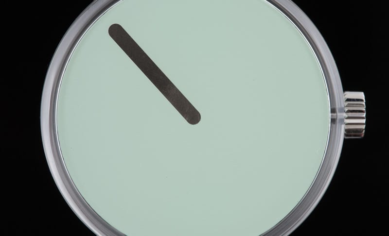
A quick glance at the Hourglass from above reveals a watch dial stripped down to its absolute bare minimum, rendered in a playful, almost computer-icon visual language. There is a surface on which you’ll find a single black rectangle with rounded sides. The surface is a pale pastel color, giving it a soft, friendly look. No indexes, no numerals… and presumably no hands. So, what’s going on? Well, the whole dial is a single hour hand, rotating at a near imperceptible rate.
One-handed watches are always a challenge. There is a certain minimalist appeal to the concept, but also a lack of accuracy and legibility. They aren’t for people who are fussy about the exact time. In fact the most precise, as in those with dials with many markings, usually allow for reading within 2.5 minutes of the exact. Most go for 5 – 15 minutes. By having no markers at all, the Hourglass gives more of a loose sense of the time… It’s around 3, it’s approaching 8, etc…
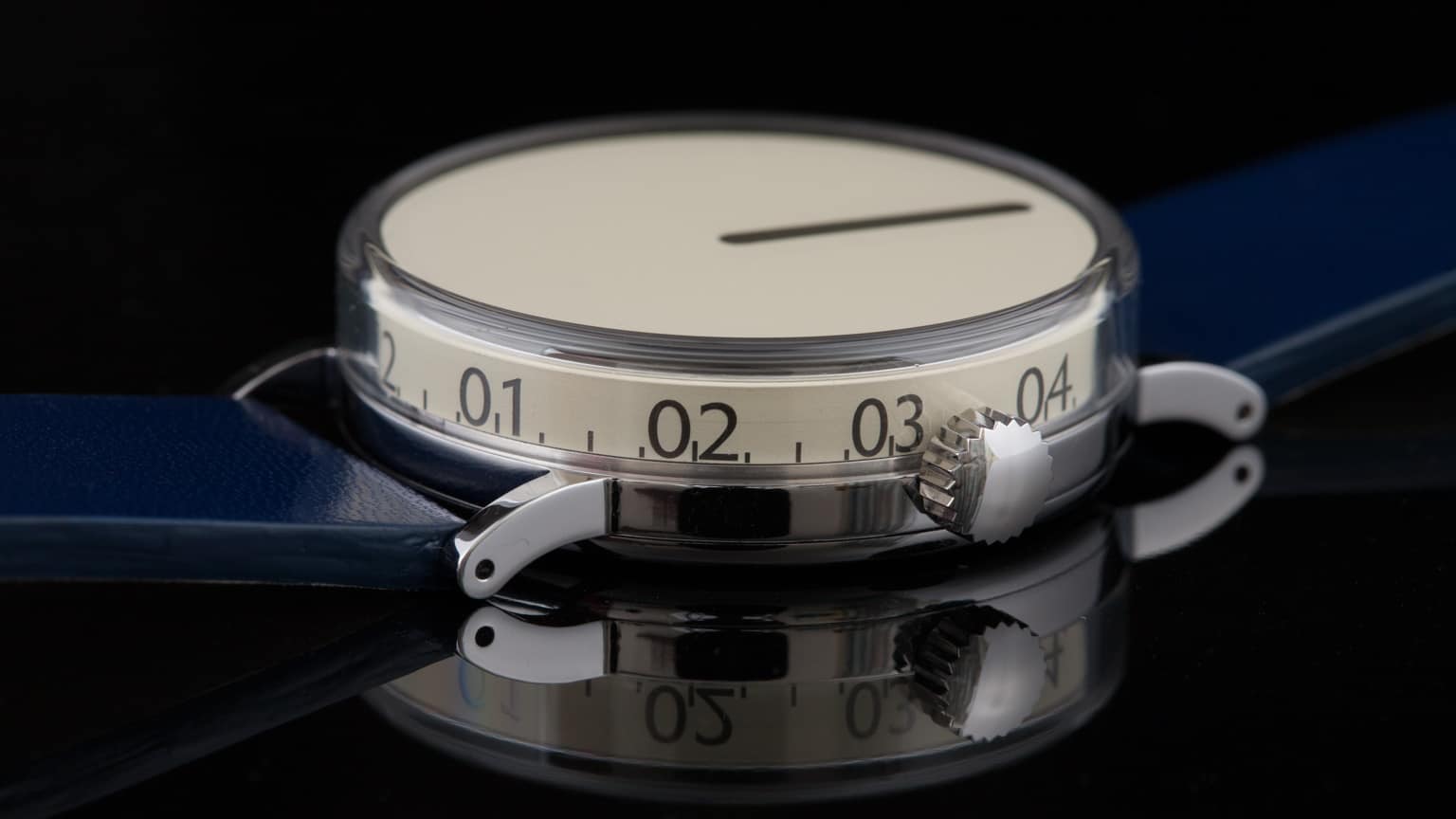
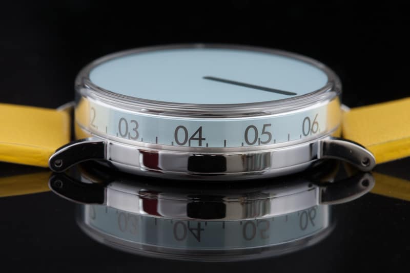
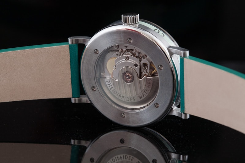
Or well, at least it would seem that way from above. The real unique aspect of the Hourglass is seen from the side. The dial isn’t a flat surface, rather it’s a cylinder with walls. The crystal, which is a sapphire, isn’t flat either, rather it’s a box that sits over and round the dial. At 6, looking between the lugs, you’ll then find an hour index with numerals and hash marks at intervals of 15 minutes. Presumably, what lines up between the lugs is the closest approximation of the actual hour.
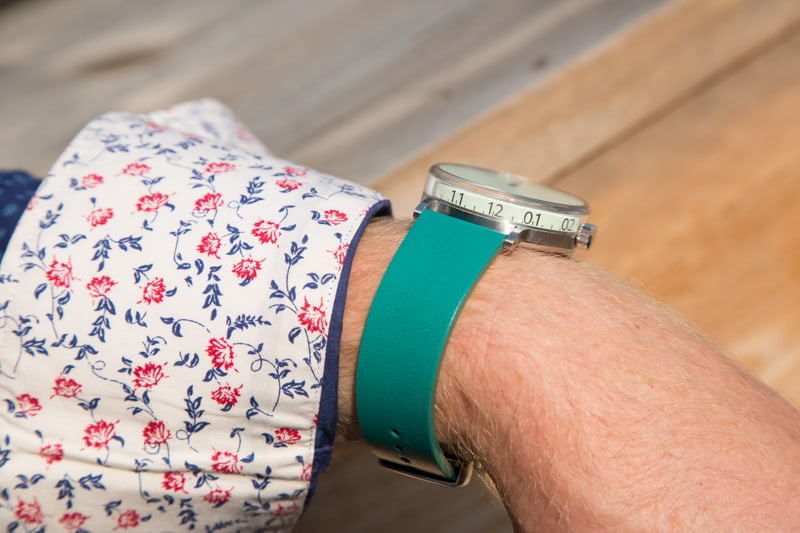
So, what you really have is a watch made of a single, 3-dimensional rotating dial that sits within a sapphire box. Definitely very different and intriguing. The case itself measures 41mm in diameter with a thickness of 12mm. Most of the case is the sapphire, with a thinner metal chassis underneath from which the lugs protrude. At 41mm, it likely wears with a lot of presence, as it is literally all dial, though without seeing it in person this is hard to confirm.
The overall look is surprising. The use of pastels creates a feminine air to it, which is further enhanced by the use of bright colored straps. It’s not unappealing though, with the green and blue varieties certainly being unisex. I would love to see a simple white dial as well, as the starkness of that pairing would obviously work with the minimal layout. What really wins me over though is the sculptural aspects of the design. It’s a watch that is meant to be experienced at angles rather than the more typical top-down view. The views then change from super minimal above, to something more technical from the side.


 Featured Videos


