The Autodromo Monoposto is the kind of watch that can’t help but illicit strong reactions from people. It doesn’t look quite like any watch you’ve seen before, yet doesn’t betray what a watch should be. Inspired by the single seat racecars of the early 20th century (monoposto being Italian for single-seat), the Monoposto melds automotive history with elements of classic watch design, to make something altogether unique and exciting. It’s as much a car-watch for watch people as a watch for car people. On the surface, you have an elegant case and dial design that border on dress, yet have a distinctly technical component that touches on the vehicular inspirations. And of course, there is the bold and potentially polarizing red line on the domed crystal that refers to the tape or paint mechanics would put on tachometers to inform drivers of their engine’s limit.
Autodromo Monoposto Review
 Case: Stainless Steel
Movement: Miyota 821A
Dial: Black or Silver
Lume: No
Lens: Domed KI Glass with Sapphire Coating
Strap: Black Leather
Water Res.: 30m
Dimensions: 43x48mm
Thickness: 10 mm
Lug Width: 20 mm
Crown: 6 x 3 mm screw down
Warranty: 2 years
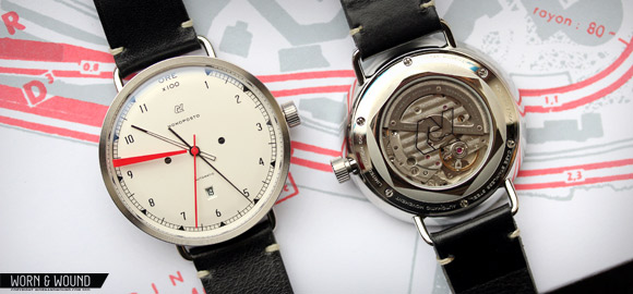
Aesthetics aside, the Monoposto is also the first mechanical offering from Autodromo. Powered by a Miyota 821A movement, which is visible through the exhibition case back, the addition of an automatic not only makes the watch more tempting to the watch nerds out there, it relates the watch more closely to cars as the parallels between a movement and an engine are quite clear. The Monoposto is a limited edition of 500, available in black and silver (250 of each have been made) and runs $875.
Chassis and Engine
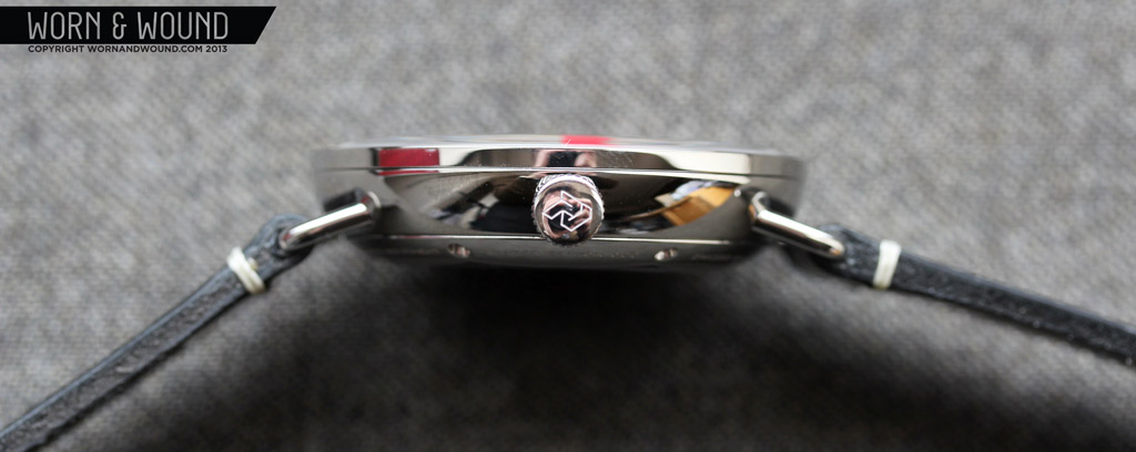
Though one’s eyes might jump to the redline on the crystal, it is the case of the Monoposto that inevitably holds my attention. Wrought with interesting details and an overall unique design, the case belies the price of the watch. The shape of the case is simple, yet results in a complex play of forms. The body of the case is a 43 x 10mm bowl of polished stainless steel with wire lugs protruding from either side. This shape does several things for the watch. It lightens the overall look of the case, as there are few sharp edges or transitions, save where the sloping sides meet the bezel and where the lugs meet the case. It puts the emphasis of the watch on the dial, which is quite large, as the shape projects up to the top edge. Similarly, when looking at the watch from the top, the sides are not visible. The wire lug design emphasizes the tachometer inspired aesthetic, by giving the watch a sense of a gauge that was converted for wearing on the wrist. And, as I’ll discuss more later, it makes the watch quite comfortable.
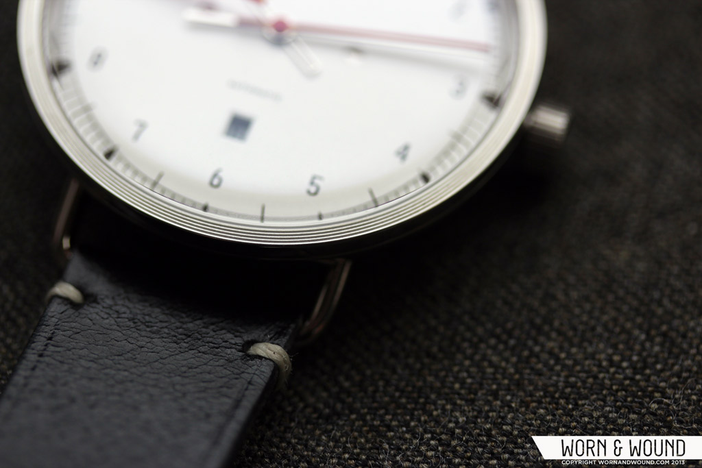
The detailing and build quality of the case hits you immediately as well. The bezel features a series of concentric circles that break up the polished surface. The ridges created ever so slightly reflect light differently from the surfaces around them, adding a decorative element that does not distract or feel out of place. Looking at the watch from the side, you can see the separation lines of 3-part case assembly (bezel, body and case back) and how precisely everything fits together. Flipping the watch over, you are presented with one of the nicer case backs we’ve come across.
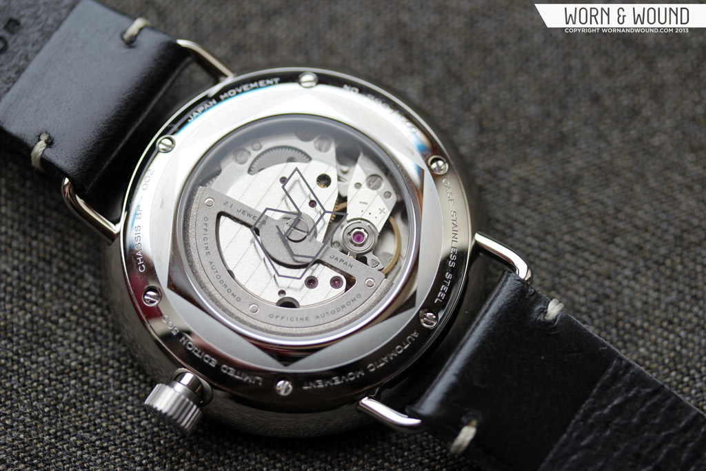
The slope of the bowl-shaped case runs all the way to the display window, immediately imparting an elegant fluid form to the back. The case back itself is held on with 6 small screws, which are incorporated into the decorative design. Between each screw is some text pertaining to the watch (Japanese movement, limited edition, etc…) as well as the specific number of that watch. Moving in towards the center there is a large etched graphics of a hexagon, rendered in matte and polished steel, with each point almost the screws. The display window is then circumscribed in the hexagon. One small, but cool detail, is that the Autodromo logo (an interlocking A and D) has been printed on the glass over the movement. The balance and interaction of shapes on the case back is really lovely to look at and presents the movement in a very elegant manner.
The Miyota 821A 21-jewel automatic movement at the heart of the watch is not without its own decoration. The rotor of the watch has a large area cut out making the Cotes De Geneve plate underneath more visible. The edge of the rotor also has a weight on it, that while a functional element adds to the overall look. Functionally, the 821A is a non-hacking, hand-winding automatic with date and a frequency of 21,600 bph. It’s a sturdy enough movement that has kept good time throughout my wearing of the watch. The 21,600 bph movement translates to a noticeably less smooth sweep of the second hand than the 28,800 bph of the Miyota 9015, though that doesn’t effect perceivable accuracy. The rotor is also audible, which is often the case with exhibition backs (and something I personally enjoy).
Dashboard
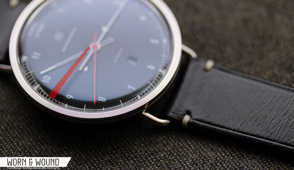
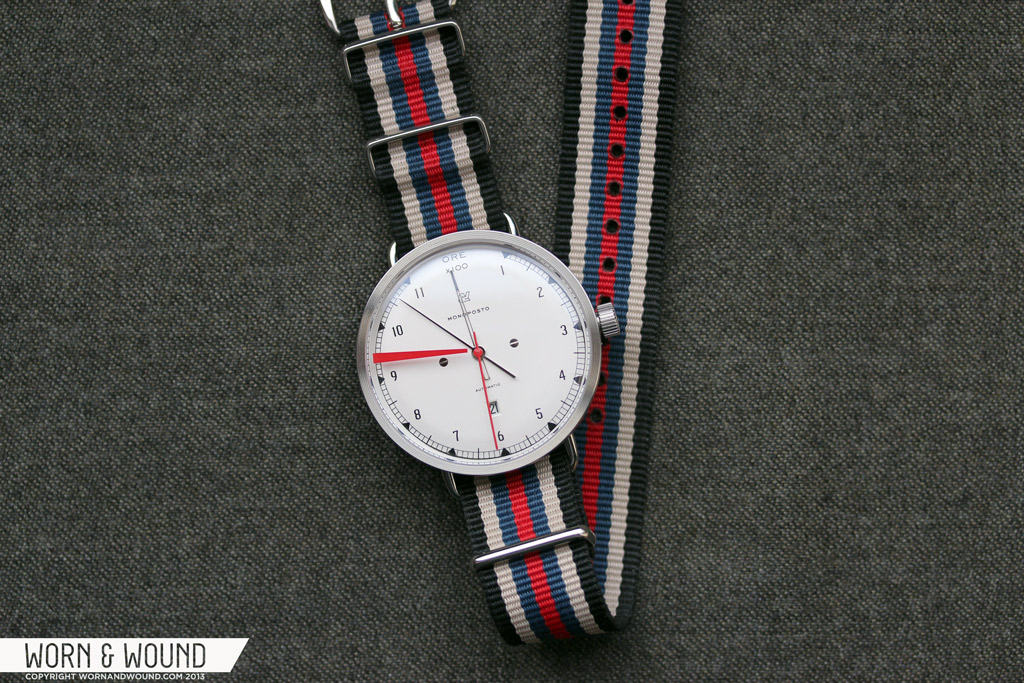
The expansive dial of the Monoposto refers to the designs of tachometers from early 20th century Italian racecars, which is a general theme in the Autodromo watches. This is clearly indicated in the index of the watch, which runs from 1 – 11 (with a break at 12) and has lines at intervals of 10 rather than 5 for telling minutes. The index has a railroad design with triangles at the hour or every five minutes, thin lines every half-minute and a longer, bolder line at the half hour. Inset from the graphic index is a numerical index for the hours, which is presented in a fairly small, but very legible font.
At 12, there is type reading “ORE x100” which refers to the tachometer scale. Though it’s irrelevant to time telling, it creates a good home point for the eye at 12. Printed underneath that is a small Autodromo “AD” logo and the word “monoposto” in an equally minimal presentation. Above 6 is a small square date window, which is a positioning I greatly prefer, and it works well with the tach-esque design. Both dial colors have black on white date disks, which works in both cases.
The hands of the Monoposto have a simple, but distinct design. The minute is a long thin needle, the hour is also long, but broader and skeletonized, and the seconds hand is a simple stick. Though the hour and minute are more similar in length than is typical, I found the designs of each hand different enough to read the time at a glance.
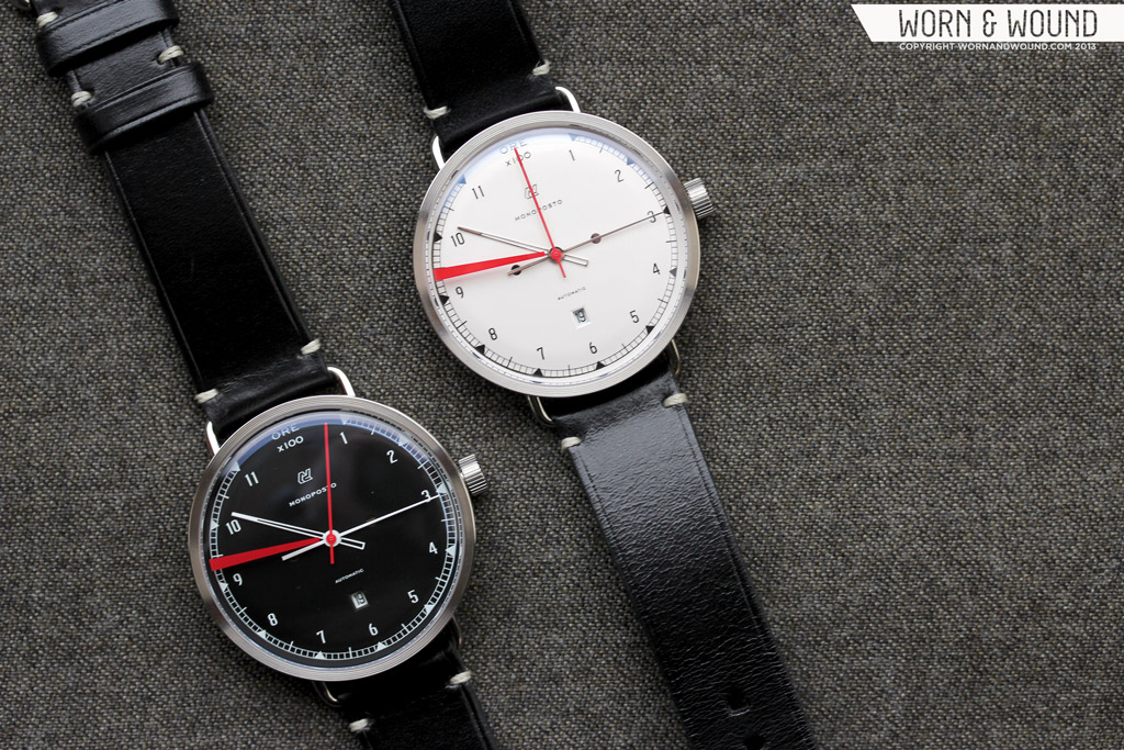
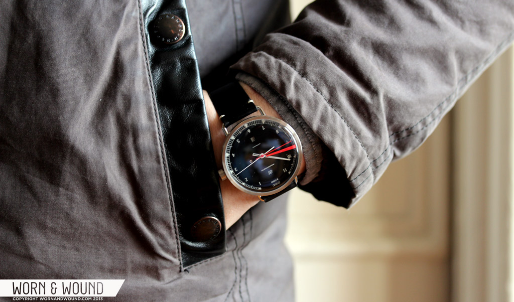
As I had mentioned, the watch is available with two dial colors, silver or black. On the silver dial, all of the text and indexes are in black, and the hour and minute hands are polished steel. On the black dial, the text, indexes, hour and minutes are in white. In both cases the seconds hand is red. Though similar in aesthetic, the two colors do give the watch a slightly different feeling. The silver dial is that type of antique silver that sometimes looks metallic and sometimes looks off white. It has a generally softer appearance than the black dial, yet also looks a touch larger (which is purely illusion). The black dial is more aggressive and sporty, and feels a bit more modern.
Though it’s technically not on the dial, the red line at 9.5, which is screened on the inside of the domed mineral crystal, has a very strong effect on the look of the watch, and could be a make-it or break-it detail for some. The watch, in general, is very restrained, even bordering on conservative. Yes, the case is exceptionally unique, but it’s not visually shocking or ostentatious. Similarly, the dial layout is not frivolous; fonts and symbols are relatively small, the hands are thin, etc… Yet, there, right on the surface, partially blocking the dial is this bold, red line. A line that actually has nothing to do with time-telling or watches, but exclusively vehicles…And I think it’s great. It’s a risky detail, but it gives the watch a personality all of its own, and clearly speaks to the concept of the Autodromo brand. Though the watch would probably be successful without it, it’s memorable because of it.
Seatbelts And A Test Drive
 The Monoposto comes mounted on a 20mm black leather strap that is handmade in the USA. It’s a very nice strap, made out of sturdy leather that arrives stiff, but breaks in quickly to become comfortable. It’s minimally detailed, with only a few contrasting white stitches that secure stress points, and a impressed lines bordering the sides.Instead of the typical thumbnail buckle, Autodromo went with a really cool roller buckle, which is a simple but nice detail. The black leather works with both dials, but for a softer option, Autodromo sells a saddle brown version on their site for $95, which isn’t bad for a handmade strap. The wire lugs on the case actually have spring bars in them, so switching straps is not an issue.
For a different, but quite appropriate change of pace, I tried a Crown & Buckle 7-stripe NATO on the silver dialed watch. This specific NATO has black, cream, blue and red in it, so it picked up on every color present in the watch, and the striped design has a sporty racing aesthetic unto itself. The wire lugs look awesome with a pass through style strap as well. This would definitely be my go to strap combo during the summer.
On the wrist, the design of the Monoposto really comes to life. The wide but thin design has tremendous presence, yet is comfortable to wear. 43mm is fairly large, but with wire lugs it is very manageable, as it feels almost like a lugless watch. Yet, at the same time, the nearly all-dial design makes the watch look larger. In the end, it’s just a very bold watch that stands out and wears unlike other watches. In both cases, the colors and styling make the watch easy to wear with just about anything. Combine that with the comfort provided by the unique bowl shaped case, which makes the watch sit on the wrist without creating too much contact, and you have a watch that can be worn daily.
Fresh Off The Lot
Occasionally, I get really excited about the packaging that watches come in. When I find packaging that is really thought through and meticulously designed to celebrate and present your purchase, yet works intelligently with the branding of the company, it ends up making me like the product even more. Well, the packaging of the Monoposto is perhaps the nicest and smartest packaging I’ve seen yet.
The Monoposto comes in a rigid leather-clad folio of sorts that is itself packaged in a cardstock box. The outer box is basic, but has an intriguing map graphic printed on it in light grey and red that wraps around the box. With the folio is a very nicely printed and art directed booklet with basic information about the watch and warranty as well as some very sexy but abstract photos of car engines, chassis, etc… The cover of the booklet features a stripped down single-seat racer printed in charcoal grey on a light grey background with “monoposto” over it that looks like an antique print…. I’m not one to save instructions, but I’d keep this for sure.
Finally, you get to the folio. On the outside, it appears to be very simple and almost plain. A rigid black flap, with minimal but thoughtful branding, secures the case. Pop the Autodromo branded snaps, flip open the flap and… You know that scene in Pulp Fiction when John Travolta opens up the briefcase and all you see is a glowing golden light?… It’s nearly like that. The inside of the folio is little slice of decadence and luxury. It’s lined with red velvet, has gold foil printing, a metal plate with various details, and of course a protective and cozy area for the watch to rest in. What I really love about this is not just that it’s fun, unique and surprising; it’s very functional. The folio definitely will protect the watch in shipping, and once in your possession, can be used to store the watch at home or for travel.
The Finish Line
There are various things that I look for in a watch, not just for my own collection, but for the watches we discuss on w&w too. Great looks, quality and value are always at the core, but there are other, more rare attributes as well. The Monoposto doesn’t really feel like other watches. It looks like a watch, makes sense as a watch, but is an object unto itself. The mix of automotive references, subtle detailing, superb build and finishing, vintage elements and a single shocking exclamation make this a watch with a personality that sets it far apart from other watches we’ve tried. As such, this watch either calls to you or it doesn’t. The red line either makes sense to you, or it doesn’t.
Regardless, the Monoposto is a very exciting watch that for a first mechanical offering from a brand really sets a high standard not just for themselves, but also for other companies with similarly priced watches. At $875, the Monoposto isn’t cheap, but it delivers in everyway it should, especially in design. And over delivers in uniqueness and execution. So…if it calls out to you, in which case it’s probably screaming your name, you’ll probably want to grab one before this limited edition leaves you in the dust.
Review watches supplied by Officine Autodromo
by Zach Weiss





 Featured Videos








Thanks for the great review! I have one on the way with the black face, but I am looking forward to it even more now!
Hi I am currently looking for a black dial monoposto. If anyone has one for sale, please let me know. I can be reached at [email protected]
Everything about this watch says gimmick to me. The price tag and features do not match up, and the price seems to be based off of what they want this watch to be, rather than what it actually is.
Good write up, can’t knock that, but the piece itself: yawn.
I purchased the silver face version and had a reasonable expectation due to the vintage auto racing theme (in line with my interest) but did not expect the watch to compare in quality and aesthetic to those in my collection costing 10 times as much. When it arrived, the packaging immediately impressed, but the consistent design theme and details really sold me. I love this watch, and it couldn’t be a more comfortable daily wear. You might question the movement for $875, but if the watch was on your wrist you wouldn’t question it further. It is subtle but beautiful, and the strap is just wonderfully made. I purchased the saddle colored strap after receiving the watch on the black strap. Same great quality, but I had a question before jumping in on the strap change, e-mailed the company and got an immediate, thorough and kind reply from the owner/ designer. Very impressive. I recommended the watch to a watch collector friend and ordered one immediately with the same impressions. Great watch, and good review.
Something i have been curious about is the two small circles around the center of the dial. Do they serve a purpose or are they another nod to the racing theme?
great review as always guys!!
This is a nice watch and looks good… but $875 is way too much for a Miyota movement based watch… I’m not saying that Swiss ETA is better than this Japanese Miyota, but we all know already that Swiss movements are more expensive.. even running on a ETA movement this would be a very expensive watch at that price.
If it didn’t have that silly red line I’d definitely consider. Is a bit overpriced too – would def prefer a Max Bill if I’m going to spend that kind of dough.
This is a watch for motoring enthusiasts. I think watch enthusiasts wont pay 875 for it, but someone who loves cars, or old Italian cars will. Pricing based on its contents is often a misconception, as design plays a big part too. Take uniform wares as a prime example. Same price as this for a quartz chrono, but the design is what you’re paying for whether you like it or not. Nice watch and review W&W.
Great review. Thank you to put my attention on Autodromo mechanical watches. I think this watch will soon become iconic – for me is already. If I would have to buy only one mechanical watch – that would be my choice! Great design, good historical and moto conotations, realiable mechanical movement. Nothing to expect more. And 250 limitation to each model!
I can’t get over the movement, otherwise I think it’s a cool watch.
Richard,
What kind of time is yours keeping in terms of accuracy, +/- per day?
Thank you so much, I placed an order right after reading your review. I cannot wait to receive the watch and put it on my wrist.
Way overpriced piece. Asking BMW money for VW engine. And besides that I think it’s ugly. Especially the hovering red line. Yuk!
Love the dial, the hands, the case.
Hate the red line.
Might have bought it anyway, except that watches with the same movement sell for one quarter of the price, or less.
Lotta profit margin in there. For the money they could have used an ETA, or Sellita, or Soprod.
No sale.
Hi there, i read your blog occasionally and
i own a similar one and i was just curious if you get a lot of spam feedback?
If so how do you reduce it, any plugin or anything you can suggest?
I get so much lately it’s driving me insane so any support is very much appreciated.
Hello There. I found your blog using msn. This is a really well written article.
I’ll be sure to bookmark it and come back to read more of your useful info.
Thanks for the post. I will certainly comeback.
Hi there, just wanted to mention, I enjoyed this article.
It was funny. Keep on posting!
This paragraph gives clear idea designed for the new people of blogging, that
in fact how to do running a blog.
Wow , det här artikeln är kräsen , min syster analyserar
dessa typer av saker , så jag ska informera henne .
Found this watch too late. Are there any that look very similar to this? Preferably with a Miyota Movement as well? Very striking design.