


 Featured Videos


There are a lot of things that motivate a brand to make a watch. Ideas that ignite, driving an enthusiast or designer to create a concept, and perhaps go so far as to make it a reality. More often than not, it’s an aesthetic concept, a desire to see a certain type of design that pleases them realized; vintage style being a common one. Other times it’s function based, with the idea of making the best diver, pilot, racing chrono, etc… Well, the brand we’re looking at today drew its inspiration from a very different source: coffee. Or, to be more accurate, the coffee break.
Brew Watch Co. is a new brand founded by designer Jonathan Ferrer that is launching on kickstarter today. The goal of Brew was to distill the subtle pleasures of the coffee break into a series of timepieces. Now, this is about as abstract as concepts come, and prior to seeing the pieces, I was concerned about how it would translate. Nothing is worst, in my opinion, than very literal design. My concern naturally being that the watches would have mugs, or utensils or even beans somewhere on their dials or cases. I was more than pleasantly surprised to see that not only was that not the case, but that the watches were full of little details that make them interesting.
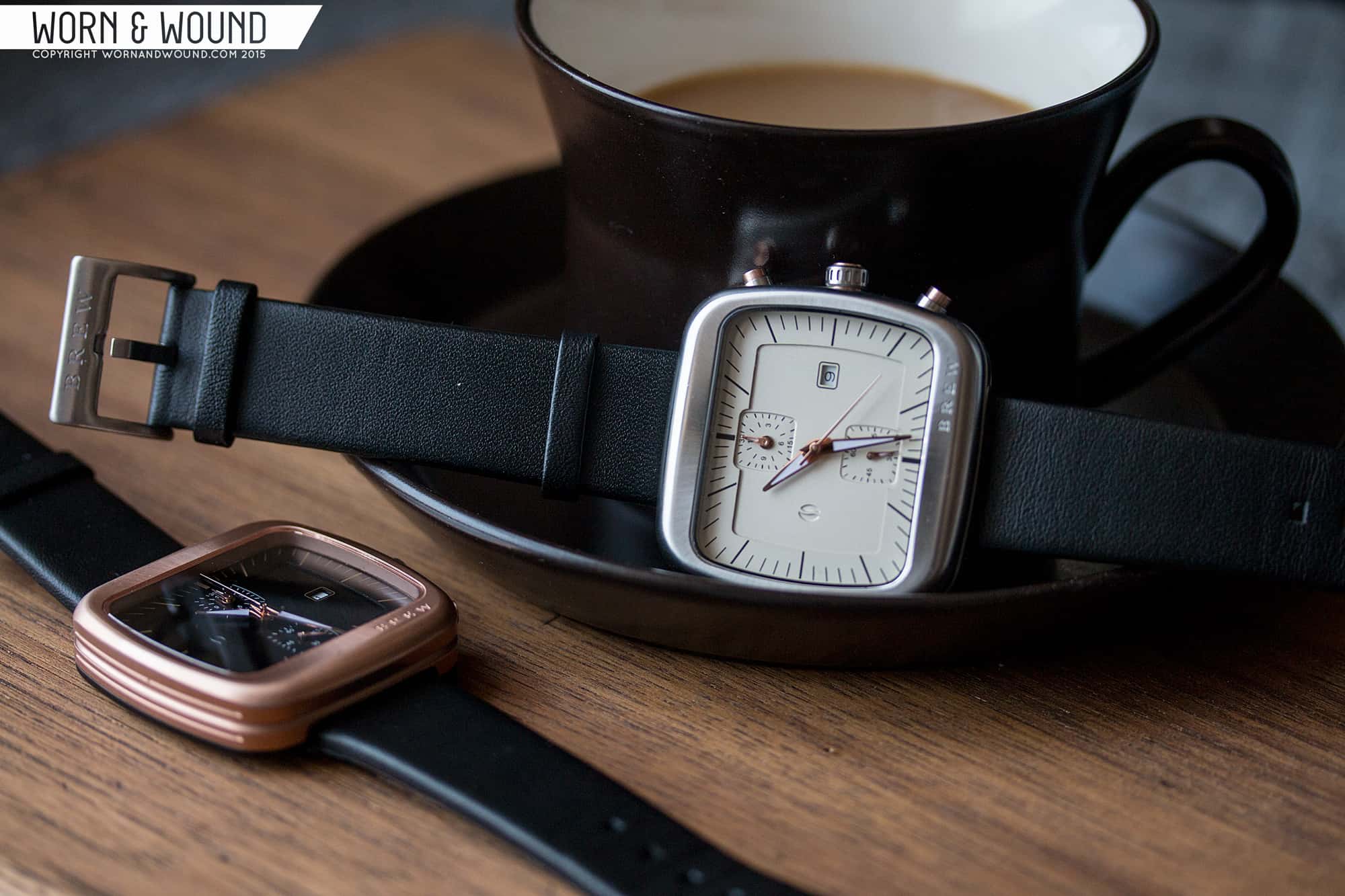
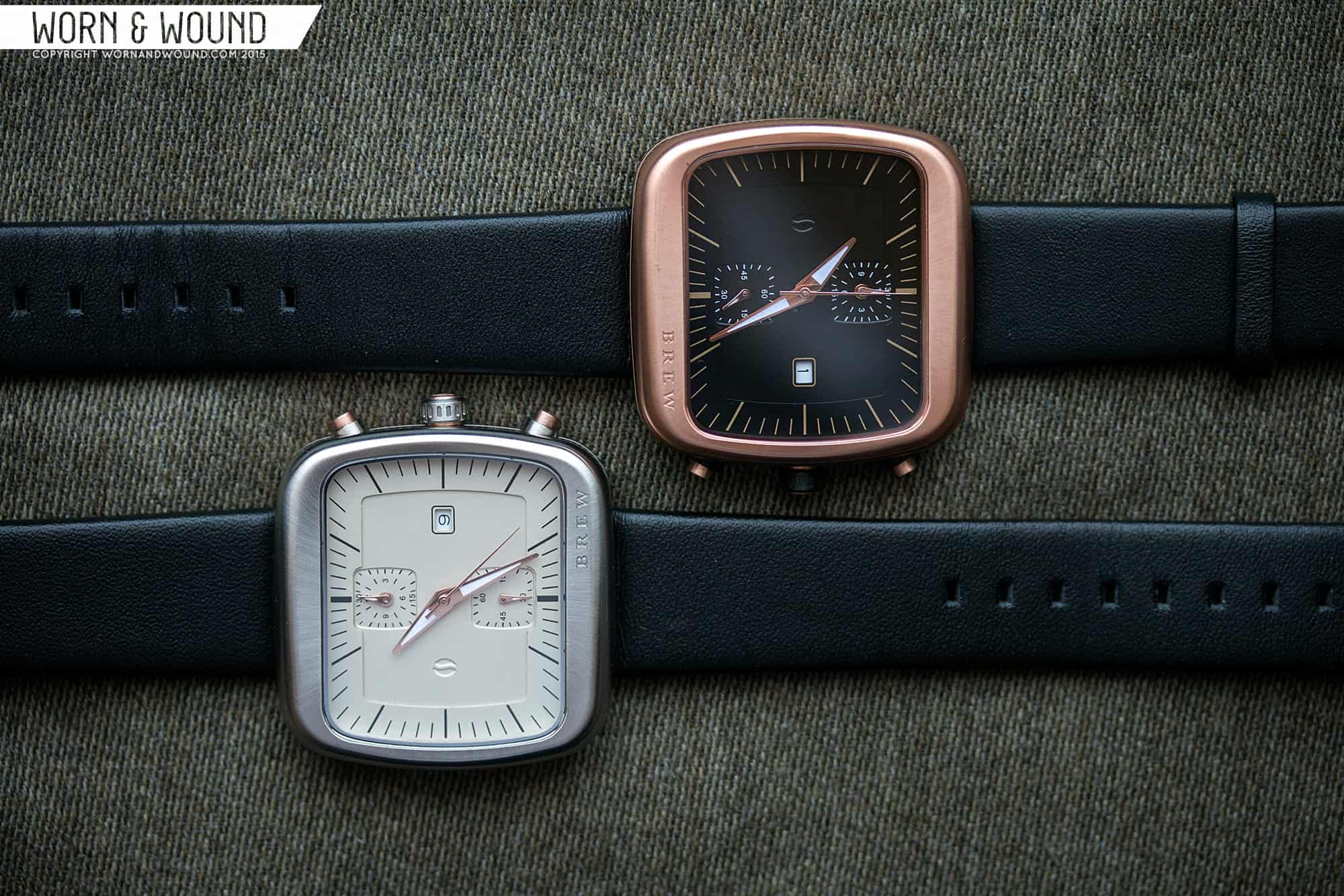
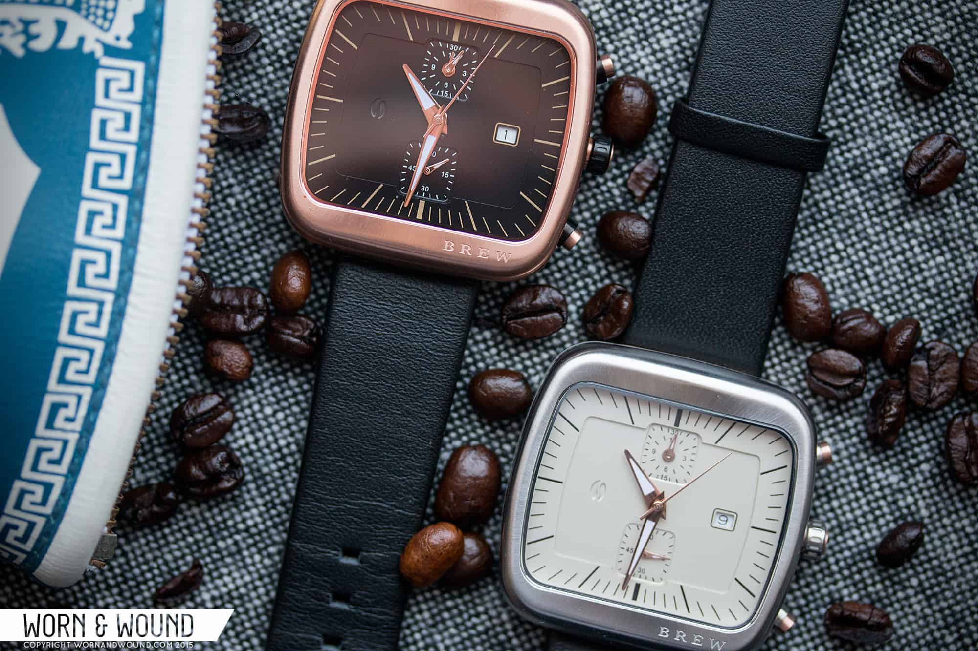
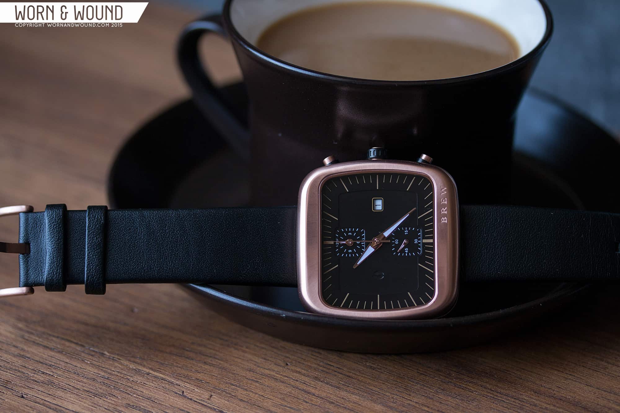
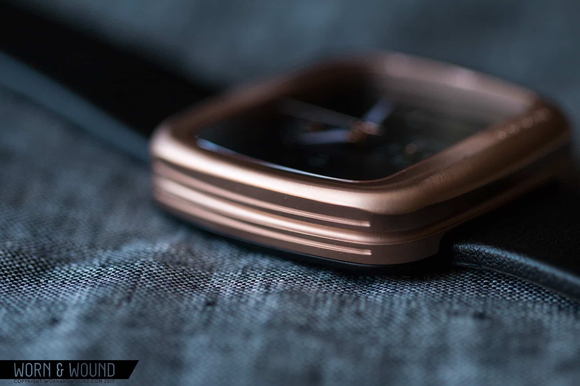
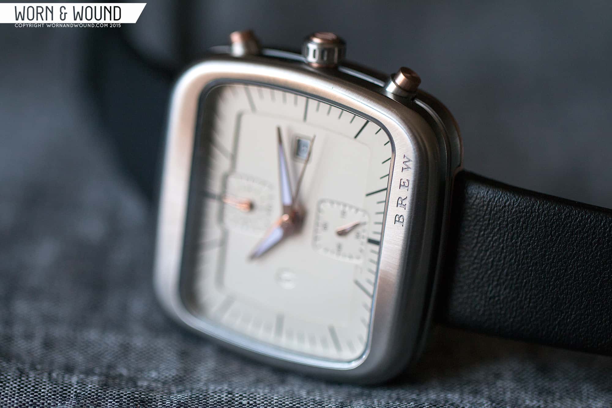
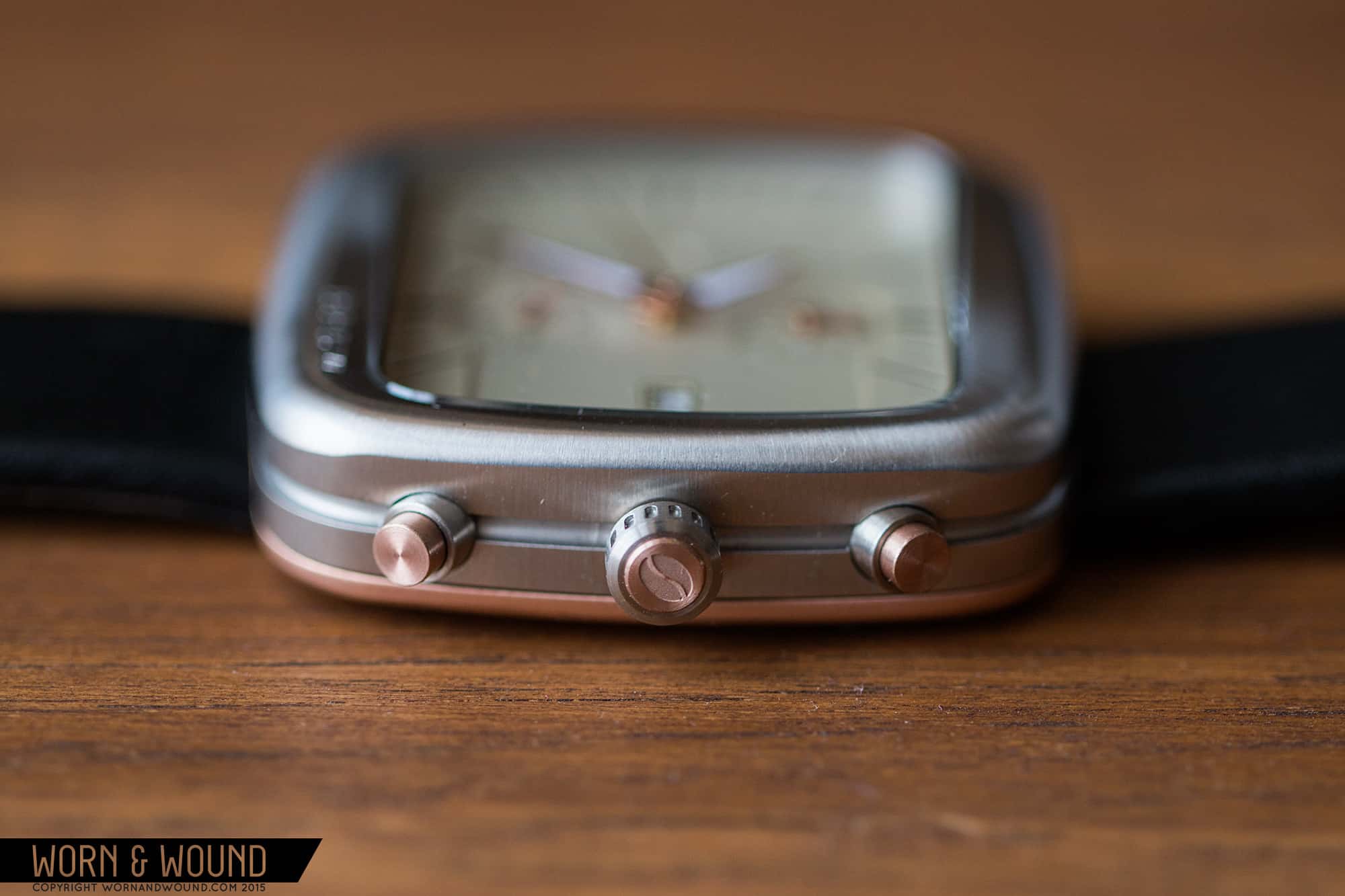
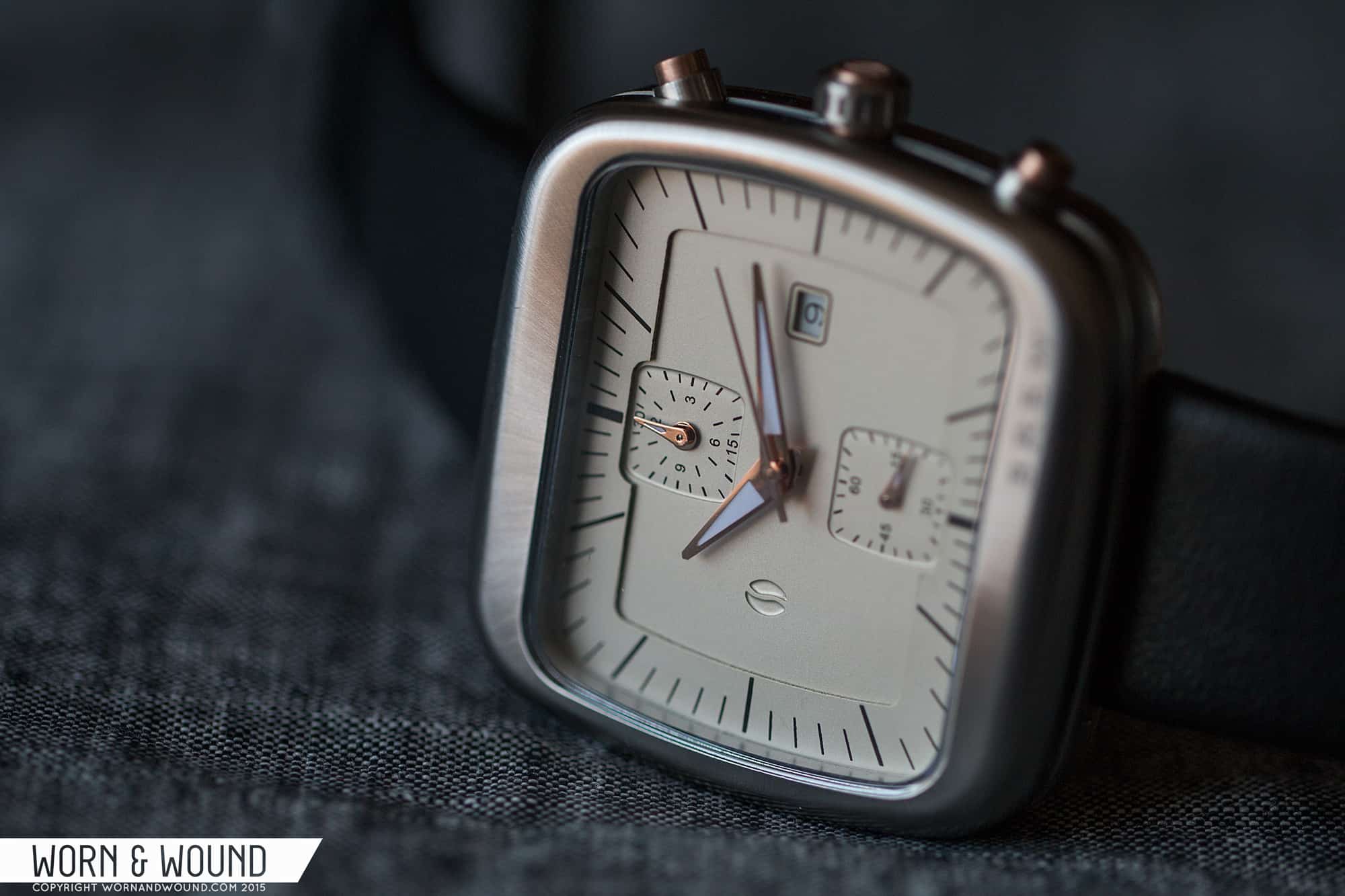
So, to design the watches Ferrer, who is an experienced watch designer, looked for inspiration in the coffee shop, and found it in the machines that are used and the atmosphere of the locales. To start, there is an overall warm feeling to the watches. They are soft and approachable, with big rounded edges on their 44mm square cases and comforting colors made from a palette of creams, rose golds, brushed steel and black. The design itself then draws a bit from espresso machines, especially in the case. Perhaps the most literal of elements, Ferrer pulled from the aesthetic of the vents, adding textural details to the case sides and crowns. The shape then, with its heavily radiused corners and edges, speaks to those big Italian sheet metal machines that are often the centerpiece of a small shop, but also reminds me a bit of those big, ceramic mugs one gets at classic diner.

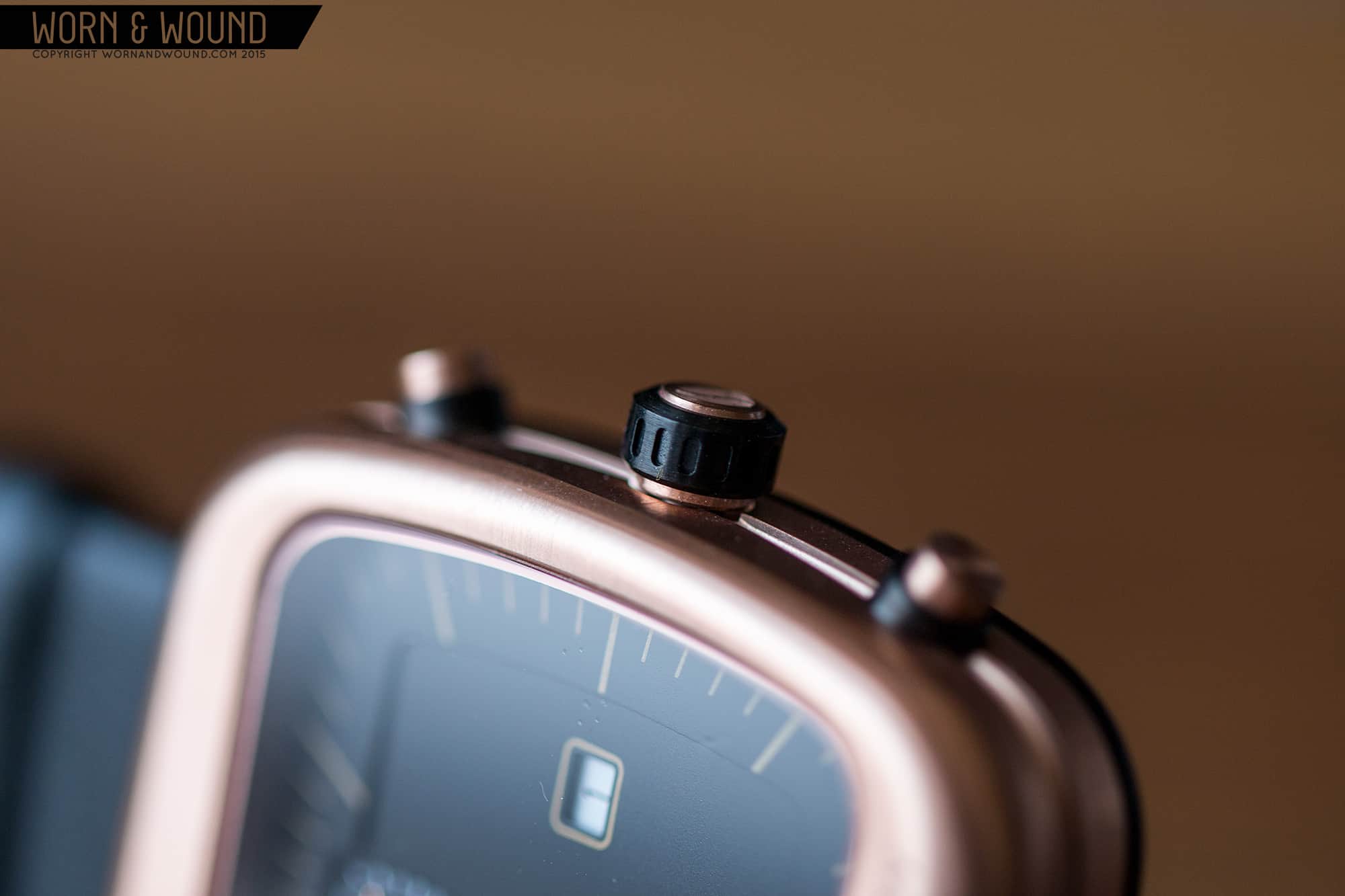
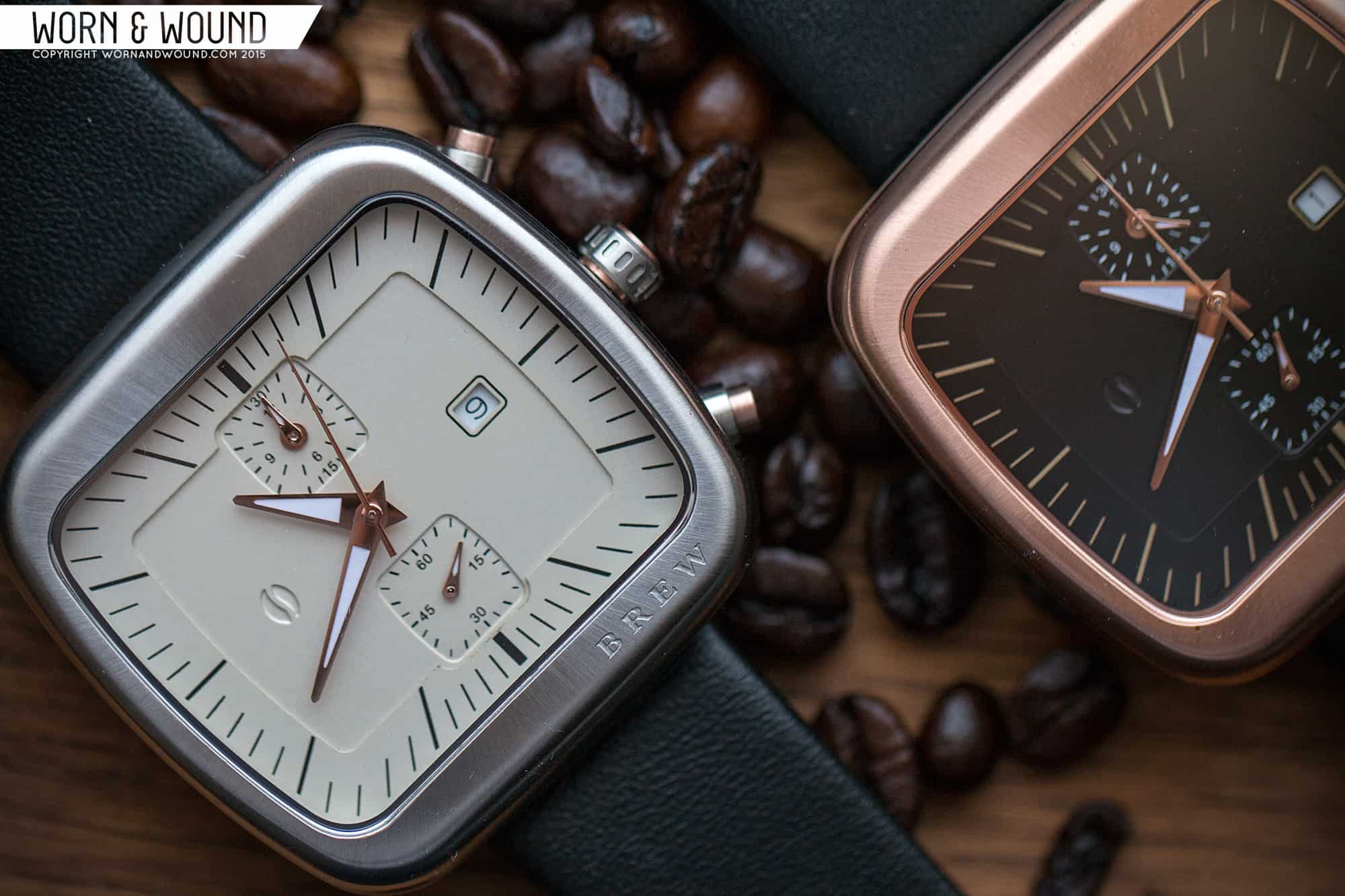
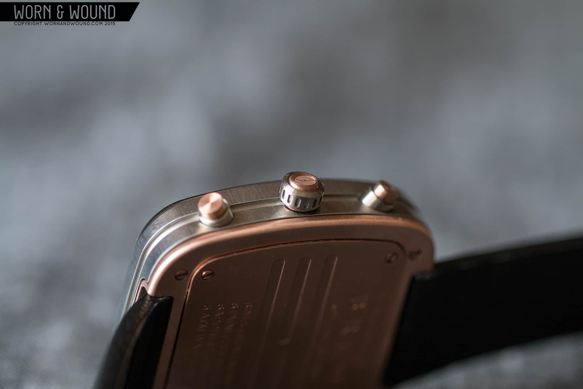
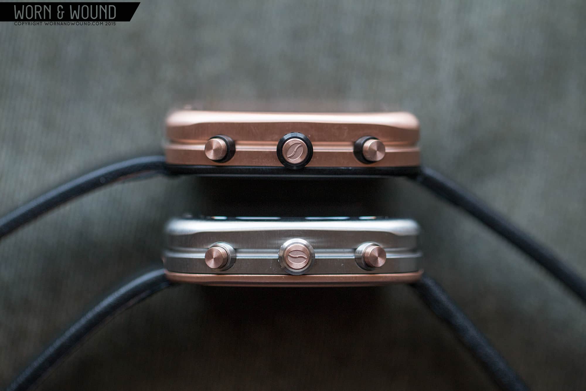
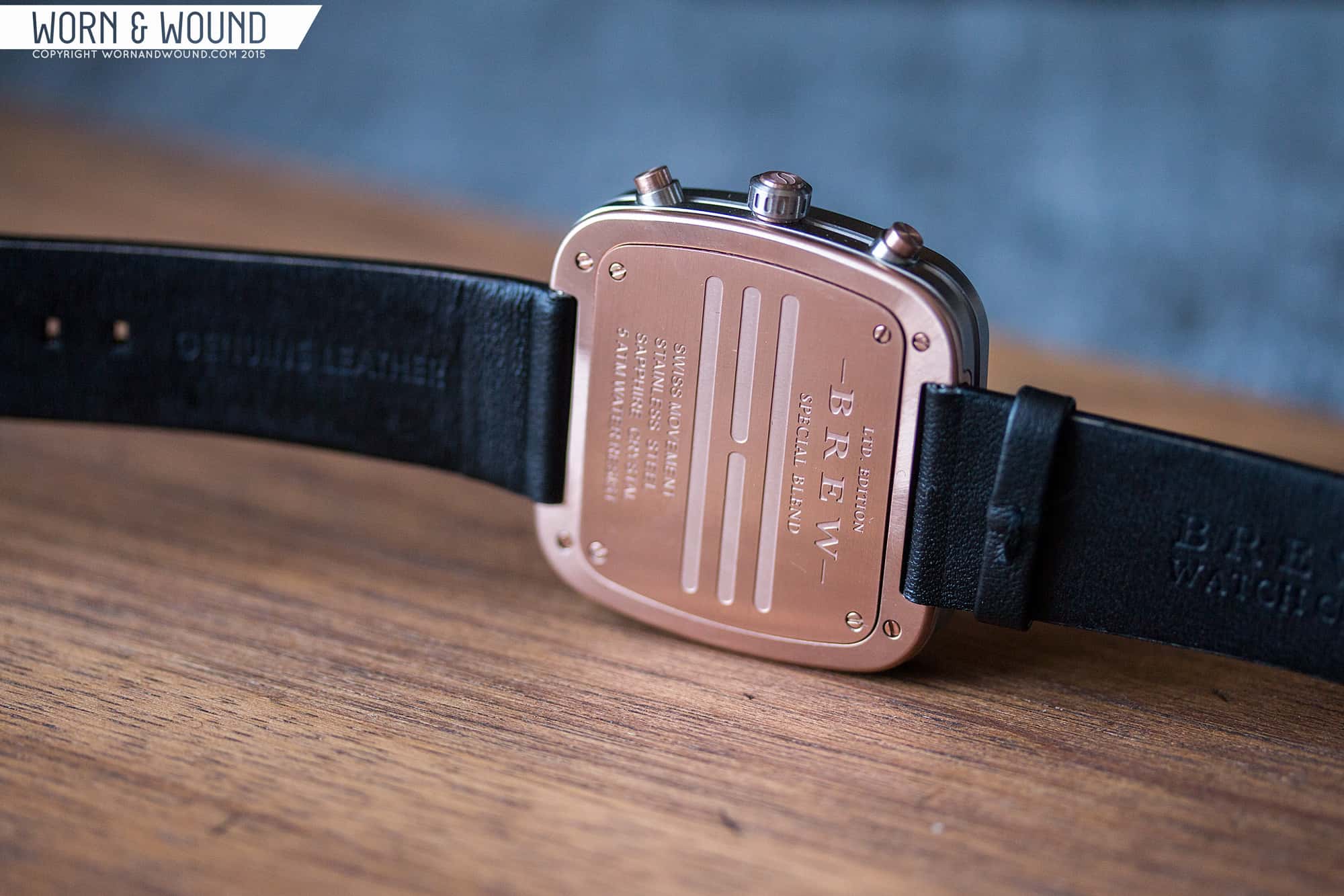
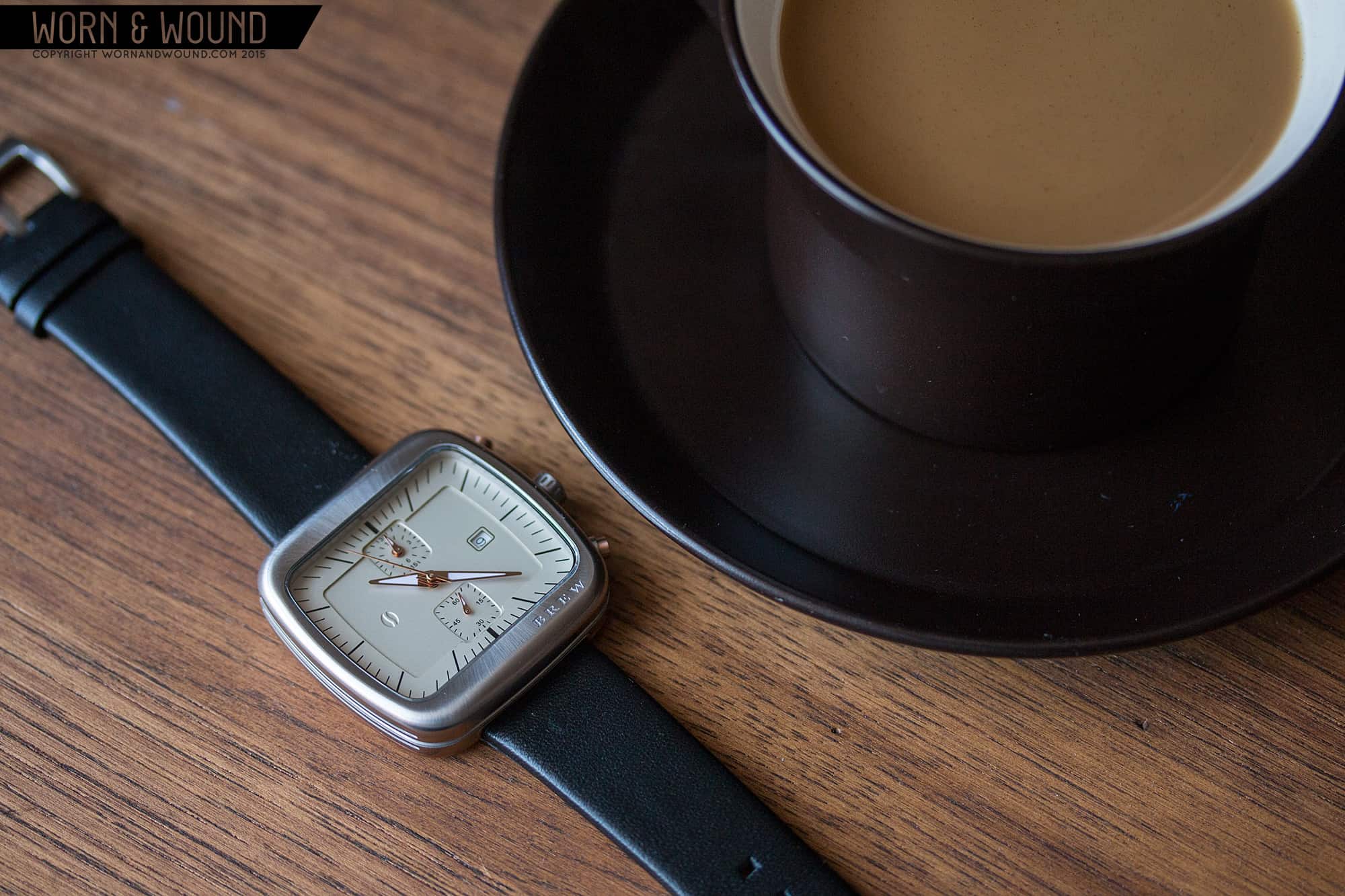
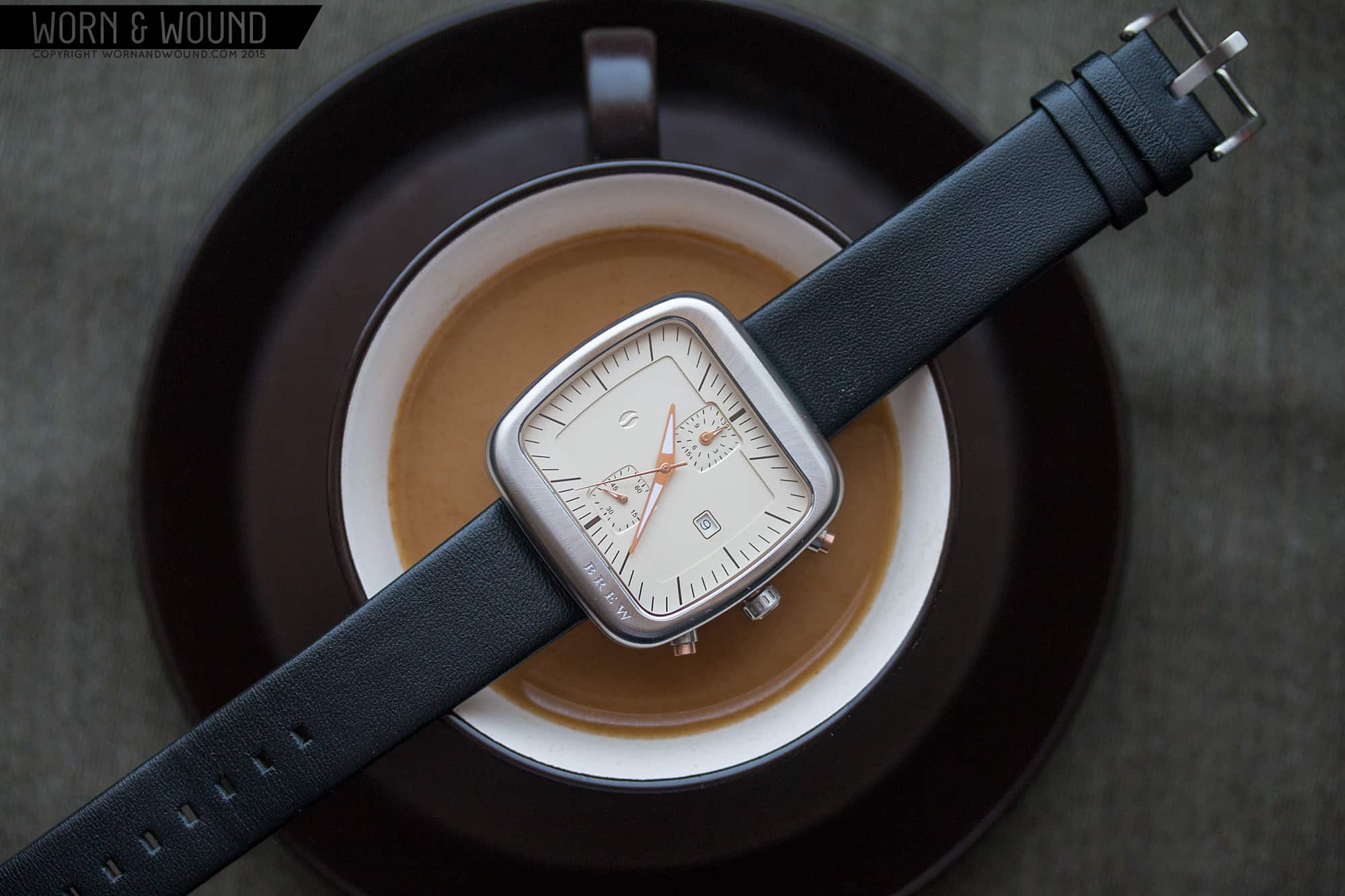
But coffee aside, what makes the case for me is a clever detailing. Each case is two tone. The steel model has rose gold PVD accents, the rose gold model has black PVD accents and the black PVD model has rose gold accents. The most obvious place this is visible is in the case back, which will be in a contrasting color. Since the case back mount flat to the whole back of the watch, it is viewable from every angle. Next, the pushers and crowns have multi-part construction, alternating materials. The crown in particular is worth a close examination, as it has a central axis of one material, surrounded by a textured cuff of another. This is where Ferrer’s experience as a watch designer becomes apparent, as details like this are not often found on watches this price, nor as well executed.
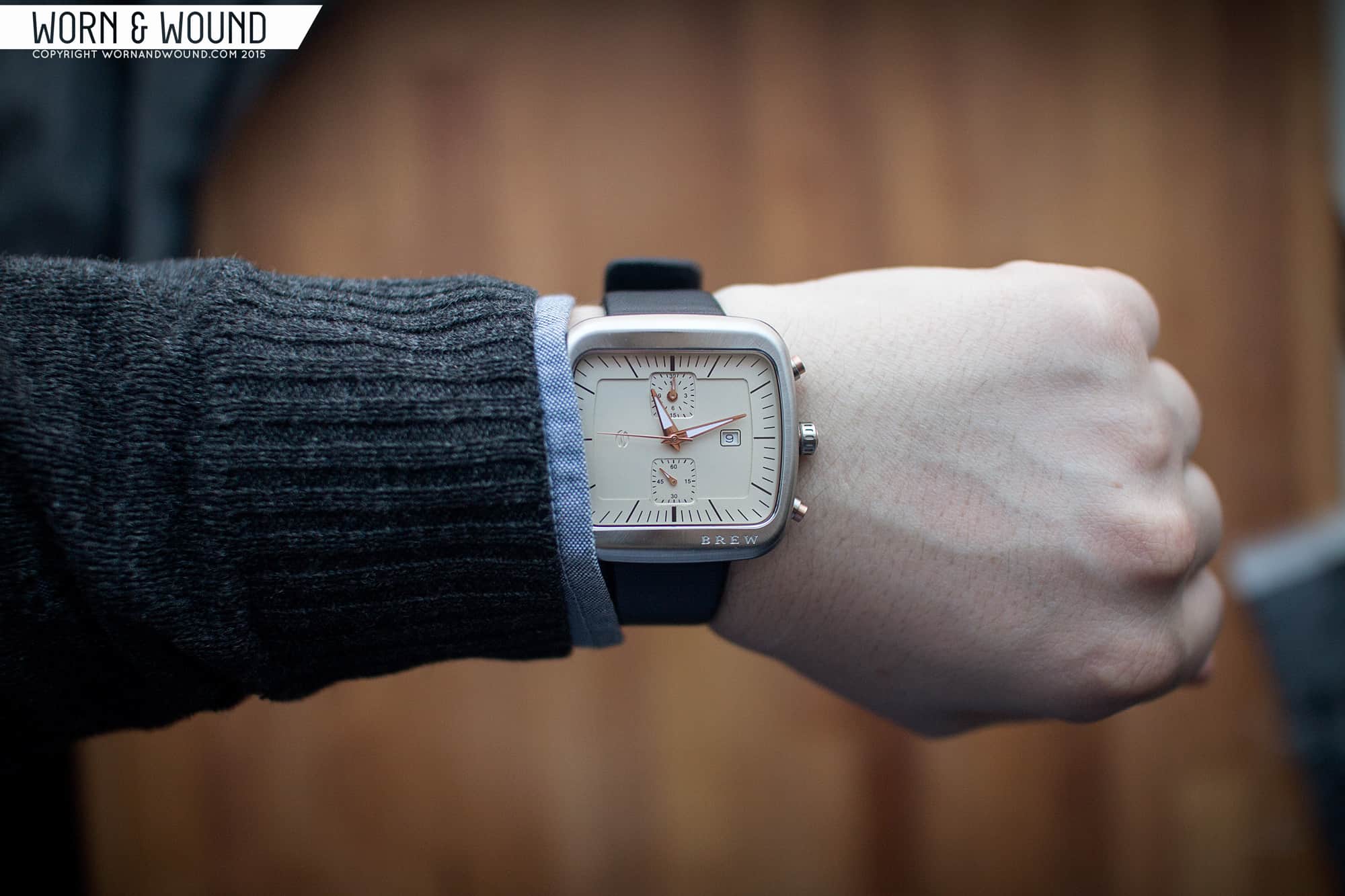
The dials have a more straight forward design, with a mid-century feel. First off, the dial isn’t round, nor square. Rather the dial area is a wide rectangle with bowing sides and rounded corners, mimicking the case, but playing with the proportions. The fact that the dial is wide actually really effects your perception of the watch… it doesn’t look like a square and doesn’t feel like a square, but it’s a square. The dial’s are all multi-layered with a single non-numerical index on the outer, higher area. The index consists of long lines that project out from the center, giving the dial a bit of a “zoom” effect.
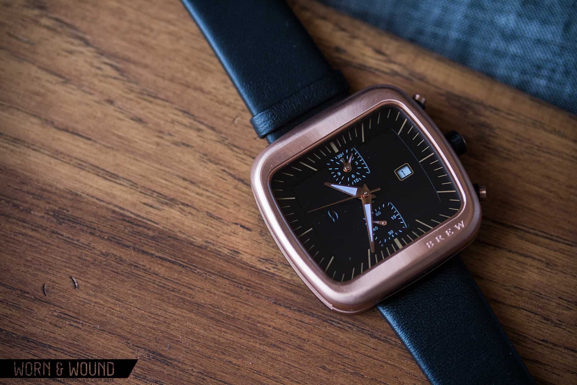
There are sub-dials at 12 and 6 that are bulging square shapes that immediately bring vintage chronos to mind. The 12 dial is a stacked minutes/hours counter while the 6 dial is the active seconds. Because of the arrangement of the sub-dials, the dial layout is heavier in the center, which is balance by the open space around 9 and 3. It’s a curious design that I think works well with the wide dial shape, playing with the vertical and horizontal proportions.
The watches feature flat dauphine hands in rose gold PVD that each have a touch of lume. There shape works with the dial and the mid-century feel, though I wonder if the lume was really necessary. Obviously it increases legibility in low light, but the sudden white color breaks the continuity of materials a bit.
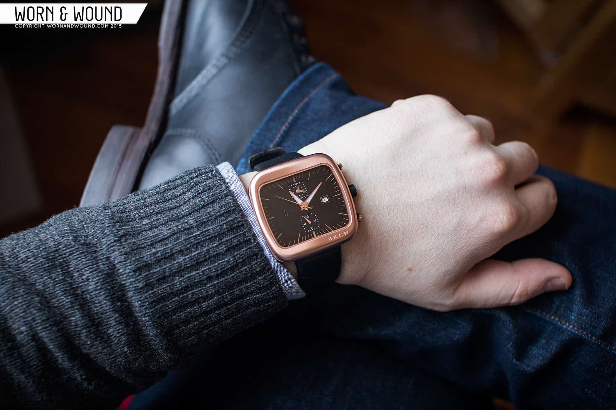
Despite the fact that the watch sounds large at 44mm, I found the Brew watches wear very well and smaller than they measure. Since there are no-lugs, the 44mm distance across the wrist is very comfortable. This is further visually accented by the wide dial, which makes it look even shorter. That said, the size does give it a masculine quality, though not too much.
Size aside, they look good too. The shape is interesting, and the very soft rounded sides and edges are very appealing, and different from what I’m used to. There’s nothing aggressive or sporty about this watch, nor is it really “dressy” in the typical sense. Yes, the choice of materials are more towards formal, but the watch has a casual feel and despite some clear mid-century style points, overall a fairly modern look. It’s very clean, and somewhat minimal, but warm and friendly all the same.
As someone who drinks a lot of coffee, brews at home, grinds his own beans and finds themselves in coffee shops a few times a week, I did find these to resonate with the experience. It’s less aesthetic and more emotional. That feeling you get when that cup of coffee that’s been brewing is finally poured, the aroma hitting your nose, and you take that first warm, delicious sip. It’s a thing of comfort and ritual. While it’s a hard thing to describe and certainly something as a reader I’d be skeptical of too, I just get what Ferrer was trying to achieve and have to applaud him for tackling something so, well, strange (it also gave me an excuse to take some fun pics).
The Brew watches are all powered by Ronda 3520.D quartz chronographs and feature flat sapphire crystal. For the Kickstarter campaign a single watch will run for $275, $100 off of the final price. For $275, these are fairly priced for a well made quartz. Yes, there are plenty cheaper out there, but these don’t look or feel cheap and they aren’t just another Daniel Wellington clone. In fact, they have details on them that challenge watches of much higher prices. The use of mixed materials, complicated and unique parts (an odd shaped sapphire has to add a decent chunk alone), gives these a lot of value. So, if they appeal to you, the concept resonates with your inner barista or you’re simply in the market for a unique square watch, be sure to check them out and support them.

