Baltic Watches HMS and Bicompax 001 Review

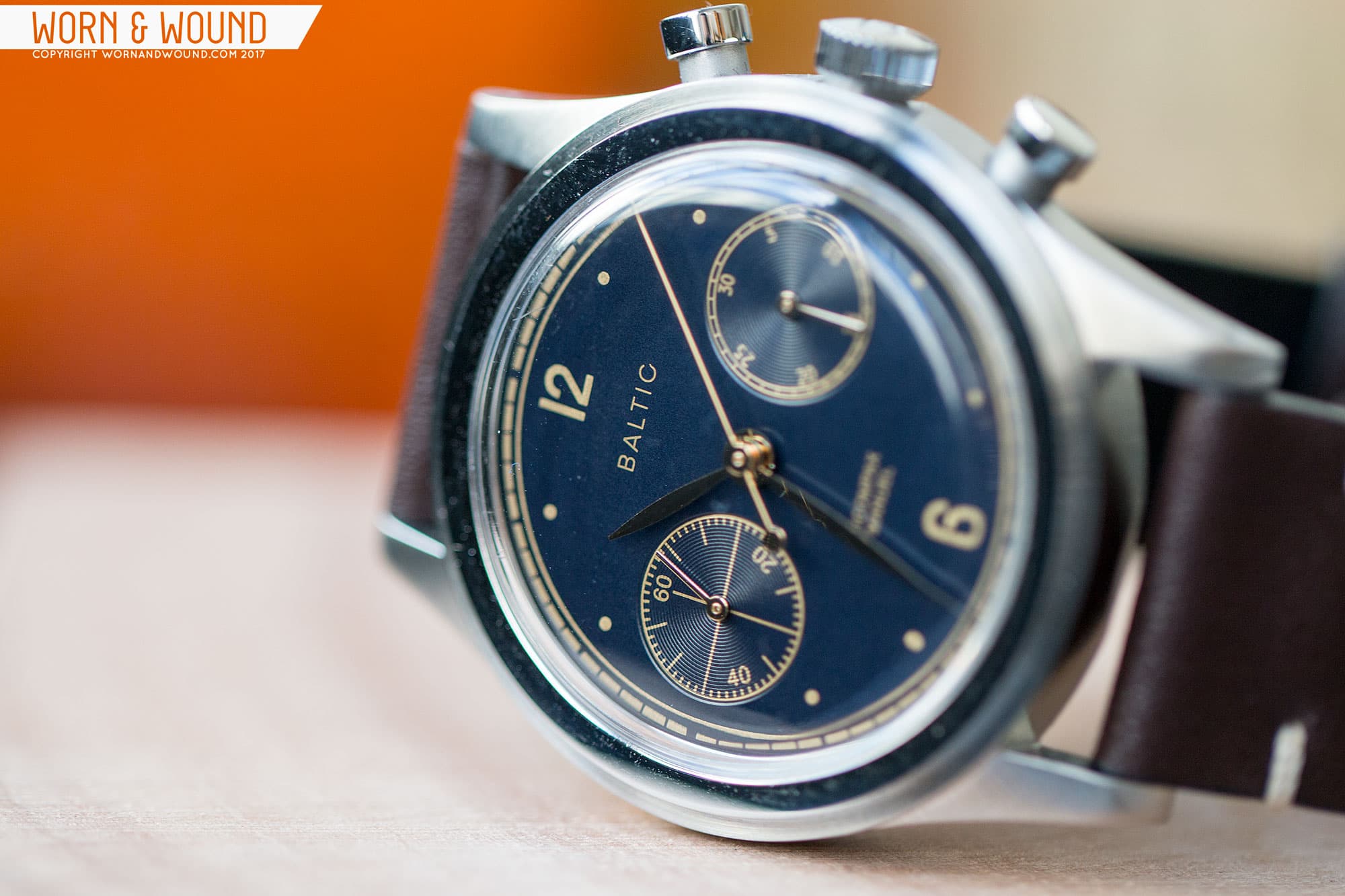
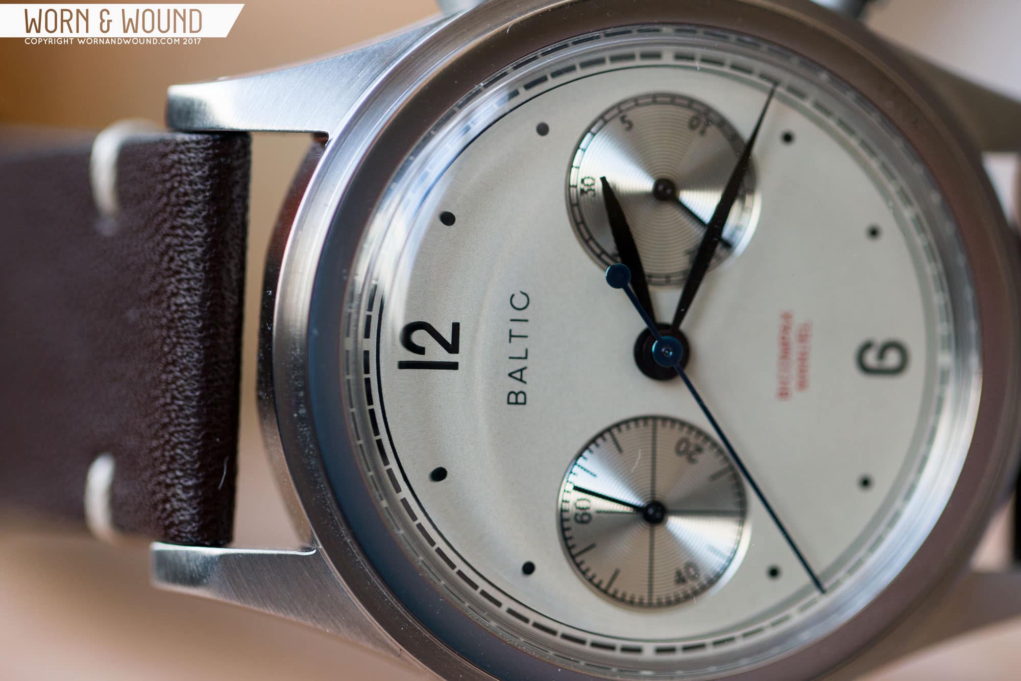
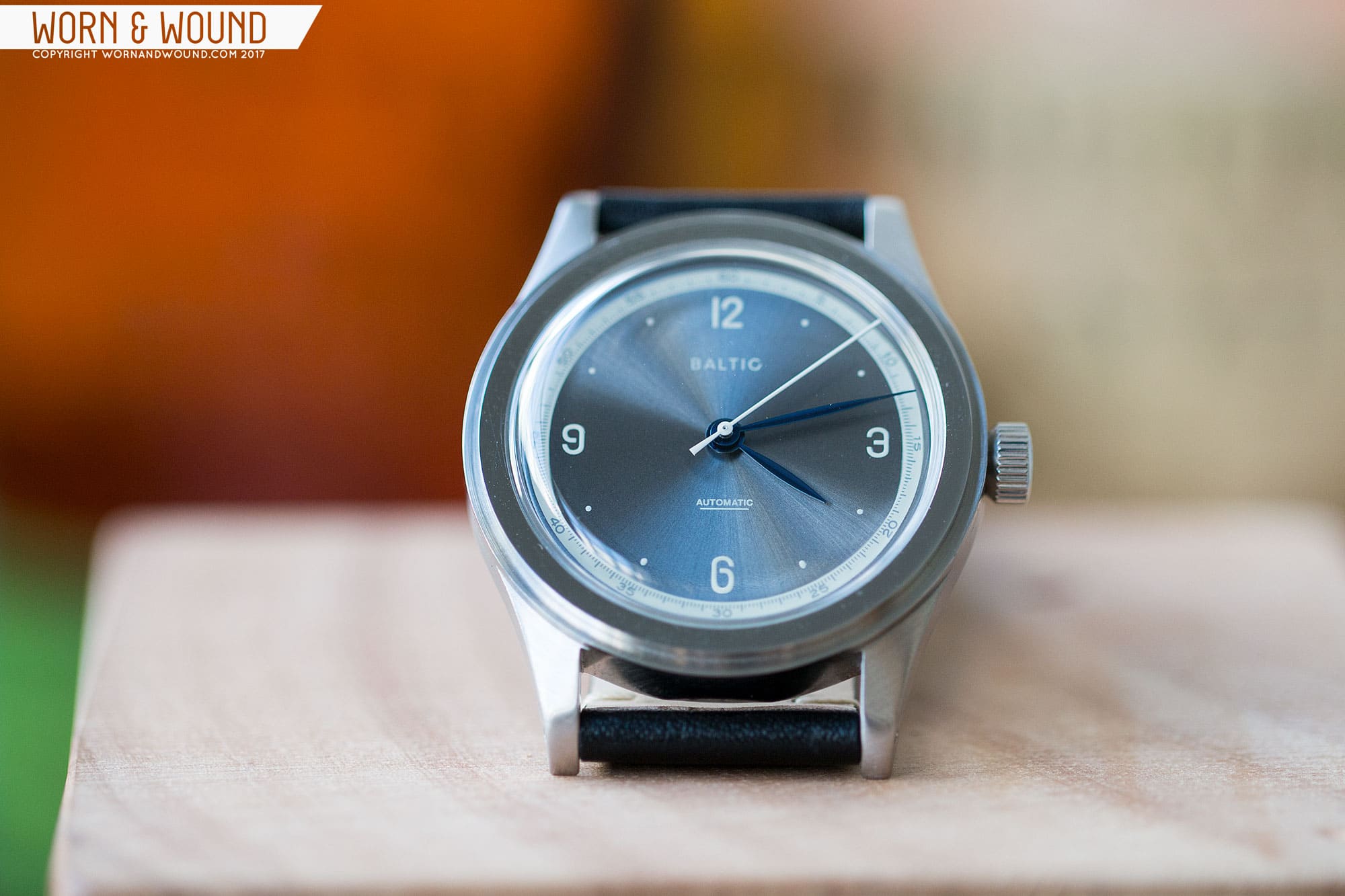
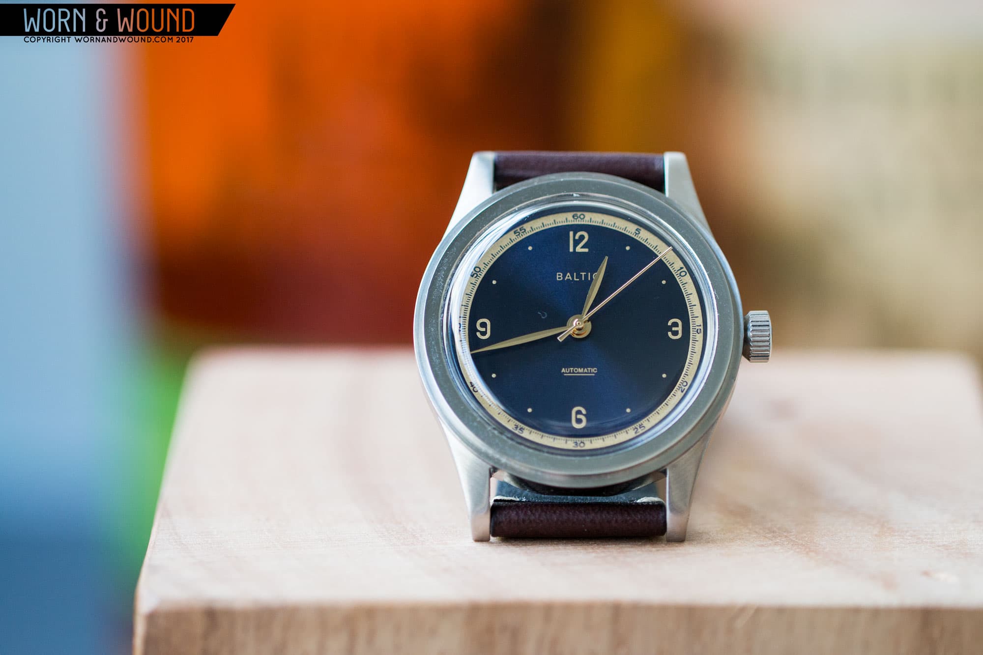
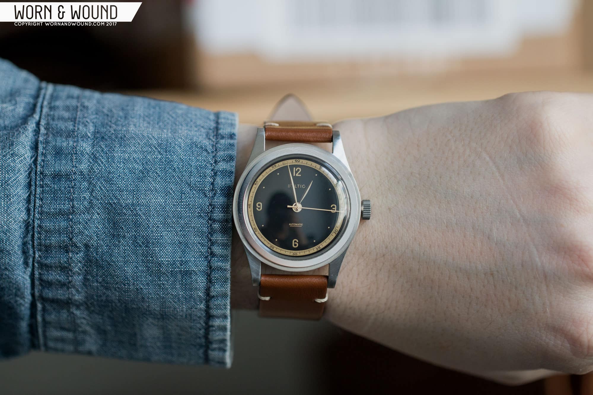
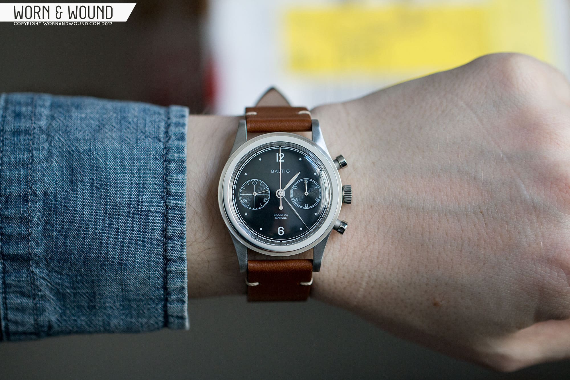
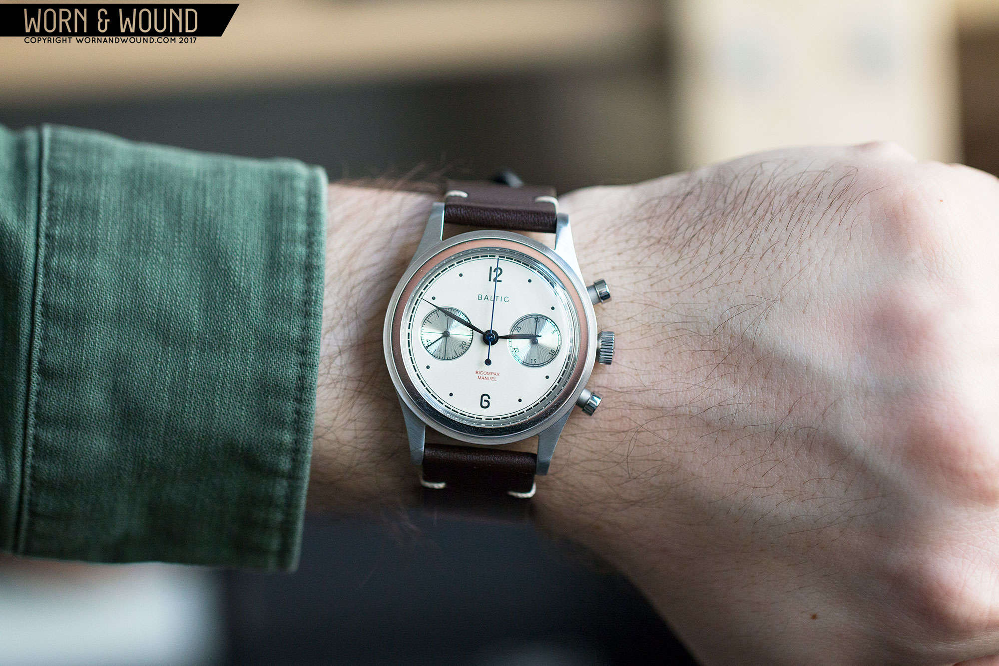
It’s a funny thing. With all of the vintage reissues and throwbacks coming out, some just get it right while others, not so much. Sometimes it’s a matter of faithfulness, other times it’s simply proportions. Often, everything gets really close, save one gnawing detail, like a bit too much text or an obtrusive date window. Regardless, one thing that is always true is that when they work, people know it immediately, and the brand and watch get celebrated by all. Such is the case with newcomer Baltic, who just launched their first watches via Kickstarter.

BALTIC_GROUP_3

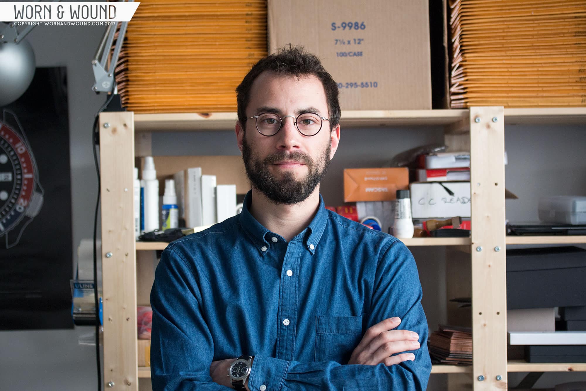
Based in France, Baltic was founded by Etienne Malec who inherited a fascination with, and a collection of, watches from his father. A collector before collecting was cool, Etienne’s father extensively recorded his watches in a journal, keeping track of every one that passed through, with price paid, price for selling, what he traded it for, etc. Perhaps something we take for these days with Instagram and forum posts that never go away, this sort of tracking really gave Etienne an insight into these watches in the day they were collected.

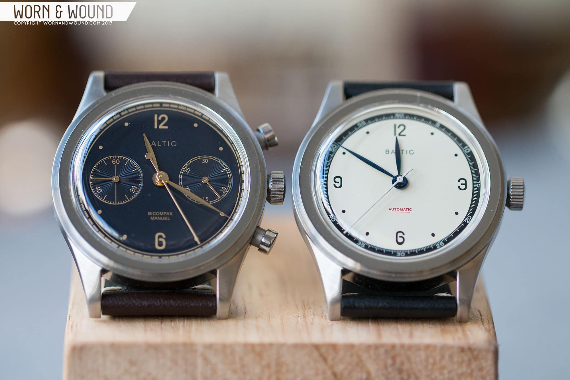
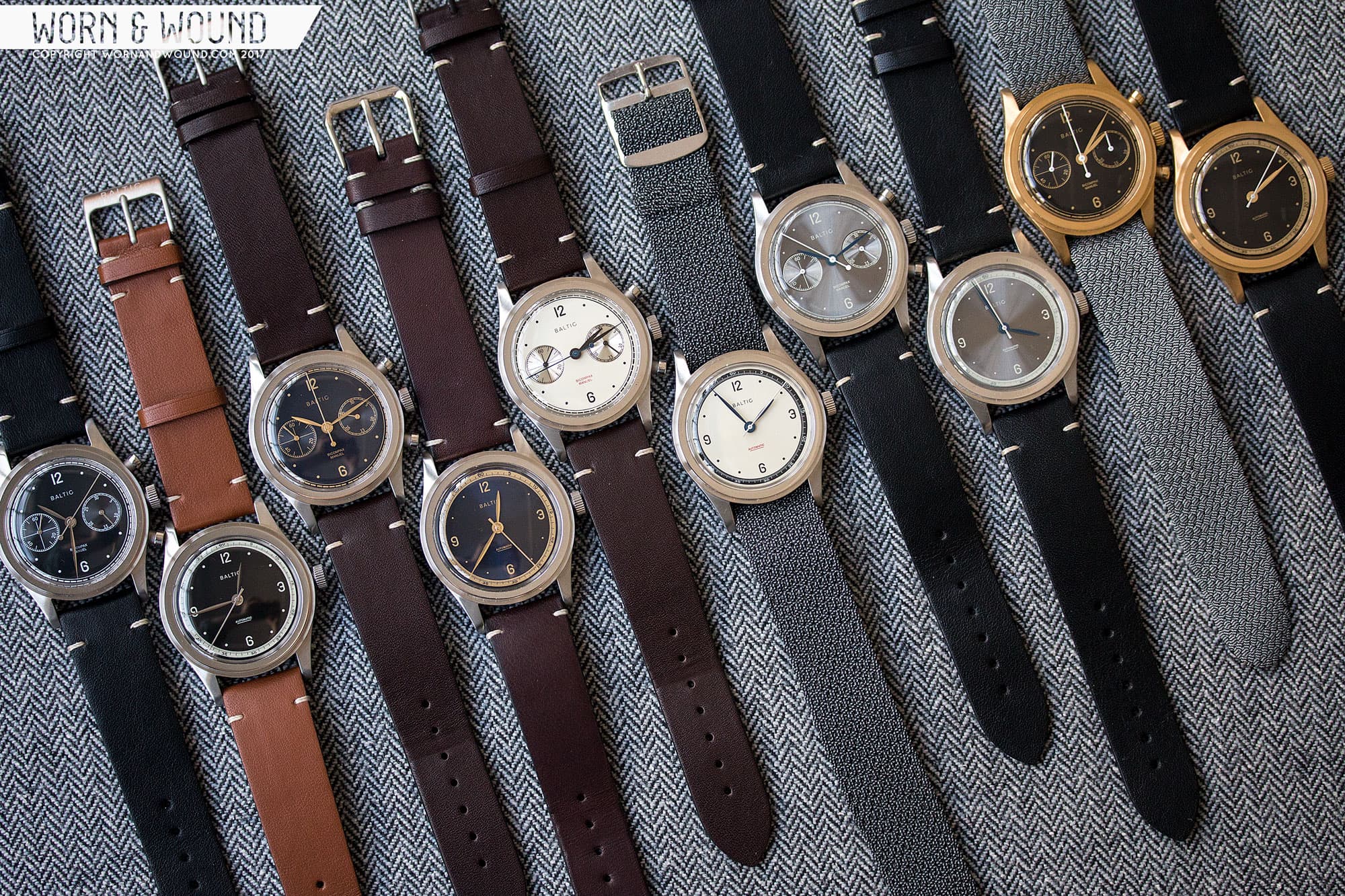
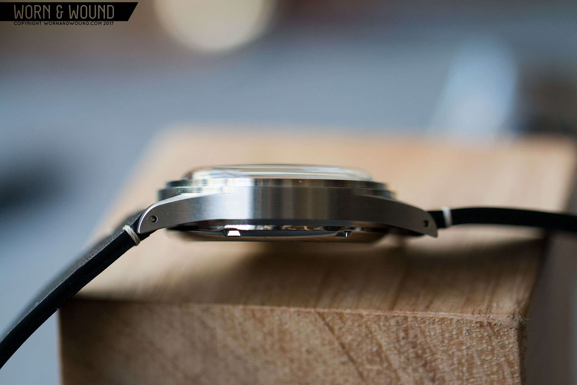
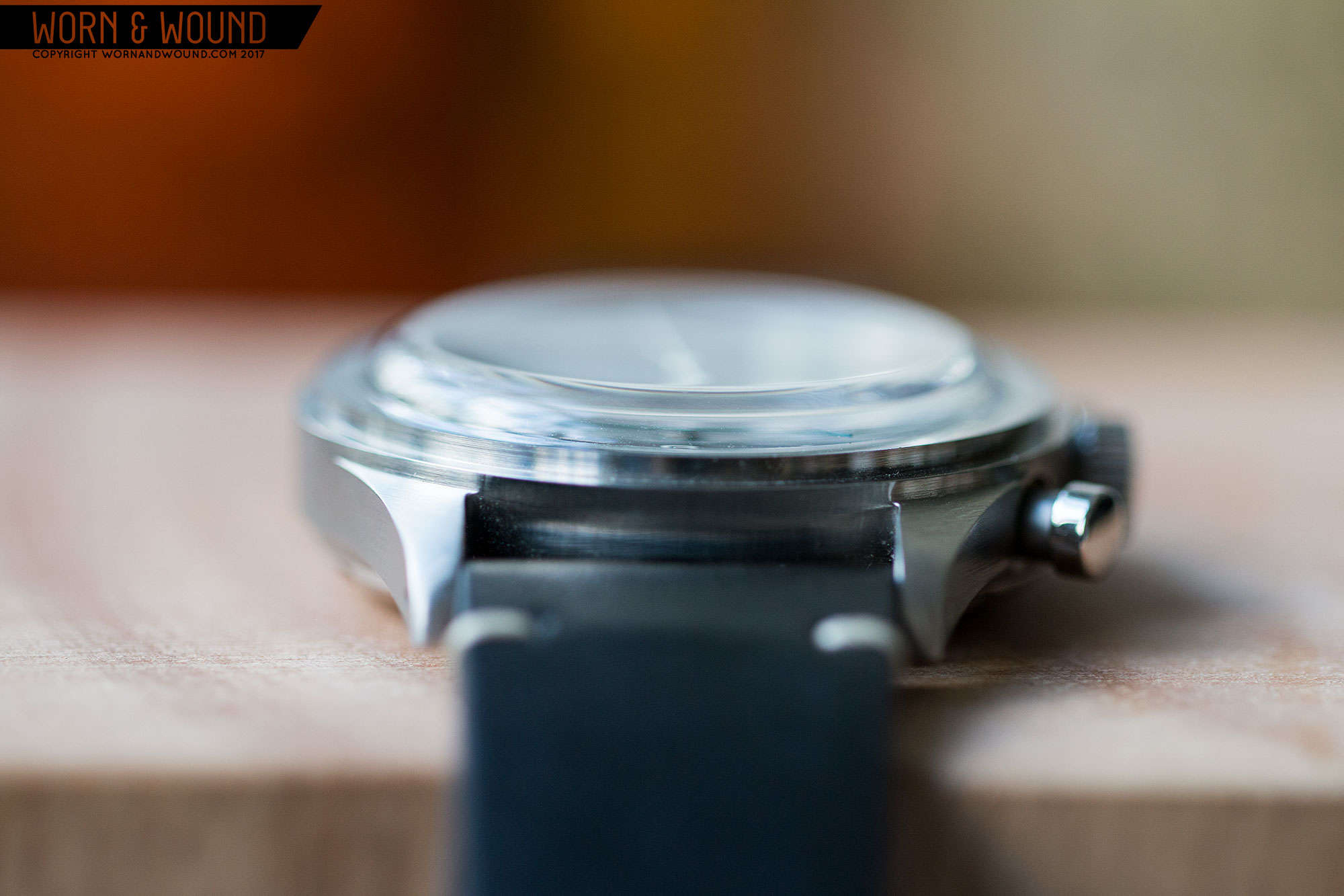
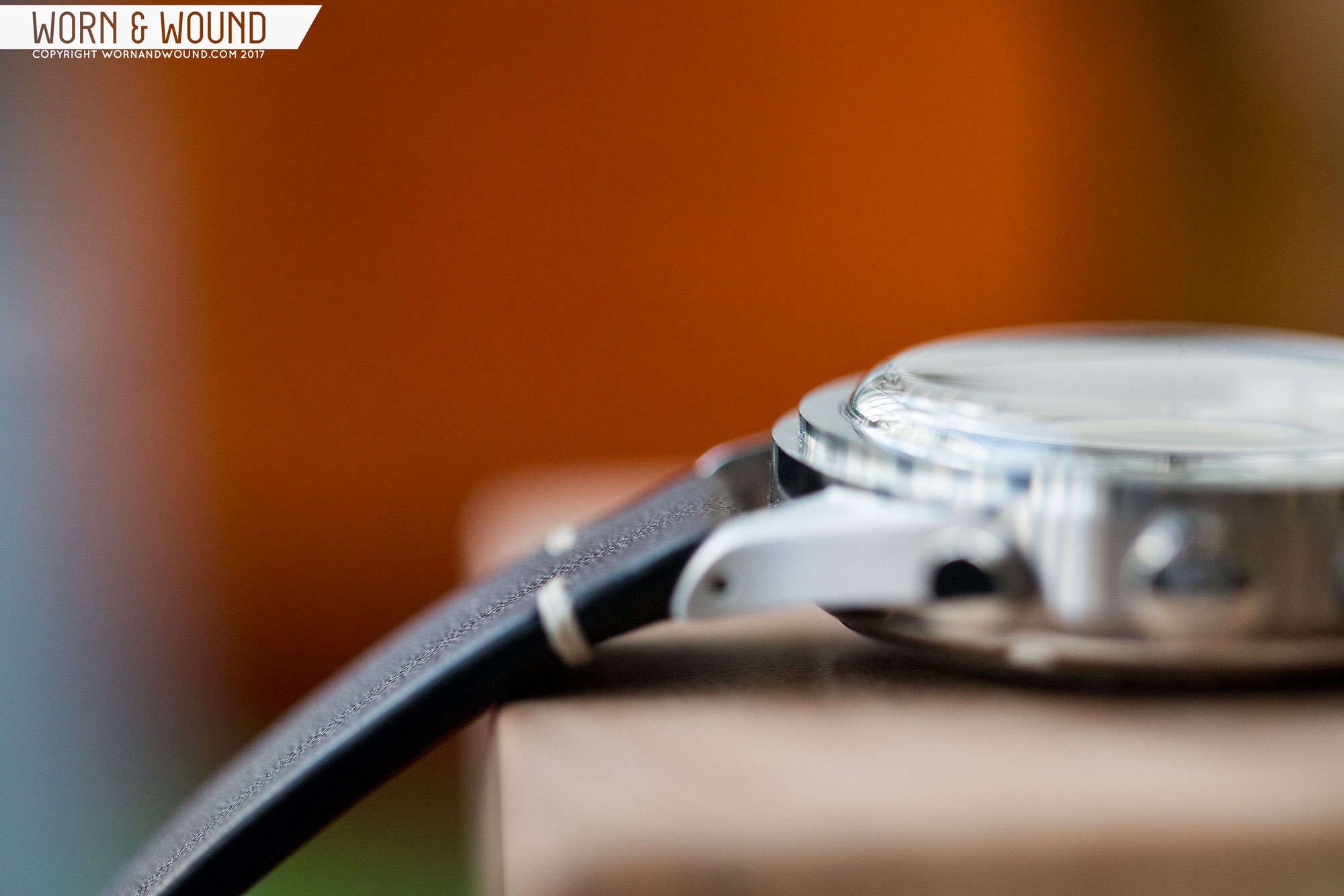
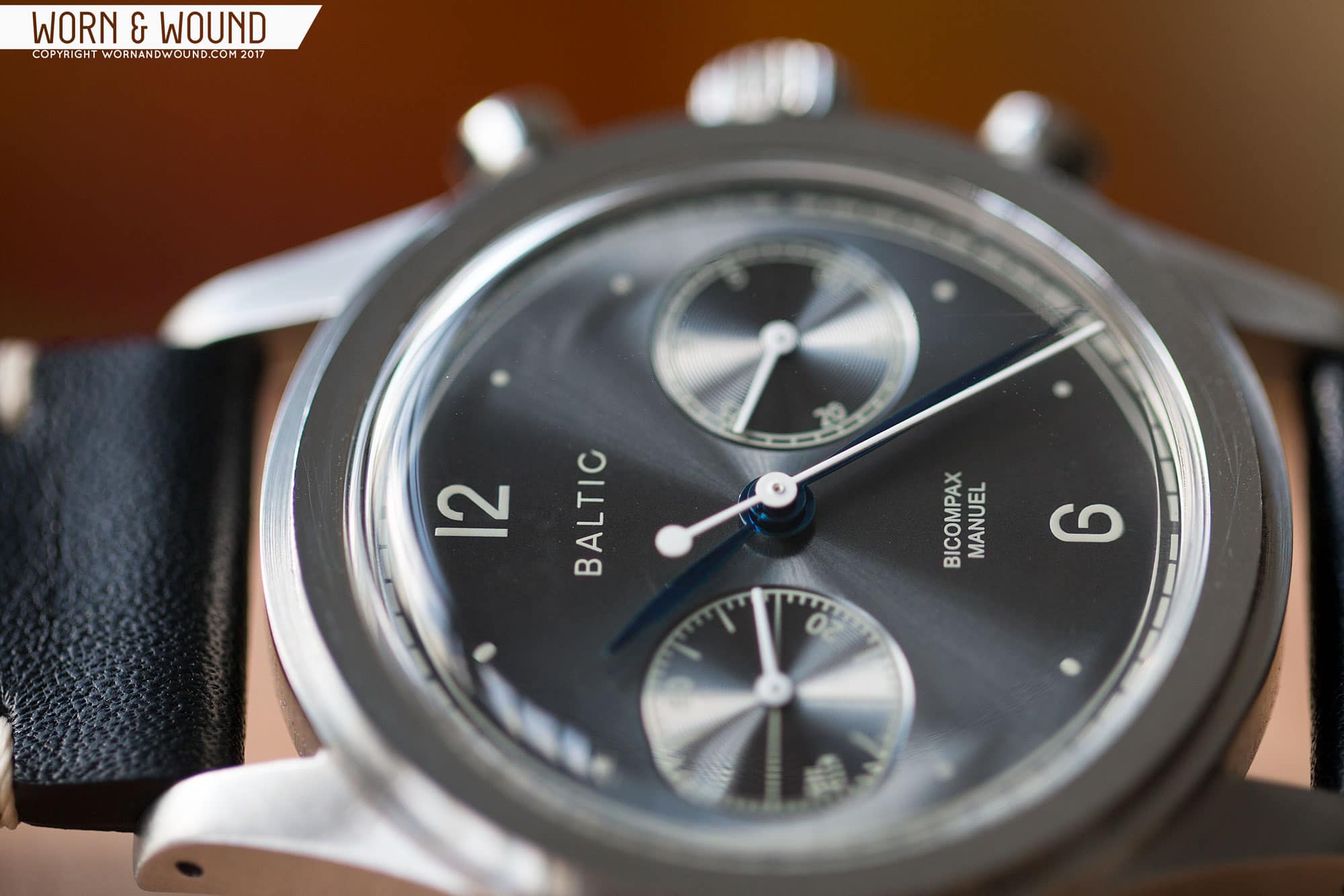
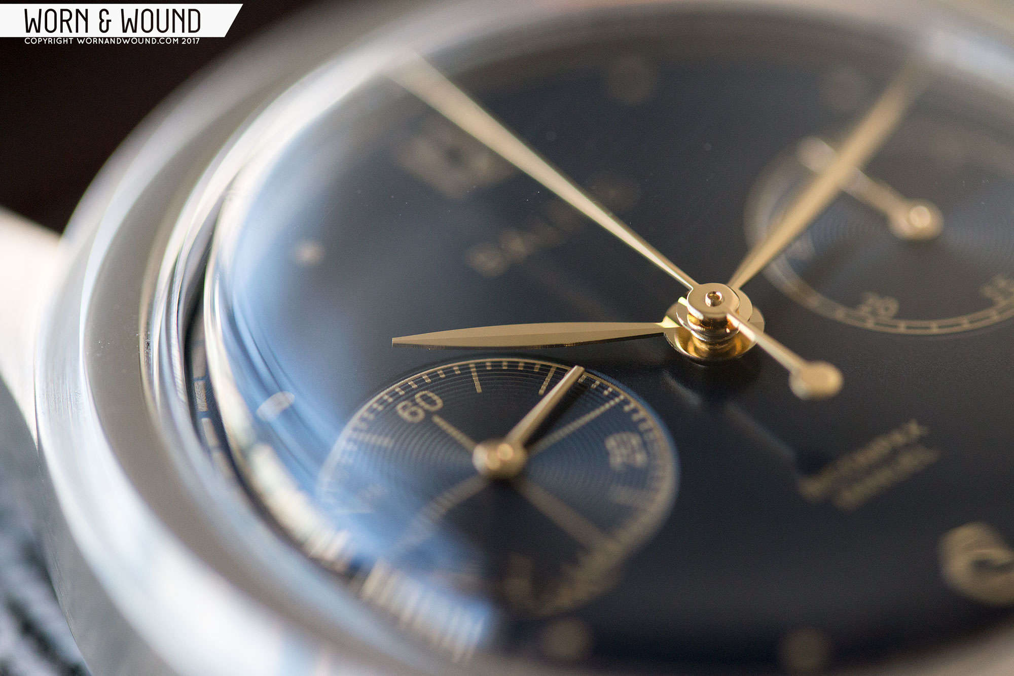
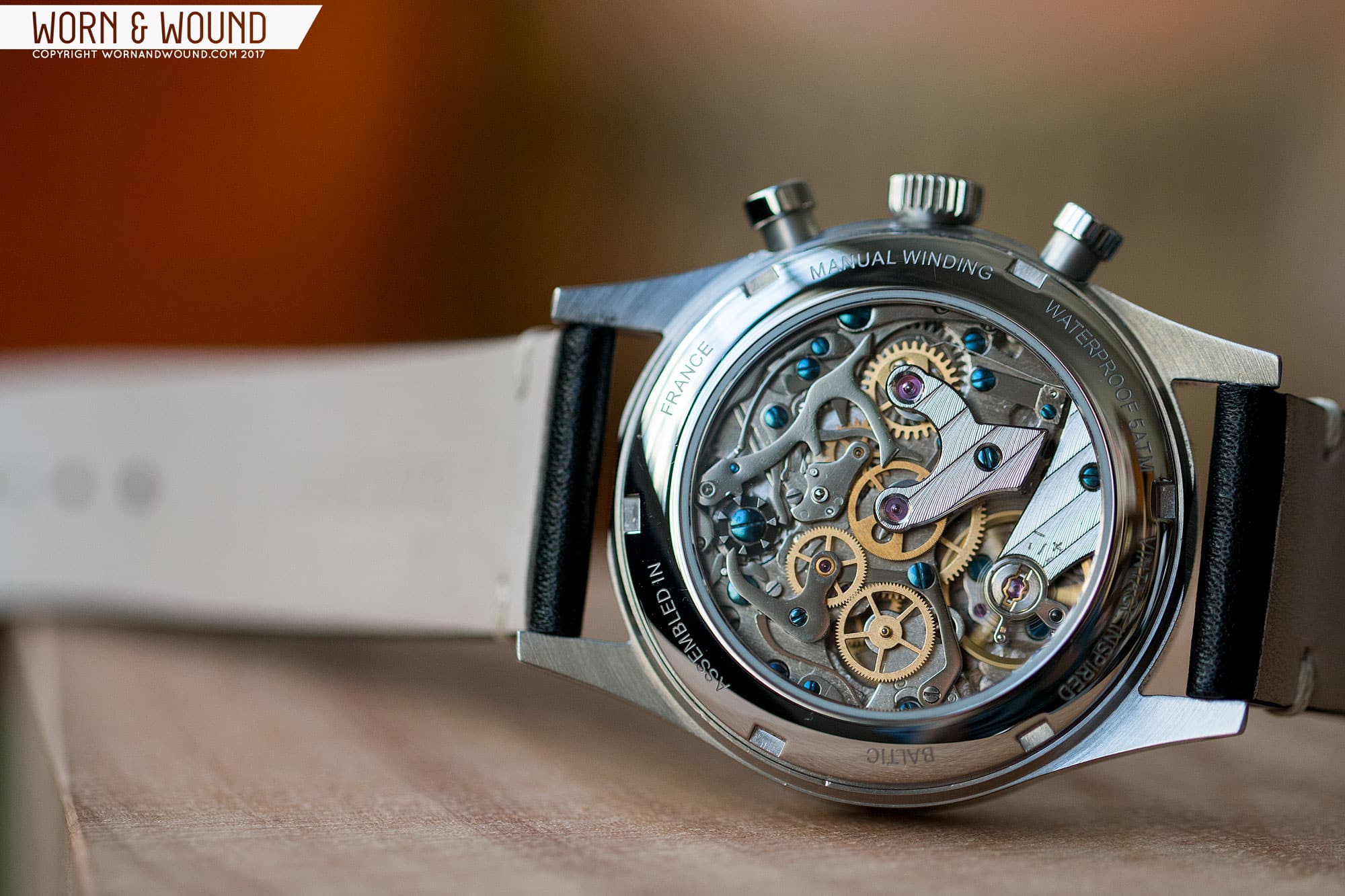
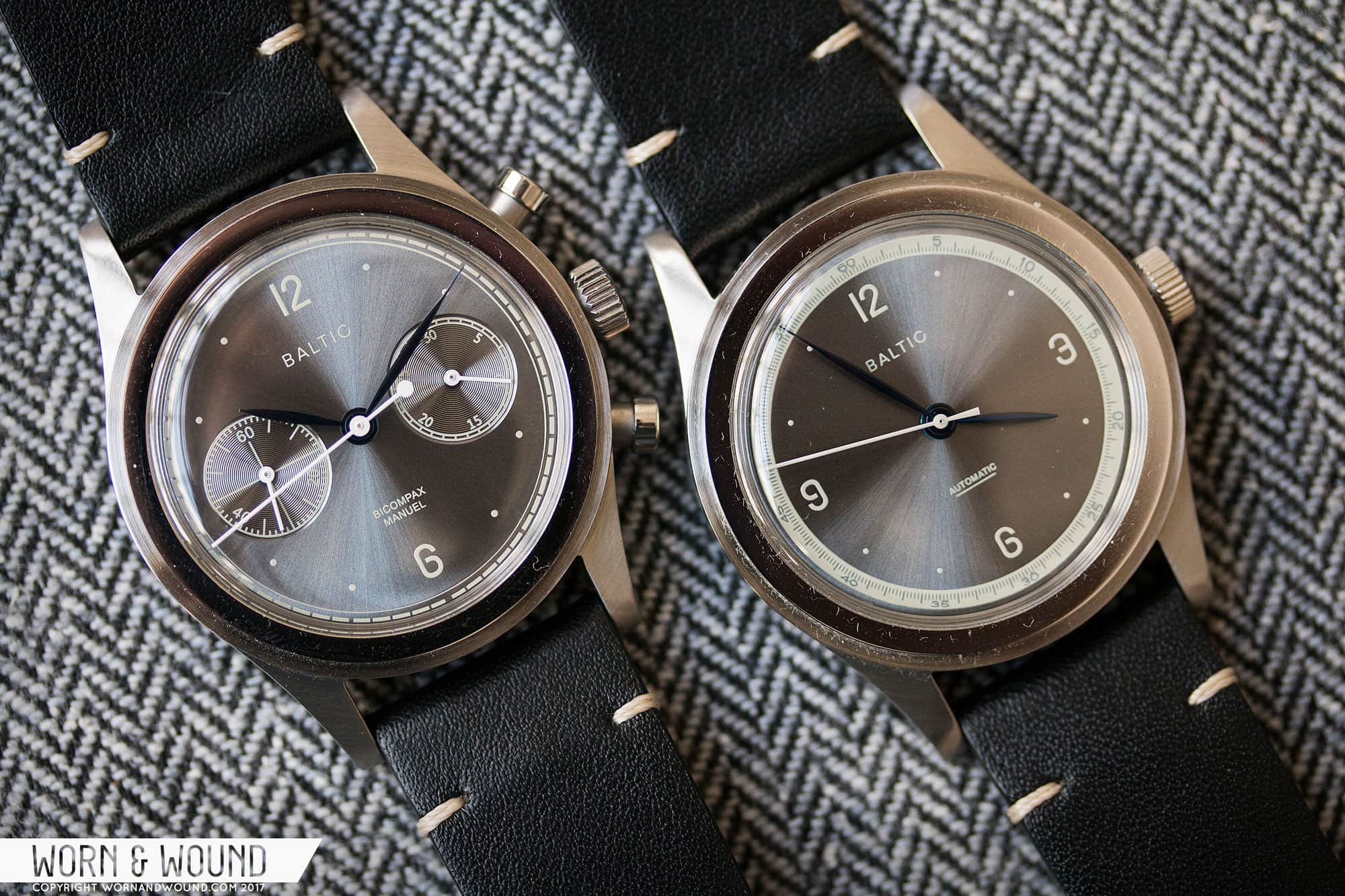
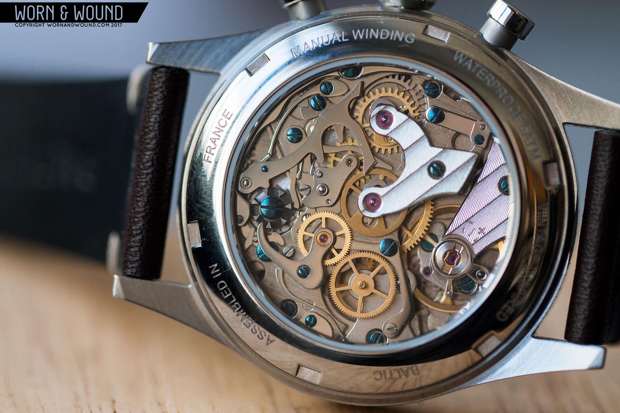
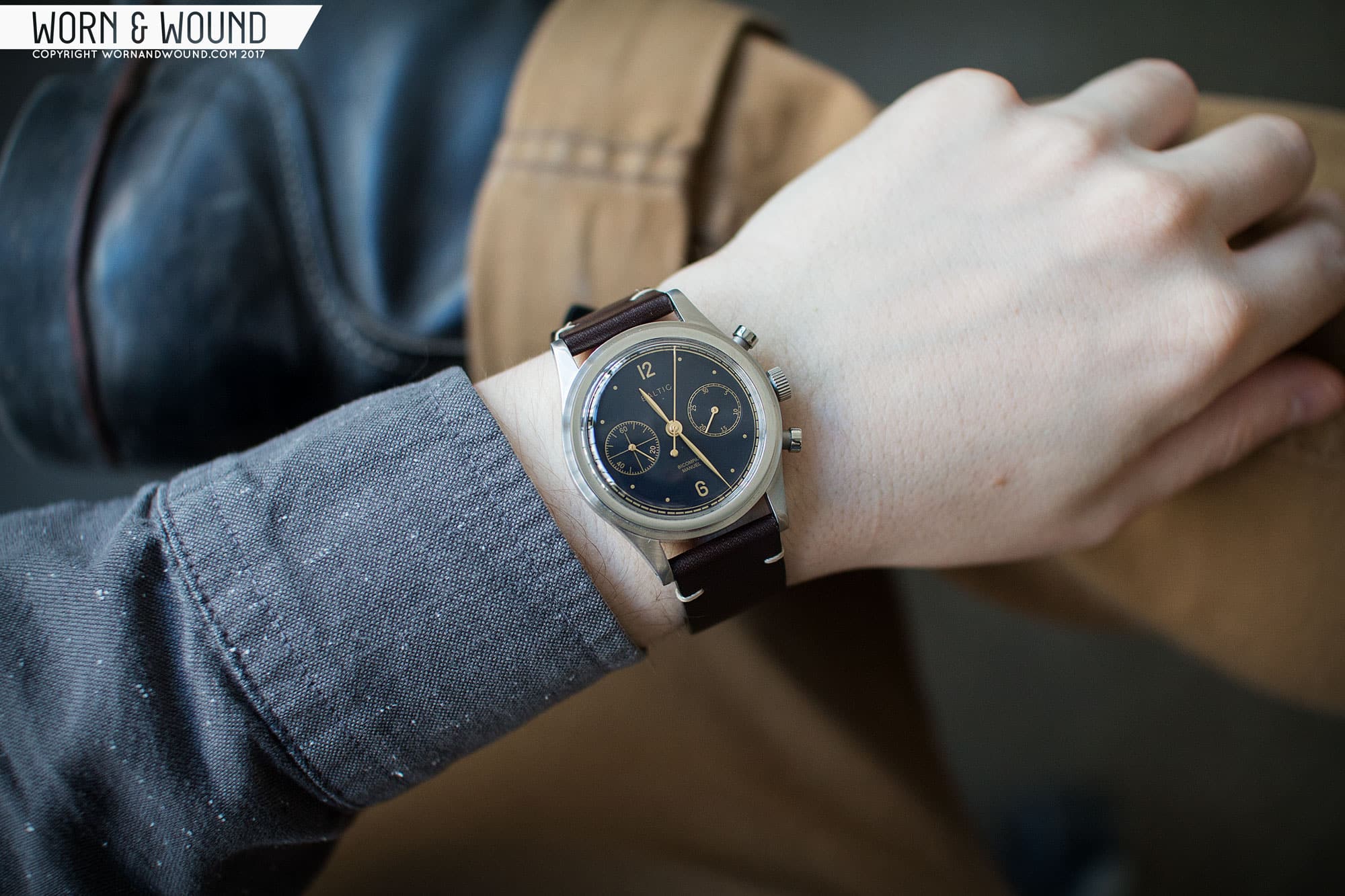
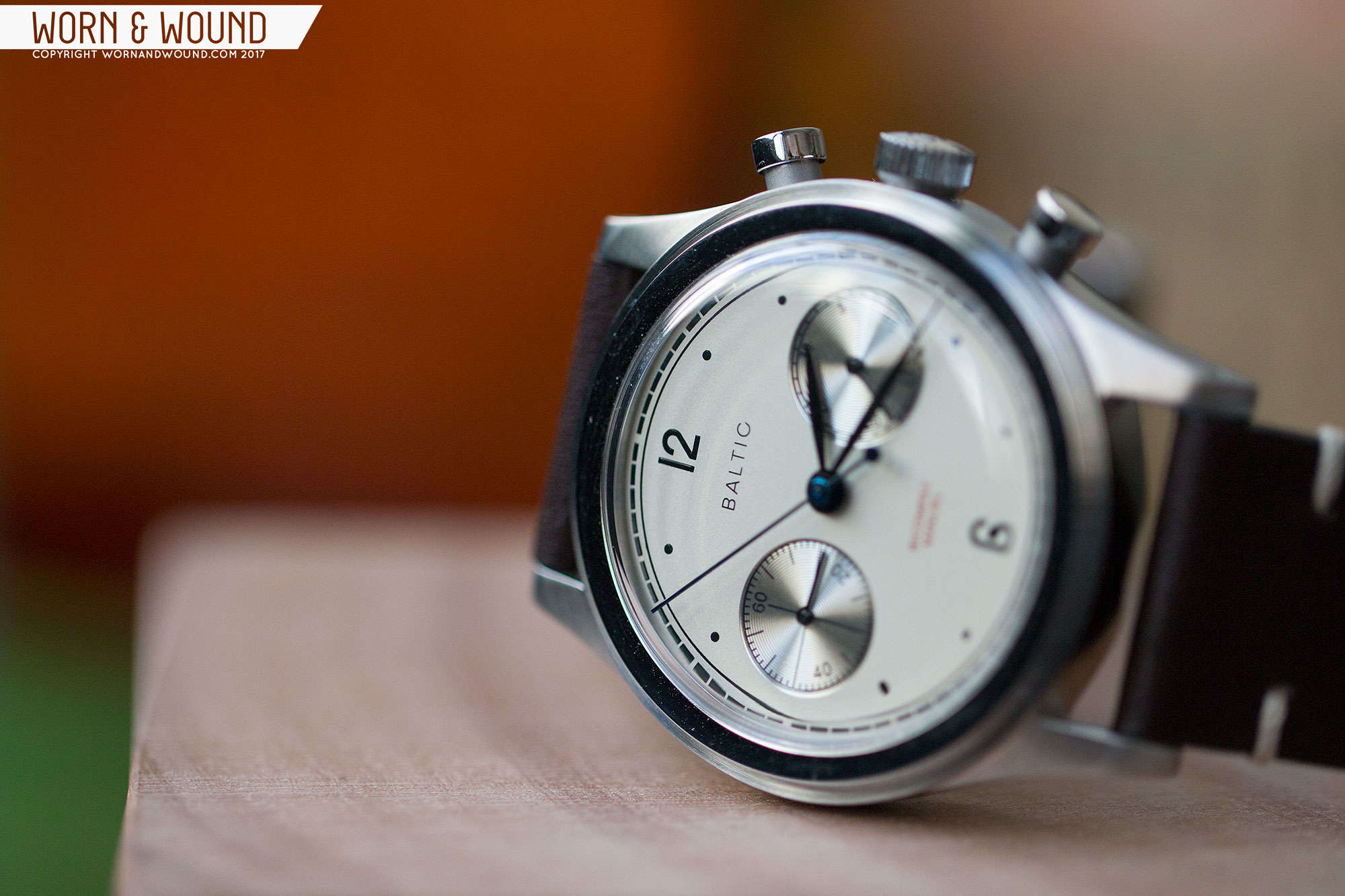
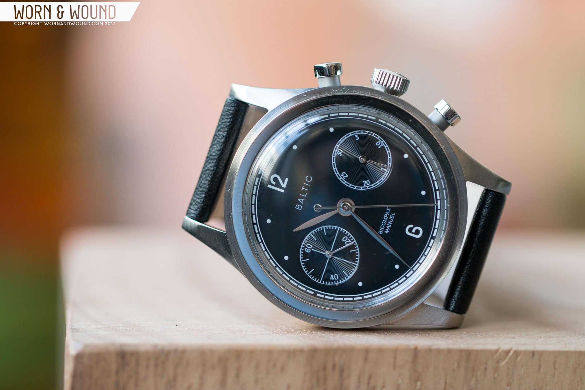
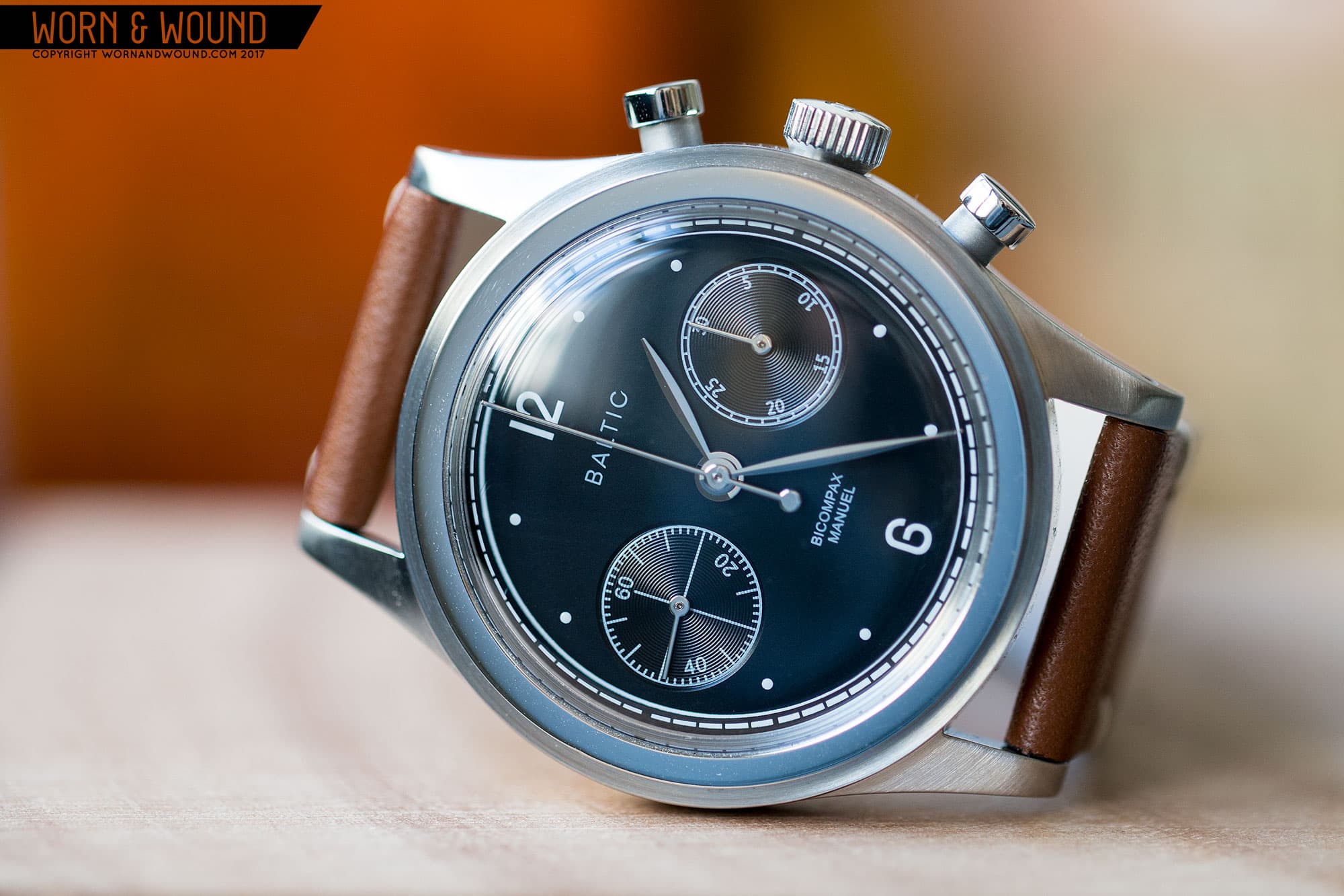
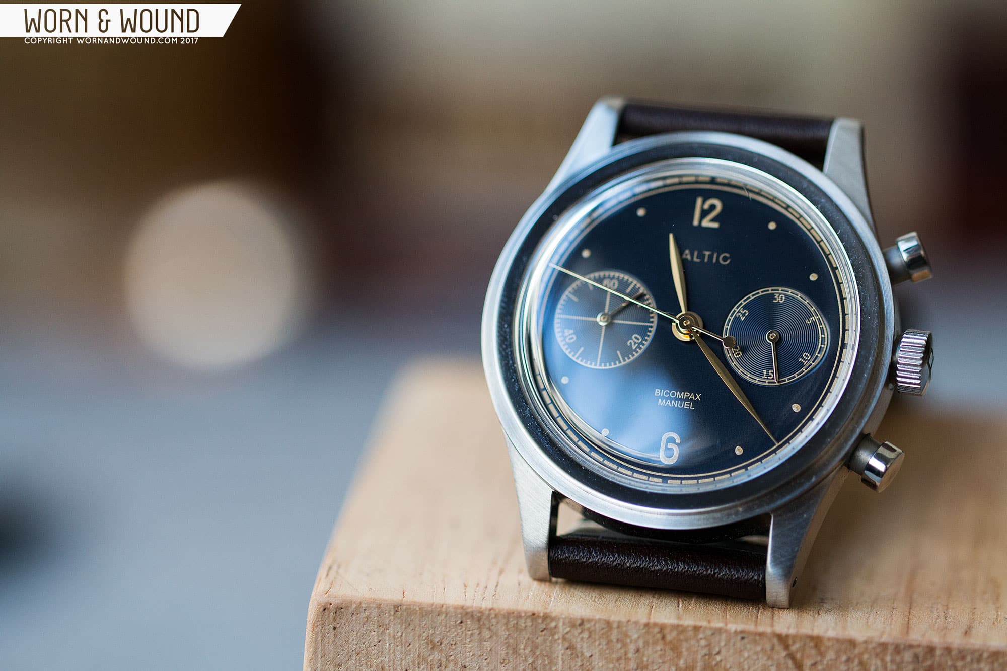
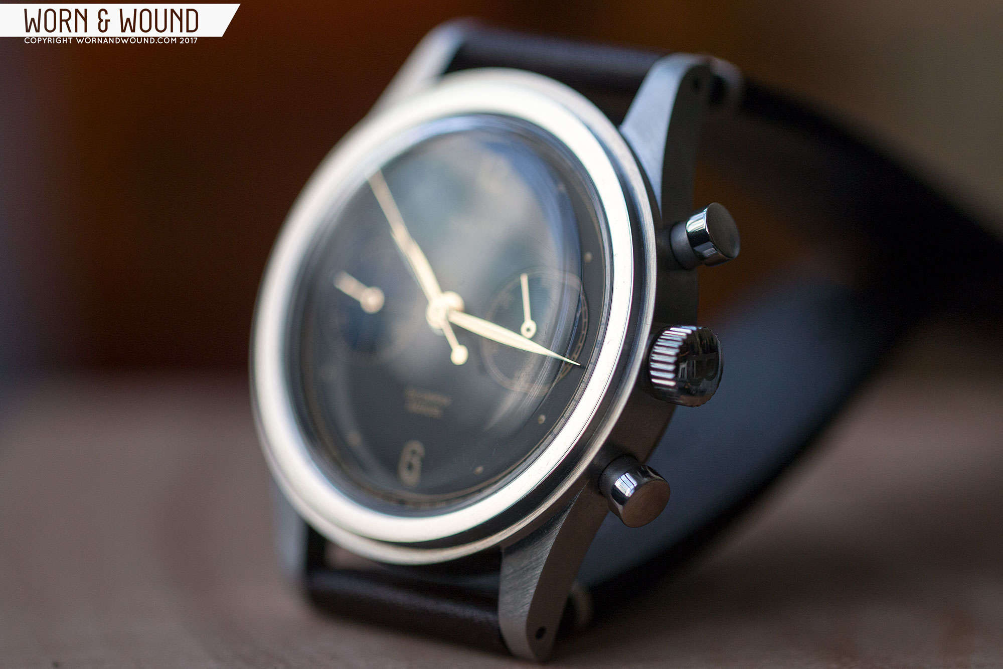
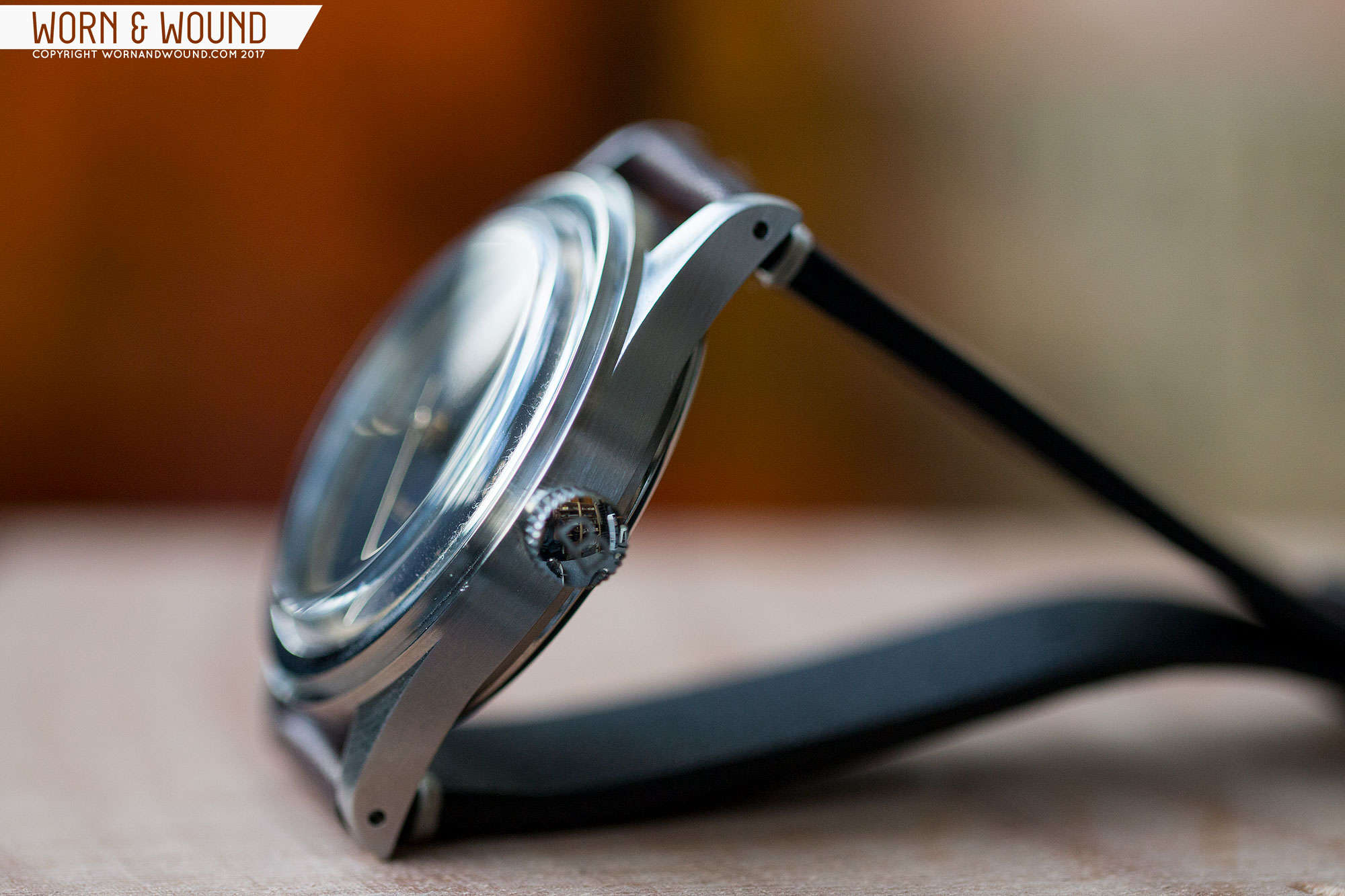
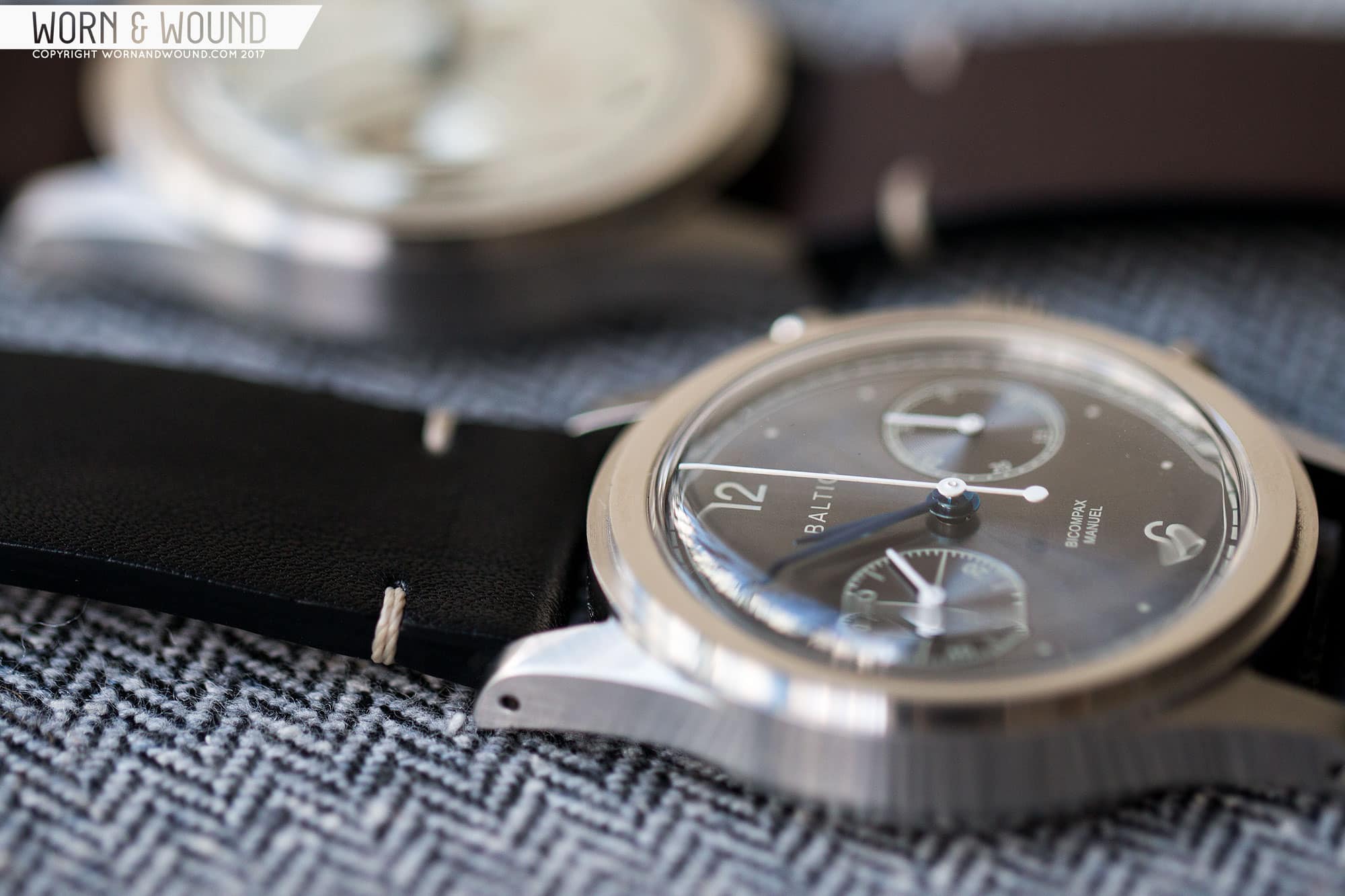
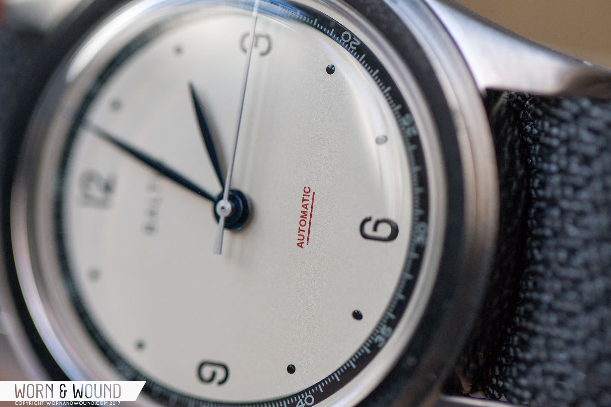
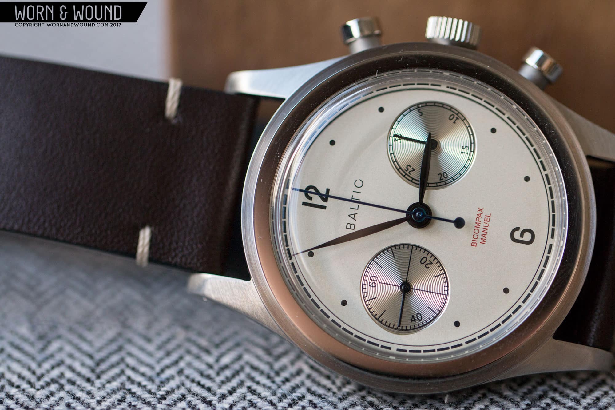
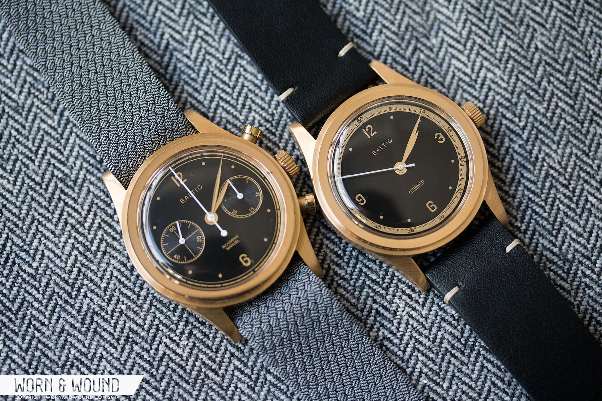
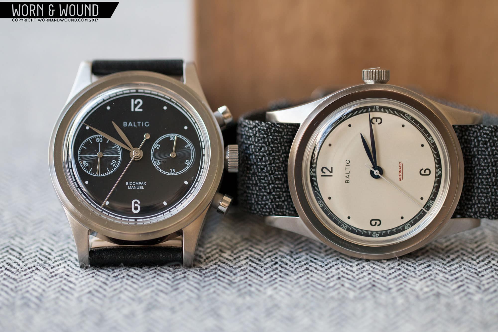
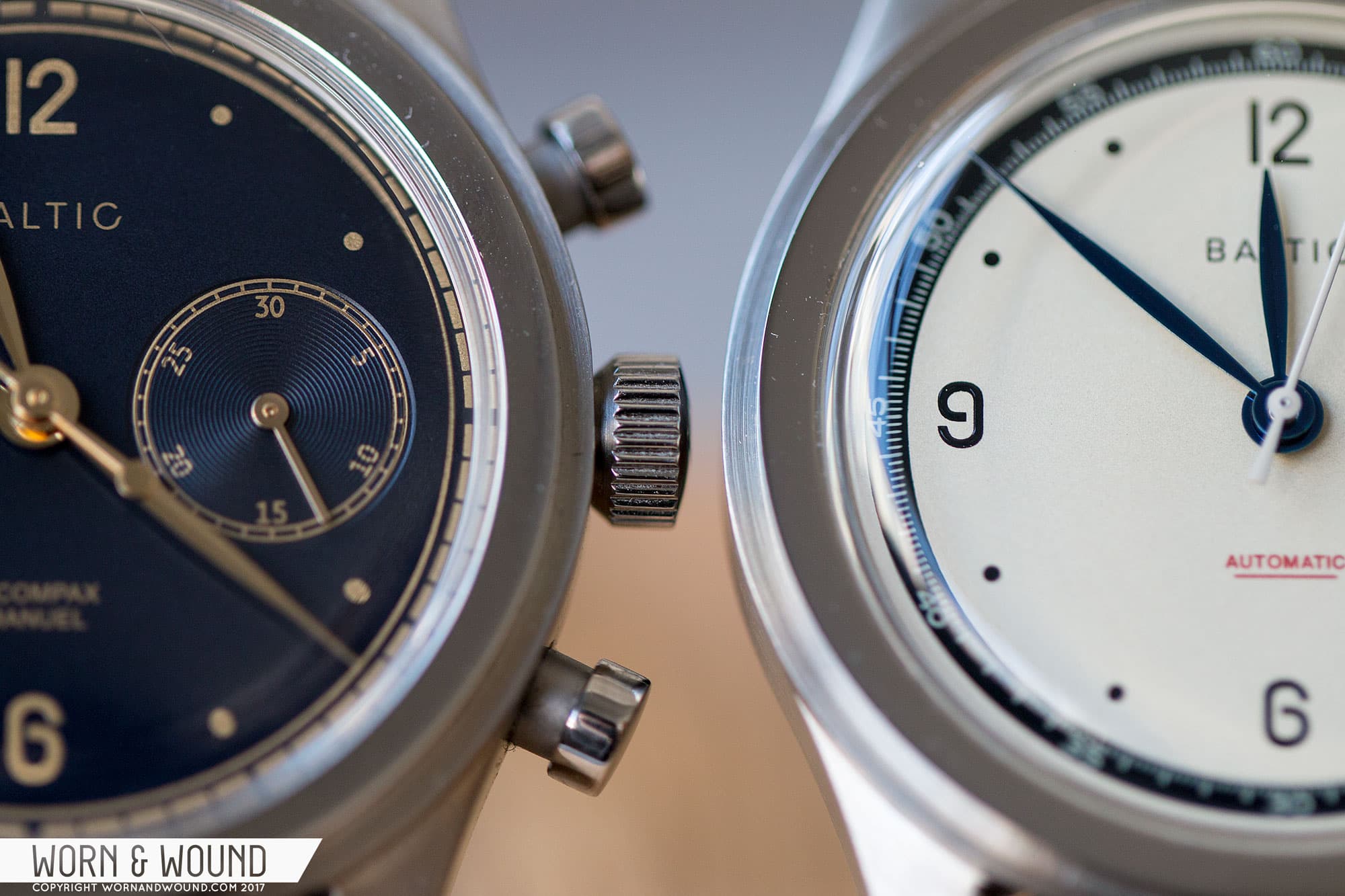
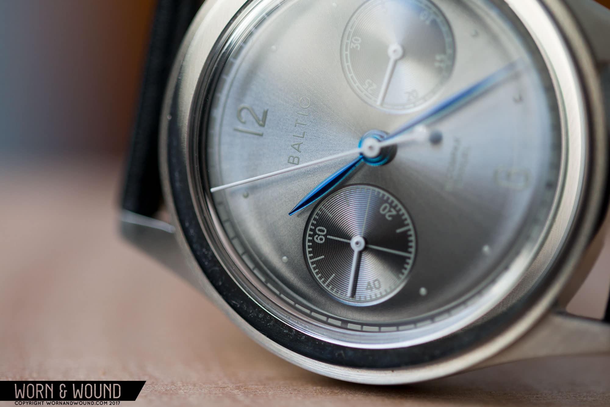
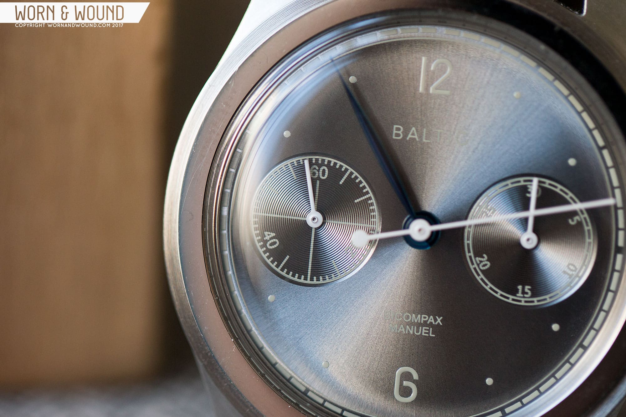
Inspired by the timeless simplicity found in some of these pieces, particularly from the ‘40s, Baltic created two classically clean and restrained mechanical watches. One is a three-hand automatic (the HMS 001), powered by the Miyota 821A. The other is a hand-wound chronograph (the Bicompax 001), featuring the Seagull ST19. The watches will be made in China, but in a move to both differentiate the brand and create a higher quality product, all assembly and QC will take place in France by an established watchmaking group. Both are priced under $1,000 and are available in six different styles.

To hear about Baltic in Etienne’s own words, check out Episode 6 of The worn&wound Podcast.

Save

Advertisement
$399

Baltic Watches HMS and Bicompax 001 Review

Case
Stainless Steel
Movement
Miyota 821A, Seagull ST19
Dial
Various Colors
Lume
NA
Lens
Acrylic
Strap
Leather + Perlon
Water Resistance
NA
Dimensions
38 x 47mm
Thickness
12mm
Lug Width
20mm
Crown
Push-Pull
Warranty
NA
Price
$399

Case

The ‘40s inspiration is immediately visible in the case design, which balances a simplicity that speaks to a different era of manufacturing and an intentional subdued elegance. The standout feature is the stepped bezel design, which as the name describes, has multiple levels before hitting the boxed acrylic crystal. This was a more common design element in the early 20th century, and while very simple, it effectively adds some pleasing ornamentation to the case.

The rest of the case continues with a functional simplicity. The lugs are long and thin with a slight contour. They have drilled holes for easy strap changes, and they’re another nod to history (not that they aren’t around today). The profile is quite thin and has flowing lines, with the box acrylic crystal only coming to 12mm. You can really imagine how a milling machine would cut the various lines of the watch, speaking to a sort of practical design that the stepped bezel is a product of. Lastly, the case is nicely finished, with directional brushing on all surfaces, save the top of the bezel, which is polished.

The overall sizing of 38 x 47 x 12mm is very appealing for a watch of this style, even if it’s a bit oversized for the sourced period. In practice, however, it’s the right size for these watches as they wear well and look balanced. And being that these aren’t recreations of anything specific and made in 2017, they could be sized however they felt fit, so it was great that they went with a happy medium. The chronograph in particular just feels so right. The thickness is the same on both the automatic and the manual chronograph too, which works very well for both and is an impressive achievement.

Dial

The simplicity of the case is balanced by the restrained, but not plain dials. The Bicompaxes and the HMS’ share an overall flavor, though have a few different details that have a significant impact. Starting with the former, the primary index consists of printed numerals at 12 and six, with small dots for the other hours save three and nine, which are replaced by the chronograph sub-dials. Around this section is then a printed circle, separating the inner dials from an outer index, which in this case pulls double duty as the chronograph seconds and time-minutes index. Instead of your typical contrast color markers per minute, here they are voids in a thick line. It’s an unexpected way of creating the index, but works well, keeping the focus on the primary index and sub-dials.

BALTIC_SILVER_3

Looking at the sub-dials, at three is the 30-minute counter while at nine is the active seconds. The first thing to note about the sub-dials is simply their diameter. They are perfectly sized for the dial and watch, leaving just the right amount of space between their edges and the outer indexes, while also having a lot of visual presence. Rather than having the indexes on the two registers match each other, creating a faux symmetry, they have fairly different graphics. The 30-minute totalizer has a railroad index with small numerals at intervals of five. The seconds counter has larger numerals at 60, 20 and 40, with small lines per second, longer lines at intervals of five and crosshairs running from 5-45, 60-30.

I like how the two look together. They balance each other out as the seconds has more going on, while the 30-minute has a bolder outline. At the same time, I could see how this lack of symmetry could get a bit under my skin, but having only spent a brief time with the watches, this didn’t have a chance to set in and my initial impression is positive. Both sub-dials also have circular graining, giving them a different sheen than the rest of the dial. Lastly, you’ll find “Baltic” at 12 and “Bicompax,” “Manuel” above six, all in small and unobtrusive type.

Save

Moving on to the HMS, instead of sub-dials, the numerals at three and nine have returned, maintaining a similar balance as the chronograph. The typeface chosen for the numerals on both types of watch is very distinct and a bit strange. The three, six and nine in particular have interesting curves, mixing a fixed-width with straight sides and peculiarly radiused corners. The six and nine are also both open, giving them a vintage feel. Overall, I really like it as typefaces on watches are often very safe, but when they push a bit, such as here or on the Stowa Antea B2B and the Hermes Slim d’Hermes, the result can be very exciting.

BALTIC_CREAM_3

Both versions use leaf hands for the hour and minute hands, and stick hands for the rest. On the chronograph, the chronograph-seconds hand is very long, with a large circle for a counter weight. The central seconds of the three-hander has a smaller tail that flares out a bit to balance the other side. The leaf hands work well with the watch, providing an elegant yet legible solution, and they speak to the ‘40s inspiration.

As mentioned before, the watches each come in six styles: cream, black and silver, blue and gilt, black and gilt and slate grey, with the sixth being black and gilt in a gold DLC case. The cream was the first to grab my attention. The surface is a warm off-white while the indexes are all in black, providing ample contrast, with red flavor text above six. The cream chronograph is unique amongst the group as the sub-dials are silver, adding some variation in color that is very cool looking. The cream also features blue hands.

Save

The black and silver is the simplest, cleanest version with white indexes and text all around and silver hands. It’s austere, but it works well. The blue and gilt might have been my favorite in the end. The surface is a deep midnight blue that shifts from nearly black to a rich navy depending on the light. The indexes are faded gold/ochre color, which plays beautifully with the blue, and the hands are polished gold. If you’ve ever been on the fence about blue dials, this one might win you over.

BALTIC_BLUE_5

The black and gilt I only saw in the gold case, but I imagine the effect in the steel case isn’t all too different. This essentially adds some warmth and a bit of an aged feel to the black dial concept, perhaps ending up a little more lively than the black and silver. To mix things up a bit on this one, the hour and minute hands are gold, while the other hands are white, which pops off the dial. To round things out, there is also the slate grey dial which is a medium grey with a sunburst finish. On the samples I saw, the indexes and markers were in a cream color, which was cool though a bit hard to read. The production will have white indexes and markers. Here, the hour and minute leaf hands will be in blue with white stick hands.

Save

Advertisement

Movements

Miyota 821A

The HMS will feature the Miyota 821A movement. The 821A is a 21-jewel automatic, non-hacking movement that can be hand-wound, has a date (though not used on the Baltic), has a 42-hour power reserve and a frequency of 21,600 bph. The 821A is essentially the Eta 2824 of the Miyota lineup, with the now very popular 9015 being the 2892. It’s a bit thicker, but a reliable workhorse. It’s a totally respectable if not terribly exciting choice for the three-hander, and helps keep the price point down.

Seagull ST19

The more interesting of the two is the ST19 chronograph made by the Chinese watch giant, Seagull. A controversial choice given the mistrust of Chinese movements, the ST19 has an interesting history, and was definitely the right pick for this watch. The ST19 isn’t a clone of another movement, rather it’s a proper continuation of the Venus 175, the tooling of which had been sold off by the Swiss brand to the Chinese in the ‘60s. The 175 was developed in the ‘40s, which ties in perfectly with the concept of the watch, and frankly, it is the only affordable manual-wind chronograph available.

Of course, the stigma of it being cheap, something that also runs completely counter to the very concept of modern column-wheel chronographs, looms over the movement like a rain cloud, making watches with them more novelty than anything else. Well, perhaps until this point. As Etienne explained to us in our podcast interview, the movements are QC’d three times by the brand including once in France, making sure they are “good” movements. Equally important, the case is engineered to the movement. The result is that the winding of the movement, and the sensation of starting, stopping, and resetting the chronograph, is all confidence inspiring. On previous ST19 watches I have used, the pushers felt mushy and the winding too loose. It was a genuine surprise to see/feel that that wasn’t the case with Baltic’s watches.

As for the finishing, the ST19 sports blued screws, likely chemical, and various polished bevels and textured plates. It’s cool looking at a glance, but in my experience, not something you want to take a loupe to. That’s a bit of shame as the movement architecture is cool and simply being able to watch the chronograph work with a view unobscured by a rotor is enjoyable. I’d love to see someone go more simple with the decoration, if that’s even possible from Seagull. Perhaps just gilting or plating the movement, as the faux-high end polishing plays back to that novelty concept.

BALTIC_ST19_2

Back to the movement itself, it’s a 19/21-jewel, manual-wind chronograph featuring a column-wheel, non-hacking seconds, no date, approximately a 38-hour power reserve and a frequency of 21,600 bph. As I wrote above, it really was the only choice for Baltic as a quartz chronograph, even a mecha-quartz, would have lacked the undeniable charm and cool factor of a mechanical movement, and a Seiko NE88 or Valjoux 7750/3 would have upped the cost tremendously (not to mention, either would have added to the watch’s thickness).

Save

Advertisement

Straps and Wearability

The Baltic watches will feature 20mm vintage-style leather straps in various browns and solid black. These look the part for the watch, with a 2mm taper, side tacks by the lugs and buckle, edge painting and leather lining. They aren’t very high-end, but they are a good starter and make sense at the price point. Additionally, Perlon (woven nylon) straps will be available. The Perlon they chose is by far the nicest I’ve ever seen, with an interesting two-tone weave that makes them very attractive. I’m not typically a Perlon fan—it just doesn’t do it for me—but this I loved.

On the wrist, as one might expect, the watches wear extremely well, especially if you’re a fan of more modestly sized watches. I genuinely find 38mm to be a near-perfect size for an everyday watch, and the Baltic—balanced by the height of the acrylic crystal, length of the lugs and the 20mm lug width—does not feel or look small in any way. That said, the HMS model does wear smaller because of the illusion that the dial has a smaller radius due to the contrasting chapter ring. It still fits well, but it’s worth noting.

Aesthetically, both models are winners. They manage to execute a vintage feeling without seeming contrived or too old fashioned. They absolutely fit in with modern, classic clothes, and thanks to the clever and subtle color combinations, they add something of their own. The blue and gilt models, in particular, exude a sense of style that feels unique, giving the watch a personality that separates it from other neo-vintage watches. Additionally, the graphic cues, like the strange typeface and inverted indexes, add to their understated charm.

Conclusion

In the end, what you have with the Baltic HMS 001 and Bicompax 001 are two watches that truly embody the current watch zeitgeist, with neo-vintage designs that are creative while still paying respect to classic watch designs. From the stepped cases to the restrained dials to the movements inside, the watches from Baltic hit the right classic notes while giving everything their own spin. They don’t feel generic or look like a random vintage eBay finds, rather they have a personality all their own. And because of Baltic’s independent status, the company was able to take risks where needed, which is particularly notable in their use of the ST19, ultimately making a product that people really want.

BALTIC_ETIENNE_1
Mr. Malic in our Brooklyn Offices

Baltic is a brand that I have a feeling we’re going to see a lot of in the next few years. In the lead up to their launch, they built a decently sized social media following and actually took in-person meetings at their showroom outside of Paris, which generated a solid buzz about the brand. That’s how we first heard of them, in fact. This lead directly to an immediately successful Kickstarter project, having launched just yesterday (April 12th, 2017) and blowing past their goal, hitting six-figures within hours of going live.

It’s kind of fascinating, as we’ve seen many vanilla fashion watches get huge sums of money on Kickstarter thanks to their easy-to-digest designs and exceedingly low prices, while we’ve also seen some relatively cool mechanical tool watches fail at reaching their goals. The Baltic watches are far more esoteric, referring to classic watch design and featuring mechanical movements, including the divisive Seagull ST19, yet their campaign will be/is a huge success. I think it goes to show two important things: first, that the community of watch enthusiasts out there—looking at Instagram, reading blogs, etc.—is a powerful group that is looking for the next great thing. And second, that good, tasteful design prevails. For the watch layman who is browsing Kickstarter and pledges, it’s likely that the aesthetics will be what pull them in.

BALTIC_CREAM_2

As for pricing, the HMS 001 retail will be 399 Euros, while the Bicompax 001 will be 649 Euros. Both are, in my opinion, very fair prices if a bit higher than the average for watches with these movements. That said, the fit, finish, design and execution of Baltic watches are very high, with the chronograph, in particular, exceeding expectations. Of course, through Kickstarter, they can be had at substantial discounts, with the HMS coming in at 239-299 Euros and the Bicompax at 399-479 Euros. So, if you’ve been looking for a vintage-style watch to add to your collection, a new hand-wind chronograph or just something simple and stylish, be sure to check them out.

For more Baltic, check out their website: Baltic Watches
To pick one up on Kickstarter, check out their Campaign

Save

Advertisement
Images from this post:

Save

Related Reviews
Zach is the Co-Founder and Executive Editor of Worn & Wound. Before diving headfirst into the world of watches, he spent his days as a product and graphic designer. Zach views watches as the perfect synergy of 2D and 3D design: the place where form, function, fashion and mechanical wonderment come together.
wornandwound zsw
Categories: