


 Featured Videos


I think a change is coming to the boutique watch world, especially in the niche of the dive watch. Slowly but surely, we’re seeing more and more watch brands strive to create new, unique designs. Designs that push manufacturing abilities while maintaining solid values. The days of stock cases and hands, everything being a minor variation of each other with a different brand logo, is disappearing. Perhaps it’s because the market did get saturated that now new, younger brands, feel the fire to innovate.
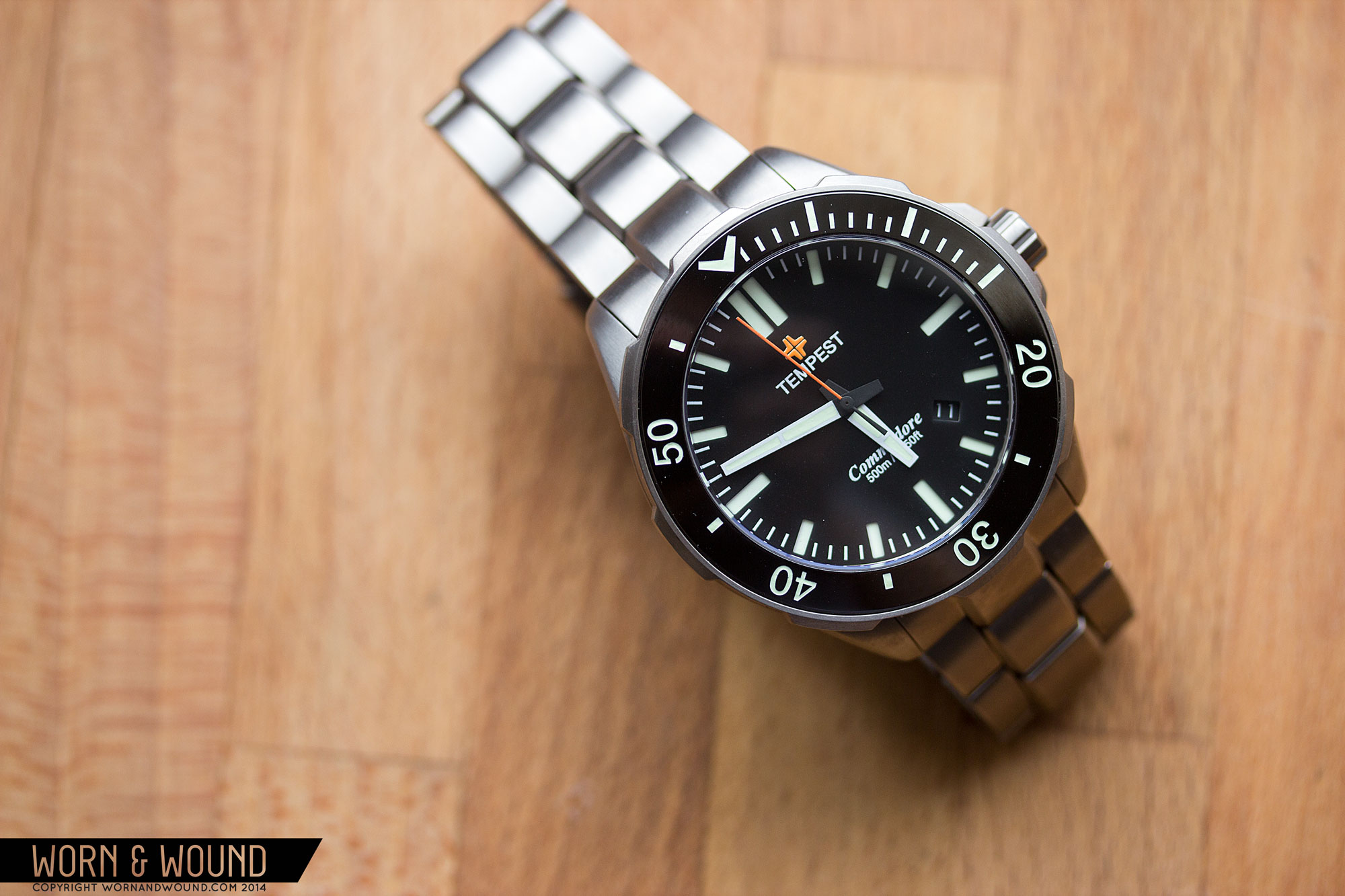
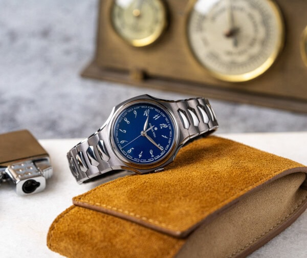
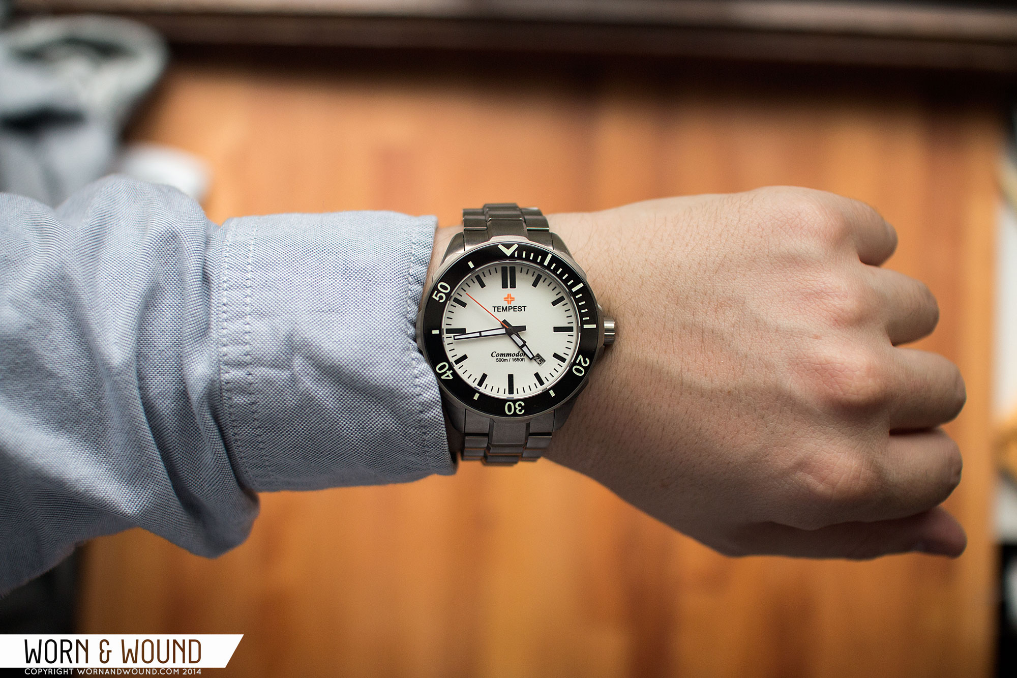
The Tempest Commodore, the subject of today’s review, exemplifies this. This new breed of boutique diver has many of the same qualities as the last gen; tough-as-nails, Asian-made divers with Japanese automatics, sapphire crystals and more, that come in under $1,000. But, immediately upon removing one (we have many to show) from its packaging, the difference was clear. The case was captivating, with sleek contours and sharp edges and a reported 500m WR. The inky black of the bezel could only be ceramic, the smooth sweep of the second hand confirmed the Miyota 9015, and the bracelet…well I’ll just get to that later. All this, and the price? Wait, that must be wrong… Nope, the Tempest Commodore comes in at $598, making it a great value too. Admittedly, that is a pre-order price that will go up, but I’ve been told not by more than $100, still well within the good value bracket.
Tempest Commodore Review
 Case: Titanium
Movement: Miyota 9015
Dial: Black, blue, green or full-lume
Lume: Yes
Lens: Sapphire
Strap: Titanium bracelet
Water Res.: 500m
Dimensions: 45 x 49 mm
Thickness: 14.5 mm
Lug Width: 22 mm
Weight: 143g (brand’s measure)
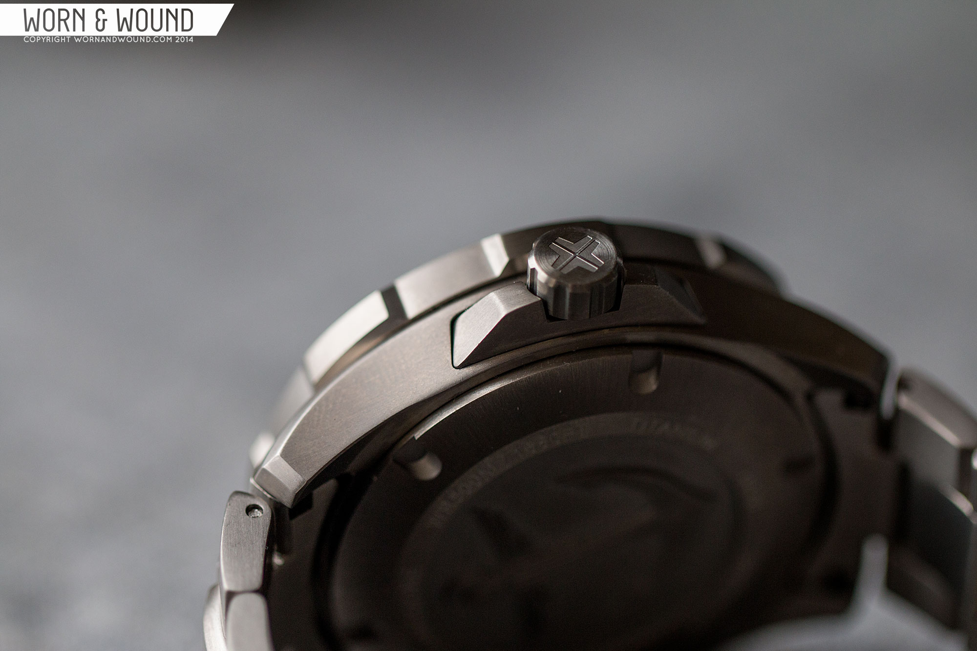
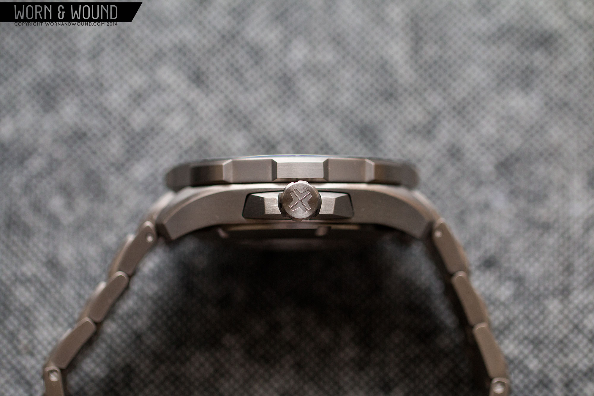
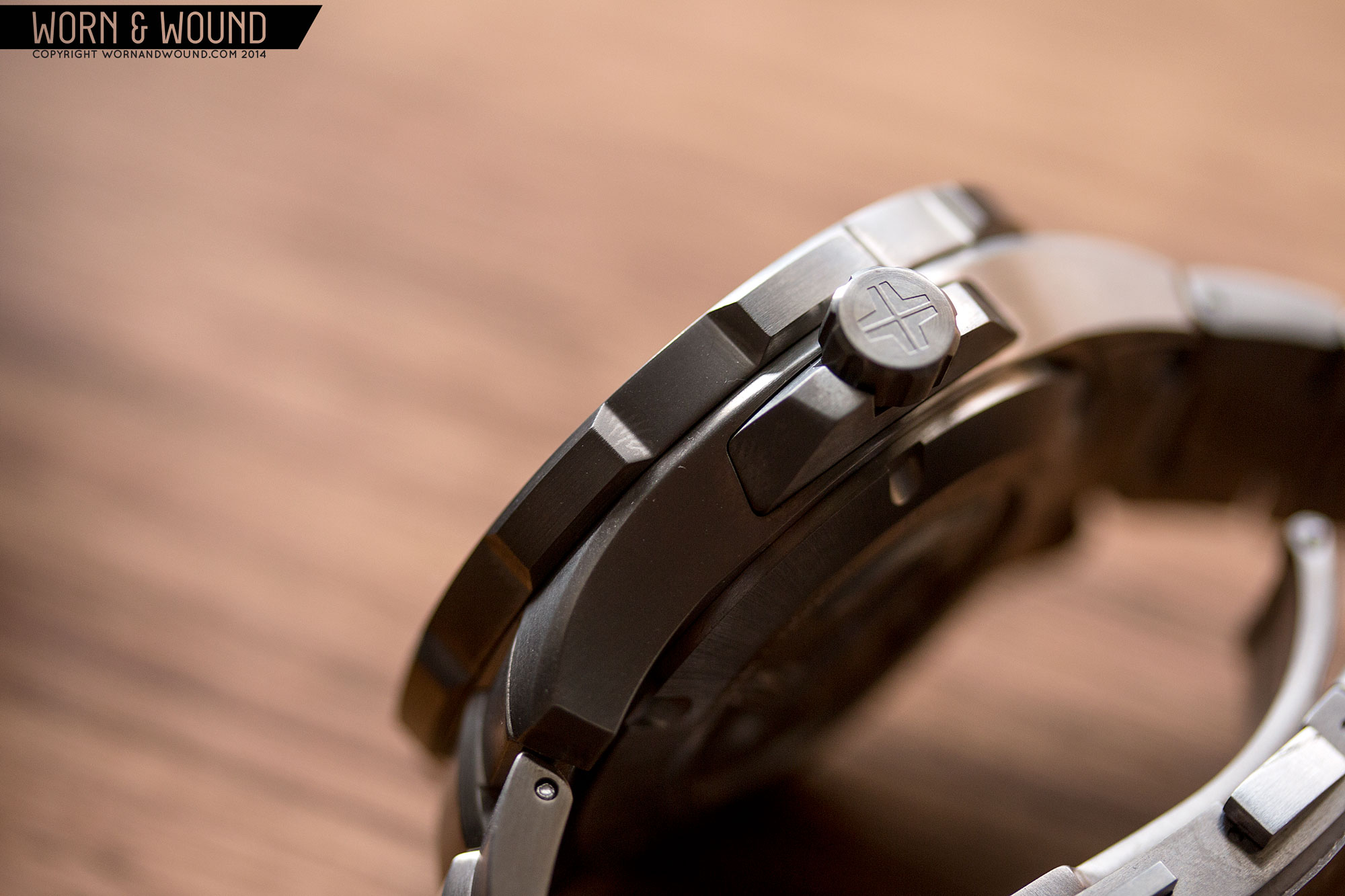
Crown: screwdown
Warranty: 2 years, limited
Price: $598 – $700
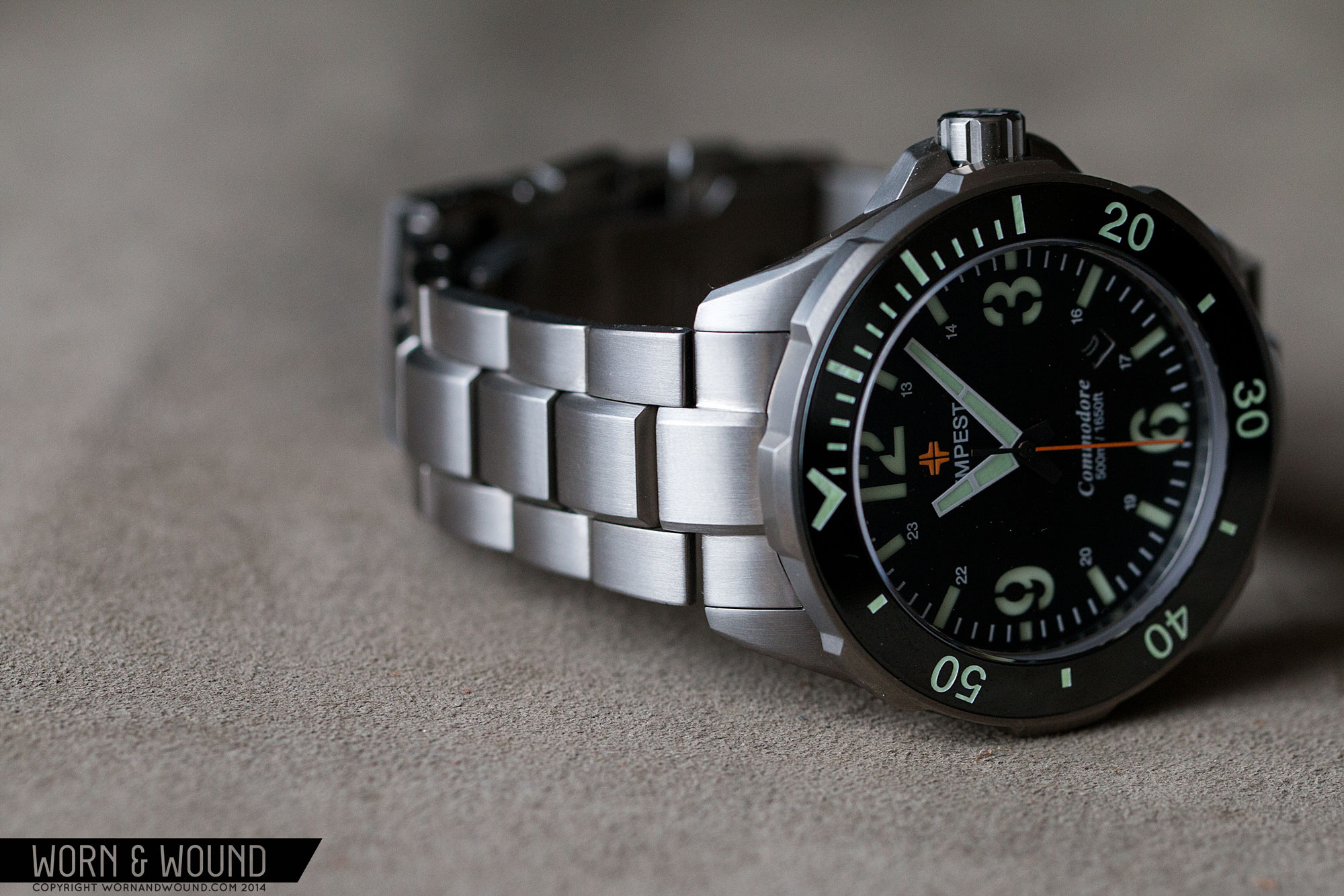
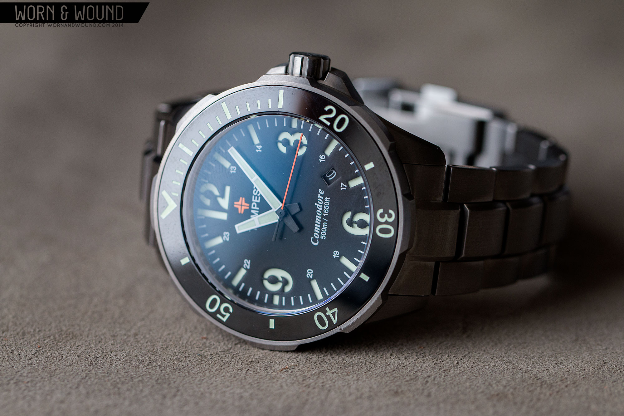
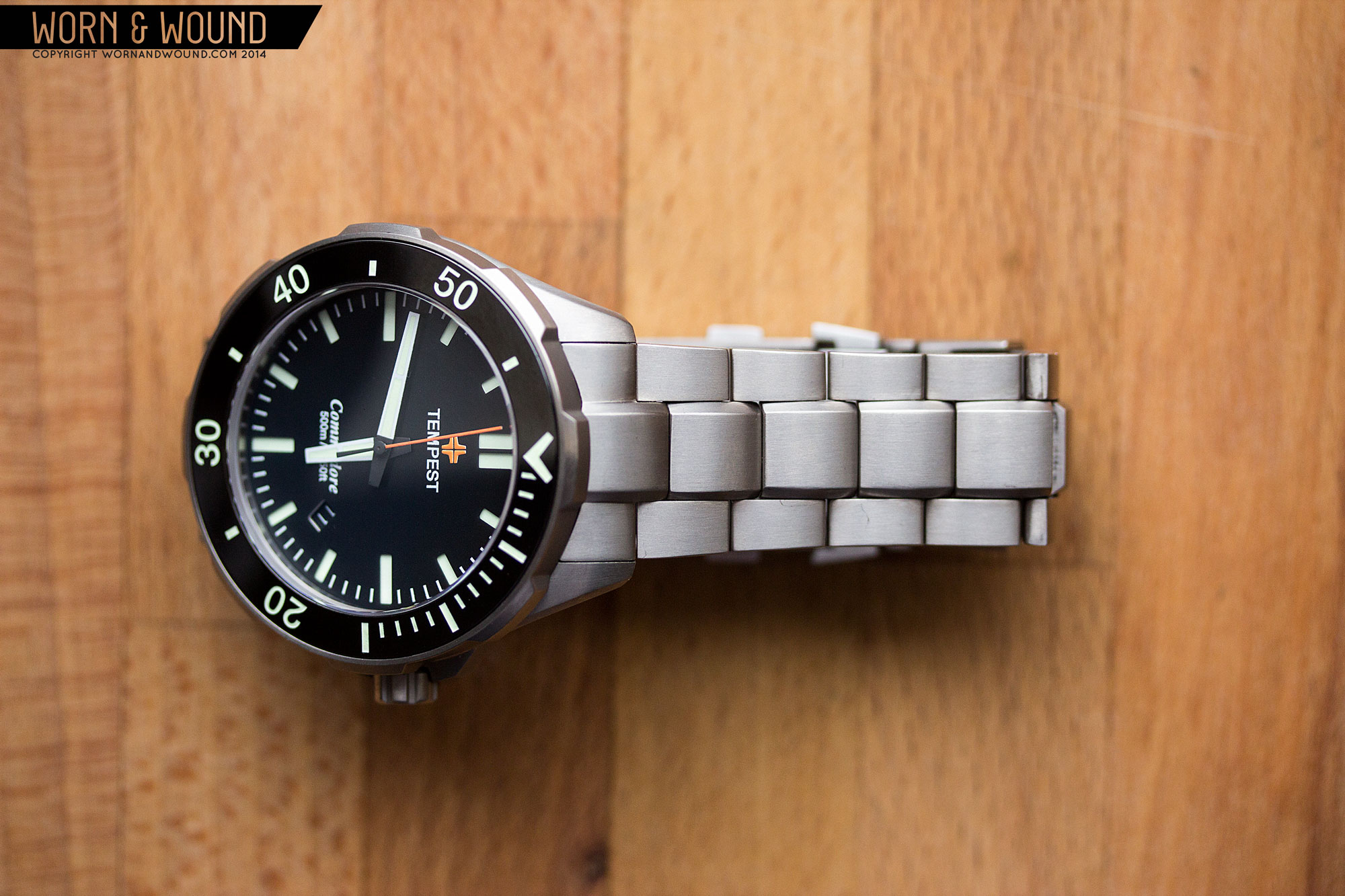
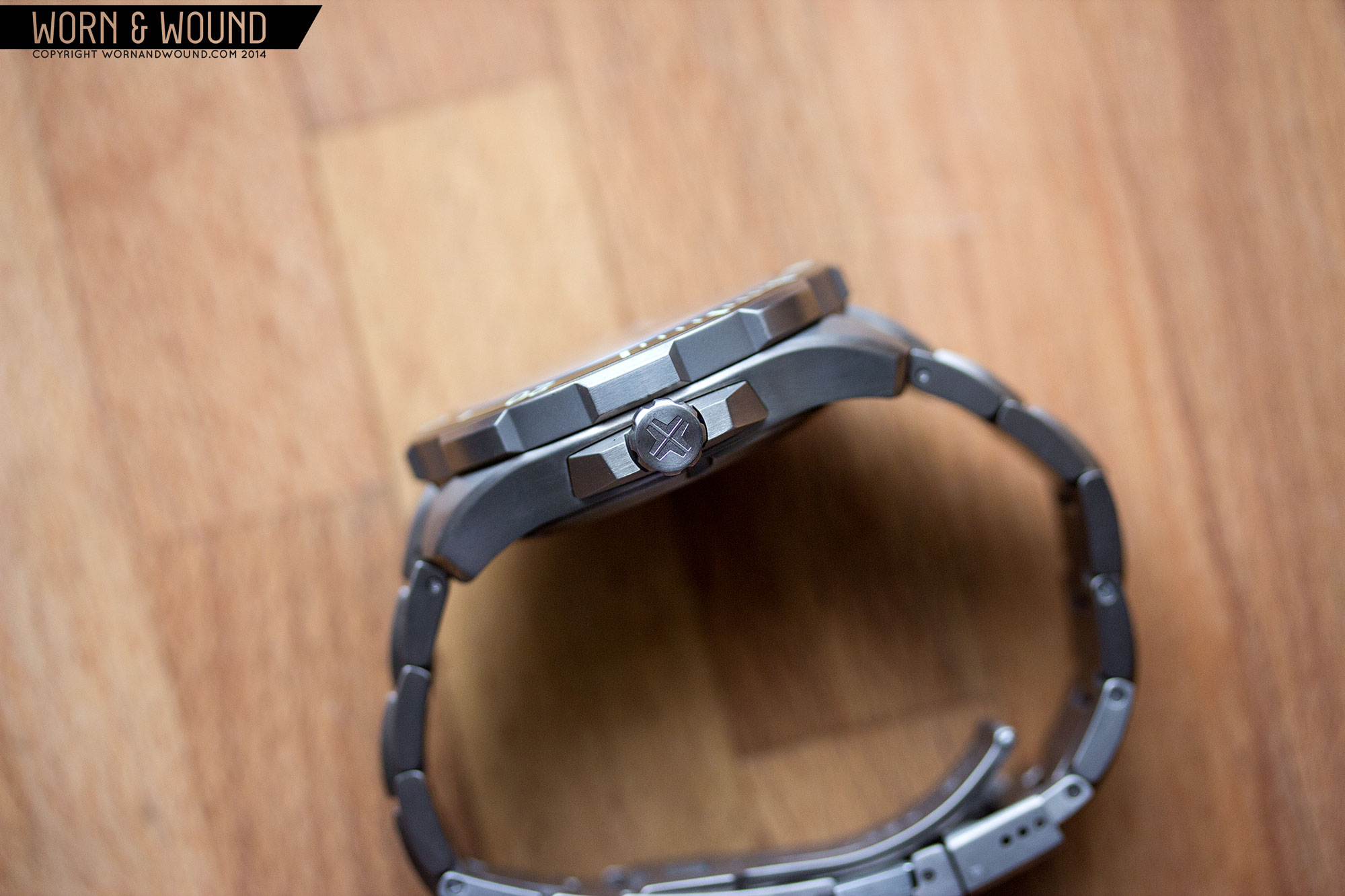
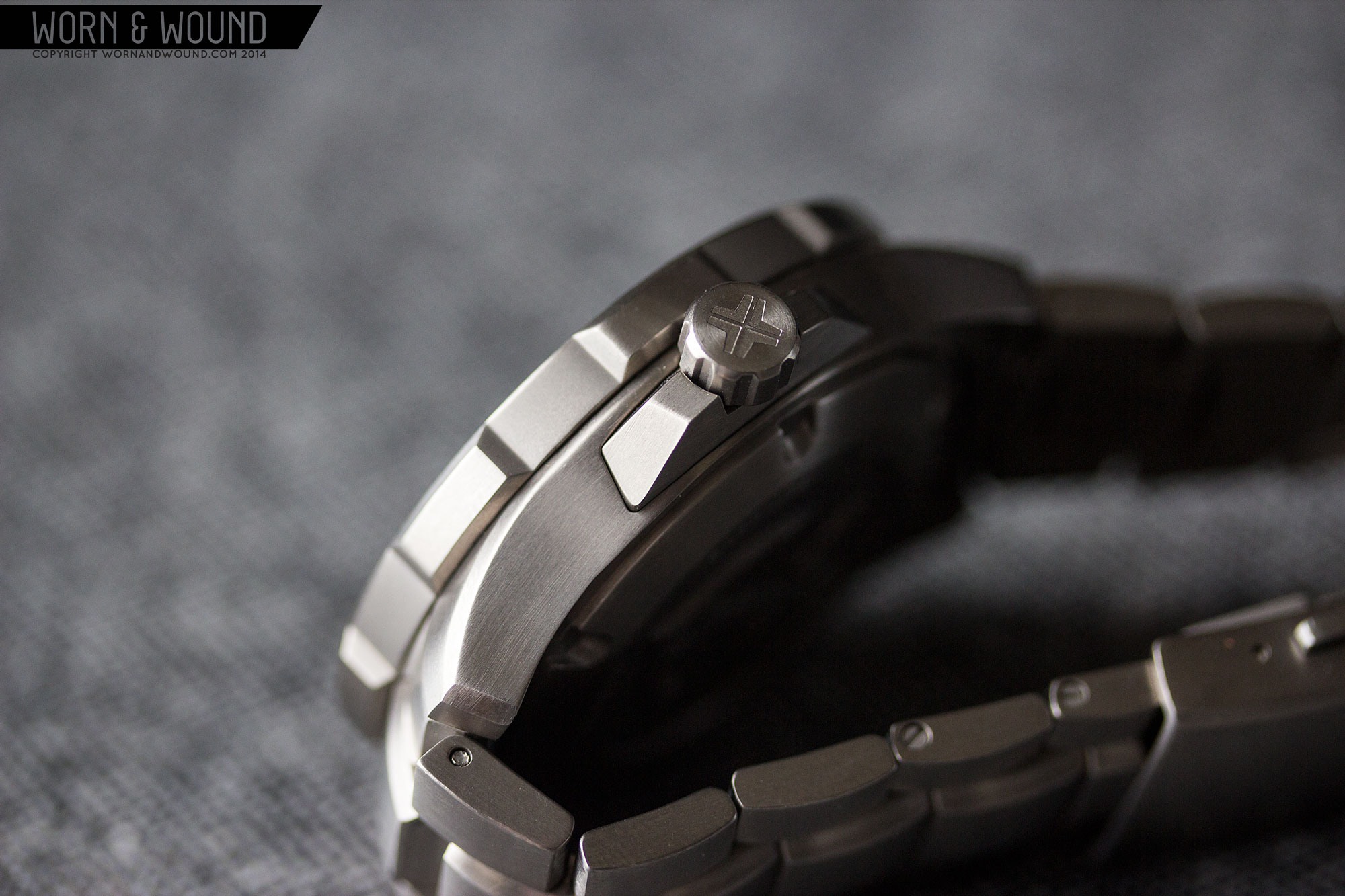
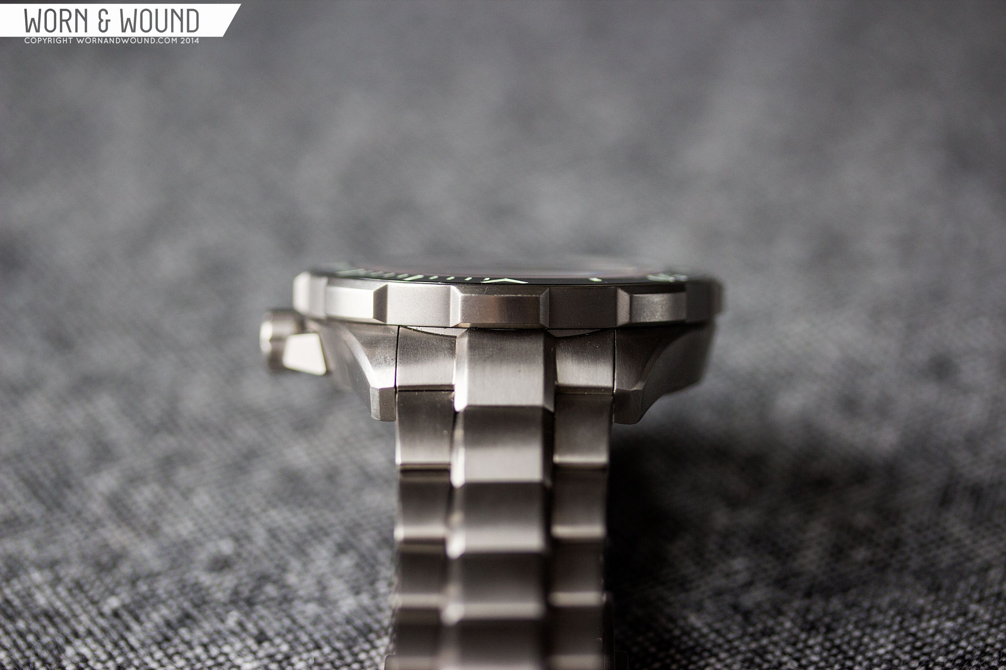
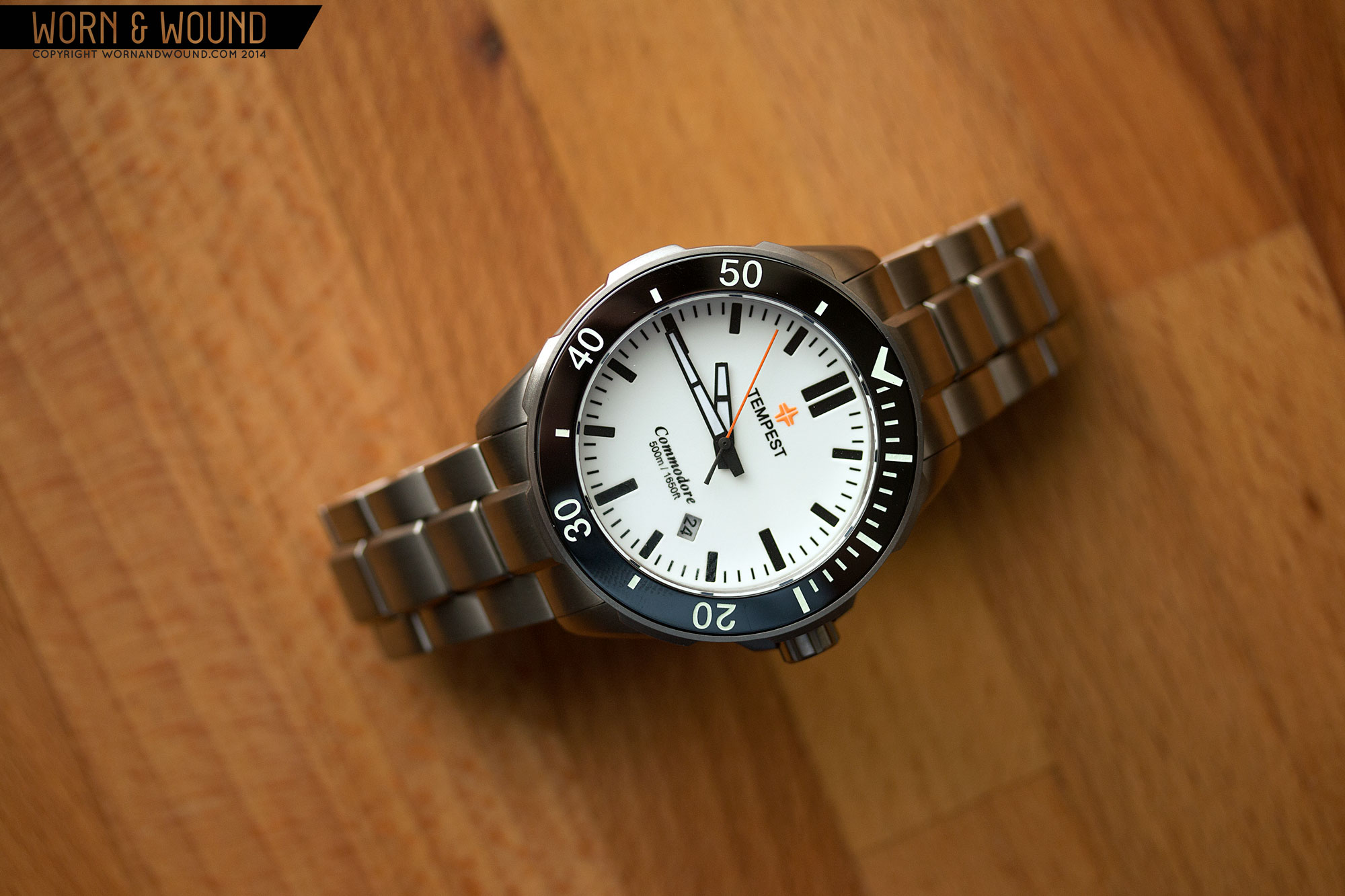
Case
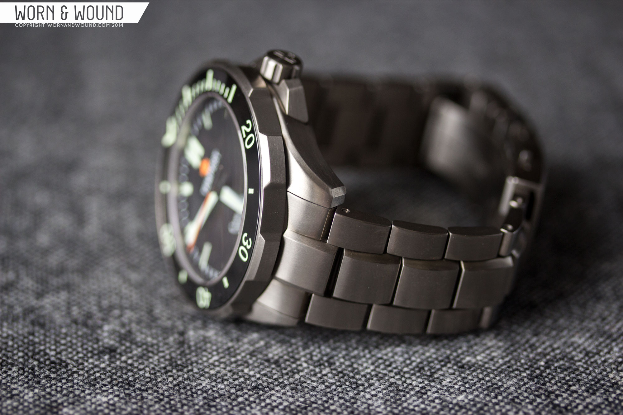
The Tempest Commodore’s solid titanium case is big with modern angles and a 500M water resistance, for which each watch is individually tested. Measuring 45 x 49 x 14.5mm it’s undoubtedly a large watch, but thanks to the titanium and and some clever geometry, it doesn’t seem oversized. From above, the design is angular and masculine, with broad beveled lugs that cut in, a massive bezel, and a cool, sharp crown guards. The dark grey titanium has a satin finish that is elegant but rugged. Looking down the case, you can see that the proportions and design of the case sections is quite interesting.
The mid case actually tapers up towards the bezel, being smaller than 45mm at the bottom. This does a couple of things. First, it simply makes the design more visually interesting than slab-slides would have been, adding some aerodynamic angles. Second, it lightens the overall look, making the design more palatable than 45mm would seem. It’s also a nice detail from a manufacturing perspective, having a machined looked.
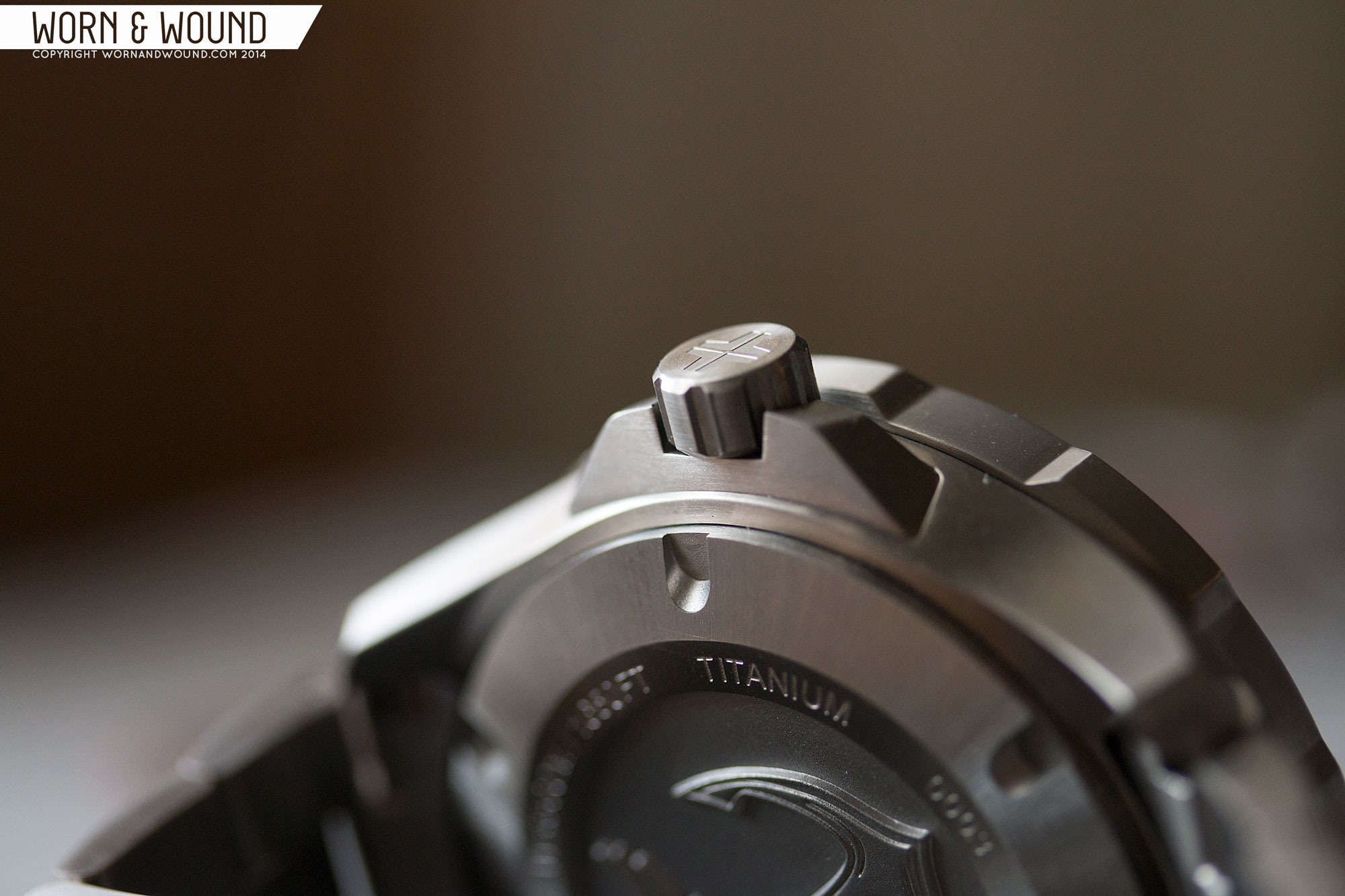
From this angle you can also see that much of the height of the watch comes from the bezel, which is about 4.6mm tall. The bezel features very wide grips, rather than the typical coin-edge or teeth. They are quite easy to grip and feel good in the hand. I imagine the same would be true with diving gloves as well. The big teeth have an appealing rugged aesthetic as well, each finished with beveled edges. The designer used this element to flow through other aspects of the watch, such as the bracelet, to create a nice unity of design.
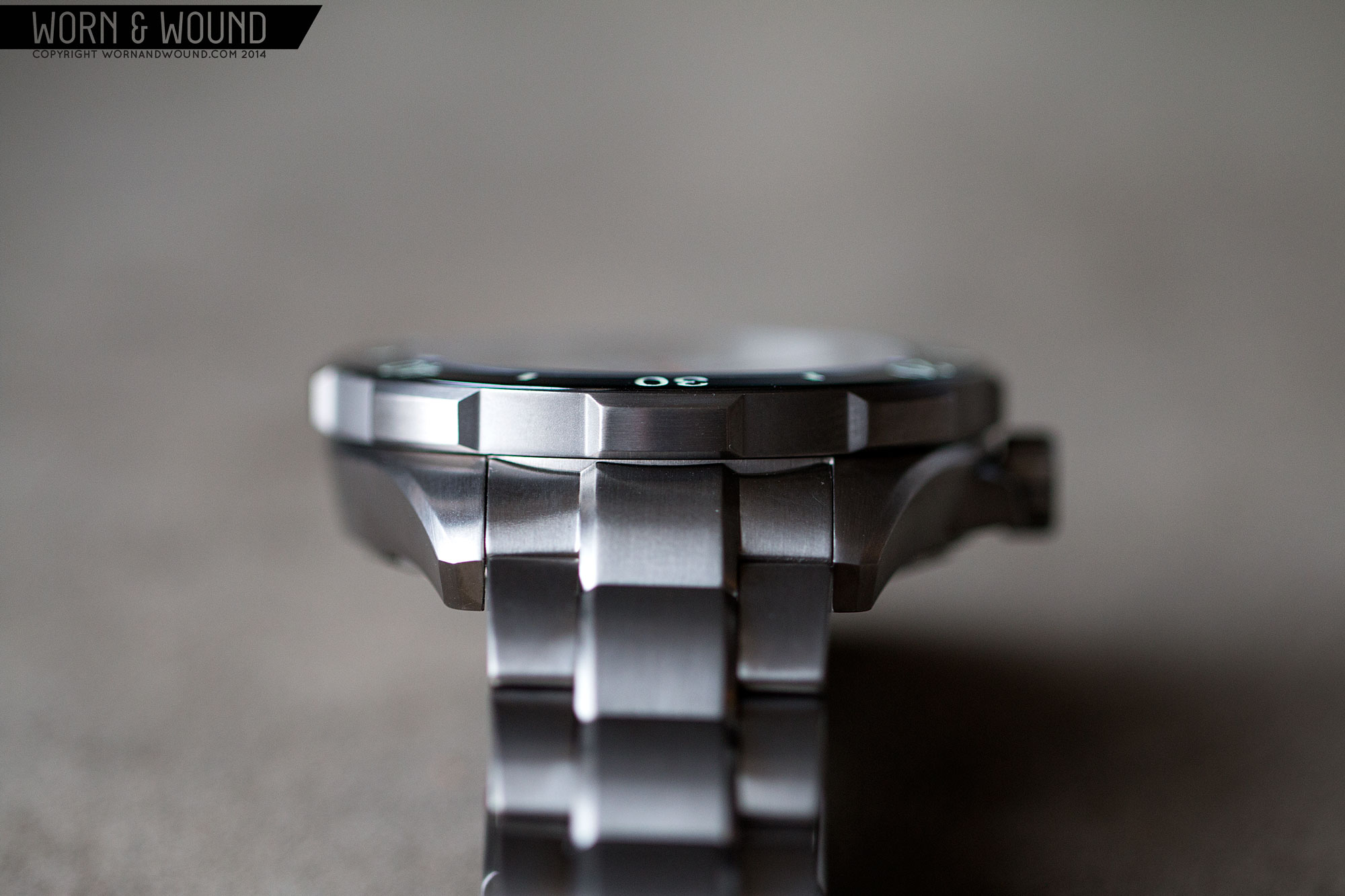
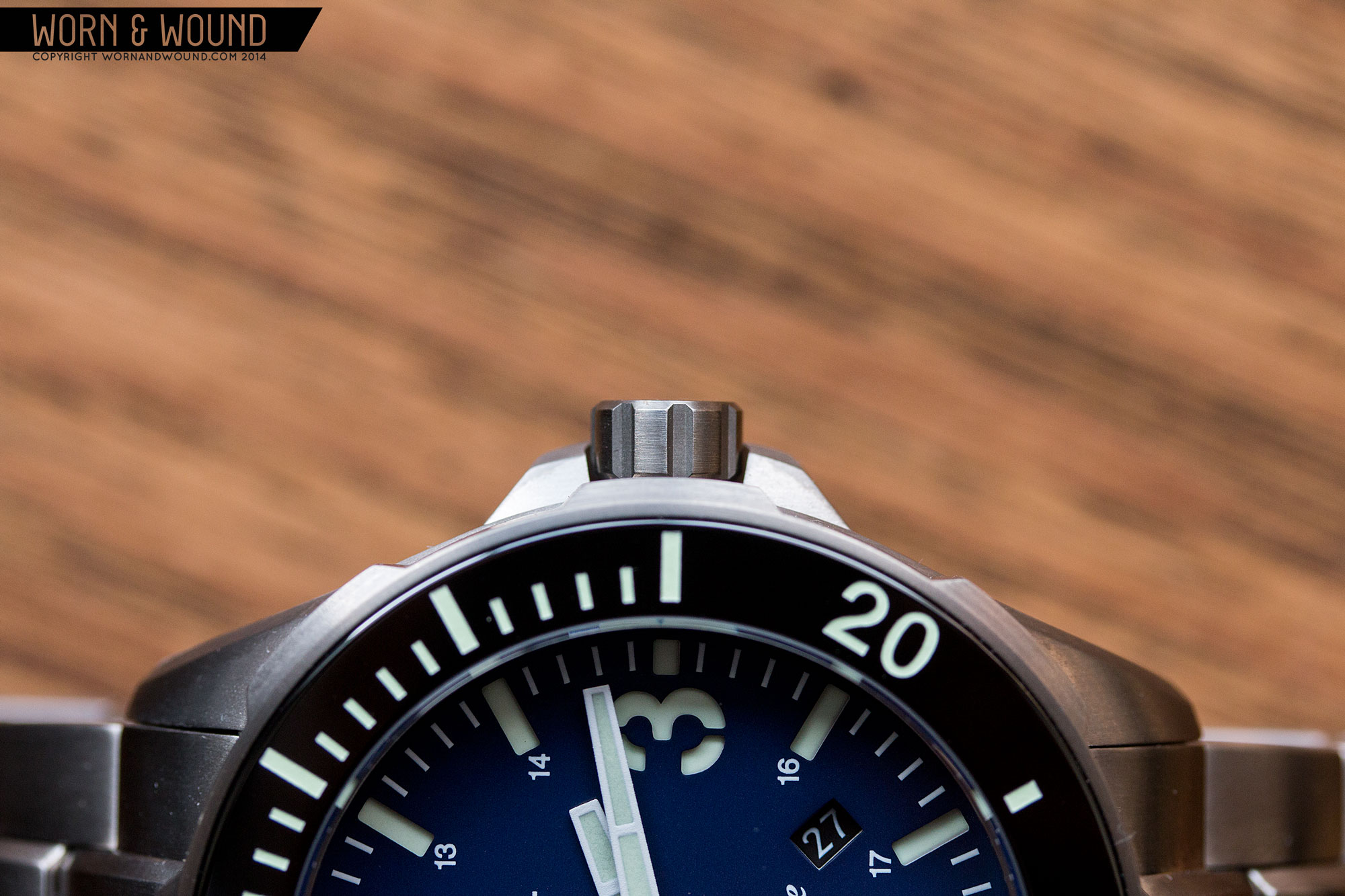
The bezel features a 120-click uni-directional bezel. It gets the job done with a decent click, though it does have a touch of back play. That said, it seems to line up well with the markers. More interestingly, the bezel insert is gloss black ceramic. I was very happy to see them employ this material, as it works with the modern theme of the watch, is highly scratch resistant and adds value.
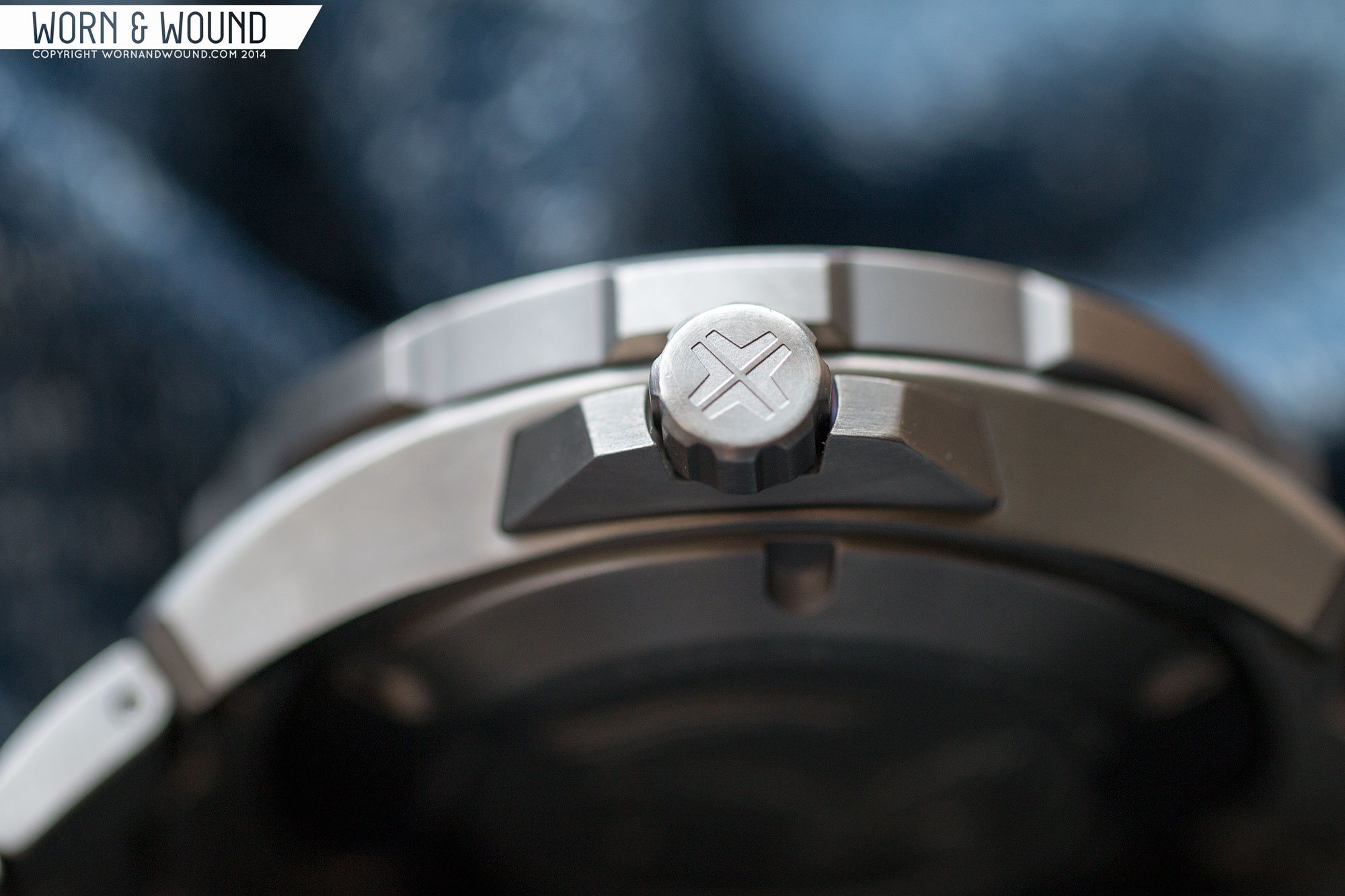
They say details make the difference, and the Commodore proves this with two great elements. The first is the crown guard. From above the look simple enough, shrouding the crown in case of an accidental smack. From the side, you can see it’s much more interesting. The guard seems to actually be its own piece, cutting through the side of the case. The geometry is then very angular, responding to the angles of the mid-case, but doing there own thing.
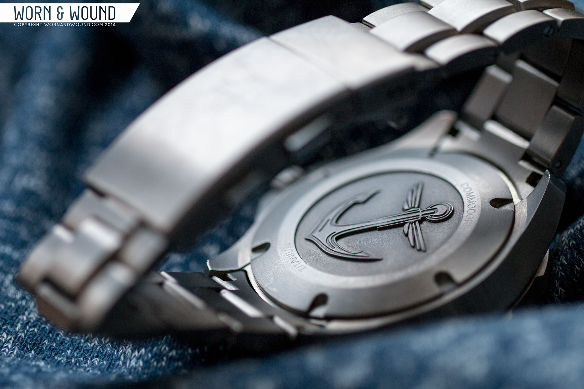
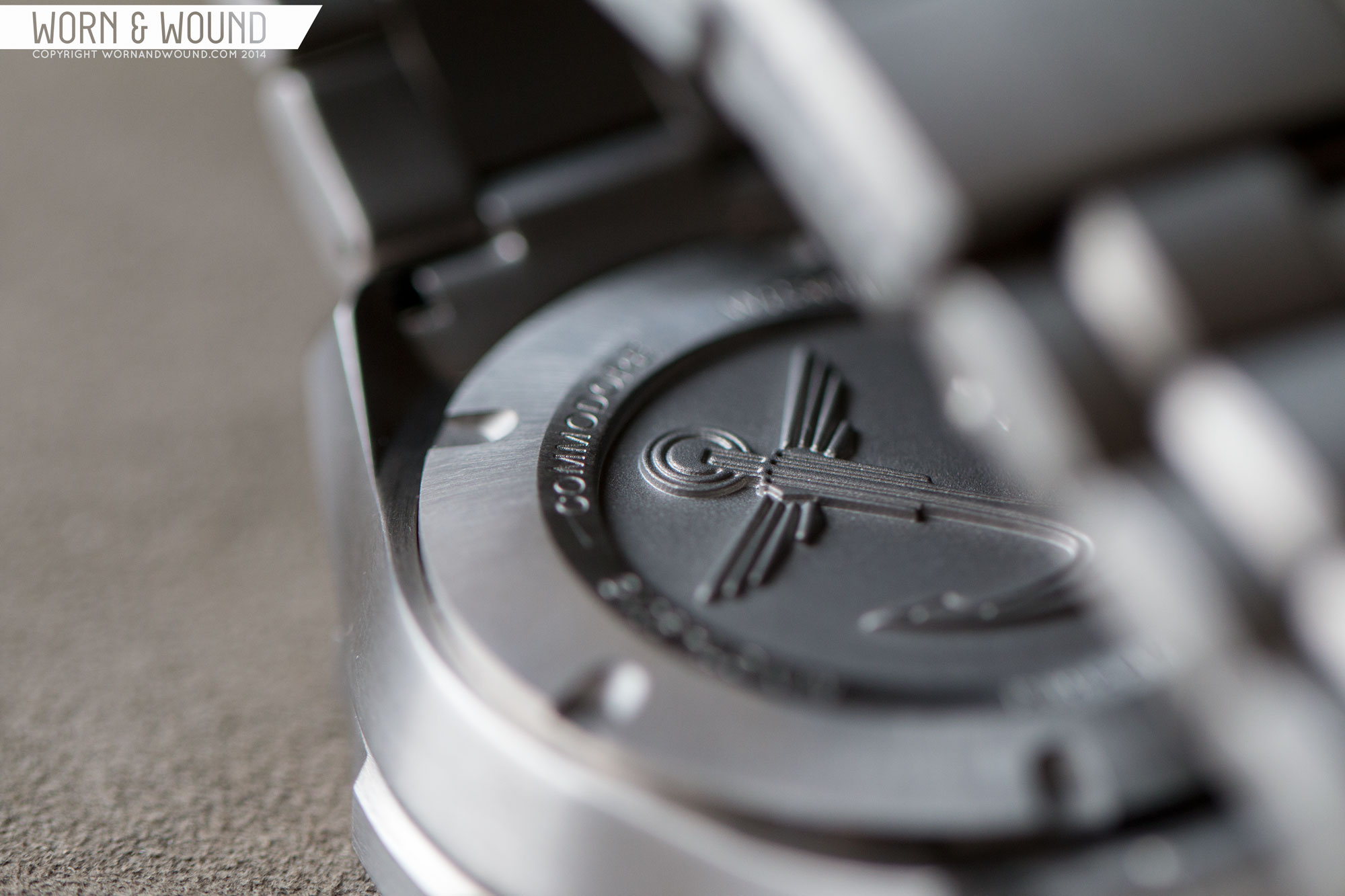
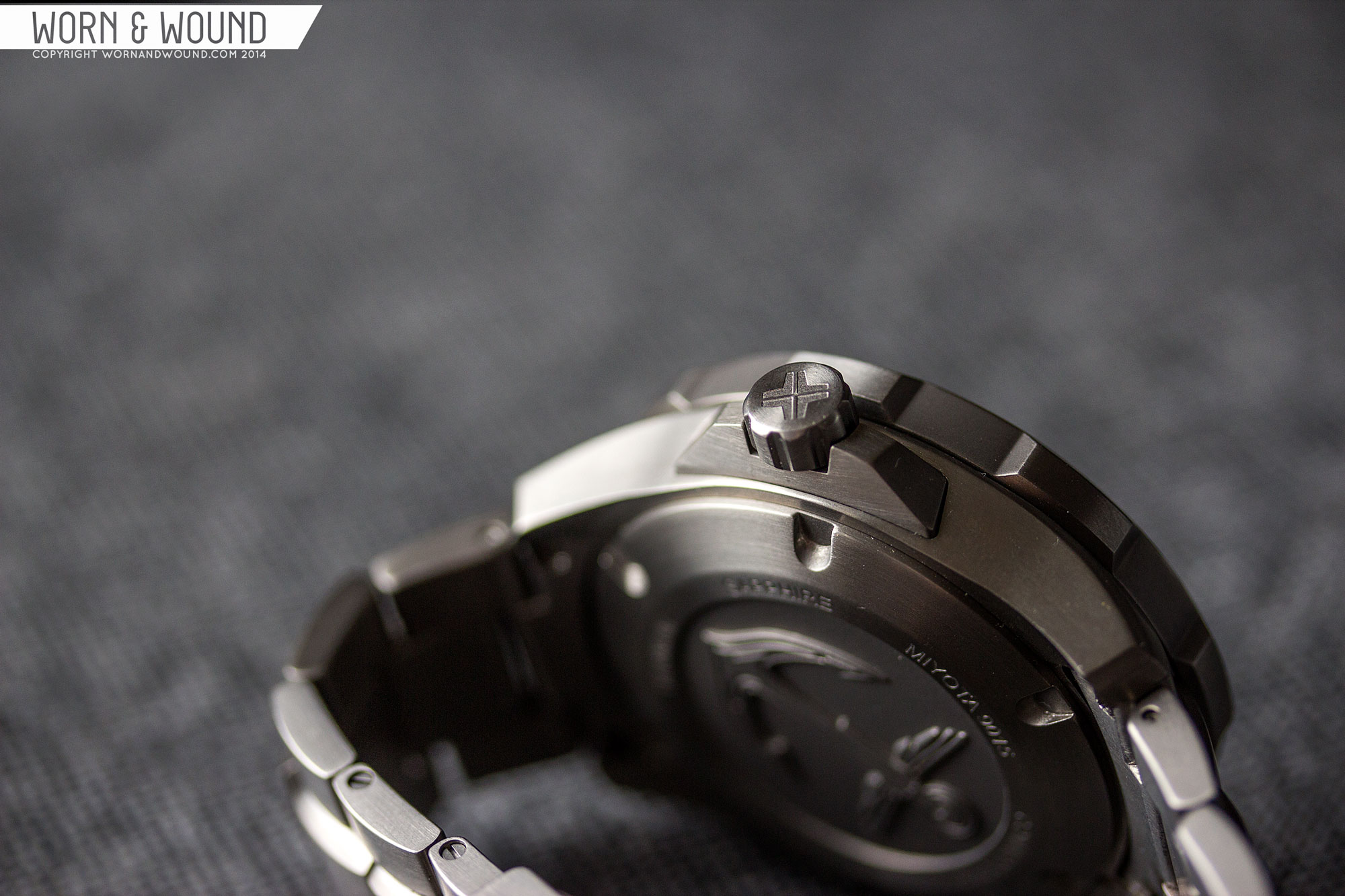
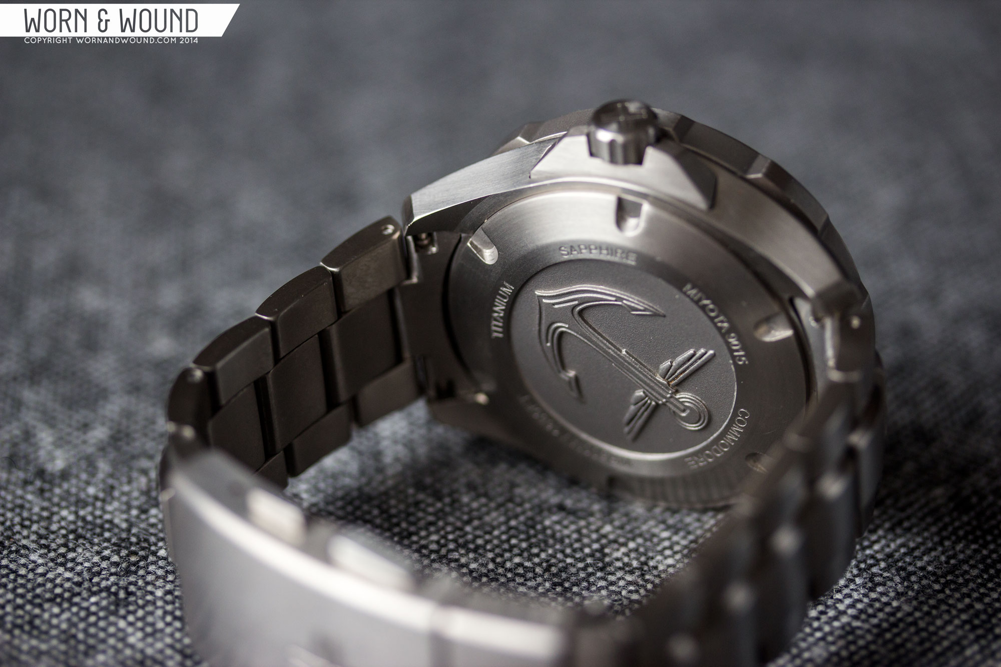
The other is the beautifully sculpted case back. The solid titanium case back is screwdown and features sparing details on the watch, just the basics. In the center, however, is a very detailed engraving of an anchor. While I’ve seen nice etchings from time to time (not often enough) it is truly rare to see a very deeply machined piece of art like this on a case back.
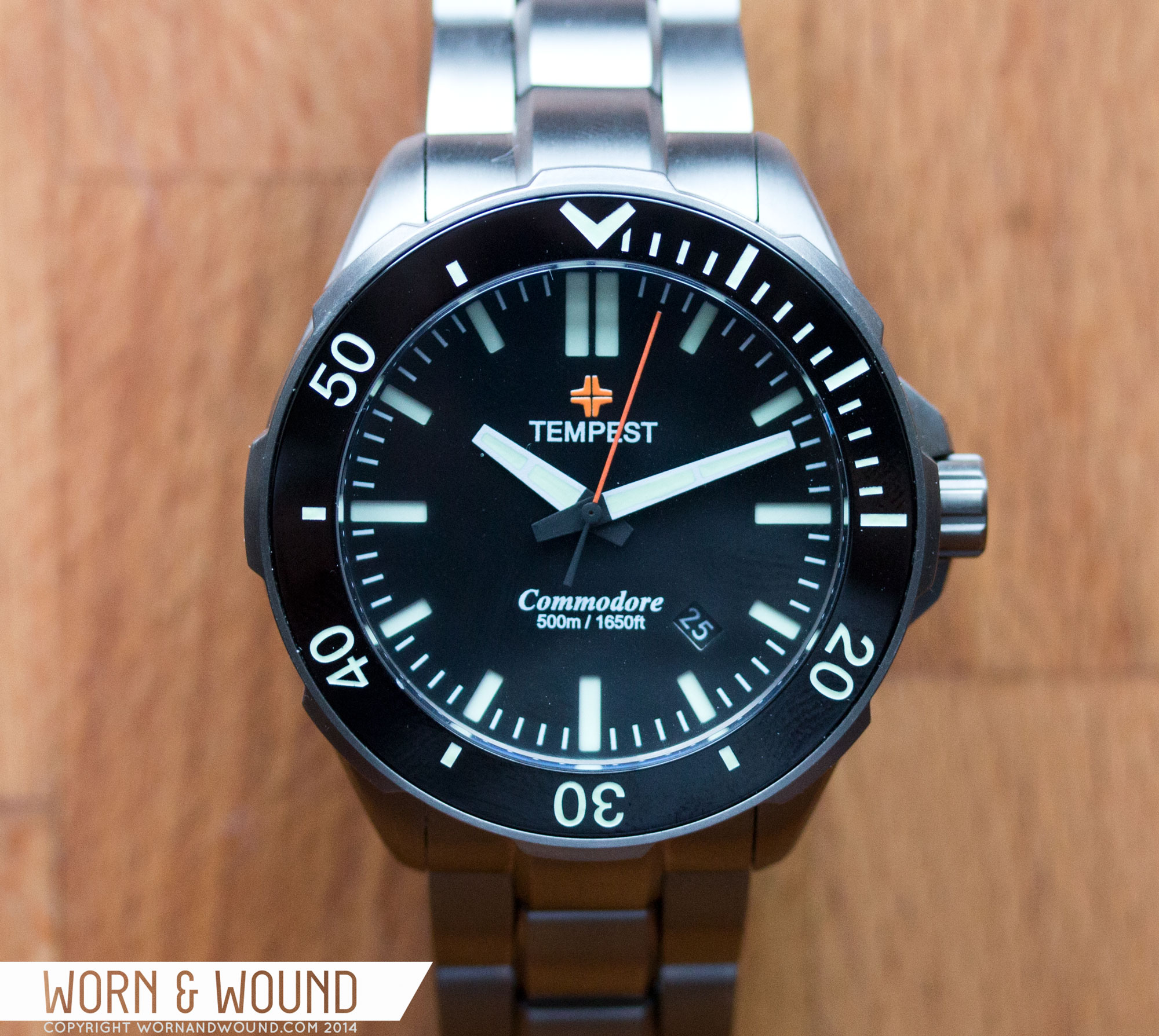
Dial
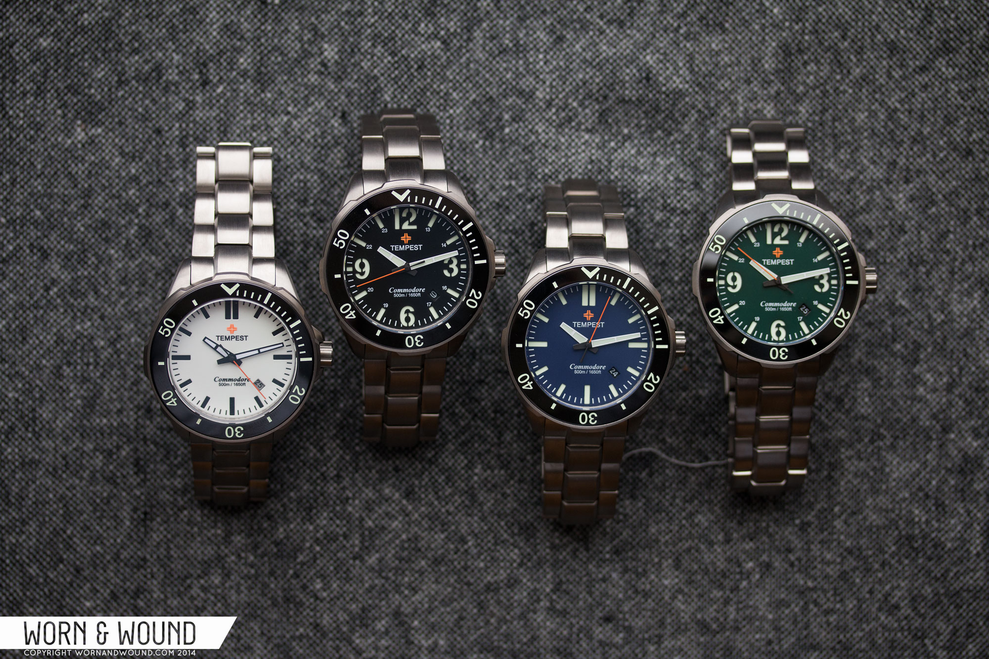
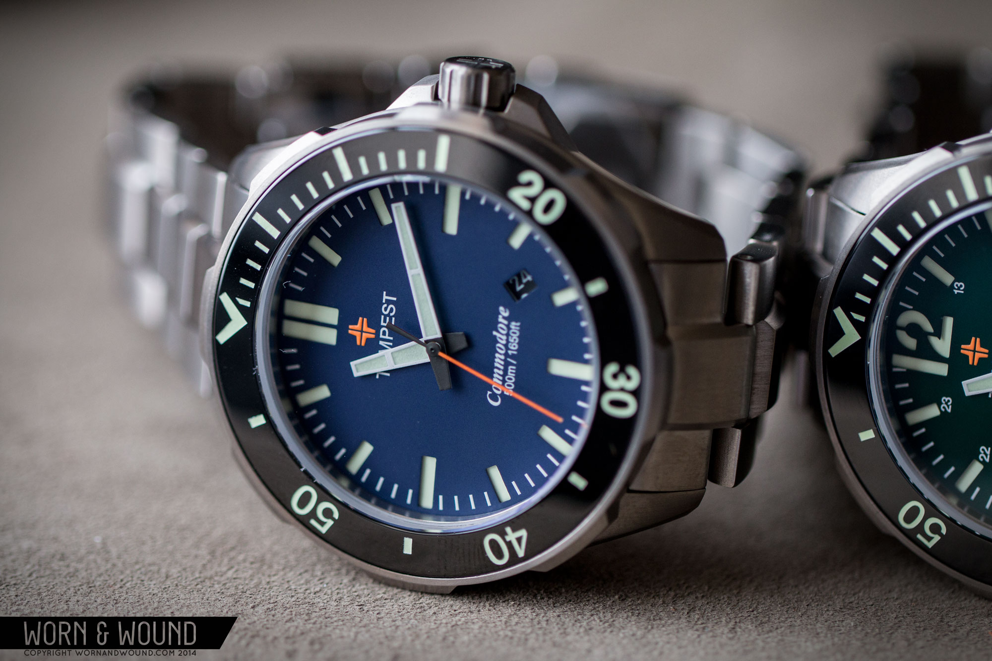
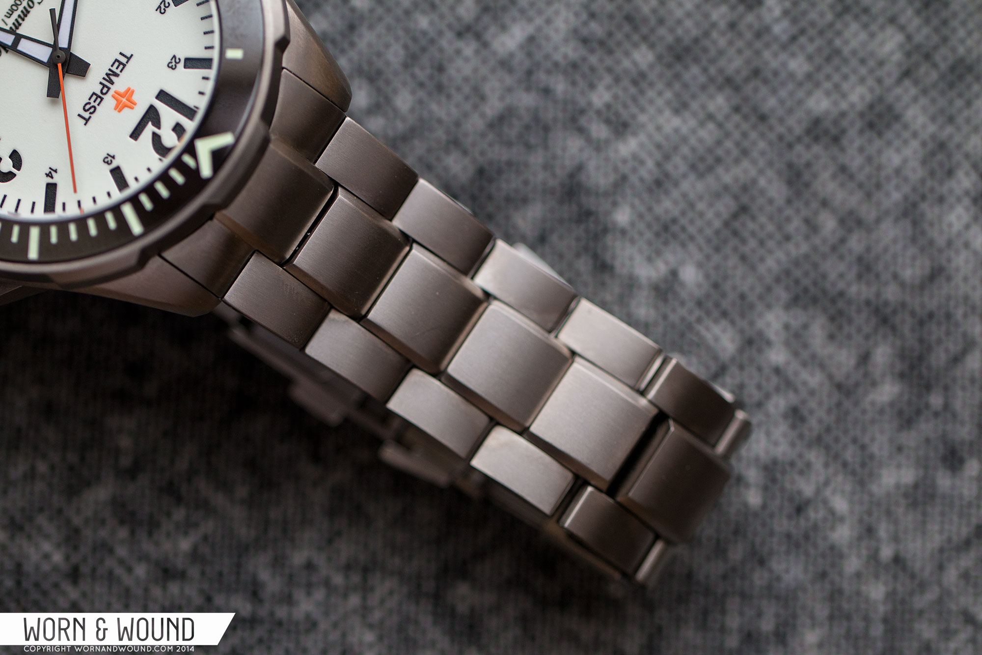
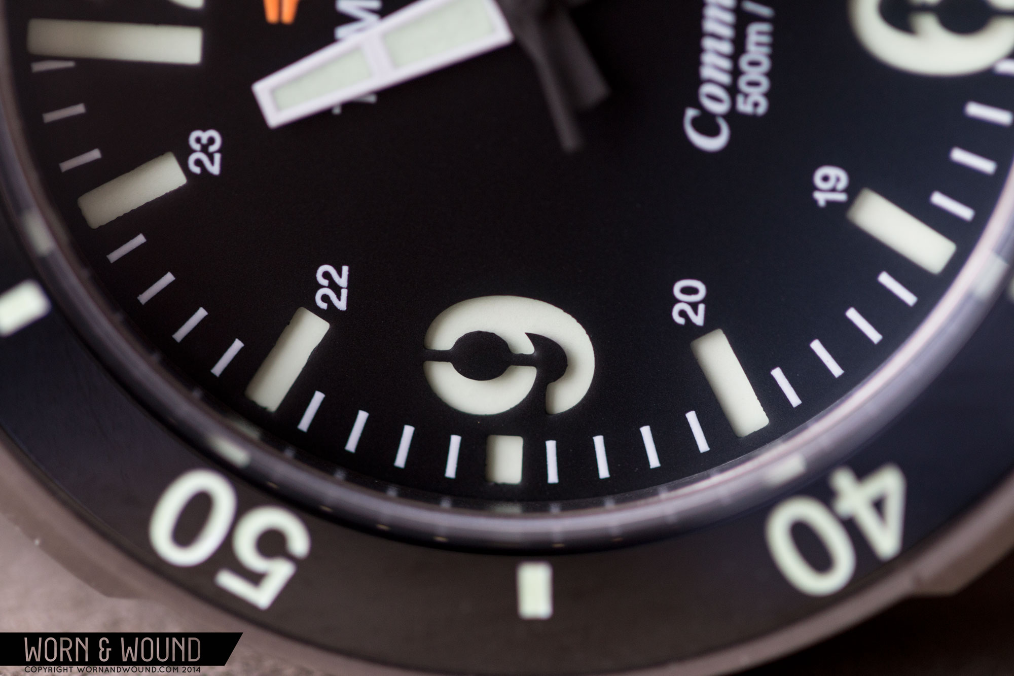
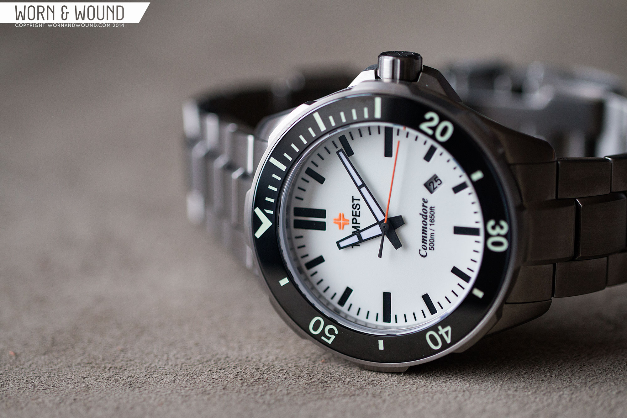
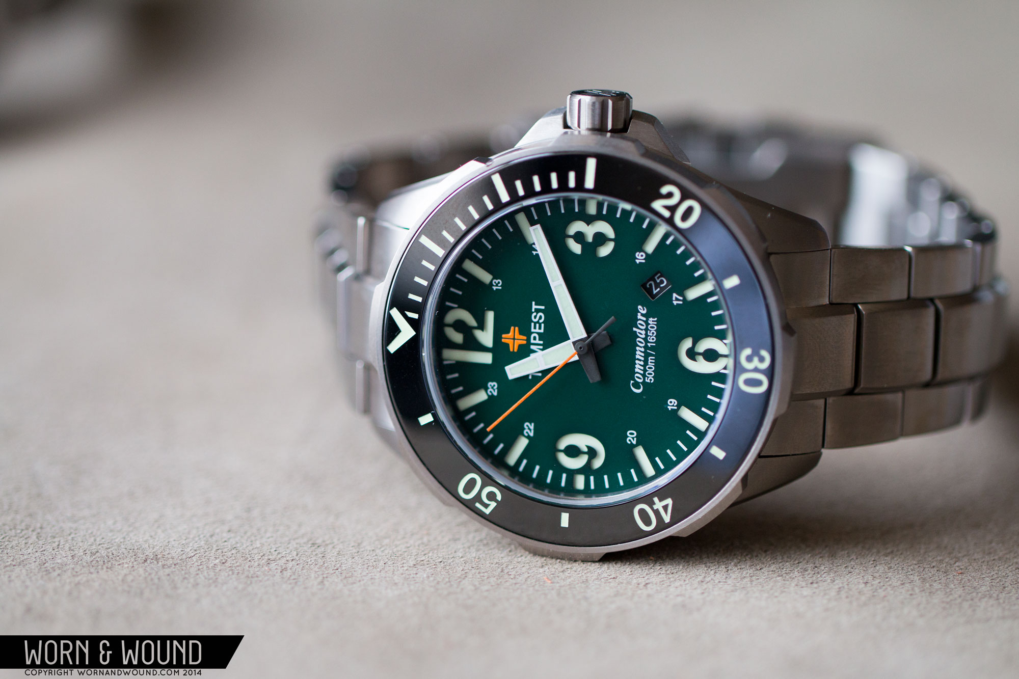
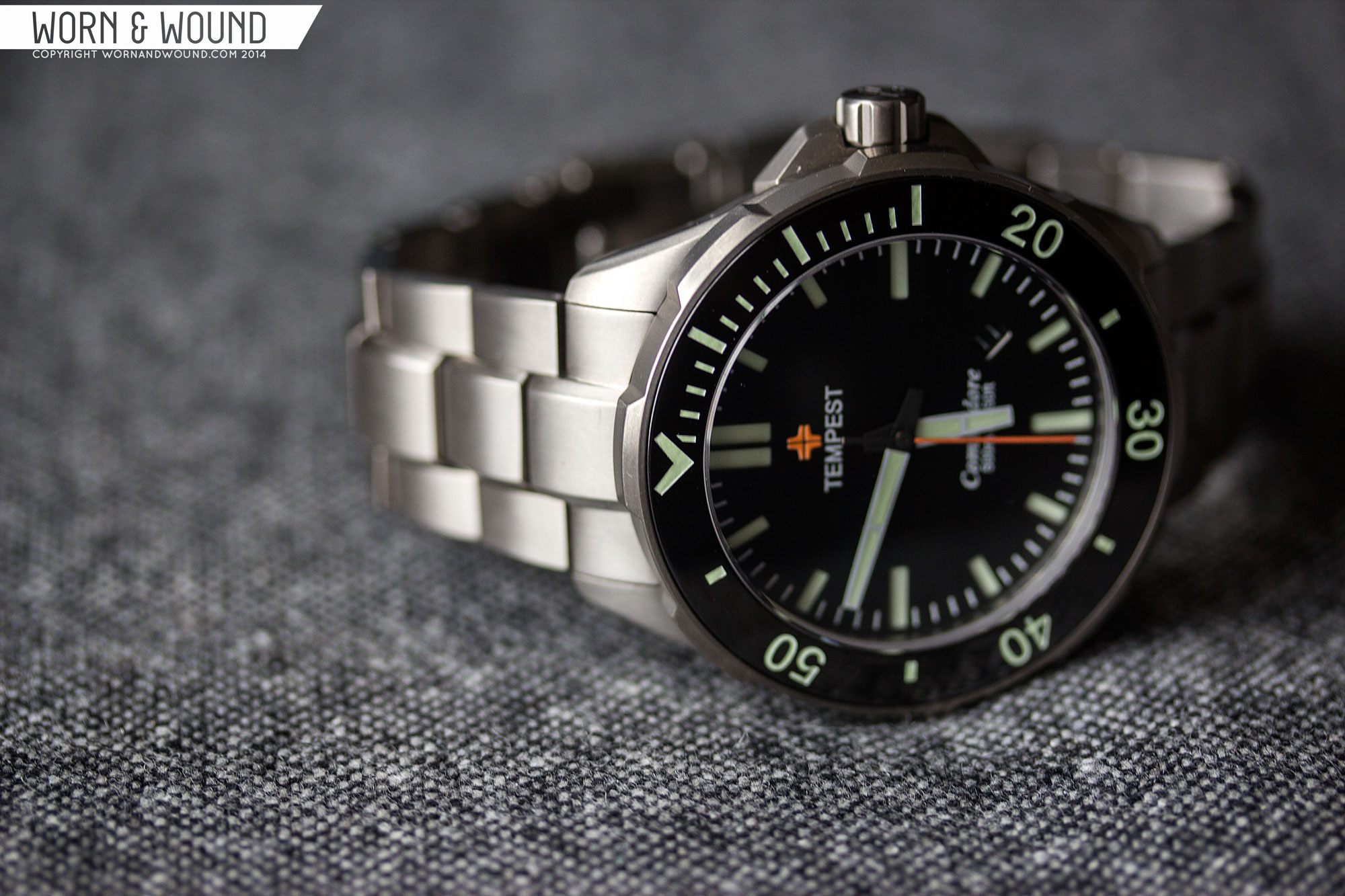
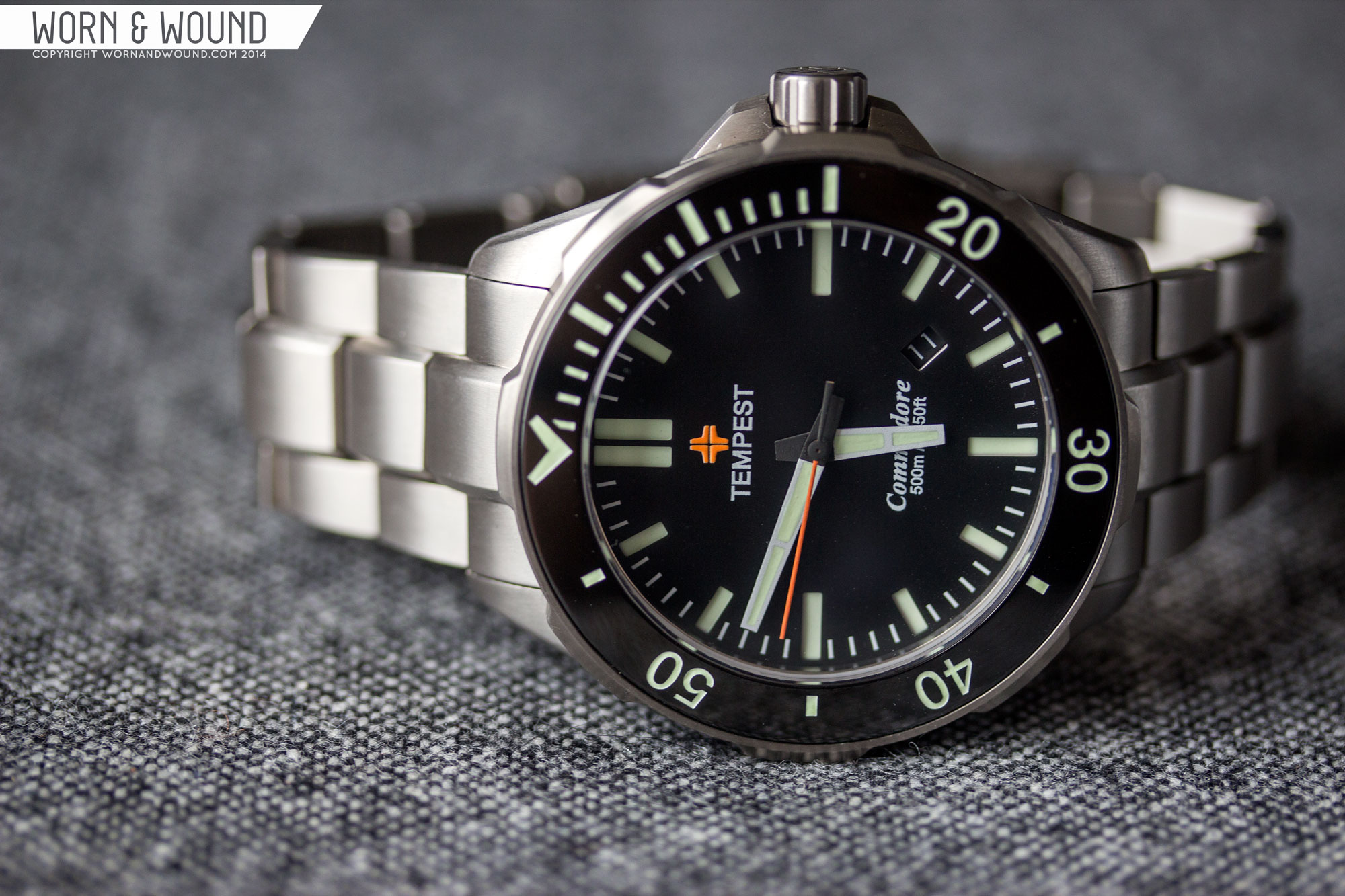
The Dial of the Commodore comes in two design and four colors for a total of eight options. The two designs are nicely different from each other, one is geometric, with a more subtle, but still aggressive feel. The other has large 12, 3, 6 and 9 numerals with a 24 hour reference for a more intense, military design. The two designs actually have a similar relationship as the Sinn 556i and 556a. Both are sandwich dials with the major shapes cut out. It’s available in black, blue or green, all of which feature a lumed sublayer, or full-lume/white which has a black sublayer.

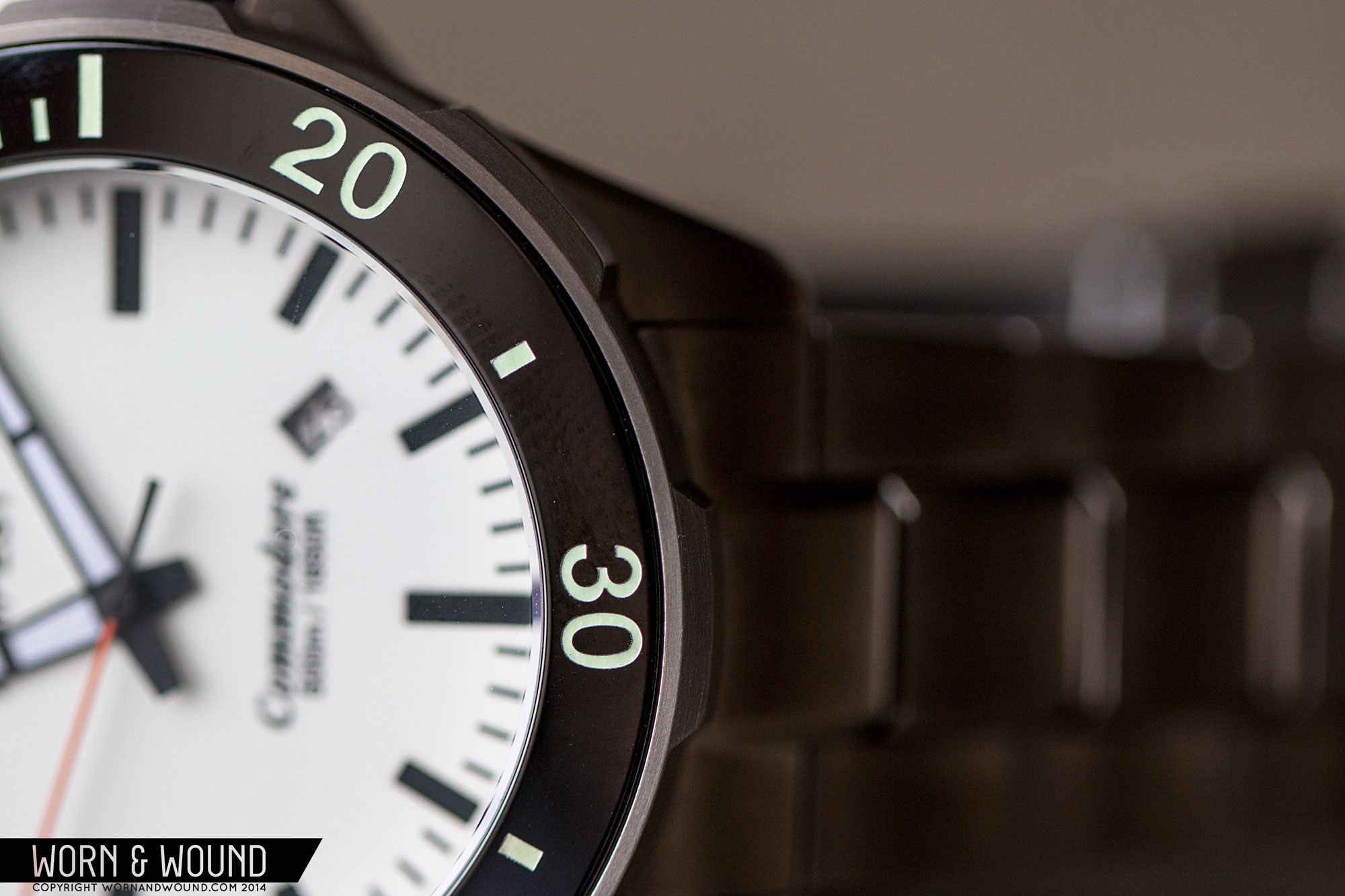
The geometric dial is bold, but clean; maintaining the overall modern feel of the watch, but not betraying the classic dive aesthetic. The cut-through rectangles are well-proportioned getting larger at 3, 6 and 9, and doubling at 12, giving it a bit of a cross-hair feel. Between them are white lines for the individual minutes/seconds. At 4.5 is an angled date window showing the white on black text date wheel (true for all colors except the full-lume).
The numerical dial takes a step away from dive watches and into military designs. The large 12, 3, 6 and 9 numerals dominate the dial, and have a very stylized look do their “stencil” design. There are vertical lines running through the “eyes” of the numbers in order to keep them in tact. It’s a cool look that would be contrived in any setting other than that of a sandwich dial. As mentioned, there is also the addition of 13-23hrs, given a second clear military reference.
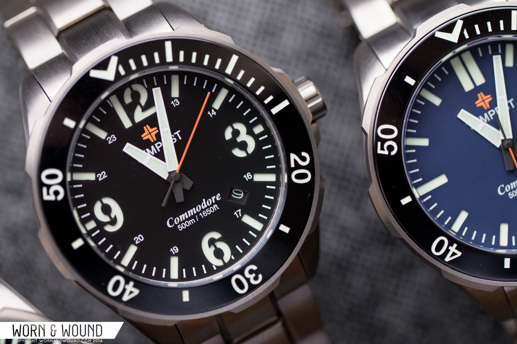
Just under 12 is a bright orange Tempest logo, which is a sort of cross shape, with “TEMPEST” just below in white. Above 6 is “Commodore” in a serif italic typeface, under which is the depth rating, 500m/1650ft. All the text is sensibly sized and the type of info one expects to find on a dive watch. The flash of fluorescent orange in the logo is also a nice touch.
The bezel insert has a fairly classic dive design. All in lume, there is a “V” at the origin followed by markers for the first 15, then numerals every 10 alternated by small blocks. It’s simple, but it works. It’s clean in a modern way, yet there is a touch vintage too in its more restrained approach.
The Commodore features blocky, tapering hour and minute hands with lume fillings that are split. They are easy to read and work with both dials designs. The seconds hand is a fluorescent orange (matching the logo) that making it stand out. I do like the bright orange second hand as well, though I wonder if an orange minutes, PloProf style, might have been more logical.
Regarding the color options, the black is classic and to the point, while the other colors mix things up a bit. The blue ranges from an indigo to a more pale tone. It’s the most soothing of the colors, taming the more aggressive elements of the watch. The green dial is a vibrant forest hue, nearly emerald. Definitely a change of pace, but a nice one. It works particularly well with the numeral dial, adding to the military feel. The full-lume/white dial is the most extreme and surprising. The use of a sandwich construction with a black sublayer has a different effect, somehow increasing the perceived contrast. I honestly didn’t expect to like it very much, but in person its really striking, transforming the watch.
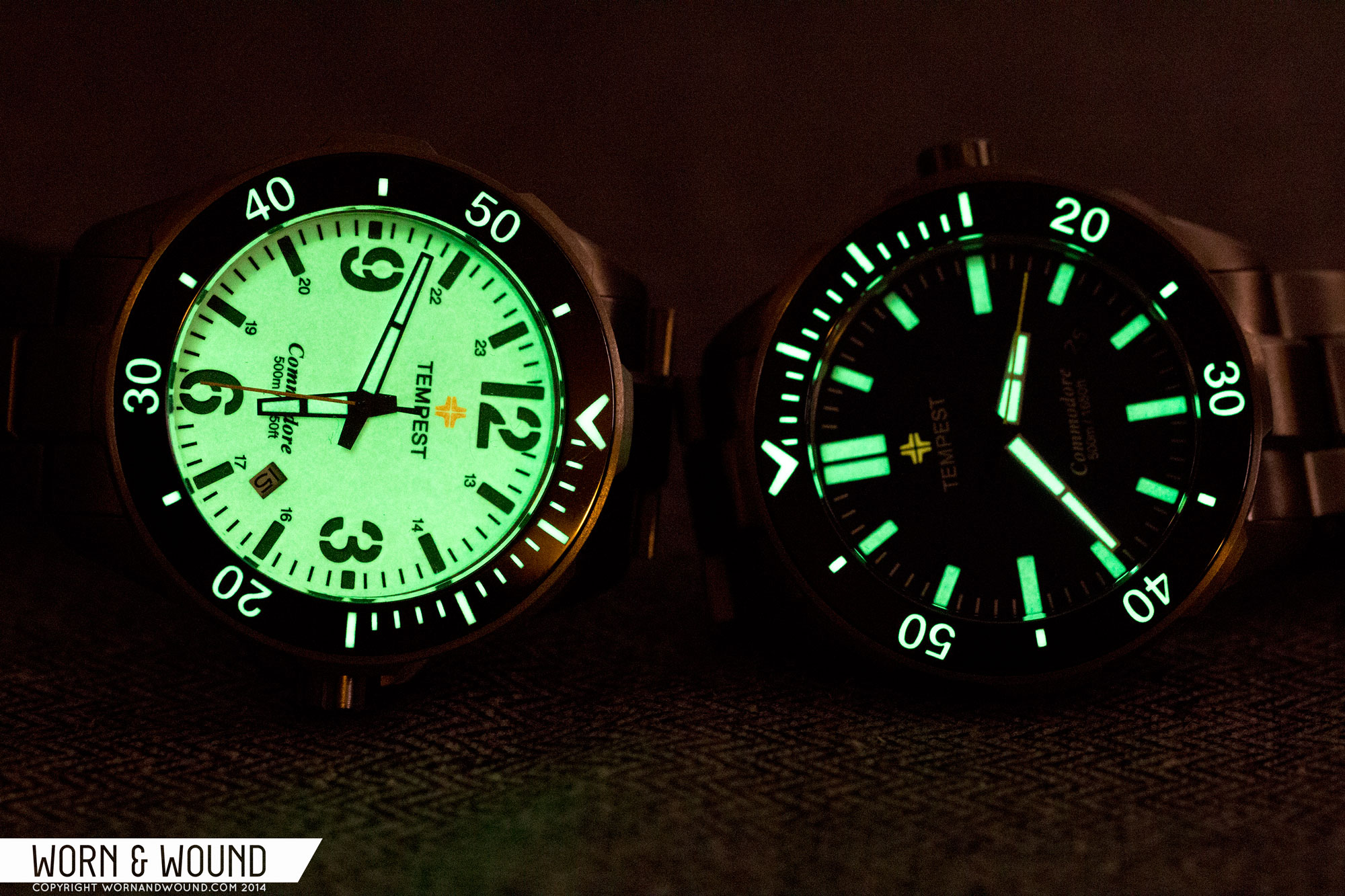
There’s nothing more disappointing than when you pick up a bad-ass dive watch that looks and feels great, only to find out the lume is lacking. That was not the situation here. I was very happy to see the lume on all of the models was exceptional. It glows bright, especially on the hands and bezel, but the dial is not far behind. The lume is listed as Lumi Bright on their site, but seems to be very similar to C3.
Straps and Wearability
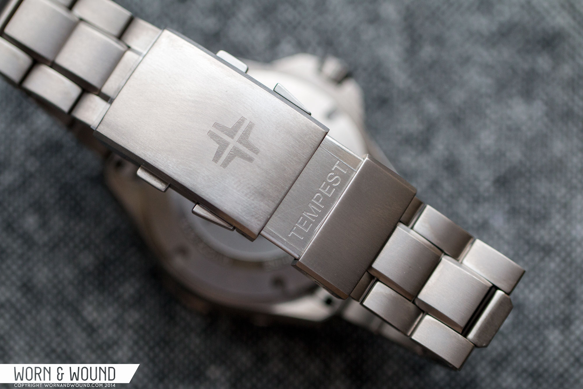
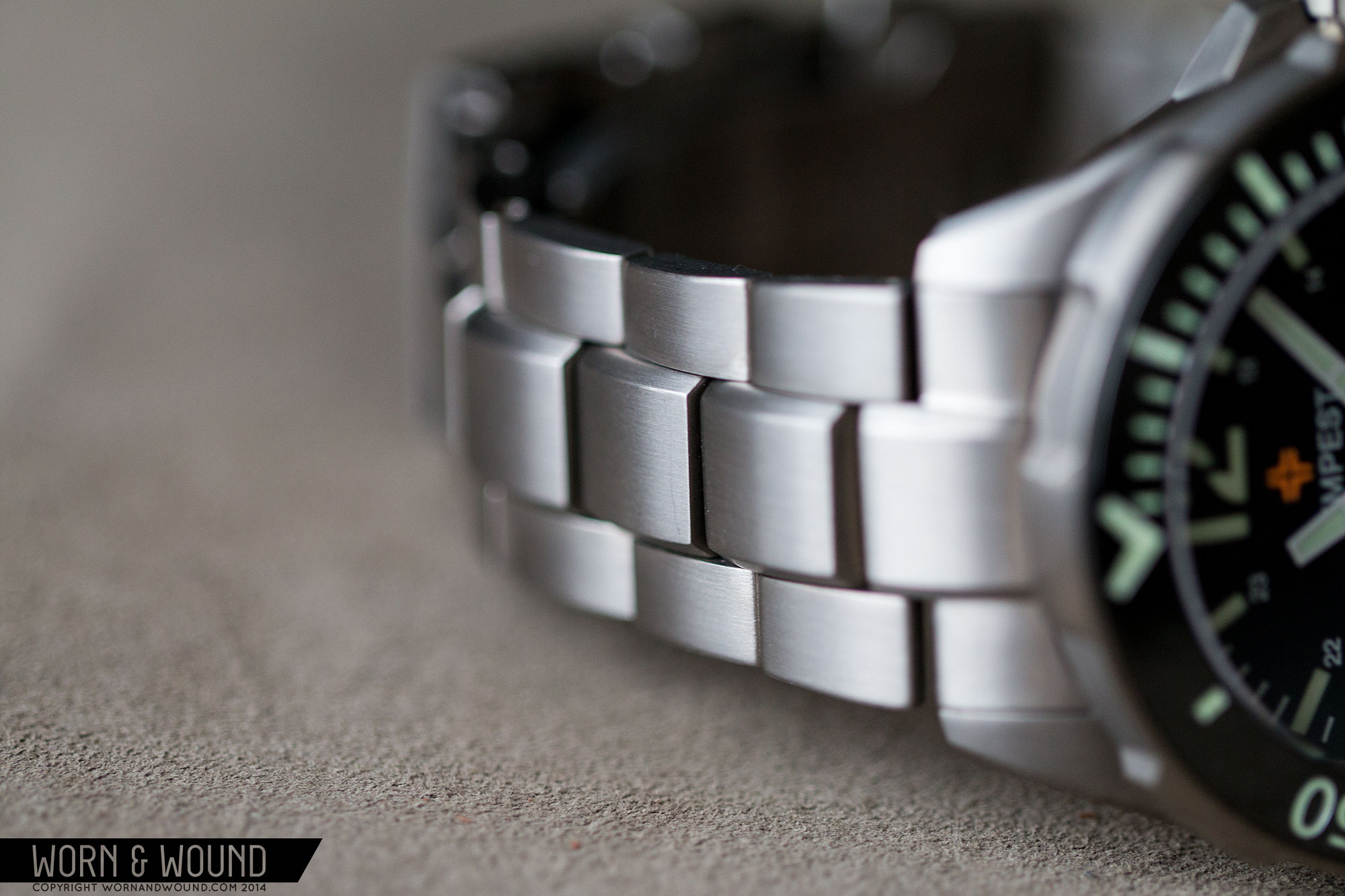
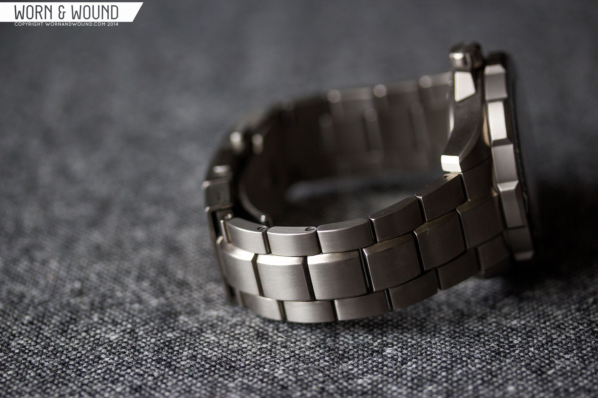
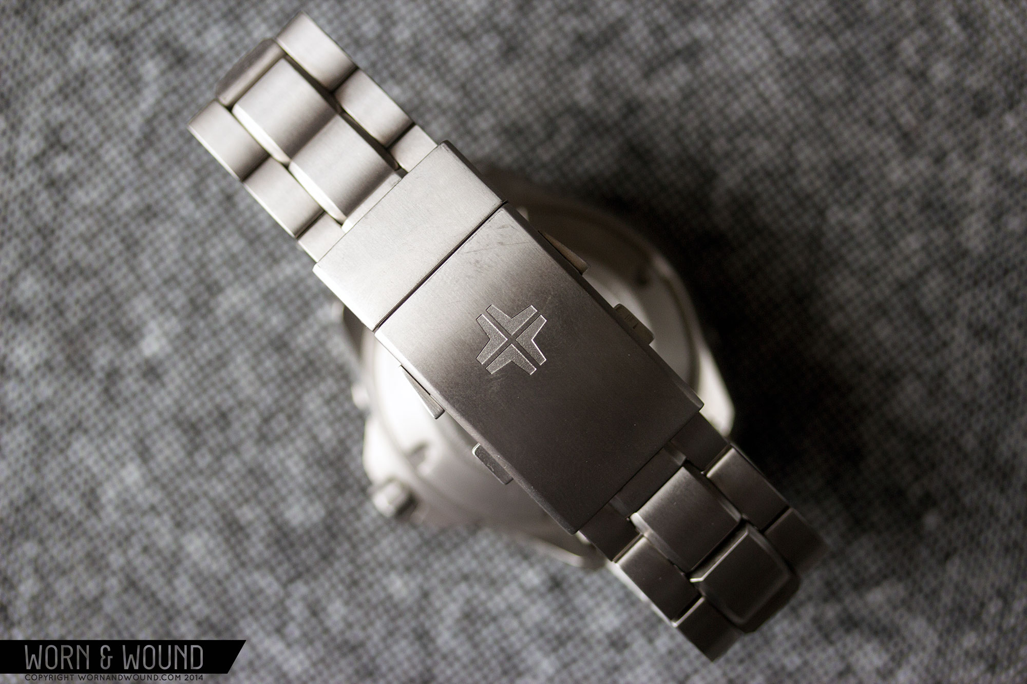
Continuing with the theme of great design and execution, the bracelet is fantastic. It’s a 22mm solid titanium 3-link style that tapers to 20mm at the clasp and has solid endlinks. It’s thick, sculptural, overbuilt and features a great clasp. The design is very aggressive, perhaps more so than other elements of the watch, with a pronounced ridge that runs along the center link. The 4.5mm thick center link bevels on its edge, adding some bold geometry. This extends into the bezel grips, as mentioned before, tying the design together. Though the design plays off of the classic Oyster style, it takes it in it’s own memorable direction. And because it’s solid titanium, it maintains a fairly light weight.
The clasp is then a beastly deployant with a built in sliding dive-extension also made of titanium. There are two sets of buttons on it, one to open it you push in, and one that extends the extension by pulling back on. I love this kind of design as, for those of use who are mostly above sea level, it allows you to slightly loosen the bracelet if needed.
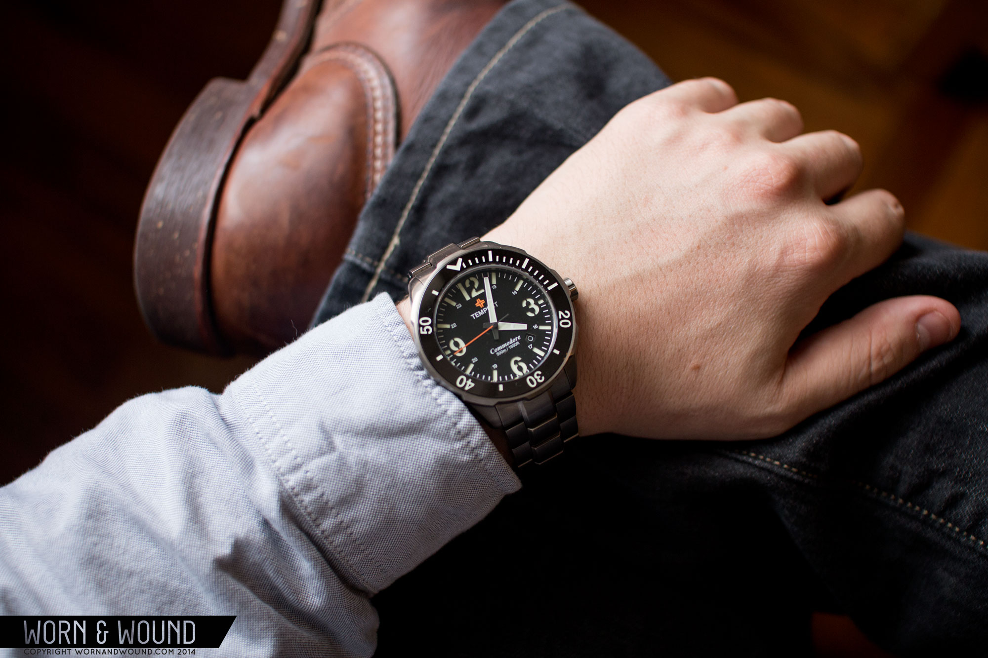
On the wrist, the watch is large, but wears well. There’s no doubting it’s big, larger than I typically would go for, but the proportions work and the lightweight makes it more comfortable. The lug-to-lug doesn’t over stretch, and the watch contours well to the wrist, so it fits on top of the wrist properly. If you’re wrist is 7+” I think you’ll be alright.
More importantly, it looks great. It has strong, masculine lines, airing on the side of aggressive. The sharp angles, armor-like bracelet and dark grey titanium meld perfectly for a rugged, modern sport watch. My personal leanings are more towards the vintage, but I found this a pleasure to wear. And, despite its size, it doesn’t shout for attention, or seem like a big watch for the sake of being big, which is always a plus.
Depending on which dial design and color selected, I think the watch could work differently with clothes. The geometric dials are more subdued, perhaps being better for those who plan on wearing this all the time, to the office, etc… The numeral dial is punchier, more in your face, coming across more sporty. That one, I’d consider to be the more casual of the two. Either way, jeans, boots, some heavy cloth and you’re good to go.
A Comparison for Comparison’s Sake
Looking at the raw specs, the Commodore has some similarities to a popular watch that costs many times more; the Tudor Pelagos. Now, the Pelagos is made by Rolex and is, to be honest, one of the most gorgeous and well-made modern watches to drop in sometime (there is one in the w&w family, and it’s hard to give back to its rightful owner). While the Tempest is in no way an homage, and while excellently made, can’t really compete with Rolex’s abilities (few can, just a fact), its similarities make it an affordable equivalent of sorts. The fact that they are visually quite different makes this more compelling, as they both offer their own style.
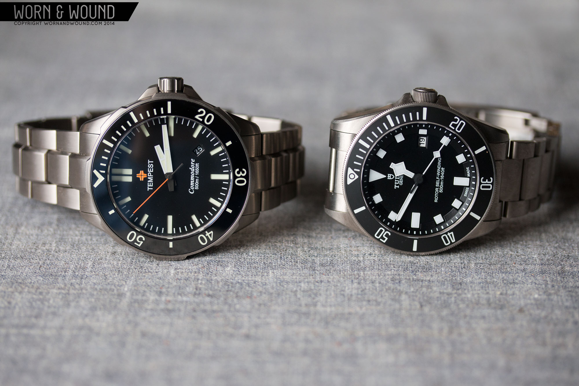
Looking at what they do have in common, both are solid titanium with titanium bracelets, both have ceramic bezels, both have 500m cases and both are quite modern. The Commodore is $598 – $700 and the Tudor, new, is about $4,000. A big difference. That said, the Tudor’s got its fancy clasp, perhaps the best bezel mechanism ever, lume like laser-beams and edges so sharp you can shave with them. Inside, the Tempest has the respectable, but inexpensive Miyota 9015, while the Tudor has the slowly-becoming-extinct ETA 2824-2… one that has been fancied by Tudor/Rolex.
So, I’m not saying, if you can’t afford the Tudor, the Tempest is nearly the same for a lot less. But, if you are really into the Pelagos and can’t afford it, I think you’ll find that Commodore provides some of what makes it a great modern watch at a fraction of the cost. And, if you like the Pelagos because it’s titanium, 500m, etc, but don’t like the looks or think a watch like that should not cost $4k (arguments can be made), the Commodore will bring you those things at a great value. Just food for thought.
Conclusion
I think the Tempest Commodore is going to catch on in a big way. It’s got so much going for it and a great price to boot. The case will take your breath away and at least one of the many dials options will probably be appealing to you. If the large size doesn’t phase you, and you’re a dive watch guy, a fan of titanium or looking for something modern and sporty to add to your collection, the Commodore has got you covered.
If it doesn’t, I hope you can agree that the details and value of this watch indicate that Tempest is a brand to keep an eye on. This watch shows more promise than many I’ve seen from seasoned favorites in the last few years. Hopefully the next one will come down a bit in size, perhaps to 40-42, for those who max out in that range. I’m already looking forward to it.

Love it.
Great watch for the 7 guys on Earth that can pull off a 45mm.
Well… I’d prefer a smaller version too, but I do think it fit me. If I liked larger watches more, I wouldn’t take issue. I’ve seen plenty of thin wrists rocking monster Tsovets, SevenFridays, Panerais, etc… All the guys wearing them were happy though.
-Zach
Keep in mind that the lug to lug is only 49mm. That’s actually not terribly massive and I personally find that the lug to lug is often as, if not more, important than the diameter since it’s overhang that ends up making it look larger. It’s basically the same length as the Damasko DA363 I’m wearing right now which has a 42mm dial and I have a 7.5″ wrist. I had the chance to spend some time with the Commodore as well and it definitely does not wear like a wrist clock.
Zach, can you start adding the lug to lug length to your review specs. Even more than case diameter, the lug to lug can really determine if a larger watch will wear nicely on smaller wrists.
That bracelet is awesome. Just flat out fantastic. It’s like a spine for the watch. Great design.
I like the dial without numerals much better. The Arabic dial seems…less refined or immature to me, can’t quite put my finger on it.
Hi Josh,
It’s always there in every review. It’s the second dimension listed… so 45 x 49, 49 is the lug-to-lug.
Thanks,
Zach
Wow, I have no idea how I never realized that. Well, thanks Zach!
Lug to lug can be tricky for smaller wrists if the lugs jut out straight (like the 45.5mm Omega Planet Ocean). The Tempest looks like it has a nice downward slope to the lugs and it just might work okay on smaller wrists.
As for the Arabic numeral dial, it gives this watch a nice Breitling Avenger Seawolf (1st Generation) vibe.
Just my take.
nice but too big unless I’m under water a lot(never)
Great review of a great watch – I have 2 on pre-order – look forward to getting these beauties in! 45mm is by no means an oversized watch – more than 7 guys on Earth will be able to pull this one off (well, maybe not Bud with his girly wrists).
I’d like it a lot, but that bezel is just too thick. Slim it down and you’ve got a winner. Also, coin edge! I’m tired of these weird edges on bezels; either go with Rolex’s Sub-style, or go with coin edge, something that’s not going to slip with neoprene gloves on.
That said, I may get one to have as a practical dive watch (though I wouldn’t wear it otherwise, as I’ve got an Omega for that).
Could someone please elaborate what’s new about this design? I’m new to the WIS community, and pretty much all dive watches look the same to me.
Ha ha! Thanks for writing Timmy. I have to say, and this might make me a few enemies, but most dive watches are indeed very similar to the point of being the same. It’s only after nearly 4 years of looking at watches daily that I see small details as making a big difference. In the case (not a pun) of the Commodore, it’s the shape of the case (the tapering, the crown guard), the big teeth of the bezel, the sculpted bracelet and the sandwich dial. As well as overall look and feel. That said, none of those details are so new as to be truly revolutionary, but I can tell the watch was designed from the ground up. At the same time, it’s playing off of classic designs, thus the general sameness…
I hope that clarifies, and welcome to the WIS community! Keep reading and collecting and you’ll get a sense of how important all the little details are.
-Zach
Black dial with military-stencilled numerals is very nice. Now, if they could just release it in 40mm.
I also prefer the dial without the numbers, just a personal preference. Nice looking piece, good color options, little big for me also but all in all thumbs up!
Nice, but way too big. 42mm is the biggest I go.
45mm is just stupid big. The Tudor is already a big watch and it makes
it look downright puny in that picture. Really Tempest? Unless you’re
6-5 and built like a linebacker or maybe a rapper this will just look
ridiculous on you.
Everyone has different tastes Aaron – 45mm is by no means an oversize watch and will look fantastic on most wrists. You stick to your 40mm unisex watches and don’t poo-poo on those of us that can rock an awesome watch like the Commodore!
I have ordered one (and own wiking as well, because tempest watches are top notch!), and I am tall and big enough, but agree with Aaron.
This 45+ boom last years is wrong way.
42mm should be better. Just my 2c
Love the unique design and features of the Commodore! Looking forward to getting the blue Arabic and white stick versions when the pre-orders ship. 45mm really is a “Goldilocks” size for a dive watch (not too big, not too small), and being titanium will be super comfortable on the wrist. Thanks for the review and pics W&W!
Great review, it looks like a great watch. As someone who can comfortably wear a larger piece, I’m tempted.
Out of curiosity, what are the Rolex capabilities that the Tempest can’t compete with?
This watch IMO is a perfect size,I have the Viking and it fits great ! Great review and photos .
Really, those 45mm are your biggest problem with this watch? I think I’m definitely starting my own “watch company” and start selling some chinese watches for 5times more money than a sane person would pay for them…
Cool watch, one of the best micros in a long time. It makes the Pelagos look like the rip-off it is.
Is it just me or the date window is askew? It’s not positioned exactly at 4:30, you can tell it’s nearer to one lume stripe than to the other!
Also, too big 🙁
Also, titanium too soft 🙁
Great review of a great watch. Keep up the good work on these affordable ones!