


 Featured Videos


So far, our Chronography series has been pretty technical. We’ve talked history of chronographs, broke down the common designs, and looked in-depth at the stories behind two classic movements, the Lemania 5100 and the Valjoux 7750. Today, we’re departing from that to look at an iconic chronograph design used by many brands past and present. A design that I think no collection should be without.
In the world of chronographs, few turn heads quite like those with a Panda dial. High contrast and with lots of presence, there is just something about these dials that is simply hypnotic. One of the funnier/cuter nicknames in watches, a Panda dial is defined by a white dial with black sub-registers. Ideally they will be arranged in the 3-6-9 or just 3-9 positions creating the effect of two Panda eyes staring out at you, and perhaps a mouth or nose. The inverse is also often referred to as a Panda as well, but we’ll save those for a later article.
Beyond aesthetics, part of the allure of the Panda is that today it’s an uncommon design feature, and some of the watches that have featured said dials are now worth insane amounts of money. So, it’s not just a cool, whimsical dial design that has been held over from the 60’s and 70’s, it’s a genuinely iconic concept. As with any guide, just a cross-section is listed here, and I’m sure there are pieces missing. For one, it probably could have just featured Heuers, but for the sake of diversity, I tried to vary things a bit. It’s also a guide in a few parts, as I can’t help but be wordy when talking about these beauties… so you’ll have to wait for part II.
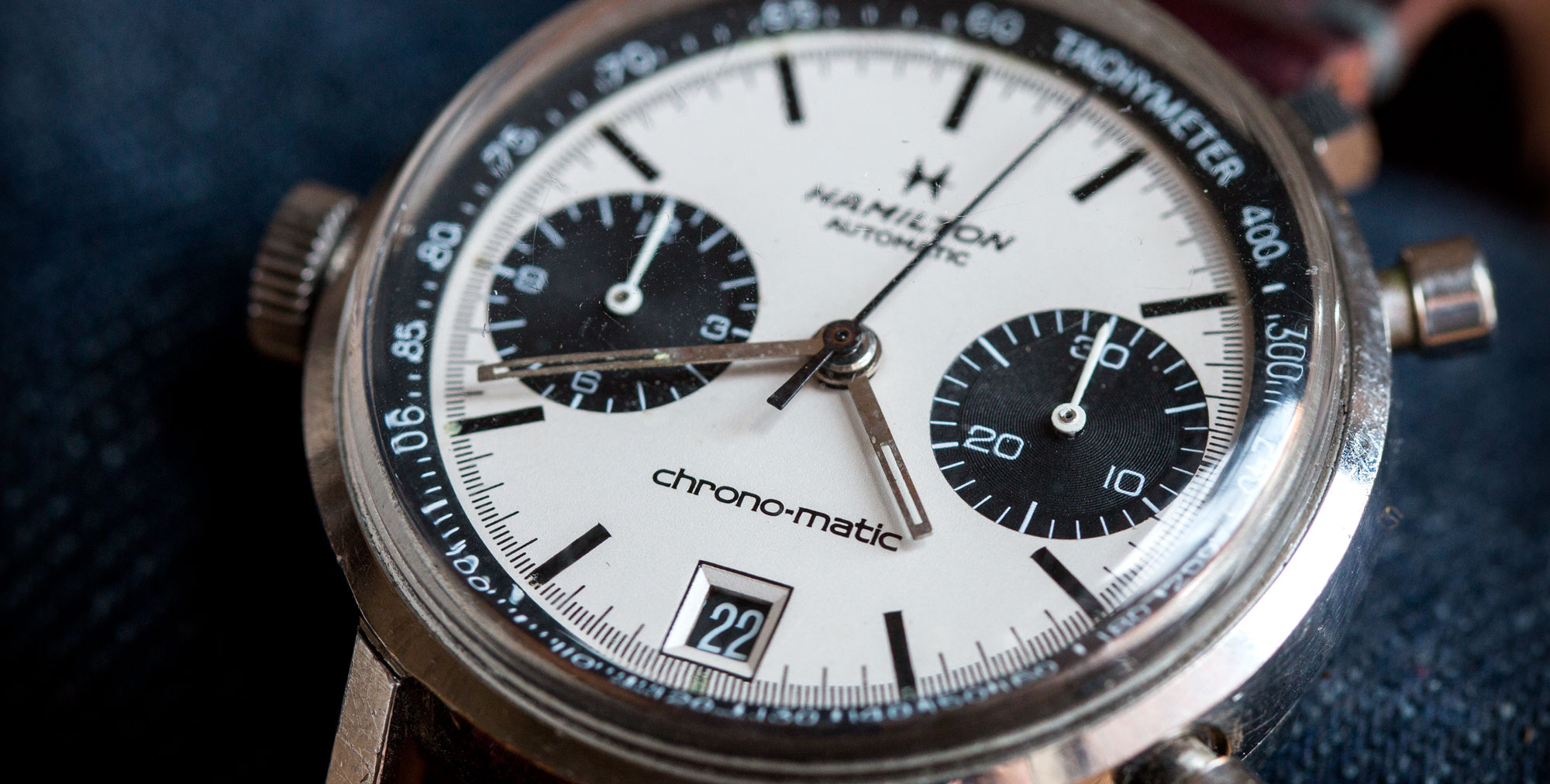
1969 Hamilton Chrono-Matic
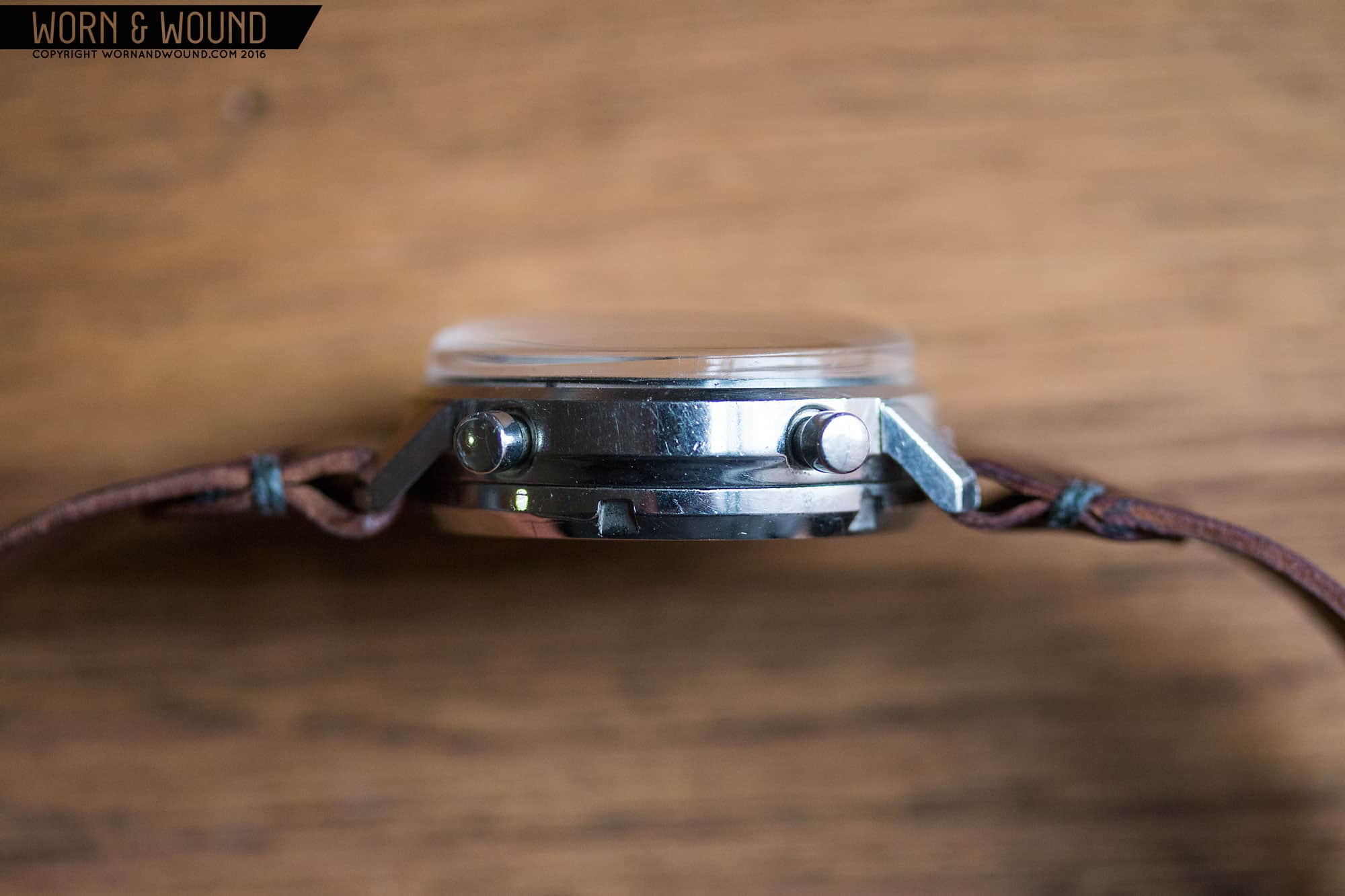
To kick this off, I’ll start with a personal favorite (and the watch I’m wearing while writing this piece), The 1969 Hamilton Chrono-Matic powered by the famous Caliber 11. If ever there was a perfect Panda dial chronograph, this is it. Rare, gorgeous and under-valued, the Chrono-Matic is powered by one of the three “first” automatic chronographs developed. Often associated with Heuer and Breitling, the Cal. 11 was co-developed with movement manufacturer Buren, who Hamilton had a stake in. Thus, Hamilton made a small handful of watches with this classic chrono caliber for only a couple of years.
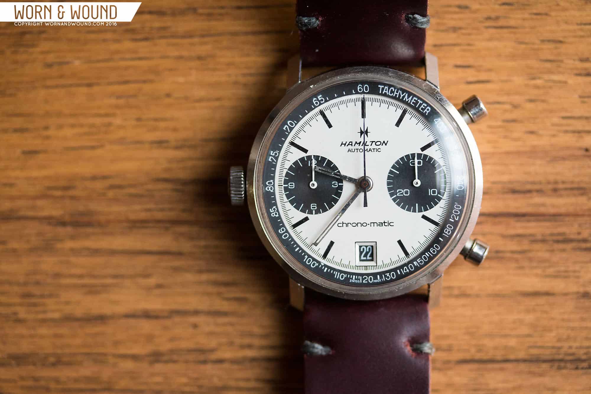
And it’s too bad this watch was made for such a brief period, as it’s a jaw-dropper. 36 x 40 x 15mm, it’s a funny, stout watch that wears exceedingly well. The case is incredibly simple with a cylindrical mid-case and short straight lugs shooting out and down and a very steep angle. The huge box acrylic crystal adds a few millimeters to the height, but balances that massive case back. You get the sense that to accommodate the tall Caliber 11, whose design features a chronograph module on top of a Buren micro-rotor movement, they took an existing case and added a case back that would cup the movement. Inelegant perhaps, but effective and gives this little watch an odd but charming personality. Also thanks to the movement, you get the incredibly cool left-side crown, right-side pusher arrangement.
Whatever proportional oddities might exist in the case the dial makes up for with a perfection that should be studied by historians. The placement and size of the sub-dials: perfect. The length and width of the black rectangular hour markers: perfect. The width, angle and typeface of the Tachymeter chapter ring: perfect…. And dare I say it, the date window and inverse date disk: perfect. Seriously, just look at that dial… it’s incredibly balanced. Just look at how the sub-dials just touch the 1/5th second index, but don’t overlap, allowing the perfect amount of room for the markers at 2, 4, 8 and 10. The date window too works out in a similar fashion, and in a stroke of genius, features a crisply printed hair-thick outline in black, giving it just enough more presence. No color, just black and white, which in its 47 years of existence has taken on just a touch of beige. It’s simple, it’s clean, it’s got character but nothing extraneous or unnecessary. It’s what a bi-register chronograph was meant to be.
The Chrono-Matic is often referred to as a “Poor Man’s Carrera”, but I think that really undersells the watch, and keeps it in the shadow of Heuer. The Chrono-matic has a personality all its own and while not as famous or valuable as a Carrera, is just as scarce as many models making it uniquely desirable. If ever there was a watch that defines “they don’t make ’em like they used to” this is it for me.
Citizen “Bullhead” Challenge Timer ref. 67-9356
A bit of a sleeper among vintage chronographs, the Citizen Challenge Timers deserve their day in the sun. I would have been remiss to not include a bullhead in this guide, as well as a more affordable vintage piece, and the Citizen fits the bill and then some. The ref. 67-9356 is unique even among the Citizen Bullheads as it has a distinct octagonal case design with strange but gorgeous facets, giving it aggressive and sporty lines. It also, according to sweep-hand.org’s guide to buying these watches, is the only stainless steel model. The general shape alone will make this watch stand out in a collection, but the added bullhead crown and pusher arrangement really takes it into cool and unique territory.
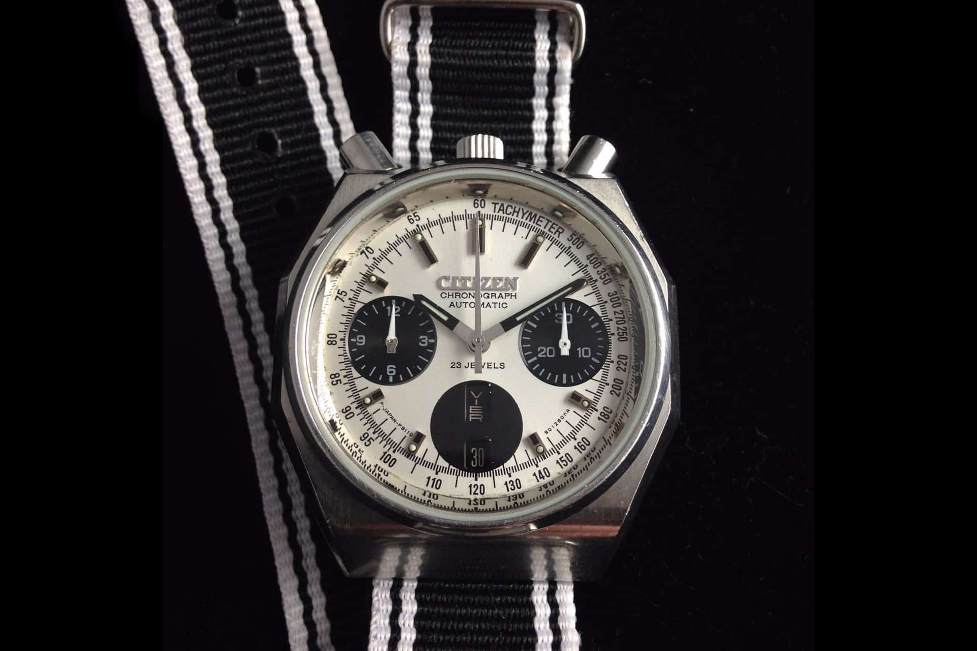
Beyond the striking case design (which is more than enough of a reason to be interested in my book), the watch features an excellent Panda dial. The design featured 3-large black sub-dials, though only two sub-registers at 3 and 9 for the minute and hour counters respectively. The third sub-dial was really just an additional dot that surrounded the day/date windows (not unlike the Monnin Le Jour we discussed). A bit odd, but does give the watch a balanced look and subdues the day/date window overall. Around the registers you have a lot of black on white lines for the various indexes including a Tachymeter that is level with the rest of the dial. Perhaps most striking are the applied steel markers, each of which feature black inlays and small lume dots. It’s a busy dial, but one where the information is still well presented.
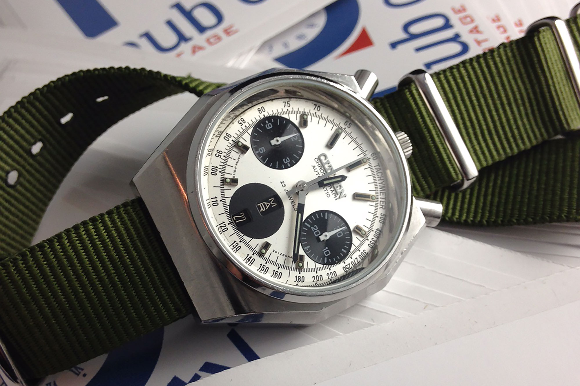
The final touch that puts this watch well beyond the edge of cool is the Citizen 8110A caliber inside, which might just be the most under-discussed and under valued chronograph movement. First released in 1972, this in-house 23-jewel automatic chronograph features a column-wheel mechanism, a vertical clutch, day/date, hand-winding, 40hr power reserve and a frequency 28,800 bph. Great specs, but it has one more huge trick up its sleeve, it’s a flyback. So, instead of start, stop, reset, and start again, you can just start and reset and it will keep going. This is a very rare complication today, let alone in the 70’s. In fact, those combined details would be challenging to find in but the most high-end of manufacture chronographs today. To make things even more interesting, the movement is also 27mm wide and 6.9mm tall, making it smaller and thinner than a modern Valjoux 7750. Just, so, cool.
images supplied by Hub City Vintage
Heuer Carrera 2447SN
Any chronograph fan should get a chill up their spine when they hear the words “vintage Carrera”. The epitome of 60’s chronograph design, the 2447 Valjoux 72 powered pieces are so elegant they could be worn with a tuxedo, yet so sporty they were welcome on the track. In my eyes, they are a true design icon, an object that should be exalted in museums and text books. This is true for every 2447, whether it be an early execution egg-shell dial like Mark’s, or the slick, black with white border 2447N. But, naturally, it’s the 2447SN that we’re going to include in our Panda guide.
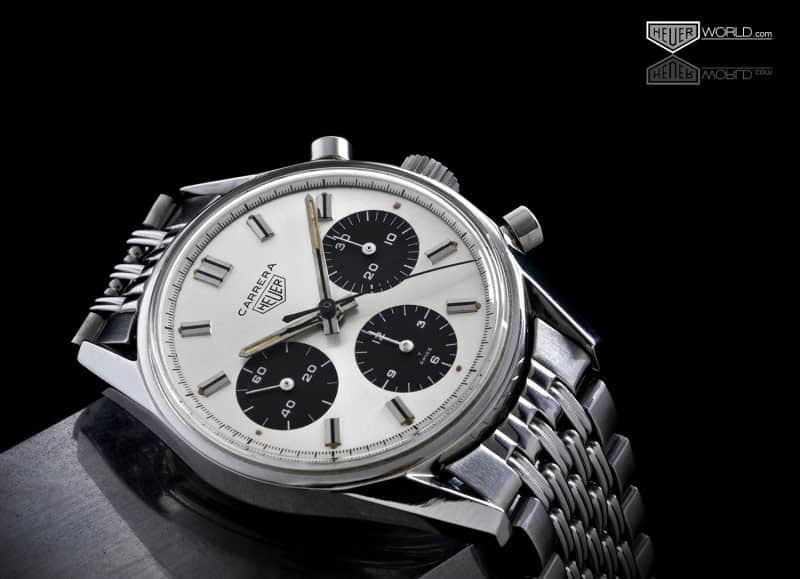
To be fair, this one might cheat a little bit. You see, the dial isn’t white, but more of a brushed silver, nevertheless with three black sub-registers, the Panda aesthetic is in full effect. What’s most striking about these watches, something that slowly but surely was lost in later generations, was the almost Bauhaus minimal dial. It lacks anything superfluous or redundant. The outer index is void of numerals all together, trusting in your intelligence to read the correct time. The main surface then features applied markers with black inlays and lume dots, skipping 3, 6 and 9 to not crowd the sub-registers (actually, very early executions have longer markers at all 12 locations). It is only on the black sub-dials that you have more traditional markings in Singer style (you’ll note the same font that is used on Speedmasters and Daytona’s of the era…and the Hamilton Chrono-Matic above) giving the Carrera a sportiness befitting its name.

The case on the Carrera is a work of art as well, one that truly needs to be seen in person to be appreciated. Fully polished, the long, faceted lugs angle in towards the strap, meeting it at just the right point. The interior surface is then angled down, giving the illusion that the lugs cut away entirely. It’s a clever design that is as gorgeous today as it was in the late 60’s (well, I wasn’t alive then, but I can assume). On the wrist, the 36mm case wears perfectly as well. It’s one of those watches that makes modern watches feel incredibly chunky and inelegant. Put this one on the grail list.
Autodromo Prototipo
It would simply be cruel to put together a guide, or guides as it would be, on Panda chronographs without including at least one watch you can easily purchase today. As luck would have it, not only is the Autodromo Prototipo a contemporary watch, it fits the bill very well and has a few options to offer. If you’re unfamiliar with the Prototipo, I recommend checking our our review, as well as follow up “look at” and “Brian Redman LE gallery“.
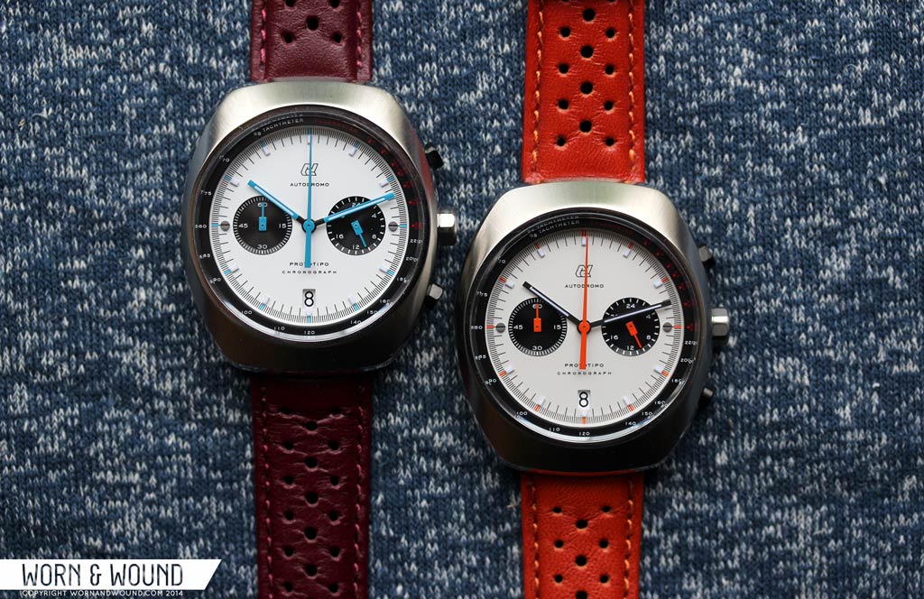
Part of what makes the Prototipo such a fun and successful watch is it that it captures the spirit of vintage racing chronographs with its barrel case and two or three register dials, but happens to be new and affordable. Of the various models, several have been of the Panda dial variety. On the original design, the dials featured registers at 3 and 9 for 24-hr time and active seconds, respectively, thanks to the Seiko VK mecha-quartz within. As with the vintage watches mentioned in this article, the Prototipo’s dial is actually very clean, and almost minimal, with a simple index of black lines with an accent color at intervals of 5. The black sub-dials then have numerals for their respective units, but the typeface is kept very small, giving them a more modern feel. The tachymeter similarly has a very small typeface, and is floating above the dial, giving some visual separation.

The lugless barrel case is a nice throw back to 70’s designs, and is emphasized with great finishing. The top surface has radial brushing, giving it a gorgeous sunburst effect while the beveled edges that run the circumference of the case is mirror polished. This breaks up the case side and adds just the right amount glint and glimmer. On the wrist, the Prototipo wears exceptionally well. While larger than the other watches mentioned here at 42 x 48mm, it is in-line with other barrel’s from the 70’s, and wears smaller than it sounds. At $625, the Prototipo is a great option for those seeking the iconic Panda look, but aren’t looking to spend what the vintage pieces now demand.
Rolex Paul Newman Daytona
I was going to make the Daytona the final watch of Part II of this guide, but I feared the wrath of the Panda-fiend if I didn’t include it here. Yeah, you can’t talk about Pandas without talking about the Rolex Paul Newman Daytona, the most collectible and highest value of the lot. Now, I’m not a Rolex collector, and I don’t foresee seeking out a Paul Newman in my future (unless I win one of those billion dollar Power Balls), so my knowledge and experience with them is far from deep, but on a purely aesthetic level the Paul Newman not only checks the Panda boxes, it has a certain eccentric flare that others lack. For in-depth info on them, you can’t beat Ben Clymer’s Reference Points on the matter.
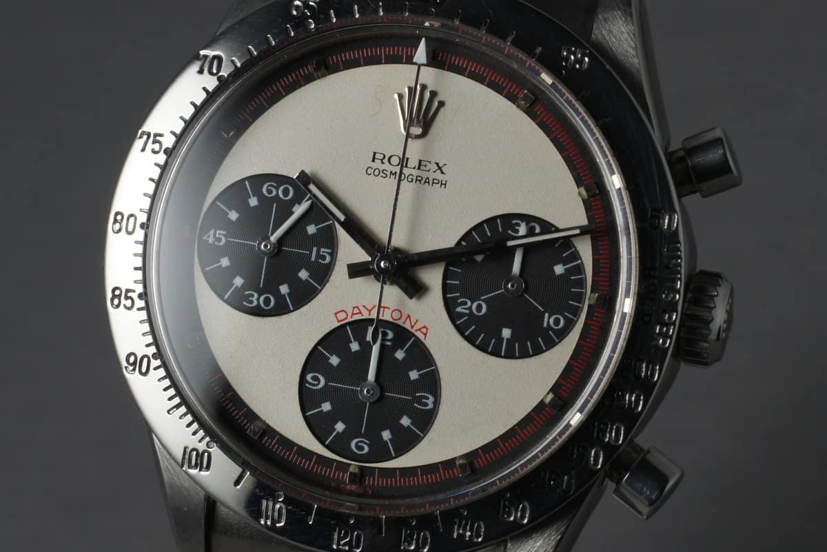
Looking at the watches, the way the sub-dials float within the white space, the way the index is pushed out to the very edge, the way the external tachymeter bezels extend the dial out into space… it’s a very striking watch. Many references also include red elements, namely in the minute/chrono seconds index, and branding for a subtle but effective hint of color. The sub-dial design is then very peculiar. The typeface is ornate, with wide numerals with an almost calligraphic quality and open 6’s and 9’s, contrasting the more typical, sport typeface of the bezel. The markers too are simply strange, with little squares pushed in to the center of the registers by thin white lines. The rest of the space is used up with crosshairs. It’s such a distinct design that a brand simply can’t use those elements without it immediately bringing the Paul Newman design to mind.
Now, at the risk of being beheaded, I must say I’ve always found the design a bit off putting. In photos it just looks odd and a bit too ornate for me. A mix of elements that don’t necessarily fit together, clashing classic with modern, and some large empty areas conflicting with others of intense printing. But, I have had the experience of seeing and handling one in person with a black dial and reference I am uncertain of, and, yeah, it was pretty gorgeous. Smaller than expected, the proportions worked and the dial elements I found questionable clicked as well. I particularly liked the red on white index surrounding the black central surface… It was unlike anything else I’ve seen, a watch that can’t be repeated.

In the Paul Newman family there are a few references that fit the bill, but it’s the 6263 that really gets collectors going. Oyster case, screw down pushers, black acrylic bezel and a 2-color dial, the white version coolly collects over six figures at auction. It’s also the most Panda-like of the group, ditching the red index for a cleaner, monochromatic palette. The way the acrylic bezel frames the dial feels unbroken by the red line of previous references for an overall bolder look. With that big crown emblazoned at 12, the rarity and insane value of the 6263, it’s fair to call it the King of the Pandas.
Rolex Paul Newman Photo Credit: HQ Milton
—
Part two will exam 5 more classic Pandas, so stay tuned.
