Not often enough do we see collaborations between interesting product designers and watch brands. It’s a logical pairing that for some reason only happens on occasion, but when it does, interesting results always emerge. Think of the subtle and tasteful Rado r5.5 by Jasper Morrison, or the smooth forms of the Ikepods by Newsom. Well, NOON Copenhagen just released a new series of watches designed by Japanese design firm Nendo.
Nendo is a very interesting company led by designer Oki Sato. Though the breadth of their work is quite difficult to summarize, key elements that run through the years are a minimal aesthetic that is offset by a spirit of play. Take for example the Roopuppet tote, which is a simple bag with clean lines. However, the pocket on the side inverts to become a hand puppet shaped as a kangaroo, a bear, a human being or a dinosaur. While that example is quite literal, other pieces are more conceptual, such as the “object dependencies” series, which contains amongst other objects, a cantilevering table that has no connection, and precariously balances via a stack of weights.

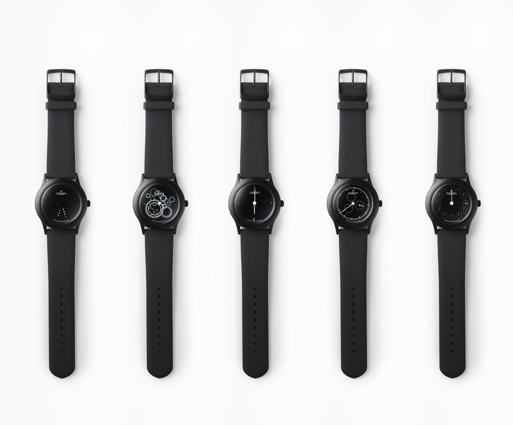
So, for NOON, Nendo created a series called “Dark Noon” that utilizes their disk system for interesting and bizarre results. The watches range from simple to read, with a subtle design gesture to make a more interesting timepiece, to straight up un-readable, instead going for wrist-art in motion. The watches are just variations on dials, with a consistent 40mm black IP case design. The series consists of 5 watches: Times, Chrono, Line, Numbers and Gear.

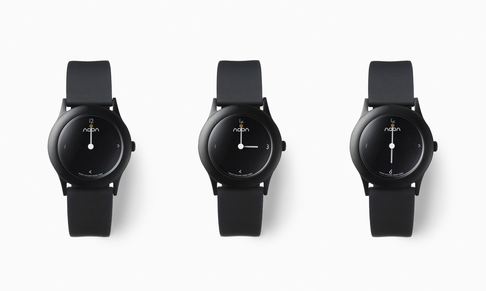
Times has a fairly conventional layout, with an index of small watch faces for the hour/5-minute markings. There is one large hand, which I presume is the minutes, and small hand that “floats” on transparent dial. When the time is exactly on the hour, the small hand completes the small watch face it is over, to indicate the same time again.
Chrono is not a chrono at all, but rather a sort of joke about chronographs. The chronograph sub-dials rotate around the face with the hour hand, creating an ever-changing dial layout. Ultimately, it’s a very easy to read design that despite the name (I’d personally ignore the chrono reference) has a very simple and elegant design. Perhaps this is the closest thing to an affordable Ressence?
Line is the subtlest of the group, consisting of an all black dial with no indexes, and two hands. The hands are dashed white lines that form one solid line at the top of the hour. If one is looking for an all black watch with a slight twist, this might be a good option. Fundamentally, however, this watch is just a one-liner…
Numbers utilizes the transparent disks in an interesting way, to essentially create a self-completing dial. The index of the watch only has numerals at 3, 6, 9 and 12, except they are incomplete. That is to say, the number themselves are missing parts of their form. As the hour, which is indicated by a traditional hand, aligns with the numeral, the marker for that hour is made complete. Another very subtle play on a typical dial.
Lastly, is Gear, the most visually complex of the group, and the least possible to use as a watch. The dial and hands of Gear, as the name might indicate, is made up of a series of cogs of varying shape, in no particular order. The hands are white and gold cogs that float above the dial. The effect is chaotic, but not unattractive. Though perhaps a bit ironic to have a quartz watch with a face that refers to mechanics that make an unreadable watch, as a conversation piece it certainly brings a lot to the table.




 Featured Videos


