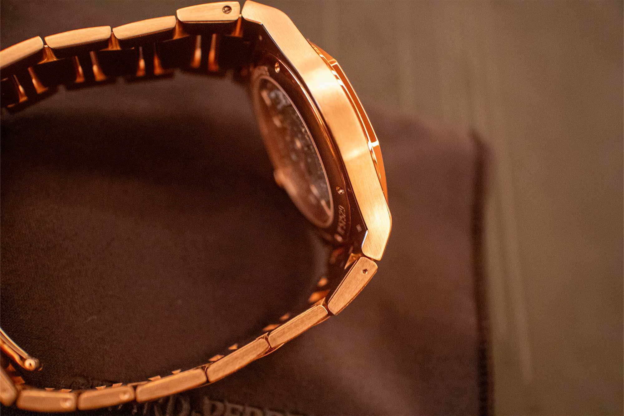
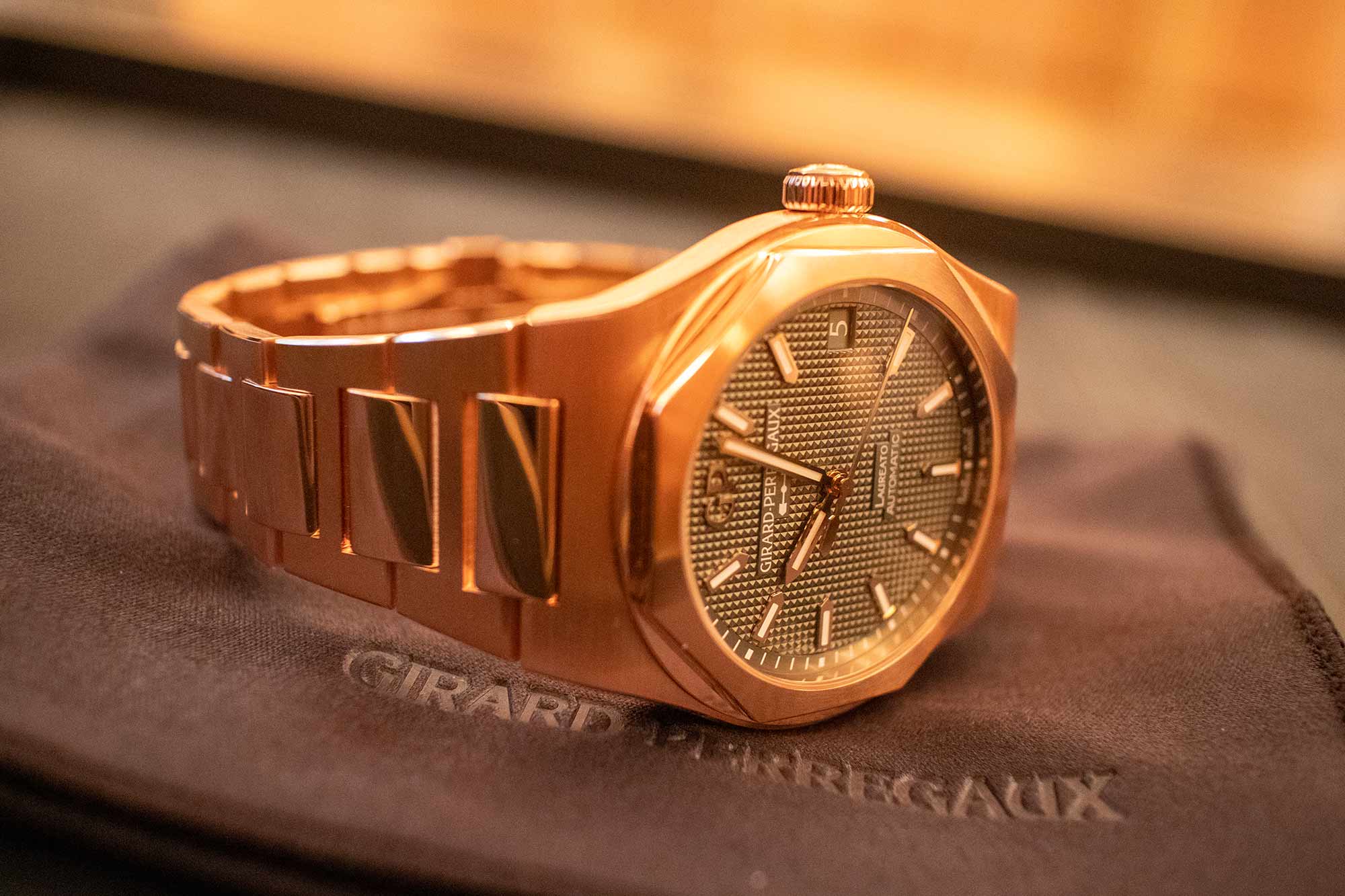
There’s something undeniably satisfying about a big gold sports watch. I think their appeal is rooted in the idea that they don’t really make too much sense. A sports watch, in theory, is something that should be built to take some abuse, if not in sport, than in the average day to day life of a normal human being. They should, effectively, disappear. Making a sports watch out of a solid block of gold turns this idea on its head. Gold, of course, is anything but under the radar. It’s noticeable from across a room, in fact. Further if it’s immaculately finished in a way that brings its shine and luster to the forefront. And gold, for all of its great qualities, is not exactly the most robust material. Some alloys almost seem to have the consistency of peanut butter. You can tell when they’ve been touched in a way that steel just doesn’t show. And yet, the pull of the gold sports watch is real. And Girard Perregaux, with the Laureato, makes an awfully good one.
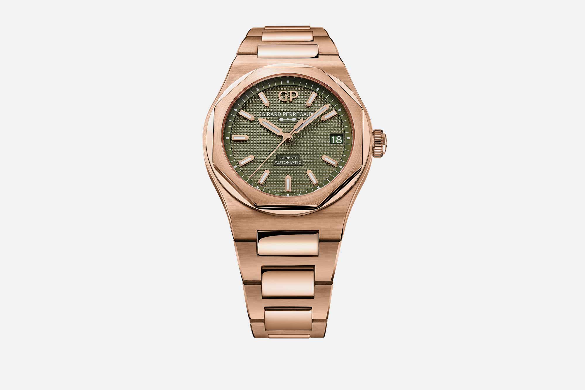
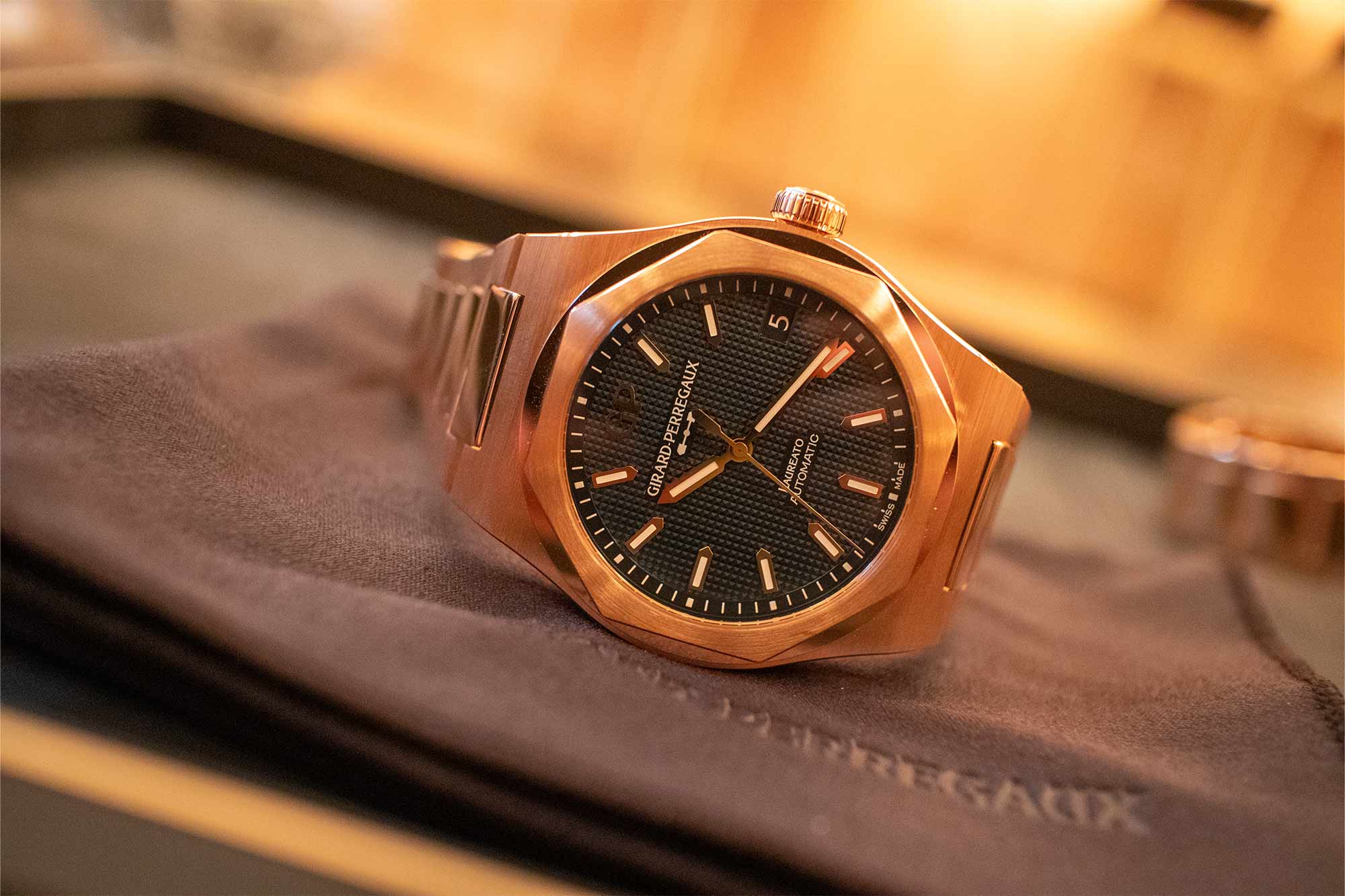
At the same press event that saw GP announce their fantastic new titanium Laureato chronograph, they also unveiled, under embargo, two new pink gold flavors of the 42mm Laureato in exceedingly well matched dial colors. Ultramarine Blue and Sage Green dial variants enter the collection today, and each works incredibly well with the subtle pink hue of the gold. I was particularly impressed by the green dial when I saw these watches in person a few months ago. Green and yellow gold is a classic combination, of course, but it’s less common with a pink gold alloy. This particular alloy, though, has a more coppery tone that works perfectly with the light green, which presents as almost gray in some lighting conditions. For a big, heavy, gold watch, it’s very understated and subtle.
The Ultramarine Blue is perhaps a little flashier and more traditional. It’s a dark blue and will please fans of the color for sure, but isn’t jaw dropping in the way the Sage Green is. Both dials of course are accented with the traditional Clous de Paris motif that the Laureato is known for, adding plenty of depth and visual interest. The date window at 3:00 is nicely integrated with the rest of the dial, and is color matched on each reference.




 Featured Videos


