About a year ago, I attended a press conference in San Francisco where Frederique Constant and Alpina announced their newly developed “Swiss Horological Smart Watch Platform“. Analogue watches with health tracking capabilities that actually looked like real watches. It was an interesting concept, and a more clever reaction to the incoming “smart watch” genre than slapping a logo on a digital watch.
To do this, they had teamed up with MotionX, a Silicon valley company with a lot of experience in the health tracker world. Beyond the functionality, they made sure the watch was made to last longer than typical pieces of tech. It was designed to be efficient, with a 2.5 year battery, and has a modular design where parts of the movement will be able to be upgraded for a small fee. I really liked that they made it, to some extent, have the permanence of a real watch. It’s truly a shame that most smart watches will end up in landfills within a few years of their purchase.
They also announced that this tech would be available to other brands for use, showing it in Alpinas (sister brand of Frederique Constant) and more interestingly in Mondaines. Though they only teased the watch, it was striking in appearance, perhaps making more sense as a platform for this new technology. Rather than create a new aesthetic concept for their Smart Watch, they took their Helvetica 1 Bold watch and adapted it. I reviewed the Helvetica watches last May, and found them to be genuinely attractive and interesting watches, so I was excited to see how the tech mixed in. Fast forward a year, and I’ve now had the pleasure of getting to try the Mondaine Helvetica 1 Smart Watch out for myself.
Case
The Mondaine Helvetica Smart Watch uses the case of the “bold” series for a sporty build. Measuring 44 x 50 x 13mm, it’s a big watch, but one that wears a bit smaller due to the short lug-to-lug and nice proportions. As I remarked in my previous Helvetica review, the case design is very attractive. It’s not a cookie cutter case by any means, with very interesting angles and facets throughout. For the typography nerd, you’ll find the “1” numeral, in Helvetica of course, has been used to create the lug shape. A surprisingly subtle detail considering how literal of a translation it is.
From above, the case is deceptively classic looking; it’s essentially a circle with tapering lugs coming out of it. A longer glance reveals the clever “1” shape that comes up and meets the bezel, as though it were holding it in place. A view from the side reveals much more complexity. The mid-case is not a cylinder, but rather has a conical shape, first flaring up and out, and then sharply cutting back in, creating a ridge at the case’s widest point. The bezel then mimics this shape, creating a slight under cut around the case edge. It’s the kind of design that depends on good machining to succeed, which it has and is genuinely very attractive because of it.
The biggest differences between the original Bold and the Smart watch are the crown and the case back. There actually is no crown, in the traditional sense, but rather a push button at 3. This is used to sync the watch to your phone, as well as put the watch into sleep mode. Aesthetically, it has little effect on the overall design, and still features the Mondaine cross on its outside flat surface. The case back is much larger and deeper on the smart watch than the original, adding a couple of millimeters in height to the watch. It’s bowl shaped though, so it sits in the wrist, making the watch wear a bit thinner than it sounds.
Dial
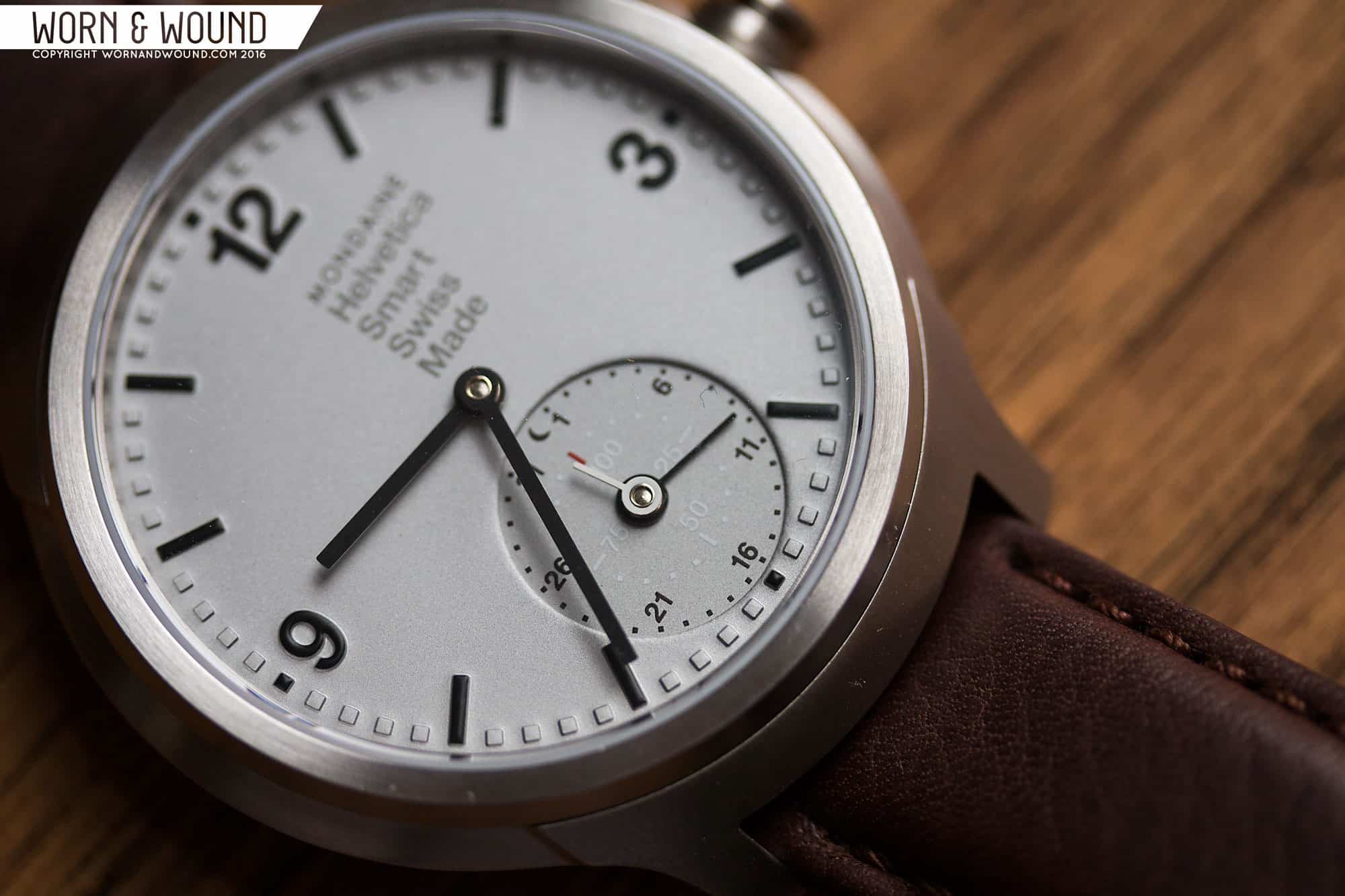
The dial of the Helvetica Smart watch is also adapted from the Bold dial. It’s a nice layout, with some cool “designer” twists that play off of the Helvetica typeface, and give the watch a very modern, graphic feel. The dial features the same primary index, which consists of hour numerals at 12, 3 and 9, skipping 6 for the date/progress sub-dial, long rectangles for the other hours and small squares for the individual minutes. The hours and long rectangles are in black, while the minutes are the same color as the dial surface, which in this instance is a matte silver. The markers are all 3-dimensional, but rather than being applied, they are actually pushed up out of the dial material. Oddly, the font seems to be thinner than the “Bold” on the Smart Watch, likely being the Regular font.
The big visual and functional difference between the quartz and smart watch versions is the massive sub-dial at 6. Before getting into it, I’m a sucker for sub-dials, especially over-sized ones, so I immediately found it very appealing. The sub-dial doubles as a pointer-date indicator and a progress meter. So, within are two hands and two indexes. The outer index is the date in black, featuring 31 squares with numbers every 5 dates, starting at 1…so 1, 6, 11, etc… At the very top of the index is a small moon, which indicates when the watch is in sleep mode.
The inner index is white and is a progress meter based on a 100% scale. It has squares for every 5% and numerals every 25%. Throughout the day, as you walk around, the hand will progress around in relationship to your set steps goal. The idea being that you can just glance at the watch rather than access your phone for your current progress.
It’s a busy sub-dial, but the use of color coded hands and indexes makes it easy to read. In general, I like the looks of it and think that the design looks cool with a sub-dial. That said, I think the elements could have been stylized a bit more. Sure, the typeface being used is Helvetica, but the overall design of the sub-dial feels a bit generic in the end.
Functionality
So, the big deal here is less the design and more what the watch does. It’s not just a watch, it’s a health tracker. I don’t personally think it should be called a “smart watch” as that suggests that it has cellphone alert functionality. Rather, it has a pedometer/accelerometer that tracks steps and sleep. While those are certainly smart functions, they are “quantified self” focused. Semantics aside, if you’ve ever used one of the many other health tracking devices out there, you’ll find the Mondaine very familiar.
It’s a passive tracker, most of the time. You simply wear it, and it does its thing. When you want to engage deeper, you take out your phone, open the MotionX app, and sync the watch by pressing on the crown. This sends a Bluetooth signal, the watch and phone pair, and the info is downloaded to your phone. The reason to do this is to save the data and look at long term goals and trends via the “coach” section of the app. It’s really quite simple.
As someone who has tried trackers before, I do like that it’s all integrated into an attractive watch. I’ve worn Jawbone Ups and got annoyed at having an extra item on my wrist. I’ve tried clip on trackers, only to find they fell off into the oblivion on NYC sidewalks. So, a watch integrated tracker is a logical way to wear it.
The watch also records sleep in one of two ways. When you go to sleep, you push and hold the crown until it beeps, which tells the watch that you’re hitting the hay. With your phone, you can tell the watch whether you will wear it when you sleep, or place it under your pillow. I opted for the latter, as the watch is a little chunky to wear while sleeping in my opinion (full disclosure, I don’t wear any watches while I sleep as I find it annoying). Under the pillow worked, though I was concerned I’d knock it off of my bed, as I usually sleep with an arm under my pillow. When it records sleep, it tells you when you were in light or deep sleep and your overall sleep period. This then feeds into your overall “coaching” goals.
Additionally, the watch can wake you based on your sleep cycle. So, when you set your alarm for 9am, rather than going off at the moment of 9, it goes off when you are in a light sleep cycle, somewhere between 8:30 and 9. I didn’t try this out with the watch, but I have used a similar phone app to do this for a few years… let me tell you, once you use a sleep cycle alarm, you will never go back to your standard buzzer. You wake up much more refreshed and without that startled feeling of being yanked out of deep sleep.
Beyond health tracking, the app is used to adjust the watch and keep the time. The crown on the watch is not used for adjusting time at all… it all comes from the phone. This guarantees that your watch is keeping very true time. With that said, the hands can get out of alignment and then be adjusted from the app. I’m not sure what would knock them out of alignment, but the sample, which has clearly been worn my several reviewers, was a bit off. The app actually lets you adjust each hand remotely, turning clockwise or counter clockwise as needed. It was quite a bit of fun to adjust it, I have to say.
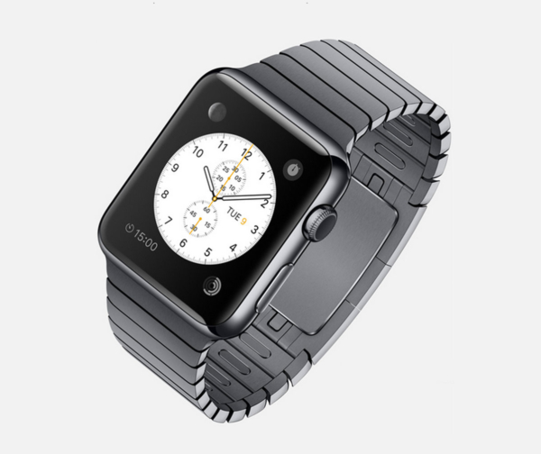
One of the advantages of the Horological Smart watch platform is increased battery life. These watches get 2+ years per battery. Current digital smart watches get far less and need constant recharging, which is simply a pain in the ass. I also appreciated that it wasn’t constantly linked to my phone. When I tried an Apple watch for a little while, my biggest issue wasn’t the watch’s battery, it was my phone’s. The bluetooth drained it at an appalling rate. That’s not an issue with the Mondaine at all.
Straps and Wearability
The Helvetica Smart watch comes mounted to a 20mm, straight cut brown leather strap. It’s a hearty strap that gives the watch a sportier, manlier feel. The leather is an earthy, matte brown with slight contrast stitching and substantial padding. It’s a nice strap, though I think something tapered and a bit more understated would have suited the watch better. It only appeals to the watch’s sporty side, and not its design side.
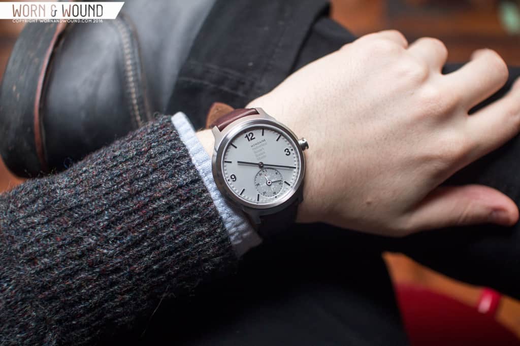
On the wrist, the watch wears well, though big. 44mm is wide no matter how you look at it, plus 13mm is tall. The 50mm lug-to-lug though is tolerable, so it doesn’t overstretch length wise. The height is slightly tempered by the bowl shaped case back, but it does looks and feel thicker than the Bold Quartz design. This is a watch that is meant to be worn daily, as one would need to to properly track their info, so it is definitely best suited for people who like larger watches or have bigger wrists. On my 7″ wrist, I did find it felt a bit bulky after a long day. While I don’t know what the movement requires for size, I do think they are limiting their market by making it so big. The 40mm Helvetica Regular watches are far more wearable across wrists of different sizes.
Conclusion
All in all, the Mondaine Helvetica 1 Smart Watch and app do what they say and look good doing them. It’s tech built on a good existing platform, MotionX, so it doesn’t have silly issues that a first time product might. But, I’m just not sure how useful it is. As far as health trackers go, it’s expensive at $950 MSRP. But the price increase isn’t Helvetica Bold plus health tracker, it’s much higher, over twice the price of the simple quartz version, and far more than the quartz version plus one of many other health trackers on the market. Furthermore, there are phone apps that do everything the watch does anyway, and are free (Pacer and Sleep Cycle, for example). Also, as someone who changes their watch regularly, but still wants to keep track of their steps, etc, it doesn’t offer any work-arounds.
But, if an analogue watch combined with a health tracker is what you seek, this is probably the most attractive option out there. It’s a very good looking watch and a unique one too. I think the smart features integrate well with the design, so unlike digital smart watches, you sort of ignore those aspects when they aren’t in use. Perhaps my biggest take away is that the Helvetica Bold looks really good with a big sub-dial, making me wish they’d go back to good old fashion “dumb watches” and bring out a Unitas powered version, as it would look great.




 Featured Videos


