Inside the Collection: Common Threads Through Uncommon Chronographs

I am not a chronograph guy. At least that’s what I keep telling myself. I’ve owned my share of chronographs over the years, but they always seem to be first on the chopping block when something new comes along that I need to clear out space for. They also, in general, don’t appeal to me aesthetically. I tend to like a less cluttered, more serene dial than what you’ll find on a typical chronograph, simply because of the nature of the complication itself. And I certainly don’t belong in the nerdiest segment of chronograph lovers, who have deeply held beliefs about the best chronograph movements ever made, and can rattle off the most minute differences between Speedmaster references at the drop of a hat. I admire the dedication and knowledge of these hardcore chronograph superfans, but I’ve never counted myself among them. 

Advertisement

And yet, day to day, the watch I’ve worn the most by far over the last year is a chronograph that flies in the face of everything I tend to think about my own watch preferences. And if you were to ask me, “Hey Zach, out of all of your watches, which one has your favorite dial?” I’d have to respond with another chronograph, that has one of the most intricate and beautifully made dials I’ve had the pleasure of owning. So what’s going on here? How did such a non-chrono guy wind up with this weird chrono subcollection? 

My IWC Pilot’s Watch Chronograph 41 Ceratanium has effectively become my daily wearer since picking it up last summer. It’s lightweight (Ceratanium is basically heat treated titanium that takes on ceramic-like scratch resistance and a unique gray tone after heat is applied), a perfect size for my wrist, and, most importantly, I love the way it looks. 

When I first read through the press release for this watch over a year ago, I kind of brushed it off. It registered at the time as a throwback to the fully blacked out watches that were popular several years ago, and that never quite hit for me. But when I had a chance to see it in person at Watches & Wonders 2022, it was pretty close to love at first sight (I wasn’t a fan of the OEM rubber strap, and still prefer to wear it on any number of after market options). What sold me were the contrasts. This is not even remotely close to the “murdered out” black on black on black watch that I was expecting. The hands and hour markers have a light gray, almost beige, tone that provides for plenty of contrast, even in lower light situations. In fact, as I type this, we’re heading toward evening, my workspace is dimly lit, and I have absolutely no trouble reading the time on my watch as it sits on my wrist. It’s just a great looking dial, and to me it feels like a particularly minimal execution of a chronograph that I find appealing as someone who’s not generally into a typical chrono layout. 

Hardcore chronograph fans might scoff at this, but the thought of timing anything with this watch almost never enters my mind. I like to actuate the chronograph from time to time, because like many in our hobby, I just find it fun to press buttons, and the tactile sensation here is quite pleasant, but I don’t think of this as a “tool watch” in the traditional sense, even though it is most certainly eminently capable. Like every other watch I’ve ever bought, I decided to take the plunge on this one for the simple reason that, to me, it looks great. The interesting material and surprising versatility of the watch in day to day wear are added bonuses that keep it on my wrist almost constantly. 

In my mind, the Kurono Chronograph II “Shiro” sits on the opposing end of the spectrum when compared with the IWC. This is a far dressier chronograph in a completely different style. Where the IWC leans toward modernity in its size and unusual case material, the Kurono is a vintage throwback in polished stainless steel, with multiple timing scales and a more conservative 38mm diameter. But aesthetically, it excites me just as much. It all comes down to the dial, but you’ve really got to see it under a loupe to fully get it. 

The Shiro’s dial uses ultra precise printing and multiple layers of a thick lacquer to create an impression of depth that is uncommon in watches at this price point. The printing itself almost seems to take on a three dimensional quality that can only be fully appreciated under magnification, at least by me. With a retail price of about $3,700, it feels kind of like stealing to own a dial this good. 


View this post on Instagram


A post shared by Zach Kazan (@zkazan)

Advertisement

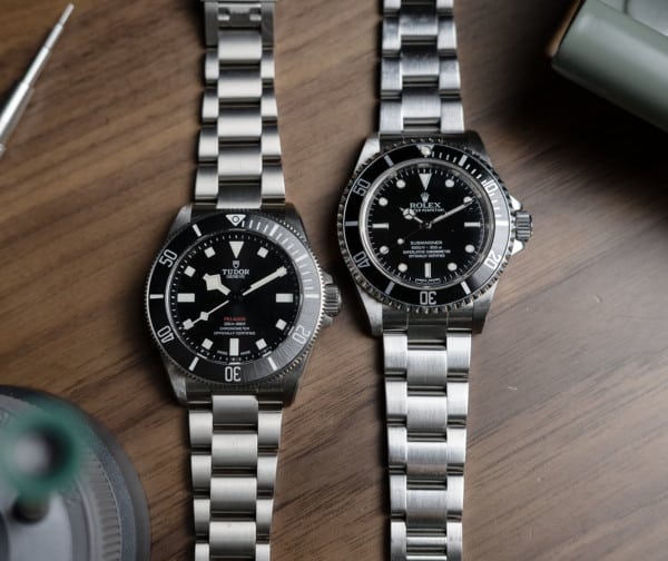
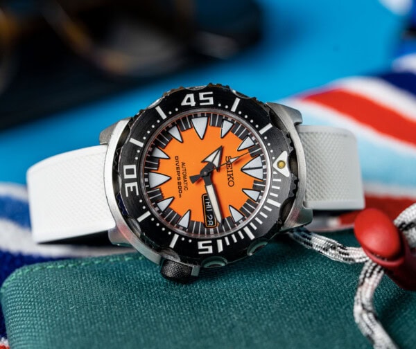
The joke I like to make about the Shiro is that it’s beautiful, but you can’t read the time. That’s mostly in jest. Is this the most legible watch in my collection? Not by a long shot. The individual minute markers, and even the studded five minute markers, are small enough that I really have to pay attention when setting the time precisely. And the hands are polished and quite lovely, but have a way of disappearing in certain lighting conditions, not to mention they’re close enough in length to cause more than one instance of confusion when reading the time at a glance. I’ve become accustomed to it at this point, and think of these things as interesting quirks that you brush aside to enjoy other aspects of the watch that make them seem almost irrelevant. 

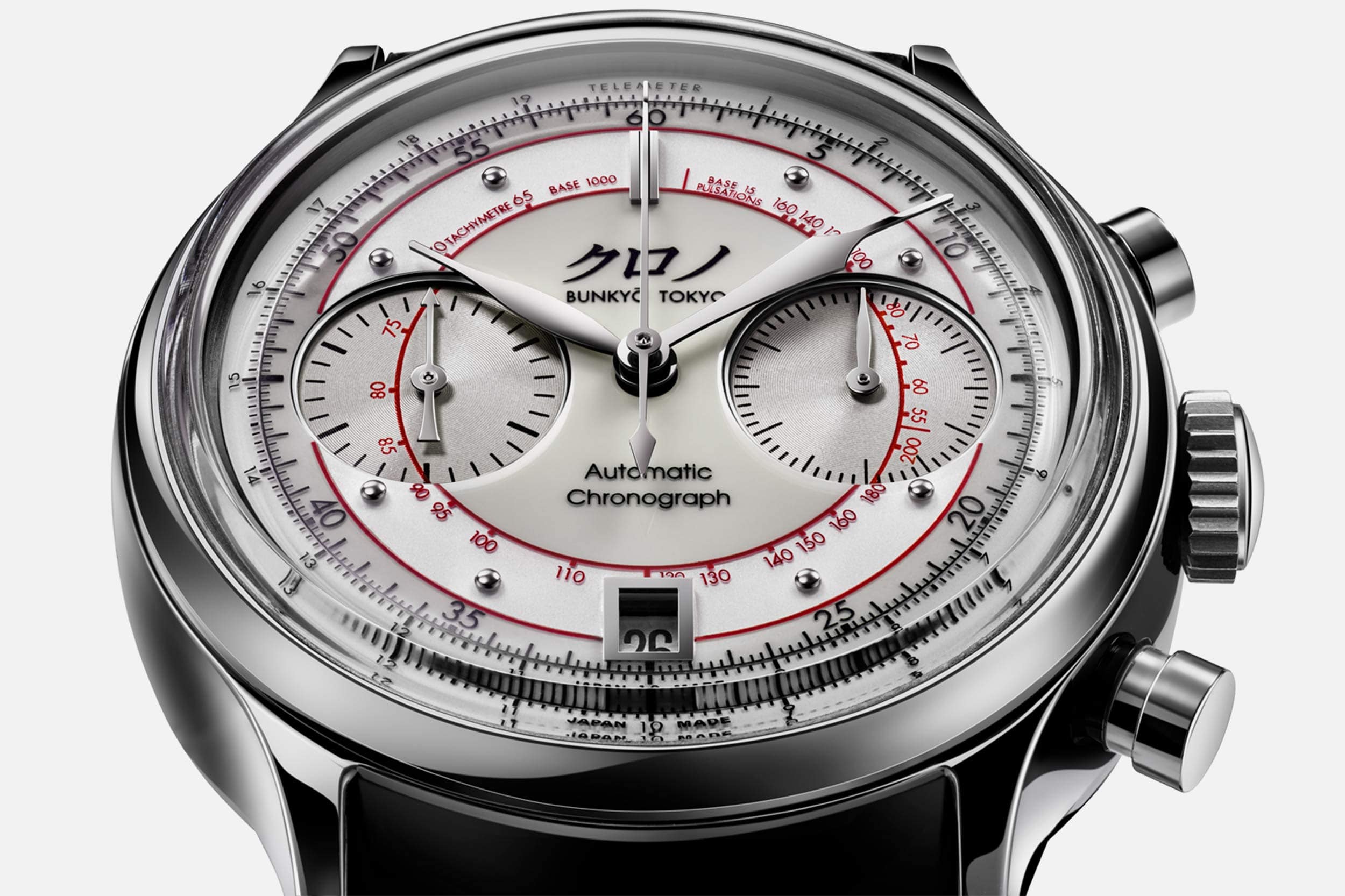
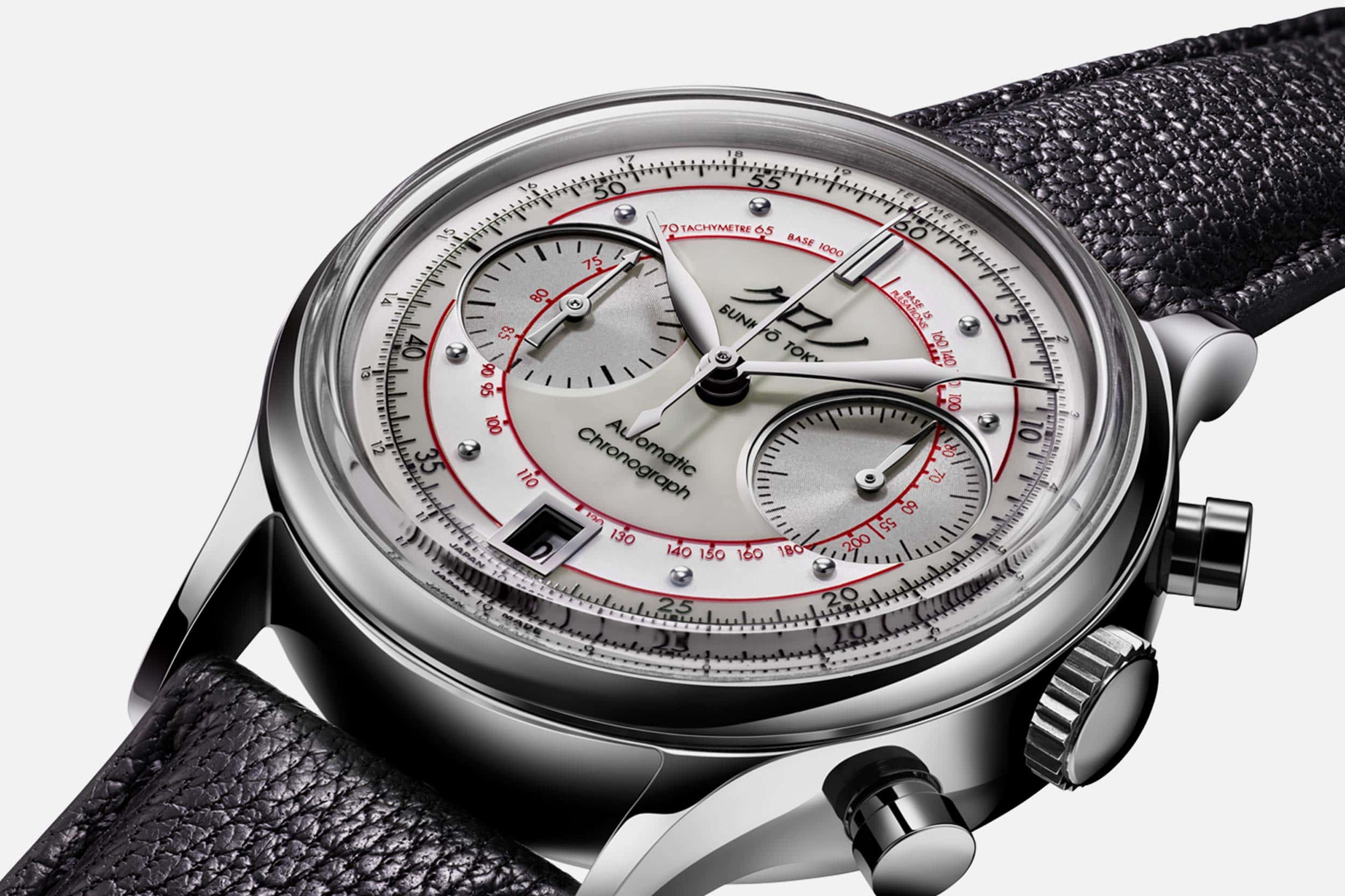
A busy dial like this usually doesn’t have this kind of pull. World time watches and multi-function quartz chronographs rarely draw me in, because they feel like a sea of numbers and words that obscure the components of a watch that I personally find most essential. Here, every bit of additional dial information – the multiple scales, the use of multiple colors and tones throughout the distinct sectors, the framed date window, those five minute studs – illuminate the high level of craft at play here. Some might argue that craft that ends up in eye strain is wasted, and that’s a perfectly fair position to take. But I disagree. When I see the dial, under magnification or not, I’m constantly blown away by the level of detail, and how well so many complex elements work together. A bizarro world version of this watch that makes room for more negative space wouldn’t be nearly as effective. I think the whole point is that it’s filled to the brim with perfectly executed, vanishingly small details. 

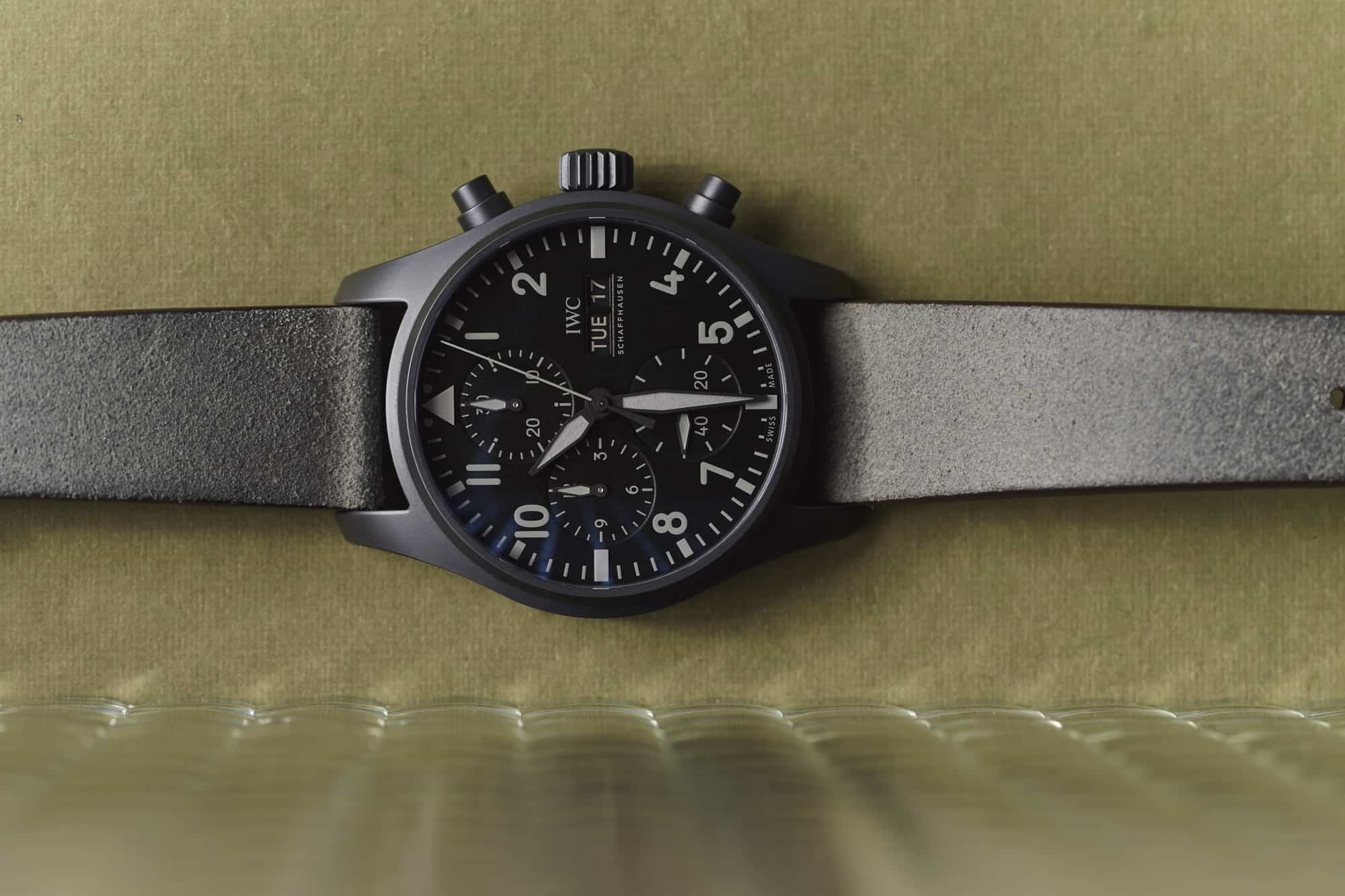
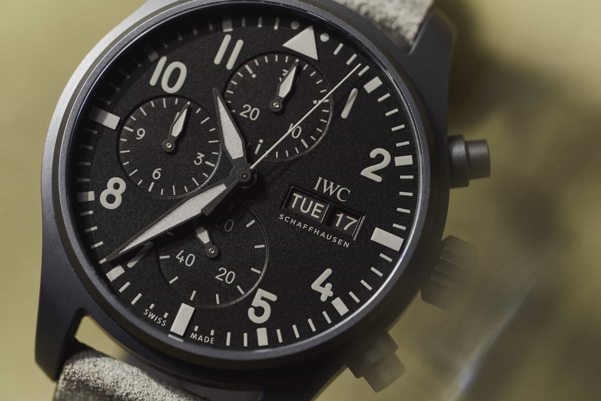
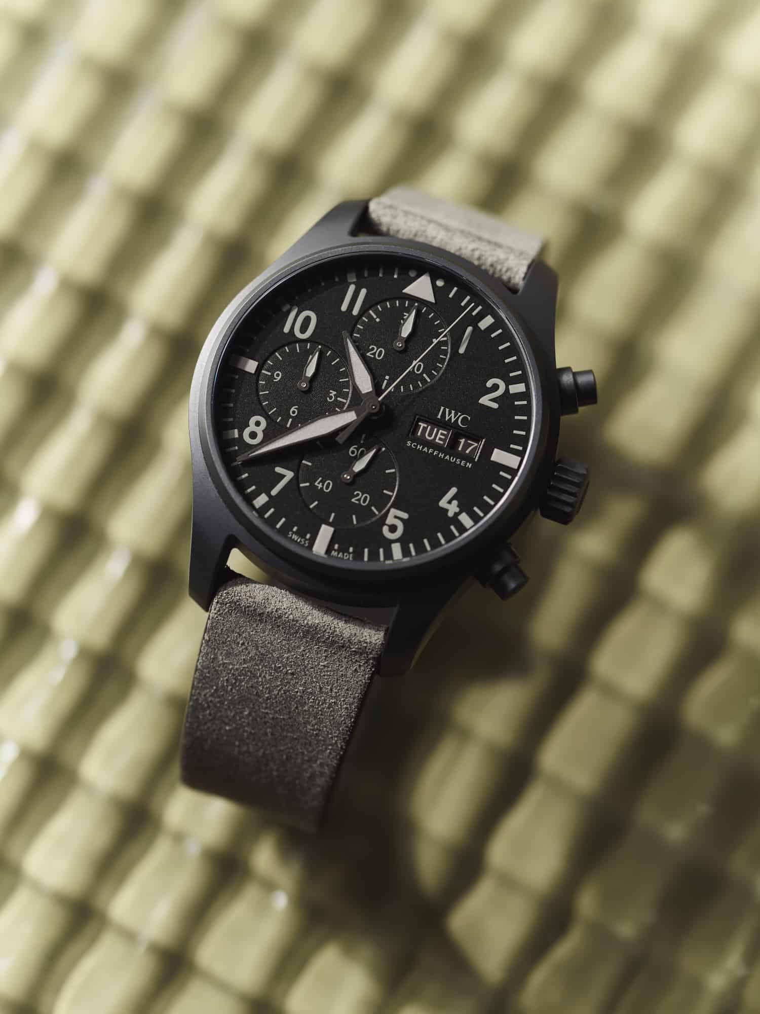
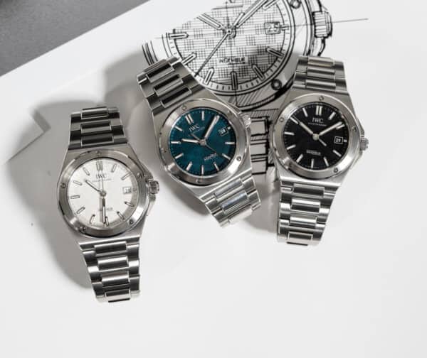
Sometimes people ask me what kinds of watches I like, and I’ve found myself responding with some version of simple, time only watches with interesting uses of color while wearing my nearly monochromatic IWC chronograph. Likewise, claiming I prefer styles that are spare and minimal while knowing the Kurono has what I think is a permanent space in my watch box feels like a contradiction. Even in a collection with contradictions, though, there are threads that run through even the most disparate watches. Watches that don’t appear to have anything in common might strike a similar nerve, appealing to a distinct part of our warped collector brains that are able to see similarities and connections where most would see watches that couldn’t possibly live together. One of the things I love about this hobby is how a watch can surprise you, and that might be the real connection between the IWC and Kurono: they co-exist in my collection as an unlikely pair that reminds me to be open minded about the watches we expose ourselves to. 

Related Posts
Zach is a native of New Hampshire, and he has been interested in watches since the age of 13, when he walked into Macy’s and bought a gaudy, quartz, two-tone Citizen chronograph with his hard earned Bar Mitzvah money. It was lost in a move years ago, but he continues to hunt for a similar piece on eBay. Zach loves a wide variety of watches, but leans toward classic designs and proportions that have stood the test of time. He is currently obsessed with Grand Seiko.
Categories: