When last we looked at Melbourne Watch Co., I was pleasantly impressed by their first watch, the Flinders. It was well executed, refined, had a few surprising details and, most importantly, was enjoyable to wear. Beyond all else, it made me make a mental note that Melbourne Watch Co had some design chops, some clever ideas and clearly was a brand to watch. Today, we’re excited to talk about their next watch, the Portsea, which is currently kicking ass over on Kickstarter, having quickly blown through the initial goal and one stretch goal.
It seems as though Marine Chronometer inspired watches are making a bit of a comeback. Sure, several brands have seemingly always offered classic interpretations, but we’ve seen a handful recently release ones, both affordable and not, that take the look, restyle it, making watches that are new designs. The Portsea is one of these watches, and to date is the most unique and perhaps the best looking. Named after a seaside locale on the Mornington Peninsula, the Marine DNA of the watch is clear, but there are added layers of complexity both visually and mechanically.
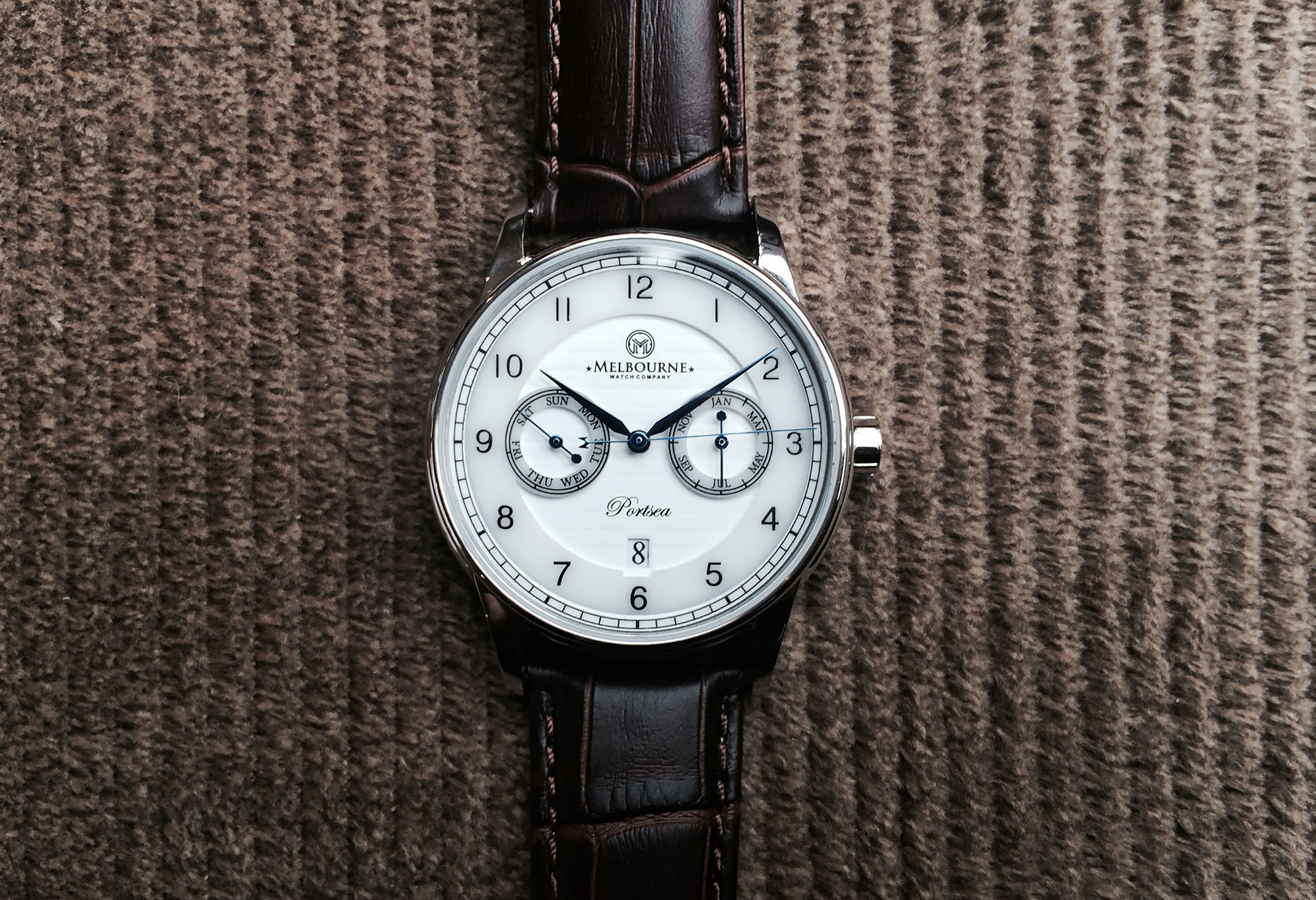
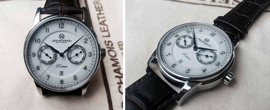
Starting from the inside, the Portsea is powered by a Miyota 9120 automatic. This movement is essentially one of their 9015’s, the growing favorite Japanese automatic, with added calendar complications. As such, you have sub-dials at 3 and 9, which indicate the month and day, respectively. You then have the date at 6, completing the triple calendar. Typically, this movement would also have a 24-hr sub-dial at 6, but Melbourne removed that, thus cleaning up the dial and allowing for the date at 6. Typically, Marine watches are time only, likely with a sub-seconds dial.
The dial then takes the Marine vocabulary and executes it with some interesting twists. Most notably is the use of a ceramic disk, which includes the main index and rings for the sub-dials. The disk, which appears to have a blasted finish, stands off of the main dial, creating a textured and layered display. Further emphasizing this, the dial below has a pattern of indented horizontal lines (perhaps a nod to the Nautilus?), and above the disk is a chapter ring with a railroad index, for 3 layers. The indexes themselves stay true to the Marine style, with clear, almost sterile Arabic numerals and a serif typeface for lettering.
The ring shaped sub-dials are particularly interesting and different. Sub-dials that sit below the main dial are so common that this obvious but effective twist creates a lot of visual intrigue. The play between the hand that has to raise through the center, the ring and its index as well as the textured dial beneath creates something that, in photos at least, is eye-catching. The dial will also be available in classic white with black markings and an unexpected navy blue with white markings, which is also a nice departure from the norm.
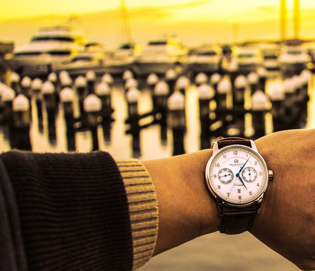
The 316L steel case of the Portsea is 40mm in diameter, comes in polished steel or PVD rose gold (limited edition) and features a flat sapphire crystal. The design is classical and handsome with long slender lugs coming off of a slab-sided central case. The bezel, which is rounded and polished, is set in from the edge a bit and just below the lip of the lugs, creating a series of steps for a decorative detail. The case back has a surprising amount of intricacy with a 3-dimensional stamped “Nautical scene”, which includes an anchor, a trident and various other sea-worthy icons. It has a lot more depth than a typical etching or engraving, for an impressive, albeit hidden, scene.
Melbourne set out to get $25,000 AUD on Kickstarter to fund the Portsea and have already surpassed that, plus their first stretch goal of $45,000 AUD to include German made alligator straps with the timepieces. At just about 60k (at the time of writing this) they are set to hit their next stretch goal of $75k to include AR coating on all sapphire crystals. Though they hardly seem to need our help getting the job done, if you’re interested, this is best way to get the Portsea at a bit of a discount. The eventual retail price will be about $725, but if you pick it up on KS, the pre-production cost is as low as $595 (there was a less expensive option, but it’s already gone!).
As a fan of the Marine style, I’m quite excited by what Melbourne has put together and am looking forward to getting my hands on one. Marine watches are interesting and fun to wear. They have formal qualities, speaking to classical aesthetics that date back to John Harrison, technical qualities, speaking to Nautical instruments and even a touch of sporty qualities too, with larger more bulky cases than a dress watch. As such, they are versatile watches that can be dressed up or down for the occasion or season.
It’s worth noting that there are some changes that will be made between the samples shown and production model, all for the best (from their KS page):
Hands – The “M” on the prototype seconds hand is undersized. This will be corrected for production to be similar to our previous models
Dial – We will be adding spacers between the mid and base dial layers to enhance the depth effect. We will also be enhancing the base layer horizontal pattern effect and overall colour palette and the cut out at 6 o’clock will be removed as it is no longer required for visibility of the date window.
Case – The “M” logo will be engraved onto the crown as per our previous models.
Case Back – We will be replacing the current screws with versions that do not protrude as substantially from the case.
Straps – The prototypes came fitted with deployant clasps. The production version will have regular buckles as per our previous models.




 Featured Videos


