Editorial: Our Reactions to the Bremont Rebrand

Bremont made their debut at Watches & Wonders last week, and they unexpectedly became the talk of the show. The new watches represent a dramatic departure from the design language Bremont has cultivated over the past 20 years, and serve as the introduction of Davide Cerrato at the helm of the company (he’s been CEO since spring of last year, but these new novelties are the first from the brand without the design input of founders Nick and Giles English).

Relaunches are complicated, and we can’t recall a similar attempt at a rebrand that was so ambitious. To unveil a completely new strategy at a brand’s first Watches & Wonders under a CEO who has been in place for less than a year is a massive undertaking, and regardless of how you feel about Bremont’s new direction, there’s no denying that this was a big swing. Below you’ll find reactions to Bremont’s Watches & Wonders presence from Zach Weiss and Zach Kazan, both of whom had a chance to (briefly) go hands-on with the new novelties. We hope to have an opportunity to spend more time with these watches in the near future to bring you a more complete evaluation outside the fanfare and noise of the industry’s major trade show.

Zach Kazan

A somewhat slower year for big, flashy new releases at Watches & Wonders means that smaller stories about watches and brands that don’t normally generate a ton of heat will be talked about and picked apart in a way you wouldn’t necessarily see. Last year, when Rolex dropped a Day-Date that displayed neither the day nor the date, for example, a lot of new releases from smaller brands (and everyone is smaller than Rolex) got swallowed up in a vortex of hype. But even in a truly bonkers release year, I think people would still be talking about Bremont’s Watches & Wonders debut. But this year, without the buffer of a single sensational watch that was the talk of Palexpo, it left a void that Bremont’s big rebrand could naturally fill. 

By now you’ve no doubt heard the broad outlines. Bremont, under the leadership of new CEO Davide Cerrato, debuted a new vision for the brand at this year’s Watches & Wonders. The rumors had been swirling for months about what the eventual  rebrand would entail. There was talk of a dramatically reduced price point that surfaced months ago, which would seem to fall in line with what we know about the company’s overall state: they’ve taken on massive investment from outside sources with the goal of dramatically increasing market share. The appointment of Cerrato as CEO a few months after news broke of Hellcat LP’s big buy-in early last year should have been a signal that we’d be heading for a significant shuffling of the decks. Cerrato has developed a reputation as the guy you bring in for a big change, having both huge successes (at Tudor, where he oversaw the release of the original Black Bay) and some notable not-successes (HYT, we hardly knew thee).

But even more than Cerrato’s entrance, the story here is very much about the exit of the English brothers, Nick and Giles, who have been the heart and soul and guiding light of the brand since they founded it in 2002. The new direction of the company, which is being pitched as a focus on watches built for exploration of land, air, and sea, does not seem to include Nick and Giles at all. It’s a notable exclusion, and something that longtime fans of the brand mentioned immediately as I engaged them in the halls of the Palexpo and around Geneva as the rebrand became a focal point of conversation throughout the week. Nick and Giles, as founders go in this industry, have always been remarkably accessible, and the hardcore Bremont acolytes felt a personal connection to them and their vision. 

Now, they seem to have been erased. Nick and Giles each posted images of watches from the new collection on their personal Instagram feeds, with identical accompanying messages admitting that change can be hard, but imploring followers to give the new watches a chance. But the tone of the posts was that of an outsider, and comments, notably, were turned off. 


View this post on Instagram


A post shared by Nick English (@bremontnick)

Advertisement

Also erased in the rebrand are many of the key identifiers of the Bremont we’ve always known. The new Terra Nova watches (Bremont’s new take on field watches, and the “land” vertical of the rebrand) and the Supermarines (“sea,” naturally) do not feature Bremont’s signature Trip-Tick case construction. They’re also missing things like chronometer certification, and, yes, the propeller logo is gone as well, making way for a new compass inspired logo. The new branding was pretty divisive based on the conversations I had last week, but I’m not offended by it. It lacks the charm of the propeller in my opinion, but I tend to think people make too big a fuss about logos, particularly when they’re new. If the watches are good, people will accept the logo, and if they aren’t, they won’t.

So, are the watches good? That’s kind of all that matters at the end of the day. It’s incredibly hard to form a coherent opinion on watches that you only get a few minutes to handle in the harsh light of a Watches & Wonders meeting room. Another complicating factor that I don’t think is mentioned enough: when a brand is presenting many, many references, as Bremont did this year, it becomes even more challenging to parse what they’re really going for. I think this is why some brands, like Ulysse Nardin and Lange, for example, only bring one or two watches to present. They just make more of an impression when there isn’t a lot of competition for attention.

This is a long way of saying that my mind is not made up yet, and my feelings are mixed. I’ve never been the biggest fan of Bremont anyway, if I’m being honest, so I didn’t have any significant emotional investment in the brand doing away with a lot of what their biggest fans felt made them special. But I’ve always respected that they kind of do their own thing, have an independent streak, and were committed to the bit, always drawing on their Britishness, a handful of very distinctive design quirks, and the personality of their founders. 

I’ll say this: when I put the 38mm Terra Nova on my wrist and took a wrist shot, I liked the way it looked. It’s a simple and easy to wear field watch, which is what a field watch should be. It’s compact, feels well made, and the bracelet is quite nice, even if it doesn’t necessarily feel like a perfect aesthetic match for the case. The dials have a nice fumé-like effect, which of course is not completely original by any means, but is well presented and offers a break from flat and monochromatic looks that we typically see on watches of this style. The numerals and hand set aren’t really for me, and the case shape isn’t quite my vibe either, but these are subjective things, and another enthusiast could easily see this watch and find a lot to like. This simplest version of the Terra Nova has the bones of something that could work really well, and may even be great one day, but it feels like that’s  one or two updates away.

The confounding thing about the new pieces is that it’s impossible to discuss them, at least at this early stage, without the context of what came before. To put it another way, there’s no easy way to simply look at them on their own, without all the baggage, good and bad, from Bremont’s 20 plus year history. Every evaluation of these watches is by definition reactionary in that the community is responding to a considerable change in direction for a company that, at least from my point of view, had carved out a very specific niche. 

But time will pass, and eventually there will be enough space between the old Bremont and the new to really consider these watches on their own terms. Rebrands are jolting and take time to settle, and the Bremont rebrand has definitively not settled just yet. There will be more to come later this year, including a Supermarine in a ceramic case that hasn’t been formally announced yet but also isn’t under embargo. I actually liked this one quite a bit, and it feels significantly more premium than the Terra Novas I saw in my presentation. I also expect we’ll see more from the “Air” side of the brand, and I imagine that will be a moment when collectors decide to continue along for the ride, or bail out completely. For what it’s worth, I was told by the brand that the Trip-Tick case, absent in the new collection, has not been completely abandoned, so it’s within the realm of possibility that it could make a return in a new aviation themed watch.

The other key impression I’m left with after meeting with the brand last week and thinking about the rebrand in the days since is that even if collectors and enthusiasts are expressing some consternation about Bremont’s new direction, it’s quite possible that the general public who actually buy watches could eat this up. The watches are affordable (the 38mm Terra Nova, on a strap, starts at $2,850) and, I mean this in a kind way, generic enough to cast a wide net. They’re uncomplicated and might be easy to sell. It’s possible, perhaps even more likely than not given what I surmise is an overall reduction in production costs, that these watches will be an enormous financial success for Bremont. 

And that opens up a larger, existential question about the impact Bremont’s rebrand might have on the industry. We’re currently living in what I think many enthusiasts would classify as a golden age of relatively affordable, interesting watches, but not every brand will be successful, and it’s possible that some that struggle could see a need to take on additional investment. If Bremont’s gamble pays off, even if it alienates what was once their core demographic, will other brands follow suit? What this move means for independence in watchmaking, particularly in the affordable and enthusiast driven space, is something we’ll have to pay close attention to. 

Zach Weiss

I believe in constructive criticism. This has always been at the heart of our approach to reviews and critique in general at Worn & Wound. We don’t write click-bait articles that play into negativity (10 Reasons Not to Buy X, etc.…), and we don’t rip watches apart if we don’t like them. Chances are, if we don’t like them, they won’t make it onto the pages of Worn & Wound, and taste is subjective. I have strong opinions and often don’t agree with people, so to assume that if I don’t like something, no one should, is arrogant, at the least.

Which is part of why writing this article is challenging. I know people will disagree and perhaps even be offended by this, though speaking to other watch media in Switzerland leads me to believe I’m part of the majority this time, but Bremont’s rebrand failed. Full stop. In place of the DNA built by Giles and Nick English and their team, one defined by aviation, a pursuit of the “extreme” (as seen in rigorous testing and semi-novel engineering solutions) and toughness but not at the expense of a Saville row air of luxury, is one of generic adventure. Cookie-cutter outdoors maxims fill their copy, like “take it further,” “built to explore the world,” and “higher, further, deeper, faster” (I thought it went Harder, Better, Faster, Stonger?), providing little more than a brand mission that ChatGPT could have created.

This flows into the visual rebranding as well. While not offensive, the new Wayfinder logo is once again generic. They explained that it ties into their aviation history as the cardinal points look like propeller blades… Sure, if you want them to, but it also looks like a simple compass found on a map legend. Brits I encountered in Geneva quickly pointed out that Stone Island, an Italian luxury brand popular in the UK, also has a compass logo, which was their immediate association, not to mention the Safari web browser. There’s nothing wrong with a compass, but it’s been done, and nothing is memorable about their approach. The new typeface, similarly, is inoffensive but generic, something you’d expect to find on a short-lived SUV model.

Was Bremont’s previous logo brilliant? No, but the calligraphic propeller blades were their own, and when combined with the clean typography of “Bremont” and “Chronometers,” spoke to the gentleman’s luxury sports brand they were. I could dwell or get into their use of camo-patterns and tones, which brings in a perhaps confusing military element, but the lack of “chronometers” in the new logo is a good segue to the product. As pretentious as it might sound, Bremont used to refer to their timepieces not as watches but as chronometers, as they all were COSC certified. While a bit of marketing-speak for sure, this also was a cleverly British thing to do, as John Harrison created the first chronometers in England, a technological breakthrough on par with the moon landing, or perhaps even greater.

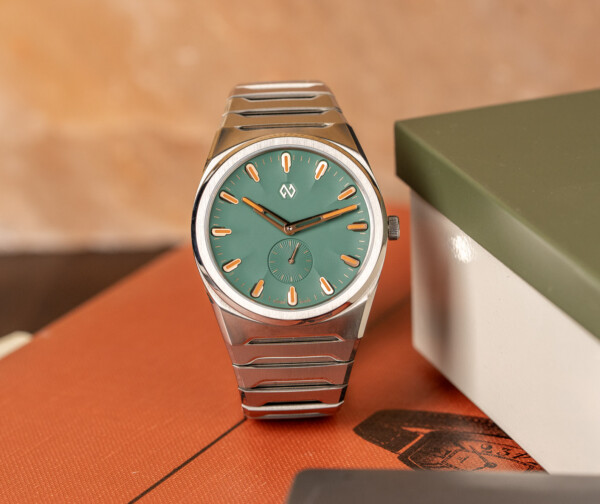
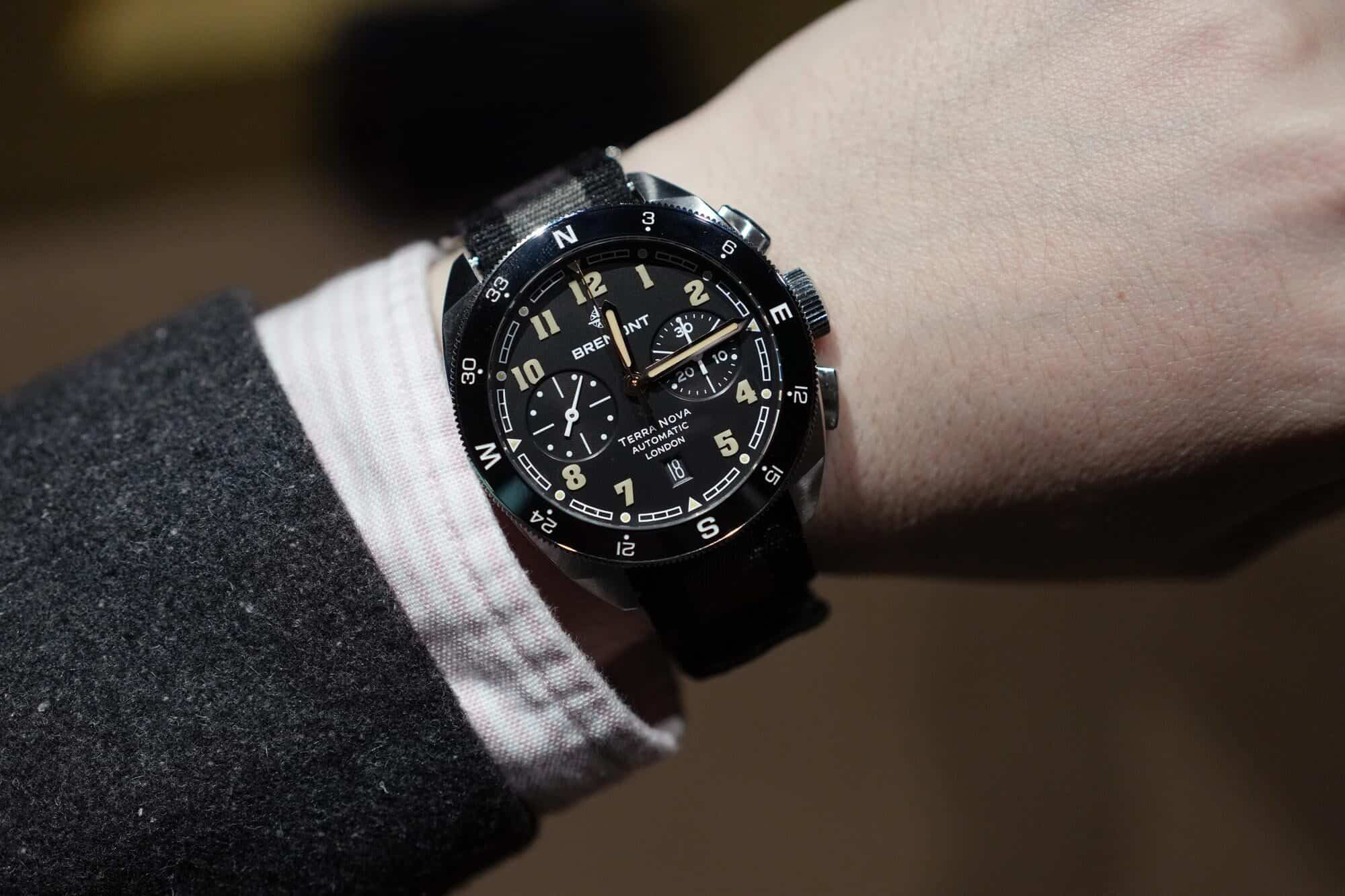
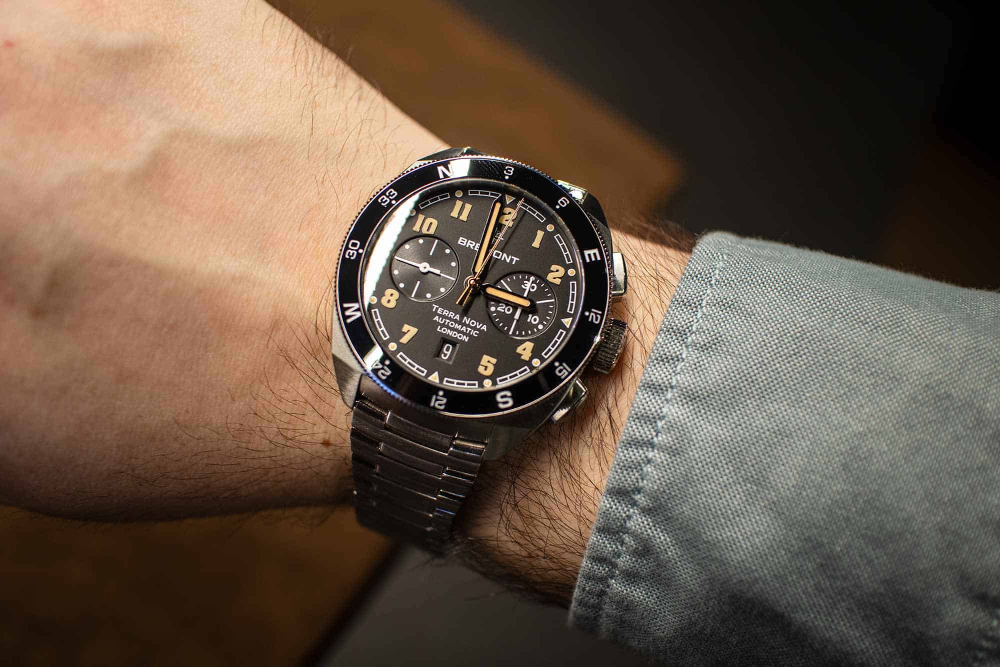
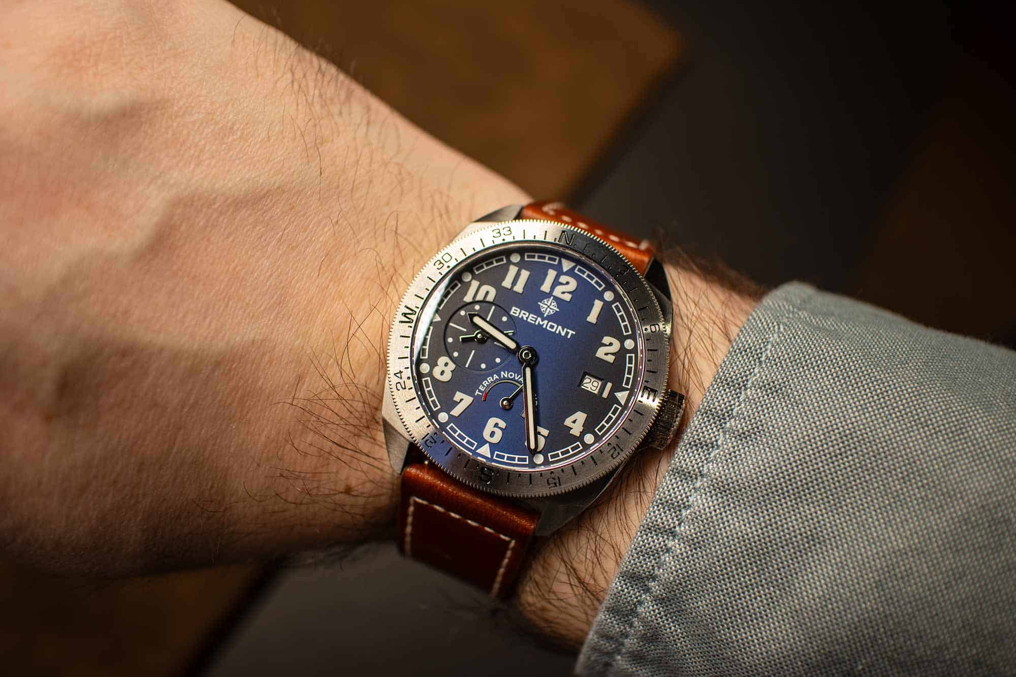
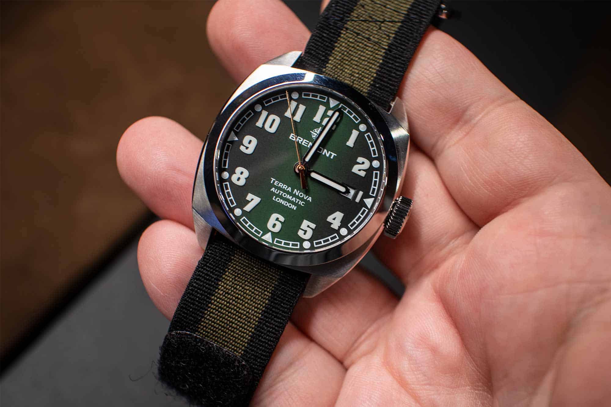
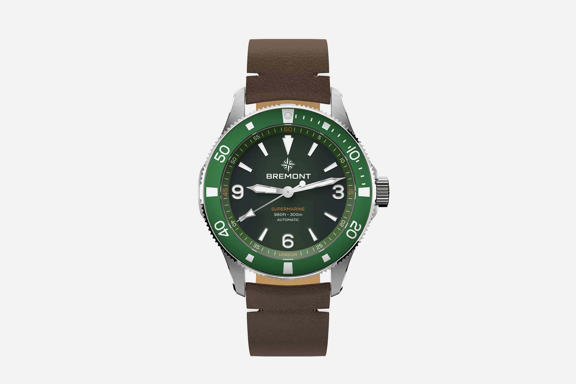
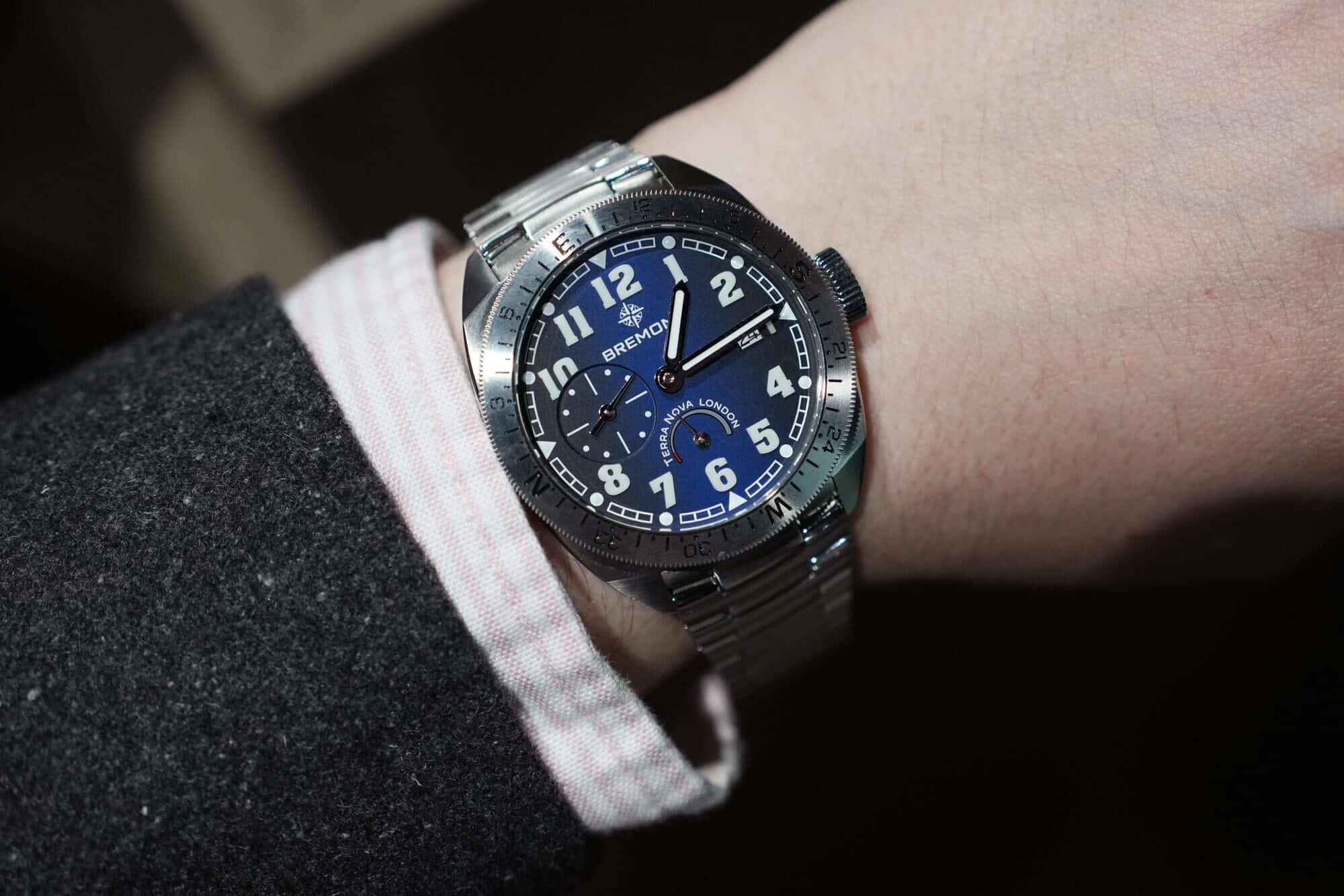
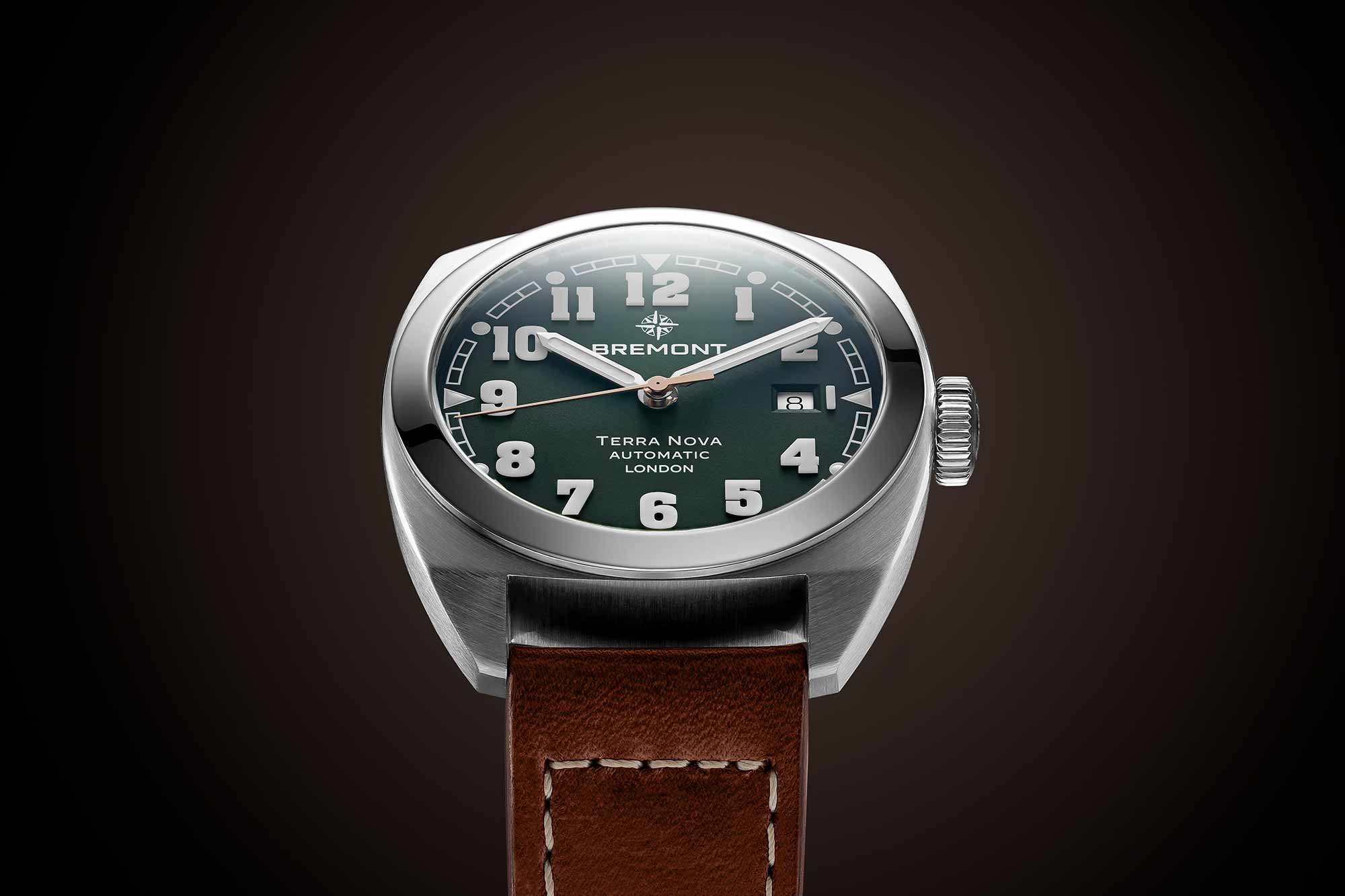
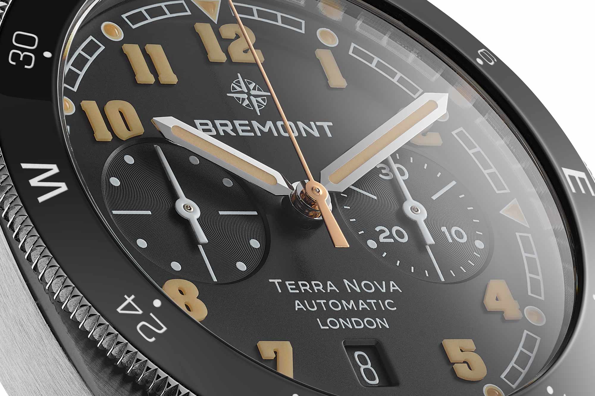
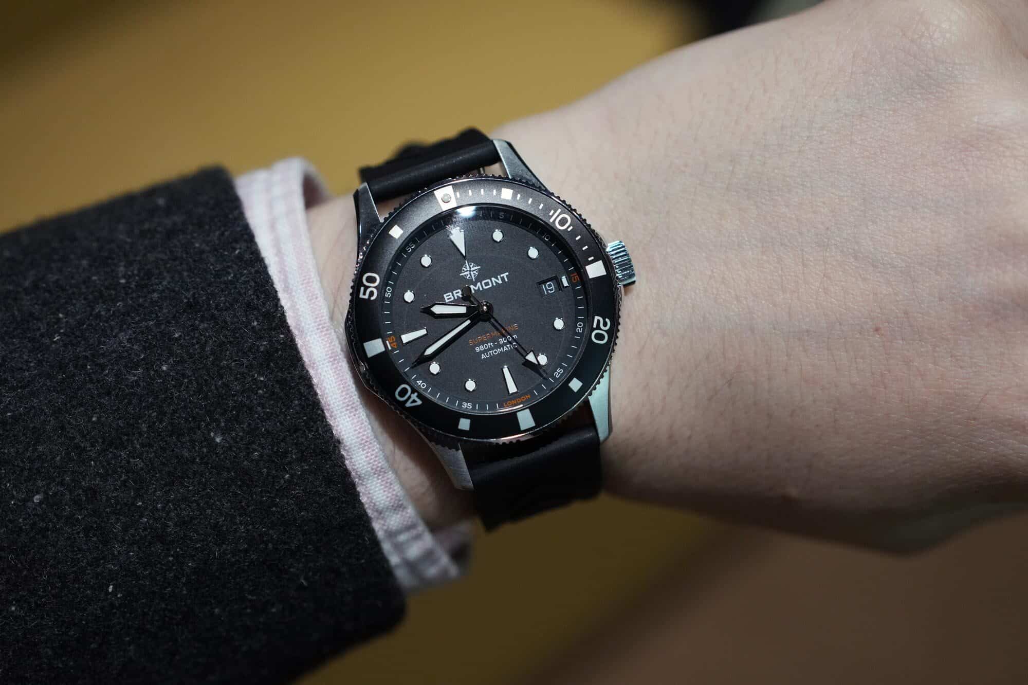
Now, they are not. They are just watches again. And, they don’t look or feel anything like the Bremont that once rose to prominence, nor do they have many of the features that made Bremonts Bremonts. The catalog is now split into Land, Sea, and Air, which likely describes dozens of brands and various restaurant menus. Land translates to “field” watches of a sort, sea to divers, logically, and air, in theory, is pilot’s watches, but is currently the remnants of the previous brand. At Watches & Wonders 2024, Bremont debuted the Terra Nova collection for their land offering and reintroduced the Supermarine as their divers.

Look, this isn’t a review, and I’ve likely gone on too much already, but the specs speak for themselves. No Trip-Tick cases, hardened bezels, shock absorption, chronometer certifications, or DNA from the brand before. Yes, they are all 904L steel, the corrosion-resistant alloy famously used by Rolex, which is uncommon but not unheard of. Ball comes to mind, as does the UK’s Aera and Garrick, the latter of which are also machined in the UK, and that’s not to mention Grand Seiko’s Ever Brilliant steel. Less special than they would lead you to believe, though admittedly a step in the right direction.

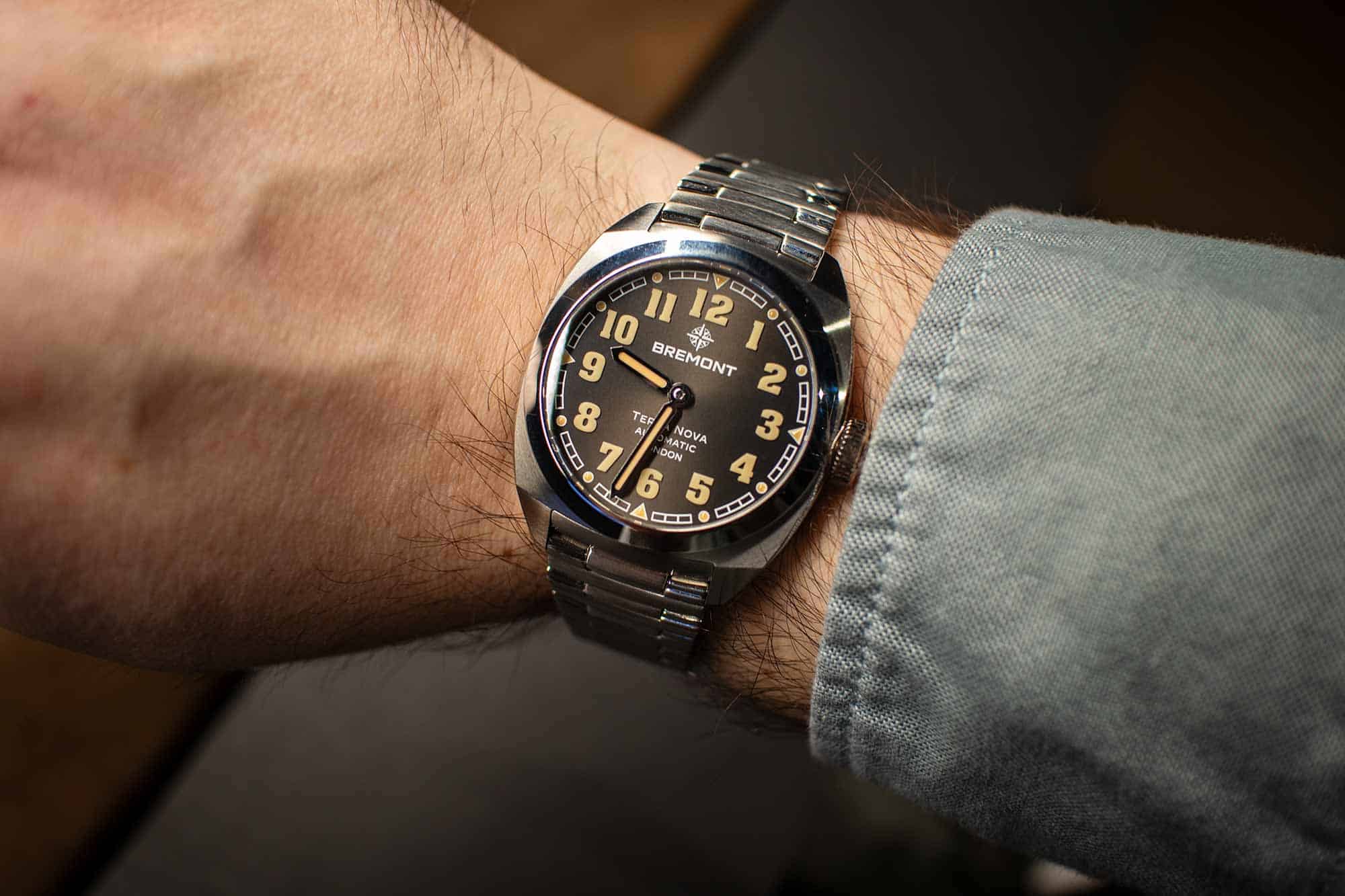
In terms of design, the Terra Nova watches were an odd mix of early 20th-century military pocket watches with mid-century barrel cases and oversized dial text and branding. Available in various sizes, from a two-hand 38mm version up to a 42.5mm chronograph that was huge on the wrist. Compass bezels without 24-hour hands suggest functionality but don’t provide it, and all feature rebadged Sellita movements. They start just below $3k and go up to $5k. 

Are these the worst watches ever? Hardly. They even have a quirky charm in their odd Franken-military-mash-up of details. But they aren’t British luxury watches. If they were $300 – $500 and powered by NH35s, they might even be popular, but as watches that are inheriting the legacy of the MoD-sanctioned Broadswords (which were in the same price bracket too), they don’t make the cut. They lack refinement and don’t know what they want to be.

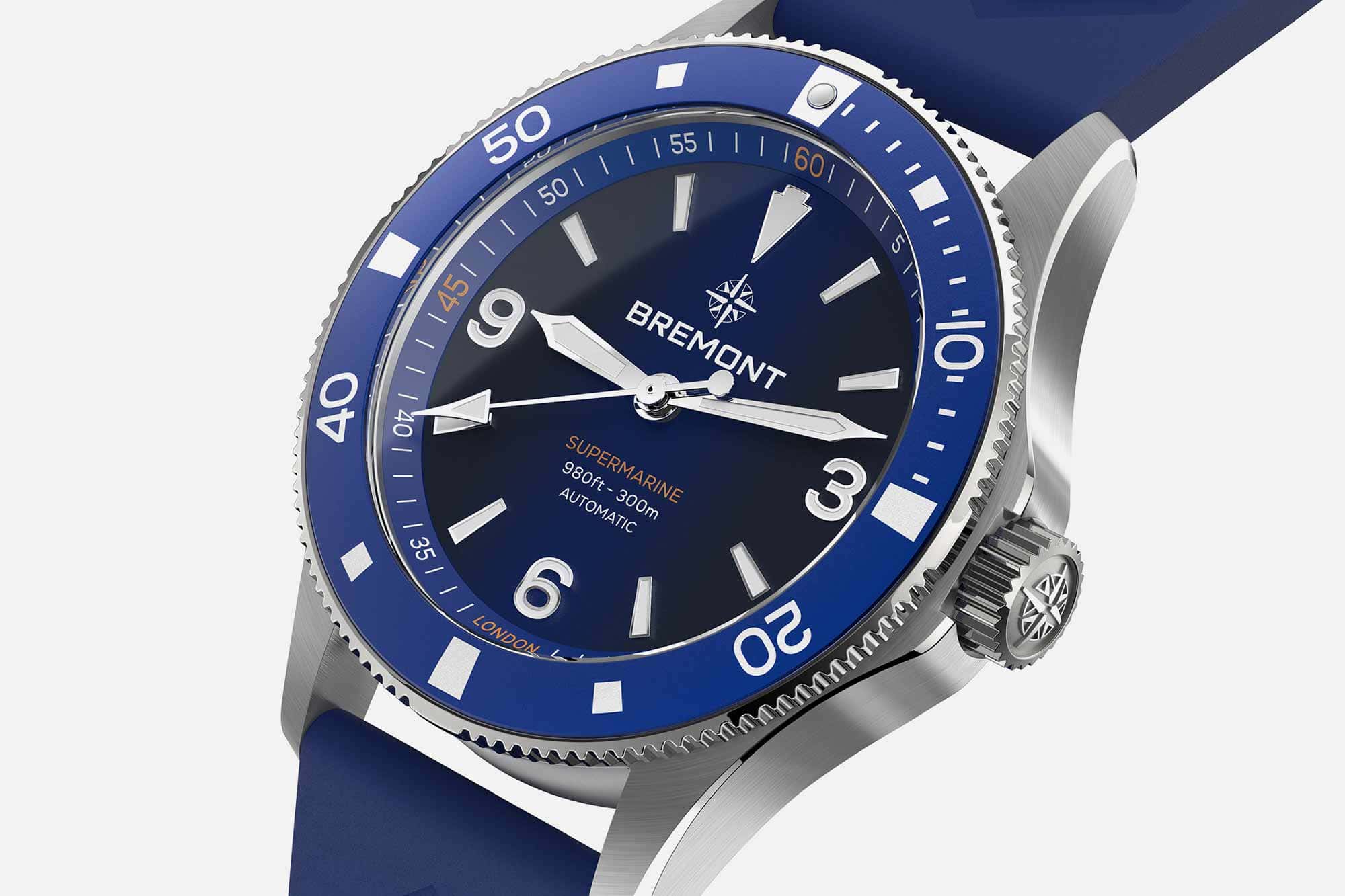
While I can find something in the Terra Novas, the Supermarines, which take over from a line of attractive, if conservative (which describes the old Bremont in general) dive watches lack any charm or nuance. These are generic divers that could be by anyone or no one. Montblanc meets Breitling meets TAG meets AliExpress. They feel rushed and unbalanced. The colors of the anodized aluminum bezels lacked subtlety, coming off like cuttings from soda cans. The branding on the dial is so oversized that they position the hour and minute hands at 9:13 in soldier shots not to block it. The Breitling-wannabe bracelet, which was the best part in person, looks mismatched. With a starting price of $3,650, finding something redeemable is hard. 

But, to be fair, Bremont needed help. They were languishing. One of the brands that felt most talked about as a fresh face in modern luxury in 2010 was almost irrelevant by 2024 (earlier, actually). They somehow lost momentum in a market that was full of it (ok, we know it was because of investors). They never grew or evolved. When they succeeded, such as with the Broadsword collection, they didn’t know what to do with it. Attempts at something new, like the Supernova, didn’t hit. Many other releases felt based on the same formula they’d used for years. It got stale. And their attempts at owning a British-made story felt hollow and dubious.

But rather than building on their past successes, understanding what made their watches and brand special, clearing out SKUs, and refocusing, they’ve denied the past, going in a generic direction that puts value engineering over design. I could perhaps understand this if Bremont had gone out of business and lay dormant for years, only to be resurrected by people unrelated to the original brand, but there is continuity. The old brand is still there, an embarrassing reminder of what happens when a brand loses direction while also upstaging the present.

Related Posts
This is the house account for Worn & Wound. We use it on general articles about us, the site and our products.
Categories: